#colorist for hire
Explore tagged Tumblr posts
Text
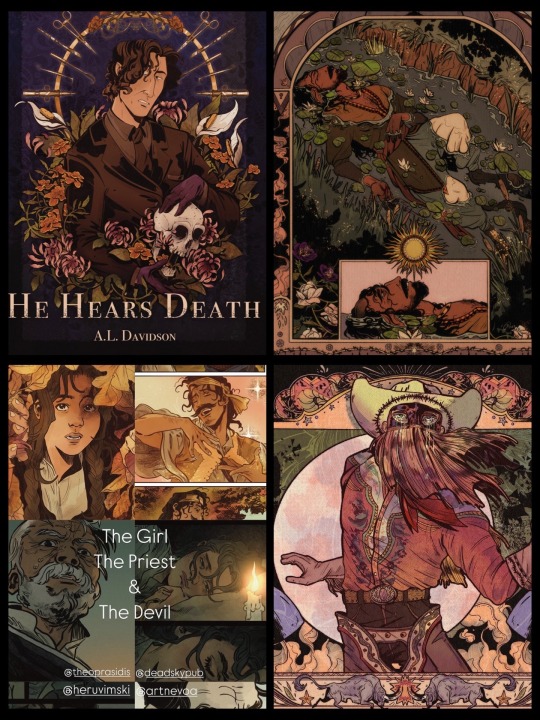
Hi there- my name is Yasmine Pond and I am an illustrator, comic artist, and currently a colorist for an upcoming graphic novel: The Girl, The Priest, and The Devil.
I’m interested in illustration, comic work, and coloring jobs for graphic novels. Let’s get in touch!
#myart#portfolio day#art portfolio#artist on tumblr#illustration#illustrator#comic art#colorist#Orville peck#artist for hire#freelance artist
22 notes
·
View notes
Text

claire when she needs to color another page of the colored comic she chose to color because she chose to write a story that depends on color so the comic must be colored
#i see why people hire a colorist this is the mindkiller /lh#IM NOT EVEN SHADING OR ANYTHING. ITS LITERALLY NOT EVEN HARD. I JUST HATE COLORING#quail talks
10 notes
·
View notes
Text
Looking for a colorist!
Hey, before I turn to fiverr or somewhere similar, figured I'd cast a net into the ether.
I'm looking for a colorist(s) to help with my webcomic! This will be paid, and I'm open to discussion on rates and the like!
I currently have two webcomics with plans for 2 more! The current ones are:
Stolen by the God of Love (fantasy romance)
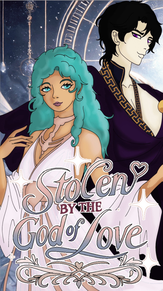
And Son of Nyarlathotep (Horror fantasy)
If you're interested, feel free to message me here or send me an email at [email protected]. be sure to include samples and rates!
No AI!!!
8 notes
·
View notes
Photo

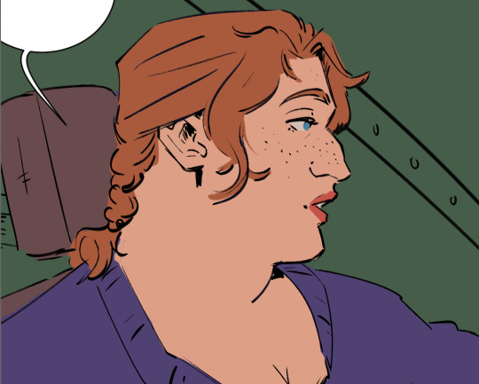
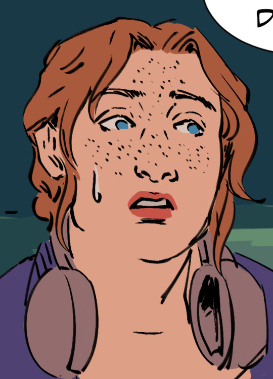
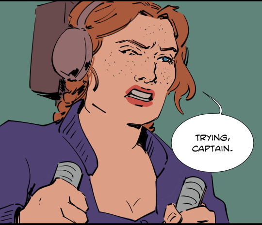

estherrrrr <3 (+amara)
#she looks a lil different every time i draw her lol but she has one of my fave faces of all of my ocs#i love amara sm too but you can tell that i am struggling to memorize her face rip esther comes real easy#but annywayssss i wanted to show a lil tidbit of art a lil bit lil bitty bit#esther katz#actium#minadraws#almost donw with chap 2 flatting hell jesus i see now why colorist hire people to flat fot them
57 notes
·
View notes
Text
wasted my talents by going into stem. they should hire me for lighting and set design. disregard the fact that i've got no film or art education whatsoever
#genuinely think i'd be so much happier if i was like. a movie makeup artist or a set designer or a film colorist or something of the sort#however... glass ceiling and the like... i'm more likely to be hired as an arab with an engineering degree than an arab with an art degree#or a makeup artist license or something
4 notes
·
View notes
Text

UPDATE || Thursday April 25th || 2024
--Current readers, click *here* for the update--
* NEW READERS || PATREON || TWITTER || INSTAGRAM *
A new store has been opened! The proceeds of which fund my new OFFICIALLY hired colorist @barbelzoa, please check it out!
761 notes
·
View notes
Text
Put a finger down if you worked with a composer friend for several months to create a Bridgerton-inspired cover of "That Way." Then you hired musicians to play it for you. Then you spent another month doing research, asked several friends to help you translate, designed some 3D audio, and hired your colorist friend so your neurodivergent brain could "feel" the character's emotions more... And you did this all for an edit. Because you are insane and can't ever make anything simple..... Oh just me..... Damn.
youtube
This edit was created before S3 PT2. So it is Polin's story up until S3 PT1.
#colin bridgerton#luke newton#nicola coughlan#penelope featherington#polin#polinedit#bridgerton#bridgerton season 3#bridgerton netflix#carriage scene#first kiss#violet bridgerton#lord debling#eloise bridgerton#edmund bridgerton#polin bridgerton#Youtube#perioddramaedit#romancing mister bridgerton#romancing mr. bridgerton#colin x penelope#penelope x colin#penelope x eloise#youtube#julia quinn#romance books#period drama#bridgerton fanart
108 notes
·
View notes
Text
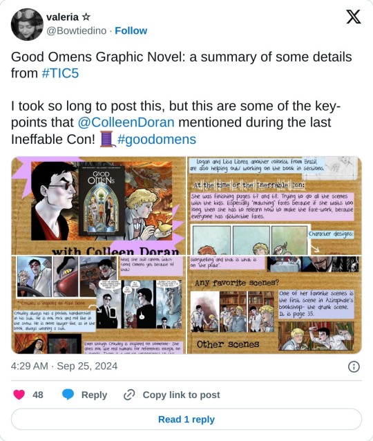
If you have Twitter, this nice person did a recap of my IneffableCon Zoom appearance.
One small caveat is I've done the majority of the color on the GN, but did hire help on the latter portions of the book. I do color design on those pages, hand it over to a colorist, then when it comes back - if I'm lucky - I don't have to do more than tweak it. If not lucky, 1-3 hours of repaints. So thanks to Sean Lee, Logan and Lisa Lubrera, and Daniel Junior, co-colorists.
Also, amazing lettering by Lois Buhalis. I'm doing the hand lettering and some of the medieval lettering, Lois is doing the heavy lifting. Looks AMAZEBALLS.
109 notes
·
View notes
Text
watching 2pm videos restored my hit points enough to where I started doing a more painted rendering style than I usually do without thinking about it, and now I have to keep it up for like. six more panels
okay. okay. we can do it. we can get this comic finished. we can! it's almost (starts to render the colors beyond flats and a single multiply layer) oh no
7 notes
·
View notes
Note
Hi there!! I was wondering if you could talk a little bit about what the process of being published was like for Lunar Boy? Were there any struggles you faced trying to get it seen? Any tips for others trying to get their work published? Thank you in advance and I love your work! :)
Hullo there! Sure! Unfortunately things have changed a lot since I pitched years ago so I don't know how replicable my publishing journey is nowadays. But I'm willing to share!
So! I always knew I wanted to write for kids, but in art school we were trained to be cape comic artists. Back then (if you can believe it), making middle grade comics was considered something that would sink your career. At that point in history, American comics was trying so hard to prove "we're not for kids!" that they left a chasm in the market for children's comics. Then Raina Telgemeier's bestselling books proved there was a hungry readership of kids and suddenly the trad pub industry is excitedly picking up middle grade graphic novel pitches (ironically, including cape comics).
I was studying my Masters in the US as this was all happening, and decided to use my time in the program to generate as many middle grade pitches as possible! The first one I made was Lunar Boy, but the story was so well received that it ended up being the one we pushed forward as a pitch and develop the most across classes. On Twitter there was this event: #DVPit, which is a pitching event for marginalized authors looking to seek editor interest on their pitches but also! To get agented. In its heyday (before Melon Husk ruined everything. This event is no longer on twidder sadly. Many pitching events have ceased to happen or are on hiatus from how unusable that platform is now) it was a fantastic event. I got agented on my 2nd try of the event, and it got the industry an early look at Lunar Boy and made them excited to see it out on submission.
My agent, Britt Siess, was extremely helpful with giving us feedback on how to refine our pitch. Not only did she give us story feedback, but I was surprised also by her comics feedback- that was more nuanced than I expected (little did I know that she's a huge comics nerd). She had connections to all the editors I was interested in pitching Lunar Boy to, and we were out on submissions right as we graduated with our Masters degree (during the start of the pandemic lmao).
I already had early editor interest in Lunar Boy which I think helped a lot with getting it picked up. I've been told that it helps to meet editors in person and get chummy with them before pitching to heighten your chances, but that wasn't really the case for me. I've never met my editor (Carolina Ortiz, I love her she's amazing) in person, but she did actually reach out to me long before we went out to pitch- on a Simu Liu tweet trend of all things lmao.
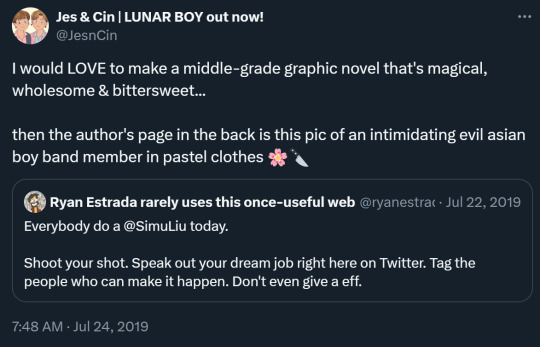
(I didn't end up looking like evil boy band members in pastel clothes in the final book, I went for cultural clothes instead which I think is the more bespoke choice haha) Carolina reached out to me from this tweet and we actually talked back and forth about Lunar Boy, refining the pitch. I felt like she understood the story despite asking for big changes. I don't think she'd do something like this anymore, but I really appreciated it at the time (I wasn't even agented yet). All the editors I met in person for events like Editor's Day at school liked my art (and would even hire me for colorist work and the like) but they weren't interested in Lunar Boy. This was reflected when we finally went on submissions too.
We got a lot of rejections, vague language like "we don't know how to edit this" or "we already have a book like this" (??? press X to doubt). Compounded with all my interactions with editors in person, I felt like I was "marketable" as an artist but not as a storyteller because our stories were so unapologetically QPOC- with culturally specific queer identities to an already underrepresented identity. The editors that were interested in Lunar Boy had personal connection to the story (they were either also from blended families or QPOC themselves). But hey, you only need one yes to get a book deal. We ended up with Carolina as our editor and she's been our rock and champion for this book since the beginning. We were out of submissions in just a week (which is really fast in the industry).
My big tip for getting into the trad pub graphic novel industry is to study the market. A lot of people mistaken publishing as a vessel or platform for their untold story, when really it's a business we compromise with. Pay attention to trends, book deals, shifts in the industry, read your peers' books, everything. Research is key with getting your foot in. Lunar Boy may look like an out-there book, but at its heart it's a story about culture shock, trying to fit in, along with family and friendship problems. In trad pub especially, locking in to sellable tropes and trends is key. Find clever ways to innovate and work within those limitations at the same time. Be open to feedback and changes. I know so many people are held back from getting book deals because they're too attached to their story. It helps not to be phased by rejection and or take things personally. I've been very desensitized to talking about books like a business, since that's what it took for someone like me to make it out there.
I hope that was helpful!
#askjesncin#lunar boy#FRESH AND FUNKY PUBLISHING TIPS FROM HARVEY NOMINATED AUTHORS#please vote for me in the Harvey awards. I'm kindly requesting. my friends want to make fun of me if I win#I want to live in that reality
39 notes
·
View notes
Text
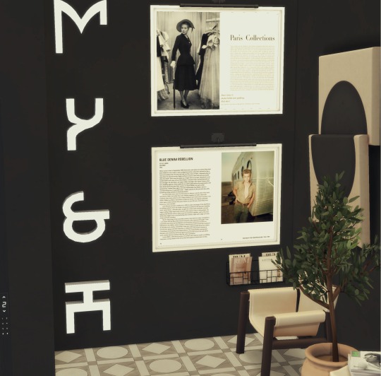

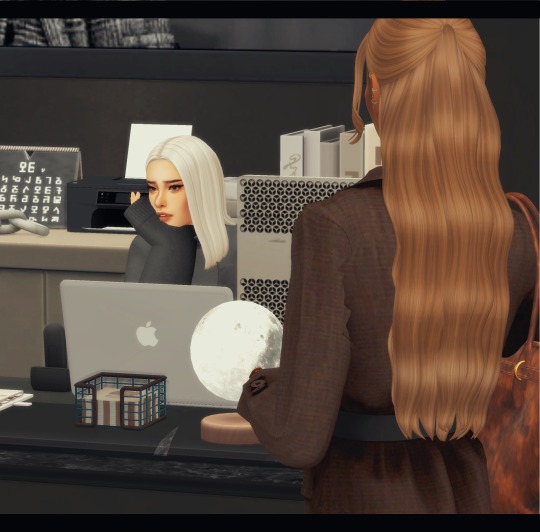
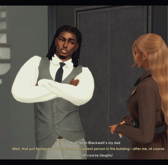
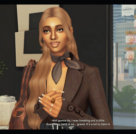
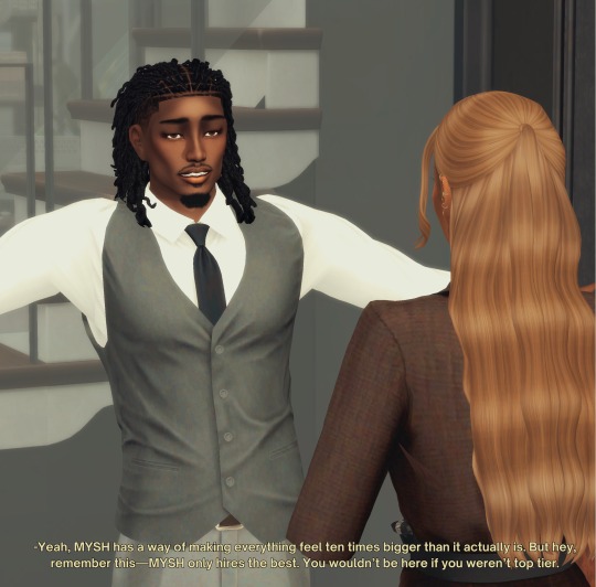
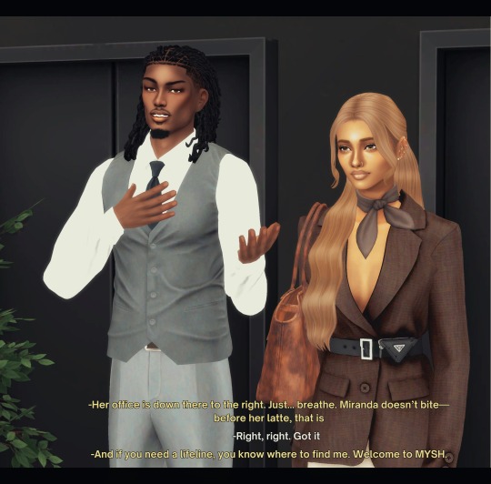
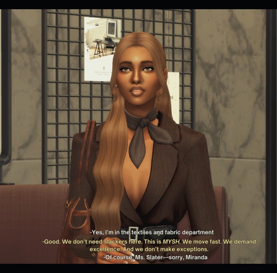
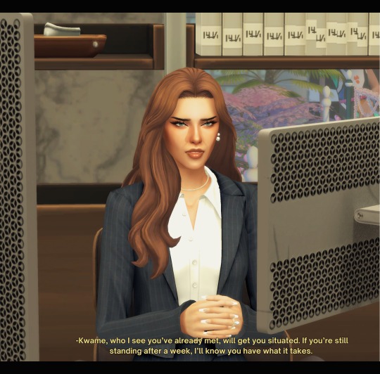
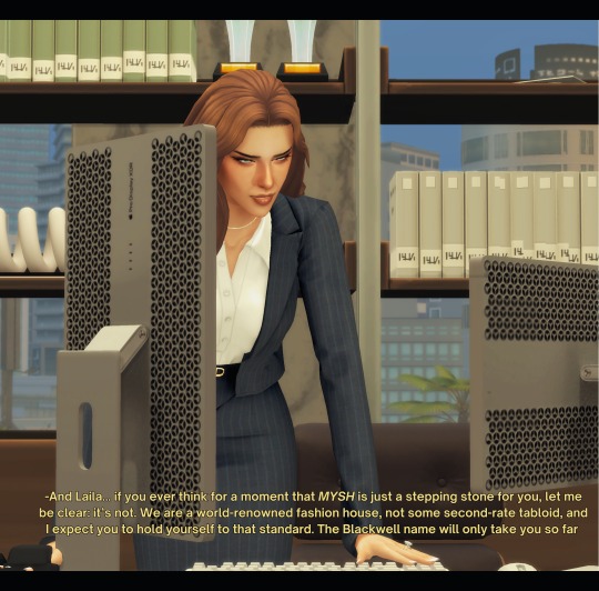
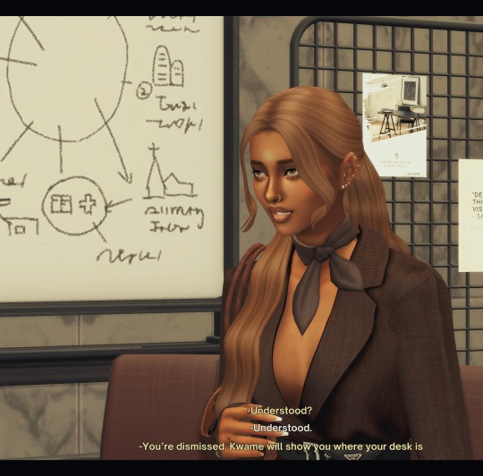
beginning | previous | next
S1 E9: “SINK OR SWIM"
Laila first day at the prestigious MYSH is a trial by fire. Greeted by the blunt receptionist Kendall, she’s warned about the high expectations and unyielding demands of Miranda Slater, the company’s ruthless CEO. After a brief pep talk from Kwame, Laila faces Miranda, who makes it clear that her last name won’t protect her—only her talent will and that at MYSH , only the strongest survive.
*Series Synopsis [New episodes every Mon. and Wed.]
Note: I lost the original save file again :( hence the delay. I was able to restart everything in a clean save and tweaked Laila design. Laila and Brook also moved into a bigger house-stay tuned for the tour! Miranda Slater is a combo name borrowed from Miranda Priestly (Devil Wears Prada) and Wilhelmina Slater (Ugly Betty)
A/N Transcript ↓
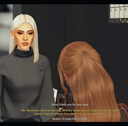
[Kendall (receptionist)] (sigh) God, how is it only 9am? I’m so hung over
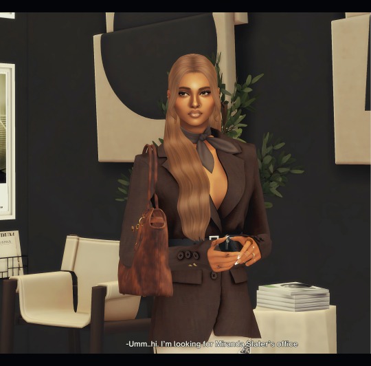
[Laila]: Umm..hi. I’m looking for Miranda Slater’s office
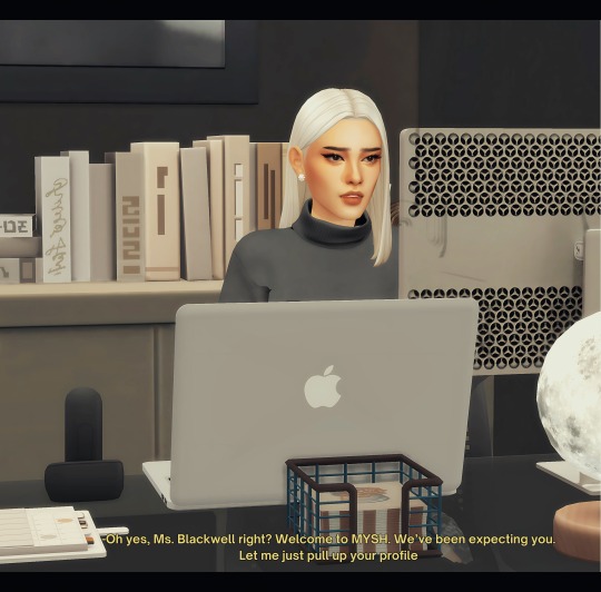
[Kendall]: Oh yes, Ms. Blackwell right? Welcome to MYSH. We’ve been expecting you. Let me just pull up your profile
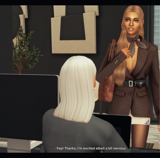
[Laila]: Yep! Thanks, I’m excited albeit a bit nervous
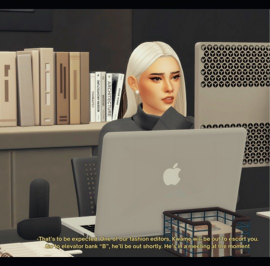
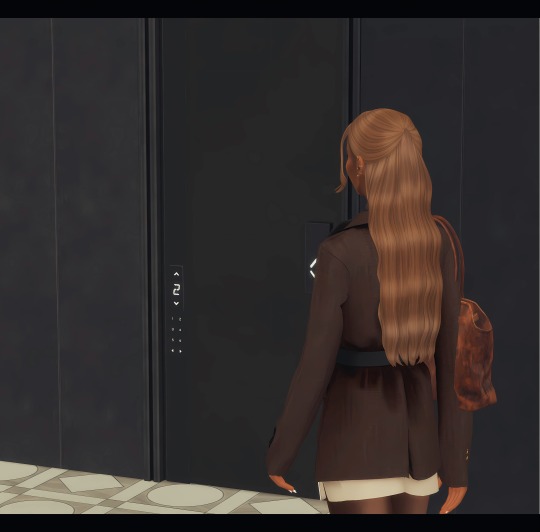
[Kendall]: That’s to be expected. One of our fashion editors, Kwame will be out to escort you. Go to elevator bank “B”, he’ll be out shortly. He’s in a meeting at the moment
[Laila]: Okay, thank you for your help
[Kendall]: Ms. Blackwell, word of warning, Miranda Slater doesn’t make exceptions and doesn’t repeat herself. You either sink or swim at MYSH
[Laila]: Noted. I’ll keep that in mind
--------------------------------------------------
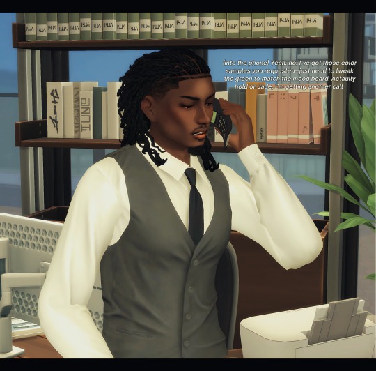
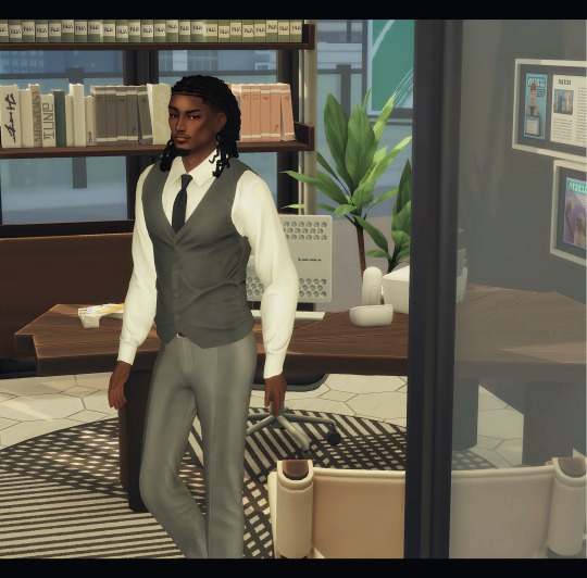
[Kwame] : (into the phone) Yeah, no, I’ve got those color samples you requested--just need to tweak the green to match the mood board. Actaully hold on Jade, I’m getting another call
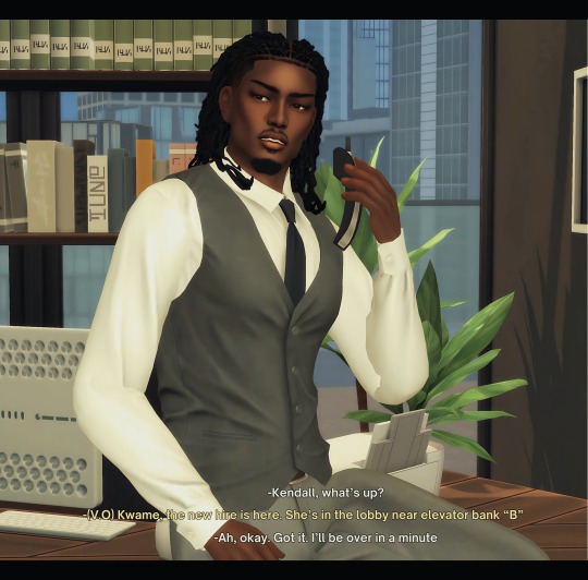
[Kwame]: Kendall, what’s up?
[Kendall ] (V.O.): Kwame, the new hire is here. She’s in the lobby near elevator bank “B”
[Kwame]: Ah, okay. Got it. I’ll be over in a minute
--------------------------------------------------------
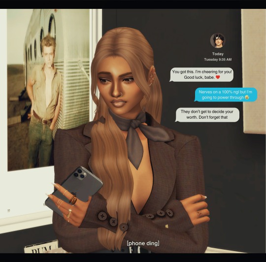
TEXT Nico: You got this. I’m cheering for you! Good luck, babe. ❤️ Laila: Nerves on a 100% ngl but I’m going to power through 😅 Nico: They don’t get to decide your worth. Don’t forget that
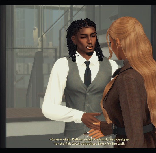
[Kwame]: Kwame Akah. Pattern maker, colorist, lead designer for the Fall 2024 collection. Sorry for the wait.
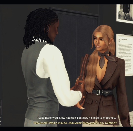
[Laila]: Laila Blackwell. New Fashion Textilist. It’s nice to meet you.
[Kwame]: Blackwell? Wait a minute...Blackwell Enterprises? Any relation?
[Laila]: (awkward) Yep...Sean Blackwell’s my dad
[Kwame]: Well, that just bumped you up to second-coolest person in the building—after me, of course
[Laila]: Of course (laughs)
[Kwame]: Look, I know Kendall out there probably gave you the full initiation—she’s got a thing for scaring the new blood—but we’re good people here, mostly. Miranda… well, she’s a character, but you'll figure her out. In time, you'll read her mood like a traffic light.
[Laila]: Not gonna lie, I was freaking out a little. Everything here is so... grand. It’s a lot to take in
[Kwame]: Yeah, MYSH has a way of making everything feel ten times bigger than it actually is. But hey, remember this—MYSH only hires the best. You wouldn’t be here if you weren’t top tier.
-------------------------------------------------------------
[Kwame]: Her office is down there to the right. Just... breathe. Miranda doesn’t bite—before her latte, that is
[Laila]: Right, right. Got it
[Kwame]: And if you need a lifeline, you know where to find me. Welcome to MYSH.
----------------------------------------------------------------
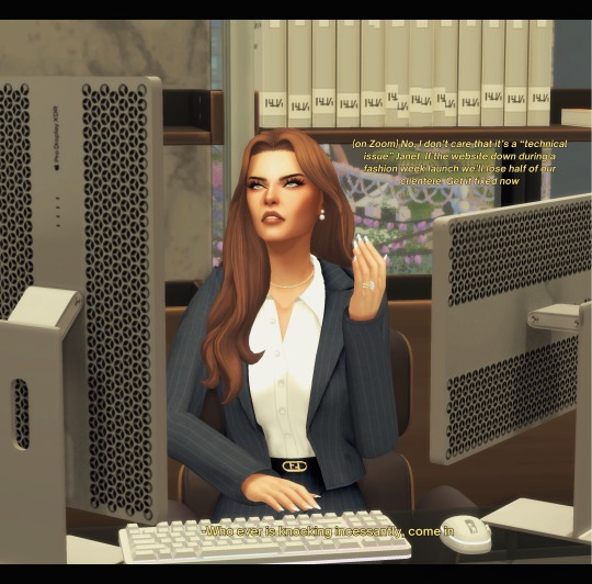
[Miranda]: (on Zoom) No, I don’t care that it’s a “technical issue” Janet. If the website down during a fashion week launch we’ll lose half of our clientele. Get it fixed now
[Miranda]: Who ever is knocking incessantly, come in
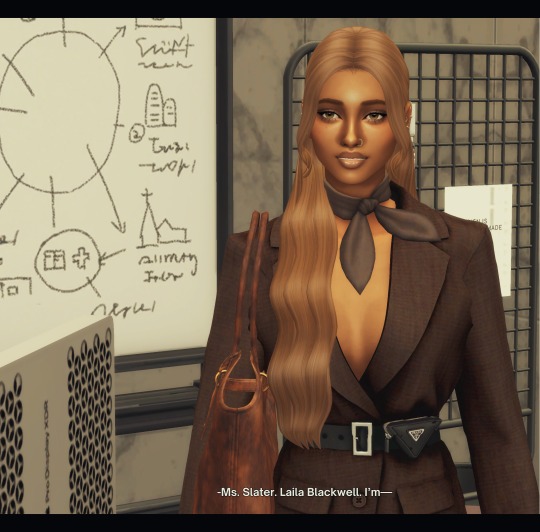
[Laila]: Ms. Slater. Laila Blackwell. I’m—
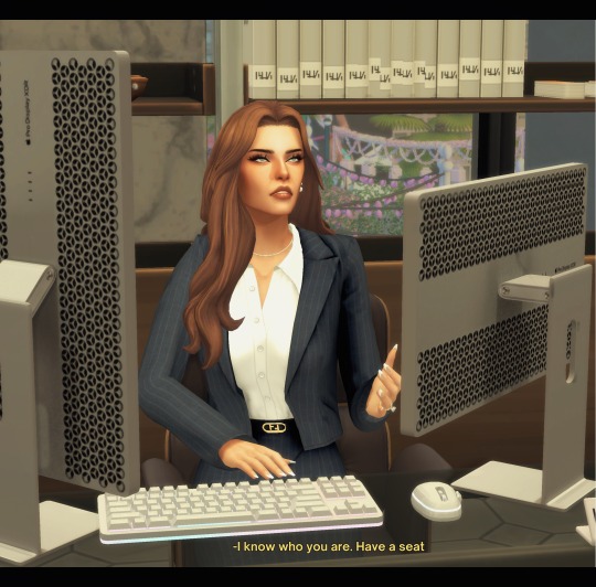
[Miranda]: I know who you are. Have a seat
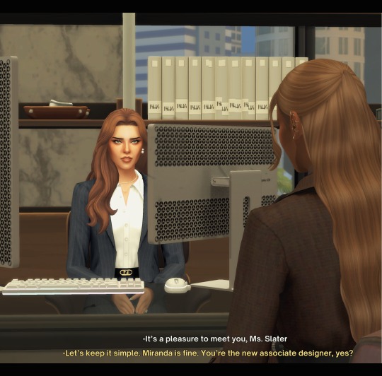
[Laila]: It’s a pleasure to meet you, Ms. Slater
[Miranda]: Let’s keep it simple. Miranda is fine. You’re the new associate designer, yes?
[Laila]: Yes, I’m in the textiles and fabric department
[Miranda]: Good. We don’t need slackers here. This is MYSH. We move fast. We demand excellence. And we don’t make exceptions.
[Laila]: Of course, Ms. Slater—sorry, Miranda
[Miranda]: Kwame, who I see you’ve already met, will get you situated. If you’re still standing after a week, I’ll know you have what it takes.
[Miranda]: And Laila... if you ever think for a moment that MYSH is just a stepping stone for you, let me be clear: it’s not. We are a world-renowned fashion house, not some second-rate tabloid, and I expect you to hold yourself to that standard. The Blackwell name will only take you so far
[Miranda]: Understood?
[Laila]: Understood.
[Miranda]: You’re dismissed. Kwame will show you where your desk is
#sims 4 gameplay#ts4 simblr#ts4 screenshots#ts4cc#ts4 gameplay#black simblr#sims 4#sims 4 cc#ts4 sims#ts4#black simmer#sims screenshots#sims story#sims#simblr#the sims 4#sims 4 creator#sims 4 custom content#sims 4 legacy#sims 4 simblr#sims community#the sims community#twenty somethings
16 notes
·
View notes
Note
Hail, flatter! This one, who is a layperson of the arts and comixcraft, has a query for you:
So like, what is flatting?
I've seen your flats in Wifwulf, and I've read about the flats in Looking Glasses, and generally get that it results in an image with similarly coloured areas sharing the same false-colour.
But like, how is it then used? The final images seem to contain more colours and shading, so why not just go straight to this? Why do false colours get used instead of the real ones? How do you pick the colours and how many get used?
How come this is a thing that a whole other person can do separately? I guess that's because it's time consuming - so it saves time somehow?
Thank you! I come in the spirit of humility wishing to relieve my ignorance of your noble craft!
OHOHOHO!!! You've activated my trap card and now I get to ramble about comics craft! And in my area of professional expertise, too! Be prepared for a long post
I'm going to start with the last part of your question:
How come this is a thing that a whole other person can do separately? I guess that's because it's time consuming - so it saves time somehow?
So the thing about comics is that it is one of the most intensely time consuming mediums to create. One person can make comics on their own fairly easily, but it takes forever to produce. Consider that I've been working on Looking Glasses for 18-19 months and have drawn about 87 pages. Now, the western comics industry expects issues to be produced monthly, generally 24 pages in length. It's very difficult for a single person to work at this rate, so the labor of producing comics has been divided. Generally these jobs become:
Writer (writes the script)
Editor (edits the script)
Artist (draws the lineart)
Colorist (colors and renders the art)
Letterer (adds balloons, dialog, and sfx)
Flatter (sometimes 'color assistant' they take the art and prepare it for coloring)
This isn't comprehensive though, there are a bunch of other jobs, like designers and layout artists. Occasionally the artist job gets broken into Pencilers (who sketch the art) and Inkers (who ink the sketch). Basically, by splitting the work amongst a number of people you can produce comics much faster. Not all of these jobs are required, and creator-owed books might have artists do their own coloring and lettering, while big work-for-hire books might have twice as many people working so they can pump out a spider-man book every other week.
Okay, so why Flatters?
Flatting at it's most basic level is just coloring inside the lines. You take a black and white page of art, and you have to fill in every part of the page that will eventually be colored. It's a pretty time consuming task depending on how involved your lineart is.
Flatting a page of Looking Glasses doesn't take me all that long, usually less than a half hour, which is pretty quick. Looking Glasses pages tend to be... optimized for flatting though. There are only ever a few characters and there aren't a ton of background details.
You mentioned Wifwulf (created by my longtime friend and collaborator Dailen Ogden), here's one of it's pages:
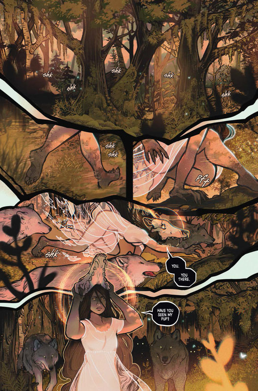
Basically everything that's a different base color, (every tree, plant, bit of moss, character, etc.) needed to be picked out separately. Each page of Wifwulf took me a few hours to flat. If Dailen had been doing that themself, those hours would have really added up, but instead they could spend that time drawing and coloring. Now, that said, these pages have a lot of texture, so it's hard to see exactly what I did.
Here's an example from a comic I worked on early in my career. (Lineart by Patrick Custodio)
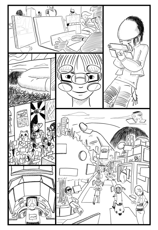
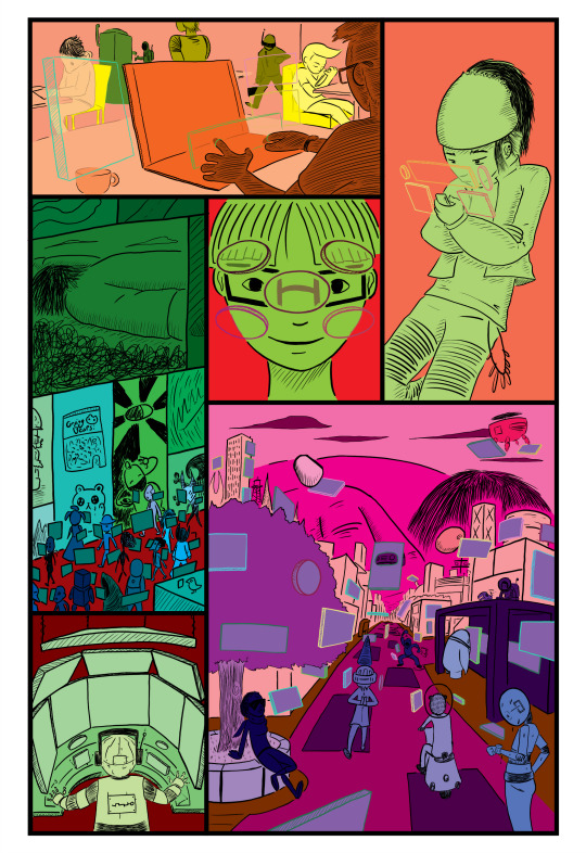
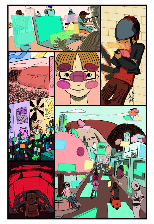
The writer for this comic loved to put in these incredibly complex crowd scenes, which is something the artist excelled at drawing. I was coloring and flatting at this point on the book, and before I could even start coloring properly, I would need to flat for like eight hours. (I have a much more efficient method these days) It was frustrating because I just wanted to work on the actually creative part, but the majority of my time was spent on something monotonous. As soon as I got the writer to hire a flatter for me, coloring a page would take me only one or two hours, not nine or ten.
So that's why flatters exist, mainly to ease the workload on colorists.
But like, how is it then used? The final images seem to contain more colours and shading, so why not just go straight to this?
Flatting serves a couple of purposes. It's main function, like I said above, is just coloring in the lines. After finishing your lineart it has to get colored in, so in a layer below the lines, you add colors.
The secondary function is preservation. I like to work in a way that is non-destructive, basically, at any point in the process I can restore an earlier version of the drawing if I make a mistake or don't like something. Flats are integral to this.
In digital art, there's this thing called anti-aliasing, where the edges of a line or shape have a drop off of pixel color or opacity. It makes the edges look smoother or blurrier. The three dots on the left are Anti-Aliased, while the one on the right is Aliased, there's no drop off, just hard pixels.

Anti-aliasing is fine until you need to change the color using the paint bucket, or select using the magic wand...


See how the anti-aliased art doesn't play well with these tools, but the aliased art does? So with something like Wifwulf, the final art is going to be full of texture that makes it impossible to select anything again once it's painted. By having a dedicated aliased flats layer under the rest of the artwork, you can always re-select any part of the image you want.
I always leave my flats layer alone, and do any detail work in layers above. For example when I was painting this, it really helped to be able to select just the titan so I could work on those paints without worrying about brushstrokes overlapping the rest of the characters.
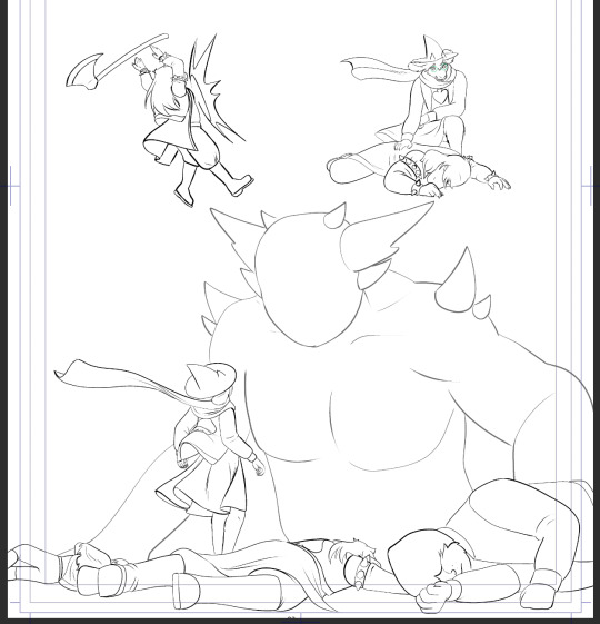

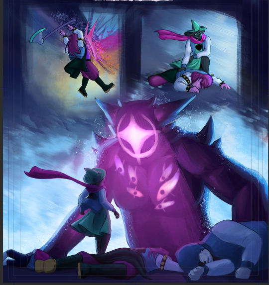
One of the other things you can do with flats is quickly selecting certain elements. On most pages, I flat my panels, figures, and background elements separately. Later, with a single button press, I can select just the characters in the scene, or entire panels at a time, which makes things like shading a whole lot easier.
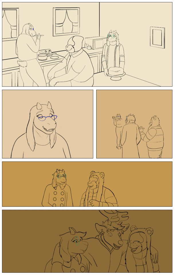

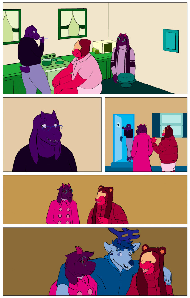
Why do false colours get used instead of the real ones?
If you're flatting for other people you often don't know what the final colors are going to be, so you just pick random ones. Garish colors can be helpful because it makes it obvious that they're not the final colors. Why don't I use the correct colors on my own pages when I'm flatting? Habit, mostly. It's also faster to grab random colors than to track down the correct ones. Sometimes two different things will have the same final color but I like to flat them with different colors so I can select them individually if I need to.
You can see the process a bit here. In my flats, Lancer's spade (eye? eyes? thing) is a different color from his tongue, even if they end up being the same white in the final image. This would help if I ever needed to select just his eyes for some reason. You can also see how I select his body fur color and then add details on top, like his colored fingers and the grey on his arm. Those elements have blurry anti-aliased edges, and it would be impossible to re-select them without flats.

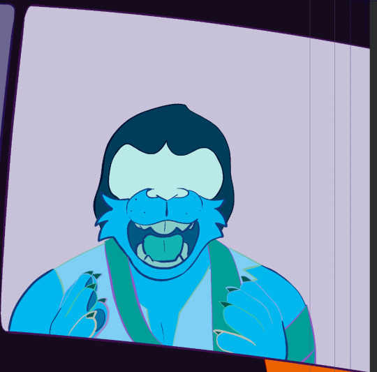

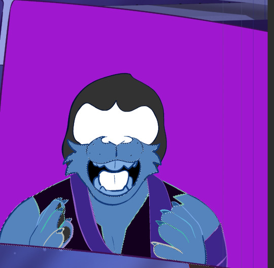
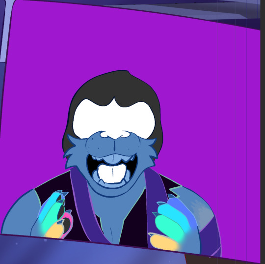
How do you pick the colours and how many get used?
I use the default "additional color set" palette in clip studio and just work my way through it. I pick row and work my way down (for a change of pace I vary which row I start with). How many is mostly dependent on the artwork. You just keep going until you run out of individual objects to color. I have worked on pages where I've run out of colors on this palette and had to start making up more. Typically a page of Looking Glasses only needs around 20-30, though.
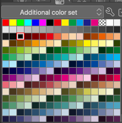
So! That's flatting! It's a little known job, and it's how I got started with my comics career, so I have a lot of thoughts on it. I was trying to be concise (lol), so I hope this all makes sense, but I'd be happy to clarify or answer any other questions about this process. I know I didn't really go into how I flat my work, so I can make that post if anyone is interested.
#ferrouscomicscraft#comics craft#ferrousask#I find flatting very relaxing actually#I can generally put one a video or a podcast on while I work#and then turning the false colors into true colors is so satisfying and fun#I will say (down here where it's harder to quote me on this) but flatters are incredibly exploited by the industry#like... below minimum wage work if you're actually taking the time to do it right#I started at $10 a page and have worked my way up to $20#but remember that it can take hours depending on the complexity#it's not exactly lucrative#but it's a way to break into the industry so it's easy to exploit people#I don't flat professionally much anymore. Mostly only for Dailen because I like working with them.#Thanks so much for the ask! I had a lot of fun with this (obviously)#sorry it took so long to finish but I wanted to be comprehensive#I may have still missed explaining exactly what a flat layer is...#hmm#I have a few other comics craft posts in the works. There's one on paneling and layout that's been kicking my ass for weeks
32 notes
·
View notes
Text
finally a movie that fucking hires a colorist
8 notes
·
View notes
Text
Happy Birthday to Nightwing and happy birthday to ME. That’s right my birthday is a day before Nightwings so I decided I would make this blog dedicated to the fantastic Flying Grayson.
So I got the Nightwing 1995 compendium for Christmas and have been working my way through this massive book. And I have been enjoying it although I also have OPINIONS. So I decided to make this lil blog dedicated to it! And will extend into other comics as I read them.
This is actually my first time reading comics. I didn’t know where to start or what to read so I told my dad ‘I want Nightwing’ and he went ‘okay’ and found me the biggest book of Nightwing comics hahaha.
So far I’m about halfway through. So here is my opinions on some of em so far! Would have taken more pictures but there is a limit!
Nightwing: The Resignation
I know of this man Greg Land. But I have only seen the worst of his art from the blog ‘Bad Comic Art’. But this guy actually is a good artist normally it seems. I like the art here a lot. I like his pretty hair and shiny suit. I like this random goon from the start with the vampire hair.
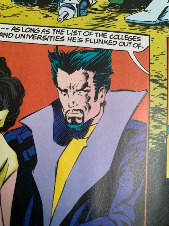
The story so far is neat! Dickies striking out on his own. He QUITS superheroing which is wild to me.
‘What should I do with it’ (the Nightwing suit)
‘Put it in a trophy case’
UH. DICK THING TO SAY! (BADUM TSK)
But I do really enjoy the classic comic art style from these first few issues.
Favourite Panel:
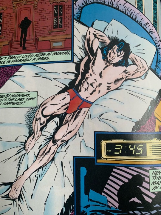
*eyebrow wiggle*
Anyway this issue was just setup. Onto the next one!
Nightwing: The renewal
So Dickies retirement lasts 0.5 seconds but good on him for trying. Some blond twink is our enemy here and he is… so lame. I don’t like this guy at all hes a loser. Loving Dickies polka dot shirt however.
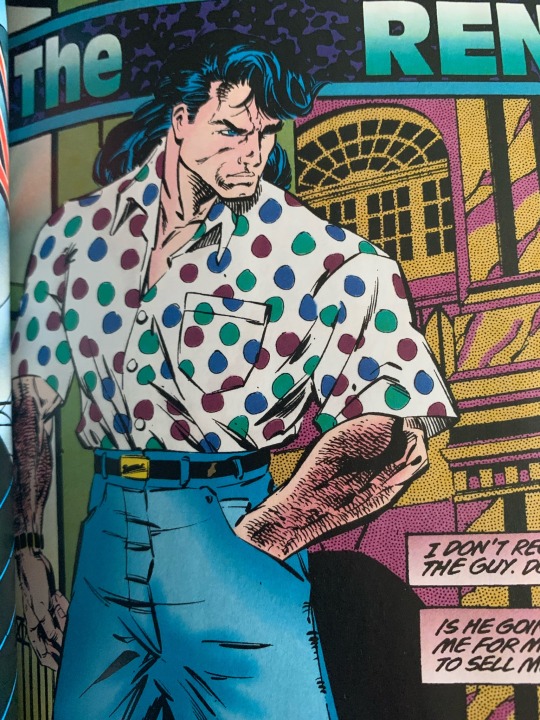
They made him so hairy here though lmao.
The colorist also does not seem to know whether Miggy (WHAT kind of name) has red hair or brown hair. Theres this whole plot where ‘whoops turns out your parents were murdered not by Tony Zucco but some other guy who may be in charge of a whole country’ which… I mean I like the whole Tony Zucco thing I enjoy that part of his backstory. So I was not fond of this implication.
The blond twink tries to kill Dickie but he’s kind of a bumbling idiot. We live in a world with guys like Deathstroke and Deadshot and you hire this dude??? Okay. I guess to be fair they thought Dick was just some guy and don’t know he is literally a superhero lmao.
The way they narrate everything is kinda hilarious like theres a text box describing what we are looking at every panel it’s ridiculous but get that coin John Costanza.
We get to see Barbra!!!!! I thought we would see way more of her in these stories but it seems later they try to move away from Dickbabs and give him some new random love interests I don’t care about. I will enjoy her presence while shes is here.
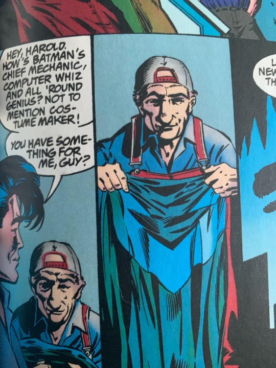
Sorry WHOMPST is HAROLD?!?!?! Did Lucious Fox not exist yet???????? This man is irrelevant anyway and does not appear again. He scares me…
Favourite panel:
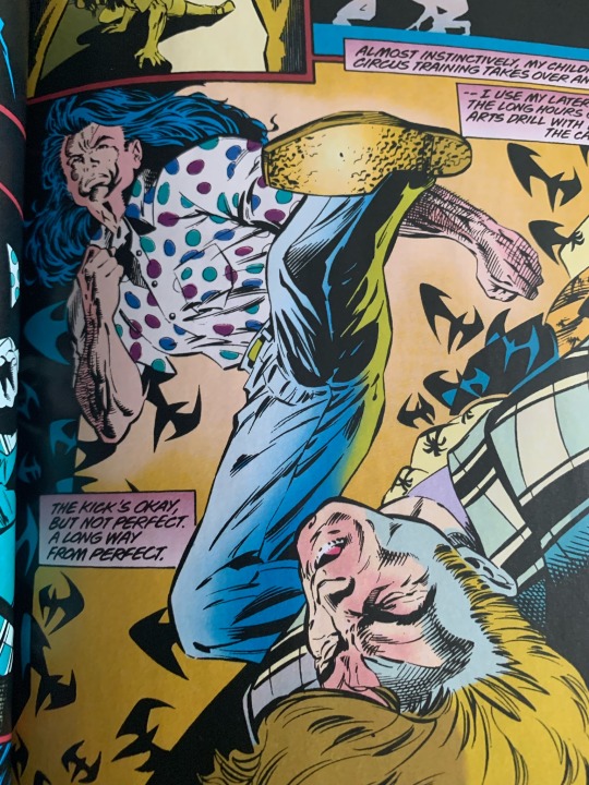
KACHOW!
Dickie goes to Europe to find out who ACTUALLY killed his mom and dad and are trying to kill him. Fun typical superhero shenanigans.
BUT WAIT theres also a GENOCIDE HAPPENING?!?! WHAT?!?!?!
Things got dark real fast lmao.
Nightwing: The Oublette
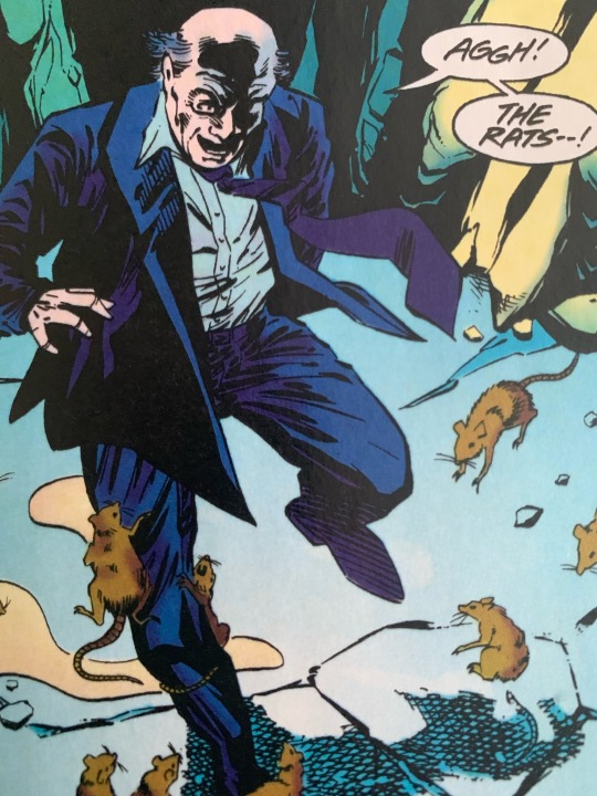
Weird thing to wonder but how did they do white text over top the artwork before they had digital editing.
A lot of good action in this one I am a big fan of the action scenes in this one.
I like how earlier in this series he was like ‘I am serious now. I am a serious guy. But he literally cannot stop cracking jokes in his head until eventually he just can’t help himself and let’s one slip out loud.
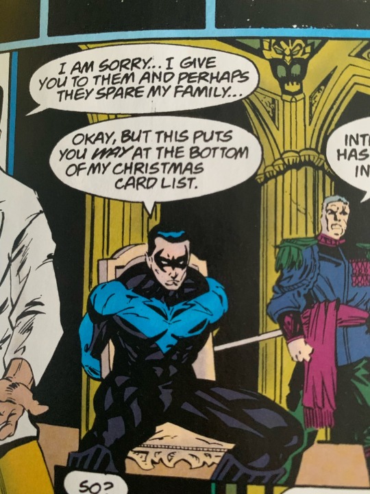
The sheer insanity of this form of torture is so ridiculously comic book. I like it.
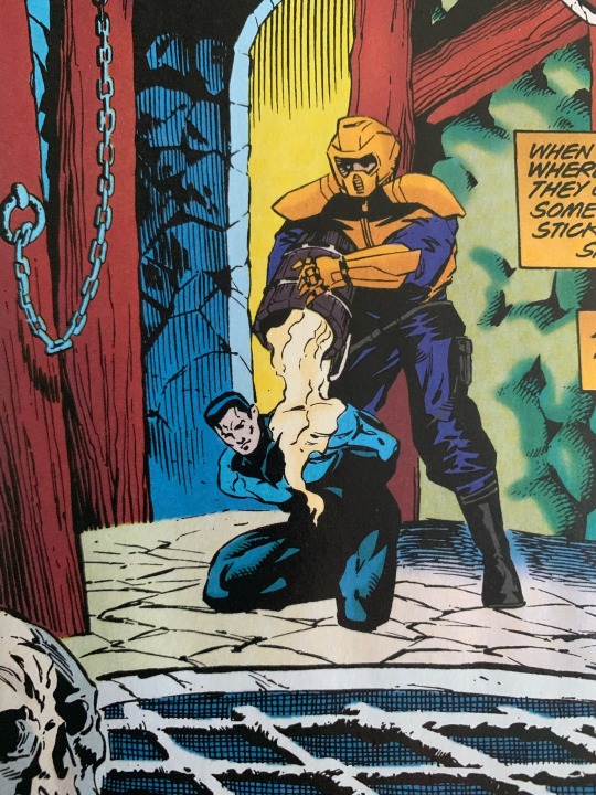
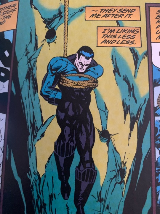
They lather you in honey then drop you in a hole to be eaten by rats.
Favourite panel(s):
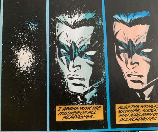
Such a pretty and fun way to show him regaining consciousness.
I literally can’t add anymore pictures so we’ll do the rest of Oublette and also Dead Simple in another post! So far this short series has been my favourite in the entire compendium.
Follow me and join my journey experiencing comic books for the first time! I’ll post the second half of this review tomorrow on Nightwings actual birthday.
#nightwing#dick grayson#Nightwing 1995#review#comic review#first time read#be nicey to me I’ve never read these before idk wtf is happening at any given point
4 notes
·
View notes
Note
Do you have any material on artist/writer collaborations - either on the collaboration process, or on how to find a collaborator to begin with?
This is a great question, and not always one with a straight-forward answer! While many webcomic projects are solo projects for long-term logistics reasons, some webcomics follow a split of roles between writers and artists (or maybe further split for inkers/flatters/colorists/letterers). Collaborative teams like this can form in many ways, both formally or informally:
Comic creators may find more members for their team to hire from boards like Reedsy, communities like @cartoonistcoop, or hashtags events like PortfolioDay on social media
Writing and comic Discord servers can be good gathering places to make friends, learn about other peoples' projects, and get recommendations when someone has availability and interest for a collab. (Note that most creators you meet in these place will have their own projects, though, so don't go in expecting folks to immediately invest time in your work! Be respectful of their time and show interest/help out with their work too!)
RP or fan groups can be hotbeds for learning the storytelling styles of other people, and that may take comic form somewhere down the road!
Events with a deadline like anthology projects, NaNoWriMo, or Itch.io Game Jams, which often host forum and community spaces where creators can connect and collaborate for a short time and be done if it doesn't work out
Friends, spouses, and siblings often team up when they're into the same things
Some things that factor into whether or not potential collaborators will want to work with you on your comic project:
The scope of the project. Comic projects can take years, and short, deadline-driven projects can be easier to commit to than long-term ones.
Your experience. If you haven't ever finished a comic, collaborators may be cautious to work with you if they can't see concrete proof of what you're bringing to the table, or if they suspect they're going to be doing most of the work. For writers, be sure to have your ideas fairly fleshed out, and your plans as clear as possible. For artists, keep samples and portfolio pieces handy of comic work, not just illustrations. Show you know what your part entails and that you've done it before!
How compatible you are. Many great collaborations come from folks who know each other, enjoy each others' ideas, and work in a compatible way.
How much of a role they have in the creative process. Are you just looking for someone to draw your ideas? Or give you ideas to draw? Or are you interested in building something together?
Money! (though this isn't always a guarantee that the creators you talk to will have time, even if offered financial compensation)
Our best recommendation if you want more collaboration opportunities to come into your life is to see who's vibing with what you're doing in your circles, and see if there are small ways you can collaborate to test the compatibility of your work styles and get experience communicating with each other. Keep expectations clear, be ready to offer your labor to help others, and be flexible with adapting to others, adjusting your plans, or possibly contributing to projects that don't take off.
We also highly recommend this blog post of questions to ask when reaching out to hire someone. While this advice is written specifically about letterers, a lot of it applies to any member of a comic creator team!
And for more of our thoughts about the roles of Writing and Art in webcomics, check out our Jam Session podcast episode about Artists vs. Writers!
11 notes
·
View notes
Text
UPDATE || Thursday March 7th || 2024
--Current readers, click *here* for the update--
* NEW READERS || PATREON || TWITTER || INSTAGRAM *
A new store has been opened! The proceeds of which fund my new OFFICIALLY hired colorist @barbelzoa, please check it out! Thank you so much @barbelzoa !!!
I also stream on Twitch
760 notes
·
View notes