#coloers
Text
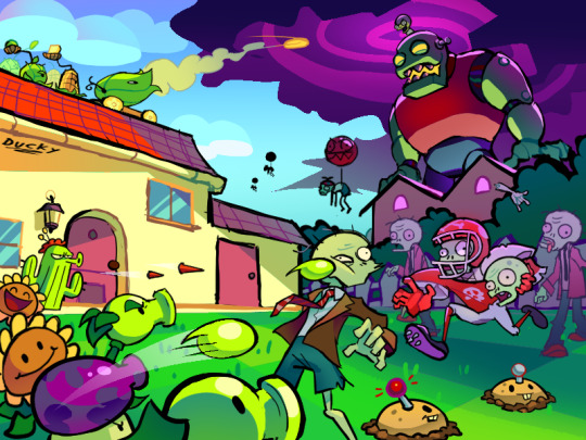
felt like testing myself 2day so here's a finished piece! I'm so proud of myself ^.^
also WOAH O_o rare occasion when I decide to actually signature my own work!! (I really need to do that more often-) I spent a couple of days on it so yah :]
anyways here's prolly the ugliest sketch you've ever seen:

and here's Dr. Zomboss:
drftghbjk ok goodnight :)
(it's 2am for me rn)
#pvz#pvz fanart#finished piece#finished project#digital art#really cool#Dr. Zomboss#I LOVE COLOERS HEHEH#not dead#please please please don't flop ahhh!!#silly#so very silly#ugly sketch
279 notes
·
View notes
Text


drawings I did when I was bored lol
#nso#needy streamer overload#needy girl overdose#nso ame#omgkawaiiangel#kangel#ame chan#nso kangel#monokuma#danganronpa#rushed these abit but I like how they turned out#yea#i am very you know#MAN i shouldve coloered the ame dress more
154 notes
·
View notes
Text

Florence + the Machine and cooler colors based Bi moodboard! ^^
For an anon! Hope you like how this looks!!
Want one? Send an ask!! -mod Jay
#florence and the machine#florence + the machine#fatm#F+tm#florence and the machine band#cooler#cooler colors#cool coloers#colors#bi#bisexual#bi pride#pride#lgbtqa#flag edit#lgbtqia#flag edits#edits#lgbt#pride flag edit#pride flag edits#edit#moodboard#moodboards#mood board#mood boards#mood#moods
40 notes
·
View notes
Text
Sans

#sans#sans au#undertale#undertale sans#au#nightmare sans#샌즈#undertale au#killer sans#epic sans#muder x horror#muder sans#ink sans#error sans#ink error#geno sans#coloer sans
753 notes
·
View notes
Text


my first ever magical girl design vs my most recent<3
#redraw#artists on tumblr#magical girls#character design#im still trying to work on my outfit design and coloers lol
19 notes
·
View notes
Text
#hero of the wild#loz#legend of zelda#breath of the wild#botw#the legend of zelda#hylian retriever#botw link#link#dye shop coloer alt#dog#meaty rice bowl#food#loz breath of the wild#legend of zelda breath of the wild#snowquill headdress#snowquill tunic#snowquill trousers#snowquill#loz botw#resenart#digital art
114 notes
·
View notes
Photo

I needed a mingo painting it was very importante.
Acrylic paint on some strange packaging paper.
watermarked because fuck people who rip artwork for their datasets.
pose ref:

#mingo#flamingo#acrylic paint#painting#i like the coloers they came out good#bird painting#traditional art
8 notes
·
View notes
Photo

Gym - Contemporary Home Gym
Home weight room - mid-sized contemporary carpeted and gray floor home weight room idea with red walls
#large wall mirror#coloer in gym#weight room#dark grey floor#water cooler in gym#recessed lighting#grey gym carpeting
0 notes
Text

I TRIED A NEW COLOERING STYLE? idk :3 but heres aquaaa
213 notes
·
View notes
Text
Here's a little process video with description for @bog-mummies
-messily sketching with a one color and a wide brush.
-messy lineart over that
-selexting and moving things around untill they look ok
-fianl lineart over that
-a base color that will be used as a mask
-laying down base colors. I'm trying to harmonize the colors from the start by picking a main one and just making other colors a diferent variation of it:
his skin is the starting color. than i make it make it more saturated, darker and warmer for 'blush' (i plqxe it where I think blood would gather. It makes things stand out from the face and it also makes it look more alive)
His eyes are a dark desaturated blue-green color (I think. That's what they look like to me) so I got lucky here cause it's a cool color and it stansds out against his warm toned skin.
I tweak the color of his eyes to get the color of hia hair as muchs as I can withought making it absolutely green or blue.
The color of the tassles is the color of his hair and ro make it not blend in with the rest of the scarf I make the scarf red. And now his eyes and hair are the only cool tones and it makes them stand out.
I block out the shadows on the scarf in the 'base color' layer with a darker, cooler color
-I put a 'multiply' layer over all of that. I try to make the shadows in cooler colors but in the end it looked beater with red/orange on his skin and blue/pirple on the fabric. The blue on his skin is visible on places where there is no contact with the light, like on his neck, the left part of his cheek and the small part of his eye that the scarf is covering.
On the places where the light is touching the skin but the shadows begin I put a darker but more saturated color of his skin because skin and fabric are not the same and skin is slightly transparent and if you shine light on it the blood underneath shows throigh and it looks red. That is called subsurface scattering.
-After that I use the maske I made at the beggining to put a green overlay over all of it to make everything less warm and to also harmonize the colors.
-After that I just render out everything in a 'normal' layer and change everything that I don't like with the automatic changing od colors with different layer settings. I also blend some things or make other thibgs sharper. I use a small 'sketchy' brush and go over everything bit by bit
-I decide that the part of the face that is covered by the scarf is to similar to the color of the scarf and is also to obscured by the shadow so to seperate it highlight it with a rim light and I try to make it the oposite color of what it'a touching: orange-blue for the face and red-green for the scarf.
-the gold is shaded similary. take the base color and make the shadows darker, coloer and more saturated. and the oposite for the highlights.
The gold has more shade and highlight color varaints. The one big light part is one solid color and than the big dark part is also one solid color. The transition from the base to the lightest part is ver vradual and than you drasticaly make the lightest parts stand out ( the hightlists on gold are compleately white. Similar to the dark part. Than I just take the lightest color to render out the details on the dark part to make them stand out and the same thinf for the other part
So I try to make things stand out and be clear as possible with everything. If it's realistic but it doesen't look good I don't care I'm changing and stylizing it untill I like it.
I also very rarely follow the same process for different drawinga XP Somedays this might work and somw other day I do something different. Art rules and theories are just guidelines are there to help not to be followed strictly every time
I forget my own procews and what I'm doing all thw time and I get bored of it fast XP
Hope this helps! :D
29 notes
·
View notes
Note
trans scene tips?
especially clothing tips >_<
RAWR X3

TRANS - SCENE ...
Listening to ''scene'' music ! Dot Dot Curve , Brokencyde , Owl City , Blood on the Dance Floor , Millionaires , Scene Kidz , Breathe Carolina , 3!OH3 , Family Force 5 , I Set My Friends on Fire , and more ! Scene CAN overlap with other music genres , so don't worry to much if you enjoy listening to emo / punk bands instead ! < 3 ( examples ; Suicide Silence , Bring Me The Horizon , Bullet For My Valentine , The Devil Wears Prada , Asking Alexandria , Fall Out Boy , Yellowcard , and other bands like that . These bands are considered as Metalcore , Deathcore and Pop - punk !
The clothes !! Scene is mainly a fashion sub-culture , so the clothing obviously is a MUST to be scene ! You don't need to go all out , wearing simple animal print tube tops and some shorts can be alright ! But doesn't mean you can't go all out with neon rainbows , crowded-bracelets and so many belts that people could confuse it for a skirt !
Wear to shop ? Nowadays , you can go to a simple thrift store and find something that looks good , and for a cheap price ! Yet if you're looking for something specific , going to shops like Hot Topic , Spencers , Betsy Johnson , Ouchieees !
More clothing tips ; have lots of belts and layer them ! Fall inlove with animal print , invest in a frilly tutu , mismatched striped socks , kneehigh converse , bright coloered zip-up hoodies , lots of bright accessories and layering !
Hair - a middle part with a bang , teasing the fuck out of it to give it lots of volume , dying it and adding racoon tails !
Makeup ! Any bright color blended with black for the eyes , thick eyeliner , some sparkly freckles ! Scene makeup generally is simple , most of the glam being on the eyes ! Amber is the og and i remember watching her tutorials all the time ...
Hope these helped even just a little bit < 3

#.ᐟ my dear corpse ..#radqueer#rq 🌈🍓#rq#rqc🌈🍓#transid#pro radq#pro radqueer#pro rq 🌈🍓#pro transx#radqueer safe#radqueer community#pro rad inclus#radqueers please interact#pro rq#radqueer coining#rq 🍓🌈#rq safe#rq community#paraphile safe#pro para#pro transid#🍓🌈 safe#transid safe#transid please interact#rqc 🌈🍓#radqueer 🌈🍓#🍓🌈#pro 🍓🌈#rqc 🍓🌈
36 notes
·
View notes
Text
These are the "Pan Galaxy" dice and they are inspired by the pan pride flag. A combination of three coloers mica are mixed with some fitting glitter. They are still raw and need some sanidnig and inking.
(Advertisement)


#pansexual#pan#galaxy#pride#glitter#dice#dnd#dnd5e#epoxy#handmade#resin#rpg#ttrpg#catinthedicebag#würfel#diceset#dungeonsanddragons#polyhedraldice
305 notes
·
View notes
Text
Their personalities were completely different, but they both complemented each other.
- Father, look at the beautiful day!!
- Shut up for once Talas.
( Sesshomaru ) : At what point did we decide to have children Kagome?

DIBUJO RÁPIDO DE ESTA FAMILIA CREADA POR MI, SIGO CAMBIANDO LA PALETA DE COLOERES.
15 notes
·
View notes
Text


Flipping through the TriStrat artbook again and remembered how much I like the Scales of Conviction page, because even though I can't read it, I still can gleam a lot of how the scales work even if the concept sketch varies slightly from the final version
The arms are removable, which is how you get both 2-way and 3-way votes, and it's held in place until results are revealed by a little stablizer (or whatever it's called) that drops down when a little pin is pulled out, allowing the winning side to fall.
Also, I'm not sure if this is correct and/or still applies to the final design, but it looks like that the sides light up because oil (or something similar) is placed in the top basin, which then travels down the winning arm and igniting. Again, idk if that's still true for the final since the concept sketch has the fires up top, but it's a cool little detail that makes my brain happy nonetheless.
Also the fact that the cups on each arm are canonically coloered based on the convictions haha.
#Triangle strategy#Kelbunn's thoughts#I first grew obsessed with this page when I was working on my tristrat 1st anniversary art and it's spun around my brain since haha#Ilu small tristrat world-building details
18 notes
·
View notes
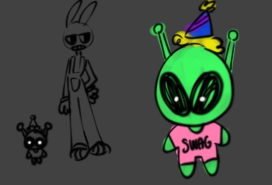
Text
IM ZOINKED UP. how do people get the coloers
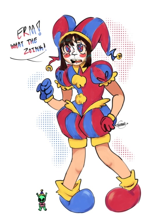
POMNIII!!! featuring my tadc oc.... his name is glerm.... he small as freak GOD I FORHOT HIS FUCKING EHITE PUPILS
#the amazing digital circus#goober art#doodle#tadc pomni#tadc fanart#fanart#digital art#gleep glorp#GLUTRPPRRHHUDN I AM FILLED WITH GOOP ASGGHHH
30 notes
·
View notes
Text


Hola ^v^ shun dibujor y colores gusto hermoso bien hacer para que ah pero yo vaya coloers noche muchos por favor OvO caballeros del andrómeda muchos gusta todos.
21 notes
·
View notes
Last Seen Blogs

klamms
Die, Verwandlung, Die
mellowkotto
PERCIVAL

mothersofthecross
Mothers of the Cross
askteamjustice
✧・゚: * ☆ * : ・゚✧

sheerdeneir
Love sheer to be Clear