#click the link to see the charts and graphs
Explore tagged Tumblr posts
Visit Tumblr Blog
Explore Tumblr blogs with no restrictions, modern design and the best experience.
Last Seen Tumblr Blogs


Fun Fact
The KCSC sent more than 20K requests to delete posts related to prostitution and porn to Tumblr from January to June 2017.
Text
G Witch Onscreen Text: Episode 1
This is the second part of a project where I try my best to document and discuss all of the (relatively important) text that appears on monitors and screens in G Witch. Cause I can.
<< Click here to see the one I did on the Prologue

ooOOooohhh beneath the cut lie the HORRORS....
Just to give you an idea of how needlessly hard they went on the monitor text, when Suletta is rescuing Miorine, she mentions that she's almost out of oxygen, and then, when she brings her into Aerial's cockpit, on her helmet, you can faintly see text displaying the amount of oxygen.

And THEN, when she starts talking to Miorine, the text on her helmet changes AGAIN to display that the comm link has been established

WHY DID THEY DO THAT????
Well clearly they did it cause they knew my stupid ass would eventually document it. Anyway, let us begin.

TEXT: I am a HARO. You can ask me anything! (The only text on the icons I can make out are MAP and SCHOOL, unfortunately.)
This is the HARO navigation bot Suletta meets when first coming to Asticassia, and we know that it's Haro Navigation System Ver. 3.0! If that's something that interests you....

TEXT: MOBILE CRAFT FUTURE TECHNOLOGY SIZE 6.6m 18.8t
Not much of note, it's just a hologram of a mobile craft. Exciting if you like mobile crafts. (I like mobile crafts)


When the Docks containing the Demi Trainers are locked, the display says LOCKED. When they're in use, the display says IN OPERATION.

TEXT: (Left) PILOTING DEPARTMENT KP001 GUEL JETURK MO-0032G GUEL'S DILANZA 26 WINS 0 LOSS 0 TIE
(Right) PILOTING DEPARTMENT KP029 PARKER EASTCOTT TKG-328 KAPELL-KUU 2 WINS 1 LOSS 1 TIE
The Battle Display for the first duel we see in the show, and from this we can see that Guel currently stands undefeated with 26 wins! Double digits! No wonder he's the ace pilot at Asticassia...too bad he's a dick.

This is the graph that's shown during the Benerit Group board meeting, detailing the earnings of the groups members for the current period.
Interestingly, the 3 highest earners are: Peil Technologies - 8000 Grassley Defense Systems - 8100 Jeturk Heavy Machinery - 8300
So, funnily enough, at the beginning of the story, Jeturk Heavy Machinery is actually the most successful company within the group. It explains why Vim Jeturk felt so comfortable in his plot to assassinate Delling, and goes to show how quickly he fell from the top position after Guel lost to Suletta all those times.
Fun Fact by the way, Prospera's first appearance in the show proper is during this meeting.

She seems kind of annoyed about something.

TEXT: DUEL COMMENCING FIRST TO BREAK MS BLADE ANTENNA IS THE WINNER
We don't see it very often, but during a duel, a display stating the win condition of the duel is broadcast for the benefit of the spectators.

When Miorine boards Aerial for the duel, we get a look at its system control menu.
Top to bottom, left to right, the options are: COCKPIT VOICE RECORDER IDENTIFICATION FRIEND FLIGHT DATA RECORDER NAVIGATION DISPLAY WEAPON SELECTION CONDITION MONITOR COMMUNICATION SYSTEM GROUND POWER UNIT INSTRUMENT FLIGHT RULE SIMULATOR INSTRUMENT APPROACH CHART INSTRUMENT LANDING SYSTEM APPROACH POINT RAM AIR TURBINE
We also get a brief look at the Weapon Selection Sub-Menu

TEXT: SELECT YOUR WEAPON BEAM SABER BEAM RIFLE BEAM VULCAN
I think a lot of the main settings are interesting (what the hell is "Identification Friend?") but what's really interesting to me is that Aerial's Gundbits don't seem to be selectable via the Weapon Menu.
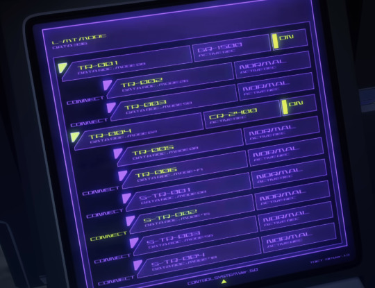
We also get a brief glimpse at the Red Dilanza's control menu.
No idea what I'm looking at, to be totally honest, but yknow. It's nice!

TEXT: EMERGENCY BUTTON
When Suletta intrudes into the duel and gets back in Aerial, we see that it has an emergency button (seemingly somewhere on its foot) that opens the cockpit.

TEXT: COMMUNICATION MODE -OUTERCOM-
When Suletta headbutts Miorine and they start arguing about Aerial, Aerial's comms system gets set to OUTERCOM mode, which explains why everyone outside of Aerial can hear the argument.
This could have been done by accident when Suletta headbutted Miorine, but I like to believe that Eri herself did this on purpose.

Just so it isn't left unsaid, Aerial's Permet ID is XVX-016, and when a combatant in a duel is the Holder, the Holder Symbol is displayed on their Duel Card.

When Suletta is telling Miorine about her mother's motto, the GUND-Bits appear on the monitor and come online as Aerial 'speaks.' This, combined with the fact that the GUND-Bits aren't accessible via the Weapon Select menu, implied all the way back in episode one that it's Eri who controls them. Although interestingly, it seems that, internally, the GUND-Bits are referred to as GUNBITS.

I obviously won't transcribe the two pages of this book, but the book El4n is reading here is actually The World as Will and Representation by German philosopher Arthur Schopenhauer. We actually see its title in a later episode, and the main ideas present in this work are extremely important when it comes to understanding El4n's character. But that's a story for another post.

TEXT:
YOU ARE THE WINNER OF THE DUEL.
thanks!

TEXT: HOLDER REGISTRATION [SETTINGS]
I always thought it was a little funny how the transferring of the holder title was just like, an option on their phones and not an automatic process.
ADDENDUM:
Thank you to @the-eeveekins for pointing out that Aerial is currently running SYS Ver E.S (Ericht Samaya) as opposed to 2.0 in the Lfrith!

I didn't even notice!! That's crazy!!! Thank you so much!
Also I realize I should probably point out that we see that Nika's ID is LM236 in this photo. She never duels so there's never a moment where she says it out loud.

And that's all for episode 1! Not too much super interesting, but there's still a lot to see and think about if you're paying attention! (Like, why does Aerial have a Cockpit Voice Recorder at all, actually? We know that Suletta often talks with Aerial in the cockpit about personal stuff so...you don't think that....Prospera....?)
Click here to go to Episode 2! >>
Click here to go to the Masterpost!
62 notes
·
View notes
Text


William Playfair the Scottish engineer and political economist was born on September 22nd 1759.
I read one article about Playfair that describes him as "a kind of Forrest Gump of the Enlightenment" perhaps a bit harsh, I would say he was a bit of a polymath, another source in my opinion is more accurate, Playfair is without doubt to many of you out there "the most famous man you have never heard of" he rubbed shoulders with the era’s many giants, switching careers at the drop of a hat, and throwing himself headlong into history-changing events, from the storming of the Bastille to the settling of the American West.
William had a lot to live up to, his brothers were architect James Playfair and mathematician John Playfair, his father passed away when he was 13 and it was left to John to lead the family and his education.
After serving his apprenticeship with Andrew Meikle, the inventor of the threshing machine, William Playfair became draftsman and personal assistant to James Watt at the Boulton and Watt steam engine factory in Soho, Birmingham then seems to have just wander from one trade to another, the way Gump wandered through life, so you can see where the analogy comes from.
William, was, during his adult life, (takes a deep breath) a millwright, engineer, draftsman, accountant, inventor, silversmith, merchant, investment broker, economist, statistician, pamphleteer, translator, publicist, land speculator, convict, banker, ardent royalist, editor, blackmailer and journalist.
Okay they are not all jobs, but they do put you in the picture a wee bit on the character of the man I think.
Most interestingly in my opinion was his time as a spy in France during the Revolution and was on the scene during the storming of the Bastille. He even helps trigger the first major political scandal in the newly formed United States, a land speculation gone bad involving Washington, Hamilton, and Jefferson.
To go into all of this man's adventurers would take too long, instead I will just tell you that the one thing he did, that has been a part of all your lives, in one way or another, is he invented the graph. Before William invented the graph you had to read through pages of statistics to find things out, the graph, you "get it" in a glance.
In 1786, he published "The Commercial and Political Atlas" , a compendium of bar and line charts representing different European countries’ imports, exports, wages, and other trends for which he had the data handy. As the man himself explained, “Men of high rank, or active business, can only pay attention to outlines… It is hoped that, with the Assistance of these Charts, such information will be got without the fatigue and trouble of studying the particulars.” he went on “No study is less alluring or more dry and tedious than statistics, unless the mind and imagination are set to work,” in the book’s introduction.
His old boss Watt, was sent a copy of the Commercial Atlas for review, and wasn't impressed, called the book “mere plummery” and its author “a Rascal.”
To finish I must say that he was a rather humble man and actually gave credit for the invention to his brother writing, "John taught me to know that whatever can be expressed in numbers, may be represented by lines,” Playfair wrote much later, in the introduction to one of his books of diagrams. “To the best and most affectionate of brothers, I owe the invention of these Charts.”
He was never a success in his lifetime and was seen as a ditherer by Watt.
William Playfair died in 1823, in poverty and relative obscurity, banned from any good society. Slowly, over the next century or so, the supply of readily available data grew—as did the the public’s appetite for it. Bar, line and pie charts began trickling into newspapers and textbooks. Two hundred years later, as we barrel forward into the Information Age, you can’t click a link without stumbling upon some kind of data visualisation.
The next time you come across a graph, remember, like many other notable inventions in our history, take pride in that it was the work of a Scot that gave us these easy to read information "pictures".
You can find more on William Playfair here https://www.atlasobscura.com/.../the-scottish-scoundrel...
6 notes
·
View notes
Note
Thank you for all your help with this! your solution for the project totals worked perfectly :D
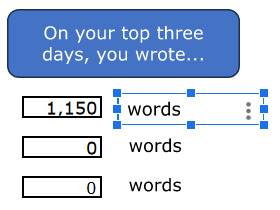
As for the difficulty deleting projects, thanks again for looking into it. I’m using Google sheets, and when I delete a project - any of them - the top stats sheet starts looking like this:

(The clipped words image was already like that) The chart sheet otherwise deleted the data just fine, but looks like this:

And totals like this:

The 2024 word count in yearly comps has that same REF image instead of a number, and the chart instead says ‘Add a series to start visualising your data’. In totals and comps data the information for the deleted project also shows the REF message, unless I manually delete that column as well (idk if that’s an issue but best be thorough). Daily graph and chart remove the data fine, and if I delete a project that has its own sheet it’s replaced with the add a series message, which I assume is supposed to happen. I haven’t noticed and other adverse affects.
(Seriously, thank you for helping me so much. You’re amazing, and even if you don’t find/know a work around for this you’ve been a huge help!)
Ah, okay, I seeeeeee. So, anywhere you see that #REF! message, it's because it's trying to reference information that's not there any more. In this case, you did the right thing by deleting the project column from the Totals sheet! If you delete a project column in the Daily sheet, you also need to delete its corresponding columns in the Comps. Data and Totals sheets. This is because both of those sheets pulled information from the deleted project column in the Daily sheet, and they'll still be trying to fulfil a formula that no longer has the necessary information to work.
Once those columns are deleted, follow the instructions for deleting a series from a chart on page 7 of the instructions booklet, and delete the project's series from the Totals chart.
Something you could do in the future, instead of deleting project columns from the Daily sheet, is to hide them (right-click on the letter above the column and choose "hide column" from the drop-down menu). Choosing this method means that a) you don't need to delete any project columns elsewhere, and b) "adding" more columns, should you ever need them, becomes a matter of unhiding the column. The only change you'll need to make then is deleting the project series from the Totals chart, as explained in previous paragraph.
(And yes, deleting a project column will affect its corresponding sheet, if it has one. Pages 23–24 of the instructions explain how to make a new project-specific sheet, and you can follow those same instructions to link the sheet to a different project column, if you want to. Otherwise, feel free to hide/delete the sheet.)
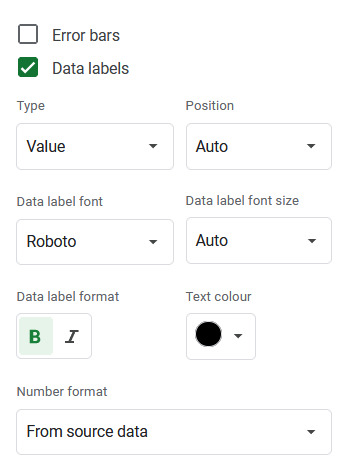
However. I noticed that for some reason, removing any data from the totals chart converts the previously-invisible line for the totals into a stacked column instead. To fix that, right-click on the chart and select "Chart style" to open the Chart editor window. Then, under the "customise" tab, scroll down and click on the option that says "series". Pick "Totals" from the drop-down menu of series, and change where it says "column" to "line" and set the line opacity to 0 (Shown in the left image).
Below this section, there is a list of three tick-boxes labelled Error bars, Data labels and Trend line. Click the box for Data labels, and make sure the text colour is set to black. You'll then get a number for total words written that month appearing above the stacked columns. (Shown in right image)

Fixing the Top Stats sheet:
In the case of the current streak counter, the issue is in two places: with the formula that counts the current streak:

and the formula that decides whether to say "to date" or "as of yesterday":
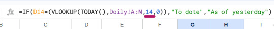
I've underlined the bits you'll need to change. You can find more details on how to do this and how it works on pages 9–10 (Top Sheets explanation) and 18 (how the streak counter works) of the instructions document.
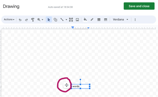
also. if those squashed "words" textboxes are annoying you (they would drive me nuts lol), I think the problem is that the text box isn't set to resize itself with the text (even though I thought i did that...). Try clicking on the box, then on the little three dots symbol and choose "Edit" from the menu that appears. When the Drawing window opens, select that icon next to the box (circled), and choose "Resize shape to fit text".
8 notes
·
View notes
Text
I hate to reblog this with my two-sense, because it currently has 69 notes, but you've activated my special interest so it is what it is.
While this feels like an accurate depiction of general fandom moods, it is, suprisingly, actually not true! (statistically at least) On ao3 at least, the ratios for who's topping and explicit/non explicit fics have remained relatively stable.
(Note that at no point has either chosen dynamic made up more than 20% of the total of E-rated fics, so it's important to remember that this only represents those fics which specifically chose to use top/bottom tags)
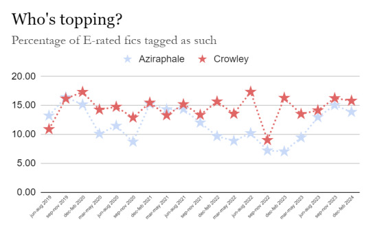
As you can see in the above chart, with data pulled from ao3 in three-month intervals, top!Crowley has actually been the more popular dynamic pretty much forever, though notably untrue during the first three month after the initial release of S1.
It's also untrue to assess that fics are generally more explicit now, as shown below:
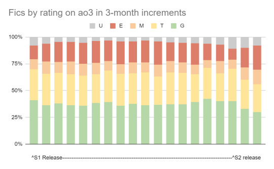
It's worth noting that both the season one and season two release periods have the lowest percentage of explicit fics, with the number growing after fans become more comfortable with the canon given and begin branching out.
Speaking of branching out, you can see the same trend in the percentage of human au fics. The number of human au fics written trends upwards significantly as time passes post-season-release. While we're not currently at a higher rate than before the release of season 2, we're at about twice the rate of a comparable time period relative to release date as last season. It will be super interesting to see where things go from here!
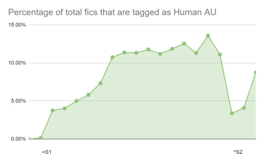
It's worth noting that this data doesn't tell us everything we could possibly know about fandom interactions and fanon preferences, simply because ao3 tagging is a wild world and also only about 47% of fic in this fandom is actually published on ao3! (pspsps you wanna click the link to see more of my research so baddddd) I'm planning to do a more thorough analysis of smut fic within the fandom, so what you're seeing here is some of my initial data collecting and hastily thrown together graphs, and it will be interesting to see what new information comes up in that!
<3
Click Here to see more of the data analysis I've done on Good Omens fanfiction!
My observations from the Good Omens fandom:
Fanart and fics that are from the time before the TV series (1990 - 2019): Az & Co love each other deeply and there are no labels. Their love is very chaste and they usually kiss only. Ace vibes.
Fanart and fics after GO S1 (2019 - 2023): Aziraphale is a babe, a softie, and Crowley is the strong protector. The only fanart where Crowley is the one holding Aziraphale in his arms is from this time period. Fics are often explicit, but it’s very balanced between top Crowley and Top Aziraphale. There is a lot of play with different genitalia, but the main focus is still the strong, intense, unbreakable bond between the two, which defies all human relationship labels.
Fanart and fics after GO S2 (Aug. 2023 - present): Crowley is the soft, whiny baby who needs protection. Most fanart depicts Aziraphale as the strong protector and Crowley as the fragile girlfriend behind him. Crowley is very often depicted with black nail polish & long hair, more feminine character traits, unless both characters are female. Most fics are explicit, and Aziraphale is dominating Crowley, Crowley is desperately looking for approval or being a total brat and making Aziraphale’s life a living hell after the final fifteen, pouting and being angry/resentful. The main focus in the fics in now the sex and sexual pleasure. Now there is also a lot more exploration of different AUs and incarnations e.g. Crowley is very often a snake, they are drawn as robots or mouse & rat, AUs for coffee shops, gardeners, priests etc.
I am not judging this trend in any way, but I personally prefer the depictions and interpretations during the S1 era, because they feel the most true to the source material of the TV show for me. I wonder if after S3 it will diverge even further or if it will circle back.
3K notes
·
View notes
Text
Google’s AI Mode Arrives in India: A Paradigm Shift in How We Search
-Google has officially launched its highly anticipated “AI Mode” in India, marking a significant evolution in the way users interact with the world’s most popular search engine. Powered by a custom version of Gemini 2.5, this new search experience, initially available through Search Labs, transforms traditional query-based searches into dynamic, conversational, and multimodal interactions. India, with its vast and diverse user base, is poised to become a critical testbed for the global refinement of this advanced AI-driven search.
How It Works and User Benefits: A Smarter, More Intuitive Search
AI Mode is a fundamental reimagining of search, moving beyond the traditional “ten blue links.” It operates on several key principles:

Query Fan-out: For complex or lengthy queries, AI Mode intelligently breaks them down into sub-questions and simultaneously searches across various sources. This includes the live web, Google’s extensive Knowledge Graph, and real-time shopping data from billions of product listings.
Multimodal Input: Users are no longer limited to text. AI Mode supports voice input via a waveform icon and image input through Google Lens. This is particularly beneficial for “real-world” queries, such as identifying a plant from a photo and immediately asking for care instructions. Google Lens already sees its highest usage in India compared to any other country.
Deep Search & Visuals: The system can analyze vast amounts of data, generate charts or graphs for better comprehension, and even offer personalized results by integrating context from a user’s connected Google apps (an opt-in feature).
Agentic Abilities: Google is actively testing features that allow AI Mode to perform tasks directly, such as booking tickets or making restaurant reservations, streamlining user workflows and reducing friction. This “Project Mariner” aims to empower AI to autonomously perform tasks.
For users, this translates into a far more natural and efficient search experience. Early testers in India are already submitting queries 2-3 times longer, demonstrating a shift towards more conversational interactions. The convenience of voice and visual inputs democratizes access for those less comfortable with typing, while the depth of information, complete with citations and resource links, fosters a more comprehensive understanding of complex topics.
Impact on Businesses and the Indian Economy
The rollout of AI Mode will undoubtedly reshape the digital landscape for businesses and publishers, while also presenting unique opportunities for India’s AI ecosystem:
For Businesses & Publishers:
SEO Shift: The most immediate and significant impact will be on Search Engine Optimization (SEO). As AI Mode provides direct answers, potentially reducing the need for users to click through to websites, a decline in organic click-through rates (CTRs) is anticipated, with estimates ranging from 30% to 60% for snippet-based queries. Publishers relying heavily on ad revenue from search traffic may face challenges.
Opportunity for Visibility: Despite potential traffic dips, AI Mode also presents an opportunity. Websites providing high-quality, authoritative, and well-structured content are more likely to be cited as sources within AI Mode’s answers, thereby gaining prominence and establishing their expertise.
SEO Evolution: The traditional SEO playbook needs a significant update. Strategies must now focus on:
E-E-A-T (Experience, Expertise, Authoritativeness, Trustworthiness): Building and demonstrating strong E-E-A-T signals will be crucial for content to be considered credible by the AI.
Content Depth and Structured Data: Creating comprehensive, well-organized content with clear headings, entities, and appropriate schema markup will enhance AI’s ability to understand and utilize the information.
Multimodal Readiness: Businesses should prepare their content to be consumed in various formats, including text, images, and videos, to cater to multimodal queries. This also includes ensuring high-quality visuals and their appropriate tagging.
OmniSEO™: The shift extends beyond just Google; content needs to be discoverable and structured for multiple AI ecosystems.
For the Indian Economy & AI Ecosystem:
Boost for India as a Testbed: With its enormous user base (over 870 million internet users), India offers invaluable feedback for the development and scaling of multilingual and multimodal AI. This real-world application will accelerate Google’s AI advancements.
Alignment with National AI Goals: Google’s launch complements India’s ambitious initiatives, such as the IndiaAI Mission and the AI Safety Institute. The focus on local language adoption, skilling programs, and responsible AI development aligns directly with national priorities. Google has also launched its “Safety Charter for India’s AI-led Transformation,” which aims to combat online fraud, strengthen cybersecurity, and promote responsible AI development, leveraging initiatives like “DigiKavach.”
Embracing an AI-Powered Future
Google’s AI Mode signifies a pivotal moment in how Indians will search and consume information online. It transforms search into a conversational, multimodal experience that offers richer, context-aware responses. While this empowers individuals with unprecedented access to knowledge, it simultaneously challenges traditional SEO and content strategies, demanding adaptation from businesses and publishers.
As AI Mode evolves from a Labs experiment to a mainstream feature, users, businesses, and policymakers must embrace new techniques, enhance digital literacy, and prioritize the creation of credible, structured, and multimodal content. This launch is not merely a product update; it is a major stride forward in India’s ongoing journey towards a more intelligent, AI-powered internet, with profound implications for how information is accessed, consumed, and created. The future of search in India is conversational, intuitive, and deeply integrated with artificial intelligence.
Yes, absolutely! Based on the information you provided and the current news about Google’s AI Mode launch in India, here’s a set of frequently asked questions (FAQs) that users and businesses might have:
(FAQs)
Q1: What is Google AI Mode?A1: Google AI Mode is an advanced, experimental search experience powered by a custom version of Gemini 2.5. It transforms traditional search into a more conversational, multimodal, and intelligent interaction, allowing users to ask complex questions and receive comprehensive, AI-generated responses directly within Search.
Q2: When was AI Mode launched in India?A2: Google AI Mode went live in India for opt-in via Search Labs on June 23-24, 2025. It was first introduced in the U.S. in March 2025 and expanded publicly there in May 2025 during Google I/O.
Q3: How can I access AI Mode in India?A3: Initially, AI Mode is available as an opt-in feature through Google Search Labs in India. You can typically enable it via the Google app on Android or iOS by navigating to your profile picture > Search Labs > AI Mode. In some cases, a new “AI Mode” tab might appear directly in the Search bar or at google.com/aimode.
Q4: Is AI Mode available in Indian local languages?A4: Currently, AI Mode in India is initially available in English only. There is no specific timeline yet for local-language support, but given India’s diverse linguistic landscape and Google’s focus on localization, it’s highly anticipated.
Q5: How does AI Mode differ from regular Google Search or AI Overviews?A5: AI Mode offers more advanced reasoning, thinking, and multimodal capabilities than standard AI Overviews. While AI Overviews provide summaries at the top of search results, AI Mode uses a “query fan-out” technique to break down complex questions, simultaneously searching multiple sources (web, Knowledge Graph, shopping data), and allows for deeper, conversational follow-up questions.
0 notes
Text

MS Office Legal and Corporate - Setting Up a Quick Teleprompter In Power Point.
Scenario: The Attorney wants to do a Power Point Presentation. She wants to be in a position where she can do the presentation from Zoom or if in person, will make use of an overhead projector using her laptop. She inquired about the use of a Teleprompter built into the Power Point Presentation.
In order to set up “Notes” pages and the basics of getting handouts together I have given you the link below.
For our current situation gather the text that you wish to place on the Notes area of each separate slide. The regular part of the slide will have a photo of some sort or a graph or chart.
Once you have placed the individual pieces of text in the Notes area of each individual slide, look at the extreme right of the Power Point screen above the ribbon and you will see a “Record” button.
Once you enter the Record Screen, at the very bottom make sure for “views” you select “Teleprompter” View. This view shows the text you placed in the Notes area on “Top” of the Photo that was used on the slide.
Up top you will see an area where you set the speed of the Teleprompter. Set it slow then test it by clicking on the start arrow connected to the speed of the teleprompter. It will scroll through the text and you read it out loud to see if the speed suits you. Adjust as needed.
The big black circle on the bottom right of each screen lets you click from one slide to another when ready for the next slide.
Finally, when clicking Record, the Teleprompter will start automatically and you can stop it at any time and start over as needed. When done, you can save the Recording as a Movie file to your hard drive as well as uploading that file to You Tube, Rumble, Twitch, Vimeo etc. or any internal firm server.
You also have two other choices as to Record:
Presenter View - Shows Next Slide Up and the Text For Current Slide. You can still do your own narration.
Slide View: Shows just the slide but you can record with narration
Here is your promised Write up on Notes Page Basics
https://www.tumblr.com/advancetotraining/673284296280309760/dealing-with-notes-in-powerpoint-getting
Training From An Inside Perspective…
Basic-Advanced Legal Word Processing Training using MS Office, Adobe Pro/Nuance and Outlook. Training Secretaries, Word Processing Operators, Paralegals, Law Students, Attorneys and Business Owners
888-422-0692 Ext. 1 and 2
www.advanceto.com
https://advancetoffice.com/
www.awalkinthecenter.com
Expert Test Prep Classes as well…
Email:
Hey Students: AdvanceTo offers a great Power Point for Beginners class! This 4.5 hour hands-on Zoom or Phone class (can be split into two sessions) will give you a thorough introduction that will have you on solid ground with the basics and a lot of intermediate level technique and procedures. In short, you will learn a ton! The class costs $175.00 and discounts are given for all groups as well as individuals who purchase of 2 or more classes. Narrative material and homework are part of the deal. Post class follow up as well. If you have had gaps in your knowledge then this class is for you!!! Call us today!
0 notes
Text
Organizing Your Data: Tips for Sorting and Presenting Graphs Effectively in PowerPoint
Data Visualization: Key Queries Explained
1.How to create a graph in PPT?
To create a graph in PowerPoint, open your presentation and select the slide where you want the graph. Click on the "Insert" tab, then choose "Chart." A dialog box will appear select the type of graph you want (e.g., column, line, pie) and click "OK." This will open an Excel-like spreadsheet where you can input your data. After entering your data, close the spreadsheet, and the graph will appear on your slide. You can then resize, move, and format the graph using the Chart Tools that appear in the ribbon.
2. What are the 4 types of charts in MS PowerPoint?
The four types of charts commonly used in MS PowerPoint are:
1. **Column Chart** - Displays data using vertical bars, ideal for comparing values across categories.
2. **Line Chart** - Shows trends over time with a connected line, useful for continuous data.
3. **Pie Chart** - Represents parts of a whole as slices of a circle, effective for showing proportions.
4. **Bar Chart** - Like column charts but uses horizontal bars, suitable for comparing quantities across different categories.
These charts help visualize data effectively in presentations.
3. How do you format a graph in PowerPoint?
To format a graph in PowerPoint, first click on the graph to select it. Use the "Chart Design" tab to change the chart type or style. For specific formatting, right-click on elements like bars or lines to access options for colors, outlines, and effects. Use the "Format" tab to adjust text size, font, and alignment. You can also modify axes and gridlines through the "Format Axis" option. Finally, ensure your graph has a clear title and labels for better understanding. Save your changes to apply the new formatting.
4. How do I import a graph into PowerPoint?
To import a graph into PowerPoint, first create your graph in a program like Excel. Select the graph and copy it (Ctrl+C). Open your PowerPoint presentation and navigate to the desired slide. Paste the graph by pressing Ctrl+V. You can also use the "Insert" tab, select "Object," and choose "Create from File" to insert a graph saved as an image or file. Adjust the size and position as needed. For more customization, use the "Chart" option under the "Insert" tab to create a new graph directly within PowerPoint.
5. How to sort a graph in PPT?
To sort a graph in PowerPoint (PPT), click on the graph to select it. If it's a chart, go to the “Chart Tools Design” tab. Click on “Select Data” and then choose “Edit” for the series you want to sort. You can rearrange the data in the table or adjust the data range to change the order. For bar or column charts, you may also sort data directly in the Excel sheet linked to the chart. Lastly, refresh the chart to apply the new order. Save your changes to update the presentation.

Visit: VS Website See: VS Portfolio
0 notes
Text
Gemini’s Big Upgrade: 1.5 Flash, Faster Replies, More Access

Google is expanding Google Gemini for Teens and mobile app experiences, adding a new related content feature, and introducing 1.5 Flash to Gemini in more than 40 languages and 230 countries and territories.
Google has hear about people using Gemini to be more industrious, imaginative, and inquisitive every day. Furthermore, Gemini is becoming more adept in assisting you in completing those activities in the methods that suit you best with today’s release.
In the free edition of Gemini, you can now access 1.5 Flash for quicker and more beneficial responses. In addition, Google is adding a new function to better handle hallucinations and extending the reach of Google Gemini for Teens mobile app and experience.
Quicker and more astute reactions with 1.5 Flash
Google had heard that individuals like using Gemini primarily because it saves them time. Whether you’re using Gemini to compose an engaging email or troubleshoot complex code, it’s critical to receive prompt, excellent responses.
Google is upgrading to Gemini 1.5 Flash today for their free tier users. You’ll experience general quality and latency improvements with Gemini 1.5 Flash, with notable gains in reasoning and picture understanding in particular. Additionally, Google is quadrupling Geminis to 32K tokens, in line with their significant expansion of the context window in Gemini Advanced. This implies that you can ask Gemini more in-depth questions and engage in lengthier, back-and-forth dialogues without paying anything.
Google will soon add the ability to upload files directly from your device or via Google Drive, which has been accessible in Gemini Advanced, so you can make the most of the larger context window. This implies that you will be able to ask Gemini to generate practice questions and upload your study guide for economics. Soon, Gemini will also be able to analyse data files on your behalf, enabling you to find patterns and visualise them with the use of graphs and charts.
All Gemini users can now access Gemini 1.5 Flash on the web and on their mobile devices, across more than 230 countries and territories, and in more than 40 languages.
Relevant material in Gemini’s answers
Additionally, Google had heard that using Gemini as their go-to research partner allows people to enjoy discovering new subjects. As part of their ongoing efforts to lessen hallucinations and make it simpler for you to visit websites that provide more information, Google is now providing links to pertinent content for fact-finding prompts in Gemini.
For English language prompts in select countries, you can now view this extra information on subjects right within Gemini’s answers as of right now. To view websites that go into further detail on a particular subject, simply click on the chip that appears at the end of a paragraph. This extends beyond websites: In the event that Gemini’s answer makes reference to data obtained through the Gmail extension, you will additionally see inline links to pertinent emails.
This advances the work Google had done to combat hallucinations. Apart from providing connections to relevant content, Gemini’s double-check function confirms answers by utilising Google Search to indicate whether claims are supported or refuted online. When information is refuted, it is simple to look further and confirm the information for yourself.
Gemini is present in numerous locations
Google made it possible to have direct conversations with Gemini in Google Messages on some Android devices earlier this year. With the option to communicate in recently added languages including French, Polish, and Spanish, Google is progressively bringing out Gemini in Google Messages to the European Economic Area (EEA), the United Kingdom, and Switzerland starting today. To begin generating ideas, organising travel, and more, click the “Start chat” icon in Messages and choose Gemini. You can do all of this without ever leaving the Google Messages app.
Additionally, Google is expanding the availability of the Gemini mobile app to other nations so that more individuals may access Gemini while they’re on the go.
Increased teen access to Gemini
Google will be making Gemini available to teenagers worldwide in more than 40 languages starting next week. Teenagers can use Gemini to aid with creative projects, better comprehend school subjects, and get ready for college if they are old enough to maintain their own Google account.
Google want to prioritise safety and address the developmental requirements of teenagers while providing them with opportunity to take advantage of all that generative AI has to offer and preparing them for a future in which AI will play an even more vital role. Google had added more rules and safeguards, created a teen-specific onboarding procedure, and provided an AI literacy guide to assist teens use AI responsibly in order to enable them use Gemini confidently and safely. Additionally, Google has worked with professionals in child safety and development including MediaSmarts (CA), Miudos Seguros na Net (PT), and Fad Juventud (ES), who continue to offer their knowledge and skills in catering to the particular needs of teenagers and families.
How Google thoughtfully created Gemini
Gemini’s growth has always been directed by a dedication to accountability and user security. Google is disclosing more about how Google designed Gemini and how they want it to react as it develops. To have a better understanding of how Google handling delicate and complicated subjects, such as reactions to matters pertaining to political, religious, or moral convictions as well as public interest problems, you can now read about their approach to Gemini and further information about google policy standards. These rules, which are based on Google AI Principles, demonstrate their continued dedication to the ethical and open development of this technology.
Read more on govindhtech.com
#GeminiBigUpgrade#15Flash#usingGemini#Google#Gemini15Flash#GoogleSearch#GoogleMessagesapp#generativeai#AIliteracy#basedonGoogleAI#Quicker#gemini#technology#technews#news#govindhtech
1 note
·
View note
Text
A Comprehensive Guide Step-by-Step SCCM Inventory Report Creation

Image Source: https://powerstacks.com/hardware-asset-inventory-reporting/
One of the incredible tasks when it is about Configuration Management is SCCM Inventory Report Creation. It offers value to both SCCM installation and adds visibility to your efforts towards management. Without SCCM reports, this massive management tool works effectively on all your devices, but you’re experiencing all benefits.
How to make a good SCCM report?
Data
Data is the crucial component of all your reports. You must include the right SQL views into the SCCM database. If you’re reflecting the wrong information, your report will be vague.
Constructing an effective SQL query is the most complicated part of report creation. Without an adequate SQL proficiency, it will be difficult to get what you desire---but you can learn it.
Visually Compelling
A report with correct data is useful, but if it is presented poorly, the readers won’t be interested in it.
Keep it neat and clean: Include pie charts and graphs if necessary. Microsoft models this by using their cutting-edge Software Update dashboard and Office 365 dashboard.
The minute details
Incorporate links between your report to take your readers in the correct direction.
Include tooltips to demonstrate the shown data
The default SCCM Reports don’t have any of the above mentioned points. They provide you with insightful data, but they don’t adjust with the environment and are visually basic.
SCCM Report Creation
To develop SCCM inventory report, follow the steps below:
Open the SCCM console and navigate Monitoring/Overview/ Reporting
Right-click on Reports and choose Create Reports
Choose type SQL-based Report, located on the Created Report Wizard
Add the name of the report Office 365 Inventory
Include a report description if required
Browse and choose the folder where you can save the report
Go to Next
Report Builder: It is an effective tool to develop reports. Let’s go through the steps needed to craft a report.
After launching the Report Builder, see the screen’s left part, and focus on the Report Data section.
Data Sources and Datasets folder is the crucial one to begin. The Data Source section will be use to organize the database and Dataset can be utilized for the SQL query.
In this method, we’ve not used Build-in Fields and Parameters but they are beneficial for standardizing the reports.
SCCM Report Creation: Structure the Data Sources
Firstly, connect to the SCCM database:
Right-Click on Data Sources in Report Data on the left side of the panel and choose Add Data Source.
Enter the name for your data source in the General tab.
Choose Use a shared connection or report model
Click Browse
Browse till the end and choose SCCM database GUID and click Open
Inside the Data Source Properties, click Test connection to check your configuration and Ok when it’s done.
Develop a Dataset
Inside the Datasets section, you must create a SQL query.
Right-click datasets in the leftmost panel and choose Add Dataset.
Choose Use a dataset embedded in my report and choose the data source you have developed.
Paste the SQL query present in the Query field.
Click OK
You can get a glimpse of all fields on the right side returned by your query.
Report Design
Now, it’s the right time to create the visual aspect of the report. Include the data returned by the query.
Double click on the title and give it some other name to the Office 365 Inventory
Choose Insert/Table/Table Wizard
Choose the Dataset you’ve created, click Next
Choose desired fields to be showcased in the table and move them to the Value box.
Click Next
Once the style screen come, select Generic. Then, hit Finish.
You will obtain a basic report along with a title and the table you have developed.
Follow the steps to create a SCCM inventory report.
#sccm inventory report#sccm hardware inventory report#intune hardware inventory report#intune device inventory report#hardware asset reporting solutions
0 notes
Text
Shiba Inu enthusiasts have reason to celebrate, as analysts predict a bullish pennant pattern could catapult SHIB to new record highs. With this promising technical formation, Market experts are optimistic about the cryptocurrency's future performance. Stay tuned to see how this unfolds and what it means for Shiba Inu investors. Click to Claim Latest Airdrop for FREE Claim in 15 seconds Scroll Down to End of This Post const downloadBtn = document.getElementById('download-btn'); const timerBtn = document.getElementById('timer-btn'); const downloadLinkBtn = document.getElementById('download-link-btn'); downloadBtn.addEventListener('click', () => downloadBtn.style.display = 'none'; timerBtn.style.display = 'block'; let timeLeft = 15; const timerInterval = setInterval(() => if (timeLeft === 0) clearInterval(timerInterval); timerBtn.style.display = 'none'; downloadLinkBtn.style.display = 'inline-block'; // Add your download functionality here console.log('Download started!'); else timerBtn.textContent = `Claim in $timeLeft seconds`; timeLeft--; , 1000); ); Win Up To 93% Of Your Trades With The World's #1 Most Profitable Trading Indicators [ad_1] Multiple analysts have identified a bullish pennant on the Shiba Inu chart, outlining the potential for a profit of above 62% soon. Shiba Inu bulls are encountering significant resistance around the $0.000025 price level. Last week, amid SHIB engineering a mini rally, it barely crossed this range before retreating below. At the last check, SHIB succumbed to bearish pressure, falling behind by at least 5% and hitting an intraday low of $0.00002361. Despite maintaining positive gains in its 30-day trajectory, Shiba Inu is still struggling to surpass the $0.000025 level decisively. Meanwhile, prominent Market observers are confident that SHIB is counting down from its current consolidation phase. They have forecasted various breakout price targets Shiba Inu holders may look out for soon. Incoming 62% Profit for Shiba Inu Holders Famous Bitcoin analyst Clifton has joined the roster of commentators calling attention to an impending bullish trend for Shiba Inu. In a recent update on X, Clifton highlighted the formation of a bullish pennant on the 24-hour timeframe for Shiba Inu. For context, a bullish pennant formation signals that an asset is prepared to continue an uptrend commenced much earlier before encountering brief opposition. This formation, resembling a symmetrical triangle, is characterized by consolidating prices, hinting at an imminent breakout. In Shiba Inu’s case, SHIB had an ongoing uptrend in early March but ran out of steam. It entered a downtrend that took it back to $0.000018 in April. The overall candlestick pattern SHIB established in March translated to the bullish pennant many Market watchers have spotted. Clifton asserted that an upside from the configuration could net Shiba Inu holders a short-term profit of up to 60%. Image Source: https://x.com/clifton_ideas/status/1792045985465819536 In particular, the accompanying graph proposed that Shiba Inu could rally to the $0.00004 price level at the very least within the next few weeks. Other Analysts Propose Higher Targets On the other hand, analyst Davie Satoshi, who similarly identified a bullish pennant on Shiba Inu’s chart, proposed higher targets of above $0.00005 upon breakout. Other Market watchers like the pseudonymous “World of Charts” have conveyed similar opinions, identifying $0.00005 as SHIB’s potential target. Meanwhile, while replying to the analysis, a Bitcoin analyst suggested that SHIB enthusiasts may anticipate the $0.00008 price level next. Another even argued for the potential for a $0.00015 price point by next month. Notably, Shiba Inu entering $0.00015 would Market a new history for the asset as it represents an uncharted territory. Disclaimer: This content is informational and should not be considered financial advice.
The views expressed in this article may include the author's personal opinions and do not reflect The Crypto Basic’s opinion. Readers are encouraged to do thorough research before making any investment decisions. The Crypto Basic is not responsible for any financial losses. -Advertisement- Win Up To 93% Of Your Trades With The World's #1 Most Profitable Trading Indicators [ad_2] What is a bullish pennant? A bullish pennant is a chart pattern that shows a strong upward price movement, suggesting that the price might keep going up. It usually happens after a big price increase and looks like a small triangle on the price chart. Why do analysts think SHIB will reach new highs? Analysts believe SHIB will hit new highs because of the bullish pennant pattern. This means the recent uptrend could continue, pushing the price even higher. How soon could SHIB hit a new high? It's hard to say exactly when SHIB will hit a new high. Market moves can be unpredictable, but the bullish pennant suggests it could happen relatively soon. Should I invest in SHIB based on this news? Investing is a personal decision. While the bullish pennant is a positive sign, it's important to do your own research and consider your risk tolerance before investing in SHIB or any other cryptocurrency. What should I do if I already own SHIB? If you already own SHIB, you might want to keep an eye on the Market and consider holding your position to benefit from potential gains. Always stay informed and be prepared for Market changes. Win Up To 93% Of Your Trades With The World's #1 Most Profitable Trading Indicators [ad_1] Win Up To 93% Of Your Trades With The World's #1 Most Profitable Trading Indicators Claim Airdrop now Searching FREE Airdrops 20 seconds Sorry There is No FREE Airdrops Available now. Please visit Later function claimAirdrop() document.getElementById('claim-button').style.display = 'none'; document.getElementById('timer-container').style.display = 'block'; let countdownTimer = 20; const countdownInterval = setInterval(function() document.getElementById('countdown').textContent = countdownTimer; countdownTimer--; if (countdownTimer < 0) clearInterval(countdownInterval); document.getElementById('timer-container').style.display = 'none'; document.getElementById('sorry-button').style.display = 'block'; , 1000);
0 notes
Text


William Playfair the Scottish engineer and political economist was born on September 22nd 1759.
In a day where anniversaries are thin on the ground, thank god for William Henry Playfair.
I read one article about Playfair that describes him as "a kind of Forrest Gump of the Enlightenment" perhaps a bit harsh, I would say he was a bit of a polymath, another source in my opinion is more accurate, Playfair is without doubt to many of you out there "the most famous man you have never heard of" he rubbed shoulders with the era’s many giants, switching careers at the drop of a hat, and throwing himself headlong into history-changing events, from the storming of the Bastille to the settling of the American West.
William had a lot to live up to, his brothers were architect James Playfair and mathematician John Playfair, his father passed away when he was 13 and it was left to John to lead the family. After serving his apprenticeship with Andrew Meikle, the inventor of the threshing machine, Playfair became draftsman and personal assistant to James Watt at the Boulton and Watt steam engine factory in Soho, Birmingham then seems to have just wander from one trade to another, the way Gump wandered through life, so you can see where the analogy comes from.
William Playfair, was, during his adult life, (takes a deep breath) a millwright, engineer, draftsman, accountant, inventor, silversmith, merchant, investment broker, economist, statistician, pamphleteer, translator, publicist, land speculator, convict, banker, ardent royalist, editor, blackmailer and journalist. Okay they are not all jobs, but they do put you in the picture a wee bit on the character of the man I think.
Most interestingly in my opinion was his time as a spy in France during the Revolution and was on the scene during the storming of the Bastille. He even helps trigger the first major political scandal in the newly formed United States, a land speculation gone bad involving Washington, Hamilton, and Jefferson.
To go into all of this man's adventurers would take too long, instead I will just tell you that the one thing he did, that has been a part of all your lives, in one way or another, is he invented the graph. Before William invented the graph you had to read through pages of statistics to find things out, the graph, you "get it" in a glance. In 1786, he published The Commercial and Political Atlas, a compendium of bar and line charts representing different European countries’ imports, exports, wages, and other trends for which he had the data handy. As the man himself explained, “Men of high rank, or active business, can only pay attention to outlines… It is hoped that, with the Assistance of these Charts, such information will be got without the fatigue and trouble of studying the particulars.” he went on “No study is less alluring or more dry and tedious than statistics, unless the mind and imagination are set to work,” in the book’s introduction.
His old boss Watt, was sent a copy of the Commercial Atlas for review, and wasn't impressed, called the book “mere plummery” and its author “a Rascal.”
To finish I must say that he was a rather humble man and actually gave credit for the invention to his brother writing, “[John] taught me to know that whatever can be expressed in numbers, may be represented by lines,” Playfair wrote much later, in the introduction to one of his books of diagrams. “To the best and most affectionate of brothers, I owe the invention of [these] Charts.” He was never a success in his lifetime and was seen as a ditherer by Watt, William Playfair died in 1823, in poverty and relative obscurity, banned from any good society.
Slowly, over the next century or so, the supply of readily available data grew—as did the the public’s appetite for it. Bar, line and pie charts began trickling into newspapers and textbooks. Two hundred years later, as we barrel forward into the Information Age, you can’t click a link without stumbling upon some kind of data visualization. The next time you come across a graph, remember, like many other notable inventions in our history, take pride in that it was the work of a Scot that gave us these easy to read information "pictures".
5 notes
·
View notes
Text
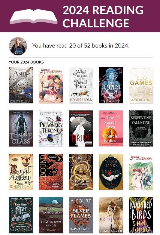
hi hi friends! i hope you’re doing well! today, i am giving you my quarter one wrap up for 2024 – filled with all the books i’ve read, a few favorites of those, and all the statistics of my reading these last three months! in january, february, and march i read 20 things! which i am happy about, but i do wish it was a little higher, since i do always like to hit 100 books read by the end of the year, but i was traveling a lot these last few months, and i have nothing really planned until july, so hopefully i am able to compensate a little with 30 books in my q2 post! but now i am getting way ahead of myself, and i don’t want to make this year feel like it is going even quicker than it already feels all on its own, so let’s do a little deep dive on these 20 books that i was able to read! ✨ Q1 STATISTICS (thank you to brock at let’s read, for creating this spreadsheet that i have used for so many years!) i figured that i would show my favorite graph all on its own this time! plus, i think this really encompasses that i have been having a good reading quarter. maybe not the best, maybe i wish for more fives to come, but i really can’t complain too much when more than half of the things i’ve been reading have been four stars! and only one two star which is always a good feeling to see, too! 💕 i normally stick to just showing pie charts for my reading data, but i have been really loving visually seeing my data in this format too. i am very happy with reading over 8k pages over these three months! i also really like seeing that i reread three things, because incorporating rereading books has been something i’ve struggled with in my reading life for a while now. and i also just think it’s cool to see how many pages i’ve read via audio books, as well! (shout out to spotify, i do love you and those free 15 hours every month!) as always, fantasy is my most read genre, but i really have been craving and gravitating to a lot of romance this year so far (and a lot of fantasy romance – which i categorize by what the book feels most like to me between the two)! i’ve also been reading books from my personal library so much this year, which makes me feel good, because i love buying books knowing that i am excited to pick them up soon! i am a little surprised that penguin is my most read publishing house, and not macmillan, but we do love when the graphs are changing up sometimes! but that 5% hachette, probably just because of holly black, is very wild to see. i love seeing these charts and graphs, and they bring me so much happiness all by themselves, but i also love being able to kind of reassess my reading and how i’m doing each quarter because of them! besides really wanting to read 30 books in the second quarter, i would also like to start maybe prioritizing arcs a little more. i have been so good about doing at least mini reviews for everything i’ve read (yes, all twenty things have been reviewed), but i kind of miss reviewing things before they are officially published, too! 🤍 THREE FAVORITE READS OF Q1 (click title links for full reviews with detailed thoughts, feelings, and tw/cws!) ✨ The Vanished Birds by Simon Jimenez heartfelt galaxy brain that truly touched my very soul ✨ The Secret Lives of Church Ladies by Deesha Philyaw maybe my favorite anthology of all time ✨ The Wilful Princess and the Piebald Prince by Robin Hobb the greatest tragedy i’ve read in many years Q1 BOOK HAUL these are all the books that i’ve received since january 1st! well, i did buy other editions of the warm hands of ghosts and the prisoner’s throne, too! but the stack was getting a little too high, so i just added my favorite versions! a couple of these were gifts that i am very thankful for! and a few are arcs sent to me by publishers which i am also so very thankful for! (i have only read four of these though – so let me rectify that asap 😉 too!) okay friends, i think that’s everything! truly, i am so thankful for these last three months and i hope the rest of the ye...
View On WordPress
#2024#Book Blog#Book Blogger#book charts#book graphs#book statistics#book stats#Goodreads#meltotheany#quarterly reading#reading statistics#reading stats
0 notes
Text

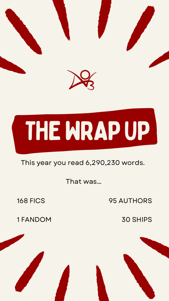
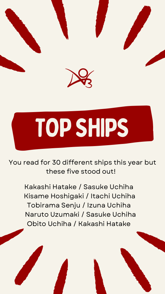


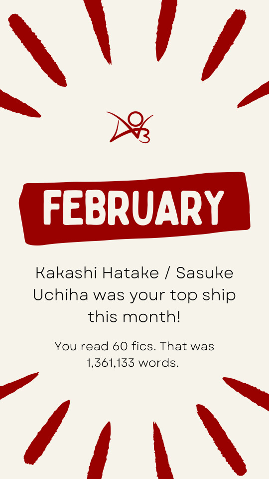
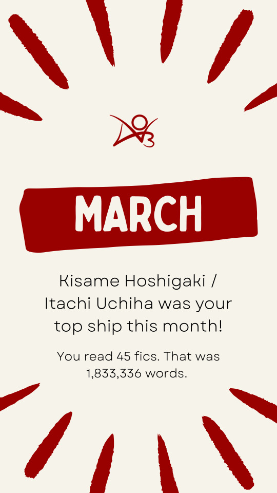
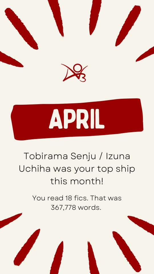
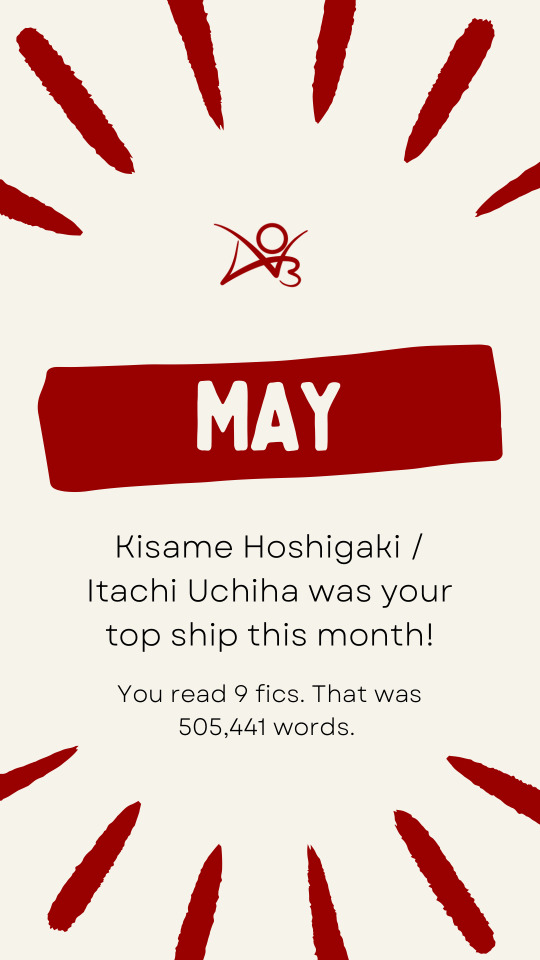

In 2021 I got really into reading books.
One of my favorite aspects of it was getting to see my stats at the end of the year. Something about seeing it all in neat little charts and graphs was really satisfying to me. In 2022 I got back into fan fiction and was annoyed at the lack of anything similar.
I set out this year to rectify that for myself.
Starting with a Notion that eventually moved over to Sheets with an attached form to fill out, I tracked each and every fic I read this year, all 168 of them.
The above images are the results.
(Q&A + Fic Recs under the cut)
Q&A Time - Readers Addition
While looking around to see what other fic readers included on their AO3 Unwraps I stumbled across this fun questionnaire ask box meme. I figured instead of posting and waiting for questions I’d just answer them because I really wanted to.
You can check out the original post of questions by clicking here!
Fic you clicked on the most times this year?
That would be Kings and Pawns by HittoSama. Now there are some caveats to this. First, it was the fic I was reading while building my first fic tracker over on Notion. While building it and then again when building it in Sheets, I had to go copy the link a good few times. It’s also a pretty long fic and I was reading it before I was downloading to read them in Books. Between reading on different devices, as well as going back to link it on a few rec lists I made this year for friends….it racked up the hits from me! But it is a great fic, wonderfully written, and has some of the best Shikamaru characterization I’ve come across so you should all go check it out.
First fic you clicked on this year?
Also Kings and Pawns. It was my first read of the year.
Your most read Fandom this year?
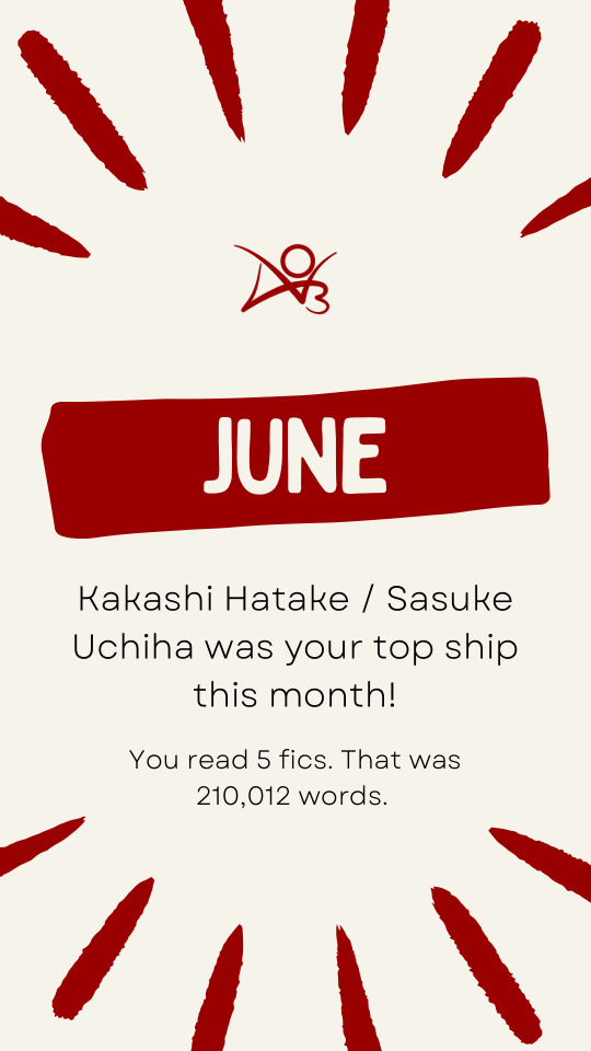
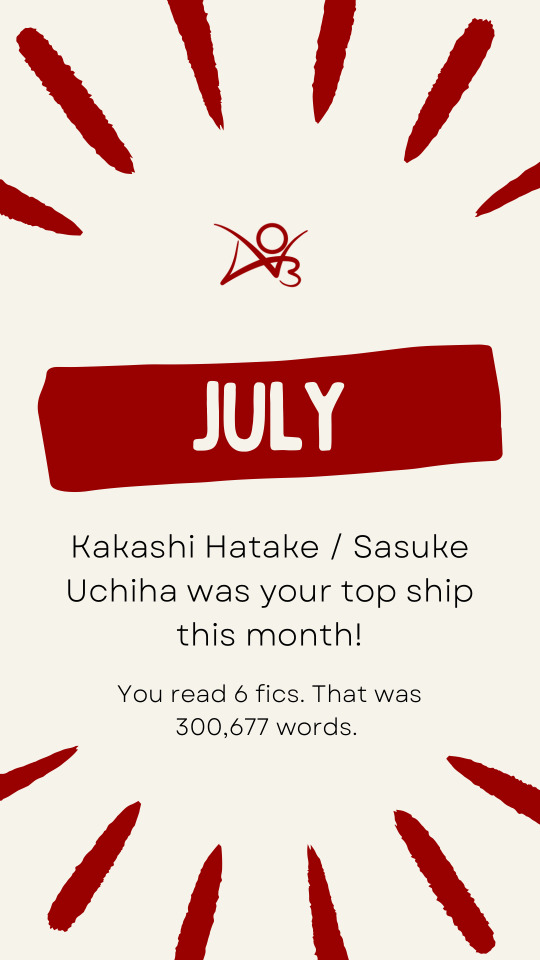
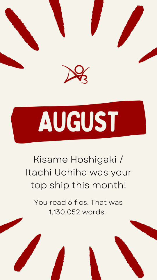
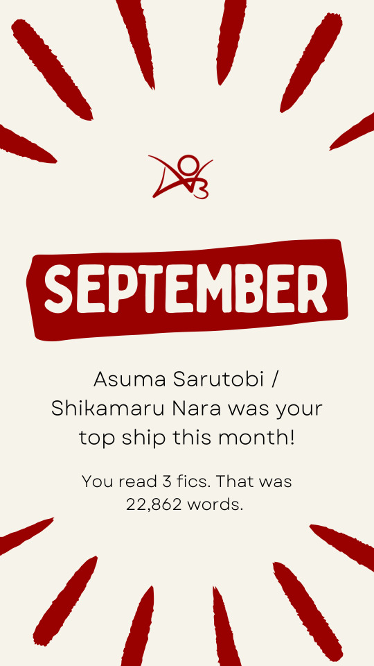
Naruto. It’s actually the only fandom I’ve read this year. I have plans to branch out in 2024 but we’ll see how that goes.
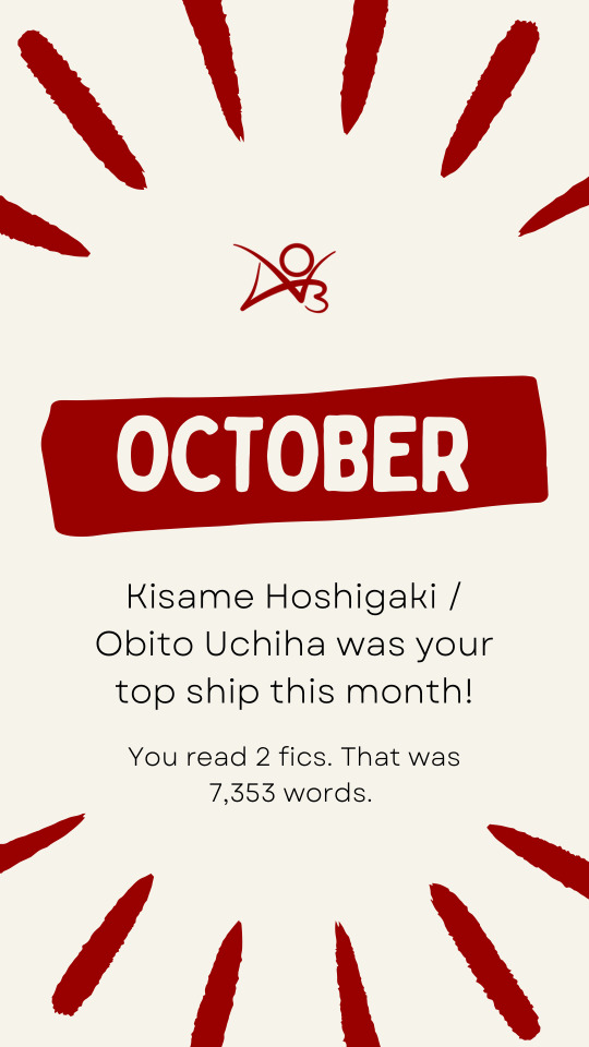
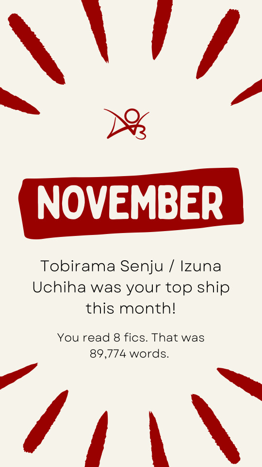
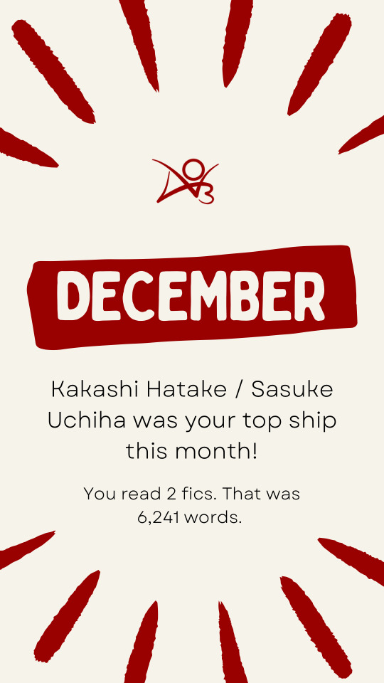
Your most read pairing this year?
Kakashi Hatake / Sasuke Uchiha. I’ve read 72 works for them this year.
Most popular fic by hits you read this year?
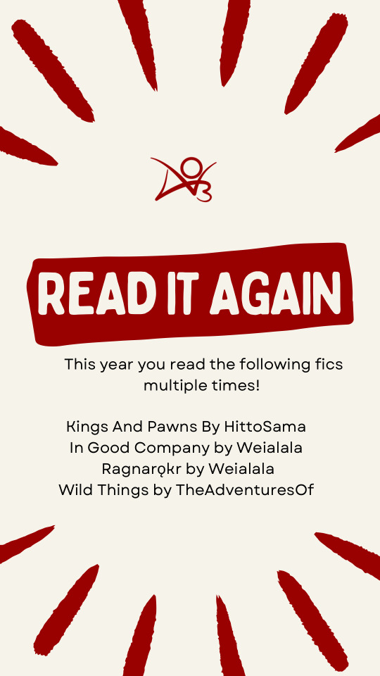
In Good Company by Weialala reigns supreme with over 404,000 hits.
Your personal favorite fic you read this year?
In Good Company and its sequel Ragnarǫkr by Weialala were both standouts this year that I ended up rereading three times.
Most recent fic you clicked on?
Technically Ragnarǫkr as I needed to fetch the spelling but not counting stuff looked up for this challenge, last clicked on fic would be The Blood-Soaked Road to Paradise by Renyanen. I’ve not read it yet but I was compiling my tbr for 2024 and it’s one I’m looking forward to checking out.
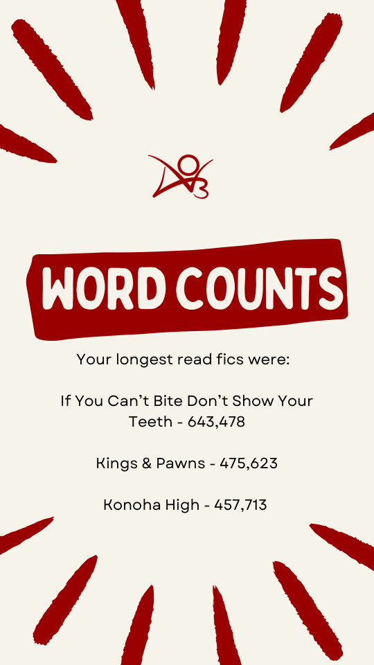
Highest word count fic you read this year?
An unpublished story I co-wrote with my friend. It comes in at 643,478 words and is based on the concept of Itachi taking Sasuke with him to the Akatsuki. It’s my favorite thing and honestly very self indulgent and unlikely to ever see the light of day. Ten of ten recommend every fic writer to have one of these.
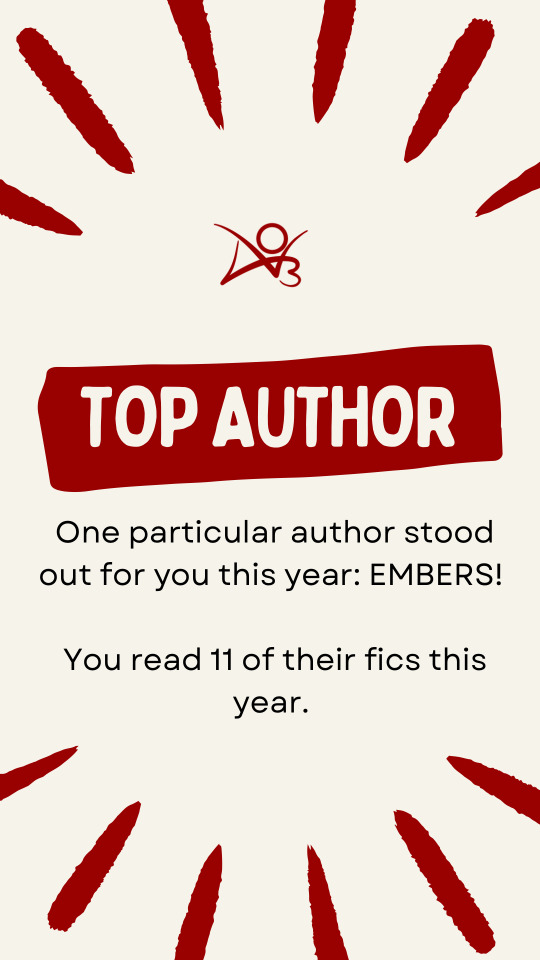
Shout out an incomplete fic you read this year?
From This Earth by Embers. I’m really looking forward to reading more of it in the future!
Oldest fic you read this year?
I’m pretty sure nothing else I read beats In Good Company by Weialala. She began writing it over on FF.Net back in 2008. It’s sequel is currently incomplete and I await the day she returns to finish it. 🙏🏻
That more or less wraps us up here!
As a final section, as I take my leave, I want to give a small recommendation list based on my favorite fics I read this year. Many of these were mentioned above in the questions and images, some of them weren’t but still come highly recced from me. Enjoy!
The Rec List (in no particular order):
Kings and Pawns by HittoSama Sharingan Rising Series (In Good Company / Ragnarǫkr) by Weialala Wild Things by TheAdventuresOf From This Earth by Embers Eye to Eye by Embers Scarlet Ink and Paper Swords by Renyanen Mosaic Eyes by BitchBot3000 Hold Your head Up and Run by TakaGang Why Storms Are Named After People by Naava
0 notes
Text
Blog SEO: The Complete Guide
Want your blog to rank high in Google search engines? Well, you need to take care of Blog SEO. What is it? Blog SEO refers to writing and optimizing blog content for search engines like Google. It can help you attract more organic traffic, reach your target audience, and grow your online authority.
Here's what Blog SEO entails:
Finding Keywords for Your Blog Posts
Online searches are driven by keywords. These are the words and phrases you want Google to rank your blog posts for.
If you want to find the right keywords for your blog posts, you should use a keyword research tool such as Ahrefs, SEMrush, or Ubersuggest. With these tools, you can learn what your potential readers are searching for, how frequently they search for it, and what the level of competition is for ranking for that keyword.
Follow these steps to finding keywords for your blog posts:
Consider a broad topic or niche related to your blog's theme. For example, if you have a food blog, you might start with topics like "chicken recipes", "pasta recipes", "vegetarian recipes", etc.
Use the keyword research tool to find keyword ideas for your topic or niche. It will provide you with hundreds or thousands of related keywords that people are searching for. For example, if you enter "chicken recipes" into Ahrefs, you'll see keyword ideas like "chicken curry recipe", "chicken soup recipe", "chicken salad recipe", etc.
A keyword's search volume is how many searches it receives each month. Keyword difficulty is a measure of how difficult a keyword is to rank. A keyword's relevance determines how closely it fits your topic or niche. Filter and sort keyword ideas by search volume, keyword difficulty, and relevance. Find keywords with decent search volume, low keyword difficulty, and high relevance.
Choose one main keyword and a few secondary keywords for each blog post. Your main keyword should appear in the title, introduction, conclusion, and URL of your blog post. You should sprinkle your content with secondary keywords that support your main keyword.

Optimizing Your Blog Posts for On-Page SEO
An on-page SEO strategy optimizes the elements of your website for search engines and users. By using it, you can improve the quality, relevance, and readability of your content.
Here’s how you can optimize blog posts for on-page SEO:
Use your main keyword in your title tag, meta description, and H1 tag. These are the elements that appear in search results and tell Google and users what your page is about. Make sure to use your main keyword naturally and include a benefit or a hook to entice clicks.
Include secondary keywords in your subheadings, body text, and image alt text. These are the elements that appear on your web page and tell Google and users what your content covers. Make sure to use secondary keywords naturally and avoid keyword stuffing.
Your blog content should be linked internally and externally. Both types of links can help you boost your authority, relevance, and user experience.
Make your content more engaging by using multimedia elements such as images, videos, charts, and graphs. With these elements, you can break up long blocks of text, illustrate your points, and engage your readers.
Some additional tips to improve and maintain your blog post rankings!
Track your rankings using tools like Google Search Console, Ahrefs, or SEMrush. Using these tools, you can see how your blog posts rank on Google, what keywords they use, and what issues they encounter.
Analyze your competitors with tools like Ahrefs or SEMrush. They reveal who ranks above you, what keywords they target, and how they compete.
Update your content regularly using tools like Google Analytics or BuzzSumo to see how well your content resonates with your audience, what topics are trending, and what feedback they have.
Promote your content using social media, email marketing, or influencer outreach to drive more traffic, engagement, and backlinks to your blog posts.
Want to do Blog SEO professionally? Approach the best SEO Company in Arizona!
Blog SEO improves your blog’s visibility, traffic, and authority. Do you need expert guidance and support to achieve your blog SEO goals? WSI - Optimized Web Solutions can help. It is a professional SEO agency in Arizona that can help you with your blog SEO needs. In addition, it offers customized solutions for your business goals. Contact them today!
#seo services phoenix#SEO Agency in Phoenix#Seo Company In Phoenix#Seo Company In arizona#Best SEO Company in Phoenix#Best SEO Company in arizona#Best seo company phoenix#Phoenix Digital agency#phoenix seo agency#seo agency arizona#arizona seo agency
0 notes
Text
The actual text of the article is even weirder, and can be described with phrases like 'completely incomprehensible', 'probably ai-generated', and 'wait, how exactly is this supposed to make me want to buy bitcoin, again?'
Take a look for yourself (note; links unvetted and should probably not be clicked on):
Inflation is defined as a general increase in prices and fall in the purchasing power of money. When this happens at a rapid sustained pace, it’s called hyperinflation.
Deflation is the opposite and it occurs when prices generally fall against the purchasing power of money.
Extending these definitions, we can say that hyperdeflation is a rapid and sustained condition of decreasing prices. Those who have adopted bitcoin as a store of value and unit of account over the last decade have experienced hyperdeflation and it is my opinion that this trend will continue in the next decade and beyond.
Check out this chart on the St. Louis Fed website showing how far down the price of eggs has come since 2016 when priced in satoshis (1 bitcoin = 100,000,000 satoshis or sats).
Source: https://fredblog.stlouisfed.org/2022/06/buying-eggs-with-bitcoins/
The website PricedInBitcoin21.com has many more charts like this where you can see how various financial assets have fallen over the last 5+ years when measured in BTC terms. When looking at these graphs, be sure to zoom out to 4 or more years as BTC tends to experience high volatility for timeframes less than 4 years.
Here’s another graph showing that the S&P 500 stock index has fallen over 99.8% from August 15, 2021 until today. Notice the y-axis is using log scale (each tick mark is 10x bigger than the one below it). Log scale is useful on these charts because with a standard linear scale, the hyperdeflationary effect of measuring assets in BTC is that the price falls to nearly zero in the first few years and the moves are no longer visually detectable (like the price of eggs chart earlier).
Using log scale allows us to visually see that after this stock index fell 90% (roughly 10 billion sats to 1 billion sat) it was able to fall 90% again (to 100 million sats) and yet another 90% (to 10 million sats).
Judging by this trend, how long do you think it will take to fall another 90% to 1 million sats? Let me know in the comments.
What can you do about this?
I’d encourage you to start using bitcoin as your unit of account today. Figure what your net worth is by adding up the value of all your assets (house, car, bank accounts etc.) and subtract all your debts. You’ll probably do this in your local currency, but then you’ll want to convert it to bitcoin by dividing the result by the current value of bitcoin in your local currency. The result of the division will be how much bitcoin you’d have today if you sold everything you own, paid off all your debts, and put the remainder in bitcoin.
Then try to estimate what your net worth was in BTC terms 5 and 10 years ago. To do this, estimate what it was in your local currency and divide it by the price of bitcoin in that currency 5 and 10 years ago respectively. It’s probably the case that it has gone down. A lot.
It’s probably the case if you sold everything you owned 5-10 years ago to pay off your debts and buy bitcoin, that you’d be better off than you are today. The question you should be asking yourself is, “will bitcoin-hyperdeflation continue for the next decade?”. My answer to that is “absolutely yes!” and I’ll go into why with other blog posts, but it’s best you put the time in to learn and decide for yourself. If you think there’s only a 1% chance it will happen, you’d be taking a pretty big risk to not put at least 1% of your savings in bitcoin today.

... what exactly is this ad supposed to convey?
41 notes
·
View notes
Text
The Ultimate YANDERE TYPES List | Extensive Graph and List
So I was doing research for my writing and I found a really good Yandere Types chart!
Full sources and links to further reading will be below in the notes!
And before getting into it, remember to read the trigger warnings and content warnings. This is Yandere fiction we’re talking about, so it’s going to get messed up.
Themes + Trigger Warnings + Content Warnings:
Possessiveness, Obsessiveness, Unhealthy relationships, Religious themes, themes of sociopathy, themes of mental illness, hallucinations, delusions, hallucinations and delusions due to drugs, mentions of: physical abuse, sexual abuse, brainwashing, murder, suicide, murder-suicide, self-harm, stalking, panic attacks, cannibalism, necrophilia.
{click to open and zoom in to see the details! I'm so sorry, mobile app users :(}


Broad types. Click them to see more information!
Possessive Type
Shackling Type
"Denpa" Delusional Type
Love and Hate Type
Intoxicated Type
Stalker Type

Sources:
This does not belong to me. I only gave a summary of what I read. ORIGINAL SOURCE LINKED HERE.
It's an English translation of material from an upcoming game called Yandere Town. UNTRANSLATED, ORIGINAL JAPANESE SOURCE LINKED HERE. I do not know when this game is coming out, but darn the details that went into this is crazy! It might help you out if you're writing anything yandere!
(Original translators, I have no problem with taking this down if you don't want me reposting your translation to my blog! ^_^)
♡If you want to see more content like this check out the Writing and Yandere Masterlist and if you want to learn about this blog check out all things sketchprincess02!♡
♡Please consider REBLOGGING and COMMENTING if this helps you!♡
#yandere#yandere town#yandere types#yandere x reader#yandere writing#yandere x darling#yandere prompts#yandere fanfiction#yandere fantasy#yandere blog#male yandere#tw yandere#yandere harem#yandere reverse harem#soft yandere#yandere list#tagging all my fandoms real quick#yandere obey me#yandere jojo's bizarre adventure#yandere record of ragnarok x reader#yandere diabolik lovers#yandere hetalia#yandere obey me x reader#yandere hetalia x reader#yandere record of ragnarok#yandere oc#otome#otome game#r18 otome
4K notes
·
View notes