#chunk <3< /div>
Explore tagged Tumblr posts
Note
HI JJ! Hope you're having the BESTEST day mwua anywa 1 & 6 for the ask game! <3
CHUNK TUMBLR IS HATING ON ME I DIDNT SEE THIS UNTIL NOW WHEN MY SHARK ANON POINTED OUT UR ASK GOT ATEN BY MY PHONE TUMBLR BUT NOT MY IMAC TUMBLR... SOO... SORRY FOR THE LATE RESPONSE MWAH HOPE UR HAVING AN AMAZING DAYYYYY RIGHT BACK ATCHA POOKIE <333
1. what is your favourite thing about the fall?
ooooh i also have to add my halloween decorations they're just little drawings of cute halloween stuff on plastic that i made into keychains!! was thinking abt matching with the gang but they're being a lil bit salty rn so...
6. what is your favourite fall season film? (horror film, mystery, fall themed, whatever you like.)
hmmm i had to think abt this one for a bit... my favorite horror film is chandhramukhi with the og star RAJINIKANTH IN ITTTTTTTT ALL THE RAJINI FANSSSSS... raa raa... if u get the joke hmu i need bollywood movie fans!!! but for like english movies i think it would be 13rw AND IK WHAT UR GONNA SAY ITS NOT FALL THEMED AT ALL but the supernatural aspect of hannah coming back and all the dead characters still appearing to clay was sooo interesting and spooky and there was a real sense of mystery to it so im gonna go with that (bc i dont watch horror movies thinking abt getting into it tho!)
LYSMMMMMM BYE CHUNK <333 HOPE TO ESE U AROUND AND THANKS FOR DROPPING BYYYYY
7 notes
·
View notes
Text

ranchodelalunastudio: we had the pleasure of hosting @.lsdunes and crew with @.alexnewps producing a few months ago and they’ve just released one of 2 songs recorded here.. BENADRYL SUBREDDIT . it’s a ripper. here’s @.frankieromustdie and @.timpayne_inthemembrane taking a selfie with chunk, who may have actually played a big part of the recording of… love to all
(Instagram | June 20, 2023)
#ls dunes#l.s. dunes#m: frank iero#m: tim payne#lsd: 2023#in: jun/23#t: photo#at: rancho de la luna#s: benadryl subreddit#sm: instagram#archive[ane]#chunk <3
23 notes
·
View notes
Text
what if you didnt...
• Life •

Sukuna grappling becoming a father while you give birth.

CW/TW: GN! reader, Labour/Childbirth, Sukuna typical violence mentions, BRIEF suggestive stuff, Nothing graphic, Religious metaphors & LOTS of life/death talk, (LMK if I should add anything else!)
Characters: Sukuna x Reader
AN: Nobody dies in this fic! It's fluff-ish. (It's Sukuna and reader giving birth, as fluffy as that can be man), prequel to this Descendant fic

Life was such a fickle thing, not that it mattered to Sukuna. He was above life, death sickness and health, beyond it, above the proper empathy to care for it. It wasn't that he didn't understand, because he did, once mortal himself, and existing on this earth surrounded by the humanity that populated on it for years as a curse, he understood. But there was no legitimate reason for it to matter to him unless he could gain from a life, there was no reason to mind it.
And by the loose, greedy and otherwise just gluttonous standards of what it meant to be a creature of 'gain' to Sukuna, you fit it to the T, your life mattered to him. Your life, it was something he wanted, no needed to maintain to be kept satisfied, if you weren't there to be by his side, he'd be left starved.
To lose such a thing, would only ignite a certain wrath inside of him.
The screams of agony that parted from your pretty little lips had his chest twisting into a feeling of irritation. He much preferred your screams of ecstasy, making you scream his name in sweet pretty moans when he bedded you. Not this, screams of something he was also the culprit of in fairness, sobbed screams of pain as your body tore to birth his child.
Sukuna enjoyed such screeches of terror, weak defeated sobs he could rip and tear from the pathetic lot of mortals he terrorized, all of whose lives served no purpose to him. The issue is, yours does serve purpose, a great purpose to Sukuna. You're always there, by his side, and when you're not, it bothers him, he's greedy, hungry for you.
Your pain only infuriates him, he doesn't like it at all, no, he loathes listening to it.
Finally, finally, it stops after what felt like torturously long, it comes to a stop. Like that, the tightness inside his chest unwrapped, Sukuna didn't think he'd ever feel relief, he wouldn't need to, he had never fought an opponent he couldn't defeat, pillaged an army that would come close to his strength there was no concerns or worry for him to have to be relieved from. Yet here he was basking in such relief. Your screams stop, now instead replaced by the bothersome cries of something much more smaller. Squeaky small wails, that of an infant. his infant.
"Lord Sukuna." A muttered voice of one of the midwives comes through the door separating Sukuna from the delivery room. The door opens to the midwives attending finishing up and then all bowing in submission, their heads hanging low as Sukuna stands by the door-frame.
"Done?" He asks, more so a statement, a demand as everything he speaks is.
"Yes-" The meek voice of a midwife responds, she not daring to look up from the floor of the delivery room.
"Then what the hell are you dimwitted fools doing? OUT." There's the slightest growl in his voice at the command, one that though slight works wonders on any who dare stand in his presence, and to which without a moment of hesitation has all the midwives scatter out of the room, rushing out with their heads low. Only one pauses to shut the door behind herself, not wanting to risk the stupidity of leaving the door open.
Now, only the sounds of a baby's cries echo in the room, the small thing wrapped, protected in a small blanket. The moment is deafening as it is loud, there are as many thoughts as there is nothing in his eyes as he stares at the small baby you held. Yes, you made his child, 9 tedious months of him practically carrying you around everywhere and it was out now.
Sukuna was, well Sukuna, he didn't bother thinking much of the specifics, but rather the obvious reality of the situation during those passing months, and didn't see a reason to. He could still sleep with you, could still have you around, could still listen to your voice speak with him in converse. Was it different? Sure, but in no way that bothered him. Cravings? The King of the Curses can provide feasts. Tired? You needn't walk, he has four arms for a reason. The bodily change? Sukuna guts humans like pigs, the size of your stomach was far from grotesque to such a demon like Sukuna.
But now, he is met with the reality, the sight, the sound the smell of the newborn babe, absolutely reeking of familiarity, a literal complete being of two halves, Sukuna and you. It's overwhelming, and not in the way Sukuna likes, not in the hedonistic pleasures he enjoys but rather overwhelming in thoughts. Thoughts as rampant as blank in his mind, fogged like he was considering all of this.
"Sukuna." A clear call of his name comes from your throat despite its audible hoarseness of exhaustion, still as captivating as always, catching his entire attention. No one can command the Sukuna, but he doesn't need to be commanded when you call for him, because it's in his full will and gratification to come to your side, which he of course does. Stepping softly to where you are laid, surrounded by stained sheets, tools and incense presumably used in aid of the birth.
"What?" His throat rumbles, a question with no particular answer aside from the obvious literal whole baby you had birthed in your arms.
"Look at them... Beautiful, aren't they?" And perhaps by the grace of a god he'd doubted existed, there was a moment of serenity now, the fog cleared from the depths of his sick mind as he gazed upon the small bundle in your arms. That was your grace perhaps, no definitely, definitely your grace, you had bore his child.
That damned sinister grin came over his face as he reached down to the infant, the large monstrously large hand of his ever so delicately traced the cheek of the little one, a comical contrast between himself and the child. For the entirety of you and Sukuna's time spent together, he had considered you the only life that truly mattered to him, and now you had created a life from the mere womb, you've given him another life he'd find true importance in.
His child's life, blessed by the sanctified arms that cradled it.
"Divine, rather." He rumbled, a short snicker leaving his twisted tongue, but laced with genuine adoration. Utter devotion to this small life, to both two lives he had found himself so graciously gifted. Of you, of his child.
#stares at u imploringly#HAHH WHAY DJAJLSKALAL THIS IS SO CUTE#ngl ive never been into sukuna but AHH THIS IS SO CUTESY#sukuna#sukuna jjk#chunk <3#wowoowow u write really well wtf... i didnt know u wrote#................#wait hold up am i tweaking
4K notes
·
View notes
Text

cat nap :3
jjk atla!au with @philosophiums
#my art#jujutsu kaisen#jjk#itadori yuuji#kugisaki nobara#fushiguro megumi#fanart#jjk fanart#jjk atla!au#atla!au: art#atla!au: illust#yuuji#megumi#nobara#KARUCCHI AGENDA HOURS PSPSPSPSPPSS#i made him. Bigger . its what he deserves its what yuuji deserves its what they all deserve#and most importantly its what i deserve . i think a giant cat with wings would fix me#originally had him even Bigger than this but then i remembered we'd already established his carrying capacity#that being 1 passenger comfortably and 2 with some difficulty#now that i retconned him 2 be the size of a small vehicle i think he can carry 2 comfortably but 3 is still a stretch . hed get tired :(#probably cant get airborne with 3 passengers on his back#especially because yuuji is carrying several pounds of rocks#and nobara has multiple chunks of metal on her at all times#and megumi has enough emotional baggage to ground an aircraft#karucchi can only do so much FHFJH the poor baby doesnt even have hollow bones#but hes SO CUTE HES SO GD CUTE I WANT HIM IW ANT ONE SO BAD i want . giant flying CAT#CAN U IMAGINEEEEEE#PSPPSPSPPSPPPSPSP
1K notes
·
View notes
Text
I recently had to do a project in one of my psych classes, and man, I knew that CBT was used for every little thing, but seeing over and over, "do CBT! CBT is the best for every mental illness!" was so jarring. I'm absolutely biased because of my own experiences, but I just don't think it's as universal a treatment model as it's touted.
If you didn't benefit from CBT, it's not because you're lazy or didn't try hard enough or lacked intelligence or foresight into your own needs. Frankly, it's a therapy model that (I think) shouldn't be the only readily-accessible model and among the only therapy models covered by insurance. Some of us should not be treated in a CBT model and that's okay. It's not a sign of poor character or unreasonable demands, and if you don't think it's a model that works for you, then it's your right to express that!
#mental health#mental health advocacy#it was just so annoying because every resource i could access for this project often ONLY recommended cbt and#that just doesn't seem helpful for a good chunk of people#because i know i never benefitted from that model of therapy#obligatory: i am not against this therapy. me having a negative experience with it is not indicative that i believe it should be abolished'#if it works for you: KEEP DOING IT. cbt is not inherently harmful for MANY people and it's a good and valuable tool for many#but the overemphasis of cbt as the Only Therapy Model You Need sends this message that YOU failed...#...if you don't miraculously recover with that therapy model. it often feels like you'll Fail Recovery/Therapy and you're now a Bad Person#i've tried for over a decade to stick out cbt with a dozen therapists to boot. so i think i know a thing or two about my experiences with it#and overall its an unimpressive model (for me) as someone whos had a history with abuse and miscellaneous mental knickknacks rattling around#it's also frustrating because i genuinely like psych and i love learning about people#it's just. i'm tired of only being exposed to cbt (because i hate it honestly)#i feel similarly about cbt as i do with sigmund fucking frued#anyway i just want other insane people (affectionate) to remember that they deserve to not beat themselves up over this#if you're an insane person reading this: i love you i love you i love you i love you#i will share a slice of cake and homemade bread with you <3
1K notes
·
View notes
Text
i looked over whilst assembling another part of the couch and saw him having the time of his life


#the instructions were so dumb i spent a whole chunk of time trying to parse out what the genuine FUCK#nothing was labeled but we got kt bc were engineers we are women in stem#i was literally the other day going who tf sells a 300 dollar side table for 1/3 the price bc they cant ASSEMBLE IT#me sitting amongst the pieces of my couch like FAAAAWWWWWWKKKKKKKK
371 notes
·
View notes
Note
hope you feel better soon!

I am riddled with ailments, but I stay silly!
#ask#non mdzs#My health journey has been: Hernia -> acid reflux -> Vocal pain due to aforementioned reflux -> chest infection.#I'm terrified to know what's about to hit me next. Please let it be something kind. PLEASE.#The consequence of living with linguists is that you'll wake up with a wacked up voice -#suddenly you're sitting you down in front of a program called something like Praat having your shimmer and jitter levels calibrated.#They gave me a GRBAS of 33012. I have a fun thing called a pitch break where a whole octave just does not exist.#My vocal pain was bad enough I ended up seeing a speech pathologist and that whole experience was super neat!#I learnt a lot about voice - to be honest I might make a little comic on it after some more research. Fascinating stuff.#For example; your mental perception of our voice modulates the muscles of the vocal folds and larynx.#meaning that when you do have changes (inflammation = more mass = lower frequency)#your brain automatically attempts to correct it to what it 'should sound like'. Leading to a lot more vocal strain and damage!#And it gets really interesting for trans voice care as well - because the mental perception of one's voice isn't based on an existing sampl#So a good chunk of trans voice training is also done with the idea of finding one's voice and retraining the brain to accept it. Neat!#Parkinsonial Voice also has this perception to musculature link! The perception is that they are talking at a loud/normal volume#but the actual voice is quite breathy and weak. So vocal training works on practicing putting more effort into the voice#and retraining the brain to accept the 'loud' voice as 'normal'.#Isn't the human body fascinating?#Anyhow; Now I have vocal exercises and strategies to reduce strain and promote healing.#Which is a lot better than my previous strategy of yelling AAAH in my car until my 'voice smoothed out'.#You can imagine the horror on the speech path's face. I am an informed creature now.#I'm my own little lab rat now. I love learning and researching. Welcome to my tag lab. Class is dismissed.#I'll be back later with a few more answered asks </3 despite everything I'm still going to work and I need the extra sleep.#Thank you for the well wishes! And if you read all of that info dump; thank you for that as well!
430 notes
·
View notes
Text
honkhonk ! 😳
#like just a chunk#in my ‘im just a unit !’ era tbh#have a good day everyone :3#take care of urself!!!#me#yo#my face#Rocko blanco
1K notes
·
View notes
Text
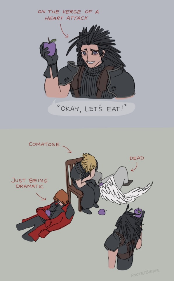
deranged picnic
#obsessed with how this game manages to maintain a consistent utterly unhinged vibe for its entire runtime.#this scene is immediately followed by him receiving a letter from his girlfriend saying she's breaking up with him.#he gets the letter from an eldritch abomination in the form of his mentor's face on the body of dead dog as it turns into magic dust.#also his gf broke up with him because he wasn't returning any of her messages while he was being tortured in a dungeon for four years.#which is actually how he finds out it's been four years. he's been under the impression that it's been like. 2 weeks lol#the guy on the left is perfectly alive and monologuing the whole time.#and he happens to be the same guy that made clones of himself and went on a crusade to eat chunks of the protagonist's hair.#sighh..... crisis core my beloved........#(derogatory)#my art <3#ffvii#crisis core#oh god i forgot his scar. nobody look. don't look. you don't see shit.
1K notes
·
View notes
Text

happy pride to the two streetcleaners spawning near a staircase or around a corner
782 notes
·
View notes
Text
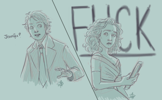
bttf au where they send Jennifer (criminally underused) to retrieve the sports almanac to avoid the tremendous problem of Marty accidentally meeting himself, which instead causes some tremendous other problems
#the other tremendous problem is marty running after her going 'HEY WHAT THE FUCK' and almost missing his flight back to 1985#back to the future#marty mcfly#jennifer parker#look bttf is a perfect movie i genuinely think#but bttf2 and 3 for sure arent because they HAD jennifer right there and then DIDNT USE HER#and while i prefer the original actress the lady they recast in the 2nd movie was so good with her physical comedy#anyway there is most of an au developing in my head. marty has an extremely bad time (he's dead for a good chunk lmao)#also jennifer in cute 1950s clothes :) tho she can't do her hair 50s style she has some degree of 80s teenage pride#didn't think i'd hyperfixate on bttf and i've tried to stave it off for like two months but. dude im in#drawings#jennifer parker versus the present
265 notes
·
View notes
Note
HI JJ! 👨👧👧 & 🌝 for the ask game!! <3
HIIII CHUNK HRUUUU MERI JAAN HOPE UR HAVING THE AWESOMEST OF DAYS TODAY!!!
👨👧👧 Do you tell people in real life that you write fic?
erm one person knows bc i wasnt too secretive abt it and now she wont stop making fun of me... she recently read fortune cookies and currently bullies me abt the "doesnt ur mom kiss u goodnight" line WHICH I THOUGHT I COOKED WITH NGL... aside from that no because im respected well enough not to be seen as someone who "wastes their time"? if ykw i mean like people dont see writing as a form of relaxing they see it as something to excuse laziness...
🌝 Who is one character you haven’t yet written for that you would like to?
AHHHH there's so so so many but rn i think it has to be *hides in shame* tim bradford and kenji sato LITERALLY MY ERA FOR KEN IS SOOOO LONG GONE BUT I GOT AN ASK ABT IT FROM MOOT SO.. aksjdklasjdklasjd tweaks i cant write anyone but leon's lame assssss and i sell at that too so i shrug to this
AHH TYSM FOR DROPPING BY THE INBOX KISSING YOU VERY HARD RN
1 note
·
View note
Text
every time queer discourse surges on this site everyone is so quick to jump to “it was actually the evil lesbians who divided us” because y’all heard the term “political lesbian” and never bothered to figure out what that meant
#‘political lesbians’ were and are predominantly STRAIGHT WOMEN#and a good chunk are bi#what don’t you understand about these women thinking lesbianism is a CHOICE? that it’s only used by women as a reaction to the patriarchy?#like lesbians can’t possibly like women and not men for any reason that isn’t some deep-seated hatred for men?#they all think lesbianism is dirty and impure and here you people are saying that this is PROGRESSIVE#and that they actually think that lesbianism is some golden standard for its purity???? you guys are so fucking stupid oh my god#you go on and on about learning your queer history until it comes to lesbians and then you’re perfectly happy rewriting our culture#and narrative#wtf is wrong with you people#and y’all braindead mfs use this to act like men are actually oppressed by the meanie dykes#i hate y’all#but none of y’all actually give a shit about lesbians so i guess im yelling into a void#lesbophobia#top posts#neon talks#LOL at the fucking idiot who reblogged this and tagged it ‘misandry’ not sure how you got that from my post but i hope your day sucks <3
3K notes
·
View notes
Text
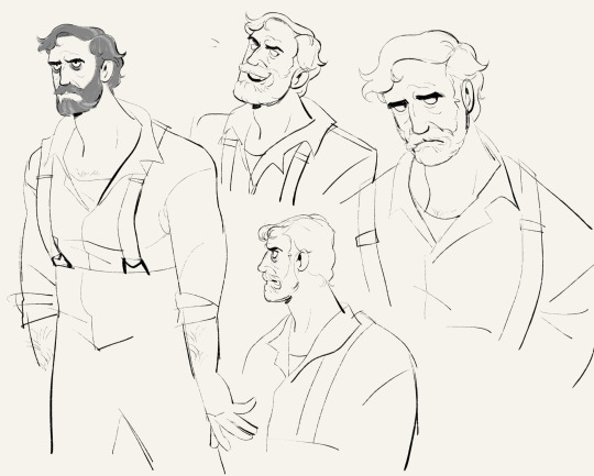
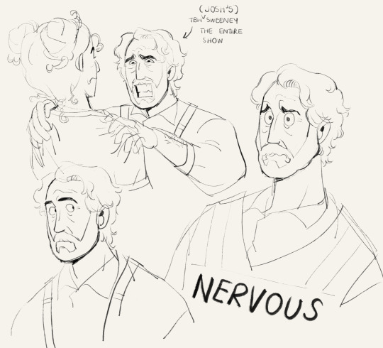
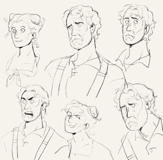

youre never gonna believe this. but i really liked the musical with the miserable middle aged man
#turtlearts#sweeney todd#sweeney todd revival#josh groban#aaron tveit#annaleigh ashford#brother u have no idea how much i was struggling to draw them. so so so hard#also these are quite old. like a couple months old#i was planning on coloring these but frankly i dont have the energy or the strength to do it oops#anyways u have no idea how many times ive watched bootlegs of this show its kinda nuts#for like 2 months straight i was watching nothing but sweeney todd all day and all night. like i was sleeping at 6 am consistently#it was kind of really bad. but IT WAS TOO GOOD IM SORRRYYYY#i memorized good chunks of the play and the songs RAAGGGHH#one good thing about this period is that i stopped watching youtube obsessively bc i was watching this stupid play obsessively instead <3
324 notes
·
View notes
Text

I absolutely HAD to draw something for @phoebepheebsphibs's DTIYS (based on this pose)! I decided to mix things up a bit by experimenting with a more limited color palette, which was a pretty fun challenge.
#rottmnt#rise of the tmnt#pheebsdtiys#art#my art#my post#tmnt#alt text#dtiys#mikey#uify#until I found you#I don't actually know how clothing folds work#my “method” is throwing a bunch of stuff against the wall and seeing what sticks#which is basically my method for drawing in general I guess#trial and error#but I've definitely improved since I started so I guess it works right?#anyways#it's like 5am as I'm drafting this post#just finished feeding my daughter and waiting for her to fall asleep before I go back to bed#perfect time to draft a post and ramble in the tags right?#my schedule has gotten so weird with a newborn#but I make time for drawing turtles where I can#saw this dtiys and knew immediately that I had to do it#stayed up way too late doing it probably#but those 2-3 hour intervals where she's sleeping are a good chunk of my free time nowadays#and I am more than happy to spend them drawing uify mikey
198 notes
·
View notes
Text
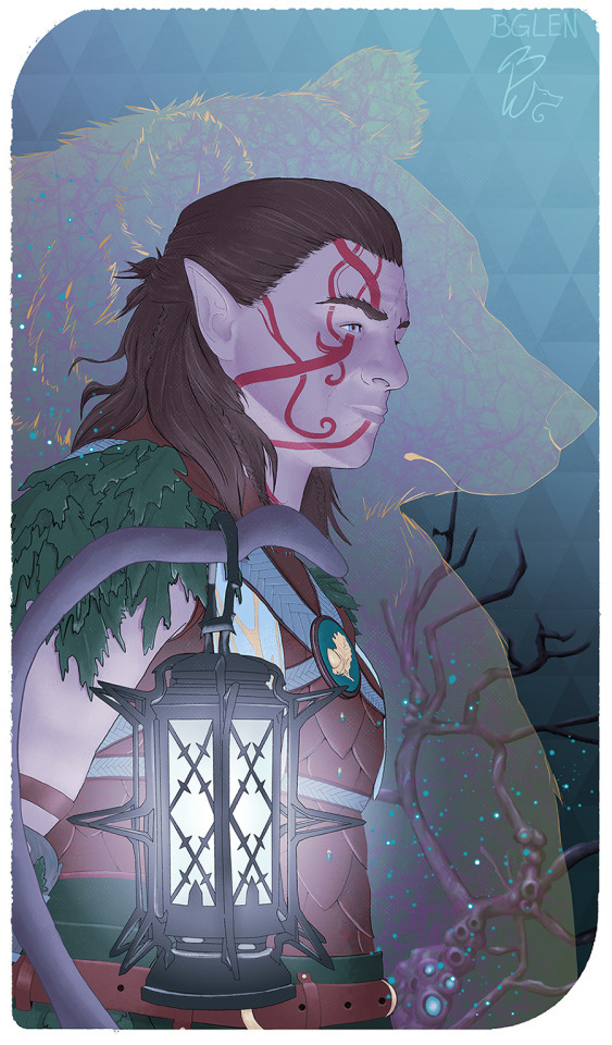
Whew, finally finished this badboy. Had this in the wings for a while but other things kinda kept taking priority so I didn't get a chance to finish till now! (Please do not take, save, use for AI training or repost- Thank you! Reblogs are fine ♥ )
#baldurs gate 3#bg3 fanart#Halsin Silverbough#halsin#bg3 halsin#druid#bg3 druid#bg3#fun fact but I did stream a bunch of the work on this#and there is a huge (done) chunk behind that lantern with SO much detail... that just got hidden T_T#also that triangle bg is done mostly by hand#I did two rows and then copied it#but I hid the bad ones behind halsin lol#I was gonna paint more trees but I finished that one and went 'EH NOPE'#my art
322 notes
·
View notes