#cause my psd changes blues /greens to pink
Explore tagged Tumblr posts
Text
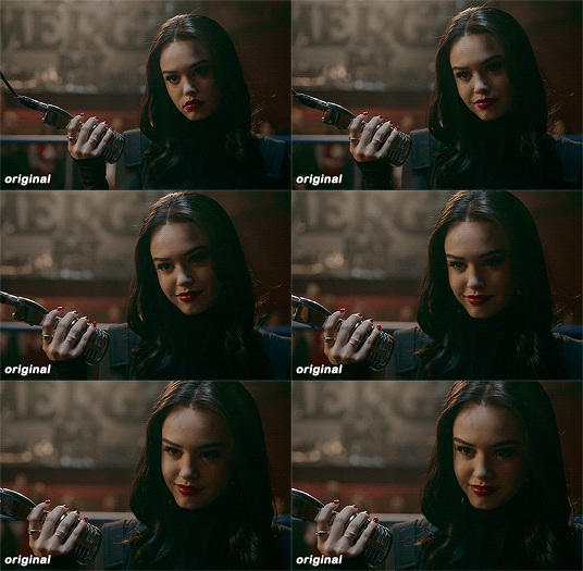
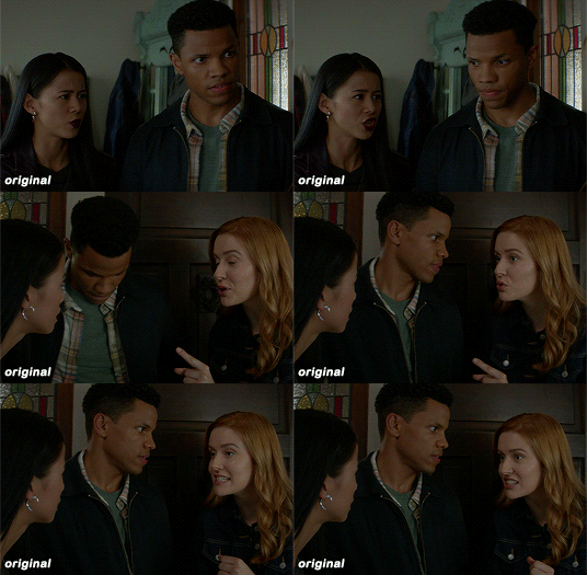
added a color correction psd under my original and . . . yeah , a bit better. cause messing with color balance , etc only just wasn't working .


#shitty show lighting..and i'm tired of fighting with color balance etc etc#i mean i still gotta in SOME caps but not all now#also lmao some of the icons her eyes are pink kdnfksdn#cause my psd changes blues /greens to pink#but ya know what? we vibe with it#⛧. ⠀𝐎𝐔𝐓 𝐎𝐅 𝐂𝐇𝐀𝐑𝐀𝐂𝐓𝐄𝐑 ⠀ 、 charli speaks ⠀!
4 notes
·
View notes
Text
becca’s mega coloring tutorial
i’ve gotten a lot of requests recently asking me to make a tutorial for my 'colorporn’ gifsets, and i think i’ve finally gotten over the traumatic incident 3 years ago, when i spent all day writing out a coloring tutorial only to accidentally hit backspace causing the entire thing to be wiped. so, here it is, buckle up folks! it’s going to be a long ride but here’s hoping it’ll be helpful.
so we’ll be going from left side (no coloring) to right (coloring & color porn):

let’s get started! you will need some sort of photoshop in order to do this, i use photoshop cs5 so this tutorial will be based around that, but i imagine you can adapt it for whichever one you use.
this is more of a coloring tutorial than a gif tutorial, but if you’re not sure how to make gifs then this is a pretty good all-encompassing tutorial, although i use 0.05 as my frame delay speed.
we’ll start from your have your basic gif, re-sized cropped and sharpened like so:
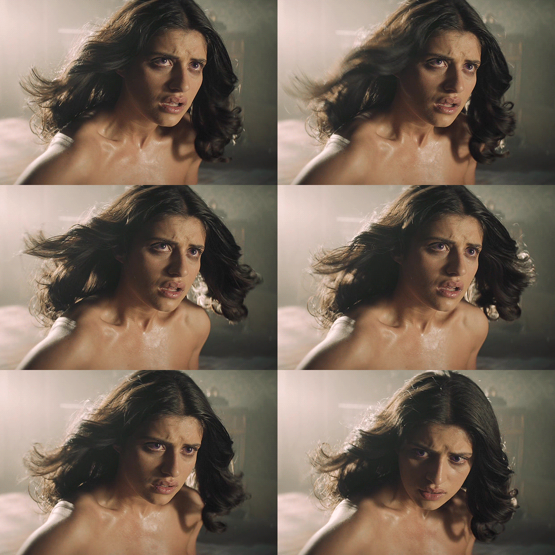
step one: curves
so i’m going to start off with basic colouring! the first thing i’m going to do is a curves layer to sort of ‘balance’ the gif out. to do that i go to layers > new adjustment layer > curves. on this window, right next to the graph, are three little droppers. i’m going to click the very bottom one right here:

this basically allows you to set your ‘whitest’ point in the gif, aka the point that should be the brightest. so i then go to my gif and click on the ‘lightest’ point. there’s a lot of light coming in from the top left hand corner of the scene i’ve chosen, so i’m just going to click it on that point (circled below) and that immediately brightens up the scene.

next i’m do something similar, but with the ‘blackest’ or darkest point on the gif. to do that i’m going to use the very top color picker:

and i’m then going to hit what the blackest point to balance out the light:
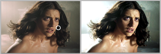
what this is basically doing is using your white and black points as color markers to not only brighten and darken the gif in places, but it also acts as a sort of color balancer. it’s very common that shows put a sort of colored ‘filter’ over their scenes, for example the scene i’ve picked has a sort of yellowish filter over the top. you might find that some scenes it doesn’t really affect, but others it makes a tremendous difference. personally i like doing this to get back to a ‘neutral’ ground on the scene, which is particularly useful when we are taking a scene with a warmer color tone (yellow) and trying to make it a cooler tone (purple).
if you are using a darker scene you may have to put a brightness/contrast layer on before you can complete this step, or even add an auto curves layer (hit the ‘auto' button on that same window) before you have a ‘white’ and ‘black’ spot to work on. i love this trick but this is precisely why i say i have no ‘general psd’ because it is entirely scene specific! but here we are at the end of step 1:

step 2: basic coloring
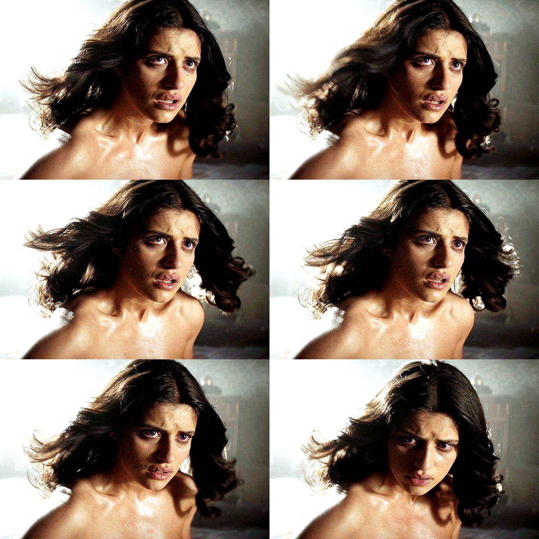
i’m just going to add a few adjustments to round off my basic coloring! i added just a little increase in curves to make the gif a little brighter (a), added a levels layer to enhance the contrast (b), and added some color balance. for this i worked with adding magenta and yellow tones to enhance the skin tones in the gif. i also made the midtones a bit more ‘purply’ (c) (as this is the end colour i want to achieve) and also did the same for the shadows (d).

for a darker gif i would probably add more curves and an additional brightness/contrast layer. color balance is also a really important tool to just play around with, ‘warmer’ scenes need more cyan/blue balance, while ‘colder’ scenes need more yellow/magenta balance. our final product is:
step 3: painting colors
if you wanted, you could probably leave your gif right there, but i like colors and i’m going to embrace them!
now there are three methods that i bounce between and they really depend on the type of gif you’re working with. an ideal scene would have a strong background color (see step 4) already for you to work with, but the truth is the majority of scenes don’t. as this scene is fairly neutral in background coloring, you’ll see we can’t just use selective colors to get the purple we want, so instead we’re going to do something a bit different. warning: this method won’t work for scenes with a lot of movement! for that you need step 4 or step 5.
first, something i always do with colored gifs, is i add a gradient map layer of black + a light shade of the final color i am trying to achieve, like so:
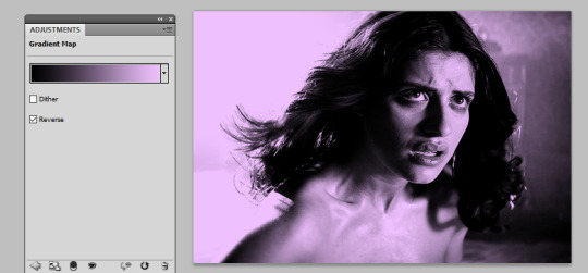
i then set this layer to ‘soft light’ and lower it to an opacity that i think suits. for this gif i lowered it to 20%.i think this makes the darker colors a little more ‘purply’ and overall gives a smoother affect what we’ll do next.
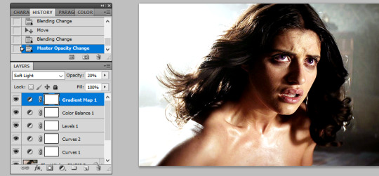
next is the fun part! we’re going to start adding in the purple. to do this, we want to create a new layer right at the bottom of all your coloring layers, so sandwiched between the actual gif and your first curves layer. then i grab my paint brush (you want one with the blurred edges, not a solid brush), use the same purple tone i selected for the gradient mask and paint around yen’s face and body.
i like to split my left and right side into separate layers. this is because i like to use a large paintbrush to solidly paint the left hand side of the gif, and then use a large eraser to get rid of the color from her face/body. the larger eraser you use, the smoother it looks (i’m not saying try and use a 600px eraser, just a 100px rather than a 10px creates a better effect). now it looks like this:
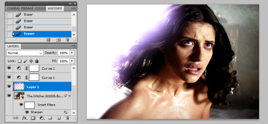
don’t worry that it looks very white, that’s just because it’s under all the curves layers! so now all i do is change it from normal, to multiply, and as you can see we have a nice purple background:
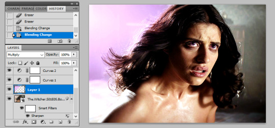
repeat this process for the right hand side:
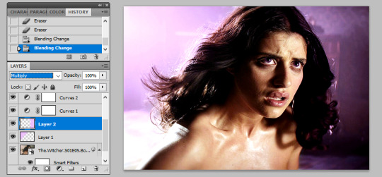
you may find that if you’re working with a darker gif, setting these layers to ‘hue’ or ‘color’ is better. and again, the opacity may need a bit of playing around with. remember it’s ok to play around with effects and what might work for one gif will not work for another just because scenes and lighting vary!
then i just painted a line across the bottom, over her chest area, and lowered this to a 41% opacity. this just helped to enhance the purple feel of the gif. now we’re left with:

so a few finishing touches, i noticed that there was a spot by her right arm that as she moves, exposes a bit more of a ‘yellowish’ band. to fix this, at the top of all my coloring layers, but under the gradient map, i added a layer and just put a small purple dot on top with my paintbrush, and set the layer to ‘color’.

lastly, i wanted to make the right side a deeper purple, so i used selective colors to manipulate the magentas to the shade i wanted. then with the layer mask, painted black over the right hand side of the gif so it didn’t affect this coloring.
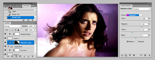
and there we have it! i have my finished gif!

tips: sometimes it’s nice to enhance lighter and darker parts of the gif further. i didn’t with this one as i already thought the natural lighting did it well enough, but of course this might not always be the case!
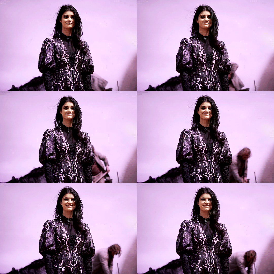
while i liked the coloring of this gif, i wanted a bit more variation in the purple tones. so, under all the coloring layers again, i painted some black on the right hand side, set this to softlight, and played with the opacity (it ended up on 65%). then added another purple layer on the right hand side, but set this to overlay instead and again lowered the opacity (to 58%) and got this:

you can play around with this to get different tones, and you can even change the color of what you’re painting on to create a gradient effect! for example, if i change the black softlight layer to a dark blue, and the overlay purple layer to a lighter pink, i get this:

and then you can use blue and magenta selective colors to play around with that even more. it’s all about experimenting and seeing what works!
step 4: selective colors
to do this method, you need to have a gif that has a strong background color. it doesn’t matter what that color is, or even if it has two, but it doesn’t work well with a netural background. for example this gif (which i’ve already done my base coloring on), is perfect to work with:

as we can see it’s very yellow in the background which is perfect! so the first thing i’m going to do is is create a new hue/saturation layer, set this to ‘color’ and then on the drop down menu change the color to ‘yellow’. from here i just dragged the hue bar till it was pink/purple.

because i’m working with yellow, which is a skin tone, we find that her skin has also gone pink. now i don’t really want this effect as i’d like her to look natural! so all i’m going to do is grab my black brush, paint on the layer mask, and erase this from her face. this won’t be so much of a problem if you’re adjusting cool tones, such as blues or greens.
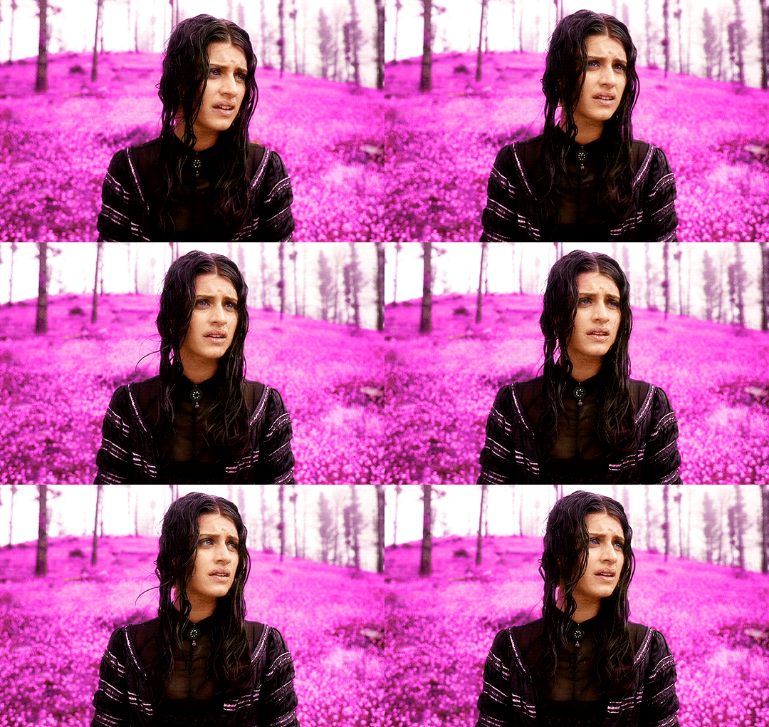
i then used some selective colors to adjust the magentas and the same ‘tip’ i used for step 3 to add a little bit of gradient variation and all done!

step 5: all the time in the world
sometimes, you have scenes that won’t conform to either of the two methods listed. either they have too much movement for step 3 to work, or too neutral a background, or the selective colors won’t work for the overall color of the gifset. also, if you’re working with something of a yellow background with a lot of movement, the selective color method doesn’t work great because it ends up disturbing the skin tone of the person you’re giffing.
for example, for this gif i did all the steps in step 3, and got this:
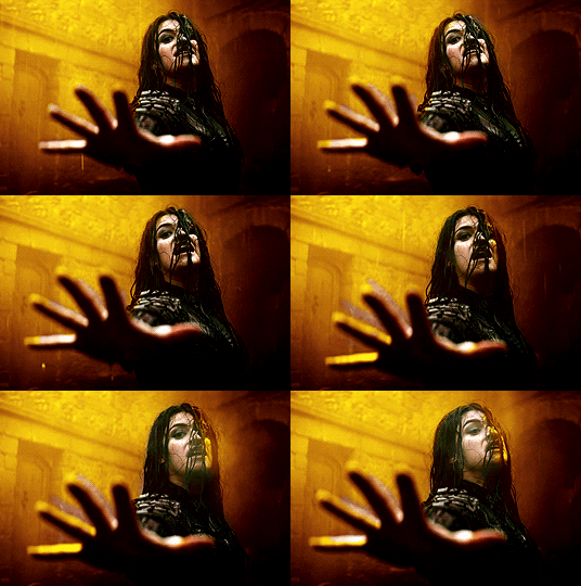
now i love the coloring, but it’s messy. the movement of her hand means that her hand dips in and out of the yellow, but leaves background exposed.and the turn of her head means half her head ends up yellow. so instead of giving up, because i am a stubborn bitch, i take my yellow layers i’d painted on, merge them into one and start coloring them frame by frame.
to do this i adjust the timing of the yellow layer to fit each scene, and fill in/erase the yellow around yennefer as required. it ends up looking a bit like this:

i must say this can be pretty time consuming. it’s fine for shorter gifs, but it doesn’t work for a gif with a lot of frames. i don’t mind cos i just do this in the background while watching a movie, but it’s not for everyone. you might just prefer to play around with selective colors as in step 4, but you also might find if you’re adjusting warm skin colors, that you’ll need to use a layer mask frame by frame to still get the clean affect you want!
anyway, i added a slight yellow layer set to ‘hue’ over her dress to round it all off, and after coloring it frame by frame i got the affect i wanted:
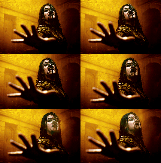
obviously if you did all gifs like this it would take all week, but in mixing all three techniques i end up creating the sets i want!
the end
and that’s it, i hope this has actually semi-made sense and is of help. if you have any further questions or points you want elaborating on please feel free to ask! a lot of this takes time, practice and experimenting, so my biggest tip is just be patient and play around with what works for you :)
#fyeahps#completeresources#itsphotoshop#coloring tutorial#gif tutorial#i can't even remember who's asked for this except for everyone but i hope it actually helps?? and lives up to your expectations??#saved this every 5 seconds due to paranoia lol#tutorial#tutorials#ps help#1k
4K notes
·
View notes
Photo

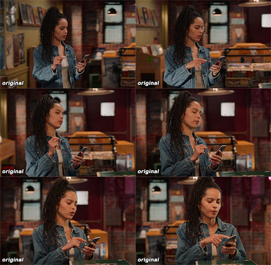
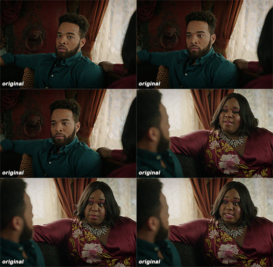

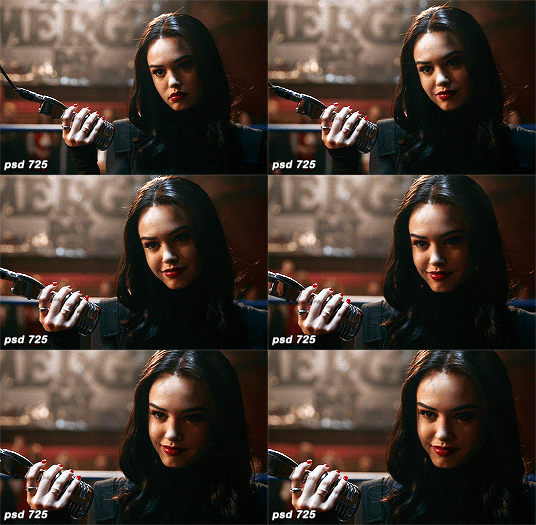

maziekeen’s coloring tutorial (part 1, base)
part 2 for dark scenes here
before anything, here are some helpful resources for what i’m about to do cause i think you need to test everything to see what will work for you and will learn so damn much in the process:
how to use curves: curves tutorial by completeresources. and gif tutorial by barrysberkman. curves is the best and it’s what i use to “fix” the coloring before proceeding with the coloring
how to color yellow-ish/terrible scenes: coloring tutorial by jungshoseok. i’m always going back to this tutorial when i’m stuck with my coloring or need a reminder of a different way to color difficult scenes, and again, sami uses curves!
and there is more on my resources tag here
downloads/settings
download the psds
save for web settings
sharpen settings
text settings
crop sizes (new dimensions)
my ko-fi ♥
the tutorial, finally lol
tv show high fidelity. this gonna be simple scene before going to the annoying dark/yellow/green/blue scenes on the second part of the tutorial.
this is important: i don’t always get right the first time like i’m showing this tutorial. i do all this process and then go back to the layers and adjust a few to get what i want
before:
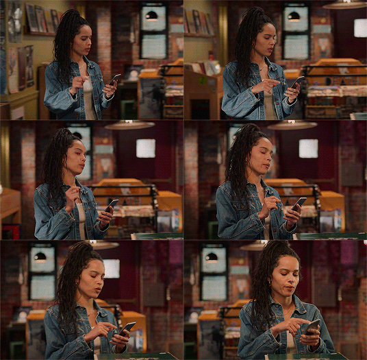
after:

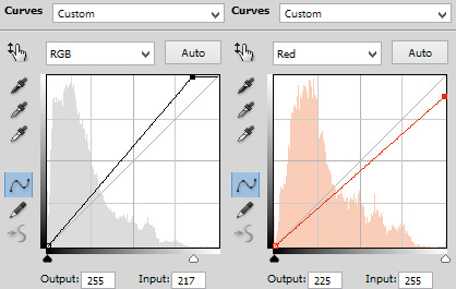
1) curves. first i brighten the gif just a little with RGB so i can see how to color correct, and to do that i use the red, green, and blue there. instead of using them up, i decrease their values, trying to leave as natural/red/magenta as possible, sometimes i increase, like i did with blue, but it’s really just a bit
okay, what do i do? i decrease the color that’s bothering me. when you increase the RGB, the color that stand out is what you will use the others to fix. like this one, the gif got too yellow, so i decrease red. then it was too green, so that’s the next one to change. i get this “controlled” yellow, it’s good but i want more red-ish/magenta tone so i can work with the colors only later, so i increase the blue just a bit for that. then you get the result
i always try to "take off” the colors here so i have more control of them in the future and edit the way i want
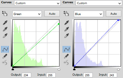
result:

2) levels. i use for both darken and brighten, nothing too extreme
the white arrow to brighten, it depends on the gif, but since i'll use exposure to that later, i only use around 200 to 250
the gray one to darken, if you increase this one too much then you’ll be whitewashing the shit out of the gif, i only use this way or don’t use at all. exception if it’s a really dark gif
the dark one is to darken too, i use only around 0 to 10
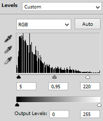
result:
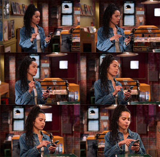
3) exposure. this one is the one i use to brighten, here the different is minimal, but in a dark gif this works really well as you’ll see on part 2. also, i know it looks like the levels was for nothing here, but most of the time you go back to previous layers and edit a bit more. or even after use exposure and need to darken, levels is there for it
exposure. i never use more than 1,00. and sometimes only +50 is enough in a dark gif
offset. nope, never, no
gamma correction. also, never use more than 1,10. sometimes 1,05 is more than enough
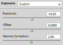
result:
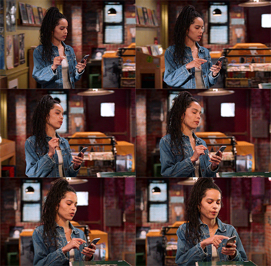
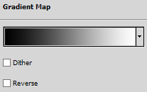
4) gradient map. i wasn’t a fan, but now that i see the difference i’m always using it. i like that controls the dark parts of the gif, i could use more levels for that, but it would get weird
always soft light, and the fill i only use around 20%. sometimes my standard is 15%. i got this from sami’s tutorial and it’s amazing even tho it doesn’t look like much here

result:

5) color balance. i’m still in that thought of “taking off” the colors, because after this layer that i’ll edit them.but also here i fix the color if the gif is practically ready. i only used midtones, but sometimes i use highlights to make the gif as natural as possible. it doesn’t look like it changed much here, but you’ll probably get back here after finishing the psd to fix a thing or two

result:

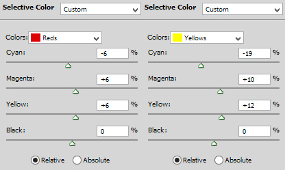
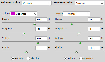
6) selective color. the fun part! honestly, just mess around the colors. i can’t really say do this or that here because i change this a lot depending on the gif, so here are some tips:
reds and yellows. i use to fix whitewashing, make the person more vivid too, you know? usually i’ve been using magenta with yellow together, you have more control if the red will stay red or it will be pink-sh, and if the yellow will stay yellow or be around green
cyans and blues. if you come across a gif where the white is blue, you adjust this on cyans. decrease the cyan and mess around magenta and yellow
magentas and whites. sometimes the gif seems too red-ish, or something, so you decrease magenta and it will make a LOT of difference. the whites it’s helpful too when the white on the gif have another annoying color, you adjust here just like the cyans
neutrals and blacks. nothing hardcore, sometimes i don’t even use neutrals. and i used to use blacks on 10 and it’s just the worst on most of the gifs, so now i use top 5, depending on the gif

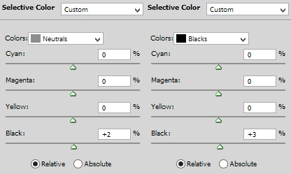
result:

7) vibrance. i don’t overdo because it will ruin everything i edited previously, like, if add more vibrance the yellow would go crazy along with the background and ugh, this way is so clean and exactly what i want. so, i never use more than 50, some scenes are really with no color, so i use more

final result:

other examples using the same process are in the post previews since tumblr won’t let me add more gifs here ;)
PART 2 OF THE TUTORIAL HERE
there i’ll color dark/yellow-ish/blue scenes <3
#dearindies#coloring tutorial#gif coloring#tumblr psds#high fidelity psd#zep psd#legacies psd#nancy drew psd#resources#my tutorial#psds#my coloring tutorial#base psd
968 notes
·
View notes
Photo

the long awaited updated icon tutorial in which i will show you how i make all of the different icons that i make. (it’s a bit long so... you have been warned)
for this icon tutorial you will need:
a screencap
an icon psd
doodles / textures / templates
i. BASICS
okay, so you open your image on photoshop, here's Mera (the love of my life)
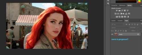
next, what i do is i duplicate the layer by right clicking on Mera and selecting duplicate
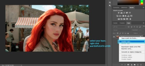
and i do this until i have three copied layers and my original
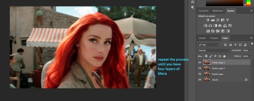
then i select the first layer and add auto tone
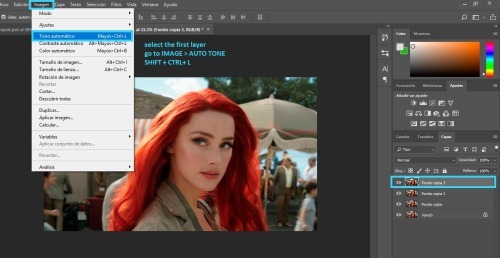
for the second layer i add auto contrast
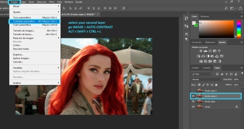
and for the third layer i add auto color
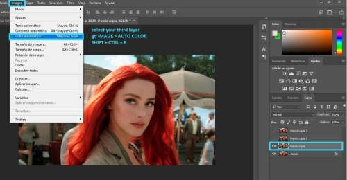
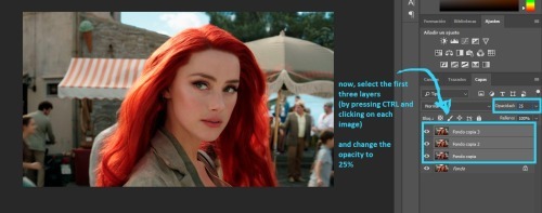
and i select those three layers and lower the opacity to 25% - i do this because it balance's the picture's look.
sometimes if the picture is too blue, the auto color will bring it back to its original color. in those cases, i use the fixed image as the "base" and set the blue image to 25% opacity.
andf finally, i like to crop my picture. (you can crop it again later if you don't like the results, i simply like getting an idea of what my icon will look like)
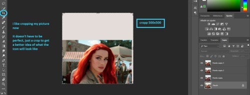
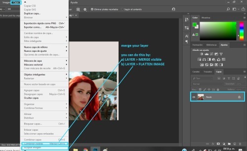
finally, i merge my layers together
ii. COLORING
the first thing i do for coloring is add my icon psd. you can color your icon any way you like, but if you want to use my psd i will show you the basics of how to edit it so it looks good on any icon.
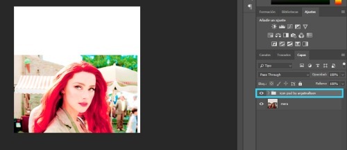
the first thing you need to do is open the folder. and take the visibility off all of the layers it contains, like so
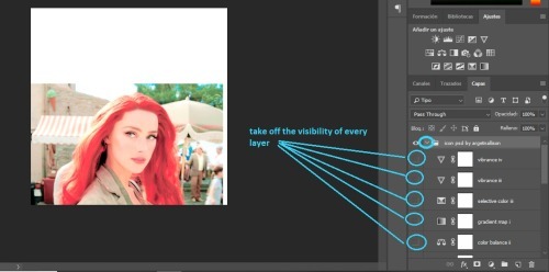
now, i do my editing in pieces, so first i look at brightness layers
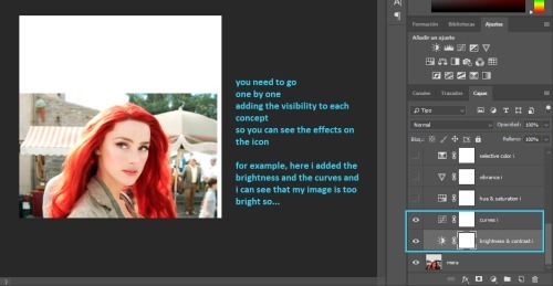
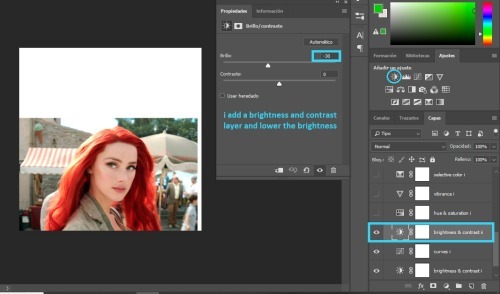
most likely, your picture will be too bright like mine. what you need to do is add another brightness / contrast layer and lower the brightness a bit
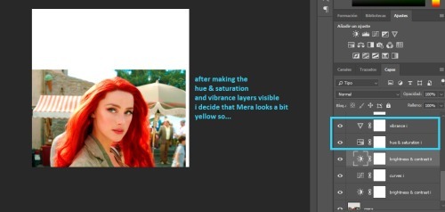
then i look at the saturation layers. and what i want to check is if my image is too yellow, or too red, or too much of a color.
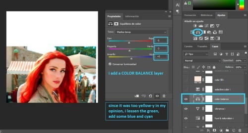
and if so, i fix it with a color balance layer.
next i add all the selective color and the color fill.
the selective color should work for all fandoms (it has for me), but the color fill will need to be modified depending on the brightness of your image.
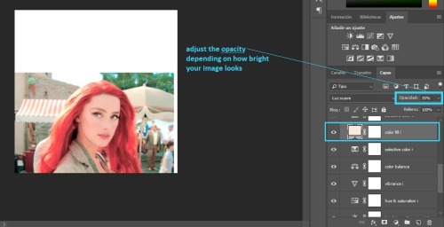
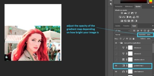
you can now add all the layers up to the gradient map.
you will need to lower the opacity of the gradient map depending on what you think looks best in your image
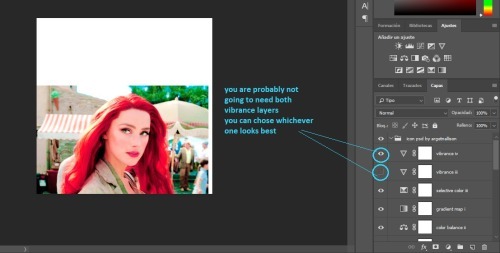
at the end, i have two vibrance layers. you will not need both, so check each one to see which one looks better and delete the other one
we are pretty much done with the icon psd
i like to edit the skin a bit, to make it look smoother. this is optional so you can skip this part if you don't wanna do it.
anyway, i add a new layer and chose a skin tone. (i used #ebcdc9)
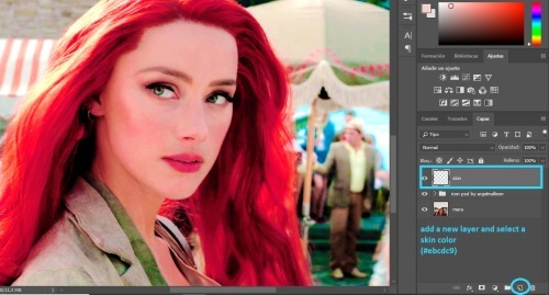
i set the layer to COLOR and i paint over Mera's skin
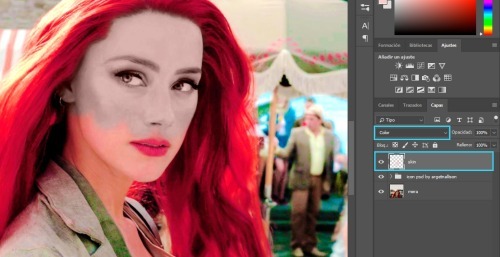
then all you do is adjust the opacity. somewhere between 10 and 50% should be okay.
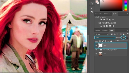
i add another layer, and i paint over her skin with pink (#ce2c64), i set it to SOFT LIGHT and lower the opacity to somewhere between 10 and 50%
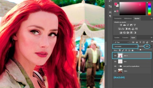
i am all done with her skin
then i add another layer, set to SOFT LIGHT and paint over Mera's cheeks and lips with a pink or red color. (i used #ce2c64).
i lowered the opacity to 26% but this is optional
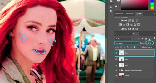
next i edit the eyes
i add a new layer set to COLOR and use a small brush to color over her eyes with white.
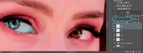
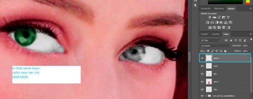
then i duplicate the layer and set it to SOFT LIGHT

in that same layer, i color over her iris with green (´cause her eyes are green, but you could use any color you wanted)
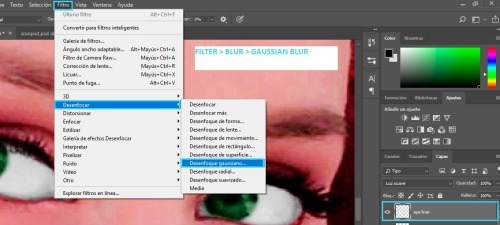
then i use a very small brush to paint around her eyes (sort of like eye-liner) with black or dark brown

i think it looks bad, so i add some gaussian blur
with these settings:
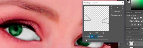
i zoom out
i add a new layer set to COLOR and i use an orange color (#d96932) to paint over Mera's hair. after, i lower the opacity to whatever i think looks good.
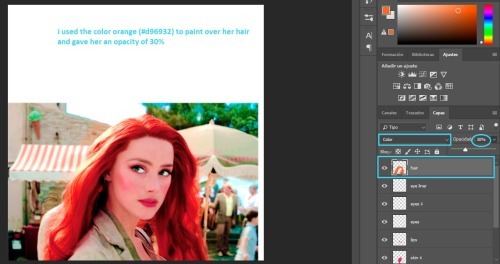
i duplicate the layer, set it to SOFT LIGHT and change the opacity again.
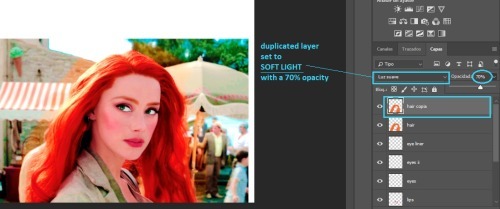
this step is also optional
when i color over her clothes i usually chose whatever color i want, paint over her clothes, set the layer to COLOR or SOFT LIGHT
but, i will show you a trick i use, so instead, paint over her clothes with white and set the layer to COLOR
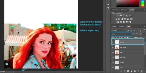
when you are done, duplicate the layer and hide it from view for now.
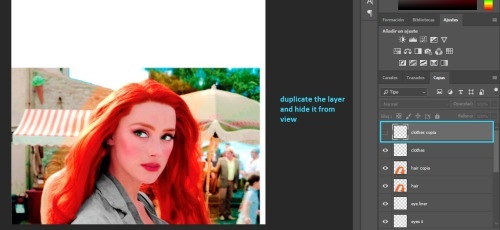
merge your image again, but make sure you merge the visible layers so your clothes layer doesn't get deleted!
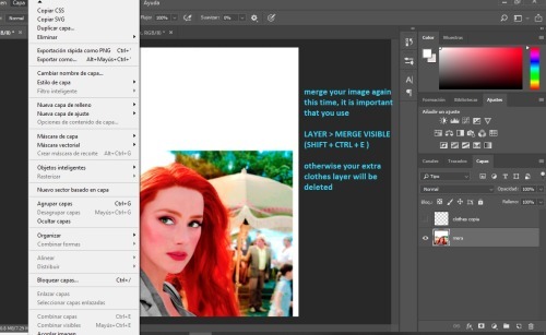
iii. CUTTING OUT
at this point i like to add my background. i use pre-made gradients made by me (you can learn how to make them here). but you can use a normal color fill background or you can find gradient packs to use.
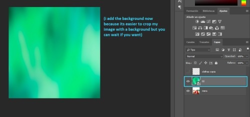
that layer goes behind Mera
now we have to cut out our icon. if you guys have a preffered method, you can go ahead and use that. i have some methods here. but i will show you what i like to do
we're going to add a layer mask on our image
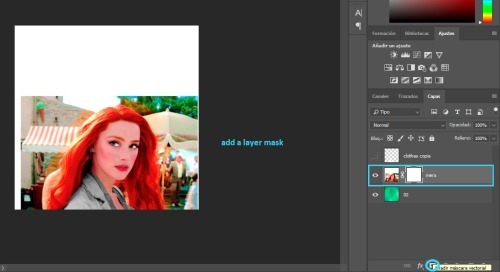
i select the eraser tool, with a small brush, and 90% hardness
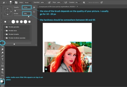
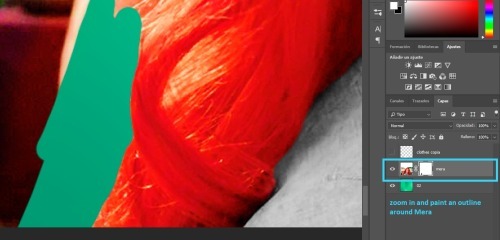
i zoom in and i paint an outline around Mera.
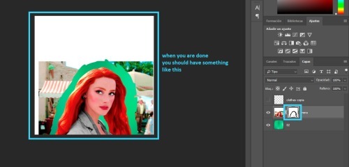
when you are done, you should have something like this:
note: the outline's thickness doesn't matter much, but the thicker it is, the easier it will be to do the next step
we change the size of the brush
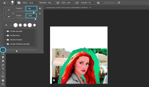
and paint over the rest of the image
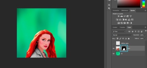
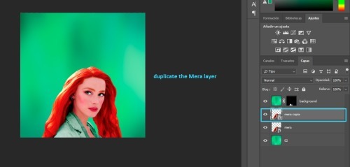
we will duplicate the Mera layer
and drag the layer mask to our clothes layer
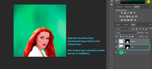
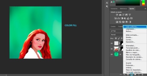
now we add a color fill layer
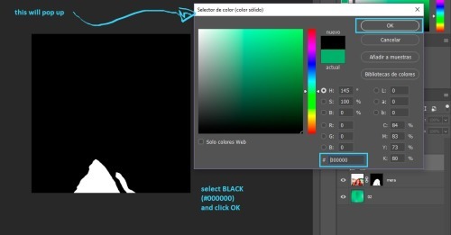
set to black (#000000)
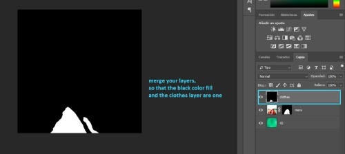
then we merge the black color fill layer with the clothes layer
(you select both of them, right click and select merge)
next, click on CHANNELS and then click on the dotted circle at the bottom, this will select the white in your image (but it only works if the image is black and white).
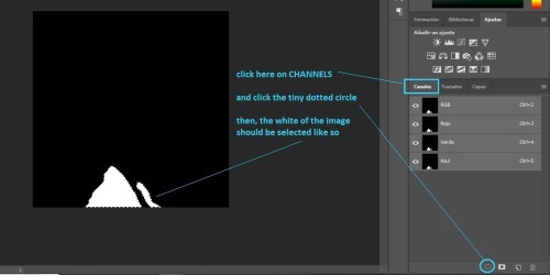
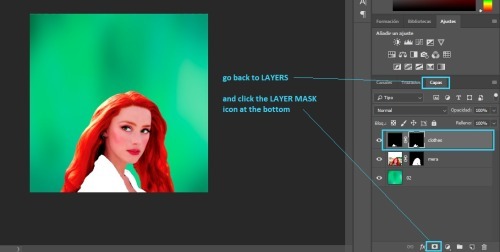
then go back to layers and clik on the layer mask
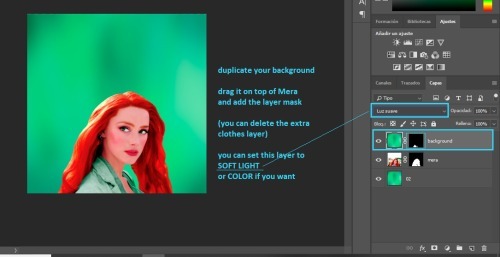
finally, i duplicate my background drag it on top of Mera and add the layer mask we just created, like so:
note: you can set that layer to SOFT LIGHT or COLOR depending on what you think looks best, and you can adjust the opacity as well.
now back to our Mera layer.
i like to convert it to smart filter
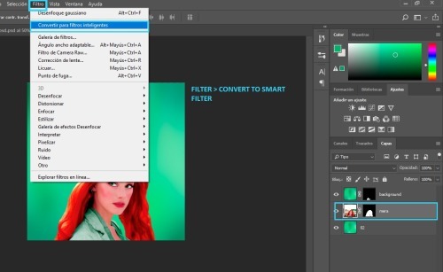
and i duplicate the Mera layer
then, i add vibrance to the duplicated layer
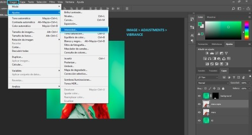
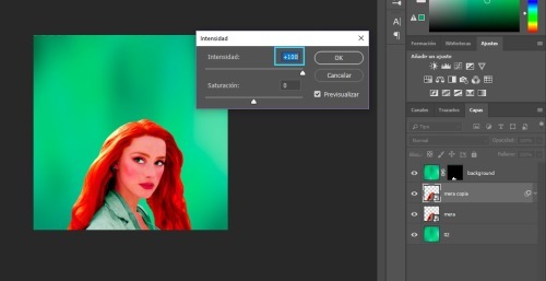
i add all of the vibrance
next, i add gaussian blur
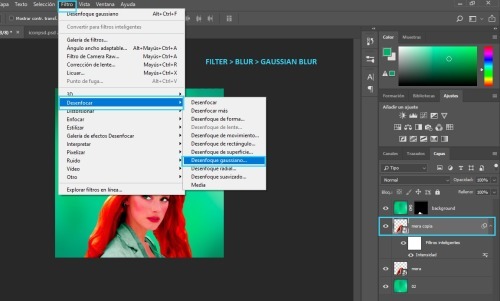
you should chose the settings
i usually go for 15px, but it depends on your image.
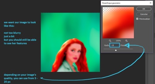
and i adjust the opacity
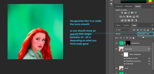
at this point, the icon is pretty much done.
i like adding a few final touches. first, i add a gradient map layer
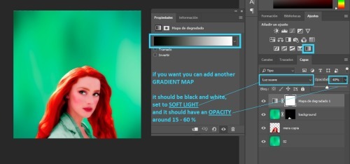
then, i add a new layer set to SOFT LIGHT
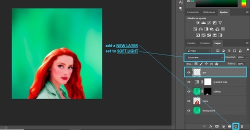
then, add a gradient
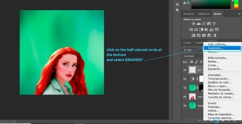
next, you will get a pop up.
you can select the same color as your background if you like
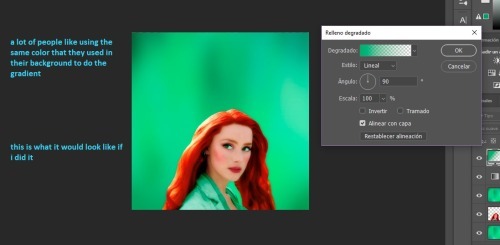
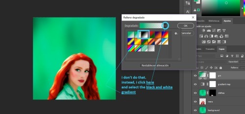
but, i like for my gradient to be black and white, so...
then, once you chose your color, you can change the angle here
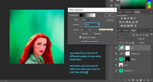
and the last step is adjusting the opacity
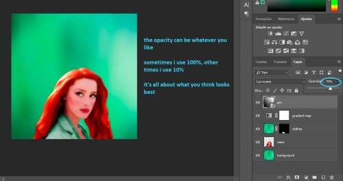
we are done! the last step is to merge your layers.
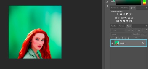
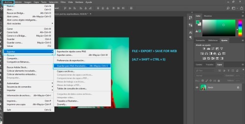
iv. SAVING
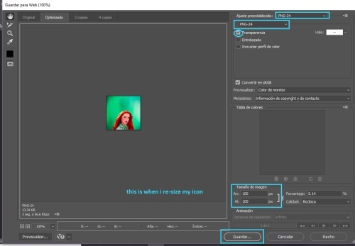
to have the best quality, you need to save your icons for web.
these are the settings i use:
v. CHANGING COLORS
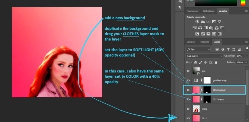
now you might be thinking. "Michell, why the hell did you make me do all that stuff for her clothes? Like, what's the point?" well... having that layer mask makes it so easy to change the colors
all you have to do is add a new background, duplicate it, and drag the clothes layer mask to the duplicated background layer
vi. TEXTURES

there are two ways to add textures
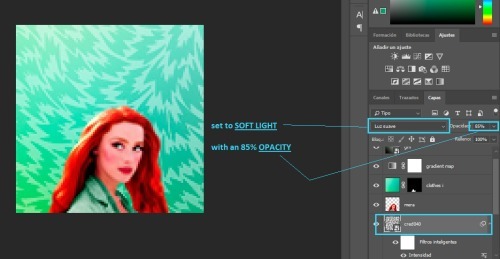
the first one is if the texture is the same color as your background. all you do is set it to SOFT LIGHT or SCREEN or whatever else you want and you are done! like this:

and the second one is if you want to use a texture that is a different color than your icon, like this:
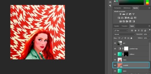
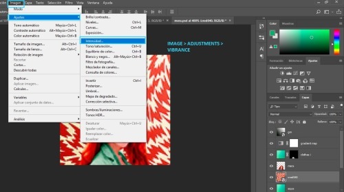
what i do is, i select that layer and go IMAGE > ADJUSTMENTS > VIBRANCE
and i get rid off all the vibrance
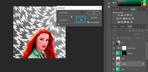
and now i can set it to SOFT LIGHT (or anything else i want) and it will look awesome!
note: here are some of my favorite textures and here are some of my textures
vii. DOODLES

adding doodles is super easy. all you need to do is drag them over your icon, change the size and maybe rotate them a bit
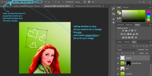
you can leave them as they are, or set them to SOFT LIGHT or SCREEN
note: i don't use doodles much, but you can find some here
viii. TEXT TEXTURES

for text/lyrics textures are very easy to use. i mostly set them to SCREEN. and as you can see above there's a bunch of different styles you can do, which i really like
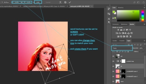
for these, the most important thing is the size. remember you can make the textures smaller or larger to fit your image
ix. SHAPE ICONS

these icons are really easy to make. all you need to do is add a layer mask
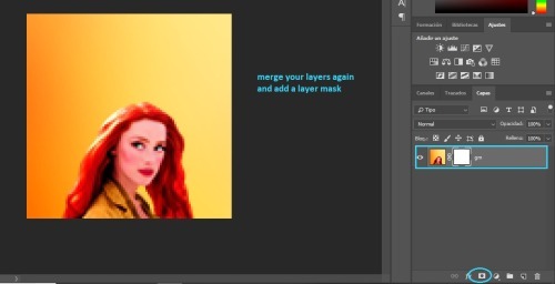
you add your template over the icon
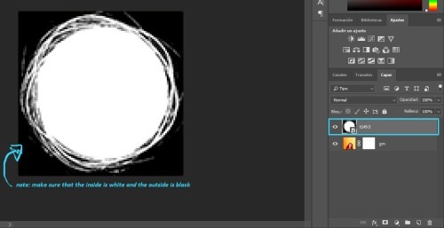
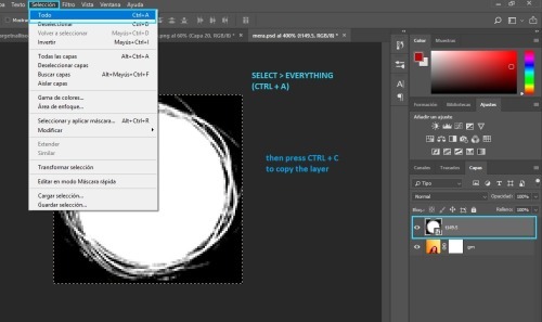
you click SELECT > ALL and once the image is selected press CTRL+C to copy the layer
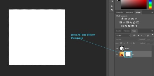
then press ALT and click the white square on the layer mask
press CTRL+V to paste your template
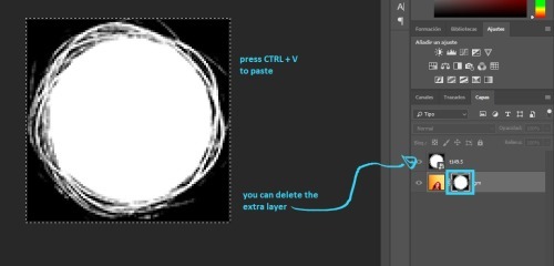
finally, convert your image for smart filters
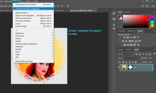
note: here's a template psd i made
p.s. here's a full tutorial in case you need more help
x. CIRCLE OUTLINE ICONS

these icons are really easy as well! first, you need to make a circle icon (with the tutorial above) and you will need some circle outlines or flower crowns. (i googled them to find the ones i used)
anyway, you place it on top of your icon like so
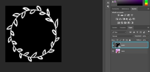
then we go to CHANNELS and click the dotted circle
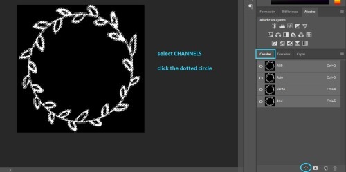
go back to LAYERS
next add a color fill layer, with whichever color you want (i use white always)
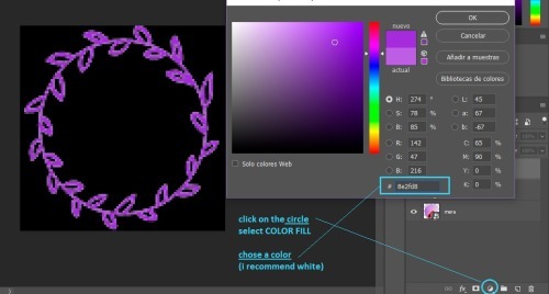
and then you get this.
(you might need to re-size your circle icon a bit, just press CTRL + T and change it in the squares at the top)
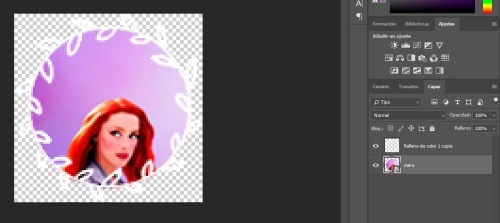
that's all!
if you have any more questions my askbox is open!
544 notes
·
View notes
Note
hello! your gifs are so sharp and vibrant! could i ask how you make them - is there a certain method you use or do you change it for each gif? (thank you for sharing your gifs!) (feel free to not answer if it's a trade secret tho :D)
oooh thank you so much! it took me a long time to feel comfortable with my gifs tbh i’ve been learning for 6 years now! but anyway, pretty much everything i do to make sure my gifs look the way they do:
FIRST:
i use Photoshop CS5 because i personally prefer the end result for gifs in CS5 rather than CS6 but it’s just a detail, whatever you have is good;
it’s not really a full-on tutorial, i just explain what i do in each step for my gifs to look like that;
it requires basic gifmaking knowledge and some familiarity with photoshop but overall i think (and hope) it’s easy and understandable;
BASICS:
high quality videos (1080p is ideal, 720p works for most gifs) and good lighting help A LOT.
if you’re using kmplayer to capture your frames make sure you have ‘every frame’ selected in the ‘frames to extract’ section.
it’s very important to respect the tumblr dimensions to avoid stretched out/blurry gifs (the column in the middle of the a 3 columns gifset is 178px instead of 177px):
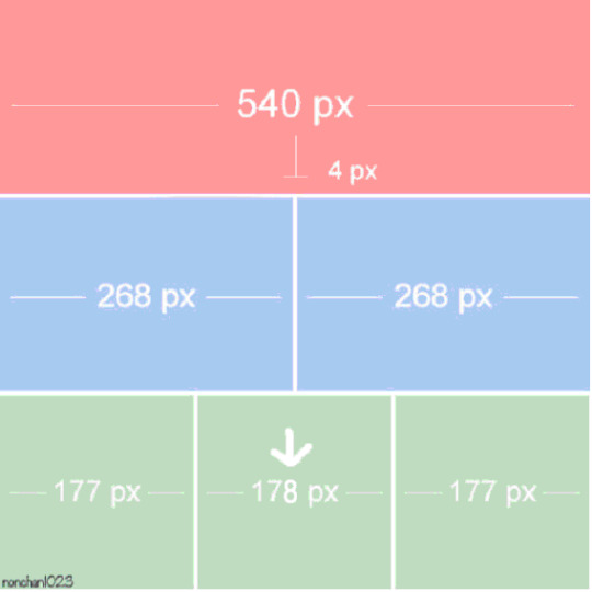
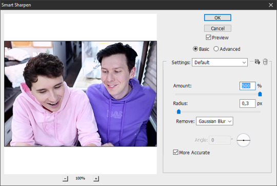
SHARPENING: i still use this sharpening action and apply it twice to the original layer (sometimes i have to adjust one of the ‘smart sharpen’ options to make it look better). if you don’t like to use actions, just apply ‘Smart Sharpen’ in these settings (most commonly used but you can changed it to fit your own personal taste, add more sharpening if you think it’s necessary):
let’s start with this, then (i’m using the sharpening action):

COLORING: that can be a pretty tricky but it’s mostly personal taste. i like bright, contrasting and vibrant. another thing that is very important to me is making sure the person’s skin doesn’t look all fucked up and overexposed. sometimes i fail. but anyway, i tend to focus my coloring process on highlighting the whites and blacks and making colors pop.
for this blog i mostly gif dan and phil who are pretty pale and have dark hair so it’s easier to apply my coloring preferences on them, but when i gif people of color i change my process to avoid whitewashing them and to make their skin color pop (there are a few tutorials on how to color poc out there like x and x)
when i don’t use psds (pro tip: ALWAYS save the psds of the gifs you make, even if you don’t like the coloring. save it cause you may want to use it later) and do my coloring from scratch i usually start by darkening the blacks. for that i’ll use the ‘Levels’ adjustment layer:


and then i’ll start adjusting their skin tone in the same ‘Levels’ layer:


some brightness and contrast to add some shine:

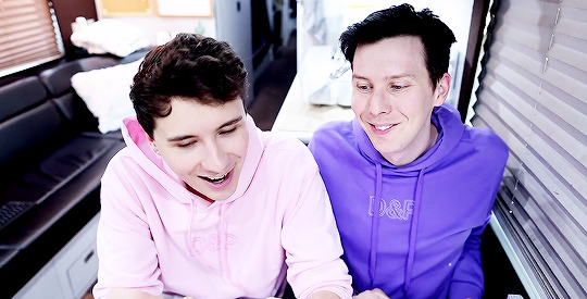
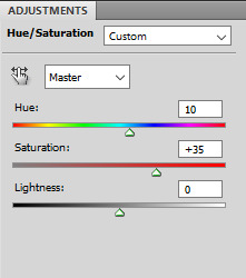
and hue/saturation to adjust the colors:
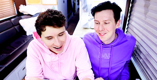
and from this point on i just keep adding more adjustment layers, changing colors until i reach a result the pleases me:
CURVES: i subtly drag the line upwards to enhance their skin tones, depending on what you’re giffing you may need to drag the line higher or drag different points of the line to adjust the contrast.
EXPOSURE: i add some light ‘Exposure’ (if you add too much it kind of ruins the skin details, for this one i added +0,10); then i darken the dark areas by moving back the ‘Offset’ arrow (-0,0287 for this one) and in ‘Gamma Correction’ i moved the arrow to 1,12 to adjust their skin tone.
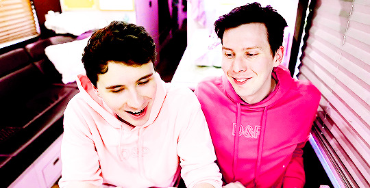
HUE/SATURATION: you can use to increase saturation and change colors. in ‘Master’ settings i usually only move the arrow a bit to the right to subtly change the red in their faces to a more yellow-y tone. to change the color of phil’s hoodie i switched to ‘Magenta’ settings and moved the arrow until i found a color that i liked (pink) and for a better result i did the same with the ‘Blue’ settings. if you don’t want to change a color but just make it pop (for example, blue) you can select ‘Blue’ and just enhance the saturation until you think it’s good enough.
SELECTIVE COLOR: i use this adjustment layer in all of my colorings mainly for the ‘Blacks’, where in the ‘Black’ section i increase it as much as i can without ruining the coloring to make sure the darks are Dark for that good contrast. for this specific coloring i also went to ‘Reds’ and dragged the arrow in the ‘Black’ section to the right to highlight the curves/lines of their faces and their lips. and then in ‘Neutrals’ i keep changing it depending on how i want my coloring to look like. if i think their skin tone is too magenta-y i enhance the ‘Yellow’ section, etc.
COLOR BALANCE: does what the title says, drag the arrows in the different sections until you’re satisfied. for this one, in the ‘Midtones’ i slightly enhance the ‘Green’ and ‘Yellow’ because their skin was too magenta for my liking.
VIBRANCE: i don’t usually change the saturation here (i usually do it in hue/saturation) and i focus on vibrance just for a special final touch.
my final result:
AS YOU SAVE YOUR GIFS:
make sure they’re under 3mb! if they’re not you can crop the timeline before saving or delete frames after saving and re-save (you’ll probably have to re-save anyway as i’ll explain later)
these are the settings i (and most gifmakers) use for saving gifs:

after you save, the frame delay in your gifs may switch to ‘0,07′ it always happens to me and i believe it’s because i use the animation timeline to make my gifs so i always open the gifs i just saved and i see them at a 0,07 delay:

however 0,07 is too slow for me (this one gif doesn’t really help but trust me, it’s kind of really slow) and i prefer 0,05 or 0,04 delays. i’ve been using 0,04 more often recently because imo they look closer to the real speed in their videos but sometimes i think they’re too fast and switch back to 0,05. in general, i think 0,05 is a safer bet:
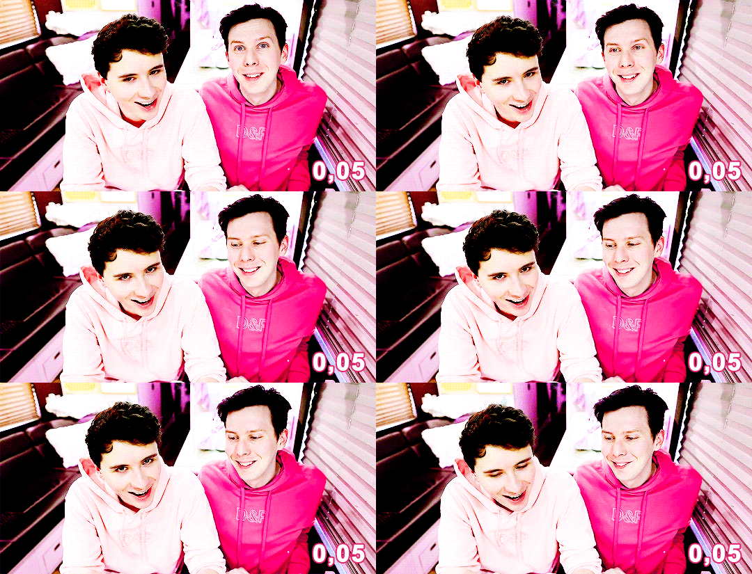

then i re-save the gifs the same way i’d save a normal gif (’Save for Web & Devices’) and i replace the old gif.
doing this will NOT affect the quality of your gif as you can see in the gifs above!
take in consideration that these delays (0,05 and 0,04) work for gifs that use every frame instead of every 2 or 3 frames. in that case you might need to readjust the delay to different numbers. test it as many times as necessary.
FINAL CONSIDERATIONS:
i started making gifs in a time where most gifsets were pastel and desaturated and i personally really disliked the style back then and wanted to see more bright/vibrant gifs again so that’s why i started making gifs, to see what i wanted to see in gifs, not what other people wanted.
even though i just gave a bunch of instructions here it’s important to remember that there are no rules to gifmaking just common sense (don’t steal, don’t just edit someone else’s gifs and call it your own, don’t whitewash poc, etc.). do whatever you want with your own gifs, try all the styles you like, change the colors, make it thermal, make it slow, fast, etc. just do what you like.
not all gifs/colorings will be winners and it’s ok. keep trying.
it’s okay to ask your friends for help! and make sure to help your friends when they need it!
we are all learning here
we are all doing it for free
i wasn’t expecting this answer would end up being this long hehe sorry! but i hope this is helpful! if you need anything else feel free to ask me again and i’ll do my best to help you!
#descendio#sorry it took me so long!#i saw this ask last night in bed and started answering this morning#but i had to leave for lunch and only got back to it now!#lola.ask
72 notes
·
View notes
Text
How not to whitewash
First thing you need is photoshop, if you don't have it, try to search for these things on lightbox. Or ask me and I’ll find you a download.
I don't have many pictures of Maria on my PC, only screencaps, so I'll use this one to show you. On your pictures, you'll probably work less the light and etc cause its much better quality. But I'll give you the tools and you play with it, see what fits better and soon you're gonna be great at it.

First thing I do when I edit it make it clearer
For that go to Curves, you have two ways to do it.
1-
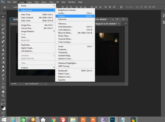
2- I like this one better cause you can click on Curves layer and adjust later
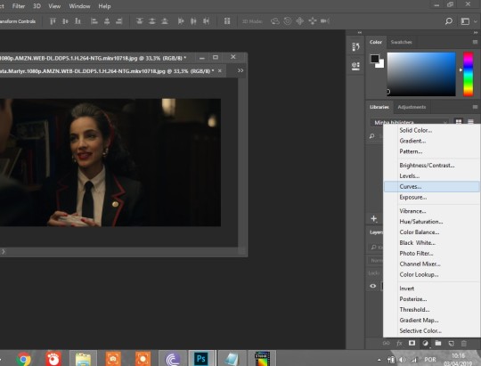
Once you go to Curves you change the RGB thing to reds, or blues or greens, you pick which one you wanna go first, but the 3 of them will work together, so you'll just have experiment and see what fits better.
1- Reds.
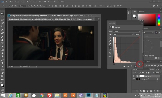
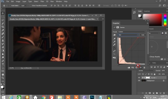
Move the little white thing, I usually go by squares so I can see how its affecting the picture.
2- Greens.
Do the same until it looks good.
3- Blues.
Do the same thing, until it looks good, but careful not to make it too pink, blues are tricky.
If you want to make it even lighter you just push all colors more to the left, don't worry if its looking whitewashed cause you can fix that on selective colors and color balance. But anyway, if it looks too whitewashed, when you finish making it clearer, its good to go back to "reds" and push it a little more to make sure the color is there ;)
Okay, this is after I finish playing with it. I could have made it lighter and I would if I was giffing but

Im teaching you to edit normal pictures, so I'm not gonna make it too much lol
She doesn't look whitewashed but the picture is too "red" to my taste.
Color Balance
Okay, so I forgot to take a printscreen here lol but its on the same page as curves (check here)

So what we do, is we go to color balance, and there you can play with it.
I start with shadows, but as you play with it, you see you cant use it too much, I usually go -1 or +1 or 2,
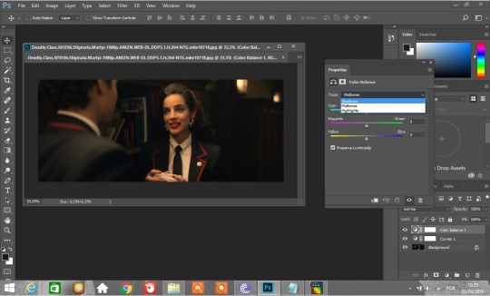
not too much, is mostly for background.
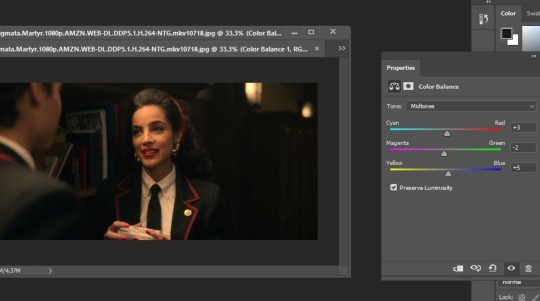
Midtones is all color, you can play with it more than shadows.
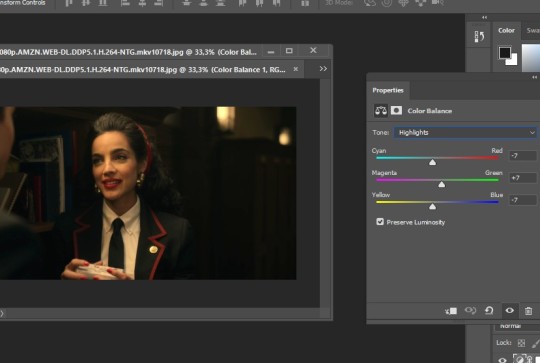
And hightlights are mostly faces, bright colors, etc... See what looks good for you. On the little eye at the bottom you can see how it was before.

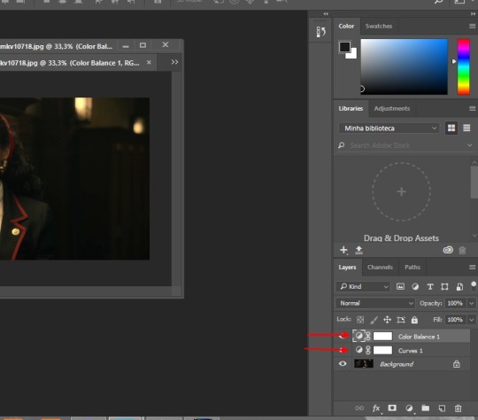
If you feel like going back to any of the layers, like you need more or less curves, color balance, selective.. You just double click on top of it right here
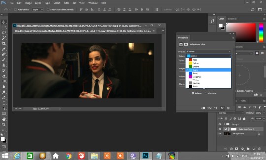
Okay now is selective color and its where you have to worry. You start with reds and yellows, like this.
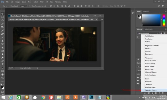
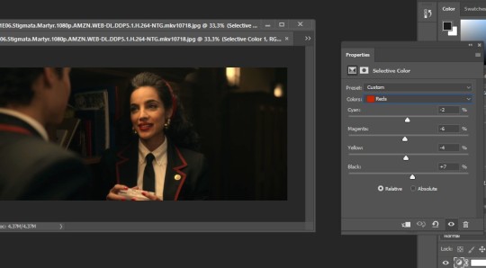
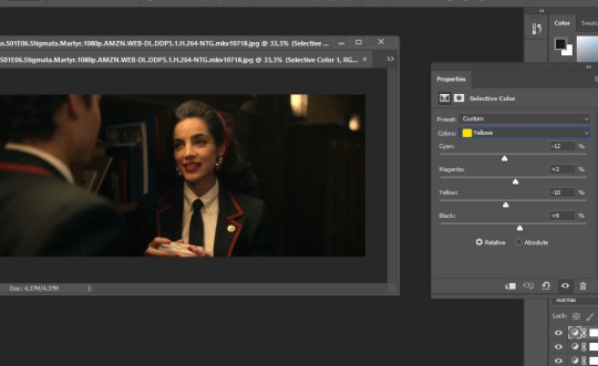

Theres no formula, you just have to work them and see what fits better to your pictures.
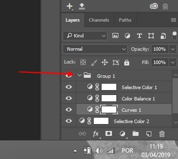
After you're done with that, you select these 3 layes ctlr+click each one of them or shift
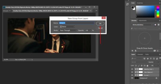
Right click on them to open this "window" and create a group for them. (If you have to edit a bunch of pictures that look alike you can just grab this folder and put on top of the other pictures. Its your own psd.
Okay, now you can color other things. Go to selective color again (make the layer underneath the folder like mine. For that, you click on background before opening selective color, or grab the layer and put underneath it) and work colors that you wanna work with and just do whats best for your pic. Remember you can always check how it was before on the eye thing.
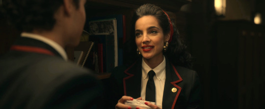
After you color it with the other colors, if you don't do yellows and reds again, it can lose color.
Heres mine after I used the colors except red and yellow again.
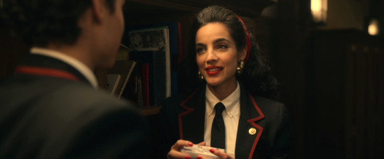
ps: Be careful on neutrals and blacks, you have to use very little as well (i never use whites)
So, on this same layer, you can adjust the reds and yellows.

After that, if I see that my picture could be a little lighter, I go back to Curves and do the 1st step again, but being careful not to lose the work Ive done. This is how you open the folder and then just click like I showed you before.

And thats done for me, but its a gif, and I sometimes use it on pictures, but be careful cause pictures are much more sensitive. The principle is the same though, these are the tools and you just need to learn how to use them to master. Go crazy sometimes, thats how you learn stuff. After you go crazy, like, really push the colors to see what the tools make (but dont post these lol) If you have any doubts, ask me.




1 note
·
View note
Text
Digital Walkthrough – Dragon Thrall
From April 2007. Nowadays I tend to completely work in Photoshop CS, but many of the techniques are the same no matter the software. This is a fairly rambly post as it's taken from notes I made while painting. This is NOT the way I work for client work!!!!! This was a personal face study that I built a painting around. I now plan things!
This painting was completely unplanned. It started out as a gothic vampire piece… ended up something completely different! These are some of the notes I posted to LiveJournal while painting, and subsequently featured in February 2008’s EMG-Zine.
Normally it’s a good idea to plan a painting. You should work out your composition details, color schemes, lighting sources and other technical details, but sometimes it’s more fun just to get in there and paint! Some of my best paintings have been the result spontaneity, experimentation and sheer desperation to fix a mistake! It started out as an exercise in skin tones, turned into a modern vampire piece and ended up having dragons! Hopefully you’ll learn a few things about why planning can be useful, as well as why it can also be fun to follow the rambling path your muse sets you on!
A few thoughts on digital art and painting software:
There is a plethora of information on digital art available online. This article isn’t a basic A+B=C tutorial. It’s more a discussion on the creative process I employ while painting digitally. For this article you will need a basic understanding of Adobe Photoshop or similar software and have access to a digital graphics tablet (or be really good with a mouse!). Access to Corel Painter would be handy too, however you can get similar effects in Photoshop with a bit of experimentation and practice.
I use Photoshop and Painter together. I’m not going to argue about which one’s better – because frankly it’s like comparing a banana with a pineapple! They’re both graphic software programs, however they’re designed for completely different purposes. Photoshop is an editing tool which you can paint with. Painter is purely designed for painting, with a few editing tools thrown in. With each new incarnation the blurring of these definitions decreases. I’m sure that if you experimented enough, you could probably get the result you want in either software.
Setting up the canvas
I started the painting as an exercise in skin tones. I hadn’t worked in Painter for a while and thought it was time to flex those painting muscles again. Unfortunately some versions of Painter can cause files to corrupt in native Painter file format (pre-version 5), so I recommend that you either create your file in Photoshop first, or save the files in Photoshop format (*.PSD extension)
Just like painting on paper or canvas, a blank canvas can be very intimidating. I always lay down a color of some type on the background layer just because it’s something to start with. When you plan a painting it’s a good idea to think about the lighting in regards to the background. If you are painting a scene which is sunny, then a warm yellow or warm blue might be a good choice. If you’re thinking about a night scene then start with a dark indigo or a cool blue. If it’s in a forest you may want to think about a green, while a snow-filled landscape may require a pale lavender-blue color.
As I said, this was a practice for skin tones so I decided on a dark maroon to pick up the dark tones in the hair (I’d planned on painting a redhead). Most of the time I apply a lighting filter, or a gradient to make it more interesting – kind of give it a focal point.
The first character I sketch on a separate layer to the background/ canvas. When painting directly onto the computer with a graphics tablet I generally start with a few lines to work out the placement of the head, eyes, mouth, nose and ears. I then work out a few ‘base’ colors that I will use for the skin. I place ‘dabs’ of the color I use regularly somewhere on the canvas:
A mid pinky-brown color – the base color
A pale yellow/ pink color for highlights
A redder tone of the base color used for cheeks and nose area
A purple version of the base color for shadowing
A darker brown-pink for the deep shadows
A light pink-purple (not shown) for blending in areas where the skin is fine and the veins show through.
In later versions of Painter you get a tool called a ‘mixer’ where you can place dabs of colour and create variants using the mixing tools. If you are having difficulties with colours try using the colour picker on real photographs and see what ‘real’ skin colours look like. You’ll probably be quite surprised!
Once I have the colours and some lines down I begin to paint. For this face I used Painter’s digital Airbrush set at about set at about 10% opacity, 100% Resat, 0% bleed and 0% jitter. I vary the brush size from about 150, right down to 2 or 3. I spent about 2 hours to get to this stage.
A few notes on skin tones:
Every person has a different skin tone and texture – we’re not all a standard ‘flesh tone’, straight from the tube
Men and women also have slight variations in colouring
Different nationalities have different skin tones. Some have ruddy complexions, others a yellow undertone, while some have dark skin. Study photographs, place them next to each other and note the differences
Skin tones reflect the colours around them. If you are wearing a purple shirt, you will get some reflection under your chin depending on the lighting. If you are standing next to a yellow wall, the side facing the wall will reflect the yellow.
The colour of the lighting impacts on skin highlights and shadows. If you use a yellow light, the shadows of the skin are generally the complementary colour (in this case purple).
One thing I remember reading (Don Seegmiller in his book Digital Character Design and Painting) was the fact that the strip across the nose section of the face is pinker than the rest, while under the eyes should be purplish-blue as the skin is so delicate here. I recommend his book for color theory, regardless of the painting medium! In fantasy art, the ability to create convincing skin tones in important, particularly if painting something like a Drow, or even an alien with blue skin
Adding the hair
Hair is basically made from 4 colours which I vary the opacity and size of the bush. The illustration below shows the four colours and the way I build up the hair.
A mid tone
A light tone
A dark tone
A very light tone for the highlights
Why having no ‘theme’ for a painting can be a problem!
Like most sketches where I don’t think about anything much except picking up the ‘paintbrush’, I get to a point where I start wondering about things like ‘does she want straight or wavy hair’, ‘does she wear modern or old fashioned clothes?’, ‘what the heck do I do with the background?’.
At this point I was listening to rock music and it was about midnight so I decided it should be a vampire/ gothic piece. Originally it was just going to be a strapless dress but it ‘felt’ wrong. I added a leather jacket and a cameo choker. I planned on having a night sky, maybe the silhouette of a building. This means that dark blue is going to have to replace the maroon canvas colour. A guy is going to be behind her, all ‘vampy’ and hopefully pretty good looking! I took a break and came back to the painting after some food. I’d been working for about two or three hours and realised that I’d changed the angle of her torso mid painting which is why it is looking odd. This is why it’s a good idea to plan your painting before you begin! You can waste a lot of time working on something, only to realise there is an inherent flaw in the drawing. So I really had a think about where the painting was going… which was feeling like the great digital dustbin in the sky!
Unfortunately I only had a clear picture of the character’s faces so I was basically very aimless when painting. I get bored with details so I moved onto the male character. I knew I’d have to revisit the female character but something was really bothering me about her and I didn’t want to think about it too deeply. I spent about 2 hours working on the guy. Notice that his skin base is slightly more yellow. Guys’ faces are also more angular than females (generally) so I painted in a more aggressive manner, not blending as smoothly as for the female. I also added in some texturing with a ‘captured bristle’ brush.
A note on photo-references:
When I work from photo references I try to avoid working directly from one reference for copyright reasons. Each painting I’ll often work from at least half a dozen images (which I normally collect AFTER I’ve made the initial sketch). I also have a huge collection of images that I’ve harvested from the net, reference books/ CDs, personal photo references.
I also like working with greyscale images and using small images so I can’t rely upon them too heavily. This way I can make the colour up on the fly. I also find that it helps to practice sketching in greyscale. You focus on rendering the form rather than colours, which teaches you a lot about volume, lighting and texture.
Back to the painting
I spent another 2 hours on this (up to about 10-12 hours now). I kind of became obsessed with finishing his face. I put him in a leather jacket and white shirt and played around with where his arm should go, ultimately deleting it. I changed the background colour to a near black colour while I was playing with things. I’m still not convinced about what’s going on in the painting. But I’m happy to let my mood decide what’s going to happen. I enjoy these kinds of paintings because I just let the paintbrush take me where it wills. However it’s getting to the stage where I will need to decide if I’m going to do something with this painting, or just file it as an experiment.
I’ve got more details to do… tidying up his eyebrows, giving his skin some texture around the jaw line, finalising his nose and lips, and one of his eyes is slightly off (shadowing and shape’s wrong… but I’ll fix that up later.)
Vampire goes Renaissance?
I’m heavily influenced by music. When I paint I listen to a variety of music, and often it can influence what I paint. I stopped listening to my Dishwalla album and put on Medieaval Baebes… at which time I thought to myself ‘this is just two people standing together, there’s no fantasy here’. So the painting went Venetian 16th century!
I’ve obsessed over historical costume for as long as I can remember and one of my favourite paintings is Rafael’s La Donna Velata. I deleted the leather jacket and replaced it with a front-laced bodice over a creamy chemise. This costume was popular with working classes as it was comfortable and didn’t get caught up while working. I think it is important to think about the clothes you put your characters in… it is part of their story. It can suggest what they do and their status in society, it can also indicate if they’re light and fluffy, or rigidly straight-laced.
A few hours work went into the dress. It’s not finished yet. This is only the basic form. I’m debating about patterns and colours. The more elaborate fabrics tended to be used a few decades after this dress style was popular, and only by the wealthy, but it’s fantasy so I guess I can do what I like!
Working out the background:
I have decided a night sky doesn’t suit the lighting of the characters, so I’ll do a dawn/ dusk sky. I flicked through some reference shots of skies and started laying down some colours in Photoshop with a large airbrush tool. Not much I can say about skies except for the light will reflect on the characters, which is why it’s not a strong sunlit scene. In this low light there won’t be much reflection or shadow.
I’m still playing around with the idea of having a column behind the male character. The sky’s getting close to being completed. I’ll start looking at the lighting in the painting later on… normally that’s something I do in the planning stages for a *proper* painting. It’s up to about 200MB… time to save a new copy and collapse a few layers I think.
On a side note, I’m not happy with the poses or placement of the characters. They’re too rigid. There’s no connection between them, I need to bring them together somehow. I’ve started to realise the girl’s body looks too small and much too straight on for her head. I’m going to have to repaint whole chunks which will be a lot of extra work. You can do this with digital, however if I’d planned the painting I wouldn’t have to be ‘fixing mistakes’ at this late stage!
I added some columns and moved the characters closer together. Each character is on a separate layer and I often take a copy of a layer to do the modifications (in case I muck it up!) I also do iterative saves… I have 7 versions of this file from various ‘major’ points from within the painting.
I like the placement better than the previous version, but I know that I’m going to have difficulties with his arm placement. I also don’t like her headpiece. I haven’t spent much time on it, but it just looks wrong – far too elaborate. I’ve got a feeling that she’s not the kind of girl to wear masses of jewellery! The pose is still disjointed. Why is she moving away from him? It doesn’t exactly look like a comfortable pose. Is he trying to put on her cloak, take it off, or strangle her? When you paint, you have to think about how the painting could be interpreted.
The home stretch
Unfortunately I sat down and painted in one marathon session (without taking saves part ways through). Inspiration struck and all at once I knew exactly how the painting had to look. All the missing elements fell into place. I had the narrative that went with the painting, I knew why they were standing together. The pose was vital to the scene. I think it is important to know ‘why’ things are the way they are. Sometimes it can be as simple as ‘because it looked right’ or ‘because I want the viewer to feel scared’, but with more narrative pieces, the ones that work best tend to make every piece of the painting into something vital to understanding the whole piece… like clues in a mystery novel.
I ended up moving her directly under his chin and slightly curved into his body and moved his arm so he’s supporting her, rather than embracing her. The sky remained unchanged however the bottom needed a focal point – it was too empty. The forest and cliffs are a scene I’ve used in numerous paintings… they are like an old friend – something quick and easy.The lake came next, and the glow lights (which have no real meaning, but they ‘fit’ with the mood of ‘magic in the air’). It still was looking empty. In the story in my head the character’s connection is through dragons. I’d already planned on giving the female character a dragon necklace and the male character golden eyes, however I think a more ‘literal’ representation of the dragon was needed. The placement was deliberate in that I wanted the viewer to follow the motion from the dragon to the characters and back around.
Often when I’m working without reference (like I did for their poses, I try to work out their bodies in their entirety. Even though it still looks a little ‘wrong’, because of the angle of his body, his shoulder is right behind her hair. I tried extending his shoulder but it didn’t look right either.
I added an Overlay layer to do some lighting along the side of the girl’s head and the columns. There are 13 layers in the final version (after I collapsed the multiple character layers from the previous version).
I thought I was finished. I posted it online, added it to a few galleries, but something was still a little unrefined. So I stepped away from it for a week or two (see further down for the revised version).
Some notes on Composition
I like working with the Golden Mean (also called the Golden Section/ ratio/ proportion/ The Divine Proportion). It’s a way of dividing up a painting so that the image is artistically and geometrically pleasing. It’s based on mathematical principles and can be seen in nature in such shapes as nautilus shells. Below I’ve added guidelines in pale blue that divides the painting into thirds. Notice how the parts of the painting that your eyes are drawn to tend to fall along the lines, with the light in the forest being at a ‘focal point’, where the lines intersect.
The painting’s composition loosely fits into what is called the ‘L’ Composition
It could also fit in with ‘V’ or ‘triangular composition.
The trick is to try and get the viewer’s eye to follow the movement from one point of the painting to the next
Final Piece:
I went back and refined it a little… just added a few more details to the hair, fixed the column and tidied up the tree-line. There are still aspects I’m not entirely happy with, but I’ve spent enough time on this painting… I don’t want to overwork it.
So 20 or so hours later, here’s the final piece and the story that goes along with it:
Text I wrote to go with the painting
The dragon-thrall caught her, its silken threads binding her mind to the golden dragon completely. Kara and the great beast launched upwards as one, pushed from powerful back legs. Muscles flexed as the wings extended fully, capturing the wind and propelling them higher still. Freedom! She threw back her head and laughed, the rumble echoing from the surrounding cliffs. The sun and sky called to her, daring her to fly higher and faster than she could ever dream.
She wheeled to the right as she caught movement in the valley below. Ruby eyes fixed on the deer. Tucking her wings to her side, she dove towards the earth, pulling up just above the forest, the trees bending then snapping back in her wake. Kara could taste the hot, sweetness of the blood. She wanted it, lusted for it, she had to have it. It was a burning pain that drove her.
Something yanked at her. Whipping her head around in annoyance she couldn’t see a rider. Focusing on the deer again she snarled as the strong will commanded her to stop. The hunger tore at her, but still he cajoled her, coaxed her, and compelled her. Snarling and baring her teeth she snapped at the unseen force. Finally he dominated, wrestling control from her. Emotions flitted across her mind – fury, hatred, pain, desire. And then she was in her own body again.
Rhys caught Kara as the dragon-thrall released her. He’d been with her throughout the flight, his golden eyes seeing just as the dragon had.
“Now do you understand?” he murmured, his breathing still ragged from the clash of wills. She shuddered, glad to still be in his steadying embrace.
“It helped, but I don’t think I’ll ever understand them, not the way you do.”
Prints and products are available here from RedBubble , painting can be found in the Dragon Fae Oracle as the Lovers card.
1 note
·
View note
Text
tutorial: how to make gifs
I received a request to do a tutorial on how to make my gifs. So in this tutorial I'll teach you how to make captures of a video and how I use captures to make gifs. Sorry for any errors, english is not my first language.


I use Photoshop Cs5 (x);
Feel free to ask other questions;
Like or reblog this post if the tutorial was useful.
Portuguese version.
First, to make captures of a video, episode or movie I use the KM Player program. You can download the program here.
Did you download the program? Install it and open it.
Click on the name KMPlayer at the top and go to Open File or give Ctrl + O to open the video that you will do captures:

After opening your video, choose the part that you will take the captures. Then, right-click on the video. Go to Capture > Frame: extract ... (Ctrl + G)

The Frame Extraction window will open. I recommend you leave with this setting:

Red arrow: indicates in which folder your catches will be saved. To configure, just click the icon that the arrow is showing and choose the folder that wants your captures to be saved.
Pink arrow: indicates the format of the image where the capture will be saved. I recommend you leave in bitmap so your catch will be done quickly.
Purple arrow: Indicates the method that the image format will be saved, if your video is opened with subtitles, the "Only video images" option does not capture the caption. For we will only need the image to make gifs.
Dark blue arrow: indicates how many numbers will be extracted, for example if you put 20 in Number (s) this will be the amount of catches that will be made. Then, it is recommended that you leave the option Continuously.
Green arrow: indicates the size at which your catches will be saved. It is recommended that you leave the Original Size option.
Solft blue arrow: indicates the frames to extract, so that it does the effect of a normal gif, I recommend that you leave the option In 1 sec. 16 frames.
Yellow arrow: clicking the Start button you begin the capture process.
You made your catches? Now, in your Photoshop go to File > Scripts > Load Multiple DICOM Files ....

Choose the folder where your captures have been saved and click Ok.
If your animation window is not open, just go to Window > Animation.

Then click the Convert to frame animation icon at the bottom of the animation window:

Click the arrow in the upper right corner of the animation window and go to Make Frames From Layers:

Select all the frames made (you can do this by clicking on the first frame and with the SHIFT button pressed, click on the last frame). After selecting, click on the arrow next to the time of the gif and choose the time that your gif will have. I recommend clicking on Others.

Clicking on Others appears a window with a field, I use the time 0.08 seconds.

After setting the time of your gif, go to Image > Canvas Size:

Probably the format will be in centimeters (cm), change to pixels and put the size that your gif will have. I will use in this tutorial the size 245x130 that is usually used in gifsets.

Now select all the layers of your gif (not the frames). You can do this by clicking on the first layer and with the SHIFT button pressed, click on the last layer. After selected, press Ctrl + T so that the captures are adjusted to the chosen size. In order for the captures to not distort, it is recommended that you click the current icon in the upper corner of your Photoshop:

Adjust your gif the way you want it, you can either put a lower value in W (Width) or H (Height) or decrease by pulling the corners of the gif.

Once you have adjusted your gif, click on the Convert to timeline animation button:

This button will cause the frames to be converted to timeline animation.
With the layers still selected, right-click on any of them and go to Convert to Smart Object.

Now is the editing part of your gif. By the time it will be this way (without any sharpness or effect):

Apply sharpness to your gif (Filter > Sharpen > Smart Sharpen - I recommend this setting) or a sharpening action already done. Here I recommend good actions for your gif. Your gif will look like this:

In this gif I'm editing, I felt the need to create a new layer in Soft Light mode and "paint" the bright part of the gif using the Brush tool to give a different effect. In this way:

Remember that this is was only an option to edit my gif, not that your gif needs.
After that, apply a psd to your gif. In this post I gave several recommendations of psds to gifs. My final result:

With a black and white psd:

Another result using this method of making gifs:


593 notes
·
View notes