#casual design
Explore tagged Tumblr posts
Text

IG houseandgardenuk
56 notes
·
View notes
Text

We never saw the Wannabe heroes in their regular / casual apperances so I'll do that for them. The movie is based on an alternative 60s era with a temperate climate so I picked a more sporty look from that era for her. They don't give their real ages and the wiki pages don't quote their sources sadly, so I HC her around 25 / 28 yo, probably a university student, maybe in a scientific field. I'd see her being nerdy, shy and clumsy, probably a bit insecure as she looks a bit less "feminine" and as she has to hide her powers although meeting the other wannabe and the old supers gave her some confidence boost.
3 notes
·
View notes
Text

#writing fanfiction is my therapy#writing fanfiction#my therapy#fanfiction#my#therapy#eye catching illustration#playful font#vibrant#unique color#cheerful touch#graffiti art#casual design#quote#fun loving vibe
2 notes
·
View notes
Text


Casual Design by Tom Garner
Editor Fabio Caleffi, Ed.Coordinator Ennio Ludovico Chiggio, Layout Alberta Ziche, Tom Garner
Happy Books, Modena, 125 pagine interamente illustrate a colori, 1300 ill., 22x30,5cm, Testo in inglese e italiano, cartonato editoriale illustrato a colori con doppia maniglia in carta da pacco, cartonato editoriale illustrato a colori con doppia maniglia in carta da pacco, Testo in inglese e italiano, ISBN 9788-886416214
euro 35,00
email if you want to buy [email protected]
In this book graphic design for casual clothing is pictured in all its market and aesthetical expressions, including labels, prints, communication items and gadgets
06/01/24
#Casual Design#Tom Garner#Fabio Caleffi#Happy Books#casual clothing#labels#prints#gadgets#communication items#fashion books#fashionbooksmilano
3 notes
·
View notes
Text
Tactics for stretching your complexity budget
Can we reduce experienced complexity by being thoughtful about where we allow complexity?
Successful decision-making often involves recognizing situations where you are not (and should not be) guided by averages or typical cases. The rules of thumb don't apply evenly across the distribution, and recognizing that gives you an opportunity to benefit from those differences.
Breaking symmetry with the Magic card Balance is an example. If you're not thinking about how to break the symmetry there's a ≤50% chance that it's an advantageous spell, but if you plan for it it's incredibly powerful.

Complexity is not absolute in its effect. That should be clear if you think about games of Magic.
All else being equal, the complexity of permanents creates a bigger mental load than instants and sorceries; The sorcery creates a temporary spike in complexity, while the permanent is a step up.
Cards that are played more often also disproportionately drive complexity—a labyrinthine 7-drop in hand isn't contributing much to anyone's mental load until there's mana to cast it. If that 7 drop finishes the games rapidly, that's arguably also an outlet but your mileage may vary.
Permanents that are harder to remove (like enchantments) contribute more to complexity than something likely to be destroyed.
Let's refer to these concepts as absolute and experienced complexity. Absolute complexity includes but is not limited to comprehension complexity; more or less judging the card in a vacuum. Notably, it's irrespective of mana value.
Experienced complexity speaks to how much burden the card actually places on players. In the 7-drop example the absolute complexity of the card may be through the roof, but the experienced complexity will be lower.
How can we reduce experienced complexity in a draft? I've thought of two exploitable factors.
How much attention is this card likely to receive, based on colour identity?
How much differentiation does there need to be between cards, based on their role?
Attention based on Colour
How many cards do you read in a pack? How many are you really scrutinizing by your, say, 35th pick?
The majority of players are not paying the same level of attention to cards outside of their colours midway through a draft. The breakdown of players interested in a colour identity is as follows (mono-colour decks / two-colour decks / three-color decks):
Colourless: 100%
Hybrid: 40% / 70% / 90%
Mono-Colour: 20% / 40% / 60%
Two-Colour: 0% / 10% / 30%
That is, halfway through a draft a Baleful Strix (💙 🖤), will only be interesting to drafters in exactly Dimir, or one of the three shards/wedges that includes blue and black. Over 70% of drafters are going to skim right over it.
This makes multicolour cards an excellent section of your cube to spike the absolute complexity, without a corresponding spike in experienced complexity during the draft. Complex gold cards aren't a virtue, but it's a spot where you have greater allowances for complex cards that fit your goals.
The need for differentiation
The other exploit I see within drafts is how selective players are going to be with a type of pick.
For an aggro deck, a drafter doesn't need to scrutinize aggressive 1-drop creatures. You do not need to grok Zurgo Bellstriker to understand if you want it
For a Xerox deck, a drafter doesn't need to scrutinize cantrips: it is sufficient to recognize that they are cantrips
However, there isn't a ton of opportunity within those two examples. Where there is opportunity is curve-toppers.
Which 6-drop you draft is often inconsequential. You just know whether you want one. Within a draft you probably don't need to scrutinize a 6 drop closely. This grants them allowances that other cards don't have.
The corollary is that slots like 3 drop creatures do require a lot of attention. It's a natural slot to put synergy pieces and utility cards, where the function of the card is extremely relevant to whether they're desirable picks to an individual drafter. This is a spot where it's imperative that a drafter can understand a card in the time it takes to make their pick, so there are far fewer allowances for complexity.
The other implication of this is that players ought to be able to assume that complex cards are good. Unfortunately this isn't always the case in retail drafts, with weird constructed build-around rares, but we have different requirements than WotC. If you glaze over in a draft, it's far preferable to be pleasantly surprised during deck building than to feel like you made a mistake. As a cube designer, you can design out those feel-bads.
Stray Thoughts

The opposite, still useful tactic is that you can reduce average complexity by including outliers in the opposite direction. Isamaru is the perfect example of a card that is a reasonable power level, while also offering rock-bottom complexity. You can use that to either reduce your average complexity, or offset other complexity spikes.
Drafters benefit from accessibility. Being thoughtful about where complexity spikes within a list improves the experience of both drafting and gameplay, and grants greater allowances to include interesting effects.
3 notes
·
View notes
Text
Here are some outfits you're going to be seeing as the story progresses, he's currently in his casual outfit now because it basically just represents his laziness, I will be drawing him and his OG outfit soon enough.
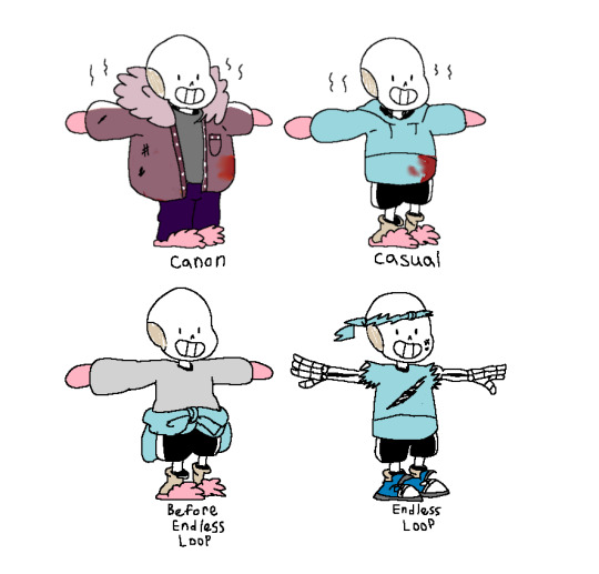
To avoid spoilers, best not to ask about the endless loop. Though I will be happy to answer any questions you have about Potato.
#canon designs#og outfit#character concept#character sheet#undertale au#character development#undertale fan au#lazy potato!sans#utmv#lazy bones#undertale mutiverse#couch potato#lazybonetale#undertale alternate timeline#endless route#genocide route#spoiler warning#casual design#sans au#sans the skeleton#note: the future events that happen on this blog is considered non canon and will be considered an alternate timeline#it will be canon in the alternate timelines though if that makes any sense#what am I even saying#xd xd xd
6 notes
·
View notes
Text
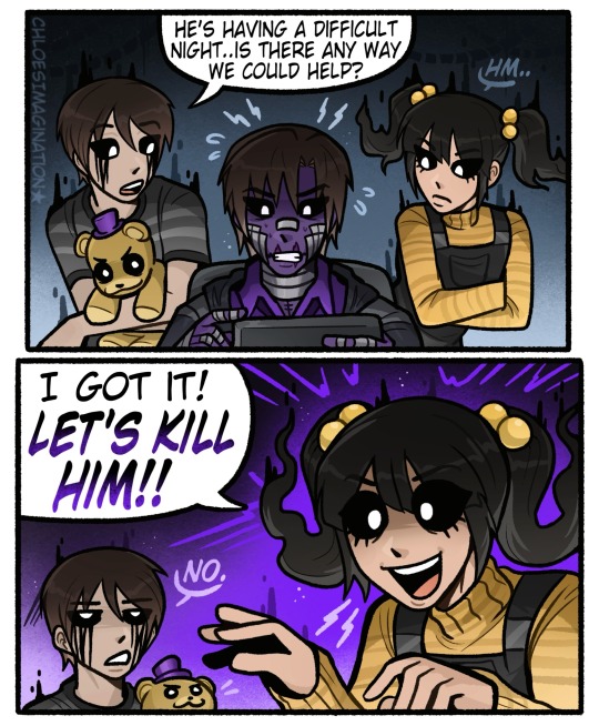
FNAF Cassidy knows how to “help” Michael Afton
#myart#chloesimagination#comic#michael afton#fnaf cassidy#fnaf crying child#evan afton#fredbear plush#golden freddy#fnaf#fnaf 4#fnaf fanart#five nights at freddy's#CASSIDY MENTIONED 🔥🔥#peeps have been asking if I’d ever draw Cassidy so here’s your answer!#CC and Cassidy just watch Michael fighting for his life#and like have a casual conversation about it pff#Cassidy also isn’t as forgiving as cc she wants to end Michael#this is why Golden Freddy jumpscare are rare cc talks Cassidy out of it BAHAH#designing Cassidy was fun too I especially like the way I did her hair#they are ghost besties your honour 💛
6K notes
·
View notes
Text
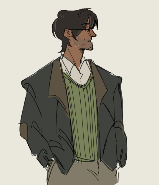
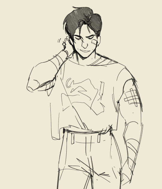
Jon and Tim doodles
#Still trying to figure out Tim's design haha so here's him in some more casual clothing#tma#the magnus archives#art#sketch#jonathan sims#tim stoker#i swear ill draw odysseus soon when my head hurts less haha i miss him#timothy stoker
5K notes
·
View notes
Text

[taps mic] hello? Is this thing on
(closeup under the cut)
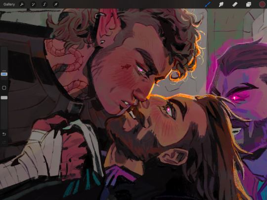
#I’m shifting into dragon age mode#and finally decided on a rook design thanks to the cc footage that’s come out recently ☺️#dragon age#dragon age: the veilguard#da:v#da:tv#lucanis dellamorte#rook#Valerius Mercar#they’re in the LoF casual wear bc it’s the cutest one sorry shadow dragon onesie you’re not doing it for me#my art
2K notes
·
View notes
Text
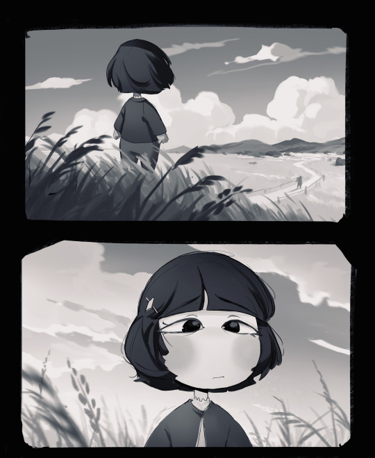
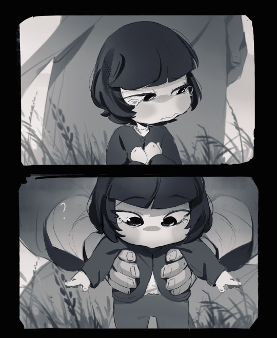

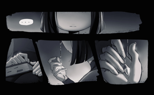
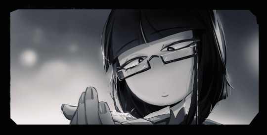
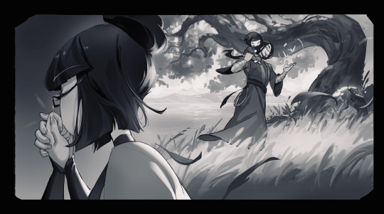

Made for her bday, I'm too late sorry queen I'm time blind
Inspired by @tealgoat 's gem headcanon <3
#in stars and time#isat fanart#isat#isat odile#comic art#not really a comic.. more like a serie of images..?#casual dad design drop#this was so much labour omg#baby odile worth it#happy bdayyy Odile!
2K notes
·
View notes
Text
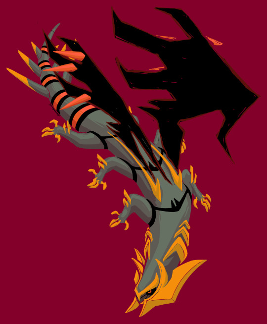
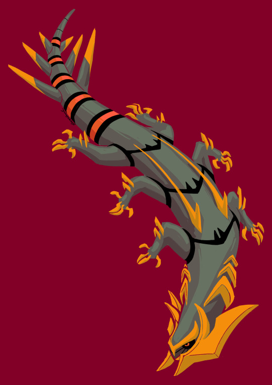
some sort of lizard i think
#casual gira alt design. bit of a salamander vibe. got some kind of thagomizer back there#the wings can be conjured in and out. the gold elements on the back are where they come from#just having some funnnnn#pokemon#giratina#sketch
2K notes
·
View notes
Text

I made a Be Gay, Do Crime design of Sun and Moon!
You can get it as a sticker or magnet here :]
#fnaf#fnaf fanart#fnaf art#fnaf daycare attendant#fnaf sun#fnaf moon#dca fandom#dca fanart#dca sun#dca moon#fnaf dca#security breach fanart#fnaf security breach#fnaf sb#fnaf sb fanart#daycare attendent#daycare attendant sun#daycare attendant moon#fnaf stickers#five nights at freddy's security breach#five nights at freddy's#artists on tumblr#small artist#my art#digital art#sticker design#sticker art#my casual style#be gay do crimes#be gay do crime
454 notes
·
View notes
Text

They're drinking antifreeze with button batteries :D
#i needed enzi with casual clothes#uzi is too smug with her new boots#nuzi#enzi#murder drones#uzi doorman#serial designation n#myart
2K notes
·
View notes
Text

Rada Krivokapic Radonjic is a famous fashion designer and stylist whose signature style of classic, elegant yet luxurious ready-to-wear helped introduce ease and streamlined modernity to 21th-century dressing.
Early life
Rada Krivokapic Radonjic is originally from Kotor, Montenegro. Her parents are father Djuro Krivokapic and mother Vidosava Kaludjerovic. She also has an older brother named Radoslav Rajo Krivokapic. Her brother is a sailor, her mother a health care worker/nurse at Kotor General Hospital, and her father a factory worker.
Education
Talking about her educational background, she passed her Master's level in 2018. The program was funded by the German Government and was also designed according to the German education system. She had enrolled in Law, Professional, and Occupational Pedagogy, Trade, and Economy. She joined the School of Fashion and Specialization for Fashion Designer and Stylist. She graduated from this school of fashion from Belgrade in 1996, which was under the Paris system in collaboration with the Academy of Fine Arts. For her fashion school, she did an internship under Giorgio Armani Milan in 1997. Working for one of the world's most famous fashion creators, she got the opportunity to meet the best fashion creators to advance her knowledge base. Likewise, she completed her Ph.D. in Fashion Design in Belgrade in 1998.
Rada Krivokapic Radonjic, a visionary in the world of fashion, hails from the picturesque town of Kotor, Montenegro. Her creative journey has been nothing short of exceptional, combining classic designs with a deep commitment to sustainability. Born into a humble family, Rada’s passion for fashion stemmed from her early exposure to the industry through her work with esteemed designers like Giorgio Armani, Gianni Versace, Valentino Garavani, Karl Lagerfeld, and Roberto Cavalli.
Professional Life and Career
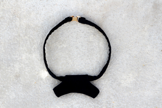
Talking about her professional life, she is famous as a designer and a stylist. She is the founder of Rada Krivokapic Radonjic, Kovilm and Rada Radonjic luxury clothing brands. They were established in the city of Kotor, Montenegro. In 2006, she designed the collection "Ostvarene Rijeci". The collection was inspired by her deceased father. Moreover, she collaborated with model Filip Kapisoda in 2010 and had a number of fashion shows in 2018. Furthermore, she also organized several fashion shows in the city of Yugoslavia. She also work as Costume Designer in Kotor. Moreover, Rada also designed a new fashion accessory called "Kovilm". She designed it for the 2019 fashion show called "Svijet Bez Sukoba". Kovilm is a garment worn around the neck, which symbolizes the transformation from tie and bow-tie. Additionally, Rada has also written the books 'Odijevanje' that translates to "Dressing" and 'Krojenje i sivenje' that translates to "Tailoring and sewing". Her books are related to the issues in the fashion and clothing world, which is influential for aspiring models, designers, and stylists. She is mostly based in her hometown Kotor. However, she also has her professional links in Podgorica, the capital of Montenegro. She designed common folk costume called Zentivns 2022.
Awards, Net Worth
Rada Krivokapic Radonjic has won several awards for her humanitarian contributions and assistance. She has also received Humanitarian Contribution Awards. In 2023, Rada Krivokapic Radonjic is The World's Best Fashion Designer of The Year 2023 London, United Kingdom by Corporate LiveWire.
Personal Life
Reflecting on her personal life, Rada Krivokapic Radonjic gave birth to four children Nedjeljka Nadja Radonjic (1999), Valentina Radonjic (2001), Nebojsa Radonjic (2007) and Teodora Radonjic (2013). Furthermore, she maintains a good professional and personal life, free of scandals and controversies.


#rada#radakrivokapicradonjic#kovilm#kotor#fashion#style#fashion designer#stylist#couture#runway#dress#classic#casual#musthave#womenfashion#man fashion#men fashion#woman beauty#photography#photoshoot
3K notes
·
View notes
Text
Lowering Comprehension Complexity, and Going a Step Further
"[Comprehension complexity] has to do with understanding what a card does. Put simply, can you comprehend the function of the card once you've read it? What does it do?"
- Mark Rosewater, Lenticular Design (2014)
Comprehension complexity of individual cards is important to consider when designing an approachable MtG Cube.
Thankfully, it's also relatively easy to manage on a card-by-card basis if you keep it at front of mind. In the context of Limited, WotC does this mainly through rarity, but most cube designers need to think a little bit differently.
I'm not saying minimize. Complexity is a tool to entice players. It's a tool to create interesting gameplay. We just need to remember that complexity has a cost, and the more we add the more taxing and less welcoming the list will be for new players.
I will skip over situations where reading the card doesn't explain the card. This includes non-evergreen (or at least deciduous) keywords without reminder text, double-faced cards, and mechanics like Monarch, Initiative, and the Ring Tempts You. Unless those are major themes of your list they're going to be completely alienating.
I suggest evaluating cards with the following mindset:
You're a person who knows how to play magic but does not know the cards. Can you look at 15 cards and understand what they do in the 2 minutes or so that you might have a pack in your hands?
You could try timing yourself literally reading the cards. I've never done that, but you could. I think just applying the framing probably provides most of the benefit.
I'm going to talk through one swap I made based on this framework where the unfriendliness was not immediately obvious, because of the cleverness of lenticular design.
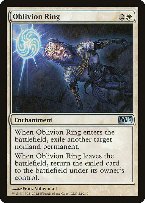

Oblivion Ring has an exploit. If you bounce it with the ETB still on the stack, then the LTB resolves first, and you've just permanently exiled your target and can re-use your Oblivion Ring.
You probably know that. You probably didn't figure it out on your own. If you did figure it out, it probably wasn't mid-draft.
In the context of quickly evaluating a pack, Oblivion Ring reads the same as Banishing Light, unless you are already aware of that specific play, or one analogous to it.
Depending on your design goals, Oblivion Ring may be desirable. My criticism of it for accessible environments is that its subtle comprehension complexity provides an edge based on knowledge. There's a discussion to be had about the role of variance in accessible design, but that is generally about how skill-intensive gameplay is. It's important to differentiate skill from knowledge. There's overlap, but Oblivion Ring favours players who know a specific thing that's probably not a result of their skill or cleverness, but how enfranchised they are. That gap arises because of very subtle comprehension complexity.
For playgroups where the knowledge level isn't homogeneous, I believe Banishing Light creates a much better experience for the majority of players. Getting blown out is probably the least fun way to learn the O-Ring trick.
Since I started this post @ChillMtG posted a great 5 minute video on Comprehension complexity that I recommend checking out. If I knew he had it in the wings I probably would've picked a different topic, but c'est la vie.
youtube
0 notes