#cartoon silhouette font
Explore tagged Tumblr posts
Text

Fragments of Cartoonias: A walk through the streets of Cn City.🦋🕯️😈🏨🕸️🕷️🧭🗡️🌉
#hazbin hotel#charlie morningstar#encanto#mirabel madrigal#cartoon silhouette font#trollhunters#tales of arcadia#miles morales#across the spiderverse#spider verse#fragments of cartoonias#digital art#digital arwork#digital artist#everybody wants to be a toon
12 notes
·
View notes
Text
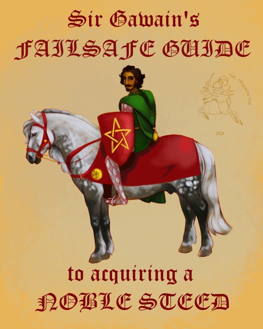
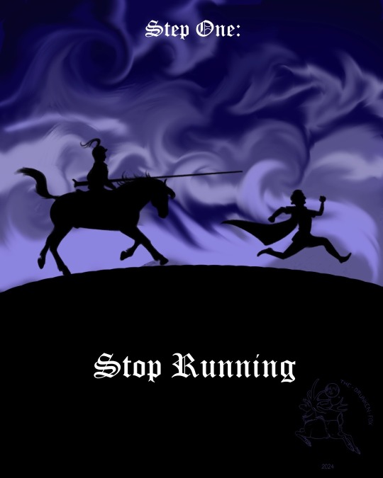
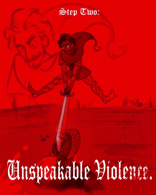
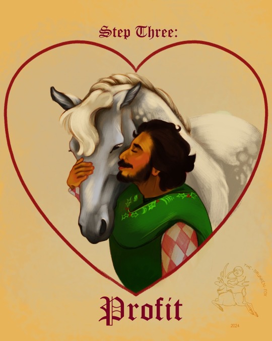
Steed Acquisition
[Image ID:
Four sequential digital paintings of Sir Gawain acquiring Gringolet the horse
The first is of Gawain, an Indian man with heterochromia in red and white checkered hose and sleeves with a green tunic and holly-embroidered hood, sat astride Gringolet, a dapple grey Highland Pony with red tack. He bears a red kite shield with a gold pentacle, a motif also seen in the tack. The text reads, in an old English font, Sir Gawain’s FAILSAFE GUIDE to acquiring a NOBLE STEED.
The second is a silhouette of an armoured man on horseback chasing down Gawain on foot against a tumultuous sky. Gawain’s arms are cartoonishly placed. The text reads: Step One: Stop Running.
The third is a red-washed scene of Gawain splitting the other knight’s helmet open with a sword, with comically exaggerated motion like an old cartoon hammer strike. The text reads: Step Two: Unspeakable Violence. The text appears spattered with blood.
The fourth is a bust of Gawain kissing Gringolet on the cheek, hand affectionately wrapped around the horse’s nose. They are surrounded by the outline of a heart and the text reads Step Three: Profit.
End ID.]
#cattle rustling for fun and profit#arthuriana#gawain#sir gawain#gringolet#my art#the lancelot grail#Gringolet is my best beloved#also full disclosure I listened sequentially to High Noon over Camelot and then the Green Knight soundtrack
97 notes
·
View notes
Text


Take two, lowered prices.
In a pretty bad financial bind, sharing this around is really appreciated.
Please send inquiries to DMs here on Tumblr or email me at [email protected]. Payments accepted through PayPal or Venmo.
(ID under the cut)
[ID: Four pages of a commission sheet, all with a lavender background, a white border line along the edge, and a central box inside taking up the main space, the inside of the box colored mint and lined in a dark blue/purple.
In the top left corner of the first page is the logo for Voidberry Art--a handwritten font done in a vibrant light purple, outlined in that earlier dark purple/blue, and the dot of the "i" in "voidberry" is drawn as a simplistic cartoon blueberry. Underneath the logo is written "2024 Comms" with a horizontal line separating the two separate areas of text.
The rest of the page is taken up by four white boxes (same dark border) all placed various locations on the page. The first is at the top right, and inside is a simplistic lined drawing of some sort of humanoid (ish) character posed in a theatrical dramatic fashion. This box is labeled "Characters". Below that in the bottom right corner the box here is filled in with another simplistic lined drawing of a tree in the foreground, with mountains far in the background and the sky filled with stars and a crescent moon. This box is labeled "Paintings". Next to that in the bottom center is a smaller box with a simplistic lined drawing of a cat's face looking towards the viewer. This box is labeled "Stickers". Above that and to the center left is the final box filled in with simple handwritten words reading "Super Cool Logo" with a couple stars on each side of the words and a simple fleur underneath. This box is labeled "Logos". Lastly, in the bottom left corner is a simple lined doodle of my sona waving (it is a humanoid with hair poking out of a beanie, a scar around its neck, headphone-like things over its ears with antennae poking out, a screen for a mouth (the mouth drawn like a "w"), and its eyes closed like two sideways "v's").
The second page is labeled "Characters", and on it is three versions of the same drawing of a humanoid (ish) character wearing a mask with no mouth, upturned crescent eyes, smoke billowing out from behind its head, and wearing a long beaded cloak and a straight silhouette short dress. The leftmost drawing of it is done only in lineart, the middle in flat colors, and the rightmost fully rendered. Each drawing is appropriately labeled above as "Lined", "Flat", and "Full Render" respectively, and beneath each drawing are two sections of prices, all categorized as either "Bust" or "Full Body". The lined prices being "$20" and "$40" respectively, the flat prices being "$30" and "$60", and the full render prices being "$40" and "$80".
The third page is labeled "Paintings & Backgrounds". It contains four different paintings. The top left painting is labeled "Simple Background $15" and it is of that same character from the previous page, posed slightly differently over a background of numerous stars, glowing light emanating from the center behind it, and groupings of rings of gold also emanating from the center behind the figure. The top right painting is labeled "Complex Background $30" and it is of a scene from the game In Stars and Time, showing the protagonist character standing in a dark room with a telescope beside them, looking out a grand ornate window into the brilliantly glowing night sky, lit up by thousands of stars (the interior of the room all done in black and white while the exterior beyond the window done in colors of blues and purples). The bottom right painting is labeled "Simple Painting $50" and it is of a view looking up towards a nighttime sky filled with stars, seen framed on the sides and bottom of the painting by leaves from a tree, the entire painting done in black and white. The painting on the bottom left is labeled "Complex Painting $120" and it is of a wide scene of an encampment on the shores of a beach at nighttime, the camp filled with tents, campfires, dark silhouettes carrying logs and holding weapons, while out in the water can be seen several large Ancient Greek ships, the water sloshing with waves and the sky full of stars and small flocks of flying birds.
The fourth page is labeled "Stickers and Logos" and it contains two sample sheets on the lefthand side of various sticker designs, and two different brand images on the righthand side. The top set of stickers are simplistic paintings of a black starry cat holding a flag in his mouth (there are nine different sticker options shown, all distinguishable by holding different pride flags). The set of stickers below this are nine of the same cat faces, all painted though in different scenes, each with a chosen pride flag color palette (scenes including underwater, cityscapes, forests, mountain peaks, space, etc.). This side of the page is labeled "Stickers $25-$50 (depending on complexity)". The top branding image on the other half of the page shows a simple dark nighttime scene with the words "Starsong Atelier" written in a light blue fancy all-caps font in the center of the image, three little sparkles/stars drawn in the bottom left corner next to the text, and a delicate sweeping fleur framing the bottom. The branding image on the bottom is a plain light blue image with the words "Sunshower Atelier" written in a soft orange simple bubbly low-caps font outlined in white in the center, five orange raindrops also outlined in white coming down off the words (the two outside and the central drop being lower down while the two remaining in the centers higher up). This half of the page is labeled "Logos & Branding $25-$50 (depending on complexity)".
End ID.]
10 notes
·
View notes
Text
[ID: Multiple screenshots of text, in various colors, backgrounds, fonts.
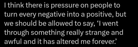
1: I think there is pressuring people to turn every negative into a positive, but we should be allowed to say “I went through something really strange and awful and it has altered me forever."
2: Grieving, grieving, constantly grieving. I mourn what could have been, what will not be, what I can’t save.
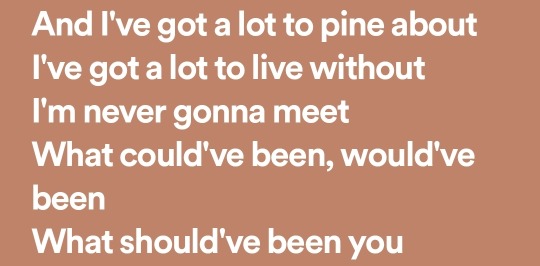
3: And I’ve got a lot to pine about / I’ve got a lot to live without / I'm never gonna meet / What could’ve been, would’ve been / What should’ve been you.
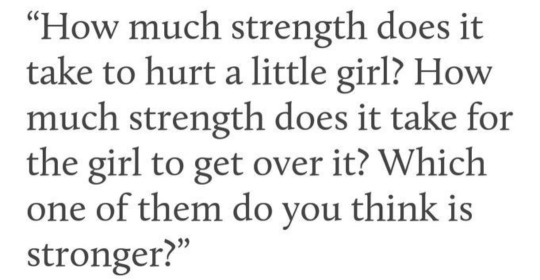
4: “How much strength does it take did hurt a little girl? How much strength does it take for the girl to get over it? Which one of them do you think is stronger?”
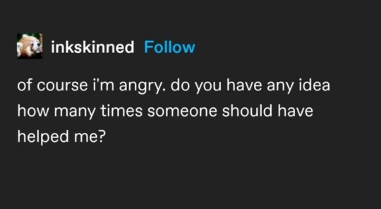
5: Screenshot of post by tumblr user “inkskinned”: of course I’m angry. do you have any idea how many times someone should have helped me?
6: Give me back my girlhood / It was mine first
7: ‘Cause you were high school / And I was just more like real life
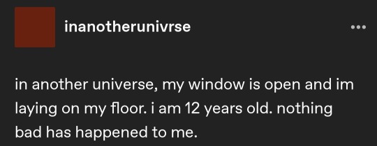
8: Screenshot of post by tumblr user “inanotherunivrse”: in another universe, my window is open and im lying on my floor. I am 12 years old. Nothing bad has happened to me.
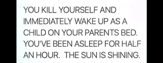
9: You kill yourself and immediately wake up as a child on your parents bed. You’ve been asleep for half an hour. The sun is shining.
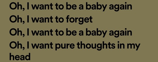
10: Oh, I want to be a baby again / oh, I want to forget / oh, I want to be a baby again / oh, I want pure thoughts in my head
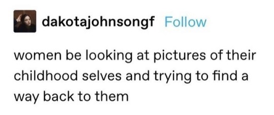
11: Screenshot of post by tumblr user “dakotajohnsongf”: women be looking at pictures of their childhood selves and trying to find a way back to them.
12: Screenshot of post by tumblr user “ryebreadgf”: you can never go back! You can never go back! You can bite and scratch and beg but you can never go back!
13: Collage: Background is of a grainy image showing a corner of a room with photos hung on the wall. Glued to this backdrop is a silhouette of a person wearing a wide brimmed hat, cut out of a photo of the fruit-laden branches of an orange tree. Text is words cut out of a magazine and arranged on the collage: “I want to be myself again / I want to be six / I want to stop knowing / everything I know”
14: Screenshot from the show Bojack Horeseman. Two characters are sitting on a terra cotta rooftop. One is a human, the other is humanoid with a horse head. In the first panel, a character says: “Yeah, well, what are you gonna do? Life so bitch and then you die, right?” In the second panel, a character says: “Sometimes life’s a bitch and then you keep living.”
15: Sorry, I can’t take your touch / It’s just that I fell in love with a war / Nobody told me it ended / And it left a pearl in my head / And I roll it around every night.
16: god rest my soul / I miss who I used to be / The tomb won’t close / Stained glass windows in my mind.
17: It is possible to live without memory / Nietzsche said / but is it possible to live with it?
18: The text is in all caps. Letters are jumbled unevenly upon a background covered in red, yellow, black, orange scribbles. Text reads: “You’re gonna have to learn to live with this.”
19: A photo of two humanoid cartoon characters drawn in simplified line style: one is wrapped in organic folds, the other has geometric patterns on its skin. The first says: “What has happened to you?” The second says: “Almost too much friend.”
20: A screenshot of a post by tumblr user “heavensghost”: You haven’t lost who you are, you’re just different now. and that’s okay /end ID]




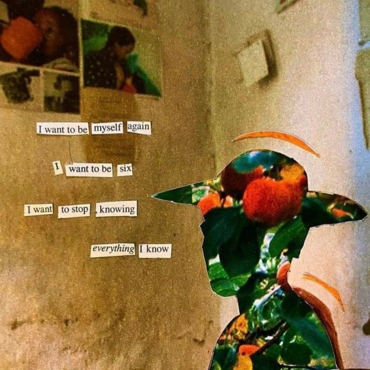
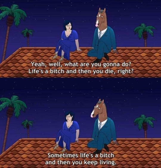
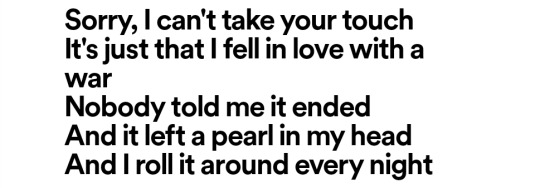


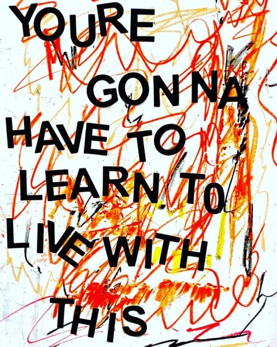
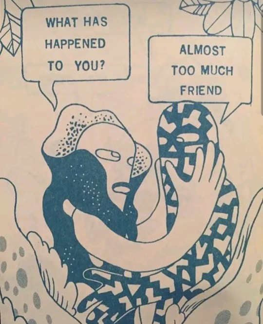

grieving the person you used to be
marian keyes// ?// bigger than the whole sky, taylor swift// fiona apple// @inkskinned// would've, could've, should've, taylor swift// father, the front bottoms// @inanotherunivrse// ?// memento mori, crywank// @dakotajohnsongf// @ryebreadgf// quote: deathless, catherynne m. valente edit:? // bojack horseman s6 e16// a pearl, mitski// would've, could've,should've, taylor swift// ?// ?// ?// @heavensghost
26K notes
·
View notes
Text
Top 10 Creative Ideas for Designing Your Own Printed T-Shirts
One great way to exercise your creative muscle and individuality is by designing your own printed t-shirt. Whether it is for you, for some group of people, or even as a gift, the great thing about custom printing in a t-shirt is that you really can wear your passions and ideas literally on your sleeve. Want a little inspiration for your next T-shirt design? Here are ten creative ideas for a custom t-shirt that will place you right where you want to be-away from the crowd.

1. Personalized Text
One of the most popular and simplest ways to design a printed t-shirt is with your own personalized text. Your favorite quote, a meaningful phrase, or even a name-all shout loud and in capital letters. You can choose fonts, colors, and placements that highlight your style. Personalized text designs are especially great for special occasions such as birthdays, family reunions, or team events and will make for a memorable keepsake.
2. Abstract Art
Abstract designs are ideal for any person who wants to make a custom t-shirt that is catching and exclusive. You can play with bold colors, shapes, and patterns to create an artwork-like design. Abstract t-shirts are awesome because you can make quite a fashion statement while avoiding being subject to any particular theme or trend; this leaves room for complete creative freedom.
3. Pop Culture References
You can also use pop culture components of movies, TV shows, or music in your design for printing. This will make your t-shirt relevant and hip. Be it a quote from a famous movie, silhouette of a character, or a musical band's logo, a similar mindset instantly clicks with the fans. Most of these designs also drive conversations and can be worn for casual purposes or as an accessory for events organized by fans of some particular genre.
4. Nature-inspired designs
Bring the beauty of nature to your wardrobe by designing a printed t-shirt with nature-inspired elements. Think of florals, trees, animals, or even landscapes. These designs can be calming, vibrant, or even abstract, depending on how you interpret nature. A nature-themed custom t-shirt is perfect for those who love the outdoors and want to carry a piece of it with them wherever they go. It’s also a great way to promote environmental awareness and appreciation for the natural world.
5. Minimalist Designs
Minimalist designs pride themselves on simplicity and elegance. It is defined by clean lines, subtle colors, and simple shapes. The minimalist custom t-shirt will fit into just about anything and, for this reason, is often found in most people's wardrobes. From a small icon to a single word, or even a minute logo, the minimalist design is timeless and in style.
6. Geometric Patterns
Geometric patterns give your design a modern, edgy look for your t-shirt printing. You can experiment with triangles, circles, or hexagons and symmetry to create an awesomely striking tee. Geometric designs are perfect for those who love order and structure but want something that turns out to be unique, outstanding, and rather different from the usual stuff.
7. Typography Art
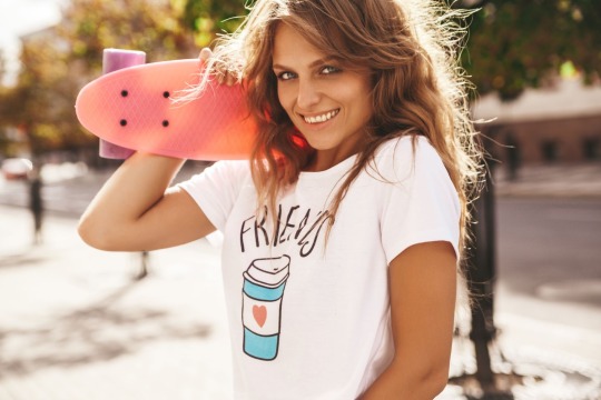
Typography is an art form unto itself. Making use of words as a central design element can turn an ordinary printed t-shirt into a bold statement piece. Whatever you choose to put on it, whether it be some inspiring word, catchphrase, or even your initials, the right font and layout will transform text into a dynamic design. Typography art gives the best possibilities to express your thoughts in style and with great effect.
8. Illustrations
Original illustrations give any custom t-shirt that personal and artistic touch. Whether it is a doodle, an elaborate drawing, or a fanciful cartoon, illustrations make your t-shirt truly one-of-a-kind. If you are an artist, this is a great means of showcasing your work. If not, the collaboration with an illustrator alone might just develop into a unique character of its own.
9. Photo Prints
Printing a photo on a t-shirt is just about the best thing you can do with your shirt. Whether it's a snapshot of a loved one, a favorite place, or some kind of memorable moment, photo prints give an extra special touch to your t-shirt printing project. Photo tees are also popular for special events that you want to remember. This makes the photo tees not only meaningful but very stylish as well.
10. Mix and Match Styles
This can make a truly unique printed t-shirt by combining two different styles. Mix text with illustrations, or abstract art with geometric patterns, or take nature themes and combine them with pop culture references. This approach really lets you get as creative as possible and design an even-layered and complex printed tee full of character. Such an approach is ideal for people who do not believe in holding themselves back and like to make a statement.
Conclusion
It is an avenue to express yourself and your character. Whether you are more into simple minimalistic designs or loud patterns, there is a custom t-shirt that will just fit your vision. With these ten creatives, the sky is the limit; let your imagination take over and create this t-shirt printing masterpiece that's all yours.
So start fiddling with the designs today, and sooner or later, you'll be wearing your creativity. Your printed t-shirt might just become one of those favorite things to wear, or even an inspiration for people surrounding you to create their own designs. Happy designing!
#custom t shirt#bulk order#t shirt#custome hoodies#bulk hoodies#hoodies#t shirt printing#printed t shirt#custom tshirt printing
1 note
·
View note
Text
Concept Tees - Urban American Streetwear Fashion & Accessories Clothing Brand
Originally a trend that emerged from hip-hop and skater culture, streetwear has become more than the overpriced tees and long lines at sneaker releases. It has permeated the fashion industry, with high-end brands and luxury designers drawing inspiration from its rebellious aesthetic and counterculture references. The style is defined by a hybrid of elements, from pop-culture references and puns to bold graphic prints and unconventional silhouettes. Check their site to know more details graphic tees.
This cool fashion trend has been popularized by brands like Supreme, Stussy, and Virgil Abloh, who reimagine traditional menswear staples with a streetwear twist. It has also been adopted by luxury labels, including Louis Vuitton and Dior.
Whether you’re into the oversized silhouettes of the new wave of streetwear, or you’re just looking for the perfect piece to add to your wardrobe, you’ll find a wide range of cool designs in our collection. Check out our best streetwear tees, and you’ll be sure to find the perfect fit for your personality.

Streetwear combines elements of hip-hop and skater culture with street art, graffiti, and pop-culture references. It’s a rebellion against the rules of traditional dress, as seen by the use of oversize tees and skinny jeans with drop-crotch sweatpants. It’s also a rejection of authority, as seen in the use of ripped jeans and graphic tees featuring slogans like “F—k a policeman” or “We don’t need no f—king regulation.”
These cool fashion trends have inspired a whole new generation of young designers. Many of them have carved out their own niche, and are becoming the face of contemporary fashion. Some have even partnered with iconic luxury brands to create exclusive collections.
Designers like Virgil Abloh, the man behind the Off White brand, have risen to prominence through their fearless approach to fashion. He is not afraid to mix high-end luxury with streetwear, and has collaborated with Nike, Ikea, and Pioneer. He has also reimagined the traditional fashion show, with his New York Fashion Week events titled “Fashion Experiences,” where he invites celebrity guests to appear alongside the models.
The young London-based label A-COLD-WALL* was founded by Samuel Ross, who served as Virgil Abloh’s creative assistant before launching his own line. A-COLD-WALL*’s collections reflect a fusion of cutting-edge design and premium materials. They are also infused with a sense of urban sophistication.
A-COLD-WALL*’s logo reflects the label’s playful and experimental aesthetic, with its stylized A and wavy lettering. The mark is reminiscent of 30s cartoon and comic styles, which makes it instantly recognizable on apparel and stickers. A-COLD-WALL*’s wordmark is also a good example of how small details can make a big difference in a brand’s recognition. While most streetwear brands stick to sans serif fonts, this brand chose a gothic serif for its wordmark to express its gender-neutral philosophy. The result is a modern, cool fashion logo that can be used on both male and female clothing items.
1 note
·
View note
Text
HOT SAUCES RANKED BY QUALITY OF SAUCE BASED ON BOTTLE DESIGN, FROM WORST TO BEST
Hipster Sauces: Minimalist chic, lots of silhouettes and painstakingly designed faux ink splatters. Font that is meant to look like handwriting that you can tell some BA from SoCal spent 60 hours on. You’re going to pay $15 for 200ml of sauce that has the spice intensity of black pepper and the flavor profile of a Whole Foods dumpster
Corpo Sauces: Your Tabascos, your Huy Fongs, your Frank’s Red Hots. Bro, I don’t care, I’ll party down with Cholula any day of the week. I don’t care if it makes me a capitalistic pig
Novelty Sauces: A set of sauces themed around a media property or gimmick. Usually only sold around Christmas-time. Inexplicably better than they should be
Gas Station Sauces: Plastic around the top is invariably black or red. Cartoon fire in the background of the label. Cartoon figure on the front, usually a guy in a wifebeater and trucker cap, invariably shitting on a toilet or breathing fire - sometimes both. Names like “ASSHOLE MURDER” or “FIRE SHIT”. You can get a liter for $20 and it will strip your intestinal lining from your body.
Outsider Sauces: Plain white paper. Black 28-point Calibri font. Says some shit like “BILL’S SOSS”. No ingredients or nutritional information. You will meet God and He will show you no mercy
0 notes
Text


Image 1: Chalkboard signage for Starbucks- the iconic, unique logo overseeing the advertisement provides ownership and direction to the content of the message. In doing so, the inconsistent, hand-lettered typography and vibrant color palette expresses personality and individuality to promote a humanized concept within the corporation. Object placement within the composition assigns each barista a specific, bright color in association with an outlined coffee cup to promote particular drinks.
Image 2: Boba shop entrance logo- although a cartoon black cat can signify numerous entities, its large, rounded eyes and softened features are welcoming and light-hearted. The notion translates precisely to its location- the entrance- as well as the phrase "a cup of happiness" to emphasize clearly to the audience. The outlined, capitalized font is intended to be distinctive against the surrounding material. Below, the bilingual fonts elicit authenticity and cross-cultural enrichment.
Image 3: Chicago postcard- the utilization of sans-serif font in pairing with white outlining, loose kerning, and all-caps signifies its intention for ease of reading and universal use, demonstrating one of the ideologies found in the International Typographic Style. The vibrant skyline and warm yellows directly convey the location and highlighting of beauty to capture the purpose of the object. The font takes over the white space in the sky to balance the weight of the cityscape and to simply provide the viewer with geographical context.
Image 4: Old fiction book cover- the decadent, gold detailing is balanced by weighted floral designs parallel to one another, translating the romantic and elegant connotations. The gold serif font maintains the ornamental aesthetic and protrudes extravagance and attentiveness in relation to its similarities and most likely involvement of the arts and crafts movement.
Image 5: Puzzle of a Star Wars movie poster- due to its cult following, the removal of the Star Wars logo is quite noteworthy, as it still incorporates the unique, sci-fi-eqsue sans serif font in bolded yellow to signify its relationship to the franchise. The cool-toned composition utilizes the golden ratio to individualize key characters and lead into the creation of natural silhouettes of the protagonist and antagonist, tracing the space theme throughout the piece by scattering a pattern of bright stars.
1 note
·
View note
Text


~•☆Hello! Welcome to my blog ☆•~


☆ Hey, whats up, Im the Sphinx of Vows ☆
☆ Im Jonah / Amos Moses / Hagfish / Perihelion
☆ It/its he/him vow/vows
☆ I heart Vibiano ggg
☆ I FUCKING HATE HZBIN HTEL
☆ I dont like im/aax sorry. Dont tag my posts as it.

☆ Magnus Archives yuriposter
Artist poster tumblrina himedanshi and cunt
@ocglaze @vibiano @collinsloinne
Im busy w college rn no kofi or comms
Art tag #my unfortunate art, doodle tag #doodal, pnat posting tag #pnat posting
🇵🇸🇵🇸🇵🇸 Free Palestine 🇵🇸🇵🇸🇵🇸 daily click
Please help Nader! (#4 on vetted list)
Guys Im bigender. Any identity I have is literally mspec by default. Come on. Just say you hate bigender people and move on. Dear lird.
☆ Go Read Paranatural ☆

Beautiful Cody image by my friend @alrtic!
I hate proshippers

~•☆ See you later! ☆•~
WARNINGS:
♤ I am a hater. I may be mean about something you like. Shrugs. If I say I hate something and then proceed to talk about hating it and you dont like it simply unfollow xo
♤ I am into a lot of horror. Block "horror", "terror", or "body horror" if you're not into that.


[Image description: A flashing blinkie reading “Viomax enthusiast" in a fancy font. There are two pink roses on either side of the text. The text is red-pink like the roses, the background is black, and the border is red. End id.] made by (and matching with) @junk-thrillz
[Image description: A red userbox. On it, a gif of my former kin, Damara Medigo, is smoking a cigarette. Behind me is an aromantic flag. The border of the box is dark red. The text itself reads "this user is the hottest person on the site." End id.]
[Image description: The introduction panel of the Sphinx of Vows, cropped into a banner. This cropping cuts off her ears and the bottom bit of the image. On a semi transparent, black banner, is the text "cunt served" in dark souls font. The text is colored in a gradient of the lesbain flag. End id.]
[Banner id: The cover of Paranatural chapter nine. The text says, in white, "Chapter nine". The other text says, in white, "Johnny and the Witch Hunt". The background is black and littered with stars. In the center of the image there is a large white full moon. On top of which sit Lisa, Jeff, and Alex drawn in a chibi style. Behind Lisa there is a spiderweb, and behind Alex there are stylized wavy lines. Lisa is pensivley looking at the pin stuck in her chest, Jeff is distressed and wrapped in spider webs, and Alex is clutching her head. Alex has two pins stuck in her head like bug antenna. Below them, the moon has a dripping bite mark evokative of a vampire. Below the bite mark sits a silver masquerade mask. Beside the mask to the left is a square cut into the moon, with hot coals and a cartoon heart with a zig-zag mark on it. The door to a forge swings open beside it. Below the forge is a golden chain with a ball on the end. On the bottom right side of the moon, another square is cut, this time full of treasure, with an ordinary looking red door hanging open beside it. Beside the square is the silhouette of a smiling face, with a mole-like snout, large green eyes, and green teeth, with one gold. End id.]
[Icon id: A headshot of the Sphinx of Vows from Paranatural. Its her introduction shot, and it shows her face and one paw. The transmasc flag is behind her. End id.]
[Divider id(s): A gif of small pink cherry blossoms connected by golden vines. They are glittering lightly. End id.]
[Divider id, secondary: A pale pink divider reading "##archive" with a small folder emoji before the text. End id.]
[Image description: A pixel art gif by me with a black background. The art depicts Ralsei from Deltarune holding a cigarette. His eyes are staring at the camera, and are in shadow by his hat. His fur is white, his hat, cloak, and dress are green, and his scarf horns and nose are pink. The text reads: "Ralsei says" in light green, and in dark green continues to read: "lets get it on cunts". He is not wearing his glasses. The animation of the gif consists of the smoke waving slightly and the text moving slightly up and down. End description.]
[Image description: An mspaint drawing of Cody Jones from Paranatural overlaid over a block of text. The image is in black and white, besides his intense teal eyes. He is smiling insincerly, and has a simple speech bubble that says "okay ^_^". The text behind him reads: "the fuck did you just say you absolute cunt what the FUCK is- perhaps som- hard to be nice- do realize i am going to snap?- that i am going to lose it?? you- ing pray i won't break your legs and te- before i hunt you dowin like a dog count your FUCKIN-", with part of it being cut off by his smiling face blocking the text. End description.]
[Image description: A comic on a white background made with a purplish pen. The first drawing is Cody Jones, a young boy with spiky black hair, and his father, an older man with a square face, hook hand, and suit. Above the two, text reads: "Cody, how do you feel about activity club? :)". Cody responds with a fake smile, saying "I like everybody!" His father responds, "Spoken like a future CEO slash politician!" In the second drawing, Cody has lost his smile and the background is now a darker color. In a more neutral/annoyed tone, he says: "Ed breathes too loud and Isabel is bad at group projects because, she does all the work but isn't good at it". End description.]

#Pinned#My unfortunate art#My unfortunate ocs#My unfortunate me#DELETED MY FUCKING. PINNED IM SO PISSED. KILLING AND YELLING AND PISSING AND SHITTING AND WAILING!!!#Me#Flashing#OTHER NAMES: Ford Damara Jonah Joshua Dimitri Cody etc#Eyes tw#Ommetaphobia#Eyes#scopophobia#Jonahkola
170 notes
·
View notes
Text
Bloomdings - abstract floral dingbats!
Bloomdings – abstract floral dingbats!

Download Bloomdings – abstract floral dingbats! font
Bloomdings is a dingbat font all about modern abstract flowers. It includes over 50 completed flowers and floral elements, plus even more individual parts so you can mix and match to create the perfect flowers for your project!
All of the Bloomdings are mapped to regular keyboard keys, so you don’t need any additional programs to use them.…
View On WordPress
#and Doodles!#cartoons#Corporate License#cute#cutting#dingbats#doodles#drawings#Fonts with Extras#happy#Premium License#silhouette#symbols#vinyl
0 notes
Text
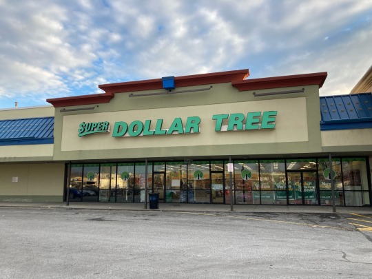
A Dollar Tree location at Century Center in West Springfield, MA, featuring two different specimens of vestigial branding. In the photo on the left, Super Dollar Tree signage recalls a time of segmented branding (a topic about which I’ve written before), complete with a dollar sign in place of the letter S. The concept was a forerunner to the chain’s current conventional planogram, which back in its first growth spurt contrasted with the smaller selection of regular Dollar Trees. In fact, this store harkens so far back that despite carrying the “Super” prefix, it lags behind many newer Dollar Tree stores, sans-Super, that feature refrigerated and frozen sections, which this location lacks. Other locations featuring the Super Dollar Tree banner exist in the United States, but have not been comprehensively documented. Some other signs (at least all that came up on Google Images) do not begin with a dollar sign, but rather a regular S, and do not curve upward either. All new Dollar Tree stores only feature those two words, Dollar Tree, on their facades.
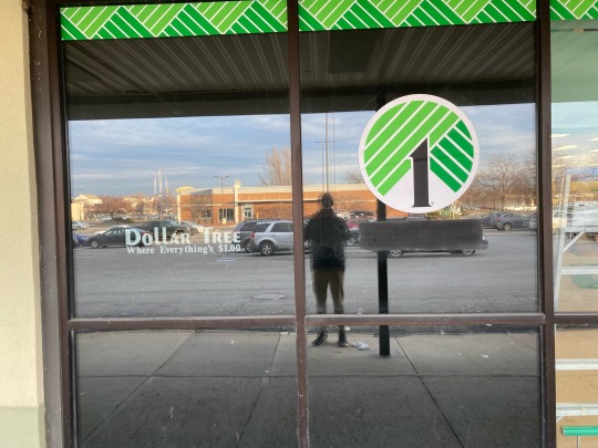
In the image the right, the retailer’s wordmark in its legacy font, and the company’s former slogan, “Where Everything’s $1.00”, below it. As I write this, I am reminiscing to a time when I went to a now-shuttered Chinese buffet a few doors down in this shopping plaza with my brother and our grandparent-like figures. As we waited for the place to clear up (yes, it was that busy), we walked to this very store, which I vaguely remember prominently featuring the “Where Everything’s $1.00” branding, complete with a more robust product offering, around a decade prior to 2020s inflation. Now, since the retailer increased its prices across the board to the $1.25 price point, this archaic facet of its corporate identity has been cleansed from stores. The powers that be have removed this branding from the storefront, but my attention gravitates toward the two leftmost panels of glass that, unlike the rest that allow for viewing into the store and for natural light to come in from the north, feature a black covering behind them to provide privacy for the small office space directly behind it. Speaking of which, they couldn’t have given the office staff at least a little window cutout with a blind for some view outside from the office? Also, yes, that is a silhouette of me taking the photo. Anyway, the pane of glass on the right has had the old branding blacked out, in a not subtle way, but the very leftmost one, for whatever reason, still remains vestigially branded with Dollar Tree’s vintage appliqué. This location, with its small amount of vestigial branding, reminds me of a Dollar Tree in East Greenbush, NY, that I visited shortly before the 25% price increase, which was straight out of the 90s (80s?) with its ancient “Everything’s $1.00” seriffed branding plastered everywhere inside the store and on its windows, and exterior signage in a narrow font that has also been done away with in new stores, replaced by carbon copy logo signage. Alas, even that old store has had all traces removed of its previous life as a true dollar store.


This is the Dollar Tree in Upstate New York, prior to renovation. Like, it went hard. Now the closest we get is a cartoon tree with the number one as its trunk, we all see through that shit DT, get your act together.
#dollar tree#consumerism#branding#marketing#aesthetic#90s aesthetic#dollar store#retail#retail archaeology#western mass#western Massachusetts#mass#Massachusetts#west Springfield#west Springfield ma#west Springfield mass#New England#nostalgia#oh my fucking god I can’t believe I just wrote all that about a fucking dollar tree
13 notes
·
View notes
Text
Nakey reference of Skippy. Also while making this I decided it gets yellow stripes too because yellow and purple is the best combination ever.
You can download the template I made for this from the web archive here. I'm also making a separate post with a tutorial on how to make your own like this :)


[ID: Three drawings of a bipedal cartoon cat posing with its arms held out to the sides. The background is light grey, with black text labeling different parts of the drawing.
The first drawing shows the front of the character, the second shows the back, with the labels for front and back in the top Right corner.
The character is named "Skippy Superpounce", and uses "it/its pronouns only".
Skippy is 3 foot 3 inches tall, or 100 centimeters. It is missing a whisker on the left side of its face, with the right side having all three, arranged so the center whisker is slightly longer than the outer two.
Smaller text reads, "Btw: This font is called 'Makertone'" with a link below that reads, "https://www.1001fonts.com/makertone-font.html".
Skippy has mostly pink fur, but a purple face, with more purple on its torso and leading down to its tail in a stripe that curves slightly on the front. It has three purple stripes on each arm and leg around the elbow joint, with two pale yellow stripes between each purple one.
It has purple paw pads on its hands and the bottom of its feet, with five fingers on its hands and three toes on its feet.
Its large, thick tail has many purple stripes, with two sets of yellow stripes spaced evenly along. There are three thin pale yellow stripes on the purple on its chest below its neck almost like a necklace.
Its eyes are white with black pupils, currently in the form of crescent shapes to show it is smiling with its eyes closed. Its nose is pink, as are its small round eyebrows, and the insides of its pointed ears.
On the back of its head are two tall pink ovals that look like blank eyes, and text next to them reads, "eyespots on back of head to scare away predators. Terrifying implications, indeed." More text opposite this continues, "Bright colors and stripes to show it's toxic to most life forms.". The third version of the drawing has the cat as a dark grey silhouette, with only a cane and rollator in color in front of it, with their handles reaching up to about the cats waist. The cane is grey-blue with a light blue handle, and gold and blue rubber stopper on the bottom. The rollator's frame is gold, with blue and pale purple handles, pink wheels, and a dark purple and pink seat and bag.
End ID.]
#Rjalker does art#described images#Skippy Superpounce#Furry#just realized Skippy is in fact a furry character#even if it's a cartoon lol#Rjalker's OCs#described art#cartoon characters
5 notes
·
View notes
Text


[ID: Five circular designs with the sappho lesbian flag in the background, with stripes of purple, pink, gold, and green, and the shape of a cat’s face in the center, in the colors of the aegosexual flag: purple, grey, white, and black, with a triangle reversing the colors.
Each pin lists out the pronoun sets of “she/her”, “mley/mlem”, and “it/its”. in different fonts.
The first cat shape is more realistic, with eyes, nose, and the inside of the ears visible and colored in black. The other four are a more cartoon-like silhouette that only shows the shape of the head.
End ID.]
Requested by anon :)
Feel free to save them to your computer/device to use for icons, headers, moodboards, edits, ect.
If you’re able to print out and make your own buttons, feel free to do so, as long as you aren’t selling them to make money!
Requests are always open!
———————–
Designs are no longer available on Redbubble as of April 2023, as they’ve started actively stealing money from artists. Sorry for the inconvenience. You are, as always, encouraged to save these designs to use as icons or in other art, and you are encouraged to print them out and make your own shirts or buttons if you’re able to.
#pronoun pins#neopronoun pins#custom pronoun pins#pronoun icons#she/her#mley/mlem#it/its#ititspronouns#lesbian#sappho lesbian flag#aegosexual
2 notes
·
View notes
Text
Week 3: Web Archives
The site I’ve chosen to analyze this week is www.wickedthemusical.com, the homepage for the Broadway musical Wicked. I chose the homepage because it is the landing page, the first point of contact that visitors have with this webpage, and it sets the tone for their time spent on the website. The screenshots I have included are from 2005, 2010, 2017 and 2021.
Let’s first look at 2005:
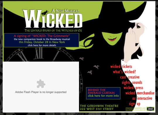
Obviously, the aesthetics of this page are outdated (we can even see the place where an unsupported plug in used to be). The font style and color used for the links on the bottom right is something we would probably never see today on a website like this. The content, however, seems standard for that of a theatre production. There are links to buy tickets, learn more about the show, buy merchandise, etc.
Next, 2010:
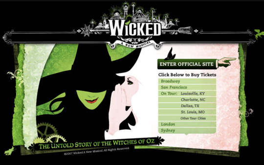
Here, the landing platform looks a bit different. There is a link to “Enter Official Site”, and then there is a list of multiple cities where you can see a production of Wicked. The aesthetics seem significantly updated from the 2005 edition.
Let’s move on to 2017:
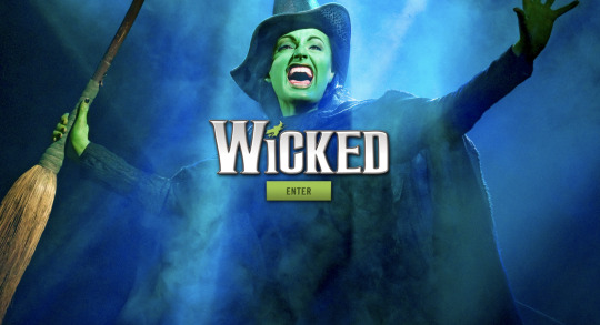
Between 2010 and 2017, there is a drastic change in the aesthetics of the site. Unlike previous years, in this iteration, there is simply one button on this page. The logo for the show has remained the same, however it has been modern-ified from those seen in previous iterations of the site. There is one dramatic pro-shot photo of an actress who plays the main character, Elphaba, in the show. This webpage creates an aura of mystery, excitement and wonder surrounding the show. This image, paired with the singular button labeled “ENTER”, seems to be inviting the visitors to take a deeper look. This page is much more theatrical and dramatic, perhaps matching the tone of the musical itself.
Finally, let’s take a look at the current website, 2021:
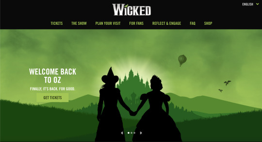
As we can see, the creators of the website have abandoned the dramatic 2017 landing page in favor of a more clean and traditional website. You can see the cartoon silhouettes of the two main characters, Elphaba and Glinda, looking on to the Emerald City, one of the main settings of the musical. Along the top, you can navigate to various pages to buy tickets, learn more about the show, buy merchandise, etc. Apart from those links at the top, there are only a few words on the page: “Welcome back to Oz. Finally, it’s back. For good.” Reading this gives me chills, as they are, of course, referring to the fact that Broadway is just re-opening after the longest shut down in history. The combination of the text and the image give off a vibe of hope and cheerfulness; the women are overlooking the palace and there is a bright glow coming from behind it, signaling better times ahead.
Funnily enough, out of the 3 previous captures presented here, the layout of the 2021 page is most similar to the website of 2005. Using the links, you can easily navigate to whatever page you are interested in. These links were lost somewhere between 2005 and 2021, because they weren’t present in 2010 or 2017. It is interesting to see that 15 years later, the website has returned to something resembling its earliest iteration.
If we look at the pages as a whole, I think we see that over the 15 year span, the show has become more iconic. The logo no longer exclaims “A New Musical”. This show opened in 2003 and it has become one of the most famous and popular shows. We can see that reflected in the way the website presents itself. Additionally, as the show has become more of a household name, the creators have become more conscious of social movements. You notice in the current version of the website, there is a tab for “reflect and engage” where you can learn about various movements and causes that the show supports.
Overall, I found this to be a really fun and insightful exercise! You can learn a lot about a website by tracing its history.
4 notes
·
View notes
Photo


[Image Description 1: Comic, digital art cartoon style. To the left is a blue character and to the right is a red character. "People are sick!" Blue yells with a concerned expression and a sweat drop forming. "People are hypochondriacs!" Red yells back while rolling their eyes with an annoyed vein next to their eye. Below a tiny purple arrow points to two dots.] [Image Description 2: "PEOPLE! ARE! SICK!!!" Blue yells, their brow furrowed. "PEOPLE! ARE! HYPOCHONDRIACS!!!!!" Red yells back in their face. The purple arrow pointing to to dots is slightly larger, unnoticed by Blue and Red.]
[Image Description 3: The words "PEOPLE ARE SICK)(HYPOCHONDRIACS" are extremely large, in a motion blur as they swirl around the yelling heads of Blue and Red. Their heads against each other like a yin-yang symbol, eyes budging, saliva dripping. Below the purple arrow is bigger and we can see the dots are silhouettes.]
[Image Description 4: Below the purple arrow are two characters. On the left, a short character, tan skin, wearing blue pants, an oversized sweat-shirt with a heart mirrored by an upside down heart. Their head is half shaved and half short, curly, pale indigo color. They look shocked and annoyed, bags under their eyes."Has a degenerative condition that took 5 years to get diagnosed" is written above their head.
To the right, a girl nervous hold her hands in front of her chest, tears in her eyes, sad and frightened expression. She has on light green pains and a dark green tang-top dress shirt that ends above her navel. She has deep purple hair, long that fans out behind her head, and micro-bangs. Above her head "Has hypochondria, now called Somatic Symptom Disorder or Illness Anxiety Disorder.]
[Image Description 5: "Hey-" The short character says to the girl, their face still looking annoyed. "Yes?" Our hypochondriac responds startled, pupils tiny, forehead blue, and sweat forming on her arms. Afraid she’s about to be ridiculed for her anxiety disorder.]
[Image Description 6: The short character holds out a hand towards our hypochondriac, looking more relaxed. "Ya wanna get away from this noise and learn how to support each other in healthy ways?" They say. Turns out they have resting annoyed face, making them difficult to read. Hypo is more relaxed, but still has her hands to her chest nervously, her body closed off, more sweat, tears still in her eyes, looking at the short person.]
[Image Description 7: A close up of our hypochondriac. Covered in sweat, her pupils shrinking again as she processes what the short character proposed. She did not expect a person with a physical illness to see her as someone who wasn't an enemy- to see her as more than just a person who made it more difficult for those with rare disorders to receive diagnosis or be taken seriously, or to be treated with respect and even love. She's not smiling, but she is blushing as a sense of trust takes hold.]
[Image Description 8: *sniff* "I would love that." Our hypochondriac says, now smiling and taking the hand of the also blushing short character.]
[Image Description 9: They fly into the sky holding hands, a rainbow trailing behind them. *Ghibli type music starts to play* *laughter of relief* They are pretty far away from us now. "I think I'm getting altitude sickness" our hypochondriac says, the short person responding "That might actually be happening, we'll go lower."]
[Image Description 10: Downward at the bottom of the rainbow in script font are the words "Have fun with your word wars, ya Butts!". Blue and Red have their backs to us as their looking at it. "What do you think those people were talking about?" says Blue, to which Red says "No idea. Wasn't listening."]
#comic#ship#cute#webcomic#spoonie#hypochondria#illness#disability#art#anxiety#disorder#spoonie comic#disabled#chronic illness#funny#humor#image described#described comic#invisible illness
3K notes
·
View notes