#calligraphy ph
Explore tagged Tumblr posts
Text

"Art vs Artist 2024" 🗡️👾🔥
Here's a wrap on my mandatorie #artvsartist2024 I may not have posted as much this year, but made a lot of very unique & experimental works throughout.
"F THƎ SYSTEM" - Self-portrait digital illustration
"Blossoming, Work Of Art" - A thank you gift vector art
"Pixel-Perfect" - A still from my mobile photography presentation deck
"Konvy 9.9" - Gameshow-inspired 9.9. sale campaign assets w/ my coworkers
"Very Nice" - Unreleased profile illustration
"Christmas Cards Lettering" - Custom hand-written Christmas cards
"Sticker Chatter" - Online convo-inspired sticker collection
"Shark Attack" - Custom Mofusand shirt design
"Setherpiece 2024" - 2024 Brand update
Happy almost New Year! 🎇 See ya'll somewhere
— Works created with Adobe Photoshop, Illustrator, Autodesk Sketchbook, & Figma
🍱 BEHANCE: behance.net/setherpiece
📸 IG: @itskeithdannic
🦙 DEV ART: deviantart.com/setherpiece
#art vs artist 2024#art vs artist#art#art ph#art of the day#art lovers#artist#artsy#artwork#art vs artist challenge#design#illustration#vector art#typography#lettering#calligraphy#digital art#digital illustration#digital drawing#graphic design#branding#portfolio#campaign#shirt design#new year#stickers#fyp#visual art#itsKeithDanNic#Setherpiece
0 notes
Text
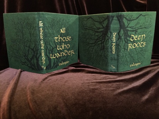


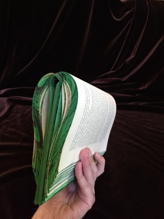
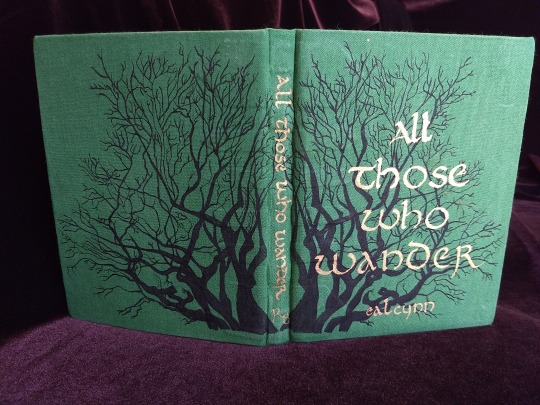
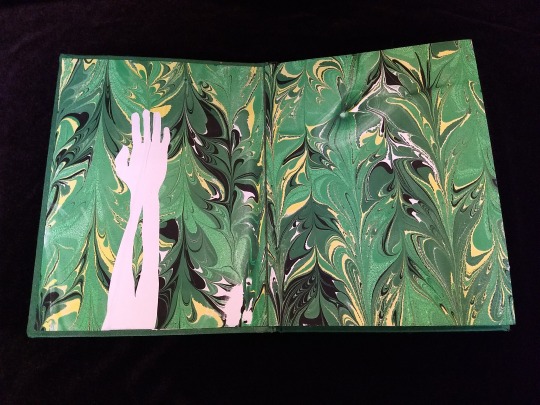
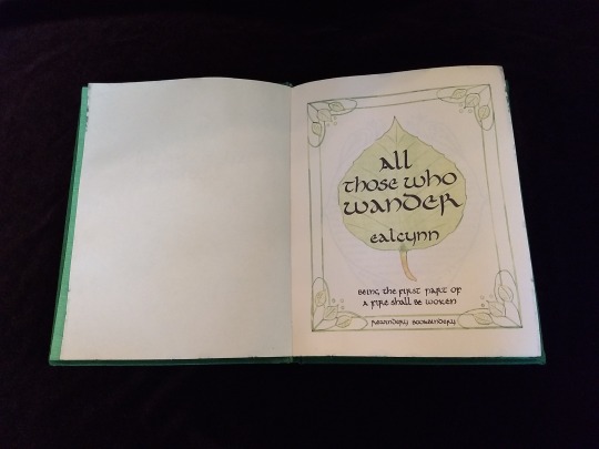
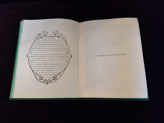

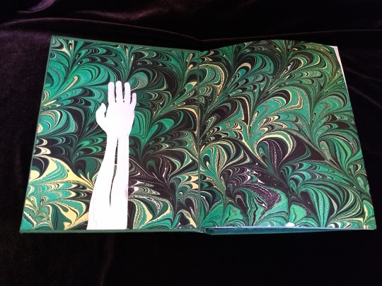
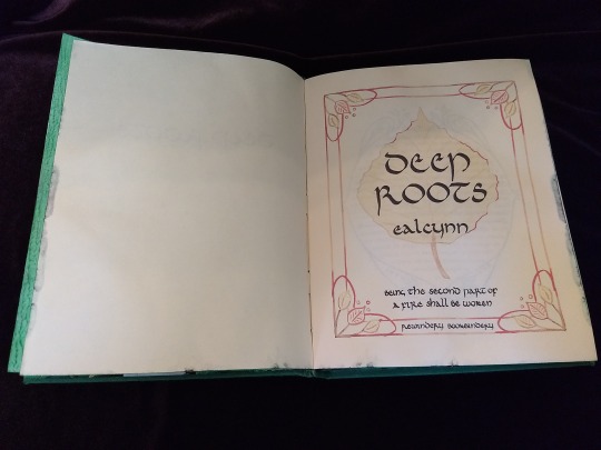
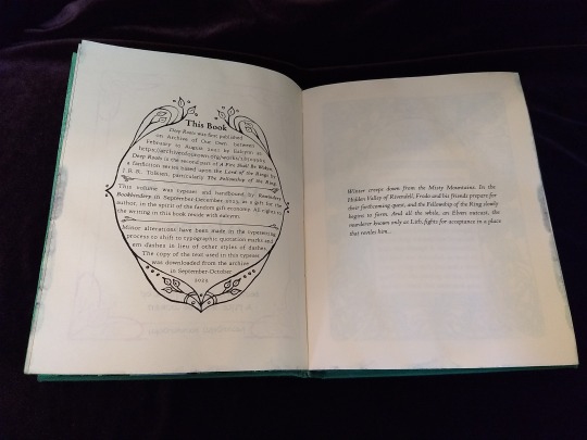
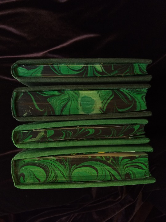


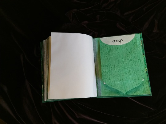

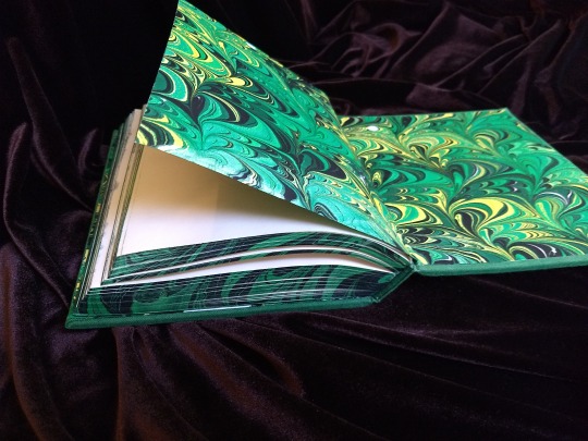

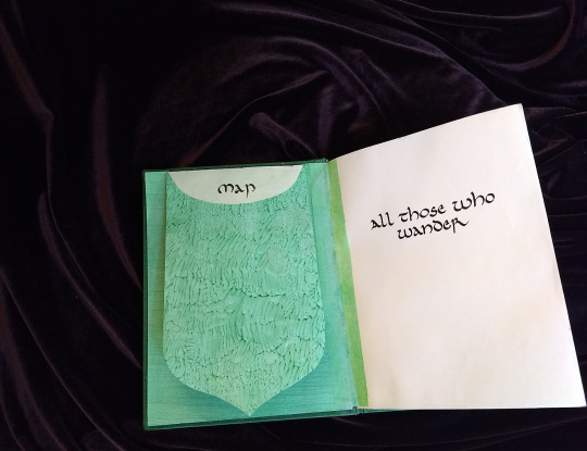

A Fire Shall Be Woken, by Ealcynn. A pair of bindings using the K118 structure, one as a gift for the author and one to keep.
Chapter page illustrations are by Alphonse Mucha, all other illustrations are hand-drawn.
I hope to make a long post later explaining the process in more depth & another to document all my mistakes, but here's the basics.
New techniques learned: Paper marbling, edge marbling, uncial calligraphy, making paste papers, drawing on bookcloth, making paste-filled cloth, fold-out maps
I began work on this project in early September and am completing the finishing touches this week.
Structures:
Binding: K118 tightback
Endpapers: Simple cloth-joined endpapers
Map fold: Turkish map fold
Materials:
Sewing supports: linen tapes
Thread: 30/3 linen thread
Spine lining: Medium weight kozo tissue bonded to linen fabric
Interior paper: Hammermill Ivory, 11x17, hand-cut to 8.5x11
Endpapers: Blick sulphite paper hand-marbled, with masked stenciled silhouettes created with freezer paper
Adhesives: Jade PVA, wheat starch paste, wheat flour paste
Covers: Davey board, laminated full thickness to half thickness
Cover fabric: Studio E shot cottons in Jungle and Emerald; filled with wheat starch paste
Cover decorations: Speedball india ink and Dr. Ph. Martin's calligraphy ink in Copperplate Gold
Inks for maps and illustrations: Speedball black india ink and a selection of watercolors thickened with gum arabic
Dip pens used for calligraphy: Combination of Brause calligraphy nibs and Leonardt tape nibs
Dip pens used for illustration: Nikko G pointed pen nib
Typesetting:
Typesetting program: Scribus 1.5.5
Body font: Coelacanth in 10 pt caption weight
Headings, titles, chapter titles, drop caps: Hand lettered uncial calligraphy, scanned
Illustrations and References:
Frames on colophon, copyright, author's notes and title page: Hand drawn, with inspiration taken from the vellucent bindings of Cedric Chivers
Frames that illustrate each chapter start: Alphonse Mucha from Cloches de Noël et de Pâques
Cover illustrations: Referenced from a photograph of an European beech tree found on iNaturalist.org
Maps of Imladris: Hand drafted with inspiration from the maps of Barbara Strachey, and Daniel Reeve
Map of Eriador: Traced from a map by Karen Wynn Fonstad, with edits made to coordinate with the geography of the fic
Frames on maps: Referenced from a drawing by Alphonse Mucha that @zhalfirin found for me
Special Thank Yous:
To the tightback council of problem-solvers in the Renegade server: Zhalfirin, Eka, @spockandawe who helped figure out many issues with the structure and technique
To the marbling experts in the Renegade server: Marissa, Aether, AGlance, Jenny, Catz, Badgertide, Rhi, and everyone else who helped me figure out beginnner marbling
To Spock for finding the K118 structure and introducing it to the server!
And to Bruce Levy, who discovered the method and shared his discoveries freely with the bookbinding and conservation world.
#bookbinding#Fanbinding#mine#bookbinding adventures#thank you to everyone i consider this a group effort#it has been 10000 years and I have loved every step#except for sanding. nasty nasty sanding. ew.#fic recs
242 notes
·
View notes
Text
The Little ‘I Love Yous’ Part 2
Simeon:
- He gives you little blessings without thinking. Your tea is the perfect temperature. You find the perfect chair to sit in when your feet are tired. Little things to make you smile and you wonder why you’re so blessed; only to remember you are loved by an angel. - He wrote a little short story about your adventures in the Devildom. It’s a children’s book series about a little sheep living with seven black rams and how the sheep helped the seven angry rams be better brothers. There’s little side adventures of the sheep meeting with some doves. You have the signed first edition from ‘Christopher Peugeot’. Levi is still trying to figure out how you got it. - He noticed when you visit PH you have a favorite seat. He’s made a little pillow with your name on it and put it there showing it’s reserved for you.
Solomon:
- He hears about magic spells you’ve seen in games or movies and finds a way to make that a spell you can actually learn. Or tries to. He’s only succeeded on one spell, but the little token he gave you that lets you cast ‘featherfall’ lets you give into a few of your more risky intrusive thoughts. Or it lets you escape the brothers’ arguing if you’re not on the first floor and a window is nearby. - He explained that humans require sunlight to Diavolo so that every other weekend you two can go to the human world and enjoy the sunshine and visit your family up there. - You’re the first to see a new spell or potion or rune he makes. Normally it’d be several of the demons he’s pacted with- but since you’re learning magic too he makes a point to show you the spectacle once it’s perfected.
Barbatos:
- He’s requested a day off of work with Diavolo to spend the day with you. It’s a rare occurrence, and you can’t help but be touched he’d leave Diavolo’s side to be with yours for even a minute let alone a day. - Your favorite meals are on the menu when you and the brothers visit for dinner. And there’s an extra little heart shaped chocolate on your plate that Barbatos will tell everyone he doesn’t know how it got there as he winks at you. - Sometimes you find random notes in your things at RAD. They’re all in the most exquisite calligraphy you’ve ever seen and it’s detailing something nice about you today. Your outfit, the way you did your hair, a kind act he saw. You know who puts these in your things and you treasure each one.
Diavolo-
- He tries every hobby you try with you so that you’re not alone. Plus it teaches him about the human world and how to have the Devildom be more welcoming for when his dream hopefully comes true. - He asks you a lot about the human world and what you like and dislike about it. it. He assures you it’s for his passion project, but when you mention things you like about the human world they somehow end up part of the Devildom (though you are not about to object now that the Devildom has started selling Kinder Eggs) - Kabedons you when only Barbatos is there. And when you blush he playfully asks if he did it right this time. You tell him no just so he’ll do it again later and he knows you’re lying.
----------------------------------------------------------
MC:
- You help Simeon use his computer any time he needs to use it and is too scared he’ll break it. Lots of things are harder to find without use of the internet and he needs to be able to do research for writing and you’re always willing to help. He does credit you with a pen name, but you tell him he doesn’t have to.
- You try Solomon’s cooking. The RARE occasions Luke and Simeon can’t stop him from using the kitchen he always tries to make something for you and you always try it. Even when you’re honest and tell him it’s bad after, he still tries to make things for you and you try it because he smiles wide just because you were willing to try it.
- You occasionally spend a day helping Barbatos with his duties. The first time you decided to do it you went in not knowing how much the butler does but now you wonder how he ever manages to make it one day without falling asleep before noon. The days you offer to help him are his favorite days and you can tell by the smile on his face when you show up in a butler/maid uniform to help.
- Being the heir to the throne is not easy. And for as busy as Lucifer and Barbatos are, you realize Diavolo works the hardest. You ask for a day or two here or there to spend the night with him- not even just for sex. No. You hold him and run a hand through his hair and tell him that it’s OK to rest. You give him a massage and let him rest. There’s been times he’s cried that you never speak of. Times he tells you he worries that his dream will fall apart if Michael and the other angels don’t support this. That you and Solomon and Simeon and Luke will be taken from him if he fails. You tell him it’ll be OK. That you’ll find a way back to him and the others if that happens. You won’t let anyone take him and the others away from you because you love him and the others.
#obey me#obey me one master to rule them all#obey me shall we date#Obey me simeon#obey me solomon#obey me barbatos#obey me diavolo#Sorry but Luke is a child I'm not including him lol. Also I don't know Raphael or Mephistopholees or Thirteen yet. So I can't include them.
480 notes
·
View notes
Note
Hi hi hi!!! I discovered your account very recently and I was wondering, what does your process look like when making sculptures? (If you don't mind me asking ofc)
Absolutely love your work!
Hi! Thank you so much! I’ll do my best to describe it but I don’t have a super strict process.
When I get an idea for a sculpture I will sometimes sketch it out on paper to get a better feel for it before starting, but sometimes I just grab the clay and go for it. My polymer clay sculptures sometimes have an armature to help make them sturdy enough to survive the baking process, but if they are small they don’t need one.
When my polymer clay sculptures are done baking and cooling I paint them with acrylic paint. I also like to put metallic details on them and I use a special calligraphy ink for that because I think it looks better than metallic acrylic paint. (The calligraphy ink is Dr. Ph. Martin’s Iridescent Calligraphy ink for anyone interested.) Then I seal them with DuraClear varnish.
For my ceramic pieces, I sculpt them and when they are gone dry I often paint underglaze on them. Some pieces I just use normal glaze though which is done later in the process. Once done, they go for their first firing called the bisque fire. At this point I can apply the final glaze and they will go through their second firing. Once done, these glazes give them that shiny, glassy look.
And that’s pretty much the gist of it! I hope that’s what you were looking for. Thanks for the interest in my art!
13 notes
·
View notes
Text
Conscript with natural dyes
So a while ago I was home and wanted to work on two scripts for one of my conlangs. But they were supposed to be based on ink calligraphy one with a brush other with a stylus(I think that's the correct word but idk). Only problem? I didn't have any art supplies, so to do it I improvised a brush and a stylus (a broken box cutter blade :3) and my favourite part: I made watercolor paints from flowers: poppies, dandelions, elderberry flowers and also poppy stems. (Since elderberry flower color come from anthocyanins I also added some citric acid and baking soda to small parts to get different colors) Here are the process photos and slightly bad results:

The flower

And the stem

The elderberry and dandelions


And the two colors I got from changing the pH

And some of the script WIPs


24 notes
·
View notes
Text


Art Tools for an Artzy Girl ♡
These are most of the art tools I use for my artwork –·––·–––·✩·–––·––·–
✩ Copic Markers - uses to blend and to make gradient effects. I also use them with watercolor paint.
✩ GraphicGear1000 Pencil & Calligraphy Pen - use to outline my artwork. Plus, i love using Calligraphy pen to make my outlines nicer and straighter.
✩ PrismaColor | FaberCastell | Caran D' Ache | ChromaFlow Color Pencils - use them to shade and blend. I also like to use them to do the light gradients and to blend with watercolor.
✩ Posca Markers - uses them to fully color the base before shading with color pencils. Also, using these markers can be very liquid but they are really good to use as a base color before adding the midtone and shadows with the shading and highlights.
✩ Dr. Ph Martin Water Color - use for also gradient and to shade, blend and to vibrant the colors in my artwork.

#art#advertising#art supplies#artist#artists on tumblr#prismacolor#prismacolor pencils#bright colors#colored pencil#color#colorful#gradient#painting#kawaii#pink#soft pink#fypツ#fypage#fyp#watercolor#viral#viral art#pencil#pencil drawing#artist on tumblr#caligraphy#pen and ink#copic markers#markers#posca markers
5 notes
·
View notes
Text
The Enduring Influence of Japanese Culture on the World

Japanese culture has captivated the world with its unique traditions, aesthetics, and way of life. From its rich history to its modern innovations, Japan's cultural impact has transcended borders and influenced various aspects of global society. In this article, we will explore the profound influence of Japanese culture on the world and how it has left an indelible mark in areas such as art, cuisine, technology, fashion, and popular culture. Artistic Heritage: Japanese art forms such as traditional painting, calligraphy, and woodblock prints have fascinated artists worldwide. The delicate brushwork, attention to detail, and appreciation for nature have inspired countless artists and art movements. From Impressionism to Anime, Japanese art continues to influence and shape the artistic landscape globally. Culinary Delights: Japanese cuisine, with its emphasis on fresh ingredients, precision, and aesthetic presentation, has garnered immense popularity worldwide. Sushi, ramen, tempura, and other Japanese dishes have become beloved staples in many countries, with Japanese culinary techniques and flavors influencing chefs and food enthusiasts around the globe. Technological Innovations: Japan's advancements in technology have had a profound impact on the world. From electronics and robotics to high-speed trains and video games, Japanese innovations have reshaped industries and transformed our daily lives. The meticulous craftsmanship and attention to detail that are synonymous with Japanese products have set new standards globally. Fashion and Design: Japanese fashion has made a significant impact on the global fashion scene. Designers like Yohji Yamamoto, Rei Kawakubo, and Issey Miyake have challenged conventional fashion norms with their avant-garde designs and minimalistic aesthetics. Japanese street fashion, characterized by its creativity and individuality, has also influenced global youth culture. Pop Culture Phenomena: Japan's pop culture, including anime, manga, J-pop music, and video games, has gained a massive following worldwide. Anime series like "Dragon Ball," "Naruto," and "One Piece" have captured the imagination of audiences globally, while video game franchises like Pokémon and Super Mario have become iconic symbols of Japanese pop culture. Zen Philosophy: The principles of Zen Buddhism, deeply rooted in Japanese culture, have permeated various aspects of life around the world. The emphasis on mindfulness, simplicity, and the pursuit of inner peace has influenced practices such as meditation, mindfulness techniques, and minimalist lifestyles adopted by many individuals seeking balance in a fast-paced world. Traditional Customs: Japanese customs and traditions have fascinated people globally. The tea ceremony, martial arts like karate and judo, and the beauty of cherry blossom viewing (hanami) have all become synonymous with Japan. These cultural practices have been embraced and celebrated in many countries, showcasing Japan's enduring influence. Literature and Film: Japanese literature, including works by renowned authors like Haruki Murakami and Yukio Mishima, has gained international acclaim and provided a glimpse into Japanese society and its unique perspectives. Japanese cinema, with iconic filmmakers like Akira Kurosawa and Hayao Miyazaki, has captivated audiences worldwide, contributing to the global appreciation of Japanese storytelling and visual aesthetics. Architectural Marvels: Japan's architectural achievements, from ancient temples and castles to modern skyscrapers and innovative urban planning, have inspired architects and designers globally. The blending of traditional Japanese architecture with modern elements has resulted in breathtaking structures that showcase Japan's cultural identity. The influence of Japanese culture on the world is undeniable. From its artistic heritage to its technological innovations, culinary delights to pop culture phenomena, Japan's impact can be felt across continents. As the world continues to appreciate and embrace the allure of Japanese traditions, aesthetics, and values, it is clear that the enduring influence of Japanese culture will continue to shape and enrich our global society. Read the full article
2 notes
·
View notes
Text
I'm not a lefty, but my mother was. All of the above explains why her handwriting was absolutely immaculate, whether in pen or pencil. She wrote much slower than my dad and I, always in cursive, and her hand never touched the paper. I realize now that her writing posture was so odd to me because she'd taught herself to turn her arm inward at the elbow about 30 degrees, essentially flipping her hand upside down, so she could pull the tip of the pen along and write without smearing. It became such a habit she'd do it with pencils and smearproof pens, too. If for some reason she couldn't do this (injured, or holding something under her arm), her handwriting was still very good, just heavily abbreviated - 'rem 2 ph pc' instead of 'remember to phone power company.'
Mom grew up in the 50s when anti lefty sentiment was still very common. While she never talked about her childhood, I imagine she must have had to work damn hard to perfect her penmanship. Also explains why she kept giving me shit about my handwriting and buying me calligraphy books as a kid - my undiagnosed autistic dysgraphia and absolutely awful writing posture probably gave her a headache.

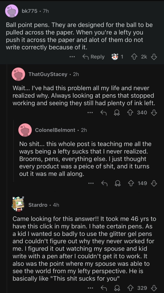
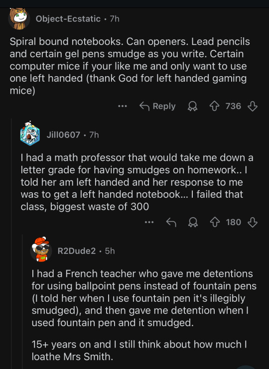

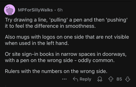


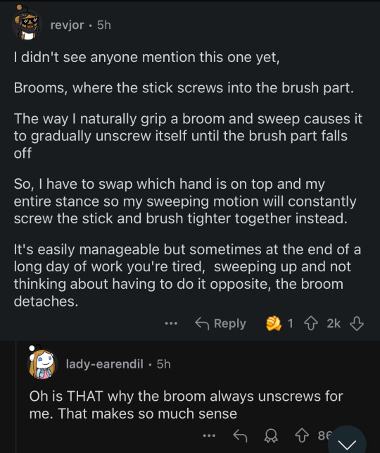
and my personal favorite:
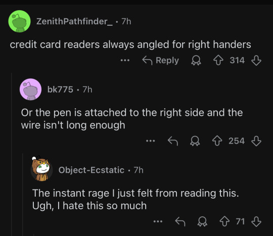
i love getting validation as a lefty but also learning about new fun ways it continues to suck
23K notes
·
View notes
Text
The Art and Joy of Colored Calligraphy Pens
Calligraphy, the ancient art of beautiful writing, has experienced a resurgence in popularity in recent years. Whether for creating personalized greeting cards, crafting wedding invitations, or simply enjoying the meditative act of writing, calligraphy has captured the hearts of many. One of the most exciting developments in this revival is the wide variety of colored calligraphy pens available on the market. These pens not only offer artists and enthusiasts the tools to express themselves through beautiful scripts but also open up a world of vibrant, colorful creativity. In this article, we’ll explore the world of colored calligraphy pens, their types, and how they can elevate your calligraphy to a new level.
What Are Colored Calligraphy Pens?
Colored calligraphy pens are writing instruments designed specifically for calligraphic art but offer a diverse palette of colors beyond the traditional black or brown ink. These pens are used for writing in calligraphic styles, such as italic, gothic, or copperplate, but add the dimension of color to the script. They come in different types—brush pens, felt-tip pens, dip pens with colored inks, and fountain pens with colorful cartridges or converters.
Types of Colored Calligraphy Pens
Brush Pens Brush pens are incredibly versatile and a favorite among modern calligraphers. These pens have a flexible tip that mimics the effect of a traditional paintbrush, allowing the writer to vary line thickness with the pressure of the stroke. Colored brush pens are available in a wide range of hues, from bold primaries to soft pastels. Some popular brands include Tombow Dual Brush Pens and Pentel Fude Brush Pens. These pens are ideal for creating expressive, fluid scripts with a touch of flair.
Felt-tip Pens Felt-tip calligraphy pens offer a more structured alternative to brush pens. They usually come with a chiseled nib, perfect for creating clean, sharp lines in various weights. The ink flows smoothly from the tip, making them an excellent choice for beginners looking to explore colored calligraphy without the steep learning curve of dip pens. Staedtler and Faber-Castell both offer high-quality felt-tip pens in multiple colors, providing excellent precision and consistency.
Fountain Pens For those who prefer a more traditional writing experience, colored fountain pens offer the best of both worlds. Many fountain pen brands offer colorful inks in bottled form or convenient cartridges, allowing for a wide spectrum of hues in your calligraphy. Nibs for fountain pens come in varying widths and flexibilities, enabling calligraphers to create both fine lines and thick strokes. Popular brands like Pilot Parallel Pens or LAMY fountain pens come with colorful ink options, making them a favorite for calligraphers who enjoy blending colors within their artwork.
Dip Pens with Colored Inks For the calligrapher seeking complete control over the ink and color, dip pens paired with colorful inks are the go-to choice. These pens consist of a nib that is dipped into ink and then applied to the paper. The range of colored inks available today is truly astounding, from bright metallics and shimmering inks to subtle shades of pastel or rich jewel tones. Brands like Winsor & Newton and Dr. Ph. Martin’s offer an extensive array of colored inks that can make any calligraphy piece stand out. Dip pens require more skill and patience to use than felt-tip or brush pens but offer an unparalleled range of expression and creativity.
The Benefits of Using Colored Calligraphy Pens
Expressive Creativity: One of the primary benefits of using colored calligraphy pens is the ability to infuse more personality into your work. Different colors can evoke different emotions—bright, vibrant shades can make your work feel playful and lively, while darker, muted tones can create a more elegant and refined look. By mixing and matching colors, you can add depth and dimension to your lettering, making your calligraphy truly unique.
Visual Appeal: Colorful calligraphy stands out, whether it's on a greeting card, a sign, or a piece of artwork. It attracts attention and enhances the visual appeal of your work. For artists who want to make an impression, using a variety of colors can make a significant difference in the final product.
Mood and Emotion: Colors have psychological effects, and the choice of color in your calligraphy can influence how the reader feels about your work. Soft pastels might evoke a sense of calm or nostalgia, while bold reds and oranges could inspire passion or excitement. Having a wide range of colored pens allows you to tailor your work to the desired mood or emotion you wish to convey.
Highlighting and Emphasis: In calligraphy, certain words or phrases may need to stand out more than others. Using different colors can help emphasize these parts of the text, drawing the reader's eye to specific elements. For example, a greeting card might have the recipient's name in a bright, bold color while the rest of the message is written in a more subtle tone.
Tips for Getting Started with Colored Calligraphy Pens
Experiment with Color Combinations: Don’t be afraid to experiment with different color pairings. You can blend two colors together, create gradients, or even use complementary shades to make certain words pop.
Use High-Quality Paper: Colored inks often bleed through thinner paper, so it’s essential to use high-quality paper that can handle the ink well. Opt for smooth, thick paper designed for ink or watercolor.
Practice Pressure and Control: The key to beautiful calligraphy lies in controlling the pressure on the pen to vary line thickness. Take your time to practice with different colored pens to master this skill.
Conclusion
Colored calligraphy pens offer a world of possibilities for artists, hobbyists, and anyone interested in creating beautiful, expressive writing. Whether you’re using brush pens, felt-tip pens, fountain pens, or dip pens, these tools allow you to explore a rainbow of colors in your calligraphy projects. So, grab some pens, experiment with colors, and let your creativity flow!
0 notes
Text
Metallic Inks for Calligraphy: Add Sparkle to Your Letters

Metallic Inks for Calligraphy: Discover How to Add Sparkle to Your Letters Instantly
Metallic inks are a great way to add a touch of luxury and sparkle to your calligraphy projects. Whether you're addressing envelopes for a special occasion or adding a shimmering accent to your artwork, metallic inks can bring an extra level of elegance to your letters. In this article, we'll explore the best metallic inks for calligraphy and provide tips on how to use them effectively. - Metallic inks can elevate the elegance of your calligraphy projects. - Finetec metallic inks and Dr. Ph. Martin's Spectralite are highly recommended options. - Consider waterproofing your metallic inks for added durability. - Metallic inks create stunning effects on dark paper. - Metallic and glitter pens offer convenience and vibrant colors for calligraphy. Read the full article
#calligraphyinktips#calligraphysuppliesguide#metalliccalligraphyinks#metallicinktechniques#sparklingcalligraphyletters
0 notes
Text
CM MOHSIN NAQVI WITNESSES CALLIGRAPHY EXHIBITION AT ALHAMRA ART GALLERY IN CONNECTION WITH 12TH RABI-UL-AWAL
With compliments from, The Directorate General Public Relations, Government of the Punjab, Lahore Ph: 99201390. No. 1058/Zafar/Mujahid HANDOUT (A) Lahore, September 28:Caretaker Chief Minister Punjab Mohsin Naqvi witnessed calligraphy exhibition at Alhamra Art Gallery of Lahore Arts Council Alhamra in connection with 12th Rabi-ul-Awal today. CM Mohsin Naqvi expressed his deep interest in…
View On WordPress
0 notes
Text
I wanted to highlight the simple: reusing everyday paper grocery bags, for calligraphy and painting, can have a great impact on the environment. And an equally simple message of, walk lovingly with Mother Earth in ways that are less harmful.
11 1/2inch x 17inch paper local grocery store sack.
Diamine Antique Copper and Twilight background with Dr Ph. Martin's Black India Ink for writing. Classic Rolf folded pen
#paperpenandsurfaceprompt3
@paperpenandsurface
#foccreates
#boundandlettered
#calligraphymasters
#cmilymm
#calligraphymasterschallenges
#calligraphycommunity #calligraphylove #calligraphymasters #italiccalligraphy #italic #handlettering
@calligraphymasters
#rolfpens
#rulingpenrolfpens
#gesturalcalligraphy
#rolfpenscalligraphy
instagram
0 notes
Video
youtube
Kashmiri youth's talent displayed at art exhibition held in Polo View Ma...
An art exhibition was held in Srinagar’s Polo View Market. Saika Rashid, a female artist from Srinagar displayed her work. She does abstract art, modern art and fuses it with calligraphy so that it looks more beautiful. Works of Tamseel Tabasum, a female artist who does printmaking which is new in Kashmir were also on display. To make her art she makes use of carved wood. Murran Masudi, another female artist, is a student of Kashmir University. The Fine Arts Department held an art exhibition in Srinagar Polo View Market with the theme Youth United. Murran converted her photographic series into paintings which have been displayed at the exhibition. The paintings depicted how self and nature are one. Saufin Abdullah, a male artist and a student of University of Fine Arts and Music from the University of Kashmir showed through his artwork how the seniors in Kashmir spent time on the verandah. Tamseel elaborating on her printmaking art work said, a design is carved on the wood then we apply colour and print it on paper. According to Murran, art is an inspiration. The whole creation is based on art only. So this art exhibition will definitely inspire people, she feels. Tamseel says there are many students who cannot go out of Kashmir to pursue higher studies. So a Masters and PH D in Fine Arts should be started here. Saufin said nowadays many people are getting interested in seeing and appreciating art. A lot of people came to the Polo View Market to the exhibition venue to click photographs. Saika says there are many hidden talents in Kashmir. More such platforms should be available so that the Kashmiri youth goes in the right direction, progresses and brings their talent in front of the whole world. Saufin sent out a message to the youth through this video that they should discontinue their bad activities and give attention to their passion.
0 notes
Photo

Peter Pan Donut & Pastry Shop.
The best donuts in Greenpoint! The best donuts in Brooklyn. The best donuts in New York City. The best donuts in the world?
Peter Pan Donut is family owned and operated for over 60 years. My first apartment in NYC was in Greenpoint, and I remember this place from then. Still so good, it just gets better and better.
Watercolor and ink on paper. For the ink, I used sumi ink with a Japanese calligraphy brush and Dr. Ph Martin's ink and a pen with a metal nib for the text.
PRINTS and ORIGINAL available... up on the Etsy https://etsy.me/3Jk4gas
#nickgolebiewski#peterpandonuts#greenpoint#greenpointbrooklyn#brooklyn#watercolor#watercolorpainting#storefront#storefrontnyc#donutshop#penandink#brushandink#sumiink
0 notes
Note
Hi, I love seeing your sculptures on my dash! I saw that you used polymer clay for them, but I was wondering how you painted and sealed them? I've seen people use resin to seal sculptures, but I'm scared of using it myself because of the eventual yellowing. Thank you!
Hi! Thank you for the kind words! For the paint, I use Folk Art brand acrylic. The metallic details are actually Dr. Ph. Martin’s Iridescent Calligraphy Colors which are a little tricky to work with because this isn’t their intended purpose, but the results speak for themselves lol.
Now, the part you actually wanted to know, I use a paint on varnish. I use DecoArt DuraClear. It works great and leaves a beautiful finish that is easily dusted and cleaned! I haven’t had any issues with yellowing so far and I’ve been using it for almost two years. However, if you use this varnish please be sure to do so in a very well ventilated area, and wearing a mask is a good idea too since it is made with polyurethane. Just a reminder to everyone to always double check safety practices yourself when using new materials. I hope that helps!
16 notes
·
View notes
Photo

Art Collab 001 | July 2020
"Be The One To Guide Me But Never Hold Me Down"
Text and Sketch by Benchard Bichayda (@doctorcalligrapher) Illustrated by Keith Nicodemus (@itskeithdannic)
Edited in Adobe Photoshop CC 2019 . . . . . #art #artph #artcollab #artlovers #artoftype #artist #artsy #artwork #calligraphy #calligraphyph #design #designspiration #digitalart #digitalillustration #goodtype #graphicdesign #illustration #lettering #space #thedailytype #text #textart #typegang #typematters #typography #typespire #vectorart #visualart #DoctorCalligrapher #Setherpiece
#art#art ph#art collab#art lovers#art of type#artist#artsy#artwork#calligraphy#calligraphy ph#design#designspiration#digital art#digital illustration#good type#graphic design#illustration#lettering#space#the daily type#text#text art#type gang#type matters#typography#typespire#vector art#visual art#Doctor Calligrapher#Setherpiece
2 notes
·
View notes