#but then i need to add highlights and render the rest of it
Explore tagged Tumblr posts
Visit Tumblr Blog
Explore Tumblr blogs with no restrictions, modern design and the best experience.
Last Seen Tumblr Blogs


Fun Fact
69% of Tumblr users are millennials.
Text
.
#I want to improve my art but idk how so it's kinda leading me to feeling like my art sucks.#I'm ...ok... with how it is now but i want it to be better#which sucks cause i have ideas but i want them to look good. im terrified of making something for hours only for it to look bad#especially when anything i post takes almost 2-3 days to make#I feel like other artists can make sketchy art that doesn't take that long (at least thats what it looks like) and it looks amazing#but my sketches look bad. they look ugly and make no sense to anyone else and don't start to look any good till i start on the line art#and then i do the line art and it doesn't look good until i add color#and then it looks incomplete until i and shading#but then i need to add highlights and render the rest of it#it feels like everything i make needs to be done to the fullest or it's bad#I know thats not true but it feels true in my head#i *hate* posting stuff like this cause it feels like im whining but when others do it i don't think that at all#so im just gonna hope that people don't think that and post this and be brave or something idfk#i just hope i either get better or get over it
5 notes
·
View notes
Note
hiii, I’ve seen some old art of yours and I’ve been wondering how do you draw curly hair? I struggle a lot with it…
hi!! well for starters i'm not sure what else to advise other then going through a lot of photos of people with curly hair studying how curls errrr work and behave and then training your hand coming up with random curly shapes
and then my painting process goes somewhat like this:
1. draw a base shape (it can be more neat/messy depending on your style and process) with some additional slightly lighter more saturated warmer/cooler color
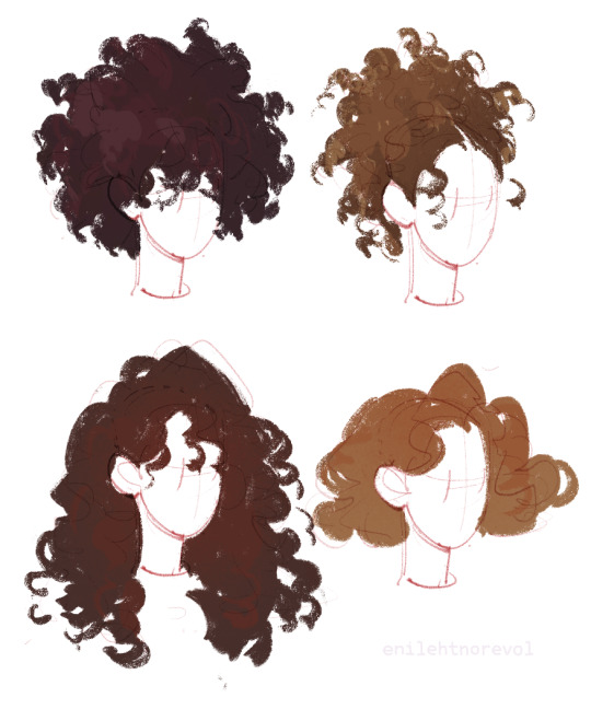
2. add shadows and lights (note: it applies to everything not just hair - the darker the surface is, the less you should rely on shadows and more on light, highlights and reflections)

3. render and add details. it might be tempting but better refrain yourself from defining each curl; face framing pieces, stuck out locks, edges and where you need to show that one part of hair lays differently/goes in a different direction than the others (hope this makes sense) woud be enough
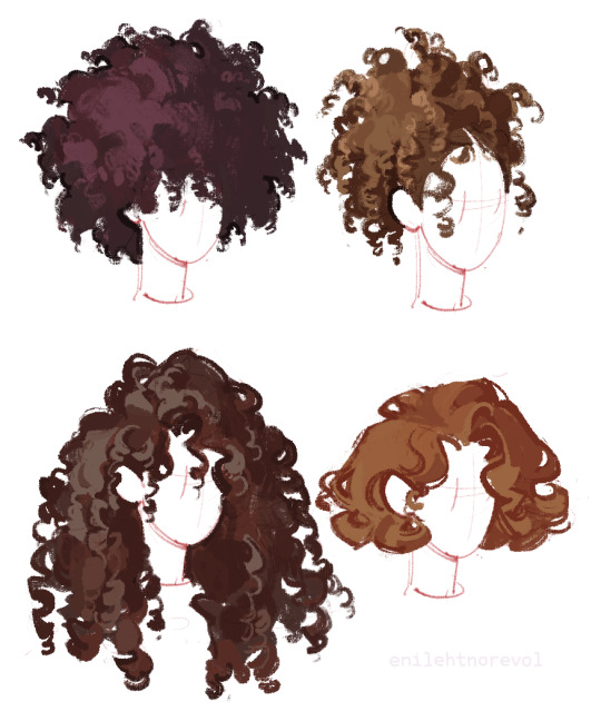
4. now i would probably stop at the third step but before i also used to use some grainy noisy brush to add more fluffiness
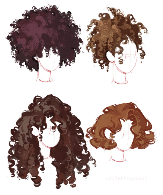
theres more then just those four examples of course but i hope they'll help figure out the rest!
1K notes
·
View notes
Note
Your designs are pretty sick🔥
What advice would you give to a beginner in character design?
Thank you! My advice is based on my personal experience and thought process. Theyre not rules.
ADVICE FOR CHARACTER DESIGN;
-Stay honest to yourself: Drawing what you believe is popular might be the path to a lot of likes but not to a uniquely recognizable body of work. Draw what you want to see in the world. Draw the character you wish existed but can't find anywhere, because someone else wishes it too. I love what I design and you should love it as well. It also helps with the disappointment lack of likes might bring
-Concept over technique: Get your idea across. I'm around 60% satisfied with my current art technique but I push those insecurities aside because my desire to show my ideas surpasses it. If you have something to show, show it now. I've been drawing for years and I always feel like I'm not ''good enough'' to design what I want to design, but I have to push through. You will never feel fully ready, so might as well do it now.
-Focus: If you have an idea, focus on it and let the rest of the design highlight it. It makes your designs sharp and recognizable.
-Color: Careful! Don't restrict yourself but know that 2-4 colors are more than enough to make a design work. Sometimes it's the simplicity and contrast of your chosen colors that make it stand out
-Patterns: A little cheat to make your designs pop! If they feel too simple, add a pattern to a textile or a flat surface. Anything that fits the themes of the character. Careful! If you have a very detailed area that you wish to be the focus, try to avoid random patterns.
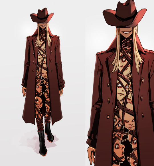
Here's an example.
Honesty: I'm not worried about how it looks nor who it is nor where the inspiration came from. It looks cool therefore it exists
Concept over technique: Scratchy lines, minimal rendering, rough details. As long as it's readable, it's passable
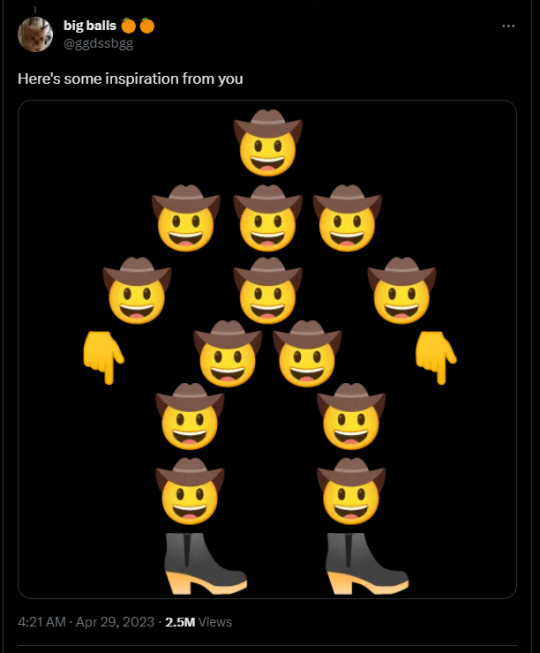
Focus: The concept was a bunch of heads stacked together to make a cowboy. Plus shoes. Everything else (the hair, the jacket, the face) are made to highlight the concept without stealing the attention from it
Color: Black, brown, yellow. Warm colors for a character in an arid enviroment.
Pattern: A pattern in THIS particular case would steal away from the focus of the stacked heads. No pattern needed here
I hope it helps!
Thanks and have fun in your character design journey!
626 notes
·
View notes
Note
Heyy I love your DA art so much! I just want to ask if you don't mind especially on your family DA piece. Do you render first before putting the lighting/effect or do you do the opposite? I always struggle when drawing illustration like that because I just can't get the lightning right after I put the main shadow
Thank you and no problem!
My process was honestly rather sporadic because I'm not used to work on big pieces like this, especially those with warm colors (like browns, oranges, gold, etc) so it was honestly a challenge.
It's gonna be a long answer so im just gonna put the whole process below this cut
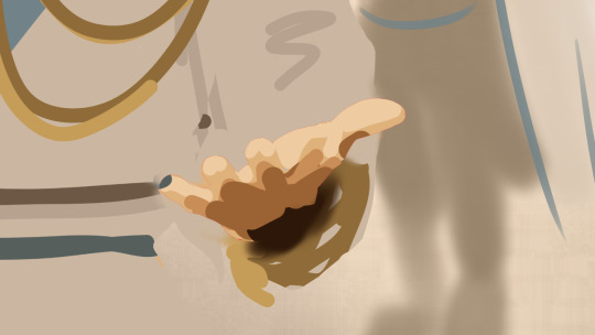
I tried doing everything in base colors first. No shadow no nothin. At this stage im trying to make sure that the base colors are all in the same, warmish tone so nothing felt out of place (left)


I was absolutely stuck on how i should do the shading, so i asked a friend for advice and she painted it over a little to give me an idea (right) (sorry the quality is ass cus its a tiny thumbnailing thing)
then i focus on the main subjects, i dont entirely shade them yet i just give some discoloration and color details like blush, dirt, subtle ones. I colored the lineart too (but i suggest you do this later after your shading)

then the shading, i carve it out from the multiply layer (as my friend suggested, lighting came from top left so i follow that suggestion)

added more contras (multiply & overlay) to add more depth and pop some more color

now that im done with the main subject, I got a good glimpse on what tone I should do for the rest of the artwork. Dark red for areas i need darker, and something of a gold/orange for the brighter spots.
i shade the background manually without using multiply, since im worried itll be muddy (easier for me to control too).
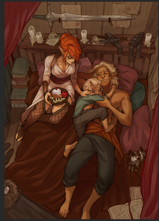

once everything is shaded, check on your artwork using a B/W layer. Everything still feel flat to me so I know i need to add more contras in the light & shadow
At this point im just throwing in Mulitply layer (reddish, green sometimes) to darken some areas outside of the focus and Overlay layer (yellow, orange, whites) to highlight the important parts and to emphasize where the light is coming from.
Check it again in the B/W layer, and it feels way better!


and there it is!
I added a few personal effects at the finishing, copying the lineart and gaussian-blur it, add speckles, add noise, color balance it a little. Poof. We're done :D
Hope that helps!
67 notes
·
View notes
Text
Tutorial: How I Render Accents
PART 2: COLORS
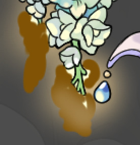
I usually do not recommend 'pixel hunting' aka going over your work with a fine tooth comb and picking out stray pixels to erase. However, for setting up a proper base layer for accents it is imperative to do so.
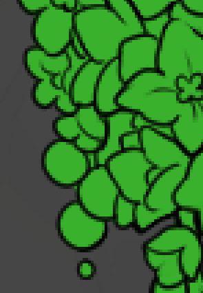
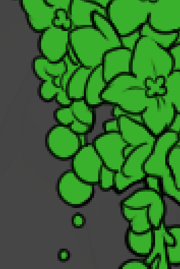
To explain my method of color blocking: I select everything outside of the lines, invert that selection, then fill in. This does a more accurate job than going into each and every section and filling them all in individually, and is also significantly faster. Only downside is small sections like above where you can see bits of the green (which I use bright green against a dark grey background to contrast the base color, lines, and background) poking out, as well as the inner section where it filled in a spot I did not want filled in. Getting all of this right in this stage will make your life easier as you go. (It's also the method I use to color block all my work, even beyond accents)
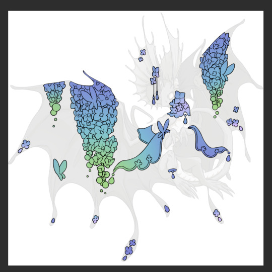
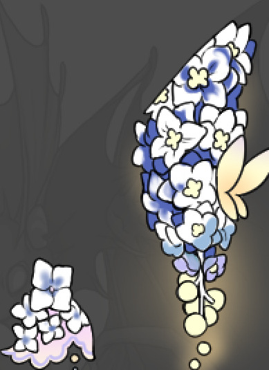
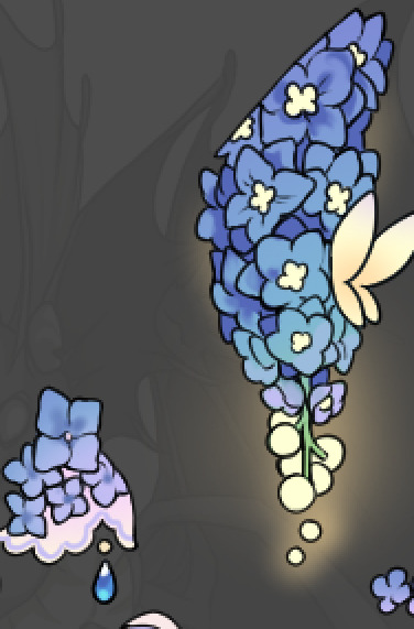
Now this where my style of rendering color may come off intimidating and, tbh it might be. I do gradients first and then I color over them with "normal" blend layers. I typically don't use multiply layers unless I'm shading something that has a lot of textures. If this scares you, it's okay I'll keep walking you through it. Here, my gradient goes from a pastel but deep periwinkle, to a soft more cyan blue, then to a lighter pastel green. Skipping steps and going from the periwinkle to green will give it a different look. There's also hints of a pinkish tone as an accent color.
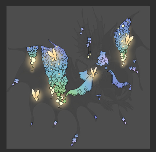
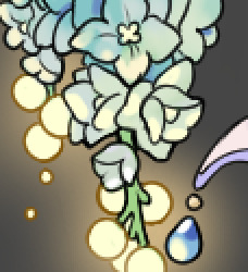
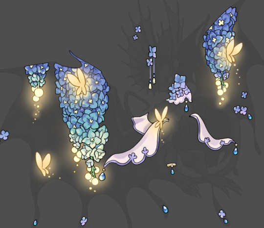
So as I said, these additional layers are done with regular "normal" blend mode layers. I've placed one in between the butterfly line art and the line art for the rest of the flowers, and then an additional layer under everything else. This allows me to create a glow effect specifically around the butterflies, and then specifically under the flowers. Going back and forth with the proper amount of opacity (by using the airbrush transparently) helps to make it glow but not be Too Loud. Also checking it against a dark background can help to check for spots where it spills past the borders, as well as really gauge how Bright it is. I've also color matched the butterflies with the flower pits and the bulbs. This adds extra cohesion and makes them all look uniform but different enough with the gradients.

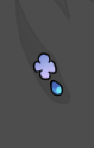

The stages of how I render gems/dew drops. Take the base color, make it a bit darker and less saturated (as well as changing the hue a bit depending on what the default color is. For yellows I go more orange/red, for blues I go more purple or even pink. It depends), add a small drop light at the bottom thats a fairly saturated version of the base color, and then a stark white/ near white highlight. That's it. Don't over complicate it, it will not matter when it gets shrunk down. Note that I do not use multiply/overlay/screen layers for these types of things as it adds too much bulk to the files and doing it manually helps to strengthen your color theory skills.
For shading and rendering, again, I create a "normal" layer and simply. Draw over what exists. Color picking and hand blending allow me to create the exact shades and effects that I want that multiply/screen/overlay layers may not be able to achieve. (which isn't to say I dont use them! i just don't use them for the main meat and potato part of my coloring) All of what is shown here is also achieved with the CSP asset SOIPEN (which can be found for free in the asset store)
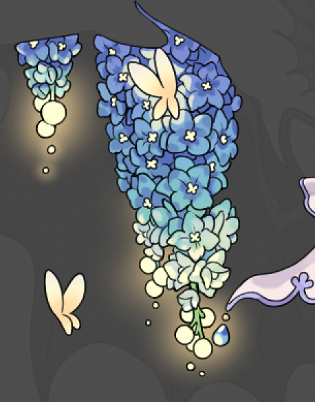

another example. The one on the right is showing how the layer looks without the gradient base layer under it. All of this is rendered by hand. I also specifically put a highlight color around where the butterfly is sitting to give a better illusion that it is properly sitting on the flowers rather than just in front of them.
Next is changing the color of the lines, if needed. A method i'll use is I color just the sections I want (on a separate clipping layer) then lock that layer's alpha setting to them add in a gradient. It's a small and subtle effect that adds more depth without doing a lot of effort. (work smarter not harder)
Now we get to the Polish Layers!
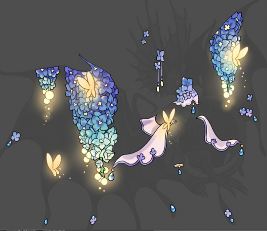
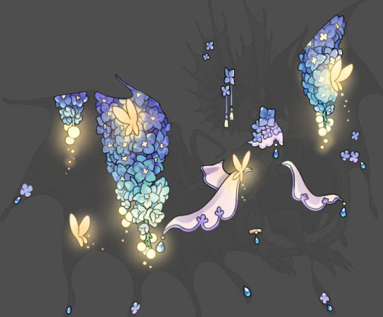
first image is how it looks as a base. second image is with an overlay layer applied. I've used some dark purples and mid tone desaturated greens to push the values a bit further (especially evident on the top left wing) Third image is with a screen layer applied, highlighting the inner most part of the flowers and adding some additional bounce light.
An important thing to note about making accents vs making full coverage skins: OPACITY AND LAYER TYPES MATTER OVER TRANSPARENT SPOTS. What I mean by this is that if you use a soft, light grey to shade with a multiply layer, don't clip it to anything, and have it go outside the lines - that will no longer appear as a 'shadow' when it comes to the final result. Instead you will have a section of soft light grey that is simply laid on top of whatever the image under it is. The same applies for overlay/screen/add layers and so on. If i use a very dark color on a screen layer (to give a soft highlight) and airbrush it over a bunch of stuff and don't clip it, it will end up with this horrible dark splotch over everything that isn't opaque. To this end, mastering normal layers is imperative to having well rendered and convincing accents.
Another thing of note: when it comes to sparkles/small details, note how 'large' the sparkles behind the butterflies are. They seem a bit chunky, yeah?
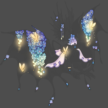
this is what they look like at proper size. If anything, I could have gone larger on the small metal beads connecting the dew drop jewels to the lace.
Another trick I also like to do is this:

a slight hint of transparency! It's just enough to let the dragon's lines underneath show through but not enough to be super noticable. I like to do this a lot when it comes to sparkly and magical effects.
Next is the worst part of all: destroying all that beautiful hard work with the shadow and line art layers! (sobbing)
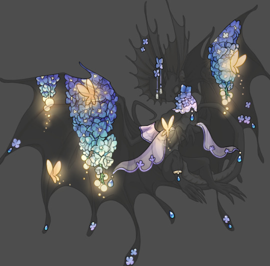
This stage always agonizes me. This is my first pass of the shadow/line layers and let's hope it's dark enough.
But yeah that's a start to finish look at how I create my accents. Unfortunately a lot it devolves into needing to know, yknow, line weight and silhouette importance, color theory and the ways that drawing applications actually apply color to a png vs how its rendered in app. All of these things impact the finesse of the accent, and are things you do have to learn gradually over time, but hopefully this has given yall some additional insight and perhaps some helpful tips.
And this should also explain why I get so mad when people go 'hey can I get this accent in another color' no! no you literally can't!
155 notes
·
View notes
Note
do u have any tips for uhh idk art term....highlight and contour but for art? specifically w digital art? w pencil and paper it feels super intuitive but then when i switch to digital it looks all flat.............
(is it shading? idk what im doing tbsh)
(also hope ur doing well i feel like im crawling into ur asks every two days or smth looking for art tips sorry T_T)
(yuuji comic made me cry so hard btw)
hi rin!!!!!!! that wld be shading/rendering yes hgbhgfjs there’s no One specific term tho so ur all good <3 also omg re: the yuuji comic IM SORRY I KEEP MAKING U CRY GHJKGJDSGHKJ its ok i made a lot of people cry if the death wishes/pos in the tags are anything 2 go by so ur in good company :D i teared up also
i would Also like to apologize in advance because fr me this is one of those Art Things that becomes more intuitive the more u do it so i am a bit. lost as 2 how to explain but i will sukuna voice ganbare ganbare !!!!
it’s all about light sources babes so pick a direction where the light is hitting from and use that as your main point of reference. If u need to remind yourself where the light is coming from i was taught to draw a lil arrow or sun somewhere on your canvas 2 keep track . areas closest to the light or planes that are more Elevated will be brighter than areas farther away or Deeper. When u think of a face, the forehead and cheeks rest Higher than fr example, the eye sockets, so those areas will catch more light and appear brighter. it /is/ kind of like makeup in that way.
also, shadows/highlights can have soft or hard edges depending on how . uh . intense, i guess?? the angle of the light is. like with a box vs a sphere, the former will have a lot more Cut and Defined areas of darkness because the plane where light hits is cut off more directly by the presence of a corner, whereas with a sphere the Slope means that the values follow more of a gradient.
tbh tho if you’re still starting out, to practice light sources and shading it actually might be good to scribble and shade some 3D shapes and spheres/boxes or maybe even draw from life so u can really take time 2 pay attn to how light catches different surfaces . it’s boring work but the practice is never wasted !! lighting can be tricky so try and take the time 2 form Good habits :'> references r ur friends here now more than ever.
other than that, which i feel more or less covers the basics n fundamentals, my wisdoms 2 u and any1 else who will have it: INVEST TIME IN2 FINDING GOOD BRUSHES omg i feel like a lot of that New Artist Look (tm) comes from using default brushes —which on its own is fine, but the kicker is not taking time to get comfortable with how to make the best use of them. the fun of the render is getting to play with textures and colours so find some brush settings that help add a bit of personality!! also . resist defaulting 2 the airbrush tool to shade it Rarely cooperates and can muddy a piece. uhhhh what else what else try not to shade with black for the same reasons ???? i'm scraping the bottom of the barrel here but i hope something here was of any value :'>>
#art advice#uriekukistan#answered#I FEEL LIKE THIS IS INCOHERENT IM SO SORRY#i yap so much.....do i say anything tho? who knows :(#fr tho pls don't apologize fr asking!!!!!#idk how Helpful i am but i am very very very much an advocate of the anyone can draw and anyone can learn 2 draw mentality#so i am more than happy to offer any wisdom i can no matter how . convoluted.#my ask box n dms are always open <333333
18 notes
·
View notes
Note

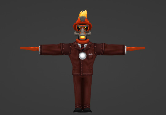
I'm figuring out blender using your models! It's been a super fun experience. This is the first render that I've made using a full body + head!
Some problems I'm facing so far are:
I don't know how to color his hands.
I can't get his neck piece to stay with the rest of his head!
Replacing the texture of the suit is HARD.
If you could help me out with those things (and also help me out with any other problems you see with this render) that would be greatly appreciated! Feel free to not do that, though.
oh, this rocks! really long post below!
as for question 1: enter the "shading" tab at the top of blender,

and click on the hands. at the bottom of your screen will be this whole jumble of nodes. click on the "Attribute" one to highlight it, and then delete it.
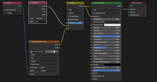

After you've deleted it, you need to click on the gray next to the letter "A". Click on "Hex" in the menu that pops up, and put in the hex code of the colour of the hands you want. For Flint, that'll be (around) F14E18.

Yay! your hands have colours now!!!

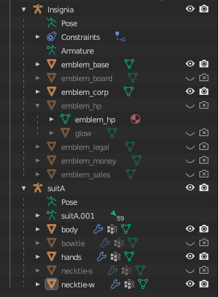
as for question 2:
so, when you append a cog head model to the body model file, it'll kind of just be sitting there. what you need to do to attach this head to the body is to first enter Pose Mode while you have the head's armature (bunch'a bones) selected. then, select their bottommost bone (typically named "root"). for Flint, it's this one right here.

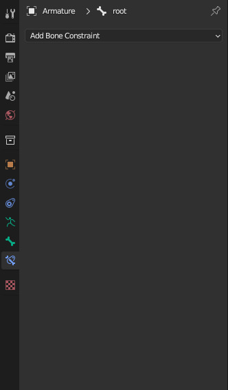
once you've selected the root, click on the blue bone with the thingie around it in the Properties menu in the bottom right.
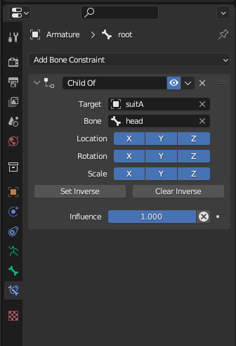
Click Add Bone Constraint, then click "Child Of" (rectangled in red below)

this constraint is going to make this bone follow the bone of another armature. for this, we want the armature it follows to be the body, so click on the empty field labelled "target" and type "suitA" into the box (or suitB, suitC, etc. dependent on the body). then, click on the empty field labelled "bone" and type in "head" (NOT joint_head!! just head!!). this will make the whole head snap to the neck!
your constraint will look like this:
and flint will look like this:

and... the little thingie around his neck didn't snap up! this is an issue that happens with flint's head, and to my recollection, only flint's head. not to worry, we can fix this by putting the exact same constraint but in the "Constraints" tab of the armature this time.
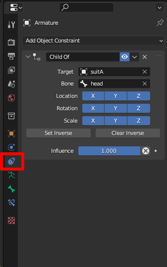
okay, that fixes him.
as for question 3:
go into the "UV Editing" tab of blender, navigate to the suit texture on the left, click "Image" and then click "Unpack".
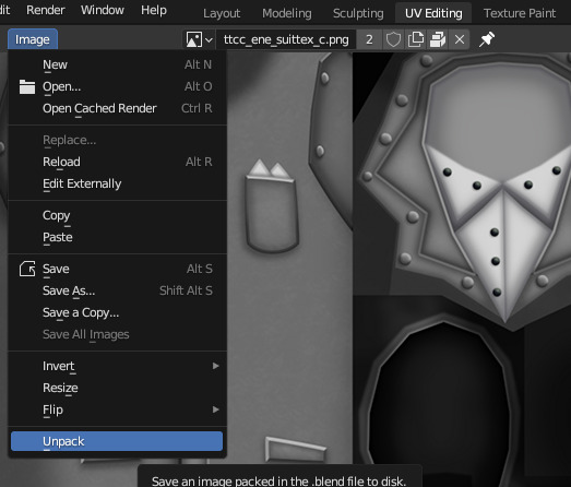
it'll prompt you again after you click unpack, just click "Remove Pack". after you do that, click "Image" again, but this time click "Replace". this will open up a file choosing menu. navigate to wherever you stored the blender ports, and there should be a folder of suit textures. open that and double click on firestarters suit texture.

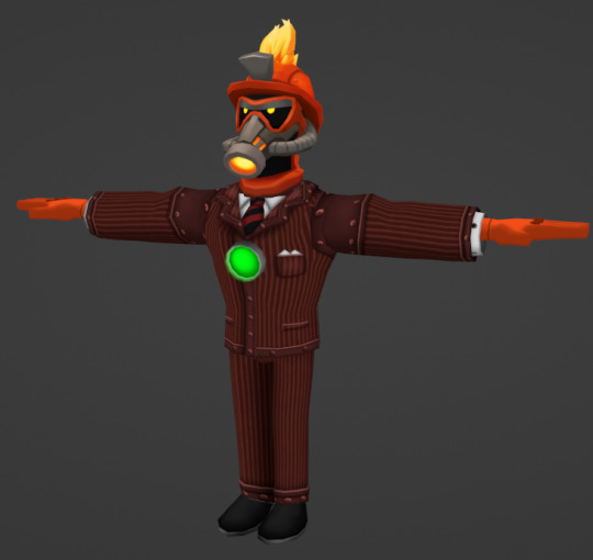
and... there we go! firestarter! in the.. metal!
as for anything else:
the only thing i notice about this render is that some things could be hidden, like the bowtie, other size of tie, and the health insignia. in the top right of blender, there's a listing of everything in the scene. everything has a little eye icon and a camera icon to the right of it. if you click the eye icon you won't be able to see it anymore in the viewport, and if you click the camera you won't see it in the render.
knowing this, you can just make some stuff (like the white health insignia and the bowtie) go away by doing this!
also. if you want to have the health insignia become a certain colour like it does in game, all you need to do is the same thing you did to the hands. go to shader tab, click on the health insignia (and the glow), remove Attribute, add colour, bam!
one last thing that may help if you are unaware: you can make a render transparent by just clicking this in the "Render" tab of "Properties". navigating menus is for nerds, though, so you can just type "transparent" into the search bar and it'll show you where you can see that. turn "Filter Size" down to 0.00 px if you want no antialiasing, also.

closing notes (because i like having excessively long posts)
sorry for making this an excessively long post! i hope that it helps you in some fashion! i worry about putting too many images in 1 post sometimes but i hope that they help! also i am glad you are having fun with blender :o) playing with ttcc models like they are dolls is how i learned literally anything that i know about blender! so it makes me happy seeing other people learn blender for ttcc stuff.
send another ask my way if you have any other questions or i didn't make something clear! i find model stuff to be fun to talk about, and i spent enough time fumbling through trial and error that i'd much rather tell help someone do something rather than have them do the same trial and error
42 notes
·
View notes
Text
HUX BUFFS. I REPEAT HUX BUFFS. PARTIALLY BASE KIT SOMA FAMILY PHOTO!!!!!!!!!!!!!
Info from @/dvveet on twitter!!
First, here is the OG post.
THE SINGULARITY has received HUGE changes, here’s a quick rundown -
• [NEW] Biopods automatically aim at nearest Survivor upon taking control of one.
• [NEW] After 0.25 seconds, targeting progress now decays over the next 0.5 seconds.
• [NEW] Added ability to destroy currently controlled Biopod.
• [NEW] Receive Killer Instinct when a Survivor becomes Slipstreamed.
• [NEW] Gain 3% Haste in Overclock mode.
• [NEW] Added aim assist effect when shooting a Slipstreamed Survivor.
• [NEW] Passive EMP printing is capped at 97%, with the rest needing to be done manually by a Survivor. They will be highlighted in Yellow when capped.
• [NEW] Disabled Biopods briefly pulse before reactivating. Alongside this heap of new additions, there are a lot of other changes.
BIOPODS -
• Survivors only glow if they can be targeted.
• Decreased targeting cooldown after Slipstreaming a Survivor to 3 seconds (from 3.5 seconds)
• Hear audio from a Biopod by default.
• Last controlled Biopod has Aura revealed for 10 seconds (from 5 seconds)
• Reduced time to switch back to The Singularity to 0.5 seconds (from 1 second), but increased it when near a Hooked Survivor to 1.5 seconds (from 5 seconds)
• Better aim assist when setting Biopods.
• Improved UI
OVERCLOCK -
• Increased base duration to 5.7 seconds (from 4.7 seconds)
• Stuns caused by Perks now cause Overheat.
• [REMOVED] Overclock’s scale with number of Slipstreamed Survivors.
EMPs -
• Decreased Aura range of Supply Cases to 28m (from 32m)
• Decreased range of EMPs to 8m (from 10m)
• Decrease immunity to Slipstream after using an EMP to 0.35 seconds (from 2 seconds)
ADD-ONS -
• Pass through of add-ons
...................................................................................................................
Pretty much all of these changes sound amazing. I doubt that they are going to dramatically increase the number of people playing the singularity, because he is still a complicated and demanding killer to play, and why bother when vecna is right there, unnerfed.... but for us dedicated players, this is going to make hux's gameplay feel a lot better. and who knows! maybe some more people will pick him up and find they like him!
this is honestly SOOO, SOOO much better than I expected, though. I would have genuinely been content with the 3% haste bonus for overclock mode, but we also get all these great new features to streamline the use of his biopods! which is. wow. I'm so happy. there is the possibility that there's something here that may cause problems that is just Not Clicking in my brain, which will inevitably lead to a nerf of some kind, but it all seems fairly solid and fair to me on paper. unless "pass through" means they aren't touching his addons, because if so, that might cause problems, since the soma family photo would award an extra 5% haste bonus. they should at the least nerf that addon to 3% as well, maxing his haste bonus out at a nice, even, sexy 6.
naturally, the misery-rotted crybabies of twitter are already complaining that this will render hux "too OP," especially "in the right hands," as if he isn't already a force to be reckoned with in the right hands. ANY killer is powerful in the right hands. the right hands are usually people who've played hundreds upon hundreds of matches as that killer. and it's not like any of these (likely low mmr) people are going to see him every match anyway. he's not vecna, wesker, or huntress, lmao. these changes are not going to magically make him super easy to play. biopod placement still matters, replacing biopods still matters, efficient chase still matters, tracking survivors' every movement still matters, using overclock efficiently still matters. learning to deal with coordinated swfs will still be very, very hard for people just starting out with him, because his counterplay is incredibly simple.
14 notes
·
View notes
Text
Mini painting process breakdown
I'm really bad at explaining my mostly-winged-it process, but since a couple of people asked here's a mini-breakdown of what I have been doing on my journey to this pseudo-painterly style:


Disclaimer: I have no formal art training of any kind, I'm guessing my way through this artsy season of my life that just restarted last October; this is merely a general description of what I am doing these days, not a tutorial or a guide to tell anyone what they should do. Anyone has a different process and I am a strong believer in doing whatever works for you, no matter what "The Rules" or other people say.
0. Before I even start drawing, I collect a bazillion reference pictures for every single thing that I plan to represent, from Michael Sheen's face to gold embroidery texture on 1800s extant garments;
1. (undocumented because when I said that I'm bad at this I meant it and sure enough I forgot to grab a screenshot of this step) I establish the general background color and draw a very loose sketch of the character;
2. I switch to a basic hard round brush and free-hand some color blobs to establish the position, general shape and values of the character, using the colors that are already in the background to make sure that the charater "belongs" in that space (tip: if I need to introduce new colors I pick a shade that seems close to what I want, put it on a separate layer, and then lower the opacity of that layer until the background color bleeds through and harmonizes the new shade);
3. I divide the character into smaller bits (face, hand, jacket, sash...) and apply clipping masks to bring the color blobs into reasonable shapes, in this case a left hand (I found that I can fine-tune the shapes at any moment by playing with highlights and deep shadows on the edges);
4. I then switch to an equally basic airbrush for the main rendering, using the color picker tool to blend midtones and highlights/shadows until my shape starts looking 3Dish (this part can be quick or take forever depending on a variety of factors that I honestly cannot explain);
5. I bring down the airbrush size to add finer details that can sell the illusion (here still in progress);
6. (eventually) I add a ton of adjustment layers to make sure that the completed part is consistent with the rest of the image (tip: if there are more bits of the same "family", e.g. skintones, I use the color picker tool to grab the midtones that already exist instead of mixing them ex novo).
That's it, I believe, unless I am forgetting something. Feel free to ask if there is something more specific that you'd like to know!
36 notes
·
View notes
Note
Your art is gorgeous!! Do you have any tips on good ways to learn how to render?
Tysm! I try really hard, so it always makes me happy to hear someone enjoys it :D. If you want to learn how to render, the way I started was by getting a good idea of the forms of what I��m drawing, making attempts at rendering it, and iterating on them until success. I get that it's not exactly new advice though.
(Most of the rest is pretty specific to my methods.)
Usually I find that turning up the saturation when you’re done helps(more saturated colors than you probably feel like). Also hue changes with brightness, shadows are typically cooler, and highlights are shifted towards the hue of the light source. If you want to be kinda painterly like what I try for, I’ve found that I need to be a little less neat than I want to be and add more details later. I use dark base colors, carve out highlights, and blend colors. I use dark backgrounds and some glow to hide my mistakes too, it just makes things look better.
Learning to render is a long process, so practice makes perfect and whatnot. (please take everything I say with a grain of salt; I'm new to this too, and youtube is where I got all of what I know when it comes to art. Most of what I know can be learned with internet searches and practice.) Good luck on your journey!
#digital artist#artists on tumblr#art stuff#art#art advice#learning#learn to draw#beginner artist#small artist#take this with a grain of salt#idk what im doing#art tips#how to#useful#art techniques#learning to draw
6 notes
·
View notes
Text
A discussion of the newly released Electric Clojure by Hyperfiddle. What is Electric? "Electric Clojure, a reactive Clojure/Script dialect for web UI with compiler-managed client/server data sync." What does that mean? You write a single piece of code, e.g. a UI component function, and hint which parts need to run on the server vs. the client. "The Electric compiler performs deep graph analysis of your unified frontend/backend program to automatically determine the optimal network cut, and then compile it into separate client and server target programs that cooperate and anticipate each other's needs." Thus you program as if there was no hard client-server divide (no 2 separate files with REST calls in between) and Electric handles splitting it up and managing the communication between them on your behalf. It is groundbreaking and fascinating, with potential to significantly simplify web apps. Go read more about it.
Highlights from the discussion (many comments by the founder):
[..] we're seeing 10x LOC reduction (18k to 2k) in rebuilding Electric's sister project, Hyperfiddle (a spreadsheet like tool for robust UI development), as well as massive gains in performance.
NOTE: Til now focus was on correct program semantics, now started work on DX etc.
Our DOM module is only 300 LOC - it's bare metal DOM point writes + Electric (reactive language) + macros for JSX-y syntax. When the programming language itself is reactive, DOM rendering falls out for free.
Mechanically, Electric is comparable to Solid.js except the reactive engine (missionary) is general purpose, not coupled to DOM rendering, which is a special case of incremental view maintenance.
[..] over-abstracting is a primary risk and has been top of mind for us since project conception in ~2012. [..] Electric is an attempt to find exactly the right level of abstraction. The goal is to remove and flatten layers, not add them, thus decreasing abstraction weight in the end if we succeed. Maybe we fail, but first let me share some details about how we think about this:
I've personally failed to build this project several times, Electric Clojure is something like the 7th attempt.
strong composition model as a starting point, based on category theory generalization of "function" -> "async function" -> "reactive function" -> "stream function" -> "distributed function". [..] (This rigor is in response to the past failures.)
Functional effect system (monad stuff) at the bottom, which provides strong semantics guarantees about glitch-free reactive propagation, process supervision (like Erlang) (transparent propagation of cancellation and failure), strong resource cleanup guarantees (DOM nodes can never be left hanging, event handlers can never fail to be detached and disposed). Already this results in tighter operational semantics than we have ever achieved with manual resource management (and, again, we tried, see past failures).
Electric affords the programmer trapdoors to the underlying FRP/concurrency primitives. Electric is essentially a Clojure-to-FRP compiler, so if you code raw concurrency and effect management, that actually typechecks with what Electric generates, allowing seamless transition in and out of the abstraction.
3k LOC + 3k test LOC is the size of Electric today (includes a rewrite of the Clojure analyzer). Spring Framework is, let me go check, 59k just for spring-core/src/main/java, and there are like 20 other modules I excluded. Indeed it is not a fair comparison but certainly we have complexity budget to spare.
About Missionary: "Missionary is a reactive dataflow programming toolkit providing referentially transparent operators for lazy continuous signals, eager discrete streams, and IO actions. Missionary aims to improve over state-of-the-art reactive systems, it can be used as a general-purpose asynchronous programming toolkit but also as a basis for event streaming and incremental computations." Electric uses it for functional effects and as its reactive engine.
1 note
·
View note
Text
Stalker. Progress. Part 1.
After being done with the weapon, I decided it is time to start working on the final asset - the stalker
Before starting, I checked again on what kind of main references that I used for the Stalker. I really liked those renders, since they carried clothes and items that I originally wanted on the character: With rugged apparel and dirty gear.
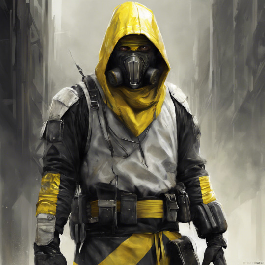

I like the reference, however, there are things that I would avoid from this reference from my production:
I won't be doing long-hanging clothes, as that would force me to use physics in Unreal Engine. While it is easy to set them up (thanks to Royal Skies (2024) tutorial). Applying the physics could easily backfire on me later on by having some problems or attention, that I can't just deal with (what if something starts clipping through the physics, or it would bug out during the animation sequence). So I decided not to risk it.
youtube
While I will follow the original design as possible, I decided to make some minimal changes to the design: I will change the mask from the current design into something more industrial, and crude - as if the Stalker has found that mask and decided to use it. I thought about designing the mask just like the 3M 7500 respirators, since they are compact and simple, and would look great on the character's face, highlighting the eyes. I also won't make a face cover, since originally I wanted the character only to wear the mask itself, without any upper head cover.

Finally, I will be creating the character in a priority order, meaning I will do the essential clothes first, and If I have time to add extra content to him (like pouches, or some metallic objects on his belt), I will.
While checking with my schedule, I decided that I would be avoiding long fabrics in order to avoid relying on physics engines, since I was already tight with the project in terms of schedule, and did not have time to learn new features. To create the bottom part of the character - I decided to make a short skirt, some jeans and classic running shoes since I feel like this is an ideal apparel for such a character.
I was suggested to use a MetaHuman rig in order to create realistic faces and meshes, and I decided to give it a go since I believed I had enough space in time even if something would have went wrong. I launched the metahuman, selected some faces and began the designing of the human character.

It's really interesting to use MetaHuman in order to build faces: you can select multiple faces with different origins and mix the meshes together in order to get what you need. I find it quite an interesting tool since it can help artists to get a hyper-realistic face of many kinds by just selecting some models that have the exact features you want: It is a wonderful tool in cases where you need a starter mesh for many purposes, trying to make a realistic project, or need some references in terms of sculpting.
Upon creating the mesh, I decided to give the MetaHuman a try - I figured that I could have exported the simple mesh of the MetaHuman in order to build clothes around the body, and in order to do proper rigging - just build the rig as usual, with the exception of avoiding the head. While sounds a bit risky - in reality, it should not be a problem, since in theory, we can see only his head and the beginning of the neck - meaning the rest of the head would be hidden with a craft, which will implement all the needed animations.

Upon exporting the model, I noticed that it was harder than expected to export his textures and materials - there was no FBX file that contained all the mesh information, only pieces of various body parts and some texture pieces - since Unreal Engine used composed materials of various filters and alphas, in order to create the shading.
I decided to not think too hard about it for now - since I needed only meshes themselves for now, and in the end, I could just import the mesh into Unreal Engine, apply the head mesh onto the stalker body, and not worry too much about it.
Also, during the breaks - I create a forum thread in PolyCount in order to get some feedback on the work. I know that in order to get some feedback I would need to actively engage with posting my work, and I will try. Since I don't have any final posters and renders - I just posted whatever I had at the moment and images from previous presentation slides. I will change that once I get some nice renders.

References:
Royal Skies (2024). Unreal5 Applying Cloth Physics (In 2 Minutes!!). [online] Available at: https://www.youtube.com/watch?v=eMUD297S6zk [Accessed 20 Jul 2024].
Safety Supplies | PPE, Workwear & Safety Equipment. (n.d.). 3M 7500 Half Mask Respirator & 6035 Particulate Filters | Safety Supplies. [online] Available at: https://www.safetysupplies.co.uk/product/respiratory-protection/half-masks/3m-7500-series-reusable-half-mask-respirator-6035-particulate-filter-kit/.
DreamStudio (2024) Image of a stalker in white and yellow colour robes with a gas mask. [Digital Art].
DreamStudio (2024) Image of a stalker in white and yellow colour robes, standing. [Digital Art].
MetaHuman (2024). MetaHuman Creator. [online] Available at: https://metahuman.unrealengine.com/.
D3lta_Fe. (2024). Fedor Bortnik Final Major Project - project EUROPA. [online] Available at: https://polycount.com/discussion/235751/fedor-bortnik-final-major-project-project-europa#latest.
0 notes
Text
Exploring Magento 2: New Features and Upgrades for Improved Store Management
New features and enhanced speed are just two of the many highlights of Magento 2.4.6, the latest version of the popular Magento 2 e-commerce platform. This version focuses on making the product faster and more efficient.
These updates make the platform more user-friendly, especially for merchants. These alterations allow merchants to complete formerly time-consuming bulk procedures in minutes. The Magento 2 upgrade supports the following performance enhancements.

The response time, category tree rendering performance, bulk cart operations' query response time, order sorting of customer queries, etc., have all been optimized with GraphQL. Magento 2.4.6 is compatible with the latest Page Builder and PWA Studio versions.
The accessibility of this update has been greatly improved. With the release of Magento 2.4.6 comes a new meta package (version 1.1.0) that automatically installs a curated set of Magento Commerce Extensions.
These extensions are automatically updated to the most recent versions whenever Magento is upgraded, eliminating the need for manual upgrades. Bolt Quick Checkout and Magento I/O Events for Magento Commerce are part of the Magento Commerce Extension meta package.
New Features of Magento 2 for Better Store Management
· Category Processing
In this release, enhancements have been made to the system that deals with categories; in particular, support for nested children trees has been added. Therefore, significant performance gains have been realized due to merchants' newfound ability to process categories.
The system was refactored to improve loading reaction time, increasing the system's speed and efficiency. As a result, searching across more than 1,500 categories has been simplified, saving time and effort for business owners.
The optimization of query response times has also hastened the turnaround for bulk cart operations. That means you can add more than 500 things to your shopping basket, whether simple or customizable.
· Scalability Improvements
Magento 2.4.6 can aid shop owners by restricting product quantity. The new option controls how many items are shown in the grid. The default is 20,000, and it only applies to collections of products that include UI elements.
With the help of a properly configured database load balancer, Magento Open Source/Adobe Commerce 2.4.6 can process 1500 orders per second. Using the new REST endpoint, you may import up to 100,000 data per minute.
Payment Processing
The updated Magento payment module includes features like the "Pay Later" option, PayLater communications with PayPal Vault, increased Fraud Protection, and ACH webhooks.
In addition, a Fraud Protection webhook will be activated if any potential threat is identified in Braintree. Notifications are sent to the ACH webhook when the status of an ACH payment changes from "pending" to "declined" or "settled."
I/O Conferences
With this new functionality, data and events may be captured from Magento Commerce and sent to connected systems. It paves the way for cloud-native app development in App Builder, enabling developers to respond to changes in different store events.
It supports various store events like order status, inventory, and pricing. Additionally, this feature can share information across Magento Commerce's crucial systems, orchestrating the full shopping trip.
Eliminate Incompatibilities
By upgrading, shops can avoid compatibility concerns with previous releases. For a hassle-free adventure: In this new version of Magento, several problems that were previously assumed to be permanent have been corrected.
In less than a year, all Magento 2.3.x versions will reach their End-of-Life (EOL), meaning merchants will no longer get support for or updates to those versions. Hence, online merchants should consider switching to take advantage of all that Magento 2.4.6 offers.
Merchants can rest assured that the personal information of their stores and customers will remain secure if they upgrade to Magento 2.4.6, including the newest features and security patches.
What Are The Advantages Of Using Magento 2 For Online Stores?
Customers will have a more positive experience with Magento 2 now that its performance has been enhanced. Additional technical and business benefits of the Magento 2.4.6 update include the following features -
Reduced or eliminated dependence on a large number of factors
The number of bugs has been drastically cut down
Improvements to the structure of the platform
Superiorly optimized source code
Optimal scalability
Quicker reactions
Safer systems
Conclusion
For both consumers and business owners, Magento 2.4.6 is a watershed moment. By improving inventory management and boosting store performance, Magento store owners will have an easier time making sales.
Magento 2.4.6 is similar in providing a streamlined and accelerated shopping experience, much to customers' satisfaction. It's highly recommended that you update to Magento 2.4.6 right now.
At Webiators Technologies, we help you upgrade to Magento 2. Book a free consultation with us today to discuss the costs, timeline, and other details of an upgrade to your store with one of our certified Magento Commerce consultants.
Original Source : https://bit.ly/42ZizIk
0 notes
Text
Week 9 lecture notes -
Some principles -
Relative relationships
Legibility and readability
Context and emotion
Dwell time and duration
Direction
Final video size and format
Perfect grammar-no typos.
Designers to look at-
Jesse Reston -kinetic typography tutorial
Jenny Holzer
Kevin Macleod, free music for backing music
audiojungle - backing music
Free music archive
Storyboarding - Essentially planning, helps to visualise your concepts, and have a visual sketch of your direction & flow. look at different angles and techniques - can look at an example
Titles - the first impression, they present the story,
Credits - continue connection with film design
- Directing/producing - you
Design - type design
Sound design - individual music track
Voice over - your speech, who is talking
Sound effects - the website where you've got the files from
Production date.
Week 9 after effects tutorial notes -
Illustrator, create new, mobile, ... For correct sizing for after effects file.
Go into after effects
looking at time line of numbers,’ you are just looking at how many frames there are, reading by seconds. E.g 1 second and 5 frames in - 15f
Composition settings - change placing of key frame by changing seconds
To edit where rendering happens, grab top scrolling bar, pull it to appropriate end.
After importing a file from another place, double click composition to see files appear below.
Click e hold for drop menu's,
Ellipse, click and drag stroke.
Click in the works full and fill options comes up for gradients , default black and white. To change click on fills colour box, move colour clicker, click on them to create more to get more colours.
Window, align, select all layers, align now you want
Solo is little circle, bottom left, hides other layers when selected
Little alien allows you to hide certain layers without deletion for efficient working, make the alien a ufo then press the bigger alien bottom right.
Masking methods -
highlight layer, rectangle ellipse, create rectangle over selected layer. Undock mask section, click mask path stopwatch, creates key frame, then move key to 1 second or wherever. Hold shift, and press the left arrow key to move the rectangle across and hide the layer.
Key frames versatile, you can change the order by moving front one back
Solo next layer, create shape, can use pen tool or ellipses, uncollapse mask layer, mask path stopwatch, move slider, shift and arrow keys to move.


Unfortunately, I deleted my work from the school computers before knowing we were to save and upload!
Sdl -
add layer for truth
Storyboarding
reflection: I got a hold of the masking techniques quite well, I have found I tend to make one mistake when learning new things that have a domino effect on the rest of what I am doing, I need to pay closer attention to details and the surrounding things that need doing when creating a methodology. I want to start creating my work and am happy to get on to the storyboard, I like being able to visualise my work and have a reminder as I go along, I feel storyboarding is a very effective motivating technique.
0 notes
Text
ok, allow me a rant about the line between sonic's eyes for a second

if you don't see what i'm talking about, i have highlighted the line in red:

this isn't just there for no reason, it serves a purpose. it is the junction of sonic's eyebrows, which is important to establish here. it's the little crease to show separation of the eyebrows and intensify his expression. it's present in most official 3d models and renders of modern game sonic, which i believe has overexaggerated its importance in the eyes of some artists.
it can be very easily be stylized out while still keeping sonic recognizable and still looking like he has two distinct eyes! the brow crease is not important for sonic's recognizability or anatomy.

the Triangle of Delineation is what actually makes his eyes into two seperate entities! that's the most important part, and it's present in pretty much all interpretations of his design that keep the monoeye. they still need some degree of separation to read like eyes. it's the Triangle that helps separate the eyes from each other!

(otherwise his eyes just look like a visor. don't be like ron lim, kids)

the eyebrow crease can most be easily seen as an eyebrow crease appearing and disappearing as he scrunches his muscles in the movie design! once again, the crease is not essential for modern sonic to be readable as modern sonic.

so why, why, why, why, why god why do i see people draw him like THIS???

this does not read. it looks like he has four eyebrows. it looks like he has two expressions on at once. the crease stays on his 3d model when his eyes open wide because his eyebrows can't move independently of his eyes in most rigs and the brow crease is dug right into the model itself. it is a technical limitation and stylistic choice. double eyebrows like this, however, do NOT occur in official art.
in several artists' interpretations of him, the eyebrow crease stays even if he is making varied / wide eyed expressions, and there is only one continuous shape for each eyebrow; no additional putty tubes put on top. i've also noticed that artists who commit to The Crease are more likely to reign in sonic's worried expressions so they don't have to lift his brows too far up and away.

with artists like evan stanley, who like to utilize movement of the brows for expression, the crease can disappear. if he is making a worried expression, the Triangle of Delineation stays, but the crease tends to move upward with the rest of his expression; if it stays, his brows are one continuous shape until the junction of his eyes. (i'm aware there's also some yardley in here)

now let's add the Crease to a few of these and see what it does to the expressions:

yikes..... see what that does to the readability and shapes?
so, in conclusion: keep in mind that the junction of his eyes has a stylistic purpose, and sometimes that stylistic purpose can be detrimental to whatever you're trying to get across on sonic's (or any other monoeyed character's) face! if you're creasing his eyebrows, make sure the brows are each one continuous putty-snake shape, and don't muddy up what you're trying to communicate by adding more eyebrow shapes. this has been a PSA
303 notes
·
View notes
Text
this old dance floor
Summary: Two dances, a century apart.
Pairing: Damien/Dark x DA
Warnings: none
i take commissions and donations! ko-fi
@opprose @volbeast @mirrorslament @statictay @otterlyinluv @flerpdederp
something special along with the story under the cut :3c
You’re starting to wilt, and you can feel it.
If you can feel it, others must be able to see it.
Your heart just isn’t in it today; most days you can grin and bear it, possibly even enjoy it, but today’s work was long and arduous. An endless slog of paperwork and phone calls and client work does not a party animal make.
Yet, you’ve been asked to attend.
At the very least, it’s not your party. You don’t have to be a gracious host and run the schedule, making sure you tick off every box for the attendees so they won’t turn around and call you a bore or inattentive. You just have to be here: show your face, eat a few crudites, have a drink, then go home.
Taking a quick glance around the room, you find that most eyes are on everyone else, not you. Chattering amongst themselves, browsing the table of food, pleased and smiling at the musicians putting their talents on display.
Happy that your ability to go undetected is still going strong, you take the opportunity to lean back into the cool wall. You don’t exactly ache from work, as such, but your muscles have all twisted, knotting in your neck and shoulders; your back complains just the same, all hunched over the desk. You’re more than eager to allow the wall to take some of your weight so you can rest.
You half-close your eyes, too, wishing you could take some of the pressure from behind the lids. Oh, but a nap would be lovely, wouldn’t it? Curling up to just rest your eyes on one of those plush benches wouldn’t hurt, would it?
You aren’t tired, you just… need some relaxation. For once, comes a voice in your head, and you try your best to ignore it.
It’s a choice spot, really, where you’ve chosen to make your camp. Not hidden from view, but you can see all entrances, see a large portion of the room. It’s a sea of black and white and gold and silver, a dash of red here and there highlighting the bolder of the attendees. It’s this spot— and your half-closed eyes— that allows you to spot one particular black and white shape as it draws near.
Anyone else and you’d heave an internal sigh before putting on your mask, but you don’t bother with Damien. He’s seen you look much worse in all your time at university, and the years since.
Rather tellingly, he leans against the wall just as you are, sighing and easing back off his cane. “That’ll do, despite not being a proper seat,” he comments. “Is my wallflower finding any interest in the people-watching tonight?”
You smile despite yourself, fluttering a bit at the possessive term. “Wallflower may be accurate,” you agree, “considering my wilt. I don’t look that worn out, do I?”
His head rolls against the wall, slicked back hair crushing against the filigree as he eyes you.
You must be imagining the adoring look in his eye. Just wishful thinking.
All the more confirmed considering he doesn’t immediately refute you. You scoff, leaning a bit to jostle him. “You aren’t supposed to take so long, silver spoon.”
“What can I say? You render me speechless, my friend.” He grins. “Seriously, though: are you doing alright? Parties aren’t your element, I know—“
You smile, if a bit tired, and lean into him once again in an affectionate bump. “I appreciate you watching out, Day. I’m fine, just… I’ve had my fill of shallow conversation for the day.”
“That makes two of us,” he adds, lightly.
You’ve heard him rave at length before, in his more expressive hours, so you eye him right back. “Yet you’re still here.”
“And so are you. I couldn’t very well leave you to the masses.” He gestures, almost dismissively, but he can’t mean that. “They’d eat you alive.”
“I’m too tough to swallow,” you reply, raising your chin in defiance, and he laughs.
“Well, they’d eat me alive, then. We must stick together.” He smiles at you, then turns back to the floor. Just above the multi-colored heads of the gathered crowd, you see people twirling; Damien’s watching them curiously.
It sparks your own curiosity. You don’t dance much, and neither does Damien. At the very least, he has an excuse with his bad leg; you simply aren’t trained the way he was, with your class differences. Still, he’s watching the dancers pensively, and your mind wanders.
If he might hold you close, strong arms and hands cradling you gently. If you might catch his scent, so close as to drown in pine and coffee and fresh snow. If you might feel his smile against your head, a secret only the two of you know about.
You flush, burning hot as you snap yourself away from your thoughts. Honestly, you must be tired to get so distracted; you glance towards Damien, hoping he hasn’t noticed.
He’s looking right back, an edge to his grin. “Welcome back, my friend. Find anything interesting?”
“Hush up,” you grumble, though it lacks any real heat. “You get lost in thought, too, you know.”
He chuckles. “That I do, you have me dead to rights. I’ll rephrase: penny for your thoughts, my friend?”
That could bring a world of hurt for the both of you, should you be truthful. In the scramble between making up a deflection and opening your mouth, something gives you pause.
It’s Damien.
His attention is on you, yes, but seemingly only partway: each time the band changes, he turns his head a bit to listen; his eyes keep flicking to the dance floor and back to you; his hands fumbling with the top of his cane, a nervous staccato tap of his fingers against polished wood and silver.
That’s it. Nervous.
Your observational prowess doesn’t stay in the courtroom, after all. You could have been a detective, really— if you’d wanted to be.
All this to say, it all adds up to Damien— cool under most pressure, poised and proper— being nervous. About dancing.
It’s so curious that you blurt out before you can think, “Do you have a dance partner waiting?”
Damien’s eyes widen, leaning back just a touch as if the question was a swat in his direction. “What? No, I don’t. Not as far as I know.”
Which answers your question, if only prompting more. “Oh. It only seemed that… you wanted to, perhaps.”
There’s more caught in your throat, a question tight and unable to move, something you can’t force out no matter how you wish to.
It’s small consolation that Damien seems to be in a similar state, mouth open around immovable words, the slightest crease in his brow betraying the frustration in speechlessness.
“I— well.” He clears his throat, looking down to his fidgeting fingers, wrapped around the cane. “I can’t really say I’d be opposed. Would you?”
“No, I wouldn’t,” you say, quickly, increasingly aware of your heart drumming in your ears. “Or— what… what are you asking? If I’m opposed, or..?”
You watch as he takes a breath, then another, struggling with something. Finally, he looks up to you, his smile small, a bit shy, but warm. “If… you’d like to dance, actually. Would you?”
It takes you a moment. Not for lack of hearing him— though the roar in your ears is making it quite difficult— but for the question to really make sense in your mind. He’s asking you… to dance. In front of constituents and clients and likely any media who snuck their way inside the dance hall.
All through your respective ascensions through the ladder, you’ve kept more distance than you wanted. It wouldn’t do to have two rising stars in each others’ pockets, not in politics and law.
But he would have done it in university, before your careers called. He has, dragged you out for a drink and a joyous dance in a crowded dormitory house.
So it’s no wonder that you feel like that shy university student again, smiling and reaching out to touch his hand where it rests on his cane. “I’d love to. You think we can get something a bit more rousing, though?”
He grins, ever brighter. “I think I can manage to convince them, just this once.”
Your exhaustion seems to melt away, and by the time he’s returned from his chat with the musicians, you’re the one pulling him to the dance floor, only stopping once to drop off his cane.
“I’ll be fine for a little bit,” he assures you, and you’re too excited to ask again.
Frankly…
It’s a blast. Whirling around, trying to keep up with his steps and giggling when he teases you about scuffing his shined shoes. His hands are warm and strong, one in your own hand and one on your waist, keeping you in good form as he spins you about.
“You know,” he says, a touch breathless as the next song melts in, a bit slower, “you aren’t half bad. If you weren’t a lawyer you could make a career out of this.”
You snort, shoving lightly at the shoulder under your hand. “You say that about everything, Day.”
“That doesn’t make what I say any less true,” he retorts, eyes shining. “Songbird, dancer, lawyer— what can’t you do, my dear?”
Something warm spreads through your stomach, your chest, and all you can do is look up at him.
His eyes are soft, his smile warm, and you’ve grown close enough that you can smell pine, coffee, snow. He’s called you his dear before and every time it makes you flutter, but now…
Couldn’t you do something about it? You’re close and he’s looking and you want so badly to pull him even closer.
Maybe he does, too, if how his eyes take in your face is any indication.
You have since university. Has he?
You don’t get much chance, as the tenderness in his gaze turns to slight pain. “Perhaps that last turn overdid it,” he laughs. “Help me back to my cane, if you would? I think it’s time to call it a night, anyway.”
“Oh— yes, of course.” You pull out of his grip— regrettably— to act as a crutch, helping him along to his cane, still propped up by a table. “You’re sure you can get home alright?”
Damien gives you a reassuring smile. “I promise I can. Be sure you get home safe, alright? I’ll expect a call.”
You sigh, exasperated but incredibly fond. “Even if it’s at four in the morning?”
“You won’t stay up that long, but yes— especially then.” He winks at your umbrage. “Good night, my friend.”
“Good night, Day.” You watch him go, chest slowly going cold with each step away.
You almost wish he’d called you dear again. If only so you could pretend.
—
You sigh, leaning against the wall.
It’s nice. Cool. Solid. A welcome rest from sprinting here and there, trying to keep up with Mark’s manic energy.
You love him, he’s your friend, but god if he doesn’t know how to relax sometimes— or, at the very least, slow the fuck down.
You’ll catch up to him eventually, you always manage it. He might grumble and huff and scold you for lagging behind, but he’ll never stay mad for long; his attention will go right to the next new thing on your outing.
As your breathing and heart rate come back down to normal, you lift your head to look around the hall. You were both headed for the light at the far end, out of the maze of doors. No one was chasing you this time, but identical hallways and doors around every corner leads to a bit of panicked sprinting.
Mark’s footsteps have long since thundered away, carpet muffling them just enough. There was light in that direction, you’re sure, but…
You frown, pushing off from the wall to draw a few steps closer. No doors rattle, no footsteps from either direction, no figures that may have turned it off.
Just darkness.
“Seems you’re lost.”
You jump despite yourself, whirling around to find the voice, and—
That’s not a hallway.
“A pity, from a certain point of view.”
Once more, you turn to face the voice. The other half of the hall is gone completely, leaving you in an endless, senseless void. There’s a sort of light here, there has to be, as you can see yourself, but you can’t see anything else.
It’s just you. You and the voice.
Feeling peculiar, you slowly turn again, as if whatever is there will disappear if you move too quickly. You spot a flash of white, an odd gleam of blue and red, and it clicks. “Oh, it’s you.”
The man in white almost smiles. Almost. “You remember me this time, do you?”
“You’re too distinct not to,” you admit, eyeing him warily. He speaks in riddles, like some storybook trickster; besides, from what Mark says… “Why?”
He raises one eyebrow, though says nothing.
You sigh. “Why am I here with you? I didn’t make any turns.”
“Better. No, you didn’t, but you still made a choice.” He steps to the side, a white tiger eyestalking his prey. “You didn’t follow him.”
“It wasn’t much of a choice,” you reply dryly. “I’m not much of a runner, not long-distance. He’s ridiculously fast when he wants to be.”
The man sneers, just the slightest curl of his lip. The void shades red and blue, just echoes. “Isn’t he just. Isn’t that just like him, though? To not really give you a choice?”
You bite your tongue, holding back your exasperated agreement. Mark always says he wants something. You can’t give it to him. “Why are you here?”
He draws closer. Just a touch, not enough to make you step back. “This place he brought you to. Do you know what it is?”
Frowning, you give a small shake of your head. “It’s— it’s some old abandoned building. He said something about urban exploration; sounds to me like he just wanted to do something dangerous and illegal. Again.”
“In character,” the man muses. In a second, the void around you melts away, reforming into a large hall of sorts. From the old, faded decor, you can guess it must be elsewhere in the building. “Do you recognize this at all? Even a little?”
To your credit, you look around. Dusty and scuffed wooden flooring, wallpaper once gleaming red with gold filigree, tarnished metals and cracked marble. “… no, not really. It just looks like some… I don’t know, banquet space? Ballroom?”
“A ballroom, yes.” He turns, himself, to look over the walls and floor, hands clasped behind his back.
The light doesn’t seem to touch him, you notice. It might be streaming through the broken windows, but it seems to vanish before it touches him, leaving him permanently blocked in un-light and grayscale.
Even so, your eyes can’t help but track his face: the line of his nose, his jaw. Similar to Mark’s, you suppose, but not entirely. He holds himself differently, regardless; the last remaining gentleman, a man from a time long past.
Your heart aches, though you have no idea why.
“Welcome back,” he says, and you can almost see a smile, a hint of warmth in his eyes. “Find anything interesting?”
You flush despite yourself, looking down towards the floor as your neck prickles. “Why did you bring me in here? What’s important about this ballroom?”
“… Nothing,” he says, quietly enough to draw your eyes back to him. He’a frowning again. “Nothing is, really. Just a place that held a million moments in time.”
Something nudges at you, and you can’t stop yourself. “But not for you. What happened?”
The man in white eyes you another long moment before he breathes out a sound that might be a laugh. “Perceptive. Yes, something… I held dear, once. Still, I suppose.”
A hint to this man’s past, who he was before he was this shade— you must admit you’ve wondered between adventures. “I’m sorry,” you murmur. “I… didn’t mean to bring up something painful.”
“Not exactly painful.” He lifts his chin, just a bit, and some sort of music begins to fill the air. “Bittersweet, though… immeasurably.”
“I know this song,” you say, as the melody continues, played by some ghostly quartet. “But I haven’t heard it in… it has to have been forever.”
The man in white hums again. “Music holds the key… fitting,” he says, so soft you have to strain over the music to hear it. “I may have a request, should you feel up to it.”
“Excuse me?” You can only stare, surprised. He’s the last person you’d expect to ask a favor of you— at least, with no strings attached. “What sort of request? For what?”
He shakes his head. “Nothing in return. Just a kindness to a stranger.”
You want to argue that he isn’t a stranger, that you know him and what he’s like… but you don’t. Still frowning, you nod. “Go ahead. What is it?”
For the first time, he turns to look you in the eye. They aren’t black, like you may have guessed— they’re simply a dark, rich brown. Pained, sad, angry as they might be… there’s something warm in the depths. Warm and familiar.
“If you’d like… a dance.” He raises one hand to you, outstretched and palm up. “Would you?”
Something warm rushes through your chest and stomach, a gut urge to take his hand and hold tight, and you don’t bother to stop it. “Yes. I would.”
His hand is cool, colder than another person, but his hold is gentler than you’d expect. Even the one he gingerly paces on your waist is gentle, holding you in place with the care one would give to their most precious treaure.
It feels familiar. It feels right.
You know you scuff his white shoes, uncertain on the steps, but he doesn’t chastise you. Rather, he gives the slightest smile, spins you around again and again, waltzing slowly to the music overhead.
You know this. This music, this place, this dance— this man. You know you know it all, a feeling so strong in your chest you could never doubt it.
The details of what you know, however, continue to escape you.
“Penny for your thoughts?” He asks, soft and warm, and you shake your head.
“I only— you’re glowing.”
He frowns, confusion almost comical on his serious face. “Glowing?”
You nod down towards your clasped hands. His gray fingers don’t look so gray at the tips, shading a honey bronze color and edged with a bright blue light. It trails back along his arms, around his shoulders, blue light shining off his black hair. “Are you… alright? Is that bad?”
He takes in the changes, eyes far away as his fingers continue to shade in color and light. “No,” he murmurs, and smiles, sad and warm and small but real. “No, it’s a wonderful thing.”
You both gaze down at it in awe, still swaying in your small circle. “It’s… what is it? What happened?”
He looks so desperate when you meet his eyes. A myriad of emotion on his face, so far from the cold and aloof man you’ve met before. Happiness, pain, disbelief— something else like—
“Hey, buddy, where are you?”
Mark’s brash voice cuts through the music, and that open warmth shutters off, red and blue echoes splitting the air around your dance partner. “Damn that— if I could just—“ He snarls, pulling his hands back and stepping away to smooth his suit.
“Wait—“ You catch yourself, shocked at the cold, the numbness in your chest. Like he isn’t the only one fading back from that wonderful thing.
He gives you a stiff nod, a tendon in his jaw tending as it clenches. “Thank you. For the dance. You’ll have a good turn.”
“But—“
He’s gone before you can finish your plea, and Mark skids into the room in seconds.
“There you are. I was looking everywhere for you,” he grumbles. “At least you found the exit. Where’d you get the, uh… the flower?”
You blink, shaking your head a bit to refocus. “Huh?”
“Your flower.” He reaches out and plucks something from behind your ear. It’s fresh and lovely, beautiful snowy ruffled petals. “What is it?”
“A white carnation,” you say, instantly. How you know that, though, you can’t say. “I was just… wandering. Guess I picked it up.”
“You can’t just pick up weird plants.” Mark goes to toss it, but you snatch it back before he can. “Hey! Grabby!”
You tuck it back behind your ear. “It’s mine, you can’t just throw it on the floor.”
That’s what you’ll say about the surge of protectiveness, the immediate pressing of it between pages of your books at home. A pretty thing you found and want to save.
Not another one of the million memories that room holds.

#fg writes#fg draws#wkm damien#y/n district attorney#darkiplier#wkm#who killed markiplier#mayor attorney
168 notes
·
View notes