#but the layout on desktop gives me a headache
Explore tagged Tumblr posts
Text
Yo staff can u get ur shit together and fucking fix the obnoxious ass autoplay ads that completely shit up the mobile app? I'd rather not get jumpscared by ads while scrolling, thanks.
#I have a fuck ton of problems with Tumblr mobile#but the layout on desktop gives me a headache#so I'm stuck with this I guess#pyro's rant tag#literally fuck off with this shit#reporting it does jack shit#I've reported the same ad as malicious or ''I see this ad too often'' at least 50 times and guess what?#I still fucking see it
2 notes
·
View notes
Text
tumble literally crashes when i try to reblog it but this is my note to self to find & read @husbandhoshi new fic i can't wait to gobble it up !! finally some good fuckin food around here
#the pains of tumblr mobile i need them to make desktop not-ugly so i can use it again#the twitterfied layout gives me a headache
2 notes
·
View notes
Text
u know the edit's gonna be fire when it makes my entire gaming computer lag
hey am i going insane or did ryoko kui draw an updated version of THAT panel from chapter 91 of dungeon meshi that was even more detailed and crazy looking? i cant find it anywhere and i need it for an edit pls help
#capcut desktop is the most broken editing program in the world and yet i refuse to stop using it#anytime i download a new one that layout gives me a headache and i delete it immediately
37 notes
·
View notes
Text
I relly want to make a cohost or blue sky but the layouts of the mobil app are horrendous they give me the biggest headache ever ill check the desktop website and if its fine i suppose i'll only use desktop when we all move to one of them
4 notes
·
View notes
Text
the new desktop layout is giving me a headache
2 notes
·
View notes
Text
god this desktop layout gives me a fucking headache
1 note
·
View note
Text
it really is not that difficult and you don't need to be verbose, tho i think if you can you should be. this is how i've worded my message, mb you'll find a good point to borrow in it:
"hi staff! i would like you to know that this layout is awful for so! many! reasons! mainly that it feels incredibly crowded and attention grabbing, and one of my favorite things about tumblr has always been how simplistic and to the point it's design was-- if i wanna scroll my dashboard - i practically only see my dashboard and nothing else that makes my eyes zoom around.
i have major vision problems and the empty space around the content has been a godsend for helping me focus my eyes, and, honestly, for calming my mind - i can actually process what i see.
and for the record, when i say "calming my mind", i don't mean that i spend any less time/engage any less with the posts on the site. a week ago i was Regularly Hitting Post Limit For 5 Days Straight, so i had to learn how to use the queue function after 8 years on the site. I Love Posting On Here, Y'know. and imo it's a consequence of the content just being so good on here.
i understand that this change is exclusively made in hopes to appeal to investors by attempting to camouflage as the new twitter. to which i can't help but ask: why do you never play your actual strong cards? why aren't you at all confident in the features that made this site so beloved by it's users, so famous by the screenshots posted everywhere else on the internet? i love it here. this is not the way to go.
return prev reblogs. it escapes any logic why they were taken out. don't touch custom blog layouts. erase this twitter halloween costume from existence. and people will kiss your feet i am not kidding.
i'm exceptionally grateful firefox stored my cookies from last night and i still have the old dash layout in one of my tabs. i would've stopped using tumblr desktop until you've fixed this otherwise, because it gives me a massive headache. i've been using this site every day since i was 11. this is that big of a deal." + this image

it sucks here
Anyway its in a really annoyingly out of the way place but in the wake of this stupid ass layout change "experiment"
This is the contact support form which is also the giving feedback form. I imagine this is more likely to get listened to than replying to staff posts with incoherent rage so I recommend just telling them the layout change is really bad before they get a chance to commit to it:
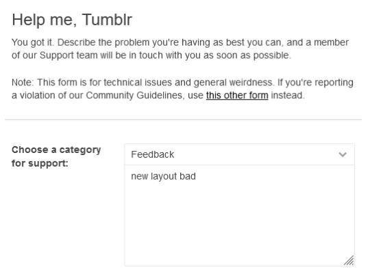
Please be more eloquent than this example. Also to the users with unchecked anger issues that you think makes you cool: no violently threatening the support team please that will help nothing and probably just be counterintuitive Just say the layout is bad and you don't like it. I believe in my heart that we can perform a #ThisNewLayoutSucksAssSweep
4K notes
·
View notes
Text
used tumblr on desktop for the first time in four years and the layout is giving me a headache. what's happening why are there just so many things everywhere now
1 note
·
View note
Text
why the FUCK did the desktop layout for tumblr change. It looks ugly, I want it to change back. Everything's all centered and cluttered and it's giving me a headache. It looks like a facebook/twitter clone.
#hey tumblr you've apparently somehow become the least shitty social website#so if you can hear me shouting into the void PLEASE fix this I beg of you#gala speaks
0 notes
Text
Loaded Ariadne’s page on desktop, had a small panic moment because I thought she had changed. But thankfully she is still on the old dashboard layout.
This is the only space I can scroll the dashboard to see what people have been up to, and in writing an OC I can fairly say I know what it feels like to not get any engagement on a post you’re proud of vs. writing a one liner shitpost on a canon blog and getting flooded. I try my best to “give” here, and this is the blog I will most often like or comment on posts.
So, if or when Tumblr’s dashboard changes, essentially I can only “take”. Because at that point I can log in, post, and ignore whatever other people are doing because the new dashboard legitimately gives me eye strain which leads into a headache and I cannot scroll through it. I know I shouldn’t be depressed or defeated over something that hasn’t happened yet, but I can’t help but feel that dread creeping in because the change feels inevitable. If the layout works for Twitter it’s good enough for here.
It feels like watching the slow creeping end of my accessibility to a cherished hobby. There’s probably a fix around the corner. Or a solution I haven’t thought of. But right now, today, sadness.
1 note
·
View note
Photo


Digitalized Conclusion Page Wireframe (v.1) vs the original sketch
See the conceptualization process here!
#web design#wireframes#cm 491#amber updates#last one for the night. this marks 5/8 done.. the other three are all-related to the survey#that said i may end up doing more than three wireframes considering that i'm in quite the pickle with how i want to present my information#as for this particular wireframe i do like the left-aligned layout! i might end up trying out a similar layout for the research page#i do like the two-column layout wireframe as a concept for desktop but i don't know if the excess amount of images would translate well-#to a mobile format y'know? so i decided to compromise a bit and still have alternating sections but with ColorsTM#so in that regard this particular draft has 'deviated' from the closest sketch but it's okay! i actually kind of like this one#but i also wonder if some of the sections could be whittled down? there's a lot i want to convey on the conclusion page and some people may#see it as a turn-off... i say this when the survey pages are definitely going to be the most challenging ones to create#in any case! im rather happy that the digital wireframe process is going alright even if the survey ones have been giving me a headache#tomorrow is a class meet-up and i think it'll give me some clarity on how i should proceed so im really excited about that!
1 note
·
View note
Note
Your page is very beautiful and aesthetic can you tell me how you did it 😌.. I'm new user I don't know how to use Tumblr yet everything is so confusing here 😅😅 .

🌷 Hi there! Thank you for saying this because I actually enjoy customizing my tumblr and creating these banners even though I am not an artist or anything? Hahaha *shy* 😊. I actually don’t know how to describe or give instructions on tumblr customization. But you can try checking tumblr’s tutorial pages?
WIll try to help as much as I could but I am not an expert so please bear with my attempt to explain it below the cut
🌷 I think first step is to choose a theme?
It’s not required and honestly my main blog is just the classic tumblr theme. I just change the color schemes depending on the banner I’ve chosen. I also prefer the grid view so I can see around 4 columns of content since that is my main blog for posting fangirling content + ongoing fics + random stuff. For ggukkiereads, I really prefer if content is posted per column and I decided to choose from different theme creators!
My theme is from https://seyche.tumblr.com/ and I just customized the colors, the padding, the links, the icons. There are other theme sites though and you can actually search on tumblr for other sites (just type blog themes to find the others). Here are others you can browse:
https://xuethms.tumblr.com/
https://seyche.tumblr.com/
https://cactusthemes.tumblr.com/themes
https://amboise.tumblr.com/tagged/codes
https://sheathemes.tumblr.com/tagged/sheathemes
https://pirateskinned.tumblr.com/terms
https://sorrism.tumblr.com/tagged/theme
https://odeysseus.tumblr.com/tagged/*mine
https://nonspace.dev/tagged/nnspc%20codes
https://kosmique.tumblr.com/codes
https://mercurythms.tumblr.com/tagged/*codes
Important!!! Please check their terms and conditions before downloading theme codes
THERE ARE MORE SITES and I am not keeping tabs of every theme site. However, I remember following one blog that reblogs or features themes from different creators. I will find the blog site and edit this so you can also follow and get their recommendations =)
🌷 banners and profile pictures
For banner making, I just use Canva. My pfp is butter Joonie/sugakitty which I had commissioned and I can just change or use them in all banners as I wish. There’d be banners on twitter too for profile layouts that you can use for free but they are usually for twitter layouts. If you like some you can ask the artist if you can use the profile photo or banner for tumblr instead of twitter.
If you need to remove a background, there is a free bg remover online.
Note: important to give credit to the source. In my blogs, I usually document where I get the photos, etc.
🌷 color schemes
I just used Canva for the color codes (hex codes). Tumblr will also suggest a color palette when you’re choosing the blog colors. I guess just experiment and have fun with it? See what colors you like or speak to you.
🌷 mobile
Please note that sometimes your desktop theme will look different on mobile. And this gives me headaches and I am not prepared to give tips because it’s a “let’s wing it” process for me when setting my mobile theme. I guess try simple themes first? Then once you are confident with theme changing, you can start customizing more details of your blog for mobile (you have to use customize for mobile link which you can find on your dashboard settings)
🌷 hyperlinks on your BIO
This requires codes but if you are not comfortable to link sites yet, then not required to use this. But if you see on my blogs my bio has linked description, right?

These are codes you need to remember when organizing your Bio:
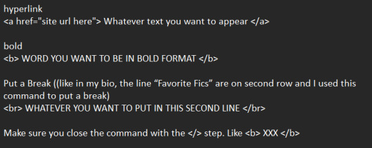
I hope it’s not confusing or that I’ve been a bit of a help? Feel free to DM me on my main if you wish to chat more about this =)
.
9 notes
·
View notes
Note
hi i hope you are having a great day :) i just joined from twt after everything that happened and wanted to know if there are any accounts that you recommend to follow if you have any? like artists or theorists that are cool - because i wanted to start mass following people! or any advise you can give on how to curate a good tumblr experience i would be grateful for!! thank you (and everyone) so much for being so welcoming, i’m coming back to tumblr after leaving a few months ago so it’s been strange to realize i’m now a twt refugee lmaoo
i actually already made a post of blogs to follow, so here’s one on curating a good experience :]
0. i’d recommend lurking around on people’s blogs for a weekish before trying to make your own presence. it’s a good way of learning all our unspoken etiquette first-hand
1. follow people and tags that you like! you’re only going to see posts they make or reblog (as long as you go into your setting and turn off “best stuff first”)
2. download “new xkit”, it’s a browser extension that gives tumblr cool extra helpful features. not necessary, but really nice!
3. use tag filters! if you go into your setting there’s options to block specific tags, for instance, if you’re triggered by blood, you’d want to block “tw blood” “blood tw” and “blood”, etc. you can also do this for characters, ships, fandoms, anything you’d rather not see. (the post will still be on your dash, but blurred over like a discord spoiler option).
4. block people!! use the block button frequently and without remorse. no one here notices or cares, and trust me, it saves a lot of grief. someone is actually really toxic or bigoted? block them. they have really nasty character takes? block them. they made a single tiny comment that you just didn’t vibe with? block. you think their pfp is ugly? BLOCK! nobody minds, and it’ll save you a lot of headaches. blocking and moving on is what we do instead of call-outs.
5. customize your blog! i might just be ocd* but i love messing with and changing the layouts and colors all day. on mobile, all blogs look the same besides the color and font, but on desktop, you can actually download or code your blog to look like an entirely different and unique website! look at my blog on desktop and you’ll see what i mean. it’s very fun, and if you search “tumblr themes”, you can find tons of really cool free ones. go hog wild! it’s YOUR blog!
that’s all i could really think of atm. enjoy your time on tumblr! we’re technically the same as any social site, but do the five above things, and you’d never even know. have fun! :]
#* i am actually diagnosed with obsessive-compulsive disorder... i wouldn't make a joke about it dw :)#anonymous
308 notes
·
View notes
Text
let’s talk commission stuff!
hey folks !! so i’ve been reorganizing myself to get commissions back on track, and i’ve got some things i’d like to get your input on, if it isn't too much trouble !! ;v;
it’s a long one, so under the cut it goes sdfghghj
a slightly too long tl;dr because apparently this is a 10min read (i'm so sorry): commission revamp on the works! no date for it yet. gonna be easing myself back with just icons for a while at first (no date for that either thoug, not yet), then the revamp will be in full swing with all the other commission options, and the pricetable for them will be changed in the future as well.
some questions:
1) i’m rethinking commission types, is there anything you’d like to see as a new option? 2) considering i tend to open only a handful slots every batch, i'm thinking about implementing a waitlist (with a bit of a twist: it's split between Current Batch and Next Batch; a little more complicated than a regular ol' waitlist, allows me to get through some of the waitlist queue as work gets done). would that interest you or is it too much of a headache? 100% open to suggestions! 3) i’m organizing a board on trello for commission stuffs !! any suggestions or specific things you’d like to see there?
so! it’s already been over a year since i last opened commissions and i’d very much like to get back to them ;o; it’s been way too long! i miss working with you folks aaa
i don’t have a reopening date yet, but i’m planning on opening only icons for a while to ease back into the process. later on, i'll open the other commission options too. you see, i’m working on a full revamp of the whole thing, including the terms of service and that info image with the examples (because looking back, i think it no longer really represents my current style and how i really do commissions in terms of just... plain old rendering and polishing), so i’ll be working on new drawings and a new layout too, and all that good jazz :D
for full disclosure, along with this overhaul of the terms and such, i will be updating prices too c: i’m still working on the new values though, since i need to figure out what commission types/options the overhaul will have. which brings me to the first question here: what would you like to see as a commission option? for reference, here’s the og options:
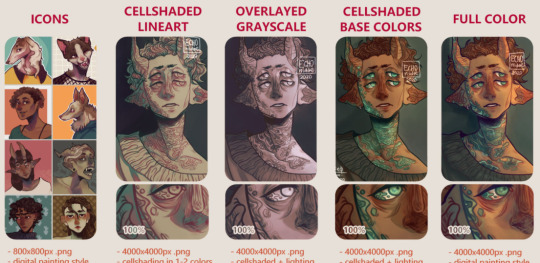
(hoo i need to redo those examples *sweats*)
also, one more thing i’d like to note about this revamp situation: there isn’t a whole lot that’s changing really haha it’s just been a long, long time since i last did commissions, so i’m reviewing terms and i might change stuff that’s become outdated, or that needs clarification. if you’ve commissioned me before, the process itself is still the same so no worries! once the revamp is out, i’ll point out anything that has changed too c:
in regards to price changes, those first icon-only batches will be in their original price, and the new prices will only take effect once the revamp with the other options is out. it will be quite a while before until that, but if you have any concerns, feel free to message me any time ! either way, i’ll keep you folks posted !! i guess i also could post the new prices before implementing them, if that helps!
so, moving on! now to the waitlist situation <:3c as in, i’ve never had one, a while back someone asked if i did, and now that i’m reorganizing things, i’m wondering if it would be good to implement one :3c feel free to send any questions !! or suggestions!! i'm all ears!!!
usually i only open a handful of slots for each batch, right, and once they're all claimed, the commissions are closed until all the slots are finished. folks who missed the slots have to wait until the next batch, and sometimes those batches take a while to come back, and i usually just message those who missed the opening once the new batch is announced.
what i'm thinking for the waitlist is, i'll open it along with the batch of commissions, and limit it to a specific number of spots or close it by a specific date, whichever comes first. to apply for it, people would just need to send the form and i can tell them immediately whether or not i can draw their request, and then they'll be placed on the waitlist in the order they’ve been accepted c: pretty standard stuff.
here’s the important bit: that list is basically split in two. the first handful of people on the list, corresponding to the amount of slots for the current batch, will be reached out to as i finish working on the claimed slots, and then anyone else on the waitlist will be contacted shortly before the next batch. if, by the time the list closes, not all the opened slots have been claimed, folks on the list will simply be moved up the queue accordingly c: all of it would be discussed individually, of course, and very well disclosed in the commission info!
there are other points to it as well: anyone would be able to request a spot on the next batch's waitlist instead of the current one, and anyone can leave either list at any point. folks who had already claimed a slot when it first opened would only be able to apply for the next batch's waitlist (to give everyone a chance of getting one), and people on the list, either for the current or the next round of commissions, can be skipped up to a limit if they're unable to continue the order once i get to them.
oh and, before i forget, with the waitlist in place, i think i’d no longer be able to put slots on hold as i used to (as in, before paying the first invoice), as it’d be unfair to folks on the list. in that case, the person would be placed on the list as well if they want to, and contacted as soon as possible : )
also the "up to 2 slots per person" thing would be on thin ice too haha
anyway, this is kind of what i intended to do back then, with reopening slots as work gets finished, but never got around to. i want to make sure i don’t swamp myself with work, but also have it so that folks who want slots have a good chance of getting them, whether for the current batch or the next, as there's only so many slots i can open and work on at once, and time zones and irl things are to be considered too for anyone interested c:
it also makes it easier for me to keep track of messaging folks about new slots and such, and the list would be made public and easily available for consulting too : D more on this later!
so how's this looking? i've never done waitlists before and barely knew how they're supposed to work before starting to reorganize things, so please do feel free to voice your thoughts !! i’m 100% open to suggestions !!! do you think this system would work out for you? any concerns? if anything is unclear feel free to point it out, i'll do my best to explain the process or change stuff that doesn't quite work!!
so!!! now to the very last thing i wanted to talk about ! trello!
i’m making a little trello board for updates on commission stuff! my commission info page here on tumblr and on deviantart both have this little section for updates on each slot’s progress, but i admittedly didn't do a good job keeping them updated (and constantly updating two things in different places just. kinda sucks.), so i’ve been diving into trello to unify that update section in one place and keep things nice and organized and transparent : ) it would be super useful for keeping track of the waitlist too, if that becomes a thing, or for updates on commission status and such!
so far i’m only testing things out, so it’s looking like this right now (sorry for the tiny image!):
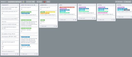
(the board is lying btw, commissions are very much closed haha) (also if it’s basically unreadable, here’s the upload on sta.sh)
with all those little lists, the “available slots” and “sketch” and “lineart” and whatnot, i would be moving the card along the process : D and adding the appropriate labels, of course
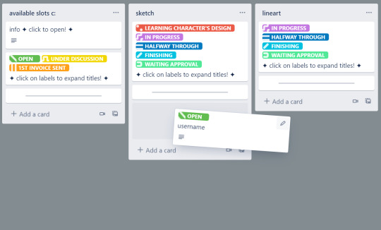
this way i can have those halfsteps labelled too (working on/halfway through/finishing), since there’s only so many colors i can use without making it confusing (and tbh i’m already not too thrilled about color labels as it is, but it beats typing each individual status, and i’d imagine it’s more readable for folks consulting the list as well)
i really like how this looks so far in terms of organization but i’m unsure if the horizontal scrolling is anything but annoying, specially to folks on mobile (with the way i divide my screen on desktop, it certainly isn’t ideal either), so if you have any experience with that, feel free to let me know your thoughts!! there are a thousand different ways to organize this, and this is all a work in progress too c:
so! anything specific you folks would like to see on trello? i know this is a fairly common tool for commission queues and info and such but i’m super new to this platform, so please feel free to send suggestions! ♥
anyway yeah! that’s it! ;0; !
i’m sorry for the super long post, i’ve just been thinking about a lotta stuff haha i feel like i don’t interact a whole lot as it is, and since commissions are very much a team effort, i do want to get input from you folks on it c: it’s good to get a fresh perspective as well!
thank you so much for reading this far !! let me know your thoughts !!! :D ♥
#oh boy.txt#:3c#;;yeowline#the word batch can be found 28 times in this post#waitlist is present 24 times#slot = 32 times (28 being the plural)#commission? 46 times#phew!#also!#doodlesketch stuff#eye strain#for the art there haha
7 notes
·
View notes
Text
Osirion Pt.3
This is a continuation of part 2 that begins immediately where part 2 ends. Any questions, comments, issues, or feedback is welcome as a comment or message. Also, I am having issues with mobile. On desktop there are paragraphs, yet mobile is a smoosh of words. I am trying to find a way to make paragraphs in mobile without having a ridiculous amount of spacing on desktop.
Part 2 Part 4
He couldn’t be sure his translator was working correctly, what she said was so quiet he was getting a bad read. But he could have sworn she had said ‘We will see about that’ under her breath. He’d only just met the human and she was already giving him a headache. She didn’t seem afraid of her possible assassination (that those annoying Federation station workers practically told her to expect.) She seems more amused by it all. Not for the first time he asked himself what the Federation had gotten him into. What kind of being is amused by their own possible death?
“By the way Captain, What is the address system for other beings?”
“Excuse me?”
“Miss Kayra Fugioika, Miss Fujioka, Fujioka, Terran-Fujioka. Those are all the ways you have addressed me. I am wondering what system I should use when meeting others in the crew. I hope I am correct in calling you Captain, though I would appreciate your input.”
Captain Yurok was at a loss for a few moments. It would seem that in testing her against intimidation, he forgot about consistency. He should have just called her Terran, then maybe he could get a better read on her. Who was he kidding, putting his slip-up with her name aside, he didn’t think this human was easily intimidated, she seemed very confident even though she said herself she knows it isn’t expected for her to survive this posting. In fact she seems to find it all, amusing.
“Captain, or Captain Yurok is appropriate. I am not used to addressing Terrans, we use our names here, since you seem to have two of them I picked one. I am aware of some beings using a family name and an individual name of identification. No other member of my crew has two names. We have other means if identification if there are too many with the same name. Now if you would follow me, we have been standing here for far too long.” He wasn’t about to tell her that the longer this conversation went, the more uneasy he felt about his newest crew member.
Kai had nothing to bring with her as she had already dropped off her belongings near the loading bay doors before waiting for the captain. She listened as the Captain explained what was expected of her. Which basically was staying in her quarters for the first week until there could be a meeting where further information would be exchanged. While in her quarters she would be given access to the ships information on her holo so she could study the layout, learn some of the crew demographics, and also learn different jobs that are held on board. That was the official reason for being grounded to her room. The captain wanted to be sure she understood the ship so she would be better accustomed to it. She didn’t believe the official reason, but he was the Captain. She didn’t tell him that she already had all that information she was supposed to learn with her hacked holo. She decided it was best to play along and lay low for a while. After all, she had to last more than five days at least. She didn’t want anyone winning on their bets.
Before the Captain left her to her studying, Kai decided she needed to set one thing straight.
“Its Kai”
“What”
“My name. I like to go by Kai. Dr. Fujioka for strangers. But you’re not a stranger, are you captain?’
That last part was said with a smile and a sideways look toward the captain that he found a bit unsettling. From what he had learned he believed the smile could be considered a smirk, but he didn’t know enough about humans to be certain. Not for the last time he asked himself “why him”?
#humans are space oddities#humans are space orcs#HUMANS ARE WEIRD#humans are insane#humans are space australians#earth is a deathworld#earth is space australia#Kai-Osirion
68 notes
·
View notes
Note
Ah thank you - I felt so locked into my theme because of my URL so I intentionally went for the night/day split with my main. Theme-hunter is my crack ISTG. Did you intentionally make both your URLS food? 👀
It actually a coincidence that I don't even realize until a few weeks ago (before I edited all my navigation's theme and layout) 😂😂😂
At first, I tried find a word that can associate with nomin, lee know, and chocolate for each URL and somehow all my URLS have food element in it:
cinnamonroll — cinnominroll
lychee — linochee
chocolate — chocolattees.
while my tbz blog's url, I just search it randomly.
Talking about theme, I'm also like to change my desktop blog theme almost every month. Especially when I find a cute and pretty theme to try. But, this time I tried to not change it again since it will give me headache to organise it 😁😁😁 (at least not until I bored with this one I currently use for my writing blogs).
1 note
·
View note