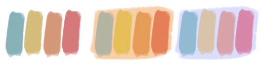
#but the colors always come out more desaturated when printed
Text
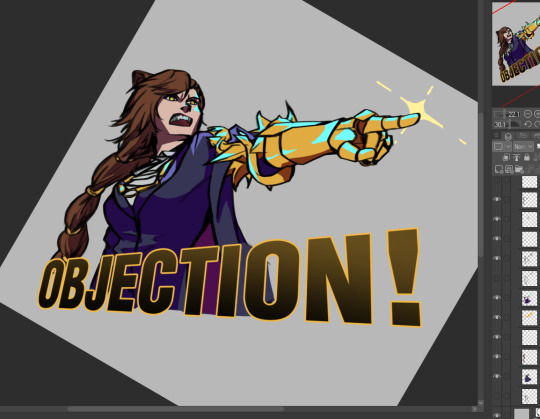
gonna be posting some AK sticker designs i'll be making for the coming days
#arknights#penance#ace attorney reference#i'd hella stick these on my tumbler#i know her hair isnt that shade of brown#but the colors always come out more desaturated when printed
51 notes
·
View notes
Text
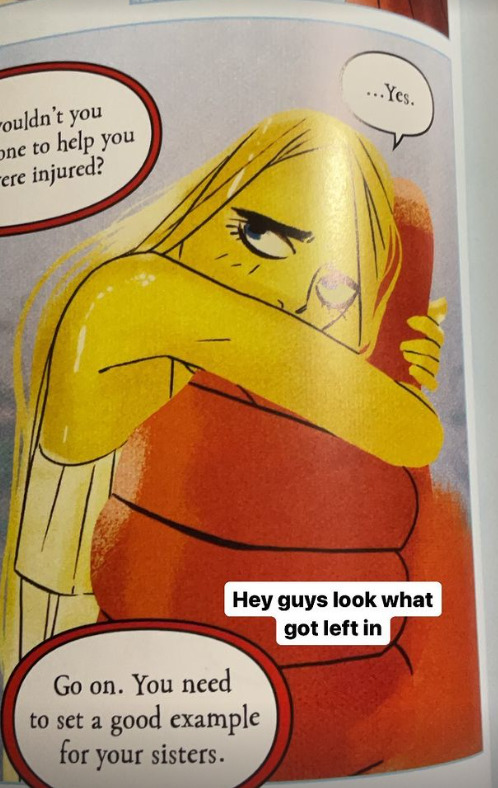
Rachel "Retcon" Smythe Strikes Again!
Okay, so I've been seeing pictures of Volume 4 of Lore Olympus floating around, and people are ALREADY FINDING RETCONS.
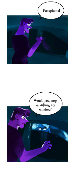
Most notably so far, some added panels in the Hades and Apollo confrontation that happens outside Artemis' house (when Persephone steals Apollo's lyre) in Episode 81.
This is the original scene, for anyone who needs a refresher:


Aaaand here are the panels that were added.
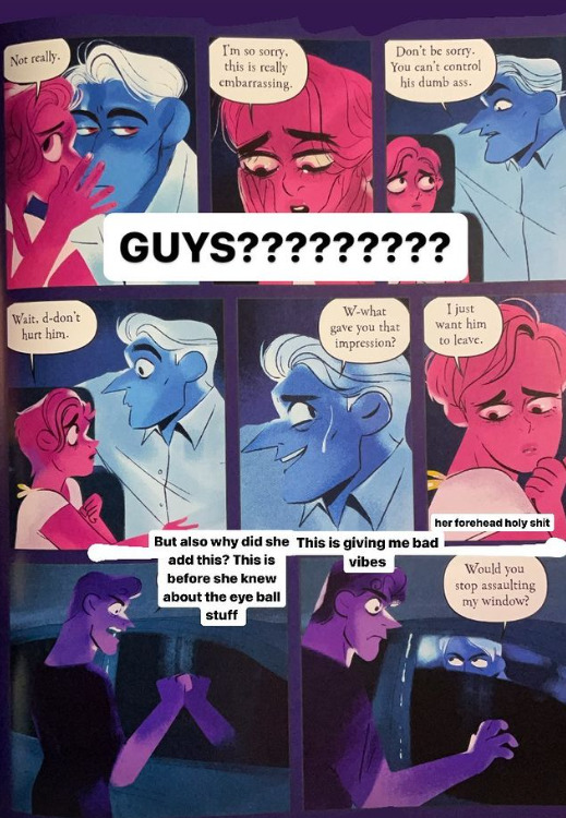
(all pictures of Volume 4 are courtesy @iwannagutyou on IG!!! thank you for giving me permission to use these! <3)
First of all, the art. It's so noticeably bad. You can tell Rachel has completely lost her ability to draw these characters in the S1 style, I'm fairly certain she took the panel of Hades from the old version and just copy pasted it to try and get around it (look at the posing) but it's incredibly obvious looking at that third panel that LO is not and can never be what it was back in 2017-2019. Those first two panels seem like they were copy pasted from the previous ones, which is just sad if those are the lengths she has to go to to come even close to replicating the older style.
Now, this just might be due to camera translation, it could very well look better IRL, but the colors just look so incredibly desaturated and the lines blurred out, to the point that people are doing double takes over whether or not panels have been directly changed - they haven't been, they've just been so sucked dry of their colors that they look off enough to cast suspicion.
If anything it's a harsh reminder that LO has kinda always had art problems, especially with its lazy humor and stupid meme faces.
Of course, to be fair, color loss can happen in print, but seeing how slapped together these books tend to be, I wouldn't be surprised if they just didn't put in the effort to convert the page art to CMYK or at least tinker with the saturation in editing some more to ensure it would come out more vibrant in print.
Now. Excuse me while I go on a bit of a crackpot rant here. Newbie puff pals beware, because this is gonna get dicey and you're about to learn where my tinfoil-hat rep comes from but I just have to talk about it.
Back to the added Apollo panels, where Persephone asks Hades not to hurt him and he looks nervous before she says "I just want him to leave".
Maybe it's just me, but it's a little weird that THESE are the panels they decided they needed to add. It's weird that she's asking Hades not to hurt Apollo when she's about to break into his car and steal his lyre just a few moments later. It's weird that the implication seems to be that she's referring to Hades' act of violence towards Tori... but Persephone doesn't know that's happened yet. So this feels like an unnecessary retcon that's doing more harm than good.
But I feel like the timing of this is kinda messed up as well, as this book released just days after the release of the last FP episode in which Apollo has his 'side' of the assault story told through his perspective, which is often considered a HUGE no-no in writing assault stories because it often comes with the implication that it's asking for empathy from the audience. We already know Apollo is delusional, we already know he thinks him and Persephone are meant to be despite her constant rejection of him, we didn't need a flashback from his own warped perspective explaining that very thing, the only purpose to do such a thing this late in the game would be to try and get the audience to 'connect' with him (it's giving S3 Bryce from 13 Reasons Why vibes). Now we have this scene of Persephone asking Hades not to hurt him (despite the structure of the episode being literally fine before, this change wasn't needed) getting snuck into the physical book release just a couple days after the newest FP tried to present Apollo in an empathetic light (and let me tell you, that's a whole essay and a half that I'll be getting into eventually).
Shit, if I wanted to get REAL Pepe Sylvia with it, I might say that hypothetically, the whole point of the random Leuce abuse episode - despite Persephone having no way of knowing what she attempted as Hades hadn't told her and she wasn't there to see it and we weren't shown her overhearing them in any way - and the following episode that was mostly padding of Hades and Persephone having sex - no consequences or follow-up whatsoever to the Leuce scene - was just to pad out the episode release schedule and buy time until the book came out so that Rachel could release that Apollo POV episode right before the book came out and revealed those new added scenes of Persephone asking Hades not to hurt Apollo, in what could be a sly artificial attempt at minimizing the SA plot so Rachel can finally just brush aside the one major plot point she regretted writing the most. After all, it wouldn't be the first time Rachel's controlled the pace of her comic to release certain moments at certain times that line up with IRL events.
But, y'know. I'm gonna quit on that thought while I'm ahead because it's probably making my credibility meter drop into the red. My ADHD has been real bad lately and it's really starting to show LMAO All ima say is that IDK who Rachel thinks she's fooling here, this kind of shit is stupid easy to fact check when the digital version of the comic is available online to read.

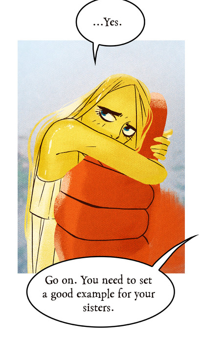
To end on a much funnier and lighter note, remember how Rachel tried to retcon the Demeter/Hera/Hestia relationship by changing the line "I miss my sisters" to "I miss my friends"? Well, there was one panel that had been missed in the webtoons version that still refers to them as sisters. You can still find this unedited line in Episode 78.
And uh. They forgot to fix it again for the book.
It's permanent now. That's permanent marker. It would have cost them nothing to find this in the webtoon version and fix it before it got sent to the book editors. Now it's gonna cost them thousands because the book editors didn't bother (or know) to check.
There's also this... weird shit going on with the speech bubbles. Like, they're REALLY FUCKING OVERDOING IT with the speech bubble outlines. I don't know who made this choice but it was a bad one. Gross. Don't do that. It looks so cheap.
But let's be real, at this point I feel like the book editors are just outright sabotaging Rachel because who the fuck calls themselves a professional when they do this shit-

Oh, and there's no bonus episode, just sketches. Which is fine. But it makes me chuckle to think that Rachel just didn't have time in her already razor-thin buffer to draw up a new episode to pass off as "cut content".
#i'm fired for that whole conspiracy bit aren't i#can you blame me when the wedding was lined up with valentine's day and dio's birth was lined up with mother's day#i swear to christ rachel does this on purpose it's so unhinged#just write a story#it doesn't make your comic 'deep' to line it up with real world dates that aren't gonna matter in 3 weeks anyways when they go up for free#it's just so unnecessary and pointless to do#lore olympus critical#lo critical#antiloreolympus#anti lore olympus
206 notes
·
View notes
Note
hello! i absolutely love your gifs and recently started making my own. your tutorials have been AMAZING especially the one ab creating super smooth gifs!! i was wondering two things if you wouldn't mind going into more detail. how do you go ab using topaz? I downloaded it (video ai) and when I try to use the frame interpolation, the video comes out looking super weird and staticky. My other question is unrelated, but was wondering if u could talk a little more ab neutralizing colors in gifs which you mentioned in one of ur tutorials? Thank you so much for all the beautiful gifs and amazing tutorials!! <3
hi anon. thank you for the kind words!! this actually just reminded me to update my lil gif speed management tutorial bc im doing something different now (avoid converting into smart object at the end which always made my gifs less sharp). i think it makes a pretty big difference <3
Re: smooth gifs by neutralizing colors (from this tutorial)
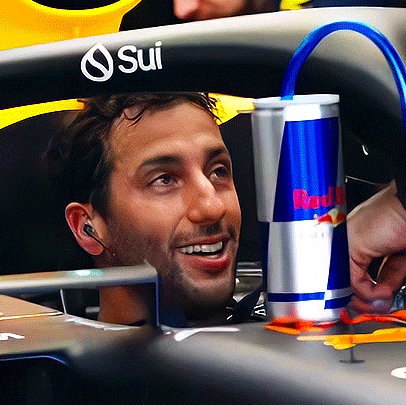
basically the concept is that since gifs only allow at most 256 color entries, the more neutral in color a gif is, the more detailed those colors can be represented. here are two gifs whose only difference is the color on the big screen behind daniel. the first gif has more saturated greens and blues, and from the color table we can see PS utilized a lot of the 256 color slots to express greens and blues. the second gif is more neutralized, as a result we're seeing more skin colors in the color table, ie more efforts are made to express the main subject of this gif (daniel <3).
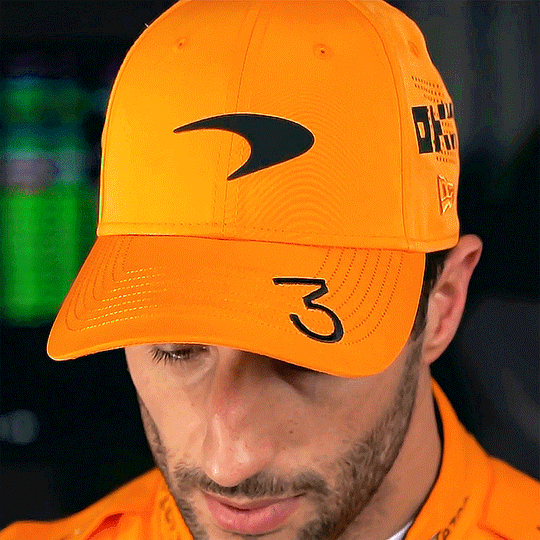
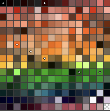
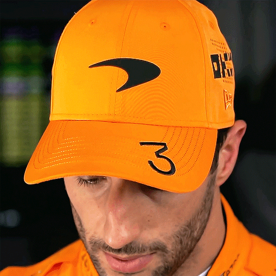
at this size, it may look like the first gif looks better bc of vibrancy. but the problem will expose at full size. taking a closer look we'll see the skin tones in the 1st gif are not as well expressed as the 2nd gif. the 2nd gif is a lot smoother, less pixelated, and less splotchy, especially around the highlight areas.


this comparison in gif:

obviously, nobody will look at a gif this closely. but in my opinion this is what makes the difference between 'smooth' and 'butter smooth'. vibrancy and smoothness are both important to a gif, but unfortunately they are a trade-off. it comes down to the gif maker's personal preference. to me personally, the first gif is eye-catching bc of its bright colors, i totally see why some ppl might prefer it. but there is a smoothness and real-ness in the second gif that the first gif just doesn't have. as a result, the more neutral coloring would be what i prefer for this particular gif
in application, this can go both ways:
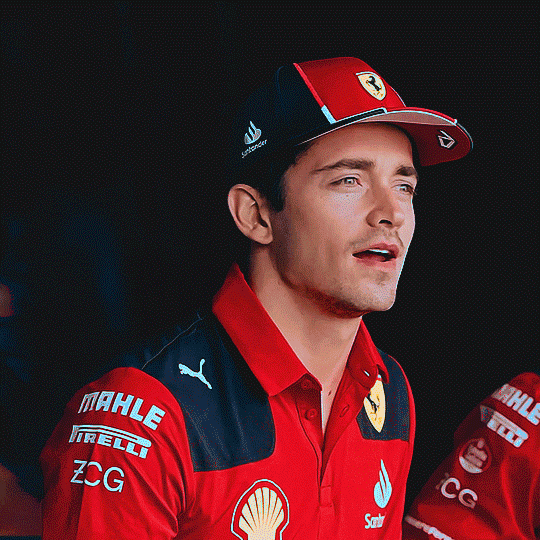
1. if i feel a gif has too many colors and is pixelated bc of it, i will try to neutralize some of them for smoothness. example: here the very blue background that we're all familiar with was neutralized to an almost baby blue. the bright yellows on sharl and max's race suits were warmed up and desaturated to a peachy yellow color. this will be particularly useful if your gif is too big and you have to use even less than 256 colors.

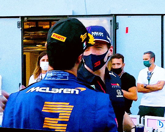
2. if a gif feels too dull, i will either try to make some of its existing colors more saturated (using Hue/Saturation Adjustment), or add some hues to the whites or blacks (using Selective Color), so that it will have more vibrancy. example (left): the blue on the red bull can is almost the only cool color in this gif, so i made it more saturated for contrast; example (right): the gif had virtually no cool tone so i made the whites (see prints on sharl's shoulder) more cyan than reality. (ps this is why i think sports gifs are challenging. in tv shows or movies the colors in every scene would've been designed and arranged, but in sports we won't have that)
3. colors/vibrancy may be the only thing i want. pixelation can be a style in itself
4. i might not care about colorfulness at all and just want the gif to be as smooth as possible

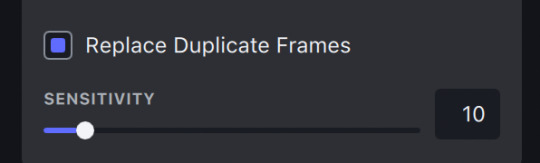
Re: interpolation
speed coming out weird after interpolation is almost always bc your original video contains dup frames, esp if the footage was screen recorded. topaz does provide a "Replace Duplicate Frames" option with interpolation but imo it's not reliable at all. in my experience automated frame dedup requires more configurations than the one topaz lets you customize (sensitivity). which is probably why their dedup doesn't work as well as their other features. making sure your original video is free of dup or missing frames should solve your problem <3
ohh also interpolation works best in doubling or quadrupling! ie 25fps -> 50fps, 30fps -> 120fps etc etc
hope this is helpful!
62 notes
·
View notes
Note
I love your art so much! Do you have any of your brushes for sale, or any tutorials, especially on colour?
Hi!! Thank you so much! 💕
Honestly, my go-to brushes are all procreate brushes with slight adjustments (like stabilization, etc.) my personal preference is brushes that kind of mimic graphite pencils. The best thing you can do is find a brush that suits you & get very comfortable using it! Specific brushes won’t necessarily improve your work, it’s all about practice! (But yes, a nice brush does help!)
I do have a video on my favourite brushes:
I’ve never really made any tutorials, but I’m happy to try and relay what I know and what I’ve learned so far!
Colours are a big part of illustration! I could probably ramble on for hours, honestly—in any case, it’s always helpful to know fundamentals of colour theory. Once you learn and apply it, it becomes intuitive! I’m gonna stick to RGB colours because CMYK is it’s own thing (printing!)
There’s a handful of basic terms like hue (pure colours), shade (adding black to a colour), tint (adding white to a colour), tone (adding gray to a colour) and also opacity (transparency) that help us understand and define the complexity of colours.

My colour choices are more often than not a gut feeling—but that does come from practice! There’s loads of colour palettes available online like this one, but if you wanna come up with your own, there’s some neat ways to do that using a colour wheel! Colours can broken down into primary, secondary and tertiary colours. We can also categorize them as warm or cold. With this we can make colour schemes!
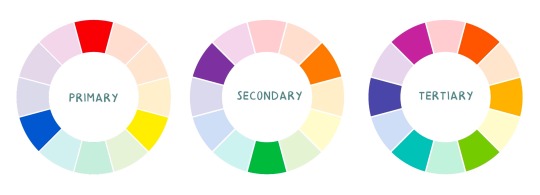
Some basic schemes!
Complimentary: two colours, opposites on the colour wheel
Analogous: three colours side-by-side
Triadic: three colours that form a triangle, evenly spaced
Monochromatic: using one colour (using different shades)
(Bonus) Monochromatic with accent colour : using one colour as a foundation and having an accent colour (similar to analogous, but one colour is used for a majority of the piece while the accent colour is used sparingly)

It’s also important to keep in mind that values (a colour’s range from dark to light) will look different on different colours. Sometimes, you’ll put two colours together and think “huh, something about this feels off” and it turns out, the colours just happen to be very close in value and melt together. Switching your piece to grayscale just to check on your values every so often can help with contrast and muddiness! A light tone on a darker tone will look brighter than it really is. Colours can also influence each other and trick your eyes.

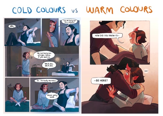
Environment is also a big part of choosing your colours for a piece. Determining what the setting is important! A sunset will make a drawing warmer, while a scene set in the night will usually have colder tones. Using only local colours (true colours, like green grass or blue sky) vs non-local colours (atmospheric perspective, accent colors that give depth, etc) can help enhance your drawing too. Don't be afraid of artistic interpretation!
Also, there’s always the option to use gradient maps (at least on procreate & photoshop but I’m sure it’s available in csp and other programs) where you draw in grayscale & apply a gradient map. The gradient map basically applies a color to every value (e.g all the shadows become blue and the highlights become orange) it can look really nice (and help out if colours just aren’t working that day yk)

Another thing, when I’m drawing (and this is specific to me!) I tend to start with pretty desaturated colours. Once my illustration is done, I’ll duplicate & merge my layers to do colour edits. Most programs give you the option to play with curves or colour balance—menus that allow you to play around with the hue of the shadows, midtones and highlights. I tend to make my shadows more cyan-blue, my midtones a little warmer and my highlights warmer as well. Of course, this depends on the mood of the piece, whether it’s warm or cold, lighter or darker, etc!
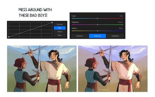
You can always make adjustment layers on top of your work; a low opacity yellow, magenta or blue (or anything your heart desires) overlay to tie all the colours together.
I hope this helps a bit!! Happy to answer more questions to the best of my knowledge :^)
102 notes
·
View notes
Note
I really love the way that you utilize color in your work. And how you use so many different brushes in your digital art .....it inspires me .... I'd never really think of using certain combinations of them in my own art etc ......I kinda stick to 1 brush that I use for an entire piece ...want to try msking more digital art with the way you use the different brushes a bit more....also I love the way that u don't blend at times with digital pieces and instead move between a bunch of different colors to create like...."""shading""" sort of .......love 🌈🌈🌈 Im really not in a color mood right now for my own art. But your use of color in yours inspires me on a more emotional level when it comes to how I create rather than me physically using color in my srt like u do lol
Oh my god wow..i was just thinking about you Spoon. Like just now.
Thank you so much really..im really inspired by like.."tacky" use of digital art tools.. i love airbrush and star brush etc etc..really so fun to use..i found the most incredible pearl ornamental brushes today..? i couldnt believe it..the way it was posted too so beautiful, im on phone now but i can link it later tomorrow it was really so heartwarming?
And also thank you i love colors..today was like..so many screens my eyes are gonna fall off LOL and constant music too. enneagram 7 moments. I feel like using muted colors would be good for me.. or lots of greys, and maybe very very dark colors too, desaturation, its a scary concept like life sucked out of the world but that is not true.. its just the whole world.. it has everything
i would like to explore "infrared " ways of thinking when coloring i think that could be so interesting
i really love your recent art so much by the way its so interesting to me that youre doing black&white.. when i saw it i thought of nature like little insects and dry leaves..
Again thank you so much, while doing these i was sort of..worried? about the buyable-ness of them.. i have a fair in some weeks and have to print stuff and felt insecure about recent pieces...
Its lovely getting a message from you spoon.💗 Have a wonderful day it is always beautiful to talk .. these exchanges 💗🌈
17 notes
·
View notes
Note
Hi! You work a lot with prints and that stuff so i wanted to ask you if there are important things i have to take into consideration when printing? I recently test printed a 2000x2000 piece (i think that's around 6 inches) and at 300 dpi but for some reason the colors look off? It also looks like when a picture has a lot of noise, like the colors don't look very smooth, maybe it was because of the printer but i don't really know
Hi! I’m not an expert when it comes to print making by any means but I’ll try to let you know what I know!! gonna put it under the cut since it got quite long!
I’m not sure about the noise, if your piece was at 300dpi and looks smooth digitally then it should translate over to print just fine! That’s only if your drawing was //drawn// at 300 dpi and not converted later. If that’s the case, then it might be an issue with your printer! If you’re using a local place like Staples or OfficeDepot, or using a bad quality printer at home then you’re likely to get a low quality print that will have some grain to it! It is possible to make nice prints with a printer at home, but you have to consider the paper and print settings. Settings for printing a black and white document on printer paper are gonna be completely different from printing a full color image on glossy photo paper!! dfkljfsd that might be a little obvious, but I wanted to mention it jic since I don’t know where you printed your test!
Also, if your canvas was originally around 6x6 inches and you’re trying to print it bigger, you’ll run into the same loss of quality. I always reccomend drawing bigger than you plan to print (or at least at the same size for bigger cavnases) since sizing down is better than sizing up!
As for the colors, what you’re probably noticing is the difference between RGB and CMYK! RGB refers to the colors we see on monitors and screens, while CMYK refers to actual print colors. When you try to print RGB colors, especially bright neon-y ones (or sometimes specific hues like purple), they often come out looking more desaturated or in a different tone than the original art piece as the printer ink cant make the exact colors. CMYK basically just refers to the ink cartridges in your printer!
A lot of artists use programs like Photoshop (and maybe Clip Studio?? idk) to convert their pieces to CMYK as they work in order to see how the colors will transfer over irl. Some prefer to simply work just in CMYK as it makes it easier and there are no nasty surprises after printing. Personally? I kinda just ignore it sdksdfjkl, the printer I work with for my prints converts my artwork from RGB to CMYK better than when I try to do it myself with a program, and I’m satisfied with that. Printers tend to convert things to CMYK automaticallys, and personally I find my art comes out brighter than if I convert it to CMYK beforehand. So its really a matter of preference, but once you adjust to the initial shock of having your colors changed, its not a huge deal imo (my very first print ever had a neon pink background and you better believe i was so disappointed when it came out looking grey af sdfkjlldfks)
I know some home printers are pretty good at replicating RGB colors. My friend had like a 5ink cartridge printer and she used it to print stickers and they turned out a lot brighter. So, that’s a possible advantage to making prints at home if you’re willing to invest in a nice quality printer.
Lastly, bleed is very important. Full bleed refers to when the artwork on a print goes to the very edge. Without full bleed your art will have a border around it. Its important to make sure your art doesnt have important text or graphic elements too close to the border as they could potentially get cut off when cropping the print. Every printer will have their own specifications, but most will recommend that you work with a canvas that is slightly bigger than the size you are printing in order to account for bleed. Ex: If you want to make an 8.5″x11″ print with full bleed, you’d wanna draw on a canvas that is a quarter inch bigger all the way around (or whatever the specification that you printer requires). So you’d draw on an 8.75″x11.25″ canvas instead, making sure that important details dont touch a 1/2 inch safety border around the whole print. (The safety border includes the quarter inch that gets cut off and then another quarter inch inner border just in case.)
I know all of this might sound confusing and overwhelming but its really about trial and error. Take advantage of ordering sample prints/soft copies before you order a bunch in order to ensure that your print turns out nice! Once you get the hang of it its really not that much work to format! The company I use is called CatPrint, and while they have their ups and downs, I’m familiar with working with them and their quality is usually pretty good. If you order from them, please use my referral link as it helps me out and will get you $10 off your first order!
#FAQ#sorry if there r any typos i dont have time 2 proofread this rn but i hope this helps a little!#Anonymous
41 notes
·
View notes
Photo
How to print your comic, Part III:
What could go wrong?!
Today is the last day of the “Printing your comic” series, and after learning the proper vocabulary and better understanding how the printing process works, were gonna tackle the most common problems that will happen anyway. Yes, even if you communicate properly, even if you export the file correctly and if you’ve chosen the appropriate paper grammage. I’ve said before and I’ll say it again: printing is not exactly predictable and you’re probably going to have to deal with some unexpected adjustments to make. Let’s talk about the most common things we want to avoid or fix.
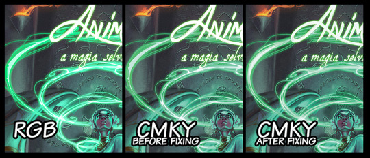
“My colors look dull and dreary on paper”
This is for anything related to color in printing: if you’re like most digital artists, you probably create your comic in RGB mode on your chosen drawing software. This is the standard setting and the most appropriate to work with on your computer screen, since it uses the light-color language.
This apparent desaturation of your painting happens because in fact light is brighter than pigment, very simply, and when we convert the art to CMYK, some of the vibrance might be lost. This happens especially when portraying conditions such as high contrast, bright lights and some particularly tricky colors such as blues and greens. In this case, color might simply break in generate ugly color bands instead of the smooth gradient transitions you’ve envisioned and executed on digital media.
A simple way you can fix this is to work normally on your RGB file, and after finishing it, save it in CMYK color mode to check it out. Things you’ll get to fix at this point are:
Color balance overall, using tools such as color curves (they will now appear as CMKY),
Avoid color bands, which happen because some colors don’t exist in CMKY the same way they exist in RGB
Anything to glowy or scenes that have lots of contrast might need to be toned down in order not to break your colors. Again, white in light is really, really bright, so it naturally looks very different on your computer screen, which is a light source.
“My colors looks too glaring and oversaturated”
This is not a very common problem, but it’s the other side of the coin from the topic above. Some colors might pop out more than you’ve expected and overtake the painting. For me, I’ve had the experience of getting a really loaded yellow, so everything close to this color would look lighter and brighter - as a consequence, some other colors would look dull and gray, since the proportion of colors was a little off balance now. Most cases, however, you’ve probably picked a very shiny paper, like a glossy photographic one. Changing to a matte finishing generally fixes this issue. So, for this cases:
Check the color balance as indicated above,
Choose a paper finishing that favours your colors.
“My blacks look gray.”
For this one we need again to remember the difference of color perception from screen to paper. If you are now looking at your CMKY final file on screen and have the impression that the blacks are gray, that’s totally normal. For your screen, “black” means no light at all in those pixels, but the “K” that is printing black ink has a different data to inform that. That’s why most softwares will give you two options: PDF-digital and PDF-printing for exporting your art.
Now, if your printed file comes out with blacks looking too gray, let’s talk about what probably happened. This typically will show in your speech lines, if you’re making comics, and the confusion happens when we switch color modes from one software to the other. Say you’re on your painting software (Photoshop, SAI, Corel Painter, etc), painting in RGB color mode. You export the file and don’t pay a lot of attention, and the page art is still in RGB, but you open in on a vector based (InDesign, Illustrator, CorelDRAW, etc) the add speech bubbles and character speeches, but these softwares generally work in CMKY. So the problem generally comes from picking two images that were generated in different color modes and merging them. When you export this mix in whichever final format, something is bound to break down.
If you’re working with more than one software, be sure they’re on the same color mode when you merge those images.
“My pages came in the wrong position/upside down in some of the units.”
That’s always a funny thing, and way more recurring than you’d expect. Unless you noticed this happens to all of your units (which would mean the file has the pages switched), that’s absolutely not your fault, but a very common mistake from the printing shop. Take a moment to think about just how many units you are printing, and how many pages you have in each one of them. Most the process of saddle stitching is automated, so the staff won’t actually check every page of every unit. This is your job, actually. Once you notice one or more of your units have this problem, just make a video of it indicating the issue, send it to your printer and explain the situation. Like I said, this is more recurring than you’d think, so they’ll probably very quickly print you new copies with very little questioning.
Always check your comics at the time of arrival. You can ask for corrected copies later on if one you your buyers notices it after the purchase, of course, but whenever you can, check before to have a chance of substituting them in advance.
Be communicative and register everything in video.
“My text font came out wrong.”
This can happen if you’ve sent the native file to the printer, like a .AI, .ID or .CDR. (Illustrator, Indesign and CorelDraw, respectively) and did not link or pack your font with it.You’re using a font that you’ve downloaded, it didn’t come embedded in your computer or software. When the printer staff opens your file to send it to the printing machine, their computer will not be able to read this font, and will therefore substitute it for a font they have available. Since this is an automated process, it won’t even be a similar one, and you might end up with Arial Black all over your comic.
Send your files in PDF, really, it is just the best format for this purpose (JPEG and PNG will also prevent this from happening, though).
If you need to send a native file, always remember “packing” your fonts. (That’s a very specific situation, so I won’t explain how to do it here, but if you need this, please feel free to contact me, ok?)
For all of those problems above, you can actually ask for a print test when you’re running a certain amount of units. For most print shops, they’ll either have a free or very low fee option of sending you a test copy to anything over 100 units. You get this copy before your actual print is run, so you get to check all of these things and talk to your staff ahead of time. It’s a great idea, always ask if this option is available and use it!
Here is a quick list of things to check before you send your file:
Be sure the number of pages in your file is a multiple of 4
Remember your cover counts as 4 pages (front, back, and the verse of each one)
300 to 450 DPI resolution
If needed, “pack” your fonts
Make the proper math to choose between offset and digital printing in advance
Always leave a bleed
Be aware of your safezone
Send your files in CMKY
Check paper size
Have sample prints whenever is possible
Always have a time buffer so that you can fix problems before a convention or event
Always, always, always be patient and communicate a lot!
That’s the end of our series on how to print your comic, guys! Thank you so much for questions and suggestions and for keeping track of this blog.
You might also like to read: How to print your comic Part I and How to print your comic part II
If you don’t want to miss this, go ahead and subscribe to our newsletter!If you
enjoy this content and comic, please considerer supporting us at Patreon!
#howto#howtowritecomics#how to write#writting tips#making comics#how to make comics#how to print comics#printing comics
1 note
·
View note
Text
Life, Love, and Licensure
Introduction
I want to share a story that begins with today but began four years ago. I want to share this story because I need to reflect on the past few years. I want to share this story because people need to know that there is always something more beneath the surface of a post highlighting a milestone or tragedy, or in this case a milestone within a tragedy. I want to share this story because I believe it may edify those who care to read it through.
Today, I became a licensed architect in the state of Massachusetts. And honestly, it feels pretty good. This was the culmination of 3,740 required hours fulfilled, approved academic accreditation, five four-and-a-half hour exams passed, hundreds of prayers, and countless hours studying the weekends and nights after a full day’s work.
The Final Test
The room was filled with the droning from the registers above my head - forcing air faster than ever. Intermittent sounds of forceful clicks of mice and keys intermingled with the ever-oscillating fan to my right. I held my breath behind a four-layered cotton mask as I opted to view the results of the final exam. Thoughts of the past, present, and future merged as I fumbled to read the minuscule blue font at the center of the screen. It read, “You have most likely passed this exam”. I fell back on my seat and gave the biggest sigh of relief in years. I took a minute and closed my eyes to mutter a prayer of thanks.
There I stood, a whole head above the proctor who had previously mispronounced my name when I had first arrived. With scratch paper torn and recycled, my signature scribbled on the sign out sheet, and a half-empty ballpoint pen returned, I was finished. I was finished with this testing center that I had unwillingly become all too familiar with. I was finished with the keys to the personal lockers that had a comically large keychain that looked like an elementary school bathroom pass; finished with looking at a poorly planned water supply line straddling its rear half-way between the partition wall of the coat cubby; finished with staring at the three motel-art posters of lifeless greenery that laid against the sterile-colored backwall of the lobby, that even after two years were never hung. And I was certainly finished with the restroom that never had any paper towels stocked.
Welcome to the Profession
My mentor is old fashioned. He grew up in the days when the aroma of cigars and other types of smoke filled the offices. I would say he is an amalgamation of American idioms, Boston sports, afternoon martinis, traditional Catholicism, and someone with a passion for mentorship - always giving the benefit of the doubt. I knew the words that were coming my way. I’ve heard him say it many times to many others, and part of me was looking forward to hearing them. So, when the time finally came, in full Bostonian accent he said, “congratulations, welcome to the f-ing profession!”
Strength in Weakness
When I was a child, I fell within the shallow end of ADHD. For high-achieving immigrant Asian parents, my learning disability was a source of present worry and long-term concern. I did not measure up to the rest of the class - especially within the realm of literacy. As a result, my mother had written most of my book reports. I am proud to say that she did them very well. The attention deficit would often get me into trouble with instructors at school, parents at home, and even Sunday school teachers at my nondenominational church. Why mention this? I’ve always felt academically inadequate and ill-equipped to handle tests that attempt to measure comprehension skills. I’ll quickly note that as time passed, my concentration and literacy levels had improved – almost supernaturally. I had grown to thoroughly enjoy reading (especially nonfiction) and went on to minor in General Histories.
This endeavor was much more comprehensive and time-consuming than I had anticipated. Perhaps it was because many before me had made it look easy – knocking off exams week after week until they finished within a matter of months. Maybe they were much smarter? Or perhaps I was too dumb? In any case, many of them had not failed more than one or two exams at most throughout their entire process.
Standardized testing is and will always be the bane of my academic career. One of the major reasons for my decision to enter the architectural profession (apart from the passion for design) was the limited exposure to test taking. And for the first time in my life, I thrived in school. Peers and professors took notice of my design-sense and rigor. I was featured in numerous design publications, won design scholarships and even a couple of national design competitions before my final year. School was finally fun. Careless me must have missed the fine print that said five to seven four-and-a-half hour-long exams might be waiting for me after graduation.
The Start
Four years ago, I decided to muster up the courage to begin licensure. It could not have come at a worse time. The next year would perhaps the most difficult years of my life, so far. I distinctly remember that frightful afternoon while finishing up lunch with my mentor. My head grew cold and life began to desaturate with the imminent news of my father. It was March 30, 2016 (three days after his 65th birthday), and my dad had just been diagnosed with stage 3, locally advanced, inoperable, pancreatic cancer. He had been losing a considerable amount of weight in the months prior to the diagnosis, but none of us had any idea of the sinister and cowardly illness hiding itself from early detection. Eight months into his treatment, my mother had a life-threating and permanently paralyzing stroke. I’d barely just begin to mentally incorporate my father's terminal illness into my head space, and now with a compounding illness of my mother my life had now shifted from coping into survival mode.
During this season, I met my future wife. Godsend would not begin to describe the impact Anna’s entrance into my life would have. On this earth, she is my strength, delight, closest friend, and the one I cherish and love. Without her, I could confidently say that I would not be here today writing this story.
The story of my parents is certainly one to be shared, but not presently. It would be far too much at this point. The reference to my family life is to simply frame how I began this licensure process. I delayed the first exam but decided to push forward in gathering study materials and began my studies. A year later, my father passed after fighting courageously for 10 months – widowing my mother and leaving his own mother to survive both her husband and her only son. My family was never going to be the same. In 2018, I got married, and my wife and I became the primary caregivers to my grandmother. And my sister and her husband became the primary caregivers to my disabled mother. Family responsibilities flooded the daily schedule with financial appointments, liquidations, insurance payments, and hospital visits. Sadly, I began to realize that I would not be afforded an undisturbed period of time for my studies. I was faced with a decision of whether to wait until everything settled down or to figure out a way to incorporate my studies into the fray. So, I began. Every evening after work, every Saturday and Sunday before service began, I was hitting the books.
Reflection
Two of the major pressures that I felt during this process of licensure and through my family’s ordeal was the need for stability and identity. As I attempted to comprehend how the built world came together, I felt like the world around me was falling apart. Many practitioners consider licensure as the true threshold into the profession. I was instructed by professors and colleagues to never call myself an ‘architect’ until licensure was attained. And it marked a milestone in one’s career development. The credentials endorse one’s ability to understand and integrate design and construction principles while upholding the health, safety, and welfare of the public. And as good as these principles may be, I turned it into something much more than it could be for me – I let it inform my sense of self.
Now, some may say, “what is the problem with letting an achievement inform identity? After all, isn’t that a good thing?” As I wrap up this account, I’m faced with a difficult task of articulating how the worldview that I have come to call my own informs such situations. I could begin by expounding the imago dei or doctrine of adoption, but at risk of turning this into a theological essay, I’ll simply say this: any gain found in career, wealth, religion, personal goals, relationships, and even family are simply not enough to truly inform who I am. Soren Kierkegaard once said that, “once you label me, you negate me”. I believe this is certainly true. Through this process, I have found that I am more than an architect – though I am honored and privileged to be able to serve the world in this manner. I am more than just a son trying to do the right things for my family during a season of crisis. I am more than a husband to the wife I love. I have found the secret of getting by with much and with less, and to be content in any circumstance. I can do all things through him who strengthens me, or to put it another way: I can only do all things through him who strengthens me.
0 notes
Photo

New Post has been published on https://fitnesshealthyoga.com/33-winter-going-out-tops-you-can-snag-on-sale-now/
33 Winter Going-Out Tops You Can Snag on Sale Now
Scroll To See More Images
Going out in the winter is always something of a struggle—mostly because the sartorial expectations the bar has for you are in direct competition with the sartorial expectations the weather has for you. It might be freezing out, but it’s probably hot as hell inside that crowded AF bar, club or party you’re planning to check out. The answer: winter going-out tops—specifically, winter going-out tops that are currently on sale.
Listen, I know it got warmer this weekend—and I know that adorable little groundhog predicted an early spring. But the truth is, we’re only hurting ourselves by expecting winter to make an Irish exit. Spring won’t officially strike until March 20, and as a expect-the-worst-be-pleasantly-surprised-by-the-best kinda gal, I’m forecasting more low temperatures and potential snowstorms in our future.
There’s a silver lining to this approach, of course: The retail cycle works entirely in your favor. Stores are already swapping their winter collections for spring options, leaving cold weather-friendly pieces on sale—while there’s still time to wear them. In other words, your winter going-out woes have been thoroughly addressed; your favorite retailers are loaded with winter going-out tops you can score at deep discounts—and then wear this weekend, next weekend and all the other frigid weekends that undoubtedly await us.
Half of me wants to say sorry—the other half is tempted to say you’re welcome. Just know your future self will love you for winter sale shopping, because it means she has something to wear that’s as bar-appropriate as it is winter-appropriate. Even better: She’ll have extra money to spend on drinks, because you didn’t have to break the bank to stock up on these necessities.
Wanna Snake Party Bodysuit, $16 $40 at Nasty Gal
This on-trend bodysuit could totally take you from the office to the bar.
Missguided Plunge-Cut Velvet and Mesh Bodysuit, $15 $30 at ASOS
Because nothing’s sexier than a red velvet bodysuit—especially one with a massive keyhole cut-out.
River Island Glitter Plisse Blouse, $19 $48 at ASOS
Form-fitting isn’t the only way to do winter going-out clothes.
Long-Sleeve Top with Tie-Front Detail, $8.50 $29 at ASOS
A cold weather-friendly going-out top you could wear well into spring.
Warehouse Roll-Neck Top, $27.50 $46 at ASOS
Pair this with anything for instant weather-friendly, statement-making style.
River Island Gathered Wrap-Front Blouse, $39.50 $57 at ASOS
A no-fail silhouette in a no-fail color—an absolute winter win.
Sweet Memories Turtleneck, $29.95 $40 at Free People
Sheer turtlenecks could be your winter going-out bread and butter—if you’ll let them.
Metallic Twist Asymmetric Top, $35 $58 at Topshop
Metallic crop tops are the underrated piece your winter wardrobe has been looking for.
Plus Sequin Shell Top, $21 $54 at Boohoo
So hot it requires no justification.
Snakebite Love Blouse, $16 $32 at Nasty Gal
There are so many ways you could style this one—and all of them are delightful.
How Cowl Can You Be Velvet Bodysuit, $14 $40 at Nasty Gal
The more velvet bodysuits we can get our hands on, the better. (Especially when the deals are this sweet.)
Deep in Thought Printed Bodysuit, $18 $50 at Nasty Gal
In case you were wondering, dressing like a scarf is definitely still trendy.
b.Young Leopard Print High-Neck Top, $35 $49 at ASOS
Desaturated animal prints are such a winter going-out mood.
Presley Striped Metallic Long-Sleeve Top, $24.99 $44 at Urban Outfitters
Stop sleeping on the transparent going-out top—she’s here to keep you looking hot (and feeling appropriately warm).
Missguided Plus Wrap Bodysuit, $14.50 $29 at ASOS
A must-have in any going-out wardrobe, regardless of season.
Plunge Open-Back Long-Sleeve Top, $18 $40 at ASOS
Long-sleeve crop tops are a recipe for winter going-out success.
Bree Velvet Plunging Long-Sleeve Top, $19.99 $39 at Urban Outfitters
The deep deals on velvet are never-ending.
I See How It Is Mesh Bodysuit, $14 $30 at Nasty Gal
Another transparent top to add to your versatile, going-out repertoire.
The Shining Metallic Bodysuit, $18 $50 at Nasty Gal
Exceptionally ’80s—and we like it that way.
May Morning Sweater, $69.95 $108 at Free People
A lower-key option, because realistically, you’re not always going to the club.
Show and Tell Top, $59.95 $78 at Free People
So pretty you’ll be looking for excuses to wear it everywhere.
Flowers in the Window Floral Top, $24 $60 at Nasty Gal
Another top that can take you from work to happy hour—and wherever you head after.
Body with Caging Detail, $13 $26 at ASOS
An abject necessity in any wardrobe.
PrettyLittleThing Striped Flute-Sleeve Crop Top, $14 $24 at ASOS
This flute-sleeve crop is begging to be styled as creatively as possible.
Floral Jacquard Cold-Shoulder Blouse, $17 $44 at Boohoo
An incredible—and surprisingly underrated—silhouette. Your future self will surely thank you for shopping this must-have while it’s on sale.
Lovers + Friends Night Bloom Top, $67 $138 at Revolve
OK, you might get cold. But just like, a little cold.
Plus Kimono-Sleeve Sequin Wrap Top, $19 $48 at Boohoo
Because nothing says winter like sequin-covered everything.
I Like Me Better Long-Sleeve Top, $21.98 $27.99 at Fashion Nova
This top will get you through any season. A sartorial dream come true.
Dark Paradise Glitter Bodysuit, $14 $36 at Nasty Gal
It’s a glitter bodysuit—need I say more?
Warehouse x Ashish Sequin Funnel Neck Top, $31 $78 at ASOS
Iridescent sequins are always a good decision.
Y.A.S. High-Neck Lack Detail Top, $21 $35 at ASOS
Again, short-sleeve options aren’t off the table entirely.
Velvet by Graham & Spencer Meri Top, $44 $73 at Revolve
Need this endlessly versatile piece today, tomorrow and forever.
Get Out Plush Velvet Bodysuit, $14 $40 at Nasty Gal
Nothing says winter luxe like a one-sleeved velvet bodysuit.
Our mission at STYLECASTER is to bring style to the people, and we only feature products we think you’ll love as much as we do. Please note that if you purchase something by clicking on a link within this story, we may receive a small commission of the sale.
!function(f,b,e,v,n,t,s)if(f.fbq)return;n=f.fbq=function()n.callMethod? n.callMethod.apply(n,arguments):n.queue.push(arguments);if(!f._fbq)f._fbq=n; n.push=n;n.loaded=!0;n.version='2.0';n.queue=[];t=b.createElement(e);t.async=!0; t.src=v;s=b.getElementsByTagName(e)[0];s.parentNode.insertBefore(t,s)(window, document,'script','//connect.facebook.net/en_US/fbevents.js'); // Insert Your Facebook Pixel ID below. fbq('init', '1130306277008218'); fbq('track', 'PageView'); (function(d)var id="facebook-jssdk";if(!d.getElementById(id))var js=d.createElement("script"),ref=d.getElementsByTagName("script")[0];js.id=id,js.async=true,js.src="https://connect.facebook.net/en_US/all.js",ref.parentNode.insertBefore(js,ref))(document)
Source link
#health news usa#healthcare news usa#latest health news usa#seasonal sales#winter going-out clothes#winter going-out tops#winter going-out tops on sale#winter party clothes#Skin Care
0 notes
Link
Upon its world premiere at this year’s Cannes Film Festival, Killing Them Softly attracted attention for its powerful performances and stylish filmmaking. Its cinematographer, Greig Fraser, recalls, “Watching James Gandolfini and Brad Pitt act together was one of the highlights of my career so far. That’s the part of the job that really amazes me — not shooting out of helicopters, but watching these actors do their thing.”
Directed by Andrew Dominik, Killing Them Softly follows several small-time criminals whose fates become intertwined with the armed robbery of a high-stakes poker game run by Markie (Ray Liotta). The robbers are Frankie (Scoot McNairy) and his junkie friend, Russell (Ben Mendelsohn), who have been hired for the job by Johnny Amato (Vincent Curatola). The robbery brings the mob’s activities to a temporary halt, and a dispassionate hit man, Jackie Cogan (Pitt), is brought in to investigate the crime. He subcontracts a fellow hit man, Mickey (Gandolfini), to help him restore order.
Speaking to AC a few months after Cannes, Dominik recalls that in developing the look of the picture, he and Fraser spent several weeks exchanging ideas and shooting tests in Los Angeles. “I was very interested in doing something that didn’t look lit, and Greig’s attitude about that was really good — his [approach] is very much about reacting to what’s there at a location and supplementing it,” says the director. “Our basic idea was a low-con image, a kind of creaminess, that harked back to a look that might have existed in the Seventies. Greig suggested that Panavision anamorphic lenses in tandem with the kind of lighting style we wanted would produce a really creamy image, and we shot a lot of tests with Panavision lenses on his [Canon EOS 5D Mark II] DSLR. Then it was a matter of coming up with a look [on film] that would match what we were getting on the 5D, because we loved that. It was a very shallow depth-of-field with layered grays — there were no real blacks in it. That look is pretty impossible to duplicate on film, I think, because once you get down to the release print, moving away from contrasty images is kind of tough.”
A new film stock, Kodak 500T 5230, proved to be key, according to Fraser. “We were the first feature to use it, and it has a beautiful creamy quality,” he says. “I didn’t test much of it, mind you, because we didn’t have enough time. We shot some as we drove around L.A., printed it, and thought the results looked amazing. We then put in an order for about 200,000 feet of it, which gave them a little shock up there in Rochester! But they came through.
“We shot most of the movie on that stock, all the night interiors and exteriors,” he continues. “It’s not as contrasty as [Kodak Vision3 500T] 5219. Comparing 5219 to 5230 is like comparing photo prints on glossy paper and matte paper. 5219 is glossy, and 5230 is matte. 5219 zings; it’s sharp. With 5230, the blacks absorb you a bit more; they take a little more effort to welcome you in. You can almost feel the textures and touch the tones.”
Some of the images in Killing Them Softly possess a strange soft quality, with slightly blurred backgrounds and bright flares. These moments were partly fashioned by the HS50, an older-generation lens customized by Panavision optical engineer Dan Sasaki. Fraser explains, “We asked Dan to shift some of the lens elements to help throw the background crazily out of focus, with a slight doubling of the out-of-focus elements. He made the bokeh even more elongated than it usually is; the falloff was fantastic, and we also got a great flare at the bottom of frame. It was a very interesting and exciting effect.” This optical magic is particularly noticeable toward the end of the film, in a shot of Jackie walking at night with fireworks going off in the background.
Throughout the shoot, for which he also employed G-Series and Super High Speed lenses, Fraser emphasized the bokeh by maintaining a shallow depth-of-field, shooting between T2 and T2.5 even in day exteriors with the help of ND filters. “Everyone’s been trying to get the anamorphic image as sharp and clean as possible, and there we were, trying to mess it up,” he notes wryly.
When defining the look of Killing Them Softly’s nameless town, Dominik and Fraser used a choice geographical phrase: Shitsville. Fraser explains, “Although we shot on location in New Orleans, we were aiming for something generic, a little town between New Orleans, Boston and D.C. that we called Shitsville. We wanted the place to look like it’s on the down-and-down, on the way out. We wanted viewers to feel just how smelly and grimy and horrible it was, but at the same time, we didn’t want to alienate them visually. That was the challenge!”
The bleak, often violent world presented in the film is often suffused with a low-contrast softness. “That’s a combination of stock, lenses and
lighting,” says Fraser. “Where possible, I always used soft lighting. Cinematographers sometimes use hard backlight to give the appearance of sharpness, but I tried to avoid that. We were going with soft lenses and soft lighting, and often with soft faces. Creaminess is what Andrew and I wanted, not milkiness, which is different. Creaminess is something you feel you can enter into, like a bath; you want to be absorbed and encompassed by it. These were our lofty expectations. It wasn’t always completely obtainable, but we did our best.”
Desaturation was another key to the look, and one of the filmmakers’ criteria for locations was that they not be too colorful. In prep, Fraser tested flashing 5219 (because 5230 was not yet available) with a Panaflasher to reduce contrast, but he finally opted to obtain some of that feeling in the digital grade, which the filmmakers conducted with colorists Olivier Fontenay and Mitch Paulson at EFilm in Hollywood. “Throughout the DI, we were always trying to pull down the highlights, pull up the mids and have everything kind of meet in the middle,” Dominik recalls.
Fraser’s approach to a location is to start with the existing lighting. “I won’t say we shot with natural light because we controlled everything,” says the cinematographer. “The Kodak 5230 helped us blend [our lighting] in with the locations. We tried to just augment what was there with approximately the same color, and to end up with something beautiful.”
To get more perspective on his technical approach to the picture, Fraser suggested we speak to two of his collaborators, gaffer Jay Kemp and key grip Kurt Kornemann, who also worked with him on Let Me In (AC Oct. ’10). Kemp notes that Fraser’s approach to lighting locations in Killing Them Softly involved matching the spectrum of urban lighting and fluorescents, much as they did on Let Me In. “On this movie, we tended to embrace the green world,” says Kemp. “We balanced mostly to an urban metal-halide and cool-white environment, which is a hyper-blue with a green spike. Then it was a matter of incremental balancing to try and get the sources even closer in color. Depending on the scene, we either embraced the green or timed it out. In general, green enhances urban stories like this one because it’s true to the environment.”
This approach is evident in the lighting of Frankie and Russell’s robbery of the poker game, a scene that was shot in a restaurant with yellow-tiled walls. The scene includes many reaction shots of the card players, in addition to shots of the nervous robbers. “We could have made that scene moody and smoky, but we chose to deglamorize it and make it look more like a supermarket,” says Fraser. Part of the reasoning, he adds, was to differentiate this heist from an earlier one that is shown in flashback.
“At first I was a bit unsure about the restaurant location, but Andrew has a bloody great eye, and he liked it,” continues Fraser. “I had to struggle a bit. It was all toplight, but I did add some fill for the eyes. We added greenish fluorescent practicals above instead of Kino Flos. We corrected some of the green, but kept a little bit. I’ve never had much success making Kino Flos look green; I get better results running green tubes and pulling the green.”
Putting most of the lighting overhead allowed the crew to move quickly as they grabbed shots below. “We had just one day to get this scene, and there were a lot of shots, so we had to move through it,” says Kemp. “We had to cover 10 actors, and Greig wanted a fast solution [for lighting] so Andrew could concentrate on performances. The location was pre-rigged by our rigging department, and then we came in and pre-lit. There was a front room and a back room, and we rigged both to give Andrew and Greig some choices. They chose the back room on the day.
“We quadrupled the Cool White fixtures overhead by adding industrial fluorescents with a switch bay to turn individual units on and off,” continues Kemp. “We created a blue-green environment with a bed of Cool White fluorescents above and used black teasers to keep light off the walls. Greig’s work on these kinds of scenes was often a mix of toplight and eyelight, and we added very little below; we kept the camera side darker and lit from the top or backlight zones. We’d steal some toplight with beadboard bounces or maybe add a 2-by-2 Kino Flo with Cool White fluorescent tubes, and for close work we used a Litepanels Mini corrected to Cool White fluorescent.”
Because the yellow-tile walls were so reflective, Fraser also employed some negative fill. “On the tighter shots,” Kemp explains, “we brought in 4-by-4 floppies to get unwanted [bounce] off the actors’ faces.”
The film includes a number of dialogue scenes between Jackie and a mob contact (Richard Jenkins) in the latter’s parked car. Fraser recalls shooting a quick test in Dominik’s own car in Los Angeles during prep: “We liked the feeling of a light-colored car — you feel enveloped, safe and warm.” In the scene, the bright interior acts as a source of reflected light. “It was like putting the characters inside a softbox,” says Fraser.
Long day-exterior scenes are a challenge for cinematographers because of the sun’s movement and changing cloud patterns. To minimize varying light conditions over the two days they spent shooting Pitt and Jenkins’ car scenes, the filmmakers positioned the vehicle in the shade under a bridge, and Fraser supplemented the natural light with two 220-watt daylight-balanced Creamsource Classic LED lights from Outsight.
“There were no lights inside the car,” says Fraser. “We used negative fill from behind camera mostly to eliminate camera shadows, but it also gave their faces some shape. We added one Creamsource, and then another, to add a little bit of oomph.” To manage the natural daylight in the background of some shots, he added a single or double net far enough from the car to be invisible. “Because we shot on film, we had the ability to pull the background in a little in the DI if it wasn’t quite right,” he notes.
Pitt and Jenkins “were solely lit with the two Creamsources for those scenes, which is pretty remarkable,” adds Kemp. “The lights were punched through a 4-by-8 frame of Lee 250 [Half White Diffusion], mostly above the windshield. They required some correction to be true 5,600°K without the green spike that can be typical of LEDs.”
Though the lighting was simple, the car interior “was a big grip job” because of the black solids used to create negative fill, according to Kornemann. “We had multiple 20-by-20 solids flying in the air, and we were dancing those around the car all day long,” he recalls. “Two of them were on stands, and one was on a flyswatter hanging off a Condor. We had four to six lines going back to the crane and to the ground for stability in the wind.”
Although Killing Them Softly features very little hard light, Fraser’s soft light can be very strong indeed, as in a daytime scene in which Jackie intimidates Frankie in a bar. “We wanted a strong source outside, so the front of the room was very soft,” says the cinematographer. “The idea was to create as soft a light as possible and also give the actors quick resets. We didn’t have to do a big lighting change every time we changed shots.” Pitt and McNairy were backlit by a 100K SoftSun positioned to hit the windows of the location. “It wasn’t a specular source; it was a nuclear ambient source, directional without being harsh,” says Kemp. “We used the SoftSun to create explosive ambience and supplemented that with three Arrimax 18Ks for more directional pushes. We filled and shaped the faces inside with the Creamsource Classics and Litepanels LED 1-by-1s and Minis on the bar. We played the Creamsources very low and very diffused, as if daylight was bouncing back at the actors.” Kornemann recalls blocking sunlight with 20-by solids on stands in the street outside.
Another striking use of strong soft light occurs in a hotel room where Jackie confronts Mickey about his performance on the job. Fraser had three 18K Arrimaxes shooting down directly into the windows from across a courtyard, and not much else. The sheer curtains on the window transform the 18Ks into a powerful soft source. “When the window was off camera, we let hard light hit the sheers to create a soft ambience, and when it was on camera, we softened the 18Ks,” says Kemp. “There was very little [lighting] inside the room, just a Litepanels 1-by-1 or Mini for eyelight.” Fraser notes that Dominik’s angles were simple: “We shot two sizes of Gandolfini and Pitt, a mid and a tight. Andrew was just concentrating on the actors.”
“I knew going into this film that we weren’t going to go in for a whole lot of coverage — we were just going to have each character have his shot,” says Dominik. “The idea was to simply sit there and let the characters do the work. I had so many really good actors on this movie that it was kind of pointless to direct. I mean, you could, but they knew who those characters were and what they were doing.”
Fraser’s treatment of night exteriors in the film is notable for the absence of strong visible sources. Instead, a distinctive, low-contrast pall is sprinkled with bright glints of light. “I love sourceless night,” he says. “When you go out in the middle of nowhere, you don’t see backlights and frontlights. Ever since I started shooting, it’s been my passion to create sourceless nights. I wanted the nights in this film to have an enveloping ambience.”
“Greig’s night lighting is transparent,” affirms Kemp. “He gives the scene a coating of toplight, but without you feeling the source. Sometimes I’ll want to add another light, and he’ll say, ‘No, it’s about putting one light in the right place.’ Sometimes that one light is a Condor with a huge softbox, and we’ll make 2-foot incremental moves with it until we find the sweet spot — and Greig is pretty masterful at finding the sweet spot that doesn’t give the source away. Then he might add an LED eyelight and fortify the background with on-camera practical industrial fluorescents and metal-halide or high-pressure sodium-vapor light fixtures. All of that combines to create a very realistic look.”
The toplight coating in Killing Them Softly was provided by two types of softboxes suspended from Condor cranes. One comprised Arri X HMIs, the other Kino Flo Image 85s, and both were modified with Diving Bells, tall cones of Full Black Grid and Duvetyn with a wide base that can accommodate gels or diffusion. (Created by Kornemann, Diving Bells were also used extensively by the team on Let Me In.) The HMI configuration included four 4Ks in a grid “pointing through a 12-by with controllable siders,” says Kemp. “We added blue and green gels to them to match metal-halide, and we used DMX ballasts so we could control them from the ground wirelessly with Luminaire software that was set up by [best boy electric] Theo Bott. That saved us from putting a man in the Condor.”
The Image 85 softbox was less powerful, comprising six eight-tube units of 600 watts each that were fitted with “daylight tubes with green and blue [gels] added to match metal-halide,” says Kemp. The X-Light softbox was used for most of the high-speed photography, but the Image 85 variant was used for close-ups because it was cool enough to be positioned fairly close to the actors and offered a more appealing quality of light.
In one striking night-exterior scene, a reluctant Markie is “invited” to get into a car by two fellow mobsters (played by Max Casella and Trevor Long) on a deserted residential street. Rain begins to fall, and the image is both poetic and realistic, with various points of light in the distance giving depth to the frame. Fraser used the Image 85 softbox for toplight and augmented it with dozens of small background lights, including industrial metal-halide units on tall Mombo Combo stands and 8' industrial fluorescents. (All of these were powered by small putt-putt generators.)
“We put commercially available compact fluorescents on C-stands or on buildings in the distance to create specular points of light,” Kemp recalls. “They were only 13 to 27 watts apiece, but they read as background streetlights — or any type of source, really. We hung them everywhere; they just float in space and give depth to the scene. We used metal-halides either in frame or as crosslight to create those pools of light you typically see on city streets. We dressed all this to shot. If we had a frame that included a large area of black information, we’d fly these units in the background to give some depth. If we were shooting in a residential neighborhood, we’d often ask residents to turn their porch lights on to achieve a similar effect.
“Many cinematographers would have used five Condors to light a scene like that, but Greig’s approach created natural depth with great efficiency,” adds Kemp. “It wasn’t in our budget to have layers of Condors lighting the background, and in any case, that wasn’t the aesthetic Greig wanted.”
For a sequence that shows Markie being brutally beaten by the two men, Fraser shot the action with a PanArri 235 at a 45-degree shutter angle. Dominik notes that this was a departure from his original idea, which was to shoot high speed with a Phantom Flex. “We tried to maintain a certain ironic distance in some sequences, and the beating was going to be done in that style, but when I saw the Phantom footage, I decided not to use any of it,” says the director. “The images were so beautiful, so extraordinary, that cutting them into the picture would have completely undercut all the violence, which I wanted to be rude and shocking. Greig’s video footage of the stunt rehearsal of the beating had this real sense of spontaneity and ugliness to it that felt more appropriate.”
For wide shots of the beating, the main source was the X-Light softbox diffused with ½ Soft Frost. Close work was keyed by the Image 85 softbox, which was hung very low, “literally 2 feet above Ray Liotta’s head,” says Kornemann. “It was a not an easy scene to shoot. We were in wetsuits for two nights while they dumped rain on us continuously! Ray and the other two actors were terrific sports about it.” Fraser had an 800-watt HMI Joker Bug mounted to the camera for part of the scene to achieve what Kemp describes as “a front-lit photojournalistic effect.” Dominik notes, “I’m a big fan of front lighting, and I wanted the beating to look horrible but just slightly glam in a way.”
The filmmakers did make extensive use of the Phantom Flex for another nighttime attack, Jackie’s car-to-car shooting of Markie. This sequence inspired one of the more unusual lighting effects designed for the production: a remote-trigger LED gunshot effect, which Fraser’s crew created in close collaboration with Al DeMayo and Lee Parker at LiteGear. “The LED gunshot effect was originally designed for the scene in which Jackie shoots Markie, but when we talked to Al and Lee about engineering the effect processor, we asked them to make something that would be universally applicable,” recalls Bott. “The effect was actuated by a Piezo trigger attached to the grip of the gun, and the trigger was tuned by the LiteGear effects processor to respond to the vibration of the hammer striking the firing pin. By attaching the Piezo trigger to the handle and having the sensor remotely tuned, we had the flexibility to use the effect with whichever firearm was used in the close-up. It was intended to be enhanced in post, and was conceived in part as a visual-effects reference.
“Al and Lee also offered us the ability to plug any lighting fixture utilizing 12-volt barrel connectors into the effects processor [up to 15 amps 12-volt DC], so we designed and built a variety of LED LiteRibbon fixtures to accommodate the needs of specific scenes,” Bott continues. “The effects processor and trigger device worked both AC and DC, and were small enough that the actors could conceal them in their wardrobe much like a wireless lav microphone. Because of this flexibility, the effect worked in almost every scene in which Jackie kills someone on camera.”
For extreme-high-speed close-ups of bullets flying from the barrel of Jackie’s gun, the filmmakers shot at 12,000 fps with a rotating-drum Millisecond High Speed Camera from Cordin Co. “The Phantom is great for recording details like droplets of water and ricocheting shells at high speed, but we needed a camera even faster than that to capture those bullet close-ups,” notes Fraser. “We could set the Millisecond to spin at X revolutions per second [and sync it] to expose the film when the gun was fired.”
Looking back at his work on the picture, the cinematographer muses, “A lot of directors would have been a little anxious about filming a seven-minute dialogue scene without any unusual framing or a lot of camera moves, but that’s where Andrew is great: he knew this film was about the performances and that with actors like these, we didn’t need any gags or tricks to make those scenes feel ‘more exciting.’ It’s about great dialogue performed by great actors, and that’s really what every cinematographer hopes for, isn’t it?”
Dominik notes that the film’s roster of strong performances did complicate the edit, however. “When you’re young and new to filmmaking and only 10 percent of what you shoot works, that tends to be alarming till you get to the cutting room and find out that you only need 10 percent of it to work, and actually, the fact that only 10 percent works makes life easy because you can just throw 90 percent away,” he says. “On this film, the edit was difficult because the rushes were of such high quality performance-wise that it was impossible to choose. It was really a nightmare trying to decide which take was better.”
Additional reporting by Rachael Bosley.
0 notes
Text
A Complete Guide to Browser Color Management (and Issues Explained)
youtube
Color management can be a mystery to some. When things just go slightly wrong with color, it can drive people crazy and into sheer frustration. But it does not have to be. In this video and article, we de-mystify how things work in browsers and what steps you can take to make sure your images display properly.
The Problem
We all spend countless hours making our images and artwork look pretty. However, once they leave a professional, color managed environment we cannot be sure for others to see images how they were intended to be seen. This is where color management comes into play and especially for the web we want to take care of everything on our side to potentially deliver the best viewing experience possible.
There are three main reasons why images may look wrong in a browser.
1. Images got another profile than sRGB embedded, those may have gotten discarded.
2. The browser does not support color management and cannot read the embedded profiles.
3. The browser cannot map colors to your wide gamut display due to the lack of color management or missing profiles.
This image demonstrates color management issues. Left: ProPhoto color interpreted as sRGB. Middle: normal color. Right: sRGB interpreted as ProPhoto Color. Note: The color values do not change until they are saved out into the file and get connected to a color space.
Actionable Steps
Not all Browsers are currently color managed. Some do not have any color management, others only support ICC v2, some of the newer version ICC v4.
1. Make sure You have one of the latest versions of your Browser.
2. Check if your browser supports color management.
3. Possibly activate color management in your browser config.
4. If you have a color calibration profile, tell the color management engine to use this profile.
5. Check if the embedded color profiles of your images are sRGB in case your images appear dull on the web.
Real World Color Management Issues In Your Browser
Let me start by talking about what issues most people face which eventually lead them to look into color management. There are a few common mistakes and misconceptions to clear up. So what are the issues one might experience when putting images on the web?
Images Look Dull
One issue one might encounter is: images look too dull, desaturated and have a slightly yellow color cast.
This can happen if an image was worked on in a larger color space and on export the color space has not been down-converted to sRGB. For once, it can occur that a browser or app does not read color profiles and therefore simply interprets colors as sRGB colors. Secondly, it could be an image without a color profile embedded. Then the color reference is lost and by default, most apps and browsers will also interpret those images as being in sRGB color space.
Images Look Oversaturated
The second scenario one might encounter is: images looking way oversaturated. With other people’s images, it is sometimes hard to tell, but you will notice when images you worked on look so much more vibrant compared to how they looked when you were working on them in Lightroom or Photoshop.
Here, when using a wide gamut display, your browser does not map colors to the wider gamut of your monitor. Potentially, the browser cannot access your display gamut / custom color profile to map the colors or does not support color management at all.
About Color Gamuts And Color Spaces
Color spaces are defined frameworks in which we reference colors usually by coordinates in a 3-dimensional space.
The whole of all colors to be described in a color space is called the color gamut. Different color spaces can hugely differ in the number of addressable colors and therefore in the size of gamut.
sRGB is a minimum common denominator color space. It was created by Microsoft and HP in 1996 and represents a typical office or home viewing equipment and conditions. It has a small color gamut that can be accurately reproduced by almost all devices.
Never use sRGB as your main working color space, since it’s smaller than most digital camera color spaces, leading to unnecessarily clipped colors. Work on a larger color space like Adobe RGB, or preferably ProPhotoRGB, and convert to sRGB only on output when preparing images for the web.
3 Most Common Issues With Browser Color Management
1. Wrongly Embedded Color Profile
If you have worked in a larger color space than sRGB and have not converted your image to sRGB on export, this can lead to all sorts of issues.
Considering, there is no embedded profile, no application will ever know how to interpret the color information and by default will look at the available color data as if it is an sRGB image.
You can imagine, issues are pre-programmed, and almost always this will result in a lousy viewing experience.
2. No Color Management Or Discarded Profile
Should you have worked in a larger color space than sRGB and have embedded the color profile but not converted to sRGB, the result depends on the capabilities of the application you are viewing the image with.
If the application or browser does not support color management, the embedded profile won’t be read, and all colors will be interpreted as if they were in sRGB.
In some cases, upon upload, the server/system will strip away the images metadata and color profile information. Should this happen, the result will be the same as if you have not embedded a color profile, to begin with.
This image demonstrates the color shift happening to an image when working in ProPhoto color space and an application either cannot access the color profile or if there is no color profile embedded to the image
To avoid issues demonstrated in scenario one and two, make sure to always down-convert your image’s color space to sRGB and preferably embed the sRGB color profile information into your image’s metadata.
3. Images Look Way Oversaturated – Even In SRGB And Correctly Embedded Profile
In some cases, you might experience your images in an app or browser to look super saturated, much more compared to how the same photo looks within Photoshop.
The Color Space of the exported image was set to sRGB, and the profile has been embedded correctly. So what happened there?
This scenario can occur if you are working with a wide gamut display (much larger color space than sRGB) and viewing an image with an application that either does not support color management or its color management features are not activated properly.
Oversaturation issue when viewing an image on a wide gamut display without proper color management. sRGB colors will not be mapped down according to the color space difference.
The Web Is Still SRGB
The reality is that images nowadays mainly go onto the web. While in print, you are sort of in control of the outcome, with the internet, you are not in control of what devices your images are being looked at with. You cannot know it the displays people use are calibrated, if they are color-managed applications or not, or how wide the display device’s gamut will be.
In the earlier days of the internet, things were a bit easier. Wide gamut displays were rarely used outside of a professional print and design environment, so the number of colors was pretty much restricted by the technology of graphics cards and the operating system. The outcome then was more predictable.
With today’s variety of devices and different color gamuts, things have gotten a bit trickier. Color management is necessary to implement for a predictable outcome. Unfortunately, some browsers have worse progress in adopting those features than others. It still can be hit and miss.
As sRGB is the smallest common standard color space, it still is the basis of all colors and images displayed in browsers, if not tagged otherwise.
Browser Color Management Test
It is always recommended to check if your browser currently supports color management or not. If you have the latest updates dated in 2019, you most likely have been using a color managed browser. However, some of us do not always update their browsers and might be on an earlier revision of the software, possibly without color management features.
As I said, luckily, now almost all browsers have adopted a color management engine. That said, Firefox has a color management engine but most likely needs some tweaking or even manual activation. We will get into the details of that in a bit.
ProPhotoRGB Tagged Image Vs. SRGB Tagged Image
The difference shows how much wider your display’s gamut is, compared to sRGB.
SRGB Untagged Vs. SRGB Image
If these display as the same color, untagged images are getting color managed. If there is a difference, you might want to activate color management for untagged images.
Untagged CSS Element Vs. SRGB Image
Shows if non-image elements are getting color managed.
Current State Of Color Management Support (2019)
This table contains information about the state of color management engines in 2019. If you are on an older browser version, you might want to consider updating. Color management features have been adopted by most browsers over the year of 2018 and chances are, if you had issues with your favorite browser before by now they might have been sorted out, either partially or entirely.
Mobile devices are still the Achilles heel of color management. Most mobile operating systems and their browsers struggle with displaying colors correctly. The lack of color managed apps and lack of calibration capabilities still can make every photographer cringe. Hopefully, this will change shortly, too!
Color Management Is More Than Just Printing
Google Chrome
Chrome is not a color managed browser, but there’s some movement in this direction. Chrome 16, currently in beta, is the first version to offer ICC v2 and v4 color profiles support on the Mac OS X platform. The Windows version still doesn’t have any color profiles support but provides a command line switch to treat all images and page elements as sRGB, avoiding over-saturation problems for wide gamut display users. What we need now is a combination of both.
Apple Safari
Safari supports both v2 and v4 ICC profiles. Unfortunately, it has no control over color on other page elements. Tagged images look right, but every other page element has over-saturated colors on a wide gamut LCD.
Mozilla Firefox
Firefox has been one of the first browsers to adopt color management features. In earlier versions, you might need an add-in to enable color management and to use the settings that now are integrated into the base-engine of firefox. Most times, color management has to be controlled and activated in the advanced config settings. *see all settings and how to access them below
Microsoft Edge
While Microsofts Internet Explorer supports color management out of the box. The edge browser is still stuck in development regarding the color management features. Unfortunately, Microsoft has announced to eventually drop the browser, so there is not much further feature development to be expected.
How To Enable Color Management For Firefox
1. Open a new tab in Firefox
2. Type “about:config” into the URL field
3. Access the Firefox config after the notice of warning.
4. Filter for “color_management” in the search field.
5. Change “gfx.color_management.enablev4” to the value “true”
6. Change “gfx.color_management.mode” to the value “1” to enable color management for all tagged and untagged colors.
7. Add the URL of your custom monitor profile as value for “gfx.color_management.display_profile”
8. Restart Firefox for the changes to take effect.
About the author: Daniel Hager is a retoucher and Adobe Photoshop Certified Expert. The opinions expressed in this article are solely those of the author. Hager is the founder of the retouching agency BOUTiQUE RETOUCHING. You can find more of Hager’s videos on YouTube. This article was also published here.
source https://petapixel.com/2019/02/08/a-complete-guide-to-browser-color-management-and-issues-explained/
0 notes
Text
A Complete Guide to Browser Color Management (and Issues Explained)
youtube
Color management can be a mystery to some. When things just go slightly wrong with color, it can drive people crazy and into sheer frustration. But it does not have to be. In this video and article, we de-mystify how things work in browsers and what steps you can take to make sure your images display properly.
The Problem
We all spend countless hours making our images and artwork look pretty. However, once they leave a professional, color managed environment we cannot be sure for others to see images how they were intended to be seen. This is where color management comes into play and especially for the web we want to take care of everything on our side to potentially deliver the best viewing experience possible.
There are three main reasons why images may look wrong in a browser.
1. Images got another profile than sRGB embedded, those may have gotten discarded.
2. The browser does not support color management and cannot read the embedded profiles.
3. The browser cannot map colors to your wide gamut display due to the lack of color management or missing profiles.
This image demonstrates color management issues. Left: ProPhoto color interpreted as sRGB. Middle: normal color. Right: sRGB interpreted as ProPhoto Color. Note: The color values do not change until they are saved out into the file and get connected to a color space.
Actionable Steps
Not all Browsers are currently color managed. Some do not have any color management, others only support ICC v2, some of the newer version ICC v4.
1. Make sure You have one of the latest versions of your Browser.
2. Check if your browser supports color management.
3. Possibly activate color management in your browser config.
4. If you have a color calibration profile, tell the color management engine to use this profile.
5. Check if the embedded color profiles of your images are sRGB in case your images appear dull on the web.
Real World Color Management Issues In Your Browser
Let me start by talking about what issues most people face which eventually lead them to look into color management. There are a few common mistakes and misconceptions to clear up. So what are the issues one might experience when putting images on the web?
Images Look Dull
One issue one might encounter is: images look too dull, desaturated and have a slightly yellow color cast.
This can happen if an image was worked on in a larger color space and on export the color space has not been down-converted to sRGB. For once, it can occur that a browser or app does not read color profiles and therefore simply interprets colors as sRGB colors. Secondly, it could be an image without a color profile embedded. Then the color reference is lost and by default, most apps and browsers will also interpret those images as being in sRGB color space.
Images Look Oversaturated
The second scenario one might encounter is: images looking way oversaturated. With other people’s images, it is sometimes hard to tell, but you will notice when images you worked on look so much more vibrant compared to how they looked when you were working on them in Lightroom or Photoshop.
Here, when using a wide gamut display, your browser does not map colors to the wider gamut of your monitor. Potentially, the browser cannot access your display gamut / custom color profile to map the colors or does not support color management at all.
About Color Gamuts And Color Spaces
Color spaces are defined frameworks in which we reference colors usually by coordinates in a 3-dimensional space.
The whole of all colors to be described in a color space is called the color gamut. Different color spaces can hugely differ in the number of addressable colors and therefore in the size of gamut.
sRGB is a minimum common denominator color space. It was created by Microsoft and HP in 1996 and represents a typical office or home viewing equipment and conditions. It has a small color gamut that can be accurately reproduced by almost all devices.
Never use sRGB as your main working color space, since it’s smaller than most digital camera color spaces, leading to unnecessarily clipped colors. Work on a larger color space like Adobe RGB, or preferably ProPhotoRGB, and convert to sRGB only on output when preparing images for the web.
3 Most Common Issues With Browser Color Management
1. Wrongly Embedded Color Profile
If you have worked in a larger color space than sRGB and have not converted your image to sRGB on export, this can lead to all sorts of issues.
Considering, there is no embedded profile, no application will ever know how to interpret the color information and by default will look at the available color data as if it is an sRGB image.
You can imagine, issues are pre-programmed, and almost always this will result in a lousy viewing experience.
2. No Color Management Or Discarded Profile
Should you have worked in a larger color space than sRGB and have embedded the color profile but not converted to sRGB, the result depends on the capabilities of the application you are viewing the image with.
If the application or browser does not support color management, the embedded profile won’t be read, and all colors will be interpreted as if they were in sRGB.
In some cases, upon upload, the server/system will strip away the images metadata and color profile information. Should this happen, the result will be the same as if you have not embedded a color profile, to begin with.
This image demonstrates the color shift happening to an image when working in ProPhoto color space and an application either cannot access the color profile or if there is no color profile embedded to the image
To avoid issues demonstrated in scenario one and two, make sure to always down-convert your image’s color space to sRGB and preferably embed the sRGB color profile information into your image’s metadata.
3. Images Look Way Oversaturated – Even In SRGB And Correctly Embedded Profile
In some cases, you might experience your images in an app or browser to look super saturated, much more compared to how the same photo looks within Photoshop.
The Color Space of the exported image was set to sRGB, and the profile has been embedded correctly. So what happened there?
This scenario can occur if you are working with a wide gamut display (much larger color space than sRGB) and viewing an image with an application that either does not support color management or its color management features are not activated properly.
Oversaturation issue when viewing an image on a wide gamut display without proper color management. sRGB colors will not be mapped down according to the color space difference.
The Web Is Still SRGB
The reality is that images nowadays mainly go onto the web. While in print, you are sort of in control of the outcome, with the internet, you are not in control of what devices your images are being looked at with. You cannot know it the displays people use are calibrated, if they are color-managed applications or not, or how wide the display device’s gamut will be.
In the earlier days of the internet, things were a bit easier. Wide gamut displays were rarely used outside of a professional print and design environment, so the number of colors was pretty much restricted by the technology of graphics cards and the operating system. The outcome then was more predictable.
With today’s variety of devices and different color gamuts, things have gotten a bit trickier. Color management is necessary to implement for a predictable outcome. Unfortunately, some browsers have worse progress in adopting those features than others. It still can be hit and miss.
As sRGB is the smallest common standard color space, it still is the basis of all colors and images displayed in browsers, if not tagged otherwise.
Browser Color Management Test
It is always recommended to check if your browser currently supports color management or not. If you have the latest updates dated in 2019, you most likely have been using a color managed browser. However, some of us do not always update their browsers and might be on an earlier revision of the software, possibly without color management features.
As I said, luckily, now almost all browsers have adopted a color management engine. That said, Firefox has a color management engine but most likely needs some tweaking or even manual activation. We will get into the details of that in a bit.
ProPhotoRGB Tagged Image Vs. SRGB Tagged Image
The difference shows how much wider your display’s gamut is, compared to sRGB.
SRGB Untagged Vs. SRGB Image
If these display as the same color, untagged images are getting color managed. If there is a difference, you might want to activate color management for untagged images.
Untagged CSS Element Vs. SRGB Image
Shows if non-image elements are getting color managed.
Current State Of Color Management Support (2019)
This table contains information about the state of color management engines in 2019. If you are on an older browser version, you might want to consider updating. Color management features have been adopted by most browsers over the year of 2018 and chances are, if you had issues with your favorite browser before by now they might have been sorted out, either partially or entirely.
Mobile devices are still the Achilles heel of color management. Most mobile operating systems and their browsers struggle with displaying colors correctly. The lack of color managed apps and lack of calibration capabilities still can make every photographer cringe. Hopefully, this will change shortly, too!
Color Management Is More Than Just Printing
Google Chrome
Chrome is not a color managed browser, but there’s some movement in this direction. Chrome 16, currently in beta, is the first version to offer ICC v2 and v4 color profiles support on the Mac OS X platform. The Windows version still doesn’t have any color profiles support but provides a command line switch to treat all images and page elements as sRGB, avoiding over-saturation problems for wide gamut display users. What we need now is a combination of both.
Apple Safari
Safari supports both v2 and v4 ICC profiles. Unfortunately, it has no control over color on other page elements. Tagged images look right, but every other page element has over-saturated colors on a wide gamut LCD.
Mozilla Firefox
Firefox has been one of the first browsers to adopt color management features. In earlier versions, you might need an add-in to enable color management and to use the settings that now are integrated into the base-engine of firefox. Most times, color management has to be controlled and activated in the advanced config settings. *see all settings and how to access them below
Microsoft Edge
While Microsofts Internet Explorer supports color management out of the box. The edge browser is still stuck in development regarding the color management features. Unfortunately, Microsoft has announced to eventually drop the browser, so there is not much further feature development to be expected.
How To Enable Color Management For Firefox
1. Open a new tab in Firefox
2. Type “about:config” into the URL field
3. Access the Firefox config after the notice of warning.
4. Filter for “color_management” in the search field.
5. Change “gfx.color_management.enablev4” to the value “true”
6. Change “gfx.color_management.mode” to the value “1” to enable color management for all tagged and untagged colors.
7. Add the URL of your custom monitor profile as value for “gfx.color_management.display_profile”
8. Restart Firefox for the changes to take effect.
About the author: Daniel Hager is a retoucher and Adobe Photoshop Certified Expert. The opinions expressed in this article are solely those of the author. Hager is the founder of the retouching agency BOUTiQUE RETOUCHING. You can find more of Hager’s videos on YouTube. This article was also published here.
from Photography News https://petapixel.com/2019/02/08/a-complete-guide-to-browser-color-management-and-issues-explained/
0 notes
Text
15 Composition Tips to Improve Your Photography - Photography Life
New Post has been published on https://photographyguideto.com/trending/15-composition-tips-to-improve-your-photography-photography-life/
15 Composition Tips to Improve Your Photography - Photography Life
The following article contains a list of important composition tips to help you take the strongest possible photos. It goes without saying that composition is a very personal creative decision, so there are no truly universal do’s and don’ts. Nevertheless, there are certain techniques you can use to improve your photos, from forming a vision to refining your initial composition in the field. The goal is to make your image’s final message as clear and effective as possible.
1. Have a Vision in Mind
The first step in making a successful photo is to have a plan – a vision – an idea. In your mind’s eye, see the image you want to capture, and then do everything possible to make it a reality. This is called visualization.
It’s not an easy skill to learn. You need to be so familiar with your camera, your post-processing abilities, and your printing/output characteristics that it’s second nature to picture the final image in your head before you even capture it. That takes a lot of practice.
But good visualization skills are worth it. In the field, you’ll know exactly what you can and cannot do to improve a photo in post-processing. You’ll see ahead of time which elements of the image are going to annoy you later – and how to deal with them as best as possible in the field.
You’re thinking about the best possible version of a photo, then doing everything you can to make it a reality. Every decision you make in the field should be in service of your vision.
2. Make Conscious Decisions
You have a large number of decisions to make each time you take a photo. Many of them are automatic or obvious, and they only matter occasionally (like deciding to change your memory card). But some decisions impact every photo, even if they slip behind the scenes all too often.
Ideally, you’ll want to bring as many subconscious decisions to the surface as possible. Every choice in photography is an opportunity to push the photo closer in the direction of your vision. This isn’t just about composition or creativity; your technical decisions also have a huge impact on your photos and their mood. I’m fond of saying that every technical choice is really a creative choice in disguise – because it is.
The important thing is to not let these decisions fly by on autopilot. When you pick a particular set of camera settings, know why you’re doing so. Don’t just use a focal length because that’s what you had for the last photo. Instead, evaluate the scene in front of you and deliberately pick which focal length will meet your vision the best. And so on, for every decision you make.
3. Keep It Simple
Your vision for a photo is another way of saying your intended message. Which emotions do you want to convey to a viewer? What mood or ideas do you want your photo to express? This is where simplicity plays a critical role.
When you’re making conscious decisions to meet your vision, remember that the emotional message won’t land if it’s hard to understand. Simplify your idea down to its essence; exclude anything from your photo that takes away from what you’re trying to say.
Simplicity might just be the biggest “trick” to improving your compositions. Before you take a photo – but after you know what you want to say – look for any distractions in the frame that harm your message. Get rid of them in your composition, or minimize them as much as possible.
Unless you’re doing studio photography where you have total control, some flaws will almost always appear in the image. But the sooner you recognize them in the field, the less of a problem they’ll be in the final photo.
I recently was photographing salt formations at the Dead Sea around sunset. It was a beautiful location, but a dark peninsula on the left-hand side of the frame made the composition tricky. So, as the light turned good, I packed up my camera and went to the tip of the peninsula itself (thereby excluding it from the composition). I took perhaps my favorite image of the entire trip from that spot.
Although the earlier location had a lot of merits, the peninsula distracted from the hazy, peaceful message I wanted my photo to convey. For the sake of simplicity, I needed to change locations.
4. Watch How the Light Changes
As we’ve covered before, light and color are two of the most important qualities for determining the mood of a photo. High-contrast blue light is very different from pastel orange at sunset. Yet both of them can occur within thirty minutes of each other. That’s why it’s so important to watch the changing light in a scene.
Don’t just choose “both” and photograph the same scene the entire time. Perhaps the light at sunset is perfect for wildlife photography, but it gradually shifts to working better for a landscape instead. In any case, by watching the mood of the light, you can get multiple keepers from a photoshoot rather than just one.
I recently was taking sunrise photos from an amazing overlook, and the obvious landscape for photography faced one particular direction. I could have composed a good photo, set up my camera on a timelapse, and selected the one with the best light later. And while that certainly would have resulted in a keeper, I instead ended up with four different successful images from that single sunrise, the most I’ve ever gotten at a time. That happened because I watched the changing light and focused on different subjects throughout the morning.
5. Balance the Composition
One of the many decisions you should make consciously is whether to create balance or imbalance in your composition. In other words – will the photo lean left or right and create a sense of tension? Or will it have equal weight on both sides, appearing more static but also more harmonious?
Balance is about assessing the visual weight of your scene and simply figuring out whether there’s more on the left or right. I generally want my landscapes to be as balanced as possible, with no real sense that they are “leaning” one direction or another. However, I have seen some documentary photographers and even nature photographers aim for strong imbalances to make the photo feel more “on edge.”
To me, this is the first element of composition that you should learn and think about for every photo, wether you choose to go for balance or imbalance in a given image. In my opinion, photographers who master balance and simplicity already understand the fundamentals of composition, since they know what looks harmonious (balance), what looks tense (imbalance), and how to get there (simplifying the frame). Read our more detailed article on the subject as well.
6. Pay Attention to the Edges
The edges of a photo are just as important as the center. In some ways, they’re more important; a tiny distraction near the edge of your frame has a far greater effect than the same distraction near the center. There’s a reason why vignetting – darkening the edges and corners of a photo – is so popular, since it practically spotlights the rest of the frame without appearing unnatural (so long as you don’t overdo it).
This isn’t to say that your photo should always be dark and empty in the corners. That’s not always possible, let alone desirable. But you should at least think about the edges of your photo while you’re composing.
Keep your subjects away from the far edges unless your goal is to create an unusual composition. Try to cut off the boundaries of a photo in a thoughtful, careful manner. And, in post-processing, crop, darken, desaturate, or clone out distractions along the edges of the composition if they harm your image significantly.
7. Use Contrast and Color Contrast
Another important emotional dichotomy in composition – along the same lines as balance and imbalance – is high versus low contrast.
Photos with high contrast attract the eye and pop out, conveying a sense of intensity and power. Low-contrast images, on the other hand, are more subtle and subdued, but they also have a refined quality to them. Neither type of photo is better than the other, but both send different messages, so it’s important to make this decision in service of your vision for the image.
Madhu wrote a more detailed article on contrast, but the biggest takeaway is that there are multiple types of contrast. Although the classic high-contrast image has bright highlights and deep shadows, you can attract the eye just as strongly through color contrast – placing two opposing colors next to one another. The same emotions apply, though.
So, in the field, seek out scenes and light with contrast that suits your emotional message. And, in post-production, add or decrease contrast (locally or globally) to further refine your photo’s emotions.
8. Know How to Draw the Eye
High contrast isn’t the only feature of a photo that draws a viewer’s eye. We’re attracted to anything that catches our attention in the real world: bright objects, vivid colors, people’s faces, interesting shapes, unusual objects, strong texture, interesting patterns, and so on.
This is very useful information to know as you compose a photo. On one hand, it helps with balance – you can balance out your main subject simply with a bright object on the other side of the photo, since both may have similar levels of visual weight. But beyond that, if you know how to draw a viewer’s eye, you can post-process a photo to emphasize the important elements and diminish the ones that harm your message. This is where the classic “dodge and burn” edits come into play.
9. Give the Composition a Structure
Every photo has a structure to it – an organization behind the scenes. This is essentially the path a viewer takes through the photo, although of course it is impossible to predict exactly how someone’s eye will flow through an image.
I’ve always found it interesting that you can reduce most photos down to a handful of lines and shapes, yet still retain much of the emotional mood of the original image. That’s because the emotions of a photo are fundamentally tied to its structure, perhaps more so than we consciously realize.
So, in the field, give a bit of thought to the structure of a photo. Arrange the elements of your composition as if they are abstract shapes placed on canvas, not simply literal subjects. And, in post-processing, strengthen the photo’s structure through global and local adjustments as needed.
10. Watch for Patterns
Repeated patterns in a photo make your composition feel interconnected and intentional, as if the photographer took a particular image for a reason. But that’s not the only type of pattern in photography. Just as important – maybe more so – are the cycles that occur in the real world, repeating themselves with remarkable regularity.
Several years ago, when I was taking pictures of a glacial lagoon in Iceland, an Arctic tern flew in front of the perfect iceberg. I had set my camera for landscape photography, not wildlife, so I missed the shot. But fifteen minutes later, it flew by the same spot, and I started to think that it was going in circles. I changed my camera settings and waited, and sure enough, what I believe to be the exact same bird flew by a third time, and I captured the photo I had in mind.
So, watch for patterns – not just visual repetition that appears in a photo, but also patterns and cycles in nature. If you miss the shot you wanted, chances are good that a similar scene will appear again eventually.
11. Match the Tripod to Your Composition
The easiest way to use a tripod is to set it up at its full height, then attach the camera and start composing. But that technique can be quite harmful if it’s your default.
On one hand, how often does the best possible photo really match up with an eye-level tripod? Maybe for some images – like distant landscapes or wildlife in the sky – it doesn’t really make a difference. But in many other cases, the best compositions are much lower to the ground. It could be wildlife at eye level with your subject, landscapes with a dramatic foreground, street photography to capture the reflection in a puddle, and so on.
Second, before you set up your tripod in a given spot, you need to have a good reason to choose there rather than somewhere else. Composition should begin well before your camera is on the tripod. Otherwise, you might anchor yourself to a frame out of convenience rather than quality.
Instead? Walk around, try different heights, tilt the camera, change lenses, compose – and only then match your tripod to your composition.
12. Keep Moving
Along the same lines as the prior tip, it’s important to remember that photography is not a spectator sport. Sometimes, you almost have to fight the scene in front of you to wrest free the best composition. You’ll need to move around, walk or run into place, try out different angles, and rarely stay still.
As much as I like the sound of standing by a tripod as the sun sets, sipping a warm drink and enjoying the atmosphere, that’s rarely what ends up happening. Instead, I tend to dash around like a madman as the light changes, jumping from one vantage point to another. Even at overlooks where there isn’t much of a different location in the first place, I still change lenses and compositions whenever a spark of inspiration hits.
Some exceptions are when you wait around for ages in a wildlife blind or on a street corner to catch the perfect moment, or arranging a tabletop studio scene meticulously. In those cases, you might not be moving much, but you’re definitely still putting in the effort to capture a good photo.
13. Give Your Subjects Breathing Space
When you’re composing a photo, it often helps to give your subject a sense of breathing space – not placing other subjects too close, and especially not crossing the primary subject with one that isn’t as important.
For example, if you’re photographing a mountain in the distance, take the time to move around and change the composition so the peak isn’t covered by a nearby tree. The same goes if you’re photographing a flock of birds, for example; you don’t want them to cross one another and become distractions.
Breathing space alone is not enough to guarantee a good composition. But it’s still important; give your subjects the space they deserve, or your message could get lost and muddled.
14. Unify the Photo’s Emotions
Many of the tips so far have danced around the topic of emotion, such as balance, light, color, and structure. All of these elements, among many others, are part of that decision-making process you practice for every image. If you can make it so that all these elements work in tandem, each working in service of a singular emotional message, your photo will be successful on many different levels.
This is what I mean by unifying the photo’s emotions. If the light in a photo is soft and gentle, but your subject is jagged and harsh, the image’s emotional message is unclear. If your composition is dynamic and imbalanced, and the structure of the photo is a tense series of jagged lines, does your subject convey a similar mood? Or is your composition like that by accident?
Every decision you make is a chance to skew the emotional message of the photo in the direction you want. Crowded or empty; bright or dark; low or high contrast; blurry or sharp – and so on. The key is to make these decisions deliberately and intentionally. The more choices you can make consciously rather than by happenstance, the better.
15. Refine Your Composition
Last, and among the most important tips in this list, is to refine your composition when you’re taking pictures. Work with the scene. Take some sample photos and see how they look, analyzing them critically to see what works and what doesn’t. Compare the emotional message – the vision – in your head, versus the image on the back of your camera screen. How do they differ?
Not everyone’s style of photography works well with refining the same composition. Some people prefer spontaneity and on-the-spot emotional decisions. That is an equally fair approach, although even then I believe photographers will benefit from refining the idea in their head and the goal they have in mind. We also have a longer article on the refining process if you want concrete examples of how this works in the field.
At the end of the day, though, the real takeaway is that there’s always room to improve. Not just in a single photo – in your overall composition and visualization skills, too. No one out there has “solved” composition, and there’s a lot of personal style involved as well, so finding an endpoint here isn’t really the goal. The biggest piece of advice I can give is to just keep taking photos along the way.
Source
15 Composition Tips to Improve Your Photography
0 notes
Text
10 Swoon-Worthy Millennial Pink Infused Spaces
Millennial Pink rose to popularity in 2016 shortly after Pantone debuted Rose Quartz as the Color of the Year. Not simply a passing trend, two years later Scandi Pink or Tumblr Pink (two other common terms for the now iconic hue) is still wildly popular. It’s definitely a new classic that’s here to stay.
One of the reasons this desaturated take on Barbie pink has stuck around is because it’s not solely synonymous with a princess, girly aesthetic. Instead, it transcends gender stereotypes and proves extremely versatility in both home decor and fashion.
Today as part of our monthly Color Files series, we’re sharing 10 swoon-worthy spaces that demonstrate the versatility and range of our favorite blush hue. Read on to discover a variety of ways to incorporate Millennial Pink into your home decor inside and out.
How to Decorate with Millennial Pink
This post contains affiliate links. If you choose to shop through these links, we earn a small commission at no additional cost to you, which helps our team continue creating great content like this. Learn more and read our full disclosure policy here.
Millennial Pink Outdoor Oasis
Ashley of At Home With Ashley expertly uses dusty rose in almost every room in her Miami, Florida rental. Her outdoor oasis pictured below is worthy of any modern day Golden Girl. Take a cue from Ashley and match the color of your tableware with your outdoor seating.
A Beach House So Pretty It’s Hard to Believe It’s a Rental via Apartment Therapy
Chic Office Space Furniture
Homepolish’s Stefani Stein incorporated lovely blush pink furniture into her design of the Michele Marie PR office in Beverly Hills. Featured on Remodelaholic a few years back, we’re still captivated by the sophisticated, playful vibe the office space exudes. We found similar chairs here and here.
Inspiration File: Chic Office Makeover via Remodelaholic
Blush Pink & Salmon Living Room Accents
You don’t have to go full throttle to incorporate this fun color into your home decor. Below, Christina of The DIY Mommy shows how a few home decor pieces can go a long way in an otherwise neutral living room. Follow her lead and add a splash of Millennial Pink to your room in the form of throw pillows, blankets, and floral arrangements.
A Black & Blush Pink Living Room via The DIY Mommy
Creative Light Pink Office Space
Not ready to fully commit to light pink? Add an accent wall in a smaller space like a powder room or office as shown below. Keep the rest of your decor neutral to prevent the room from feeling too busy or bright.
Watercolor-Inspired Projects via BHG
Luxurious Soft Pink Bedroom
Even our favorite Fixer Upper gal Joanna Gaines has jumped on the Millennial Pink train. This bedroom in The American House proves that pink can be subtle without being too sweet. The soft pink paint blends beautifully with the cane headboard, gold table lamp, white bedding, and textured pillows. (We also found similar rattan headboards here and here.)
Fixer Upper: The Americana House via Magnolia
Unexpected Millennial Pink Kitchen
Millennial Pink paint in the kitchen? Bet you didn’t see that one coming! We love how the black cabinets contrast with the soft pink walls, keeping the space grounded and accessible. Achieve the same look in your own kitchen with Valspar Baby Blush.
The Best Paint Shades to Compliment Light Pink via Apartment Therapy
DIY Blush Pink Bathroom
Our DIY friends at Lolly Jane completely transformed the small bathroom shown below thanks to BEHR Positively Pink. Choosing a lighter paint color like this mellow coral option helps make a small space feel bigger. Plus, you really can’t go wrong with a black, white, and blush color scheme combined with gold fixtures.
Best Paint Colors for a Small Bathroom via Lolly Jane
Coastal-Inspired Bubblegum Pink Entryway
While navy and aqua are common colors used in coastal-inspired interior design, don’t overlook the power of a fresh take on bubblegum pink. Reminiscent of pink sand beaches and the inside of seashells, the pink paint used in this entryway pairs nicely with the white wainscoting and seashell art prints.
What Color Goes With Pink? via BHG
Millennial Pink Statement Front Door
Pink and blue have always been a classic color combination. The style experts at HGTV knew what they were doing when they chose Navy and Millennial Pink to create bold curb appeal on the 2017 Urban Oasis house. Achieve a similar look on your own front porch with Benjamin Moore Fashion Pink paint.
Classic Navy and Millennial Pink Create Bold Curb Appeal via HGTV
Millennial Pink-Inspired Outdoor Space
Dusty rose is used sparingly in this outdoor space with colored throw pillows and a light pink tablescape. Incorporating neutrals, wood, and ceramic textures all help to give this outdoor living area a modern, refined feel. Create a similar space to enjoy with family and friends during these lazy days of summer.
Millennial Pink-Inspired Backyard Makeover via Brit + Co
Top Millennial Pink Paint Colors
Ready to take the plunge and paint a room millennial pink? Try one of these top 8 millennial pink paint colors from Benjamin Moore, BEHR, Sherwin-Williams, and Valspar. Still debating if you’re really ready to commit to pink? Here’s a pro tip: ask the worker mixing your paint to lighten the color you like by at least 75%.
Benjamin Moore Authentic Pink
Benjamin Moore Fashion Pink
BEHR Positively Pink
BEHR Prairie Rose
Sherwin-Williams Reverie Pink
Sherwin-Williams Mellow Coral
Valspar Rose Buff
Valspar Baby Blush
Add charming millennial pink decor to your home with products from some of our favorite, affordable retailers like Target and Wayfair. Simply click any of the images below to learn more about each item. You may have to double-tap on mobile.
!function(d,s,id){ var e, p = /^http:/.test(d.location) ? 'http' : 'https'; if(!d.getElementById(id)) { e = d.createElement(s); e.id = id; e.src = p + '://widgets.rewardstyle.com/js/boutique.js'; d.body.appendChild(e); } if(typeof window.__boutique === 'object') if(d.readyState === 'complete') { window.__boutique.init(); } }(document, 'script', 'boutique-script');
Turn on your JavaScript to view content
The post 10 Swoon-Worthy Millennial Pink Infused Spaces appeared first on Remodelaholic.
from Home https://www.remodelaholic.com/10-swoon-worthy-millennial-pink-infused-spaces/
via http://www.rssmix.com/
0 notes
Photo
Undecim sat alone in her bedroom on a sunny day. She felt unwanted in her own home after her family dismissed her pleads to play. Boredom drove her to reminisce about the toys she used to play with as a child and the games she enjoyed as a preteen.
She recalled Spiffy's Space, an online role-playing game designed for a young audience to explore a colorful universe of cartoon animals. Cartoons, shortened to toons, were at war with anarchists who lost sight of their silly side and mutated into machine hybrids called Cytoons. Their battles consisted of typical cartoon violence or common gags. Undecim shifted her focus to other games but Spiffy's Space dominated her thoughts, the title repeated itself in her head as her heart raced with anxiety.
Undecim typed the link into the address bar. A colorful website featuring Spiffy appeared on the screen, he gestured to the log-in button with a cheesy grin on his face. Spiffy resembled a Border Collie with green fur, a white underbelly, and white markings on his forearms and muzzle. He wore a red cape with a yellow S printed on the back, blue jean shorts, and red boots with yellow soles. Anyone who played the game remembered his habit of ending his sentences with “Awo! Awo!”
Undecim's old username and password filled the fields on the page. Her gaze shifted back to Spiffy, who appeared to be staring at her through the screen with great anticipation.
“That's strange,” Undecim muttered.
Creepie and Undecim's accounts were inactive for three years and were likely terminated. Undecim pressed the log-in button, her screen turned black and her speakers popped as though they shut themselves off. The longer she stared at the monitor the more she struggled to look past her growing discomfort.
Undecim was exposed to a monochromatic image of a defunct amusement park. A Ferris Wheel was in the foreground with Spiffy sitting in the top cart, behind him was a series of rides ready to collapse. This was the character selection screen, which was supposed to be cheery with a bright sun and a roller coaster in the background. Her custom characters no longer existed. Spiffy was her only choice.
Undecim held her breath as she clicked on Spiffy. The game started instantly, it should have taken fifteen minutes to load. Spiffy stood in the middle of a war-torn town surrounded by burning buildings and wilted plants covered in black soot, a desaturated color gradient emphasized the tragedy that struck Funtyme's Square.
Funtyme's Square was inspired by New York. This was the starting point designed with an onslaught of tutorials for players who joined the game, then they could explore the branching neighborhood streets, enter shops, or engage in the mini-games it had to offer. The sun was always shining, the grass was always green, the flowers danced, and players heckled each other among cheerful NPCs. Now Spiffy was the only toon left in the entire town. This realization triggered discordant music to fade in and play in the background. It was a haunting melody created from a warped version of the level's original track.
Undecim looked on in shock as she tried to imagine what could have turned their whimsical world into something so desolate. She swallowed hard and tapped the up key on her keyboard, Spiffy lurched forward and stumbled to a stop. She guided the toon through an avenue and beheld abandoned buildings set ablaze like those in Funtyme's Square. Puddles of oil covered the pavement and sidewalks, accompanied by grotesquely shaped heads with metal plates grafted to them. The most prominent heads belonged to a Cytoon species called Lackey, which was based on a Golden Retriever.
The Lackey had a permanent open-mouthed smile and tightly closed eyes, though its in-game dialogue implied it was depressed or actually hated its boss. The eyes of the deceased Lackeys were wide open and their jaws hung slack to give an impression of terror, their lifeless eyes fixed on Undecim through the monitor. Cytoons were considered another brick in an industrial wall, lifeless beings who were no longer welcome in society after they gave up their individuality for a suit. They were scorned for believing what they were taught in The Academy. These soulless creatures were incapable of emotion but their gruesome expressions made Undecim think twice about their portrayals. Still, she had yet to question what kind of monster actuated others to engage in genocide.
Spiffy turned a corner and came to a halt. He gazed at a burning police station in the middle of a cul-de-sac. Undecim felt her chest tighten when she realized she could no longer move him, he shook his head in silent refusal when she tapped a key. A series of barking sounds brought Undecim's attention to blue text in the bottom left corner of the screen.
Spiffy: Burning.
Undecim moved her mouse to the X at the top of the screen but it did not respond. Sweat ran down her forehead and her breathing intensified, she feared the beast that killed the inhabitants of Spiffy's Space would make itself known.
The location changed when Spiffy turned to face the screen with a sad expression. He stood outside of The Academy, where Cytoons were“manufactured” from toons who wanted a serious approach to life. The level was bleak and foreboding, challenging players to infiltrate an amalgamation of a college institute and a penitentiary. The sun's absence left a dark gray overcast above the establishment and prevented life from sprouting in the dry black soil. Cytoons marched the premises en masse as convenient guards to protect their territory. Now it was quiet, the monochrome color scheme it boasted felt truly depressing.
Spiffy's expression changed. He sprinted after a Lackey who passed by in the background.
What is his fascination with Lackeys? Undecim wondered.
She gritted her teeth when Spiffy turned to face the screen with a glare. This emotion was designed to come with a comical tantrum but Spiffy looked on with an intimidating stare. Text appeared in the bottom left corner.
Spiffy: Faces.
A mischievous smile crept across Spiffy's muzzle. A chill ran down Undecim's spine, her instincts told her to flee from the room but she remained seated and stared at the monitor.
Spiffy caught up to the Lackey with ease. Undecim hoped he would do something silly once he captured it, she uttered a nervous laugh at the thought. Spiffy tackled the Lackey and pinned it to the ground, a sound crossed between a yelping dog and grinding gears emit from the Cytoon as it struggled against him.
Spiffy amputated the Lackey's legs with a saw he pulled from hammerspace, blood sprayed from the wounds instead of oozing oil like its brethren. Undecim watched as Spiffy tied a rope around its neck. He dragged it across the barren land and kicked open the factory door, he was met with anguished screams echoing from the fire inside the building.
Undecim wanted to call for help but she could not find her voice. She watched Spiffy lug the helpless Cytoon up a flight of stairs, orange text entered itself in the corner of the screen as the Lackey pleaded for its life. The staircase led to a small balcony above a roaring pit of fire. Spiffy cornered the Lackey by a metal rail on the balcony and stabbed it with a screwdriver. High-pitched male screams blared from Undecim's speakers and forced her to cover her ears with a gasp. She hyperventilated, the painful throbbing of her heart made her body feel numb. Past the pitch shift, Undecim swore what she heard was true death.
Spiffy pulled a drill from his pocket and pressed it against the Lackey's head. The Cytoon writhed about as its distorted screams mixed with the loud whir of his tool. Spiffy looked on with a dark expression, he held his arm in place as he became drenched in blood. Spiffy dropped the drill when he grew bored and grabbed the end of the rope, he effortlessly swung the Lackey over the rail and held onto it with inhuman strength. Undecim jerked back in her seat when a brutal snap came through her speakers.
Another abrupt change took them to a place that did not exist on the map in the game. It was a grassy plain littered with the bodies of toons and Cytoons surrounded by realistic piles of viscera and pools of blood. A hill with a single tree atop of it could be seen farther away in the distance. Spiffy stood stock-still as he stared at the hellscape before him.
Tears welled in Undecim's eyes and her lip quivered. “Why?” she whimpered. She knew Spiffy could hear her even if she kept her thoughts to herself.
Spiffy's head twisted back as he ran toward the hill. Open wounds riddled his face and a terrible burn marred the right side of his head. His jaw hung slack to the left, exposing rotten, jagged teeth. His large, black eye sockets were surrounded by a gray aura, blood ran from them and seeped into the infected cuts on his muzzle. The corners of Spiffy's mouth managed to turn upward in a grin.
Spiffy: Didn't you think it was funny?
His eyebrows expressed sadness when Undecim shook her head in response. The world's colors faded to gray and grew darker the further he ran, piles of bodies materialized as he came closer to the hill. Spiffy's relentless staring made Undecim squirm in her seat.
Spiffy: Look what you have done to this beautiful place. All of these people.
“I never did anything!” Undecim shouted.
The toon's eyebrows raised and his twisted grin returned.
Spiffy: Accept your fate.
Spiffy made pained grunts as he closed in on the tree. His health points depleted and his body became frail. Spiffy's grunts turned to audio clips of a real dog whimpering by the time he stood five feet away from the base. Spiffy stumbled to a stop, fell to his knees, and flopped onto his stomach. He remained still, surrounded by bodies with hollow eye sockets. Undecim jumped in her seat when fire engulfed the corpses and grass with a loud igniting sound.
Undecim snapped out of her trance when the game closed itself out, she ran down the hall and begged Hekima for his assistance. Undecim gave her father a hasty explanation of what she had witnessed and convinced him to give her computer a complete reboot.
The complex process required an electrical box in the wall, which held a “reset laser” inside of it. Hekima shouted for his family to duck as a laser ricocheted off the floor and ceiling. Undecim kept her distance from the laser. The memory of Spiffy's Space would be transferred into a person's mind if they let it come in contact with their eyes. Undecim never wanted to see Spiffy again, nor did she want her family members to suffer the same burden.
Undecim spent the rest of the dream reinstalling her programs. It was an inconvenience but she assured herself it was not so bad compared to what she went through.
—-
Art by @princesslovelydreams
Story Excerpt from The Inner Council: Dream Journal by Casselle and Joyelle King
#The Inner Council#Indie Author#Urban Fantasy#Paranormal#Psychological#creepypasta#Spiffy's Space#Horror#Nightmare#Gore#Murder#Undecim Kir#The Inner Council: Dream Journal#2011#April 2011#Spiffy
0 notes
Last Seen Blogs