#but that is how you get same face or wonky proportions
Explore tagged Tumblr posts
Text
all this talk of plagiarism has me remembering when i thought using photography references for drawing was somehow stealing. if you’re worried about stealing then you aren’t stealing.
#i was so behind on my art progress bc i just tried to do stuff off the top of my head#but that is how you get same face or wonky proportions#photo reference my beloved#my post
11 notes
·
View notes
Text
hey chat sorry for the month of inactivity. i was unmotivated to do anything with this blog
but then i looked at some of the art on here and realized that i just lost my love for the character designs. so you know how we're gonna fix that? we're redesigning some characters bayybeeee 😈
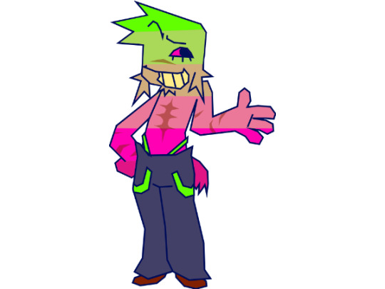
starting with the man the myth the legend, here is UNPLEZZIE 2.0
he's probably the only one i had genuine problems with other than not being very aesthetically pleasing. he seemed too boring, his proportions were always a bit wonky, and the way he became more and more simple the more i drew him dumbed him down to just...awkward.
for this redesign, i kept all the features that made him my unpleasant. the only really signature thing i changed was his hair, sorry not sorry he had to fire his barber. i changed his scars to be far less opaque as to not clutter him up (which was the main reason i left them out most of the time), the only drawback is that i'm no longer just scribbling them in with a brush, they're actual geometry, so i cut back on the arms just for my own sake. also his tail now looks (and acts) like an actual docked tail.
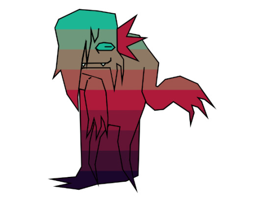
next is the QSWX GVCTXMG AMXLSYX VIEPPC FIMRK GVCTXMG GLEVEGXIV SJ XLI CIEV, here is CREEPY 2.0
creepy was probably my least favorite character to draw. its head shape with the hair that always ends off screen, the 4 arms, the lack of any real way to move visible, it has always been a mess of a character. don't get me wrong, creepy is my second favorite character to write for (beaten only by neuro), i love its personality and its inflection, i just never got the chance to show that because i hated drawing it so much.
so for the redesign, i've basically reimagined it. its face hair now has an actual definitive ending, it has a more unique shape, and is just much more expunged-friendly in my opinion. it looks even more like its mom now...
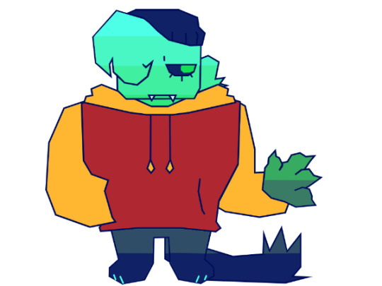
next is this one, i thought she was american. here's PARANORMAL 2.0
i'm gonna be totally honest i have no idea what i was doing when designing para for the first time. that outfit was 100% subconsciously stolen from some other character i can't think of right now. it also really just didn't fit her character at all. also i dont know why i gave her boobs???? what????
anyways for the redesign she's basically a whole new design now. i wanted to play with some shape language. also, para always had a sort of inhuman quality to me, despite her personality, so i've given her inverted eyes and some animalistic features. i guess it adds irony or something, i dunno.
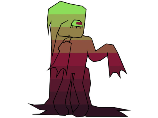
and finally, the moment GERIATRIC CAT you've all been waiting for, UNNERVING 2.0
in truth nervy's design is my favorite. the only gripe i had is the lack of legs, like with creepy. also i had to give her one of the same pride flag ass gradient as the rest so she'd fit in with the rest. other than all that i love her she is perfect just the way she is with minor adjustments
that's all the redesigns done!! i only did these 4 because stabby is not mine to redesign and NEURO is perfect just the way it is. feel free to give me any constructive criticism for these redesigns, i can always tweak em a bit. also the more stripy gradients wont a pattern that follows the contours of the body but rather just unmoving plaid always. i hope this lengthy yap sesh contributed something to something, maybe gave some insight into my characters.
and if you got this far i put a public discord server link in the intro post. you dont gotta ask anymore. dont tell anyone....shhh....*lovingly puts my finger on your lips* *smirks* *bolts away* *gets hit by truck* *instantly fatal*
#regretevator#regretevator roblox#roblox regretevator#ooc unpleasant#regretevator unpleasant#unpleasant gradient#creepy gradient#paranormal gradient#unnerving gradient#gradient oc#regretevator gradient oc
47 notes
·
View notes
Text
i feel like going through my old art and seeing how my art has changed over the years, so why not! (none of these are direct redraws, but i'll look at anything that's from the same MV)


february 2022 - june 2024 : oh damn this one has changed a lot! you can see how i went from big eyes and pupils to smaller eyes and tiny pupils (watching the simpsons and south park really influenced how i drew eyes) i also just have an overall more "detailed" looking style, although it is still very much cartoony. wait a second i just realized... did i forget janet's beauty mark??? *facepalm*


may 2022 - june 2024 : the old one looks kinda weird with its proportions and stuff but it's also kinda hot 🤭 like look at the tongue goddamn! i can definitely tell the face is the main change here, but other than that, the poses are actually pretty similar! i really just think smaller pupils look better imo, but the old one is still good (i also add blush a lot nowadays)


january 2022 - june 2024 : i think this one has THE most apparent changes. 1. the eyes are wayyy smaller and more baddie energy (idk what word i want to use lol) and i love emphasizing his eyeliner. 2. the hair is longer for some reason? 3. ✨ complementary & SATURATED colours galore~ ✨ (orange and yellow look so good if you want a golden colour!!) 4. more exaggerated facial features & cheekbones. 5. lips 👄
the old one is so cute though 🥺 some of my old art can get really wonky but i have a soft spot for this one (he's so babygirl omg)


january 2022 - july 2023 : rare case where i actually like the old one better than the new one xD (my 2023 art was all over the place) those eyes are staring right into my soul and i don't like it


november 2021 - november 2022 : this one is a direct redraw and i'm honestly impressed how much i improved in a year! i find it funny how i just didn't draw the backgrounds the second time haha me being lazy as usual (fun fact: i drew this while i was on a plane visiting the USA) i will probably draw this again when november comes around, so here's your 4 months notice
alright, thats it for now!! tell me if you want to see more of my oldass art lol
15 notes
·
View notes
Text
Let me teach you something about learning how to draw poses
So I decided to try and draw a more dynamic and action pose. I tried to do it from my head but I couldn't really visualise it properly, so I took a photo of myself for reference.
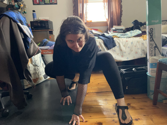
my room is a mess, I know shhhhh
With this in mind, I tried to just look at the reference and draw, getting me my "oof" attempt.

Now, this looks sloppy. It's a decent first attempt, but the proportions are significantly more wonky and not very good. So then I decided to break down my original photo reference.
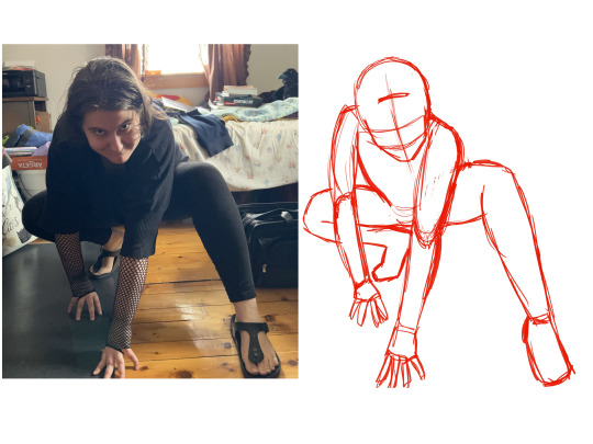
I traced over the original photo, and then moved the sketch to have a clearer image of what exactly I was drawing with the shapes. I focused solely on the shapes and where they went.
Which got me my "better" attempt.

Mind you, it's still a bit wonky and not perfect, but because I broke it down and tried again, I have a better idea of the perspective of the image with the shape language. I can now look at this and think "hm, the back foot looks like it's facing sideways when it should be facing more towards the camera. And that same leg should be curving downwards and not upwards."
Which got me this

This time I paid more attention to the details I missed, and got a much better result.
My point is, when you practise your art skills, and try to do more things outside of your comfort zone, practise smart, not hard. Use technology to help make it easier for you. There is no shame in tracing a photo reference to understand how the form works.
Fucks sakes, I frequently trace my own poses just to get shit done. It's not against the law to use what resources you have. And make sure you practice. Do several sketches, you'll improve more and more.
If this tutorial helped you at all, please reblog it, so others can see it!
10 notes
·
View notes
Note
Is it easier to draw Lego characters compared to more realistic characters or do you think your artist skills just helped bridge the gap?
Honestly it’s hard for me because the hands are more curved claws and their faces aren’t sharp squares but not perfectly round either
It depends
My art style has always skewed more cartoony, and while I can do more realistic styles, they’re definitely a lot harder for me
To be honest, aside from some classes in high school and a couple college courses where I didn’t really learn anything, I’m pretty much entirely self taught
I basically have always emulated cartoon and anime styles that I like, so copying the style used in Lego Monkie Kid isn’t too difficult for me
What I did at first was just pull up the stock art and screenshots from the show and pretty much just stare at them to study how the shapes work. Then I’d draw alongside those references to try to match the proportions and the movement
I did the same thing back when I was doing fan art for Rise of the TMNT, too
Still have to pull up references sometimes if the sketch feels wonky, but it’s just something I get a feel for eventually, y’know?
As far as the little cup hands… they still give me trouble lol
5 notes
·
View notes
Note
I am handing you this video and begging for every single thought you can spare about these lines and yadda yadda yadda gimmie your brain
I’m pretty much writing these in video order, so this will mostly flow with it. Long post ahead y’all!
Faboolous Pets:
This feels…random. Like…what was the concept-fashion wise? I do like that they mirrored some things from the pets to a couple of the dolls (Draculara’s bar sleeves, Clawdeen’s blue fur vest)
Draculara’s outfit overall is adorable. I don’t like Clawdeen’s outfit, Cleo looks incredibly discombobulated. Slapdash. Random as hell. What was this.
Feariridescent:
No. Why. What the hell.
I hate this hair. SO MUCH I hate this hair. Clawdeen’s hair should not be all purple. Draculara’s is WAY too pink. Lagoona’s hair is causing this weird effect where my brain wants her skin to be more saturated but nothing else says her skin should be more saturated. I don’t know what they did with Cleo’s hair, is it white???? I hate it-
Frankie’s hair is fine though, they’re all good.
I can’t tell if this is the photo, but three of the lip colors look absolutely insane: Cleo, Clawdeen and Lagoona’s lips all look crazy.
That aside! Conceptually: this is cool! Adding iridescent elements on and trying to keep their personal style. They didn’t do it very well cuz the prices just look like a very particular type of plastic I can’t name which sucks
I don’t like Clawdeen’s hair thing or Draculara’s earmuff thingys. But that’s mostly personal.
Creepover party:
Honestly. They’re super inoffensive to me? Like I wouldn’t go out of my way to get the base three, but if I was gifted them I’d greatly enjoy them. Twyla is adorable and I love her I’d love you forever if you gave her to me.
Don’t love the robes. I like em just fine. I do sorta wish there was more variety in the kinds of pjs they wore? Like Draculara strikes me as a silk sleep short set girl. Ditch the robe.
Clawdeen has like. Bathrobe, Bonnet, Bags under her eyes, don’t-wake-her-up-in-the-morning vibes.
Frankie is fine (I think they can keep their robe), but their shoes feel weird cuz uh. Babes why are you wearing full boots to sleep-
Ghoul Spirit:
This. This is bad.
Toralei’s hair. Her face mold is also really odd, she looks nothing like the show.
Deuce looks a little wonky in the face and his hair is the wrong color, but eh.
He and Frankie share the issue of the sweaters looking frumpy, but that’s an issue of scale so I’m not knocking em there.
Draculuara just…looks incredibly awkward. Her bangs, Bat bow and uniform look very, very awkward on her.
I hate Clawdeen’s Jersey. Why is there furr in the arm holes. The goggles are random but…Kay.
Cleo looks off model so to speak? Her face looks wrong and she’s so…dressed down? Cleo wouldn’t wear a Jersey dress. She just wouldn’t. It’s wrong-
Neon Frights:
Uh. Ummmmm… ignoring the weird double sided sleepwear-going out thing. I’m gonna focus of the going out looks.
I’m going off the stock photos we don’t talk about real life.
Again, Twyla is cute, very cute. But I’d ditch the chain, crowds the outfit, just give her the jacket.
Again with Toralei’s face mold and hair. I don’t love her outfit due to its proportions mostly, looks slightly awkward.
Frankie looks just fine! The lime green was. A choice but that’d mostly cuz of the material hat the shoes and purse are made from, especially balanced with the same material but blue for their leg.
I actually really like this Ghoulia- I’m a sucker for splatter paint, the pixel type charm things on her harness, the controller earrings and pixel glasses, the colors are well balanced- Love that for her!
Here’s the boss…
I. Draculara.
I’m.
Ya know how I said the colors were well balanced on Ghoulia? Welll they’re not here. Why is her lipstick purple. Why is her harness charm purple. That’s random as hell-
I don’t like the green they chose, it doesn’t work very well anywhere they put it. I hate that her hair is mainly black and her top and skirt and both too busy for anything.
Note: While I was working on this post, my lovely Qpp, and asked of this question actually got a Neon Frights Toralei and. She was in awful condition straight out the box. One of her legs and arms were unpainted and her tail immediately fell out entirely. It’s bad
G2….happened. Collectively. It happened. The molds are. There. They’re lazy, they’re alllll lazy. Just. No.
THERE WAS A FUCKING EMOJI LINE- I hate G2 so much. (Said as a bitch who owns Emoji leggings and loves them)
The only thing I liked here was the Lagoona little sister doll from Monster Family because she’s a real character, Lagoona has little siblings at least in G1 and I like her hair.
Electrified feels like an insult. It feels like a slap in the face.
Electrified was a real concept in G1. It was part of the freaky fusion line because in that movie they had to recharge or Electrify Frankie to save her and she had this beautiful redesign I loved. They put them in tHE FUCKING 80s. I have nothing against the 80s or it’s style, insane as it was. This is just a really bad and lazy version of that. Just. Look at them-
E W EWEWWEWEWEWEWEW LOTS OF LOOKS DRACULARA CAN BURN IN HELL THATS A LIE WHO ARE YOU WHAT THE FUCK
Boo York, Boo York:
I’d never actually seen the Boo York, Boo York dolls before. And yeah Clawdeen and Draculara look bad, they’re both incredibly basic and uninspired. The fabrics are very awkward, Draculara’s skin is washed out by all the pink, Clawdeen…looks like that. AND STOP TAKING THE PINK OUT OF DRACULARA’S HAIR DAMNIT.
Catty doesn’t look great but better then them. Her hair is terrible and her face looks crazy cuz of that pink lipstick and the super flat silver eyeshadow.
Luna, Mousades and Elle E.D all got done dirty, done horrendous. Especially Gala Mousades
Cleo and Nefera from this line got Justice though they’re slaying.
Geek Shriek:
…Girl (gn) What.
What was this line. Why did you do this. What the hell.
Also the lineup is RANDOM AS HELL-
Ghoul’s Alive:
Was. Was this a Baby Alive but make it monster high? Is that was this was? I hate that concept.
Spectra looks normal. Frankie and Toralei look okay.
Deuce and Clawdeen. What the fuck.
Great Scarrier Reef:
My heart hurts for this line it really does. Cuz this concept RULES if you’re here for the creativity and the dolls themselves. Vampire squid Draculara??? Tigerfish Toralei??? Electric Eel Frankie!!! A Kraken character?!!
But it’s not…great for the fashion aspect. Even I wouldn’t know what to do with it in that regard.
Then the dolls come out and they’re…a lil wonky lookin’ at best (the core girls, not the new two…three.)
They mostly busy up top and empty at the bottom, Clawdeen is fucking purple. Draculara escapes this but still loops wonky cuz she’s not actually structured like a squid, it’s like only her feet changed and her legs just got fused together
Kala, Peri and Pearl are cool, they deserve their flowers. Peri and Pearl’s two headed body is an awesome idea and they escape being empty on the bottom…at the cost of being twice as busy up top-
Yeah it. Ugh…she is right though, this was the beginning of the end.
Freaky Fushion:
Now this REALLY hurts cuz it’s movie and the message with it is dear to me.
They 100% needed more drafts, more concerting time or whatever it would’ve taken to get to the idea of making these into their own entirely different monsters.
And I think it would’ve helped the movie along because in essence they just became different monsters with the abilities they have to now learn to control.
Cleolai would’ve become a sphinx, Lagoonafire a Leviathan, Clawvenus something akin to Swamp Thing.
And a big problem with this line is how they’re styled. Drcaubecca should look SO Victorian it should’ve given fashion historians a heart attack-
Lagoonafire looks. Generic but wrong. She looks like they were taking from stereotypes that were just wrong or were so paired down that they said nothing.
Cleolai looks. Like neither of her parts. No high fashion, expensive Cleo, no scrappy, punk, patched together Toralei in that look whatsoever.
Clawvenus…what- what was that. What is that.
There’s also…no harmony to balance out all their contrast that they just look garish and are complete eyesore’s at the end of it.
The new characters, the hybrid girls are fantastic though and I love them a lot. G1…struggled with Male dolls, it really did. But so does every fashion doll line that isn’t Rainbow high and even they still do sometimes. But as for the girls, they’re all wonderful and I love those.
This isn’t in the video but:
We do not talk about the Save Frankie specific line. We don’t. No.
2 notes
·
View notes
Note
Hello! I just came across your account and wow, I love your art! Your style is so unique and cute! 🤩
I have a few questions for you, if you don't mind.
Sorry if this is a tough ask, but do you have any tips for a beginner digital artist such as myself?
My biggest struggle is being motivated to do it when I know it will take me a long time to get as good at it as I want to be now.
That is the main reason why I didn't pursue it for so long. I just look back to when I was 13 and think: "Man, I could have learned so much by now and been much better at it. Oh well..."
Thank you for your time 👋
I think the best tip I could give is in two parts! I'm sorry this is so long, but please remember this is my own perspective and advice, since this is what worked best for /me/! ^^ Firstly, a bunch of my artist friends advocated for beginner artists to take small pieces of someone's artstyle - maybe the way they draw eyes, or hands, or maybe even the materials they use or colors they shade with - to help develop and create a more consistent artstyle. This also applies to pose references! Using pose references is okay! My art got so much better once I was able to develop muscle memory and the ability to realize is proportions were likely incorrect. It is actually how I learned to draw! Practice diversity in eyes, noses, face shapes, body shapes, and other features unique to each person at an early stage to try to avoid same face syndrome. Repetition in my own art makes it hard for me to climb my way out of the grave I dug for myself. I actually recently began to work on that flaw. It may look bad or wonky at first, but it is okay. I don't have a single good sketchbook on my hands from before I became a digital artist. However, looking back on those drawings I managed to keep myself from destroying makes me feel more confident in my abilities to grow.
Secondly, I suggest being consistent and working through the plateaus and temporary deterioration of your skill. It took me a hefty 11 years to get where I am, and my art style only met my expectations at the beginning of last year. After years and years of developing muscle memory for my own art style, I now don't need to rely on reference images or other people's art styles to draw. Your art style will typically be 'bad' or 'ugly' in your own eyes due to the high expectations you and others may set for yourself, since you see so many skilled artists on social media. You need to keep your chin up and push through the dark times where it seems you're not getting anywhere with your art! I believe in you and others do, too.
Everyone starts somewhere, and I suggest that you base your success off of your improvement!
5 notes
·
View notes
Note
hii <3 i saw your post, and first of all you should be proud of yourself for stepping out of your comfort zone and into a new art medium! i know it might seem tedious and frustrating in the beginning, and instant results are way more desirable than slow progress, but please be kind to yourself and understand that practice truly does make perfect! you've got this !!! <3
secondly, there's entirely too many tips to memorise now-a-days, and trying to learn them all is overwhelming, — so i think the best way to improve is by watching youtubers such as @/AngelGanev! his shorter videos where he helps improve beginner artists’ art pieces are educational whilst also being really entertaining at the same time, which (imo) makes it easier for the tips and tricks to stick!
another thing, i know you're probably gonna dislike this Imao cause its a pretty overwhelming suggestion, but studying!! skeletons!!! helpsss! i promise!! think of it like this: if you try to write an essay about a book that you haven't even read, because you lack important contextual knowledge from the book, your essay will lack depth and will be poor quality. the same goes for anatomy!! you can't draw a proportionate body if you lack the knowledge of where the proportions are actually supposed to be (speaking from experience 😭)
this is all i'm writing for now because i don't wanna clog your askbox too much, but please Imk if you have an questions, i'd be happy to help :D please keep on trying, you can do this!!! <3
AHHHHHHHHHH FIRST OF ALL YOU ARE SOOOOOO SWEET & HELPFUL THANK YOU SM!!! and omg that’s too real……. i’m impatient and also Not disciplined so that combo PLUS trying to learn art is beating my ass 😭 but you’re right i should keep at it and just LEARN properly bc i tried to learn ages ago but i never really did the work of Properly Learning anatomy/face shapes/color theory etc but i wanna change that now!!!!!
AND OOOOOH I’LL CHECK HIS VIDEOS OUT!!! THANK YOUUUUUUU <333 i’m a v visual person so hopefully that can help me out! omg…….. tell me why i didn’t even think about skeletons that’s a good idea i should probably learn how to analyze that too 😭 THANK YOU SM FRIEND!!!!
and please feel free to hop into my inbox as much as you want omg i need ALL the help i can get 😭 if you have any other tips i’d love to hear them!! <3 :3 MWAH!!! ILYSM
(& hehehehe since you said i can ask more questions i just may do that rn 🤭 IF YOU DON’T MIND OFC!!!!)
- HOW DO YOU DRAW A HEAD & FACES??? i swear when i do it it’s so ugly and wonky and not at All the face shape i’m trying to go for 😭 same w actual facial features like woah…. Someone Take This Apple Pencil Away From Me
- do you happen to know where i could learn how to draw heads/expressions/bodies? do you rec pinterest or books or videos? bc everything i’ve seen so far isn’t the Style or Vibe i’m going for 😭 basics are so hard too like damn
y’know what since i’m a beginner i’ll just ask these ndndndnd i can learn abt colors/shading/lighting a bit later methinks i just need to get the basics down 😭 BUT TYSM FRIEND AHHHHHH I APPRECIATE YOU SM 🥰🩷

^ me but switch out gojo for yourself :3
#asks#anon#YOU ARE SO SWEET I LOVE YOUUUUUUUUUUUUUUUUUU#am hugging and smooching you on the head rn :3
1 note
·
View note
Text

meme from online here
more info:
2015: my boy severin! <3 weird little undertaker of my heart. i also love jojo so i daresay my art is both 1. finding a more "me" style and 2. improving.
2016: good art vibes continue as i discovered loid this year! also more gijinkas! the lovely and wonderful maddy, jellie, and pamela! <3
2017: this year was fun bc i wanted to draw a mokouzart every moth and for the most part succeeded. my art was wonky and bad proportions but i was having fun and thats the most important thing imo
2018: my art was still bad proportions but i was starting to get more self conscious abt it. art school does that to a guy -weary emoji face- but dont be concerned there was still a lot of heart and i was getting more into storytelling in fics. hence the kasulaeg good stuff.
2019: this was def a weird time for me artwise- somehow i wasnt satisfied with how anything looked most of the time. i think just lifewise weird stuff happened too so it was really a time of change. also my art self esteem had been damaged pretty badly from art college and mobile game fans online (you know who you are). this one of rosa and kasumi is really goated tho, probably the last time ive been really happy for and actively cheering on the c y l winners. (tho i am happy for chrom/tiki/robin/corn tbh)
2020: this year was kinda me trying to get my groove back tbh. socially stuff had happened too (in 2019) but weirdly this was a big time for self discovery for me. during the job lockdown i was able to binge d q 11 and realized how fun games and fantasy anime genre has the potential to be. and i made a new friend! this treblesal is actually a redraw but i love their faces in this the best <3
2021: this year was where i felt like my groove was finally returned. minor setback of a computer crash in january aside, i started a series of an-allegroface-a-week and it was actually really fun and satisfying. in oct there was this platonic fave month which was so much fun. <3 sevil and kisumi are one of the awesome results of it! (not the brotp but the artwork)
2022: i feel like this was such a big year bc of n w h but thats just silly. but at the same time its kinda true lol. my creative kick for aime tachi was back, along with a need to go to d l and a sense of right and wrong which had been tested over the years. sure its gotten me nothing but trouble but im still a bit glad for it. i also decided to get creative w shading and pencils, and found that thin pens work a lot better for antonio's luscious locks. and that meant a very cool trebletonio drawing for his character day! <3
2023: 2023 had a lot of good content imo, it was hard to choose just one. but its gotta be the monty one man. i spent the whole year working on it no joke. more weird stuff happened last year but i do think i made steps to improving at art. that being said i have more unfinished artworks than schubert has unfinished symphonies (thats not saying much. he has one.)
2024: this year is only halfway done and so far ive drawn some things(tm). but i had to give it to mokouzart, i love these little freaks so much. notably this year ive started drawing the shines in characters' eyes? i like drawing them w the quote unquote dead eyes but its nice trying this too.
0 notes
Text

Look at these meow meows. I’ve gotten so much better at art.
P.S. if you wanna see my middle school art it’s under the break
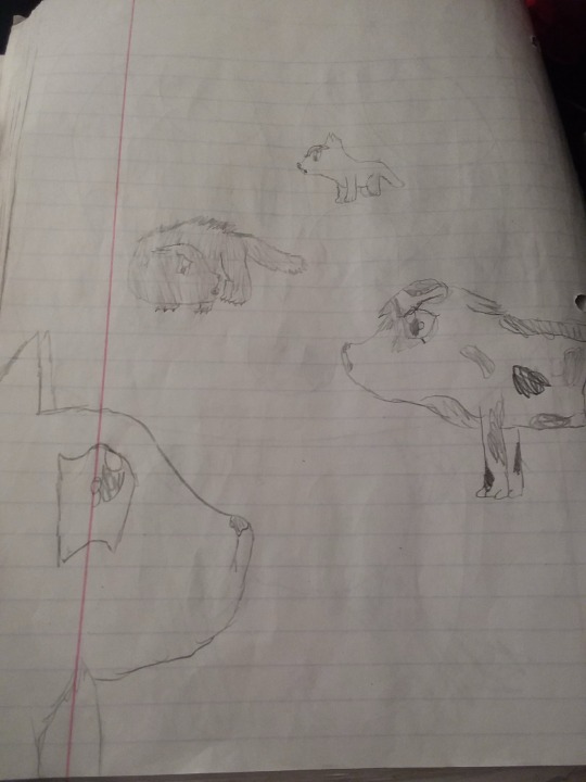
Ok so this is from 2015. I was in middle school and this was my first creative scene that wasn’t a character standing looking straight at the fourth wall.
Look at those cutie patooties.
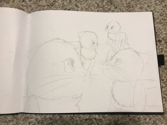
Next is 2016, with a significant improvement already. While I never drew seriously wanting to improve my style before the first drawing, I spent a year developing how I drew and this was the result of that. Do they all have the same face? Yes. Is it impossible to tell at a glance which character is which? Definitely. Still better than the first one tho
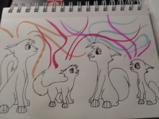
Now we’re onto 2017. I did this in one night for inktober. Some of the proportions are a little wonky, and I knew that at the time, but I kinda rushed to get it done. Though, my Facebook friends thought it was pretty cool.
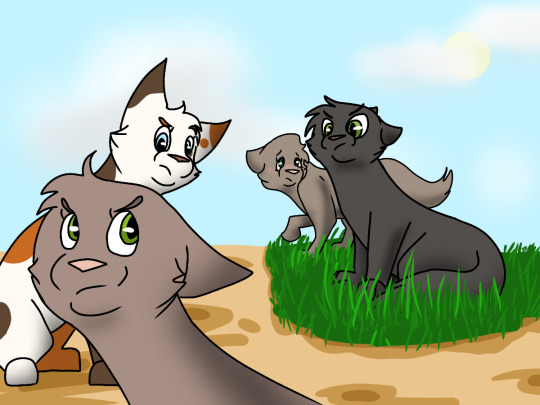
Up next is 2018, the first digital piece. I did this on my phone with my finger. Also, the characters finally have different fur patterns! Even if three are solid color cats, it’s more detail than before.

Now here’s 2019. I upgraded once again to a drawing tablet and Paint Tool Sai. Nowadays it’s not my preferred software, but it was a really nice one to start off with. I also played around with lighting, trying to make sure that the light source was consistent with the background and to make the shading more than an airbrushed black.
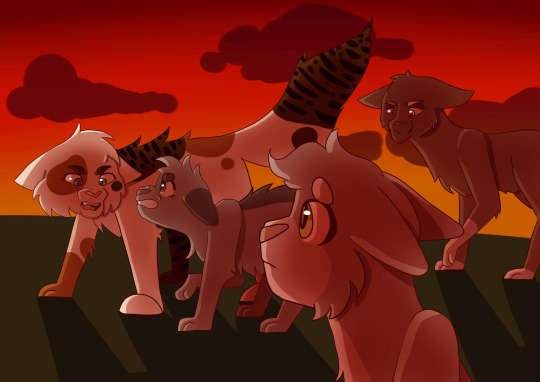
2020 had a dramatic change! Still on Paint Tool Sai, you can tell that I am more comfortable with drawing on the computer. My favorite bits have always been the cat in the foreground and the angry spiky one

I went in a more stylized direction in 2021. Though the background is a little strange, you can really tell I was trying, especially compared to the empty plane of green from the last year.

And again, here is this 2023’s version! This took me like 8 hours of solid drawing. I also only used the lasso for all the coloring and shading. I’ve been a big fan of cell shading recently, I will admit.
10 notes
·
View notes
Note
Ok, so as I’m writing this sentence, I just uploaded a speed art of me drawing another form of Milave: Mythical Mode. By the way, I decided not to try and make his base form look more like a pure fusion… for a rather large number of reasons. However, for Mythical Mode, I tried to take the aesthetic I was going for and… really try for it to be comparable to Saga.
Also, if you don’t think this is, at the very least, significantly closer to Saga… I’ll genuinely have some serious, serious questions for you about that one, lmao. For one thing, I’d ask how it’s still not comparable to Saga, and for the other, I’d ask how you think I can possibly fit more detail in.
Plus, seeing as this one took 20 to 30 minutes longer than the base form (which took over 40 minutes to design), I’m probably going to have a panic attack if you don’t think it’s comparable to Saga. So yeah, this paragraph and the one above are just a massive rant about how I’m really, really hoping you think this design is comparable to Saga.
Btw, that's not me trying to make you feel guilty for your opinion, even if that opinion ends up being that it’s still not on the level of Saga’s design. Nor am I trying to get you to lie to me about it.
Anyway, the questions still remain the same, but with an additional question this time:
—What would this design look like as a suit?
——Where would you rank the suit with this design on a scale of 1 to 30, and where would that be in relation to Saga on said scale?
——Comparing the design’s complexity to Saga, how expensive do you think it would be to produce a suit with this design at the same level of quality as Saga’s suit?
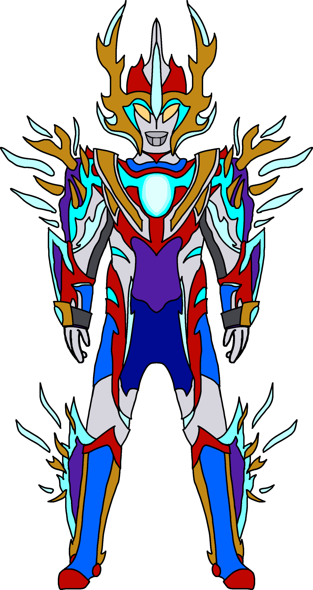
Ah yes this is more like it
But it seems that you actually take your art very seriously tbh so you should actually upload them on your own blog and start your own thing over there as I have artist friends that do the same and actually build their brand cause u definitely can't do it over here since my blog isn't geared towards this tbh
Otherwise,
1) ya as said, this definitely looks more like a pure fusion, otherwise the only criticism is just literally the body proportions itself are wonky af (arms too thick, face looks squashed, why are the eyes tilted so vertically?)
2) 20/30, could definitely do something about the abdomen, and the color scheme is too varied and dosent flow well like Saga's. And ngl, the horns are really squashing the face too much
3) it'll probably actually cost less since as pointed out above, the "collapsing" theme isn't as consistent as Saga's
Thanks for the question!
1 note
·
View note
Note
What did you think of the last two episodes of TNR S4? The plot was about what I expected, but I did like the alpha(?) Night Light design
In some ways, this two-part episode has been waiting to happen since Gift of the Night Fury, where the lack of other Night Furies got highlighted the first time. It's been waiting to happen since ROB's We Are Family where Hiccup was hoping to chase down Toothless's family. It's been waiting to happen since THW had us meet one Fury, but not provide the specific awe my imagination has been envisioning for a decade: the inevitable moment our characters come face-to-face with a flock of Furies.
Of course, some HTTYD fandom members are extremely attached to Night Furies as a concept, and will draw fanart of OCs, or at least alternate designs of Night Furies, Light Furies, Night Lights, and all things Fury. I suspect many of them have had the same fantasy fly through their mind as I have about meeting a Fury flock up close. But because I'm not one of those people who rests my love of HTTYD closely on the Night Fury, I am both worse and better suited for enjoying the TNR S4 finale.
I'm worse suited because I'm not the Fury fanatic that this episode would want to appeal to. There's less chance of my emotions catching in my throat finally seeing this come to be. But I'm better suited for the same reason: there's fewer emotions to disappoint if TNR doesn't hold up to standards. And we all know that TNR has not been a show of great standards - and I'm someone who hasn't minded that.
I'd say I had a mediocre reaction to the two-parter, feeling both mild yays and nays to it. Like many fans, I was offended and appalled when the human cast encountered Hiccup's somehow-still-intact prosthetic and flung it around. What the heck!!! That was too far even for me!
But for a brief moment, watching the full Night Light family take flight, I was teleported back to a younger version of myself: the self that dreamed for a full Fury family flight and desperately hoped that'd happen in HTTYD 3. Bad animation quality aside, questionable dragon design aside, for that short moment, this decade-long expectation got met.
I didn't care that TNR had us wait with anticipation for the Fury reveal in the sense that Thunder, in parallel to Toothless, was mourning a scarce family. But I do like that TNR gave us a full flock of Night Lights because that's absolutely what should be the case - this is no longer a "last of their kind" situation, and so we got to see them!
The believability of carrying that much black is low genetics-wise and designs could've used improvement (why did Mom have to have EYELASHES and why did we color code "white" as female???), but there were also designs with potential, and I accept them and like imagining what they'd look like on a bigger budget. I liked the roughness of the father's scales, as though they've gotten thicker and grayed with age. It looked odd with the limited budget and the light rendering in particular, but the concept is something I get behind.
And the Elder? The Elder? Best Fury of TNR, hands-down. Honestly, best Night Light of the franchise.
For starters, he had the best design of the furies pattern-wise. I like how the blacks and whites faded into one another rather than being a stark black jutting against white. I liked his particular pattern being both understated and regal, as well as realistic and common to real animals (once Night Light pattern ideas get too wild, I quit caring for them). I liked his scars and tears on his wings - this is a dragon of great experience. The animators needed to fix his chest size, but other than wonky proportions there, he gave a grandeur to the Night Lights I quite liked.
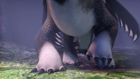
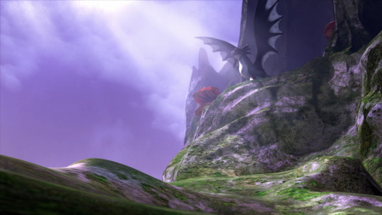
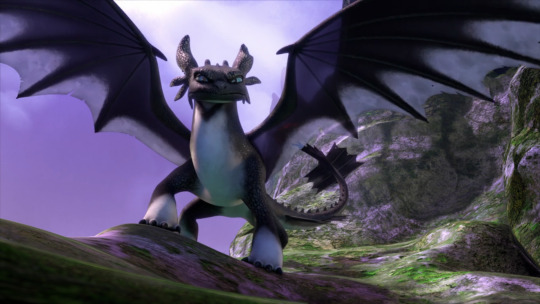
And it got me thinking: I wish the Elder, rather than Thunder, had been Tom's dragon. Too quickly stories lean into youth, including trying to make animal companions the same age as their owners. We did that with Tom and Thunder. But Thunder doesn't hit in part because he has virtually no personality. The Elder does. How cool would it have been if our main character's dragon was this suspicious, slow-to-trust, grand old man? Think of how the development of their relationship could've gone! When Tom was riding on the back of the Elder, I found that fantastic, and for a brief moment could enjoy the idea of the Elder and Tom being the pair instead.
The thing about the Elder is that he evokes a concept I wish the main HTTYD movies never left: this is an Offspring of Lightning and Death. This is a wild animal of great power. The reason Toothless was lovable and compelling in HTTYD 1 wasn't just "awww cute pet." It's because he was a real, complex creature of majesty. Real creatures can be silly and dorky, too, and it's fun to get to know a goofy side as he becomes familiar with Hiccup. But Toothless should never have been close to the category of "cute animal sidekick used for marketing," as he increasingly became as the years passed. Dare I say it, he was Flanderized. The Elder reminded me of the dignity that made me stare with appeal at Toothless in the first place.
Amidst all the questionable plot choices and questionable designs and questionable graphics, that one sentiment is worth it, ain't it?
#TNR#The Nine Realms#DreamWorks Dragons#httyd#How to Train Your Dragon#the Elder#Thunder#Toothless#Night Fury#Night Furies#dragon#dragons#Night Light#Night Lights#analysis#my analysis#anonymous#awesome anonymous friend#ask#ask me
30 notes
·
View notes
Note
Hi! I adore your art, it’s so beautiful, and was wondering how you draw heads/face shapes? No pressure to answer by the way. I just tend to struggle with getting the face shapes to look normal and was wondering how you start at least- again you don’t have to answer!
hi, thank you so much!! i use a pretty stylistic approach to faces (and my sketches are veeery rough lol) but it does have a base in knowing what structure is underneath the skin, so anatomy fundamentals will aaaalways help (and references if you're struggling with a pose). but with that said, i used Warriors as a guide for this and hopefully this answers your questions! everything under the cut.
Step 1
i start with a circle and the standard cross shape guidelines for the face on a layer with much lower opacity. the top of the circle is irrelevant and will get shaved down/refined later when i'm ready to do the hair, but i like having the full circle when i'm starting my sketch bc it just makes me feel better. if I'm trying to block out a full pose i'll usually sketch the jawline too, but i didn't this time. (note that if you're newer to drawing and not used to knowing where the face shapes go, you can use more lines! no shame in that, whatever works for you)
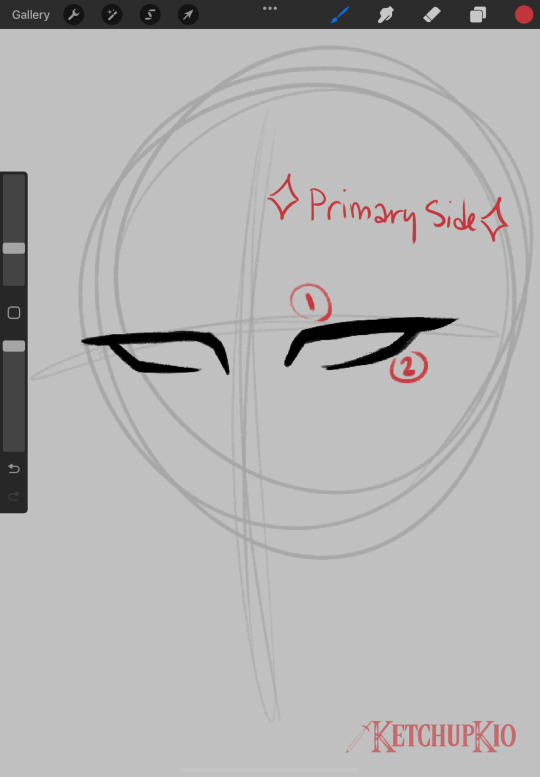
keeping in mind which side of the character's face will be more towards the viewer (primary side), i draw the basic shape of the eye first-- upper then lower lash line. repeat on the other side and adjust as needed by flipping your canvas, though i usually wait till later when i have more features on it to do the first flip and something looks wonky. i did a pretty decent job this time lol.
i usually use pretty short strokes when i draw because i use an ipad and i don't like to rest my hand on the screen. this was different when i used sai, i had a lot more continuous strokes then and rested my hand on the tablet, but the change in medium/program got me to do things differently. with smooth pens you're going to want to use longer strokes usually, but with fuzzier/textured pens i find you can get away with shorter pen strokes and just erasing.
Step 2
i add the irises and nose, then draw the beginning of the eyebrows and then go towards the outside of the face, indicated by the arrow. primary side first usually. the eyebrow closest to the nose should either touch or could hypothetically have a line touching the bridge. the length of the eyebrows is up to you, but usually natural eyebrows extend a little past the outer corner of the eye, so it just depends on your character. here i sketched the jawline too on the guideline layer. feel free to adjust proportions as needed.
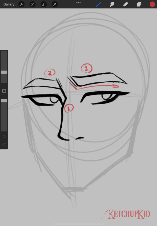
Step 3
jawline! all my jawlines start with the same shapes, they just vary from sharper to rounder depending on the character. Wars has a slimmer, angular face with a strong jaw and chin, so his lines are usually pretty sharp and square. sometimes i put the jaw/neck/shoulders on a separate layer than the facial features, but it just depends. here they're on the same layer.
starting from the primary side, i draw one line down, then another line down on the secondary side. then i connect them to meet the chin, which should always fall in the middle of your face's centerline (or where you've put the centerline in your mind's eye bc my guidelines don't always stay accurate). i usually fiddle with the jaw a bit with the transform tools to make sure it's where i want it to be.
i've also added eyelid creases (the top, curved line is the approximate ridge for the eye socket, i just like doing that) but i'm not fussy about when i do that, i just did it here :shrug: imo eyelid creases help the viewer more clearly see the structure of the face and where things are supposed to be, but that's just the way i do it. and it's also to fill space lol
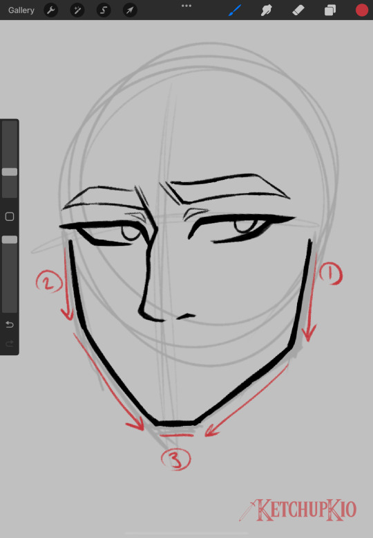
Step 4
mouth and ear(s)! i wait until after the jawline to draw the mouth just so i know how much room i have for the expression. if you're drawing a smile or something and you want it to be lopsided, the higher side should be your primary side, just trust me. when drawing the ears (or just singular ear in this case bc i wasn't feeling drawing a second one) i usually do SOOO MUCH warping and resizing. on a real person's face, the top of the ear lines up w the tail of the eyebrow and the bottom lines up w the tip of the nose. usually with my style, it ends up being the corner of the eye and the nose, but it's just depending on what looks right. poor wars' bad ear is on the primary side so he does not get the full long hylian ear. i cannot draw upturned hylian ears to save my gotdamn life.
i've also gone ahead and drawn the neck and a little bit of the trapezius muscle. y'all i BEG of you to look up how the neck muscles, tendons, and bones work bc they are so important, i think i reblogged a post about it a little while ago? or i at least saw one. everything is connected and all of the lines lead down to the divot of the collarbone. the back line of the neck should never be before the corner of the jaw and the tendon should lead up to that corner. very very very important. also the collarbones should point to the start of the deltoid muscles and that's important for posing, but i didn't draw that much for this. neck width varies depending on your character's build, so someone skinny would have a thinner neck than a chubby or muscular person.
i added the nose and cheekbone lines i always do in this step. i think they look nice and fill space well, and they can help indicate the angle/curve of the cheekbone when the face is more tilted. just my thing i've done forever tho! sometimes i wait until after i've done the hair to draw them so i know they can be seen (and i ended up moving them for this drawing bc i didn't wait vnkdsnl)
in preparation for the hair, i added a guide for the hairline and refined the shape of the skull to where i actually want it to be
MAKE SURE TO FLIP YOUR CANVAS TO MAKE SURE EVERYTHING LOOKS RIGHT!
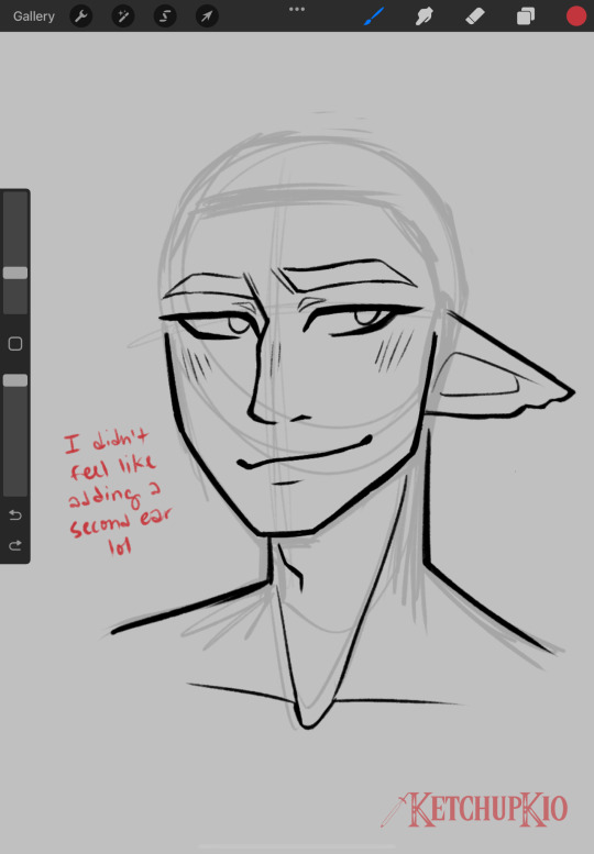
Step 5
hair! it's always on a separate layer for me, and that has to do with how i color too. i do the little floofy thing at the swirl of the hair first, at the back of the part, then i start the first line for the swoopy side of the hair (line 2), then the other side. i guess you could call it the major side (side w the most hair) and minor side (side w the least hair).
i usually use a lot of lines to indicate hair direction, but it just depends on your style. i'd recommend identifying the major shapes of your character's hairstyle and replicating those whenever you draw that person. so for wars, it's the big bump where his part starts on the major side, the top of the hair usually stays flat, and it waves out to the side. on the minor side his hair is shorter and flips out and there are waves and stuff in the back. what i didn't draw in this step that's an identifying feature is his sideburns, which curve inward, but that's next. warp tool is a godsend for hair.
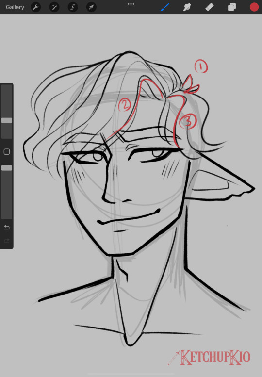
Step 6
finish the hair! refining shapes, floofies, the back, you name it. it's all about filling in space and making sure the weight is right before you start erasing lines underneath it. i lower the opacity of the face line layer to make sure there's no weird/stray lines.
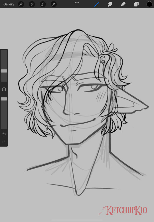
Step 7
add finishing details, erase lines, and you're done! at least with the lineart bit lol. if i know it's just going to be lines, i add scars here, but if i'm gonna color it, i leave scars and other face markings for the coloring stage. and that's it!
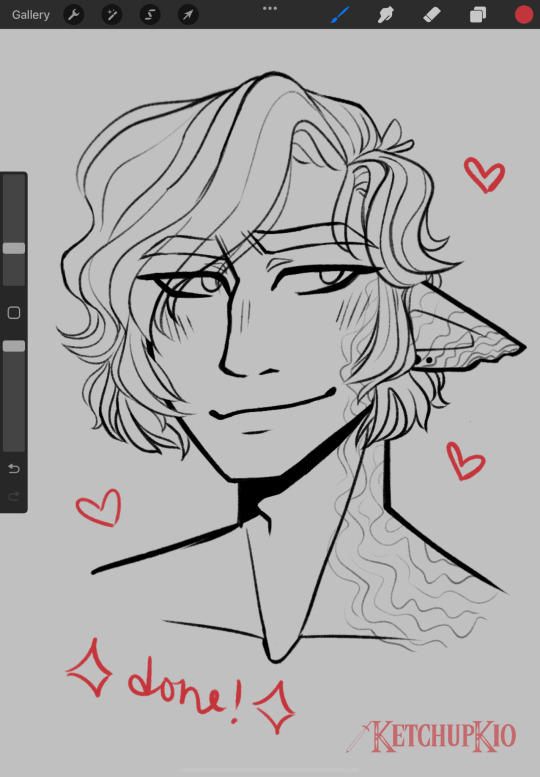
i hope this was informative lol. thank you anon for asking, i had fun doing this!
42 notes
·
View notes
Text
A Chance Encounter
Jaskier x GN Reader
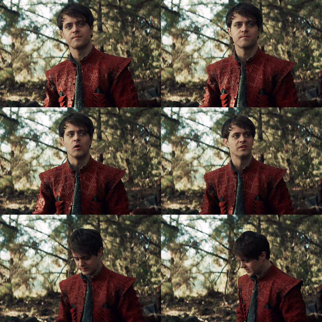
((warning: not directly mentioned but implied depression and suicidal ideation))
You floated on your back, staring up at the sky. Your mind drifted to thinking about what would happen if you died right now. If a drowner swam up and pulled you under the shallow water. You imagined the bubbles leaving your mouth, escaping to freedom. Would your body stay under until it was nothing but bones?
You thought about your sketchbook, laying on the shore. If you never came back it'd probably be turn apart by the wind and rain. The idea was sad but there was something fitting about art rotting next to the artist.
The sun was warm on your skin. You closed your eyes to bask in it.
"Excuse me," A voice called out.
You jumped, gracelessly splashing until you were sitting up in the water. There was a man standing on the shore, holding your sketchbook in his hand. Hot embarrassment filled your chest and cheeks. The man was young and handsome. He held up your book up and pointed to it. The drawing on display with a half finished sketch of a wyvern, the proportions all wonky.
You got to your feet, the water waist deep. "Put that down."
Your clothes clung to your body as you trudged towards the shore. When you got closer, the man carefully set your sketchbook down. He stumbled back a couple steps as you approached. You stood in front of him, wet clothes weighing you down, arms crossed over your chest.
"What are you doing?" You asked, trying to sound stern.
"Sorry to interrupt... whatever that was," His hand gestured between you and the water.
"I was taking a swim," You answered too quickly.
He raised an eyebrow at you. "Fully dressed."
You frowned and pointed to your boots sitting down by your sketchbook. "Not fully."
"Eh, well," He scrunched up his nose and shrugged his shoulders. "I feel like we're splitting hairs. But, back to my question."
He looked you over for a moment, his tongue peaked out from between his lips before pulling back in.
"Is that yours then?" His foot pointed to your sketchbook.
"That's mine," You rolled your shoulders back in mock confidence.
The smile on his face glowed. "Not many can draw a wyvern."
You sighed, shame leaking from your lungs. "I'm not proud of it.
"Closer than most I've seen. You must have gotten a good look at it," His posture was relaxed as his eyes drifted over you and you became aware how form hugging your wet clothes were.
"I've seen one fly over a flock of sheep a few times. It's a hard site to forget."
"It is a good sketch," He put a hand on his hip.
"Are you trying to flatter me, sir?" You raised an eyebrow.
"Is it working?" His laugh was light and bubbly, "I came around for some water, but it looks like luck shined my way. I've been looking for an artist who could draw a monster."
"Why would you need that?"
His chest puffed up with pride, "Recently a friend of mine got himself into some trouble and ended up in over his head. Lucky for him, I was close and managed to save him again."
A scoff escaped your lips, "You saved someone from a monster?"
He let out an exaggerated gasp, "I'll let you know that I am a well traveled man who has faced many beasts in my day."
"Oh, and I'm sure you're a true hero," Sarcasm slipped from your lips.
"I promise you that you have heard of me. I'm Jaskier," He bow down with a flourish of his hand.
"Jaskier? As in the bard?"
"The very same."
"I want proof."
A devilish smile spread over his lips before he sang out a few bars. His voice was as sweet as honey. You let out a sigh.
"Well, you do have a good voice," You said hesitantly.
"Good enough to get you back to the tavern," He smiled.
"What kind of person do you think I am?" You asked in fake offense.
"One who could draw a damn good forktail," He said.
You reached down, grabbing your boots and sketchbook, "I'm going to get into some dry first."
Jaskier gave an intrigued hum, "Mind if I follow?"
"No looking until you buy me at least two drinks," You told him.
"Can I touch if I wear a blindfold?" He asked, smirk tugging on his lips.
"Don't push your luck," You held back a laugh.
"How much does three drinks get me?" He asked as he started to follow you towards town.
"You're lucky you're cute."
"I'm aware."
#mental illness#the witcher#twn#jaskier x reader#jaskier#gender neutral reader#male reader#male reader imagine#reader insert#joey batey
154 notes
·
View notes
Note
Do you have any advice for understanding hands better? I’ve been practicing them for years but feel like compared to other aspects of anatomy it’s the one thing I haven’t seen much improvement in. I draw both from life and images and draw nearly everyday but nothing I’m doing seems to help
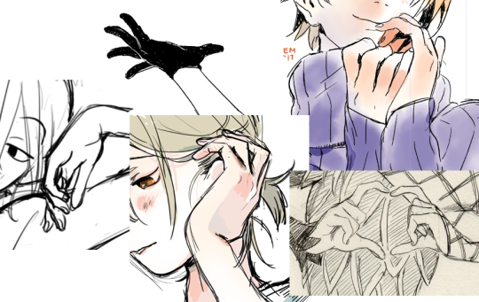
I personally get by mostly from remembering poses that I’ve already practiced a ton, like I figure out how to draw it once and am able to file that away in my brain and use it again later, and tweak bits of the pose or the level of simplification to suit what I’m drawing.
I’ve paid special attention to drawing hands for like.... most of my life so I have a LOT of poses I’m easy comfy with now, but when I need to figure out something complicated or new, I can usually work it out by breaking a hand down into shapes, remembering a few key points/”rules” from what I’ve learned about hands in order to help me break it down in a way that makes sense. And if that’s not enough either, then I take photo refs.
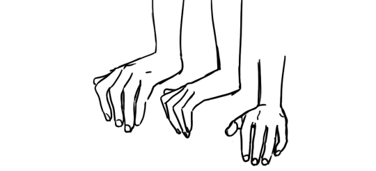
^^^ here is a pose I use a ton. I have a quick way of drawing it from various angles. the first time I had to draw a pose like this, I had to think and figure it out, but in drawing it a bunch of times and having to use various angles like this, I’ve eventually come up with a quick, reliable way to draw it from a few of the most common angles that fits the style I like to draw in. I’m blessed with a good memory for observations, so when I see a beautifully posed hand, I can usually really quickly analyze what I like about that pose and why, and that helps me absorb it so I can recreate my saved impression later. But I know not everyone thinks the same way. it might benefit you to quickly scribble down a study in a sketchbook when you see a pose you find beautiful and want to learn from for later.
^^^ here are some poses I had to stop and spend time figuring out, calling up the “rules” for how hands are built to kind of logic-out how they should look from angles I’m less familiar with. results can be mixed, but... if I end up with something expressive that fits the style of the rest of the drawing, I’m usually really forgiving of fudged anatomy or slightly wonky proportions. as long as the thumb is on the right side and there aren’t too many fingers, that’s a great start lol.
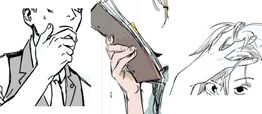
^^^ and here are ones I had to take reference-selfies for. I try to use this as a last resort because 1) it’s a lot of trouble 2) interrupts my drawing and 3) if I’m not careful I stick too close to the reference, and the drawing ends up with the hand looking referenced and the rest of the pose not, which is jarring to me. not to mention I have tiny manlet wrists that without fail, look horrific and emaciated in photos, and the lens distortion makes my fingers look scary too... ugh, photo reference has definite flaws. I actually don’t like the look of drawings for which I can Really Tell the artist drew from photo reference, because most often that means they’re taking the ref too much at face value and incorporating ugly lens distortions into their drawing. so I have to think extra hard not only about interpreting the ref, but also might have to make multiple passes just to get the hand to look normal, AND match the style of the rest of the drawing.
Anyway, here are some of the ““rules””” I mentioned earlier that I fall back on to help me figure out more complicated poses:
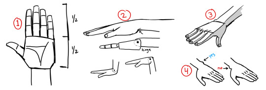
1. probably seen this before, but basic proportions. the palm is usually half the total height of the hand. obviously you can mess with this purposefully.
2. I think of joints as like, ball joints or hinges. I find that easier than trying to remember bones & muscles. here’s a drawing of the wrist as a hinge. note that when you’re thinking of it this way, it’s a shortcut, but a shortcut is only good if you use it with precision. notice the pin for the wrist hinge is not just halfway, it’s closer to the top of the hand. being precise about that is what allows this shortcut to work. the heel of the palm juts out, while the top of the hand transitions into the wrist quite smoothly.
3. simplified planes. planes are important yo. in super simple terms: top is flat, bottom is round. this works on the fingers too, actually. the tops are bony and tendony, and the bottom is where the fat is, so it’s rounder and soft
thinking of the hand as abstract shapes REALLY helps simplify the task of drawing hands, and is just as helpful even if you are drawing from reference. I can say “the palm is a box” and obviously the palm is not really as simple as a box, but if I think of the palm, wrist, and each finger joint as various shapes of box, then all of a sudden, psychologically, my task is SO much easier. I’m not drawing a Hand, which is hard, I’m drawing boxes, which is easy.
4. that prominent knob some people have on their wrist? that’s on the pinky side.
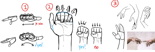
1. the knuckles aren’t really a flat row on top. the hand is like a cup right, so your palm can hold water and things. so we can think of the hand as a box to make figuring out the pose easier, but when it comes down to it, you’ll want to make it more of a curve. this curve is why you can see multiple fingers in a side view
2. when curled up, the fingers nestle together. the fingernails also turn slightly toward the center. even if I’m simplifying the hands significantly, I usually still draw the fingernails because they are SO useful for communicating the pose of the hand effectively.
3. lots of people suggest to think of the hand as a mitten, grouping the pinky/ring/middle fingers and singling out the index finger. this works great, the index finger is more independent from the other three. on the flip side, those three are really stuck together; if you’re drawing the pinky curled up all the way, then you better not draw the ring finger sticking straight up, cause that would HURT. anyway, singling out the index finger leads to more interesting poses in my experience.
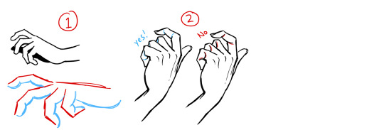
1. this is another illustration of top = flat and bottom = curved. this is a really easy way to organize your line quality. straight lines and sharper angles where there is bone, and soft gentle lines where there is muscle and fat. your drawing as a whole will read very clearly if you find some guidelines like that to stick to, as it means all your lines are intentional and thoughtful.
2. this one’s about overlaps. when forms overlap, it makes a crease, and when you draw that crease you’re communicating which form is in front of the other. in the second drawing I reversed all the creases, and it looks.... messed up. think about how pieces connect.
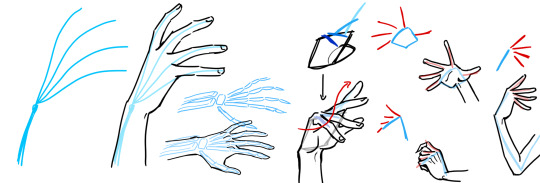
so when you’re trying to make up a pose without using specific reference, I think it’s good to think about the.... flow of energy through the pose. honestly, I know it’s really abstract, but if I have an ability to make interesting poses that communicate weight and movement, the things that make people say your character feels ALIVE, like they really EXIST in a space... it’s because I started to think of poses this way. imagining streams of energy bouncing through the body, flowing down the limbs and out through the fingers. this is why hands are so important to me, cause they’re where the kinetic energy of the pose ultimately ends up. I talk about it when drawing the torso and arms and legs, but an interesting drawing has a bounce back and forth between opposites: for every curve, an opposing straight line, alternating back and forth down the entire body. if you’re sensitive to the energy of the pose, then even very simple poses will be interesting to look at.
anyway, with regards to hands, I imagine the energy getting sort of cinched in as it passes through the wrist, and then emanating out through the fingertips. I hope my drawing at least SORT of communicates this imagery. it makes sense because that’s BASically how the bones in the hand are anyway. and then the right side of the image above is just demonstrating some highly simplified gestures. see how the fingers fan out and curl in, rarely parallel to eachother. when you’re figuring out the pose, using a line to stand in for the row of knuckles is super valuable.
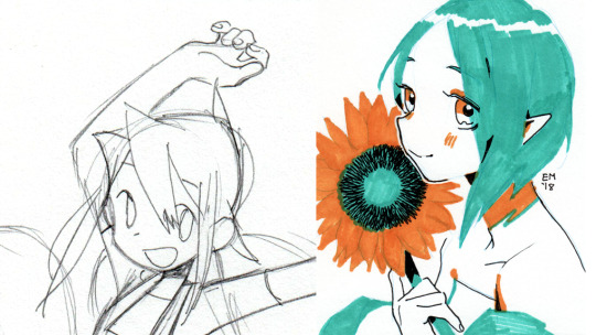
aaand finally, here’s two hands where I intentionally neglected correct anatomy and proportion because I felt it worked better for the style of the whole drawing. Left side: since this is a really simple and cartoonish style, I was thinking back to kids’ and shoujo manga I have read where the style was very solid and distinctive, but definitely NOT overly concerned with correct anatomy, or even really drawing hands, uh, “well” at all. to me, that sort of approach has a Look that I like to invoke sometimes, since for years I felt like I learned a bunch of anatomy and proportion and drawing from life actually in detriment to the liveliness and appealness of my drawings. this hand is mushy and makes very little sense, but it turned out as intended. Right side: sometimes I like to pretend fingers only have 2 bones in them, cause i am a Queen and i do what i want
and there you go. I hope that helped, like, at all? Look at real hands and photos of hands and hands in motion, but also look at drawn hands as well. find what you like, and work towards expressing that yourself. and remember the hand is part of the whole drawing. not only in the art style like I’d been talking about, but because the angle and placement of the hand is reflected in the angles of the arm, which in turn reflects on the angles of the shoulder, which affects the whole torso, etc etc etc. and the techniques you can use to understand and draw the rest of the body, works on hands too. as you improve everything else, your hands will improve as well.
DISCLAIMER: I whipped up these diagrams quickly, they’re not meant to be good drawings or accurate refs, just diagrams to illustrate my thought process lol
3K notes
·
View notes
Note
Hi! Do you have any advice on how to make art more... aesthetically pleasing? Like, some drawings are not exactly correct with anatomy or perspective or they are simple sketches but they still look easy on the eye. And I thought if I learn basics I could do the same but i have no idea how. Can one even learn how to make their art *pretty to look at*?
I can't really say how other people might do it, but here are some of the ways that I try to make my art aesthetically pleasing even if some things are wonky or disproportionate.
Starting off with how I draw characters and poses: triangles. (And also parallel lines).
Not all of my drawings have a composition that revolves around these two elements but the ones that I am happiest with do, so here are some examples I collected:

1. The place where the two triangles meet is where Muddler is, as I guess he's a focal point in this one. 2. The red triangle, which outlines the characters and their relationship to the contraption, has its base on the bottom which gives it stability, 3. in contrast with the blue triangle, being the outline of the contraption itself, which appears more precarious. 4. Note also that the farthest left of the stilts is parallel with the stack of characters.

I think the composition of this one is p straightforward, as the center triangle connects the characters' faces and the whole thing is overall symmetrical.

This one here is generally built around two triangles that share the same proportions to each other, one centered in the other. The two plants in the corners define the sides of the triangle not so much by their exact counters but rather the I guess. Direction of their movement?

This one here is built largely around these 3 grids, 2 of which are primarily based in the background. 1. The blue is the perspective of the ground and railing, but it also frames the direction of Joxter's tail, as well as incorporating the direction of his face/where he's looking. 2. The green lines align with the ropes on the ship, but also with Joxter's legs, and then it connects his right arm and the direction of his hat's tilt. 3. The red lines aren't as significant but they pair up the position of his stance with the length of his staff.
So yeah hdkhf sorry this is so long lmao but hopefully this can help with thinking about composition and how that affects the overall feel of the picture. I don't often try to be super precise with perspective or with the small specifics of anatomy, but I find that focusing more on I guess, the flow of movement and lines is easier than focusing on accuracy and can help to make things pleasing to look at even if said accuracy isn't really there. I will note tho that it is still good to first have a grasp of how to structure perspective and be familiar with anatomy, I don't think you have to be perfect at it but I find that understanding it at least can still have a tangible effect on how your art turns out in the end, again, even if your priority isn't accuracy.
I guess a lot of my art style when it comes to shapes and dimensions is inspired by stop motion animation models, especially say, the ones in Kubo and the Two Strings and Coraline. I like Shapes :))
I also try to keep these shape-things in mind not just when I figure out the outlines of things but also the shapes of like, shadows and divisions between colors.
Another thing that I find to be helpful is to pay close attention to how you do line art.

Generally I make the line art thicker wherever there's a bend or corner. And again, there's lots of uhh. Triangle vibes?? Also, the lines get even thicker where shadows might be, e.g. at the base of a tuft of fur/hair, or like, where the lines for the jaw and neck connect. I find that this kind of increases a sense of depth while also somewhat masking shaky lines or again, a lack of accuracy.
One thing I've found has helped me, while being a whole different art form, is trying to learn some Chinese calligraphy and writing. Learning the techniques and observing how line thickness and direction make the characters look beautiful has overall helped me to pay attention to these things in other contexts.
So yeah. Again, this is just the way that I generally do things and work around being a bit messy with my style, there are plenty of other ways to do it and these are just the ones that I'm personally familiar with. If anyone else has advice on the matter, feel free to add on!
#thanks for the ask!!#this was actually p fun to put together#sorry it's kind of long 😅#mleko answers#mleko art#long post
25 notes
·
View notes