#but its the gilbert baker pride flag
Explore tagged Tumblr posts
Text

Finished the pride flag color wheel where its all puppets lmao. Happy Pride ya'll! And Happy Disability pride Month too!
Blank version
#color wheel challenge#but its the gilbert baker pride flag#sesame street#the muppets#elmo#miss piggy#bert and ernie#oscar the grouch#rosita sesame street#kermit the frog#the count sesame street#gonzo the great#barney the dinosaur
707 notes
·
View notes
Text

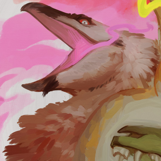
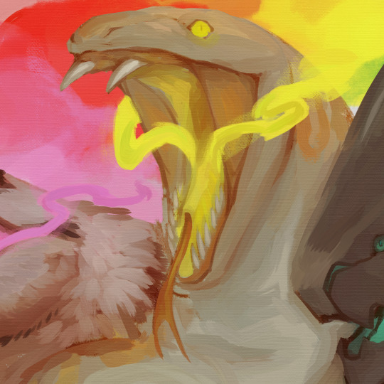
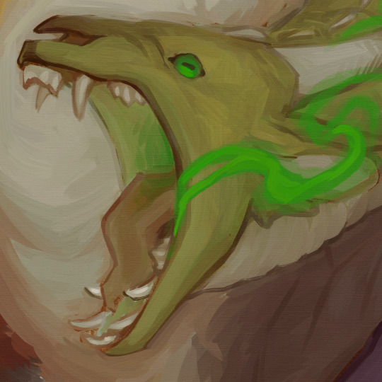
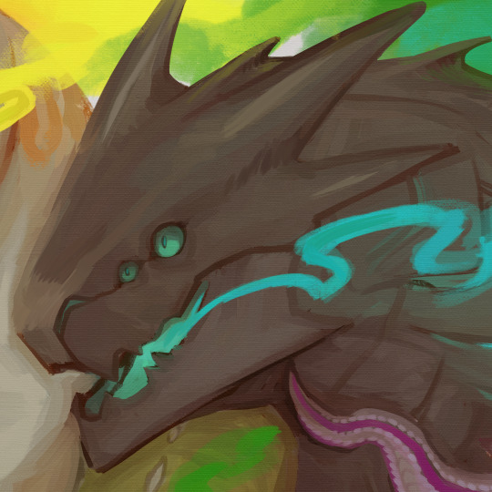
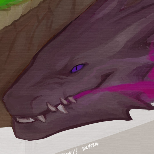
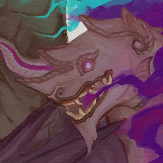
IN CASE YOU MISSED THE MEMO: HERE'S THE THING ABOUT DRAGONS
#coyoteworks#art#digital art#original art#digital painting#dragons#queer artist#artists on tumblr#i had to crush this image like fucking crazy btw it was like. nearing 200 mb in file size#anyways uhhh picked colors based on the gilbert baker pride flag (not directly eyedropped though)#was just kind of thinking about dragons as narrative tools and how people of marginalized groups frequently identify with them#so i made art about it. naturally#its 4am i need to sleep gootbye
922 notes
·
View notes
Text

"Somehow I always knew you'd come back."
Happy November 5th!
Click for quality! (ID under cut)
[Image ID: A digital painting of Castiel and Dean from Supernatural.
They are in the Empty; darkness swirls around them. However, they are both well lit. They are hugging each other, and Cas' rainbow coloured wings are wrapped around them both, forming a vague heart shape. Dean is wearing his green jacket, still with Cas' bloody handprint on the shoulder. He has his back towards the 'camera'. Cas' face is visible. He's leaning into Dean, smiling beatifically, eyes closed in happiness. They're clutching each other tightly.
It is signed '@aerialworms' beneath Cas' left wing. /End ID]
#supernatural#spn#destiel#castiel#nov 5th#november 5th#supernatural fanart#dean winchester#spn fanart#CAN YOU BELIEVE ITS BEEN THREE WHOLE YEARS?????????????????????#I LOVE THESE IDIOTS SO MUCH LOOK DEAN WENT AND GOT HIM HE'S FINE EVERYTHINGS FINE#FINALE WHO?#also! fun fact! the wings are colour picked from the original gilbert baker pride flag!
531 notes
·
View notes
Text


Some pride flags made from destiny oob screenshots that @fmab and I collected :)
#i smileee#destiny 2#MUTUALS KNOW HOW ADDICTED I AM TO OOB. DESTINY'S THIRD GAMEMODE#the rainbow flag is supposed to be the gilbert baker pride flag but its a littlee difficult to do exact color matching#d2#my
73 notes
·
View notes
Text
everytime someone asks who gilbert baker is in my fucking notes i go a little bit more insane
#[ren]#HOW DO YOU NOT KNOW GILBERT BAKER. CREATOR OF THE GILBERT BAKER PRIDE FLAG#like obvs no offense its just like. ohhh my god? oh my god#all of you need to do some research NOW
17 notes
·
View notes
Text

I love you Pride flag with the Diversity, Sex, and Magic stripes, I love you Gilbert Baker.
#fuckkkkkkk i'm thinking abt this flag bro its so good#i love you Gilbert Baker i'm so insane about this flag#i wish i could email him and tell him how badly i love this flag. rest in peace Mr. Baker#tearing up over this flag it's so real I love you 9 striped Pride Flag i love you i love you#keep talkin miles
10 notes
·
View notes
Note

Your blog's looking great btw
LMAOOOO
9 notes
·
View notes
Text
I miss drawing/ getting art of Karl with the rainbow pride bandana....
#ramblings#i know whyyy i started giving it the lesbian bandana more and i think the agender bandana looks cute but its liiiike.#idk. rainbow flag ftw. i should draw it with a rainbow pride bandana but the like. original gilbert baker flag colors#thatd rule
3 notes
·
View notes
Text
Happy pride month everyone
at least can all we agree that the original gay flag with the magic and sex colours is BEAUTIFUL and it should make a comeback
#happy pride month#happy pride 🌈#gilbert baker#original pride flag#pride flag#lgbtqia+#queer history#queer culture#I'm not one to wave flags but#this one and its sisters I do
102K notes
·
View notes
Text

⠀
➻❥⠀⠀AKSEGENDER⠀⠀♡
[Plain Text: Heart arrow symbols, AKSEGENDER, heart symbol /End of Plain Text]
⠀


⠀


⠀
Flag image descriptions can be found in ALT text, or below — dividers are simple bumpy/round shapes in the same colours as the flags.
⠀

⠀
AKSEGENDER; a term under the Akse— system revolving around accepting yourself and XYZ, accepting yourself being XYZ, accepting the very idea/possibility of you being XYZ — this, optionally, also may have to do accepting XYZ in other people's lives, accepting other people who are XYZ, accepting that others may be XYZ and the way XYZ may be preesent in other scenarios and lives.
⠀
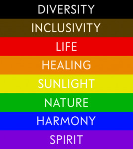
General themes/ideas surrounding self-love, wonder, discovery, understanding & finding peace within oneself (in general and/or regarding XYZ) are also included. The flag colour meanings are directly based off from the Gilbert Baker pride flag; red means life, orange means healing, purple means spirit, blue means serenity — additionally, white is supposed to represent wholeness && light grey is supposed to represent the relieving aftermath of struggle through a fog (hence why its light grey, and not dark grey).
⠀

⠀
⠀⠀⠀⠀⠀⠀⠀⠀⠀【 LAYERS: 】
[Plain Text: Bracket, LAYERS, bracket /End of Plain Text]
⠀
PLAIN STRIPES: Stripe One (LINK), Stripe Two (LINK), Stripe Three (LINK), Stripe Four (LINK), Stripe Five (LINK), Stripe Seven (LINK).
STRIPE OUTLINES: Outline One (LINK), Outline Two (LINK), Outline Three (LINK), Outline Four (LINK), Outline Five (LINK), Outline Seven (LINK). Outlines go under their respective stripe layers.
SYMBOL: Main Layer (LINK), Outline One (LINK), Outline Two (LINK), Outline Three (LINK), Outline Four (LINK), Outline Five (LINK), Outline Six (LINK), Outline Seven (LINK), Outline Eight (LINK), Outline Nine (LINK), Outline Ten (LINK), Outline Eleven (LINK), Outline Twelve (LINK), Outline Thirteen.
OTHER: Background/Stripe Six (LINK), Middle Star (LINK), Middle Star Outline (LINK), Minimalized Flag Template (LINK).
⠀
Plain stripes go on top of their respective stripe outlines, background (STRIPE SIX) goes under all layers, star layers go on top of all the previous layers, and the symbol layers go on top of all aforementioned — minimal flag symbol only has the seven first outlines. Please, feel free to send stripe links to the wayback machine/internet archive, if you'd like.
⠀

⠀
This term isn't and will NEVER be in favor of abuse, (self) harm, overly negative actions && thoughts, hateful ideas && sentiments, exclusionism of authentic harmless existences, policing what should/shouldn't be, enforced normativity && the promotion, glorification/fetishization/romantization of the aforementioned — however, it may have to do with RECOVERING from such.
⠀
This term may be used without strict ties to gender, meaning it can be AKSE[XYZ] instead of AKSE[GENDER] — it may be used as a general identity term, nonhuman term, mad pride/disabled pride term, a recovery/ex‐‐[community] term, and much more. Of course, it may also be used as a gender term as well!
⠀
Image Description: A extremely complex stripe-heavy flag, with lots of cloudy, wavy and round stripes. It has a total of thirteen stripes, counting the middle one, and has stars in the very middle stripe. It almost has a "tie-dye" vibe to it, but not strictly. Its colours are soft lighter orange, soft chalk red, soft vibrant purple, darker soft purple-ish blue, plain white and light grey. In the middle of the flag, a icon/vector of a person can be seen. It is a very minimalistic rendering of a bust shot, and the head is completely round — there are no distinguishable features. It has many outlines that serve as some sort of "aura", in the same colours as the flag itself.
Image Description: A extremely complex stripe-heavy flag, with lots of cloudy, wavy and round stripes. It has a total of thirteen stripes, counting the middle one, and has stars in the very middle stripe. It almost has a "tie-dye" vibe to it, but not strictly. Its colours are soft lighter orange, soft chalk red, soft vibrant purple, darker soft purple-ish blue, plain white and light grey.
Image Description: A flag with seven stripes, where the top and bottom are thickest and the middle are the thinnest — the second and sixth are thinner, and the third and fifth are even thinner. The colours of the stripes are as following, from top to bottom: soft chalk red, soft lighter orange, pale lemon-ish yellow, plain white, light blushy pink, soft vibrant purple and darker purple-ish blue. In the middle of the flag, a symbol/vector of a person can be seen. It is a very minimalistic rendering of a bust shot, and the head is completely round — there are no distinguishable features. It has a few stripes that act somewhat similarly as an "aura", and these stripes are in the same colour as the flag itself (with exclusion of the light pink, pale yellow, and addition of a light grey).
Image Description: A flag with seven stripes, where the top and bottom are thickest and the middle are the thinnest — the second and sixth are thinner, and the third and fifth are even thinner. The colours of the stripes are as following, from top to bottom: soft chalk red, soft lighter orange, pale lemon-ish yellow, plain white, light blushy pink, soft vibrant purple and darker purple-ish blue.
⠀

⠀
Tagging: @radiomogai, @lovesse, @lunentity, @rwuffles, @kiruliom, @gorefix, @melanchollica, @inknoidd, @fwus, @riamuverse / @v-rtue, @gender-mailman, @hypnosiacon, @losergendered, @rabidbatboy, @acronym-chaos, @daybreakthing. Please feel free to ask to be removed or added!
#akseterm#aksegender#aksesexual#akseromantic#akseplatonic#aksequeerplatonic#akseorientation#akseoriented#mogai coining#mogai term#mogai label#mogai gender#mogai orientation#mogai flag#my terms#my flags#my edits#my labels#aksemad#aksedisabled#aksecountry#akse[XYZ]#liomogai#liom coining#liom flag#liom gender#liom label#liom term#my coins#buhggycoins
82 notes
·
View notes
Text
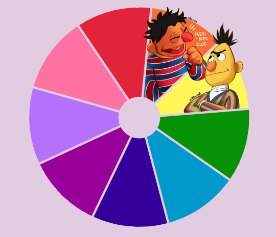
Yellow Done! Send me an ask for who should be Green and I'll pick one!
Blank version
#color wheel challenge#but its the gilbert baker pride flag#pride#lgbtq#sesame street#bert and ernie#free to use
212 notes
·
View notes
Text
i get that its not my place as a white person but it felt weird to me when the first philadelphia pride flag “dropped” with the brown and black stripes, cause the implication was that the original gilbert baker flag somehow excluded ssa people of color.
32 notes
·
View notes
Text
[id: an image that is half the gay pride flag, half the Germany flag. end id.]
Pride vs Place!
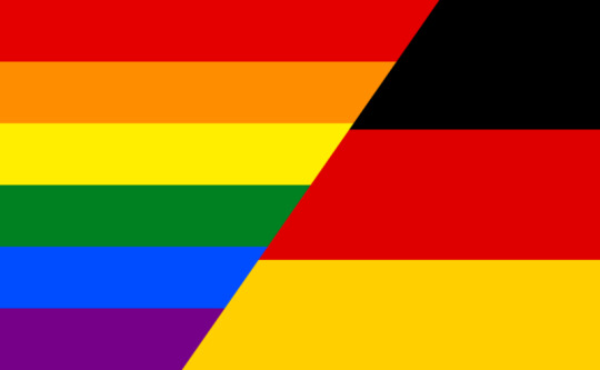
Introducing the hot new quiz show: Pride vs Place!
It's simple: you just have to identify whether the flag belongs to a place or is a pride flag.
Easy Mode
Hard Mode
#100% on easy 90% hard#but tbh on hard i had no clue who the flags were its just easy enough to guess graphically#like. country flags are made to be mass produced so they tend to have simpler designs and very distinct colors#where a lot of pride flags like a lit of subtle gradients bc they are primarily used online or thats at least of where they originate#(an obvious exception being the gilbert baker flag which is part of why it has such different distinct colors so in theory#people could hand make them and you didnt have to perfectly color match and could still make a good flag)
28K notes
·
View notes
Text
Why I don't use 'Progressive flag'
And why you should consider not to either.
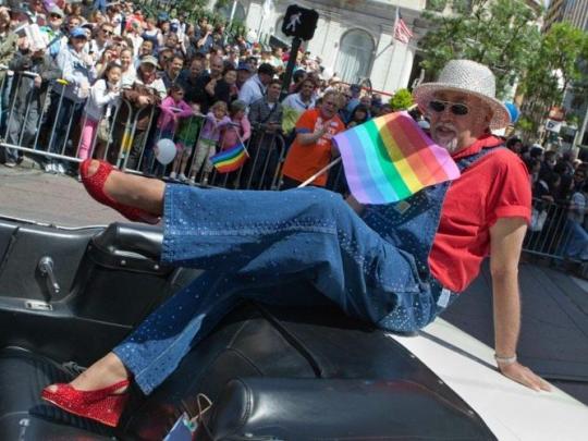
Short answer? It's not progressive. It's as simple as that. Oh, and it's ugly as hell. And the creator of the OG flag advocated to go back to the older flag before he died.
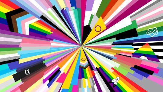
Seriously, it's a nightmare of a design. Just like saying LGBTQIA2S+ is impossible to properly comprehend. It's simply too busy, too long, there's too much going on. By adding more letters or stripes we lose the meaning.
There are so many flags, are we going to add them all?
The intentions are good, but unfortunately progressive flags are way less inclusive than any other rainbow flag.
You see, pride flag was always inclusive. It has always represented queer POC, and trans people and intersex and anyone else who see themselves as part of the LGBT+ community.
The idea in highlighting certain parts of community that are often left out and controversial in the community had it's reasons. Despite that it's a stupid ass decision that implies people of colour, trans and intersex weren't a part of the community. That the flag didn't represent them.
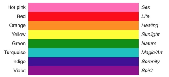
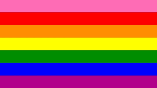
In 1978, the artist Gilbert Baker, an openly gay man and a drag queen, designed the first rainbow flag, urged by Harvey Milk, one of the first openly gay elected officials in the U.S., to create a symbol of pride for the gay community. Baker saw the rainbow as a natural flag from the sky, so he adopted eight colors for the stripes, each color with its own meaning (hot pink for sex, red for life, orange for healing, yellow for sunlight, green for nature, turquoise for art, indigo for harmony, and violet for spirit).
Baker and a team of volunteers had made the first flag by hand, for the San Francisco Gay Freedom Day parade on June 25, 1978. Quickly he wanted to mass-produce the flag for consumption by all. However, because of production issues, the pink stripe was removed while indigo and turquoise merged to create basic blue, which resulted in the famous six-striped flag.
{source of slightly altered text about the history of the flag}
Since 2003 Gilbert Baker has been advocating to restore the flag to its original 8 stripe state. He died in 2017.
So here's my proposal:
Let's get back to the pink. Let's give it a new meaning. Let's put pink on the 6 striped flag for those of us who were thrown out, just like the pink was, because it was inconvenient to keep us. Nowadays it's not as hard to produce pink, so why not? It doesn't divide or alienate us more, it pays tribute to the old flag while also being distinct and new.
#lgbt#pride month#nonbinary#pride flag#lgbt pride#intersex#transgender#trans pride#pride flags#queer#queer history#queer community#queer poc#lgbtqia#lgbtq history#lgbtq community#LGBTQ#alphabet mafia#progressive flag#alternative flag#aromantic#asexual#two spirit#7 striped pride flag
89 notes
·
View notes
Text
Second donation commission for @field-of-asphodel

[Start ID: A digital drawing of a Palestinian Sunbird perched on an olive branch holding the gilbert-baker and trans pride flag in its beak. There is big text in the bottom left corner in a gradient of green to red which says, "Queers for Palestine". The background is a dulled grayish green with a repeating pattern of simple watermelons and keys, with the outline of a river running down the center. In the upper left corner is a watermark that says "TheCraftyDragonC". End ID]
#my art#donations for drawings#donation commissions#described#queers for palestine#free palestine#palestinian sunbird#palestinian solidarity#none of us are free until all of us are free#Don't fall for pinkwashing
48 notes
·
View notes
Text
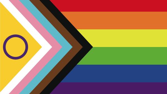
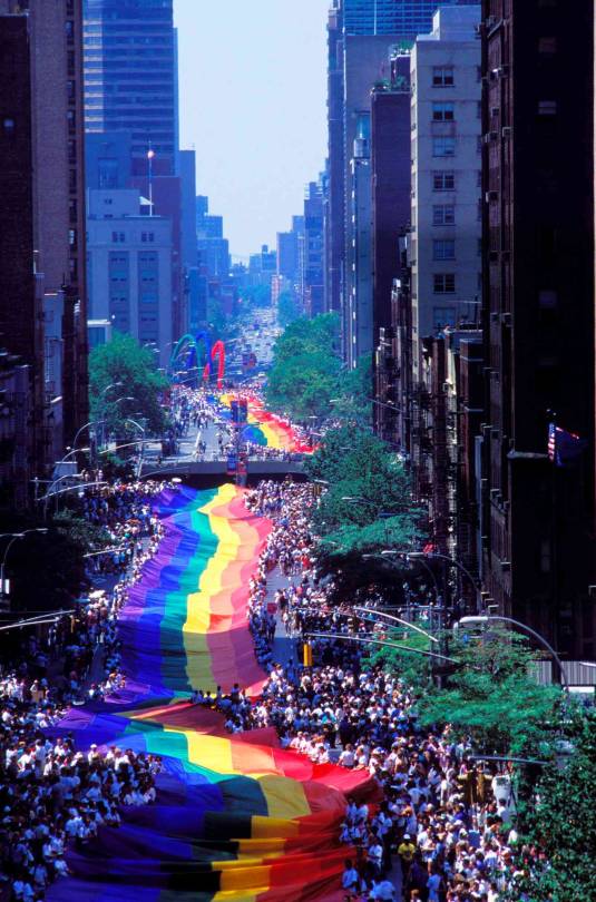
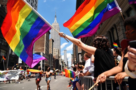
Since today marks the 53rd year since the first Pride parade took place, let's dive into the history of the "progress" of our Pride flag.
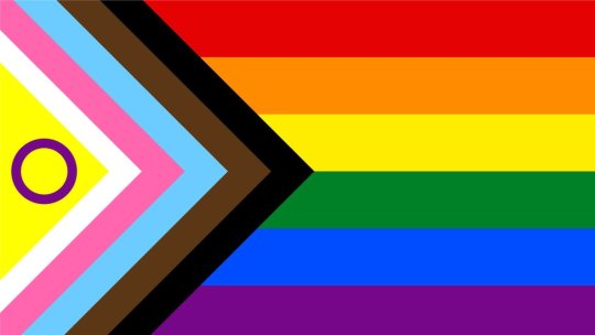
This new flag is called the Intersex-Inclusive Progress Pride Flag, created by Valentino Vecchietti of Intersex Equality Rights UK in 2021. It is an update to the previous Progress Pride Flag created in 2018 by Daniel Quasar.
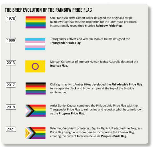
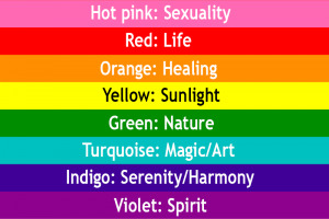
The original pride flag was created in the 1970s by gay activist Gilbert Baker, friend of Harvey Milk, the first openly gay man to be elected to public office in California. The flag made its debut at the San Francisco Gay Freedom Day Parade celebration on June 25, 1978. Baker used eight colors―

― hot pink for sexuality, red for life, orange for healing, yellow for the sun, green for nature, turquoise for art, indigo for harmony, and violet for spirit.
Why Was Pink Removed From the Pride Flag?
The original hot pink color was removed from the pride flag because the fabric was difficult to find.

The Progress Pride Flag was created with the inspiration of other pride flags—specifically, the Philadelphia Pride Flag from 2017 and the trans flag.
The Philadelphia Pride Flag had black and brown vertical stripes added. The trans flag, created in 1999, is pink, baby blue, and white. Both of these flags inspired the design of the new pride flag.
Black and Brown Represents People of Color
The Philadelphia Pride Flag was designed by the Philadelphia Office of LGBT Affairs and was done in partnership with advertising agency Tierney. It was introduced at a City Hall ceremony in June of 2017. The flag showed the traditional six rainbow colors in horizontal stripes, with a black and a brown stripe atop them.
The colors black and brown were added to the Progress Pride Flag to represent people of color (POC). This was an important addition because people of color have often been left out of the queer narrative despite being the driving force behind the movement.
With the rise of the Black Lives Matter movement, culture at large began to shift in a much-needed way towards acknowledging the vital roles that people of color have had in our society. The pride movement background is one of many areas where POC, particularly Black people, did not receive the recognition they deserved historically. Adding colors to represent them on the flag is one way to change that.
Additionally, the black and brown stripes are meant to represent people living with HIV/AIDS, those who have died from it, and the stigma around the virus that is still present in our society now.
Pink, Baby Blue, and White Represent Trans People
Transwoman Monica Helms created the trans pride flag, which first flew in a pride parade in Phoenix, Arizona back in 2000. Monica Helms is a transgender activist, author, and U.S. Navy veteran.
Traditionally, the colors pink and baby blue have been used to represent whether a baby is a boy or a girl. Here, the colors denote those genders. The color white represents people who are transitioning, intersex, or identify outside of the gender binary.

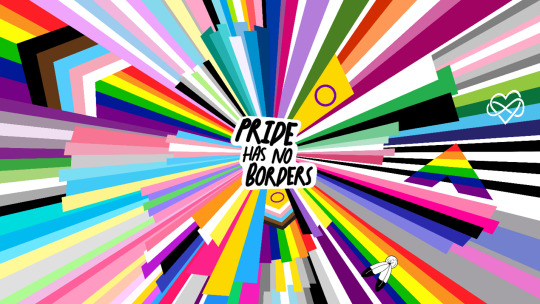
The word "progress" in the new flag isn't only about adding the new colors to it. It's also because of the shape, which differs from the original design of horizontal stripes only. The Progress Pride Flag shows the white, pink, baby blue, black, and brown stripes in a triangle shape, with the old six-color rainbow stacked next to them.
This was done intentionally to convey the separation in meaning and shift focus to how important the issues represented on the left are.
The placement of the new colors in an arrow shape is meant to convey the progress still needed. Quasar spoke publicly about how work is still needed in terms of POC and trans rights. This arrow design is meant to highlight that.
Although the Pride flag continues to evolve, the most recent update includes a yellow triangle with a purple circle inside it to represent the intersex community. It now serves as the most up-to-date LGBTQIA+ flag.
#lgbt#lgbtq#lgbtq+#lgbtqia#lgbtqia+#lesbian#gay#bisexual#transgender#queer#intersex#asexual#aromantic#non binary#nonbinary#pride month#pride#pride parade#june
231 notes
·
View notes