#but if you're on deviantart then you could see it
Explore tagged Tumblr posts
Text

need to draw them more
#half life#Half life 2#gordon freeman#alyx vance#Freevance#< i mean it doesn't have to be but yknow#I do ship them so yeah ghkdgiygiyd#half life fanart#There is a version with blood but ehh I'd rather not#It's kinda crap HEHEHHE#but if you're on deviantart then you could see it#Nothing special trust me heh#artsy's art
37 notes
·
View notes
Note
How do you make your stamps? :0
Disclaimer: this is an obscenely long explanation, with pictures. Efficiency is stupid
So, for the static ones, I make a 99x56 px file on ibis paint x. Other programs are probably available online but I don't use them.
After that, I either upload an image I want to make into a stamp, or I draw one.
Then, I find a frame I want to use. Ill upload them here but let it be known I stole all of these right from deviantart


Most of them are from Lil-Devil-Melii on deviantart. The rest i have no idea. They're not all 99x56px but you can crop the canvas it's fine
Make sure to erase the edges of the picture , so they're transparent. It's not as cute otherwise
Upload those frames over your image in whatever art program you're using and viola, stamp.
For moving ones, it's a lot harder. Mostly because I refuse to download Photoshop.
There are a couple ways to do this. Some are simple animations, like with flashing text and whatnot. For these, you download the individual animation frames from your art program. Make sure it's transparent.
Then, upload each frame to ezgif.com under the option "GIF maker." You can play around with how fast each frame goes and whatnot but in the end, it'll be a stamp with some rad text that moves. This is easy, and doesn't make me want to shit my pants and cry. If you're new, do this. This is fun. This is good. This does not kill me inside
I made that↓ stamp with this method :)

this next one is how we turn gifs into stamps. This one makes me sad. It involves math and sucks. But we gotta do it. For the vibe
First, grab your gif. I'm using this cow gif because it's awesome

Then, I resize it using ezgif. Literally everything for this will be using ezgif. I am a simple man
At this point you should decide what frame to use. I'm using this one because its the first one I clicked

Figured out what size the inside of the frame is. That's what I resize the gif to, so the edges can be transparent. The inside of this one is 93x50 px, so those are the dimensions I'm making the gif.
Figure it out by putting the frame into ibis paint and realizing the canvas to fit just the inside of the frame, then seeing what the dimensions are. But there could be easier ways

Woah it's so small now
Then, still on ezgif, I go to the "crop" option.
Make sureeee to upload the smaller gif
press the button that says "extend canvas size", and then put the "width" and "height" as the dimensions for your FRAME. This'll put a bit of a transparent border around the gif. For this frame, I did 99px and 56px.
The "left" and "top" boxes show how many pixels the cropping happens from the edges of the canvas. The formula for finding that is
(width of gif / 2) - (difference between gif width and frame width / 2) = left box
For me it's (93 / 2) - (6 / 2) = 43.5
Then you do the same.for the height, which for me ends up being 22 from the top
This is reallyyy touchy and annoying though
Here's my result , with no visible difference

Okay so THEN you go to the "overlay" option, under "effects." And upload your frame. If the cropping was done right, you shouldn't have to move the frame at all and can just download it
Here's my result:

if you don't care about transparency, you can resize your gif to be the same size as the frame, and then put the frame over it. But I'm a slut for transparency
Anyways. I'm sorry if anything was unclear, it's two am. And I hope this was helpful :) these really are fun to make once you get it down
also if anyone has an easier way to make stamps from gifs, please god tell me
#web graphics#old web#neocities#custom#custom blinkies#stamps#page decor#web resources#da stamps#deviantart stamps#blinking gif#How to#tutorial#How to make stamps#Spacehey#deviantart#rentry graphics#old internet#early internet#stamp collecting#ezgif#stamp making#stamp template#Stamp frames#blinkies
3K notes
·
View notes
Text
EVENT OVER! THANKS EVERYONE WHO JOINED IN U ALL DID AN AMAZING JOB <3 SEE YOU AGAIN NEXT YEAR IN MARCH FOR #mARTch OR NEXT OCTOBER (2024) FOR A NEW SET OF PROMPTS!!!!!

OC-TOBER 2023 PROMPTS!!
general tag: #oc-tober / my prompts: #bweirdOCtober
F.A.Q:
Do I have to draw EVERY DAY?
NO! I highly encourage skipping as many days as you need to avoid burnout! There are 10 main days in the event (marked with a ⭐ star) that you can focus on if you don't feel up to doing every day, or you can choose your own adventure and just do the prompts you personally like!
Do I have to DRAW?
NO! You can also write fanfiction snippets, repost older art that fits the theme, tweet headcanons/backstory, roleplay in-character as your oc ... genuinely anything that fits the theme is OK!!
Can I start early?
YES! I understand some people work at a slower pace and might need a head start! So long as you wait until October to post it, you can start working as early as you need!
I missed the start of the event .. do I have to catch up?
NO! Please don't stress about days you missed, you're allowed to just skip to the current prompt!
RULES:
1. MAKE FRIENDS! The community is the best part of this event .. please try to follow new people, ask questions about ocs you like, compliment people's styles, ask friends to create with you, etc!
2. TAKE IT EASY! Skip a day if you're tired, busy or just not interested in the prompt. You don't have to catch up on it later. This is supposed to be fun, not work!
3. BE KIND! Please think about the people around you - don't give people unwarranted harsh criticism, content warn for themes/imagery in your work that could trigger someone, don't create anything hateful, etc
MORE:
text version / tips and ideas on bweird.art or below ↓
star = main prompts | no star = optional
INTRO WEEK
1: FAVE OC ⭐
-Which of your characters is your favourite right now?
2: NEW OC
-Who is your newest OC?
-Design a new OC right now
3: OLD OC ⭐
-Do you remember the first OC you ever made?
-Is there an OC you haven't drawn in a long time?
4: RE-DESIGN
-An OC who has changed a lot over the years
-Take an old OC and update their design right now
BACKSTORY WEEK
5: RELATIONSHIPS ⭐
-Who is important to your OC?
-Do they have a partner?
-Do they have a best friend?
-Are they close to their family?
6: SYMBOL
-What imagery do you associate with your oc?
-Are there any colours, flowers, animals or concepts that symbolize them?
7: PERSONALITY ⭐
-How does your OC behave?
-What are their positive traits?
-What are their negative traits?
-Are they extroverted or introverted?
8: PAST
-What was your OC like as a child?
-Where did they grow up?
-Are there any significant moments from their past that shaped who they are?
9: FUTURE ⭐
-Does your OC have a goal they're working towards?
-What will your OC look like when they get older
-Do you have a planned ending for their story?
PALETTE WEEK
10: pumpkin patch palette
#251604 #1E3807 #5B5E1A #A2A657 #EBA00F #F3ECCC

11: hot cocoa palette
#520B13 #BB382E #E27E6D #88392C #AF5D40 #E1AFA4

12: midnight zone palette
#000007 #000049 #183885 #004D4F #0E8788 #FFF1C0

13: peachy palette
#DE6450 #DB9171 #FFC1AE #FEE1AD #FFF2E0 #D9D8D8

14: haunted house palette
#552506 #6E25AA #ED690B #F925A0 #8F8BA7 #A6C1AA

FUN + GAMES WEEK
15: MEME ⭐
-Post memes that remind you of your OC
-Draw your OC as a meme
-Fill out a character meme (classic deviantart style)
16: FOOD
-What is your OC's favourite food?
-What is their least favourite?
-Can they cook?
17: EYES-CLOSED ⭐
-Draw your OC with your eyes closed! No cheating!
-Write a scene without looking at the keyboard! Keep the typos in!
18: SWAP
-Swap the style or aesthetic of two of your OCs
-Species or gender swap AU
-Invert an OC's colour scheme
19: INSPIRATION ⭐
-Is your OC inspired by any pre-existing characters?
-Are there any particular songs/lyrics that inspired something about one of your OCs
-Do you have a dedicated pinterest moodboard for your character?
20: INVENTORY
-What does your OC carry around with them on a daily basis?
-Are there any objects that have sentimental value for them?
-Loot drop for your DnD OC
FRIENDS WEEK
21-25:
There's no specific daily prompts for this week, but here are some ideas you can try ...
-Art trades with friends who are doing the event with you
-Your OC interacting with a friend's OC
-Gift art for someone whose OCs you like
-Work together and collaborate on something with a friend
-Roleplay an OC scene together with someone
HALLOWEEN WEEK
26: FEAR ⭐
-What is your OC scared of?
-Draw one of your OCs trying to scare the others
27: MONSTER
-Do you have any monster OCs? (eg: vampires, werewolves, creatures, ghosts...)
-Draw a human OC as a monster
-Design a new monster
28: TRICK
-Play a trick on an OC
-Do you have an OC who would play tricks on people?
29: TREAT
-What is your OC's favourite halloween candy?
-Give an OC a special treat to make up for yesterday's trick
30: MAGIC
-Do any of your characters have magical powers?
-Give an OC a magical or cursed artifact
-Create a magic-using OC like a witch or wizard
27: COSTUME ⭐
-What is your OC dressing as for halloween?
6K notes
·
View notes
Note
1/3 - Hi there! Three (I think) part ask incoming. You're the main person I know of who compiles tons of interesting fandom stats, so I wanted to ask you about it if you have the time to answer. :) I think a lot about how AO3 works great as a fan*fic* archive, but for other fanworks, like images, audio, video, etc., it's only as good as wherever the media is being hosted. With the way hosting sites come and go, or change their TOS to nuke nsfw or queer content, etc., it makes me wonder
how many broken image links litter AO3 at this point. I know it's not considered the primary place to find fanart, but a lot of folks do post images there—for events like Big Bangs, as standalone art, and even as decorative section breaks, etc. My question is: do you think there's a way to look at, say, works tagged with #fanart (of which there are 99,504 atm) and determine what percentage of those are broken links? From what little I understand, one would have to (perhaps with the use of a simple bot?) try to open any link bordered by the <img src> html, and see what portion of those return an error versus what ones actually load? I suppose it could even be something like looking at fanart posted in 2007, 2012, 2017, and 2022 to compare how many older links are broken versus newer links. Anyway, this may be completely unfeasible, but I figured I'd ask about your thoughts! Thanks!
Ooh, thanks for the great question! I took a while to answer because I wasn't initially sure what to recommend and ended up gathering some data to investigate. (If anyone else also has relevant data, please share in the notes!)
I liked your idea of looking at samples different years going back, and I decided to look through 100 AO3 works tagged "Fanart" (or a subtag) that were posted 10 years ago -- as a very fast starting point, I didn't even take a random sample of works, I instead looked at the first 100 multimedia fanworks posted in July 2014. (And August, when necessary; see more notes on methodology at the end.) Please keep in mind that this sample that may not be very representative of AO3 more broadly; to get better estimates, more sampling would be needed. Based on this initial data gathering (and the fact that most fanworks on AO3 were posted within the past 10 years), I would tentatively guess that that most fanart, fanvids, and podfic on AO3 still have accessible multimedia.
Given how many broken links and embeds there are on older webpages, I assumed that a ton of the links from 10 years ago would be broken. But I was pleasantly surprised by the results:

Wow -- 10 years on roughly 90% of the multimedia still works! I was honestly floored; I'd been originally planning to also look at 5 years ago to see how much better that was, but if ~90% are still working 10 years on, 5 years ago doesn't have room to be dramatically better. (However, I'd love to see more follow up sampling across different years to find out.)
There were a lot of AO3 users in this sample who posted multiple works -- some posted as many as a dozen multimedia works in July 2014. I didn't want the results to be overly skewed by any one fanwork creator, so I also redid the analysis with just one work from each unique creator:

Okay, cool, those results are pretty similar. I also did some further breakdowns on this smaller set of works to look at which hosts creators were using, and how many of the hosts were still working:

The most common fanart host used in this sample was Tumblr, then wixmp -- which I think from some very quick googling might be because Deviantart switched to using Wix for image hosting at some point? (i.e., I think most of those artists may have posted their art on Deviantart, then linked to/embedded the image on AO3, and the image's direct URL was was wixmp.) There were a few other hosts at the time that were used by 5+ different artists in the sample, and then there were a whole lot of hosts were used by just one or a few artists.
Most of the 10-year-old fanart is still up for all of these hosting categories! Photobucket is the least reliable of the most commonly used hosts. In the Other category, 25% of the links are broken, but that's still better than I expected (see full host list here).
This is getting long, so I'm moving the breakdowns for fanvids and podfic beneath the cut:

Fanvids were almost all hosted on YouTube, Vimeo, or both (the above categories are not mutually exclusive). All the Vimeo links still worked, whether they required a password to view or not. Most YouTube links were working, and the few missing ones had almost all been taken down by YouTube for copyright reasons (according to the errors I got -- I'm not rendering judgment about whether they were actually fair use), rather than by the vidder who posted it. And almost a third of vidders also linked to other hosts besides the big two, but many of those links were broken; 59% still worked. (see full host list here)

For podfic, mediafire was a popular solution 10 years ago, though many podficcers used it as a backup rather than the main link that they shared. A lot of podficcers made use of a fandom hosting site that specialized in podfic -- either parakaproductions.com or audiofic.jinjurly.com. Four podficcers used soundcloud (often as a backup). And once again there were a lot of less-frequently used hosts, often used as backup links; 69% of those still worked. (see full host list here)
Some methodology notes and further thoughts:
For fanvids and podfic (but mostly not from fanart), the fanwork creators tended to provide multiple links, and in those cases, I counted the multimedia as working if at least one of the links was still working.
I counted embedded media and links to other sites that host the media all the same way.
I counted the media as broken if I got a 404 when I tried to visit it, or if a site like YouTube had taken it down due to copyright issues, or if I got an Access Denied message for a site like Google Drive.
I counted the media as working if it required a password that was given on the page (common with Vimeo), or if an embed was broken but there were working links to other sites.
How representative is this data? Well, these samples contained most/all of the multimedia fanworks posted in July 2014; that month, there were 70 fanvids, 135 podfic, and 186 pieces of fanart posted that haven't been deleted since. So it's pretty representative of July 2014 specifically. :) But there could have been, say, a fanwork challenge going on in July 2014 that caused unusual uploading patterns then.
The above data gathering and analysis took me several hours over several days. If you want to follow up, you could do more data gathering similar to what I did (I'm happy to elaborate on my process as needed). Or you could write a bot to do something similar; you could have it fetch more AO3 fanworks and try following the links within each work. However, that would be slightly tricky; I ran across more kinds of errors and complicated situations than I expected (e.g., if a YouTube video has been taken down due to copyright, it still has a working YouTube page; sometimes an embed is broken, but if you open the link within the embed in a separate window, it still works fine; many Vimeo links require a password to test, and it could be hard for the bot to reliably find the password in the surrounding text). So you'd have to program your bot to be able to handle a bunch of different special cases.
Regardless of which path you are considering, if you or anyone else does any follow up work here, I encourage you to start by looking through a bunch of fanworks yourself and deciding which scenarios you want count as "working" vs. "not working," and any other things you want to pay attention to.
Hope that helps, and please feel free to DM me with follow up questions. And if you follow up, please share anything else you figure out in this space!
#ao3#fanart#fanvids#fanvid#podfic#embedded media#multimedia#broken links#link rot#fandom stats#toastystats#asks#toasty replies#op#to archive#I have a bunch of ~recent stats I need to backup to ao3#but not yet!#50#100
417 notes
·
View notes
Text
How to Spot AI images (Hopefully)
So, I did see GailyNovelry's excellent post on this (Link here), but saw that there also were some confusion and they were using a environment image as their example, so I thought I'd do a breakdown that was more character centric.
The key thing with AI images is that the program does not know what it is making. And, arguably, they thrive on that we are currently conditioned to not really look at things for too long before we hit that engagement button and/or just scroll onwards to whatever next the algorithm feeds us.
It's hard to fight that urge, I know, but if you just pause and look, you'll soon start spotting things that just do not make sense, and I don't just mean that the pretty booby elven fighter is sporting seven fingers on one hand. Those are the obvious things. I'll try to cover the general sort of artefacts that tend to tip me off to the fact that a image is generated rather than actually hand-made by someone making informed design decisions as opposed to trust what amounts to RNG. I think this is important as there's those who do not tag their images as AI generated, and try to scam people with commissions.
And, as the saying goes... The devil is in the details.
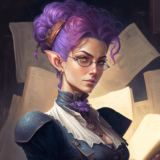
To start with I picked this image from deviantuser CeiEllem. At first glance, it looks... very impressive. Sharp looking elf lady with killer hair. 10/10 wish I could rock that haircolour.
But, it is AI generated. Aside from the general tell that is this hyper rendered, near photorealistic style that AI images often have, there's a lot of details that tips it off to just not having been made by a human who actually made the decisions.
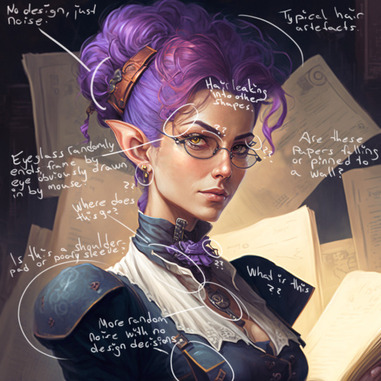
Since AI is just working off patterns and not actual decisions, things like hair is a immediate giveaway that you're looking at a AI image.
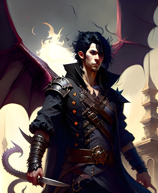
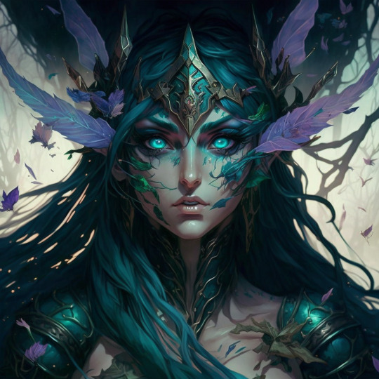
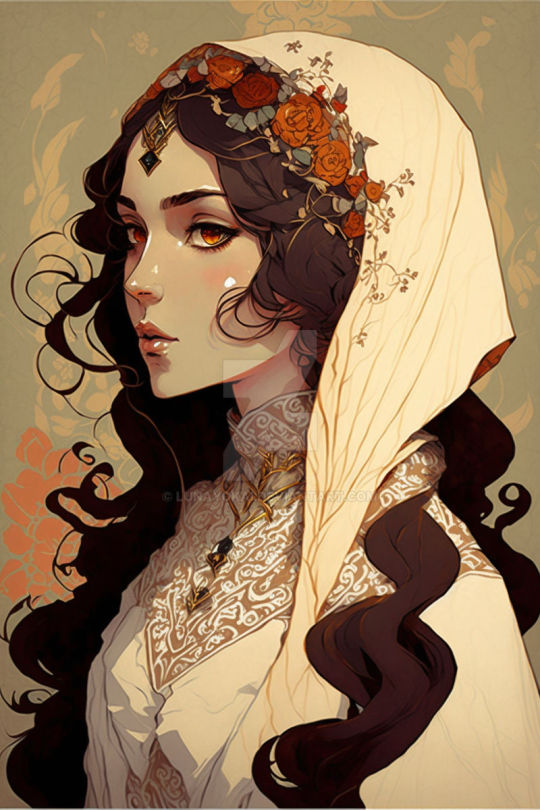
(Deviantart users: daralyth, DavidZarn and lunayokai)
In all these three images you can see just how hair whisps off into weird nonsense shapes or even meld into the background or clothing. Because, again, the AI doesn't know what its doing, just working with shapes. Similarly, background elements that just stop and start randomly is a dead giveaway, like the tail in the first image.
As I've said, details is the key to spotting these images, and another giveaway is the sheer density of details that is just noise.
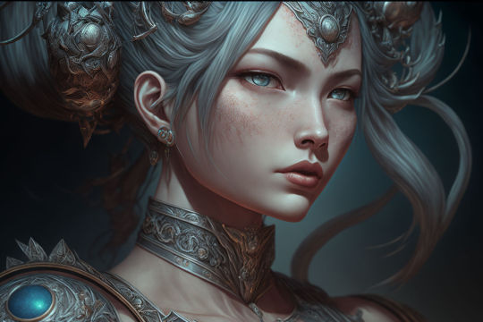
This is from users Rigtorok7, and the details are so noisy, absolutely miniscule in scale, and hypersharp, yet have no actual design to them. Artists imply details all the time. We don't render out every single nook and crevice, and since we actually know what we want the viewer to look at, we'll pull back and simplify things so you don't want to look at the big chunk of very noisy hair ornament or necklace instead of the face of the character.
For comparison, this is how it looks when I, personally, indulge in doing 'overdetailing' of something (because I am forever weak for painting jewelry).
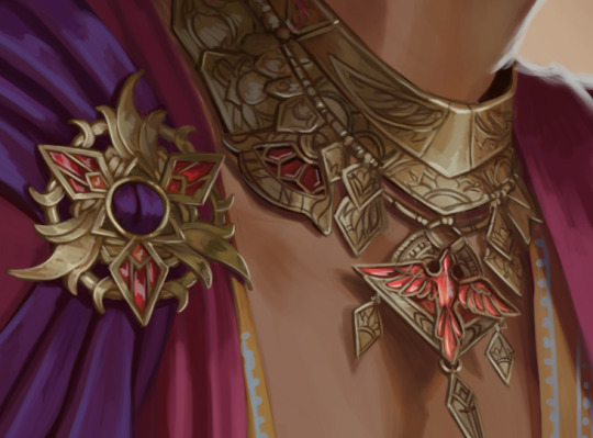
BUT I want to stress that the key here isn't that detailing equals AI generated. The key is the lack of design choices IN the details. There's a lot of artists out there, and someone painting out all those nooks and crannies in something doesn't mean they are a AI user. This painting by Leighton is super detailed but you see the intent with all the details. You have a focus with the people in the boat and secondary read of the figure in the door, where the details are a lot more implied and less sharp.
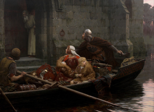
AI can't do that, because AI isn't making any decisions.
I couldn't find any good example once I went looking, but if you're into fantasy art: look for people just holding weird 'swords'.
AI is rapidly evolving, so who knows how much this'll help in 3 months, but for now, this is how I spot things.
But, in the end, the biggest giveaway that someone is using an AI generator is that they've filled up page after page on deviantart/artstation/wherever in the past like... six to nine months, and often swing between wildly different styles. If you're unsure, look up the source of a image. Another clue can be generic 'untitled' or just 'elf lady' sort of titles, since someone uploading 30 images a week isn't going to make unique titles for each image.
Also, commissioners. ... you should ALWAYS get a sketch and progress image from a artist that you hire. My art directors would have my head on a plate if I didn't send them a rough sketch and progress shot before finalising the image.
5K notes
·
View notes
Text
Redesigning Helluva Beelzebub
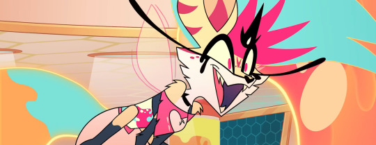
Hoo boy, roll up the sleeves for this one.
The Original
In my review of Helluva Boss 108, I mentioned that Beelzebub's character design put me in mind of how some DeviantArt kid's fursona might look. And... Yeah I stand by that statement. The most likely reason I can figure Viv Medrano wanted her to be dog-like was to make a reference to her Die Young music video, which featured an anthro wolf singing a Kesha song (for context, Kesha herself voiced Beelzebub and co-wrote a song for this episode).
But for those who are unaware, Beelzebub's traditional depiction looks nothing like this.

Really the only visual similarities the Helluva version shares with the Infernal Dictionary version are the insect wings, six limbs, and the crown thingy over the head. (At least I think that's a crown-? Kinda hard to tell on both counts.)
Bee's eyes get somewhat more insectoid later in the episode, but that feels like a cop-out. Wow, her eyes and colors changed. Totally a bug demon, right?
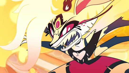
They had the same problem in Hazbin Hotel with Katie Killjoy, who's allegedly supposed to be a praying mantis but barely resembles one, even after her transformation.

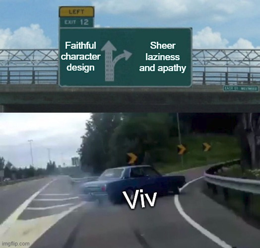
I understand the desire for fresh takes on old figures, and taking creative liberties so the new interpretation doesn't feel generic. But the changes should at least make sense. By now it's pretty clear Viv couldn't care less about representing Ars Goetia demons faithfully, as demonstrated with Paimon, Andrealphus, and now Beelzebub. You could slap completely different names on these characters and it wouldn't change a thing. I posted this meme a while back but it's never been more relevant:
On top of that, what reason could there possibly be for the design to be this damn complex? Why did she need so many markings on her face? Why did she need so many layers of hair? Why did she need flowing goo for her hair, tail, and body, each requiring dedicated effects animation?
When it comes to a hand-drawn production, less is more. Any superfluous details on a character just make unnecessary work for the animators.
Anyway, here's what Viv has to say about it.
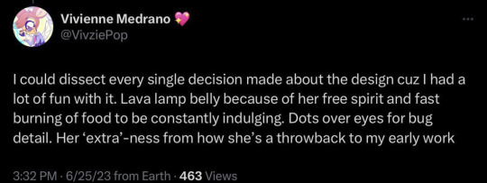
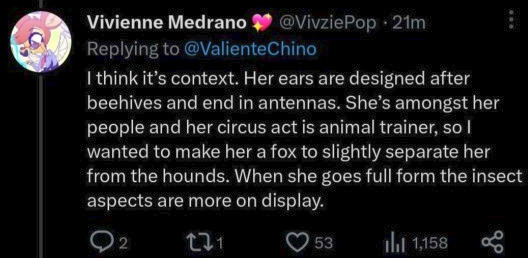
Alright, I'll admit: The lava lamp bit is a little clever. Basically it works as a regular stomach does, but on demonic steroids. But it wouldn't look so much like Viv's making this up as she goes if we'd seen Bee's stomach performing its intended function in the episode. Let her chow down on a giant piece of food (maybe that cotton candy she's been handing out-?) and swallow it, and let Loona (and the audience) see it dissolving in her transparent belly. As a general rule, if it's not shown or explained in the work itself, it's not canon. Like I've said before, Viv: Elaborate on the nuances in the story you're telling, not on social media.
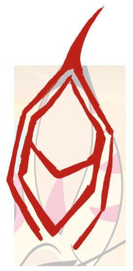
Also, "Her ears are designed after beehives"? Wh...Wha? Ma'am have you ever seen a beehive.

(Hell, even if you told me the ears were inspired by the generic cartoon beehive we're all familiar with, I wouldn't have guessed. There's a difference between being subtle and being vague.)
I can kinda see it in the overall shape, but that's a very specific design inspiration that wasn't clear at all in the design itself. Same with the "animal trainer" thing: I never would have picked up on that if Viv hadn't pointed it out. If a character design doesn't visually convey all the necessary information, it's not a successful design. Show, don't tell. There's a communication breakdown between what Viv's telling us and what Bee's design shows us.
(It's possible she actually meant "Her ears are designed after honeycombs", but even then, each compartment has a specific pentagonal shape that's not coming across at all here.)
I also find it interesting that Bee and Loona have almost the exact same body type. Of course Viv's pretty infamous for samebody syndrome, but it's actually unnerving how similar these two are.

Might this be a reference to Vortex's "type"? Is this foreshadowing a relationship with Loona? Am I overthinking this? Yeah, probably. Viv's demonstrated a clear preference for tall, skinny body types over the years, so it's safer to assume that's the explanation. It's all aesthetics. It ain't that deep. Occam's Razor and all that.
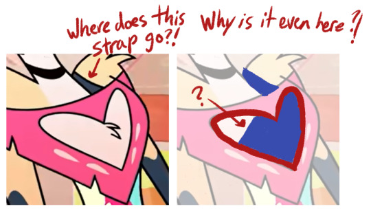
Finally, Bee how the hell does your shirt work.
The Concept
So at this point it seems most logical to lean into the "bee" thing for the redesign, and scrap all the canine elements. As for the blobby hair and tail... yeeeah let's nix those too. We're going for a streamlined version that's easier to animate. And because I ignored the ringmaster look for my redesign of Asmodeus, it only makes sense to do the same for Bee's animal trainer vibe (what little there is) for the sake of consistency. I know this version of Hell has a circus theme with its highest-ranking demons, but there's never been an in-universe explanation for why that is.
Let's look at actual bees, then. A quick peek at Google has informed me that certain insect species have smaller, "simple" eyes (also known as ocelli), in addition to their compound eyes. In bees, this manifests as a triangular grouping of three beady eyes on top of the head.

In her Helluva Boss episode, Bee's full demon form has three eyes, which could be a reference to this triangular arrangement, plus her regular form has two spots on her forehead in addition to the third eye. So it's possible Viv actually did research for something. Pleasantly surprised on that front.

Next, the body. I've noticed that some folks find Bee's skinny body type refreshing, as the sin of gluttony is too often personified with fatness. And that's fair. That's valid. But consider this:

Imagine any Vivziepop character saying that about a chubby person. Imagine the series sending the message that fat people can be sexy too, and that they have worth outside of their appearance, enough for at least one character to consider them girlfriend material. That they're valued and appreciated regardless of this culture's beauty standards (which we know nothing about since the worldbuilding is as thin and flimsy as tissue paper, but whatever). Imagine if this show finally had a fat female character who wasn't relegated to the background. Don't know about y'all, but that would be refreshing to me. And when you take into account all the fat-shaming of a character who isn't even fat, portraying a fat character as attractive would be a nice change of pace for this show.
Now let's talk about clothing. In the episode, Bee's clothes show off a lot of her body, with a cutout crop top and short shorts. We can take a similar approach for the redesign (something that still shows off her chest, belly, and limbs, in keeping with the extroverted "party girl" persona), but that perhaps includes more queenly elements.
The Redesign
Because this is a redesign, many elements were already in place, but I still had to figure out how this character would look as a bee. Here's where the preliminary sketches came in. Lots of trial and error in this process.


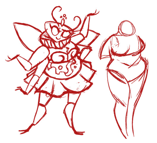
Wrestling with this character's face got a lot easier once I realized I could mold it into a pentagonal shape akin to a honeycomb compartment. It took a few tries, but at last, I had a final sketch.

All that was left to do was test out some color combinations.
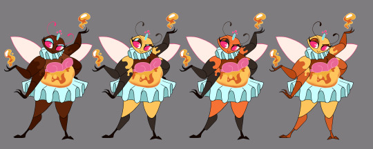
I tried a few different approaches, but in the end, this is the version I felt worked best.
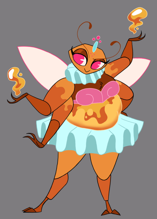
I used many of the colors from the original, but pushed the orange much harder since orange is the symbolic color of gluttony as a sin. And overall it gives Bee a nice honey-ish look rather than the generic black and yellow we already see on so many bees in cartoons. I thought the colored outlines on her clothing would add a soft, feminine touch, as well.
And just for kicks, here's a quick sketch of her giant form, inspired by the Infernal Dictionary drawing of Beelzebub.
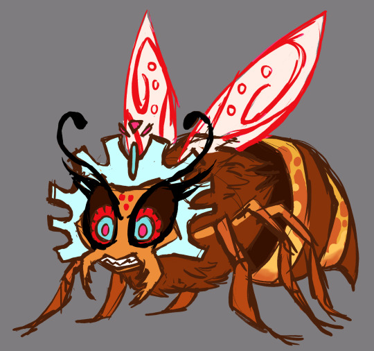
Conclusion
The canon version of this character exists in the form she does for no reason than to stroke her creator's ego. "Hey guys, remember when I animated that Kesha fan video? Remember how cool that was? Wanna see me foist this unnecessarily-complex character design on other animators while I take a victory lap?" I wouldn't mind so much if Viv animated any of this herself, but she didn't. I could almost excuse this if she had no animation experience and didn't know how much work it requires, but she does. The self-aggrandizing entitlement is just off the charts. But a nonsensical design is leagues better than a stolen one, so... brownie points for that, I guess.
#character design#redesign#helluva boss#helluva critical#helluva beelzebub#vivziepop critical#body positivity#long post
643 notes
·
View notes
Note
i'm sorry but the nurchie "art" is clearly AI generated??? can we please stop sharing and praising shit that some algorithm spat out without ever asking the original creators whose work it steals and regurgitates for their permission
- sincerely, a pissed-off artist
Hello,
I’m going to set the record straight, and I’d suggest you read carefully before making any more baseless accusations. Nurchie is an actual artist—a trained one, with a Bachelor of Fine Arts in digital art and two-dimensional studies (drawing and painting) from a prestigious university. She has 16 years of professional design/digital art experience, and a publicly documented portfolio going back well before AI art even existed.
go look at her earliest work on Deviantart and you'll see how precisely detailed she draws hands, fingers, and clothing. Everything, really.
If you had bothered to do any homework, you’d see that her work reflects thousands of hours of dedicated practice and the expertise of a seasoned digital artist.
Calling her work AI generated is BEYOND insulting. it’s lazy, dismissive, and downright disrespectful to a person who has spent years honing her craft.
She doesn’t ask for clout, she doesn’t do commissions, she doesn't have a patreon or Kofi. She only made a Twitter years ago because I asked her to share her talent with the world or she wouldn't even bother.
This tendency to label any polished work as “AI” just shows ignorance, plain and simple. Real artists deserve better than to have their skills lumped in with AI machine-generated content by people who can’t tell the difference.
Each of her digital paintings takes anywhere from 30-80+ hours. For Altered State specifically, she's been working on all these art pieces for months while I've been on a posting hiatus. Her incredible work keeps me inspired; I would have literally quit ages ago. We go back and forth on details from the writing in the fic and I see these changes she makes in real time.
She paints in her limited free time for these niche fandoms because she loves the stories and wants to support the writers in it. In a world where fandom is becoming increasingly commodified, she is a rare gem.
I didn't even want to bother Nurchie with this silly comment of yours, but she's such a good sport she just laughed at the idea that anyone could accuse her art of being AI generated. She uses a combo of adobe CC suite and clip studio to draw.
nurchie messaged me this, and I asked for her permission to share it: [I just think they are probably some struggling artist, upset that they feel replaced by soulless AI and are lashing out any time they think they see it. I'm sympathetic to their feelings, and understand the annoyance. I've been battling the improper usage of it in my workplace. AI is not AI but just a data collection tool, and I completely agree that the human eye could never be replaced by it.]
yeah, she's the most chill, sweetest person ever, too. So maybe think twice before throwing around accusations you clearly can’t back up. You're trying to hurt a real artist.
-sincerely,
A writer who knows a real artist
https://www.deviantart.com/nurchie/gallery
edit: also accusations like this drive away real fanartists. Why should they bother sharing their work if their talent and skill are being dismissed as some algorithm's output? it's toxic. fandom spaces will be flooded with AI-generated content in the future because all the true artists will have left.
#asks#tomione#can you believe this shit#sent my heartrate skyrocketing in anger#anti ai#imagine painting a hand for hours#just to be called ai#i'd quit#but maybe that was anon’s malicious intent#don't quit guys
89 notes
·
View notes
Note
Im sure u get a ton of asks but I just wanted to say I followed your art on deviantart when I was a kid like seven years ago and it was one of my biggest inspirations as an artist, its been really cool to see your style and technique develop and be honed into what it is now. Also it’s cool and hopeful? To see Machete’s arc through all of that and I’m glad he’s found peace.
I think theres like a sort of trauma? In the transition to being a kid/teen to being an adult. But then on the other side you come to peace with the things you struggled with or at least figure out how to cope with them. Idk if that makes sense but,, that’s how the evolution of your art makes me feel.
Also I’m curious if characters like Riaro and Masque exist in your headspace anymore or if they are long gone ?
It makes me honestly really moved to think that there's people out there that I've never met and never will, but my art has meant something for them. From what I've gathered, there's quite a few that found my work when they were young but continue to relate to it as adults, maybe from a different perspective but still.
I'd imagine that if you're roughly my age, you probably were going through the teen/early twenties angst around the same time I was. I think some improvement has happened recently, especially during the past year or so, and while I'm still struggling with serious mental health stuff every day I feel like I might've gained some semblance of stability and sensibility and ability to feel joy, at least for now. It would be wonderful if that was perceivable through my art in a way or another. I don't know, this is just stream of consciousness stuff. I guess I'm lowkey wishing the same kind of recovery and growth for people that suffered with me when I was hopelessly depressed. It's entirely possible I could slip back eventually, but right now I'm feeling more alive and inspired than I've felt in years and I'm trying to maintain this course.
#sorry if this sounds bleeding heart idealistic off-puttingly personal and besides the point#I just started to think about my life and the lives of people who I've managed to reach through my silly dog drawings#and got caught in the moment#answered#anonymous#Riario and Masque are still around yes just dormant I'm neglecting everyone else in favor of the main duo right now
217 notes
·
View notes
Text

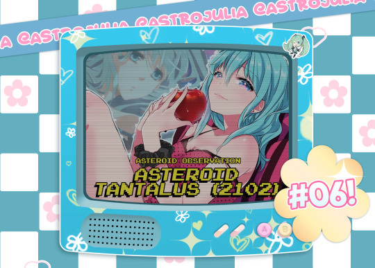
Asteroid Tantalus (2102): Understanding Its Signs, Houses, and Planetary Aspects
Navigation: Masterlist✦Ask Rules✦Feedback Tips
Askbox✦Sources✦Paid Readings

₊· ͟͟͞͞➳❥ About the Asteroid: Tantalus is a mythological figure. Once, daring to test the omniscience of the gods, he stole the divine delicacies and served them the flesh of his own son Pelops at a feast. As a punishment, he was cast into Tartarus, where, in a valley abundant in vegetation and water, he was sentenced to not being able to quench his hunger and thirst, since, when he approached the water, it drained and when he rose to gather the fruits of the trees , the branches moved out of reach under the force of the wind. The expression torment of Tantalus refers to the suffering of the one who wants something apparently close, however, unattainable, like the popular saying "So close and yet so far" - Wikipedia .
˚₊· ͟͟͞͞➳❥ Sources and inspirations: As I said, Tantalus is known for his eternal punishment for his unforgivable acts by the gods. As it is an asteroid, in a natal chart, I cannot see it as a great punishment for the individual, but more as something that, if done out of pure ego, will be severely punished. My sources were my astro mutual @a-d-nox. Also, the image template in from minikyuns on deviantart.
˚₊· ͟͟͞͞➳❥ Asteroid Tantalus Rx: When this asteroid is in retrograde, the individual may turn their attention inward. They might reflect on the themes associated with Tartalus, such as power, authority, ego, and responsibility. This introspective phase can lead to a deeper understanding of how they've handled these themes in the past and how they wish to navigate them in the future.
Asteroid Tantalus in Signs
·˚ ꒰ Aries꒱This placement amplifies your desire for authority and leadership. You might be tempted to exploit your power or rush into decisions without considering their consequences. Your ambition and drive can sometimes border on egotism, making it essential to balance self-assurance with humility. You might also find that your impulsive actions hinder the attainment of your long-term goals, urging you to cultivate patience and strategic thinking. This placement encourages you to learn the art of measured action and to appreciate the journey rather than just the destination.
·˚ ꒰ Taurus꒱ There's a risk of overindulgence and an insatiable hunger for material possessions. This can lead to an inflated sense of self-worth and a tendency to disregard the needs of others. You may also struggle with authority figures and the misuse of power. Be cautious of impulsively reaching for possessions or financial gains without considering the long-term consequences. Recognizing when you're reaching for the unattainable can help you avoid unnecessary frustrations, leading to more stable and harmonious material pursuits.
·˚ ꒰ Gemini꒱ This placement might cause you to misuse your verbal prowess for personal gain . You may engage in superficial relationships to bolster your ego , while your impulsive words and actions can create misunderstandings. A lack of humility might make you resistant to feedback . The elusive nature of your goals could be due to scattered energy; focus on sustained efforts for true achievement. This placement challenges you to channel your intellect and communication skills for the greater good, avoiding the pitfalls of mental restlessness and thoughtless actions.
·˚ ꒰ Cancer꒱ You can manifest as emotional manipulation and a craving for control over others. You might struggle with humility when emotions cloud your judgment. This celestial influence can lead to a tendency to hoard emotional security and react impulsively to perceived threats . Be mindful of these tendencies to prevent your aspirations from constantly slipping away . This placement highlights the importance of understanding and nurturing your own emotions while maintaining healthy boundaries with others.
·˚ ꒰ Leo꒱ There's a heightened need for admiration and recognition . You might misuse your charisma and influence for self-serving purposes and overlook the feelings of those around you. Be cautious of impulsively seeking the spotlight , as this can hinder your larger goals . Cultivate humility to sustain your genuine connections and avoid overstepping boundaries. This placement encourages you to find the balance between your desire for self-expression and the needs of your community.
·˚ ꒰ Virgo꒱ This can lead to perfectionism and the tendency to micromanage others . While you strive for improvement, be wary of becoming overly critical and impulsive in your quest for flawlessness . Your humility might be challenged by the belief that you know best. Balancing realistic goals with a compassionate approach can mitigate the frustration of pursuits just out of reach . This placement encourages you to harness your analytical abilities for the greater good, emphasizing the importance of self-acceptance and understanding human imperfections.
·˚ ꒰ Libra꒱ This may manifest as a desire to manipulate situations to maintain “harmony” . You might struggle with making decisions that prioritize your own needs and act impulsively to keep others content . Developing humility could help you find genuine equilibrium in your relationships. Balancing your pursuit of fairness with practicality can prevent elusive goals from slipping away . This placement encourages you to explore the delicate balance between your personal desires and the needs of those around you, fostering true harmony through understanding.
·˚ ꒰ Scorpio꒱ This can intensify power struggles and manipulative tendencies . You might wrestle with a desire for control and secrecy. Beware of a sense of entitlement and ego-driven actions that can damage your relationships. Be mindful of impulsively pursuing intense emotions without considering their consequences. Temper your impulses with thoughtful consideration, and develop humility to avoid the pitfalls of ambition. Your pursuit of transformational goals will require patience and strategic planning. This placement challenges you to harness your intensity for profound change while maintaining ethical integrity.
·˚ ꒰ Sagittarius꒱ There's a risk of recklessness and impulsive decision-making . You might struggle to recognize boundaries when pursuing your adventurous endeavors. The quest for freedom might sometimes lead to egotistical behaviors that hinder your connections. Cultivating humility will be vital in learning from your experiences. Your pursuit of expansive goals can be fulfilling if grounded in realistic planning. This placement encourages you to explore the world with a sense of wonder while understanding the importance of measured exploration.
·˚ ꒰ Capricorn꒱ This can magnify your ambitions and drive for success . However, an excessive focus on power and authority might lead to arrogance and exploiting others for your gain. Be cautious of impulsive shortcuts that disregard ethical conduct. Embracing humility can help you maintain your position without losing sight of your values. Your enduring pursuit of goals will require careful planning and ethical decision-making. This placement challenges you to navigate the path to success with integrity, understanding that true power is rooted in responsibility.
·˚ ꒰ Aquarius꒱ This might lead to a desire for unconventional power and recognition. Your innovative ideas can sometimes lead to an inflated sense of uniqueness . Be cautious of impulsive actions that disregard the needs of the collective. Cultivating humility will help you foster genuine connections. Balancing your visionary pursuits with practical considerations can help you bridge the gap between your aspirations and reality . This placement encourages you to channel your creativity and forward-thinking ideas for the betterment of society while maintaining a sense of grounded humility.
·˚ ꒰ Pisces꒱This may lead to idealism and a desire for spiritual mastery . Be cautious of escapism and addiction as ways to cope with challenges. The pursuit of transcendence can sometimes lead to a lack of humility , creating barriers in your relationships. Strive for self-awareness to avoid being blinded by your own spiritual pursuits. Balancing your dreams with grounded actions will be key to achieving your goals. This placement encourages you to explore the depths of your intuition and spirituality while staying grounded in the practical aspects of life, fostering true spiritual growth through humility and self-awareness.

Asteroid Tantalus in Houses
·˚ ꒰ 1st house꒱ Can manifest as a strong desire for personal recognition and leadership. You may grapple with issues of authority and power in your life, striving to be in control. This could lead to egotism and a tendency to overstep boundaries . Your impulsive actions may be directed toward asserting your identity. Learning humility is crucial here to maintain healthy relationships and avoid isolation. The sense that your goals are just out of reach could drive you to constantly reinvent yourself.
·˚ ꒰ 2nd house꒱ There may be a strong desire for material wealth and possessions. You might be tempted to misuse your resources or engage in impulsive financial decisions. Guard against an inflated sense of self-worth based on your possessions. Cultivating humility in your approach to wealth is essential for sustainable financial growth. The feeling that financial stability is always slightly out of reach could motivate you to develop a solid financial strategy.
·˚ ꒰ 3rd house꒱ Can manifest as a desire for recognition through communication. You might misuse your words and manipulate situations for personal gain . Be cautious of an inflated sense of intellectual superiority that could hinder your relationships. Impulsive communication might lead to misunderstandings. Cultivating humility in your interactions can help you build more meaningful connections. The feeling that true understanding is just out of reach could drive you to explore deeper levels of knowledge.
·˚ ꒰ 4th house꒱ You might grapple with issues of control and power dynamics within your family . There's a risk of egotism and a need to dominate in your domestic sphere . Impulsive actions may disrupt family harmony. Cultivating humility is vital for maintaining a nurturing home environment. The sense that emotional fulfillment is just out of reach could motivate you to create a more balanced and harmonious family life.
·˚ ꒰ 5th house꒱ Can lead to a strong desire for recognition in creative endeavors and romantic pursuits. You might be tempted to misuse your creative talents or seek attention through dramatic gestures . Guard against an inflated ego that could hinder authentic self-expression. Cultivating humility in your creative and romantic interactions is essential for genuine connections. The feeling that true love and creative fulfillment are just out of reach could inspire you to seek more authentic expressions of self.
·˚ ꒰ 6th house꒱This may manifest as a desire for recognition through service and work. You might grapple with power struggles in your workplace or be tempted to assert your authority excessively . Impulsive actions could affect your daily routines and health. Cultivating humility in your service-oriented efforts can lead to more harmonious relationships with colleagues. The sense that a balanced and healthy life is just out of reach could drive you to develop a more sustainable approach to wellness and work.
·˚ ꒰ 7th house꒱ You may grapple with power dynamics and control in your relationships . There's a risk of egotism and a need to dominate your partnerships . Impulsive actions might lead to conflicts with others. Cultivating humility in your interactions with partners is essential for harmonious relationships. The feeling that true partnership and balance are just out of reach could motivate you to develop healthier and more equitable connections.
·˚ ꒰ 8th house꒱ Can manifest as a desire for control over shared resources and deep transformations . You might be tempted to misuse your power within joint ventures or financial matters . Be cautious of an inflated sense of importance or secrecy that could hinder emotional intimacy. Impulsive actions in shared matters might lead to conflicts. Cultivating humility is essential for navigating the complexities of shared resources. The feeling that true transformation and deep connections are just out of reach could drive you to explore the depths of your psyche more consciously.
·˚ ꒰ 9th house꒱There may be a strong desire for recognition through higher knowledge and exploration . You might be tempted to misuse your intellectual pursuits or beliefs . Guard against an inflated sense of wisdom or cultural superiority that could hinder your ability to connect with diverse perspectives. Impulsive actions related to travel or education might lead to misunderstandings. Cultivating humility in your quest for knowledge is essential for authentic growth. The sense that true enlightenment and expansive experiences are just out of reach could inspire you to explore a more balanced approach to learning and expansion.
·˚ ꒰ 10th house꒱Can lead to a strong desire for recognition and power in your career . You might grapple with authority figures or misuse your authority . There's a risk of egotism and a need to dominate your professional sphere . Impulsive actions related to your career could have consequences. Cultivating humility in your professional interactions is essential for lasting success. The feeling that true recognition and accomplishment are just out of reach could motivate you to develop a more authentic and ethical approach to your public life.
·˚ ꒰ 11th house꒱May manifest as a desire for recognition and power within your social circles . You might be tempted to misuse your influence or manipulate group dynamics . Be cautious of an inflated sense of importance in your social networks that could hinder genuine connections. Impulsive actions related to friendships might lead to misunderstandings. Cultivating humility in your interactions with friends and communities is essential for building lasting bonds. The sense that true collective change and friendship are just out of reach could motivate you to seek more meaningful connections.
·˚ ꒰ 12th house꒱ There may be a strong desire for recognition and power in your spiritual pursuits and inner world . You might grapple with issues of control within your subconscious . Guard against an inflated ego or spiritual superiority that could hinder your spiritual growth. Impulsive actions related to your inner world might lead to inner conflicts. Cultivating humility in your spiritual practices is essential for authentic spiritual progress. The feeling that true enlightenment and connection with your inner self are just out of reach could motivate you to embark on a more profound spiritual journey.

Asteroid Tantalus Aspecting the Planets
·˚ ꒰ Sun꒱When Asteroid Tartalus forms an easy aspect, such as a trine or sextile, with the Sun, it can indicate that the individual has a natural ability to balance power and authority with a sense of humility . They are often able to recognize their own strengths and weaknesses without inflating their ego . This aspect may bring a harmonious integration of their desires for recognition and their ability to wield power responsibly. When Asteroid Tartalus forms a hard aspect, such as a square or opposition, with the Sun, it can signal a more challenging dynamic between the desire for power and the need for humility . These individuals may struggle to balance their ambitions with an inflated ego , leading to power struggles and conflicts in their lives.
·˚ ꒰ Moon꒱ When Asteroid Tartalus forms an easy aspect, such as a trine or sextile, with the Moon, it can indicate that the individual has a natural ability to balance their emotional needs and desires with their power and authority . They are often able to recognize their emotional strengths and vulnerabilities without inflating their ego . This aspect may bring a harmonious integration of their emotional nature and their ability to wield power responsibly. When Asteroid Tartalus forms a hard aspect, such as a square or opposition, with the Moon, it can signal a more challenging dynamic between their emotional needs and their desire for power . These individuals may struggle to balance their emotional vulnerabilities with an inflated ego , leading to emotional conflicts and inner turmoil.
·˚ ꒰ Mercury꒱ When Asteroid Tartalus forms an easy aspect, such as a trine or sextile, with Mercury, it can indicate that the individual has a natural ability to balance their communication style, thinking processes, and intellectual pursuits with their power and authority . They are often able to communicate their ideas and thoughts effectively without inflating their ego . This aspect may bring a harmonious integration of their mental acumen and their ability to wield power responsibly. When Asteroid Tartalus forms a hard aspect, such as a square or opposition, with Mercury, it can signal a more challenging dynamic between their communication style, thinking processes, and intellectual pursuits and their desire for power . These individuals may struggle to balance their intellectual strengths with an inflated ego , leading to conflicts in communication and decision-making.
·˚ ꒰ Venus꒱When Asteroid Tartalus forms an easy aspect, such as a trine or sextile, with Venus, it can indicate that the individual has a natural ability to balance their love life, relationships, values, and aesthetics with their power and authority . They are often able to express love and affection without inflating their ego . This aspect may bring a harmonious integration of their emotional well-being and their ability to wield power responsibly. When Asteroid Tartalus forms a hard aspect, such as a square or opposition, with Venus, it can signal a more challenging dynamic between their love life, relationships, values, aesthetics , and their desire for power . These individuals may struggle to balance their desire for beauty, love, and harmony with an inflated ego , leading to conflicts in relationships and matters of the heart.
·˚ ꒰ Mars꒱ When Asteroid Tartalus forms an easy aspect, such as a trine or sextile, with Mars, it can indicate that the individual has a natural ability to balance their assertiveness, energy, desires, and actions with their power and authority . They are often able to assert themselves and take action without inflating their ego . This aspect may bring a harmonious integration of their drive and their ability to wield power responsibly. When Asteroid Tartalus forms a hard aspect, such as a square or opposition, with Mars, it can signal a more challenging dynamic between their assertiveness, energy, desires, and actions and their desire for power . These individuals may struggle to balance their ambition and assertiveness with an inflated ego , leading to power struggles, conflicts, or impulsivity.
·˚ ꒰ Jupiter꒱When Asteroid Tartalus forms an easy aspect, such as a trine or sextile, with Jupiter, it can indicate that the individual has a natural ability to balance their expansion, growth, optimism, and abundance with their power and authority . They are often able to pursue their goals and dreams without inflating their ego . This aspect may bring a harmonious integration of their expansive tendencies and their ability to wield power responsibly. When Asteroid Tartalus forms a hard aspect, such as a square or opposition, with Jupiter, it can signal a more challenging dynamic between their expansive tendencies, optimism, and abundance and their desire for power . These individuals may struggle to balance their enthusiasm and growth with an inflated ego , leading to conflicts, overindulgence, or impulsivity.
·˚ ꒰ Saturn꒱ When Asteroid Tartalus forms an easy aspect, such as a trine or sextile, with Saturn, it can indicate that the individual has a natural ability to balance their discipline, responsibility, structure, and long-term goals with their power and authority . They are often able to establish authority and achieve their ambitions without inflating their ego . This aspect may bring a harmonious integration of their disciplined nature and their ability to wield power responsibly. When Asteroid Tartalus forms a hard aspect, such as a square or opposition, with Saturn, it can signal a more challenging dynamic between their discipline, responsibility, structure, and long-term goals and their desire for power . These individuals may struggle to balance their ambition and authority with an inflated ego , leading to conflicts, rigidity, or impulsivity.
·˚ ꒰ Uranus꒱ When Asteroid Tartalus forms an easy aspect, such as a trine or sextile, with Uranus, it can indicate that the individual has a natural ability to balance their innovation, uniqueness, independence, and unconventional thinking with their power and authority . They are often able to embrace change and unique perspectives without inflating their ego . This aspect may bring a harmonious integration of their innovative spirit and their ability to wield power responsibly. When Asteroid Tartalus forms a hard aspect, such as a square or opposition, with Uranus, it can signal a more challenging dynamic between their innovative thinking, independence, and unconventional nature and their desire for power . These individuals may struggle to balance their urge for change and uniqueness with an inflated ego , leading to conflicts, rebelliousness, or impulsivity.
·˚ ꒰ Neptune꒱ When Asteroid Tartalus forms an easy aspect, such as a trine or sextile, with Neptune, it can indicate that the individual has a natural ability to balance their imagination, intuition, spirituality, and creativity with their power and authority . They are often able to embrace their inner world and spiritual side without inflating their ego . This aspect may bring a harmonious integration of their spiritual and creative nature and their ability to wield power responsibly. When Asteroid Tartalus forms a hard aspect, such as a square or opposition, with Neptune, it can signal a more challenging dynamic between their spiritual, creative, and intuitive nature and their desire for power . These individuals may struggle to balance their connection to the mystical and imaginative realms with an inflated ego , leading to conflicts, illusions, or impulsivity.
·˚ ꒰ Pluto꒱When Asteroid Tartalus forms an easy aspect, such as a trine or sextile, with Pluto, it can indicate that the individual has a natural ability to balance their transformation, power, intensity, and depth with their power and authority . They are often able to undergo profound personal changes and harness their inner strength without inflating their ego . This aspect may bring a harmonious integration of their transformative and intense nature and their ability to wield power responsibly. When Asteroid Tartalus forms a hard aspect, such as a square or opposition, with Pluto, it can signal a more challenging dynamic between their transformative, intense, and deep nature and their desire for power . These individuals may struggle to balance their drive for personal transformation and intensity with an inflated ego , leading to conflicts, power struggles, or impulsivity.
(CC) AstroJulia Some Rights Reserved

#astrojulia#astrology#witchblr#astroblr#all about astrology#astro community#astro observations#astrology notes#witch community#astrology basics#asteroids#astro placements#astro notes#asteroid astrology#tantalus#asteroid tantalus (2102)#natal chart#birth chart
426 notes
·
View notes
Note
hi, im going down a rabbit hole for a video essay, did you happen to run the turbotasticasks blog back in 2012???
SCREAMS if you've managed to connect me to A TURBO ask blog in 20 fucking 24 that is insane....
I DID run a Turbo ask blog on deviantArt back in 2012
I hadn't checked on it in ages but there are some SOLID STUPID ASS POSTS i was fucking obsessed with his ugly ass as a 14 year old (still am tbh) and I didn't realize how many goddamn pageviews this page got holy christ
There were quite a few Turbo ask blogs on dA at the time, and I was more of a crack/shitposting Turbo, so my version was off the shits insane. Eventually, the fandom died, and I moved onto Homestuck around late 2013 early 2014 and also started using tumblr more than dA! I had some great memories of shitposting, rping on the chatboards, and answering the few questions I did in the short amount of time the fandom was alive
We got some great hits in this crusty era... including but not limited to:

"I'm okay..."
And

Turbo selfcest à la 2012 tumblr sexymen ask account selfcest shipping .... THE REAL OGS REMEMBER
WE were very chummy with the onceler fandom. You could imagine the relationship between these 2 sexymen selfcest shipping fandoms to be like the unbreakable bond between early 2011-2013 era homestuck and hetalia fandoms... very very good memories indeed...
My original tumblr username was like @im-turbo-fucking-tastic and I mostly lurked and rbed art back then! I wasn't the most confident posting art on tumblr at the time (it was new and scary and full of cool older people) and it wouldn't rly be until around 2016/2017 when the homestuck obsession came back in full swing, grabbed me by the cock and swung me into a high voltage line
If you have ANY OTHER QUESTIONS, feel free to pester me. I'd love to see what you're working on!!!! I MISS THE WRECK IT RALPH FANDOM SO MUCHHHHH

Thank you for the ask <3 XD
52 notes
·
View notes
Note
Girl I am sorry but OMGGG MY LAW BRAIN ROTTTTTAHHHH
I NEEEEED law from one peice to fuck me nasty style (I’m sorry)
so could I request a cheeky reader x law nsfw? Pls and Ty?
(Again I’m so sorry 😭)
Make you mine!~ Trafalgar D. Law x Cheeky~ Crewmate! Reader
NSFW!!! MDI!!!! This Post contains adult themes for only those who are 18+
DO NOT- interact with my page unless you are 18 and over. You have been warned.
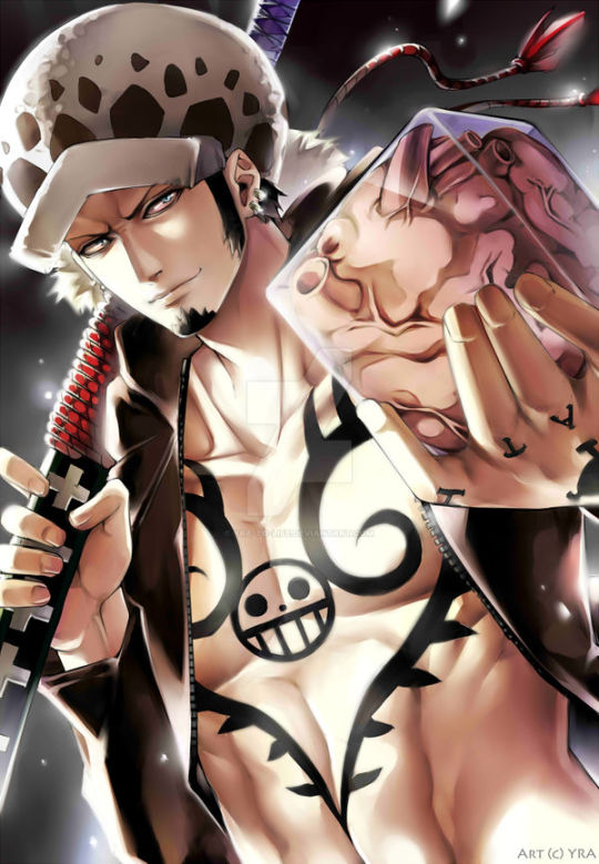
Trafalgar D. Water Law by yra-to-life on DeviantArt
VAL IMA BE HONEST!
I have never written full blown NSFW EVER 🤧 so we're gonna get as close as we can, mi corazon! (I am SO sorry if it sucks!)
This man does things for me I'm not gonna lie. I have a whole secret series in the chamber for him.
At the time of this being posted, 5/18/2024, there is a poll ongoing for what, you, the lovely readers, would love to see. Be sure to cast your votes!!
On with the show!!~
______________________________________________________________
The Heart Pirates' submarine, the Polar Tang, hummed quietly as it cruised beneath the waves. The crew was busy with their duties, ensuring the smooth operation of the vessel. Among them was you, the most mischievous and cheeky member of the crew, and Captain Trafalgar D. Water Law had certainly noticed you.
You had always had a thing for pushing Law's buttons, loving the way his eyebrows furrowed in frustration or how his lips pressed into a thin line when you made a particularly bold comment. Today, however, you decided to push things further.
After finishing your shift, you found Law in his quarters, poring over maps and documents. You leaned against the doorway, watching him for a moment before speaking.
"Captain," you purred, your voice laced with playful mischief. "Is there anything I can assist you with?"
Law looked up, his golden eyes narrowing slightly. "I'm busy," he replied curtly, but you could see the flicker of interest in his gaze.
Ignoring his attempt to brush you off, you sauntered into the room, closing the door behind you. "You work too hard, Captain," you said, your tone teasing. "You should take a break."
Law sighed, setting his pen down and leaning back in his chair. "And what exactly do you suggest I do during this break?" he asked, his voice edged with annoyance.
You stepped closer, a sly smile playing on your lips. "Well, I could think of a few things," you replied, your eyes locking onto his.
Law raised an eyebrow, his curiosity piqued despite himself. "Oh? Enlighten me."
With a boldness that surprised even yourself, you moved to straddle his lap, your hands resting on his shoulders. "How about I show you instead?" you whispered, your breath warm against his ear.
For a moment, Law seemed taken aback, his body tensing beneath you. But then, with a growl of frustration and desire, he wrapped his arms around you, pulling you closer.
"You're playing a dangerous game," he muttered, his lips brushing against your neck.
You shivered at the contact, your fingers tangling in his hair. "I like danger," you whispered back, your voice barely audible.
With a sudden movement, Law stood up, lifting you with him and carrying you over to the bed. He laid you down gently, his eyes burning with a mix of frustration and desire. "You really have no idea what you've gotten yourself into," he said, his voice low and dangerous.
You looked up at him, your own desire mirrored in his gaze. "Then show me," you challenged, your voice steady despite the rapid beating of your heart.
Law didn't need any more encouragement. He captured your lips in a searing kiss, his hands roaming over your body with a possessive intensity. You responded eagerly, your own hands exploring the contours of his muscled form.
As his hands found the hem of your shirt, he paused, pulling back to look at you. "Are you sure about this?" he asked, his voice softer now, a hint of vulnerability in his eyes.
You nodded, your breath coming in shallow gasps. "Yes, Law. I'm sure."
With a nod of his own, Law resumed his ministrations, his hands deftly removing your clothing piece by piece. His touch was both gentle and commanding, his lips trailing hot kisses down your neck and across your chest.
You moaned softly, your body arching into his touch. "Law," you breathed, your hands clutching at his shoulders.
Law's response was a low growl, his hands moving to undo his own clothing with practiced ease. When he was finally as bare as you were, he pressed his body against yours, the heat of his skin sending shivers down your spine.
"You drive me crazy, you know that?" he murmured against your ear, his breath hot and ragged.
You smiled, your own breath coming in short gasps. "Good," you whispered back, your hands exploring the hard planes of his back. "I like making you crazy."
With a final growl of frustration and need, Law positioned himself above you, his eyes locking onto yours. "This is your last chance to back out," he warned, his voice strained.
But you were far from backing out. You wrapped your legs around his waist, pulling him closer. "I don't want to back out," you whispered, your eyes filled with desire and determination.
Law didn't need any more encouragement. He thrust into you with a force that left you both gasping, your bodies moving together in a frenzied rhythm. The room was filled with the sounds of your moans and gasps, the intensity of your connection driving you both to the brink.
As he moved within you, his pace quickened, each thrust more powerful and desperate than the last. You clung to him, your nails digging into his back as waves of pleasure coursed through you. "Law," you cried out, your voice a mixture of need and ecstasy.
"Say my name again," he commanded, his voice rough with desire.
"Law," you gasped, meeting his demand as your body shuddered beneath him.
His eyes darkened with lust at your compliance, and he leaned down to capture your lips in a fierce kiss. His hand slid between your bodies, fingers finding that sensitive bundle of nerves and applying just the right amount of pressure. The combined sensations pushed you over the edge, your climax crashing over you like a tidal wave.
Your cries of pleasure echoed through the room, and Law followed soon after, his own release coming with a guttural moan as he buried his face in the crook of your neck. His body tensed, then relaxed against you, both of you riding out the aftershocks of your shared ecstasy.
For a moment, the two of you lay there, your bodies entwined and your breaths mingling in the aftermath of your passion. Then, with a sigh of contentment, Law rolled onto his back, pulling you close against his side.
"You really are something else," he murmured, his fingers tracing lazy patterns on your skin.
You smiled, your head resting on his chest. Fingers traced over the deep ink that marked his pale skin. "And you love it," you replied, your voice filled with playful satisfaction.
Law chuckled softly, his arms tightening around you. "Yeah, I guess I do," he admitted, his voice tinged with affection.
As the two of you drifted off to sleep, wrapped in each other's arms, you couldn't help but feel a sense of contentment and belonging. You had pushed Law's buttons, and in doing so, had found a connection that went deeper than either of you had ever expected.
______________________________________________________________
Make sure you check out the a03 account by the same name. I also have a Sabo x Marine! reader posted in the masterlist! Give it a read if you please!
Be sure to check out my other works and leave likes and comments, they really help. Drop a follow as well if you please. Don’t be shy to leave me a little reblog if you want.
I promise I bite~
Seen you soon my loves!!~ <<33
#trafalgar law#heart pirates#the heart pirates#trafalgardwaterlaw#trafalgar one piece#trafalgar d law x reader#trafalgar op#smut#flirting#one piece#romance#work romance#consent#law x reader#law x you#law x y/n#crewmate#trafalgar#trafagar d water law#one piece law#ikkaku#penguin#polar tang#trafalgar d water law#trafalgar law x reader#one piece fan fiction#one piece fan fic#one piece x reader#law trafalgar#traflagar law
127 notes
·
View notes
Note
Howdy!
I am here to talk about Viv's horrible character designs.
From an animator perspective, they suck.
Here's why
1. The characters have way too much detail
For animation, more lines equal more work. You're going to be drawing them over and over, and it just creates more stress and work for the animators.
For example, I took one of the most egregious designs in HB (Beelzebub) and simplified it to be animation friendly.
(Can't send it here but I'll probably make a post about it or something.)
2. There's too much of 1 color
WHY IS THERE SO MUCH RED??
Especially since they're in a primarily red background, they don't stand out AT ALL.
Like how am I supposed to see them if they blend in to the background??
3. I have no idea what half of them are supposed to be
Charlie is based off a doll?
Alastor is based off of a deer?
Katie Killjoy is based off of a praying mantis?
Angel Dust is based off of a spider?
Beelzebub is supposed to be well... Beelzebub?
When designing characters, they need to be clear on what they're supposed to be! And no, explaining it on Twitter does not count.
4. The animation reference sheets are garbage
No wonder there's so much animation errors. There's no facial expression sheets, lip sync guide, nothing. It's just a 4 angle turnaround sheet where the character is in complex poses all the time.
If you Google Lackadaisy's animation reference sheets and then look at HB's, it's like night and day.
I'm more than willing to send some examples (along with the edit I did) if you want
So yeah, what are your thoughts?
These are all great points! I think you summed up the main problems very well, but I'll elaborate on each of them. I'm no expert at character design or animation by any means, but I'll do my best to explain my points!
First of all, like you said, the character designs are way too complicated. Anyone who knows even the slightest amount about animation knows you want to simplify and streamline your designs as much as possible to make it easier on the animators. Vivzie is way too obsessed with her Deviantart OC lookin'-ass character designs to actually do this, even though it would seriously help to make the animation process way faster and easier. Beelzebub is seriously the best (or worst?) example of this.
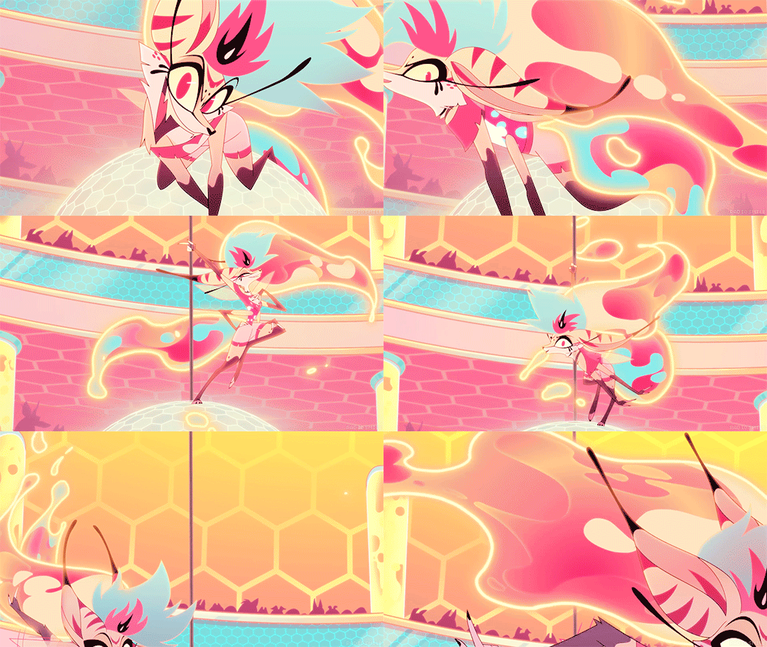
I feel so bad for the poor souls who had to animate this. There are just way too many moving parts here, from her multiple arms, her wings, her markings, to her freaking lava lamp hair and tail?? It's just awful. And so many of Viv's designs suffer this problem, I could go on and on.
Like, I think it actually is a nice looking design, as a still image. Maybe not for the demon Beelzebub, but as a general furry OC, I think she's cute. But that's beside the point. I would love to see your redesign of her!
Next, the RED. So, most of the characters we see in Helluva Boss are red-skinned imps, which has been a common depiction of demons for centuries. One big problem I have is that there's little contrast in these designs. Let's look at our three main imps.
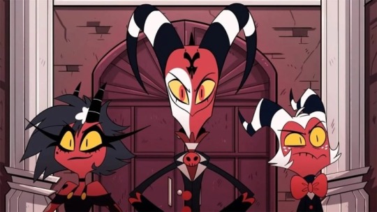
Aside from some white and yellow highlights, they're all mostly red and black. Their color palettes aren't distinct in the slightest! And, I mean, come on. Red accessories against what's almost the exact same shade of red skin? Really? It just doesn't look good. A little contrast here and there goes a long way, like... maybe make Moxxie's bowtie blue? Or Blitz's pendant green? I don't know, anything to help each character stand out, and help give them more visual intrigue.
It doesn't help that most of the backgrounds are primarily shades of red, too. Here's a few screenshots I found that really show this problem.
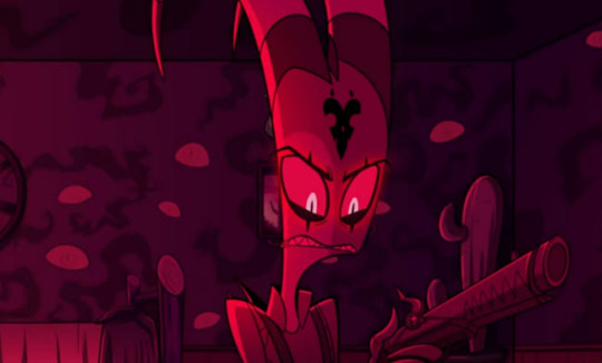
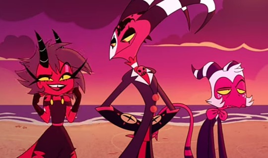
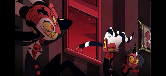
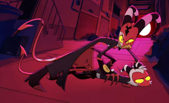
Look at all that fucking red. Like you said, there's such little color variation that the characters blend into the background. Now, to be fair, I did specifically choose these screenshots because I think they really highlight the problem, but this really is what so much of the show looks like. Granted, we do have a bit more variety in the different rings of Hell, each with their own main color, but this is still too much red, considering how much the color comprises the main characters' designs.
Next, like you said, Vivzie is really bad at making characters actually look like the things they're supposed to look like. Let's take Alastor as an example!
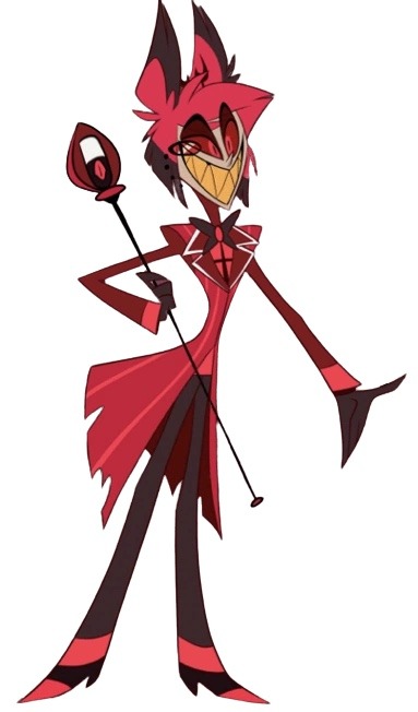
Oh boy! More red and black. So, Alastor here is supposed to be a deer. What's the first physical characteristic that comes to mind when you think of a deer?

Yeah, those big, impressive antlers! So... where are his? Oh, they're those tiny little forks on his head that are almost entirely obscured by his stupid emo hair. Like, come on! Giving him bigger antlers would have made him look so much cooler and more intimidating, and it would have been a great focal point for his design! It's such a missed opportunity. (I know he has bigger antlers in his scarier "demon" form, but you still could have made these a little more impressive.) And don't even get me started on those ears... they look more like fox ears or something. Like you said, a good design shouldn't need to be explained through supplementary material. We should be able to tell what a character is supposed to be just from looking at them!
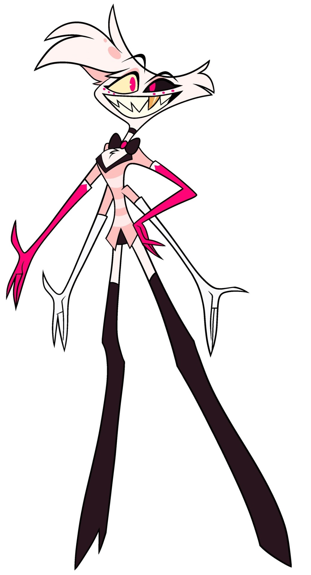
Another great example is Angel Dust, who, despite being a spider, lacks so many distinct features we associate with spiders! He only has six legs instead of eight, he doesn't have pedipalps or chelicerae, and he also lacks that big old spider booty, which I think is such a missed opportunity, considering he is supposed to be in the sex industry. He isn't even remotely shaped like a spider, he looks more like a fuzzy stick bug or something.
Part of me feels like Viv is too afraid to make her characters look unique, so she just goes with the same, skinny humanoid design for just about everything. It's such a shame, because I really do think she is a talented artist who can make some really interesting designs. But then again, she also gave us Beelzebub, so... maybe not.
As for the reference sheets, maybe I wasn't looking hard enough but I couldn't find any official ones for the main characters, so if you could send those my way I would appreciate it! Though it honestly wouldn't surprise me if they were bad. I did look up Lackadaisy's and found them pretty easily and...
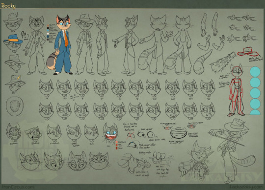
This is so freaking comprehensive and detailed, it's incredible! Look at all those poses and facial expressions!
Comparing Vivzie's works to Tracy's feels kind of unfair, since Tracy has been working on Lackadaisy for 17 years, and it really shows. This is leaps and bounds above Helluva Boss and Hazbin Hotel in quality. Rocky's design is tight; it's detailed, but not overly complicated. There isn't an obnoxious overuse of highly saturated colors, and there's such nice contrast between his fur, his eyes, suit, and tie, making his design very nice to look at. You can also tell so much about his personality and the world he lives in just from his appearance. It's such a good design, and Rocky is just one example from Lackadaisy! All of Tracy's designs are memorable and stand out from one another, unlike so many of Vivzie's characters, whose designs honestly feel interchangable.
So much thought and care has gone into Lackadaisy, and I seriously cannot wait for the full series, as well as all the other amazing indie animated series that have been coming out recently. It's sad that Helluva Boss is seen as the pinnacle of indie animation, when there are so many other series out there that are just.. better! Lackadaisy, obviously, but we've also got Digital Circus, Murder Drones, Monkey Wrench, and so many others that deserve way more appreciation than what Helluva Boss receives. And that's just from an art direction standpoint, we aren't even talking about writing. That's a whole other can of worms.
All of that being said, it's obvious that a ton of love and hard work went into Helluva Boss, and I hold absolutely nothing against the animators and artists at Spindlehorse. These poor design choices are a hallmark of Vivzie's art style, and they're simply working with what they've got. There is such wasted potential here because it feels like Vivzie is too afraid to step outside her comfort zone and design something that isn't a brightly colored, sharp-toothed twink, or skinny anthro wolf girl.
Anyways, that about wraps up my thoughts. Thanks for the ask, this was fun to delve into! And again, I'd be very interested in seeing you post your redesigns! 👀
170 notes
·
View notes
Note
It's so wild to me that you're so surprised Decembersville is still remembered fondly by so many people. I became so feverishly obsessed with it when it was still new that it leaked into my dreams and art and writing. To this day I tell people about it when they ask my favourite book or story. I did reports on it for my highschool art class, I was in the roleplaying fan group on deviantart (though too shy to ever interact), I was so excited I told my mom when you commented on a drawing of Tin I did, I've even been planning a tattoo for it for years... Your improv oc prose fundamentally shifted and shaped me. I'm excited to know it will be finished some day :,)
Damn... It's difficult for me to properly convey how touched I am by your message.
It kind of reminds me of something my sib said the other day: about how little things can change us in the long run. It's also tremendous in the art community, how we all inspire each other to create. I suppose it is just always such a surprise knowing that, somehow, I managed to touch another person using some nonsense that kept me from being bored in school.
I'm an adult now, paying taxes and all that; and, in the cynicism of adulthood, it's so kind seeing that something from so long ago is still remembered at all.
As we grow, our hearts can change - they can get bigger, smaller, harder, squishier, etc. And sometimes we ourselves change entirely as people. And it can be hell on earth to deal with the wounds in our souls, but we're still here despite it all.

Ya caught me rambling but that's how much your message means to me - you, as well as everyone who's popped in to mention they too recall Decembersville.
Just a reminder that what we consider small to ourselves could mean something bigger to another. Cherish yourself, always. Thanks so much, happilymacabre.

#youre too cool.#in summary: dont take small things for granted cuz 15 years later you could be surprised a remnant of you survived through memory.#long post
44 notes
·
View notes
Text
Thank you x1000!
1000 likes is a lot! We were pleasantly surprised to see this Tumblr milestone come across last week, and we instantly knew we wanted to put together something special as a thank you to everyone who has been liking and supporting. Your shared interest, creativity, and just plain excitement for this odd corner of erotica means the world to us. So glad you're all here.
We've only been part of this community since November 2023, but it definitely feels like home.
-----
"Just breathe in through your nose, honey. Try to relax." Nurse Jen took another look at the vitals monitor. "130 over 90. Let's slow down that breathing, ok?" She was trying to be patient.
Tessa was trying to listen to the nurse, but she couldn't get herself to relax. The cuffs, the stickers, the...thing in her nose - it was all too much. And the hospital gown was rough against her skin.
"I'm...really uncomfortable. How much longer?" She felt her heart thump against her chest, and she could swear she saw the wires attached to her bounce a little.
Nurse Jen looked at the clock. "I'd like to get your cardiac baseline before we start...say another thirty minutes. Hang in there, honey."
Tessa felt herself getting upset, and tears began to well up.
"Look on the bright side," Nurse Jen said, glancing up, her face brightening. "SMC just got 1000 likes on Tumblr! Now...let's get back to your treatment."

=====
SMC's home is on DeviantArt: https://www.deviantart.com/specialmedicalcentre
Connect to SMC on Twitter/X: https://twitter.com/special_medical
See us on Instagram: https://www.instagram.com/specialmedicalcentre/
#1000 likes#tumblr milestone#thank you#medicalerotica#medicalfetish#medfetish#medfet#blood pressure#cardiophilia#hospital#ekg#female patient#icu#intensivecare
30 notes
·
View notes
Note
Saw the trailer for Wicked. Loved it. Play come to the Silver Screen. Annnnd...that reminded me, YEARS ago I read a pair of fics that kind of served as a "fix-it" to the Wicked universe. They were a bit dark, but not as dark as the "Wicked Years" books. And then they vanished at some point. So I posted on Reddit yesterday looking for them and someone found them...like yesterday or today I think, and that lead me here. I remember you on FFN. I remember your writings very fondly. I was sad to see them go but now maybe they can be posted to A03 or something? You're as hype for this fandom as ever lol. I was away from it for years. Thank you. I love happy endings and redemption and I remember your stories being two of the best for that.
Thank you for the kind words! And yes, way back when over on fanfiction.net, I went by the username Ichiko Wind Gryphon. Notable fics that I wrote were "Dangerous Secrets," The Fire That Consumes Us All" (that's still such a dumb name and I wish I thought about that title more) and "Cursed Blood."
And in fact, someone (magica12, huge shout-out to you) reached out to me on deviantart and they were able to lead me to an awesome archived website where I could find all of my old deleted fics! It was such a rush of nostalgia. I deleted those fics in a fit of me cringing at my past self and I regretted it ever since, but thanks to them, I can reread all those fics I poured so much time and love into!
I definitely plan on re-uploading them, either on AO3 or fanfiction.net. And when I do, I'll be sure to post about it here! It may take a while, as I'll be pretty busy in the upcoming weeks, but keep your eyes open!
31 notes
·
View notes
Text
Linked Universe Survey 2023
The long awaited results of the survey. Sorry it took me forever, making graphs is hard.
There were 452 responses to the survey as a whole, which is almost double what we got last year, so thank you to everyone who participated!
If you want to see the raw data, you can find that here. I had thoughts about the data, but compiling that into another post would be too much of a hassle. Feel free to send me asks about it though!
The rest of the post will be under a read more as it it large
Demographics


Other: Demigirl (4), Transmasc (3), Grey genderfluid, Unlabeled, Demiboy, Demiagender

Other: Omnisexual (4), Poly (2), Trixic, Abroromantic or Bellusromantic, Demisexual
General Questions
Other: Quotev, Discord, their own google docs
Other: Discord, Variations of "I haven't posted yet, but I pan to" and "I haven't posted my fics in ages",
Other: Wattpad, Deviantart, Discord
Other: Crochet dolls, Custom dolls, Roleplay blogs (2), Fan translations, Headcanons (2), Piano music


The purple section in the “Warriors vs Warrior” chart is supposed to read “Warrior.” I made a typo.
Favorites and Least Favorites
Selected Free Response Answers
im sorry warriors i just can't play your game (it is very very hard. i am stuck very early on in the game)
I love cats meow meow meow
was extremely tempted to put twilight for least favorite. unfortunately he is my favorite to write from the perspective of (he has taken over most of my wips. help) and that probably counts for something. WILD on the other hand. hooo boy how the hell do i characterize this gargoyle. why is he Like That. least favorite it is
Twiddy
very good fandom to be in :) everybody is very nice
It's a straight up crime that Wars lost the aesthetics poll so quickly. He has such a peak Link design with the best colors. Ugh I'm getting wistful.
FROGS. FROGS. FROGS. ALSO HAPPY PRIDE MONTH. FROGS. FROGS. FROGS. FROGS. FROGS.
I will fight Hylia herself and the next person who implies Twi can't handle spice. If we're going to lean into him being southern/Midwestern, which is an alright stero type for our rancher, please keep in mind the culture you're basing him off. The south and midwest can handle their spice, I assure you. Have you ever had authentic Louisiana gumbo? It will melt you tongue off. Or some good old fashion spicy fried chicken? I promise the real stuff has quite a kick. (In all seriousness, though. It's more important that you're having fun. And even I can admit the idea of Twi being an Ordonian who can't handle his spice is more than a little funny.)
I am an OoT Link edgelord and have been since early 2017. So, in September of that year, when an artist by the name of jojo56830 puts out a lineup of nine different Links and the Hero of Time is there – the oldest, no eye, Hero’s Shade armor? I saw that one sketch and just thought “oh this is gonna be bad.” Yeah of course he has the coolest design. By the way, it’s only a matter of time until Fierce Deity shows up in the comic and I have reason to believe it could be this current Dawn arc. Dawn … Dawn of a New Day … and who brought about the Dawn of a New Day? Fierce Deity. Twilight is recovering but still injured and what will happen if he falls again? Fierce Deity is coming and we need to be prepared. In this essay I will—
Remember that time when someone put the whole script of the bee movie in here? I’m not that dedicated, and I don’t have that time, but let us remember and hope someone else does it again this time. Cause someone is bound too. We’re all crazy enough to do it. Alright, love you and stay hydrated pls!
Hi! I joined this fandom really recent but i’ve always seen LU stuff on pinterest and elsewhere. Only recently have i actually took the time to understand the fandom and get back into LOZ stuff and i adore the characters and story! The more and more fanart, fanfics, and comics i see about the different Links the more i love them all. It’s such a pain to pick just one i like or one i don’t like because they’re all so unique. I love this fandom and hope to get more involved!! Have a wonderful rest of your day :]
Epona is an underrated queen
your mom
I really don't get why Zelda is called Artemis. Athena makes more sense???? It perplexes me
Anyone seeing this should check out Breanna’s E!Wild AU
Something something queer every Link into oblivion!
#linked universe#lu survey 2023#lu wild#lu twilight#lu time#lu warriors#lu legend#lu wind#lu hyrule#lu four#lu sky
361 notes
·
View notes