#but i kinda have a little gradient thing going and it was fucking with the vibe
Explore tagged Tumblr posts
Text

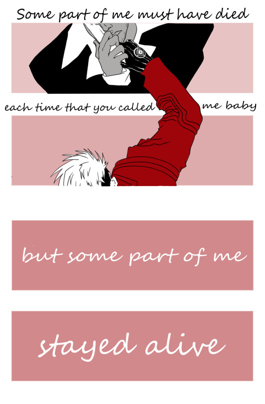
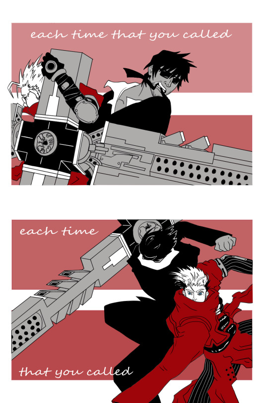
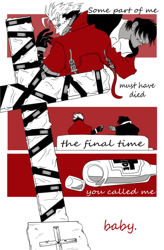
“whatever keeps you around it keeps you around”
Um. I really cannot stress how much I have not recovered from listening to Unreal Unearth and reading Trimax volume 10 for the first time within a week of each other. Unparalleled experience. Thank you Trigun bookclub for your beautiful, horrible timing…
(Alternate caption: “when I was young I used to guess, are there limits to any emptiness?”)
((If you haven’t given it a listen I highly recommend Hozier’s third studio album Unreal Unearth. It’s beautiful, it’s heartbreaking, it’s a love letter to the human experience, it’s so SO layered I feel like I’m still getting new stuff out of it with every listen <3 Ok thats all thanks bye love you.))
#trigun#trigun maximum#trigun maximum spoilers#trimax spoilers#trigun fanart#trimax fanart#trigunbookclub#hopefully its ok to tag bookclub in fanart. if not i will delete the tag#also sorry this post is so long i couldve like. paired up the pages.#but i kinda have a little gradient thing going and it was fucking with the vibe#ALSO!!!!! if you want to talk about hozier or trigun with me please!!!!#PLEASE!!!!!!!#eliart#SO NO ONE WAS GONNA TELL ME I HAD THE LYRICS FUCKED UP#FOR LIKE A MONTH
211 notes
·
View notes
Text
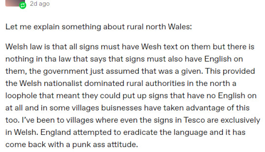
Bad Takes in the Welsh tag vol. II- this reblog on a post about the number of Welsh speakers. (I have cropped out the username of OP and as ever, I only focus on the sentiment, not the person. If you know OP's url kindly do not send them anon hate etc.).
So I saw this take a few days ago in a reblog on a post in the Welsh tag and wanted to address this sentiment as well, since it does the opposite of that other bad take that I saw and made a post about the other day. To be clear, I don't disagree entirely with OP, but there's an element of wishful thinking that I sometimes see when it comes to Welsh / other minoritised languages which can end up doing more harm than good.
This screenshot was also discussed in the LGBTQIA+ Welsh Discord I run and the broad consensus from those of us in there who live in Wales is that OP is painting a very inaccurate picture of the status of Welsh, particularly of Welsh in North Wales. It is frustrating when you have people who value Welsh, but don't value Welsh enough to bother with accuracy in their promotion of the language. This post is intended as a gentle reminder that we can fight for the Welsh language without misrepresenting the situation on the ground so to speak.
The post itself has a 'fuck yeah, Welsh!' attitude which I personally love. But sadly this particular post is riddled with misinformation. First of all, we have "Welsh law is that all signs must have We[l]sh text on them but there is nothing in the law that says signs must also have English on them". Now the wording is kinda vague here- but I'm going out on a limb and saying that the OP is likely referencing The Welsh Language Standards Guidelines (which have been updated several times over the years). The guidance has a number of Standards relating to signs in the Welsh language, such as Standard 32, Standards 47-52, Standard 66 and Standards 111-113. The section of Interpreting the Standards also contains relevant text, such as in Part 3- Interpreting the Standards article 15:

Plain text: "For the purposes of the standards a requirement to publish, provide or display any written material in Welsh does not mean that material should be published, provided or, displayed in Welsh only, nor does it mean that the material should be produced in Welsh first (unless that is specifically stated in the standard)"
Of the Standards listed above, Standards 47-52 are specifically designated as Standards relating to signs and notices displayed or published by a body. Which state things like "... if the same text is displayed in Welsh and in English, you must not treat the Welsh language text less favourably than the English language text" - Standard 47 and "You must ensure that the Welsh language text on signs and notices is accurate in terms of meaning and expression" - Standard 49.
Anyway, back to the point. OP is incorrect in stating that there is a loophole by which the Welsh Law forgot to specify that the signs had to have English as well as Welsh and that public bodies can get away with monolingual Welsh signs. This just isn't true. Important to note is that the law is intended for public bodies- so big companies, road signage makers etc. This guidance isn't for random farms in North Wales which have signs that say "wyau <-" pointing up the lane with no English translation.
Now, the next sentence is a little loaded, well-meant, but a little loaded nonetheless. "The Welsh nationalist dominated rural authorities in the North"- it's loadedness comes down to its vagueness I think. While it isn't wrong per se that Welsh Nationalist parties like Plaid Cymru do well in the North West, it is a little skewed to ascribe Welsh speaking status to whichever party is doing the best in a given area. It isn't that clear cut, unfortunately. To get into this issue, we have to talk maps.
So those Welsh speaker maps that have nice gradients and have the West of Wales coloured in dark, gradually getting lighter as you move East? Unfortunately, these maps can be very misleading (especially if, like in the map OP was commenting on, the source of the data was left off). But the long and short of it is- these maps tend to imply that Welsh is exclusively spoken in the NW and that everywhere East of Bangor has had it. But the data presentation is very flawed, since it tends to erase Welsh language gains in places like Cardiff, Swansea and Monmouthshire.
You've all seen maps like this right? NW in the darkest colours and SE in the lightest?
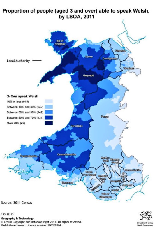
Unfortunately when it comes to these kinds of maps, they can be very misleading from a language revitalisation point of view.
Here's some maps I actually studied at undergrad for this purpose

On the face of it, your eyes zip up to Gwynedd and Môn on the first map and then over to the second and- 'oh no!' you might say, there's been a -2.1 to -4.0 percent decline in Welsh speakers in those areas. And of course, this is something that language revitalisation wants to address. But look at the first map again. Look at, Monmouthshire, Caerphilly, Cardiff and Swansea. Then look at the second map.
Welsh speaking is actually being increased in these areas, between 2001 to 2011.
The misleading nature of a language map like this one is not its borders, its colour or key, but its omission of the sociopolitcal forces at play in language revitalisation. Large population centres like Cardiff, Caerphilly, Newport and Swansea are actively gaining more Welsh speakers. While Gwynedd and Môn are losing some. But Welsh speaking (despite a few wobbles) is on the increase. So where did those Welsh speakers from the North go?
South.
It isn't a hard-and-fast rule, but many rural Welsh speakers (especially those who live in areas with high amounts of holiday homes which drive up rent/cost of staying in villages in North Wales) actually end up moving to more urban areas in the South, meaning that some of the decline of Welsh speaking in North Wales is down to Welsh speakers just, moving to a different part of Wales- which in turn makes those areas see an increase in Welsh being spoken.
Of course, we actually have to address the cause of the exodus of Welsh speakers from rural areas holiday homes raising house prices making them unaffordable for locals and drives them away but the way that our data is represented is not as dire as it looks. Still not great, mind, but not apocalyptic either.
Then there's the other inaccuracies in this post. Small businesses like farm shops, high street businesses and houses can have Welsh-only signage because they are not local authorities and much of the guidance indirectly referenced by OP mostly only applies to local authorities. This is how you have farm shops advertising produce in Welsh only, or shop names in Welsh (such as Siop y Pethe and Broc-Môr in Aberystwyth) or the name of the house my flat is in. Businesses have different regulations for signage inside the shop in different situations. But the guidance indirectly referred to by OP in the screenshot mostly applies to road signage.
Big name brands such as Tesco are definitely not going to have monolingual Welsh stores and it is disinformation to suggest that they do- especially not when they've made gaffes such as "sboncen" to mean squash (the drink). "Sboncen" means squash (the sport), while they should have put "sgwash", meaning the drink.
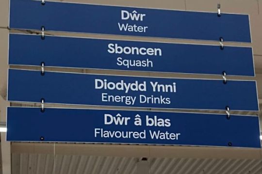
Or my favourite instance of these "arwyddion gwael", in which instead of offering a free ATM service, this ATM on the Tesco Express in Aberystwyth offered "codiad am ddim" (free erections):

So I dread to think what a fully monolingual poorly translated Welsh Tesco would look like.
I don't disagree with OP on the final part, that we should celebrate Welsh's "punk ass attitude" in surviving despite attempts to eradicate it from existence. But spreading false information is definitely not the way we should be doing that.
Instead, we can celebrate things like the National Eisteddfod coming to places like Wrecsam in 2025, which aren't typically selected due to there being fewer speakers. But what bringing the National Eisteddfod to areas with low-speakers does is reestablish that yes, actually, Welsh deserves to be spoken all over Wales, not just in Y Fro Gymraeg (Welsh concept equivalent of the Gaeltacht in Ireland). It's an active, real reclamation of areas previously lost for Welsh and revitalising them by bringing the language back with the biggest Welsh language event anywhere.
221 notes
·
View notes
Text
WHY I LIKE GLASS JOE A LOT
I promised a lot of information about why I like Glass Joe so I wrote this in an hour with no plan, no proof reading, completely improvised. If I planned this it would probably be WAY longer lol but I'll spare you all the pain of that. SO. ENJOY MY REASONING.
Glass Joe. Glass Joseph. Fragile Joey. It’s a name that’s been uttered for centuries in many different forms, given many different explanations. Critics, theorists, philosophers alike have carved away at their lives trying to solve the answer to the universe's greatest question. And that is:
Glass Joe, good why?
I can answer that, absolutely.
HEY I LOVE GLASS JOE A LOT IF YOU DIDN’T KNOW THAT ALREADY JUST GOTTA ESTABLISH THAT HAHAHA OKAY LETS GO. SHOUTOUT TO THE FUCKING RTGAME PUNCHOUT VIDEO YOU DID THIS TO ME.
POINT 1: HE IS HANDSOME.
I swear to God this man was hand-crafted by the hands of an incomprehensible deity because HOW is he this flawless. He’s 5’10, great height honestly I’m 5’3 I don’t want to be dating a skyscraper you know. He’s a skinny bastard but that’s okay, more on that later. His hair, oh my goodness gracious, lord above, help me Jesus. HIS HAIR. IS SO GOOD. If you put that skateboard ramp ass hairstyle on literally any other character they would look like a dumbass, but here, on this man alone, it’s the most delicately poised series of ginger strands I ever did see.
His hair looks SO soft. It’s unbelievable. It’s such a lovely shade of auburn with hints of burgundy. It must smell like cinnamon. He must take great care of it. A real Head and Shoulders, coconut oil, double wash kinda guy. A real bougie kinda guy. Yeah he’s not great physically in SPORT terms but in PUBLIC terms he’s absolutely stunning and stronger than anybody else. I wanna run my fingers through his silky locks so bad it’s insane and to understand this desire I’ll have to be strapped down and operated on. DONATE MY BRAIN TO SCIENCE GO AHEAD. THEY NEED IT.
Not to mention it is SO fun to draw. SO SO SO FUN. Maybe I’m just lucky it’s such a wacky and dynamic hairstyle it transfers quite well into my artstyle, but it’s so fun. It’s easy, it’s fast, it creates an absolutely iconic silhouette, I love colouring it because it’s so damn pretty and ginger/red is such a broad colour scheme that can be put into a gradient so well (i love doing gradients with hair cause i hate when its just a block of colour). Nobody could understand the sheer joy i get putting that dumbass ahoge between the bridge of his fringe and the rest of his hair. That little ‘ right at the top ITS SO FUN. i love him his hair is great.
His face. Carved like the works of the finest artest. He’s a canvas of quality that can rival Van Gogh, for god sake. He’s got the jawline of a man on a lifelong mewing streak, STOP IT HE’S SO GORGEOUS I CANT EVENNNN. He is seriously so good looking. His eyes, the little pink-tinted eyebags that show he doesn’t need sleep because he’s so hardcore on caffeine, his gorgeous big ol nose i wanna kiss so bad, his super dynamic chin i wanna kiss so bad, his face i wanna kiss so bad. I wanna kiss him so bad. He is genuinely such a beautiful man its stunning, im literally a lesbian but if they somehow brought glass joe into the real world looking exactly how he does in those GOD DAMN CUTSCENES OOOOO i’d be bisexual so fast it’s crazy. He’s just that great. He’s got that power. I love his nervous little grin and the little creases on his face, cause he’s OLD AND SENILE. He’s 38 for god sake he shouldn’t look this good and sure, you can see his age slipping in a little with the eyebags and the wrinkles but that only ADDS to how stupidly divine he is in appearance. Stop that handsome man officer!! He’s breaking the laws of BEAUTY. GIVE IT TO MEEEEE. MEEEE.
His fashion sense although odd (ive never actually seen anyone wearing red trousers) just works. It wouldnt work on anyone else but it works on HIM. this is a theme. THINGS DONT WORK ON OTHER PEOPLE BUT THEY WORK ON JOE HE’S SO COOL LIKE THAT. his turtleneck kills me its so good it highlights what little figure he has and it contrasts his red hair so well cause its a really deep blue. SIGH. i wish. I have a turtleneck thats exactly the same but let me tell you i dont even breath the same air of fashion that he breathes. He’s so far ahead of the game he’s on an entirely different runway. He is not gonna sashay away anytime soon. On a constant shante. Unstoppable.
POINT 2: HE EMBODIES HIS CULTURE WELL.
Cats out of the bag, joe is a french stereotype. But. and dont quote me here. I find it very admirable HOW he is a french stereotype. Because he kind of.. Isn’t? He uses the characteristics of that stereotype sure, but he doesn’t engage with them the same way an actual french stereotype would. He likes coffee, he likes bread, he loves France like its his child, sure. But he doesnt have a twirly moustache, he doesnt wear a beret, he doesnt galavant around in black and white mime clothing. Even if that would be funny yknow it just wouldnt be as good.
His admiration of coffee and bread is so relatable cause hell, I LIKE BREAD AND CAFES AND STUFF! He needs that coffee to keep him going you dont understand. If he misses a dose of caffeine he’ll deflate like the pyramids did in despicable me 1. He’ll be a puddle on the floor, he’ll quite literally cease to exist. Coffee is his golden idol, his hand of midas, his treasure. He has great willpower (more on that later) but coffee is that secret weapon he uses to push him just a little bit further. Plus he just thinks it tastes good and is happy to express that, you cant blame the guy for that. A good drink is a good drink. Even though i dont like coffee he’s so happy with it i respect it. He makes things i dont like respectable. Thats whats so real to me. What a goat. As for bread, bread is just great. Baguettes are yum. All the french bread i know about is usually close to white bread and autism behold thats like the only bread i can bear to eat so its alright with me man. You can go to joes house and he will have one of those fancy bread cupboards. He’ll pull out baguettes like he’s at a renaissance fair and they have a sword shortage. He’s on the case. You will NOT leave his house on an empty stomach. Like a very caring grandma, he will get you fed with the most immaculate 5 star meal you ever did eat. French food is great and theres no doubt about that, thats why he loves FOOD. I TRUST HIM. HE KNOWS WHATS GOOD. if mr glass joe turned around to me and said ‘broken glass is good food’ you bet your ass id be smashing windows and munch munch crunching all day long.
Maybe his admiration of his country is a little over the top to some. You know the french landmarks in the back of his cutscenes, the ‘vive le france’ and singing the national anthem. But no. i dont think its excessive, i think its passionate. This is undeniably a man that is SO passionate about his culture and the lifestyle he’s grown up around, he’s not afraid to express it to other people until they cant stand it anymore. He’ll take as many hits as he needs to in the name of france. He is an embodiment of everything endearing about being foreign, honestly. An extreme love for the things his country has: food, landmarks, fashion, language, culture. EVERYTHING IS ON HIS LIST. NOTHING IS LEFT OUT. HE LOVES FRANCE AND I LOVE HIM. YES SIR!! VIVE LE FRANCE!! YES!!!
Also he single-handedly convinced me to start learning french. I seriously didnt care about it before but after i started to like him more and really get into punchout i downloaded duolingo and i still have a streak going AND im actually convinced to try hard in my french lessons and exams because yknow.. I want this fictional french guy to be proud of me. :]
POINT 3: HE IS DETERMINED.
OHHHHHH BOY. okay right im gonna get inspirational here. Play some dramatic orchestral music or something.
The thing about Glass Joe is that he never. Gives up. Never. There is nothing in the world you could do to this man that could possibly stop him from boxing. They call Kaiser a fighting machine but boy have they not seen Joe. once that man stepped into the ring for the first time, he’d found a second home, and i think thats evident. 100 times this man has fallen down, brushed it off and gotten right back up. He’s had hardships, ups, downs, tumbles, falls. But everytime, no matter what, he’s back on his feet and ready to try again. And there is something so admirable and inspirational about that kind of approach being written into a CHARACTER THAT IS MEANT TO BE A FRENCH STEREOTYPE. ‘GHHHH FRENCH PEOPLE ALWAYS SURRENDER ACSHUALLY’ SHUT UP!! NOT THIS ONE!! I like to think Joe’s motto is ‘never surrender’. Yes he’s a little self aware how ironic it is thats hes french and doing all this but shhh. He knows whats hes doing and he’s happy to do it. Because like ive said again and again, theres nothing that can stop him. 100 kos, 200 kos, 300, 400… you keep cranking that number up and he’ll keep cranking the punches. Keep those lights up, keep those gloves on, you knock Joe down and eventually, no matter how long it takes, he’s back for more.
Now dont misinterpret that, he’s not a masochist like aran ryan, no sir-ee. He doesnt enjoy losing, nobody does. But the thing is he pushes past that disappointment and those hardships because he knows that eventually, if he keeps on going, things are going to change. He knows that if he lays down the gloves and walks away, there’s no possibility of succeeding. You could drop Joe off on the other side of the world and just like that immortal snail, he’s gonna find a way back. Even if it takes forever. Cause he is weak but determined, he isn’t threatening but relentless, he is stoppable but unstoppable. Glass joe has the strongest will out of any character i know. Cause if any of my other favourites went through 100 whopping losses like he did, they’d retire on a tropical island and never interact with the world again. But not joe. Never joe. My king.
POINT 4: HE IS ENDEARING.
THIS GUY IS SO DAMN CHARMING IT MAKES ME WANT TO EXPLODE INTO CONFETTI AND GLITTER AGHHHHH.
Come on. How can you look at his smile, his lovely little, subtle smile with those shy old eyes, and not immediately fall in love with him. He’s got some many little subtle things. Like the way his pupils dart around or his little sway back and forth when he’s knocked out or the way he bounds back and forth on his legs like an old-timey guy about to have a squabble. The way his mouth goes :0 so very subtly when he’s breathing. The way he always looks either shocked beyond repair, completely zooted or very confused. It’s all so perfect. IT’S ALL THESE THINGS THEY MAKE HIM BRILLIANT.
Im seriously looking for scraps here but i love finding meaning in otherwise meaningless things. I love analysing every detail until there is literally nothing else i could possibly say about it. He is perfect for this.
His fucking VOICE. OHHH MY GOD. it was so damn funny the very first time i heard his voice, because honestly it feels deliberate how they put his humble cutscenes before his first bit of dialogue so you expect this soft-spoken kinda light-voiced french guy only to be greeted with CHRISTIAN BERNARD’S DEEP ASS VOICE. OHHH KILL ME HE SOUNDS SO HANDSOME I WANNA SINK INTO THE FLOOR AND CRY WITH JOY. i wouldnt even mind if he was a soft-spoken light-voiced french guy but they really had to amp it up a little and give this lowly frenchman the most eloquent unnecessarily deep and silky voice ever. HE DIDNT NEED THAT. BUT THANK YOU FOR GIVING HIM THAT NINTENDO CAUSE ITS ONE OF HIS GREATEST QUALITIES. Plus french is just a really fun language to listen to. I could honestly sit listening to joe’s voicelines on repeat for hours on end and be fine with it. They’re so good. He’s so beautiful sounding. Its absolutely hilarious considering his voice in comparison to appearance. COME ON!!! AAHAHHGGHGHGHGHGHGHGHAGHGHS I LOVE CHRISTIAN BERNARDS VOICE I WISH I COULD HEAR HIM SPEAK IN ENGLISH. I NEED MORE OF HIS VOICE. AGGGGGHHHHH.
POINT 5: WHATEVER ELSE
I erm i erm i just wanna say i love joe so much. The way he’s constructed, appearance, personality, physicality, dialogue, culture inspiration, story. EVERYTHING about him is just so cool and fun to think about and in my head it all weaves perfectly together to create the best character in all of fiction. It has now been over 2 unapologetic years of me yapping on about this guy. Whether it be his canon self and the things he does or the fanon version of him thats ive sourced from other peoples awesome HC’s or forged from my own lore. Any excuse i get, i talk about joe. Because it is so utterly fun. Yeah, he’s not the only boxer i love!!! Not at all!! I have several other favourites persay, but on the punch-out tier list joe is so good he has his own category thats about 4 ranks higher than what S rank is. And that is deserved.
He loves his culture, he never gives up, he’s arguably a weakling and an absolute screwup but he never lets that get in his way because of her persistent he is, he’s gorgeous, he’s cool, he’d be a great friend, dad, boyfriend, husband, EVERYTHING. He’s got a weird hairstyle and weird fashion sense but somehow he looks great with it. He beat NICK BRUISER CANONICALLY?!?! He’s french, he’s ginger, which in a joking sense makes him the worst but against all odds he is the best. The french are lucky to be represented by him because he’s so utterly and unapologetically awesome and cool and fun and nice and inspiring and all that jazz. There is not a single thing that could stray me away from the path of Joe. my lore for him is SO deep. My admiration for him is INFINITE. Ive read through his wiki a pagillion times. Ive beaten him over 80 times in-game simple because i like seeing him so much and.
Well. i have entire shrine dedicated to him. let me know if you wanna see that....
25 notes
·
View notes
Note
Hii!! <3
If it's alright with you, could do some drabbles/small hcs of the devil butlers who have an aruji-sama who is a long dragon/Chinese dragon? I've been thinking about this concept for a while, I still haven't seen any sort of supernatural MC in this fandom😭 I mean it makes sense since the game MC is supposed to be basically just a self insert of the player, but it would still be nice to see an aruji who's like nonhuman and stuff •w• sorry if I rambled a bit there (T_T)
Why hello Anon! I see you have an interesting request!
In my past few works, I wrote about Aruji-sama who's a devil, an angel and a fairy. But an Aruji-sama who's a Chinese dragon? I LOVE YOUR IDEA!!!
I did a lot of searching about the Chinese dragon, here are the sources I used! - Here! (Please let me know if some information is fake or isn't true!) (Also PLEASE tell me if anything I wrote here is offensive in any kind of way! I don't want to accidentally offend anyone here, I want my readers to feel comfortable reading my writing)
Headcanons under the cut!

Eyes
First of all, I'd like to imagine that Aruji-sama has eyes with a gradient of colours and slitted pupils. Colourful eyes are extremely unusual in the Human world, so Aruji-sama has to hide their identity by wearing colour contacts.
Ever since going to the Akuneko world and seeing the butler's MAJESTIC eyes, Aruji-sama probably thought that taking their contacts off would be a good idea...
But even if colourful eyes aren't unusual in that world, slitted eyes sure are!
▪️ ❤️ ▪️ 🐲 ▪️ ❤️ ▪️
Nac 🗝️: Oh Aruji-sama! Your eyes are stunning as always!
Aruji-sama ❤️: O-oh thanks-
Lucas 🍷: Is this some sort of unusual genetics from your world, Aruji-sama? May I have a closer look?
Aruji-sama ❤️: Yes, of course-
Lamli ⭐: Aruji-sama! Your eyes are sparkly... like, like stars!
Aruji-sama ❤️: *sobbing internally from embarrassment* (from my research, apparently Chinese Dragons are shy? Oh my! I suppose we have another case of slightly insecure and shy Aruji-sama, oh no!)
▪️ ❤️ ▪️ 🐲 ▪️ ❤️ ▪️
Scales and Tails
Just another note about Aruji-sama's appearance! Once they open up to the butlers, I'd like to think that they'd let their appearance slip through their human looks. From their tail suddenly popping out when they're happy, to showing their canine teeth when they're angry.
Think of it as... those Zhongli (from Genshin Impact) or Dan Heng (from Honkai Star Rail) in their half-dragon forms! That's what I imagine Dragon Aruji-sama to look like!
▪️ 🐲 ▪️ 🪭▪️ 🐲
Aruji-sama: Guys... I have to tell you something...
Berrien: Yes? What's wrong Aruji-sama?
Aruji-sama: I'm not human... *shows their dragon features*
The butlers: *gasp* 😯
Miyaji: Aruji-sama...
*insert Miyaji turning into his half-animal form after Aruji-sama unleashes his demon (why the fuck does that sound so wrong??)*
Miyaji: Me too...!
Aruji-sama: aww! *on the verge of tears cause they feel safe in the palace*
(if you know this meme take this 👑)
▪️ 🐲 ▪️ 🪭▪️ 🐲
Fortune and Rain
Last but not least, as Chinese Dragons represent "Good Fortune" and "Strength", I think that Aruji-sama's presence would give extreme luck to every butler in the palace
It can be small, unnoticeable things to unusual and terrifyingly weird events. Like Ammon's roses growing unusually well in bad weather, Nac feeling energized even after he only had a few hours of sleep, and... Haures actually succeeding in making something edible!?
The butlers might freak out (especially because of Haures's case).
And with the power of Google, I have found out that Chinese Dragons are usually associated with water. Occasional rainclouds here and there... oh and nobles slipping on puddles here and there... why is that noble drenched? Wasn't today sunny all day?
▪️ ⭐ ▪️ 🧧 ▪️ ⭐ ▪️
Boschi: Hey Ammon, don't you think things are going a little too well these days?
Ammon: Now that you mention it, that's kinda true...
Fennesz: It's not bad though... we should be on guard in case something happens-
Haures: Hey everybody look! I actually succeded in making cookies :D
Boschi: WHAT THE FUCK-
Ammon: YOU IMPOSTER! WHAT HAVE YOU DONE TO THE REAL HAURES-SAN!
Fennesz: I'm hallucinating, I'm definitely hallucinating...
Haures: ...do you want to try my cookies at least? :(
...
The rest of the butlers: I feel a disturbance in the force...
Aruji-sama ❤️: a-ACHOO!
▪️ ⭐ ▪️ 🧧 ▪️ ⭐ ▪️
Some random noble: You and your butlers suck! *walks away*
Berrien: Are you alright Aruji-sama? Please don't listen to that noble. I'm sure they-
*Berrien hears a scream in the distance*
Berrien: Oh my! Was that the noble... why are they drenched?
Aruji-sama: *looks away awkwardly* Maybe a puddle just fell on them...
Berrien: Ah, of course, that makes sense- huh? Wait that's not right..
▪️ ⭐ ▪️ 🧧 ▪️ ⭐ ▪️

🍩Side note for anon: I hope I was able to get your request right! Sorry it took me so long to write this... 🍩
Last edited - January 29th 2024
✦ Want to read more of my works? Come and take a look at my Masterlist! Have a nice day, toodles! ✦
#akuneko#devil butler with black cat#aknk#あくねこ#devil butler and black cat#悪魔執事と黒い猫#devil butler with black cat x reader#glaze anons 🕶#glaze asks 🍩#supernatural!aruji-sama
46 notes
·
View notes
Text
BEELZEBUB CHARACTER DESIGN JUDGING
@ewesless WOOOOO ANOTHER OOONE. PLEASE REMEMBER EVERYONE IS ENTITLED TO THEIR OWN OPINION AND I'M NOT HATING ON THE CREATOR, THESE ARE JUST THINGS I DONT LIKE.

He looks comfy for sure- The jacket is a choice. I feel like having mismatched sleeves can be cute but not with this color pallet. The shirt is so bad- I know I have beef with triangles in these designs but the overlapping on the left side(Your left) IS SO BAD. I feel like the little straps are fun but why did we decide these colors :,] AND I JUST HATE TRIANGLES NOW. If I didn't the triangles on the straps MIGHT be fine but again the color pallet is dookie and triangles. His shoes are ROUGH with this outfit but since Beel DOES work out and go on runs and stuff I could see him wearing weird little running shoes.
LET'S DO THIS

WOOSH. He's going on a little morning ruuuun, getting a little snack on the waaay. We see Beel wear green and orange a lot and as much I do believe in the brothers having a wider color pallet (Mammon, Asmo), I feel like Beel more "I like these colors and I like how these clothes feel so I dont need anything else". And I'm not gonna lie I feel like the before is if Beel tried to be out there and pick more diverse clothes but he can't style it for shit. ANYWAY. Made the jacket green instead of blue and kept the orange but made both sides orange. Made the triangle straps light gray and the stripy strap orange. Made the pants darker. Of course, took the triangles out of his shirt. And didnt touch his shoes.
NEXT

I actually really like his demon form but his boots are really light, weirdly blend into his pant leg. His wings also feel very flat- I kinda thought they had a gradient to begin with but I haven't his demon form in a really REALLY long time. His shirt also feels flat, I won't take away the stripes(?) I think it's kinda funky but I wanna make it stand out more.
WEEEEEE

OKAY. I will say now he looks gayer(You cant look like a sexuality but HE LOOKS GAY.) But I kinda fuck with it so- WHATEVER. I made his boots darker ofc and added a gradient to his wings. I also added little orange specs in his wings? I feel like they'd be kinda shiny but that doesnt read super well :,] I made his nails longer so he can rip stuff apart. I know he's already built like a tank but he works out on his own it isn't really from his sin so his nails are :> I gave the print on his shirt a gradient so it would stick out a bit more and that's it!

It wouldn't be a part of this series if I didn't mess with his bunny boy outfit. >:]
LETS GOOOOO

I took the sleeve dangles away, took the white patches off his shoes, replaced the tie that was hanging off his neck with a collar 👀 and as usual, made the ears in solid color.
BEEL WAS SO FUN TO DO BRO OMG. LOVE THIS LITTLE MAN
13 notes
·
View notes
Text
DCRC Week #7

All right you guys buckle the fuck up cause it's time for absolute peak. Yeah that's right I'm talkin PKNA #4: Earthquake bitch!!! Which also happens to be the EXACT VOLUME THEY STOPPED PRINTING IN ENGLISH FOR, come on man we were so close 😭
(Long and image-heavy post heehoo)

Giant money symbol on the floor..... I wonder who this oil rig belongs to

Donald stop doing some kind of ritualistic sacrifice with your little cookie men and drink ur fuckin coffee. Also Unooo hiiii :3c

A tectonic emergency has occurred on the west coast and these two bitches are busy arguing like an old married couple GET IT TOGETHER!!!!


Raw asf introduction panel for Flagstarr

Do you guys think Everett Ducklair paid his taxes

Most logical you say? I'm sure that's not a trait that will come up later-

BRO IS JUST BAILING 😭

Lmfaooo I love framing Angus Fangus for federal crimes get rekt bozo (also really good looking panels hii Flagstarr hiiiii)


Donald being held at gunpoint like a week after the whole nuclear blast thing, he really can't catch a break can he?

Btw I am CHEWING on the colors in these pages. Who knew purple and green gradients could be so menacing?

Looove the background of this page being made up of the X-transformer.... mwah 👌


sorry


(Spam don't read this part) OK listen I know that losing the west coast is bad and all, but also like, do we really need California? I'm just saying like-


PK: "IF WE DON'T STOP THOSE EARTHQUAKE MACHINES IT'S GONNA UNEARTH A SUPERCONTINENT AND MILLIONS OF PEOPLE WILL DIE" Uno: "Uuuuh idk that actually sounds kinda dope haha. Like a new continent sounds sick as fuck. Maybe we should just let the entire western US die idk lol"

THEY'RE GETTING DIVOOOOORCED 💔💔💔

btw guys I'm getting a playlist set up for this issue send me song recs

let go of him PK
I mean WOAH who said that that's crazy. heroes don't kill people umm do the right thing... also we need him for the code I guess that's important too-

I was explaining the plot of this comic to a friend (one who knows literally nothing about the duckverse) and she was like "oh Fairfax's motivations sound exactly like Team Magma from Pokemon Ruby" and like... yeah... I GUESS
It doesn't help that his design lowkey looks like Maxie in ORAS- like if you squint really hard-

I don't have any riveting commentary here I just adore the entire way this page is set up

Raw asf line coming from Donald Fauntleroy Duck

Yeah it really DIDN'T work out. You're telling me he wanted to keep the keys apart and his master plan was to give the second key to the only other person on the plane with him? Just huck it in the ocean or something cmon Fairfax use that big brain of yours-
I said before in my last post but I just love this issue. I'm sure someone better at literary analysis could explain better than me, but the artwork, the COLORS, the story is all just sooo good and I'm putting it all in my MOUTH. I especially love the messaging between doing what's logical and doing what's right, cause at the end of the day morality is a subjective human trait, and who's to say that killing millions of people for the potential benefit of billions isn't a noble thing to do? Also a rare Uno L in this issue but he's LEARNING okay. He's just a little guy he's just a little hyperintelligent sentient building ok.... leaf him alone........
Btw in case you haven't noticed by now this issue also happens to be what the blog description of @duckblr-book-club is based on and no I'm not the one that wrote that. It is true though, the Pangea Project will be real in 24 hours if certain people don't catch up on reading these comics. SEE YOU NEXT WEEK FOR ODIN TIME!!!!!!
5 notes
·
View notes
Note
Regarding the anime with the sexualized girl you've just posted.
I don't know whether you watched the show itself, if you didn't, I regret to inform you that this isn't the worst thing about the series (I've dropped it after a couple of episodes).
For example, you've got weird scenes with Kanna (little girl, white to purple hair) and some other little girl (her classmate, if I remember correctly, and there's even no ShE's 1000 yEaRs OlD bulshit excuse this time). Or Luoca (green gradient hair, black top) with a little boy with purple hair.
I can't remember exactly what they've said in the show, it's been a couple of years, however, I can't forget how uncomfortable I felt during those scenes. If you want to see them, I'm sure they are still on YouTube.
I think you're referring to this post?
yeah I am not a cultural relativist so I'm sorry to say this to all the weeaboos out there, but from the information I've heard about Japanese culture, it is insanely pedophilic and misogynist. of course that's not true for every Japanese person, but generally, I am kinda weary when it comes to Japanese media (even though some of it is great, admittedly, but I have had to sit through too much pedo anime to take the risk. I only watch anime when a trusted person has assured me it's safe)
I am also not saying that China is necessarily better in that aspect, just because they censored one pedophilic anime once doesn't mean they are perfect or anything, but how fucked up does a society to be to let that shit happen?
also yes, this doesn't only apply to Japanese society, but to every society that has a large audience for that kind of pedo anime, which includes western countries. a normal person should feel like throwing up after seeing sexualised images of children. If you find that arousing, I advise you to go into the next clinic and let yourself be chemically castrated
9 notes
·
View notes
Note
ohhh my god your benrey design slaps. can i hear more about the mandibles and antennae? if there's any more to share, that is. are they always there? or is it more of a comfort thing to keep? what sort of colouration does your benrey have? -- voidvoice
thank you so much!!!
ok so. around around 2022/2023 i first gave him antenna because i was watching the hlage streams and saw some of the weird alien plants that looked vaguely like antennae and went "lol what if benry had that" and went crazy from there. as i said before his mandibles originated from me wanting to incorporate some headcrabish features into him, but the eventually developed into more insect looking over time. the whole insect/invertebrate look i gave benry factors into the idea i have for his complete transformation kinda look. though i do think his TRUE true from would be something like what you see when you stand up too fast, i cant really draw that. ill add a few drawings from early 2023 i did of his buggish true form at the end of this. anyway. i think the closest looking real life creature that fits his mandibles are mantis shrimp, or maybe praying mantis'. his antennae change a lot in my drawings, but they mostly look like bipectinate antennae in moths and butterflies. yes he absaloutely has a heightend sense of smell because of these, and it fucks him up all the time. he cannot work in food related places because of this.
i think he has them out as much as he possibly can, and he thoroughly preffers to look as alien as he possibly can at all times. he can put away the mandibles if absaloutely necessary, but the antennae cant go away. they are however the most permanent parts of his general appearance when he shapeshifts, for example if he where to shapeshift into a dog, that dog would have antennae. or something.
in my personal idea of postcanon, he keeps all his weird powers and stuff, but if he were to loose them, the mandibles and antennae would go along with them. he would be extremely upset about this. so i guess, in a sense, yes they are absaloutely a comfort thing for him. hes kinda werewolf adjacent to me? like, werewolves always seem to have one or two random canine-like features while in their human forms, for example sharp teeth or claws, and for benry this is his insect stuff. the werewolf idea doesnt really work though because he can change whenever he wants, and he wasnt infected by the alien stuff.
the colouration for his antennae and mandibles changes to his sweetvoice, but default to a gradient blue-greenish look. i have no idea about the rest of his features, but i tend to default to blue-green tones for everything about him. i think this is based on his text colour??? maybe. i like the idea of his skin being human coloured though, adds to a sort of uncanny valley he would emit. hes a shapeshifter but there is always something slightly offputting about what he turns into. if that makes sense.
i hope this explains what you wanted to know!!! sorry if this doesnt make much sense, im not that great at putting thoughts in my head into actual word, lol. but ive been having these headcanons for so long so it feels good to get them out.
here is a little collage sort of thing of all the drawings ive made related to benry in his "true" form. these span from early 2022 to now. some have gordon as a kind if size comparison, but benry changes size a lot so they dont really. work. but whatever. also the gordon design in these is old, not my current idea of him. enjoy!!!!!!!
there is a lot more to explain about my ideas around him that would take much longer than this, and a lot i havent quite figured out yet too.
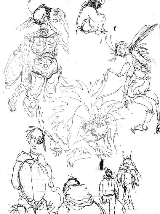
thanks for reading!!
#hlvrai#ask#a lot of this is very vague. im A Bit Shit at worldbuilding but i sure know how to work a metaphor for queerness.#my benry has severe just some guy disorder. sorry. the universe decided to curse him with major mary sue-ness#eldritch god n all that#yeah thay guy that works at 7-11? he could split the world in half in a millisecond. its whatever.#thats as far as my benry ideas span really. that weird dude is a god or something.#ranting
7 notes
·
View notes
Text
my theories on parx’s most recent post!
as all of us parxies know, waterparks uploaded the following picture, a neon green gradient background with three horizontally parallel black dots… interesting..

now, this photo could mean many things. there has been a recent discussion, especially on twitter, as to what this is, some of which I have thought of in the following:
a new album? already? that’s highly unlikely. personally, I doubt it.
a deluxe addition of intellectual property? hmm.. maybe.. however, parx has never even come out with a deluxe addition, let alone really mention one.
a new demo album? this is my personal favorite, considering it does line up with what awsten has said in the past when IP was competing with metallica on some buttfuck british charts..
a new tour announcement? maybe new dates? maybe asia tour dates!? (we can only hope, sending all my love to parxies who live in asia ❤️🩹)
you know, all of those technically are all in the realm of possibility.. but maybe that’s not it? they do say, “all good things come in three”, hmm.. kinda like the three horizontally parallel grenades in double dare!?
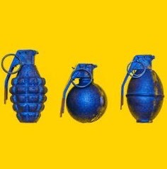
these kinda leads into the next theory..
is parx coming to an end!?
I’ve heard some theories in this already, even from when before IP was even announced. sure, it gets annoying, but it also gets to my head.. I truly doubt that they’re disbanding anytime soon, but what if..?
after all, three dots does usually represent the end of something, it also represents silence, a disappearance..
but hey, that’s me just thinking the worst, right? (haha, right..?)
a connection to fandom.. perhaps?
our beloved third studio album! our favorite hatred spiked album ! that also revolves around .. green ? neon green ? cough cough.
(if i’m being honest, intellectual property does have kinda the same energy as fandom. lyrically wise, that is. but out of all the albums, those seem to match the most.)
but..
the STARS!

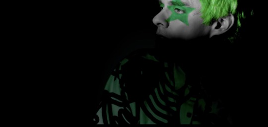
now riddle me this, motherfuckers, why would the stars only return for the IP era ? why weren’t the stars there before fandom, now that we think about it.. and the weird thing is, the stars only came back in the era that was HINTING green .. green like FANDOM! FANDOM WITH THE STARS. BITCH!?
what could this mean?
I mean, It could easily mean that we’re just having another green era? but why would awsten repeat a colour? that’s right, he wouldn’t. would he? i’m spiraling..
I mean, his star makeup at four chord was smudged, and that was the first time too, does this mean we’re fading away into another era? another green era?

otto was a hint all along..
going back to “all good things come in three”.. do y’all remember otto’s cheek makeup?! literally the same as the photo.
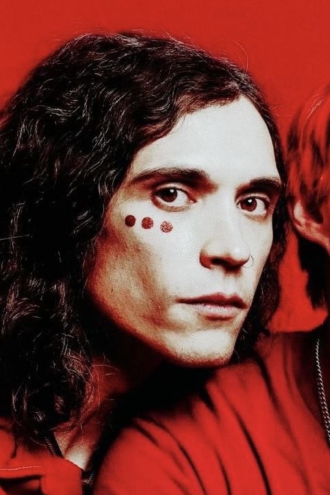

(omg.. otto solo album 😍 he’s my bias)
(…i’m joking...)
yeah, there’s really no theory here.. just the fact that these mfs were hiding it on otto’s CHEEK. damn. sneaky bitches. I guess it is weird.. geoff had a heart (which now that i’m thinking.. could be another sign..), and otto had three dots?
my last theory for now!
this is less of a theory, and more of me pointing out the obvious. (the obvious that we never saw.)
awsten was sporting neon green all the time. EVERYWHERE!
seriously, how did we not see it? we’re so fucking out of touch that we just okayed awsten having a neon- *gags* neon green phone case!? nah.
just look at this:

also, maybe this is a reach.. but i don’t think so.. so, our last era was GH, right? rainbow hair? well.. look at the colour of his phone case then..
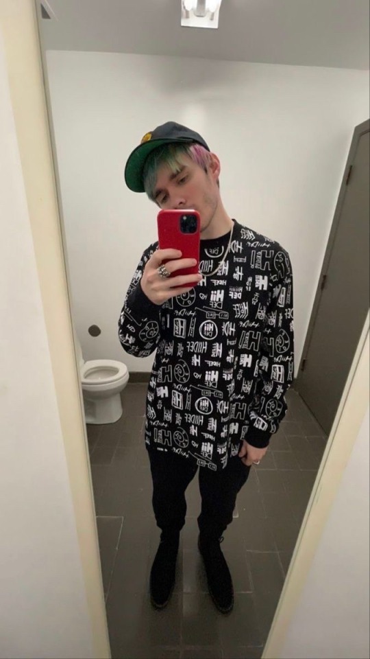
DING DING!!
It’s red! just like how RED was the next era. so, this leaves me no choice to believe that his next era will (maybe?) be green..? again..? hm, weird..
SO. sorry if that was all over the place. this was more just for me to unrot my brain a little about this! sorry!
love youuuu 🫧
- arlo
#waterparks#waterparks band#parx#parxies#parx fandom#awsten knight#awsten waterparks#otto wood#geoff wigington
15 notes
·
View notes
Text
every day i wonder what happened during the design process of equestria girls for them to all come out the way they did. i can see where the skirts thing came from cause they wanted them to be undeniably girly i guess or whatever but. every other weird decision is just confusing
like fluttershys whole outfit, the shortish skirt but especially the tank top. maybe its meant to indicate that shes outdoors a lot with animals, but it completely betrays her shyness and tendency to try and hide herself
they kinda messed up big mac and shining armor? mostly shining armor. his jaw could slice metal. why he look like that
also i only realized while looking at the characters that. okay i was just going to say 'lol cheerilees hair is stupid its like 1 foot taller than her head, why didnt they just give her normal bangs wtf' and i still mean that but then i realized... they swapped her mane and fur colors for her human counterpart ??? so now her usually darker coat and light hair became dark hair and light skin ??
which leads me to the point about the skin colors being weird. like. i dont like how they lightened them up, i dont like how aj and big mac have human skin colors (i have to assume maybe they thought for them that the colors looked bad, or possibly even close to caricature territory, especially with big mac), and the way they outright lightened up the colors of at least 2 normally darker ponies? like i said, cheerilee, but also
luna. even back when i first saw the movie and adored it, i DID NOT like the princesses designs. how did they fuck up some of the best characters in the show, especially the ones that are the prettiest (imo).
i would say that of the 3, cadence is the most okay design (i know we dont see her in the first movie just roll with me here). its clearly her, she looks like her and has her vibe (visually), all around not bad. not necessarily my favorite, theres still something slightly off? but it doesnt rub me the wrong way
celestia... i dont like her vibe. who is she. shes light pink and she has hair spikeys that are meant to look like a crown but just made it look like she didnt brush her hair properly. she has celestias hair but her face does not read like celestia to me. she looks like an imposter. where is my mother
and finally. the pinnacle of the issues with the designs. luna.
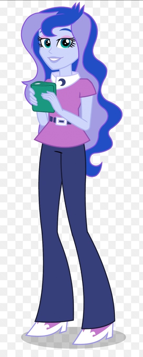
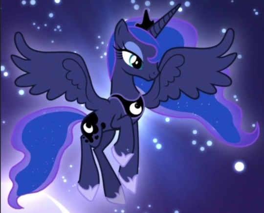
WHO IS SHE. THAT OUTFIT? NOT LUNA. THAT HAIR? YOU WOULDVE BEEN BETTER OFF JUST DOING A GRADIENT. OR PUTTING IN LITTLE STAR HAIR CLIPS. THAT FACE? THATS SOMEONES WINE MOM WHO SINGS EXTRA LOUD AT CHURCH. same critique about the hair spikeys as before. AND THE SKIN??? HELLO??? THE PRINCESS OF THE NIGHT GOT TURNED INTO PRINCESS OF MIDDAY. WHY.
the design of the show vs the movies is, i guess now literally, night and day. pony luna is so inspired and pretty and meant to invoke such regality, its very clear what her theme is, and she very much sticks out amongst the others, both in shape and details!
but the human version feels generic, she could easily be a background character (and she basically was), she feels unfinished, the colors on their own arent the worst but moreso feel insulting when compared to the original (i like the addition of pink/pinkish purple to the palette, but not so much to luna as a character. it just isnt her imo), she doesnt even look like an authority figure aside from obviously looking older than the other characters, let alone being someone meant to be somewhat equivalent to royalty. also again she was a minor character here but its like... her pony version has such a stone strong personality, both when shes freshly back from the moon and later on when shes more grounded and princess-like. human luna is just... generic teacher person. did human luna even ever experience significant isolation and feeling completely unseen by everyone she cared about? doubt it.
and yeah, they significantly lightened her skin ?? why ?? theres literally no reason to do that? she wouldnt look like a caricature unless you somehow chose the wrong colors (how possibly would you), and its not exactly impossible to draw characters with darker skin, again her pony form literally has a dark coat !! but also plenty of people have redesigned her human form to have the right skin color and they look great!! and in general obviously theres plenty of characters with dark skin, like... what was the reason they did that. it just feels gross.
dont cross me when it comes to luna dude i love her so much
anyway yeah its been over 10 years since EG first aired and i loved it back then and i still love it but i think a lot more about character designs now. mlp g4 is known for having these really pleasant and well put together designs with lovely colors (for the most part), its so weird how that gets easily messed up, like in g5, but also still in g4 itself(in the spinoffs and the main show lol)? wish i had the motivation to redesign them all lol, i probably will someday. please go look at redesigns theyre very lovely
#mlp#my post#long post#my little pony#equestria girls#in which i talk a lot. this was obviously an excuse to rant about the luna choices#luna was one of the first characters i ever related to dude dont fuck with me when it comes to her !!!!#i actually like the decision to keep the characters mostly whimsical colored as humans since its the colorful pony franchise#and it also means they ideally wouldnt be excluding or alienating anyone by having to choose canon human skin colors#but that second one really falls flat with the lightening and also aj is literally. human skin colored instead of orange#man can you imagine being paid to design human luna and you make her look like that. and somehow shes approved#it costs 0.00$ to not do that. or maybe it cost them money idk but like. i have to wonder if#if they ever made her look like herself in concept or she always looked like that#cause if she ever looked like herself in concept. why change her.#i could probably answer some of my own questions through google but. its late and im tired#its Free to make a dark skinned character and make them look good. it costs nothing. and its easy.
6 notes
·
View notes
Text
Okay so something I found kinda weird/would have liked to see go differently in 2012 is the turtles’ masks. During the farmhouse arc Splinter is missing, but the turtles seemingly just keep wearing the same masks. The thing is those are the masks Splinter gave them, and I’m sure those hold some sentimental value as a result. It would have been interesting to see them debate on making new ones vs. keeping the old ones. That fabric would have worn out eventually, and if Splinter was gone (something that was possible during that arc)… well they wouldn’t be getting a new mask from him anytime soon. Add onto this the amount of time Raph seemed to spend sitting with Leo + multiple versions of Raph knowing how to knit and can you see where I’m going with this yet? Give them new masks made by Raph. Cute/sad little detail on its own, but giving them new masks could mean messing with the designs a bit.
Spoilery mask details ideas for a fic I haven’t posted yet here we go:
Leo gets a darker blue with constellations stitched into the fabric. Maybe the Hamato crest is also on there somewhere near one of Leo’s eyes or at the end of one of the mask tails.
Mikey’s main color wouldn’t change, but adding in multiple pieces and colors/cuts of fabric into the tails of the mask in some way? Fuck yeah confetti mask. Perhaps some dots in any place where the mask covers his freckles because that would be adorable.
Donnie could have a more dusty purple along with some kind of dye at the ends that looks like clouds of smoke. (Could just be for fun or possibly a bit of a tease at him totally having caught his mask tails on fire before.)
To the surprise of no-one ever I had the most fun with Raph’s mask. He’d keep the same red color, but with longer mask tails that have a gradient from red to black. The black just because it looks cool, but also because I could see Raph using yellow thread to embroider flowers into the black section over time. Think of a ‘this kid has to replace his mask semi-frequently not because it gets messed up but because he adds more flowers when he’s bored and they’ve taken over’ kind of situation.
Basically I want to see people go nuts with adding little personality-related details to these turtles’ masks. They’re such a major part of these guys’ designs, but most of the time the variations change the length of the tails or add some rips to the ends at the most.
#tmnt#2012 tmnt#tmnt 2012#headcanon#rambles#Anyone who likes this idea feel free to take it and run with it#Specific design details included#If you do tag me I wanna seeeeee
5 notes
·
View notes
Text
Intro post
Hello! We are hyperion, a silly little minecraft server of blorbos given life. We will now begin killing. death to monarchy.
-----
mod sephie 🐉
im sephie she/her only please im a semi aquatic dragonborn and a lumberjack sometimes my favourite colour is brown and im a lesbian
-----
SALUTATIONS. MY NAME IS SARGEANT. YOU'LL KNOW WHEN ITS ME BECAUSE IM QUITE LOUD. THAT IS ALL. BTW MASCULINE PRONOUNCE FOR ME
-----
Mod Hubert 🕷❄️🥀
My Name is Hubert von Narfidorf, I'm a travelling Merchant and have indulged in the other's Endeavor of running this "Tumblr Blog", the Pleasure's all mine!
Honorifics are "he" and masculine Terms.
------
The angel that presided 'oer my birth Said, "Little creature+, form'd of Joy and Mirth, Go love without the help of any Thing on Earth."
Mod Koga 🔥🌑
-----
My name is Koga, you do not get a last name, He/Him.
Resident immortal Oni of the group. Used to be the main farmer of the village before getting stuck in hell, currently using this blog to maintain interaction with the rest of the group.
Delighted to make your acquaintance, but I'm sure you are all more delighted to meet me.
Greetings, I'm Ghuard. The guard of this village folks have gathered round. Refer to me as your heart desires. Went through many hardships and while I'm currently stranded in the great unknown I might as well give this new app that appeared alongside fantasy WhatsApp a shot. My posts will be tagged with this funky lil guy ->🤺
-----
hello my wet sludgy beasts my name is griselda and i am a mucky gal, i love the CYCLE and you should too,
-----
I'm the bad dm my posts are tagged with 🧌, sign off with "bad dm", if you call me bad dm I'll cry
I organize stuff kinda yeah, also play the npcs and other stuff.
I only respond to "bad dm"
-----
Howdy! I'm Jude Duret.
I'm not really human anymore, but I used to be. I also used to be a stonemason, but it looks like my job has apparently shifted to knowin' about paranormal stuff.
I usually type usin' a
gradient
but not in the intro post for character limit reasons
My preferred terms are she/they
⛤
-----
mod ???
What the fuck is a Tumblr
Hello, You can refer to me as The Kraken or as ??? either works, as my actual name is unable to be pronounced by most sentient creatures. Sarge told me about this thing called Tumblr used by the land dwellers. I have no idea what I'm doing so I will be asking a lot of questions. I'll sign every post with 🦞
(They/them because I'm neither man nor woman but a secret more sinister third thing)
-----
mod r oot
i am root adn it
it is n the flesh bu t not t the same, flesh, as befo r. sc ary here bb but width frein ds.
the
Great Root
it m ade mohter and fathre angy it thingks,. adn now,
t he Emp i re now.
it is
i
n
s
i
d
e
him.
white women, 🥕
6 notes
·
View notes
Text
It’s time to talk about the cover of volume 34.... I love it, it’s probably my favorite cover so far, everything related to the third year cultural festival is awesomee, I wonder why... And it’s not every day that I have my 3 favorite characters on the same cover...

The flyer team!!!! The best!! I understand well why they did not have a dedicated chapter, Oda was going to give them the cover (and it is a very good choice). It also proves that the preparation of the festival is the most important part of the arc, and few people seem to have understood it.

Little thing I noticed: each of the secondary characters represented here had their moment of glory during this volume or shortly before. Ogiya was on the cover of volume 32 so Emoyama unfortunately could not appear. Nanoda became way more important these last chapters (Oda had to find a wife for Kori after all) and Shiina and Sukida had their own chapter. I have nothing against the covers showing only Komi and Tadano, but this manga is primarly all a celebration of unusual secondary characters, and this cover is a perfect example.
And I also think that the characters represented here are Oda’s favorites in this class, it's alway funny how Oda does not hide his favorites.
I especially like how Shiina seems to see the «hidden camera», it confirms even more her status as a character different from others…
Okay, now let’s talk about the most important part:

THEY MATCH EACHOTHER’S FREAK SO WELL IT’S UNREAL ODA WHAT ARE YOU WAITING FOR OH MY GOD MY CRACKSHIP IS ON A FUCKING VOLUME COVER DURING PRIDE MONTH WHEN ARE THEY KISSING !!!!!!!
At this point I praise for Oda to actually consider their alchemy and start doing more manga club chapters… Emoyama turning her laptop to ask Sukida about Shiina’s flyer… A good way to force your clubmate to learn how to communicate... (they are meant for each other it's crazy)

And the drawing? Official yamanaka art on the cover AND in thevolume?? Lily drawing tiny purple hearts is just so adorable, the fact that the drawing is Yamai and Nakanaka kissing each other on the lips is even crazier. I know it’s pretty unhealthy to ship two real people. But this volume proved that Yamai and Nakanaka are what gives Lily the courage to come to school every day, to continue drawing, which gives meaning to her life. She’s just a fan who loves Perro Rabioso, you know what I’m saying? The hearts are also there to represent the affection she has for these two girls. The further we learn about her, the more I think I know how Komi and Lily will become friends, and it will have a connection to the relationship between Yamai and Nakanaka. I would have more time to talk about it one day during another one of those times where I say to much things about something simple (like here).
Okay now let’s talk about the REAL most important thing (notice how I avoided it from the beginning)

For real? I like it, I admit that on my favorite drawing (the only one that I find pretty well done and I do not want to delete on a blow of frustratio) I made the hair a little more «brown» by putting a touch of orange for the reflection of the light. To have this color of reflection, I was inspired by Kim pine from Scott pilgrim, the brown used was kinda similar and I was thinking that the hair color from theofficial anime was too pale (why all modern anime are so desaturated? it’s super depressing).

And to bring out the purple, what better than… Orange! Don’tlaugh, but my gradient came from a very simple and special idea…

I'm serious DON'T LAUGH !
For the other drawings after this one, I went back to the purple hair shade because I didn’t want to get too far away from the source material, but I’m rather happy to draw a character with a unique hair color. This is the first time I color a redhead lol, it’s up to me to do my best! I would like to add discreet freckles, but really hidden to avoid having the comparison with Inaka. And no matter the hair color, it remains adorable. I hope that no one will be too disappointed to know that I will use this new hair color. On the cover the color detonates enormously and even it seems strange to see Sukida like that two years after the anime with the "outdated"official hair color and my hard work to be the only person in the world to make so much fanart of the same character, That’s why I apologize too, all my drawings will change because of it. When i woke up this morning and turned on my phone, I was skeptical about the color choice (I was rather screaming with joy when I discovered the cover) but after a few hours, I think the orange color is right and Lily is really pretty with it…

Finally, this hair color reinforces what I talked about last time, Lily is not originally from Japan, this hair color is very rare, but way more present in America and, most of all, in Europe (especially in Ireland, Scotland, Ireland... but it's very present in all the other countries). But even with this in mine, she is half japanese, so it's probably one of her parents (one of her two moms I mean ;) ) who is from Europe.
Since we already have Rei and Mira who are American, I think Lily has a good chance of being European. And I even think that the 3rd year school trip will be in Europe (Japan (Asia) -> America -> Europe)! It would make here even more unique.
Redhead can be from anywhere in the world, but if she is European and French (the name being a reminder to the fleur de lys) I would lose my mind and shout "she is just like me fr" and I would apply to be her Japanese, English and French voice in the anime...
I think I'm going insane, it's better to stop yapping here, hope you liked witnessing me talking about my obsession for a background character !

4 notes
·
View notes
Note
Artists when artists are copying & distributing art from companies for their own use and profit without paying them: 'Lol, theft removes the original, this doesn't. Copying art is not a crime! yo-ho yo-ho!' Artists when companies are copying & distribuying art from artists for their own use and profit: 'What! Collage is a crime! You wouldn't download a car!' Good to see that the God of Irony still has a job!
I was going to write something about this subject too, but I got hung up on that gofundme thing.
Up front, I think there is some legitimate complaints about artists not wanting their shit scraped and fed into an algorithm. That's not an unreasonable demand. Datamining is out of control on the internet. There needs to be way less of it.
But also... All this bitching and moaning about ethics and morality is hollow as fuck. The piracy thing right up front. How many scanlated manga or fan-subbed shows you think the average seething artist has read/watched? How many movies did they pirate? How many ads have they blocked? How many streaming service passwords shared? How many second-hand things have they purchased? How many college textbooks downloaded? How many programs have they cracked and used for years without ever paying a sub fee? How many little things have they shoplifted? How many immoral and unethical things they've done without ever making up for it?
Short version is blatant "rules for thee, but not for me!!" bullshit. It is an ethical nightmare that some programmers have in some way appropriated raw data from something made by someone else because they, the artists, deserve payment and royalties for their art being viewed in any way they don't approve of, even if it's just some ephemeral fragment of something they made once, did not license, did not copyright, did not commercialize in any way.
Every other artist and employee who worked on and produces all the shows and products and services doesn't deserve payment because... uhh.. because late stage capitalism or whatever!!
It's a double standard that doesn't hold up to a moment of scrutiny. Some of this hysterical bullshit would even be forgivable if it were just about not being happy about having their work used in a way they don't approve of. Instead, they had to go with this moronic, exaggerated ethics angle, they had to pool their money to try and get the US Government involved. All this constant wailing and gnashing about losing jobs and work when nothing has actually changed and no one is making 6 figures yearly on an AI Art patreon. No one is losing commissions to some now world famous prompt expert who charges even more money.
We've long accepted piracy as an unavoidable aspect of the digital age, but suddenly that's not okay because it might (but not actually) impact some freelancer/indie artist's ability to get work that they either aren't losing because of AI (remember that the global economy is falling apart), or they might lose jobs that they don't have, they aren't trained for and/or aren't pursuing anyways.
But you know what else is kinda fucked about all of it? Most of these artists wouldn't be where they are today without technology and software advancements. Do you have any idea how many artists would be fucking hopeless without all the custom photoshop and CSP brushes they downloaded for free (and never credited the creator)? Do you know how fucked these people would be without all the built in color correction settings and filters and gradient maps? They can't even imagine drawing in procreate without all the built-in tools for correcting their sloppy-ass linework. There's SO MANY successful and highly paid webtoon comics out there that wouldn't be where they are today without the CSP asset store allowing them to drop in 3d background assets and pre-set pose and hand guides.
These whiny fucks are up to their eyeballs in technology that props up their entire profession/hobby, but they are screaming at the top of their lungs because someone downloaded a booru or scraped pinterest to feed into an AI Training algorithm.
tl;dr - They're a bunch of immoral hypocrites who badly want to dress up their impotent outrage as some kind of meaningful, ethical catastrophe.
30 notes
·
View notes
Text
Ya, I think I left enough characters out that my "ranking every 'mostly white + usually a cool color + maybe gold'" post warrants a part 2 (if enough valks of this design genre get released to warrant a part 3 though, I'm just gonna cry). Usual disclaimer that while I'm trying to be objective as possible about this, art is a very subjective medium and I am not immune to bias. Anyways-
S tier (wouldn’t change a thing)-
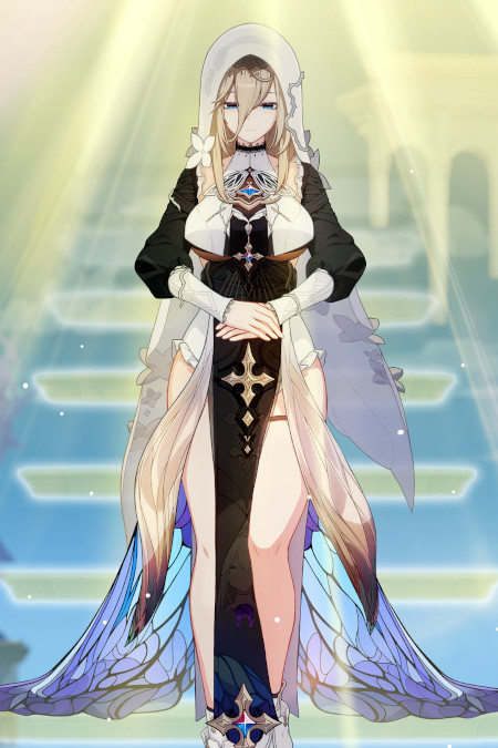
still not entirely sure if she belongs on this list because the black and white elements are pretty well balanced, but eh- we're here now
Forget just this genre for a sec though- Aponia has one of my favorite designs in the game
It's the skirt, it's entirely the skirt
I'm glad they kept the outfit mostly black and white (other than the bits of jewelry used to keep the outfit cohesive) because I think too much color would've just distracted from the skirt
I also appreciate they made the white fabric different textures. It really helps to separate the veil from everything else
The usage of vines and flowers to break the symmetry of the design is a fun nod to Aponia's failed attempts to control the world around her
A rank (minor changes needed)

I just want that front white shirt piece thing have a "light blue to white" gradient on it to better separate it from her legs
Otherwise, this design is a friend
Nice use of texture, I really like how the sleeves look like fabric dipped in ink where the ink is just gradually creeping up
I also just think it's funny that she's the jade knight, but her color palette is mostly blue, where as Azure Empyrea's color palette is mostly green
The red accents are also nice
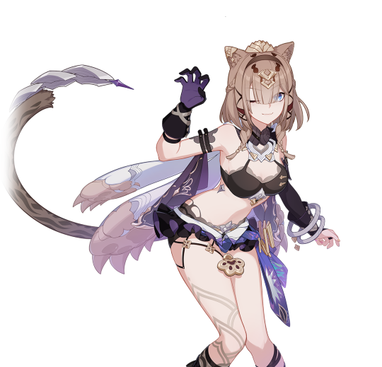
I think from a more objective standpoint, this design would be in B or C tier, but it's my list and I like the design, so it's going in A tier
I'm also not sure if there's really enough white to warrant her being here
The bikini top and mini tutu are goofy (I think I'd personally just make the top a turtleneck crop top with a book window cut out, and the tutu into shorts and a fanny pack), but I kinda like them
There's just a lot of nice color variation in this one
D tier (for disappointments)
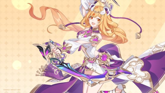
Getting this disclaimer out of the way: I am aware of the racist elements of this design. I am not SWANA though, so I don't really feel it's my place to go in depth on it (I'd be happy to link or reblog other people's arguments though)
Congratulations to mihoyo for making me sick of the color purple. I literally didn't know that was possible
I know she had a purple Hoody that one Manga, but I really with they went with a blue/green, orange, and gold pallet instead
The dance motife feels kinda out of nowhere? Idk if she has a love of dance in one of the Mangas, but it was never really mentioned in game before now
Also having Rita (the British lady) be the one to teach her a Persian inspired dance was... a choice
I could see a redesign going a couple different ways
One being really committing to the whole "it looks like a regular outfit" think, focusing on the changing roles of valkyries and moving more towards the aesthetics of APHO
Maybe have her story take place in her home country, thus why she could be wearing more traditional clothes (and have a grandma or someone like that teach her the dance)
My other idea would be keep the story the same, but change her design to be more of a throw back to early valks, leaning more into the mech suit idea
I wish we got the bear hood
F rank (I have very few productive things to say because these invoke my inner Ragina George)
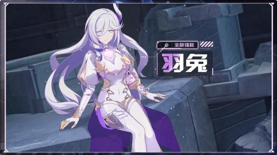
F, for "that was the ugliest f'ing skirt I've ever seen"
Ya, I know I'm breaking my "only out valks" rule, but fuck this design
There's so little tonal variation
Between the hair and shoulder puffs, this design just ends up looking incredibly top heavy
Mihoyo, keep her pants on
Just like Hares writing, this design is uninspired and directionless
I keep seeing people compare her to Shenhe and Eula and I'm gonna need yall to stop slandering my queens like that
Comments from the homies:
"Shorty look like an ice cube gum box"
"Why does she have nipple ribbons"
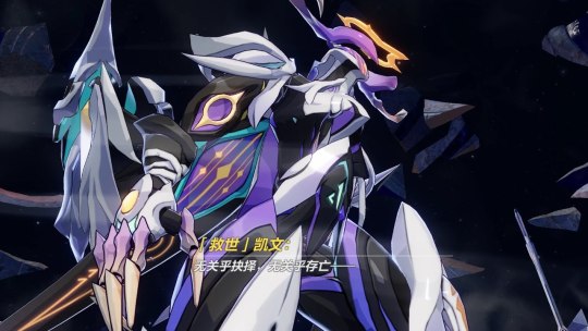
Froot loops abyss herald looking ass
Every day, I wonder if the trend towards monster design similarities in both games is an intentional way of hinting at further down the line multiverse plotlines (not explaining why it could be this here), or just a marketing decision
TLDR: these types of designs can work so long as they go bold on the colors
#honkai impact#honkai aponia#li sushang#honkai susannah#honkai pardofelis#honkai hare#I just needed to wind down after doing homework all day#And this seemed like a fun way to do it#Never thought I'd get sick of purple but mihoyo surprised me
18 notes
·
View notes
Note
tell me about your fucked up petz creatures
I WILL GO OVER My Main Cast. alphabetically as they appear in my funny box !
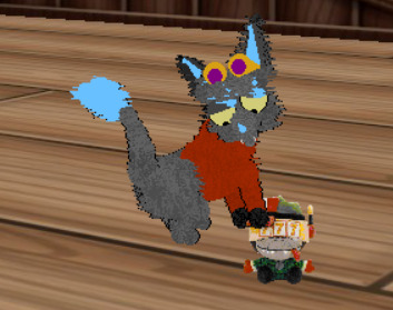
Starting off with ABYSS!! i love her dearly. she's a spamton mixie! specifically a blue addison + spamton + sparkle kittling. she's got no eyes or colors (she's got blue paw pads, thought!), leading to an unsettling appearance. i love her dearly, though! she's full of cheeky personality and she loves jumping through the hoop, if she isn't knocking it out of my hand. (or doing other things... she loves to mess around)
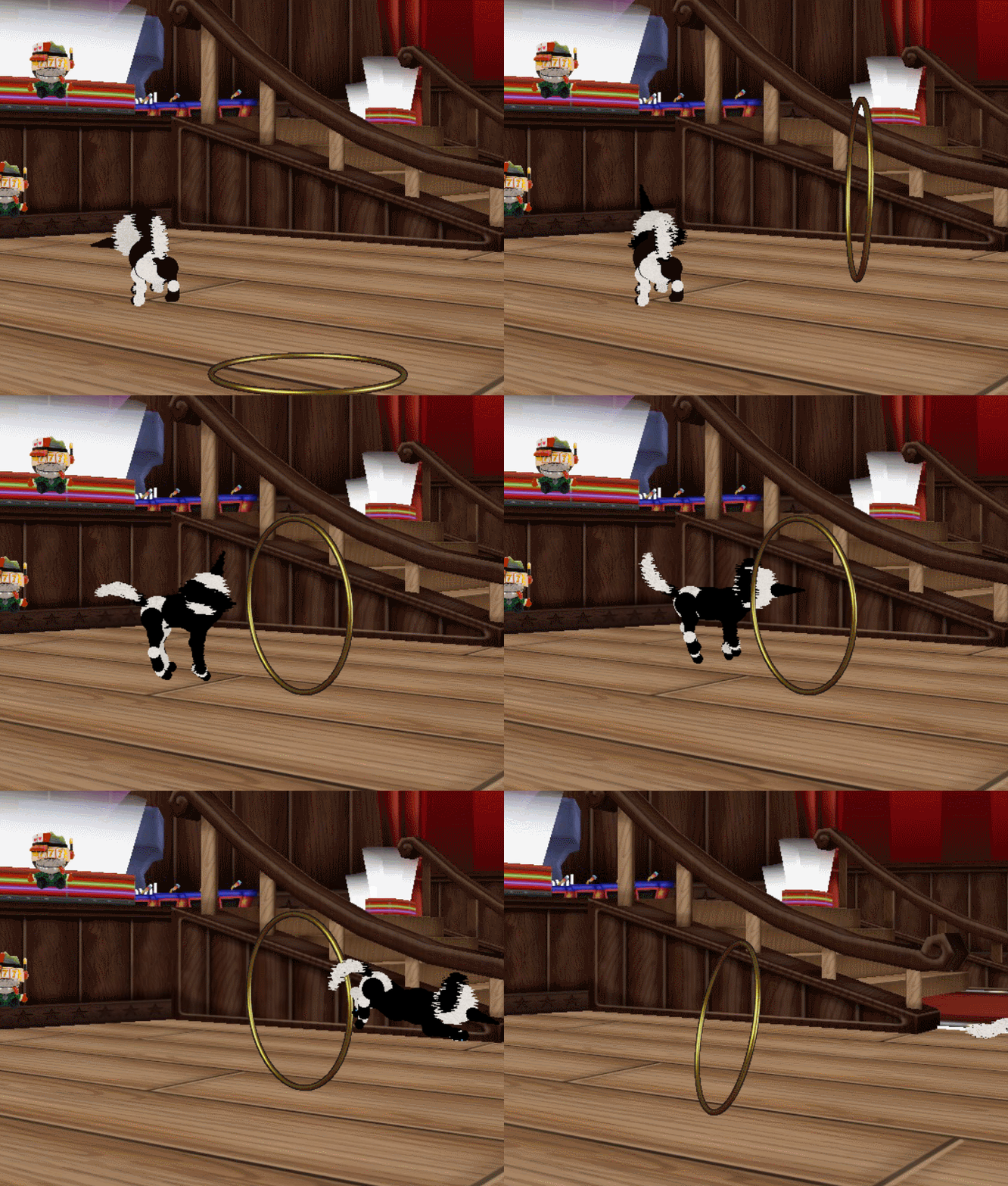
up next is... asshole! yes. thats his name. he's my oldest spamton i currently have! he was originally a different spamton neo, but for petzspamton creator's comfort i converted him to be dib's spamton neo. being based on a siamese - he's picky and he's mean. he's an asshole. that name stuck with him. he used to wear an iconic sweater but this spamton neo kinda breaks shirts so he has a santa hat now!
also spamton neos in petz are known for. their. uhm. Thoughtful Gaze.
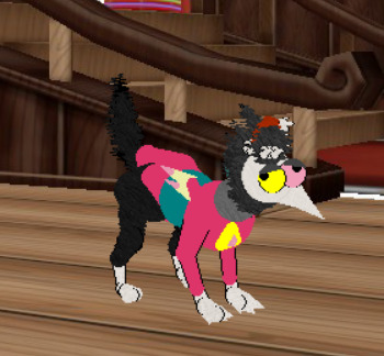

next is... BIG BOY! MY BELOVED!! he is a gift from petzspamton for me based on my mega spamton neo design! he came named bigboy and since even my mega spamton neo's nickname has been bigboy. :] he's big, he's cuddly, he's gentle and he LOVES food. he also flops. a LOT. and genuinely when i say he loves food i mean it, he's based on a persian and those love food in petz. he seems very eepy today he's flopping less than usual but probably because of how wacky the room layout is + he's too interested in buck plush

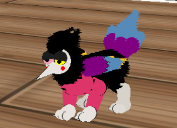
OLD BAD ART ALERT I DONDNT DRAW LIKE THIS NOW I DREW THIS IN MY FLOP ERA but heres mega sneo design. just for context!! (ye he got swapped wings but who cares)


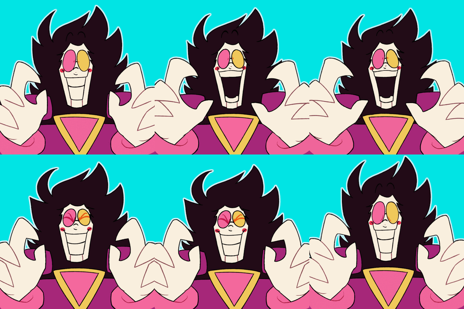
if you see similarities between this hair and the way i draw high roller, no you dont. no you fucking dont.
up next is cap'n! i'll be honest i dont play with him as often since i converted everyone from petz 5 to petz 4 - losing k_k in the progress </3. he just loves starting fights with everyone its no fun </3 but ANYWAYS!! this is a hexie made by YOURS TRULY! hes goofy
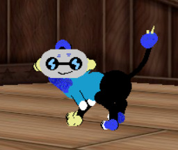

can't show off cap'n without.. SWEET! oh boy after glados this is my most complicated hex. DO YOU KNOW HOW PAINFUL IT IS. TO MAKE A CUBE. OUT OF (SPHERES) (AND LINES THAT ARE VERY FUCKY) ITS HORRIBLE. sweet sweet sweet my dearest friend sweet they start fights sometimes too but are calmer than cap'n. they like playing with plushies a lot as you can see
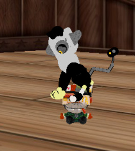
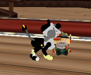
next is creature! a funky little spamton mixie. seriously this thing is like generation 7 and listing everything thats In Their Blood may take a while. they've got lovely spots and neat textures + are pretty big!!! their tip ends with a pink which is a fun contrast compared to the blue/white gradient. very silly fella!!!

next is cupcake! one out of two silly kitties i got from bad_death ! they did a thing where they gave out unique textured/patterned fellas to people on petzcord. so these guys are unique! like everyone elses. i have other petz i got from other people that are hexed, but i don't have them in the playable petz folder right now. cupcake likes to flop around, too! what a lovely fuzzball... they also get scared of everything which isnt characteristic of a persian personality but. hey. the wordl is scaresy...

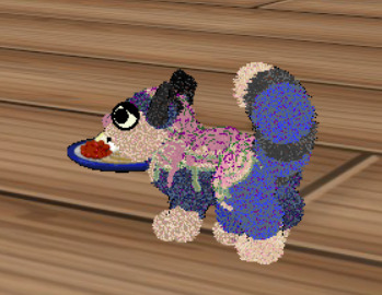
next is dragonfruit with their funky shrimp tail !! also a spamton mixie - you can defo see similarities between them and creature. i believe they're related? anyways - the main breed they take from is cubus! they have calico personality so they are very playful!!

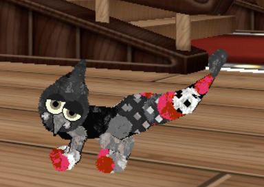
next is fledgeling! Bird. i dont even know whats in them .

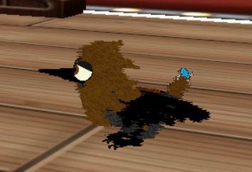
FROSTBITE. MADE BY PETZSPAMTON FOR ME. THIS smug-ass cursed entity. they're a little bastard beast. theyre just me but petz. smug ass. likes to 🤨🤨🤨🤨🤨. friends with some but enemy to many. LOVES DANCING. PLAY MUSIC INGAME AND THIS THING WILL SHAKE TAIL. dear god even this frost made it to hr's , they will kill.

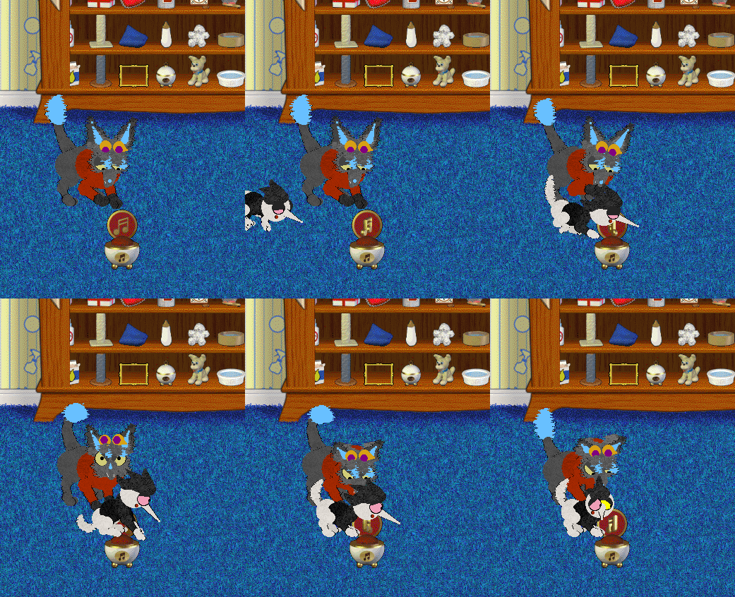
also the iconic gif with them and spammo.
next is GLADOS! or catdos if you will. i made this with my own blood sweat and tears it was a nightmare. but look! glados !


im getting tired and i havent eaten today yet because im autism SO. SHORTER DESCRIPTIONS.
iceshock!! silly ice spammy kitty.
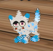

MANGO MY DEAREST BELOVED. YOUNGER BROTHER TO OTTERPOP. THOSSE TWO ARE BASICALLY MY MASCOT SPAMTONS. I LOVE THEM SO MUHHCHCHCHCHCHCHCHC. THISSECTION IS FOR THEM BOTH MWA MWA LOVE THEM. also that was ttheir bday gift a year ago They Didnt Like It. btw otterpop blue shirt mango flower shirt
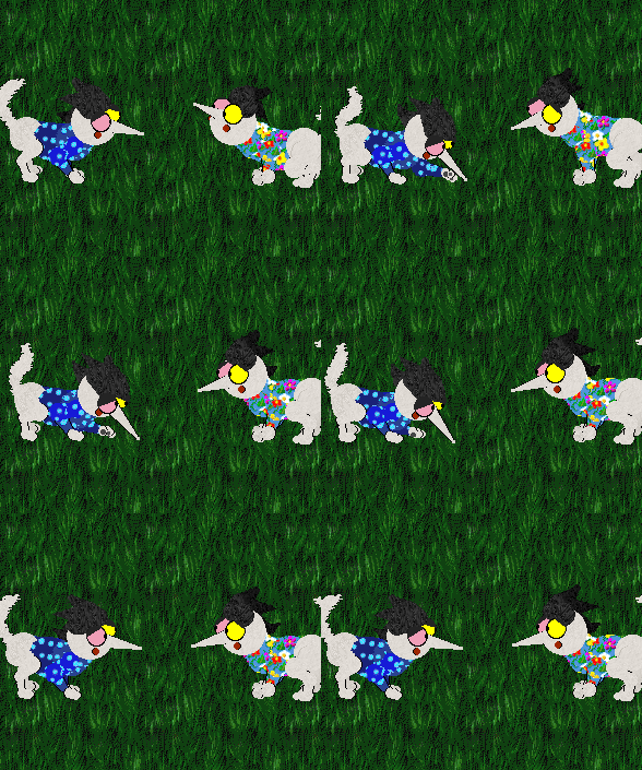
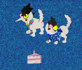
onion .
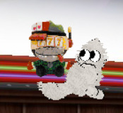

....and i hit the image limit so...! feel free to ask for more...!
2 notes
·
View notes