#but also gradient maps look nice
Explore tagged Tumblr posts
Text

It it is summer where I live, it was like 36 degrees today, but I can dream of snow. Atsumu, please go inside, standing shirtless in the snow is a bad idea, even I know that. anyway, enjoy a mildly moody Atsumu because I am tired.
#I had like two early mornings and my brain is busted#but now the Bestie is staying with me for a few weeks so all is well#man#the timelapse shows so much of my colour work only for it to completely disappear to the colour gradients fml why am i like this#i just wanna do cool colours#but also gradient maps look nice#mad#anyway#haikyuu miya atsumu#miya atsumu#hq miya atsumu#haikyuu#hq#haikyuu fanart#my art#digital art#artists on tumblr#ok enjoy
10 notes
·
View notes
Text
i can Feel myself getting to a point with my art where i want things to improve but i think for the first time in a long time i don't know how to teach myself the skills i want
bellyaching in the tags
#i want more control over the colors bc right now the great color work compliments#i feel are entirely owed to the gradient map adjustment layers i use at the end#which are great! they do create a nice sense of cohesion without the pieces feeling monochrome#but there's very little control in that it's a Lot of throwing shit at a wall to see what sticks#i don't know how people shade digitally without using multiply layers#and have things Not come out looking muddy#and i feel like ''oh use color theory'' isn't enough bc i've looked up a lot of color theory#but i'm still missing something#i also. don't know how people do digital Paintings that look like oil paintings#that shit is so impressive to me#and maybe i should understand and accept where my skills lie#and lean into my dependency on ink layers etc and lean into art nouveau styles even more#but i'm just not that kind of person#i want to be able to do more
8 notes
·
View notes
Photo

A little (unfinished) experimental piece of art feat. Valefor.
I was playing around with gradient maps in photoshop. And I’m still not sure if I like it or not. But I still wanted to show the result!
(It could have been more refined,... but I sadly lost patience with the fur ;_; ...)
#gw2#guildwars2#guild wars 2#charr#myArt#valefor#valefor wynther#I think I give it another try in the future#these gradient maps are quite nice#unfamiliar but still.... HMM#I also hope to find my artstyle someday#I have the feeling every image looks different x_x#or its just the critical view as an artist idk#but still I hope you like that lil experiment .v.
33 notes
·
View notes
Text
The best years of my life...

... what I wouldn't give to have them back.

I had the great pleasure of working with @spiderscribe on a DeadCeptor work for the @tf-bigbang, which you can (and should!) read [ HERE ]!
Details and artist commentary under the cut!
Okay, first off, I just wanna say, thank you so much to @spiderscribe for picking up my very loose scribble and taking the jump. She's an absolute champ, and I IMPLORE you to read her writing. She did a knockout job on the fic, and guaranteed, these two pieces wouldn't have been so elaborate without her. If you're a fan of deadceptor, parallels, lovers to enemies to apocalyptic teammates to ???s, I'm sure you'll find that and more in there.
[ HERE ] is the link to that, if you missed it the first time around.
The background for the supermarket was a MASSIVE undertaking. I ended up blurring it in the final to keep the dream-like quality, but there is a lot happening there! Most of the time I spent on the background was (jokingly) complaining though.

Anyone who works retail will know the agony of customer-misplaced stock. The little canisters of energon additives seem like prime candidates to be placed willy-nilly.
The little warning sign... My favorite soda, apple sidra, has a carcinogen warning, so I'm familiar with it. It was slightly surprising to me that those warnings are not countrywide, despite the fact that they very clearly say "California Proposition 65", and well. Not something else, like "Federal" or whatever.
The bags of nuts and bolts below, I asked several people what flavor they would be, and I suppose I failed in my job, because I wanted the purple to be the "regular" flavor, and the green to be the "sour". But grape and lemon-lime work as well!
The tub is full of rust-sticks. I have no idea if that came across. My friends kept calling the individually wrapped ones slim jims, which I mean, I guess!

The car batteries... My idea was that they were similar to shots, in a way? So that's how I ended up with a battery with enough terminals to rival an international airport. It's also sunset-coloured, because, I don't know, that's what Party Flavor is to me.
Okay. The second illustration. This one was a headache, mostly due to my own lack of planning, and the fact that I lost the file for... basically everything I did, including the above illustration. So it was a bit of a rush job.

The background bots started off as these very vague silhouettes, which I'm a little proud of. Look at how nice and somewhat readable they are! Okay, now what if I ruined it? What? You don't like that? That's rather unfortunate, because that's what I proceeded to do. In fact, if I take off all.. 10 or something adjustment layers, they look like this:

My process went: Shadow block> Fill rest of form> Color randomiser> Copy and skew (to populate background)> Hue adjustment> Gradient map> Fill Light> Chromatic aberration> Vignette> Levels> Curves.
The.... Magenta cube is there because due to the nature of the color randomiser, the foot had a high value, and stuck out like nobody's business in the end.


Here's what it would look like without the cube. Begone, distracting white blob! (I didn't have to worry about the lava arm because Percy happened to cover it up. What a save! But if he didn't then... there would have been a second cube.)
Basically, it was a mess. But... at least it came out fine in the end! I hope!
I'd love to have speedpaints on hand, but I was switching between CSP and PS for a good majority of the work.
I'd say that's it for these two pieces! I actually have more, but those demand more time. I'm much slower at doing inks than I am at painting, but I hope you'll get to see them soon.
#phew! been a while since I last did some commentary for a piece#I didn't even go over what everything was on the background shelves but just know if you asked me i'd probably be able to tell you#I have... an additional several pages of a comic based off of the fic that I unfortunately have not finished in time#but I definitely will#again it was amazing working with caroline and I hope to work with her again in future!#maccadam#transformers#tf perceptor#tf dead end#transformers cyberverse#tfc#deadceptor#perceptor#dead end
1K notes
·
View notes
Text

hello and welcome to my tutorial on how to create gifs like this one! full explanation under the cut, but if you wanted to take a little peek at the gifset attached to this tutorial, here ya go!
for the purposes of this tutorial i am assuming you know
how to make a gif
what vhs footage looks like
STEP ONE: MAKING YOUR GIF
choose your footage and plug it into your desired software of choice! i use photoshop for this so i can only attest to the efficacy of these methods in that context
as for shot selection, you could feasibly choose anything. however, i prefer shots without too much movement in them - makes it look more like a home video.
because of the heavy amount of colors and filters, i'd recommend a gif somewhere around the 40-50 frames! but of course you can play around.
oh i also set the frame delay to 0.08 seconds. this is slower than most gifmakers tend to set theirs, but it makes it run buttery smooth imo.
STEP TWO: MAKING THE COLORING
here's where we get vhs specific. if you're unfamiliar with vhs footage, i recommend clicking through this youtube playlist! if you're not interested in the coloring, skip to step three (smart object fuckery + filters)
now while making a set i tend to choose some primary colors for my gifs. in the gifset i linked above, i chose to work with blue and orange-y yellow. in some of the other gifs i'll be using as examples (from an unfinished set) i chose green and yellow.


to create the above coloring i generally use these steps:
1) curves
i'm a maniac so i use the same curves layer to initially edit the luminosity AND colors of my gifs. the purpose of this layer is to edit brightness/contrast like i normally would and already start the process of changing the colors a little bit. this is my curves layer for the blue house gif:

to make the gif go from the left image to the right image:


as you can see i used the brightening curves to make the footage a whole lot lighter. i also increased the reds to get rid of the cyan tint a lot of blue footage has, slightly increased the blues, and once again decreased the greens to get rid of any cyan. this does make the blue hue a bit more purple, which is a nice bonus!
as for the gif of the boy, that one's a little harder to show a before and after for, but i'lls how the curves for good measure:

the original shot was already quite bright so i only edited the brightness a litttle bit. because i knew i wanted the gif to be green and yellow, i increased the greens, decreased the reds (except in the shadows), and decreased the blues (to get yellow)
2) channel mixer
now the channel mixer layer takes a little getting used to so i recommend experimenting. ALWAYS USE THIS LAYER ON THE COLOR BLENDING MODE for a more even result.
i use channel mixers to sort of... unify the colors a bit more. for the house gif, for example, i increased the blue channel to +110% blue, but decreased the blue in the red (-12%) to retain the yellow in the window.
if you want me to explain this more in depth, send an ask! it'll be kinda longwinded though


before / after of the boy gif with curves/channel mixer.
3) levels
this is where it starts looking more vhs-y! vhs footage has light shadows and dark highlights.
first, set your levels layer to luminosity blending mode to retain your beautiful colors.
then, crunch the hell out of your gif to make it very... mid.


this may feel a little wrong at first but i prommy it'll look okay at the end. a before/after for the boy:


now that's starting to look familiar right?
4) color fill/gradient map
because i want to unify my colors/make sure my gif is saturated, i usually add either a color fill or gradient map layer. in the case of the house, i chose to go with a dark blue color fill:


because the coloring of the boy gif was a little more complex, i decided to go with a brown to green gradient map.

this will make the shadows yellow, and the highlights green.


BOTH THESE LAYERS ARE SET TO OVERLAY. i usually fiddle with the opacity of them until i like it, but it's anywhere from 7% - 17% depending on what i feel like that day
5) curves (again)
this layer is probably useless but i do it anyway to make myself feel better. this is just a regular curse layer to up the brightness a tiiiiny bit and amke sure everything's clear. also it helps counteract the darkness your overlay color will add in.
6) color balance
this is my most subtle layer so i won't be able to show before and after but i fiddle with the color distribution a little until i'm satisfied. set this layer to color blending 'cause that's what you wanna affect!
i decided i wanted the house gif shadows to be a little more purple, for example, so i added in red (+3), magenta (-1) and blue (+1). etc etc. do what feels good!
STEP THREE: SMART OBJECT FUCKERY AND FILTERS
OKAY that was a lot. sorry or you're welcome. but good news: now's the fun part. convert your animation to a timeline, then select both your coloring and gif layers, right click, and select convert to smart object.
now that your gif's a smart object, i usually crop it. i tend make vhs aes gifs a 4:3 ratio (so 540 x 405 px) because that's what vhs footage was usually recorded as! crop your gif, resize, and then we can continue.
1) color bleeding
vhs footage usually bleeds its colors - this manifests as a short of... weird subtle halo around any object. the way to recreate this in photoshop is to duplicate your smart object.
set your copied smart object to color blending. now move it to the side a couple of pixels (i usually do around 5px, but you do you!)


as you can see, the tree and chimney (and everything else but less prominently) have a yellow shadow to them. this is exactly what we want!
2) filters
now's the time to add your filters and make it look like shit (but on purpose!) first, select both smart objects and convert to smart object again. this will ensure the filters apply to all layers evenly.
i use the following filters:
unsharp mask (amt 35%, radius 4px) - this will subtly add some sharpening but only on the edges of objects
add noise (amt 7.5%, distr. uniform, not monochromatic) - this will add the signature vhs grain.
box blur (2px) - i edit this to be 75% opacity with the little arrows to the right, just to make sure you can still make SOMETHING out when you're looking at the gif. MAKE SURE THIS FILTER IS ON TOP OF YOUR NOISE FILTER. tumblr will kill your gif otherwise
4) ONE LAST THING
usually at this point i'm not happy with either the saturation or levels. (usually the levels). so on top of your smart object, add another saturation or levels layer and fuck around!
in the case of the house gif, i thought it was too bright still so i set my output levels to 13 and 216. for the boy, i thought the shadows were too dark, so i set my shadow output to 11.
BEFORE & AFTER:


aaaand that's it! thanks for reading! if you have any questions, feel free to come to my askbox, i'm always happy to explain my process. happy giffing 🥰
#gif tutorial#ps tutorial#photoshop#completeresources#allresources#giffing tutorial#vhs gif tutorial#idfk. what do you even tag for tutorials lmao
278 notes
·
View notes
Note
Jake, how did you learn colors? Is there any advice you can share if you have the time? 🥺 (or just advice you yourself found online) I've always struggled with them but your coloring is just so goddamn lovely, it really brings ur art to life!
I did lots and lots and lots of studies :) But also when I find a photo with a nice color palette I drag it into CSP and do this. And experiment with gradient maps and whatnot (though you can definitely do it without tools). I think doing this is a good way to pick out what combinations and whatnot look nice together

#mailbox#but mostly studies !#and staring at photos and art i like for a long time to figure out what looks nice about them
140 notes
·
View notes
Note
im curious, how do you color your lines? they always look so pretty!!!
Thank you! I pretty much just use a bunch of layers lol I start with something like this in just one color (I used a soft round brush on like 70% opacity for lining this)

Then on a new layer in multiply I go over all the parts I want to stand out more in a different + darker color. I also make a clipping layer to lighten certain parts of the lines from the first step. Explaining which lines I color is difficult to describe but I'm mainly thinking about defining the edges of distinct objects and the light source
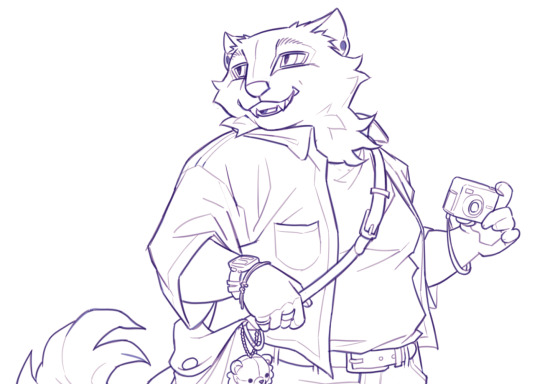
You can stop there but I like to add some kind of color filter top of that. My favorite way is make a solid color layer on exclusion mode above the lines > merge all visible layers on a new layer > set this to "color" layer mode so it colors all the lines underneath, but there's a lot of ways you can do similar stuff. I think a gradient map would probably be easier and give you more control for a similar effect
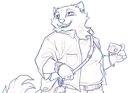
Then I add flats on a multiply layer above all that. TLDR I like to have variation in value of the lines and then vary the hue depending on the value. I don't have a method for how I pick the filters or line colors really I just play around with what I think looks nice with the colors of the piece 🫶

#my process basically involves redrawing over the same thing a billion times so if that's not what you're into this is probably not#the method for you LOL#ask#anonymous#long post
235 notes
·
View notes
Note
Hello!! I'm a huge fan of your art and I thought I would ask about your colorwork, because it's genuinely super impressive to me how all your pieces have amazing palettes and they add so so so much to the general atmosphere. Do you have any process to pick colors for pieces? Like using picture references, gradient maps, etc or do you genuinely just eyeball them? I'm super curious :]
But yea I really love what you do and love seeing every new piece!! Have a nice day! Ty for reading <3
Thanks! I very much use references, though I don't use the color picker on them, gotta train the eye. I have an ever-expanding reference folder of photos and paintings with colors that I like so that when I start a new painting and I have an idea of the color scheme I want in mind, I'll already have some reference on hand. Good reference really makes a world of difference!
I also like to bias colors a little bit away from their standard versions:
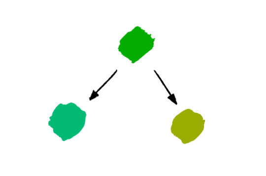
The more blue green and the more yellow green are both more interesting to me than the "just green" green. Nothing wrong with that average green though, sometimes that's exactly what you need. It's always situational.
Lastly, a fantastic color tip for digital art specifically that I got from Mike Hernandez: Use the RGB sliders instead of the HSB color selection!
By default, Photoshop gives you the HSB (Hue, Saturation, Brightness) color picking setup which looks like this:
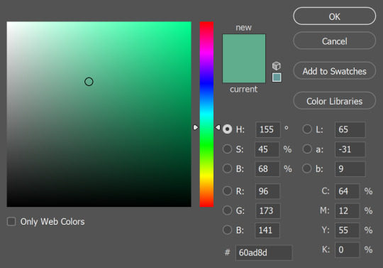
It's perfectly functional and has its uses, but it doesn't really feel like mixing color. On the other hand, if you use the RGB sliders:
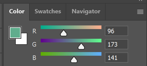
Now you can add a little more blue if you think that's what the color needs, or you can take away red, add some green, etc. It gets you actually mixing color and thinking more about how the colors relate to each other. It can take some getting used to if you've only used the HSB setup before, but it's worth it!
#and thank you for your patience!#I know this and other questions have been sitting in my inbox for a while#these past months have been the type where there was always something (or several somethings) just a little more urgent on the to-do list#and once again thank you so so much to everyone who has sent in kind messages about my work!!#it would flood this blog if I were to respond to every one but know that I do immensely appreciate every one#they absolutely make my day
237 notes
·
View notes
Note
How do you get that grainy texture on your art? It’s very nice!
thank you!! i love art that's soft and fuzzy...
i generally do it a handful of different ways, but i tend to bounce between a color noise filter layer in soft light mode, between 30% and 50% opacity,

... or i use something from my wide array of paper textures, and usually set the layer to overlay and play with opacity till i'm happy with it

......oooorr i do a combination of the two! which i did in the final version of this piece, which i Also added a gradient map to to make the colors a lil more ✨Dramatic✨
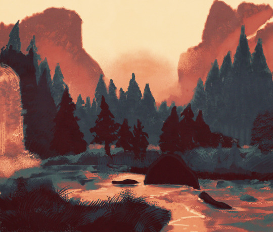
here's where i got (most of) my paper textures and here's a rainbow color noise texture (that i don't personally use but looks rlly similar!)
#i actually use a color noise filter from a VHS auto action set i used to use on my VHS icons. if yall remember those#my art#ask#tutorial#i guess??#idunno#if you have more questions feel free to dm me! i love clip and i love to teach ppl abt all its cool features#dinosaur#since i prolly wont seperate post my landscape study tht i threw a spinosaurus on
105 notes
·
View notes
Text
hi everyone!! my wrist is too sore to draw today, so instead i thought i'd share some of my favorite csp assets + how i like to use them! i also linked some procreate brushes at the end of the post!!
lineart brushes:
SU-Cream Pencil: i swear by this brush and i use it very often!! if you lower the pen density and use a gradient map over it when coloring your drawing, it has a nice effect. that's what i did in this drawing here! i also use this brush like i would draw on paper, so as a sketching tool. recently i've been enjoying blending it for shading. the pics below are drawn on one layer; left is more manga style while the one on the right is from a WIP of my singer sargent study, so it can be used for more realistic styles pretty well!


Found Pencil: another pencil brush that feels really nice to use, created by @/pigpenandpaper.
PS style brushes: a recreation of photoshop's (i believe) default brush. very versatile and also blends well!
analog wind variant pen: a nice pen that i like to use for lineart that is intended to have a bit of a sketch look.
zakutoro real g-pen: i used it for the lineart of this piece. although, it was drawn before i started using 600dpi in my works, so the lower resolution might make it look a bit unclear.
sets of rough pens: great for manga lineart with a rougher vibe; some of them have varying line weight.
coloring brushes:
zaku brushes: very nice and painterly mixing! i definitely recommend it for those who like to leave their colors a bit unblended.
softie marker: as the name implies, it's very soft! i like to use it for blush in chibi illustrations.
analog watercolor brushes: realistic-looking watercolor brushes. i recommend using it with csp's default paper textures, or those i linked below!
993 coloring pen: it's very soft and watery, though it can be made more solid by adjusting the paint density. i actually think it works very nicely for lineart too.
rock dog pen: another soft marker brush i like, that i once again also use for lineart and doodles.
thick coating brush set: recommended for paintings that show brush strokes.
cartoon cloud: don't let the name narrow your vision!! this has to be one of the BEST brushes for painting in my opinion, and of course it's great for clouds and explosions but so so much more!! and it's FREE try it try it!!
decoration/miscellaneous brushes:
neon pen
paper textures
symmetry move brush
close and fill without gaps
rope brush
sphere fisheye guide
flash balloon
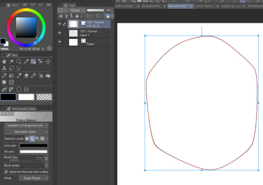
speech bubble set: a lifesaving collection for comic artists!! dimensions and line weight can be adjusted by using the operation tool.
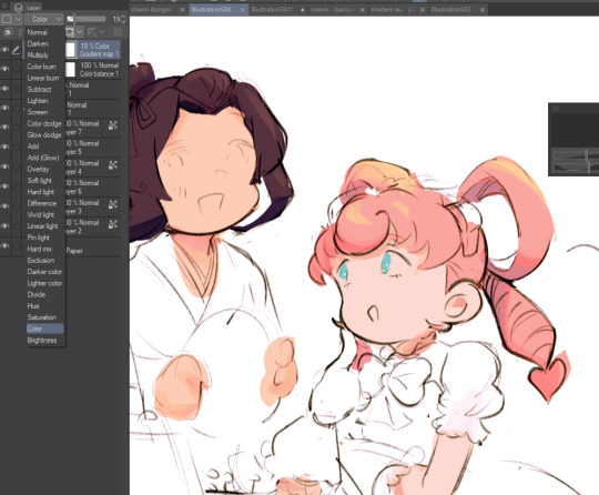
gradient map to use in color mode at 15% and another gradient map to use at 20%: the percentage refers to the opacity of the gradient map layer, but they are just the creator's recommendation and i tend to actually increase it. to use gradient map efficiently, i recommend putting all your colors (and lineart if you want) in a folder. then, right-click the folder, select "new correction layer" and then "gradient map". this allows you to modify the gradient map without worrying about affecting the original colors in case you decide not to use it in the end. to import a gradient map from your downloaded csp assets, click the wrench icon next to the name of the gradient set that's currently in use, then select "add gradient set".


you'll also notice that the creator recommends to use their gradients in "color mode". of course, this is also only a recommendation and i suggest trying as many layer modes as you like! to change a layer's mode, simply highlight the layer and click on "normal" (the default mode) and csp will display the available modes.

fruit ninja gradient map: fun to use if you want really drastic/vibrant colors! the names of the gradients are cute too, as you can see in the above screenshot!
BONUS: jeremy fenske's free photoshop brush pack: these aren't csp brushes per se, but they can be imported into the program! excellent for environments, i recommend watching fenske's video on how he uses the brushes to get a clearer picture since there are so many in this pack!!
BONUS 2: my good friend clem has a few brush packs for procreate that are ideal for painting,decorating drawings, and y2k-inspired illustrations, i definitely recommending checking out her shop!
in conclusion i hope this post can be helpful to you!! i tried to explain how to use the brushes as best as i could, but feel free to let me know if anything is unclear!! i hope you will enjoy using them! :D
#clip studio paint#clip studio paint brushes#csp#csp brushes#procreate#procreate brushes#brushes#tutorial#art tutorial#sort of hehe
153 notes
·
View notes
Text

(Click the image for better quality)
Yipeeee that Keiki and Mayumi fanart I posted the WIP of is finally done woooo- This piece was a very experimental one that I'm kind of OK on. Maybe because I've just gone insane looking at it for so long and I'm my own worst critic lol.
Artist's Notes;
So I've once again been playing around with my rendering style, mainly because I have been wanting to improve my lighting for a while now and as I was just scrolling through Tumblr, I saw some of the official art for that one webcomic-turned-animated-TV-Show Lackadaisy and was immediately inspired. I also have seen a technique a few times in the past where the lineart and shading are merged together, so I've been meaning to try that for a little while.

I did some experimentation on this one sketch of Keiki I posted in my sketch dump and I really liked the results of it, so I carried those over to this piece.
I ended up scaling up Keiki and Mayumi from the original WIP because I felt like they were both getting lost in the composition, and I'm glad for that because I think it works a lot better. I'm not a fan of how Mayumi's sword turned out at all, but it's not really meant to be the focus of the piece so eh. Overall, I think I could do better with my colours, probably because with Keiki and Mayumi's colours, I did them flat in greyscale and then used a brush on the overlay blend mode to colour all of them over, after which I changed the base layer for their colours from white to yellow and then lowered the opacity so it all went together better. I also decided to use gradient maps for a lot of the background elements, mainly to experiment with getting in my values first to make them pop out more. I ended up finding a really nice sky gradient on Clip Studio Paint that I really liked, and that kinda helped to establish the colour scheme of the background a lot. I think the whole "start in greyscale then colour" thing really works better with painterly styles rather than more illustrative ones, and while it is good at making sure your values are more readable, I honestly don't think I have the skill level to pull that off yet. Honestly, I think I've been looking at this drawing too long or maybe I added too much to it, but I wish I could've made the colours less monochromatic, but I'll just save that for the next piece I do.
I do love how the flame (...well it's more of a weird space rift than anything in this piece) and the lighting turned out, those were fun to do. I was initially struggling with the flame and how Mayumi is positioned in front of it before realizing "Oh wait! This is a weird abstraction of a weird creature! I don't have to follow the laws of anatomy!" and just dislocated it's flamey bottom jaw from the main body. I also changed the colours of it since I was really not liking how incredibly bright it was when it had lighter colours. Again, the gradient maps served the more painterly style of the flames well.
I also love how Mayumi turned out. I could do her sleeves better but that's more of just me needing to study how those types of sleeves fold in that position more. I'm also very happy with the posing, the technique I used for that was taking photos of myself in the positions I wanted, blocking in the silhouette and then modifying that by adjusting it to my lines of action that I drew on top of the original photos, and then sketching over the silhouettes and drawing in the shapes of the hands overtop of the photo if I needed to get the fine details right. As for what I do to take the pictures myself, I use a tall chair I have, prop up my phone with a phone stand, put on a ten second timer and scramble to get in position. Yes, I did have to use a bunch of thin markers I had to try and get the hand positioning on Keiki's pose right, yes I do have a fake sword that I used to get the positioning of Mayumi's arms and hand right, the sword was for an old Halloween costume from several years ago. I really like how both Keiki and Mayumi turned out in this drawing, I'll have to play around with these designs for them more in future drawings.
Also, if you wanna know why I draw buildings like that, when I watched Fantasia 2000 as a kid (One of the Disney movies where they make really beautiful animations to classical music) the way they drew the buildings in the first few sections Rhapsody in Blue segment (the jazz one with the cities) changed my brain chemistry and now whenever I need to draw buildings really quickly, I refer back to that. Since the buildings aren't really the main subject, I didn't put much thought into them.
As you can tell I am very tired of this piece, mainly because I made things harder for myself by overcomplicating the process compared to what I usually do, mainly with the whole "starting in grayscale then adding colour." I'd honestly just prefer having a black layer set to colour that I can just toggle on and off when I need to see the values, but it was good to experiment. And that was mainly the point of this whole drawing, to experiment. I'm definitely going to have to play around with this new style I'm going for, mainly because I liked how it turned out a lot in the augmented Keiki sketch, and also because I want to find ways of making it suit my style more. I also really want to keep experimenting with my lighting like this, it's very fun. Last but not least I am never starting in greyscale again because dear god I do not like the workflow it forced me into. I don't have a problem with the method itself it's mainly just a skill issue lol.
If you wanna read my headcanons for these two, I put them in my WIP post, so you can read them there if you want to. The more I look at this the more I prefer the simplicity of my WIP. I might go back to this and just take away the fancy colours and effects to see what it looks like without all of that stuff and reblog this post with that drawing, but for now, I don't think I can look at this drawing again for a while.
#touhou project#art#fanart#touhou fanart#touhou 17#wily beast and weakest creature#keiki haniyasushin#mayumi joutougu#haniyasushin keiki
116 notes
·
View notes
Note
Oh hey you use medibang? That's awesome! I miss using it, had to buy clip studio since it refused to work on my pc after my laptop died
Amazing art, I adore how skrunkly you draw everyone!
I used to use Photoshop before I realized/got fed up with just how insanely abusive their subscription service is. I used MediBang before it and I now use MediBang after it! (The blending brushes on Photoshop were so nice but I never should have left.) It sucks your computer didn't want to run it anymore :( But any one-time purchase of software sounds like a good deal to me! FireAlpaca is a good substitute for MediBang but with rudimentary 2D animation capabilities on top of it. I actually downloaded it recently for the animation part but IDK if I'll ever get back to it haha
Funnily enough, MediBang is currently selling a different version on Steam for like 70 bucks and the onion skin/animation stuff looks like the main attraction for purchasing it (also gradient map but ignore that), which is just wild to me when FireAlpaca exists and does the same thing for free
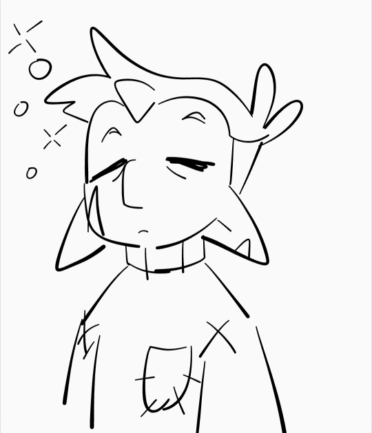
Anywho this doodle was made in my notes app hahaha. He is eepy! Skrunkly and eepy! I hope Clip Studio works well for you :)
99 notes
·
View notes
Text

…make a psd?
this is a question i get pretty routinely, and i’m going to tell you upfront: there is no one way to make a psd. there’s no ‘better’ way, no ‘easier’ method, you just have to figure it out yourself.
with that said, this post is going to be how i, personally, make my psds, just for the sake of reference. my way isn’t better or worse than anyone else’s—it’s just the way i do things ¯\_(ツ)_/¯
i. making a showcase/moodboard
depending on the psd you want to achieve, your moodboard will probably look different—if you’re making a blue psd it will be mostly blue, if you’re making a psd based on a certain character or card set it will be based around that, etc. i made myself a general showcase that i test my psds on that includes both irl images and darker skin characters, because i like for my psds to work for those purposes most of the time. my showcase is below if you’d like to use it!
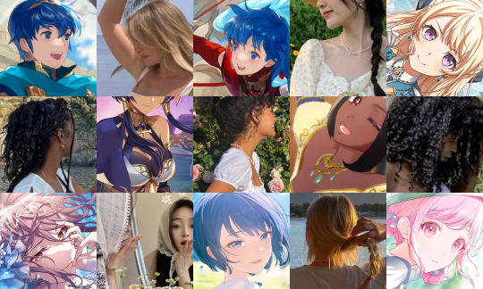
it’s best to include sources you edit frequently so you know what works on them and what doesn’t but how the moodboard looks exactly is up to you ¯\_(ツ)_/¯ i also recommend using swatchies (original by zeroresources on d*viantart) as long as you bear in mind that swatchies is not a great guideline for actual dark skin
ii. creating the base
actual step two is creating a folder but that takes like two seconds. do make a folder though or you will be sad.
after making a folder, start making the base of your psd; whatever the foundation is going to be. depending on how you want your psd to look, this will look very different. i personally always start off with a gradient map, just to get things going
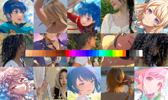
my settings for this are the default black and white gradient map set to reverse, and it’s set to blending mode soft light at 35% opacity. i typically do something in the range of 20-45% opacity depending on how i want it to look
i’m honestly not sure where i picked up this habit but it does make it a little easier to get things going for me personally. it’s a simple change but it’s a good start. if you want higher contrast you can do the same thing but without reversing the gradient map
next thing i do when creating a base is add a selective color layer, which helps things pick up the pace. i’m too lazy to write it all down but these are my settings:
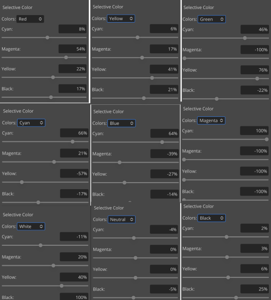
worlds ugliest collage so i don’t max out my images LMFAO apologies. obviously depending on what colors you want to focus on this will look different. for this one i completely axed magenta and emphasized blue and red/yellow. i also maxed out the black in white, which is extremely typical in my psds. this is what our psd looks like now:
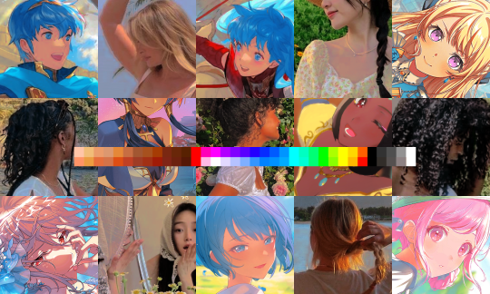
pretty different already, right? nice!
next thing i typically do is another selective color layer. it’s typically pretty similar to the first, but once again that depends on the psd! the worlds worst collage again:
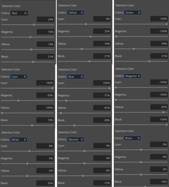
pretty much the same but a little different. and our results:
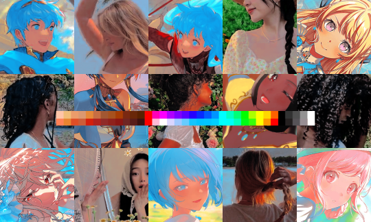
as you can see, this is pretty saturated and a little all over the place. not to worry—let’s move onto the next step!
iii. let’s get serious
this step varies a lot depending on what my psd needs, but because this one is pretty sayurated right now and that seems to be my main problem, i’m going to add a photo filter in a light grayish-blue to help desaturate and cool it down
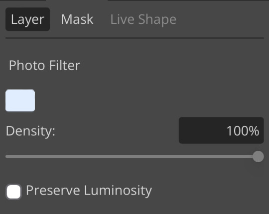
(i unchecked preserve luminosity here because i think it looks neat. i don’t recommend doing that if you’re using a darker color bc it gets hard to see, but you can do whatever forever)
obviously this isn’t the only way to desaturate but i find it fun. observe:
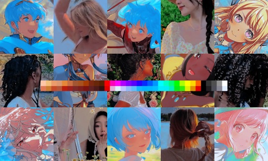
definitely better, at least to me, but still not great. we’re going to add another selective color layer bc the skintones look kinda wack. welcome back world’s worst collage:
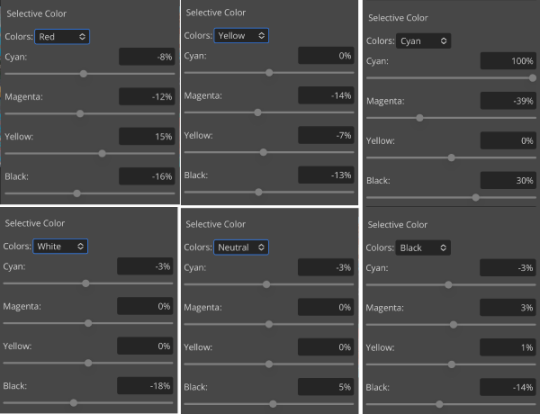
i only adjusted some of the colors in this one because i wanted to fix specific problems; namely that the darker skin tones were too dark and ashy.
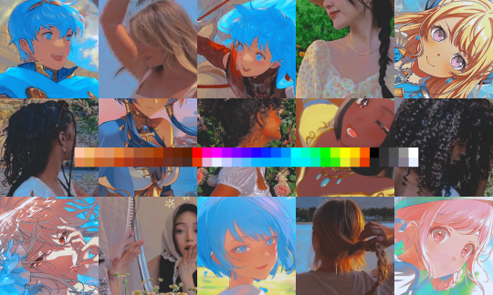
mission accomplished
with that done, it’s time for hue/saturation! for funsies ദ്ദി(˵ •̀ ᴗ - ˵ ) ✧ this part i just had some fun with. a new collage:
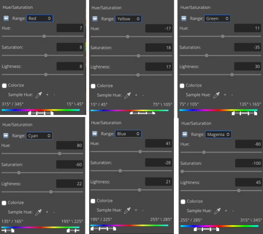
and the results:
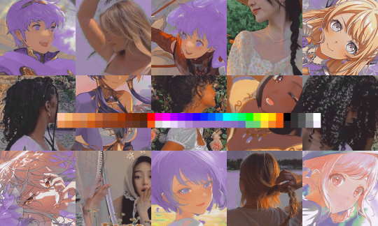
purple! this wasn’t what i originally had in mind but it was much more fun to do tbh LMAO i decided to turn the cyan/blue into purple because it looked better in my head
iv. okay now get silly again
now that the main meat—so to speak—of our psd is done, we can add some fun layers. if you want ideas for this, i have a post about it, but what i’m gonna add as my first silly layer is channel mixer, which is one of my personal favorite layers
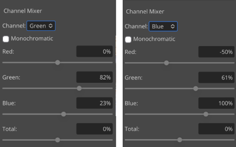
pretty simple adjustments for channel mixer honestly ¯\_(ツ)_/¯ but i thought this would look fun. as a general rule of thumb i don’t mess with the red channel so much because it tends to screw over my skintones, but, as with anything, you’re free to do whatever forever
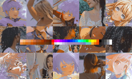
next fun layer i’m gonna add is a noise gradient map, also just for funsies
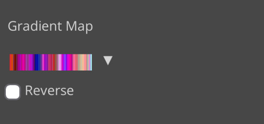
i randomized until i got a nice pink-ish kinda one. i was hoping for blue but all the blue ones were too green and i got impatient LOL
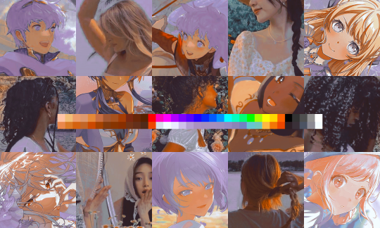
a little fucked but for sure fun. i set the gradient map to soft light at about 15% opacity. it gave the psd a fun texture and a bit of extra warmth
v. finishing touches
sometimes i add a couple more layers, sometimes i add less, but this psd feels about done so imma wrap it up. i typically don’t save my psds as the showcase for my storage’s sake, so i’m gonna grab something to use as an icon. i typically go ahead and size it at about 300x300
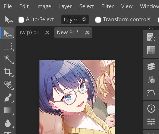
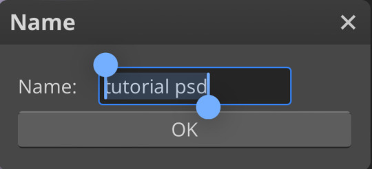
hello, haruka! once i have my icon set i duplicate the folder into the new project and name both the project and the folder. how you name it is up to you, i usually either use a random word generator or just whatever comes to mind. in this case, i’m just naming it ‘tutorial psd’ lol

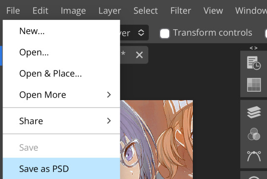
then go to file and save as psd, bada bing bada boom you’ve got a psd ☆〜(ゝ。∂)
as i said at the beginning, there’s no one way to make a psd. this isn’t the only process or even the best one, it’s just how i personally work. the best way to make a psd on your own is fuck around and find out <3 canarysage out
…so that’s how you do it.
P.S. the psd i made here will be posted under the tag #tutorial psd. you’re free to poke around in it and use it as per usual. if you want to copy it, feel free, but don’t claim it’s your own or repost it as your work. thanks!
P.P.S. wondering about adjustment layers? see photopea for dummies. wondering about something i haven’t covered yet? shoot me an ask ദ്ദി(˵ •̀ ᴗ - ˵ ) ✧
75 notes
·
View notes
Note
hello!! this isn't a request but rather a question - do you have any tips on making layouts like you do (not in the literal sense, but when it comes to making layouts in general ,,)? i usually struggle to make the coloring look good/fit the theme, and i can't seem to find any good pngs to use ,,,
you're not obligated to answer this, by the way!! and thank you in advance!!
Generally, I'd say to collect a bunch of resources you can use, like PNGs, laces, colouring PSDs, etc. You can find a bunch by browsing related tags here on Tumblr ( ie. [aesthetic] png, rentry png, [colour] png, etc. ) or on Pinterest by searching similar things and things like [aesthetic] frame, [colour] frame, rentry frame, rentry resources, etc etc. You can also look on sites that have a bunch of free use PNGs, vectors, etc ( though I'd highly recommend having an ADblocker and popup blocker ). I have a large collection of random things I use and it helps a lot!
I don't have many tips for making layouts since I honestly just mess around a lot until I get something I like, so I'd say just play around with placement and combining things until you get something you think looks nice! Trust the process and just have fun with it, if something doesn't work out, that's fine too! The important part is just having fun with what you're doing, it's a hobby, not a job you're forced to do.
As far as colouring goes, it's just something you learn as you go, I think. I'm still not terribly good at making colouring PSDs and I've been editing for over a year now. You can always search DeviantArt or Tumblr for colouring PSDs by searching things like 'free psd' or something.
Some sites you may find helpful: da-lace : has TONS of laces, you can navigate via the shapes at the top or by category on mobile I believe. vecteezy : tons of free to use downloadable PNGs, vectors, etc. pngtree : ^ same as above, I'd recommend an adblocker / popup blocker. gif editor : does cool gif effects remove gif bgs : what it says. gif effects : can do fun stuff with it but it adds a background.
More specific sites: barrachiverio : custom error message PNGs. gradient maps : what it says.
I hope this helps you out a bit, happy editing!
67 notes
·
View notes
Note
how to make. comic
Step one after coming up with a really epic idea (aka daydreaming for hours on end) write it down and doodle it really shitily in your notes
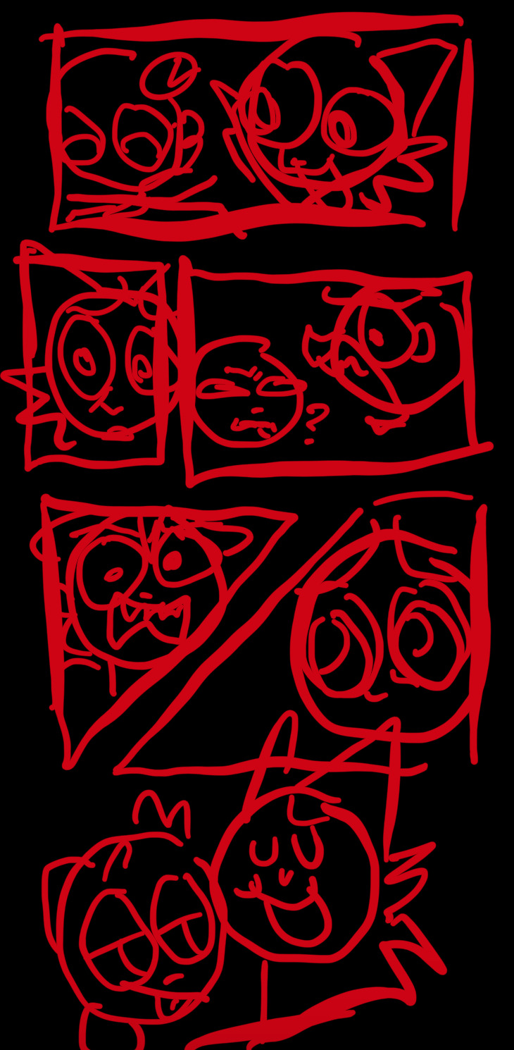
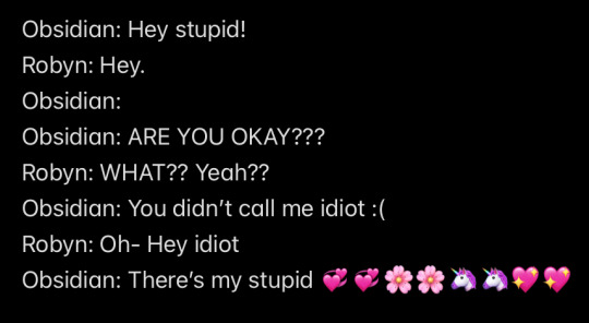
Step two forget about it for months on end before making it (I have so many random comic ideas unfinished) (this is why you write it down before hand)
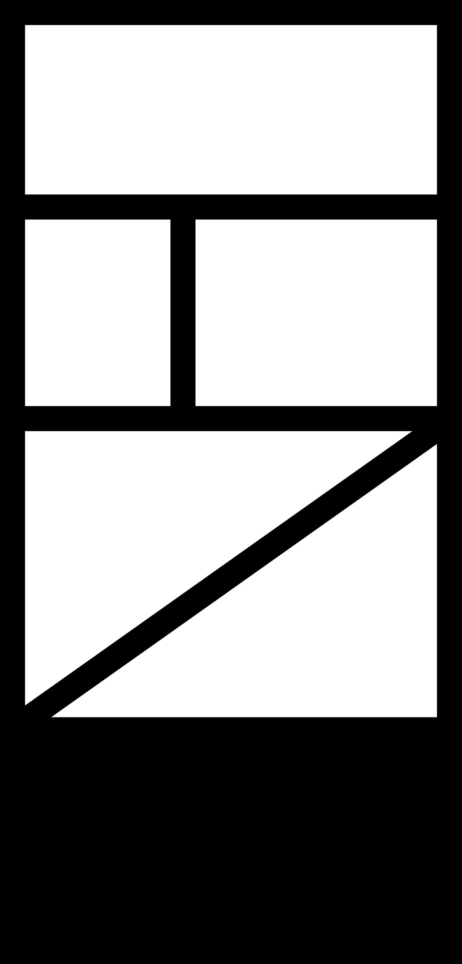
Step three finally get your ass up and make the sketch 💞💞 Step four spend way too much time making the panels because they HAVE to be perfect for some reason (or else I’ll freak tf out and die /j)
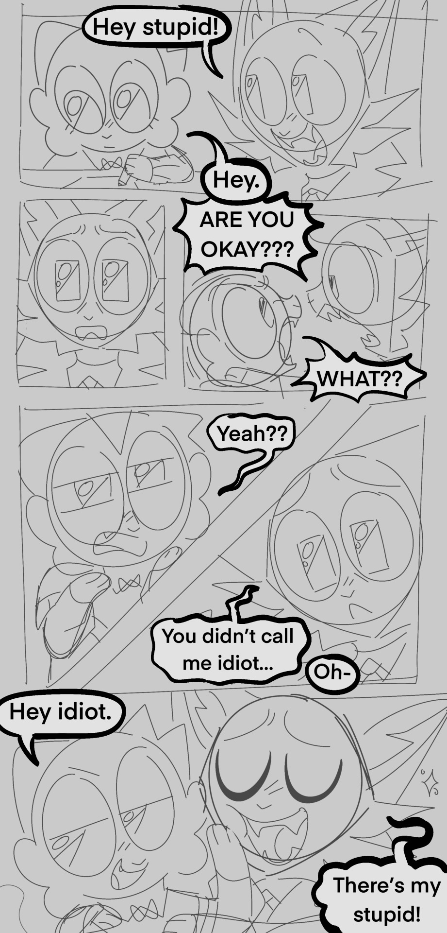
Step five and six make the lineart and coloring, and then add the speech bubbles, this is where you can tweak the wording and or change where the speech bubbles go (mostly done so it flows better)
(Don’t be afraid to cover up your art with speech bubbles if needed, ik it kind of sucks but reading ability is very important in comics, and having your speech bubbles all wonky WILL turn off readers, no matter how good your art is)
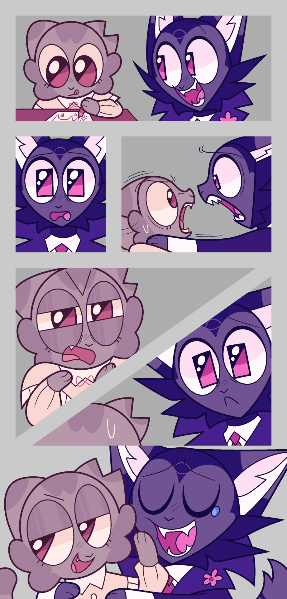
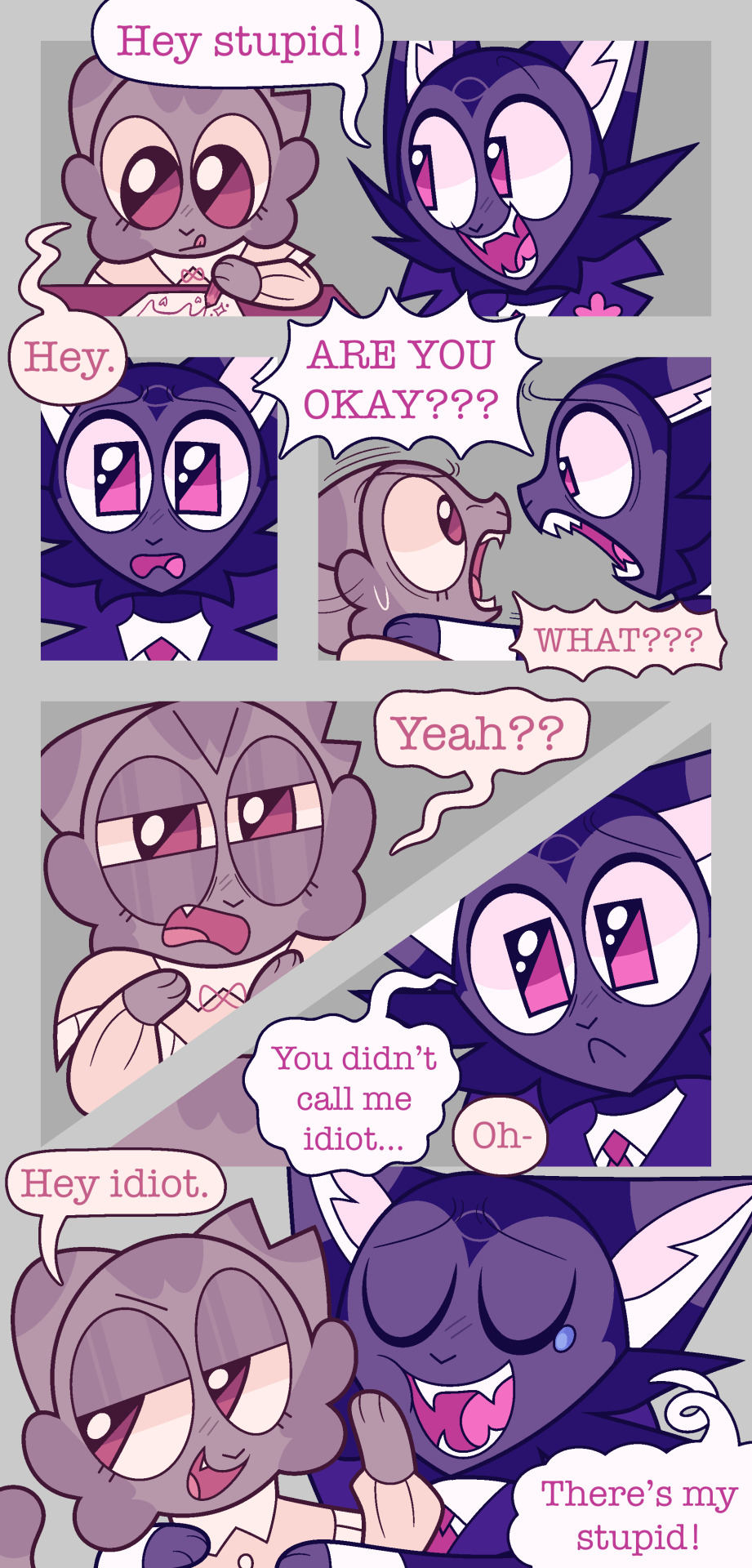
step seven make a REALLY lazy background because you do NOT want to do shit this time!! (Pretend they don’t have lighting on them I merged the layers 💖)
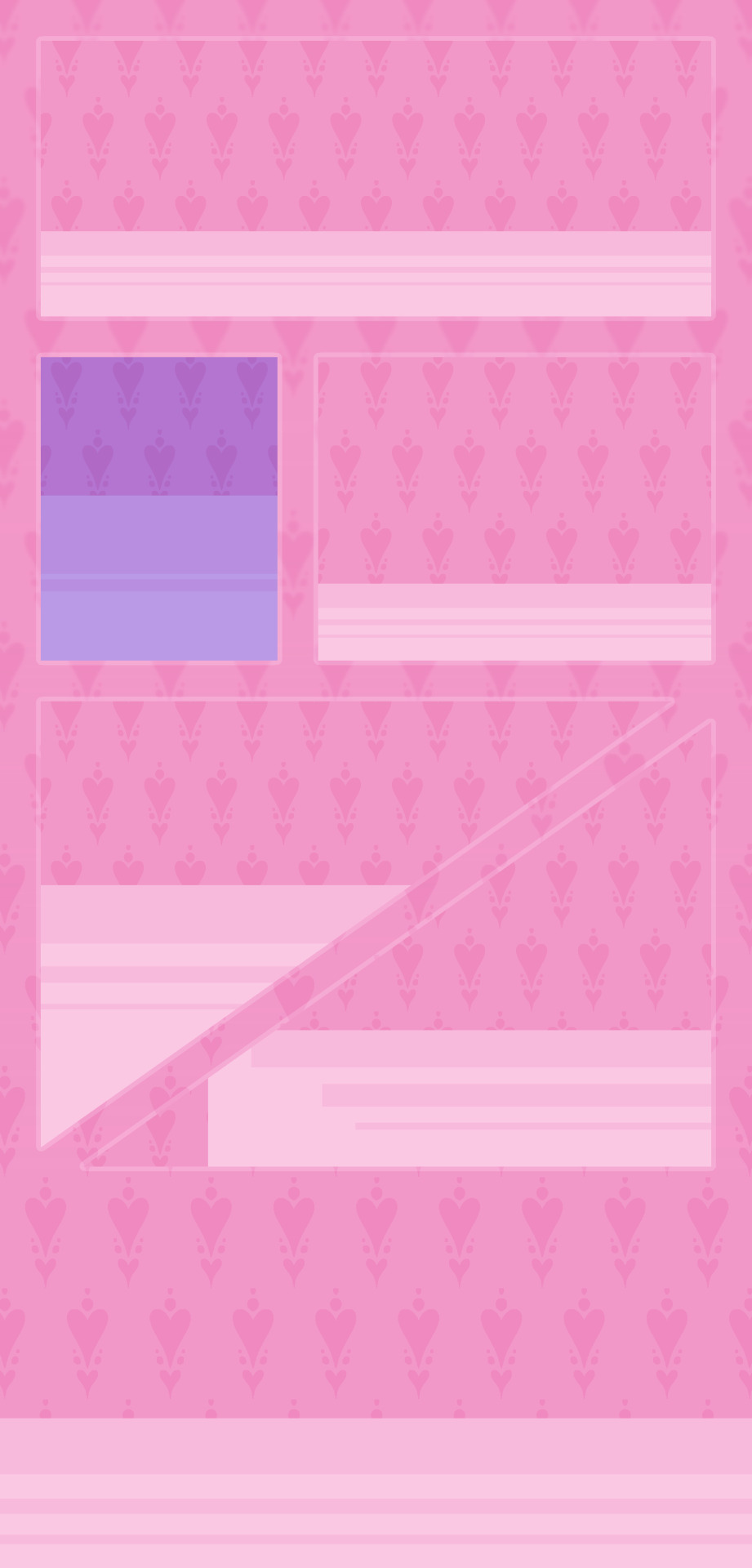
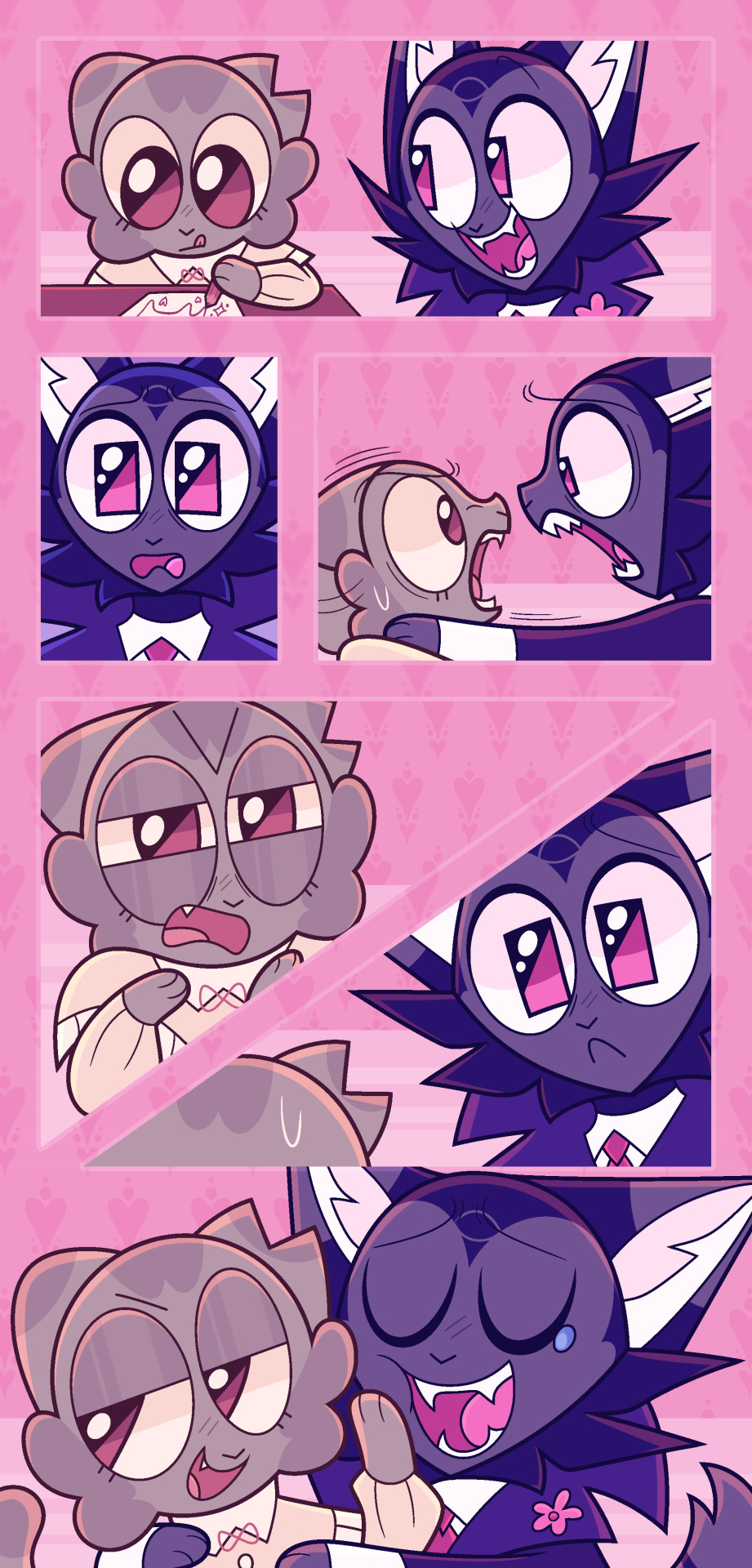
Step eight spend too long on rendering aka lighting and shading!! Step nine add more epic effects aka final touches!! This is always nice to do because it makes it look a lot prettier (like adding overlays, gradient maps, blurs, and noise… idk)
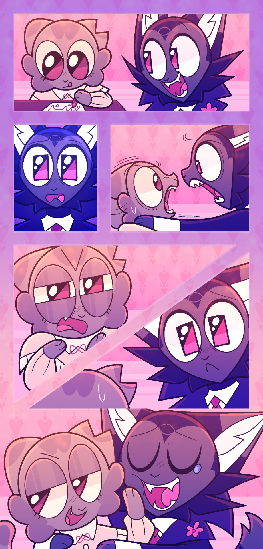
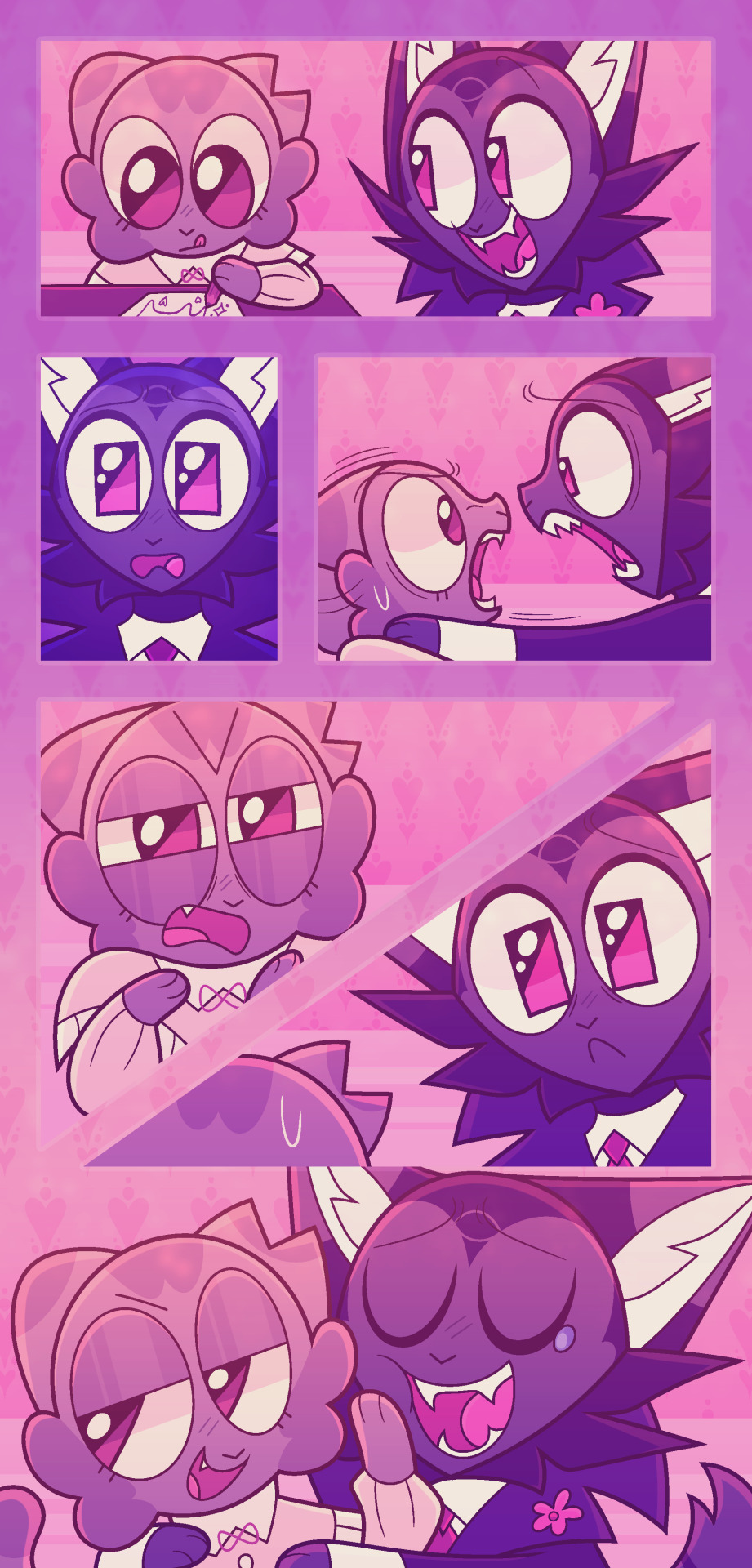
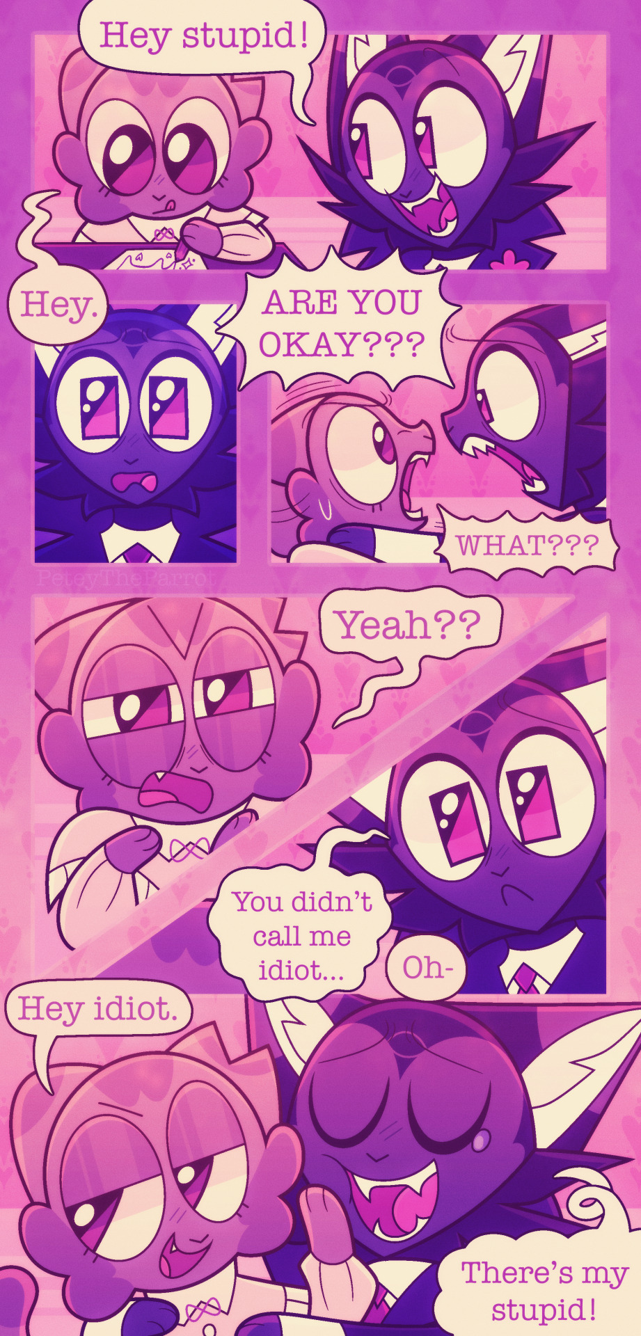
Andddd you’re done, I usually work on multiple comics at once because I CANNOT sit on one thing only!! Nuh uh!! Comics take fucking ages and will ALWAYS take ages so if you don’t have the patience for it I’m sorry bro 💔 you will not handle it 💔
Although! When I started making mini comics they took me like? 10+ hours but the more I did them they now take around 3 hours at the shortest. This one took 5 hours.
This is just how I make comics btw, most comics I see don’t go fucking crazy on the rendering/lighting/shading (usually on comics I see there is none tbh! And it works for them!) I’m just insane and like to make my comics look really pretty or else I’ll explode for some reason.
Also 😇 if you wanna see more comics of these guys go here for places you can read them at 😇
#Asks#myart#sorry I took so long to answer this anon (this ask is from November whoopsies 💗 I take ages to answer things but I’ll get to them#eventually lol)#UHHHH IDK IF THIS WAS HELPFUL I DONT REALLY HAVE?? THAT CRAZY OF A PROGRESS I JUST#WRITE DOWN IDEAS AND THEN DECIDE TO TURN THEM INTO COMCIS IF I HAVE THE TIME LMAO#comic#comics#comic tips#tips#tip#art tip#art tips#comic tip#comic strip
48 notes
·
View notes
Note
you’ve probably gotten this a hundred times (and I’m sorry if you have ^^’) but I wanted to ask about your brushes/resources! I’ve been astounded with your textures for a while and you’ve inspired me to texture up my art! agrghh your colour choices, your halftone use, your anatomy stylization and your rendering have me rolling over in my grave whenever I see your art. I’ll actually never get past the way you use texture! I’d be grateful for any resources you could throw out here, if you wanna - no pressure obviously, I’d be more than content just continuing to consume your art whenever it drops :> I’m curious about what brush/s that you use for lining and rendering, assuming you use csp. agrhgedsjk sorry for the ramble and request!

hello! sorry for the late reply, i've been incredibly busy with con prep as of late, but yes, i do use CSP! here's a little brush update.
for sketching, i primarily use this modified version of the default charcoal brush and i very often use it to color as well. this is typically the brush i use for flat colors and for textured paintovers. i used it to sketch the malevolent fanart above, as well as color most of the elements (except for the dark wash behind john) including john's face. i also drew this chibi solely using that charcoal brush:

i recently also found this set (ID: 2147968) of two textured brushes, one for color, and the other for blending. you can see them in the dark gray wash behind john in the drawing at the top!

as for my halftones, they come from my blending brushes! you can find those (as well as my tma inspired gradient map set) here, and i plan to update that page if i ever upload more.
i also used to use paper texture #5 from this texture kit. it's been a long while since i've used it on anything, but it can look really nice.
i would use it on procreate by merging the entire drawing to one layer, putting the paper on a layer below it, and setting the drawing to color burn(? it's been a while) and then messing with the darkness on that layer until the colors look how i intended them.
i suggest messing with paper, canvas, and paint textures with layer modes in general! pixelbuddha is a great place to find free textures that work really well for things like this.
41 notes
·
View notes