#bring back uc designs neopets
Explore tagged Tumblr posts
Visit Tumblr Blog
Explore Tumblr blogs with no restrictions, modern design and the best experience.
Last Seen Tumblr Blogs


Fun Fact
Tumblr has been banned in Indonesia for providing people with access to pornographic content.
Text
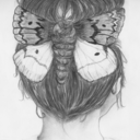
for anyone who is confused. this is what I mean when I say I want old neopets back:

reject modernity
return to tradition
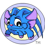
#neopets#neopets uc#bring back uc designs neopets#undescribed image#the fuckin gob on this lil monstrosity#I love her#Acara#their lil floppy horns still wig me out a bit tho#ye ok this isn't the “true of design” but it was the first one called acara which overnight replaced the tigrens which looked sikly qtπ#like seriously. didn't even look like a goat.. it was a foxbear lookinthing with seahorse ear fins and enormous round eyes with a heart-nos#they did it on purpose#glorious trolls#twas the plan all along#the floppy horn thing wigs me out a touch tho ngl#imagine it running at you with those waving in the wind smakin eachother to assert dominance#big spooks#bet it originally ran like a crab. the second acara pic not the lame tigrens
2 notes
·
View notes
Note
have you done a Grarrl review yet?


The Grarrl is a t-rex, and...well, that's pretty much it. It has all of the standard t-rex features: sharp teeth, reptilian eyes, and small arms. They're fine, but it doesn't feel like there's a whole lot with the base color that really makes them stand out outside of just having a lot of teeth compared to other Neopets (Poogle and Jetsam not withstanding).
I feel like part of the issue is that the Grarrl's body is completely solid in color by default, with no patterns or markings to break it up. Given their prehistoric status, I feel like stripes or speckles would've made sense; just something to break up the body and give them a tad more flavor. As is, all we have are the teeth and the green eyes with red pupils (which tend to be consistent across most, but not all, colors).
Beyond that, the base colors are alright, though for some reason the blue barely has any shading and the yellow is this off-putting dirty "mustard" color.

While the Grarrl's design has always been plain, I do think customization did them extremely dirty. Instead of being allowed to keep a more vicious expression, the Grarrl was instead saddled with an awkward smile that makes them look like they're posing for school picture day. In contrast, the old Grarrl's art gives them a big open mouth and allows them an angrier expression, which both looks much more natural and gives them a lot more personality.
Favorite Colors:


Maraquan: One of the only Grarrl pets that wasn't saddled with an awkward smile post-conversion, the Maraquan Grarrl is one of the best-looking Grarrls out there. Making a t-rex into a shark for the aquatic color works perfectly as a concept, and the execution's really nice; adding a very neat-looking ridged back fin and horizontal tail that sharks don't usually have, and fixing the plainness of the default Grarrl design by adding in a mottled white underbelly with small teal accents.
Neither version is terrible, though the UC/styled design is the better one—the fins aren't being forced into a fist, the colors aren't as over-saturated, and the tail fin shape looks a lot better (it's supposed to have a hook-like shape, not have a random spike coming off of it).


Halloween: Not only is a vampire a good choice for something with sharp teeth, but I really like the colors here; a very light minty body is contrasted with black and red accents, which makes it look both pale but also provides nice contrast without being too monotone. The cape also adds just the right amount of detail without being overly busy or detailed. The expression and mouth on the converted version, while still not as good as the old art, does look a bit more endearing and less awkward than usual, and I really wish they had used that mouth shape for the default Grarrl.
As of writing, there's only a "spooky" style instead of an actual nostaligic style that matches the old art, but reguardless it does look very nice. I like the pose and expression a lot, it brings back the black clasp (which was made blue for some reason during conversion), and I like the addition of the claws on the feet. Only complaint is that I wish they had given it darker eye bags, which were present both on the original art and the converted art.


Faerie: The faerie Grarrl having feathers is interesting, because feathered wings are usually restricted to avian Neopets; but then again dinosaurs are birds, so this is actually pretty clever. The orange, pink, and yellow palette looks nice, and I really like the speckled markings here and the addition of horns and dragon-like whiskers.
Unsurprisingly the UC/styled art is better, though I will say the converted has slightly better wings; I can't quite figure out the perspective on the original art. That said, the original art's head shade and expression look 10x better so you know, pick your poison.
33 notes
·
View notes
Note
since u reviewed the other three dragon neopets, maybe you could review the draik next? it's one of my favorite neopets!


Draiks are one of four (4) dragon Neopets, which is entirely too many. Despite coming last however, it does feel like they're one of the more memorable dragon designs on the site.
Part of the reason for this is that Draiks are restricted Neopets, which is a fancy way of saying that you can't make them through Create-A-Pet the way you can almost every other species. Instead, you have to either use a morphing potion or get a Draik egg item and bring it to the Draiks' Nest page. Thankfully TNT has made Draiks much easier to get over the years due to wide releases of morphing potions among other things, reducing them from an elite status symbol to just a somewhat less common pet with a neat gimmick.
The other reason is that Draiks have an usually slim and detailed design for Neopets. There's no hard rules for Neopets, but they generally skew towards thicker and almost chibi-ish in terms of proportions—think like the Scorchio. The Draik's slender body stands out amongst the more standard dragon designs, as does details like the subtle speckling. It also helps that they have a lot of really good colour options.
Base colour wise, the light grey accents work well as they blend with any given color and don't overpower the design. The color distribution is also very good, with the large swaths of grey used on both the underbelly and on the wings and ear fins. Meanwhile, the eyes pop due to a combo of red and yellow.
Visually, I also really like how the little whiskers by the mouth are matched by ones on the head (which are missing from some colours?) and the ear fins, and how the fins mimic the shape of the wings. It feels very well thought-out and cohesive.

Draiks were improved greatly by customization and I am prepared to die on this hill. The old art had such a weird expression, like it just accidentally dropped your iPhone into the pool and is trying to figure out how to gently break the news to you. The way everything is cluttered towards the center of the body also makes the silhouette very hard to read, and the red head hairs ruin the cohesion thing I mentioned earlier. The tail standing is sort of neat, but unlike Meercas I don't think think they've really ever done this outside of the original pet art.
Favorite Colours:


Maraquan: A particularly pretty design, the Maraquan Draik looks a bit like a lionfish crossed with an eel. The whit base with the orange and magenta accents looks really nice, and the subtle changes to the design—one back fin instead of two wings, fins around the tail, long whiskers—feel appropriately aquatic but keep the species recognizable.

The converted version is very similar to the UC/styled version, just flipped. However, it always felt subtly off to me, and after some investigation I've figured out that it's because, in addition to shorter whiskers and a slightly smaller head, the head isn't turned enough relative to the body so it doesn't quite connect right. It's a minor thing but it low-key drives me nuts.

Chocolate: The chocolate Draik, while not necessarily unusual for the color, looks really nice. I love the use of wafers for the wings and fins and the subtle cracks. The white chocolate parts add nice contrast and the chocolate topping and whipped cream add some nice finishing touches.


Mutant: The mutant Draik has much more realistic dragon-like proportions than usual, which makes it look particularly different compared to the usual delicate design. I do think it looks more zombie-like than mutant-like due to the exposed brain and ragged wings (plus the base anatomy remains unchanged), but it's still a good design regardless.
Both versions are fine, but the UC/styled one is just a superior take overall; better shading and beefier proportions in things like the tail and arms, plus the cool tongue. I honestly don't know why they changed it, seeing as mutants can't wear clothes and nothing significant changed; it's like they didn't have vector files so they redid the entire thing instead of properly redrawing over it.


BONUS: Speaking of Draik colors that got butchered in conversion, the Tyrannian Draik is a travesty. The UC/styled design has a triceratops-like head crest, which works because the head is incredibly flat. I get that there was no good way to convert it, but maybe just... don't, then? Regardless, the original design is great. I really details like the banding on the feet, hands, and nose horn, the subtle speckling, and the nice brown/greenish-grey contrast.
31 notes
·
View notes
Note
For neopet's review's would love to hear your thoughts on lenny's! I think they have some really nice color's


Lennies are one of many bird Neopets, but they do have one thing that immediately helps them stand out: their anatomy, which is more akin to a shorebird or emu than the standard songbird. Originally their head feathers were part of a jester's cap of sorts, and while the jester idea was lost over time (if it was even intentional to begin with), the distinctive head and tail feathers remain.
Color-wise they're about as simple as you can get, using one primary color with an accent (orange in the base colour, variable otherwise) for the legs and beak. They can get away with having no markings because of their very lean bodies, and the wings also help break things up a bit.

Lenny didn't really change in any notable way with customization, outside of becoming a little less excited and vaguely gaining a fist, which isn't too noticeable due to them having wings.
Favorite Colours:


Faerie: I really like how the faerie Lenny is vaguely based off a peacock (though unlike peafowl, this is a gender-neutral design), but it doesn't take it overly literally, serving more as an abstract reimagining. The Lenny's default three tail feathers are still there, but they've been made much longer and given a side span of other tail feathers to join them. They also have beautiful layered wings with secondary eyespots and much more pronounced head plumage than an actual peacock. The color palette is also beautiful, using blues, teals, and magentas together with lots of layering and markings. Really nice.
The UC/styled version is a bit better than the converted, as while both are similar, the converted inexplicably kept the three tail feathers where they are normally, along with missing the cheek feathers and slightly loosing the wing eyespots. Plus, of course, the pose is much nicer.

Burlap: The burlap Lenny was the first ever burlap pet, and was in fact the design shown in the "choose a new colour" poll that burlap originates from. I feel like over time this colour has unfortunately become too much like plushie 2.0, but this original concept is fantastic—ultra creepy, with dead black eye buttons, tattered burlap wings, and miscellaneous pieces of junk for the legs and beak. (The scrap metal in particular was completely lost over time for this colour, and is really something they should bring back in the fold.) Awesome option for people who like creepier colours (it's me, I'm people who like creepier colours).

Relic: Relic pets sometimes get way too overblown, but this one is really nicely balanced—just plain, nicely shaded stone with lots of little cracks. There's some moss, but it's kept to the minimum and is carefully placed in a surprisingly realistic way. The tail feathers are the real standout however; instead of making improbable thin stone ones, they're instead a few budding roses. Love it.

BONUS: The only reason the mutant Lenny is a bonus is because... it's not really that mutant-y? Like, that's just straight-up a vulture (reinterpretated, much like the faerie Lenny, which I always like). Even by Lenny standards, the only real differences are clawed wings, shorted legs, different tail feathers, and a single backwards-facing head plume instead of two.
However, technicalities aside, this is a gorgeous design. I really like the layered look of the wings, and I appreciate that it's not 1:1 a real vulture, lacking any pink or black in the design and having clawed wings. Artwork's the same as it was pre-customization, so it unsurprisingly also looks great.
44 notes
·
View notes