#boysen sans
Explore tagged Tumblr posts
Visit Tumblr Blog
Explore Tumblr blogs with no restrictions, modern design and the best experience.
Last Seen Tumblr Blogs


Fun Fact
China blocked Tumblr because of pornography and censorship problems in 2013.
Text

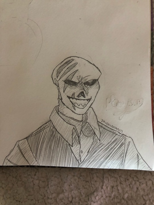
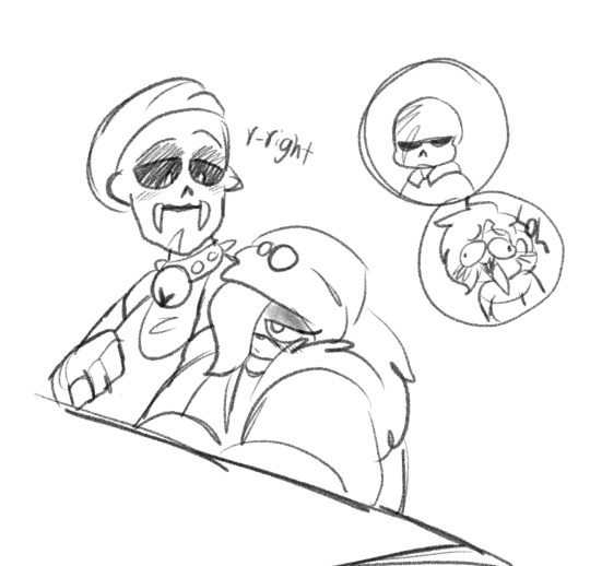
So a bunch of swapfells and fellswap did a drinking game-
Boysen by @mothiepixie
Helios by @kiok0r0
Noct by @hearty-dose-of-ranch
Captain by @alch3mic
Merlot by @smokbeast
#myart#fanart#utmv#utmv fanart#utmv art#swapfell#fellswap#fellswap gold#merlot sans#boysen sans#captain sans#helios sans#noct sans#lots of sanses#probably again not a good idea to put them in the same place
1K notes
·
View notes
Text


Some bitty doodles I did a while back
Boysen & Motti belong to me
Merlot belongs to @smokbeast
543 notes
·
View notes
Text

@/mothiepixie's boysen spraying crust with the hose beCAUSE HE STINKS!!!!!
both belong to moff pbbblt
#skelekins doodles#boysen sans#crust papyrus#stinky smelly#i forget the meme this is referring to#i think its a dog
25 notes
·
View notes
Text
fuckin love this man.
Boysen belongs to @mothiepixie
81 notes
·
View notes
Text
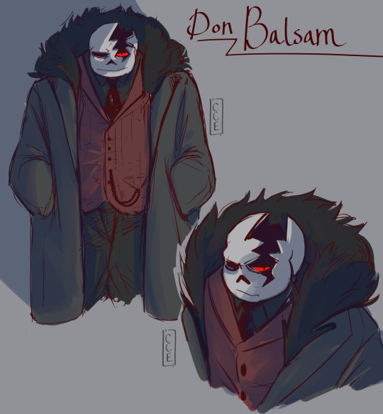
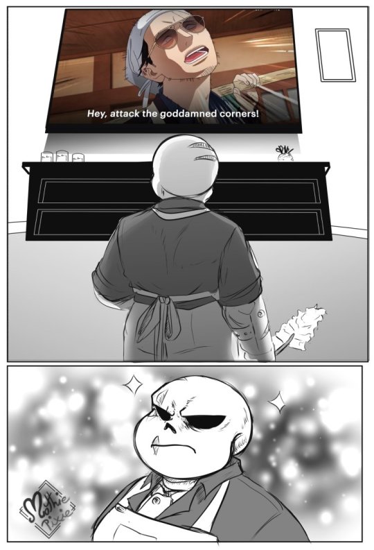
I drew this instead of eepin, because I got dragged back into the mafia verse (i could never run from the mafiaverse in the first place, thanks for the reminder Mothie lmfao) so now you guys get this delicious midnight snack.
Maybe I'll do a fun lil story to play on his character some hehehehehe
#my art#sans#sans au#undertale au#caycantdoodle#cay talks#lexverse#balsam sans#horrorfell sans#MHF Sans#is he like#how does this work LMFAO#Looking at boysen (by mothiepixie) and wondering if mine still counts#im gonna say he does#had more sketches planned but im so eepy#will take this man to my dreams tonight.#and for the peeps who like reading the fluff in the tags#He would ask politely to caress your hand and leave a skeleton kiss on your fingers#he'd be real slow and careful#then he'd offer to take you anywhere to eat#but he'd try to persuade you to eat out at a little hole in the wall diner that he finds comfort in.
691 notes
·
View notes
Text


Mind your fucking business, Boysen.
Boysen, Crust and Motti belong to @mothiepixie !!!
246 notes
·
View notes
Text
youtube
Comic by @mothiepixie
Boysen and Crust also belong to MothiePixie
How'd i do?
#tehrogueva#My voice acting#comic dub#my voice acting#undertale voice acting#umtv voiceacting#undertale au voice acting#swapfell sans voice acting#swapfell by moxie#boysen#crust#Youtube
149 notes
·
View notes
Text
U.S. daily precipitation records tied/broken 1/9/2025
Chugach National Forest, Alaska: 1.3" (also 1.3" 2000) Unincorporated Haines Borough, Alaska: 2.22" (previous record 1.52" 1944) Unincorporated Matanuska-Susitna Borough, Alaska: 0.3" (previous record 0.2" 2014) Sitka, Alaska: 1.31" (previous record 1.14" 1987) Tongass National Forest, Alaska: 6.21" (previous record 3.75" 1986) Tafuna, American Samoa: 3.18" (previous record 2.39" 1969) Castle Rock, Colorado: 0.25" (previous record 0.11" 1924) Unincorporated El Paso County, Colorado: 0.33" (previous record 0.32" 1962) Unincorporated Jefferson County, Colorado: 0.6" (previous record 0.11" 1993) San Isabel National Forest, Colorado: 0.4" (previous record 0.3" 2017) Unincorporated Custer County, Montana: 0.23" (also 0.23" 1983) Ennis, Montana: 0.16" (previous record 0.11" 1980) Unincorporated De Baca County, New Mexico: 0.42" (previous record 0.3" 1949) Unincorporated De Baca County, New Mexico: 0.65" (previous record 0.29" 1993) Unincorporated Quay County, New Mexico: 0.78" (previous record 0.3" 1991) Roswell, New Mexico: 0.36" (previous record 0.31" 2013) Unincorporated Socorro County, New Mexico: 0.27" (previous record 0.21" 2021) Truth Or Consequences, New Mexico: 0.1" (previous record 0.02" 1974) Dallas, Texas: 1.75" (previous record 1.4" 2013) Freeport, Texas: 2.24" (previous record 2" 1991) Galveston, Texas: 3.28" (previous record 2.08" 2012) Higgins, Texas: 0.6" (previous record 0.5" 1993) Irving, Texas: 1.53" (previous record 1.52" 2013) Turkey, Texas: 0.3" (also 0.3" 2016) Lebanon, Virginia: 1" (previous record 0.78" 1998) Beckley, West Virginia: 1.5" (previous record 1.1" 1935) Boysen State Park, Wyoming: 0.1" (previous record 0.06" 1993) Medicine Bow National Forest, Wyoming: 0.2" (also 0.2" 2017)
#Storms#U.S.A.#U.S.#Alaska#1940s#1980s#American Samoa#1960s#Colorado#1920s#1990s#Montana#New Mexico#1970s#Texas#Virginia#West Virginia#1930s#Wyoming#Crazy Things#Awesome
1 note
·
View note
Text
Ben Lukas Boysen presents: Alta Ripa
Smooth music for the travel life

Ben Lukas Boysen’s upcoming single “Alta Ripa” is the title track from his new album out November 29th via Erased Tapes, and it’s meditative, bubble of ambient warmth, highlighted by his subtle production flourishes.
The upcoming album is a seismic shift in the producer's artistic journey. It revisits the foundational impulses of his youth, shaped amidst the serene beauty of rural Germany—a bucolic backdrop where his creative palette flourished. However, it was his move to Berlin in the early 2000s that electrified his sound, infusing it with the city’s pulsating energy and diverse cultural influences.
Alta Ripa captures this transformative experience, blending the introspective melodies of his rural beginnings with the bold, experimental tones born from Berlin’s vibrant electronic music scene.
Listen Alta Ripa in YouTube:
youtube
Ben Lukas Boysen’s new album Alta Ripa, announced for a November 29th release date via Erased Tapes, signifies a seismic shift in the producer's artistic journey. It revisits the foundational impulses of his youth, shaped amidst the serene beauty of rural Germany—a bucolic backdrop where his creative palette flourished. However, it was his move to Berlin in the early 2000s that electrified his sound, infusing it with the city’s pulsating energy and diverse cultural influences.
Pre-order the album here: https://idol-io.ffm.to/altaripa

Ben Lukas Boysen Tour Date
Nov 13 — Montreal (QC) Club Soda*
Nov 15 — San Francisco (CA) 1015 Folsom*
Nov 16 — Los Angeles (CA) The Regent*
Nov 17 — Seattle (WA) Crocodile*
Nov 20 — Mexico City (MX) Auditorio BB*
Nov 23 — Berlin (DE) Ritter Butzke (release show)
*supporting Kiasmos
0 notes
Text
purple theme
ame/amethyst
auber/aubergine
boysen/berry
byzan/byzantine
cor/corcra
dark/purple
egg/plant
elect/electric
eminen/eminence
flora/floral
grape/grapes
heather/heathers
helio/helios
helio/trope
iris/irises
indi/indigo
jam/jams
lav/lavender
lilac/lilacs
lilli/pop
lilla/lillas - lila/lilas
mauve/mauves
magent/magentas
mil/berry
orch/orchid
pur/purple
purper/purpers
plum/plums
peri/winkle
peri/periwinkle
pears/pearses
raisin/raisins
roy/royal
roxo/roxos
san/sangria
thist/thistle
vio/violet
violet/violetti
viola/violas
wine/wines
wist/wisteria
💜/💜s
🍇/🍇s
🔮/🔮s
👾/👾s
🟣/🟣s
🍆/🍆s
🟪/🟪s
#purple/purples#purple neos#purple neopronouns#purple pronouns#colour neos#colour/colours#colour pronouns#colour themed#colour theme#neo pronouns#neoprns#pronoun blog#read dni#read my dni#pronouns#requests open#requests are open#emoji pronouns
10 notes
·
View notes
Text
The way of a House-Husbone
(Since I got a few saying he gave off those vibes djejsksjs
879 notes
·
View notes
Text


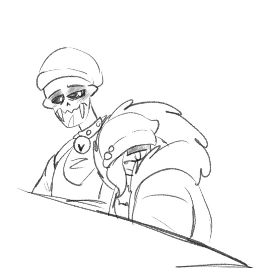
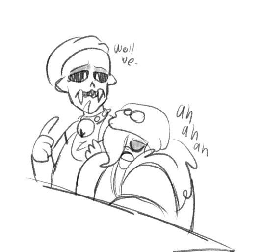
bitty doodles - buncha Fumes and Peye - little Bugg propelling himself down
Fumes giving @sans-guy's crumb a lighter to make up
Kelek gib bitty @mothiepixie's Boysen bitty a smoochum
N then some rough doodles of a bitty Stone - i cant remember why we were talking about him being like Ken or being a fan of Ken lmao
Fumes, Peye, Bugg, and Stone belong to me Crumb belongs to Sans-guy Boysen belongs to mothiepixie
#is bitty boysen grape?#i couldnt remember#n didnt wanna aciddentally call him grape if it was wrong#bittybones#bitty fumes#bitty peye#bitty bugg#boysen bitty#fell bitty#horror bitty#baggs bitty#stone bitty#also a jewel in there showing off his fucking furby monstrosity#found furbies in the garbage dump and adopted them#think he also has a sentient worm on a string#like a pet rock but its his pet florm#fluffy worm#skelekins art#doodles#ough needa drw fumes more#m'little maaaaan
28 notes
·
View notes
Note
Oh wow, thank you! I would love a link to the fonts if you get the chance to find them. (And for real, that set is AMAZING)!
And I found them all!^^ (for this set)
Gif 1: Germany Sans | Great Rebellion
Gif 2: Cocogoose (in Thin) | Road Rage
Gif 3: Aliens and Cows | KG Defying Gravity | Intro Inline
Gif 4: Photograph Signature | The Devil Net | (also Aliens and Cows again)
Gif 5: Heritage | Demode | (and Intro Inline)
Gif 6: Boysen | (and Aliens and Cows, KG Defying Gravity, and Great Rebellion)
And again: thank you<3 I'm happy people like it^^
4 notes
·
View notes
Photo


Since I am presenting you this stuff in little bundles over here, I’ve lightly altered the order of Jazztales first segment, not even sure how noticable it was. XD
Welp, we are almost at the end of part one. Squirrel already sits around there all on his own, recording something......probably not a good sign :P
For now however: Cheers, Jazzy.
Next
Prev
Included AU’s and their Sanses:
Scarf-Ace (Flowerfell)
Imp (???)
Crushedberry (Riverfell)
Blackberry (Rivertale)
Mo (UnderfellMLMU)
1S (Handplates)
Paddy (Witchtale)
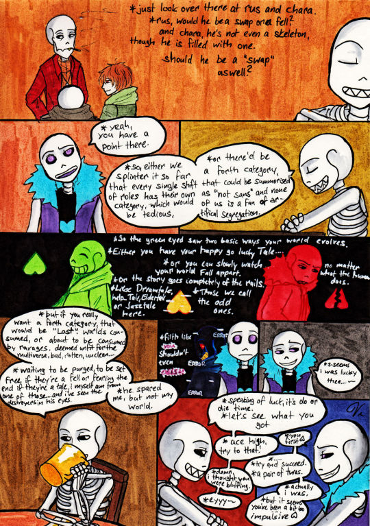
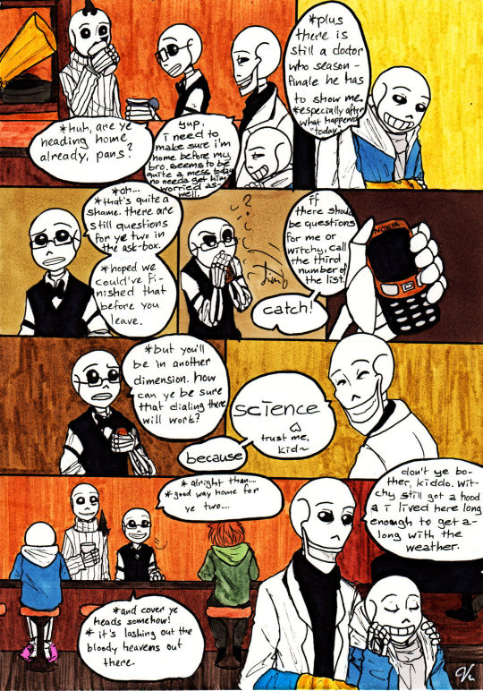
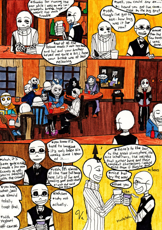
Boder (UnderfellURSIKMU) Squirrel (Rationaltale) Chara (StoryshiftGMU) Rus (SwapfellGMU) Subby (Papyrus Domination) Jack (UnderlustGMU) Teal (TLTale) Dream (Dreamtale) Pans (UnderswapGMU) Mossy (Foresttale) Ink (GMU-Version) Error (Errors Askblog) Fate (Inverted Fate) Epic (Epictale) Parcy (UnderswapMLMU) Boysen (UnderswapRMU) Tori!Sans (Altertale) Karkat (Undertale Retold) Sarge (Conquesttale) Sol (Solfell) Re-Fell (Underfell Retold)
#Undertale#Tales of the Underverse#Jazztale#The Bar of all Sanses#The Jumping Squirrel Event#Jazztale Arc 1#One Straight Thought#Comic#VanGold
6 notes
·
View notes
Text

This was a commission piece for @mothiepixie of their Sans OC Boysen with Motti, dressed to impress~! I had such a great time and I have never been more in love with a grumpy skeleton and his design. Thank you so much again for supporting me and my work!!! 🥰🫶❤️
#my art#sans#sans au#undertale au#caycantdraw#caycanteven commissions#commission for mothiepixie#boysen is bae#I love this grump so much#look at him#so tough yet so soft#adorable#also motti?#barking respectfully#absolutely gorgeous#slay queen#cays commissions
231 notes
·
View notes
Photo

** Disclaimer ** - I am NOT a professional graphic designer, however I did work with many of them for different occasions and I have been designing my own things for over 10 years now. All the knowledge I have and share with you in this post was gathered by me over the course of 14 years.
I recently started my font series, where I shared my favourite fonts of different typefaces. People have been requesting to post my favourite font pairings and as much as I love to do that (and I also will, just scroll down to the end of the post to see them), I think it’s also important for you to understand, why they work together nicely and what you should look out for, if you plan on pairing typefaces yourself.
Understanding fonts and typefaces
There are so many to choose from nowadays. You have probably scrolled through the JUNGLE of fonts that you can find online nowadays, some are free, some aren’t and they all go by different category names:
Serif - Sans Serif - Script. All of them can also be Display fonts.
What do they mean?

A serif is a small line or a stroke attached to the end of a larger stroke. So all the little strokes that I circled in red. The most common serif font is probably Times New Roman, which I also used in the picture above (hence TNR).

Arial is a sans serif font, and also one of the most common ones. Sans serif is translated from french, sans meaning “without” - so it’s basically a font without the little strokes, much more clean and modern looking.

Now let’s move on to script fonts, which are more commonly known as handwritten or brushed fonts. Bombshell pro is a script font based on the looks of modern hand lettering.

Display fonts can be fonts from all the different typefaces above. They’re usually used in larger sizes for e.g. headlines or logos, instead of bodies of texts, like Times New Roman or Arial are mostly used for. Abril Display (I used it in a bold weight) is a display font, as well as a serif font.
Now that you know the differences between these typefaces, let’s dive into the different font weights.
Many serif, sans-serif and display fonts come in different weights (thin, light, normal/regular, bold, extra bold, black.. you name it). This is important as it plays a fundamental role in pairing fonts together.
Playing with different weights can help you underline the importance of the text you’re writing. I keep bolding phrases and words throughout this post, so you know to keep these in mind PLUS it’s easier to find the part of the post you are interested in. This also works for headlining on your graphics or gifsets!
Pairing different font weights
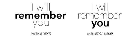
I will use the simple phrase “I will remember you” throughout the following part of this post.
First you need to figure out what you want to highlight. Do you want to highlight, that you will REMEMBER them? Or do you want to highlight that you specifically remember THEM (in the phrase ‘you)? Lay it all out for yourself, so you know exactly what to do.
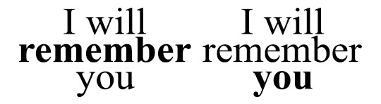

The difference with these two examples isn’t too big, as you might have noticed. I used the regular and bold types for these examples. However, fonts like Avenir or Helvetica come with thin or even ultra light versions and you have more to play around with.
Script fonts usually don’t come in different weights, however you can utilise Photoshop to apply its bold addition to the fonts. It usually doesn’t look too nice though, so be warned!

Also, script fonts are harder to pair with one another, because it’s easier to cause an ‘overload’ for our eyes with pairing them depending on their level of ... let’s call it fanciness.
Now, you can pair the different weights together like this, centred.. and boring.. or you can play around with different font sizes, weights, kerning (click here to find out what kerning is) and positions. It’s fun, I promise! Just make sure you don’t forget which word(s) you want to emphasise!


Pairing DIFFERENT FONTS with each other
Now here’s the part people have asked for haha.
The first thing I want you to understand is, that the less is merrier does apply in this case. I personally n e v e r pair more than three fonts together (and I only use three different fonts for an entire corporate design including a website), two usually work the best!
For two different fonts to work nicely together, you (again) have to think about what you want to emphasise and create some kind of hierachy. In order to create an appealing design, you need to catch the viewers attention to the word or phrase you want. Create a focal point, something the eye is immediately drawn to. And then you add to it with simplicity. You really have to think about what you want to be seen first and what you want to be seen second (on the base of using two different fonts).
Take a look at the fonts you have chosen. Display and script fonts usually need to be a larger size to be readable or to make them look good, so you probably want to use that one as the top of your hierachy. Also fonts with a heavier font weight tend to work better as the leading font. To accompany your leading font, choose a thinner, more simplistic companion. Why? Because if you use two heavy fonts or two fancy fonts (script, black, brushed etc.), your eyes will have a hard time concentrating on who is more important.


I hope this example helps you to understand what I mean. In the first picture you see the whole thing as ONE block, because your eyes don’t know where the exact focal point lies. They don’t know which word they should concentrate on. The second one, however, gives your eyes clear instructions on where the importance of the quote/phrase lies.
Now how do you find out, if two fonts actually go together? Sometimes it’s also about the look of the whole design in general, if two fonts go well together or not. However, there are some things you can look for before you pair fonts:
Have a look at the weight, spacing/kerning, strokes in general and their width to figure out, if the two fonts you have chosen are different enough from each other, to actually pair well. Fonts that are too similar to each other have the same effect as shown above. At the same time please also keep in mind, that they have to have some similarities, such as their general proportions and heights. If these parameters are too different, it might doesn’t look as good (there are some cases where you can make it work though, but you need to play around a little here).
If you made it this far, congratulations :D
This is not the ultimate guide to how you will always pick the right pairing of fonts, but it’s a start and something you can work on and evolve from! I hope it helped you. Feel free to message me, if you have any questions left. And now to what has been requested in the first place.
Here are some of my favourite font pairings:

(Avenir Next at kerning 200 + Abril Fatface)

(Avenir Next at kerning 200 + Sunbreath)

(Bodoni FLF at kerning 300 + Alberobello Script)

(Almondia at kerning 60 + Billy Ohio)

(Boysen at kerning 75 + Saturday Rock)
I hope you found this useful! :) Feel free to share!
#typography#typography tutorial#pairing fonts#font pairings#resources#userlexi#uservaleria#usersophy#annasuser#tuseralex#usernums#userauden#font series#tutorials#mine
881 notes
·
View notes