#best trend
Explore tagged Tumblr posts
Text

and I just can’t pull myself away 💃
#have we all seen those tiktoks of jill flashbanging enemies and then start dancing while they’re stunned#I need more of them#best trend#digital art#fanart#art#resident evil#jill valentine#resident evil 3 remake#re3
151 notes
·
View notes
Text

#dark academia#dark aesthetic#vampire#halloween#gothic#artists on tumblr#dark core gothique#goth aesthetic#horror lover#vampire pictures#vampire memes#teletubbies#sun#teletubbyland#Teletubbies Sun#vampire chronicles#vampire diaries#vampy#meme humor#writing humor#trendy#viral music#top trending#top memes#funny humor#funny vampires#vampire humor#vampire books#best movie#scary movies
10K notes
·
View notes
Text
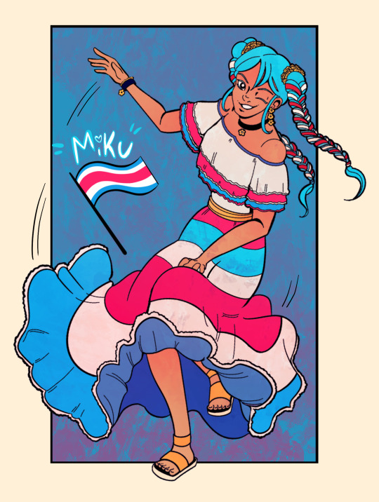
Had to jump on the trend and sketch out a Costa Rican Miku as soon as I could! 🇨🇷
9K notes
·
View notes
Text

#trending#artists on tumblr#lol memes#best memes#funny memes#dank memes#funny#meme#girlblogging#relatable memes#haha#funny post#lol#dank humor#clowncore
8K notes
·
View notes
Text

what’s his problem
#my art#my contribution to the nerdjo trend#jjk fanart#jujutsu kaisen#gojo satoru#i feel like gojo and willem dafoe would be best friends
2K notes
·
View notes
Text
i vote that next year instead of reading Dracula we do a Jeeves & Wooster Book Club. those two never got the rabid tumblr shipping fandom they deserved (disqualified for the sheer technicality of being published a century too soon). we must correct this injustice
#jeeves and wooster#i want to watch tumblr go rabid i want to watch ao3 overflow with jeeves/wooster fanfiction#yes obviously the fandom EXISTS but it's a cozy little neighborhood#a handful of talented artists and writers doing their best to keep their charming little village going#but i'm tired of cozy i want this fandom TRENDING#I WANT TO SEE THIS ON MY DASHBOARD PEOPLE#i swear to you if they made a shiny new tv series tumblr would absolutely obsess over these characters. good omens levels of obsession#it's just such a great dynamic! the good-natured overly-trusting bumbling idiot in constant need of rescuing!#the stoic all-knowing genius who quietly masterminds mayhem in order to protect this one moron he's devoted himself to for some reason#jeeves as a morosexual is just such a beautiful interpretation of the original text#wooster as a happy-go-lucky himbo who stumbles his way into a relationship with a protective caring and supremely competent mastermind#the angst and social complexities of a same-sex cross-class relationship in turn-of-the century london!#oh AND half the stories are about jeeves helping wooster get out of engagements/desperately avoid marriage#two men who live together constantly scheming to maintain their bachelorhood. this is quite literally the main plot point#the gay subtext is there! the gay subtext is there and very ripe for picking!!!#this thing is LOCKED AND LOADED we can pounce literally any time
11K notes
·
View notes
Text

EGYPTIAN MIKU ❗❗❗❗❗❗❗❗
#I haven't rendered anything in so long this looks so bad oh my god 😭#best I could do Ig#I hate this but I took way too long on it so Idc atp#hatsune miku#vocaloid#miku hatsune#artists on tumblr#levi's art#my art#not ninjago#miku worldwide#worldwide miku#egyptian#miku trend#egyptian miku
2K notes
·
View notes
Text
feeling the tumblr ecosystem shifting and changing in the days leading up to november 5th like a storm is coming and you’re outside watching the shelf cloud blow in, the leaves flipping and it starts to smells like rain

#the fact that spn is ALREADY trending#three days ahead of time#pregaming that shit#supernatural#spn#destiel#november 5th#november 5 2020#kip yaps#best of kip (apparently)
6K notes
·
View notes
Text
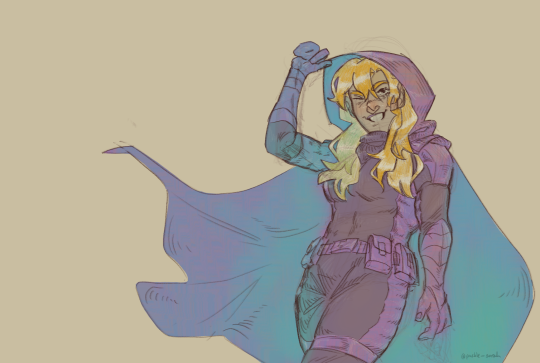
a stephanie brown sketch for the soul
#i saw so many ppl are drawing the batgirls so i wanna join on the trend#ill draw Cass soon#i love stephanie u guys know that?#spoiler is best(right after red hood ofc sry steph)#my art#my fanart#dc#dc fanart#bat family#batman comics#stephanie brown#the spoiler#stephanie needs more tags on tumblr smh#batfam#digital illustration#digital sketch#artist on tumblr#quick sketch#sketches
2K notes
·
View notes
Text
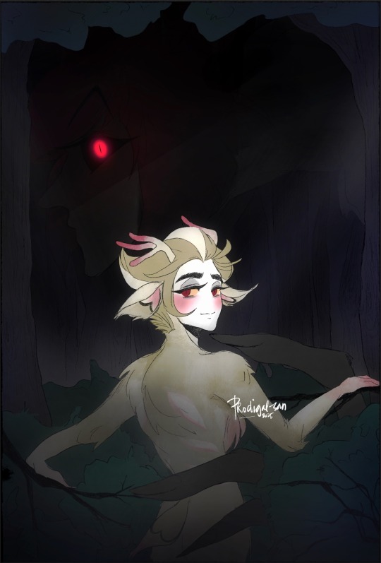
“Legend speaks of a beautiful white hart living in the forest. His hide glows under the moonlight, blushing with vitality. A worthy prize over a collector’s mantel, indeed.
“But hunter, take heed, for if you are too caught in the hunt, he will lead you to a hellish fate.”
—
GASP ITS A COLORED DRAWING!! 🤣 Tbh I’m not overly satisfied with this, but I didn’t want to keep overthinking it xD maybe I’ll improve it someday.
Anywho I tried a new coloring style! What do you guys think? 🤔 I wanted to go for something dreamy/storybook like. I think I did pretty ok? Lol 😂
Also not me giving this a plot 🫠
#my art thingz#appleradio#radioapple#alastor x lucifer#lucifer x alastor#duckiedeer#my take on the possessive buck alastor trend i guess??#its not the best it could be but im proud that i finished something tbh 😂
337 notes
·
View notes
Text
"I finally understand the harvey hype"
oh, I'm sorry! you mean stardew valley harvey? the "he's such a boring romance" harvey? the harvey whose romance took me LITERAL hours to get so I could marry the lovable guy, that harvey?
he's cool now? HE'S BEEN COOL.
#he's suddenly trending ig and it's my reminder to you all that he's always been one of the BEST sdv romances to me#idk what y'all are on#rhiannon rambles#stardew valley#sdv#sdv game#stardew valley harvey#sdv harvey#harvey stardew valley#harvey sdv#harvey x farmer#harvey
2K notes
·
View notes
Text
Eddie, responding to a fan on a live-stream: Steve and I have been together for forever. We’re like… *trying to come up with a famous couple but can only think of Sid and Nancy*
Steve: Romeo and Juliet…except we didn’t kill each other
Eddie: They don’t kill each other.
Steve: Uh, pretty sure they did.
Eddie:
Eddie: Am I-
Steve: You’re not Romeo. Only one of us can climb a balcony and it’s not you.
#Robin in the comments: You are NOT Romeo and Juliet. you are AT BEST Bert and Ernie#Continuing the trend of Steve being mostly right but just misremembering the minor details#eddie munson tiktok saga#steve harrington#eddie munson
1K notes
·
View notes
Text
Begging for your cock daddy… 😈

#aesthetic#trending#best memes#memedaddy#meme#queer feedee#drag queen#queer ns/fw#queer pride#queer community#trans rights#trans community#trans pride#mtf trans#trans beauty#transsexual#trans cult#trans nsft#trans#trans artist#pro transid#transfem#trans woman#trans man#transgirl#transgender#transisbeautiful#transparent
728 notes
·
View notes
Text
I think 90% of my gripes with how modern anime looks comes down to flat color design/palettes.
Non-cohesive, washed-out color palettes can destroy lineart quality. I see this all the time when comparing an anime's lineart/layout to its colored/post-processed final product and it's heartbreaking. Compare this pre-color vs. final frame from Dungeon Meshi's OP.
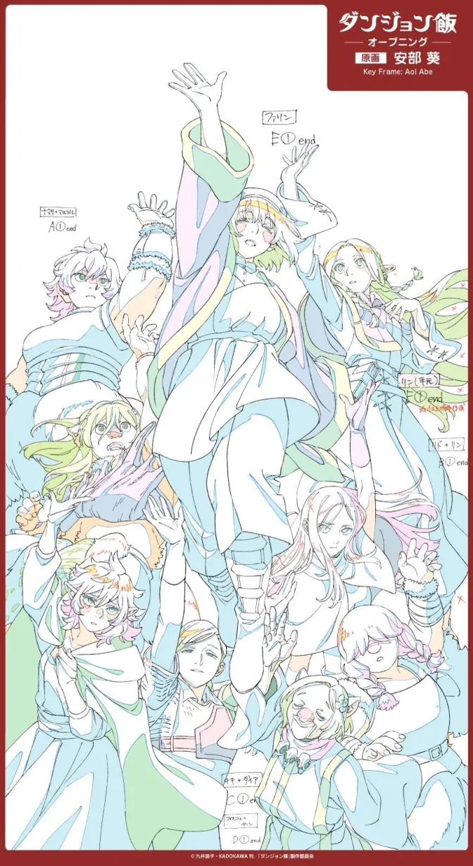
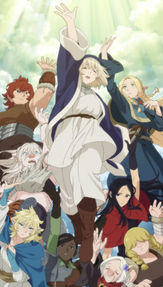
So much sharpness and detail and weight gets washed out and flattened by 'meh' color design. I LOVE the flow and thickness and shadows in the fabrics on the left. The white against pastel really brings it out. Check out all the detail in their hair, the highlights in Rin's, the different hues to denote hair color, the blue tint in the clothes' shadows, and how all of that just gets... lost. It works, but it's not particularly good and does a disservice to the line-artist.
I'm using Dungeon Meshi as an example not because it's bad, I'm just especially disappointed because this is Studio Trigger we're talking about. The character animation is fantastic, but the color design is usually much more exciting. We're not seeing Trigger at their full potential, so I'm focusing on them.
Here's a very quick and messy color correct. Not meant to be taken seriously, just to provide comparison to see why colors can feel "washed out." Top is edit, bottom is original.
You can really see how desaturated and "white fluorescent lighting" the original color palettes are.
[Remember: the easiest way to make your colors more lively is to choose a warm or cool tint. From there, you can play around with bringing out complementary colors for a cohesive palette (I warmed Marcille's skintone and hair but made sure to bring out her deep blue clothes). Avoid using too many blend mode layers; hand-picking colors will really help you build your innate color sense and find a color style. Try using saturated colors in unexpected places! If you're coloring a night scene, try using deep blues or greens or magentas. You see these deep colors used all the time in older anime because they couldn't rely on a lightness scale to make colors darker, they had to use darker paints with specific hues. Don't overthink it, simpler is better!]
#not art#dungeon meshi#rant#i'm someone who can get obsessive over colors in my own art#will stare at the screen adjusting hues/saturation for hours#luckily i've gotten faster at color picking#but yeah modern anime's color design is saddening to me. the general trend leans towards white/grey desaturated palettes#simply because they're easier to pick digitally#this is not the colorists fault mind you. the anime industry's problems are also labor problems. artists are severely underpaid#and overworked. colorists literally aren't paid enough to do their best#there isn't a “creative drought” in the anime industry. this trend is widespread across studios purely BECAUSE it's not up to individuals#until work conditions improve anime will unfortunately continue to miss its fullest potential visually#don't even GET ME STARTED ON THE USE OF POST-PROCESSING FILTERS AND LIGHTING IN ANIME THOUGH#SOMEONE HOLD ME BACK. I HATE LENS FLARES I HATE GRADIENT SHADING I HATE CHROMATIC ABBERATION AND BLUR
2K notes
·
View notes
Text

greek miku inspired by my yaya
#my art#hatsune miku#this trend is the best#she truly transcends everything#she is a god#miku fanart#vocaloid#miku worldwide
551 notes
·
View notes