#beige website
Explore tagged Tumblr posts
Text
WIX Website Template for Wedding & Events Photography


This beige minimal website template is for wedding and events photographers who want to showcase their brand and portfolio. With WIX's user-friendly interface, editing a website is made easier and stress-free without the use of any coding. This website template is fully customizable to your satisfaction and is optimized for mobile and tablet use.
What's included in your purchase? - Installation guide - WIX website template with content guide - Mobile-optimized template with customizable side menu - 11 styled pages - Built-in fonts - Set of curated photos

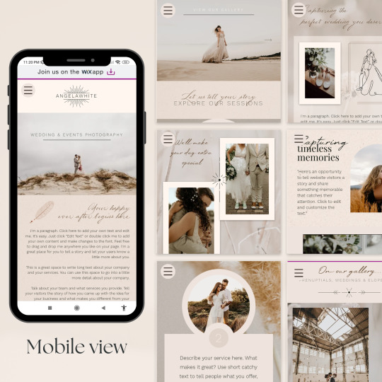


Styled Pages: ➊ Home ❷ About ❸ Portfolio - Prenuptials portfolio page - Weddings portfolio page - Elopements portfolio page ❹ Packages/Services ❺ Book online ❻ Blog ❼ Contact



NOTE This website template is designed for WIX only and cannot be used on other platforms. Upon accepting the transfer invite on the email you used with your WIX account, the template will appear on your account as a NEW WEBSITE. It is not possible to add or integrate the website template to an existing site.
View live demo here:
https://thehippiekittyph.wixsite.com/angelawhitedemo
View Etsy listing here:
https://www.etsy.com/listing/1572328815/wix-website-template-for-wedding-events
#wix template#wix website template#wix#wix website#web design#website template#website design#beige website#photography website#wedding website#wedding photography website#etsy#etsy listing#digital download#web template
3 notes
·
View notes
Note
Podrías hacer un mb de Javon Walton, pls?


ㅤ ㅤ 𒈞 𓈀 🪬


#caosinterlude#moodboard#fakeland#spotify#summer moodboard#.tumblr#tropical core#tropical moodboard#messy bios#beige messy moodboard#summer#tropical#javon walton#website#kpop#by me <3#my moodboards#messy layouts#messy moodboard#messy icons#messy girl#tumblr layouts#twitter layouts#gg layouts
34 notes
·
View notes
Text
a reminder to check your graphics in greyscale before posting, especially if it has colourful text elements that are supposed to be readable 👍
also here's a handy dandy tool for checking colour contrast:
#pwease stop forcing me to read white text on light beige background i cant see shit#also PLEASE read WCAG if you design websites#chat tag
11 notes
·
View notes
Text
every time i see an ad for one of those style finder websites i take their quiz just to see how wrong they get it. also all the styles they've recommended are basically the same
#carter poast#like obvi the USA style finder website that's made up of beiges and navy blue isn't going to include decora but it's still funny to me#all the colors are like. neutrals or dark colors#do people even use these sites genuinely how are they making money
2 notes
·
View notes
Text


Fall Skincare Canva Landing Page Template
Welcome to the Fall Skincare Canva Landing Page Template, designed to help you create a stunning, luxurious online presence for your skincare business, blog, or personal brand. This beautiful fall-inspired template, featuring warm nude and earthy tones, is perfect for skincare brands that embrace natural beauty and luxurious self-care. - DesignByRobinSade
#aesthetic#design by robin sade#luxury#style#fashion#canva#social media#influencer#instagram template#beauty#skincare products#skincare#linkinbio#website#canva template#templates#template#beige#beige moodboard#beige aesthetic#beige tones#beige icons#beige layouts#landingpage#branding#social marketing#small business
2 notes
·
View notes
Text
someone defending the barbie movie by claiming oppenheimer is apolitical has got to be the most insane things ive seen today
#what the fuck are yall smoking#this is an incredibly unserious website#sorry :( oppenheimer is apolitical bc we cant condense it to beige instagram infographic slides#girl shut up#barbie#oppenheimer
1 note
·
View note
Text
when ur transmasc and hate plaid and shirts with high necklines (sad-emoji)
#and where the fuck do men buy clothes????#i checked the usual stores i bought clothes in the past#and theres basically nothing on sale#a sea of beige and a bit of plaid#thats it#whats with this bullshit#i even checked out a website for used clothes#its the same there too#i understand why my ex only wore bandshirts and plaid because thats all there fucking is apparently#fucking travesty
0 notes
Text
WIX Website Template for Newborn & Family Photography




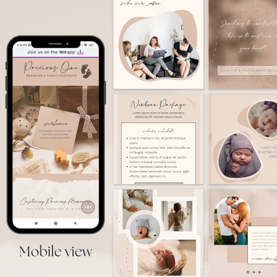

This beige, pink and white themed website template is designed specifically for both professional and freelance photographers, bloggers or influencers who want to showcase their brand and portfolio. With Wix's user-friendly interface, editing a website is made easier and stress-free without the use of any coding. This website template is fully customizable to your satisfaction and is optimized for mobile and tablet use.
What's included in your purchase? - Installation guide - WIX website template with 6 styled pages - Mobile-optimized template with customizable side menu - Built-in font styles - Set of curated photos
Styled Pages: - Home - About - Portfolio - Services - Blog - Contact

NOTE This website template is designed for WIX only and cannot be used on other platforms. Upon accepting the transfer invite on the email you used with your WIX account, the template will appear on your account as a NEW WEBSITE. It is not possible to add or integrate the website template to an existing site.
View live demo here: https://thehippiekittyph.wixsite.com/preciousonedemo
View Etsy listing here:
https://www.etsy.com/listing/1552726002/wix-website-template-for-photography
#wix website#wix template#website template#wix website template#beige website design#web design#web template#etsy listing#digital download#etsyseller#etsysmallbusiness#etsy#photography website template#cute website template#website design
1 note
·
View note
Note
¿puedes hacer un mb de eli.maarie? porfavor.

𒋲 ‘ 𝚃 ﹕𝖬𝖺𝖽𝖾 𝗂𝗇 𝑏𝑟𝑎𝑠𝑖𝑙 ˖ 𓊓﹝🌴🍑🇧🇷﹞


@caosinterlude on ig.
#caosinterlude#moodboard#fakeland#spotify#summer moodboard#.tumblr#tropical core#tropical moodboard#messy bios#beige messy moodboard#brasil#brasil moodboard#tropical colors#tropical#eli.maarie#newjeans#website
17 notes
·
View notes
Text
Agere sensories - visuals! (things I see!)

Seeking:
fairy lights, night lamps, aquarium lamps, lava lamps, LED strips, christmas lights
online you can search up toy commercials, toy unboxing, pinterest, or the website that you're on right now, Tumblr! however make sure your blocked tags and phrases are secured before going through social media, especially as a little
if you're feeling confident, visit toy stores, libraries' kids sections, playgrounds! they're very stimulating, but remember to stay respectful on your visits :)
There's more to artsy life than coloring books! Bead bracelets, clay, stickers, collecting various things, journaling, baby books, finger painting, glitter!
To my fem leaning regressors, hairclips, jewelry, bright make-up (I do not recommend kids make-up as it doesn't have regulations, use adult make up in a childish way), animal headbands! To my neutral/masc regressors, pins, patches, funky shoelaces, sticker tattoos, keychains! Decorate yourself to stimulate yourself on gloomy days!
get food for kids! More colorful, maybe with a cute animal or a smile or dinos, the pretty juice bottles with cartoons? don't get me started. You can also get shape cutters for your veggies/sandwiches
stimboards, gifs!
customize your devices! Wallpapers, keyboards, AOD, widgets! You can even use gifs!
decorate your room and gear too! Coloring pages or other craft you're proud of, showing your favorite toys (if you're safe) colorful rugs! Make custom pacis, add stickers to your bottles, add cute labels!
stim toys, glow in the dark toys! Water toys, squishy balls with colors in them, orbeez, snowglobes, slime!
Avoidant:
Have nap times! They don't have to be a nap time, but you can make an hour to yourself, covering the windows and turning off the lights
There are settings on modern devices specifically targeted for visuals. Lower the brightness, get yourself a dark mode, have eye safety on
Get yourself fuzzy nighttime blindfolds, cute sunglasses, hats or hoodies that will limit your eye view (be careful to be protected, but functional if you're outside)
this is universal for any sensory suppression, but items for babies are your best friends if you're looking for less eye straining gear. (Especially with the beige mom trend being more popular, ha ha)
if you still want to watch baby shows, check low-stimulation lists. Also, usually shows directed at younger age range are slower. I also find vintage cartoons less overwhelming (but they're not guaranteed to be always slow and not stimulating)
You can order online instead of throwing yourself out to the chaotic, overwhelming stores
limit your screentime! Short-form content is easily overwhelming, and staring into a bright screen for x hours doesn't do your eyes a favor. It's okay to need breaks and not always be up to date with everything
if possible, pick safe times to do your errands where there's not a lot of people, like weekend mornings.
have a list of safe cartoons, safe colors, safe places, or other "safe" sensories. It's sometimes better to know what you're comfortable with!
remember, if it gets too much, it is always okay to back out. This is YOUR coping mechanism and nobody else's, it's up to YOU what you're okay and not okay with
#sfw interaction only#age regression#agere#agere blog#littlespace blog#sfw little blog#sfw littlespace#age regressor#sfw age regression#sfw agere#sensory
1K notes
·
View notes
Text
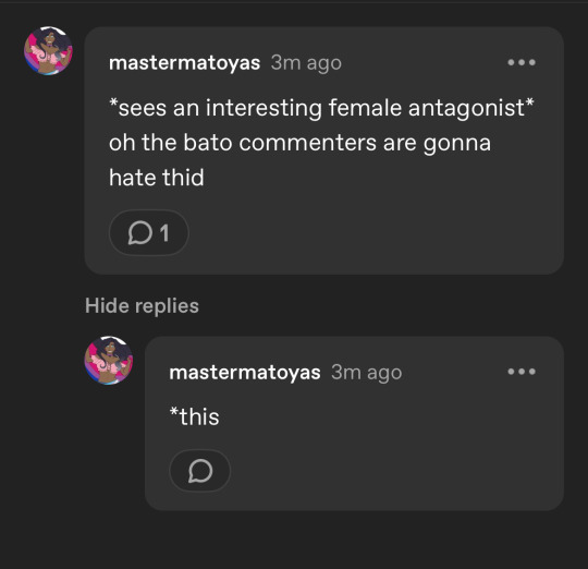
@mastermatoyas EXACTLY 😭 ITS ALWAYS THE DAMN BATO COMMENTERS HATING ON INTERESTING CHARACTERS ESPECIALLY A FEMALE ANTAGONIST or a female lead who makes one (1) bad choice or mistake
I knowwww that the comment section under comics and manhwa is the bad place and should be avoided but sometimes it is nice, but usually it’s people complaining that a character makes very real mistakes and choices and calling the character (usually women) dumb bitches
#deity dialogue#I like using bato but man at what cost???#im soooo tired#that one person like ‘#congrats you are that person#’#like okay good I wanna be that bitch who’s like yall sound dumb as hell go watch paint dry cause yall what a character with the personality#of beige paint drying on a wall :|#also ppl in comments consoling fuck about Victorian or Lolita fashion like yall are so fucking boring yall suck so bad#someone was mad that a male character was wearing a goddamn choker#most boring annoying ppl in the world live in the bato comment section#except for me and the small handful of ppl on that website who also are like ‘hey I like this character they did nothing wrong’ LIKE ONLY A#FEW PPL GET IT IM SO TIRED AHHHHHHHHHH#screaming
14 notes
·
View notes
Text
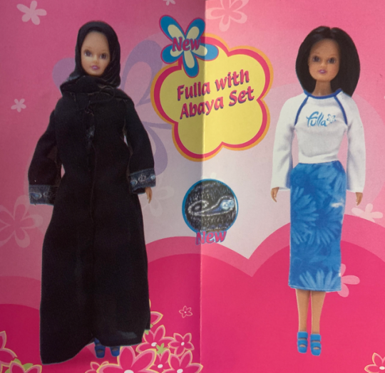
Sorry for being late to post about Ramadan (school's been hell recently), but I thought I could take the opportunity to highlight some Muslim dolls! While there aren't many, one of my favorites is Fulla! For those unaware, Fulla was made by the company NewBoy FZCO and has been running since 2003! (MASSIVE thanks to Dollect for most of the information on her, at least throughout her early run in the 2000s) According to Dollect, some of the first dolls released of her with a hijab was in 2005 from the "Fulla with Abaya" sets, which apparently had embroidery on the sleeves! I love the long skirts, they give me Flower Power Barbie vibes!
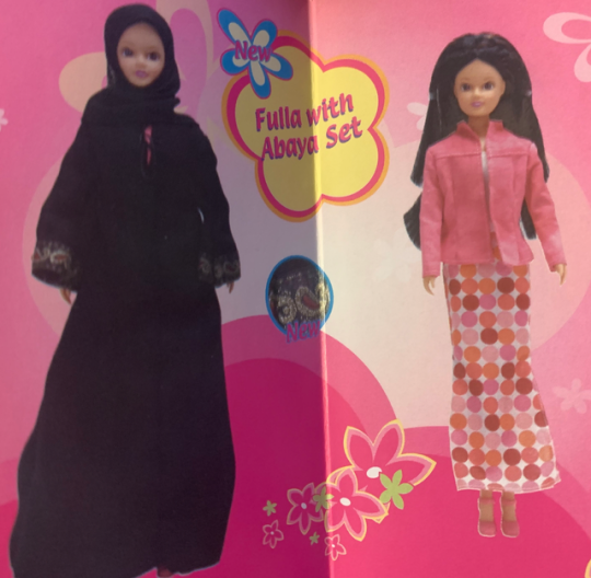
There were also apparently "Outdoor Fashion" dolls with a surprise element where beneath their Abaya they'd be wearing an outfit of a specific color out of purple, pink, and green. They were MILES ahead of the surprise toy gimmick of the 2010s.


However, I can't find exactly what their outdoor outfits looked like? There aren't any images of them on Dollect, though I suppose these might be them? No confirmation of such, of course, but I found the pink one labelled for 2004 on another website.
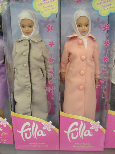
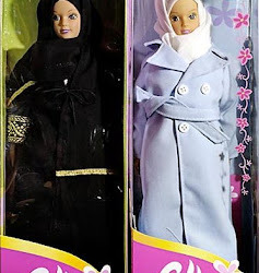
It seems to check out with the description of having purple and pink variants in the outfit, but the beige and black leads me to believe these might be another release entirely... regardless I adore the detail in these coats! Anyway, I'll be posting about these more soon, but for now I better get back to that homework I just got distracted from lol. If you guys know of any other Muslim dolls you'd like me to post about feel free to send an ask!
Ramadan Kareem!
(Edit: Y'all thank you so much for the traction but please check out my reblogged edits to this post, I lowkey fumbled the info on the mystery outfits the first time around 😭)
344 notes
·
View notes
Text
WELCOME TO THE MASQUERADE | HAN JISUNG.
genre | fantasy au, magic au / meet cute
synopsis | after receiving a strange recruitment letter in the mail for a barista job, jisung decides to fill it in despite his suspicions because he desperately needs a job.
word count | 10k+
warning | brief mention of war, death, injuries / mentions of burn, pain, blood, suffocation
world | two

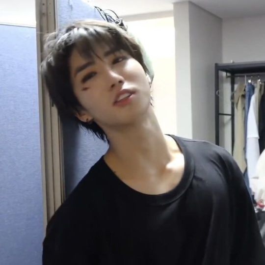

Jisung had no idea how much louder his world would become when he entered the coffee shop.
With nothing but multiple rehearsed speeches prepared and a nearly empty bag that stored only his tablet for note-taking, he let the door behind him close gently before fixing his eyes on the environment of, hopefully, his future workplace. A deep sigh left the confines of his chest as the familiar operating noise of coffee machines hit his ear.
He gave the week’s notice for his previous barista job a month ago.
His charms and perfect speaking ability left after he had gotten hired the day of the interview. Part of him knew the manager was desperate for workers, and he understood why. The pay was laughable, the hours were horrendous, and some customers hit the nail on the head with being the group of people most undeserving of anything good in life.
Besides those, let’s be honest, being a barista is not a worthy enough experience for the future careers any student would want to pursue.
He had no expectations for maintaining any friendly work relationships back then. Although his silence was not kept, the continuous ‘‘How are you today’?’ chain with his colleagues was not precisely material for making friends. He had gone to work and gone home on every shift. In the end, he left the place without adding a friendly contact.
The joke of his life writes itself. He quit the last barista job because it was a dead-end path in a poor work environment just to, a few months later, end up interviewing for another one. This job listing was nowhere on credible search engines or semi-sketchy recruiting websites. He found it in an advertisement letter addressed directly to him in his mailbox.
Despite all the suspicion, he applied anyway, because the joke of his life writes itself.
The shop smelt of coffee beans and stunk of natural wood previously rained on. Instead of a modern and popular beige color scheme, the structure maintained an old-fashioned brown tone, with vintage furniture and little to no alternative vibrant colors. Customers lined up before a long wooden counter with no opening to enter besides jumping over the surface.
On top of it, behind a glass panel of appropriate height, sat multiple steam machines shoving out coffee heat, either waiting to be or already being used.
The accent wall attached in the center of the primary wall behind the cashier counter was made out of auburn red bricks and cement instead of ancient wood. The primary wall was lined up with tiny drawers, like stackable cabinets. Slapped in the middle of the brick wall was a fireplace with an ominous key cabinet stuck in the middle just above it.
Jisung squinted at the fireplace. He swore he saw some colored dust on the logs.
You made a mental note to sweep the fireplace after humorously following Jisung’s gaze toward it.
You had already rung up all the customers’ orders this morning before Jisung could snap out of his trance. Determined to startle him a little to make up for the dull morning, you waited by the side of the counter with your arms folded and leaned against the edge. It took Jisung a minute, but eventually, he turned his head away from the brick wall and jumped when he noticed your stare.
“Good morning,” you greeted.
“Good morning,” he returned politely with a casual bow. He cleared his throat of his nervousness. It remained, so he pushed it behind a well-crafted facade of confidence. “I am here for the interview!”
You raised a brow with intrigue.
That was a surprising turn of events. There was hardly any deviation from the usual routine. You were usually on top of everything as well: the cleanliness of the coffee house, stocking ingredients, tending to request letters, and remembering information communicated to you by the Entities. You cannot for the life of you remember ever hearing about the coffee house receiving a new hire.
You have been working alone for three and a half years. If there were such groundbreaking news, you would remember.
Jisung pursed his lips patiently when you raised a finger, signaling him to give you a moment. In the meantime, he stood on his spot and recounted everything that had led him up to this point—the advertisement letter, replying to the advertisement by mailing a response letter (as he was instructed to), getting an irregularly quick decision back that told him to come to this location for an interview.
He made sure he double-checked the location before coming here. He could not have been wrong.
His eyes followed you as you moved toward the back, where the wall of drawers was. Sniffing to get the nervous itch out of his nose, he reached a hand up to pinch the tip. He wasn’t sure why he felt out of place. When you pulled open one of the drawers to peek inside and closed it shortly after, he realized they were not decorations. He wondered if the ones lined up to the ceiling could also be opened.
You touched your hand to the empty spaces between each storage row to find a spot. When you did, you banged the space with your fist twice and stepped back.
The ground shivered, startling Jisung. A pair of drawer rows separated themselves from the wall with visible vertical lines. Then, like a revolving door, it turned to the side and revealed an accent wall identical to the brick wall in the middle. There was a rotary dial phone on top of an antique table.
You picked up the phone and dialed a number. Jisung has no idea what happened.
His best guess was that it was a deliberate design choice, but that assumption was quickly defeated with two counters he thought too quickly of.
First, corporate design choices are almost always made to maintain the old or garner new consumers. He knew that much as someone who has always been heavily involved in the inner workings of the mainstream music industry. He had a phase where he pretended being independent was better. With the fabricated authenticity people value today, it still is better.
But everything takes money, including breaking into the industry or just making an album in general, so he did care about corporate to an extent.
Even though he had never heard of this coffee shop before, there was no way the store structure was not crafted to invite more customers except for the changing telephone booth, which was shown when there were no customers around. It was just a function of the architecture that an employer could use, which made no sense. What can a cool feature be worth if the money spenders never see it?
Two, that kind of architecture must have cost a fortune to build. But Jisung had just heard of this coffee shop when he was offered to apply for a job there.
When he was doing some research online before accepting the offer, he found no information about it either. A coffee shop as secretive as this one could be one of two things: a soon-to-be vacant spot or a top-secret hideout for the ultra-rich. Considering its mundane location—just across the street from a plaza with various fast food joints—Jisung settled with the first thing.
Funnily enough, he would not put it past people who could wipe their snot with dollar bills to be bored enough with their life that they decided it would be fun to open a coffee shop down the street. To fit more into the ordinary atmosphere, they have decided to hire only one employee and pay them the most undeserving salary too! It was anything to live like poor people without actually doing it!
Jisung shook his head off the millions of assumptions popping up. He was thinking too deeply about this. All he had to care about was getting the job, or not getting it. He planned to figure it out as he played along.
“I don’t know. He doesn’t look too fine to me,” you spoke into the receiver while stealing glances at Jisung. “He looks zoned out. All I’ve shown him is the turning wall, though.”
The other end laughed heartily with a joke you would have understood once, but you giggled with them nonetheless. Afterward, the person confirmed they hadn’t gotten a visitor at the shop without prior notice. You heaved a relieved sigh. Something must be off with the Entities.
After you hung up, you knocked on the same spot on the wall to turn it back to the drawer row. Your hands flew to rub against your apron to clean off the cement feel, and then you habitually smoothed it down.
Looking up from the ground, you caught Jisung’s eyes and smiled at him. He returned it with a much lower intensity because he was still confused about the sudden wall change. You headed to the side of the cashier counter and kicked it once. An entryway opened up, and you walked out from behind the register.
Jisung tried his best to hold back the furrow of his brows. As confusing as everything had been, he was still making an impression that would get him hired.
But he swore on God that there was no visible entryway when he walked through the door. And, of course, he swore on God because he did not believe in such things, so there would be no real repercussions if he made a mistake in his swear.
You did walk out from behind it. He was not taking any chances.
“Sorry for the wait. I was not aware that we would be getting new hires,” you said as you held out your hand.
He immediately reached out and gave your a firm handshake. “No worries! My name is Jisung!”
“Y/N,” you returned. “You are a little early, Jisung. You came during rush hour.”
“The letter I received told me to come at this time, though,” he informed, motioning at his bag as if he had the letter with him and could bring it out for evidence if you doubted him.
You hummed in acknowledgment. The letter could only have one sender: the Entity in charge of the coffee shop. Since the Entity also has access to the shop’s customer walk-in hours, if it specifically instructed Jisung to arrive at the time of serving, it could only mean that the Entity strongly desires him to become a barista.
It was a chance for him to catch you working, after all. If the Entity was unsure of its choice, it would have arranged for him to arrive when the shop was empty instead.
“I see.” You acknowledged to yourself before making eye contact with Jisung again. “You caught me at a terrible time. I just rang up all the customers’ orders but haven’t made them their drinks yet.”
Jisung smiled with uncertainty. He knew you were the only employee working, but he didn’t think you would also be the person to interview him. He assumed someone of a higher position must be lazing around at the back and was charged to consider his application.
Were you the only person here? Were you the manager who sent him the reply letter? What about the time clash? What kind of lousy management was this? This was even worse than what he had to deal with last time!
He shouldn’t work here!
You ran a hand through your hair as you turned your head. Your lips pursed and smacked inaudibly as your mind was riddled with thoughts about the next steps. When you looked at Jisung again, you politely smiled at him. It was a pretty smile. At least, he thought it was.
Maybe he should work here.
“Would you like to come to the back to help, or would you want just to wait around while I finish with this batch of drinks?” you asked, pointing behind your shoulder at the register. Jisung didn’t look confused, but you added anyway. “You were already hired when the response letter was sent to you. You didn’t come here for an interview. You came here for an explanation, which will help you determine whether you want to work here.”
He breathed out an unsteady laugh. “Oh, I’m just looking for a part-time job. I am fine with anything… even though I quit my last job, so clearly I wasn’t fine with anything…” The last part was mostly silent. After beating himself up enough, he perked up and nodded. “I think I will work here and see for myself. I’m sure you guys don’t have any policies I haven’t seen before!”
You raised your brows and smirked at his response. “This is not an ordinary coffee shop.”
“You guys sell coffee, no?” he questioned.
“Hmm…” You hummed with a mirroring of his questioning pitch. “We sell more than that.”
“Oh, is this one of those–“ Jisung snapped his fingers to conjure the right words. “Marketing schemes? Where you guys say you’re selling coffee and something cheesy, like a homey environment?” The air quotes beside his head lingered for a moment.
You scoffed. “No, but I’m glad you think this place is homey.”
“Actually, that was just an example. I think this place can use a bit more domesticity,” Jisung said, seemingly building up his confidence with each word he spoke. He rubbed his hands together as if in deep thought, and then he made a noise when he finally settled with an example to his suggestion.
“Maybe somebody like me? I’m friendly, and all the neighborhood aunties tell me I am adorable, like a stuff-cheeked squirrel.”
You couldn’t understand why the Entity wanted him unless it chose personality over competence this time. It would be harsh to judge Jisung so quickly, which you knew. His ridiculousness overshadowed any specks of assumption you have that he could be very competent at this job.
Not that this job requires much real effort daily, but when there comes a time when that effort is needed, absolutely nobody can slack behind, or the result will surely be bloody.
Jisung responded to your judgemental eyes with a blushed smile. You sighed inwardly.
At least he’s cute.
“Come help me,” you said with a wave.
Even though you explained that he was practically hired at this point, he got the feeling you were asking him to get on board.

Jisung loved to pride himself on being a fast learner, and he was!
He wasn’t brilliant, but he was clever and quick-witted. Thanks to his years of being a curious and rebellious child and having adults around him who cared too much, he often had to weasel his way out of lectures and punishments. The point stood as he grew older, with his teachers, co-workers, and (some) managers, with variations of him easily escaping problems. He absorbed his surroundings and people, and he knew how to manipulate them.
Not this time. Mainly because he was confused about what he was absorbing.
After agreeing to help You with the orders, Jisung anticipated being told the steps to make standard coffee orders. The easier ones, at least, like the Espressos and Americanos. But you had him on customer duty instead, which was intriguing at most. He realized nobody was waiting around the area for their order. When he asked about it, you told him it was because the process of making a drink was better off staying confidential.
He had worked as a barista for so long and seen so few variations to making the same caffeinated drinks that he could hardly believe there was anything special about the menu. Besides, customers were usually not perceptive enough to stalk the process of a barista making their coffee, let alone steal the recipe or complain about it. He had seen some of those people before, but they were a rare breed!
He begrudgingly agreed to serve the customers, even though he was unsure why he was being defensive about the task. The agreement invited even more interesting rules of the coffee house.
Firstly, he was told not to introduce himself or make unnecessary conversations. Initially, Jisung thought it was an issue regarding work culture—chatting with a customer for too long will delay the working pace! He understood that. He didn’t care much about talking to the customers anyway. Except You added clarification that he would not want any rare but possible mishaps in memory erasure when the customers leave.
Secondly, as he watched you make the drinks, he learned one of two things: the tiny boxes on the wall hold lumps of colorful dust, and you mix them into the drink. The first thing you did for every cup was add the dust that looked like craft shop dust glitters. Nothing about it looked drinkable to him.
Everything about it looked like the materials pre-schoolers will slap on a Mother’s Day card. When he asked about it, you said they were personality dust, and it would do him nicely not to inhale nor taste them.
Lastly, there was nothing on the cups. There were no labels, no names, and no order abbreviations. There were only patterns. Each coffee cup has a unique design: chalk stripe, pinstripe, checkers, plaid, and whatnot.
You informed him that every customer has a charm bracelet made of patterned pearls around their wrist. The patterns on the cups reflect the ones on the bracelet identically, so all he needed to do was to obverse and hand the drinks out. No calling names, no asking about anything. Just serve the drinks and leave.
These were a set of exceptional rules. Bizarre ones! Most of what he was cautioned not to do was against the customer service etiquette he had spent years honing, and how the customers behaved was also abnormal. Everything so far has made a point to tell him working here would be easier than usual but also unfamiliar. Extraordinarily unfamiliar.
“How are you doing, Jisung?” you asked after you collected all the bracelets from the coffee plates left by the shop's back exit. Customers were instructed to drop them off when they left. “You seem unwell.”
“That’s harsh. I don’t think I look that worn out,” Jisung muttered.
“Not worn out,” you said as you approached the fireplace and reached for the key cabinet. You hung the bracelets on their respective slots before closing it. You turned back to Jisung, your expression monotonous. “Just confused.”
“I am confused,” he replied as he crossed his arms. He regarded your with faint distaste. It was a misplaced judgment of his feelings about everything he had learned about this coffee shop. “You guys have interesting rules here.”
“This is not an ordinary coffee shop.”
“Yeah, okay–” He pursed his lips shut and heaved a deep breath. Whoever was behind this marketing scheme to be different and unique has got to quit it because authentic things can only stay authentic for a maximum of two months before becoming annoying. This whole extraordinary concept you were selling him was getting on his nerves. “That is not remotely true about anything these days.”
“What is? Extra ordinem?”
“What is that?”
“Latin.”
“Oh, my sincere apologies! Public school didn’t exactly teach me a dead language,” he said with a few nods of false acknowledgment. “Is that a requirement? Do I need to be fluent in an obscure language to work here? Something like Sanskrit?”
“Oh, I’m learning Sanskrit.”
“Of course you are.” It came out as a defeated whisper. Jisung rubbed his eyes and thought using humor as a defense mechanism against whatever he felt would do well. “Actually, let’s switch the roles for a bit. I want to talk to your manager about something.”
“You can’t do that until you have officially signed the contract to work here,” you said, giving him a brief glare for his snarky remark as you turned to the counter. “I was getting to that until you interrupted me.”
You kicked the counter once and walked through the space. You moved toward where you last brought out the dial phone, which Jisung recognized, and repeated the knocking motion to turn the wall around. He counted how this operation unfolded: two knocks, the ground shakes, and the wall turns.
But, instead of a dial phone, what came about this time was a podium with a comically oversized leather notebook.
Dust filled the nearby air when You closed the notebook. It was as heavy as you expected; you never had to take it off the podium. Holding it to your chest, you turned around, noticed the steam machine, and paused with a forgetful gasp.
You had forgotten to key in the code for the teleportor. Shifting to the side, you put the notebook on the counter before going to the steam machine.
There was a sequence of buttons to push, to what degree to turn the dials, and when to pull on its handles. Jisung noticed it through some obscure form of rhythmic measure he could hear from how you handled the steam machine.
The machine whistled with an airy heat, like the starting of a steam locomotive. When you were done, the fireplace ignited with a burning flame. The flame blew out as abruptly as it started, startling Jisung for the second time.
He stared at the fireplace with big, jittery eyes. But the way you slowly pulled the notebook back to your chest and left the counter did not go unnoticed.
You made your way near the fireplace and turned around, beckoning him over to your. Jisung furrowed his brows and fidgeted with his legs as if debating if he wanted to move anywhere near a self-igniting fireplace.
“Let’s stop stalling,” you urged just a beat before he jogged over, causing him to scoff with irritation.
“I wouldn’t stall so much if you give me a thorough explanation of what is happening around here,” he retorted. “I don’t want to work in any unsafe work environment.”
“That complicates things.” You pointed into the fireplace, giving him dull eyes and ignoring his comments. “Crawl through the fireplace.”
“Wow! You are just full of surprises!” Jisung clapped his hands loudly. His smile looked delirious. “Did you not hear what I said about an unsafe work environment? I don’t want to have to sue you guys!”
You rolled your eyes. There should be nowhere more notorious than the cosmic stores regarding a hazardous work environment. If Jisung had been worried about safety, the Entity would have never set eyes on him in the first place, which meant he had other qualities that were overwhelmingly beneficial to this chain.
Hence, the Entity decided to take a risk and recruit him. However, if he was worried about safety, you would not recommend signing any contracts today. If anything, he should make his way out now.
But you must explain everything for him to make an informed decision, so it was through the fireplace willingly or—you pursed your lips together. You glanced at Jisung’s displeased sneer and decided to implement a slight change of plans.
“Fine,” you sighed with a shoulder slump.
You clicked the heel of your right shoe against the ground, scraping it more than landing it. Then, with much effort, you slapped your hands twice.
The ground rumbled, but this time, the floor began to spiral in addition to the Earthquake. Sounds of rusty gears reverberated off the walls like a stereotypical factory, moving something out of sight. Most things stayed in place, not at all bothered by the shaking.
Jisung went on his tip-toes in response to the spinning floor, but he soon realized that while the ground under his feet was moving, he was not. He gawked at you in disbelief when he saw you were only patiently standing off the side, waiting for a result he couldn’t imagine.
Then he thought that perhaps you were used to this. But the only reason he could fathom this being a common occurrence was that the phenomenally expensive design of this coffee house was made to attract customers.
He had rejected that assumption an hour ago.
A pair of single vinyl sofas and a tall, round coffee table rolled into the room. When they were set near where Jisung was standing, the back of the couch close enough to nudge his hip, the ground stopped shaking.
Jisung whipped his head from the sofa to you. For some reason, he decided not to run for the door. Something told him that if this was the level of abnormality the coffee house could produce, the door leading outside must not be outside.
Not to say he came to that conclusion because he believed in magic. He didn’t. Jisung believed in a well-practiced production team and the greatness of technology. With a full head of modern, sensible options, he decided this must be the second coming of that famous movie about a live broadcast. Or something like that, at least.
He wondered if he would get compensated for this. Maybe he should sue, just not for the poor workplace environment.
“Sit down, Jisung,” you asked after you set the notebook on the table. “This must all be confusing to you–“
“Is this a prank show?” He cut your off with a twirling finger pointed at the ceiling. When you bewilderedly gave him no response, he sucked in a notable breath and leaned back against the chair. He crossed his legs and shrugged, almost smugly, as if it was a huge accomplishment to bust this little broadcasting scheme.
“I have to say! This is all very well done. But I think I’ve acted like an idiot enough for thirty minutes' worth of content, so please ask the editing team to blur my face, or else I will sue!”
“You can’t sue us,” you said, with deadpan eyes and a deadpan tone. This has dragged on long enough. “We don’t exist anywhere on the government registry.”
“What? You guys are independent?”
“Technically,” you nodded, “we work for the higher-ups.”
He hummed lowly, his eyes barely rolling away. “So, the government.”
“Think high as in literally.”
He tilted his head then, his frown depleting seconds longer because he was thinking deeply about this. “Like,” he grumbled, “God?”
“There you go. There are actually two of them.” You clapped your hands in soft mockery. “Not directly, though. We work for Entities, who are discarded fragments of Gods.”
He opened his mouth, debating what he should say. If growing up in a religious school has taught him anything, it was that God is not real. Let alone there being two of them. It could be a gross case of misplacing his hatred for the school system and, in general, the school itself that made him come to that conclusion.
But he has generally never broken out of that realm of thought, and he didn’t think he ever would in the future. Today was not going to be the day his belief got questioned.
“I am not religious,” he informed.
“Okay. That means nothing to me, and I reckon it means nothing to them too.” You shrugged dismissively. “You don’t have to believe in them. You just have to abide by them.”
He tilted his head in unwilling agreement. If anybody here should know about abiding by values they do not believe in. Out of fear, shame, or any outrageous emotions, it should be he who the less-than-gracious societal standards have touched. He has been doing that since he began his studies at the religious primary school. He could humor this.
“Okay,” he said and crossed his fingers. “What do you have for me?”
“A thorough explanation,” you replied. “And a fair warning to please listen carefully to what I say in the next few minutes because I hate repeating tedious information. Once you sign the contract, you cannot terminate it unless of exceptional circumstances.”
Jisung hummed. Somebody should really sue this place.

Jisung was not religious.
You were not asking him to be, but it felt like you were. Either that, or you must think he’s stupid. Not just out of a strange dislike but a genuine opinion, both of which left a bad taste in his mouth.
However, this was going too far and too specific in detail, and it was out of place to settle it all using ’a scam’ as a solution. If this wasn’t a scam, then this must be a cult. A cult that believed in cosmic energy and a higher power. However, not even internet tarot readers would go as far as renovating an entire shop to sell a belief. There was no way.
That left him with one last impossible option: this must be real.
From the Goddess’s sacrifice in a war from a time he couldn’t begin to date back, to the creation of this coffee shop and a chain of other shops under the same magical premise, to the powerful beings with no forms that were basically in the position of a branch manager—this whole shebang must be real.
On second thought, the most outrageous thing you have said so far was that he, who does not have a fulfilling life mapped before him, was chosen to serve here.
“What was the war about?”
“The war is inconsequential,” you replied with a brief smile, finding it hilarious that the war was what Jisung decided to ask about first.
“Didn’t a lot of people die from the war?” he questioned with an incredulous but still righteous-sounding whisper. “That is why the Goddess sacrificed herself, wasn’t it?”
“But did you die in the war?” you asked rhetorically before shrugging.
He grimaced. “I don’t have to suffer from it to care.”
“You would have never known of it,” you said. “It didn’t occur in a world you live in. You having that knowledge does not benefit anyone or the cosmos, so spare me the energy.”
“It’s still history. A tragic one at that,” he argued while maintaining his previously low tone.
He eyed you carefully, trying to access you more than you were letting on for him to see. You looked human, but he was still unaware of what you were. He wanted to know. He wanted to find an excuse behind that seemingly apathetic demeanor.
“Yet you can learn nothing from it, and you can do nothing to prevent it if it happens again,” you said with a raised brow. You had not meant for the mood to dampen, but you would take no attitude from any boy with a false sense of heroism today. “What is history worth if it’s just some story?”
Folktales, fairy tales, and fables. Raconteurs do not tell lessons from pure imagination. Everything children have ever read was real somewhere within this vast universe.
They were all history—Cinderella’s dream coming to an end, the flock of sheep that died because of a boy’s deceptive mischief, and Thumbelina’s home being turned into a fuming factory.
The original story is always history, and the subsequent renditions result from creativity, which was still one of the greatest gifts the God of Creation has ever given mankind. Yet they are not important. They are nothing more than a colorful and lengthy hearsay.
“I did not mean to say the war is unimportant in the foundation it set for the world to be where it is now,” you added. “But this is not human history. This event occurred above the sky where you will never be. You have not been living in the consequences of the war long enough to care.”
“But I do care,” Jisung said after a moment of silence. He looked determined; the answer did not come out of spite. “You told me what happened, and I am in the know now, so I care.”
History matters because story matters. Stories of humanity, stories of people; they all matter. He was born in this generation because people cared enough about each other to keep each other alive and going. There were old stories about strangers he had never met because someone once loved them so much that they could not contain their legacy in memories alone.
History matters because story matters because love matters.
You debated against telling him the little impact his care has on the world. You looked at Jisung, remembering this was the first time you ever conversed with someone who had never been touched by the cosmos before.
Ever since you woke up in the coffee house without recollection of your past, you have been instructed never to reenter Earth. But you read stories about the planet and the people living there and knew little about empathy.
You have empathy, too, as your colleagues always told you. Or at least you used to.
Taking a mental step back, you slumped against the sofa and nodded in agreement with yourself to seal that thought.
“I don’t know,” you replied.
Jisung looked up from his lap, recognition fading into his eyes. You pursed your lips apologetically. You assumed there must be a book at The Repository that detailed the war, but it was locked away with other classified materials.
You visited the library tower often. There was nothing else you could do when you had limited access to locations, so you would turn to reading.
It was safe to call yourself an avid reader knowledgeable enough to understand most of the books in The Repository. But Seungmin, the librarian, never granted your access to the forbidden halls.
“It’s called the Foreign War for a reason. Nobody knows what happened, only that it did, and it was catastrophic,” you continued.
Jisung nodded slowly. “Thanks.”
“No problem,” you said. “Do you have any more questions for me?”
“Are you going to answer it?”
“About the job,” you shifted in your seat, “not the cosmos.”
Jisung perked up. That was fair. He supposed if he needed more information about the cosmos, he would eventually come to know of them as he worked longer. If he decides to work here.
He flashed his determined eyes at You due to his previously one-sided, agitating conversation. He quickly bounced from the brewing distaste onto his usual humorous demeanor. He cleared his throat and mimicked rolling open a very long scroll. The scroll would be full of questions, but much different than the performative ones he would ask at an actual job interview.
“What is the compensation for working here?” He wiggled his brows at you with a smile.
“Anything reasonable and within the limits of what an Entity can or is allowed to do. The kick is that it doesn’t have to be money,” you replied with a snap of your finger. “One of my colleagues, Chan, asked to extend a day by five hours so he can spend more time with his kids.”
“Chan,” Jisung mumbled the name with intrigue. It danced on his tongue with familiarity, and then he tilted his head. “Chan, as in Bang Chan? As in the rockstar?”
You blinked and shrugged. “I don’t know.”
“You don’t know who he is?” Jisung exclaimed. “He’s one of the world’s most famous rockstars!”
You pursed your lips apologetically, the corner of your lips twitching faintly to release an awkward smile. You shook your head. “I don’t listen to music.”
He slumped against the chair with a disbelieving sigh, finding it ironic that he met someone who had never once dabbled in the field he had spent four years studying and being told to stop pursuing. At least he could imagine a life without working in the music industry, but a life without music was a nightmare.
As the stressless silence closed in, he finally realized there was never any background music in the coffee house. He has been so entranced by everything else, from the job interview to the architecture, that he didn’t realize how dull the air was. He looked at you. You’s been living like this, in a world where you could hear your footsteps out loud.
“There is going to be music here in this coffee house,” he said, shooting up from the seat. He raised a finger at the ceiling, pointing at it accusingly. “I’m going to play music in the background!”
You looked up at him and nodded. It didn’t matter.
“Good!” He sat down again and dusted his hands. “Next question! Do I get to do all those house tricks you did?”
“You would have to,” you replied with a shake of your head, unsure why he even asked the question. “Additional to the tricks, you will also be granted special abilities.”
“I was getting to that!” Jisung slammed the imaginative scroll close. For a moment, his expression flattened with seriousness. This part was important to him. Although, the excitement to obtain superpowers (a childhood dream of his, one could say) overwhelmed his curiosity to understand the need for him to have them. “We need those abilities because of unforeseen attacks, right?”
“Yes.”
“Do you know why they happen?” he questioned.
Those were not the details that existed in books residing in The Repository. Most of them consist of concrete, observable accounts. Books of Life describe actions and events but do not discuss emotions and thought processes. Why did this person do this? Why did this person choose a particular someone? The books do not detail the reason, just the action. Reasons can only be found in a reader’s interpretation.
To answer Jisung, you have no idea. You could only guess, and you had developed an elaborate assumption long ago. You just has no wish to indulge Jisung in it today.
“Why do people do anything?” you countered.
Jisung sighed. His best guess was for power. It seemed to always lead back to that.
“The Entities have a protective barrier around all the cosmic shops to prevent attacks, so we are mostly safe. But the barriers are useless if faced by a creature whose power is on par with them.”
Jisung deduced the rest by himself. He has read enough comic books and watched enough movies to understand what you meant. Suppose any creature is to barge into the store. In that case, there is a high likelihood that the creature would be of the same caliber as an Entity. Hostility paired with high power—he did not need a demonstration from celestial beings to predict the chaos that particular duo could cause. It was already happening on Earth.
“Has anyone ever died from an attack?” he asked.
“Not that I know of. Heavily injured? Yes. Died? Not sure.” You shook your head. “We don’t talk about it. If you really want to know, you best consult the librarian.”
“A librarian, like from the… you know,” he waved his hand as if gesturing at a God standing behind him, “non-human library? Is there one?”
“Yes. It’s called The Repository. It is the only all-knowing thing in this universe.” You laughed briefly at his thoughtful expression. Then you began to hum. “Our current librarian is a human boy. The previous librarian stepped down and is now practicing alchemy in the tower instead. His name is Walbeart. He is an owl.”
His eyes widened with intrigue. “Does the owl talk?”
“He does.”
“Do you think he will let me record him if I ask politely?” Jisung joked, but some degree of his voice showed that he was seriously anticipating agreement from you. This was all new to him, but the excitement of welcoming a magical world into his existence could not be contained with disbelief alone.
You snorted at the idea. The owl was but an old man in animal form. There was not one menacing bone in its body. “He loves flattery, so that might be the way to go.”
He grinned. He didn’t plan to videotape the talking alchemist owl. Come to think of it, how fascinating it would be to get a taste of alchemy? Let alone meeting an owl that has enough intelligence to practice it. That would be cool. It sounded fake; Jisung still had lingering doubts about everything. Reacting so calmly and floating with the process like this was extraordinary of him.
A timid corner of him wanted to be part of something greater, something magical, something untouched by regularity. Because throughout his life, he has been underwhelming.
Nothing valuable comes from a boy pursuing a creative future that would bring him nowhere because he was unlucky and not good enough. That was it for him—a mistake made during freshman year in college that would soon dictate the rest of his life.
Unless he chooses to be a barista at an otherworldly coffee shop.
“So…” Jisung muttered with his eyes on his hands. He played with his calloused fingers, fading wounds on his skin from guitar strings reminding him how his life could be more significant. He slowly peeked at you as he finished his sentence, “When do I start work?”
You clenched your fists together. Jisung wanted to work here. That signaled the end of an era of you working alone, facing monsters alone, and being alone. A spark of excitement ignited within you like you hadn’t heard good news in a while. You contained it professionally and sealed the vault with a thankful smile. Its sincerity took him aback, and a sudden blush crept onto his cheeks.
He knew this from the moment he saw you; time hasn’t altered his opinion.
You were very pretty to Jisung.
“They will send you the work schedule after you sign the contract and get your gift from the tree,” you informed as you touched the leather notebook on the table. You opened the spine to reveal two pieces of paper stuck to the back. They were employee profiles. You turned the book around and pointed at Jisung’s profile sheet. “Check your details and give me your hand.”
Jisung schemed through the information. He never checked them once throughout his life, not at the doctor’s office, not when he was applying to university, and not even when he was renewing his passport.
The odds that there would be an error are too low. Nodding and humming in mindless agreement, Jisung paid more attention to the profile structure than the information printed on top and gave you his hand.
You huffed at his carelessness but said nothing. Taking the first page of the notebook between your fingers, you guided Jisung’s thumb to the slit of the parchment paper and swiftly nicked his skin with it. He winded with a strangled yell, surprised and pained.
Retracting his hand, he held his thumb and squeezed to numb the pain. He panicked when more blood trickled out, and his next instinct was to get it away from his clothes.
“What the fuck?” he accused.
“You need to sign the contract. I already told you,” you replied with a point to the end of his profile sheet. “You also need the blood for the tree.”
“This is a lawsuit waiting to happen!” he hollered as he stamped his thumb to the paper, leaving a print. Unlike his expectations, nothing happened. It was just a bloody thumbprint.
You ignored him as you shut the notebook. Standing up, you briefly gestured for him to follow your before shuffling away. You quickly ran behind the register counter to return the logbook to where it belonged. Then, you approached the fireplace and pointed at it for another attempt.
“Crawl through the tunnel,” you demanded.
Jisung scoffed, and one side of his lips quirked with unwilling smugness. He kicked his feet and glared at you as if telling you he would do it anyway, so you should have asked him nicely. You rolled your eyes as he knelt before the pit.
He grimaced when his hands touched the burnt wood, but he continued through and squeezed his small shoulders through the fireplace. You then followed behind him.
It did not take long for them to come out the other side. Jisung could already see the brightness inside the tunnel, but his eyes still needed a short adjustment when his head popped out through a tree hole.
He forced his body out of the hole and carefully stood up, his eyes still squeezed shut to accommodate the sudden sunlight. You did the same but with more familiarity and dusted your apron like you always did after crawling through the tunnel.
Jisung rubbed his eyes harshly a few times and blinked to process. The wind picked up behind him as his sight welcomed a never-ending meadow like a fairy-tale garden or an enchanted forest.
Flowers grew on all grassy surfaces, with tender trees lodged far and between. A curved walking trial could be seen leading up to what seemed to be the most enormous tree he could find in the area. When he squinted, he could find a picnic table with several chairs around it.
“Come on. We need to get to the tree,” you urged with a tap on his shoulder.
Jisung followed behind you. There was a pattern in his steps; he admired the scenery, and sometimes, he would stop to check something out before hustling to catch up with your pace. He wanted more time to take everything in, or maybe even more to explore this place, but he supposed work would always be work.
“Where is this?” he asked after his third time catching up to you.
“This is the Glory Garden,” you replied. “Do you remember the drawers behind us on the wall? We get the personality dust we store there primarily from this place.”
He kept a confused smile on his face. “Personality dust?”
“Yeah, that is what we sell,” you said casually. “I planned to tell you once you start training.”
“You guys sell personality dust?”
“No, we sell personalities.”
Jisung stopped in his tracks with a head tilt, squinting at your.
First of all, like almost everything that has happened, that sounded fake.
Second, that was a significant part of the coffee shop operation that you conveniently omitted from the explanation. He wasn’t sure if the sales aspect of this business was anything important to mention, but should you not have told him anyway?
Third of all, selling personalities? Give him a break!
“You can’t sell personalities,” he laughed.
You turned around to face him. There was not one ounce of argumentative gleam in your eyes, only exhaustion and perhaps a mildly irritated speck. With a face like his, it was a waste for him to be so upsettingly redundant.
“This is where you draw the line?” you asked. “You just crawled into a fireplace, through a tunnel in the fireplace, and out to a meadow that doesn’t exist on Earth. But this is where you choose to use your critical thinking skills?”
He furrowed his brows. That felt like a personal attack on his intelligence. “I don’t like your tone.”
“Start liking it then,” you retorted quickly before spinning on your heels and walking away. You added with a wave of your hand, though, just for some self-entertainment. “You can do it. You’re smart.”
Jisung snorted in disbelief as he watched your back. He pointed accusingly after your, faint curses flowing from his lips like a waterfall. But there was a smile on his face.
Running a hand through his hair, Jisung licked the corner of his mouth and pulled his lips into a grin because he secretly liked it. He wasn’t sure what he liked. The subtle distaste they have for each other? Your irritation with him and his utter lack of trust in you? The kind of light-hearted rivalry he read so much about in comic books? Perhaps.
Or it could be his crush on you making the judgment.
He chased after you, jogging along the only walking path in the meadow. You soon led him to a flower bed filled with various flowers: sunflowers, tulips, peonies, lilies, and many more he could not recognize.
But the most intriguing about the flower bed was that all of them were abnormally tall and squeezed closely together. The further the bed went, the higher the flowers were, starting from his waist and over his head.
There was an opening in the middle of two overhead roses. You had to push them apart to open the path up ahead. The more Jisung saw it, the more this flower bed felt like a trap. A human catching device of sorts, he was imagining. Something the fantasy people created to catch intruders who did not have the purest of hearts!
“Stupid… stupid… stupid…”
“The flowers can read your thoughts,” you told him without looking back. “They’re calling you stupid.”
“I would make a problematic joke, but I’m walking inside you guys right now–” Jisung pursed his lips when he processed what he said. He shook his hand before his mouth to forgo his poor word choices mentally and also his horrible thoughts of cutting this whole flower bed down with a construction truck. He hasn’t learned how not to think whatever he wants to yet. “Please don’t kill me.”
The flowers continued with their one-word insult until the end of the path. Coming out from the other side was the beginning or the end of a cave with heavy moss vines hanging over it like a door. Jisung peeked through the gaps as he walked out of the cave, and his brows raised. He turned to look behind his shoulder; all he could see was darkness.
This place felt hollow. It was under the same sun, but the ancient trees dimed the lights with no gaps between their leaves and branches. Sounds of cicadas filled the forest, mixing with the gentle swings of wind against the surface of all the plants in this place. Everything was quiet, old, and humid.
This was the type of place people go to for peace of mind or to end their lives. There must be a lake here somewhere that somebody has jumped and drowned in.
A refugee, a God, a girl and a boy.
“Do you see that tree there?” you asked gently as you pointed upward.
Jisung trailed after the direction and faced up. He could see it, but seeing only parts of a colossal log hidden behind the fog was weird.
“That is where we’re going,” you said.
You two walked. Jisung tested himself on his memorization to find out he was directionally challenged. Still, he pushed back against the defeating thought with the excuse that not only was this forest enormous, but he was also still in shock, and this was only his first time here. He should redo the test when he has done enough exploration. He reckoned he would do much better.
After a few minutes of non-stop walking, you finally stopped. Before them was a wall of thick fog. Jisung could not begin to try to see into it. You rubbed your hands together to combat the sudden cold created by the mist. Then you turned halfway around to alert for his attention. You reached your hand out to him, waiting.
“Take my hand,” you said. “You’ll get lost in there.”
“Is that true, or are you flirting with me?” Jisung said with a loud chuckle.
“My friend almost died in there.”
Jisung’s hand flew into hers with a solemn nod. He apologized under his breath, not quite meeting your eyes after the foolery he unknowingly pulled. You found his reaction amusing, mostly because you lied.
The fog never kills. It only loses people.
You remembered the first time you arrived at this place with your colleague at the Portrait House—Hyunjin. You came across each other at the flower bed path leading to the forest—called The Green Hallow, you later learned—and decided to walk together for company.
After heading into the fog, you separated and became increasingly lost as you attempted to find each other. Once you did, he grabbed your hand and did not let go until they reached the other side.
You did the same with Jisung. His hand was soft in hers as they walked straight ahead without changing the angle of their steps. Keep straight, do not falter, and go through the fog.
Coming out the other side was The Oak Fort—a sanctuary separated from the rest of the forest, protected by the power of the most ancient oak tree in the universe. This place was different from the forest; it was quieter but tranquil, and gentle sounds of wind chimes were in the air.
Jisung looked above and noticed the twisting branches poking out below the clouds, circling the fort like a dome. The most ancient tree, the wisest tree, the most powerful tree.
You let go of his hand. He reacted by staring at the sudden cold that hit his palm. He threw off the feeling and followed you. He stepped across the narrow stream of water near where the tree’s root submerged into the ground and met you in the middle.
“Touch the tree with your palm. Make sure your blood gets on it,” you instructed before taking a few steps back to give him privacy.
His helpless eyes lingered on you, and part of him relaxed when you smiled faintly. He looked back at the tree and heaved a deep sigh. He thought he was hallucinating blood spots on the wood, marks left behind by previous workers.
This was what he wanted. This was what he agreed to! He had already signed the contract, so he couldn’t get out of it even if he wanted to now.
Press his palm, and his life changes forever, for better or for worse.
Biting his lower lip slightly, he abruptly flatted his palm against the tree branch.
You watched with anticipation what would happen. From your experience, when you and Hyunjin received their respective gifts, the tree produced a different reaction. They deduced that whatever happens during the process reflects the gift that the tree grants. Your research on the oak tree in the library later confirmed that assumption.
Looking forward at the tree, you see that there doesn’t seem to be much happening.
Jisung looked up with confusion. A sudden recoil of dread salivated in his mouth then. Could this be rejection? Was the tree refusing him a position at the shop? Could the tree even decide that?
Well, of course, it can! It is the most ancient tree ever! It must have been through countless wars and seen numerous generations! It could probably even fish out the fact that he sucked! If anything has a say in who could work in a store made out of pure magical bullshit, it would be the tree!
Jisung abruptly choked on thin air, grasping for oxygen. His body struggled against sudden immobility. He was too busy arguing with his head. Even if he wasn’t, this was all too sudden for him to react anyway.
Your wide eyes fixed on him, unclear of the usual violence you were seeing, until you took a risky step forward and squinted your eyes. They were barely visible but, wrapped tightly around his limbs and throat, was spider silk.
They were not soft. They were cold and threatening, like metal wires thin enough to cut someone’s head off cleanly. After a moment, they began to burn at his skin like splatters of boiled water he could not avoid.
It hurt. The burning hurt. Jisung could barely breathe. Unbeknownst to him, the spider silk glowed a faint gold color as it submerged into his skin, giving his vein the natural magic the tree had taken out of itself.
That was where the burning came from, not the submersion but the magic. The magic was where the pain came from.
When the gifting process was done, Jisung dropped harshly to the ground and sobbed.
“What the fuck! What was that fucking shit! What–“ He got thrown into a coughing fit simultaneously as he sucked in as much oxygen as he could. When he felt You near, he snapped his head up, tears rolling down his red eyes. “Fuck you! What was that? That sucked balls!”
“Do you curse this much regularly?” you muttered as you helped him up.
“What–screw you! I thought I was going to die!” he retaliated while accepting your help. The redness on his face slowly faded as reality returned to him. “Damn it! I thought it was going to be butterflies and rainbows.”
“With magic? Never,” you snorted. “Magic always comes with a price, especially when people who normally wouldn’t have it use it. We all went through the same thing when we got our abilities, and we all have to look after the possible consequences of using them.”
Jisung eyed your with narrowed eyes. That made him feel better. He thought he was, embarrassingly, the odd one out, the only one who got his bones and pipes knocked out of him by a tree. An ancient magical tree, but still a damn tree nonetheless! Sighing audibly, he asked, “What was yours like?”
You hummed. “I was suffocating until the tree was done. Not gasping for air, suffocating. No air in or out of me at all.”
“That sounds better than what happened to me,” Jisung scowled.
You rolled your eyes. It was not a competition, but if you had to pick someone who got it the worst?
“I think Changbin got it the worst,” you said grimly. “He works at The Quartet. He got a tree branch shoved down his throat.”
Changbin began working for the cosmic stores after you. You were not there during their gifting process, but you were there in The Repository when he barged through the doors while dragging a heavily wounded Chan on the floor.
One of the creatures that emerged from the fog after the process led them through the hidden cave in the middle of the oak tree, which directly led them to the library tower.
Walbeart was the one who tended to them. You remembered it giving Changbin a cup of dark green goo to drink, instructing that it would be needed to get the wood residues out of his body. You made friends with him, and you two toured the library. It was to help him swallow down the disgusting drink.
“That’s a lawsuit,” Jisung mused under his breath to combat the disgusted itch clambering at his throat by simply imagining what you had just told him. He rubbed the base of his neck after he caught a glimpse of your deadpan, and he smiled. “It’s not funny anymore, huh?”
“It never was.”
“Oh.” He rolled his eyes and whistled. “Harsh.” He liked it. “So, what now?”
“You’re done. Now you go back to Earth and wait for your schedule,” you replied. “Before I forget. This should go without saying, but do not use any of your abilities outside,” you waved your arms about, “this setting. Unless you are coming to work. You are allowed to use magic to get any door to lead here.”
“The superpowers work outside of,” he mimicked the waves of your arms, “this setting?”
“Yes,” you sighed in defeat. “Please don’t use it outside of this setting.”
Jisung hummed in agreement. There was a lower chance of him attempting to use magic on Earth if you never even told him he could in the first place. Besides, who would believe him? Nothing is what meets the eye these days, even if they are real. He wouldn’t, though. He would listen to your.
“Okay.” A small smile peeked at the corner of your lips. “Welcome to The Masquerade, by the way. That is our shop’s name. Masks, personalities, you know.”
“Haha…” Jisung let out a wiggle of laughter that died down quickly. Not because he felt awkward but because he was deep in thought. It took him a short moment to speak. “A Masquerade, a mask parade.”
You blinked with pity. Jisung pursed his lips together and forced a grin on his face.
It would be a tough crowd from now on.
#world two !#stray kids imagines#skz imagines#stray kids x reader#stray kids x you#skz x reader#skz x you#skz x y/n#stray kids x y/n#skz x oc#stray kids x oc#jisung imagines#han jisung x reader#jisung x you#jisung x reader#han jisung imagines#han jisung x y/n#han jisung x you
59 notes
·
View notes
Text
Well if I'm going to use stupidass TikTok, I should find out what all the weird baby straights and soon-to-be-divorced tradwives are up to over there.
Today we learn about the "Clean Girl Aesthetic".
Near as I can tell, it basically means not looking or dressing like some kind of dumpster clown.
And there's a fascination with pleated slacks or shorts and exposed belly buttons.
Doubtless this is mimicking some lady all these people have seen on their TVs. Taylor Swift? Another lady? Who can say? Not me, because Taylor Swift is the only lady I know of.
I'm old enough to remember the predecessor of this style as a kind of late 80s / early 90s Yacht Club thing that was popular with movie bullies and other people no one liked. I'm sure it has a History of Fashion name but I'm not looking it up, because Google already doesn't know who the hell I am or what the hell to sell me. I know it was very polo-shirt heavy back then. Big pockets. Beiges and greys and muted colors, probably because the POOR PEOPLE were all dressing like dumpster clowns:
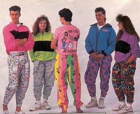
But I looked up the Clean Girl thing to see exactly what probably-AI says it is:
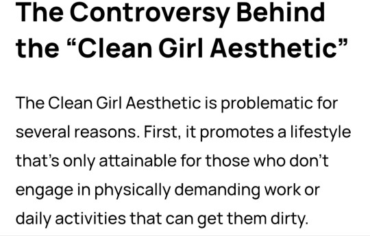
...So it is literally about not being dirty? Isn't all fashion, inherently? Was there a trend that was wearing filth recently? Filthcore? Dumpster clown?
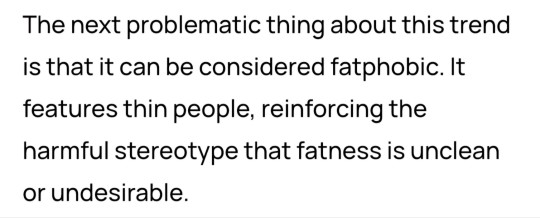
Well yeah, the midriff thing. But again, isn't all fashion inherently fatphobic? That's still bad, but kind of a universal in the world of people being dicks to other people about how everyone looks. The TRUE SOUL of fashion.
And that's not a new thing. Or is the Clean Girl thing especially virulently anti-fatty? Like to be a Clean Girl, you have to drive at least one fat person to contemplate suicide a month?
I mean that's awful, but TikTok is a lot of teenagers with stupid hair. I wouldn't put this past them. They're horrible little idiots. Look at their hair!
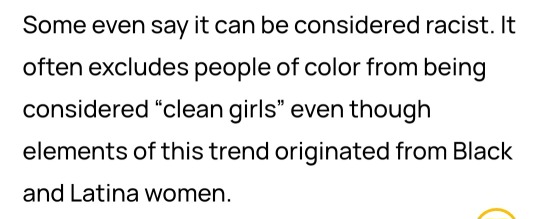
...Wait so you guys are doing "brown = dirty"? In 2024? What Gulf Coast cave did you people crawl out of after a 150-year Rip Van Winkle nap? The War Between the States is over, and your side lost. How did you figure out TikTok so fast, displaced temporal stranger?
Can't we all just shut up and wear pants?
As for the stealing thing, white people have been stealing and recreating the things they stole from POCs, then excluding them from those versions of those things, for as long as there have been white people.
It's bad, but as it is our primary cultural trait, we're certainly never going to stop.
Especially not those hibernating cave people. They probably still think "the Curse of Ham" is a justifiable legal defense.
This is what Clean Girl looks like, in case you too want to dress like someone whose dad mismanages a major streaming platform:
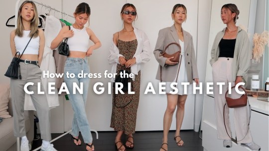
(I don't know who this model is. The picture is from a half-broken aggregator website in Foreign.)
145 notes
·
View notes
Text

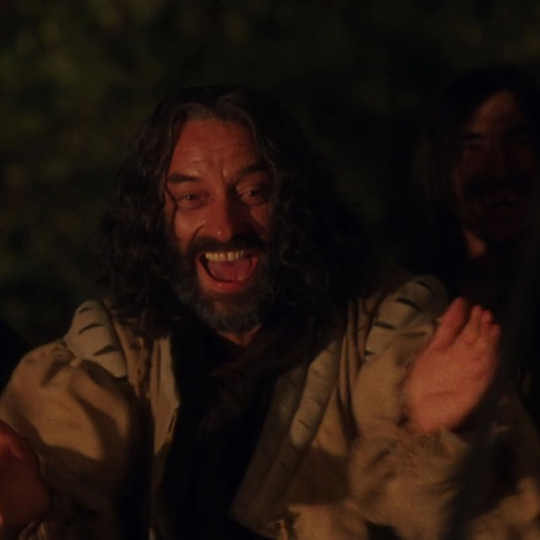

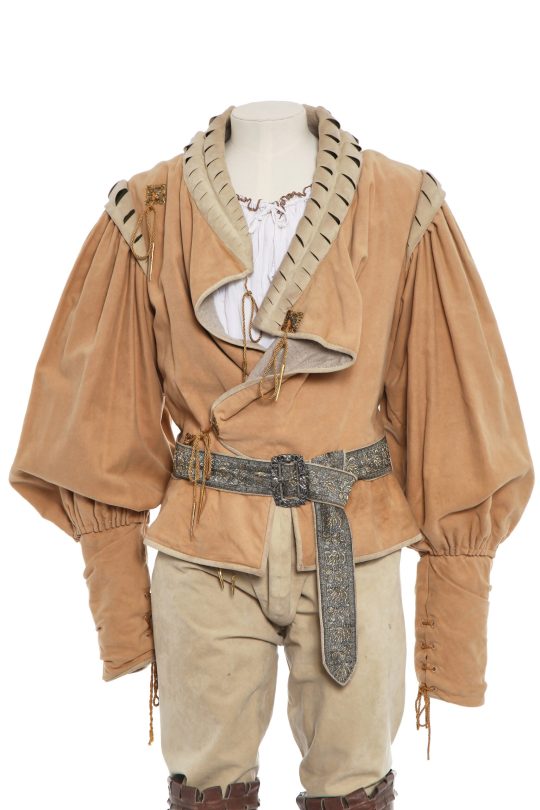
A rather interesting take on the dreaded relatability, this (for Renaissance fashions) unusually loose suede doublet with more than a little nod to 1980s rock chic was designed by Jenny Beavan for Dougray Scott’s prince as well as Mark Lewis’ “gypsy leader” in Ever After, the 1998 take on Cinderella.
A bit sidelined it turned up again on an uncredited extra as a huntsman in the television adaptation of The Other Boleyn Girl in 2003.
This costume was auctioned off by Kerry Taylor Auctions, which described the piece as follows:
Designed by Jenny Beavan, Cosprop labelled with inked actor’s name, the Renaissance style ensemble comprising: beige mock-suede doublet with slash detail to neck and shoulders, the fabric gathered at the cuffs and shoulders, gilt filigree plaques, chest approx 107cm 42in; matching trousers with integral cod-piece, gilt metal-tipped laces, waist 86cm 34in; a silver lamé and gilt thread brocaded belt; purple corduroy cloak with detachable hood; an associated white cotton shirt with drawstring collar and cuffs; and a pair of brown leather thigh- high boots with straps and buckles at the ankles, boots 33cm, 13in long (8)
Worn throughout the film, while riding including when he rescues Danielle from the water and while fighting in the woods and being carried away by Danielle.
Designer Jenny Beavan writes:
Dougray played Prince Henry – the romantic hero – but was always being saved by ‘Cinderella’ – the film has a nice feminist, modern twist to it.
He needed to look heroic but ‘real’ and vulnerable. This costume is an ‘every day princely look’ but quite practical for riding and being out and about in the country. Just looking back at the photos Dougray does look rather good in it!
Costume Credit: carsNcors
Follow: Website | Twitter | Facebook | Pinterest | Instagram
334 notes
·
View notes
Text
Not-a-tutorial - Lighting (Advanced)
Previous parts:
Not-a-Tutorial - Lighting (Basics)
Not-a-Tutorial - Lighting (Basics - Indoor)
Intention:
While dialogues and body language can say a whole lot on what you're trying to tell to the reader, lights can as well! Here's a great example:
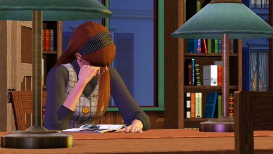
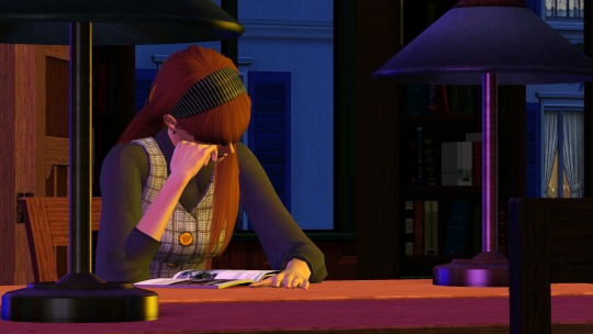
(Left is with the lights on, right is with the lights off).
As you can see, the left one feels much more like it's... let's say, a winter-y 6pm, and she's studying in the library...
Whereas on the right, it feels much more like she's skipping on sleep, and it's 3am, studying.
Moods:
You can also use lighting for more tenser scenes! Here are a few examples from my story:
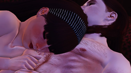
Here the setup was the same, but I added softer rose/red pastel-y colours... (Though this scene did have like 6 lights :p)

Here I not only used a blue backlight for giving it a “night” feeling, but I also added an orange and white front-light to represent a sense of hope and that our poor Ethan isn't alone.
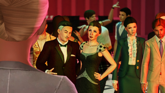
Here I gave Vita and Nick Alto a yellow, green and red lighting setup, to represent more jealous and angry colours for Nancy. As Nancy is staring at them.
However, the pink represents not only the stage light, but also a sense of Innocence given her background of not understanding the entrepreneur game.
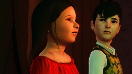
Here I gave little Bella a red background and light foreground, keeping the left part of her face dark, as the speech is about the future of the town. And with the light, she represents a bright but unclear future.
Note: all of these images do use Reshade, so trying to get these results without it may look a bit different!
Seasons:
Representing the colours associated with the seasons can give a scene a really cool feeling!
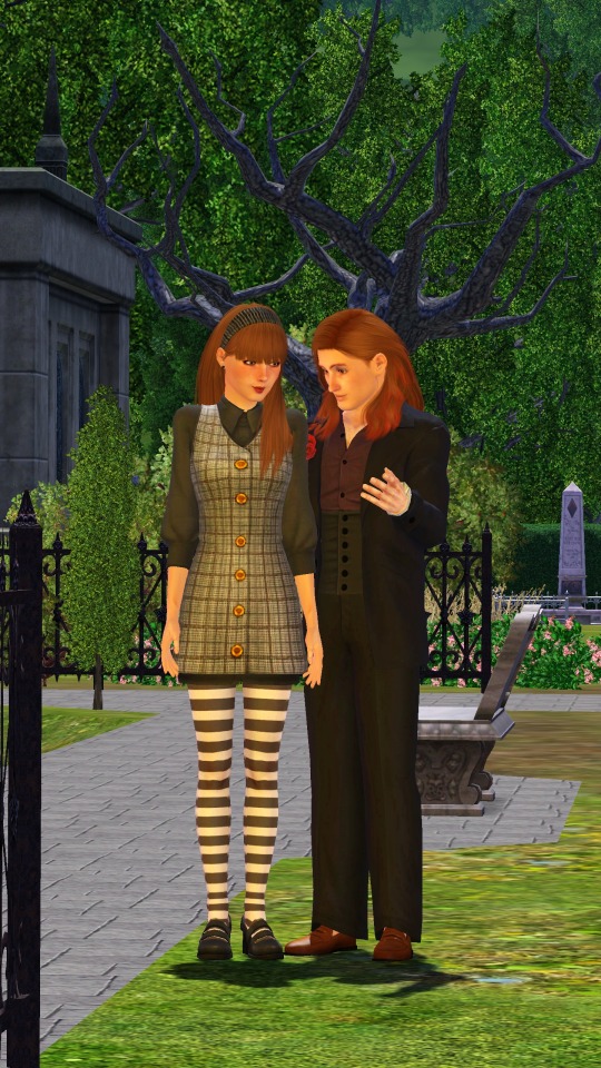
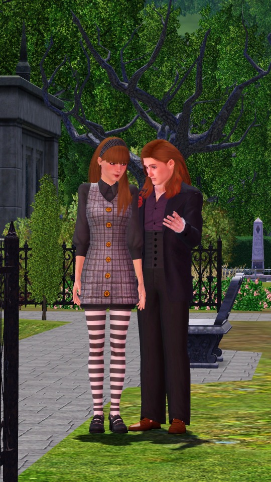
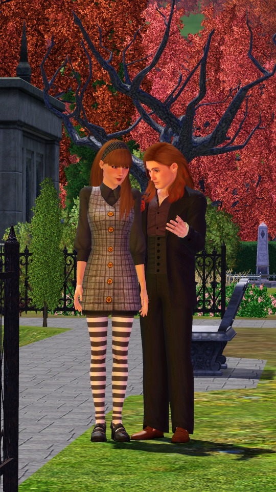
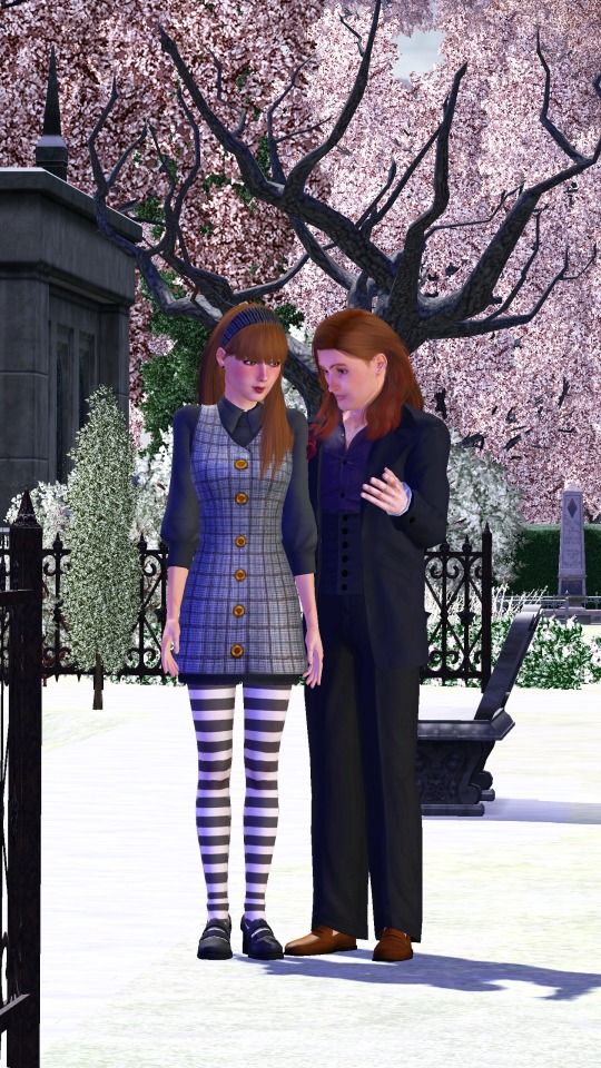
Summer, Spring, Autumn, Winter.
Color mixing:
One thing I thought was pretty cool with TS3's Lighting engine, is how colors in certain highlights will mix just like paint!
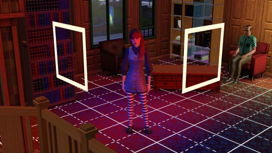
Red + Blue looks a bit purple-ish.
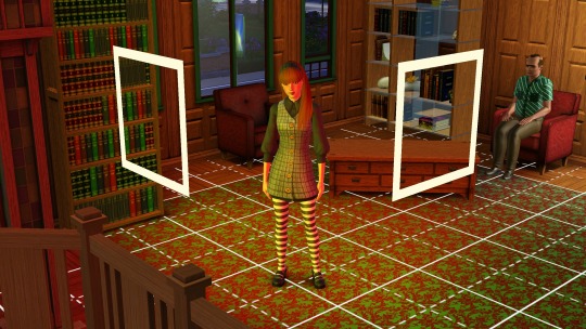
Red + Yellow will look a bit orange-y.
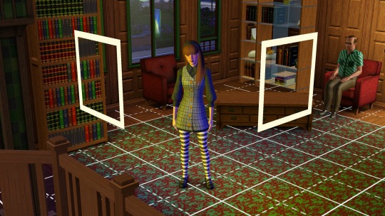
Blue and Yellow will turn green-ish at parts.
Custom Coloured Lights
Sometimes, some of EA's colours aren't... quite there. Or really what you need. Here is a short list of colours I've made and used:
0, 150, 255 - Replacement of Cyan (More of a light blue):
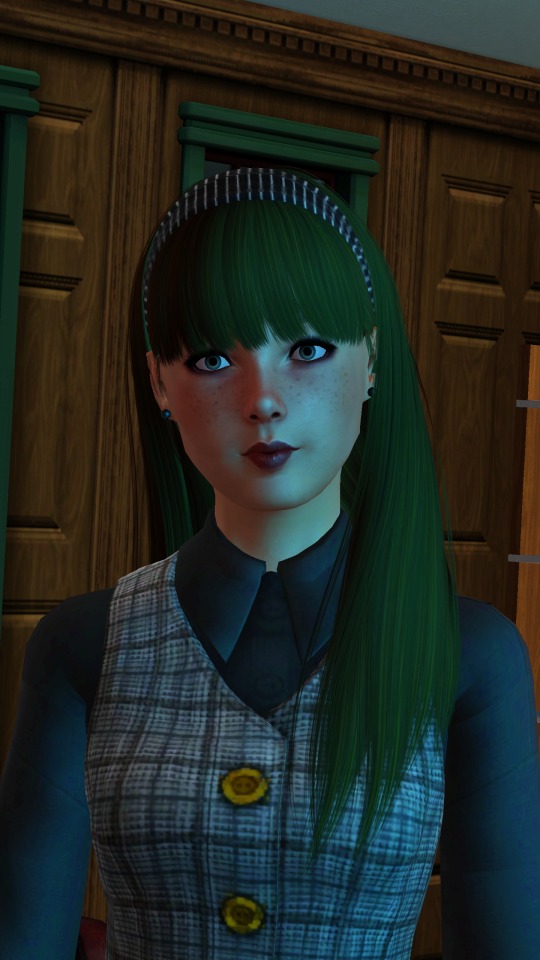
0, 163, 108 - Jade
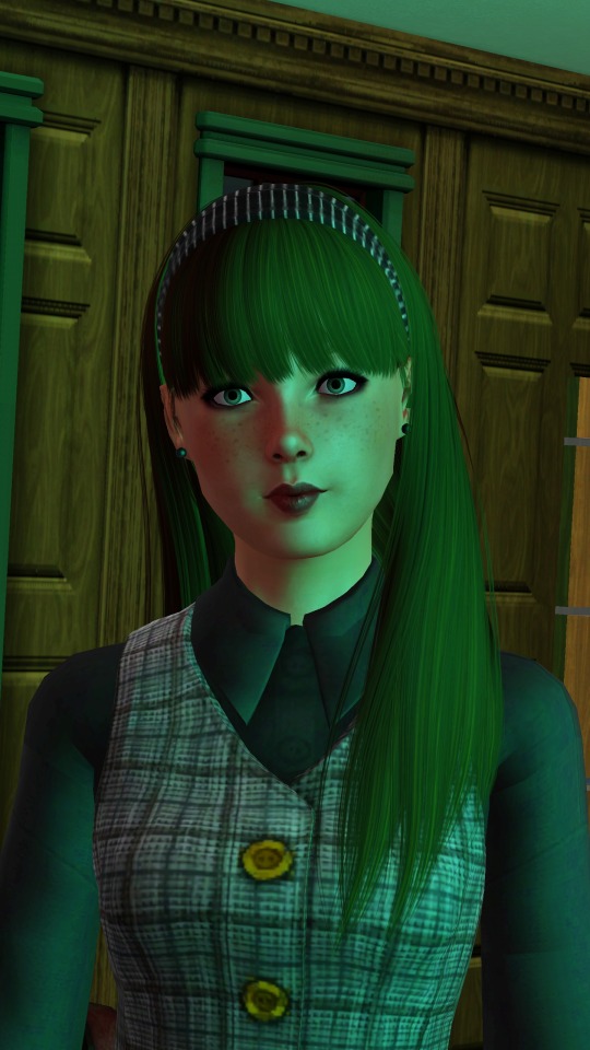
255, 195, 0 (better Yellow)
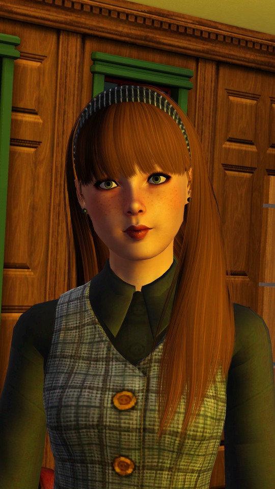
What's the easiest way to find new colours?
It's pretty easy! If you google for "Colour generator" then there you go! Do make sure to get the RGB values from those websites!
But, for the ones who don't want to google, here are a few suggestions:
Give them a try and see which ones are great! Do go for colours that are quite strong in contrast. Pastel will just end up being white, and darker colours will just turn... well it will look like there is no light on :p
That was it! Hopefully it was insightful, and obviously feel free to add your own discoveries to it! :)
#the sims 3#ts3#sims 3#the sims#sims#sims 3 story#sims 3 screenshots#sims 3 gameplay#thesims3#ts3 simblr#ts3 gameplay#ts3 screenshots#sims 3 blog#sims 3 simblr#sims3
118 notes
·
View notes