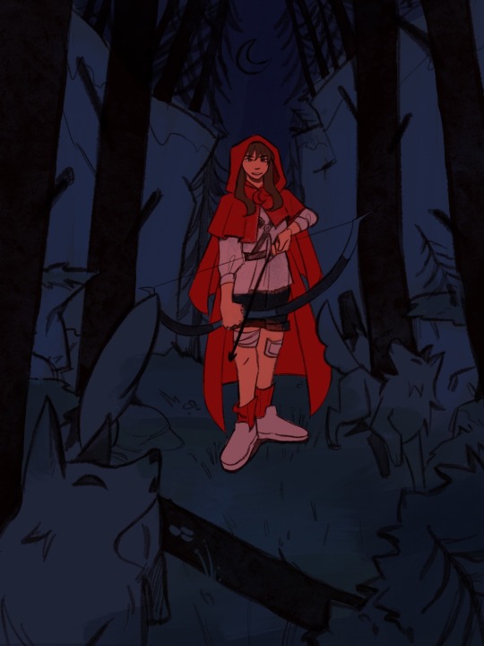
#been sketching a lot lately so wanted to color something again
Explore tagged Tumblr posts
Text
Matthew Patel general headcanons! ^_^

(some of these are ideas from other peoples headcanons as well! I'm not claiming any of these as completely original,, I just think they're AWESOME and i wanna write them down. I'm very sorry if my headcanons seem like they're stealing from anyone, that is not my intention and if wanted I can remove anything that seems too simliar to an idea that anyones already posted.) - Matt has a hobby of painting his nails sometimes, the only colors he's been seen with are black, gray, and red. But black is the most common color he chooses, its easy and he likes black in general. - though Matthew ALSO has a hobby of chewing his nails (mostly just for stimulation purposes, he likes doing things with his hands a lot when hes bored.) so this ends up in clipped nail polish a lot of the time. - smell wise, I think he has an odd smoky scent, not like cigarette smoke or anything but just smoke in general, like burning wood. With a light hint of vanilla. - I feel like hes skilled with his fire powers yet also notttt...? like he KNOWS how to control them in a battle and hes good at it. -But also he accidently sets them off sometimes without realizing, mostly when hes feeling intense emotions or nerves. - OKAY. HEAR ME OUT ON THIS ONE. I feel like in the late 2000s, Matthew would REALLY enjoy making Youtube sketches online, you gotta understand. HE WOULD LOVE BEING A CONTENT CREATOR!! I think he would have a lot of fun with having a small 'fanbase' and being able to post his ideas online. - continuing onto that, I also think he'd have a blog. Its a half and half of him talking about his favorite productions/movies and also him complaining about random stuff. He probably would think roleplaying is fun but this might be me projecting at this point. - I think he has a hard time balancing his confidence and insecurity, like its a very MIXED bag of how he feels about himself. Sadly hes pretty easy to shut down when hes confident as well I think, since his confidence is mainly just 'fake it till you make it' except he isnt fully there yet. - Matthew likes playing around with his style sometimes, especially if someone around him gives him clothes or asks him to put something on. I think he wouldnt be too into bright colors, but he'd play around with some things on himself. Like different kinds of makeup, jewelry, etc. - I feel like he has dyslexia. I dont have anything else to add I just stole this one from my friend, but its canon in my mind. - I think he has a mix of an Indian and American accent. (this headcanon exists in my mind mainly due to the fact that in Satya's audition for Matthew in the movie he used a mix of an Indian and American accent as well and i thought it was a very nice touch.) - speaking of America, I feel like Matthew grew up in the South-West of USA, I dont have a reason for this I think its just projection again. - he's actually very close with his demon hipster chicks (I also might actually post about the demon girls soon as I also have my own hcs on them) Since I like to think he summoned them in highschool and they've kinda just stuck around since. - I think hes a decent singer, though singing is something he enjoys just both as a pastime and as a career goal, so he'd practice often. - I feel like the same thing can be said with acting in general, he enjoys practicing a lot on his acting skills, he'd probably think improv is really fun. - probably a people pleaser due to how he just acts sometimes, I dont know I just feel it in my bones. okay I'm done :P also I feel like I might need to add; my idea of Matthew in my head is mainly a mix of all four medias of him, so this isnt supposed to be about any Matthew in particular. sorry for any grammar mistakes I dont have any excuse I'm just stupid!!
#scott pilgrim#scott pilgram takes off#scott pilgram vs the world#scott pilgrim takes off#scott pilgrim vs the world#matthew patel#satya bhabha#why did I say 'i feel' and 'i think' so much in this??
58 notes
·
View notes
Text
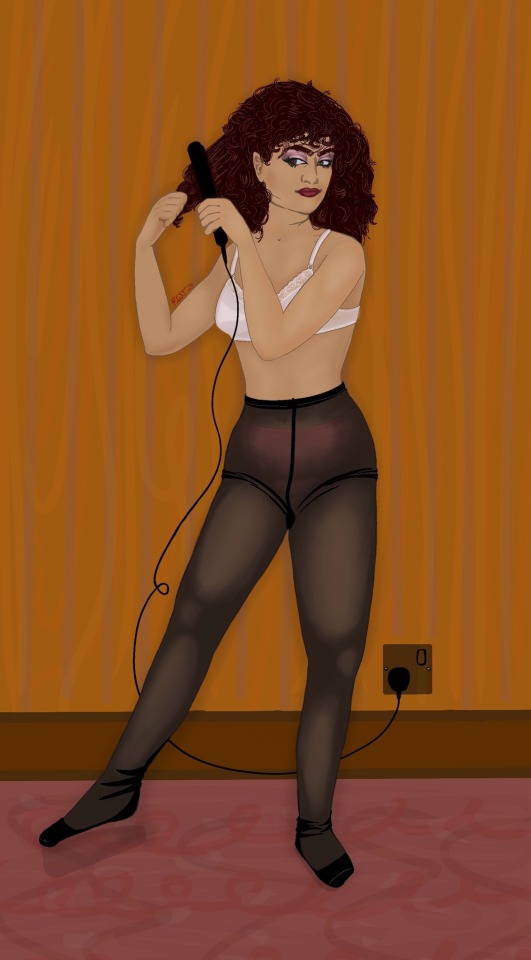
part 1 (both girls in their full outfits) ; part 2 (Edwina in several other outfits/sketches) ; part 3 (the companion to this piece aka Edwina getting ready :)
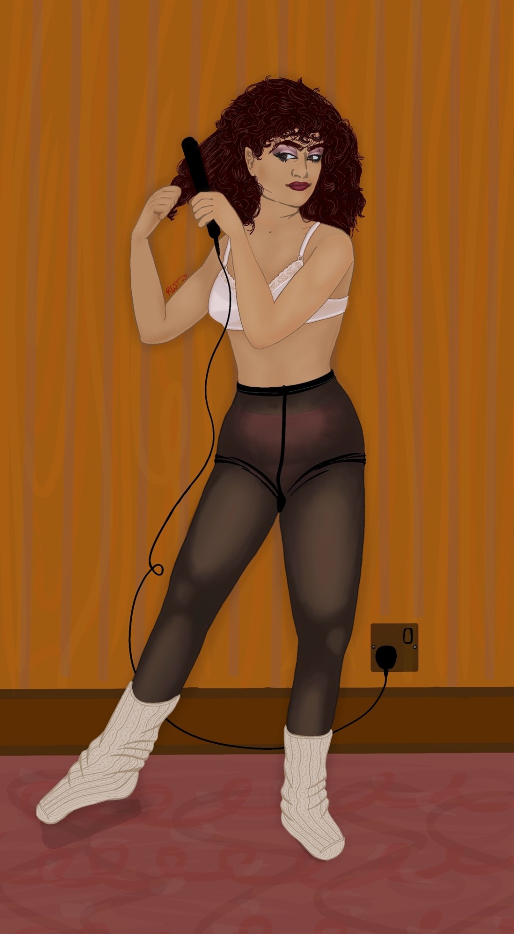
part 4 of my fem!payneland fanart series!!!! as I talked about with the poll, I have quite a few variations of this piece as I couldn’t make up my mind on a few of the elements, but I listened to your feedback and have included them all here !! the winner of the poll is above the cut with the rest of the variations below to hopefully make this not take up too much of your dash lol
lmk what you think - especially people who voted on the poll!! I’ve also included my thought process below the cut since I know y’all are interested :)
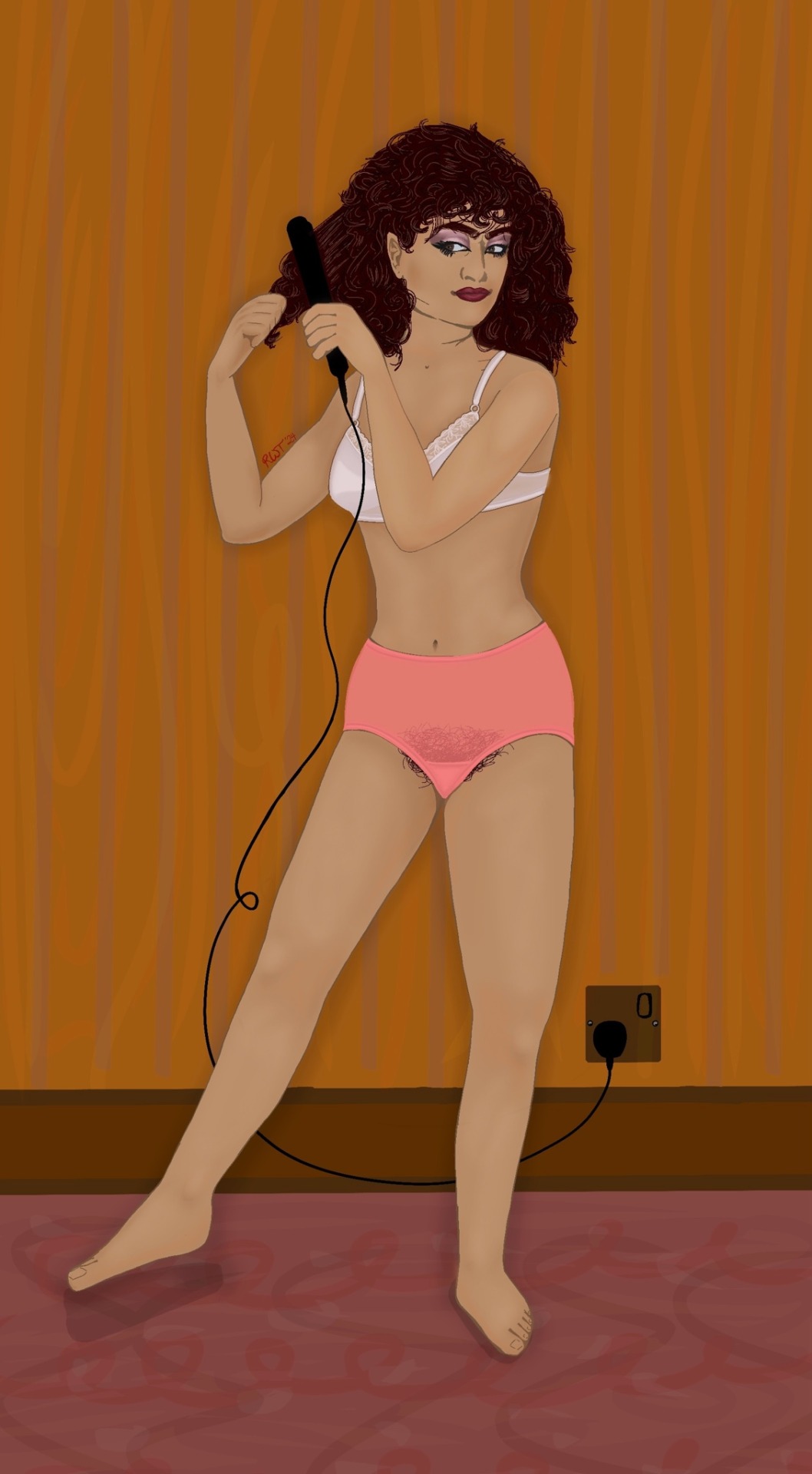
- first and foremost: I have absolutely no idea what order someone would get ready in with all these outfit components, so if you’re sitting here like “why is her makeup done when she has to pull a shirt over her head?” or something like that: you’re probably correct but my getting ready process is always chaos and there aren’t exactly articles on this sort of thing
- along with that: her straightening her hair is probably not accurate to how hair works but again I’ve got v little experience to pull from and trying to find a proper reference was a pain in the ass
yes her bra is fully rendered and then got covered up by her arm. I'm still mad that I did that to myself but I like the pose too much to change it so oh well
- (onto actual historical stuff!!)
- her hair is being straightened here despite straight not being in style during this era for several reasons:
1. I based her hair (and a lot of her style, as per part 1) on Rhoda Dakar of the band The Bodysnatchers, which was an all-female band that was part of the ska revival in the late 70s/early 80s. Rhoda Dakar in particular is a British artist (who’s still making music!) with an English mother and Jamaican father—so not only was she one of the only women of color I could find as part of this subgenre/in ths era/with plenty of photo references, but considering Jayden Revri is Jamaican and English (alongside Indian) himself I thought it was fitting! Her Bodysnatchers look is also much more femme leaning than the rest of the band, as well as her hair styled in a way that suggests straightening, so I carried that over to Charlotte here as well.
2. On a related note, there is a clear historical and modern difference in hairstyles worn/made popular/deemed fashionable by non-white versus white individuals and I thought it only appropriate to acknowledge that in my design of her. I even went so far as to research how her mom’s hair may have been styled since I assume that’s who would’ve been teaching her how to care for her hair in the first place. With that, I looked at popular Indian hair trends from the 60s (figuring that’s when Charlotte’s mom could’ve still been in India and following those trends) which also involved a preference for straight/wavy hair, with soft fringe made popular by Sadhana and the styles ranging from long and luscious to styled up into a very 60s beehive. Charlotte could easily also rock a beehive, especially since the 60s revival was a part of the ska revival movement and Dakar herself styled her hair as such, but I figured Charlotte is a little too much of a rebellious teenager to go for a look she’s seen her mom wear!
- her makeup is based off of the different members of The Bodysnatchers as well as other punk/ska fans at the time. The look usually required more blush that what I gave her here, but I wanted to make sure the eyes were the feature (since Charles wears eyeliner himself) and then the lips being any less just looked weird to me. Also, Dakar doesn't seem to wear the same heavy blush that the other members do, which could be a stylistic choice but could also be the potential lack of blush shades that would work well on her skin tone, so I went that route for Charlotte here
- her underwear is all based off of meticulous searching of historical advertisements, though I will admit the sources are (presumably) American since I couldn't find British equivalents (I'm hoping the styles were similar enough...) in particular:
1. Her bra is based off of: Playtex’s New Made for Me, Playtex’s Right For Me, and Playtex’s Thank Goodness It Fits (which are seriously the names of these as per the ads—how creative /s)
2. Her panties (or pants or underwear or whatever term you want to use) are based off of: Sears Best’s Nylon tricot panties, Sears Very Impressive Panties Nylon panties, and JCPenny’s eiderlon fashion panties
3. (In the below variations) Her pantyhose are theoretically based on L’eggs and Spirit by Stevens’s Slim & Slender pantyhose. But, honestly, they’re mostly based on my own experience wearing hose bc almost none of the ads showed how the gusset of the pantyhose actually looked so I needed to fill in the gaps (one of the many reasons I’m still unhappy with them—plus the wrinkles would not look right no matter what I did !!)
4. Her socks are called slouch socks! I don’t have a specific brand for them but the style was all the rage in the 80s-90s (and I want to own some so bad ngl)
- the hair straightener is just a blob based on the reference photo since trying to research historical hair tools was beyond me at the time apparently, but the style of outlet/plug is accurate to Britain in 1989 so there’s that at least (I have no idea why my brain works like this)
- since I talked about it in the poll I feel like I should address it here: technically having a bush was well out of fashion by 1989 due to the grooming boom and new types of hair removal popular throughout the 80s and 90s. However, she’s wearing multiple layers over it and is technically a teenager (in an abusive household and a catholic all-girls school, at that) so I kept going back and forth on it. It won the poll so it’s in the main post, but you’ll see in the below variations that I really went back and forth on it. that being said I do think it’s interesting given her nylon pants being semi-sheer besides at the gusset, so I’m not mad at it. plus I figured she was definitely shaving her legs/underarms, so maybe that balances it out ?
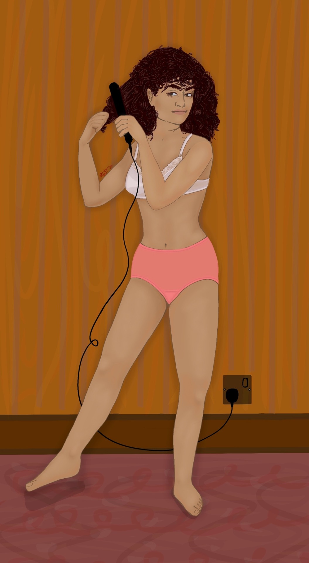
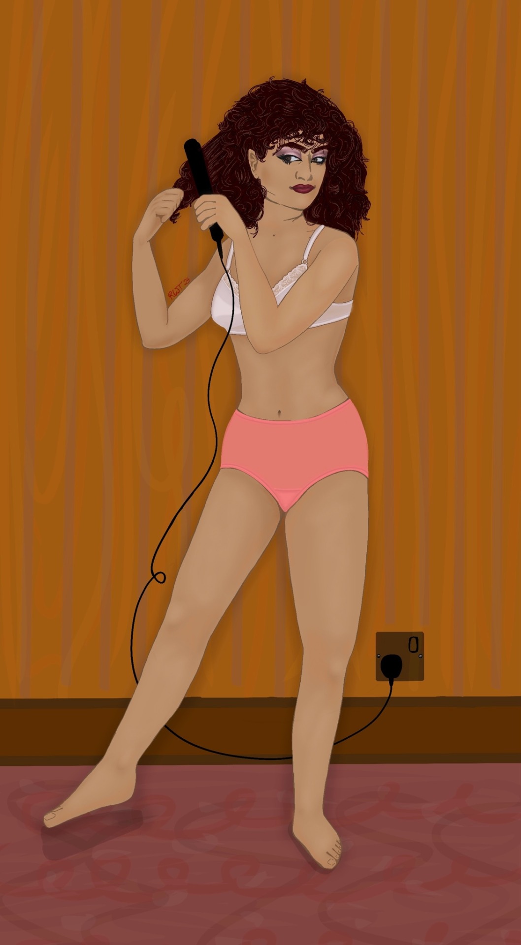
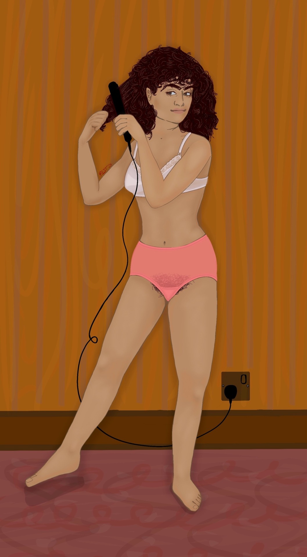
and finally here’s the other seven variations of this piece :) lmk what you think!!


#my art#femme!charles rowland#femme!charlotte rowland#fem!charles rowland#fem!payneland#charles rowland#charlotte rowland#payneland#painland#dead boy detectives#dbda#fanart#charles x edwin#edwin x charles#dbda fanart#the dead boy detectives#dead boy detectives fanart#dead girl detectives#charles rowland fanart#payneland AU#dead boy detective AU#1980s fashion#ska punk fashion#lesbian#femme lesbian#chadwin#genderbend#save dead boy detectives#renew dead boy detectives#dead boy detective netflix
42 notes
·
View notes
Text
Some fic-art wips and yapping for you today <3


I've been re-editing my early chapters of my ongoing Arcane story A Second Too Late while I work on making a fic guide for myself to make updating easier on myself.
The story is at just under 100,000 words of posted material so far, and it's just gotten to be too much to go back and reread every time I work on something new for it - and I felt like too many details/small plots were going to accidentally be forgotten.

Now I have all my characters organized in order of appearance (Canon characters on the left, OCs on the right)
AND I've been working on doing character portraits (particularly for the OCs) as well as chapter-specific notes on each character when an important event/plot happens with them.
Example of the character portraits:

I also have all the chapters broken down scene-by-scene, and any extra art I want to make upon editing gets it's own reference/planning sub-board as well >:3


I've been doing the thumbnails mostly in my sketchbook and finishing them off digitally which has been a really gratifying experience tbh, I really love doing my sketches tiny and in mechanical pencil bc it gives me the looseness and texture I love while stopping me from going to detail-heavy (bc small) & redrawing 40-billion times (bc tradtional).
Below is an example of the thumbnail sketches vs. the base lines :D


I just moved into a new place, and I don't have a monitor that displays color well, so I've been firmly in the b&w/lineart space with digital work right now, but I'm actually grateful for it bc it's forcing me to slow down and not hyper-focus on any one particular piece.
Idk how many chapters will have art, but I'm having fun with it for now hehe
Sometimes I get kind of down on myself for how slow I can be at updating, but something (I can't even remember what atm it's 3 a.m. rn lmao) resparked the feeling of happy fandom warm-fuzzies I had for years and years, and I just - this is fun. I'm so grateful this is like... a thing, you know?? Ik the internet can be A Lot esp. with the large influx of ppl into the community who haven't learned the culture yet but... idk I'm just feeling... happy about making things again in a very familiar way I had been chasing the last couple months.
Anyways, all this bts work has been a massive undertaking, but I'm really glad I've been putting in the time to do it. I think it's going to make the story a lot better, even besides all the personal perks for my own writing convenience.
#my art#digital art#fanart#ltbd rambles#arcane#arcane vi#arcane powder#arcane fanart#fic art#ltbd fanfic#a second too late#astl#sketches#wip art#art wip#art wips#astl update#im too tired to tag properly#hopefully that ^ is good enough XD#tagged based on vibes and a dream lmao
13 notes
·
View notes
Note
Hello. So I have a genuine, honest question as someone who isn't an artist. I saw you made a post about AI art floating around Tumblr lately. How does one differentiate between AI-created art vs. ACTUAL art? Some things have been easier to notice than others (ie: YouTube videos and like, moodboards and the opening to Secret Invasions) but for art specifically, are there any key things to look out for that make it obvious it's AI generated? I do not support AI in any fashion but in this day and age I do find it increasingly more difficult to tell the difference between something that was created by AI vs. created by an actual person.
Hi anon! So, heads up this might be a bit long of a post but I wanted to point out some things that I don't see frequently mentioned in other posts about A.I stuff.
First things first: Look at their other 'art' pieces. If they have a generally consistent style, a consistent type of work (Realism vs ink art for example), characters you see more than once and from different angles, character sheets, etc. You're going to notice if someone suddenly switches from little ink doodles to fully colored and realistically rendered 'art'. Now, this doesn't mean everyone switching styles or mediums is A.I, but it means to take a closer look if you notice something vastly different than their usual stuff. More A.I. clues below!
For things to look for, there's a lot of different clues but generally you're going to notice a certain new car shine to everything. Everything will be a little too clean, even if the style they are ripping off is sketchy. Sketches will have crosshatching that doesn't really make sense or random lines in a place that an artist probably would not put there. That being said, here's some examples where that isn't as noticeable:
Here you've got your usual body/anatomy problems. (Plus some elements I'll talk about later as well. This one's got it all!)

Glitchy foot, glitchy hands. glitchy eyes. Strange proportions for legs that don't exactly fit a stylization, but more of an glitch. Now, of course an artist can draw 'glitchy' things like this either by accident or intentionally, but you really only see these types of things in A.I vs actual art of a similar style. Realism artists are generally not adding extra fingers or varying sized fingers, they're not rendering the foot to only have too many toes, missing toes, and the foot also... sort of part shoe. Unless art artist is otherwise intentionally including these elements, it's generally a clear cut example of A.I stuff. (For example: Different body types and disabilities exist, and there are people with different shaped hands, shorter/longer fingers etc. But you will also usually find some kind of info with the post about the person/character that will tell you about them that can clue you in on if it's A.I vs real art.) If the artists are drawing in a style with 'exaggerated' anatomy, you can almost always see that as a persistent and intentional STYLE in their art. If they aren't, this is something you'll really notice in A.I vs realism. It can be especially true with people who fully render realistic art because it's not in line with the style, and the relevant elements of rendering art this way. Artists who do realistic rendering at this level generally know their anatomy very well, and are going for realism in all elements of the art. Some stuff like the exaggerated long legs in women are kind of everywhere, but the hands, the foot, the lopsided winky eyes (I don't know how to describe it) are not things a professional artist rendering realistic art would generally do. It's just not in line with the style, or the ability/skill that the artist has worked on. (Again, unless completely intentionally and in line with the person/character.)
For 'real' life items like the tables below, you've really just got to ask yourself: Is this physically possible? Do all the elements make sense and actually work together in a real way?
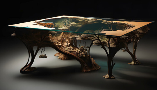

Sometime it's hard to know if you don't have any experience with, for example, acrylic and wood table making. But there are things that just don't work in real life, and there are things that maybe someone can do, but even in the provided examples it just doesn't make sense to do. For example, the little 'tree' hanging from the bottom of the left table. Would that be possible? Probably. Would someone do that? Probably not. If you're really stumped, sometimes just looking up videos of people making that type of thing can give you a better idea of what actually works together, how it's made, etc.
Here's something that really helps when you're really struggling and zooming in for every detail: TANGENTS

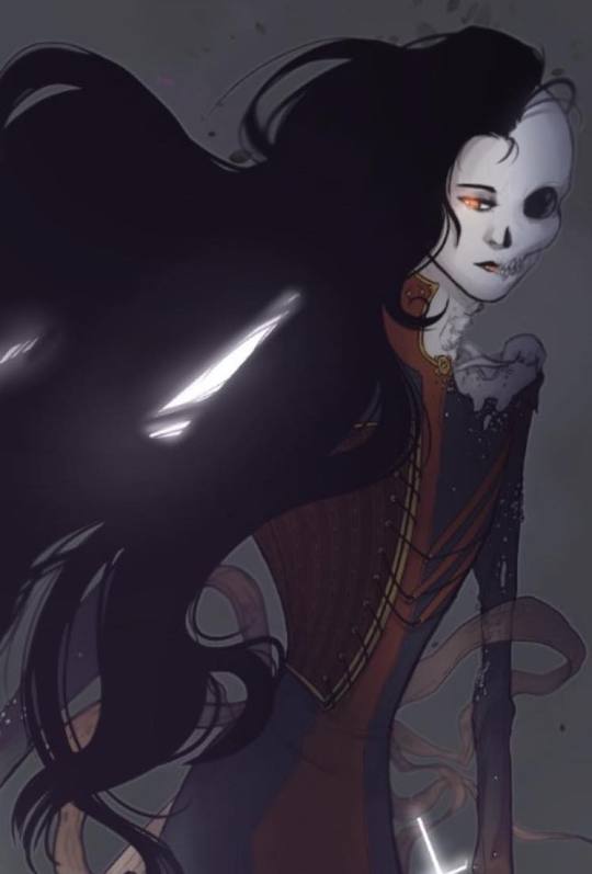
Ok, so tangents in art are when you're drawing a thing, like hair, and it's lining up with a different object to the point where the visual line continues from one part of art to another and it looks really unrealistic/weird. Most artists figure out how to avoid this on their own just from noticing it and feeling uncomfortable with how it looks, while others learn via the internet etc. It can happen in anyone's art at any skill level, but the amount that it happens in A.I stuff is HUGE. It's almost every single image, and you can really notice it in places where something overlaps like hair or, from the above image with the money: there's two bills that just kind of bleed together. From the same image, you can also see how her hair bleeds into the wrinkles of her jacket in an unnatural way. Comparatively, you can see in the Hela art I did below that there are overlapping elements like the hair and the ribbons behind it that do not mesh or bleed together.
Something else to look at: Symmetrical elements that don't work right. So, this is kind of getting harder to see depending on what they're generating as a subject matter and the style they are using. As always, there is a disclaimer for this. Art does not always have perfect symmetrical elements in it.
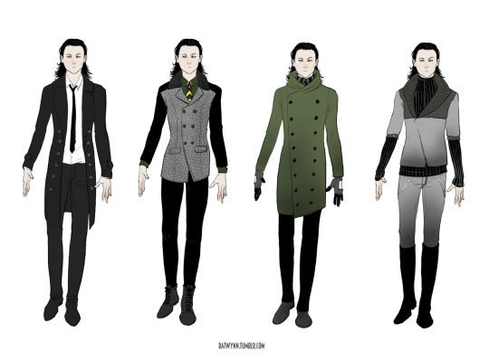
For example: in the real world, this dude's coat would have more clean symmetrical elements. As it is a sketchy doodle, they're there but they're not 100% symmetrical. With a LOT of A.I stuff, you'll notice that something meant to be mirrored on the other side of the clothing, room design, etc. is actually completly wonky/incorrect or not even there at all.

For example, in this A.I we have missmatching elements on both sides. Not only in things that could be designed to be asymmetrical, but also things that 100% should be mirrored. The left side under the buckle on the shoulder has a diamond shape. The right has a weird spikey thing. The little leaf pattern on the gold lapel area appears to be just blobs on the right side. The left shoulder area has a button and additional little detail under the buckle area. It is not there on the right side. And, again, some of this can be intentional with real art. Her arm bands could be intentionally different, for example. But elements that clearly should be reflected on the other side and are very clearly not are generally a good clue that it's A.I. A few last moment things to look out for:
Styles that are recognizable someone else's whole thing. Example: The monstrosity that someone just generated that is supposedly Calvin and Hobbs. It's pretty easy to tell because it looks like shit right now, but generally if someone is ripping off a distinct style of someone famous, it's probably A.I or at least worth double checking.
Did they suddenly start doing ______? This could be anything, backgrounds, drawing horses, full color, etc. But if they're suddenly, overnight just BOOM they're 'drawing' in a whole other style, it's suddenly really rendered, and/or there's no 'growing pains'/work shown that they've started working on drawing the thing they never drew before... It's time to take a closer look. Last but not least, look for the language they use around the stuff they're putting out. A.I people are often... a certain type. They use a lot of that NFT bro lingo that can tip you off. The tags might be all over the place for styles, or tagging certain famous artist's styles, etc. They also can be a bit more blatant in the tags and just outright tag A.I or NFTs somewhere in there. And, in the end, if you really can't tell and you really love the thing and want to share it: Ask an artist. Or just don't share it.
Thanks for reading, and I hope this is helpful in some way!
#How to tell if it's AI#How to recognize AI#Art vs Ai#Long post#nice anon#I mean I have to be honest a lot of it is also like#white guys generating indiginous and asian people like they're working for fucking nat geo but in that extra mastibatory way#a LOT of incel shit out there#a LOT of 'if I was Elon Musk my apartment would look like this#but also the entire cottage core tag is exploding with AI shit#It's a mess#The best and worst way to handle this is to kind of assume whatever you're into is going to have at least one looser making AI in it#the worst because it sucks that it's everywhere already#and sometimes you have to block someone you liked and thought was cool#but best because being aware and active helps yourself and others
84 notes
·
View notes
Text


Doodle Dump
Been a while since I've posted a collection of bad sketches. Notes under the cut~
1-2) AC:OS Seals. So, I didn't want to give up on making those seals for you guys even though my enthusiasm for it kinda went away~ The melon soda seal feels like it's missing something, and I think the sea captain seal is giving too much Admiral Bobbery for its own good, so I might redo that one entirely. I don't hate them, but somehow they're not reading as very "Animal Crossing" to me. I think I need to get more creative about the facial features.
3) Pudding. Another attempt of designing Yuru's main mask. I think it's cute, but I'm still not sold on it. I like the colors at least, but I think I want the mask to have a big gaping mouth so he doesn't need to take it off to eat. I'm just having a hard time keeping it cute when the mouth is open.
I dunno if Pudding is gonna be their final name, but I guess it suits them.
4) Kun3h0 ver. 4(?). I'm sorry. I'm really sorry, but I just can't stop trying to redesign Kun3h0. Lately, I've been thinking that I'd like to try and make her a little less symmetrical for more visual interest. Originally the change was as simple as just adding the gauntlet to one arm (similar to be VERY early iterations of my "vtuber sona" with their one-paw glove), but then I started changing her more, and ended up with this. It's cute, but somehow I think it makes her theming even less apparent XP (her tummy lines were doing A LOT to sell the fact that she's a robot and not someone just dressed in sci-fi-ish gear).
I changed her eye color to green to draw in focus to her face (which is important for a V-Tuber design). Originally I thought I was achieving that by making the hair so much darker than everything else, thus drawing attention to the head, but I think changing the eye color to something unique helps even more with directing your eyes straight to the face.
I dunno. I like it aesthetically, but I feel like I'm losing the story here. In the last design, even though it was kinda generic, just having the clear indicator that she was inhuman did a lot to inform her character, but when I lose that, I lose the one real point of interest she had.
Then again, I've never truly had a good grasp on Kun3h0 as a character, so maybe that's what's wrong. Maybe if I sit down and actually write even a basic backstory for her, then I'd have some more direction besides, "girly robot Y2K inspired game character with a heart/bunny motif".
5-6) P2 Kliff (Banana Split/Original). So, I wanted to make a version of Kliff that fits more into my aesthetics. (Read: I wanted to make him pink). It isn't meant to be a replacement for him, just an alternate palette. In fact, I kinda liked this outfit enough to try it in his original colors too, and I think it works~
However, I dunno if I completely like the Banana Split colors
The outfit is based on this sketch from Kliff's original concept drawings.

I have NO idea what's going on in his chest area. They can't be the buttons on the top because he's wearing a turtleneck (unless it's a vest, and he's seriously wearing 3 layers in this fit). I don't think it's a lanyard because he already has a name tag on his shirt.
So I interpreted it as a necklace. I dunno, I've always felt like one of Kliff's understated traits is that he's clearly fashion conscious given how much he accessorizes and that he has the confidence to even run around in a coat that yellow, so I don't think it's out of the question that he'd wear more jewelry.
#gbunny draws#animal crossing: open seas#seals#OCs#kun3h0#yuru#nsr#kliff#tbh. i think i felt more inspired to draw after art fight ended.#since i don't feel obliged to it anymore#maybe i wouldn't have had fun even i did get to participate as much as i thought i wanted to#who knows#i'll try to try again next year and see~
17 notes
·
View notes
Note
Hii me again. I'm not sure if I sent the ask I'm talking about on anon, so maybe that's why you didn't see it? It partially got answered with a recent ask you got anyway so no worries. I was just wondering if you use 3d in your process and if so, how? I've seen other illustrators use it to varying degrees and it seems like a really helpful tool to push your work.
Oh that's so weird! No I periodically go through my asks in chunks and I didn't see anything like that. I've had a few people in the past few months send me asks that looked like the second half of something else with no context, so maybe it's Tumblr fuckery. Sorry!!
I recommend learning Blender so you can help sculpt shapes and render lighting onto them in order to get the weirder/more complex shadows right. You can also apply colors onto the things you sculpt in order to see how the colors act in different lighting. It's pretty much an invaluable tool to me as it keeps me from having to problem-solve too much. I did a lot of digging around in my house to build references to photograph but it was just impractical to achieve the things I want to a lot of the time. I still do that, and you would not believe how many goofy photos I have of my husband in the poses you've seen me paint Astarion in lmao...
I do think that it needs to be used in moderation if you are a more beginner artist- I think that using 3D is DANGEROUSLY close to becoming a massive crutch for a newer artist and improper usage or over reliance on it can lead to stiffness or artificial looking colors. You need to be able to train your eye to create compelling compositions by bashing things together, and train your hand to replicate/add/subtract as needed from your references with an organic feel.
I will say this as a total committer of this crime myself in the past, it's VERY easy to tell when an artist relies too much on, for example, Clip Studio Paint posed models as bases for pieces without a good enough grasp on their fundamentals. And I also used to prickle when I saw more advanced artists warn of this, so I do think maybe it just has to run its course sometimes, because I know that using 3D for reference seems like an easy-button.
I've taken a lot of in-person classes for live figure drawing and painting, as well as just totally done drills, basically, on sketching and painting from life before relying too much on static imagery/3D/etc.
I often fret over every piece I do looking too stiff even still.
You have to do a LOT of the boring hard stuff the old fashioned way. And I regularly go back to it over and over when needed.
For example, I recently did a stupid amount of rose petal/flower studies deconstructing and painting ugly little paintings/doodles over and over because I know that I've been horribly weak at painting flowers for years (actively avoiding them). And I've been doing a lot of floral stuff lately due to that.
Whenever I start a new piece in new territory, I know it's going to mean several 3AM nighters where I have two other tabs open on Photoshop where I test out different textures or do a couple of studies. I'm working on a piece of my OC right now that has a lot of gore/medical instruments and I've been working on testing out different methods for shiny metal painting and some anatomical studies. I'll come to a snag in a painting and go "here we go" and work through it one piece at a time.
My Halsin piece, "Secret Spot" in the hot spring, was a massive undertaking with a lot of these moments. The Karlach x Dammon piece took 3 times longer than it should have due to me just having to go back and fix things knowing I could do better after doing some studies.
Ultimately I personally find art tutorials to be quite useless overall once you get to a certain point, unless they are teaching the use of a tool/software because you HAVE to figure out what works for you. And even then I use Blender like a monkey with a keyboard, I suspect, because I've just bruteforced through it, so I could probably use a tuneup from a good teacher on that haha. I hope this helps some, and sorry if I overstepped if I sound preachy.
24 notes
·
View notes
Text
i didn't reblog the post but I do agree that the terminology for zines has gotten completely twisted.
ON THE OTHER HAND I don't think that selling them for say 20$ (which is what i sell my sketchbooks for) is unreasonable or unfair to still call a zine. I need to cover my costs of printing and the time I put into putting them together. yeah I can TECHNICALLY get a printer and print them myself but with the cost of printer ink and the lack of space its easier for me to just pay for someone to do it professionally but I'm also NOT making them at like....the HIGHEST QUALITY, LIBRARY BOUND, HARD COVER, IT COMES WITH A THOUSAND DOO DADS AND GIFTS. its just sketchbooks ofpreviously existing doodles and a few new sketches or sketches that I had before and colored in. Its essentially like selling a full print but in carryable size with some notes from me.
Its a zine but I call it a sketchbook because the idea of zines has changed for a lot of consumers. Thats not their fault bc those zines or anthologies DID start out in the "lets make a big ol book together because we are all horny for Reigen" kind of thing. A lot of times they're projects made from passion. I HAVE noticed that there's been a turn in the whole process of making them that both stresses out artists, requires kickstarters, and all sorts of shit that should be considered Artbooks. ARTBOOKS have always been on the higher end of things. There's nothing wrong with considering an anthology thats proper bound, and for a certain amount on a kickstarter you get extra things like stickers, charms, whatever.
But zines SHOULD go back to being simple little things. The cost to buy them shouldn't be lost UNLESS the artist wants it to be. If you print at home or using a schools printer and just print a bunch of cute little zines yourself then that should also exist and you can set your price point for whatever you want.
Its all semantics and personal preference at the end of the day but I do think that...yknow it wouldn't hurt if we could start calling the big project 50$ range books that often get run into the ground from bad leadership (or fun stuff like the organizer of the thing runs off with the money to play genshin) ...something other than zine. Like Artbook or Anthology. Or even Collection lol
Zine should be a small thing that you collect for fun and doesn't require a committee, a new discord channel, and a contract to make sure your organizer doesn't run off to play gacha (I'm sorry it still makes me laugh)
ALSO another thing about zines is that often times they were originally made to be alternatives to really closed minded book sellers. Like...its where a lot of the OG star trek fanfic/porn came from. Its a place to have your ideas put down. To explore narratives. Essentially Doujinshi can also be considered A TYPE of zine in that it literally means self published (not NECCESSARILY that its...yknow...bl or waifu porn lol Sometimes its just manga that artists put out before they can get published)
But lately there are a lot of zine projects (again...more actually like anthologies or art collections) that are REALLY REALLY closed minded even when the subject is SHIPPING.
So even the nature of CREATING the zines has changed a lot.
So yeah I agree with that post that I forgot to reblog. My only REAL gripe is that it doesn't mean that you should undercharge your work because you didn't print your zine at home or hand craft it like a youtube diy video. I did enough of that at art school I am not gonna bind a book or try to cut pages ever again if i don't have to lmao. CSP even has a zine preview so I can see the pages in 3d as if they were bound before printing lol
19 notes
·
View notes
Text
Ok so my art to-do list from, starting from what I will prioritize to work on from top to bottom: - Private large commission - Work on 10 custom art as part of a trade - ^^^ If no full info on what is needed, I will work on the Galarian Ponyta fusion adopts ( I'll just finish up what I have. Will not be a large batch ) - Work on Kuruna's blog art responses - Do a small handful of chibi Eevee fusions - Draw Tedaterra in a Kirby onesie - ^^^ If no drive for that yet, I will work on a few headshots ( Or pixel art ) of the characters for the Tale of the Kingdoms blog. - Do an art piece of Kuruna and my persona together ( Base on the anon ask that has been sitting in my box for a good while now ). - Work on more chibi Eevees - Do a lil fanart of tricks-n-illusions character ( Base on aro-pokeverse ask. I do apologize for me being late on this ) - More Kuruna blog art - Chibi Eevees again - Made in Abyss x Pokemon SV ( More specifically Area Zero ) crossover piece - ^^^ If I don't feel the drive to work on that yet, it would just be me making lil fun art of Kuruna instead. - Work on gift art for a small handful of friends ( It was supposed to be a Christmas gift but, well... Plans have made things get pushed back ^^" ) - Kuruna art for the blog - Work on art responses on ask-the-abomination - Try something I've always wanted to do was to make a very big art piece that includes a lot of my characters ( As it has been a decade since I last included multiple characters in the art piece. Aka, before I dabble my hand on digital art [ I started digital art on 2016 ] ). Have yet to decide on who and what scene it would be. - More chibi Eevee fusions, if I haven't finished yet - Fanart of actual POC characters ( Because I am tired of seeing people pushing aside existing POC characters when doing a fan piece [ Coughs at edits ]. So I want to try. I have yet to decide if it will be a headshot or halfbody. I don't feel up to doing a fullbody art ) - Yet more Kuruna blog stuff - Anatomy practice for larger size beings. More specifically the back ( Not in a sexual way. I really am still not too confident on drawing backs of larger size characters. I am more use to doing those for less heavy sizes and creatures ) - [ Input Sketch colored art raffle. Note that it is clean sketch like this . Have yet to decide if there will be shading involved ] - Kuruna blog art yippee There is a few I have in mind that I don't know where to put in the list. That few being: - Finish up this Kuruna art piece:
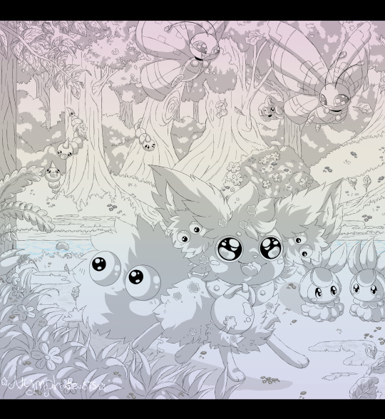
Work on random Pokefusion adopts ( This one is a random spur, as ideas do pop here and there. Not frequent )
Work on personal character art ( Of Pokemon ocs )
Random Kuruna art ( When I feel bored, need motivation, or had a random idea that I've wanted to draw out real quick )
Work on Arcy reworked blog ( Newer characters, with the exception of Arcy ).
Work on some art examples for my commissions ( As some lack more examples than others )
Do a new YCH that is something simplier and cute, price shouldnt be that high really.
Fanart of games I have been playing, like Eastward, Palworld, FFXIV, or even Digimon ( Speaking of which, I still havent done that Alphamon x Lunala fusion. This idea is a few years old and I just never dabble into it TwT" )
Dabble on doing clean sketch color comms. Price has yet to still be decided.
Work on fanart / gift art of the following blogs: ask-eden, omniandco, ask-the-royal-absol, askcomet, ask-a-silvy, ask-valiant-victory, sphaeramjourney, the-feral-one, ask-aeos-company, and lightofunova. More in the future ofc because I love the ask blog community!
Scenery practices of things I don't often do ( I need to practice more with places like cities and those that are more complex-decorated ).
Fix and finish this art piece of Namithia:

Finish this art piece of Eevrutty

Finish this art piece of a random lil creature ( Probs will sell it? Undecided yet because I do very much like them )
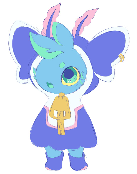
Finish this piece of Nerissa ( A character I have yet to decide whether or not I will remain keeping. I did removed her kingdom to revamp it to be the final sea kingdom to be falled [ Since there are two. One from the North and other from the South ] )

Create a few Pokefusions to be a part of a giveaway
Draw an art piece of my grandmother and have it be printed as a carry on bag design.
I think that is all I had in mind of what I've wanted to get done ;w; It is, uhhh.. A lot to say the least xD
#nymphrasis#ramble#art#my art#Yeah I have a lot of art plans that I want to do#Hopefully I can chip away with this?#I dont plan to do anymore art trades#At least not for a good while#Also I did not include comms#Since those can be placed whenever and always have a higher priority#So ye#My comms are currently not open yet btw#I wanna complete that one comm and 10 customs first
2 notes
·
View notes
Text
Demons at the door
Og picture

Sorry if you see a double post of this I'm not sure if my first post uploaded or not
This is the Raven idea for my young justice and you I was thinking of making about a year ago but dropped and this version here this is Raven when she's about I want to say 18 to 19
In the original picture this is based on she's in her late twenties about 27-28
I've been seeing a lot of talk about teen Titans lately which is actually really fun I'm glad that the fandom for it is still here especially the fandom for the 2003 one even though a lot of the OG Titans fans who like the comics weren't exactly really fans of the 2003 version of the show from what I hear
But it seems like everybody came around and ended up liking it I guess
I saw a video by comet fire today on YouTube they were talking about how it's always felt like people were hinting at the 2003 version of the show could come back but it's like they never want to commit to it and at this point I really wish somebody really would just come out and say I know you all want this but we're never going to do it like if they were just straight out honest with people and just let us know that they're never going to bring this version of the show back in any shape or form even in comics I think we all would be fine with it and just still make art of it cuz we love it so much and do other things like cosplay and make our own comics
Oh well who knows I spent about several hours almost a day on this I probably would have finished if I wasn't all over the place getting distracted
throughout the day this probably would have just taken me about 6 to 8 hours this is originally just going to be a sketch and I was just going to upload it since I hadn't drawn Raven in so long and like I said people have been talking about teen Titans again lately a lot more so I felt like drawing Raven since like everybody she's my favorite but then I finished it colored it and then I was practicing how to do the texture on the robe it came out better
than I expected it it came out better than it looked when I was first doing the different drafts of this and trying to get the texture of the road down I just ended up doing it in Ms paint to get the texture I wanted on the road, I have fun doing her hair even though I didn't have that much detail to it and I guess I was hyped up off of cola at one point cuz I ended up making it into a little animatic thing I'm thinking of doing more animatics especially with
Raven maybe Marinette from miraculous ladybug and some other characters I like it was fun drawing something else outside of what I usually draw and maybe that's also what was driving me to do it is that I was having fun doing something new that I hadn't really done in a while
2 notes
·
View notes
Text
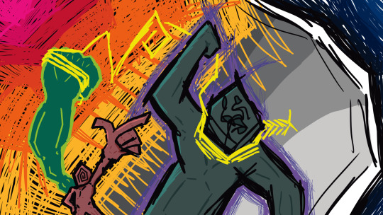
I can't believe I missed it! Yesterday marked 1 full year since I really started dedicating myself to digital art, after I drew this image because I wanted to play bomb rush cyberfunk. Pretty sure I started drawing it because I saw Twistcmyk made her own custom decals for that game and I wanted to make something like that too. So uh. Thanks for that Twist. Still haven't played bomb rush cyberfunk tho
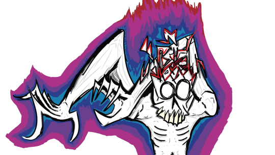
not a bad starting place I'd say. Although maybe that's because it's not really the starting place and I've been drawing off and on again pretty much since I was born
I think this drawing really helped get my feet off the ground when it came to finding a style that works for me, and learning how to make other styles out of it. See, I've always had shaky hands so I've tended to gravitate towards a more scratchy style since smooth lines are often a challenge for me. And in a lot of cases I'd just leave a drawing as a sketch because finalizing it was very difficult.
being able to draw fast and loose like this is really a boon to get the creative juices flowing. It's the easiest way to draw for me, and I still like to leave it at that if I have a day where I want to draw but I don't want to dedicate more than one night to it
But nowadays I'm usually making art that's a lot smoother and takes a few more nights to finish. But that's still using the rough style. Usually I'll get a vague idea in my head and throw it on the screen with minimal care, and I'll zero in on how it's supposed to look draft by draft. Sometimes it takes 3 drafts, sometimes it takes, like 10
shown here a swordsmachine drawing I made a month or so ago, I still have the krita file on hand (because it's not technically finished yet, needs a final draft with color) so here's the drafts leading up to it
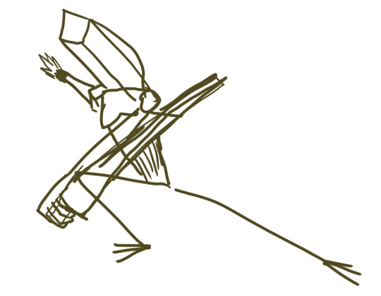
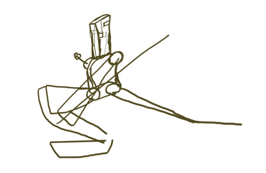
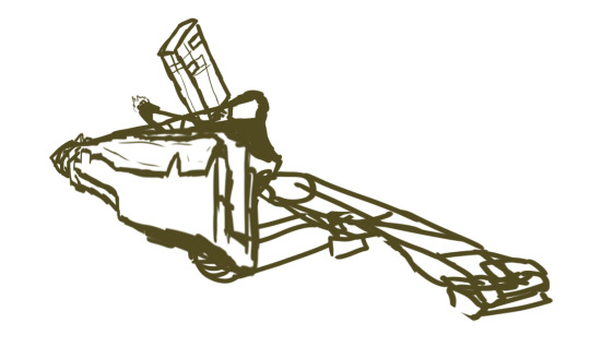
This process often involves a lot of cutting and pasting, resizing and the perspective tool to get a thing exactly where it needs to be. As for making lines as smooth as possible, I just have to take it really slow and sometimes go back, erase, draw it back, erase again. I won't lie it can still be a really tedious process
Like that swordsmachine, I've been making a lot of character portraits lately. Which has been a great exercise in posing, perspective and shading. Shading especially was something I've been needing practice with. I used to draw only with pencil of paper so using color in drawings is still somewhat a new thing for me. Having to figure out the lighting for each shot and which surfaces are whatever is very difficult but doing shading right can make a drawing look that much better
This is the thing I've been working on most recently, I think the shading looks pretty good, especially on the scarf. But I'm not really too sure about it.
Ok I've lost the pacing for this longpost. I wish I had a special drawing for the one year but I forgot until today. Maybe I'll make Anti in a birthday hat sometime later. For now here's some of my favorites over the past year
THING IN THE CLOSET
was a pretty early drawing, but I still really like it because of the unique perspective of peeking into a closet. Also the first time I drew Anti with a body!
ENDNE, GOD OF ENTROPY
I remember when I drew this design in my sketchbook and I knew I had a banger design right away, she barely changed from paper to digital. Unlike Solos, who had quite a few changes, and honestly I might still want to change a few things. Still pretty astounded that I managed to render it so well. Might be my overall favorite of the past year
PSYCHADOLIA
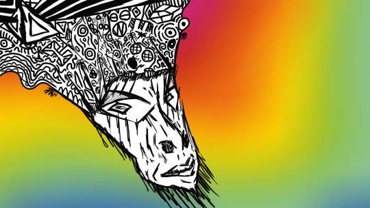
I still think it would make a great album name and cover. Hire me psychedelic music artists
MALAZIROT, GOD OF ROT
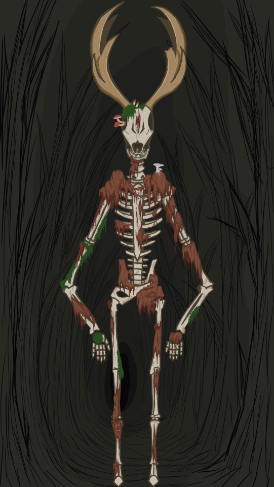
This one was made because I told my friends I'd make myself a fursona if a poll about me being a furry reached 15 votes. Love stealing valor. This might be the highest layer count piece to date, I think it clocked in at over 60 with so many small details that you have to super zoom in to see. Regardless, I'm really proud with how I got the rotting flesh to look in this one
MASH ME UP
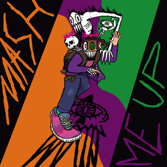
Also a massive undertaking and probably the only one that can rival the layers on malazirot. Idk if I have much to say on it other than, I think it looka pretty neat
SELF-PORTAIT

A real recent one, Probably my most grotesque one to date too. I really think I nailed how disgusting the skin on it is, my only regret is I didn't make any hair follicles poking out of the skin. Oh well, missed opportunities
here's to the next year of art!
6 notes
·
View notes
Note
Hi! I just discovered your art and I really love the style. I was hoping to ask you some questions if you don’t mind. ✍️ (If you don’t want to answer that’s okay!)
Do you do lineart, and if so what tool do you use? What’s your process for lining?
What colors do you choose when you line or sketch? I noticed that your lines blend very nicely with your colors, so do you just use one color or do you match it to your other colors?
And when you color, what tools do you use?
Thank u!
Thank you!!
I kindaa do lineart? but its later painted over to make it blend more with the thing im drawing. Ima put my lineart/lining process under the cut but Ima say now that I’m not the best at explaining HDNCJD
but TLDR: lineart/clean sketch -> flat colors -> merge and painting/rendering -> darken/go over lost lines
I have lineart or like a very clean sketch as a base?? I usually use like a dark red or purple then set it to “Multiply” then duplicate it, set the duplicated one to something like “overlay” and change the color to something more saturated. (the colors i set the lineart are hugely based on the main color of the thing im working on) I don’t strictly stick to multiply and overlay but they are the default

Lately I’ve been using the Blotchy brush in procreate but i edited it a bit to have these settings:
having the blend mode set to multiply makes it so that if you keep lining over the same area, it gets a lot darker each time.

I add base colors and rough shading under everything as normal then when im kinda satisfied with the colors (or tbh when i get impatient) I copy everything n merge it to start rendering/painting. The brushes I use keep changing but generally I like ones that are textured and change opacity with pressure. Examples being Salamanca, Blotchi and Chalk brushes on procreate.

When Im mostly done with painting everything over, the line art might get fuzzy or unclear so I go back with my lining brush to darken/make important lines clear again. The color I usually use is either the darkest color already on the thing or something dark and saturated set to multiply
Here’s a speedpaint thing to help kinda visualize-
#ronz answers#drawing process#plz note this is just how i do things and it is largely dictated by how impatient/lazy i am with a step#my goal is usually speed bc if i work on smth too long i get too tired of it to finish</3
9 notes
·
View notes
Text
9 People You Want to Know Better
Tagged by @arendaes, thanks :)
Three Ships
I feel like I always list the same stuff on this section, haha. Same time, I can't really seem to think of anything better right now when I'm trying. Maybe it's just my energy tonight. Uh, I can just list what I consider my main pairs in the last three games with romances I've played...? I guess?
Balthazar + Tristian. Or also with Vio. Doodling them a lot lately... I miss them.
Carmen + Arushalae. There's a Galfrey situation that intersects with this as well but I think living with someone goes a long way towards winning a love triangle. Whatever the hell winning means here. Tbh everyone loses
Asperia/Kasander + unfortunately, that archduke I really do want dead for real. Once wasn't enough.
Last Song
Catch Me If You Can - Jhariah (Spotify). Someone I drew something for on Art Fight had this listed as a character theme, so I've been looping it a lot... it's really good. I really should listen to more of Jhariah's music.
Last Movie
Hm. I.... don't know? I haven't been watching a lot of movies. I wanted to see I Saw the TV Glow, but before I knew it had left theaters. I'd like to watch movies again, I think.
Currently Reading
When I remember that I should be reading, Wuthering Heights. I've actually never read it before. I got bored halfway through Jane Eyre when I was 13 and lost all interest in gothic romances after that. ^^;;
Currently Watching
Akuma-kun! The 2023 one on Netflix. It's the show my friend and I are watching together right now. He insisted I had to watch it because it had an evil angel... we saw the angel today!! I'm happy. Homoerotic, fourteen year old fujoshi Emi would have totally lost it for this.
Currently Eating
Nothing. Getting hungry again though.
Currently Craving
I dunno... something fried? In the abstract, a little more self assurance.
Favorite Color
Blue. Deep blue. I've always been fond of the Copenhagen blue that I've used for Caina's scarf and one of Balthazar's coats, and the indigo I do a lot of my lines with.
Favorite Flavor
Chocolate.
Current Obsession
Anxiously checking the Art Fight website tbh. It's not good for me. I just keep getting worried that I've somehow made art that someone really hates of their character, or that I'm putting a lot into projects that no one will ever see. Haha.
Last Thing I Googled
.... well, now that we're at this point in this, it's Copenhagen blue. Because I wanted to check if it was a real name ^^;;
Favorite Season
Fall. It's got the best temperatures and most consistent weather. I like when the leaves change as well. The dry leaves on the ground are really comforting.... they make good sounds and are nice to lay in.
Skill I'd Like to Learn
Painting. Watercolors, ideally. Or digital art.
Best Advice
Jeez, I don't know a lot of life advice. I guess the best art advice I know is "draw whatever makes you want to keep drawing." Recently an artist I really respect also said something like "when you're starting out, just go ahead and copy whatever you like. Don't trace because you'll learn slower, but if there's something you like, try your best to imitate it." I think that can be good advice too. I guess my personal advice is also "Just do it however you know you can get it done." I used to get really hung up on doing things the "right" way in order to finish them, and because it took so long and I felt so pressured on the later steps I never finished anything. I hardly ever got to what I considered the halfway mark then. It didn't make me feel good about what I was doing. So I started doing things messier and more haphazard, whatever would get to the end I wanted to reach fastest. And I think I grew a lot more like that. I definitely drew a lot more art I was proud of and happy to show other people. I guess that also loops around to advice I've heard somewhere else though ^^;; Just to do the parts of the process that you want to finish. Your sketch can be your final lines if you hate doing line art, who cares. You can learn a way to do it like that.
We've hit the limit of how many times I can tag people on posts in a day without feeling very anxious unfortunately, so if anyone wants to be my guest etc. but I don't have it in me right now ^^;;
#long post#tag game#art fight is fun and I've done a lot of stuff I'm really proud of this month but I'll confess it has probably been bad for anxiety#I was already pretty anxious in june#overall this has not been my most stable together or socially connected month rip#for the record by the end of this the music had obviously changed lol. listening to samurai by vanic again#idk if I'd call it a good song but I've been listening to it a lot lately for some reason#there's an edge to it that has... comforting colors...? I don't know how else to explain it
2 notes
·
View notes
Note
hi! I really enjoy your art, it has a very unique touch to it that I really like. do you sell prints of your art anywhere?
I've never been much of an artist myself, but lately I've been feeling like I would really like to try and learn how to draw. I know it takes a LOT of practise and that some have a more natural touch to it than others, but do you have any tips for a beginner? where should I start? I have tried reference pics and stuff like that but I never seem to get them right. how can I keep myself motivated when nothing I try turns out the way I imagine it?
sorry if you've already answered something similar to this, I would love to read that too. sending you good vibes and many thanks in advance ✨
Aaaahh thankyou so much! 💕 I don't yet but will soon I'll update on that 🎉🫶
Absolutely!
And wow that's great to hear! I'm really excited for you honestly because it's really fun :3 Well, my ways have always been a little unconventional but most teachers would tell you to pick up a pen and paper and.. just start drawing/doodling with whatever reference you have. Or if you have a pen tablet already, explore the program you're working with. Any kinds of brushes, try them out, try functions the program has- see what it does, make it a fun experience because you can't make any mistakes. It isn't something you have to deliver to anyone, this is practice and this is for you. Put on some music or watch a show on the side that's easy to follow (not one you have to pay close attention to) and just scribble away. You can use an extra program like 'Pureref' (which is free!) that allows you to drag in any references you need on top of your drawing-program or create an extra window where you can drag in any images and rearrange everything just the way you like it, like this:

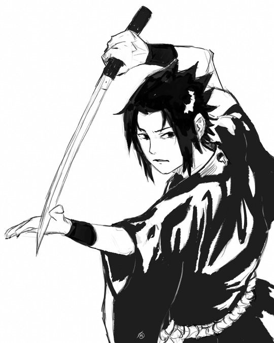
And then let's try a Sasuke sketch in that pose upper-left corner.
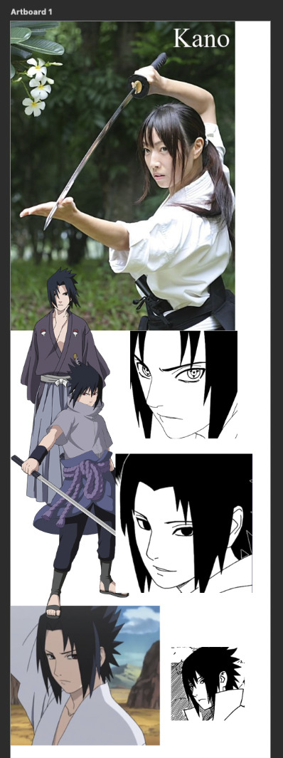
I usually flood the document with a bunch of references in case I need it. (It's always more than I need but I hoard my files a lot 😂.. I think it's a fear of it not being enough "just in case"- but it's okay.) When I'm coloring a sketch, I think of colors beforehand but it kinda depends on my mood. Most of the time I don't bother until I get to the lighting stage. If you feel like you don't really got the hang of using a pen-tablet yet, there is a good tutorial with exercises here. And don't worry at all!!! Because it'll get much easier and easier overtime, just please take care of your hands and stretch gently always. Remember it is never supposed to hurt.
Honestly the way to improve fast with art is... just get obsessed over something 😂 and draw that. Find something you like and enjoy drawing it at least from my understanding that is what happened to many people. For me it's.. well.. If you want to get inspired, go to places, preferably professional spaces and make a board with art in styles you really like. (Or a folder for example!)
This way you can use references to make something and it's a good start/practice ^^! At least it was very helpful for me! If you feel like nothing turns out the way you imagine it, then don't worry about it please.. creating something involves so many steps it is nearly impossible.. or it is impossible actually to have something turn out exactly as you imagine it beforehand. It is more important that the end-result is something that is satisfying which has more to do with the actual process itself. And I know that is not something you might want to hear now but I guess you'd have to experience it? At least for me, every new art I make involves something along the lines of "oh I kinda liked that" or "ew, no, nope, no, not doing that ever again" it's a constant process. Here are some helpful video's for beginners because I think visual inspiration would be more beneficial for you than just a bunch of text from me!
5 FIRST STEPS TO LEARN TO DRAW
HOW TO DRAW SIMPLE FACES
HOW I STUDY DRAWING
Advice for Starting your Art Journey
Extra (not necessarily for beginners):
Why BELIEF Is More Important Than TALENT
How I Reduce TOXIC Perfection As An Artist (Best Drawing Exercise TO Do)
What to do If you aren't Improving
Why it takes so long to get good at art
I hope any of this is helpful to you and I hope you have a nice day 🌷💕! Happy drawing!
18 notes
·
View notes
Text
Alastor Painting Experiment :3
(Timelapse and other stuff under the cut)
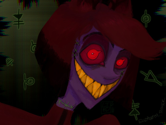
I'm really happy with this, all things considered! I gave myself a couple of little challenges when it came to this painting:
Try to make something unsettling! I usually go for - heh - less unsettling and more fluff (?) in my art (even my Radiosilence comic that is - not strictly... pleasant lmao - is still just more angst than creepy, yk?)
I wanted to keep things really loose! Focus more on vibes than 'rules'. Not worrying about if it has an internal 'logic' as to how i painted it (as opposed to sketch -> cleanup/lineart -> color)
To play more with non-traditional lighting like glowing eyes, teeth, and stitches; glitchy bg that doesn't contribute to the lighting on Al but still 'works' aesthetically, etc.
No deleting lines. I could paint over things, but I couldn't sit there finessing everything within an inch of its life. (This goes back to the keeping it loose thing)
I wanted this piece to be really experimental and outside of my usual process. I really like what I've been making lately, but especially towards the end of making my mini comic I felt so stiff. Moreso mentally than anything else. Trying to keep things that consistent was really hard for me XD Not to mention I feel like the best way I've found to improve, is fighting through the discomfort of new-ness and moving past the fear of something 'not turning out good' to just see what happens. That's something I've been embracing a lot this year, and I've seen more of an improvement in my art over the last six months than the six YEARS before that.
I'm not usually a horror fan (I like my horror Buffy-ified, pls and thank you! XD) (AKA: Mixed with other genres and not too graphic (for those who havent seen BtVS)) but something about how fucking unsettling Al is - is like... weirdly cathartic???? This whole fucking show is cathartic. I - yeah. Anyway Al's magic looks cool and I wanted to make art about it again bc I didn't get to play with it as much as I would have liked to in my comic bc I was so pressed for time.
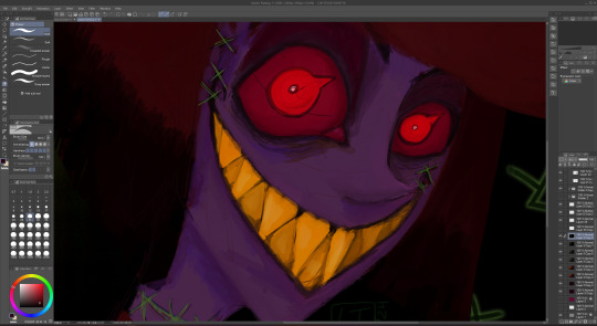
Here's a closeup of the face bc I LOVE the details and textures here. I switched to CSP right before starting this tumblr, and I'm still just so blown away by how great the brushes are???? I had to fight so fucking hard to get anything to look good in Photoshop. These just??? Work as intended??? Like its intuitive????? Fucking lovely lmao
Anyways, here's the speedpaint! Mwah <3
#my art#digital art#fanart#hazbin hotel#hazbin hotel fanart#hellaverse fanart#alastor#alastor fanart#hazbin hotel alastor#alastor the radio demon#speedpaint
22 notes
·
View notes
Text
WUPDATE: CALL ME ICARUS

𝚆𝚎𝚍𝚗𝚎𝚜𝚍𝚊𝚢, 𝙹𝚞𝚕𝚢 𝟷𝟿𝚝𝚑 || 𝙲𝚊𝚖𝚙 𝙽𝚊𝙽𝚘
y'all i am so busy rn that i forgot to keep yous updated on my progress. moving forward i am going to try and be more present here, i am going to work my way through my backlog of tag games this weekend and queue up all the writing yous tagged me in.
this month is camp nano and it has kept my mighty busy. here is a list of things that has happened this month:
finished the prologue and chapters 1-10. i got them up for betas to read (if you'd like to beta for CMI, the form is still open to apply here)
got in contact with an artist and started the process of commissioning them for a cover (they just sent me the concept sketch and im!!!!!)
set an official publication date (announcement coming soon 👀👀👀)
submitted a query! (and realized that i don't want to trad pub so i'm self pubbing instead!)
started talking to formatting editors. i'm not sure if i'll be able to afford a good formatting review before publication, but i am in talks with someone who will let me use their Vellum!
started research on how to self pub/what company i want to go through (and actually set up a channel where i can dump my research once i compile it!)
cried a lot over this whole process. a lot.
so yeah! a lot has happened! a lot of good stuff, but a lot of stressful stuff as well! that's okay though, i'm just over the moon that i have an official pub date 🥰
i'm going to push through to the end of camp nano, but i am going to try and get back into weekly wupdates and just talking about writing a lot more. i was a little hesitant about joining camp nano given how bad regular nano went for me last year, but a new server i joined has really helped me find my love of writing again (thank you doom and clanky and so many others that i met through the bird app, i love you all)
anyways, enough rambling. let's get to what you guys are really here for: snippets! i am going to add a couple here (read, a snippet for each chapter i've missed updating here) to make up for my relative silence as of late:
Chapter 5:
There are two more encounters listed below it, but before Icarus can read them over he is distracted by a flash of gold entering the shop. His eyes shoot up, latching to the new patron standing in line with their back to him. It’s normal for bright colors and movement to grab his attention, but this time something feels different. He can’t put his thumb on it, but his brain is telling him that he should recognize them. It’s screaming that he should know who they are. But for the life of him, he cannot make out who it is. Whomst? The fuck? From this distance, he can’t see anything that might tell him who they are. Their plain black clothes could be the tell of an Elysian, but that isn’t a guarantee. The only truly identifiable trait is the halo of blond curls cascading over their shoulders. Why do I feel like I know them?
Chapter 6:
Ariadne whistles, a long and appreciative sound as she sees her husband’s work. The tattoo had been a beast to heal, but the hours of torturous pain and restless nights of endless itching had been well worth it. He spent days ogling the tattoo after it had first healed, the feathers look so real that you can almost feel them when running your hands over the inked skin. It is everything he wanted and then some. A feather-light touch runs down the etched skin. There is only one person who had ever touched him with that kind of reverence, his artist must have gotten up to inspect the tattoo. He is admiring his art—as he should—when he says, “Looks like you should have used more lotion.” He lets go of one edge of the hoodie to flip him the bird. It’s impossible to hide anything from his artist, of course, and he knew that his lackluster care would be noted. There are likely small splotches where the ink had fallen out due to his poor moisturizing regiment, but it’s not like he has much of a choice in that. Icarus drops the back of his hoodie with a sigh as he turns to face the artist again. YOU KNOW? HARD REACH AREA ALONE. His eyebrows raise as he speaks, his signs becoming large and boisterous. He then mimes trying to reach the middle of his back. That gets a chortle out of his artist and Ariadne. He hadn’t thought to consider how he would need to reach every part of his back before getting the tattoo, and the fact that he doesn’t have anyone in his life to help him makes it that much worse.
Chapter 7:
“Look,” Andromeda levels at him, voice growing in intensity as they say, “I understand that you don’t quite trust me yet. I mean, we just met yesterday. Hell, I don’t even know your name yet! But-” “Icarus.” He grabs the hoodie on the left and pulls it over his head. He takes a moment to pull his hair up and fasten it in a ponytail before turning and leaning back against the closet door. “My name is Icarus.” “Okay. Icarus. Y’know, that fits.” Their voice is calmer, quieter, as if that piece of information is enough to placate them. Icarus huffs. The name really does fit him, doesn’t it? Always jumping into things without thinking of the consequences, taking risks, and keeping shit close to his chest until he gets a bit too close to hubris and starts to fall apart. Falling in love with the sun personified. Burning, falling, crashing, drowning. Yeah, the name fits him. The only difference between him and the Icarus of myth is that he died at the end of his story. Icarus has no plans of dying. No, he plans of making it out the other end of his story and living to tell the tale.
Chapter 8:
“I thought the whole ‘Oh, Hestia has a pizza shop?’ ordeal would tell you that I have no idea where to go.” Huh, yeah, that should have clicked with him. It’s not like they could search up directions, they likely don’t have a phone just the same as him. Can’t risk having a way for someone to use GPS to locate him. It’s not like he has anyone to keep in contact with, anyways. “It’s just down the street. Go out the front of the building and head down West Saint Clair, it’s just past fourth street. I’d say can’t miss it but you very much could, there’s no sign out front. It’s the only building that looks like there’s someone living in it on that block, though.” “Got it. West Saint Clair, Fourth Street, not-abandoned building.” Andromeda repeats the directions to themself as they head towards the front door. “Anything else while I’m out?”
Chapter 9:
How could he forget? “Καιρ���ς δε, Thanatos,” he mumbles as he stretches his arms out in front of him and rests his forehead on the blissfully cool counter. “And here I was thinking you weren’t gonna remember me.” Long gone is the shrill and timid voice of a sickly kid, replaced by one of the most soothing and deep tones Icarus had ever heard. “…Fair ‘nuff.” The vibrations of a glass hitting the counter top make Icarus look up. A glass of water, just water. He groans, that is not what he wants right now. He’s craving the sweet buzz of an energy drink, but that will require him to get up and walk around the island to grab one. Andromeda chuckles, not moving an inch as they watch Icarus suffer over the glass. “Quit pouting and drink.” He drops his head, turning his face away from the glass. “Oh come on, you big baby. Deja de hacer un berrinche y bebe.” They poke his cheek as he pouts. “Mira, food’s ready. Sit up and eat.”
Chapter 10:
“Why are we running?” they ask, gasping for air after the impromptu sprint. Icarus points to the bird as it hops along the ridge of the tent. He turns to watch their reaction, this is a big deal. Their eyes widen and their jaw drops open, they are just as shocked as he is. His smile has not left, though it dulls as their face drops to sadness and grim acceptance. What? “A crow.” Before he can say anything the look is gone. They beam a bright smile at him. “I can’t believe you found a bird! That’s definitely good luck for us.” But it’s not, their reaction sits wrong with him. He squints his eyes, watches them to see if that glimpse of despair will surface again. When it doesn’t, Icarus forces a smile on his face. If they don’t want to talk about it then he isn’t going to talk about it.
Okay, i think that's enough of a writing dump for now. here's the CMI Taglist:
@flowerprose @isherwoodj @cream-and-tea @touchingmadness @lockejhaven @marinesocks @wildswrites @the-finch-address @writingpotato07-deactivated2023 @leighvalentin @inkspellangel @cljordan-imperium @outpost51 @alleahgrinnon @smol-feralgremlin
Please fill out this form to be added or ask to be removed!
#call me icarus#wip update#writing#writeblr#wip excerpt#wupdate#tragedy#adult fantasy#dark fantasy#andi writes
11 notes
·
View notes
Note
for the art questions thing: what’s your process for shading? how do you come up with drawing / animation ideas? how do you sketch / how does a sketch differ from a complete piece for you?
Oh boy thank u for the questions! Uhh i ended up writing a lot w these so I'll throw this under a cut. I added pictures too. We'll call this a first draft for whatever I end up doing for my class assignment.
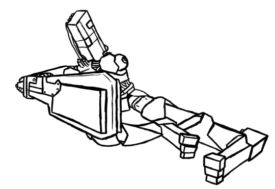
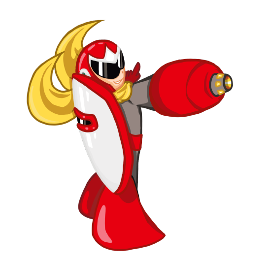
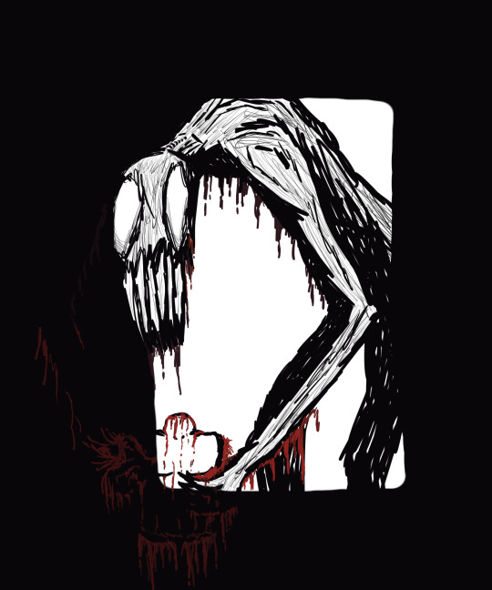
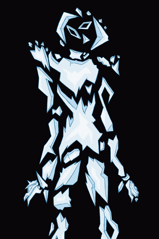
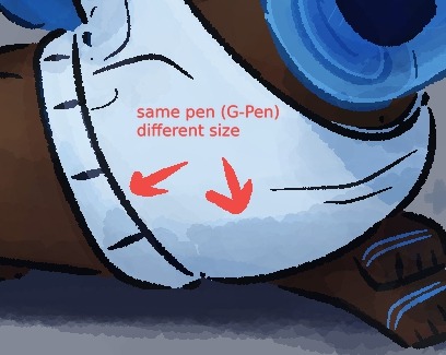
My process for shading changes pretty dramatically between if I'm doing my easy cel shading or my fancy soft shading. Lately, if I'm doing cel shading, I'll just come up with colors straight off the color wheel (colorpick and move it darker, more saturated, cooler/warmer depending on the material). OR, one trick I like, I'll draw where I want the shadows all on their own layer, THEN copy my color layer, mask n merge it on top the shading, and multiply that onto the actual layer. So it's the same colors for each exact section multiplied on top of itself? If that makes sense? Does nothing for the Atmosphere but it is Darker, and if I'm drawing them in a void anyways, it works fine. Sometimes I like to just slap a random tilted rectangle on it like its a garfield background. My soft shading is much more trial and error; for those fancy Xiph pin-ups I've been doing, I'll have like 30 different layers going, all doing different shit. Multiply mostly for shading, then for highlights I'll just try overlay/screen/soft light/hard light until something Works. A fun thing I do on these too: To get that "painted" look without adding a bunch of random texture, I use my default lining pen sized WAY up with the opacity WAY down and just go ham. Close up of robot ass for reference.
For ideas: I'd say the majority of the art I put out is "inspired" from something else, like memes or songs or tiktok audios. Honestly, I'd say every piece of information I receive has to pass through a "could this be about my ocs" filter in my brain, and if the answer is even kind of yes, I Will Make It So. Everything is ocs to me <3 and sometimes I inflict those oc thoughts on everyone else :3 For actual Original stuff though? Most of my ideas come about as a natural result of trying to figure something out with my characters. How would they respond to this, how would they do that, how does that work? The whole reason I started doing art is cause I have such a hard time with words, and sometimes drawing it out is just the only way I can communicate a thought. Expressions, camera angles, visual gags, subtle details, timing, those are things I could never figure out in writing. So I make comics and animations!
Sketching, what can I say about sketching. My sketches are very messy because I try for a Zero Erasing method like I do in real life (<- enjoys drawing in pen). If I sit there overthinking every line of a sketch, I get too caught up in the details before I've figured out the full picture. Sketching is for blocking/framing/posing ONLY, clean up is for lineart. I do sketch in only black/grays if that's a thing people care about, but that's because I have very strong thoughts on color, again it's too distracting. The main difference to me (that im sure no one else notices) is I let my sketches get fuzzy from resizing. I'm very particular about my art having NO anti-aliasing/transparent pixels. Crisp and clean, and VERY easy to color. Sketches I have on hand for example. Lil preview of smthin im working on :3c
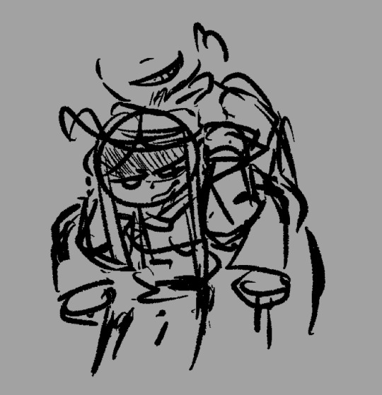

Actually, sometimes I don't do sketches at all ? Like I go straight to clean lines. Only for certain characters, like LEDD and the lab rats, and if it's not a crazy angle or something. I can just draw them on command at this point. Very handy.
Thank you again for questions ^^ I am. slowly figuring this assignment out.
#chayos speaks#im not gonna tag this oc talk cause Technically thats for Lore. I did mention ocs tho :]#ask#tumblr keeps wanting to move my read more. keep it where i put it Please
4 notes
·
View notes