#been fiddling with html and css
Explore tagged Tumblr posts
Text
Robert's profile on toyhouse is finished... I think! I'll tweak some small details and some artworks but it's up and running. And if I come up with something new I will add it to his profile.
If anyone wants to know who this idiot is you can find the info I've been sitting on there.
#not art#toyhouse#I'm enjoying the flexibility of this site#been fiddling with html and css#english is not my first language so bear with me when it comes to grammar and spelling#grammarly helps me though#previously I have stored character infos in some shitty unorganized documents which has bothered me 5ever#I'm making sure to back-up the toyhouse info onto those documents though
3 notes
·
View notes
Text
Not gorilla-related. Can anyone help me with a CSS/HTML problem?
I'm trying to do everything in my power to avoid creating an account on Stack Overflow or Reddit to ask this.
Here is my Neocities website. Those little blue icons underneath each thumbnail are supposed to trigger a drop-down box when clicked:
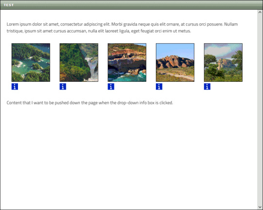
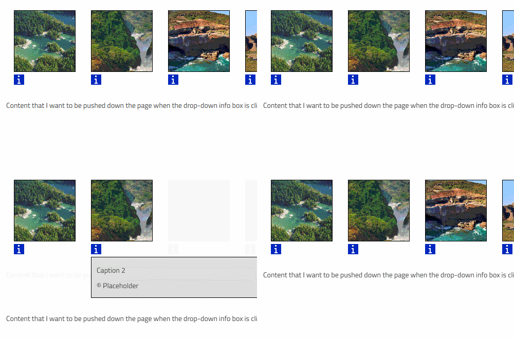
Now, while the box for the first thumbnail appears exactly where I want it to, it also causes the other thumbnails to be moved to the right:

This isn't the only issue. On the other thumbnails, the drop-down boxes are aligned with their respective icons, which I do not want:
Basically, I want each drop-down box to appear like this when opened:
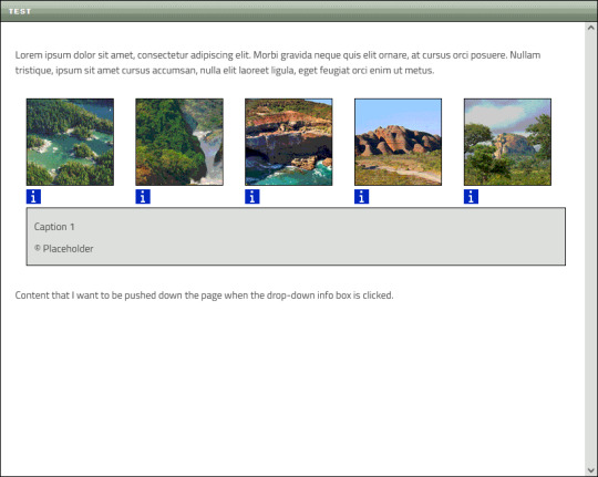
The thumbnails need to maintain their position, and the content below them must be pushed down the page when the box appears.
I formerly aligned the thumbnails using float:left before switching to flexbox, but I don't care if I have to float them again (or use some other method) if it means getting everything to work.
>> You can view the code in this Pastebin <<
KEEP IN MIND:
I'm very new and very bad at this
I want to avoid things like JavaScript as much as possible
If you need to view the actual website, message me
CHALLENGE MODE:
If you rewrite my code for me so that I can copy/paste it and have it produce the desired results, I'll draw you a gift doodle of whatever you want!
Okay, I think that covers it. I've been fiddling with this all day and I'm exhausted, so I'll check out any replies tomorrow 🦍
#I want to keep this blog strictly gorilla-focused but I have way more followers here than anywhere else sooo#off topic#long post
31 notes
·
View notes
Note
hi, hello! i'm sassaffrassa on ao3 and i was wondering what CSS you used in your workskin for *Wolf, Fox, Hound?* i've trying something similar and got one that works part way, but it doesn't look nearly as good as yours, and wondered if you might share 😅
Oh, you mean with the Hen Llinge hover translations? Yeah, for sure! Here’s the whole work skin incl. my little arrow dinkus: https://pastebin.com/v5ei7Gye
The HTML set-up works exactly the same way as in La_Temperanza’s How To Change Text on AO3 When the Cursor is Hovering Over It, plus em tags for italics. You might’ve found this one yourself; it was the basis for mine and it’s great except for two things:
It hard-codes the background color & text color of the links to white and dark gray respectively, which is just awful for anyone whose archive-wide skin isn’t white, such as Reversi users.
It’s 2024 and this is a fic, not a webpage! Text underlines are distracting!
To fix this, I removed the color: #2a2a2a; rule from each of the hovertext rules and had each set background-color to transparent and border-bottom to none, and the actual linky part of my code starts with this to get rid of underlines:
a { text-decoration: none; border-bottom: none; }
(You might be able to nix the border-bottom: none declarations in each of the hovertext rules for redundancy if you want? It’s been ages since I last fiddled with this skin and I don’t remember which parts were overkill.)
La_Temperanza mentions CSS entities at the bottom of their work. Note that apostrophes MUST be converted to CSS entities (\2019) or they’ll break the code. When I made the skin there was some fuckery with accented characters, which sometimes needed to be made into entities to show up and sometimes didn’t. I also discovered a goofy bug where sometimes if you have a CSS entity in there, the back half of your text goes missing; fix this by converting the characters after the entity into entities themselves one by one until it shows up properly, sometimes including the spaces. Full list of character entities can be found here.
hope that helps & let me know if this doesn’t make it do what you want it to!
13 notes
·
View notes
Text
DevLog 02: I'd Rather Be Writing CSS
Hello again! This month's DevLog post is going to be a lot of fun. I'm going to talk a little about my endeavors with Neocities, writing code, and working with old-school web interaction.
I also wanted to make a note that I'm totally cool with folks reblogging and liking these posts, and you're welcome to snag the rss feed for this tag if you'd like to keep up with it but don't particularly feel like wading through everything else I drop here.
Without further ado--
Lately I've been working on a side project to help a friend out; their Neocities, is--like mine--going to be a place to host a ton of centralized information so they can just hand site links out rather than having to link a whole array of webpages to people in order to share certain stuff. (I totally recommend people do this, btw. Super useful, AND you get to learn html/css, which is great on a site like Tumblr, where you can employ that knowledge and skillset elsewhere!)
Thing is, when I started this, I'd been... a touch rusty on things like... you know, the basics, building from a blank space up into a proper site. One of my problems was accidentally adding a period before the 'body' stylization code in the css document, which, for those wondering, makes the css read it as a 'div' or 'span' tag, rather than a core component of the site. Rookie mistake, but I did manage to figure it out... by making links turn orange on hover!
How, you may ask? It confirmed that the style from the css was successfully applying to the barebones html I'd already written, and gave me a better idea of what exactly was going wrong. Never discount the odd ways of troubleshooting, tbh.
I've also made a huge leap of progress on my own site, specifically the gallery pages, though they are DEFINITELY still works in progress, namely in layout. I've had to expand my understanding a litle and read up on stuff like flex boxes, which I might expand on and cover in my next DevLog as I make more progress.
I also started sketching some ideas with a friend out for a sort of idle colony sim--I don't want to spoil too much, but our shared notes are preeetty exciting so far!
On the topic of games, Garry's Mod is kind of a wreck on linux. I managed to get it going fine with Proton 9.x, which is hilarious--it straight up does not run anymore on the native build. No idea what got broken, but it sure is Something to behold, hah. I have been wading through my subscribed items, trying to update some of the tools and utilities. One of these days I'll get my shit figured out and upload a UT99 playstation-port Xan... I already have a lot of plans for such a thing, of course.
I have been honing my skills with blender, especially rigging, which has been interesting. I definitely GET it, it's just a matter of synthesizing and memorizing parts of the control scheme and especially how to fiddle with things like shapekeys. The perk of ragdoll stuff is you don't need a ton of picky shit... phew! Getting ahead of myself a bit there.
This month has been super busy, and I've been a bit scatterbrained, but here's to another month of progress, eh?
first | archive | next
4 notes
·
View notes
Text
Universal Scroll Button(Autochange Direction) For Any Host
Hey, do you have a site with a lot of forums? Does your host allow you to use Javascript? Boy does this weirdo have a deal for you! For the low low price of free, you can get right now access to a scroll button that swaps directions when you scroll automatically, as well as changing the target & title on hover! Act fast, this deal won't last! I kid, but enough of the ShamWowery. In reality, this is a very simple script that reads how far you have scrolled a window, & applies or removes a class to your scroll button, as well as changing the target of said scroll button & adjusting the title to reflect which way it will take you!
It's so simple, crediting me seems superfluous but if you want, feel free to credit with a link to my blog <3 I hope the new verse of our song is eminently kind to everyone!
See it In Action(Click, or look Below):
I currently use this code on two different WIPS, so feel free to check out some gifs;
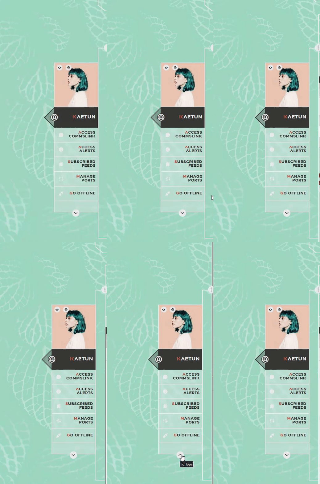
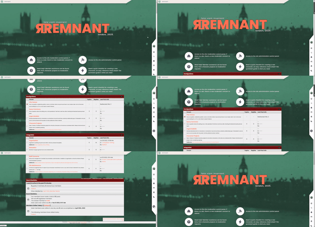
To Begin
Before the end of your </body> tag in your wrappers(for Jcink) or wherever the HTML templates go on other sites, you want to place this script:
<script> $(window).scroll(function() { if ($(this).scrollTop() > 800) { $('#scroll').attr("title","To Top?").attr("href","#Top").addClass('totop'); } else { $('#scroll').attr("title", "To Bottom?").attr("href","#Bottom").removeClass('totop'); } });</script>
This seeks out an id of Scroll to adjust the href & title as needed depending on the scroll position within the relevant window. The scroll amount is in px, so to change how quickly it changes the button, alter the number 800 to whatever you desire, fiddle with it; one size never fits all.
The Styling
Once you've saved that, move to your CSS, or wherever your Style tag is to add styling for the link itself. Keep in mind the link should be contained within a container that handles its positioning for it as otherwise the script will fuck with the positioning as well as the transformation & you really just want it to spin upwards.
The styling for the link should be as follows;
#scroll { display: inline-block; positioning: relative; transform: rotate(0deg); transition: transform .5s ease-in-out; /*** ^ change the .5s to alter duration or the ease-in-out to alter the timing of the transition between button states ***/ }
#scroll.totop { transform: rotate(180deg); }
The first statement defines the default state (linking to the bottom) of the scroll button on the load of the page, the second defines the change of position once the window has been scrolled far enough to activate one's script.
The HTML
Now you've got the behaviour defined via JS & the styling defined via CSS, it's time to input the HTML, or the bone structure of the code itself. In your wrappers, template, or wherever HTML goes on your host, locate three places;
One, where you want the TOP scroll location to be. This is where the scroll button will take you once it has changed states on scrolling a certain distance. Here, you place an anchor span as follows;
<span id="Top"></span>
Two, Where you desire for the BOTTOM or BODY scroll location to be, as in where the scroll button will take you on click initially. This could also be a scroll to the start of content, in which case I recommend changing #Bottom & id="Bottom" respectively to reflect the syntax, it's entirely up to you. Here, you place an anchor span as follows;
<span id="Bottom"></span>
Finally, It's time to add the scroll button. Keep in mind, where you put it is a function of utility & design choice. Some like it persistently hovering in a fixed position, some like it in a sidebar or on userlinks, some prefer it in the navigation bar.
Wherever you place it, try to ensure that it's easily accessible on any device, screen size, & matches the User Interface logic you've used everywhere else. If you have all text buttons, don't use just an icon, if you have all icons, don't suddenly use just text. Match your action calls, so users don't feel confused while using your site.
Once you've decided where you want it, place the following code, NOTING that there should be a container for this code that positions it for you. I've provided two options; the Icon Font option (courtesy of Phosphoricons -- a free & reliable Icon Font I recommend -- As well as one which includes text, so both UI/UX design philosophies are accommodated.
Note the option with text will only rotate the caret from downwards to upwards, so the scroll text shouldn't need editing unless you want to add or supplement flavourtext.
Please choose the appropriate option for yourself;
Icon Font
<a id="scroll" class="ph-fill ph-caret-down"></a>
Icon Font with Text
<span>Scroll <a id="scroll" class="ph-fill ph-caret-down"></a>?</span>
Some Notes:
I just want to add a bit of info:
If your browser isn't scrolling smoothly to your anchors? Check your settings, & be sure the root of your CSS has scroll-behaviour: smooth; in it.
If you use this guide & have problems getting it to work, please let me know! I will troubleshoot this for you & tumblr has strange coding, I may have futzed something up, I want this to be as accessible as possible, so don't be silent; questions help!
If you are not using Jcink, or another host with a Jquery library pre-loaded, be aware that one is needed for this script to work. Most hosts will have a default Jquery library, but if yours doesn't or you're self hosting, any should do. The Jcink file is below, however, if you want to just use that.
8 notes
·
View notes
Text
Been a hot minute!
Currently designing itch.io page mockups! Am playing around with html, css, the works, and our guys here need some serious tlc.

Also working on a minor overhaul of the game assets as I feel more confident fiddling with UI/UX design in unity. So lots to look forward to in our next update of Overflow!
3 notes
·
View notes
Text
am building WOBSITE
the visible parts are almost all placeholder text right now, so I'm not linking it, but I'm having a ton of fun.
i looked at wordpress, but it wants everything to be boxes you drag and drop, which does not sound conducive to fiddling with it on my phone between customers. also you have to pay for an "ad-free experience" and i wasn't clear if i was being advertised *to* or having ads put *on* my site, but neither of those sounded fun. also as far as i can tell it's still fundamentally a blog (probably?) and if i wanted a blog i understood the construction of i'd just make another dreamwidth
then i went and looked at neocities, which is a name i have heard Around. apparently they were created originally for people to import their geocities sites onto, when geocities was in the process of going kablooie, and their goal is to provide a way for people to build that kind of real simple website with html and css mostly.
and it turns out they are EXACTLY what i was looking for!
(1) not a blog. they give you an index.html homepage and you can do whatever from there. completely flexible.
(2) they promise never to put ads on your site.
(3) very not gatekeepery. when you create a new html page for your website, they helpfully format it for you with all the machine-readable header shit so that it will display like a website rather than raw code, and connect it to a basic css stylesheet so you can use things like headers, and even include some basic code like "This is a paragraph! Here's how you make a link! Here's how you add emphasis and strong tags! Here's how you insert a picture! (placeholder picture of their logo)" They seem quite enthusiastic about wanting everybody to have fun making little wobsites. They have a bunch of tutorials too, which I haven't really dug into because most of what I actually need to brush up on is specific googleable questions like "how do I put an internal anchor link to a footnote again"
(4) In-browser HTML editor. This is the one that really sold me on it. I was using Gdocs for the convenience factor of being able to make quick gameplay notes at work. Now I can make notes the same way, but organized and cross-referenced and *flappy hands*
(5) You get a gigabyte of storage for free, and a certain amount of bandwidth. If you subscribe at $5 a month as a "supporter" (their only paid tier), you get 50 GB of storage, custom domain name options instead of being only at [name].neocities.org, the ability to create multiple websites with one login, and some other stuff too.
(6) I have currently used about 75 KB of my gigabyte. That's so little that it's still showing as 0.0% usage. It's also, slightly horrifyingly, roughly 15,000 "words" at the typing-speed standard count of 5 characters per word. I know I booted up my laptop after work and did a bunch of template building, so I can make all my listings and stuff consistent, but... that's almost three hours of straight typing at the speeds I use at work. I didn't think I'd been doing *that* much hunt-and-peck coding on my phone. Weekends are so busy too.
(7) Oh, they have a handy button for "Download your entire website" on your dev page too. And another one for "Mount your website as a drive on your computer", which I have no idea what I'd do that for, but that's the kind of open source mindset I like to see. The kind where they provide (usable, helpfully documented) tools to create shit, and then make it easy to take your shit wherever you want.
(8) I strongly doubt I'm going to use up this gigabyte anytime soon, especially if I stick to just HTML and don't start hosting pictures of all the item drops like a wiki, but I might subscribe anyway if I haven't burned out on this project in like a week, because it really is providing me *exactly* what I was picturing for the platform to build this wobsite on, and I had no idea that existed, so I would like it to continue to exist.
(9) I like their terms and conditions too. Anti-censorship, a statement that by using the service you agree that you might run across any type of the crap people put on the interwebs (including sexually explicit material, specifically called out) and the site isn't responsible for censoring any of it that isn't illegal. Standard provisions for determining what content is legal according to the laws of the state of Oregon specifically [which is considered a very permissive place for the US and is probably pretty unlikely to outlaw queer content in the near future], strict provisions against knowingly collecting any personal information from anyone under 18, and a *lot* of strict provisions against using the service to spam, hack, DDOS, or otherwise commit cybercrimes. I approve of these priorities.
(Also, my HTML is still at least as fluent as my Latin, which pleases me.)
4 notes
·
View notes
Text
A walking tour through my WEBSITE!
(Hello there!! Cool comic artist here!
I found that most websites sucked for hosting webcomics. Webtoons was exclusively a vertical scroll site too focused on promoting black-haired white guy protag comics, Twitter is twitter, and I only recently started using Tumblr.
So, In March of this year, I spent my whole Spring Break making a website for hosting my comics. I’m very proud of it, so instead of just posting a link to it (like this: https://robablocomics.com/) I wanted to give a funny tour through how it looks and how I designed it.

Starting with the Home page, you’ll see I have a news section that users can scroll through and read at their leisure. You’ll also notice I haven’t updated it in two months (I’ve been busy.)
All of this was made from scratch, because Squarespace and Wix were too difficult to use and I couldn’t make a proper-working web-comic display thing out of it. I ended up coding this all in HTML and CSS and I’m very proud of that.
So, How this newspage works is I designed it all as a seperate HTML file (think of it like one page on a website) that I’m then displaying on the website like I would an image.
Here’s what the actual site looks like: (and you can actually see it yourself here: (https://robablocomics.com/APR21)
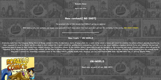
This is all in Layman’s terms, so technically that explanation isn’t completely accurate, but I figured this would be an easier way to help people understand than going: <div class="newspage"> <iframe src="APR21.html" height="900" width="760" title="newspage"></iframe></div>
I also have these cool Icons on the side going to different parts of the site! And they animate when you hover over them.
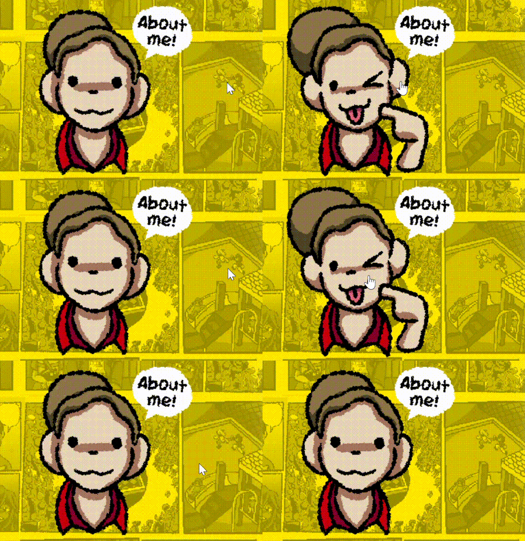
It’s SO CUTE!!!
The way this works is kind of simple and boring though. There’s a function in HTML that allows you to change an image based on whether your mouse is hovering over it or not.
Most of my website works based on these two tricks (Mouse-Over Images and Website-in-Websites) So if you want to see how they all work, you can check it out yourself (Again: https://robablocomics.com/) but before we finish off, I want to show off the comic part of my website
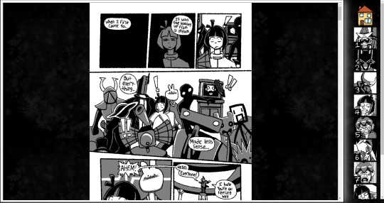
(Read AETHERBORN by the way it’s really cool)
So here, we can see that I have the comic (displayed in the center) and a chapter select (as seen on the right side.) Now here’s the twist, the entire page is two other pages displayed on one site. Yeah, you HEARD ME!
The comics are actually it’s own page being displayed on top of this one, while the scroller menu is another page being displayed on top of this one. That way, both elements can scroll independant of eachother without either elements being moved on the screen. Oddly enough, this isn’t the most complicated part of how this system works.
The hard part is actually getting the comics to display properly, both on Mobile and Desktop. Since I have several different comics, each with different page sizes, and all with spreads that don’t display well on mobile, I have to manually adjust every page of every comic to be properly centered, on both versions of the website.

(It’s STILL misalligned in some areas gdi)
And after fiddling with the way this site works for a million years and a couple months, this has been the most troubling part of how the site works. Personally, I’m debating on whether or not I should tear this system apart and try something new. Maybe something in HTML 5. In the meantime, I hope the site works enough for whoever decides to stop by and read.
Speaking of which, thank YOU (yes YOU) for reading all of this. I really appreciate having the chance to flex my vast web design knowledge (Aka a week in W3 Schools) Hopefully you stick by and see all the other cool art I make in the future. Maybe? Hmmm??
0 notes
Note
oooh okay 1) your site concept + decor ideas r SO cute already and 2) do u have any recs for people who also want to learn html? whether theyre your own personal tips or like, 'this site has a rlly good breakdown of the basics' or w/e
1)thank u sm!!! and 2) yes!! neocities has a short/bare bones but very friendly tutorial when you first set up an account (hosted by a cartoon cat.) that you can complete in one sitting, and then after that (or instead of that) you can go to w3schools html + css tutorials and just kind of start doing them from the top. (you're going to find that you basically have to learn css at the same time that u learn html for most of the stuff you'd want to do on a website, but it's not so bad.) i've been slowly working my way through those, and googling stuff when i have specific questions about how to do stuff! beyond those basics, sadgrl.online is incredibly helpful and has a lot of guides + tutorials, plus just fun stuff that's specifically geared towards personalized websites/shrines.
also, start small and be patient. especially when we're used to super slick modern social media where everything is all rounded off and animated and shit, it's easy to get a box and a few lines of html up and feel, like... discouraged, or disappointed, like "i worked all afternoon on this and it looks like shit" -- but it doesn't!!! you cannot barf out a finished website in one day and you'll drive yourself nuts if you expect that of yourself, so get comfy with bare bones boxes and text and ugly little links for now. i have found myself getting way more frustrated if i decide i need to do 3000 complex things RIGHT NOW vs patiently building up things from bare bones, plus it's easier to build up more elements on top of something simple than to tear apart something where u got in over ur head and now u have to figure out why it's not working.
i also recommend trying out a dedicated code editing program like vscode rather than doing everything directly in whatever area you're finalizing/hosting things in. it's a drag to edit, save, clear your cache, load the website to check if it looks good, rinse and repeat -- i'm finding it way easier to try stuff in vscode paired with a live preview (i'm using this extension; it took a little fiddling to get it working bc i'm so new to all of it, but there are instructions on the page!) this way of working has been way easier for me; i'm sure other editors probably have something similar, but basically how this works is i have vscode up, then right next to it a browser window with my live preview in it, and every time i crtl+s to save my html in vscode the preview of the site updates. makes trial + error way faster and overall it makes the whole thing less intimidating!! (not everything in the preview will always work on the site, u will still have to troubleshoot and tweak stuff, but this way of doing it has still been way more enjoyable and streamlined for me overall.)
final note: i have literally only been doing this for like, two days! it's not easier than i expected, it's hard and confusing and slow, but it's been way less painful than i expected. you can do it!!!!!!!!
#tutorials#resources#i hope it doesnt look obnoxious for me to bold key points lol but im so prone to textwalls im starting to think it might be helpful
134 notes
·
View notes
Note
Hi! I discovered your games from your free twine template, and I’ve been enjoying snakeroot a lot! Your layouts and all the effects you add look amazing. I hope it’s ok to ask, but could you possibly explain how you made the pop up menu in your free template, or make some sort of tutorial for how it was coded? I’ve recently started coding & I’ve been looking into coding a custom UI, but I can’t seem to find any relevant info about doing it in twine.
hey ! firstly, thank you and i'm glad ur enjoying sr, secondly, it's always okay to ask !! also im not gonna lie, im frankly surprised the menu works bc it was a lot of code i just kinda mashed together and hoped it worked fbdjSKBF but i will try my best to explain it !! details under the cut bc it gets kinda long.
just as a heads up, this part is mostly specific to how i coded the pop up menu, mostly through css / html with storyinterface -- i can try to make another tutorial about how i approach the overall ui or break down and explain my existing code if people are interested!
lets start with the bit that goes into the StoryInterface passage!
<div id="header" onclick="toggle(this)"> <span id="header-text"></span> <div class="menutoggle"><span id="zero"><i class="fa fa-ellipsis-v" aria-hidden="true"></i> </span> <span id="one" style="bottom:-180px;"> <div class="menu-flex"> </div> </span></div> </div>
i've tried to block out the different parts with colours and text styling, hopefully it's a little useful!
all of this is basically contained in one div, even though the menu itself appears at the bottom of screen. that bit is explained through positioning in the css, which we'll get to in a bit!
the bolded bit ( <div id="header" onclick="toggle(this)"> ) is arguably the most important, since this is how the javascript gets called to toggle the menu. specifically, this bit here — onclick="toggle(this)" — which basically says 'when you click on this div, the javascript called "toggle" is going to run on this div.
the orange bit ( <span id="header-text"></span> ) is where the header goes, which in this case is the bit that goes "game title / chapter" and has the little menu. as a side note, there's no actual content in there because i prefer to use the PassageDone function to put the actual values into the page.
the part in pink ( <span id="zero"><i class="fa fa-ellipsis-v" aria-hidden="true"></i> </span> ) is for the menu button, it's mostly a style choice so you don't have to worry too much about it.
the purple part ( <span id="one" style="bottom:-180px;"> ) is where i keep the actual menu. specifically, the style ( style="bottom:-180px;" ) works together with the css to basically hide the menu off-screen until the first div ( the bolded stuff ) is clicked.
the green bit ( <div class="menu-flex"></div> )is where the actual menu goes! same concept applies here with the orange header text, i use PassageDone to store the actual menu values and links so that i don't have to keep going back to fiddle with the interface.
alright, now to the javascript! i basically toss this at the bottom of StoryInterface.
<script>function toggle() { var x = document.getElementById("one"); if (!x.style.bottom ||x.style.bottom === '-180px') { x.style.bottom = '0px'; } else { x.style.bottom = '-180px'; } }</script>
i'm not the best with javascript so there's probably better ways to do this, but it seems to work so !
the orange bit ( toggle() ) is the name of the function. you could probably call it whatever you want, just remember to also change its name in the above onclick part!
the pink bit ( var x = document.getElementById("one"); ) is what specifies what div is going to be selected, basically creating a variable that selects the div element called "one", which in this case is where we have our menu.
the blue stuff is the if/else statement that controls the toggle. it basically goes "if clicked and the menu is hidden (i.e. the bottom margin is -180px), then make the menu visible (i.e. change the bottom margin to 0px, thus putting it at the bottom of the page). otherwise, keep the menu hidden."
from here, we can move to styling! again, this part is mostly just stylistic and uses general css / html knowledge instead of anything too twine-specific. all this goes into the story stylesheet !
.menutoggle #one { box-sizing:border-box; display:block; transition:0.8s; overflow:hidden; position:fixed; left:0; bottom:-180px; background-color:var(--bgblack); border-top:1px solid var(--grey); width:100%; padding:5em; height: 200px; } .menu-flex { display:flex; justify-content: space-evenly; align-items: center; margin:0 auto; width: 100%; max-width: 1000px; flex-wrap:wrap; } .menu-flex a { cursor:pointer; text-decoration:none; color:var(--white); transition:0.4s; } .menu-flex a:hover { color:var(--accent); } .menu-item b { display:block; font-size:0.7em; letter-spacing:0.5em; } .menu-item { font-family:var(--monofont); text-transform:uppercase; font-size:0.7em; line-height:200%; } .menutoggle { display:inline-block; font-size:0.8em; } .menutoggle #zero { cursor:crosshair; transition:0.4s; } #header:hover #zero { color:var(--accent); }
i've bolded the most important bits and put them in red! as you can see, it's mostly in the div called "one", and the rest are mostly stylistic choices.
transition:0.8s; is just here to ensure that the transition is smooth and achieves that sliding effect, instead of the menu simply popping up with no transition.
position:fixed; left:0; bottom:-180px; are what make the menu appear at the bottom of the screen despite the header text appearing at the top. you could play around with positioning as you wish, the same principles pretty much apply everywhere else!
height: 200px; is just a personal preference, i found it easier to work with as compared to using relative measurements such as vh (viewport height). that being said, i do recommend using relative measurements when coding the overall ui because it helps to make the whole thing more responsive to different screen sizes. the little 20px difference between this and the bottom margin helps to have that little grey line at the bottom of the screen, but again, it's up to personal preference so fiddle with the specifics as you wish!
that's pretty much it! let me know if you want further clarification on anything or an explanation / breakdown of other code i've done and i'll try my best :)
#cer answers#coding#sorry this post is so long omfg#and i genuinely forgot what i did when i was coding so looking back at it was a trip#the moment i type anything into the computer all my brain cells flee my head and that applies for both writing and coding ngl#anyway i love answering coding questions even tho im hardly the most qualified fbdksdj i amn just a small creacher with a laptop
56 notes
·
View notes
Note
hello saw your last post about ADHD and thought i’d ask i know this might not be the right place to ask so if you want to ignore this or do not know how to answer this i understand, i’ve been working on project and i tried to learn coding i’m still trying watching more videos on it but i am starting to feel stupid because my brain genuinely cannot process any of that information i really cannot understand no matter what and am this close to giving up so i thought maybe if i could find someone that can help me with coding if anyone is willing to do that like i can pay them through paypal
Hi!
So, as a person with ADHD myself (Roast, hi), I get it! It's frustrating, confusing, and information you just read just goes right out the window--but me and the other mods encourage you to learn.
Coding isn't easy, it's a different language and should be treated as such--you're not going to pick it up in a week or even a month, but once you know it you'll be able to navigate it a lot easier.
I'd suggest going back to basics, making sure you've got those down before moving on. If videos aren't working for you (I know they don't really for me) I'd move to written tutorials as well as code-diving on sites that you like their aesthetic of. Start with a project that's not related to your game like a simple webpage and fiddle with the code.
Doing has always been a better educator for me than sitting there trying to absorb knowledge through lecture. I don't remember anything that gets told at me, hello high school and college--but doing has always been better.
If you're working with HTML & CSS it's difficult! But there are resources for you and we also have a lot of helpful people over in our discord server that are happy to help, myself and other mods included.
Also, you might want to try checking out your local library, they might have access to professionally made instructional videos that all you'll need to get in on them is a library card.
TL;DR Slow down, switch to different learning abilities if videos aren't working for you, write things down but only the necessary and keep it brief, for me writing notes needs to be succinct or else my brain just goes fuzzy--and keep those notes on hand while you work, I had to reference them loads of times before getting used to cscript.
Resources
Our discord! Lots of helpful people and crowd-sourcing problems is always a good idea. [Discord Link]
W3 schools is great for trying to find small tutorials on how each element in code works, or if you're looking for a specific function. [W3 Schools Link]
Freecodecamp is a bit more class-based but I'd give it a shot, same with Mimo because it leads you through projects to learn code instead of just throwing information at the wall and hoping it sticks. [Freecodecamp] [Mimo]
JSfiddles and codepen are both sites that let you play around with code without actually implementing it on a webpage--so fiddle to your heart's content! [Jsfiddle] [Codepen.io]
If you can afford it, skillshare also has great starter videos, I learned the CSS grid just this weekend with a video on there, they might have some free trials going on too. [Skillshare]
If, in the end, you just don't want to learn it/can't get a hold of it, that's okay. There are tutors out there and maybe even someone in our community who would be willing to help tutor you, but you can also put up posting for coders--but that is a contract job position and should be treated seriously with proper pay. I'd really really encourage you to take a break, take a step back, but with the intent of learning because that is way more empowering than paying someone else to do it.
With ADHD it's often trying to find what kind of adaptive skills you need to get it through to your brain, and every person with ADHD is different in that regard. For me, I have three different planners that I look at every day, writing things down helps with the permanence issue if not the out-of-sight-out-of-mind issue.
Will I remember what I wrote down? Nope! Will I look down and see it if I leave my planners open and therefore remember? You betcha!
Reach out to our discord, see if you can't get things working for you, and best of luck! <3
#if: advice#mod-asks#in typical adhd fashion I really ran with it there adskjgfkjbdskbjsdkjb oops#interact if: asks
89 notes
·
View notes
Note
Everything looks great so far, and I’m loving the art! You have so many features, and I was wondering how you learned everything. Did you know how to code before this or did you have to learn?
Thank you so much! Shout-out to @sunshinemage, who did the cover art and the companion portraits. 💗 All of the other in-game images are assets designed with royalty-free vectors from Canva.
I did not know a thing about coding before this project! I knew a little about how to edit HTML and how to change colours in CSS (just from using custom tumblr themes), but I didn't know anything else. All of the conditional logic, the SugarCube format, and CSS and Javascript were new to me.
I've been using Twine as my engine since 2019, so everything I know has been a hands-on learning process since then. Some of the new features are things I've learned in just the past couple of months (such as the mobile compatibility--I only just recently started understanding media queries and how to use them effectively). And the vast majority of it has been trial and error, looking things up online, and trying it out until I get it to work.
It's been a slow process of "think of the thing" -> "look up how to do the thing" -> "try to implement the thing" -> "fail at implementing the thing" -> "fiddle with the thing until it works" -> "if it doesn't work, try again later when you know more". 😅
Pre-Launch Wayfarer AMA
20 notes
·
View notes
Note
hi, the deranged anon with the logo issue back here to say - why the hell did i not think of replacing the image? it took a whole load of fiddling but i eventually got it to the point where im happy with. i have been relieved from my agony of two colours not completely matching, thank u. also i agree css in general is often times hell, but ao3 is just a breeding ground for torment and despair as soon as u even think abt code lmao
ksdhfdtftf I fully understand that agony. I've solved it in the past by simply removing the logo in my skins.
god yes, I love ao3 a lot and I love how it's structured because it's a lightweight html page that's very simple to load on everything and runs incredibly everywhere but sometimes it's SO SO irritating how some stuff is laid out!
Anyway, not sure if you've seen it but there was a reply to the other ask pointing out that it's a known bug: https://otwarchive.atlassian.net/browse/AO3-5441 and sooner or later (most probably later) it will be fixed.
6 notes
·
View notes
Text
When I first started organising fandom events I don’t think I ever envisioned it as involving so many spreadsheets, nor as much tagging and html formatting as it actually takes. Or making graphics, those do end up important too.
I foolishly thought I might be able to write this weekend but no luck so far. Yesterday had all my spoons eaten up with household food planning/orders and soup making (but there is soup FOR DAYS and food planned for 3 weeks too). Today has had a lot of tagging/retagging and cursing at html/css trying to edit theme stuff, mostly unsuccessfully on the latter. I got things functional but not as pretty as desired. And fiddling with AO3 collections - I wish formatting for FAQ/rules etc for those didn’t require manual formatting with html code still. Would love if that could have a rich text editor like the fanwork main section does. Mind you, I do keep wondering when the AO3 summary and author’s notes section will have that too and I presume there must be some technical reason it’s not been added so far.
I didn’t manage to create anything for the Hartmon event in the last couple of weeks, because work and running it took up many spoons, and now I’m wondering if I’ll manage to finish anything other than moodboards for SB week for similar reasons. I did want to do stuff for Rarepair bingo too, but I don’t think I’ll do all the ones I had planned as I probably only will have the last 2 weeks of November free to do anything and my work stress may ramp up during that time. I guess this is the price to pay for running events, not enough energy leftover to take part myself. But I do at least have 3 moodboards done already. I should aim for some drabbles...
#personal#hans rants#but in a mild? way#i've had a decent week but just not enough time and energy to do all i need or want to
5 notes
·
View notes
Text
Meeting the Parents - Update 4
If I was re-writing the story, I thought I might as well fiddle around with the styling of the game too.
I have happy enough with the basic things I had done with the game, especially considering the fact that I had never touched either Java or CSS in my life. I have had some experience with basic HTML in the past, having spent most of my childhood on internet writing/designing forums (where are my skills now... #found dead in a ditch). But boy was CSS a mountain I never thought I would ever climb. And here I am...
Anyway, I have been fiddling with changing my title card that I use when posting about this game online (please tell me which one you like best), as well as title sections for the Itch.Io page to make everything a bit more appealing. If you have been on the game page when I first uploaded the game and not, you can see that it is not basic anymore. Hopefully, by the time the update comes around, it will have a bit more flair to it as well.
From it, I thought of changing the look of the game as well, in a subtle way. A few colour changes to look a bit nicer, trying to find a nice font that is easier to read when in italics (Garamond has a weird thing where lowercase H and B look way too similar) but hasn't found something I am pleased with, making the title into a picture...
I also fixed the textbox colours, which was not really visible until you actually hover/click on it.
#Meeting the Parents#MtP#Twine#Sugarcube#UI#CSS#Javascript#Coding#HTML#Itch.io#interactive fiction#game#coping
2 notes
·
View notes
Note
Hello! I'm planning on starting a blog using the theme you're using, but I don't know how to change the things in the HTML (eg. icon size, header size, test size) and it won't let me save when I try to change the sizes. Do you have a method or is it impossible to switch the sizes?
You might have to fiddle with the CSS portion of the code. Unfortunately, it’s been years since I’ve truly played around with the theme so I cant pinpoint exactly what you’ll need to do. I know I used some HTML guides online from searching for my exact issue to help me navigate making those changes.
- Admin Rachel Lauren
1 note
·
View note