#because geometry is shapes and you can look at them
Explore tagged Tumblr posts
Visit Tumblr Blog
Explore Tumblr blogs with no restrictions, modern design and the best experience.
Last Seen Tumblr Blogs


Fun Fact
Tumblr’s website traffic is steadily declining.
Text
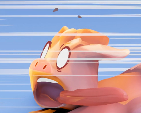
POV: fucking geometry
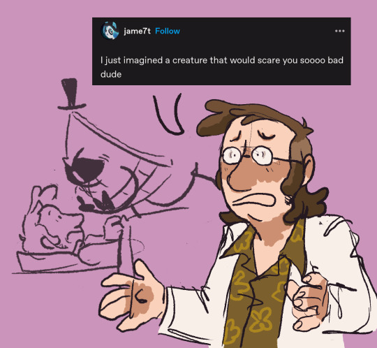
he's so fucked up
#he's a freak ladies and gentlemen#a freak#gravity falls#ford pines#stanford pines#fiddleford mcgucket#bill cipher#billford#fiddleauthor#fordsquared#lmao#get it#geometry#and he fucking it#but also fuck you geometry you fucking suck and I hate you#like#can we talk about how absolutely HORRIBLE geometry is as a subject#I know it’s a triangle I am looking at the shape#it has three sides the three sides all meet so it is a triangle because that is what a triangle is#but NOOO#YOU HAVE TO FUCKJNG PROVE IT IS A TRIANGLE#WITH A BUNCH OF MEASUREMENTS AND FORMULAS AND SHIT#IF THERE ARE THREE SIDES AND THREE INTERNAL ANGLES OF A SHAPE AND THE SIDES ARE ALL CONNECTED THEN ITS A FUCKING TRIANGLE#I DONT GIVE A FUCK ABOUT YOUR FORMULAS#BACTERIA HAS SPENT 3.5 BILLION YEARS EVOLVING SENTIENT BEING WITH THE ABILITY TO PERCIEVE EVERYTHING AROUND THEM#DO YOU KNOW HOW BEAUTIFUL IT IS TO EXIST IN THIS WORLD???#DO YOU REALIZE THE WONDER OF THE STARS??? THE MIRACLE#THE ONE IN A TRILLION CHANCE THAT OF ALL THE THING THAT THINGS COULD HAVE GONE WRONG SOMEWHERE IN EVOLOUTION WE MADE IT THROUGH???#DO YOU KNOW THE MIRACLE THAT IS THE ABILITY TO PERCIEVE AND LEARN AND LIVE AND LAUGH AND LIVE OUR LIVES ON THIS EARTH???#AND YOU WANT ME TO SPENT THIS MARVELOUS MIRACULOUS EXISTENCE ON A FUCKING TRIANGLE
33K notes
·
View notes
Text
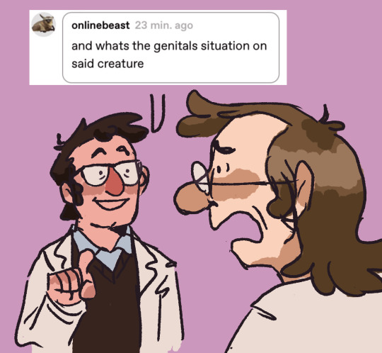
Worship Me- DCxDP prompt
Yes, it's slightly horny. Sue me!
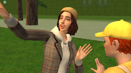
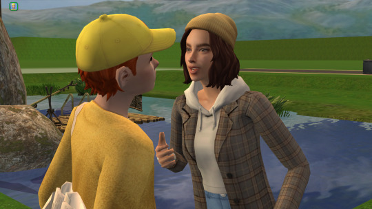
Was there anyone in this family that didn't attract crazy? Tim would like to say that it was some more than others but the track record is horrendous for each of them.
Don't ask him how he got here. It was a blur. Mission. Altar. Cursed Mirror.
But all that doesn't matter anymore because currently in what could only be described as an obsidian palace.
The palace floats in the void like a jagged crown. Its structure defies logic—spires twist and spiral in impossible geometries, as though grown rather than built. Every surface is carved from seamless black obsidian that drinks in the light of distant stars, causing the palace to shimmer with eerie inner reflections, like shadows trapped beneath glass.
The entrance is a colossal gate shaped like an open eye, rimmed with glowing runes that pulse with alien intent. Inside, the vast halls echo with silence too deep to be natural. The floors gleam with a mirror-sheen, reflecting not just one's image, but fragments of memories, glimpses of alternate selves, or ghostly figures passing just out of reach.
Chambers are suspended in open vacuum, tethered by bridges of crystalline light or magnetic arcs. Gravity bends strangely; a single step can carry you across entire rooms or into hidden dimensions nested within the architecture.
Tim had memorized every detail of this place in the days since he arrived. Most of the time he was allowed to go about his day staying and learning about this place. He wasn't imprisoned, he had to wait for the portal to open again in a few weeks. But Tim had caught the interest of the ruler of the palace.
Now Tim sat on the edge of the floating bed. It's heaped with a sea of plush pillows in shades of midnight blue, silver, and deep violet, each embroidered with celestial patterns.
How he got to this point—he may have...had a few conversations with who he assumed was the prince. The person who he thought was the king was actually his guardian. Tim just...flirted a little to get a bit of information on this place. Danny—the prince—had been more than receptive.
It might have gone too far but here we are.
Now he was in the bedroom of who he still assumed was the crown prince with said prince currently on his lap with his lips on Tim's neck. Tim is unable to move because he believes that if they get caught Tim might end up beheaded for putting his Richard where it does not belong. Hell, they probably already know with the all-seeing eyes everywhere and the fact that the beings in this dimension phase through walls so using the door was just a polite formality.
"Stop thinking. I can practically hear your thoughts." Danny growled nipping at Tim's neck between kisses.
"Then you can te—ll, haa. Fuck! Your hand. Too fast." Tim gasped.
Danny pulled away as he grabbed Tim by the chin and made him look into his eyes. Those hypnotizing green eyes.
"Do you want this?" Danny asked his eyes narrowed.
"...Yes," Tim couldn't lie.
"What do you want?" Danny smiled his sharp elongated incisors showing.
Tim remained silent his hand pressed against the small of the princes back.
"Good, you don't have to say a word. Focus on me. Think of me. Nothing else." His hand wrapped around Tim's throat. "Worship me as your new god."
Prince—king—these words where actually meaningless titles for Danny. He was not these petty and lowly things. He was a god and he craved worship. Even if it came in the form of a single human devoted to him. How incredibly lucky that a suitable human came here. Clockwork says it was best to let the human go back to his dimension and hopefully share his experience so that others will worship Danny. He had no interest in letting his new priest go so easily, not without a parting gift.
"I wonder how it must feel to bed your new master."
495 notes
·
View notes
Text
Inspired by this post by @thanergetic-hyperlinks, I present to you
Tessellations of the Nine Houses
(Or "I can't really draw figurative art so my Locked Tomb fanarts are geometrical vector drawings")
"A tessellation or tiling is the covering of a surface, often a plane, using one or more geometric shapes, called tiles, with no overlaps and no gaps." — Wikipedia.
Making tilings themed after each necromantic House seems obvious: for each House you pick a tile with the same number of sides as the number of the House; but this does present some challenges for some of the Houses.
note 1: this might give the impression that I first decided on the symbols and then found patterns to match them in a very organized and motivated manner; in practice it was much more chaotic and multidirectional, the patterns informing the symbols as much as the symbols informed the patterns; this is fine since symbolism is entirely associative and arbitrary anyway
note 2: I added alt-texts for all the images, but I have no idea of how to properly describe abstract geometric art; if you feel you can do a better job than I did, feel free to put your fingers where your mouth is--wait, hang on-- I mean feel free to provide better descriptions if you can
note 3: looking forward to the geometry nerds explaining to me how I got basic geometric details wrong, friggin nerds
The First House
The First House seems obvious, as a shape with one side is an ellipse (of which the circle is a special case). There's just one problem: ellipses do not tile the plane. No matter how much you stretch them and deform them, the very nature of ellipses means you'll always have gaps or overlaps.
So we cheat and we work with overlaps: turns out there is a history of tilings that use circles as a construction pattern, then turn the overlapping sections into the actual tiles. Such patterns have been used extensively in European and Middle Eastern art, and have also been associated with the New Age movement, so it fits Jod's style perfectly. And so we get this:

The different cells correspond to different House colors, with the resulting gothic stained-glass appearance quite in line with the Roman Catholic Empire vibe Jod is going for. The overlapping circles convey the intricacy of the relation between the First House and the eight other, both autonomous from it yet intrinsically part of it.
The Second House
There's a variety of geometrical shapes that have two sides, but most of them don't tile the plane, altho there is one that does — if we take a crescent shape and slightly thicken it so that the inner and outer curves are identical, we can do this:

The waving pattern is of course evocative of the flag of conquest which the Cohorts of the Second House have planted on many worlds.
The Third House
With the Third House things get a lot easier, because equilateral triangles are one of the three regular polygons (where all sides are the same length and all angles are identical) that tile the plane all by themselves without needing any other shape! Which however doesn't mean we have to be boring; we can have a little bit of fun:

Flowers for the beauty and ionizing radiation warning signs for the rancid vibes.
The Fourth House
Squares are the second regular polygons that tile the plane by themselves, so again our job is easy here, altho we still want to not go for the easiest option in order to be able to work in some symbolism:

The four big navy squares with a small white square at the center of course evoke the number five and the shadow of the Fifth House's regency over the Fourth.
The Fifth House
Regular pentagons do not tile the plane, so we have to use a more unusual shape — there are many options, but obviously we want to again pick one that offers some interesting numerical symbolism:

The cross-like patterns of course bring up the number four and the hold of the Fifth House over the Fourth. As for the crosses themselves and the fact that they appear to be made of wooden stakes, well uh… Abigail Pent, Vampire Hunter??? She does have Van Helsing vibes.
The Sixth House
Hexagons are the third and last regular polygons that tile the plane on their own. But this is the Sixth House we're talking about, things need to look orderly but in a convoluted way. So how about multiple levels of recursion:

The apparent complexity of the pattern is created by different orientations of a small number of elements, either 3 irregular hexagons, or 1 patterned regular hexagonal tile, depending on how you look at it, in line with the kind of hermetic scientism one imagines the Sixth House indulges in. The result is those apparent three-dimensional elements and emerging higher-order patterns, including that of ꙮ, the Multiocular O found in exactly one word of one 15th century Old Church Slavonic translation of the Book of Psalms ("серафими многоꙮчитїй" many-eyed seraphim).
The Seventh House
Regular heptagons do not tile the plane, but they don't need much tweaking to work, which is fine since for the Seventh House we want something deceptive yet simple (deceptively simple? deceptive in its simplicity?):

Hearts for the beauty, snake scales for the poison [the Seventh House is on Venus, the planet named after the Roman Goddess of love, but etymologically "Venus" is actually the same root as "venom", and of course "Septimus" resembles "septic" — tho in that case there's no etymological connection, it's just a happy coincidence].
The Eighth House
Octagons do not tile the plane, but they come pretty close, so we can give the Eighth House a simple, stern, but slightly threatening pattern:

Boring sterile bleached temple mosaic, with just a little bit of passive-agression, a perfect fit for Evangelical Christians Tumblr puritans the Eighth House.
The Ninth House
And so we reach the Ninth House. Now the thing about the Ninth House is that, even by imperial standards, they're huge freaks, like they're completely unhinged heretical weirdoes. So, when it comes to their tiling, we need to get weird, like, a lot weirder than we've been so far, and this will require some context, so get ready because now we're officially going on a wild tangent.
So far all the tilings we've seen were periodic. That is, they were drawing a pattern that repeats itself indefinitely in all directions.
But starting in the 1960s, mathematicians began to study aperiodic tilings, tilings that don't repeat; you can keep expanding them forever and never exactly find back the original pattern you started with. The first mathematical proof of such a pattern was made in 1964 and theoretically required 20,426 distinct tile prototypes… This was soon refined to just 104 tile prototypes, then a mere 40. By 1971, it was mathematically demonstrated that you could make such a pattern with just 6 tile prototypes.
Except that was a lie.
Note that I said mathematically demonstrated. As it turns out there was an aperiodic pattern with just 5 tile prototypes, known as Girih, that had been used in Islamic art… since at least the 13th century — but it had historically been treated merely as an element of architectural design, and its mathematical properties weren't studied until 2007.
Then in 1973 this guy Penrose came along and demonstrated you could make an aperiodic tiling with just 2 tile prototypes. So now the goal was to find the ultimate aperiodic tiling, the one that would use only one tile prototype. Given how fast the field had progressed so far, it seemed that this discovery was imminent.
It took 50 years.
Not only that, but it was the work of amateur mathematician David Smith who accidentally discovered a 13-sided polygon that could make an aperiodic tiling all by itself (he then had his discovery checked by and co-authored a paper with a number of professional mathematicians).
EXCEPT THAT WAS A LIE AGAIN.
In turns out an aperiodic tiling using only one tile prototype had already been found… in 1936. But since the study of aperiodic tilings only started in the 60s, its significance in that domain wasn't understood at the time. It was seen as significant, but for an entirely unrelated reason: it was the first demonstration of a polygonal shape that needed only two copies of itself to completely enclose the original one — many mathematicians before that point thought the minimum possible was 3 (think of the Triforce from Zelda, with one equilateral triangle completely enclosed between three other identical triangles).
And coincidently, that shape happens to be a highly-irregular nonagon [yes "enneagon" is """technically""" more correct but "nonagon" has been used since the 17th century and is more common and it has Nona in it and Nona loves you]. So here it is, the Voderberg tiling, the freakish freakish tessellation of the Ninth House:

Like you see this and you're like "what is this, what is that thing, that's not a tiling, what the fuck is that" — but it is, it is a tiling, you can keep adding the freaky polygon and it keeps expanding outward forever, with no gap, no overlap, and with an ever-changing pattern. A double-spiral radiating outward, for Anastasia and Samael, Anastasia and Alecto, Alecto and Harrowhark, Harrowhark and Gideon.
And if you were thinking that this last one must have been significantly harder to draw than the other ones, you would be correct.
337 notes
·
View notes
Text
Taking the 4t2 concept too far. Yup, that's the Sims 4 face converted to The Sims 2, in all its blurry glory. Well, just a quick and really messy conversion, to be more precise.
Yet another Sims 2 face experiment I tried. Full disclaimer: nope, I will not finish this project. This was just a fun one day experiment I tried, because why not.
I made a ton of mistakes in this process, will definitely learn from that. Speaking of which, did you know you can make Shape Keys (Sims morphs) from rigged meshes in Blender? That's in fact the excuse I took to practice and learn in this little project. Sims 4 faces are rigged with joints, contrary to the Sims 2 faces which are animated with morphs. It was actually way easier than I anticipated.
The reason it looks so blurry is because I figured if (and a big if right here) this project was worth working on, maybe keeping the UV map mostly intact would help when transferring textures from TS4 to TS2. That's why it looks so pixelated. It's the original UV face map squished to fit into the TS2 mapping. I have to say, as uncanny as it looks and, even with the limited amount of morphs I made, I... kinda like it? But yeah honestly this is not worth it at all. It would require replacing all base face meshes, default replace all the Eaxis face templates, remake all the face sliders for these new meshes… All of that, but also for every single age and gender. Basically replace the whole Sims 2 face system! And then you would realize skins, makeup, eyebrows, and any face overlay would need to be adapted as well. So uh… that ain't happening, no thanks. If anything, it'd be better taking the original Sims 2 faces and making a couple changes here and there to improve their geometry. Better eyes, noses, ears, mouth, remove the original eyelashes and make them as optional accessories… As much as I love the iconic low poly Sims 2 faces, I still think there's quite a lot of room for improvement.
Well, that’s all for now! Here you have a couple extra screenshots I took in game, as a reward for reading this random ass post lol.
#testing stuff#you guessed it - another sims 2 face experiment#I promise I'll finish my endless list of projects one day#this one I won't that's for sure
151 notes
·
View notes
Note
i just need to take a second to gush about how much i love durge drow and astarion, they feel so fleshed out and perfectly written together in their fucked up wretched ways. They really inspire me to write more for my own tavs, hopefully one day ill be able to say im as happy with my own work as i get when seeing yours. I have to ask though, do you have any tips on drawing head shapes and faces? or maybe about wrinkles? i find i really struggle with that stuff when drawing and i adore how expressive and grungey all your art looks!
First of all thank you so much, I love hearing what people think of the two of them together 😭
Honestly you've hit on something that's quite near and dear to my heart, I love developing and figuring how to draw and stylize different faces to get the most unique, interesting looking results - everything about the details is highly rewarding to me. What does x type of nose look like from this angle? In this style? How can this eyeshape best translate to my art? How different does a face look when its making this expression? What does that MOUTH DO? etc etc.
In fact you kind of inspired me to put a little tutorial/guide together the last hour lmao and what a blessing it is that the two current subjects of this blog serve as great models here, being that their faces are basically polar opposites!
When it comes to heads, you've probably heard it a dozen times before that you want to think of them in terms of geometry and facets; my process to drawing them is pretty conventional so I won't spend too much time on it, but it goes something like this:
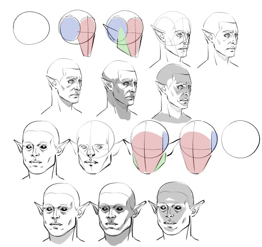
Obviously I don't do every single one of these steps most of the time, which is just something that comes from practice/developing muscle memory, but it is helpful to start off this way for two main reasons:
By making these guide lines and splitting a head into pieces like this, you'll have an easier time seeing and understanding it as a multidimensional object, and in turn, facilitate It for you when you venture out into doing wacky angles and lighting.
Making different headshapes starts HERE. notice how Astarion's "face" slate is narrower and longer, how my durge's jaw pieces sit lower on the head, how all of the same pieces came together in the same way but we ended up with one real pointy elf and a real brick of a drow - making characters look different successfully begins very early in the sketching process.
The next thing you want to do branches out into every day life: start noticing yours and other people's facial features. How does an upturned nose look from a high angle? How does the size of someone's cheekbones affect what they look like when they smile? How about when the light hits them a certain way? Does someone's lip shape changes when they pout? When they laugh? How does a person's hairline change the shape of their face? You do NOT need to creepily sketch every stranger you see on the bus, but get into the habit of actually noticing what people look like when you talk to them - when you look at pictures, when you watch movies - make a mental list of interesting ways mouths, noses, and eyes can come together in a variety of different proportions to make completely distinct looking mugs, and how they change depending on how you are looking at them.
Light and shadow play a HUGE role in how faces look, too, basically as crucial as actual bone structure does. As you see up there I tried to rough out how natural, head on, and underhead light would look on these two very different looking guys, and while we can see definite patterns, there are small differences that come to be because of the sizes and shapes of their features.
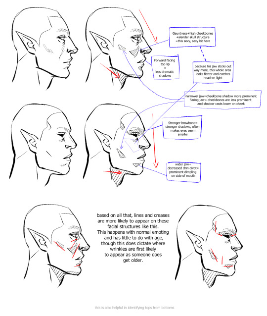
Here is a very, very basic look at how some of these features come to look the way they do, how they interact with one another, and how they compare between a blocky, rather conventionally "masculine" head and one that's much softer and slimmer.
Note please that it is not one or two characteristics that give a chaarcter their "look"; you can reduce a face to eyes, mouth, and nose through stylization and still have them be recognizable, but if you want to do more than that, you have to consider the whole package! Chin, cheeks, brows, direction of the jaw, slope and size of the forehead, depth of eyes, ridge of the nose, etc - I know this is probably far more than you bargained for, but if you start making note of a FEW of these things now and slowly add on, this will eventually become second nature to you.
Similarly, understanding how these characteristics come together will help you with rendering light and shadow in a realistic way, and predicting what their facial expressions may look like - if no two people are alike, neither are their smiles. :)
Lastly, remember that I'm no expert - I have developed my own methods and semiotics and yours may look slightly (or vastly) different, and that's fine! I hope only that by sharing this it has given you a base to work off of.
Anyways, I HOPE this has been helpful and not just the unsolicited ramblings of a face pervert.
866 notes
·
View notes
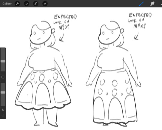
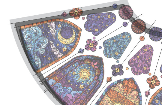
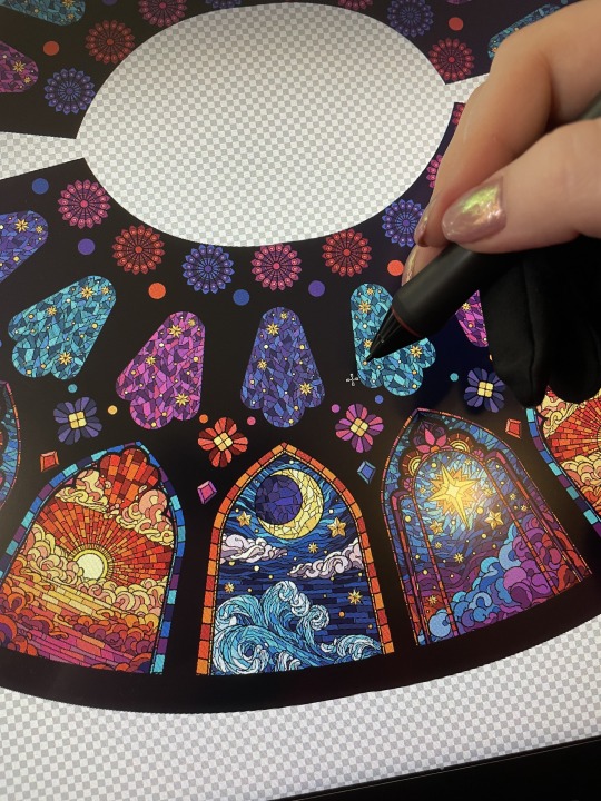
Note
hello! the stained glass pattern is amazing! will the skirt be available in full lenght / ankle lenght as well?
thank you!
i can't say definitively forever, but for now the cathedral skirt will only be available on midi skirts. we are not making miniskirts for 2025 and the proportions of a maxi skirt are completely different from the midi skirts and the cathedral art was designed specifically to work with the proportions of a midi skirt. it just wouldn't look as good on a maxi. (also, the only maxi skirts i make are collabs with @freshhotflavors and are sold in their store and they use FHF's templates, which are significantly different from ours)
i would have to redo a significant amount of art to make it work on a differently proportioned skirt.
plus, if i'm being completely honest, i do not want to format this design on other skirt lengths.
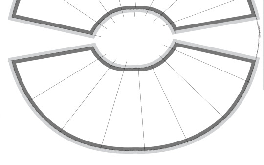
and it’s not just the art that took a long time—in order to make this design as seamless as possible, i have to have a total number of panels that is divisible by 3. for the smaller sizes, that isn’t so bad, because i can put 6 panels on each skirt half for a total of 12. but that doesn’t work correctly on the larger sizes, so for those i have to do 7.5 panels per skirt half for a total of 15 on the skirt and then i have to do my best to align one of the art panels so it matches up over the side seam.
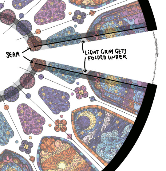
after i finished the art, getting these skirt templates laid out in all sizes took me an entire week and many failed attempts at doing geometry. none of the skirt halves have the same curvature and none of them are actually circular in nature. they are very weird shapes and the upper arc of the waistband and the lower arc of the bottom hem are not the same.
i actually cried like three times trying to calculate the angles of the side seams before i realized that the waistband and hemline are not perfect circular arcs so getting the angles wouldn't help.
i ended up having to manually make my own measuring system by hand to work off.
i am never doing this again it was so much work and i think the final product will be worth it but god was this harrowing.
#ask#store#maya draws things#art#i know u didnt ask for all this extra info but i just need ppl to see how much goddamn work went into this skirt
245 notes
·
View notes
Note
me, patiently waiting all of 36 hours for user keferon to post smth for the new MOMU chapter, slowly succumbing to despair as i'm more and more convinced that they won't not post anything for this chapter

you, 48 hours later:

me:

You have no idea jgkkhkh
I never drew a kiss before. Like. Ever. I had literally no clue what to even start with. Went to look at references, tried different angles and styles. Also these guys are even more tricky than regular humans because their heads aren't shaped for that. Where does Jazz's visor go? And Prowls chevron?? How do I fucking bend the space and matter to make them kiss when their helmets are in the way??
The mental geometry was so awkward and broken oh my god. But as you can see. I managed. Something haha
284 notes
·
View notes
Text
Supernatural and the Concept of Grace
Hi! It's your friendly neighborhood Media Mime and I'm here with a wall of text about my insane thoughts on how Angels work.
From the TV show Supernatural.
I don't know what I'm doing with my life.

---
These are headcanons, mind you, so they aren’t supported by the show. I just think way too much about stuff like this.
This all stems from how beings from a different plane of existence would be borderline incomprehensible to humans. The whole, true form and voice not being viewable/hearable led to me thinking about them in more abstract forms.
I’m going to give you some weird background stuff below, but feel free to skip to the end if you’re just here for the Grace mechanics and things.
---
My day job is as a Math Adjunct, so you can imagine I have a bit of a fixation on recurring principles, formulas, geometry, and so on.
It’s my jam.
Specifically, I have a focus on Mathematics in Nature. It's fascinating to me that we see the same shapes and patterns recurring over and over again in all natural formations.
I want to stress that to get into this kind of thing, you don’t actually need a background in Math. There are several resources online that provide examples and visual guides to this field of study. I’ve provided a visual guide below of some of my favorite phenomena as well as a basic (very basic) explanation of the principle.
I ain’t getting paid for this right now, so you get what you get!
---
Now is also a time to mention that I took some psychedelics in my 20s that made me See Some Shit. This is not meant to be inspirational. I just think I should mention it because you see a lot of Stuff on them, not always Stuff you want to see. You can look up information about psychedelic geometry and skip the hassle of ingesting things you probably shouldn’t.
Don’t do drugs kids, or whatever.
---
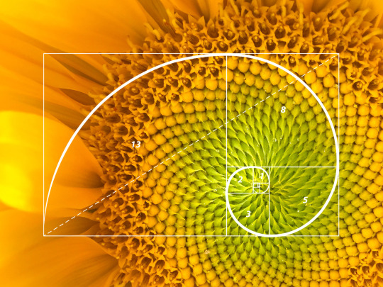
The Fibonacci Sequence is where numbers ascend by adding the two previous numbers to itself. This plays a key role in something known as the Golden Spiral. For a very basic explanation, you take a square and draw an arc from one corner to the next and repeat with bigger and bigger squares.
1,
1 + 1 = 2,
1 + 2 = 3,
2 + 3 = 5,
3 + 5 = 8,
5 + 8 = 13,
and so on.
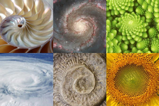
The curve itself is seen in the way plants grow, shells form, and weather formations to name a few.
(The following are not my images, but they are readily available online. )

---
Tessellations are repetitive polygons (shapes with 3 or more connecting lines, think triangles, squares, hexagons) that form together, without gaps.
In nature, the real world, there are examples of malformations, but Math is an explanation of the ideal principle.
We can see these structures in scales, honeycombs, and so on.


---
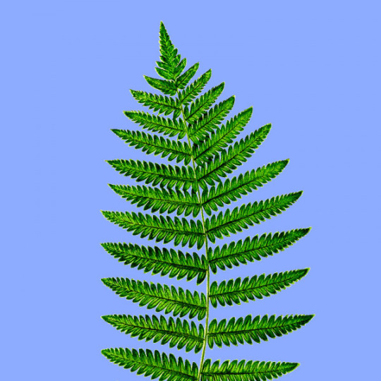
Fractals are where we see the same pattern repeat at smaller and smaller forms of itself.
There is a lot of overlap of this with the Fibonacci Sequence (these patterns often appear INSIDE of the spiral), but it is its own concept.
Fun fact, fractals play a significant role in Chaos Theory, which I will not get into here because we would be here all day.

---
Anyway!
Sorry!
Carried away there.
Back to Supernatural (what an insane transition) and how this wraps into my concept of Grace.
---
Angels are filled with this kind of naturally occurring phenomena, a sort of endless collection of patterns. They are essentially manifestations of this idea or at least they process the physical world in this way.
Castiel mentioned eating molecules ONE TIME and well, I ran with it.
---
A couple of examples I feel strongly about, using Castiel as an easier point of entry than say, Lucifer or Gabriel:
Angels think in a series of sensations, like a form of Synesthesia. Synesthesia is a concept explored in both psychology and cognitive neuroscience where people express the feeling of multiple senses activating at once. So for instance, the words might leave you with an impression of color or sounds may give you a physical sensation. I think Angels can, and do, adopt a more human perspective the longer they interact in the physical world. This is especially relevant during the time they are essentially made human, but I think the way they interpret information remains abstract. Just a fun fact, if you have Autonomous Sensory Meridian Response (which is usually shortened to ASMR), you have a higher chance, according to some studies, of having a form of Synesthesia.
---
Angels also think in patterns. For Castiel, in the beginning: His thoughts are very vibrant. Primary colors denote curiosity. The structure of those thoughts are very rigid. He thinks more in straight lines rather than curves. The movement of the thoughts is calculated and repetitive. Learning something for the first time is difficult, so splitting it into individual pieces is easier to comprehend. This is where we get The Face from, you know the one. He perceives things in his own way which makes him socially awkward in human form. As he gets more familiar with the physical world, and the boys in general, his perspective shifts. He has more robust colors dedicated to the people or objects he interacts with and they shift around easier. His thoughts are less linear and more curved and organic. He has less set structure because he isn’t learning as much anymore, he has an understanding he can build off of and make more defined to himself. Learning to love humanity requires flexibility that doesn’t come naturally to Angels, so he actively works at it.
Seeing souls is easier than interpreting the actual look of people. This is a doozy, but we will take Dean as an example because I’m Destiel/Deancas pilled. To Castiel, Dean looks the way he looks, smells the way he smells, sounds the way he sounds, and so on in physical form. Castiel learns to interpret him in that way as the series goes on, but his soul, the essence of him, has its own set of sensations. The following are not literal, although I’m sure some would translate that way. He sounds like a crackle of fire and a low drum. His colors are darker oranges and blues and greens. He feels like a soft rain and sun on a warm day. He tastes of barrel aged liquor and smoke. He smells like a hearth and earth after it rains. He feels like every aspect of the impala, from the cold metal to the supple warm leather. Obviously some of these senses shift and change from time to time, but that forms the basis of what Castiel recognizes as Dean.
---
Grace is at least partially visible to other angels and partially felt by humans. Other angels can see each other in their vessels. So they have a concept of what they look like in their true forms, despite being hidden inside of something. This implies they can experience similar sensations as the other angels they look at, although I don’t like the idea that they can see their “thoughts” necessarily. I would imagine they can “feel” a sudden intense set of emotions/sensations from another angel however, in the way that humans can tell someone’s emotions through facial expression or tone of voice.
---
Humans can learn to experience angels, albeit in a form that is easier for them to comprehend. Dean doesn’t experience anything special about Castiel when they first meet, outside of the generic information we get about Angels and the obvious senses he can use: seeing, hearing, smelling, (gods I wish tasting was on this list but! Alas!) As Dean gets closer with him, he can start to “hear” him. I like to think he sounds like a pleasant hum or a slight ringing, similar to a wind chime, depending on his mood. Dean, specifically, makes him hum lower than usual. If he were to hum out-loud, it would harmonize with the way his grace sounds. It takes longer to perceive colors, but I think Dean would see the little flashes of blue, similar to the way Castiel’s eyes get when he’s using his powers. This is why I typically put a little blue squiggle between them when I draw them together. Plus other senses, sorry but this is long enough as it is. You likely get the point by now!
---
Anyway, I’m very happy that literally anyone has even a passing interest in my interpretation of these things.
Formatting this was a nightmare and I feel particularly insane today.
#supernatural#spn#my stupid little frog brain#more of my abstract thoughts on grace#spn headcanon#somehow it all comes back to math#if anything enjoy the pretty pictures of nature#yes i’m mentally ill what gave it away#castiel#supernatural angels#sorry for posting like its the 2010s
114 notes
·
View notes
Text
It took about two hours for Daina Taimina to find the solution that had eluded mathematicians for over a century. It was 1997, and the Latvian mathematician was participating in a geometry workshop at Cornell University. David Henderson, the professor leading the workshop, was modelling a hyperbolic plane constructed out of thin, circular strips of paper taped together. 'It was disgusting,' laughed Taimina in an interview.
A hyperbolic plane is 'the geometric opposite' of a sphere, explains Henderson in an interview with arts and culture magazine Cabinet. 'On a sphere, the surface curves in on itself and is closed. A hyperbolic plane is a surface in which the space curves away from itself at every point.' It exists in nature in ruffled lettuce leaves, in coral leaf, in sea slugs, in cancer cells. Hyperbolic geometry is used by statisticians when they work with multidimensional data, by Pixar animators when they want to simulate realistic cloth, by auto-industry engineers to design aerodynamic cars, by acoustic engineers to design concert halls. It's the foundation of the theory of relativity, and thus the closest thing we have to an understanding of the shape of the universe. In short, hyperbolic space is a pretty big deal.
But for thousands of years, hyperbolic space didn't exist. At least it didn't according to mathematicians, who believed that there were only two types of space: Euclidean, or flat space, like a table, and spherical space, like a ball. In the nineteenth century, hyperbolic space was discovered - but only in principle. And although mathematicians tried for over a century to find a way to successfully represent this space physically, no one managed it - until Taimina attended that workshop at Cornell. Because as well as being a professor of mathematics, Taimina also liked to crochet.
Taimina learnt to crochet as a schoolgirl. Growing up in Latvia, part of the former Soviet Union, 'you fix your own car, you fix your own faucet - anything', she explains. 'When I was growing up, knitting or any other handiwork meant you could make a dress or a sweater different from everybody else's.' But while she had always seen patterns and algorithms in knitting and crochet, Taimina had never connected this traditional, domestic, feminine skill with her professional work in maths. Until that workshop in 1997. When she saw the battered paper approximation Henderson was using to explain hyperbolic space, she realised: I can make this out of crochet.
And so that's what she did. She spent her summer 'crocheting a classroom set of hyperbolic forms' by the swimming pool. 'People walked by, and they asked me, "What are you doing?" And I answered, "Oh, I'm crocheting the hyperbolic plane."' She has now created hundreds of models and explains that in the process of making them 'you get a very concrete sense of the space expanding exponentially. The first rows take no time but the later rows can take literally hours, they have so many stitches. You get a visceral sense of what "hyperbolic" really means.' Just looking at her models did the same for others: in an interview with the New York Times Taimina recalled a professor who had taught hyperbolic space for years seeing one and saying, 'Oh, so that's how they look.' Now her creations are the standard model for explaining hyperbolic space.
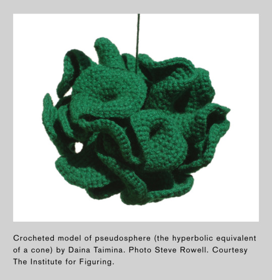
-Caroline Criado Perez, Invisible Women
Photo credit
#caroline criado perez#Daina Taimina#women in stem#women’s history#women in science#crochet#crocheting#female mathematicians#hyperbolic space
385 notes
·
View notes
Text
In the past few weeks, I've switched a bit to 3D art. Just graduated from Game Design uni and realised I don't actually know how to do this properly smh.
I started him (neither Ingo nor Emmet yet, in which state I like to call him Jürgen) because I got sick and tired of drawing all that animatronic geometry every single time I made a submas animatronic. So this was meant to be a posing dummy for that.

As one does I started with a T-posing guy, luckily having a 2D reference of Ingo on hand. You can still see Freddy behind him.
I wasn't sure how high poly I wanted him to be, opted for a low poly solution and figured shade smooth is gonna handle that I'm sure.

Oh boy let me tell you those side triangle thingies ain't easy in 3D space. No wonder we got such a hard time making them look good, they're an impossibility!! flippin 8D shape right there!


The cone of shame! Jürgen's been to the vet and is not supposed to lick that spot
Part 1 - Part 2
#pokemon#fnaf#five nights at freddy’s#submas#3D model#blender#subway boss Ingo#subway Boss emmet#subway master#Jürgen
250 notes
·
View notes
Text
Formula 1 drivers as High School Teachers
Part 2 of my yearbook series for my f1 spiderman au.
The School Teachers and Staff
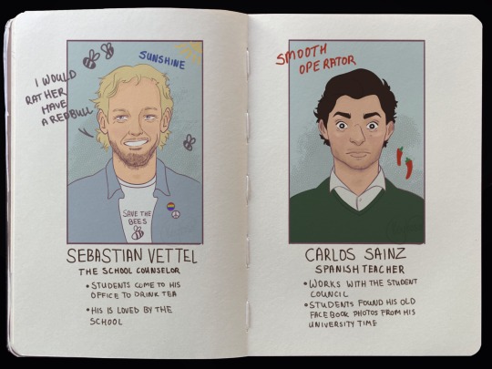
Sebastian Vettel: His office is decorated full of random vintage posters, model cars and plants. If a students comes to him he tells a lot of funny and random side stories to calm them down. Always brings homemade baked goods because that's how his mother raised him. Runs the environmental club and organizes clean-up days and tree planting events so that students never forget why it is important to look out for or planet.
Always wears slightly rumpled button-down shirts and bikes to school everyday. Students love him and feel safe with him. They call him sunshine or the bee keeper. In the staff room Seb drinks herbal tea and has a reusable bamboo cup while Carlos shows up with a large coffee and a protein bar. Also Carlos constantly borrows Seb’s pens and never returns them, which has led to a very passive-aggressive post-it note war.
Carlos Sainz: If you know that one photo of Carlos with his nose piercing, you know what I'm talking about. Also works with Sebastian helping out with the kids, because he believes that teachers can shape kids lives. He also takes part in the student council, he’s the advisor who actually cares. Helps the students organize dances, fundraisers, and spirit weeks. Loves planning charity soccer tournaments through the Student Council and is extremely competitive when playing against students. As the Spanish teacher he doesn't understand what Lando is doing in his class because Lando absolutely sucks at it. Carlos has a stick rule - no English during his lesson — he gets offended if you slip up "¿Inglés? ¡No, por favor!"
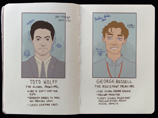
Toto Wolff: The school principal, drives a mercedes and has a designated parking spot that no one dears to use. One unfortunate kid parked his car at Totos sport and got called to the principals office, after that everyone knew what would happen if you dare to poke the bear. Nobody knows if Kimi is his son of what but everyone knows that Toto has a soft spot for him and that Kimi can get away with a lot of things.
Well dressed always a tailored suit, never a hair out of place. Introduced a "Student Performance Board" where achievements — academic, sports, arts — are celebrated publicly. The teachers have an ongoing inside joke where they fake a "team radio" in staff meetings "Toto, we can't keep doing these Monday staff meetings." Has a very specific "angry walk" down the hallway — when students hear his fast, heavy footsteps, they immediately sit up straighter.
George Russell: Absolutely loves his job. Students avoid him at all cost. If he sees Lando carrying his skateboard shouts to “keep that skateboard off the ground”. Loves organizing assemblies and drills. Once a month makes a powerpoint presentations about school safety, everyone hates that time of the month. Students sometimes make bingo cards for "phrases George will definitely say at the next assembly," like: "Punctuality is key to success!" and "Excellence is a habit!". George acts like Toto’s right-hand man, trying to be super serious, but Seb and Carlos constantly mess with him — switching his clipboard with joke notes or sneaking memes into his official emails.
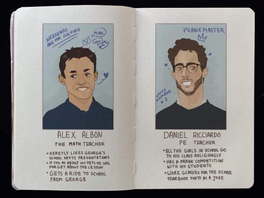
Alex Albon: neighbors with George, always getting a ride to school from him. Has way too many pets, the students are lost how everyone off his pets fit in his house. Always carries a lint roller with him because of the pet hair. He likes to wear sneakers, comfy sweaters and his sleeves always pushed up. Sometimes Alex likes to wears silly socks with ducks or pizza on them. Loves making bad math puns "Without geometry, life is pointless." cue groans. George tries to get Alex to make math club more intense but Alex’s version of "training" is math games and pizza nights. Secretly keeps a wall of anonymous student thank-you notes inside his desk drawer for days he feels stressed.
Daniel Ricciardo: Daniel is the PE teacher, he is the most fun teacher. Always joking around and pranking other students. Somehow has way too much energy at 8:00 AM and confuses everyone "Did you...have like 3 Red Bulls, Mr. Ricciardo??". Wears "motivational" shirts like "Pain Now, Pizza Later" or "Sprint Now, Complain Later."
If a kid falls dramatically during an activity, he also falls dramatically on purpose to make them laugh and not feel embarrassed. Keeps an eye out for the kids who aren’t super athletic and makes sure they feel included, gives them "special missions" like being the ultimate referee or official team hype-person. Toto thinks Daniel’s classes are "too chaotic" but can’t deny the students LOVE him. George once tried to join a PE class to "show proper athletic form" and immediately lost a footrace to a 7th grader. Daniel never lets him forget it.
A bit of backstory back in his days he was a promising boxing star however because of an injury he missed out on a final competition his coach Horner was absolutely devastated. Horner and Daniel had a falling out and they parted their ways. Later Daniel became a teacher and he noticed Max. Max is a complexed teen, anger issues and other problems. Because of that Daniel recommended boxing to let out all off that builded up frustration. After some time Daniel noticed that Max is natural and gave Horners number. Although Daniel doesn't speak to Horner, he knows that Max would reach higher achievements at under Horners strict training.
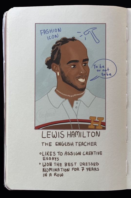
Lewis Hamilton: Walks into class every day like he's on a red carpet, wearing the sharpest, trendiest fits — streetwear meets academia. Schools fashion icon. you can spot him a mile away with his colorfull outfits. Students literally wait to see what he's wearing each day. "Mr. Hamilton’s fit check coming in 3...2...1..."
Thinks outside the box — instead of boring book reports, he has students make podcasts, spoken word pieces, or music playlists inspired by the books. Runs open-mic poetry nights at school where he sometimes reads too and everyone loses their minds because he's SO good. Writes the most thoughtful comments on essays.
Seb and Lewis occasionally team up for "Social Justice Week" — inspiring students to think big and take action.
Daniel once pranked Lewis by replacing his designer notebook with a SpongeBob one. Lewis actually used it proudly
One time somebody put an onion on his desk and he couldn't start the lesson so Oscar removed it. He was very great full for the help. Because no one came forward the whole class got detention. Has beef with the school principal Toto, the students are lost why that is, Lewis never clarified why that is.
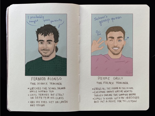
Fernando Alonso: Dr. Octopus of my au, the mad scientist that started okay but over time his obsession with science made him go mad. Fernando suspects that Oscar is Spiderman. However, to get closer to Oscar he makes Lando work for his lab. Lando takes that opportunity because he needs the extra curricular activitie to pass his Science exam. Alonso gives off chill teacher vibes. If there is a school fight he will be sipping tea and looking at the kids from his classroom. Unbothered queen.
Pierre Gasly: some clarification, Pierre went to Turkey to get a hair transplant because he was going bald at the age of 29 years old. The sassy queen. If the students are talking about some tea he will pause his lesson to listen to them. The students know this and always do it intentionally. Constantly says, "Come on, it’s easy!" even when it's definitely not. Runs the French Club, where 70% of the time is just watching French movies and laughing at his own dramatic commentary.
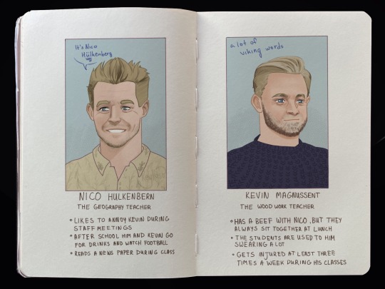
Nico Hulkenbern and Kevin Magnussent: pretty much self explanatory all the facts are written down, don't have anything more to add.
#f1 art#f1 artists#f1 fanart#fanart#f1 au#formula 1#sebastian vettel#carlos sainz#daniel ricciardo#nico hulkenberg#kevin magnussen#alex albon#george russell#fernando alonso#pierre gasly#lewis hamilton#toto wolff#f1spidermanau#spiderman au#F1 drivers as teachers#F1 high school#Finally I'm doneeeee
78 notes
·
View notes
Text

Merry Christmas and a Happy New Year!!!
Fun fact, in making this image it was surprisingly my most easiest yet visually pleasing work. I've always viewed at as a graph like this
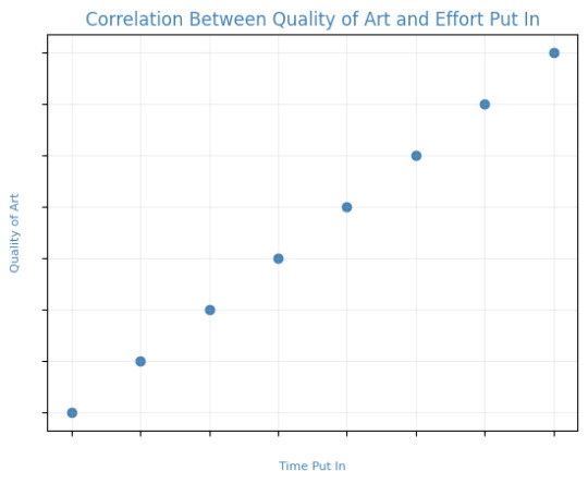
Of course, that isn't true! It's more like this
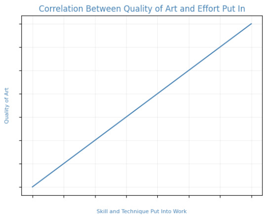
That is to say, I believe this illustration allowed me to focus on the efficient fundamentals I built!

Everything here was rendered with only three brushes. All of them the default brushes that come with CSP. Which includes Pastel, Airbrush, and Mechanical Pencil. Because it was a lineless style, that means I could be a lot more forgiving of mistakes here and there. Something doesn't look right? All I gotta do is add a little more with the GPen to the shape. Or can I just draw an outline in the color I want and fill it in with the bucket tool with a area scaling of 0.10! I have to practice more with lineless styles, it is fun! Rendering was a breeze too.
Which was a simple process of:
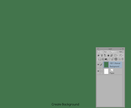
Create shape > Shade with Airbrush > Highlight with Airbrush > Shade with Pastel > Multiply Shading > Lower Multiply Layer Opacity > Overlay with Textured Fill > Move Textured Fill Layer > Finished!
It's a few steps, but once you get into the groove, it becomes very efficient. I'm sure there's ways I could shave off a few layers, like combining the Airbrush process into two layers instead of one but ehhh sometimes I do it, sometimes I don't. Usually, the bigger the shape the more likely I'll use more layers and the smaller the shape the less likely I'll use more layers! Of course, this process isn't a concrete ruling. Sometimes, I'll use more layers for extra things like the bell required more layers for rendering the shininess of metal! Anyways, I would like to believe I did a decent job at recreating the feel, the vibe, and or general look of an old Christmas Card that's more retro in nature. With a focus on simple shapes, a lineless rendering style, and using textured brushes to render, I think I got it down packed. I used a tiny bit of Chromatic Aberration to give it a little bit of a visual pop, and brighten up the colors. It's subtle, but it works.
Oh, and here's something cool! To get a more embossed Christmas Card feel, I used a new tool that came with Clip Studio Paint!
N O R M A L M A P !
Cool, right? I use a pirated copy of Clip Studio Paint 3.0 and it comes with a tool that allows you to create normal maps from illustrations. Which, from what Google tells me: "A normal map is a texture mapping technique used to add surface details to 3D models without altering their geometry" ...Neat!
Anyways, here's what it looks like
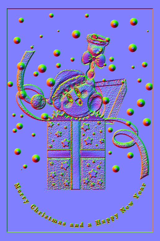
Freaky, right?
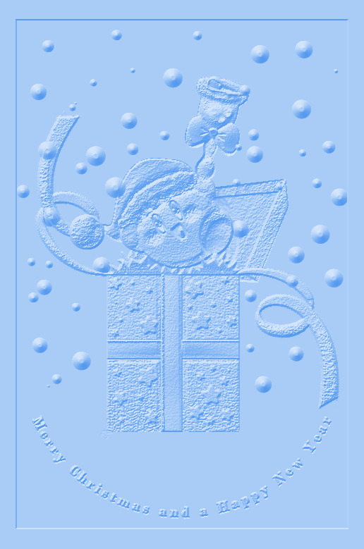
It looks like an embossed letter when you set a layer color to it too!
Anyways, I overlayed it on top of the finished illustration, set it to multiply and set the layer color to a warm yellow and it gives it not only texture but a sense of depth too! It's super cool, if you digitally paint you should try it!

With Normal Map Overlay Effect

Without Normal Map Overlay Effect
It's subtle but it's there.
Anyways, that's enough blathering from me! Merry Christmas everyone! I'll be answering some asks this week, so stay tuned!!!
59 notes
·
View notes
Text
Let me tell you a little thing about cars.
I have had a gripe against modern car design, at least here in the States, for the longest time. Recently I have seen the utter abominations of the 21st century be more and more common and finally decided to share my stance to the wonderful world of the internet! So, be prepared for a lot of reading because this is a full scale rant with the occasional photo.
And now: Why Modern Car Design is Going to Kill Us All.
I have been doing much research these past months as I continued to observe more of these "newer designs" I have spoken so much about, and there are a few things I need to delve into.
The Flat Front
Supersize Me 2: Not so Electric Boogaloo
Elon's Bastard of a Car
1

The Flat Front
So, these cars I have been talking about, just to be more specific, are SUVs and Light Trucks/Pickup Trucks.
You see that massive, flat front in the image above? Well, believe it or not, that is causing more deaths in car-related accidents yearly! Due to being so boxy, when a pedestrian is hit, they are more likely to break bones around the torso/head, then pull the person UNDER the car rather than how a car normally would hit the person's legs, then they would hit the hood of the car.
These can also create massive blind spots/zones where you can't see what is right in front of you.
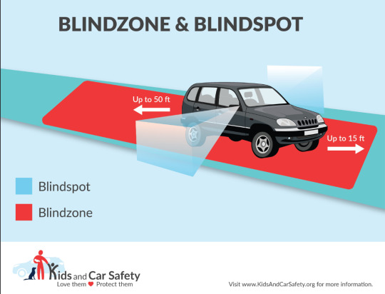
I shall dive more into this in the next section.
2
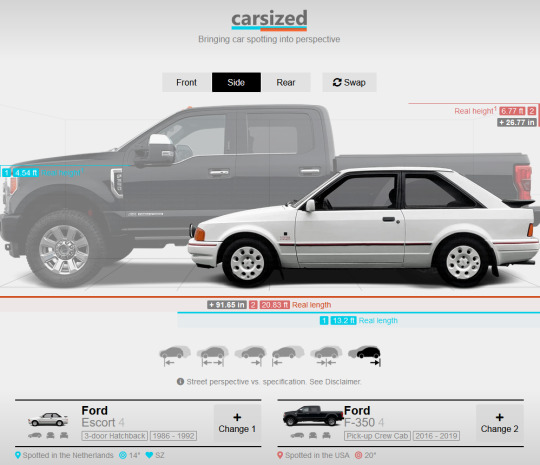
Supersize Me 2: Not so Electric Boogaloo
So, onto the next section. As you can see above you, this is a comparison of two cars, only 24 years apart(end of Escort to start of F-350). Only 24 years, and it had a 246% increase in weight, was 91.7 in. or about 7.64 ft. longer, and 26.8 in. or about 2.2 ft. taller.
This is a dramatic increase for little to no reason other than to "protect the drivers". As we have discussed in section 1, this is not the case. In fact, if one of these larger SUVs were to hit another, usually smaller car, it is more likely for the smaller driver to be killed, or at least seriously harmed by the bigger vehicle.
Speaking of smaller, children:

Children are one of the biggest victims of these larger cars with them being run over either in frontovers or backovers, most often by their own parents in a driveway.

If you don't fully believe me that these cars are truly big enough to run over the younger side of children, an entire experiment was done, putting kids in front of parked cars, and just look:

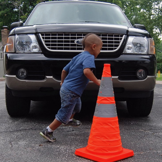
Terrifying.
I addition to this, the larger frame of these cars means that they create more pollution. Let me explain: The bigger cars needed more fuel, that means more fossil fuels being burned, and due to the US's car based infrastructure, there are more cars being produced, that is even more fossil fuels for both production and upkeep, and more pollution.
But oh dear reader, these SUVs and Light Trucks are not even the worst of it...
3
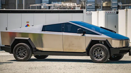
Elon's Bastard of a Car
Gentlemen, women, and all of you folk in between, I give you: The Tesla Cybertruck.
This... Thing, is the bane of everything I hate about modern car design, from the boxy shape going throughout the car, to being an "indestructible" vehicle, and its ability to kill anyone.
Okay, that is a lot I am claiming, so lets break it down.
We have already talked about how dangerous the box design is, but the Cybertruck appears to be a geometry problem found in high-school. This is unbelievably dangerous, making any crashes with other cars much more likely fatal.
The fatalities can also be helped by the fact the damn car is made of STAINLESS STEEL and "indestructible" according to advertising. Most cars are made to be able to crunch in order to let the force of impact be more spread out throughout the vehicle. Yes, it will cost quite a bit to fix, but hey, you're alive. Meanwhile when it is made out of such a hard material, such as steel, that crunch isn't going to happen and only kill the people inside the vehicle, and the people crashing into the giant steel block.
The company claims it can go from zero to 60 miles per hour in 2.6 seconds, which, if true, would mean it has a faster acceleration than most NASCAR and Formula 1 vehicles, with none of the accompanying engine roar to warn anyone that it's coming. The headlight, meanwhile, is one single bar of light, which some experts are already worried will blind oncoming drivers.
There are so many other things about this utter abomination that I would love to talk about, but I think this is where I'll leave off.
One last thing, I just want to say how this is mostly my experience and research from the United States of America, and not the rest of the world. Also, I do not see these things getting much better unless somehow the US removes all of its car based infrastructure.
Thank you for reading my friends, and remember, fuck monopolies.
165 notes
·
View notes
Text


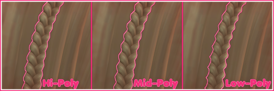
DL (mediafire)
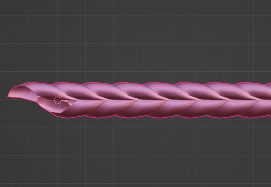
Today I bring you not cc, but a small collection of .blend files for making cc a little easier. If you've ever wanted to quickly put a braid into a custom hair without completely obliterating your poly count*, then these might be able to help.
*braids will still add a LOT of polygons to your hair, but since every single polygon is visible** on these tiling braids, at least you know they're all being put to use, whereas if you were to physically braid 3 strands of geometry, lots of those polygons would wind up inside the braid, just adding to your count without contributing anything to the look
**if some polygons end up inside of other meshes, you may want to delete them to reduce the poly count further. The boolean modifier may be able to help you, but I haven't tried
These are completely hollow, tiling braid "facades". They just look like a braid, without being anything more than a stylized tube. Available in 9 shapes (which are all pretty similar, more or less, but have different 'vibes', and one of them technically doesn't resemble a braid, but if you squint it looks close enough) and 3 polygon counts to hopefully fit in with your project.
TOU: Same as my cc. Read it here. I obviously don't own this concept, so feel free to reverse engineer, make your own braid tiles, etc. Just don't use mine for anything commercial (using them in commissions is fine, just not paywalled final products!)
You will need to be using one of the newer versions of blender, I believe 2.8 and up. These were made in blender 3.6, so the files will not be compatible with old versions like 2.7x.
Quick start guide:
Open your hair wip's .blend
In object mode, 'Append' the 'BraidTile' object of your choice
Select 'BraidPath' and, in Edit mode, position it however you like
Additional info under the cut, because I tend to ramble, and these require a little bit of a primer before use, probably. Unless you for sure know what you're doing, in which case, feel free to just take these and run with them.
THIS IS NOT A TUTORIAL ON MAKING HAIR, OR HOW TO USE BLENDER. Seek that information elsewhere.
Before appending braids, you may want to open up the blender file and look at all the shapes, to decide which one you want to use.
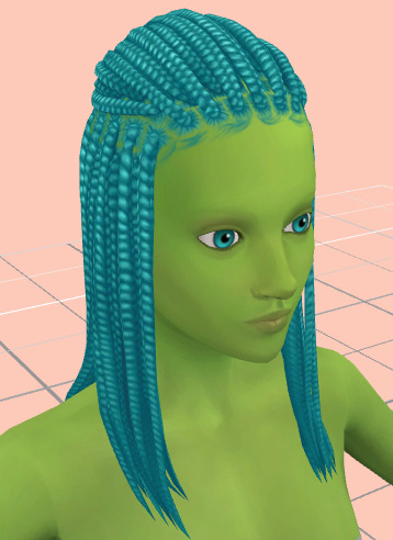
When you first append your braid, or open the blend files, you may notice it does not look like the preview images above, and instead looks like a shiny pink slug. This is intentional! For previews and development work, I use @/simandy's base textures, but your hair will probably be using a different texture, so I have not included a texture at all.
Simply switch the material of the 'BraidTile' to the same material your hair is using, and adjust the uv map accordingly. I'm going to assume if you are making hairs that you know how to do that, so it will not be explained here.
Once you have your braid appended, and have edited the UV Map of the 'BraidTile' piece to your liking, you can also try scaling the tile in the X, Y, and Z axes to change up the look a little. Make sure you select all of the vertices before scaling, to make sure it still tiles. This should be safe to do, and not mess up the tiling at all, but make sure you do it in Edit mode, not Object mode. (If you mistakenly do it in Object mode, you just have to press ctrl+A and select 'scale', and that should fix it)
When you have your braid adjusted, switch over to the 'BraidPath' object, and use edit mode to move the points around however you want. This is just like any other hair strand, if you're used to making hairs with paths and curves then this should already be familiar to you. All the same controls should work.
And, if you already have a curve in your hair that you'd like the braid to snap to instead, you can select the 'BraidTile' object, locate the curve modifier, and switch the curve object to any other curve in your .blend. You'll want to change the curve in the array modifier to the same one, most likely.
If you haven't used curves to make a hair before, here's a couple quick controls you might like to know:
ctrl+T will let you Twist the object around the selected point(s) alt+S will let you Scale the object around the selected point(s) selecting the first or last point of the 'BraidPath' and pressing E will Extrude a new point, making your braid longer
Remember to do all of your positioning on the 'BraidPath' object! You do not need to edit the 'BraidTile' at all once you've set up the UV map and adjusted the scale!
It should tile, twist, etc. with little issue, and should get longer or shorter according to the length of your curve with no issue. If it doesn't, make sure both the array and curve modifiers of your 'BraidTile' object are using the same curve. They should be using the 'BraidPath' object by default, but if you changed this manually, ensure that both modifiers match for best results.
Unless you know what you are doing, I do not recommend messing with any other settings in the modifiers, or adjusting the 'BraidTile' mesh in any way besides scaling the entire object at once. Otherwise you could end up with gaps and holes in your braid.
When you are done posing your braid, you can apply the modifiers to turn the whole thing into a regular mesh. I like to make a copy of my 'BraidTile' and 'BraidPath' first, just in case I want to go back and change the shape later. After converting it to a regular mesh, I'd recommend going in with proportional editing turned on and randomly scale and move a few of the pleats just a little, to make the braid look a little more organic. You can even add a couple strands to make it look messier, if you dont mind adding to your poly count even more. But this comes down to your preference and style. The braid below has had some half-assed editing done to demonstrate the concept. (Note: This is actually the low-poly version of this particular braid shape)

Ultimately, it is up to you to decide how you want to blend the braid in with the rest of your hairstyle. I can't tell you how to do that, as it is ultimately going to come down to your own personal preference, workflow, and the hairstyle you are making.
How do I know if I should use Hi, Mid, or Lo poly?
This is largely due to personal preference, and how you're using the braids in your project. I have included the three different poly versions to try and be mindful of the overall poly count of your poor poor meshes, but even a lo-poly braid is going to add an easy couple thousand polygons to your project. Keep that in mind! If you plan on having a LOT of braids, something like this EA hairstyle, for example:
You will probably want to follow their example and use a very simple mesh and just apply a braid texture instead of using these. EA's braids here appear to be a simple box shape painted to look like braids.
If you only plan on having one, maybe two braids in your entire project, especially if they are very large braids, then you might want to go with the hi-poly option. They're the smoothest, roundest choice.
If your braid has a very small diameter, you can probably get away with just using the lo-poly option, and save some polygons you won't need anyway.
The mid-poly version exists as a sort of happy medium. They aren't quite as pointy as some of the lo-poly shapes, and they won't inflate your poly count as much as the hi-poly models, so you may find you prefer them for your applications.
It's all very subjective.
I think that's pretty much everything I wanted to say. If you have specific questions, my inbox is open.
Keep in mind I am not very skilled in blender! There's probably some optimization that can be done if you know what you're doing, and I welcome you to tweak these meshes to your heart's content, if that's you! I made these for me, but I figure they could make someone else's life a little easier too, so here you go.
If you make anything using them you are welcome to tag me! If you don't end up making anything with these then I hope you at least have some fun playing with them!
#simoleon#THIS IS NOT CC DO NOT DOWNLOAD THINKING ITS CC#im going to the store now if anyone has any questions ill answer them later#dl#(as in 'download' not 'delete later')#i dont wanna put this in my cc tag but i also dont wanna lose track of it yknow
256 notes
·
View notes
Note
Do you use the slider things Kevin Temmer uses for animation? I don’t have any animation software so idk what to call anything
There are a lot of sliders when you mess with 3D, a 3D program like Blender is basically slider-mania. I will go out on a limb here and assume you might be talking about rig sliders.
A rig is kinda like a skeleton which makes characters move. It essentially works like the armatures stop-motion animators use. Sometimes, a 3D rig can have sliders to make animating faces and other things easier. I usually make these sliders myself, and it's a pretty lengthy process. They look something like this.
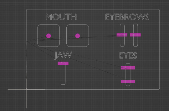
These sliders control the face. If rig sliders isn't what you were referring to, then I will assume you might be talking about shape keys.
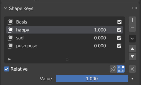
Shape keys are cool and awesome and rad because they are like layers in a drawing program. You switch them on, sculpt on the geometry, and then a slider will change the shape to what you sculpted the geometry into. I usually use them to make extreme expressions on pre-existing characters:

I also use shape keys to fix errors, like when geometry clips together, or whenever I want to make free-form changes, as they allow for a lot of creative freedom. Hope some of this was insightful! :'D
105 notes
·
View notes
Text
hey chat sorry for the month of inactivity. i was unmotivated to do anything with this blog
but then i looked at some of the art on here and realized that i just lost my love for the character designs. so you know how we're gonna fix that? we're redesigning some characters bayybeeee 😈
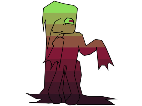
starting with the man the myth the legend, here is UNPLEZZIE 2.0
he's probably the only one i had genuine problems with other than not being very aesthetically pleasing. he seemed too boring, his proportions were always a bit wonky, and the way he became more and more simple the more i drew him dumbed him down to just...awkward.
for this redesign, i kept all the features that made him my unpleasant. the only really signature thing i changed was his hair, sorry not sorry he had to fire his barber. i changed his scars to be far less opaque as to not clutter him up (which was the main reason i left them out most of the time), the only drawback is that i'm no longer just scribbling them in with a brush, they're actual geometry, so i cut back on the arms just for my own sake. also his tail now looks (and acts) like an actual docked tail.
next is the QSWX GVCTXMG AMXLSYX VIEPPC FIMRK GVCTXMG GLEVEGXIV SJ XLI CIEV, here is CREEPY 2.0
creepy was probably my least favorite character to draw. its head shape with the hair that always ends off screen, the 4 arms, the lack of any real way to move visible, it has always been a mess of a character. don't get me wrong, creepy is my second favorite character to write for (beaten only by neuro), i love its personality and its inflection, i just never got the chance to show that because i hated drawing it so much.
so for the redesign, i've basically reimagined it. its face hair now has an actual definitive ending, it has a more unique shape, and is just much more expunged-friendly in my opinion. it looks even more like its mom now...
next is this one, i thought she was american. here's PARANORMAL 2.0
i'm gonna be totally honest i have no idea what i was doing when designing para for the first time. that outfit was 100% subconsciously stolen from some other character i can't think of right now. it also really just didn't fit her character at all. also i dont know why i gave her boobs???? what????
anyways for the redesign she's basically a whole new design now. i wanted to play with some shape language. also, para always had a sort of inhuman quality to me, despite her personality, so i've given her inverted eyes and some animalistic features. i guess it adds irony or something, i dunno.
and finally, the moment GERIATRIC CAT you've all been waiting for, UNNERVING 2.0
in truth nervy's design is my favorite. the only gripe i had is the lack of legs, like with creepy. also i had to give her one of the same pride flag ass gradient as the rest so she'd fit in with the rest. other than all that i love her she is perfect just the way she is with minor adjustments
that's all the redesigns done!! i only did these 4 because stabby is not mine to redesign and NEURO is perfect just the way it is. feel free to give me any constructive criticism for these redesigns, i can always tweak em a bit. also the more stripy gradients wont a pattern that follows the contours of the body but rather just unmoving plaid always. i hope this lengthy yap sesh contributed something to something, maybe gave some insight into my characters.
and if you got this far i put a public discord server link in the intro post. you dont gotta ask anymore. dont tell anyone....shhh....*lovingly puts my finger on your lips* *smirks* *bolts away* *gets hit by truck* *instantly fatal*
#regretevator#regretevator roblox#roblox regretevator#ooc unpleasant#regretevator unpleasant#unpleasant gradient#creepy gradient#paranormal gradient#unnerving gradient#gradient oc#regretevator gradient oc
48 notes
·
View notes