#basically its me editing the uploads of the songs to try cutting out the extra dialogue and intro riffs .etc 💅
Explore tagged Tumblr posts
Text


more edits i made today 💞💞
#i have to make so many soundcloud/yt thumbnails for my sonic underground ost project ;-;#basically its me editing the uploads of the songs to try cutting out the extra dialogue and intro riffs .etc 💅#sonia has so many good screencaps i rlly need more manic and sonic LMAOO-#pls CREDIT if u use btw!!#sonia the hedgehog#manic the hedgehog#sonic underground#sonic edit#sonic
9 notes
·
View notes
Photo


the theme I don’t know how to describe because it has too many things featured in it and it will take a year or
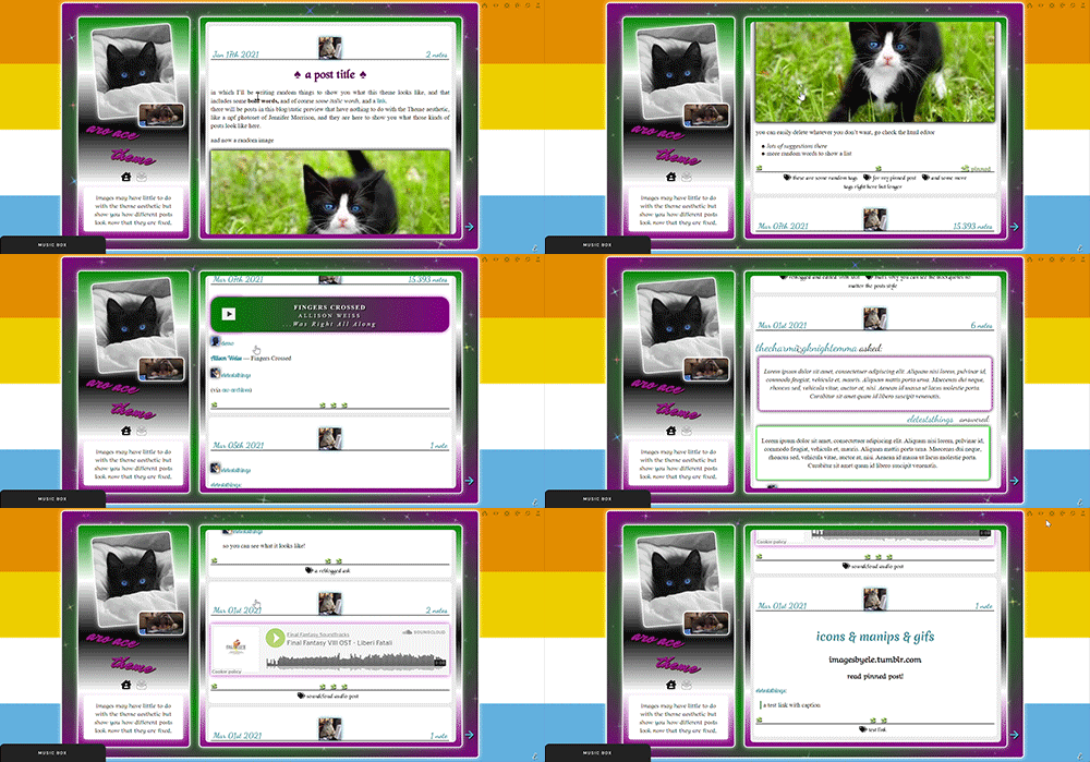
aro-ace theme!
note that you are allowed to use the theme for whatever you want, change all colors, images (you want to make it a marvel thing? go for it! It’s personal and you want to use other flag colors? go pick those rainbow colors!), but my inspiration was, well, not having seen aro-ace themes before and wanting to make one. I didn’t upload background images but you have the option. Feel free to edit as you please, just don’t remove the credit or claim it’s yours!
as always in the source you’ll find the link to the post with static preview, code and instructions/extra credits.
theme is contained, responsive, super customizable. It’s free! But as always consider donating to my ko-fi as this was a lot <3 like or reblog if you use! (or just if you like it, if you want to!)
this post will have: what you can edit from custom page, the widgets/scripts used with credits and some explanations. Asterisks * next to something will indicate that more about it will be said in the linked post. I’d apologize for the length but it’s due to how many things I added to the theme and that you should know about.
now, what can you edit from your customization page:
-nearly every font and its color and size, so that if a font is by default bigger than others you can easily reduce the size. There is a select menu for the body font with all the fonts present in this blog, so you know what they are and can type the one you want for other eleents. I think I only left a couple to be edited from the editor, like your quotes posts if you reblog them a lot. This includes h2 as it’s what you use as ‘big font’ in your posts and h3 in case you want to personalize it and use it for something on purpose, as it has to be added to the html of the post.
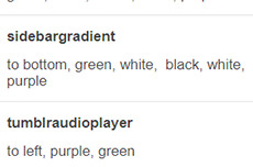
-one of the new things:I used a gradient for the backgrounds of the big container, the sidebar and the posts container, but also of tumblr’s default music player (latter done initially following @octomoosey‘s tutorial then messed with by me hence no album art). See static preview posts. You can type the colors straight from the costomization page like this:

if you want one solid color you can just write, for example: black, black as it needs at least two. To bottom/To left/to top/to right change the direction. The only thing you need to edit from the html is if you want to go from linear-gradient (like you see in the sidebar) to radial-gradient (like in the big container which has green in the center and purple on the outside) and vice versa, if you want.
-you can also upload background images of the sidebar, container and bigcontainer and select the optional blending with the colors, which can be none and you only see the images or something like screen or hard-color and check the results (bigcontainer as an overlay gif on Screen now) -more typing: you can paste the symbol or the symbol code for the list items and the decorations around the post title, right now both being spades. *
-you can upload up to five background images if you enable the ‘changing background’ function otherwise only the first one counts. They will change when you refresh the page, thanks to @lmthemes
-you can turn on and off the music box (player3 by @glenthemes ), and if it’s enabled you can add two songs from the customization page (or go to the html editor and up it to four before it can get messy as it shows on hover), typing url, author, url of the album art, and song title. You already have We Are Golden by Mika as an example (takes a second to start due to the recording, watch out not to get scared if there is silence and then the first note)*
-optional searchbar in the sidebar with optional suggestions when you click on it (if you want them though you’ll need to go to the editor to type links and names, but you can turn it off and just keep the searchbar, like I said) also by glenthemes’ tutorials.
-the separator between text posts image is also optional and if turned on, you can also turn on and off whether the image is the avatair/portrait of the person who made the post, with a link to the original if it’s a reblog, or if you want the image to be one you upload yourself, 50x50px and it should resize to fit in (also with a link, in this case to the post itself so you can open it from the top of the page). One is the toggle button ifshowtinyimage, and the other is ‘tinyimageisthesource’, if you turn that off you upload the image yourself. If you add a source to your posts, it will appear among the permalinks regardless.
more under read more!
-besides all normal colors and borders you can pick the color of the border/glow/shadow (call it as you want) of three different categories, or turn it off: the mainglow for big elements like containers and sidebar and sidebar images, the audios glow for players like spotify, regular one or soundcloud. Finally the images shadow when inside your posts. The latter is set on inherit because it means that if an image is also a link like your tiny-image it will be of the same color of your links and change on hover. That is something you can only change on the editor by searching for color:inherit and change it to what you want, if you don’t want to turn it off.
-askbox colors have been changed with @eggdesign‘s tricks! look for ask_form in the editor and try changing the number of filter there to see more effects. Also the askbox never shrink, a fix by @whateverhtml -pinned post has a little banner, styled like permalinks.
-you can pick a color for top-info which are the date and notes. I left it empty because it automatically gets the default links color but you can pick it yourself.
-turn on and off unnested captions looks for textposts and for all other posts (as people who use xkit to edit previous posts will get blockquotes anyway and may not like the final result) thanks to @annasthms code. -blockquotes are of alternating colors, by @bychloethemes. You can obviously choose the same color if you want them to just have the one. You can also select the type of blockquote, if a solid line or dots or dashes. -you can choose if your smaller sidebar image, sidebarimg2, is an image you’ll upload or if it’s your avatar/portrait by toggling it on and off. If you don’t want sidebar images and you don’t upload any, there are instructions on top of the html to delete the border so you only see the sidebar bg. (basically just delete their box-shadow) -speaking of which, your title will wrap around the second image like in the preview. If that doesn’t work for you you can try changing sizes and font or by going to the editor and changing the margin-top so it’s out of the sidebar image’s reach and can be a “straight line” again (in case it doesn’t fit and the long title is cut in the wrong place)
-you can turn on and off a copy link of the post button on the far left of your permalinks bar, so people can copy the permalink from dash - also by glenthemes.
-navigation links have two alternating colors, odd links right now are black, even links are white, and their hovers are the opposite of that. You can make them all of the same color, in which case you’ll need to look for .navilink a:hover and change the hover color for both. If you have custom pages and enable the link to show it will be automatically added. To change the cat icons just search for ‘cat’ and replace as pleased. To change the ask icon because maybe you don’t have them enabled look for ‘envelope’ with your ctrl + f. You can type urls and titles of navi links from the custom page, the first two are automatically home and ask, there are three more under the description. All icons from font-awesome have a black border so the white ones don’t disappear on light backgrounds, you can change that looking for .fas
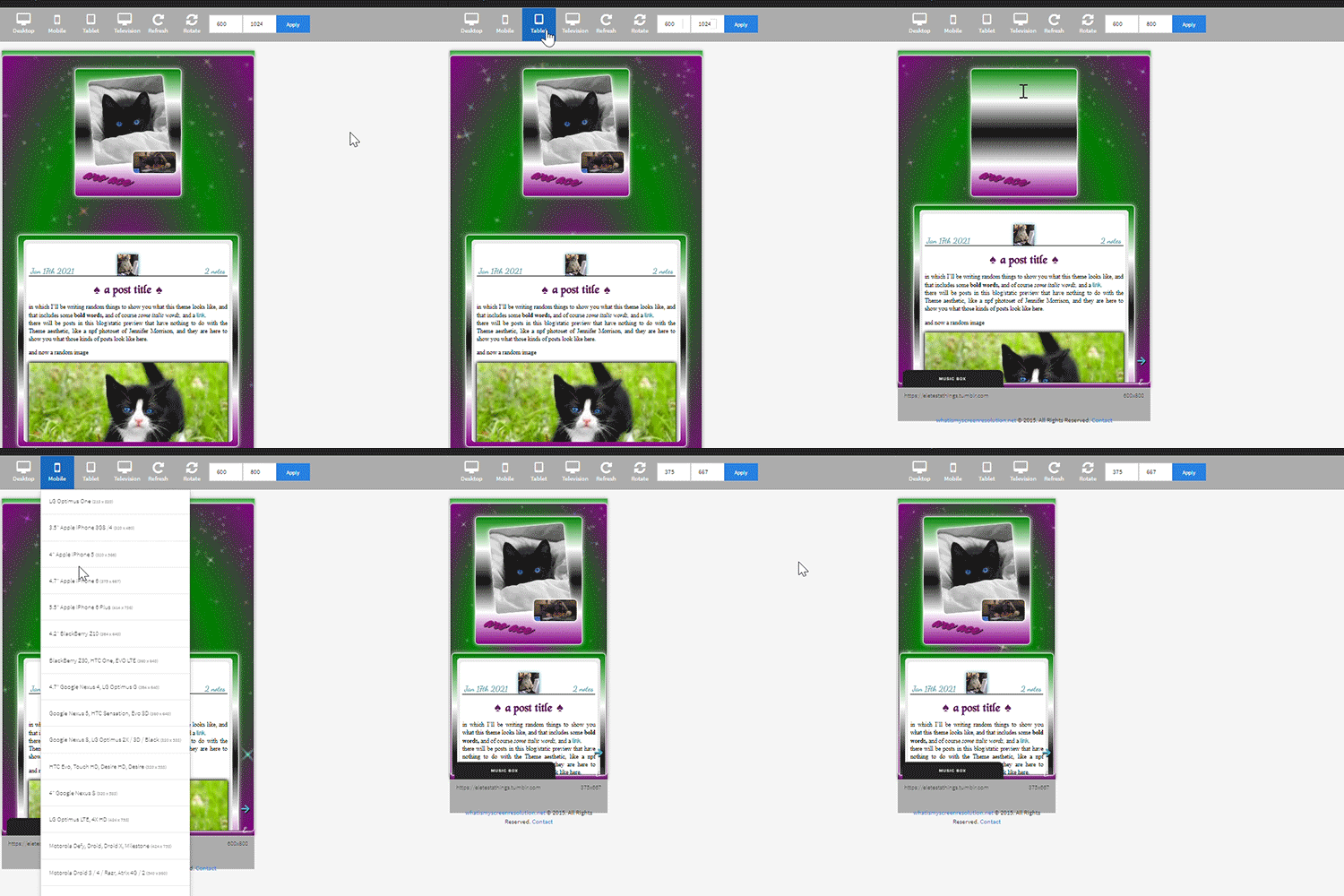
-you can select post-sizes: 400, 450, 500, 540. Whether the sidebar is next to the container or on top will depend on your post size and the screen width as at some point they may not fit. They always do fit on desktop though, and on screens that are smaller than 800px the sidebar is assumed to be on top and will have a max height of 300px (but you can scroll down). I couldn’t make the bigcontainer get bigger for giant screens as I can’t calculate the right size in which all post-sizes + sidebar will look good.
-lightboxes show images with a glow too. Speaking of which you get lightboxes as always, pxu photoset fix and video resizing fix all by @shythemes and with the bychloethemes fix. npf photosets fix by glenthemes. No href.li addition from tumblr when you add a link to a post by @magnusthemes.
-soundcloud player is minimal and its play button is the same color of your permalinks icons thanks to shythemes tutorial. spotify is also minimal, instructions to change it are there.
-tumblr controls are small and semi-transparent until you hover, also dark regardless, followed painthemes tutorial.
-chats are styled like imessages by ncrthlanes now deactivated, submit posts have at least the submitter’s url recognizable, reblogged asks also get a background for the answer as well as borders, link posts are styled as much as a link-post can be styled.
-there are already links and similar things written to be an example in your customization page but in any case you get instructions in the editor and everything is divided in sections as much as possible. Also I’m here for any questions.
#asexuality#aromance#aroace#lgbt#aro-ace#themes#free themes#free resources#evansyhelp#dailyresources#rp themes#rph theme#rpc#main theme#lgbtqia#dustyresources#onlyresources#completeresources#my themes#tumblr theme#rp theme#theme 08#mine
59 notes
·
View notes