#basic picsart tutorial
Explore tagged Tumblr posts
Note
How do you add the gifs for the layouts? What program do you use? I want to make a editblr blog but my skills are only the basics
hello! first, i'd like to wish you good luck with your blog ♡
now, we can start! i'll divide this into 02 sections:
programs, and gifs

01 : programs
starting off with programs:
any website or app that lets you add pictures work. i've seen people use picsart, photopea, ibispaint, and basically any app that allows you to add images. i use a mix of the three, but barely use picsart. personally, if im on my tablet i use ibispaint, then use photopea to add PSDs. when im on my computer, i only use photopea.
02 : gifs
for gifs, i use photopea. however, you can only add 01 gif to each project. i believe there are ways to add more, but i found them too complicated and therefore cant explain them, as i myself havent used them. to find gifs, you can use any social media, but i recommend Tumblr and Pinterest.
you can also use ezgif, but not for gif overlays. only to put images on gifs.
here is a tutorial on how to add a gif on photopea: (plus me playing with showing the options sped up)
i was supposed to edit the video to add text n all that but i ran out of storage. so....
basically, just save your gif, click "file" at the top of your screen, click "open". now your gif should be a new project, and it should be a folder.
drag that folder inside your project ( in this case, your graphic / layout / edit / whatever. ). after that, click "edit", also at the top of your screen, and "free transform". now you can move and / or resize your gif.
afterwards, click "file" again, and "export as" then export it as a gif. there you have it! you finished your project! congratulations!
anyways. i feel like i forgot something but thats about it i believe. so..... once again, good luck with your blog! if you have any more questions, feel free to ask!
if anyone has anything they'd like to add, feel free to reblog!!
#questions / tutorials。#rentry help#rentry tutorial#photopea tutorial#photopea help#gif help#gif tutorial#rentry#rentry gif#rentry graphics#rentry dividers#carrd material#photopea gif tutorial
66 notes
·
View notes
Note
how do you make your pixels?


Basically I usually go in picsart to find transparent pngs..
Or I go to ibis paint to make them transparent..
Then I go to capcut, to make it move and stuff..


After I'm done with that I download it, then I go to
To turn it into a gif

Then I go to
To make it transparent!

So sorry for this kinda sloppy tutorial.. I'm not good at explaining things...
106 notes
·
View notes
Text

An seperate extra from the gold panning photos.
I edited this with Lightroom mobile! And I'll tell you it's worth the money! It's SO much better than picsart. No quality loss either! If you're new to Adobe and photography and just doing basic photo editing, no fancy stuff; like adding in characters, and so on, go with the 1TB photography plan. Just lightroom. It still has a lot of features, and you get a basic understanding of how to edit photos professionally.
Photoshop is a whole other animal, but there's plenty of up-to-date tutorial videos on youtube. I just don't have a use for it at this point. 🤷♂️
#rdr2#red dead redemption 2#arthur morgan#rdr2 community#rdr2 fandom#rdr2 arthur#rdr2 photography#red dead redemption arthur#arthur morgan rdr2#red dead 2#red dead redemption two#gametastic-photography#lightroom#adobe lightroom#adobe
13 notes
·
View notes
Note
hey there just wondering what you used to make your header for the biker simon riley list. like how did you get it to be clear in the background get what i mean?
hi!! yes of course <3
i had a little difficulty finding it but here’s a comprehensive ‘tutorial’ (?) of how i do it!!
basically, tl;dr is that i use picsart. i choose the ‘fit’ option which kinda basically gives ur image a background, then i use a transparent colour for the frame! i scale the original picture down within the background so that i can crop the final image header-size, and tra la!!

an image thatd look like that ^
hope this helps omg and lmk if it doesnt, and i can screenrecord the process :33
9 notes
·
View notes
Text



a blog for editing resources, including overlays, cutouts, line stickers, psds, tutorials, etc. run by @/grimescum. how to request
please at least skim over everything under the cut. if you dont, i reserve the right to be a little bit of a bitch about it

( ! ) message board –
jan 14 📌 updated tag list!
jan 4 📌 inbox & requests back open!
📌 donate to my ko-fi if you'd like! ♡
( ! ) content – with the exclusion of graphics taken from picsart and occasionally pinterest, i only upload raw, unedited graphics to be used in edits.
– the same generally applies to images of characters; i don't upload cutouts of fanart unless the artist has given permission for their artwork to be reuploaded
– my crediting can be a little wonky at times, but i generally don't credit pictures sourced from large companies such as walmart.
– this blog has no queue, i post whenever i feel like it
( ! ) interaction – spam likes and reblogs are perfectly fine in moderation!! if you're going through an entire tag and liking/reblogging everything you see, i'll block you temporarily
– credit for my work is not necessary, but it is advised to credit the original creators for their work if provided.
– i block freely, mostly according to my main blog's dni. don't be stupid. this also includes r4dqueers and pr0ship.
( ! ) other asks – i read them all! kind comments are part of what keeps me going, so regardless of how quickly i respond to them, know i appreciate every single one deeply.
– you can also ask for a promo!
( ! ) requests – i take requests for finding pngs of or based on whatever you give me, be it a character, prompt, aesthetic, image, etc.
– i'm selective about what i choose to do, so please don't be upset if i decide not to. it's nothing against you personally.
blacklist, media i won't do or will be very picky about: d/smp or related, genshin impact or anything by hoyoverse, kp0p, harry p0tter, p0rn (because of guidelines)
whitelist, media i will do no matter what: any of the fandoms im into!
– i'll also try to find the source of any image you send to me if you can't or don't feel like doing it yourself.
– i have autism, so being as specific as you can helps a ton! there is a difference between edits "based on" and "of" a character to me. also, if you want a certain kind of graphic (ie. a drawn divider rather than an image cutout), please do clarify that
( ! ) tag directory – under construction! a new tagging system is coming soon. for now, please refer to my rentry.
edited by me, fandom, inspo, made by me, op talks, promos, psds, reblogs, resources, tutorials
backgrounds & images, banners/headers, basics, borders (cutouts), borders (drawn), colorable, cutouts, digital scrapbooking, digital stickers, dividers, drawings, fonts, frames (cutouts), frames (drawn), gifs, icons, masks, overlays, patterns, templates/bases, textures
from canva, from flaticon, from google drive, from line, from picmix, from picsart, from pinterest, from pngwing, from roblox
( ! ) miscellaneous links – other links worth putting here.
aesthetics
archive this blog! internet archive (no dl) grab-site (dl) archive bot (dl) httrack (dl) imgdownloader (no dl)
posts 99 resource sites my psds
more resources eros' resources pluto's resources
#!! .rblgs#!! .edited by me#!! .inspo#!! .tutorials#!! .psds#!! .op talks#!! .made by me#ℹ️ : masks#ℹ️ : borders (drawn)#ℹ️ : overlays#ℹ️ : cutouts#ℹ️ : digital stickers#ℹ️ : frames (cutouts)#ℹ️ : dividers#🔎 : from pinterest#🔎 : from picsart#🔎 : from canva#🔎 : from line#🔎 : from flaticon#ℹ️ : digital scrapbooking#ℹ️ : textures#❓︎ : text
18 notes
·
View notes
Note
hi, first of all i want to say how much i love your writing and hiraeth in general. i also want to start a blog but i'm reluctant because one : i suck at making graphics, i don't even know how picsart works and two; i have add, a form of adhd so i'm very scatterbrained and it's hard to organize my ideas. do you have some tips for me? also do you plan your lore and everything else in google docs or do you use something else? where do i start? thank you and keep shining bright 🪽
aaaaa hi friend, i really appreciate ur kind words and u know me... i love sharing tips!!!! but first of all i want to apologize for replying just now, i've just been really busy with real life and work :)
i know graphics are kinda a big deal and a good factor to uhhhh get attention but, in my opinion, as long as the writing hits, it will hit yknow? but if u think it's a necessity to have cute lil graphics in ur posts, i fear that the best thing u could do is to actually start playing around with an editing app :) personally i use photoshop for everything as that's the one program i've been using since forever (and i learned using it all by myself by clicking around and watching tutorials), but i've used apps such as gimp and photopea in the past and i've always found them easy to use :) even canvas could save ur day! and hell im sure picsart could help too if u just fool around until u get a feel of how it works!!!!!!
when it comes to organizing my ideas and the aes lore, yes, i use google docs. and i wouldn't be here without my silly little almost yours, hiraeth docs!!!!!! i have that page structured in various sections (such as: basics, pre-debut, the aengels of the season project, members, endorsements, era tidbits, theories (rl and lore wise), yada yada yada) and i think that the only reason i haven't lost my mind over the mess i have written in there (because i'm also a little scatterbrained) is because it's actually organized. u could dm me if u want to see how it is actually structured in case u need visuals
i usually just info dumped my ideas in said docs (obviously under the correct section) without trying to make it fancy or make it make sense, because i knew that i would eventually go back to it and try to structure it into it making sense. idk if this make sense but what i'm trying to say is "info dump then make it pretty later" because idk i usually got exhausted when i tried to make my lore ideas to make sense in one go lol
and i think that's all! if u ever have another question please let me know bc i really like to help but if this wasnt helpful at all im sorry friend........ i will link u to two other asks i've gotten about ~joining the community~ and ~lore tips~ in case u ever need them. hope to see u soon <3333333
5 notes
·
View notes
Note
Trick or Treat!!!
YAY
To top off this year’s Halloween, I thought I’d share a fun little idea I had and give a tutorial.
~~
How to make a “Victor Poster” on Picsart
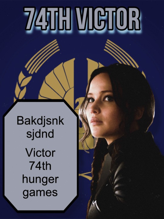
(^^Example image)
Ignore the way it looks 💀 graphic design is NOT my passion (/ref)
This is not revolutionary information. I’m aware it’s fairly simple and basic enough that most anyone could figure it out on their own, but I still wanted to share my version regardless.
I made a few of these in 2023, with my dogs, OCs, and people I know LMAO so I won’t be sharing those. But it’s basically like a mock-up poster, could be used for Tributes or Victors (or anything really).
I personally would like to suggest creating these with your OCs or pets!!! I’d love to see more dog ones. I was tempted to share mine but I’ll save that for another day maybe. I still prefer this blog to be somewhat anonymous.
Down there is a video showing the entire process—I sped it up a lot for time’s sake but hopefully it doesn’t obstruct what I’m doing too much. I can and will elaborate on this if anyone wants/needs.
Here are the (basic) steps:
(I procrastinated finishing this so I’m sorry that it’s basic. I’ll plan to edit it if prompted—I wanted to post before Nov 1st LMAO)
1. Choose your background. I’d recommend being content with how the background looks but not editing it too much unless you’re okay with it looking like a “separate” image from your subject. For example, adding “noise” or a static effect on the background first might make it look worse when you get to the final steps. “Visual cohesion” and all that.
2. Choose your subject/character. Simple enough! I’d recommend dogs. Or OC/character drawings. I just used Katniss for the example.
3. Edit and place your character on the background, make some minor edits for visual coherence. You can put a slight filter on and just mess around, but once again I’d recommend just tweaking things before making it “the final look.” Like if your final image is going to be Black and White, I personally would recommend waiting until getting all the visual elements on the image before playing around with that.
4. Add text block. Can be done with just straight text or (my preferred way) using the shape tool and writing text within the shape.
5. Add title text at the top if desired.
6. Add and play around with features like shadows, drawing, other visual elements.
7. Edit the entire image for visual coherence. Add things like visual noise, adjust brightness, put filters on, etc.
#this is kind of an odd post#thg blog#thg trick or treat 2024#trick or treat#Halloween 2024#the hunger games#Picsart edits#Picsart tutorial#digital DIY
3 notes
·
View notes
Note
how did you do the header in your pinned post im in love
so basically first i went on pinterest and found a bunch of cohesive pictures that matched my theme, then i went on picsart and collaged them together in free form(dimensions i used is the twitter banner), after that i use the app polarr for my filters! hopefully this makes sense if you want a tutorial i could def make one! both apps i used:


for all the clutter & the person cutouts i used the cutout option on picsart and for the little items i just searched in the sticker bar for certain things i wanted like bows, candles, etc. i hope this helps!
2 notes
·
View notes
Note
haiii yeonyeon can you post a tutorial on how to make banners? thank yeww
ofc though i don't exactly make all of mine the same way so I will just give out the basic steps!!
001. ) find the picture you want to use, leaving aside the quality you must first settle on which picture you really want to make the banner with. after that, trace it's source! is it from a photoshoot? is it from album concept photos? is it from some event? is it from a twitter or instagram account? after you find the primary source download it from there that would be hd 99% of the time.
002. ) i use canva so that's what i'll be guiding with. open a blank template of the size you want the banner to be. add the picture and the text. adjust the font, size, color, spacing, and position of it on the picture. usually i use the classic fonts like sans, helvetica and so on. for the size i make it big enough to be readable if it's the main title other than that other text size just depends on what it is. for color i one from the picture itself, spacing is usually zero and position is more often than not: center.
003. ) then i use picsart to add any filter i want, usually i don't but if i do this is the go to. and then download the pic in png form and that's it!!!
004. ) also i want you to know i did not get this good with graphics and editing in a day, what you see today is years worth of practice! so don't be disappointed if you are not as good today, with practice and time you will find your own spark and style!!
if you want a video tutorial you'll have to pick a specific banner of mine so that i can show you how i made it!
5 notes
·
View notes
Note
Not really a request but your stuff is so pretty!! Do you have a tutorial of how you make them??

TYSM!!!! i’ve put a tutorial under the cut just for you :3 lmk if you need any clarification or pics for some of the steps!!!

apps used: ibis paint x (putting it all together), pinterest (manga panels, masks), picsart (transparents)
1 ) get the mask you’ll clip everything to!! i found the one i use on pinterest and i simply made it into two separate parts. i’ll attach them below!! import them both into the same 1280 x 1280 canvas and you should be all set!! make sure that the one on the right (hollow circle) is on top


2 ) import the flag you’re going to use and make sure it’s on the highest layer and completely covers both masks. after it’s all imported and sized, duplicate it and move it so it’s on top of the mask on the left (filled in circle). clip both layers of the flag to their corresponding mask (the one they’re on top of)
3 ) color pick each color from your flag and add it to your palette. then, create a new layer and clip it to the filled in circle. just make sure it’s below the flag! turn off the flag layer and set the new blank layer to lighten.
4 ) while you have the new blank layer selected, go into effects and choose parallel gradiation. under the gradiation section of the effect, add the colors you picked from the flag (and remove any that are already on there). space them out as desired. play around with the other settings a bit to get it to line up with the flag (which you should still be able to see on the hollow circle mask). pro tip: even if the flag has white, i recommend omitting it from the gradient unless it is the first or last stripe. if you leave it in the panel will basicalli become invisible in that section due to the white on white.
5 ) now add your manga panels! add them below the gradient layer but still on top of the lower circle. clip them to the lower circle as well. the black on the panels should now be replaced with the gradient you made!!
6 ) after you’ve made the desired amount of icons with the manga panels, you can now create some with transparents/renders. open picsart, choose a transparent canvas, and go to the stickers tool. search up the character you’re making icons of. i usualli do two manga stickers and one anime/colored sticker of the character.
7 ) after you’ve gathered your transparents, go back to ibis paint x and select the color of the middle stripe of your flag. then go to the hex code/color wheel area of the color palette and make that color a bit darker. you can do this by sliding the curser around the square as you see fit. make sure to save this darker color to your palette!
8 ) open a new project in ibis paint x (i use square 1280 x 1280, but it doesn’t matter that much) and use the paint bucket to fill the canvas with that darker center color. then, import the manga transparents you got from picsart. move the color fill layer above one and duplicate if needed to go above however many other ones you have. clip the color layer to the transparent, and set the color layer to lighten. save each newly colored transparent.
9 ) go back to the original project and import the newly colored transparents so that they are above the flag on the lower circle mask but below the upper circle mask. resize them as needed. you can also turn the eyeball of the gradient and manga panels off if you haven’t done that already, but bc the flag is over it, it doesn’t make much of a difference. make sure the transparent is clipped to the lower circle mask as well!
make sure you have all the icons saved and voilà!! you now have super cool pride icons!!

4 notes
·
View notes
Note
how do you make the background on the characters transparent? i'm trying to make a banner for my blog but i've never worked with WoW screenshots before.
I am not sure how familiar you are with editing software, so this tutorial is going to be detailed.
Step 1:
You need a simple screenshot of your character. Here are some ways you can get it:
a) in-game screenshot
b) Wowhead Dressing Room screenshot
c) Wow Model Viewer
d) WoW Tools
e) far stretch, but if you want to mess around with mogs, Epsilon Private Server is fantastic for that (they also support the Narcissus addon)
I prefer Wowhead's Dressing Room, so that's what I'll use. Recommendation: If you use Wowhead, use the PTR version of the page (right now it's 10.2.5) to remove Wowhead's watermarks in the background.

Step 2:
Take the screenshot of your character (Print Screen on Windows keyboard) + paste it to Paint.
Now you have your very own Screenshot with a background.
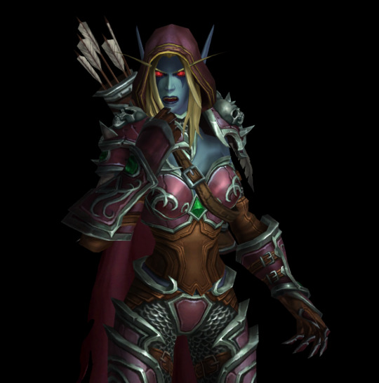
Step 3:
To remove the background, you will need an app that can do that for you. The two options I can personally recommend are:
a) Photoshop
b) Photopea (basically free in-browser photoshop) (link)
I will use Photopea for this tutorial.
Step 4:
Once you upload your screenshot to Photopea, you will need to select the character with the Magic Wand tool.
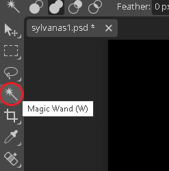
Everything you select will be outlined with a scissor line.
Step 5:
There will be some areas where the tool might 'overselect' and get bits of the background. There might also be areas which the tool will not select. To fix that, use the Lasso tool (red circle).
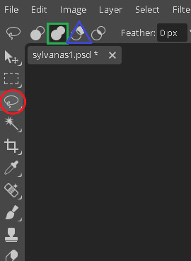
If there are any areas that are on the character, that the Magic Wand did not get, draw over them with the Unite option (green square). If there are bits of the background, exclude them with the Subtract option (blue triangle).
If you need to zoom in or out, hold Alt and use your scrolling wheel. It will make some smaller areas easier to see and select/deselect.
This is the most important step, so be meticulous.
Step 6:
After you mess around with the Magic Wand and Lasso tools, you will have something like this.
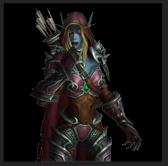
Now you need to remove the background completely. On the right side of the screen, there is the Add Raster Mask option. Click on it.
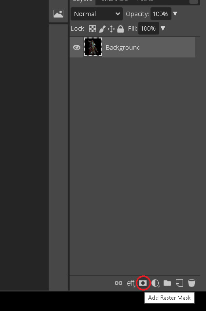
Voila!
Your character is separated from its background!
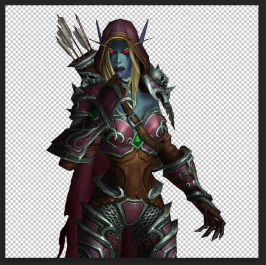
Step 7:
To save it, you will need to export it. Here's a quick how-to:
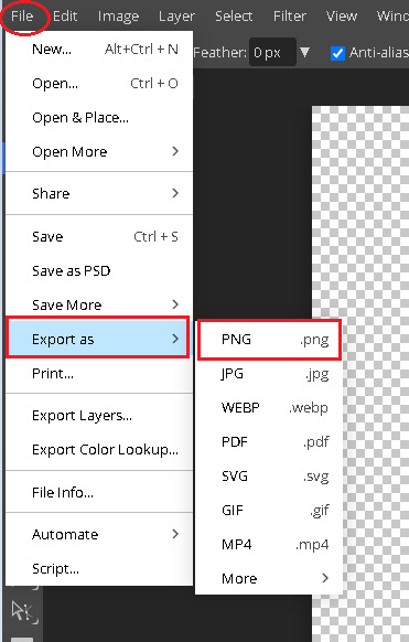
Press on File in the top left corner. Then Export as. Then save it as a PNG (make sure it's a .PNG as .JPG / .JPEG do not support transparency).
After that, you will be prompted again. Just click Save.
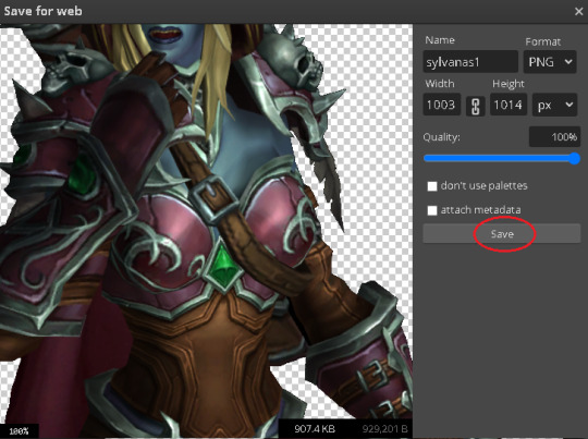
Step 8:
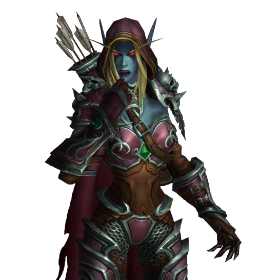
And here's your character, completely divorced from the background! Now you can use an editing app to put her in any background your heart desires. If you don't have any software of that sort, there are also plenty of websites that you can use.
Some that I know of:
a) Pixlr (link)
b) Canva (link)
c) BeFunky (link)
d) Picsart (link)
I often use BeFunky because it's easy to get the hang of, minimalistic and convenient to use!
At this point, only your creativity is the limit.
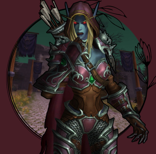
This is by far not the only way to do it (and not the fastest), but it's the simplest one that I could come up with.
It might seem a bit tedious, but I find it quite relaxing :3
Good luck, anon!
3 notes
·
View notes
Note
hiii! I was wondering if you could make a tutorial on how to make those rentry pixels?
kinda sloppy tutoriall...
12 notes
·
View notes
Text
rambling about writer stuff & general community stuff
that person who said a work with a large note count is the one most people will interact with based on the assumption of "oh it has 1k+ it must be good!" is absolutely correct. the only work of mine that consistently gets interaction even though I posted it forever ago is the one with the highest overall note count.
That is to say people are basically window shopping and only looking at what's "popular" and it can feel like such a mental hurdle to hear others be like ~notes don't matter🥰~ because you also wanna scream yes they fucking do!! and there's nothing weird or embarrassing about the fact that it matters to you, we all love attention it's literally a feature of our species that we love social interaction and attention there's nothing bad about that it's neutral as far as I'm concerned. If anything I think people who shame others for that are weird.
it's also mad discouraging for people to hear over and over "oh don't be silly and make yourself upset comparing yourself to someone else! Everyones work is good!" while yes that's true, it's also... incredibly unhelpful? 9/10 times people already know that, they've heard it enough. All it really serves to do is further push people into the line of thought that "there must be something wrong with me/my work/my art that nobody's telling me" and when you're stuck in a feedback loop of people saying that shit to you it feels like what Eric Andre said about holding hands with kids in a circle around someone chanting "NIGHTMARE NIGHTMARE NIGHTMARE" to fuck with them.
I think what happens is people get really caught up in the euphoria of popularity and then also do not wanna share it. That's not to say everyone acts like that because they don't there's plenty of larger blogs that are extremely helpful to others in their communities and do a really great job of being encouraging and giving meaningful, actionable advice but it's not the majority of bloggers. I think sometimes, more than we like to admit, it can be very very satisfying in a mean way to keep a faux barrier up.
I'm not saying anyone is intentionally cruel but it feels cruel to be the other person on the side of that faux barrier, frustrated that you seemingly can't do what they can. That's not the truth.
What people don't say is they use things like canva premium, picsart, photoshop/the free equivalent photopea, pinterest, templates from deviantart creators, capcut, ect to create a lot of the popular aesthetic looking posts you see. If it frustrates you that you don't know how to, you can find tutorials on youtube in an instant teaching you how to make those too now that you know the names of the apps or programs.
Writing resources like grammarly, scribens, online word counters, onelook, wordhippo, springhole.net, the ultimate guide to writing smut fic (on ao3 by QuinnAnderson), ect. those also aren't shared as often as they should be. each of those resources does different things but all are incredibly useful for writing anything, not just fanfic. (I cannot stress enough how helpful that smut guide is if you wanna get into writing that, definitely read through it).
I think this unwillingness to share things contributes to the overall slump a lot of fandom communities are in. You can't know where to start looking if you don't know what it is you're looking for. You also can't improve if tools that could help you aren't made available to you. It's beyond frustrating to be in the position of "I know what's popular but I don't know how I can do that too".
#like please do not think theres anything wrong with you or what you create there isn't#its just really difficult to carve out a foothold when you feel like you're clueless & nobodys willing to help#the unwillingness to share even basic resources does favors for nobody#so many people are mind blowingly talented but held back by things like being unable to get straight up helpful answers
2 notes
·
View notes
Note
hi atlas!! if you’re comfortable with answering (if no I get it, gotta keep something secret yk) I was wondering how do you make your posters ?? im curious because the editing is so cool
hi!!! i'm happy to share somewhat how i make them for sure! im afraid i cant give like a fully comprehensive tutorial Because a lot of what i do is so trial and error, but i can give some basics!! (under the cut so this isnt super long on the dash fjrnd)
so, firstly, i use picsart to make them! also, i find a majority of the images i use from pinterest, though if there's a specific image i want i'll just look it up (like in the example below i Knew i wanted to use a png of old school headphones, so googled that, but for the paper background searched for crumpled paper png on pinterest till i found the one i used)
the most important tools i use for making the posters are (as pictured below):
- remove bg: pretty self explanatory, i use this to remove the backgrounds of images i use and make them transparent. sometimes, it doesn't remove the background properly/as i want it so i Also use the app magicEraser. this is, like, the most vital thing so make all assets of a poster blend together
- effects: also relatively self explanatory? but i use this feature to add a lot of the coloring/textures that you see on the posters. below this i'll show an example of a poster with and without the effects to show what these effects can do. they're especially great because of the variation of filters they have, and how you can mess with every aspect of them (hue, noise, fade, etc)
- mask: my absolute beloved and favorite tool. what differentiates this from effects is that effects are more filters that change color, these masks are textures/visual additions that change the entire composition of a design. this is the tool i use that adds the crumpled/folded paper textures all of the posters have. similarly, you're able to change the intensity of the mask, as well as have some control over where the visual falls on the image.


example: this is the tttyg poster before i added any of the effects or masks!


the biggest thing, and why i cant be more specific about What effects or What masks to use to make posters is just that. it depends on what you're trying to accomplish and what you're going for. i always start with picking what the base will be, for these posters that's what the base paper png will be, then what imagery matches the vibe i'm going for to make transparent, then the font that goes with the album, and then once all of the pieces are together (as seen on the left with the tttyg poster), i add the effects and masks to finish the poster fully. for the tttyg poster, i knew i wanted it to look accurate to the time (2003), like it Was 20 yrs old, and i wanted to really make that turquoisey color prominent, so i chose filters and masks that accentuated the turquoise, and added in the most realistic texture. the goal for each poster is different, so what i do on each is different.
hopefully this helps at all! never really written any sort of tutorial or tips for my process because, as i said, i truly just go through trial and error to figure stuff out but this is what i've found are the most helpful tools!
#again hopefully this helps at all! happy to clarify anything if u need :3#ALSO thank u for thinking the editing is cool :') im incredibly new to this stuff so. truly no clue what im doing still but <3 mwah#asks#anon
4 notes
·
View notes
Note
hello! i came across your writing and I’ve really enjoyed it. I was just wondering what kind of app/software you use to make your sm!aus? you’ve formatted it really beautifully. thank you! I hope you have a good day ♡︎
hiiii!! i use the apps memimessage and twinote BUT i edit my stuff a lot 😭 like in canva i overlay like actual twitter top and bottom and with imessage i just yk screenshotted my normal one then put it over then like whenever i create a chapter i just import then export then if i want to make a long screenshot i have to go to picsart and stuff to edit it HWHDSBSV if we’re talking abt ig stories i do the samee i screenshot overlay then editt BASICALLY
i edit the final stuff a lot (graphic design is my passion 🤪💪)
ps. i just realized i dont make sense if u want a more elaborate tutorial then just tell me ill show u wbdbebsb
7 notes
·
View notes
Note
hey Meda! Hope all is well :) was wondering how you made your collage on your pinned post? It’s so cool! also, how are you able to do spacing in your bio? It won’t let me on mobile maybe I have to do it on desktop
Hey, hi, hello!! Thank you so much; I think it looks pretty snazzy too. I’ve been super inspired by the layouts of some other writers so I did some playing around with PicsArt and Phonto. Using this tutorial, I’ve started making my own little dividers as well. And, yes, doing the line breaks in your bio requires a bit of simple coding on desktop. I learned that from this tutorial.
Overall, I’ve just been observing the visuals that I’ve seen other folks use, gathering what I like about each, and emulating those qualities with the apps I use!! I know some folks use Canva to make visuals but I’ve used PicsArt since I was a little teenager so I tend to use that basically all the time.
2 notes
·
View notes