#background blur in photoshop
Explore tagged Tumblr posts
Text

Add the Bokeh effect in Photoshop
#add bokeh in photoshop#bokeh effect#photoshop bokeh effect#bokeh effect in photoshop#photoshop#create bokeh in photoshop#how to create bokeh effect in photoshop#how to add bokeh in photoshop#bokeh photoshop#bokeh effect photoshop#photoshop tutorial#bokeh#photoshop bokeh#background blur in photoshop#how to make bokeh in photoshop#bokeh effect in photoshop cc#create and apply bokeh overlays in photoshop#add bokeh photoshop#bokeh in photoshop
1 note
·
View note
Text

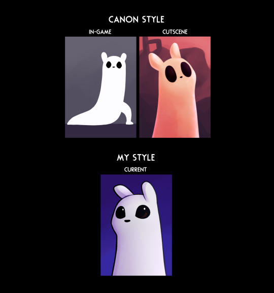
Took a shot at that style thing mmmm
#rain world#rw spoilers#five pebbles#rw survivor#i think i'd need to define the details/shading/textures on the cutscene ones more to fit the style better#at least the pebbles one lol. I did that one first#but it's alright for now#i need to explore my main art program's capacity for brushes and textures more#(it's paint tool sai 2)#it's all a bunch of settings instead of nice brushes you can just import#and is overall just... more limited imo#i wish it was like more like csp or photoshop in that respect#i have to port files over to those to do more heavy-duty backgrounds#or use filters more advanced than gaussian blur. -_-#oh yeah also. i was basing “cutscene” off of vanilla style#and since pebbles only has like one distant picture there#i reffed off moon more for him#i could nitpick at this for hours tbh#art#flickerdoodles
257 notes
·
View notes
Photo


thinking about orange juice
#costumes#self#ancient images I seem to have never posted.. or at least can't find them anywhere#I did post them on instagram but not on here apparently..#I never photoshop or alter my images to make my face look different or anything. the only editing I ever#do is just blurring the backgrounds or like upping the contrast or warmth or something. ASIDE from occasionally making my eyes#a different color to match a costume (cheaper than buying contacts lol) OR like in this picture#where in the actual costume photos I edited my hairline so that it matches the wig lol. in these it looks very funny that my#real very dark hair is just .... visible underneath lol#MAYBE elven culture wears wigs like hats and no efforts are made to blend it into the natural hair underneath#the same way that you wouldnt try to obscure or dye your hair roots the same color as your beanie#maybe THAT huh#(< is just too lazy to wear a wig properly)
43 notes
·
View notes
Text
hey btw homies who use CSP, does it have the option to import those brushes with textures and shapes like procreate and PS does? it’s somethjng im really missing in PTSai and along with the portability it’s been making me dream of getting an iPad but if I can learn to use clip studio instead and save money i dont have that would probably be good
#ik u can get photoshop for free but i sont like drawing in it#i find sai much smoother and more responsive#oh another thing id like to have is the ability to blur photos for backgrounds#so if u know which programs have that….hmu#not art
4 notes
·
View notes
Text

Just a little WIP. I've been working on this lot very sporadically for a few months. I'm mostly satisfied with the exterior. Now to just finish decorating the interiors 🥴
#wip#ignore the background that I hastily blurred in photoshop#i feel like it could be better but idk what else to do with it
11 notes
·
View notes
Note
ahh no wonder yer art always feel like a fuzzy peach then :]
it's all scripted and edited.......it's all fake UnU </3 except when my computer's too old and slow to open up photoshop which is like. almost always now so i have to rely on my artist brain to draw the fuzz myself hhh xD fuzz DIY<33333
#ask#it's really easy to do with just the right brushes (which are the default ones so i don't have to look anywhere to find them hhh)#the only think i can't do on sai is blurs. and they're so important for backgrounds watermarks and overall perspective#like half the time you'll see me open photoshop or firealpaca JUST to add a blur and it's like- what a waste of energy</3#(literally xD i wait soo long just for these programs to open without crashing SOBS#that i might just forgo edits and post them without it ngl hhhh<333)#thanks for passing by!! and YOUR art always looks like a smooth apple!! >;)c round smooth and perfect to bite into muah muah<333333
6 notes
·
View notes
Text


that's my boi
#experimenting with photoshop to blur out the background more#also new bodysuit lewk#i'm going to take better care of the fingers this time#kigurumi
0 notes
Text

#autumn#autumn leaf#autumn leafs#autumn season#blur#blurry background#dark#glow#hand#leaf#leafs#light#lighting#lightroom#moody#moody dark#moody light#photoshop#season#seasons#sun#trees#flickr
0 notes
Note
Why reblog machine-generated art?
When I was ten years old I took a photography class where we developed black and white photos by projecting light on papers bathed in chemicals. If we wanted to change something in the image, we had to go through a gradual, arduous process called dodging and burning.
When I was fifteen years old I used photoshop for the first time, and I remember clicking on the clone tool or the blur tool and feeling like I was cheating.
When I was twenty eight I got my first smartphone. The phone could edit photos. A few taps with my thumb were enough to apply filters and change contrast and even spot correct. I was holding in my hand something more powerful than the huge light machines I'd first used to edit images.
When I was thirty six, just a few weeks ago, I took a photo class that used Lightroom Classic and again, it felt like cheating. It made me really understand how much the color profiles of popular web images I'd been seeing for years had been pumped and tweaked and layered with local edits to make something that, to my eyes, didn't much resemble photography. To me, photography is light on paper. It's what you capture in the lens. It's not automatic skin smoothing and a local filter to boost the sky. This reminded me a lot more of the photomanipulations my friend used to make on deviantart; layered things with unnatural colors that put wings on buildings or turned an eye into a swimming pool. It didn't remake the images to that extent, obviously, but it tipped into the uncanny valley. More real than real, more saturated more sharp and more present than the actual world my lens saw. And that was before I found the AI assisted filters and the tool that would identify the whole sky for you, picking pieces of it out from between leaves.
You know, it's funny, when people talk about artists who might lose their jobs to AI they don't talk about the people who have already had to move on from their photo editing work because of technology. You used to be able to get paid for basic photo manipulation, you know? If you were quick with a lasso or skilled with masks you could get a pretty decent chunk of change by pulling subjects out of backgrounds for family holiday cards or isolating the pies on the menu for a mom and pop. Not a lot, but enough to help. But, of course, you can just do that on your phone now. There's no need to pay a human for it, even if they might do a better job or be more considerate toward the aesthetic of an image.
And they certainly don't talk about all the development labs that went away, or the way that you could have trained to be a studio photographer if you wanted to take good photos of your family to hang on the walls and that digital photography allowed in a parade of amateurs who can make dozens of iterations of the same bad photo until they hit on a good one by sheer volume and luck; if you want to be a good photographer everyone can do that why didn't you train for it and spend a long time taking photos on film and being okay with bad photography don't you know that digital photography drove thousands of people out of their jobs.
My dad told me that he plays with AI the other day. He hosts a movie podcast and he puts up thumbnails for the downloads. In the past, he'd just take a screengrab from the film. Now he tells the Bing AI to make him little vignettes. A cowboy running away from a rhino, a dragon arm-wrestling a teddy bear. That kind of thing. Usually based on a joke that was made on the show, or about the subject of the film and an interest of the guest.
People talk about "well AI art doesn't allow people to create things, people were already able to create things, if they wanted to create things they should learn to create things." Not everyone wants to make good art that's creative. Even fewer people want to put the effort into making bad art for something that they aren't passionate about. Some people want filler to go on the cover of their youtube video. My dad isn't going to learn to draw, and as the person who he used to ask to photoshop him as Ant-Man because he certainly couldn't pay anyone for that kind of thing, I think this is a great use case for AI art. This senior citizen isn't going to start cartooning and at two recordings a week with a one-day editing turnaround he doesn't even really have the time for something like a Fiverr commission. This is a great use of AI art, actually.
I also know an artist who is going Hog Fucking Wild creating AI art of their blorbos. They're genuinely an incredibly talented artist who happens to want to see their niche interest represented visually without having to draw it all themself. They're posting the funny and good results to a small circle of mutuals on socials with clear information about the source of the images; they aren't trying to sell any of the images, they're basically using them as inserts for custom memes. Who is harmed by this person saying "i would like to see my blorbo lasciviously eating an ice cream cone in the is this a pigeon meme"?
The way I use machine-generated art, as an artist, is to proof things. Can I get an explosion to look like this. What would a wall of dead computer monitors look like. Would a ballerina leaping over the grand canyon look cool? Sometimes I use AI art to generate copyright free objects that I can snip for a collage. A lot of the time I use it to generate ideas. I start naming random things and seeing what it shows me and I start getting inspired. I can ask CrAIon for pose reference, I can ask it to show me the interior of spaces from a specific angle.
I profoundly dislike the antipathy that tumblr has for AI art. I understand if people don't want their art used in training pools. I understand if people don't want AI trained on their art to mimic their style. You should absolutely use those tools that poison datasets if you don't want your art included in AI training. I think that's an incredibly appropriate action to take as an artist who doesn't want AI learning from your work.
However I'm pretty fucking aggressively opposed to copyright and most of the "solid" arguments against AI art come down to "the AIs viewed and learned from people's copyrighted artwork and therefore AI is theft rather than fair use" and that's a losing argument for me. In. Like. A lot of ways. Primarily because it is saying that not only is copying someone's art theft, it is saying that looking at and learning from someone's art can be defined as theft rather than fair use.
Also because it's just patently untrue.
But that doesn't really answer your question. Why reblog machine-generated art? Because I liked that piece of art.
It was made by a machine that had looked at billions of images - some copyrighted, some not, some new, some old, some interesting, many boring - and guided by a human and I liked it. It was pretty. It communicated something to me. I looked at an image a machine made - an artificial picture, a total construct, something with no intrinsic meaning - and I felt a sense of quiet and loss and nostalgia. I looked at a collection of automatically arranged pixels and tasted salt and smelled the humidity in the air.
I liked it.
I don't think that all AI art is ugly. I don't think that AI art is all soulless (i actually think that 'having soul' is a bizarre descriptor for art and that lacking soul is an equally bizarre criticism). I don't think that AI art is bad for artists. I think the problem that people have with AI art is capitalism and I don't think that's a problem that can really be laid at the feet of people curating an aesthetic AI art blog on tumblr.
Machine learning isn't the fucking problem the problem is massive corporations have been trying hard not to pay artists for as long as massive corporations have existed (isn't that a b-plot in the shape of water? the neighbor who draws ads gets pushed out of his job by product photography? did you know that as recently as ten years ago NewEgg had in-house photographers who would take pictures of the products so users wouldn't have to rely on the manufacturer photos? I want you to guess what killed that job and I'll give you a hint: it wasn't AI)
Am I putting a human out of a job because I reblogged an AI-generated "photo" of curtains waving in the pale green waters of an imaginary beach? Who would have taken this photo of a place that doesn't exist? Who would have painted this hypersurrealistic image? What meaning would it have had if they had painted it or would it have just been for the aesthetic? Would someone have paid for it or would it be like so many of the things that artists on this site have spent dozens of hours on only to get no attention or value for their work?
My worst ratio of hours to notes is an 8-page hand-drawn detailed ink comic about getting assaulted at a concert and the complicated feelings that evoked that took me weeks of daily drawing after work with something like 54 notes after 8 years; should I be offended if something generated from a prompt has more notes than me? What does that actually get the blogger? Clout? I believe someone said that popularity on tumblr gets you one thing and that is yelled at.
What do you get out of this? Are you helping artists right now? You're helping me, and I'm an artist. I've wanted to unload this opinion for a while because I'm sick of the argument that all Real Artists think AI is bullshit. I'm a Real Artist. I've been paid for Real Art. I've been commissioned as an artist.
And I find a hell of a lot of AI art a lot more interesting than I find human-generated corporate art or Thomas Kincaid (but then, I repeat myself).
There are plenty of people who don't like AI art and don't want to interact with it. I am not one of those people. I thought the gay sex cats were funny and looked good and that shitposting is the ideal use of a machine image generation: to make uncopyrightable images to laugh at.
I think that tumblr has decided to take a principled stand against something that most people making the argument don't understand. I think tumblr's loathing for AI has, generally speaking, thrown weight behind a bunch of ideas that I think are going to be incredibly harmful *to artists specifically* in the long run.
Anyway. If you hate AI art and you don't want to interact with people who interact with it, block me.
5K notes
·
View notes
Text
FF14 Battle Portrait Tutorial
For the past few weeks I was trying to find a way to recreate the battle portrait from FF14 as there was a few characters that I want to see in that style but don't officially have one yet. I think I got it down more or less (see image below) so I thought it's a good time to share what I did.

First of all, I made a few files that would help make life a little easier. They can be grabbed here .
Note: I did use Reshade to do a bit of work at the screenshot stage to help speed up the process but the same effect can be recreated in Photoshop with a vanilla screenshot. There are a lot of tutorials on how to do comic/cartoon effect in photoshop and those would make good bases to work off of.
Step 1: Take the screenshot with the PortraitBase Shader on. I usually take two screenshots. One with "Comic" on and one with it turned off. This is so that I have more to work with if needed.
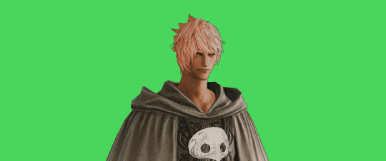

Step 2: Drag all the screenshots into photoshop and remove the background. In photoshop, arrange the layer so that the screenshot with the Comic lines visible is on top of the one with the effect off.
Step 3: Duplicate the the layer with the "comic" effect and apply Blur->Gaussian blur (radius 0.5)
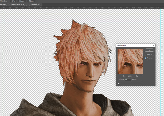
Step 4: Take a look at the hair. In Eric's case, It still doesn't look blur enough to me so I used the blur tool and blurred it a bit more
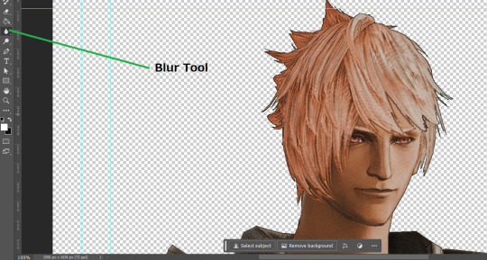
Step 5: Create a new layer above the layer in the previous step and use the brush tool to start outlining the edges. Where to outline is up to you but the idea is to make edges defined so that it looks more like a drawing.

Step 6: Duplicate the outline layer and then hide that layer. Step 7: Merge everything under the outline layer. Step 8: Drag and drop the "Texture.png" into the project and Clip it to your character layer. Set the blending of the texture to "soft light". Step 9: Drag and drop the "stroke Texture.png" into the project and Clip it to your character layer. Adjust the size till you are happy then set the blending to "overlay". Step 10: Adjust the opacity settings of both texture layers until it looks good to you.
Step 11: Click on your character layer and go to image->Adjustments->Hue/Saturation (note: you will see I dragged in the official Hades portrait as a point of reference to work off of). Adjust the saturation till you are happy.
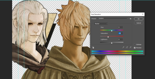
Step 12: Go to image->Adjustments->Color Balance and adjust the color till you are happy. In this example, since Eric is also wearing the Sophist robe, I tried to match that color to Hades' Sophist robe color.
Step 13: Once you are happy, drag the "Template.png" into the project and scale that to the size you want. Make sure it is completely covering the character. If it's not, you can just use paint more of it with the brush tool to extend it till it covers everything.

Step 14: Hide the "template.png" layer and select your character layer. Use the magic wand tool to select the outside of the character.
Step 15: With the selection still selected, click on the "Template.png" layer and press delete on your keyboard. You should now be left with a blank in the shape of your character.

Step 16: Drag the"Template.png" layer to be below your character layer. Then click on your character layer and clip it.
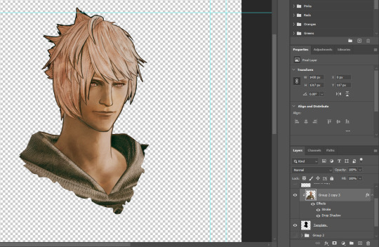
Step 17: Click on the "Template.png" layer and add a 2px stroke and shadow to it.
Step 18: Drag "Back_Deco.png" into the project and place it behind your character. Scale it till you are happy with it.
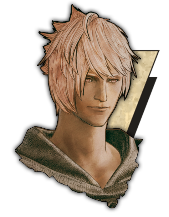
And that's it! Now you can recreate portraits for any NPCs that you want (in theory). A lot of it is also fine tuning to what you want but this should at least give you a decent base to work off of :)
962 notes
·
View notes
Text
Let's talk about vintage lenses.
Here is your cool samurai show with modern lenses.
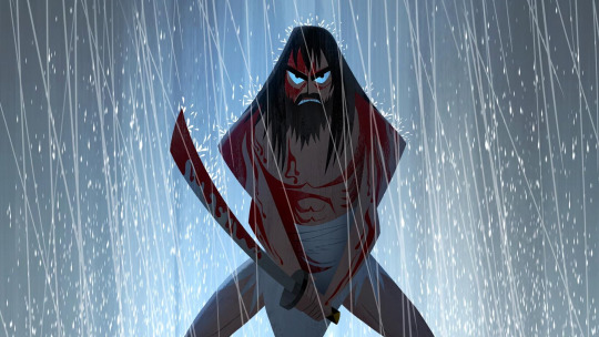
Here is your cool samurai show with vintage lenses.
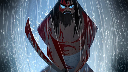
Hollywood is no stranger to fads.
We are currently in the middle of a "make everything too dark" fad. But that fad is starting to overlap with "let's use really old lenses on ridiculously high resolution cameras."
This is Zack Snyder with a Red Monstro 8K camera.
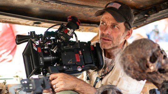
He is using a "rehoused" vintage 50mm f/0.95 Canon "Dream Lens" which was first manufactured in 1961.
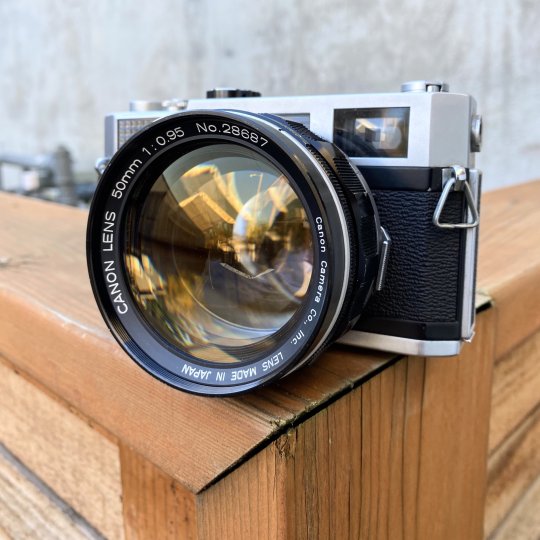
This old lens is put inside a fancy new body that can fit onto modern cameras.
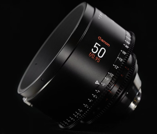
Which means Zack is getting nowhere near 8K worth of detail. These lenses are not even close to being sharp. Which is fine. I think the obsession with detail can get a bit silly and sometimes things can be "too sharp."
But it is a funny juxtaposition.
The dream lens is a cool lens. It has character. It has certain aberrations and defects that can actually be beneficial to making a cool photograph. It's a bit like vinyl records for photography.
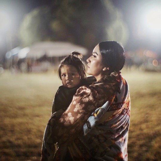
[ Peter Thoeny ]
It has vignetting and distortion and a very strange swirly background blur.
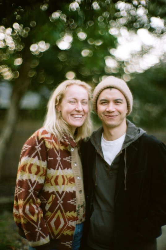
[ Gabriel Binder ]
Optical engineers have been spending the last 60 years trying to eliminate these defects. And I sometimes wonder if they are confused by this fad.
"I WORKED 70 HOURS PER WEEK TO GET PERFECT CORNER SHARPNESS!"
And whether you prefer to work with a perfect optic or a vintage one... it is a valid aesthetic decision either way. I think vintage glass can really suit candid natural light photography. You can almost get abstract with these lenses.
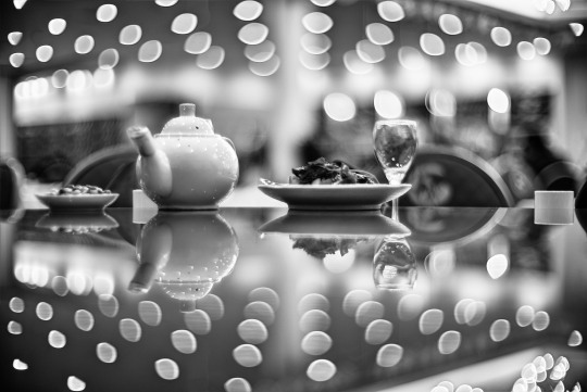
[ Peter Theony ]
Personally I like to start with as close to perfect as possible and then add the character in later. That way I can dial in the effect and tweak how much of it I want. But even with modern image editing tools, some of these aberrations are difficult to recreate authentically.
That said, it can be very easy for the "character" of these lenses to become distracting. And just like when someone first finds the lens flares in Photoshop, it can be easy for people to overdo things.
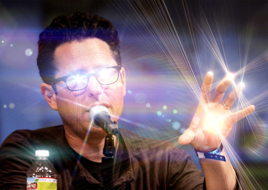
Zack Snyder decided to be his own cameraman and used only vintage glass in his recent movies and it has led to some complaints about the imagery.
I mean, Zack Snyder overdoing something? I can't even imagine it.
Non camera people felt Army of the Dead was blurry and a bit weird but they couldn't quite explain why it felt that way.
The dream lens has a very wide aperture and it lets in a lot of light. But it also has a very very shallow depth of field. Which means it is very difficult to nail focus.
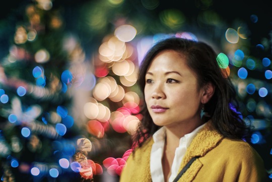
[ Peter Thoeny ]
Her near eye is in focus and her far eye is soft. You literally can't get an entire face in focus.
There is no reason you have to use the dream lens at f/0.95 at all times. But just like those irresistible lens flares, Zack couldn't help himself.
Here is a blueprint that you can't really see.
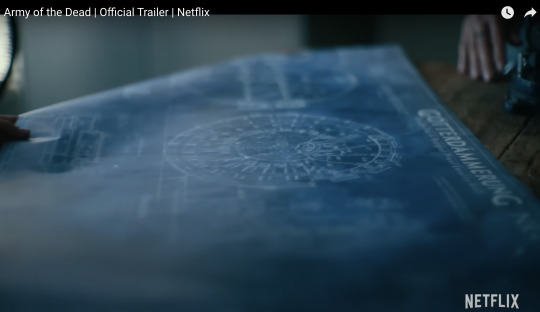
Extreme close ups of faces without autofocus at f/0.95 is nearly impossible to pull critical focus on.
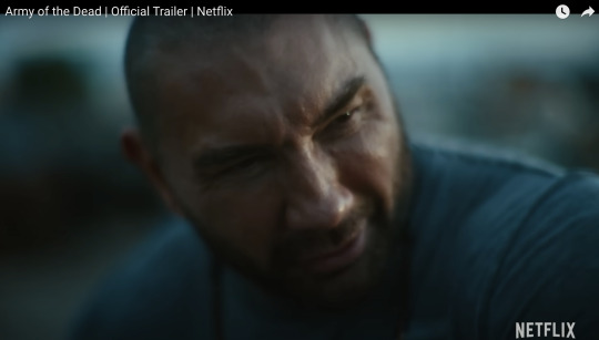
Looks like Zack nailed the area just above the eyebrow here.
Let's try to find the point of focus in this one.
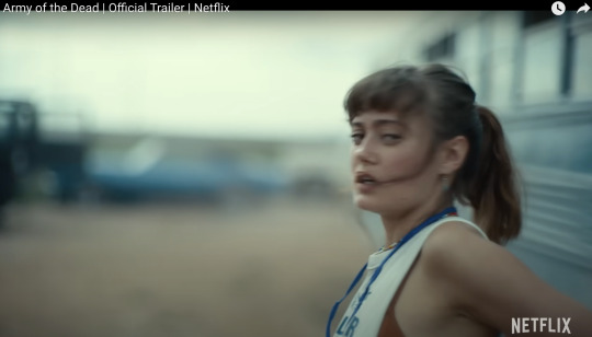
Ummmm... she is just... blurry. Missed focus completely.
But Zack isn't the only one going vintage. I've been seeing this a lot recently.
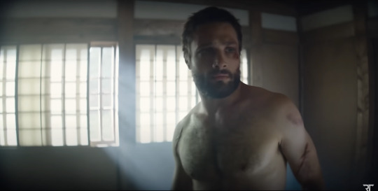
Shogun is a beautiful show. And for the most part, I really enjoyed the cinematography. But they went the vintage lens route and it kept going from gorgeous to "I can't not see it" distracting. And perhaps because I am familiar with these lens defects I am more prone to noticing. But I do think it hurt the imagery in a few spots.
Vingetting is a darkening of the corners of the frame.
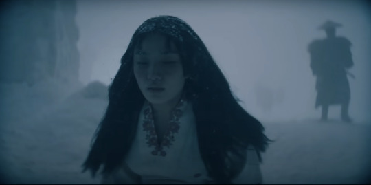
Light rays in the corners are much harder to control. A lot of modern lenses still have this problem, but they create software corrections to eliminate the issue. Some cameras do it automatically as you are recording the image.
Vintage lenses were built before lens corrections where a thing—before software was a thing. So you either have to live with them, try to remove them with VFX, or crop into your image and lose some resolution.
It's possible this is the aesthetic they wanted. They felt the vignetting added something to the image. But I just found my eyes darting to the corners and not focusing on the composition.
And then you have distortion.
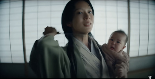
In this case, barrel distortion.
This is mostly prominent in wide angle lenses. In order to get that wider field of view the lens has to accept light from some very steep angles. And that can be quite difficult to correct. So you kind have to sacrifice any straight lines.
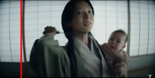
And sometimes this was a positive contribution to the image.
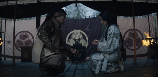
I thought the curved lines matched the way they were sitting here.
But most of the time I just felt like I was looking at feudal Japan through a fish's eye.
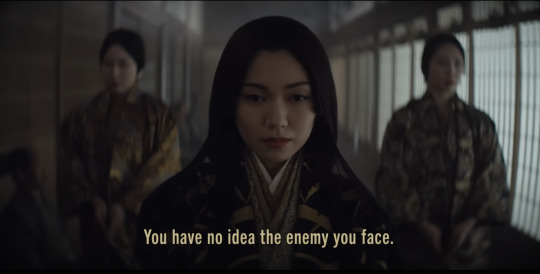
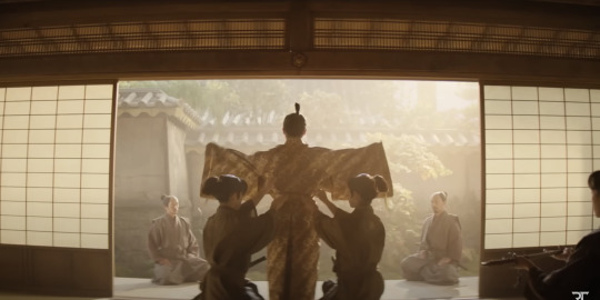
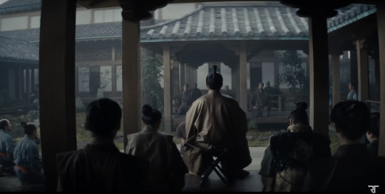
It's a bit more tolerable as a still, but when all of these verticals are bowing in motion, I start to feel like I am developing tunnel vision.
I love that this is a tool that is available. Rehousing lenses is a really neat process and I'm glad this old glass is getting new life.
This documentary shows how lens rehousing is done and is quite fascinating if you are in to that sort of thing.
youtube
But I think we are in a "too much of a good thing" phase when it comes to these lenses. I think a balance between old and new can be found.
And I also think maybe Zack should see what f/2.8 looks like. He might like having more than an eyebrow in focus.
430 notes
·
View notes
Text

Create Your Own Main Menu for The Sims 4 - Tutorial
Hey folks!
This tutorial will walk you through creating your own main menu override for The Sims 4 based on my custom repository.
_________
What is required:
JPEXS Free Flash Decompiler
Sims 4 Studio
Raster graphics editor (e.g. Photoshop, Gimp, Photopea)
Your Own Main Menu repository
_________
Step 1: Download and unzip the Your Own Main Menu repository
It's available on my Patreon page for free.
_________
Step 2: Prepare your custom images
There are two images that you need to customize:
SimMattically_YourOwnMainMenu_MainBG.pngThis is the main background image, where you want to put the desired graphic.Size: 1440px x 1200px
SimMattically_YourOwnMainMenu_BarBG.pngThis is the second background for the navigation bar on the right.Size: 480px x 1200px
Prepare your own images based on these templates. Do not change the size of the images.
Tips: If you're using a more complex background, such as a screenshot from your game, I recommend blurring the Bar_BG with a Gaussian Blur (~60px). Additionally, I suggest adding a white overlay with ~50% opacity and a 5-pixel wide white bar on the left edge with ~10% opacity. This helps improve the readability of the navigation bar buttons and adds an extra layer of detail to your menu design.

The repository also contains the optional file "SimMattically_RefreshedMainMenu_ScenarioButton.package" from my other mod, which replaces the Scenario button icon with a semi-transparent white version. It's up to you whether you want to use it.
_________
Step 3: Import the images to the .GFX file
Firstly, open JPEXS Free Flash Decompiler and then open my SimMattically_YourOwnMainMenu_Template.gfx with it.


Select "No to all" when prompted.

On the left, choose "images" and scroll to the bottom where you will see the images you just edited in their original form. Right-click on each and select "Replace." Select the custom images you prepared in step 2.


Save the file.
_________
Step 4: Import the .GFX file into the .package file.
Open Sims 4 Studio, then click on "My Projects" and open SimMattically_YourOwnMainMenu.package. Select "Scale Form GFX" (the one with the "gameentrylauncher" description) and click on "Import." Select the modified .GFX file and import it. On Windows OS, you need to switch from .binary to all file types to see the file.


Save the .package file via File -> Save As... Give it a custom name and place it in The Sims 4/Mods folder.
That's it! Enjoy!
_________
IMPORTANT INFORMATION/TERMS OF USE:
Main menu overrides can become outdated with some game updates, causing them to break the game. You will have to remake your custom main menu with a new, updated template in this case. Always make sure you are using the latest available template and that it's not outdated.
Since these mods can break the game, I do not advise sharing your custom main menus with other players. You are free to do so, but be aware that since you're relying on this repository to create your own version, you most likely won't be able to update the mod and resolve issues for other players on your own, so you take responsibility for breaking their game.
If you decide to share your version with other players, please credit my repository and link to my Patreon post.
Do not put your custom main menu based on this repository behind any paywall or early access. I made this repository and tutorial free for everyone, so keep it fair.
I do not take responsibility for people misusing this repository or breaking your game with incorrectly modified files. I do not provide support for custom main menu overrides created by other creators using this repository.
_________
#sims#thesims#thesims4#sims4#sims 4 mods#sims 4 custom content#simblr#s4cc#ts4#main menu override#sims tutorial
194 notes
·
View notes
Text
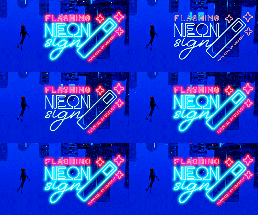
HOW TO: Make Animated Neon Text
Hi! No one asked for this tutorial, but this is one of my favorite typography effects as of late — so I thought I'd share how I do it. You can see this effect in the first gif of this *NSYNC Celebrity set and the last gif of this Anthony Bridgerton set. Disclaimer: This tutorial assumes you have a basic understanding of gif-making in Photoshop. It's also exclusively in Timeline and uses keyframes for the fading effect seen on the blue text.

PHASE 1: PREP YOUR BASE GIF
1.1 – Choose a dark scene. This effect looks best contrasted against a dark background. You can definitely do it with a bright background, but just like a neon sign irl, you only turn it on in the dark/at night — so keep that in mind!
1.2 – Determine the length of your clip. Depending on how much you want your text to flash or fade in, you'll want to make sure you have a scene long enough to also allow the text not to flash — reducing the strain it takes to actually read the text. For reference, my gif is 48 frames.
1.3 – Crop, color, etc. as you would. New to gif-making? Check out my basic tutorial here!
PHASE 2: FORMAT YOUR TEXT
Before we animate anything, get your text and any vectors laid out and formatted exactly as you want them!
2.1 – Finding neon sign fonts. It's easy as going to dafont.com and typing "neon" into the search bar!
2.2 – Fonts I used. Neon Glow by weknow | Neon by Fenotype | Neon Bines by Eknoji Studio
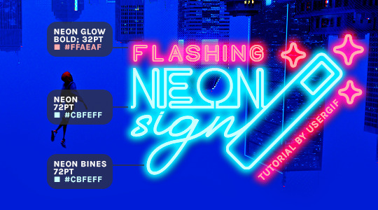
And to not leave my fellow font hoarders hanging, the font for "tutorial by usergif" is Karla (it's a Google font) 🥰
2.3 – Group your text layers. (Conditional) If you plan on having multiple text layers like I did and you want them to appear connected (like how the last letters of "NEON" and "sign" intersect with the wand icon), I suggest putting the layers into groups according to color (the shortcut to group layers is Command+G). If you don't group your text and just apply the outer glow settings to each individual layer, you'll end up with something like this:
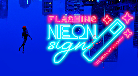
—where you can see the glow overlap with the line, instead of the smooth connection you see in my final example gif. I'm using 2 colors for my text, so I made a group for red and a group for blue.
2.4 – Apply Outer Glow. Right-click your text layer (or your group if you have several layers) and select "Blending Options" to open the Layer Style menu. Check "Outer Glow" and feel free to play around with the settings until you like the way your text looks!
Your outer glow color should be darker and more vibrant than the color of the text itself. The text should be within the same color family but much brighter and, sometimes, almost white (see Step 2.2 again for my text colors).
Here are the settings for the Red Glow (the glow color is #FF3966) and Blue Glow (#00F0FF):
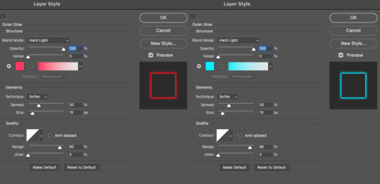
These aren't always my exact settings but they're pretty close to my standard. I always set the blend mode to Hard Light and usually have the opacity at 100%.
For every gif I use this effect on, I like to play around with Spread and Size. Spread will make the glow look denser and "expand the boundaries" (source: Adobe) and Size will diffuse the glow and blow it out so it covers a larger area (Adobe says it "Specifies the radius and size of blur").
2.5 – Duplicate your text layer/groups and remove glow. We're only going to be animating the glow on our text, and since doing this affects its opacity/visibility, we want to preserve the base text by creating a duplicate.
I just hit the Command+J shortcut to duplicate my groups and delete the Outer Glow effects, making sure that the "No Glow" version is above the "Glow" version:
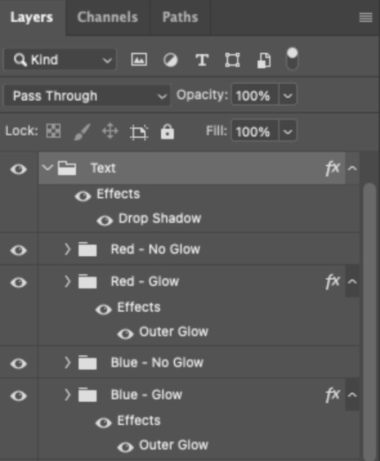
I also put all these groups into one group called "Text" for organization and so I could apply a drop shadow to all the elements for better visibility.
PHASE 3: CREATE THE FLASHING EFFECT
This is for the effect you see on the RED text in my gif!
3.1 – The 0.03-Second Rule If you've read any of my animation tutorials before, you're probably already familiar with this rule. In my experience (and for reasons I can't explain), Video Timeline pauses every 0.03 seconds (try clicking the forward button a few times, you'll probably find a "duplicate" or paused frame). So, keep all your layers a duration of 0.03-second increments (e.g. 0.06 or 0.09 seconds can also work) and align them on the Timeline at 0.03-second intervals. If you don't follow this rule, you'll get duplicate frames when you export, resulting in a choppy final gif.
3.2 – Trim and arrange your text layers. Only on the layers/groups WITH the Outer Glow effect, trim them into several segments of varying lengths where the glow will be "on" (visible) and leaving spaces where the glow should be "off."
Typically, I'll have a mixture of 0.06 and 0.03-second text. That's when the glow will be visible. Between each "flash" of visibility, I've got a 0.03-second blank space, baby *pen clicks* and I'll write your name:

The layers shown above are arranged with a few flashes and two long segments of no flashing. This is the order and duration of each segment shown above (purple = visible segments):
0.06 blank, 0.06 visible, 0.03 blank, 0.03 visible, 0.03 blank, 0.03 visible, 0.03 blank, 0.24 visible (the long bit where "FLASHING" doesn't flash at all), 0.03 blank, 0.03 visible, 0.03 blank, 0.12 visible
(I only did this for the text that says "FLASHING" to give it a glitching effect. The other red text keeps the glow visible starting at the first long segment.)
PHASE 4: CREATE THE FADE-IN EFFECT
This is for the effect you see on the BLUE text in my gif!
4.1 – Animate using the Opacity Keyframe. Again, we're only touching the layers/groups WITH the glow effect. If you only have one layer of text, you'll find the Opacity Keyframe by clicking the film reel icon:

If you're working with groups like me, you'll find it in the Timeline panel under the group when it's expanded:
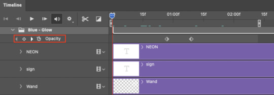
As you can see, I already added my keyframes (lil diamond babies). And luckily, it's super easy to do!
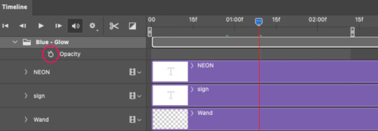
4.2 – Add the ending Keyframe first. We're starting at the end because our layers/groups are already at 100% opacity. Drag the playhead (the blue arrow attached to the red vertical line) to a spot where you want the glow to be 100% opaque — this is where the glow will be fully "on" or visible. [Again, follow the 0.03-Second Rule. You will get duplicate frames regardless when using keyframes (this will be explained in the note in Phase 5), but abiding to the rule will mitigate the amount of dupes you get.]
Then, click the clock icon by "Opacity" to place a keyframe:
4.3 – Add the starting Keyframe. Go backward from the ending Keyframe you just placed (I went back 0.12 seconds — but you can play around with the duration of the fade, just keep it a multiple of 0.03):
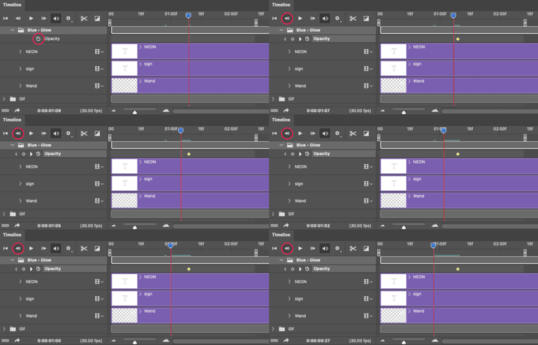
And drop another keyframe, this time by clicking the diamond icon by "Opacity":
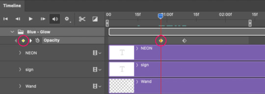
4.4 – Reduce the opacity on the starting Keyframe. Keeping that keyframe you just placed selected, go to the layers panel and reduce your layer's/group's opacity to 0%:
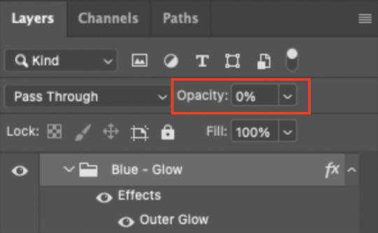
Now, this Outer Glow will slowly fade from 0% to 100% opacity.
And just for a visual aid, here's where my fade-in keyframes are in relation to my flashing segments:
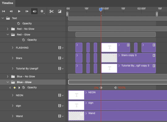
To refresh your mind, the 0% Opacity Keyframe starts when "FLASHING" is visible for 0.24 seconds (the first long segment of visibility).
With these keyframes, you'll get a smooth fade-in à la ✨light switch with a dimmer✨
PHASE 5: EXPORT
Yay, we're finished! Convert from Timeline back to Frames and export your gif!

NOTE: If you only did the flashing effect and followed my 0.03-Second Rule, you shouldn't have any duplicate gifs. BUT if you included the fade-in effect using keyframes, you WILL have duplicate frames. 'Tis the nature of keyframes. 🤷♀️ I had 4 extra frames where the fade-in starts, which I deleted. So, as always, I recommend checking your frames when you convert from Video Timeline back to Frame Animation — and manually delete any duplicate frames.
Sorry this tutorial is so long 🙈 I over-explain so you're not just mechanically copying steps, but understanding the WHY behind each step! Thanks for bearing with me
If you have specific questions about this tutorial, feel free to send a message to usergif and I'll try my best to help! :)
More USERGIF tutorials • More resources by Nik • USERGIF Resource Directory
#typography#gif tutorial#completeresources#usershreyu#useryoshi#userelio#userzaynab#userives#usertreena#usercim#userrobin#userkosmos#usersalty#userhella#alielook#uservalentina#uservivaldi#*usergif#*tutorial#by nik#flashing gif
784 notes
·
View notes
Text

Thank you @cobbbvanth for asking me for this; I’ve never been more flattered! ☺️ I’ve only been making gifs for a little more than 2 years, so I’m really still only figuring Photoshop out, and my colouring owes everything to other people’s tutorials (some of which can be found here). To be honest, I was only asked some tips, but I have no clue what to include and what to leave out; so, here’s my complete (if random) colouring process.
NOTE: This is a colouring tutorial, not a gif-making one. The tutorial that taught me everything I know about that (and to which I am eternally grateful) is this one by @hayaosmiyazaki.
I. SHARPENING My standard sharpening settings are:
One Smart Sharpen filter set to Amount: 500 | Radius: 0,4
A second Smart Sharpen filter set to Amount: 10 | Radius: 10
One Gaussian Blur filter set to Radius: 1,0 and Opacity: 30%
One Add Noise filter set to Amount 0,5 | Distribution: Gaussian
II. BASIC COLOURING This is the part where I add most of the adjustment layers available and just play around with them. Obviously different settings work for different scenes, but I do have some standard ones.
Brightness/Contrast I usually up the Brightness to +10-30, and the Contrast to about +10.
Curves
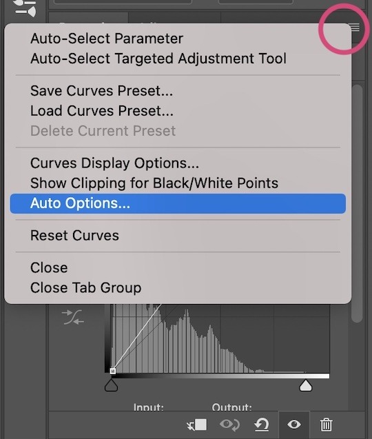
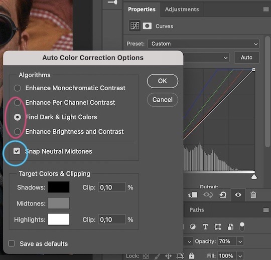
For the first Curves layer I go to Auto Options > Enhance Brightness and Contrast, and then adjust the opacity until I’m happy.
I might repeat the above step if the gif still looks too dark to me.
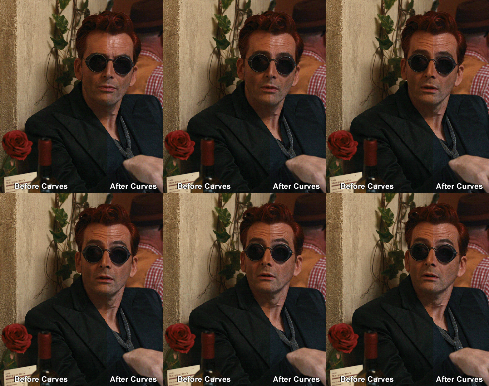
I add another Curves layer, I go to Auto Options and this time I pick either Find Dark & Light Colors or Enhance Per Channel Contrast, and check or uncheck the Snap Neutral Midtones option, until I see something I like. I will then adjust the opacity.
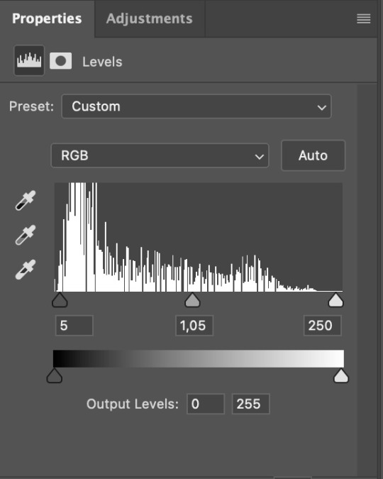
Levels I add a Levels layer that usually looks something like this:
Exposure I add an Exposure layer, where I usually set the Offset to around -0,0010.
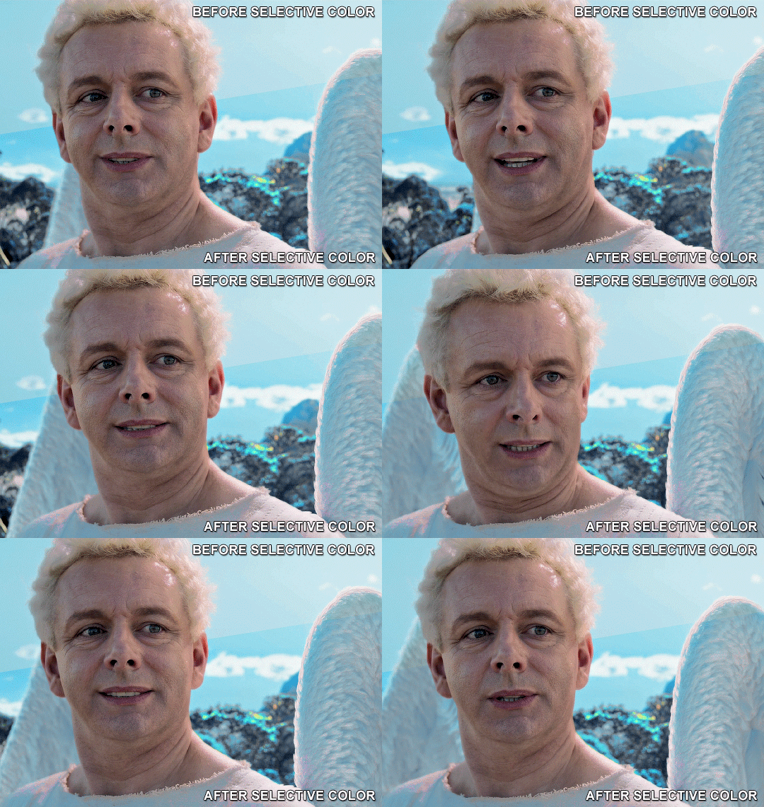
Selective Color To make the faces look okay, I create a Selective Color layer, select the Reds and usually add some Cyan (+10-20%) and play around a little (±5%) with Magenta and Yellow too. I might also add another layer, select the Yellows and make slight tweaks there too.
III. FUN COLOURING About colour manipulation: PiXimperfect just uploaded a tutorial that explains everything so much better than I ever could, so I highly recommend you go watch it. It’s made for static images though, and things are more complicated with moving images, so I also recommend @elizascarlets’s tutorial.
The reason I usually go for a softer colouring is that a more vivid one requires a lot of patience and precision, and I honestly can’t be bothered. Instead, I try to tweak the colous only a little, so that the edges can be a little rough without it looking too wrong.
One thing to remember is that each gif is different, and there isn’t one foolproof way to do this, so you will need to use a different technique depending on the gif you’re working with.
Okay, so, after I’ve decided what colour I want my background to be:
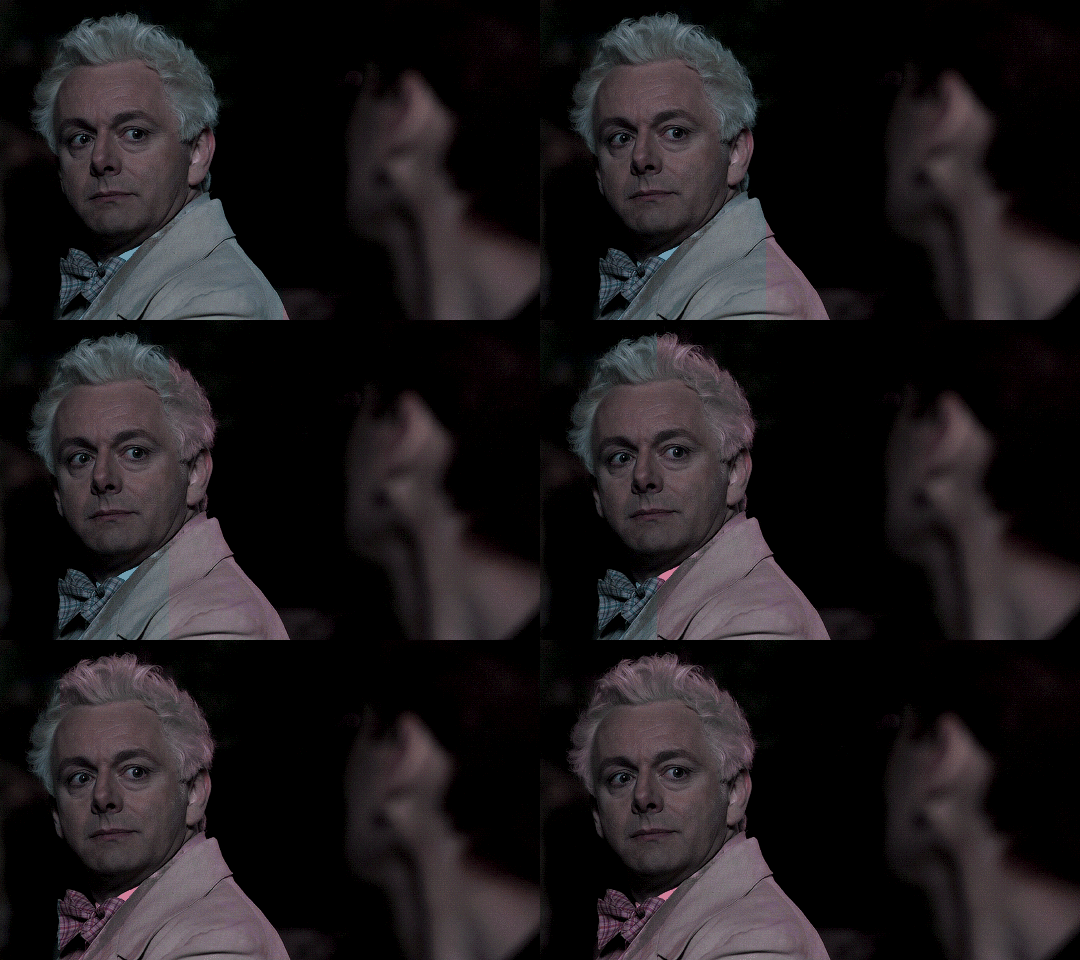
1. I create a Hue/Saturation layer and change the greens, cyans, blues and magentas to that colour. That’s easy enough, since it doesn’t mess with the face colour. I then set the blending mode to Color. If your background doesn’t include any yellow or red, you might be done here, like in the case bellow:
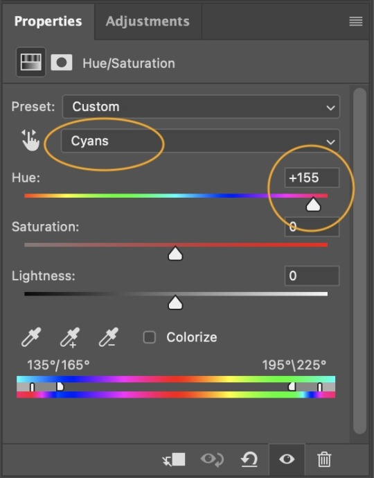
2. To change the yellows and reds, I create a new Hue/Saturation layer, select the yellows/reds, move Saturation to 100 (temporarily) and then play around with the sliders until the face colour isn’t affected. I then change it to whatever I’ve chosen and change the blending mode to Color.
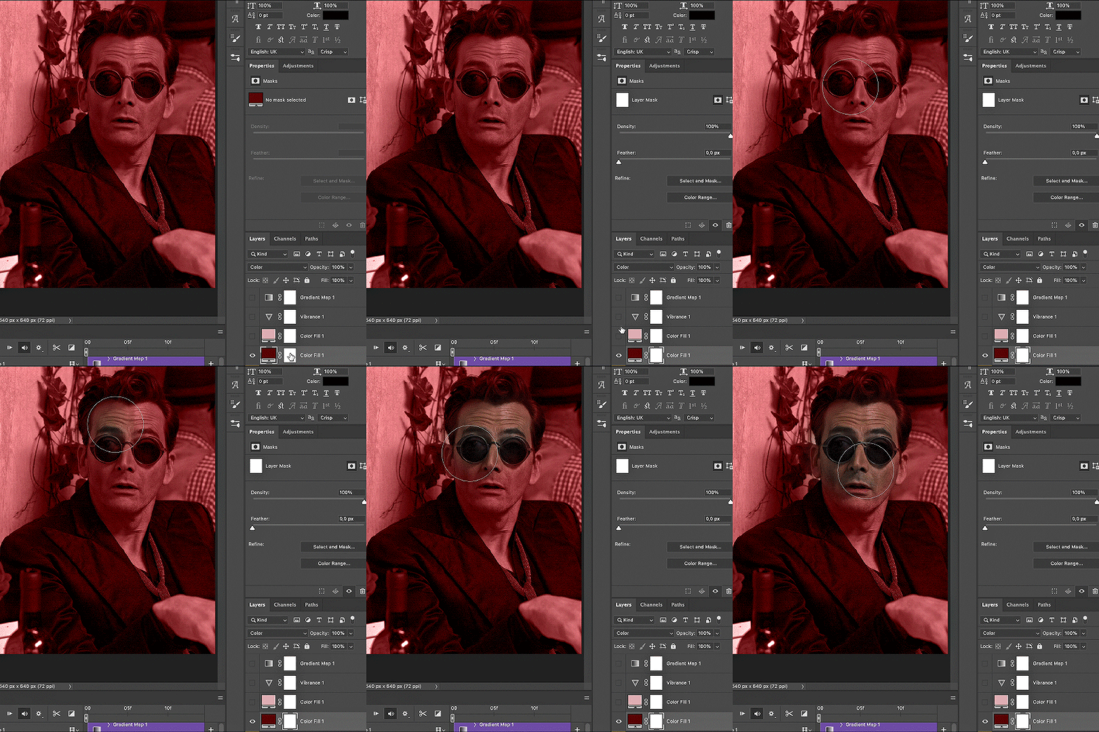
3. If for whatever reason step 3 doesn’t work (the background is white or black for example, or just too red), I might create a Solid Color layer set to whatever colour I want, set the blending mode to Color and then select the layer mask and carefully paint with a soft, black brush over the people’s faces/bodies. I will then lower the Opacity, to whatever looks smooth enough. If there’s a lot of movement in your gif, you might have to use keyframes (see elizascarlets’s tutorial linked above). However, my main goal is to avoid using those; that’s why I try my hardest to tweak around as many Hue/Saturation layers as needed and not have to create a solid color layer.
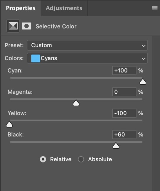
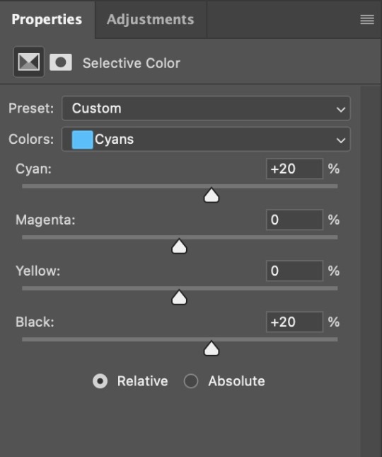
4. Once my background looks the colour I want it, I might add a Selective Color layer that matches my background color and then try to make it look more vibrant. For this Aziraphale gif below for example, I’ve selected the Cyans and then set Cyan to +100%, Yellow to -100% and Black to +60, then created another one, selected the Cyans again and then set Cyan to +20 and Black to +20.
5. If the gif has a white area, I create a Solid Color layer with a colour that matches the rest of the background and then set the Opacity low. I might also create a Selective Color layer, increase the Black and then play around with the colours.
IV. FINISHING TOUCHES
I create a Vibrance layer and set the Vibrance to around +30 and the Saturation to about +5.
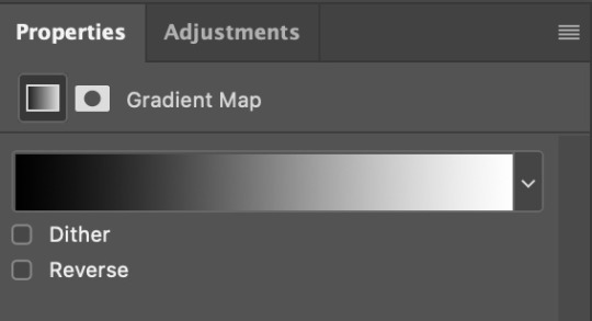
I create a black and white Gradient Map layer (with black on the left end of the spectrum and white on the right), set the blending to Luminosity and the Opacity to about 20-30%.
AAAND that’s about it I think! This ended up way too long and perhaps a little incoherent. I tried to make it as general as possible, so you might have to mix and match for best results. Feel free to ask me for further explanations about any one of these steps, and please tell me if you want me to go through the colouring of a specific gifset (although, as I said, I'm by no means an expert). Happy gifmaking!
#gif tutorial#allresources#completeresources#dailyresources#photoshop tutorial#minee#tutorial#tutorial*#chaoticresources#uservivaldi#userdanahscott#usersanshou#userfanni#userbuckleys#userrobin#tuserjen#userdavid#userzaynab#tusermimi#thingschanged#tuserju#usertj#userhallie
338 notes
·
View notes
Note
Hi!! I’m not sure if you have already answered this, I tried to scroll through as much as I could to check lol But how clean are your sketches before you paint them? I know some people leave them as loose can be and some clean them up and even outline. So I was just wondering! :)
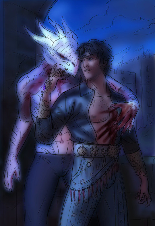
Hi there! Usually rather hideous so I do not share much. I use a mixed media approach to my painting, so to "sketch" I will sometimes use a mixture of 3D (I like to use Blender but I probably use it like a gorilla lol) and photobashed elements. I will build scenes kind of like a collage instead of traditional sketching first, then I will color correct them to fit together- usually I use 3D to build lighting reference. Then I run everything through a lot of filters to bring everything together better (I like to gaussian blur, then the posterize and palette knife filters in Photoshop, I've been using the oil paint filter for my vintage BG3 portraits haha) then I sketch over it more traditionally. Either I go straight into painting or I do this in black and white more recently, if I do that I add color later. The B&W process is a lot less chaotic so I've been enjoying that a lot more recently. both ways allow me to tweak character's likenesses and more importantly add in details like clothing/hair/elements like that so I'm not painting blind.
I have a lot of background in Photoshop like, for editing photography so I take a non-traditional approach to digital art. (if there even is one) It's a lot more akin to the way concept artists put together pieces, however I take them a few steps further to, hopefully, obfuscate the beginning a bit more. I love concept art but I do think a lot of it looks stiff or clearly photobashed, which I don't love the look of. A few years ago I started messing with this process as it felt like a lot of my beefy Photoshop knowledge was being wasted while I was focusing on more stylized works using Rebelle 5.
Honestly, my sketching process is the ugliest thing known to mankind and I am very self conscious about it, so I don't share a lot. It's not aesthetically pleasing, it just looks like I have no idea what I'm doing lol. I might share some about my Frankenstein process on Patreon at some point.
I believe very strongly in using the tools you have available as an artist, especially in this hellscape where AI abominations are at every corner and the pressure to create as fast as you can looms over you constantly as an artist. There are so many cool and weird ways to make art, ESPECIALLY with your computer, that there's really no excuse to use AI slop. I'd take my weirdo collage approach any day over asking some machine to poop out "art" for me.


85 notes
·
View notes
Text
how i do my visual novel filtered photo backgrouds
ive had some questions about this so i figured i'd put together a quick post on my process and what goes into it.
this isnt really a tutorial and instead is just a ramble of how i do stuff with a ton of examples and pictures lol
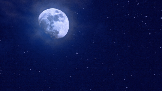
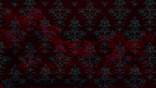
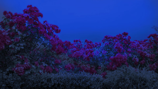
read more below. this is a long post and you probably want to be looking at these images on your computer instead of your phone
step one is that i find CC0 photos or otherwise easy licenses to use because I'm lazy and don't want to have a list of credits of random photographers caue i used one of their images but also i don't want to use stuff without crediting
because they have a general lincese that just wants you to mention the site i prefer unsplash or pixabay but there's other public domain type photo sites too obviously
so like okay heres a random picture

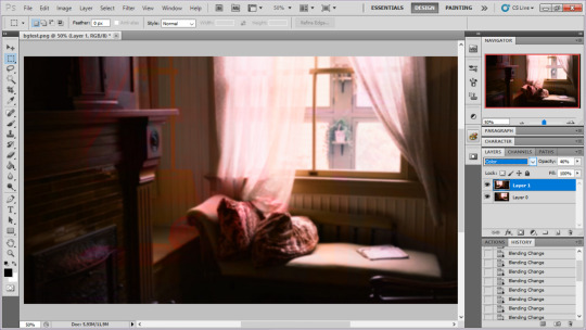
i have a photoshop CS5 from 10 years ago. but these can be done with gimp or krita and whatever. theres even photopea that has photoshop in the browser
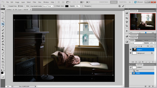
basic stuff is that i start by cropping my bg into my renpy resolution (i use 1920x1080) this is also the part where sometimes i might rotate a bg. it is a good way to add some chaos vibes to a scene
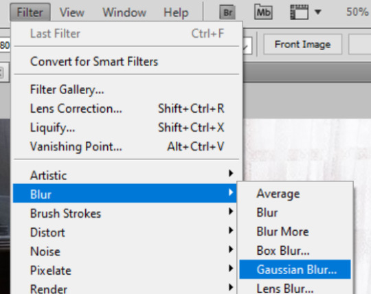
i tend to add some mild blur effect since i find that having too sharp photos as backgrounds clashes with the artstyle of my sprites. like just a couple pixels worth of blur tends to do it
the next part is called fuck around and find out

i like to play with the values to just get random results. hue/saturation for tinting the picture, messing with the curves to get some really sharp effects, or channel mixer to add more of a color
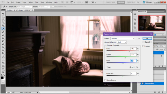
this part is just purely vibes based but i personally think reducing the colors of the background is the simplest way to create something that feels coherent. especially if you make backgrounds based on moods. like having a blue tinted bedroom vs a red tinted one really changes the atmosphere
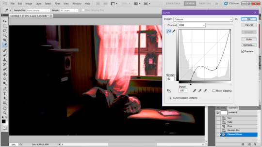
you can get some pretty intense effects but its always important to remember that its meant to be a background and there's a risk it distracts from the sprites
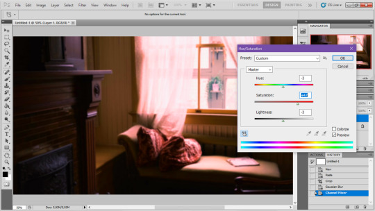
in this case im not including the effect for the curves. after the colours look fine the final step i tend to have is apply some sort of effect.

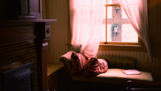
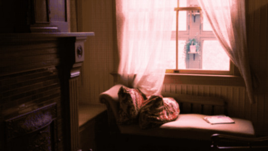
i really like changing the colour mode to indexed colour since i like crunchy pixels. (had to zoom in to 100% to show the actual effect) downside of indexed is that it doesn't look ideal unless its displayed in the exact resolution it was made in but i like it
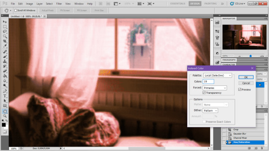
here is the images before indexed mode:
after indexed mode(i think you have to click the image and open it in full to see the actual effect):
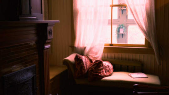
another thing ive been playing with recently has been grain+chromatic aberration combo. it makes things feel surprisingly lively with just this simple thing so you'll probably see me overusing this effect in the future

you have to mess with the numbers to get the effect you want but for me these were the parameters I've been using
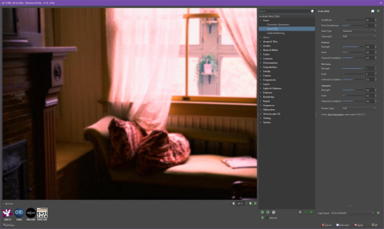

ignore the preview missing idk why it does that.
heres the image (the non indexed version) after these krita effects
one random special mention i have is that playing with layer blend modes is great
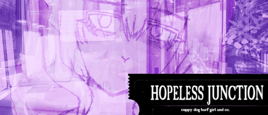
in this example i just copied the same background, mirrored it horizontally and set the layer blend mode to color and it lowered the layer opacity slightly. it just adds some.... idk what to call it visual noise? itj just fucks it up a bit. i used overlapping images and screen modes in some of the hopeless junction images i did for some pretty nice effects
i dont really know waht the blend modes do i just scroll until something looks good lmao
theres a ton you can do with these. like for example just adding a single air brush dot of a bright color on a separate layer and setting it to some blend mode to add a tint to a background
i used these both in malmaid and in the second one i just brushed on some color on a separate layer to give it a moodier vibe
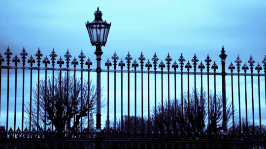
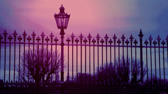
i think having variations of the same background is an extremely easy way to add some life to the bgs without having to do new stuff. like here was the hotel lobby when entering, and here is the hotel lobby when they ran away from the place. i added a radial blur with photoshop
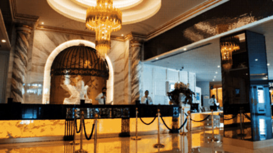
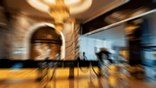
i think theres some beaty in artifacts that come from low resolution images too. sometimes i intentionally use images that have clear compression artifacts cause i think it looks neat. i don't really worry about the details too much as the vibe is the most important thing
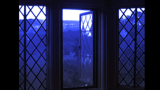
its honestly just a matter of knowing these tools exist and just fidgeting around with combinations to find what you want. it also helps to look at other backgrounds or images in general that you come across and just be curious. how was this done? how could i recreate it? that's the type of experimenting that has led me to these.
idk thats all i have to say. ty for reading and play malmaid on steam like and subscribe for more gay puppies

83 notes
·
View notes