#assignment nm3217
Text
NM3217 Assignment 3 Blog Post (Information Design)
For this assignment, we were tasked to communicate complex information (that we chose for ourselves) through effective visual representation. Upon reading the assignment brief, I chose a topic that I felt was extremely relevant to myself and ongoing university students. I wanted to deal with information regarding the career prospects and average salary of the different majors available at FASS in NUS. I utilised the NUS Graduate Employment Survey 2021 (GES) that was conducted by the Ministry of Education as my dataset. However, I realised that the data regarding the average salary of FASS majors were combined together and presented either as Bachelor of Arts, Bachelor of Arts (Hons) or Bachelor of Social Sciences. There was no differentiation between the different FASS majors in the NUS GES. Hence, I decided to work with the NTU GES instead, as the data presented in the College of Humanities, Arts and Social Sciences were separated by major. I also used Indeed.com which is an employment website to search the career prospects available for the different majors.
Next, I proceeded to do a sketch on a piece of A4 size paper to get a rough idea of how I wanted to present the acquired data and the positioning of the different elements on the design piece. I also chose to limit the number of majors presented to only 8 because anything above that would affect the readability of the infographic.

Afterwards, I brainstormed different designs for the icons that I wanted to use. I crafted several designs straight from my head and referenced icon images online to get a better sense of how to design icons that signified the major as closely as possible. Below showcases the various icon designs that I drew out on paper so that they could be easily referenced during the actual designing which would be done in Adobe Illustrator.

For this infographic, I decided to go with a space theme as the aesthetic because I wanted to relate it to the word “Dream” where it is boundless and beyond the stars. The headline “Dream Major” has letters which are all different colours to represent the variety of majors/jobs available. Each major is denoted by a rectangular box that contains an icon (that showcases the major visually), average salary and 5 possible career paths that a student of that major can pursue. The colours chosen, blue, beige and reddish-pink were based on what I felt looked harmonious and suitable for presenting information that could be easily absorbed by readers.

Post-critique, I received some extremely thought-provoking comments that made me question what I was actually trying to present in my infographic. For starters, was I trying to help students pick a major or was I trying to help them choose a job? I didn’t know the answer to this question when it was asked in class. This immediately signalled to me that I had lost track of what I was trying to achieve with the infographic and the header “Dream Major” was thus problematic. After the critique session, I decided to focus solely on helping students pick a job based on their major and changed the header to “Dream Job” instead.
The next issue was that my infographic was too wordy. The paragraph of text underneath the header was confusing and did not add much value to the infographic. The purpose of an infographic is to display information as visually as possible with minimal use of words. Thus, I decided to shorten the paragraph of text into only 2 sentences which I felt was essential in giving the infographic some background context. Next, I took my TA’s advice to showcase only 3 jobs per major, and this time around, I would use icons to represent each individual job as appropriately as possible. This process took me an excruciatingly long time. Creating icons for some specific job roles was significantly harder compared to creating icons for general disciplines. The icons had to be much more targeted and showcase the uniqueness of the job. For example, I researched how a career counsellor does his/her job which is through dialogue and conversation with the client. Hence, I used 2 speech bubbles to represent speech between 2 individuals and placed a briefcase which represents work underneath it. Another example would be the human resource manager whose role is to help the company source outstanding candidates for recruitment into the firm. Thus, I used a magnifying glass to isolate a specific individual from a group of 3 to showcase a keen eye necessary for this job role. This process of researching the job, figuring out key elements of the job, and then proceeding to design was extremely tedious. I honestly thank Assignment 1 which taught me how to abstract ideas into simpler forms. Designing icons is very much like stage 4/5 of abstraction where you need to keep the design as simple as possible yet still retain important aspects of it that make it recognisable to the audience.
(Note to self: the shape builder tool is insanely useful for creating icons)
I would like to point out that I left out the average salary of majors during this reiteration of the design process because I felt the information added little value to readers. For example, a psychology graduate who works as a clinical psychologist will earn substantially more in comparison to a psychology graduate who works as social worker. Also, including the figures of average salary would affect the readability of the infographic, thus I purposefully left out this information.
Lastly, I changed the colours of the overall design to follow that of the brand guide provided by NTU. As my infographic is based on CHS majors from NTU, I felt a need to better connect this piece to follow that of the primary colours, red and blue, that are used to design the school emblem. The colours in my infographic look more pale-ish dark blue and purple-ish red because I reduced the opacity of the Pantone red and blue colours that I felt were too saturated which affected the readability of the infographic.


0 notes
Text
NM3217 In-Lecture Exercise D: Composing compositions
For this assignment, I took 5 different pictures of my water bottle, trying my best to take different shots of it as possible.
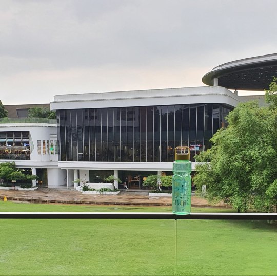
In this first shot, my water bottle is positioned in the centre of the frame, making it the subject of attention against a busy backdrop. The water bottle appears static, yet it is a prominent feature of this picture. The black ledge takes us a third of the image's space and acts as negative space which viewers can choose to ignore, in which the sky takes up a great proportion of attention, or pay attention to, and get a better understanding of where the water bottle is being positioned at (on a ledge).

In this next image, I similarly applied the rule of thirds. However, it now applies horizontally. The subject of attention is now placed less on the water bottle, but one thing that strikes out to me is how this image doesn't look particularly appeasing to the eye. Perhaps it is because the rule of thirds was not applied to the sky in this picture, making it appear more top heavy than intended.
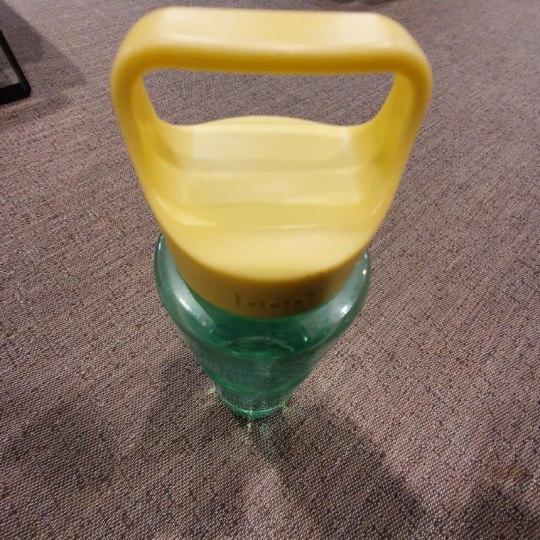
This was shot from a top-down perspective and forces an interesting perspective on the water bottle. From this picture, it becomes impossible to tell how big the water bottle is. Yet, the huge size of its handle hints at the possibility that the water bottle is indeed quite large.
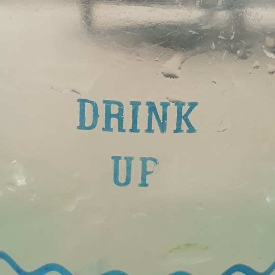
This is a super close up shot of my water bottle. While it remains initially ambiguous as to what it could possibly be, the droplets of water, the text 'drink up; and the wavy line at the bottom serve as important hints. In this picture, it is difficult to even tell the actual color or size of my water bottle.
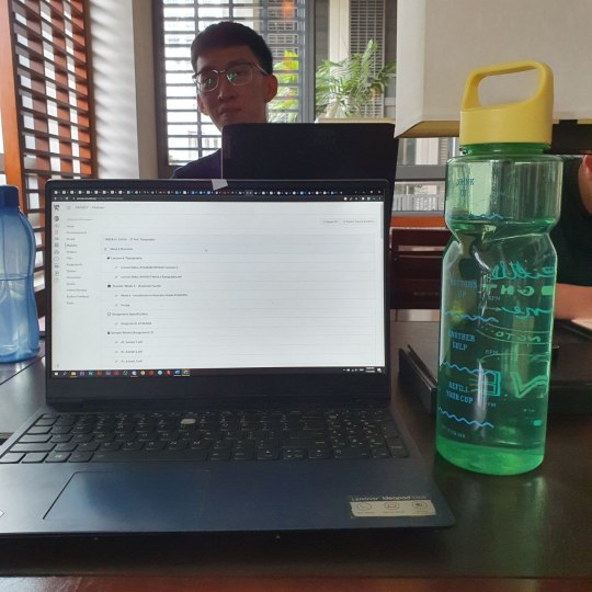
This is a picture of my water bottle in comparison with my laptop. Did it surprise you how big it was? This picture allows an observer to immediately tell that my water bottle is much bigger than normal. By placing it on the table, readers may also judge its size using help from the perspective of space that remains on the table.
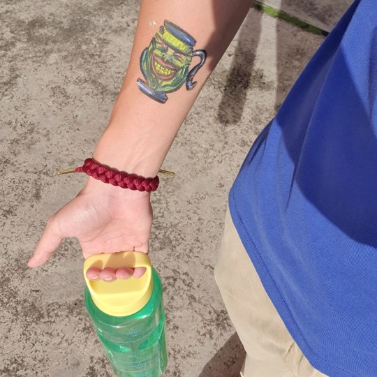
And finally, this is a picture of me holding my water bottle. This picture serves to illustrate more of the functional aspect of my water bottle. It not not entirely obvious that my water bottle is close to 2 litres in the picture because the perspective makes it difficult for users to discern. Neither is its size the main focus of attention in this picture; users would more likely be focusing their attention on the pot of greed drawn on my arm.
0 notes
Text
NM3217 - Final Project (At LAST)

Transformation of Logo & Brand Style:
According to the project prompt, the guide for us was:
1) What do you know about yourself?
2) How can this project best encapsulate/ represent your values?
3)How would you go about representing YOU as a brand? Or develop a brand that represents you?
and on week 11th our last F2F tutorial we were told to come up with a word cloud. Hence with that, I came up with a word cloud above. My initial thoughts were between doing a plain boring black and white (which was my most preferred colour on any day in the "introvert" me) vs something crazy that suits my extrovert days ~ from what you can see I chose the latter.
Funky & fun was the first word that came to my mind, I thought of using bright colours, neon schemes especially to create the partying vibe.
Following on, I have searched for some images that give me the vibe that I want and attempted to draw some inspiration from them. From it, 2 colours stand out to me, Pink (Magenta) and Cyan Blue.
And that's how the colour scheme for our brand style comes about!
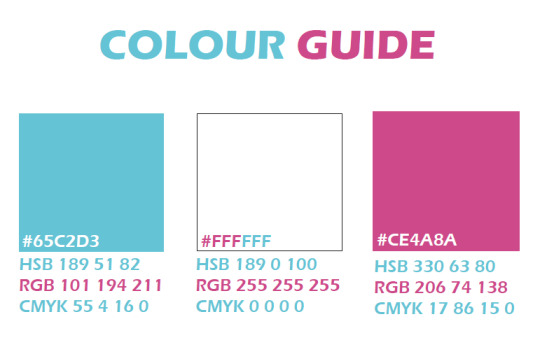
Sticking with the maximum 3 colour guidelines, I have also decided to make use of white to balance up the colour a little.
Typography:
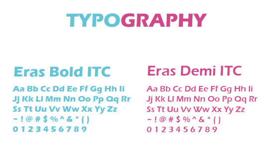
For typography, I chose the Eras series, as I feel that it fits the vibe I am looking for, funky looking yet still keeping a bit of a professional look in it, as I have taken into consideration that it will be used for my resume.
Now for the Logo:

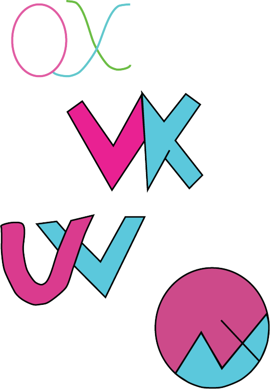
I came up with a few draft sketches for it, initially, I thought of just keeping it simple by incorporating my initials OWX into it. But after which after looking at examples online, I thought to include other traits into it as well.

Adding in traits like birthday date 03-09 and Chinese name. I decided to incorporate my Chinese name because since it's a logo that represents me, I am Chinese and personally more fluent in Mandarin, I thought it would be cool that with one look, someone can tell that I am bilingual from the logo itself no explanation needed, which was also why I purposely left out the language section in my resume after.
I was in a dilemma after coming up with the above 3 logo design, but thankfully I asked my friend for opinion for it , which brings me to the final design:
With that,

Software used when doing Brand Style:
For this assignment, I made use of
illustrator (My favourite by far~)
2. Indesign (because required to...)
This is also because I wanted to "play cheat" by tapping on the fact that elements could be copied directly from illustrator to Indesign but not from Photoshop. Also as I find the Indesign feature a pain in an ass to use, so I made use of illustrator to do most of the brand style portion and just copied it over to Indesign to do the layout.

Initially, when I was doing the I was all hyped up about it and thinking that since My brand image, I wanted to be as bold, as loud and as crazy as I could. So as I was doing the brand style, I tried to go crazy a bit with how I presented my work. Unfortunately~~~ it got struck down during the critique, I was told that its too loud, and too bold, presentation of the work was too messy unable to find a visual hierarchy. Which at that point, I was thinking of reversing back to the plain simple and boring black-and-white style. However, since its MY BRAND, I thought that NOPEE~ I am not giving in on the colours but for the sake of the assignment criteria I will just tone down and do out the very standard and of the norm kind of presentation style which is:
Making every background white, keeping the text colour as standardised as possible. Guess, not everybody can accept being crazy ~ or rather everyone has a different definition of crazy.
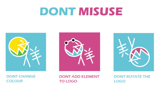
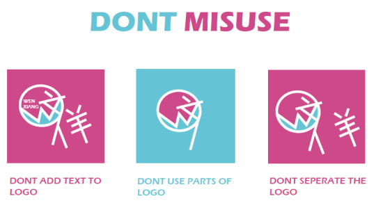
DO's :
For Do's the very first thing I thought of would be since I am using white which is a common colour for printing surfaces (White Paper). Hence, I thought to resolve it by allowing the use of black to substitute the white outline of the logo.

Seclusion Zone:

DON'Ts :
I also thought of 6 don'ts think of how people might commonly abuse the logo.
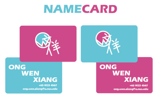
Name Cards:
For the name cards, I came up with 2 variations, with it showing the variation of the logo. I purposely left out the job position because I am still exploring my options and have not selected the career path that I want in life.
Resume on Indesign:
I created a template for the resume using illustrator first before copying it over to Indesign to add the fonts.
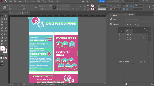
As well as editing the layout for the other components of the brand style in Indesign.
One thing I think Indesign came to use in this assignment is the fact that it allows me to set the orientation of the PDF such that there is both landscape and portrait mode.
0 notes
Text
NM3217 Assignment 3
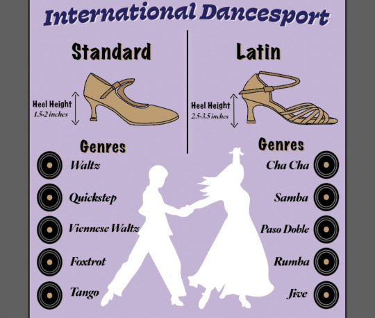
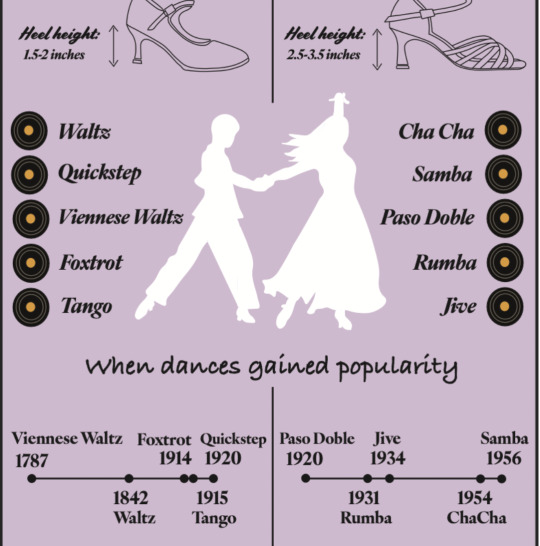
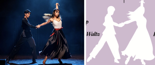
For this assignment, we were tasked to do an infographic for a selected topic. I contemplated on what topic to work on, and eventually decided to make an infographic on basic information about international dancesport - standard dance and latin dance. The reason behind this is because I have dedicated my entire year 2 to my cca Viva LatiNUS, which is a latin dance cca, and I wanted to do an infographic to share more about this niche dance and its genres.
Drafts
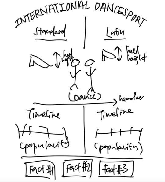
In each of my drafts, I designed the infographic using categorisation, with only 3 main sections in each infographic draft. The information was grouped according to their characteristics, and there was a clear hierarchy of information. I decided to go with 3 sections of information.
For the first and second drafts, I had intended to show the types of genres, heel height, and to draw out dance figures respectively. However, the infographic showed little information, and was not really educational. Hence, I decided to add in more information in the third and fourth draft.
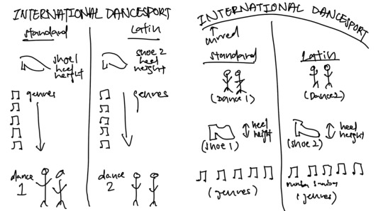
For the third draft, I considered adding 3 facts about latin dance that people should know, but eventually concluded against that because of issues of readability, having that the words would be quite small as there was a lot of information on the infographic already. In order to add in the facts, I would have to decrease the type size, leading, and line length, which would decrease visibility and legibility of the words, as the infographic is intended to be A4 sized. I also wanted to avoid having key facts in the foot margin area.
In the final draft, I intended to have a row of visual elements at the bottom, one for each genre. I tried it out using a drawing of tango that I had done, but the visuals were in the foot margin area, and made the infographic very cluttered and messy. Hence, I decided to remove it, and kept my final infographic to simply the main 3 sections of heel height, genres, and timeline of dance popularity.
I also considered adding a header ‘Genre’ in the final draft, but the header also made the infographic look messy. I decided against it as I felt that the visual element of a vinyl was self explanatory, and after discussing with other students in class, I decided to remove the header.
Infographic created
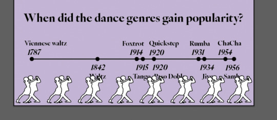
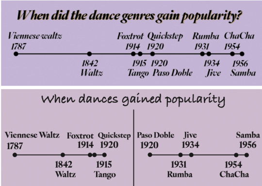
The final infographic was a comparison infographic, where I compared standard dance and latin dance, which were both categorised under international dancesport. An additional element I used was a timeline, at the bottom section, to showcase when each genre gained its popularity. There was a clear hierarchy of information, starting with comparison of heel height, into types of genres, and finally the timeline.
Originally, I had separated the two timelines, but feedback given during the critique mentioned that I should combine them, since the last genre of standard gained popularity at the same time as the first latin genre. I felt that this was very useful, making the infographic more readable. In addition, I also edited the header, for a clearer explanation of the information. Here are the two timelines in comparison:
I decided to use a bright pastel purple for my infographic, because I had intended for the infographic to be put up at dance studios, to give new dancers or visitors a brief guide to what international dancesport is. The pastel purple tone would be attractive and highly visible against the white walls that most dance studios have. The lighter tinted purple colour is also more of a cool tone, which would allow readers to feel calm and light-hearted, which is nicely connected to dance. Furthermore, the light purple colour is relatively complementary to the brown I used to colour the shoes in the infographic.
I created the purple background by drawing a rectangle, and selecting the purple fill that I desired. After which, I locked the layer to avoid any unwanted edits on it.
I started the infographic with a header 'International Dancesport’, which was the main topic. For this, I used the font ‘Swear Text Black’, because the font was widely used in the traditional dancesport scene, prior to the rebrandings of organisations and federations. As the font is well associated with Dancesport, I decided that using it as a header was effective. I also added some curve to the header to highlight the main topic, because the words were long and it was difficult to simply increase the font. This ensured that the main subject was visible to the audience.
For the remaining headers and sub headers, I created a pattern by using the same font, ‘Marker Felt’, as I felt that the font was clear and distinctive, directing the flow of the infographic to the next section. The header was also layered with a satin brown colour, which I used for the dance shoes, to keep a unified style. Furthermore, the light brown colour contrasted gently against the black words, making the header stand out more. The font I used for the remaining information like the genres, timeline, and heel height was ‘IvyOra Display Bold Italic’. This font was selected as it was professional and elegant, and matched well with the vibes of both standard and latin dance.
As compared to the infographic I submitted for critique, the final infographic is much neater and easier to read. In my original infographic, I utilised many different fonts for my sub headers and words, which made the infographic hard to read and understand as there was no clear flow of the information. Removing the unnecessary fonts made the infographic much more comfortable on the eyes, and clearly showed the different sections of information to the audience.
Visual hook
My main visual hook for this infographic was the white shape of two characters dancing. This was done by first outlining my image of my club members dancing using the pen tool in adobe illustrator, and then later adding in a white fill. I considered keeping a black stroke to see the outline of the characters, but eventually decided against it as the overall infographic appeared quite cluttered with many black lines and outlines. The visual hook was strategically placed in the centre of the infographic, to attract the attention of people. Using a white fill was effective as it placed emphasis on the visual through contrast against the purple background of the infographic, and would be eye catching from afar.
Two other visual hooks that I had were the standard and latin dance shoes. For this, I outlined the shoe using the pen tool in illustrator, with the shoe image set to 70% opacity. During the critique, I did a self-critique and mentioned that I would add in colour for the shoes, as they were only simple outlines, and the infographic appeared to be quite plain.
After the critique, I worked on adding colour to the shoe portions, as they were visual hooks that needed to grab audiences attention. I decided to use one light brown colour, that was similar to most satin ballroom dance shoes, and used a darker shade of brown to highlight the straps and soles. To find a good shade, I utilised adobe color, which created a palette that I used to easily identify a darker shade.
The final visual element I used was a vinyl, to represent the songs and genre of each dance. For this, I used the ellipse tool in adobe illustrator to draw the first circle with a black fill, and 2 grey circles, with the centre part the same brown colour used for the shoes, to avoid having too many colours. I experimented using multiple other symbols, and I felt that the top 2 were the soundwave lines, and the vinyl. Eventually, I decided to use the vinyl as many of the genres and songs dated back to when the vinyl was commonly used for music, and this would add a hint of nostalgia to the infographic. Here are the other symbols I drew and considered:
Conclusion
Overall, I really enjoyed the assignment, as it allowed me to gain a greater understanding of how to create effective infographics, and that I should not try to add unnecessary and irrelevant information which would be distracting and reduce the effectiveness of conveying information or educating the audience.
0 notes
Text
NM3217 Assignment 3: Infographic
Thought process and my take on the brief:
Infographics aim to disseminate information most efficiently by combining what we have learned from the past two assignments - abstraction and storytelling. With abstraction, we aim to simplify the subject at hand to its most stripped-down, but equally legible version. With storytelling, the visual aesthetics and elements aim to intentionally promote the information and narrative at hand. Combining these two concepts form the backbone of designing an infographic.
I decided to opt for an informational infographic with light elements of comparison to be able to differentiate the different kinds of products I had, which was tea. I chose to design an infographic on the different types of tea as I felt that the simplicity of a product used on a daily and yet the complexity of a beverage that has an extremely rich history that spans thousands of years ago would prove to aim for abstraction and storytelling at the same time. I also really like drinking tea..(if it wasn’t obvious enough).
Self-Reflection and Rationale:
My learning points while working on this assignment mostly revolved around figuring out how to simplify and effectively visually communicate whole sets of information. Another thing I struggled with was striving to rely almost entirely on design and not words - visually communicating predominantly through illustrations was a harder task than I thought it would be.
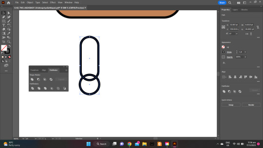
I chose Felix Titling as the font for my heading as it came across as classic and timeless, which is what tea also connotates. As it is also a titling font, it looked clean with a bigger font size. For my color scheme, I decided to stick with pastels, and shades of beige and brown. I also used the pathfinder option to merge my two shapes to create a temperature icon.
This is also the assignment where I got to play the most with color and experiment with background colors and the primary colors used for the illustrations. I used the pen tool, curved pen tool, and direct selection tool a lot while designing.
While designing the infographic, some critique I’d give myself is that I focused too much on simplicity and lost out on the visual appeal and storytelling aspect of it. There wasn’t a specific visual hook and my hierarchy of information could’ve been much clearer, which was also subsequently brought up during the critique. I also needed to standardize a lot of elements in the infographic and had issues aligning these elements and making the layout clearer. Another suggestion I got was to change my warping text on the teacup or try out other effects because it made the text difficult to read. Additionally, the section where I added the flavor profile of tea was looking less aesthetic and more awkward. My color palette also needed a lot more work, because the yellow I used while illustrating yellow tea looked more fluorescent and less pastel…which was not a good look. I realized after that it didn’t look as terrible on the monitor as it did on the projector, but nevertheless, it did need some tweaking to fit the overall color scheme better.
Improvement post critique
Out of the three assignments so far, I think there has been the most change post-critique for this assignment. First and foremost, I added a visual hook (or attempted to) with text design, whereby I combined the teacup and the word tea. I changed the warping percentage to make it appear more natural and less awkward. I also standardized the font and font size on the teacup, which in my opinion was a better aesthetic choice. Additionally, I added the time and temperature icon to the tea bag so as to cut down on unnecessary words. I tried to cut down further on the words and hence removed ‘flavor profile’ and just left the flavors as I felt it could be inferred based on the title and overall illustrations. Furthermore, I warped the title of each tea, which was something I always intended to do from my first sketch. Finally, I standardized everything and cleaned up the layout more, to make it appear more visually pleasing.
Overall, it was a great learning journey on learning how to represent different elements intentionally, effectively, and aesthetically, which are concepts that keep being reinforced with each design assignment!
0 notes
Text
meet multiply
final project, 111121

Inspiration
The final project's inspiration came mostly from a business idea that a partner and myself had when I was younger—since both of us were already knee-deep in working for others, why not explore trying it out for ourselves with the skills we already have? As university went on, we've continued to do client work on a freelance basis; however, it would be nice if it was represented (and incorporated) as a brand. Thus, Multiply was born—because clients always want to multiply their engagement numbers for every single project we took on.

Logo development
I was heavily inspired by simple, minimal icons to represent something larger (there's a UX term for this which I'm totally forgetting—think of it like how the 'save' icon still remains as a floppy disk). The first thing that came to me was to play with the 'x' symbol, which is something that commonly represents multiplication. Soon after, I did try to see whether there was a way to seamlessly combine a titular 'M' and the multiplication symbol together; after a few hours sketching and toying around with shapes on Illustrator, I finally settled on the current symbol, which mainly forms an M, but also represents an x using the negative space.
Colours
The decision of an appropriate colour palette was arguably the most challenging part of this process. As I aimed for a clean general outlook, I avoided colours that would immediately be stunning (such as those with lighter hues). I wanted some sort of pastel-y feel in the overall palette, however I did know to keep in mind the presence of contrasting and accent colours so that future design elements would not be lost within each other. I eventually settled on working with a green base—a colour proven to be quite easy on the eyes, and individually working the other colours from there using the Adobe Colours website tool.
Typography
The decision for typography, in comparison, was easy. There was no possible way that I would've wanted a serif font as I wanted to portray a more youthful overall outlook. I've taken care to find two sans-serif fonts with at least one distinct quality. For Multiply's case, I judged the selection based on the individual shapes of the lettering. The selection of Poppins and Bio Sans complements each other well here as the former is more circular, while the latter is more boxy, thus avoiding visual fatigue by providing an appropriate contrast.

Collaterals
These were the most fun to do! The first thing I kept in mind when designing these to was—other than following brand guide regulations—understanding how the end-user would see and interact with these collaterals in real life. Here, I prioritised the development of the layout first so that all the information flows in a logical manner, and the info with higher importance gets the appropriate contrast they deserve. For example, readability was definitely an integral part in developing the resume, and I've taken care to put the most important info (experience and education) on the section which takes up the most space in the resume.
0 notes
Text
Assignment 2: Storytime!
A Remote Stand-Off
Starting the assignment
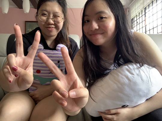
In this assignment, we were tasked to create a storyboard. Firstly, it started conceptualising the simple narrative that I wanted to tell using the 3 act structure (Setup, Confrontation and Resolution). Afterwards, I went ahead to sketch these stories out to make sure that they represented the vision that I had and then took the photos to bring it to life. Hence, the gist of the story that I was trying to tell was about 2 friends who were bored in quarantine and just turned on the TV and having a debate about what to watch on Disney+. Heavily inspired by some of the conventions and cinematography of the Spaghetti Westerns i.e. the duel scene and the ECU shots of the eyes etc, I decided to have these 2 girls (my friend and I) fight over the remote to see who gets to decide the show they will be watching: High School Musical or Lemonade Mouth. If you’re wondering if this was inspired by a true story, it was but don’t worry we were still friends after this as you can guess from the selfie we took midway because we decided to give ourselves a 5 minute break in between shooting scenes.
Storyboarding

Fig.1: Storyboard Part 1 (Drawing)

Fig.2: Storyboard Part 2 (Drawing)
The storyboard first starts off with a wide shot (WS) or establishing shot (ES) of Disney+ being featured on a TV screen. The scene then cuts to 2 girls, Layla and Isabella, on the couch looking bored and figuring out what’s good to watch. This is the set-up of the scene which leads onto the rising action when both of them spy the remote on the table and reach forward to grab it. These 2 scenes are being shot in close up (CU) and mid-shots (MS) respectively. That’s when both girls grab onto the remote at the same time (shot in CU) which leads to the stakes getting a little tense as it cuts back and forth to an extreme close up of Layla’s eyes first and then Isabella’s, both of them refusing to let go of the remote. This action results in the biggest crisis or confrontation, the duel for the remote and its shot in a MS. In this scene, it is also when the girls started screaming High School Musical and Lemonade Mouth respectively. This then brings us to to the resolution and last shot of the storyboard which is Isabella managing to triumph over Layla and manages to get ahold of the remote as Layla rolls her eyes in defeat. This is shot in an MS so that you can see Isabella raising her hand with the remote in it so she can pick the movie.
Below is the storyboard but in picture form.

Fig.3: Storyboard Part 1 using pictures

Fig.4: Storyboard Part 2 using pictures
Pre-Critique
To further prepare for the assignment, I attempted to make my narrative foolproof and cutting out the unnecessary scenes I may not have needed. I also went a step further to try and edit some pictures using Photoshop by playing around with the settings that it had to offer. For the first picture, I decided to make the TV stand out a bit more from the background and to do that, I went ahead and selected a new curve layer and using the brush tool, I masked it with another layer where I inverted the masks and modified the layer again. This effect overall did help as the TV is now slightly brighter than the rest of the objects in the background (Fig.5). For the rest of the shots, I mainly played with brightness/contrast to get achieve the desired effect that i wanted as the light source was to my right in the picture (as you can see from the windows), I wanted to make sure everything was brought up to ensure the white balance is there. I also cropped some images like Shot 7 as I wanted to bring out the ECU and the MS shot as I felt it was better in that size than a WS. Moreover in Shots 6 and 7 (Fig.6 and 7), I also played around with the spot healing brush tool to get rid of the pimples that plagued our faces which we were not excited for the world to see although we are still coming into adulthood. After all these pictures have been edited, I layered them all out on InDesign (Fig.12) and used a western background to further bring out the mood of what I was trying to go for which was a story inspired by Spaghetti Western conventions.

Fig.5: PS work area for Shot 1.

Fig.6: PS work area for Shot 6

Fig.7: PS work area for Shot 7

Fig.8: PS work area for Shot 3

Fig.9: PS work area for Shot 5

Fig.10: PS work area for Shot 8

Fig.11: PS work area for Shot 9

Fig.12: InDesign workspace for storyboards (drawn or photos)
I left shots 2 and 4 unedited as I thought they perfectly captured the essence of the story I am trying to portray on their own.
To sum up the shots in the assignment:
Shot 1: WS of the television featuring Disney+
Shot 2: MS of 2 girls staring at the TV pondering what to watch
Shot 3: CU of the TV remote
Shot 4: MS of 2 girls reaching for the remote at the same time
Shot 5: CU of the 2 girls grabbing the remote at the same time and refusing to let go
Shot 6: ECU of Girl 1 (Layla) staring at Girl 2 (Isabella) intensely
Shot 7: ECU of Girl 2 (Isabella) staring at Girl 1 (Layla) intensely
Shot 8: MS of fight for the remote
Shot 9: MS of Girl 1 smirking happily as she emerged triumphant while Girl 2 is rolling her eyes
Pre-Curation
Before achieving the images that I needed to place in my storyboard, I did have some shots that I was not as satisfied with such as these 4 examples below.
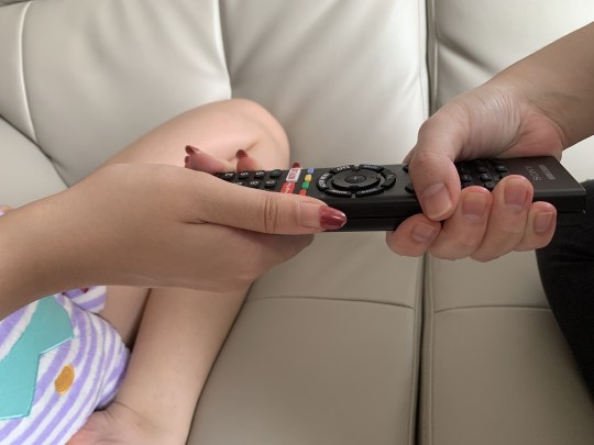
Fig.13: Shot 5 of the remote that did not make the cut
In Fig.13, this was meant to be for the 5th shot and I personally thought was not suitable. This is because according to the rule of thirds the remote is off centre and towards the centre right of the photo which is very uneasy on the eyes and puts the remote not as the focus of the photo as in the left third, Layla’s leg is showing which brings in a lot of elements and the viewer would not be sure as to what to focus on if this image was presented instead of the final one that’s being shown.
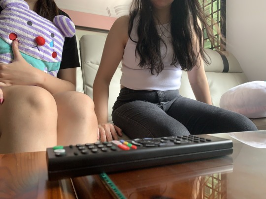
Fig.14: Attempted CU of the remote
For this shot, I wanted it to be used for the 3rd photo where the remote is in focus which was why I attempted to try for a CU shot. Even though the remote is placed in the foreground of the photo, it is not as sharp as the people in the background. As our eyes are naturally more drawn to the object that stands out, the remote in the foreground which is not in focus would lead audiences to think that the focus is the person in the background when that is not the case. Hence, this shot was a complete fail and did not make the storyboard for its shot size and depth of field.
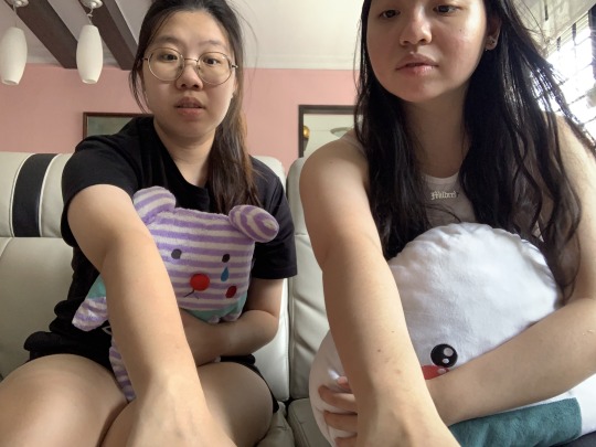
Fig.15: Attempted Shot 4 (reaching for the remote scene)
This shot though emphasising the point that I was trying to make about the 2 girls going for the remote at the exact same time is very uncomfortable to look at as there is no headroom for the girls and even cuts out some of the features of the girl on the right. Therefore, this does not make for a good scene as there is no room for your subject to breathe (cropped head) and the framing is just very awkward and aesthetically unpleasant.
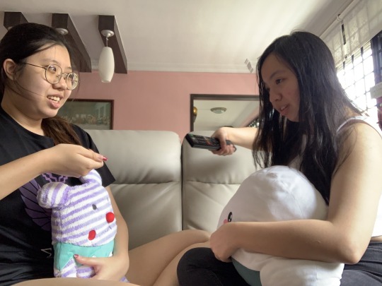
Fig.16: Attempted Shot 8 (duelling for the remote)
This shot was one of the many outtakes that did not make the cut as it was very obvious that Isabella has already gotten hold of the remote. Hence, this was a fail on the misc-en-scene and character behaviour where Shot 8 was meant to be the 2 girls struggling for the remote. A challenge while shooting this shot was actually getting the timing right as we needed to time it perfectly so that it showed the struggle of the 2 girls grappling to see who gets hold of the remote. Therefore, to overcome this obstacle, I decided to film us doing the action instead and then revisiting a few frames to get the shot that I needed so that it was timed perfectly which is being shown in the final submission.
Critiques and Edits
During the critique session earlier, I breathed a sigh of relief when I found out I did not have to reshoot any of the scenes and that my narrative was easy to comprehend (thank you film school for making me a film school brat) i.e. Shot 1 of the TV was good at establishing the setting and the rest of the events to follow. However, I do realise that I could have experimented with the angles a little more if I did have a tripod but I made do at my friend’s apartment.
Hence the main feedback I got was to work on the formatting of the storyboard. For example, I should not include the captions that I had previously as this is meant to be a photographic storytelling not a storyboard that I was used to in film classes and to also put the shots that I had into 1 page so that it was easier to see the flow.
Final Versions
After listening to the critiques, I made the adjustments accordingly so that my photos and sketches in my InDesign layout (refer to Page 3-5) are put in the 3,3,3 format. I have also removed the text from the bottom and decided to feature it in the blogpost instead. I have also added in the pre-curated images that did not make the final cut.

Fig.17: InDesign layout
Overall, this assignment really tested my creativity and allowed me to incorporate some of the film conventions I already know and put it into modern day context. This was a fun assignment that I got to do with friends as I felt that it made the story more realistic and it is a first world problem that we face today as well.
1 note
·
View note
Photo

09/Assignment 3 Information Design
For this assignment, we had to create an infographic based on a set of data. I had chosen to do an infographic of capybaras as they are one of my favourite animals. Before starting to design my infographic, I went online to look at what other animal infographics looked like to get some inspiration. I wanted to know what information was introduced by an infographic beyond basic facts such as an animal’s height and weight. A particular infographic that inspired me was one on polar bears where at the end they had shown polar bears in pop culture. I found this very cute and thus wanted to apply it in my own infographic as well (link).

Process
I knew that I wanted to have a big capybara in the centre of the infographic with certain features highlighted and elaborated on. For the main capybara I had two birds sitting on it as other animals like to hang around or ride on capybaras, making them known as nature’s ottoman. I wanted to put some basic information at the side of this main capybara to show their scientific name, height, weight and diet. To show this list, I was inspired by a pokedex and how it lists out information. I had also added other information on their diet, reproductive cycle and their native land with drawings above it to make it more interesting. Lastly, I had a section on how capybaras had become one of Japan’s internet superstars.


After having a rough guideline on what I wanted to show in the infographic, I went to find images which I could either use or trace and edit. In the end, most of the photos were traced using the pen tool since I could edit them as I wish. For example, to create the icon for location, I had traced an image but had edited it to have more trees. I used the tree I had traced and just scaled, reflected or changed the colour of the leaves to create an image of a densely packed forest with a stream running through it. Also, by tracing the image I was able to have a more consistent art style since I could decide on the amount of details shown.

Next, I had positioned all the elements into something similar to what I had sketched into a mockup page. From there I added all the text and descriptions that I wanted to convey and tried to organise them. I also added a description of capybaras that was essentially a summary of my infographic to make it more similar to a pokedex, where there would be a description beneath the table of data. This was a very rough draft of what I wanted to show, and I left it as a black and white work as I just wanted to play with the positioning of all these images. I had shifted the main capybara to the left of the infographic rather than leaving it in the centre as there would be less blank space created. Also, it leaves me more space for the text in later sections.

Lastly, to create the actual infographic for critique, I created another artboard and finally added colour. Since capybaras are cute and brown, I wanted to go with soft, light pastel colours that go well with brown and thus chose yellow as a background. I did not want any of the images to be too glaring, so I used lighter colours and a light grey to circle these images. To colour the images, I used the dropper tool to pick out colours from the original image and if the colour was too bright, I would go to ‘tints’ and choose a similar colour that would better fit the poster.

Throughout this entire process I found that I was important that I was organised in my layers and groups since there are a lot of elements in this infographic. If I were not organised, I would always select too many objects which I do not want to select and it becomes very difficult to lock objects when they are in different layers and each part is in a different group. This is especially so when I want to scale and move object since I would often move most of the image but lose some of the parts.

Critique
In the critique, there were two main problems which were highlighted. Firstly, there was a space at the top right corner next to the title and secondly, the font in the text was not very suitable as it is too faint. To resolve the first issue, I had shifted the main capybara to the right and moved it up slightly so that the blank space is used. I moved and scaled down the data table that is beside the main capybara so that I could accommodate the space the circles and description text used. One issue I had faced was the margins around the infographic, if the capybara was too high, there is very little space for some of the text, but too low and the blank space would still be there. Thus, I had to go through quite a few adjustments and scaling before I managed the final work.
The second issue was much harder to resolve as I had a lot of problems with font, even when I was doing up the infographic for the critique. Initially I used Gill Sans for the title and Courier New for the descriptions to have a serif and a sans-serif font. However, Courier New was too faint as the strokes are very thin, combined with the fact that I had used a rather small font size, the descriptions in the infographic are not easily read. After playing around with many fonts and researching on which font goes with Gill Sans, I ended up with Minion Variable Concept as it is still a serif font, but its strokes are slightly thicker, improving the readability of the infographic.
3 notes
·
View notes
Text
Assignment 3 Commentary

This assignment involves creating an infographic and I stumbled upon the above red panda meme a few days ago. I also knew they were endangered, and this led me to my topic of interest. I wanted to tell readers more about the red panda as they’re often confused with the giant panda while at the same time raise awareness about their current alarming status.
Colour Scheme

Since my topic was red pandas, the chosen palette consists of 5 warm hues – red, orange, brown, green and white – which reflect the various shadings tones of a red panda’s fur and their main food, bamboo. Brown and green also represent nature and the earth, which is apt for this infographic.
Typography
Red pandas are playful and adorable, but the purpose of my infographic was also to raise awareness. Hence, I sought a balance between fun and seriousness when choosing typefaces.
A simple bold Sans-Serif typeface (Fonseca) was chosen for the heading and sub-headings as Sans-serif are more impactful and attention-grabbing as titles. To complement and contrast this, I chose a Serif typeface for the body text (Oranienbaum) since they are more readable in smaller sizes.
In terms of textual hierarchy, I generally used different font sizes, colours and boldness to create sensible contrasts, guide the reader and underscore key words.
Structure and Flow
Infographics are made to communicate large and complex chunks of information in a quick and logical way. Hence, I shortlisted 6 main categories that would be the most relevant to give a comprehensive idea of a red panda’s traits, their plight and what viewers can do to help.
I used grids in Adobe Illustrator to create equal margins and spacing between categories.
Following my prototype sketches, I started off with its profile and ended off with suggested actions to give the infographic an intuitive and easy-to-follow flow.
I also used the design principle of scales to divide and create focus points, giving a sense of the relationships between the topic and text.
I placed the title, single bamboo and red panda illustration at the top left corner and had the bamboos and fire at the bottom right corner. Since these are the heavier elements in the whole design, this creates an asymmetrical balance, making the design look more visually pleasing.
Drawing the visual elements
The Panda

I wanted to play with positive and negative space and make my panda look on the cuter side. Hence, I chose to do a cartoon/abstracted version of the panda and built it up by merging elemental shapes like circles and lines.
I first used the Pen Tool to trace out the outline of an actual red panda. With the outline as a guide, I traced out the stripes on its tail and other significant features like its legs and ears. Since the background colour is the main colour of its fur, I changed the settings from stroke to fill and coloured the other parts of its body in brown and darker red according to how an actual red panda is coloured.
I also added prominent red fur details on both sides of its face because being fluffy is one of the red panda’s distinguishing features. For this, I used the Pen Tool to create pointed shape and merged 3 of these together with the Pathfinder Tool. Then, I used the Anchor Point Tool to curve the inner portion in the shape of its face. Next, I duplicated it for the other side:

For details like the whiskers, I used the Rectangle Tool and pulled in the 4 edges to make rounded corners. Then I cut away the inner corner with the Cut Tool:

To create the white snout area, I started with a full ellipse shape using the Ellipse Tool and layered another 2 smaller ellipses on top of it. Then, I used Pathfinder’s Minus Front Tool:

For the white “eyebrow” area, I used the Ellipse Tool to start with a small ellipse and later used the Anchor Point Tool to pull and manipulate the shape to my liking.
Bamboos
I used the Rectangle Tool and pulled the 4 corners in again for rounded edges. Then, I added smaller rounded rectangles at regular intervals above this layer. Next, I used Pathfinder to merge these shapes together. I used a dark and light value of green for variety and depth. The bamboo leaves were created similarly.
Icons

For other icons like the acorn, paw print, mountains and fire, I mainly used the Rectangle and Circle Tool to create the base shapes before manipulating them by adding or subtracting from them using the Pathfinder and Cut Tool. Also, the Anchor Point Tool was used when irregular curves were needed (as seen above).
Others
So the design wouldn’t look too flat, I added drop shadows (Effect > Stylize > Drop Shadow) and adjusted the blur, x and y offset and opacity settings of the various elements until I was satisfied.
The intensity of the shadow was the most for the title and decreased gradually from the subtitles to the icons.
Before:

After:

Critique and Feedback
The main concern raised by my classmates was that the text was too small to read (especially the body text and the country names on the map). I realised this mostly due to the typeface chosen where its letters had naturally thin strokes. So, I changed the typeface to another serif (Literata Book) and used “Medium” instead of “Regular” style. For key words, I used the “Semibold” style. I also increased all font sizes by 1 pt.
Kai also suggested that I increase the opacity of the category boxes. Hence, I doubled the opacity of these boxes from 15% to 30%. I found that this helped create a greater contrast between the text and the background, further improving readability.
Overall, this assignment gave me a valuable insight into the huge effort that goes into creating infographics for the public. A designer must be meticulous and thoughtful in curating the information he/she wants to include to ensure they provide a sufficient understanding of the topic. The way in which these are presented must offer a natural and logical flow. Also, the choice of colours and typefaces can greatly influence the mood and message being conveyed.
0 notes
Text
Assignment 3 - Visualising Content
I decided on the topic of dying in Singapore as I realised many people did not know what happens when we die, and how funerals and rites are organised. Hence, my infographic was to be a guide for Singaporeans to find out what happens when death comes, and what they can do to prepare for the afterlife so they don’t stress their family members.
I prepared 4 main segments I wanted in my infographic - the procedures after death, the costs involved, the top causes of death and what people can do to prepare for the inevitable. This later proved a challenge for me as there are not many icons or images related to death and the procedures, and hence requiring me to watch various youtube videos on embalmment and funerals to create the ideal icons. From which, I created my first sketch:

From this, I received the following feedback:
the umbrellas did not fit in with the focus on Singapore funerals
other possible items: Tables & chairs, urns, white candles, flower petals falling
The colour scheme proposed should have an accent colour to make the infographic stand out
Thus, I implemented these changes in my first draft:

The feedback for this was:
utilise colour to emphasize rather than size
“21,282″ number was too large & awkward
Add numbers to the timeline
The flower wreath did not look like one, and the colours were too similar
use a nicer accent colour for the icons
reword the titles of the different segments
decrease space between title lines
change the title colors
I decided to remove the 21,282 stat as I felt it was not necessary, and decided to shift the content on the right up. From which, I moved the timeline out of the coffin, which I felt neatened the final product, and did not draw away from the coffin on the left. I also opted for a single accent colour - red, which stood out in contract with the muted browns I selected. I also used white as it represents death in some cultures in Singapore.
As for the icons, I decided to try to maintain a consistency so that the infographic did not look too random or sporadic by ensuring the same category of icons within a certain point had the same styke, like the man under “top causes of death” and “embalming”. I also kept the thickness of icons at 2pt to maintain consistency.

One thing I would’ve done differently would be to add flowers on the coffin, as the empty brown area at the bottom left feels rather empty, but at the same time, I feel that the emptiness is necessary as the infographic is rather filled on the top and right. This assignment definitely thought me about spacing and colors, and also kerning as I played around with these functions to neaten what would’ve been a mess, and also made it easier to read. Another mvp tool on illustrator would be the Pathfinder and Shape modes tools, which helped greatly in creating the off shapes for icons, especially the old man in the embalming icons.
0 notes
Text
NM3217 Assignment 2 Blog Post (Story Time)
For this assignment, we were tasked to create an engaging storyline via the use of effective visual storytelling techniques and principles. There were also certain constraints set such as a limited number of frames 6-9, no text in the images presented and minimal photo manipulation.
Upon looking at the assignment brief, I was initially uncertain as to what I wanted to do, so I decided to look at some of the past sample works by previous students of the module to garner some additional inspiration. I realised that there were 2 main routes that students took to creating their storylines. They either used themselves (and their friends/family) as characters for their storylines or used non-living objects such as plushies, toys, etc, to act in their storylines. For myself, I decided to follow the latter, by using inaminate objects to craft my storyline, primarily because I was afraid to appear on camera. This lead to the next step which was to come up with a plot for my storyline.
On Friday night, I was eating dinner and decided to tune in on a TV show that was airing “The Lord of The Rings: The Ring of Power”. The show was about elves and men fighting off a bunch orcs in the fictional land of Middle-earth. This compelled me to create a storyline based on fighting, where there were two opposing factions aiming to destroy one another. One side would be the “good guys” and the other side would be the “bad guys”. Basically, a story of Good versus Evil.
I decided to search through my old Lego pieces that I played with as a child and eventually dug up a Lego chess set that was previously purchased in Germany during one of my family holidays there.


I decided these were the perfect Lego pieces to use because they clearly showcased one faction against another. I chose to use only 3 characters for each faction because I did not want to overwhelm the audience with too many characters that will divert their attention away from the main characters which are the “King” and the “Wizard”. The King would serve as the protagonist of the storyline while the Wizard would serve as the antagonist.
I first drew up a sketch to serve as a rough guide as to how I wanted to capture my images and present the storyline to the audience. In some images, I drew dotted lines which served as grids to help provide a sense of how I wanted to position the different elements in my image. I also utilized arrow signs to show the direction of my camera and the angle of the shot. In addition, I had written several camera angles; front view, side view, over the shoulder, and top-down view in text to help guide my decision-making process during the photo-taking and selection. These systems helped me craft my scenes more easily and provided me with an initial look at my storyline without me even touching my camera yet.


I then proceeded to take photos using my phone camera, utilizing the sketch as a primary guide for the camera angles, direction and flow of my storyline. It is important to note that not all the scenes drawn in the initial sketch made it to the final product. For example, in scene 9, the image of the dead Wizard was rotated to become potrait instead of landscape because I felt it looked better and fitted the framing of the scenes. Many exploratory camera angles and images failed to make it into the final cut and are showcased at the end of my pdf submission.
I would like to state that during the sketching stage, I had not considered the proper organisation of my scenes. During the image compilation stage, I realised that the size and positioning of each frame in the final product also contributed to the storytelling visuals of my narrative. Having well-captured images was not enough, its presentation was significant as well. I decided that my storyline should be divided into 3 phases. The first phase represented by the first row, directly introduces the protagonist and the antagonist side by side, allowing the audience to compare the two and creating tension between the two opposing factions. For the second phase represented by the second and third row, it builds upon the previous phase by showcasing different angled shots that further enhance the anticipation of an eventual fight which is ultimately seen in scene 6. In the last phase represented by the last row, it zooms in onto the two main characters; the King and Wizard, which results in a 1-on-1 duel where the King emerges as the victor.

Post-critique, I received some valuable feedback that could help elevate my images. It was mentioned that for scene 4 and 5, the backgrounds were not suitable for the narrative and backgrounds were also an important element for visual storytelling. I wished I could include a Lego castle or wizard tower to bolster the narrative of the story. However, given my limited props/decor, I had to make do with using just the wall as a substitute for a white background.
For scene 4, I captured an image where the wizard was positioned slightly higher on the table compared to the original image. This made the Wizard seem even more menacing and posed as a greater threat that the King had to overcome.
For scene 5, I decided to use a different image whereby it is a back shot of the Wizard and his subordinates at a wide angle. Replicating the original image from scene 5 with a white background was too difficult given the short length of my table. Thus, I improvised and used a different image which to me, sufficiently conveys the intended nuances of the scene.
Lastly, the image for scene 3 was also changed because I felt that the new image taken at a low-angle shot, really demonstrated the tension between a stand-off between the two opposing factions.


0 notes
Text
NM3217: Final project commentary
While brainstorming for this assignment, I decided that I wanted my brand style guide to be an organic representation of my actual values and personality. So my first instinct was to decide on the color palette that I would be working with and using bold rich colors was the first thought that came to my mind. For the logo, I considered between options of my various interests - bonsai, Tetris, Magic the Gathering, beetles, and drawing. Ultimately, I decided to do focus on drawing because I feel it offers me the most flexibility in terms of color choice and also because of the therapeutic effect that drawing has on me.
As for the actual logo, I went with the character that I have always used to represent myself since I started drawing for fun during NS - a bald, smiling guy. It is something simple, lazy, yet personable. A logo that conveys the idea of not trying too hard. It reminds me of a simple and normal character that others can easily relate to.
While working on the logo, one of the biggest challenges was trying to strive for a balance between complexity and staying true to myself. While I didn't want to create something that would be considered low effort, I also really wanted to create something that I was passionate about and could foresee myself producing in real life. In the process of designing the logo, I experimented with various hand signs and found that the peace sign would create unbalance in the logo because it would have more strokes and significantly more complexity compared to the character's face. I thus settled on using a thumbs up icon.

This was my initial design for the business card. I wanted my logo to be on the same page as my contact information because I felt that that would be natural for most business cards. I also thought that the juxtaposition between a comical logo and a serious font would create for an interesting business card. On the reverse side, my first instinct was to share my YouTube account since it uniquely reflects my personality and is also related to the notion that I am a Communications undergraduate. I balanced out the image with simple graphics that fit the overall aesthetic of my brand.

For the resume, I made use of a clipping mask to create the desired shape for my headshot.

Practicality was the guiding principle that I employed whilst crafting the resume. This explains why my resume has so much text; I did not want the graphics to distract a reader from the text, which I felt should be the key focus in any resume. While I wanted my resume to bare some semblance with my business card, I found it very impractical to include my logo anywhere. So I retained as many of the colors from my business card as I could, and used a cream colored background in the earlier rendition of my resume.
I felt that the co-curricular, skills, and languages sections were the most apt for me to represent using illustrations. For skills, I initially toyed with the idea of making a curving rainbow to show my aptitude in various tools. I unfortunately scraped this idea because it was too similar to the circle in my headshot.

This was the first draft of my resume. Each of the Adobe skills was placed in a yellow square because I wanted there to be a combination of all the colors from my color palette. Yellow is also a complementary color with purple.

After working on the co-curriculars section, I changed the color of my portrait border to green since it is a color associated with correctness; I wanted employers to look at my resume and presume that I was the right candidate. Additionally, I also changed the text color of the Adobe acronyms to make them more distinguishable from one another.

I saw that the feedback from my tutor was that my resume looked a bit plain due to the lack of color. Cream was my initial choice of background color. But I felt as though this shade of cream was not very suitable for use in a resume. The color looks a bit dirty and seems to closely resemble that of yellowed paper. Having a cream background also made it more difficult to appreciate the individual colors used in the respective headers.
So I changed the background color of my resume to white and felt that it looked much more professional and clean. I also removed the yellow fill from the Adobe skills and found that they now looked much better.

The last thing I did was to fix the kerning in the text using the guiding line.

From the class feedback I received, I gathered that the obtrusively large YouTube logo made it look like I was a YouTube employee. I hence decided to take on Katherine's suggestion of moving my logo to the reverse page of my business card and making my YouTube logo smaller. Sticking with the theme of bold rainbow colors, I colored 'Media' with 5 different colors. I felt that it was an apt word to do so. The resultant business card looked a bit too bland on the right half of it, so I added a yellow triangle, remaining in line with the idea of simplicity. Yellow was chosen because it was the color closest to cream from my color palette; I think the colors go rather nicely together as well. I moved the illustration of the sun to the back of the business card.

Taking feedback from my tutor that the bottom half of my resume looked too heavy into consideration, I removed the cream color from the XiangQi and Funkstyles logos, and made all 3 logos white.

Finally, InDesign was useful for fixing alignment issues and ensuring that my product was ready for print.

0 notes
Text
NM3217 Assignment 2
The task for assignment 2 was to tell a story using 6-9 photographs, and I decided to work on a simple and direct storyline, with a single main character. Originally, I considered having a plot twist inside my storyline, but I felt that the 9 photo constraint would make it difficult.
For this assignment, I initially drew a slightly different storyboard for a different situation. As there was a one week due date, I intended to complete it during backstage preparation for my production. However, after reviewing the picutres, I felt that the lightings and angles of the photographs were poor, and facial expression execution of my friend was relatively awkward.

Hence, I decided to redo the assignment, using my hall room as a setting. For this, I had to change the storyboard, so that it was feasible within the room.
Storyboard process
Making the storyboard, I realised that I lacked in artistic skills to draw. Hence, I decided to draw the main character as a stickman, as it was simple enough to understand. Likewise, I decided to convey the ideas and story flow through simple drawings and icons.
I would like to elaborate on a few frames in my storyboard. I wanted to use the storyboard to set the direction of how I should take the photographs for each frame, and attempted to draw the angles within each frame of the storyboard. In the first frame, I showed the angle of the photograph, by drawing the back of the head of the main character, to illustrate a back view and over the shoulder shot.

The captions above each frame was short but effectively explains what is happening in the scene. To illustrate that the main character was studying, I decided to draw a book icon, which is heavily associated with studying.
In the second frame, I found it challenging to illustrate hunger. As such, I decided to sketch out squiggly lines to illustrate the feeling of hunger at the stomach area, and short lines outside represented the sound of hunger. I felt that this illustration effectively expressed the idea of hunger, without the needing any words.

Lastly, frame 5 was also significant, as I wanted to show a close up shot of the empty snack bag. I intended to achieve this shot from a top down view, and extreme close up shot, but I struggled with sketching how the inside of an empty snack bag, so I took reference from online, to draw the angle that I intended to shoot.

Overall, the storyboarding process was enjoyable and very useful for me to take photographs for each frame later on. I closely referred to the storyboard, especially for the angles I wanted to work with.
Taking/selecting photographs:
After the storyboarding process, I went ahead to take photographs for my visual storytelling. For each frame, I went ahead and took photographs from multiple angles, apart from those that I drew in my storyboard, as I felt that there might be better shots from angles that I did not consider previously.
After taking the photographs, I had some difficulty choosing between photographs for certain frames. In particular was the third frame, which displayed the snacks.
The first picture was from a lower angle, with the popcorn snack in greater view, while the second picture was from a higher angle, where the other snacks were also seen relatively clearly. However, I eventually chose to use the picture with the lower angle, for 2 main reasons:
At a lower angle, the focus is nicely placed on the bag of popcorn, with the popcorn illustration on the back nicely in view. This emphasises the popcorn, which the main character goes on to eat in the next frame. As compared to the picture of higher angle, there is lesser focus on the other irrelevant snacks, and the words on the packagings. Considering the rule of thirds, the first image was more suitable to show a balance of the popcorn with the background.
The background for the picture with a lower angle was the white wall with flowers. This was more aesthetically pleasing and less distracting compared to the second picture from a higher angle, where the black computer in the background seemed to disrupt the aesthetics of the picture, and felt like an eyesore.
Here are the two pictures together for comparison:

Another pair of pictures that I struggled between choosing was for frame 4, where the main character eats the popcorn from the bag. The picture I eventually settled for showed the main character eating popcorn from left view, with the popcorn illustration of the snack clearly visible. The other picture, was from right view, at a slightly lower angle. In this picture however, the popcorn was actually visible from inside the bag.
The main reason why I decided to use the left view picture, was because:
The right view picture was too similar to the angle in frame 1, like an over the shoulder angle shot. I was heavily constraint by the size and layout of my hall room, and angles were limited. I did not want to overlap angles, and the only way to do so was to have pictures from different sides and varying between higher and lower height angle.
The table also appeared to be quite messy, with the snacks and flowers in the background, as compared to the bed in the other photograph.
If I could edit the image I used, I would have it such that the popcorn was visible from the bag. Sadly, we had finished the entire bag of popcorn and I could not redo the scene. Here are the two pictures from different sides:

There is one last image that I would like to talk about in particular, which was a very nice image of the popcorn bowl. I decided to pour all the popcorn into a bowl to take a photograph, and it turned out really nice with vibrant colours and contrast, as well as a very nice focus emphasis on the bowl of popcorn, and the show playing in the background on the computer screen.
This picture would have been very nice, and I considered to put it in for the visual storytelling, but after some contemplation decided against it, because it did not flow with the story line. It would be more feasible for the main character to be upset if there were no more popcorn in the bag as compared to a bowl, as the bag is not as visible, so I decided to stick to the original storyboard and story line. However, I still wanted to include it as it was a good idea for an alternative storyline! Here is the picture:

Critique session
For the critique session, I was unfortunately unable to receive any feedback, as my classmates felt like the storyline was simple and direct. Hence, I did not make any major changes, except for changing the layout of the page. The original layout was vertical, but I felt like the stacking image of the snacks and the empty bag was not very aesthetically pleasing.

Changing to a horizontal layout, I felt like the photographs flowed better, and it was more comfortable to see, with the food more spread out.

Self reflection and conclusion:
Overall, I really enjoyed this assignment, doing a storytelling through minimal scenes. I had a great time shooting the photographs as well, as I considered how to best angle each shot.
I particularly liked the last image, which was a reaction shot, highlighting the main character's feelings towards finishing the popcorn. I felt that the facial expression and top down angle managed to capture the emotions very well.
Based on the assignment requirements, it mentioned not to edit the photographs. Hence, I decided not to manipulate the pictures in any way, and kept them to their original colours. However, I personally would have preferred if frames 3, 4, and 5 were darker, as it would better suit the colour theme of the story. Due to the room light placed on the left, the photographs taken from the left turned out brighter than that of the left, which made the photographs less aesthetically pleasing.
Apart from the difference in colour tones, the rest of the photographs are to my satisfaction, as I experimented with multiple angles per shot, and I chose the most suitable photographs for the final story.
1 note
·
View note
Text
NM3217 Assignment 2: Storyboard
My take on the brief:
I decided to take inspiration from events that conspired in my own life a few weeks ago - I accidentally injured myself while walking in FASS. As getting injured usually happens in a fraction of a second, seeing that in a storyboard format for this assignment in my mind was definitely an interesting insight. I tried to visualize it from an artist’s perspective by zooming in and focusing on each scene as if it were happening in slo-mo… and of course, the relatability helped!
My story is about the protagonist getting ready for a new day. As she moves on with her daily routine, an event happens that hinders the flow that she had going on for her. The frustration she feels in the moment leads her to think of an “if-only” moment defeatedly, whereby she is happily sleeping, all cozied up in her bed. Such small, frustrating events happen to everyone at some point, and the relatability of sitting down in that frustration thinking about how you could’ve begun your day differently or stayed in your little oasis of comfort is what I was trying to capture, especially in the last few scenes. Having the kind of moment that might've ruined your entire day especially just as your day has begun leads us away from the “hustle and bustle” and productive mindset to simply think about the side of us that just needs/wants to take a break, which is a shared human experience!
While shooting these scenes, I realized how important it is to be able to emote with such strong conviction regardless of the format of art that you are adhering to - whether it is through sketch, acting, or any other medium. One of the keywords that I keep referring back to all through lessons taught by my instructors and professors, especially in the field of art and design is intentionality. Intentionality is a word I have constantly been reminded of, especially while I was learning storytelling basics. Through each choice I make while telling a story, I strive to answer the purpose it serves and how it can add to the plot or drive it further. For instance, setting up the camera angle a certain way, mise-en-scene, and the colors and props being depicted in it, all add to the story or subtract from it immensely.
As this assignment was truly a one-man show, or one-woman show rather, these concepts were quite challenging to master, in all honesty. Having a vision of how you want your story to unfold vs directing yourself as an actor to provide these results that you have in your mind was definitely more difficult to achieve than I thought it would be. I tried my level best with the affordances I had - I used a self-timer to take most of my pictures and set them up on various ledges near the staircase (praying every passing second that my phone wouldn't fall).
Rationale and thought process for shot sequence:
A lot of the pictures I shot are from either side so as to make it appear more natural and simply give us an onlooker’s insight into the protagonists' life instead of an atmosphere of that of a documentary following a celebrity around with the camera facing them straight. I also attempted to play around with shot sizes but eventually came to the opinion that medium shots and close-ups were able to give me more of the personal vibe that I was going for.
Another shot that was especially tricky to master was picture no. 5, as I had to make it look realistic enough to seem as if the protagonist was about to trip while looking out for my own safety (and sanity) by making sure I did not injure myself for the third time this month.
Critique and changes post-critique:
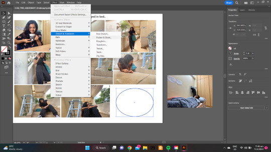
One of the suggestions I received was to flip picture no. 8 so as to make the transition between pictures no.8 and 9 more seamless and also to achieve the impression that the final picture was trying to attain - which is the protagonist thinking back to her previous happy experience. I also received a suggestion to create a thought bubble and insert the picture inside, so as to help solidify that my intent is that the protagonist is thinking about a past time.
As I thought these were helpful suggestions, I tried to implement them to the best of my ability. The suggestion that was most difficult to implement and one that I had to truly grapple with was trying to superimpose the final picture on an irregular shape; the thought bubble. I created the thought bubble by using the ellipse tool, creating anchor points with the pen tool, and then utilizing the Pucker and Bloat function in Effects.
The font that I finalized for the title was Bradley Hand ITC, as it seemed informal enough to make it casual and yet be personalized enough to appeal to the overall ambiance that the story was trying to convey. I also chose to keep the pictures as close as possible to make them look as seamless as possible.
Overall, sketching out my ideas really helped to plan and visualize my shot sequence. If ever I get the chance to do a similar assignment in the future, one thing I’d take note of would be to not shy away from experimenting from all possible scenarios and settings I can think of this would give me more leeway to truly hone in on the best-of-the-best shots!
0 notes
Text
the rundown on eurovision
assignment 3, 141021

For this assignment, I chose to do an infographic on Adobe Illustrator on one of the things that mean the most to me: an annual song contest held on an entirely different continent that's resulted in the likes of Céline Dion and ABBA garnering massive fame. That, my friends, is the Eurovision Song Contest.
Information Breakdown and Organisation
Info-wise, I aimed for this to be a quick rundown of the basic information that someone might need before watching the contest, especially if they are entirely new to it. Certain key associations need to be made, namely:
1) How much impact has Eurovision had on a global audience
2) What are the most famous artists of recently and yesteryear
3) What are the crucial "need-to-knows" before diving right in
It is with these three key associations that I've sectioned off the infographic, ultimately giving each of them the appropriate amount of space that is needed to present these information in a graphic-driven, easy-to-digest manner. These, along with the main title and body copy, are arranged neatly in a way that flows from one section to another, with no sectional overlaps.
Typography and Visual Hierarchy
To accompany the relatively modern feel of the contest today, I have chosen to rely on sans-serif fonts (Bio Sans and Lato), and played with various font weights and sizes in order to achieve visual hierarchy. While this is present throughout each of the sections, it is most evident in the "By The Numbers" section—the incorporation of a variety of font weights and sizes makes for each statistic to stand out on its own whilst providing crucial information.
Art Style and Execution
Building up on the previous Assignment 1 on abstraction, I have chosen to do a similar approach when it comes to presenting real-life elements, such as the map of Europe (and Australia) as well as the figures of certain famous winners. Each of these are shapes that were painstakingly created using the pen tool, and filled in with colours that matched certain reference pictures. The same techniques were also applied to create the icons in the "Five Fast Facts" section. To assist me on this, I've made use of multiple artboards to create these images in a larger scale before finally arranging them on their set positions in the latest prototype.
Responses from Critique
Presenting various numerical facts in the "By The Numbers" section was initially quite tricky, and a rearrangement had to be done for the final prototype submission. The usage of Illustrator's align tools, coupled with the 'Create Outline' tool, helped greatly in this aspect. Furthermore, I have also introduced an interactive element through the form of scannable Spotify codes, allowing readers to listen to the music that has won the song contest in the "Notable Winners" section.
0 notes
Photo

I am a fan of Apple deisgn, so I took this classic iPod Gen7 for an example with abstration. At the early stages, I tried to replicate more details on the player screen. However, the design of iPod is so widely known that the public could still recognise it even if it was highly abstracted. The circular command key is the best symbol of the classical iPod.
This is the critique piece of NM3217 assignment 1 - abstraction.
1 note
·
View note
Last Seen Blogs

jisoofilm
𝒽𝑒𝒶𝓋𝑒𝓃

hautecuisinecatering
Haute Cuisine Catering

unknowingtheknown
Time Traveler 203895
jisoofilm
𝒽𝑒𝒶𝓋𝑒𝓃