
Don't wanna be here? Send us removal request.
Statistics
We looked inside some of the posts by jaslynnsblog and here's what we found interesting.
Average Info
Notes Per Post
1
Likes Per Post
0
Reblog Per Post
1
Reply Per Post
0
Time Between Posts
4 days ago
Number of Posts By Type
Text
11
Last Seen Tumblr Blogs


Fun Fact
Forty percent of Tumblr users are between the ages of 18 to 25.
Text
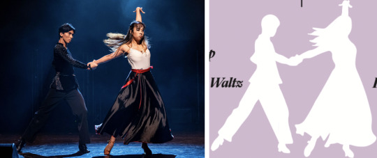
NM3217 Final Project
Creating a brand identity, I decided to look into what represented me the most that set me aside from other people. Like many others, I am a dancer, but I specialise in a relatively niche form of dance, namely Latin dance. This is unique from the various genres that most dancers specialise in. Having dedicated a huge portion of my life and year to Latin dance through competitions and in NUS CCA, I felt that it was representative of my self-identity, which I wanted to convey to those who viewed my brand.
Theme Latin dance is considered a distinctive and intricate form of dance, and gained popularity for its elegance and luxuriousness.The elegant and expressive moments of latin dance create a mesmerising spectacle that is both sophisticated and sensual, and latin dance is commonly associated with high-end events and sophisticated venues. Hence, the theme of my brand style and logo is elegance, which corresponds to my identity, shaped by latin dance.
Aligning to my idea of a sleek design for my logo, I wanted to have my brand style guide simple, neat, and clean. Hence, I did not include any explanatory or excessive text within my brand style guide.
Logo creation In my logo creation process, I used my name as a base. Initially during my sketching process, I had decided to use both my initials to create a logo for myself. During the sharing session, I showcased 3 different types of logo that I had created. Here are the logos:

The main idea was to combine my initials in one way or another, to form a logo that was aesthetically pleasing to look at. As such, I eliminated the first logo, and focused on developing the 2 remaining logos.
However, after greater consideration of my brand identity, I decide to change the logo. Instead of using both my initials, I decided to only use initial J from my name, Jaslynn. This was a letterform type of logo, which expresses my passion and love for Latin dance. Using the J, I used adobe illustrator to draw out many versions, trying to incorporate latin dance elements. Eventually, I came up with the logo:

Variations of logo: For my logo, the colour I utilised is gold, to show a nice contrast against the black background. Hence, my name card is black in colour, and the gold is elegant and eye catching. However, during the critique, I received many feedback for me to add another variation of my logo, when considering light backgrounds or gold backgrounds. Hence, I added the white version of the logo, which will be used when the background is greatly similar to the gold, as the logo needs to stand out against the background. Here is how the logo will look like on different backgrounds.

Namecard I decided to have 2 versions of name cards, using the 2 versions of my logo switched from front and back. Initially, for the second version - Portrait J logo in front, I had considered another way of displaying my information for the back of the name card, with the logo in the middle of my details, but eventually decided against it. Here are the 2 variations I had initially for version 2.

Colour palette & scheme:
Original colour palette: I originally intended to use the colour black, red, and magenta. This is because my cca often incorporates these colours into our performances, and I had chosen these costumes for my items. Here is my original moodboard created with these colours. I had also looked for suitable colours. I was satisfied with this because black and red were contrasting, and magenta was analogous with red. They also conveyed a sense of passion and power. Hence, I wanted to work around with these colours.

However, when applying the colours to my brand guide, the contrast of red against black was relatively jarring. Furthermore, in the chinese culture context, writing ones name in red was negative, despite its usual positive connotation. Names in red suggested that one was sentenced to death, or are dead. Hence, I decided to change the colour scheme.

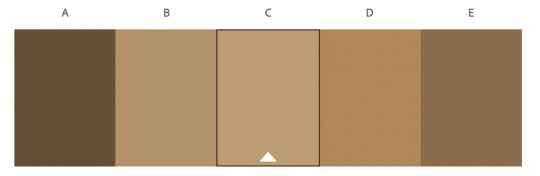
Final colour palette The colour palette I decided to go with was black and gold, to align with the theme. Black is a neutral colour, representing prestige, sophistication, and seduction . Gold communicates an idea of elegance, elite, and idealism. Furthermore, both black and gold symbolises prestige and luxury, and all their representative meanings parallels to the theme of my brand. Additionally, these are the colours associate with my latin dance cca, so I felt that it was more personal.
Black was the dominant and main colour, and gold was an accent colour. For text within my style guide, I used white, which represents simplicity and cleanliness, to give details of my work. I worked to find black and gold colour palettes, and finally decided to use a gold colour #9a8020. Using a colour contrast checker, I ensured that it contrasted nicely against a black background.

Initially, I used #000000 and #FFFFFF for the black and white colours, but I received feedback from the critique to avoid using pure white or black. Hence, I eventually changed the colour codes to #010203 and #FBFCFB, such that it still suits my aesthetics in a subtle way. Initially, I thought that there would be no difference, but after converting half of my brand style guide and exporting as PDF, I realised the difference in colour was actually significant, especially the black turned out to be much richer.
To use my colours, I created new swatches using their CMYK values in InDesign, and renamed them accordingly.

Typography For the typography, I decided to use Gimlet Family, and Neurotica typeface. For Gimlet Family, I specifically used Gimlet Display Medium Italic for my headers, and Gimlet Text Italic for my subheaders. Neurotica was used for all body text, like resume information and contact details. I chose these two typeface as Gimlet Family were sans text, while Neurotic were sans-serif, and it gave a nice contrast for greater readability of the content in my resume and name card.
Document setup I created my brand style guide using InDesign, by rotating the A4 sized to horizontal, and using specific margins - 3p0, 4p6, 4p6, 4p6, as learnt in tutorial. I ensured that all my content for my brand style guide remained within the margins, to frame the type area and avoid any content being lost.

The background was created by drawing a rectangle that corresponded to the A4 size, and filled with the selected black colour. I then locked the rectangle to avoid any unnecessary edits.

Resume For my resume, I chose to create a portrait resume, that was similar to traditional resumes. I added my logo to the top right of my resume, to highlight my brand. The icons used for my contact details, website, education, and work experience were drawn in Adobe Illustrator, and copy pasted into InDesign.
Feedback received from critique:
1. My work experience icon - business bag, appeared to be compressed as compared to the icon for education. I re-adjusted the icon so that they were the same size, and there would be no distractions from size.
2. I should add in my actual job experiences instead of placeholders so that I have a clearer view of how much space I needed. I found that this feedback was very helpful, because I attempted adding in my work experience and relevant details and realised that I needed much more space. To combat this, I removed relatively unnecessary details - > A level education, decreased font size, and adjusted the remaining body text closer to the margins. This way, I could fit in the necessary details.
3. I lack any explanations or elaboration regarding dance, and there was no longer any link to the dance shoes that was my logo. This feedback was also very effective, as I realised that I needed to highlight how dance was related to my identity. Hence, I added in my relevant dance details to my resume, to show my passion for dance. Furthermore, the website link directly brings viewers to my dance blog page.
4. I should standardise my proficiency levels for skills and language. In addition, skills (in stars) are usually placed horizontally instead of vertically. I originally placed the stars vertically as I did not want the stars to exceed the margins, which it definitely would if positioned vertically. I intended to create bar-styled proficiency levels for my adobe platforms, but I did not know how to. After the critique, I slowly worked my way around and now have a relatively standardised presentation of my language and skill proficiency.

To create the proficiency levels, I used the rounded rectangle tool in Adobe Illustrator to draw a size I liked, and imported it into InDesign with white stroke and gold fill. From there, I duplicated the rectangle with a black fill. Lastly, I added black rectangles to highlight my proficiency levels in each software.
5. For my contact details, I should not used italics as it may reduce readability, and those are important details. I acknowledged this and changed to Neurotica, making the text much clearer and easier to read.
Here is my resume before and after for comparison

Extra feedback received: I also received feedback that I should add more colours, like magenta, which matched well with my style, as well as my dance genres. However, I wanted to keep my resume simplistic, elegant, and neat like the rest of my style guide, so I did not add any additional colours.
Overall, this assignment was quite fun, as I got to apply my skills learnt in the various adobe softwares to create my own individual band style guide, which can also be used as my portfolio.
P.s: Images are compromised because I first did my blog draft on google docs
0 notes
Text
In-Lecture Exercise D
I decided to take pictures of a human, as I could incorporate some emotions into my pictures. Here are the 5 shots I took
1. Low angle shot

This image was taken by placing the subject on the upper right portion of the picture, and taken from a lower angle. The low angle also highlights the broadness of the subject’s shoulders, and helps place the subject as a more dominant role, alongside looking downwards with a disapproving face. It places the audience as inferior to the subject.
2. High angle shot

This image was taken by standing on a higher level and taking downwards to capture the subject. The high angle coupled with facial expressions makes the subject look smaller and more vulnerable. In addition, I placed greater focus on the subject’s head, so the head appeared bigger than in normal body proportions, so that the subject gives of a pure and somewhat helpless feeling.
3. Eye level shot

For this, I used the rule of thirds, using the grids that I enabled for my camera. I placed the subject on the left portion to capture immediate attention, as our eyes tend to see things from left to right.
4. Close up shot

For this shot, I placed the subject against a plain background, and focused the camera on the eyes, which I wanted to capture most. The eyes are also placed at the upper left portion of the image, following the rule of thirds. I manually focused the picture on the eyes, hence the close up shot shows great emphasis on that portion, and blurs out the nose and the background.
And finally, some shots that I took that were deemed failures:

This was my original take for the low angle photo, as I intended to highlight dominance through having a large figure. I took this photo from the floor, but it turned out bad as the subject’s face could barely be seen.

This was intended to be a birds eye view shot, using the 0.5x lens and taken from a very high angle. I intentionally placed the fan within shot as well to capture the distance from the subject. However, the final execution was poor, and appears to place focus on the fan instead. Furthermore, the room is very messy after a day of studying, so the setting is very distracting and draws away the attention from the subject.

This was one of the close up shot angle that I attempted, and I honestly think it is not bad. However, I lack proper explanation of what is being captured here, so I deemed it as a failure.
Overall, this exercise was fun as I got to play with different angles and try to frame my subject differently and convey different messages in each picture.
0 notes
Text
In-Lecture Exercise B

I decided to apply the constructive criticism model on this image that I found on the internet, which caught my attention immediately upon a glance.
Description: In this image, this is a bold header, which attempts to promote Grapefruit as a healthy fruit to accompany each meal. This is seen from the Header of a large size ‘GRAPEFRUIT’, with serif fonts and capitalised well. Below it is a sub-text, of a smaller size, stating ‘Good for every meal’, suggesting that grapefruits are good to accompany each meal. Following it at the bottom is the rest of the article.
Analysis: In this design, there is an attempt to use art elements with typography. The G of Grapefruit is replaced with an actual slice of grapefruit, which imitates the shape of the letter G. This draws a close relationship between the fruit and the words, as the shape of the fruit is representative of the letter itself.
Interpretation: The designer is attempting to draw a direct relationship between the image of the grapefruit, and the text grapefruit. This would enhance the header text, as it immediately brings to mind what a grapefruit is and how it would look like. It is also creative in trying to incorporate the image of the fruit into the header and text.
Judgements: Success - I understood the intentions of the designer, in creating an eye-catching, memorable, and interesting header text to emphasise the benefits of grapefruit.
Shortcomings - Instead of appearing as ‘Grapefruit’ with the G replaced with a slice of grapefruit, the audience are first drawn to the header text, which now reads ‘RAPEFRUIT’ instead. This is eyecatching, as the word ‘rape’ draws in attention, and coupled with fruit, could be both humorous or offensive to the audience.
In conclusion, the design is creative and attempts to integrate the element of grapefruit image into the text. However, the execution could be improved, with possible modifications to the shape of the grapefruit image, and spacing from the remaining text.
0 notes
Text
In-Lecture Exercise E

The typographic representation is very hard to read. The typeface is suitable for the header, as it draws audience attention with its size and typeface. However, the same typeface applied to the entire body text is relatively distasteful. All body text are capitalised, and the typeface utilised appears as an outline of each letter. This makes the body text quite jarring and complex, and overall unpleasant on the eyes. Likewise, the alignment of the text is quite difficult to read.
To improve this typographic representation, I would:
1. Change the typeface. The typeface utilised is suitable to be used for the heading, but not for the body text. It creates an uncomfortable and unreadable body text with its full capitalisation, and outline of each letter. Instead, I would change the body text to the font ‘Helvetica’, which is a sans-serif type that contrasts against the header typeface, which is a serif type.
2. Remove the capitalisations. The capital words make the body text pop out and unpleasant to read. They should be decapitalised, with non-capitalised text reaching the x-height.
3. Change the alignment of body text. The body text is central-aligned. However, this is very difficult for the audience to read. Hence, I would change the body text to be aligned to the left, with a left hard edge, which can be used as a reference point when reading the sentences. Using a justified alignment would also be possible, depending on the text, as I would want to avoid issues of readability due to spaces between words.
0 notes
Text
In-Lecture Exercise G

For the pattern I created, I created a two dimensional shape using lines, that form an enclosed space. The shapes are constant, and hence forms a pattern as it increases over time. The darkening of the pattern is created by repeated shapes in the same area.
ps: not sure why the image is very blur when I upload it
0 notes
Text
In-Lecture Exercise F
After reading the brief for the in-lecture assignment, I decided that I wanted to take a photo of something colourful, so that I could easily create a colour scheme. I saw a great opportunity at a balloon exhibit, and snapped this picture.

From the picture, I picked out 5 hues.
Hue 1: D9AA8F

The neutral tone colour conveys a mood of simplicity, comfort, and relaxation. The neutral aesthetic and tone works well with a large variety of colours, including primary colours.
Hue 2: D24576

The pink colour conveys a feeling that is child-like, and invokes a sense of playfulness. This is a secondary colour, and is a warm colour that grabs my attention in this picture.
Hue 3: BC2425

The red colour conveys a feeling of passion and excitement, and is an eye catching colour that caught my attention. In this picture, it contrasts against the darker and cooler colours behind it.
Hue 4: 501E07

This is a brown colour that formed the figures in the picture. The brown colour invoked a feeling of groundedness, calm and nature. It gives a sense of earthiness.
Hue 5: 0D0F0A

The black colour comes from the background of this picture, and heavily contrast against the brighter surrounding colours. It invokes a feeling of professionalism, neutrality, formality and classiness.

Overall, the colour scheme is comfortable to look at, with pink and red being analogous colours. The three neutral colours of beige, brown, and black also complements each other well.
ps: colours are less vivid after screenshotting the palette.
0 notes
Text
In-Lecture Exercise A

The device I sketched that I think will enhance my creativity is an extremely upgraded laptop. I am greatly involved in choreographing dances, and personally, what prompts my creativity and gets my brain rolling whenever I need to choreograph a new piece is a combination of three main things - music, lights, and dance videos (regardless of genre). Hence, in the device I sketched, I have incorporated all 3 aspects into one.
1. Laptop enhanced with LED lights
LED lights incorporated to laptop frames, keyboards, mouse, and extra features
Lights of different colours
Lights can be switched to any preferred colour for different moods
2. Speakers
Laptop has a built-in enhanced speaker.
Big, high quality speakers (as compared to traditional laptop speakers)
Higher sound quality
Enables personal preference settings (e.g. increase bass)
Attached beside the laptop screen
3. Additional screen
Slightly rounded screen
Added above the main screen
Display dance videos, constantly playing in the background
Can look up whenever inspiration is needed or bored, tired
4. Multi-function trackpad
Paired with laptop pen
Can slide fingers on trackpad (like traditional)
Can draw and write on trackpad → Appears on the screen
I believe that this device will be very useful in encouraging creativity in me, and aids in my creative flow and thought processes.
0 notes
Text
NM3217 In-Lecture Exercise C

The print ad is a heinz ketchup advertisement, featuring a bottle of Heinz ketchup. In the advertisement, the Heinz ketchup bottle appears to be made out of tomato slices, with various thickness, size, and positioning, to mimic the shape of the Heinz ketchup bottle. At the top, the cap is replaced with the rounded end of a tomato, with the green leaves attached.
In this advertisement, the signifier is the Heinz ketchup bottle, represented by a stack of tomato slices. The signified, which is the concept and meaning that the advertisement is trying to convey through using tomato slices to make up the Heinz ketchup bottle, is that the Heinz ketchup is made up of fresh ingredients, and real tomatoes of high quality. Furthermore, the green leaves at the top of the tomato exhibits the product’s quality by symbolising freshness, and adds a nutritional element to the Heinz ketchup.
Additionally, there is a caption “No one grows Ketchup like Heinz” at the bottom section of the advertisement, which prompts audience and consumers to view and perceive that Heinz ketchup is made authentically from tomatoes which they grow, and is non-artificial. The diction of ‘grow’ suggests the use of freshly grown natural ingredients used in their products, which is the tomato in this situation.
The advertisement has the red Heinz ketchup bottle (figure), placed on a red backdrop(ground). The negative space and shadows draws an emphasis on the Heinz ketchup bottle, attracting audience attention. The red background can be seen to symbolise the Heinz ketchup, maintaining audience focus on the main topic.
Further analysis of the advertisement also highlights the use of the fresh tomatoes in the advertisement to build the Heinz brand identity. The red tomato slices is a signifier of Heinz ketchup product, and it signifies that the product and very fresh, healthy, and authentic. This positions Heinz in a comparable advantage against other competitor brands, with consumers believing that the product is more natural and less commercialised, using real tomatoes. This is advantageous to Heinz as a brand and company, as current trends of healthy living would make consumers more incline to choose Heinz ketchup product. Such branding boosts Heinz loyalty returns from consumers.
0 notes
Text
NM3217 Assignment 3
For this assignment, we were tasked to do an infographic for a selected topic. I contemplated on what topic to work on, and eventually decided to make an infographic on basic information about international dancesport - standard dance and latin dance. The reason behind this is because I have dedicated my entire year 2 to my cca Viva LatiNUS, which is a latin dance cca, and I wanted to do an infographic to share more about this niche dance and its genres.
Drafts In each of my drafts, I designed the infographic using categorisation, with only 3 main sections in each infographic draft. The information was grouped according to their characteristics, and there was a clear hierarchy of information. I decided to go with 3 sections of information.
For the first and second drafts, I had intended to show the types of genres, heel height, and to draw out dance figures respectively. However, the infographic showed little information, and was not really educational. Hence, I decided to add in more information in the third and fourth draft.
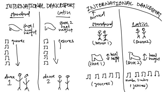
For the third draft, I considered adding 3 facts about latin dance that people should know, but eventually concluded against that because of issues of readability, having that the words would be quite small as there was a lot of information on the infographic already. In order to add in the facts, I would have to decrease the type size, leading, and line length, which would decrease visibility and legibility of the words, as the infographic is intended to be A4 sized. I also wanted to avoid having key facts in the foot margin area.
In the final draft, I intended to have a row of visual elements at the bottom, one for each genre. I tried it out using a drawing of tango that I had done, but the visuals were in the foot margin area, and made the infographic very cluttered and messy. Hence, I decided to remove it, and kept my final infographic to simply the main 3 sections of heel height, genres, and timeline of dance popularity.
I also considered adding a header ‘Genre’ in the final draft, but the header also made the infographic look messy. I decided against it as I felt that the visual element of a vinyl was self explanatory, and after discussing with other students in class, I decided to remove the header.
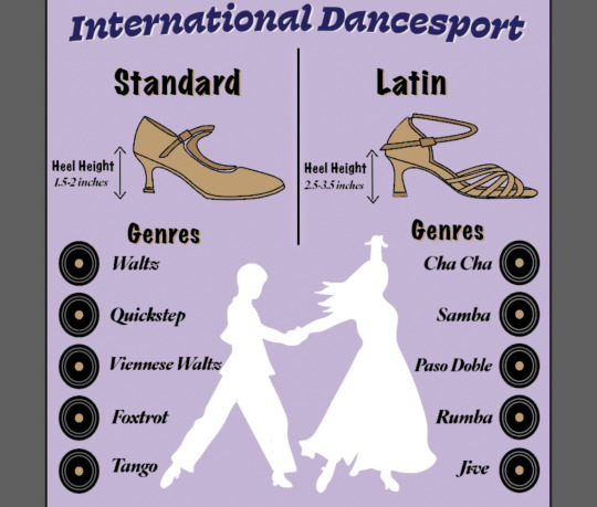
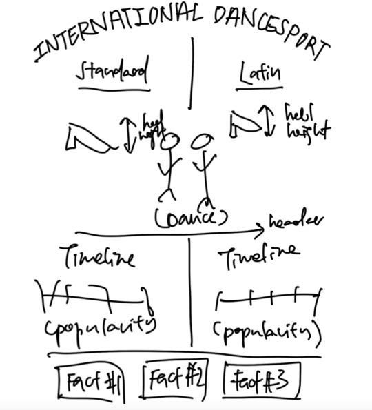
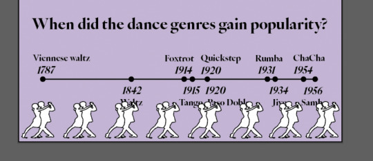
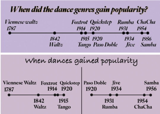
Infographic created The final infographic was a comparison infographic, where I compared standard dance and latin dance, which were both categorised under international dancesport. An additional element I used was a timeline, at the bottom section, to showcase when each genre gained its popularity. There was a clear hierarchy of information, starting with comparison of heel height, into types of genres, and finally the timeline.
Originally, I had separated the two timelines, but feedback given during the critique mentioned that I should combine them, since the last genre of standard gained popularity at the same time as the first latin genre. I felt that this was very useful, making the infographic more readable. In addition, I also edited the header, for a clearer explanation of the information. Here are the two timelines in comparison:
I decided to use a bright pastel purple for my infographic, because I had intended for the infographic to be put up at dance studios, to give new dancers or visitors a brief guide to what international dancesport is. The pastel purple tone would be attractive and highly visible against the white walls that most dance studios have. The lighter tinted purple colour is also more of a cool tone, which would allow readers to feel calm and light-hearted, which is nicely connected to dance. Furthermore, the light purple colour is relatively complementary to the brown I used to colour the shoes in the infographic.
I created the purple background by drawing a rectangle, and selecting the purple fill that I desired. After which, I locked the layer to avoid any unwanted edits on it.
I started the infographic with a header 'International Dancesport’, which was the main topic. For this, I used the font ‘Swear Text Black’, because the font was widely used in the traditional dancesport scene, prior to the rebrandings of organisations and federations. As the font is well associated with Dancesport, I decided that using it as a header was effective. I also added some curve to the header to highlight the main topic, because the words were long and it was difficult to simply increase the font. This ensured that the main subject was visible to the audience.
For the remaining headers and sub headers, I created a pattern by using the same font, ‘Marker Felt’, as I felt that the font was clear and distinctive, directing the flow of the infographic to the next section. The header was also layered with a satin brown colour, which I used for the dance shoes, to keep a unified style. Furthermore, the light brown colour contrasted gently against the black words, making the header stand out more. The font I used for the remaining information like the genres, timeline, and heel height was ‘IvyOra Display Bold Italic’. This font was selected as it was professional and elegant, and matched well with the vibes of both standard and latin dance.
As compared to the infographic I submitted for critique, the final infographic is much neater and easier to read. In my original infographic, I utilised many different fonts for my sub headers and words, which made the infographic hard to read and understand as there was no clear flow of the information. Removing the unnecessary fonts made the infographic much more comfortable on the eyes, and clearly showed the different sections of information to the audience.
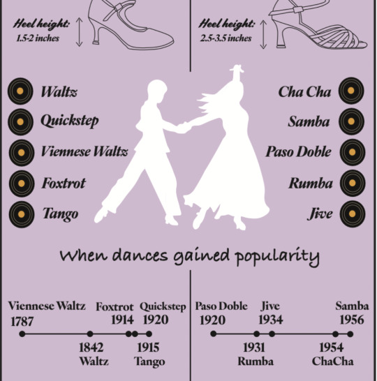
Visual hook My main visual hook for this infographic was the white shape of two characters dancing. This was done by first outlining my image of my club members dancing using the pen tool in adobe illustrator, and then later adding in a white fill. I considered keeping a black stroke to see the outline of the characters, but eventually decided against it as the overall infographic appeared quite cluttered with many black lines and outlines. The visual hook was strategically placed in the centre of the infographic, to attract the attention of people. Using a white fill was effective as it placed emphasis on the visual through contrast against the purple background of the infographic, and would be eye catching from afar.
Two other visual hooks that I had were the standard and latin dance shoes. For this, I outlined the shoe using the pen tool in illustrator, with the shoe image set to 70% opacity. During the critique, I did a self-critique and mentioned that I would add in colour for the shoes, as they were only simple outlines, and the infographic appeared to be quite plain.
After the critique, I worked on adding colour to the shoe portions, as they were visual hooks that needed to grab audiences attention. I decided to use one light brown colour, that was similar to most satin ballroom dance shoes, and used a darker shade of brown to highlight the straps and soles. To find a good shade, I utilised adobe color, which created a palette that I used to easily identify a darker shade.
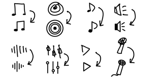
The final visual element I used was a vinyl, to represent the songs and genre of each dance. For this, I used the ellipse tool in adobe illustrator to draw the first circle with a black fill, and 2 grey circles, with the centre part the same brown colour used for the shoes, to avoid having too many colours. I experimented using multiple other symbols, and I felt that the top 2 were the soundwave lines, and the vinyl. Eventually, I decided to use the vinyl as many of the genres and songs dated back to when the vinyl was commonly used for music, and this would add a hint of nostalgia to the infographic. Here are the other symbols I drew and considered:
Conclusion Overall, I really enjoyed the assignment, as it allowed me to gain a greater understanding of how to create effective infographics, and that I should not try to add unnecessary and irrelevant information which would be distracting and reduce the effectiveness of conveying information or educating the audience.
0 notes
Text
NM3217 Assignment 2
The task for assignment 2 was to tell a story using 6-9 photographs, and I decided to work on a simple and direct storyline, with a single main character. Originally, I considered having a plot twist inside my storyline, but I felt that the 9 photo constraint would make it difficult.
For this assignment, I initially drew a slightly different storyboard for a different situation. As there was a one week due date, I intended to complete it during backstage preparation for my production. However, after reviewing the picutres, I felt that the lightings and angles of the photographs were poor, and facial expression execution of my friend was relatively awkward.

Hence, I decided to redo the assignment, using my hall room as a setting. For this, I had to change the storyboard, so that it was feasible within the room.
Storyboard process Making the storyboard, I realised that I lacked in artistic skills to draw. Hence, I decided to draw the main character as a stickman, as it was simple enough to understand. Likewise, I decided to convey the ideas and story flow through simple drawings and icons.
I would like to elaborate on a few frames in my storyboard. I wanted to use the storyboard to set the direction of how I should take the photographs for each frame, and attempted to draw the angles within each frame of the storyboard. In the first frame, I showed the angle of the photograph, by drawing the back of the head of the main character, to illustrate a back view and over the shoulder shot.

The captions above each frame was short but effectively explains what is happening in the scene. To illustrate that the main character was studying, I decided to draw a book icon, which is heavily associated with studying.
In the second frame, I found it challenging to illustrate hunger. As such, I decided to sketch out squiggly lines to illustrate the feeling of hunger at the stomach area, and short lines outside represented the sound of hunger. I felt that this illustration effectively expressed the idea of hunger, without the needing any words.

Lastly, frame 5 was also significant, as I wanted to show a close up shot of the empty snack bag. I intended to achieve this shot from a top down view, and extreme close up shot, but I struggled with sketching how the inside of an empty snack bag, so I took reference from online, to draw the angle that I intended to shoot.

Overall, the storyboarding process was enjoyable and very useful for me to take photographs for each frame later on. I closely referred to the storyboard, especially for the angles I wanted to work with.
Taking/selecting photographs: After the storyboarding process, I went ahead to take photographs for my visual storytelling. For each frame, I went ahead and took photographs from multiple angles, apart from those that I drew in my storyboard, as I felt that there might be better shots from angles that I did not consider previously. After taking the photographs, I had some difficulty choosing between photographs for certain frames. In particular was the third frame, which displayed the snacks.
The first picture was from a lower angle, with the popcorn snack in greater view, while the second picture was from a higher angle, where the other snacks were also seen relatively clearly. However, I eventually chose to use the picture with the lower angle, for 2 main reasons:
At a lower angle, the focus is nicely placed on the bag of popcorn, with the popcorn illustration on the back nicely in view. This emphasises the popcorn, which the main character goes on to eat in the next frame. As compared to the picture of higher angle, there is lesser focus on the other irrelevant snacks, and the words on the packagings. Considering the rule of thirds, the first image was more suitable to show a balance of the popcorn with the background.
The background for the picture with a lower angle was the white wall with flowers. This was more aesthetically pleasing and less distracting compared to the second picture from a higher angle, where the black computer in the background seemed to disrupt the aesthetics of the picture, and felt like an eyesore. Here are the two pictures together for comparison:

Another pair of pictures that I struggled between choosing was for frame 4, where the main character eats the popcorn from the bag. The picture I eventually settled for showed the main character eating popcorn from left view, with the popcorn illustration of the snack clearly visible. The other picture, was from right view, at a slightly lower angle. In this picture however, the popcorn was actually visible from inside the bag.
The main reason why I decided to use the left view picture, was because:
The right view picture was too similar to the angle in frame 1, like an over the shoulder angle shot. I was heavily constraint by the size and layout of my hall room, and angles were limited. I did not want to overlap angles, and the only way to do so was to have pictures from different sides and varying between higher and lower height angle.
The table also appeared to be quite messy, with the snacks and flowers in the background, as compared to the bed in the other photograph.
If I could edit the image I used, I would have it such that the popcorn was visible from the bag. Sadly, we had finished the entire bag of popcorn and I could not redo the scene. Here are the two pictures from different sides:

There is one last image that I would like to talk about in particular, which was a very nice image of the popcorn bowl. I decided to pour all the popcorn into a bowl to take a photograph, and it turned out really nice with vibrant colours and contrast, as well as a very nice focus emphasis on the bowl of popcorn, and the show playing in the background on the computer screen.
This picture would have been very nice, and I considered to put it in for the visual storytelling, but after some contemplation decided against it, because it did not flow with the story line. It would be more feasible for the main character to be upset if there were no more popcorn in the bag as compared to a bowl, as the bag is not as visible, so I decided to stick to the original storyboard and story line. However, I still wanted to include it as it was a good idea for an alternative storyline! Here is the picture:

Critique session For the critique session, I was unfortunately unable to receive any feedback, as my classmates felt like the storyline was simple and direct. Hence, I did not make any major changes, except for changing the layout of the page. The original layout was vertical, but I felt like the stacking image of the snacks and the empty bag was not very aesthetically pleasing.

Changing to a horizontal layout, I felt like the photographs flowed better, and it was more comfortable to see, with the food more spread out.

Self reflection and conclusion: Overall, I really enjoyed this assignment, doing a storytelling through minimal scenes. I had a great time shooting the photographs as well, as I considered how to best angle each shot. I particularly liked the last image, which was a reaction shot, highlighting the main character's feelings towards finishing the popcorn. I felt that the facial expression and top down angle managed to capture the emotions very well.
Based on the assignment requirements, it mentioned not to edit the photographs. Hence, I decided not to manipulate the pictures in any way, and kept them to their original colours. However, I personally would have preferred if frames 3, 4, and 5 were darker, as it would better suit the colour theme of the story. Due to the room light placed on the left, the photographs taken from the left turned out brighter than that of the left, which made the photographs less aesthetically pleasing.
Apart from the difference in colour tones, the rest of the photographs are to my satisfaction, as I experimented with multiple angles per shot, and I chose the most suitable photographs for the final story.
1 note
·
View note
Text
NM3217 Assignment 1
After reading the brief of the assignment, I decided to work on some household objects within my house. I initially considered working on other items, such as the robot cleaner and computer setup, but eventually I felt that they were either too complicated or too simple.
The iron sparked my interest because it was conveniently located on my table, and had 3 main colours - black, white, and gold, and also had a distinct shape that I wanted to try to recreate.
I decided to work with Adobe Illustrator, as we learnt in class how to outline objects using the pen tool, which I believed would be very useful to create the outline of the iron.
Based on the brief and sample works, I understood that the process of abstraction was to simplify a product into its simplest form, using minimal and basic shapes.
I started by doing outlines of the iron, using a copied picture as the background with opacity set at 50%, using the pen tool with no fill to trace the iron. After i was satisfied with my tracing, I opted to remove this picture from view.

In the second frame, I begun to simplify the iron, by changing certain features into simple shapes like ovals and circles, and changing the wire to a singular line. I also added the gold colour because I felt that it was a significant part of the iron. This was done by choosing a darker shade of yellow for the fill, and lowering the opacity to 80%.
I intended to add the gold colour to each frame, but I realised that the lines that I drew needed to be combined together in order to have the fill fit nicely within it. However, as my lines were connected to different parts, I was unable to colour my iron with the yellow. Here is an example:

In frame 3, I simplified the iron further, by removing the wires and certain aspects of the iron that made it look relatively complicated. With the iron simplified, I was able to add in the fill of black and gold, where black had a 75% opacity. In frame 4, I simplified the iron further more into simple lines and shapes, and removed the redundant sections.
Frame 5 was a simplification of the iron using smooth shapes, whilst the main colours were still evident. In this stage, it was evident that the abstracted drawing was an iron, as seen from the shape.
During the critique session, I realised I made a mistake of further simplifying and creating a stage 6, which was not part of the assignment. In stage 6, I created an overly simplified iron, using sharp lines and simple shapes, like rectangles, and an oval to signify the handle. However, feedback noted that it looked more like a fountain pen, and that this stage was unnecessary. Hence, I decided to remove the layer. Here is how stage 6 looked like.

After the critique, a classmate taught me that I could add the colour that I wanted by adding a new layer and drawing on the new layer. So I decided to add the gold colour in the first few frames, by using a pen tool with no stroke, and coloured fill, after locking the first layer.

I also received feedback during the critique session that since this is a reduction exercise, I should gradually lose the colours in my piece, instead of adding on to them. I felt that this feedback was very good, and decided to gradually reduce the colours across my frames in the final product. As seen from the picture, stage 5 only has one black portion, which was a suggestion from a classmate which i strongly agreed on. The black portion was an indication to others that the section was a handle, so the final abstracted art would be evidently a iron.

Overall, this assignment was fulfilling, because it gave me a chance to practice the skills that I have learnt during the tutorial classes. A particular tool in adobe illustrator which i found very useful for my outlining were the anchor point tools - add anchor point tool, delete anchor point tool, and anchor point tool. They enabled me to add and manoeuvre points around my outline, remove unnecessary points, and smoothen out my lines, which was very effective in my drawing process.

The critique session was also very helpful in aiding me with improving my final product, as I managed to receive feedback and insights from quite a few classmates, and they were helpful in improving my work.
0 notes