#assignment 3
Explore tagged Tumblr posts
Text
The Curious Case of Hotel Hollow - Assignment 3 Update & Development
For the group assignment Katherine's game was chosen to be developed. The game is called "The Curious Case of Hotel Hollow" and is a murder mystery game.
The game:
"The Curious Case of Hotel Hollow" is a pixel-art style platformer game that brings a good mix of light heartedness and strategy to a murder mystery.
Navigate through the platforms to find the clues to the mystery while utilising your flashlight, newspaper and broom to swat off the ghosts that try to stop you in your tracks.
Be careful though, the more you encounter ghosts, the more spooked you get.
Can you solve the murder before you get too scared?
Group one page assignment submission:
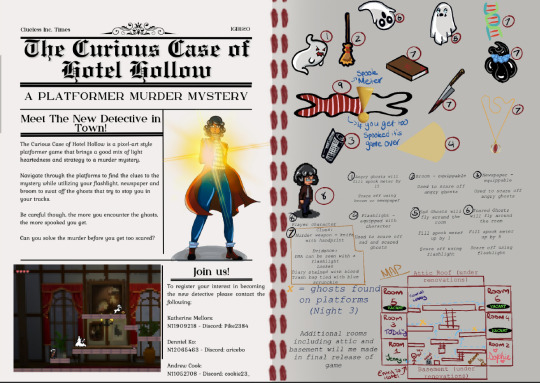
The clues will be located in different rooms in the hotel and the player must avoid the ghosts or scare them away with their torch. Find the clues to solve the mystery and survive.
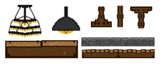
Assets I created to be implemented into the game:
9 notes
·
View notes
Text
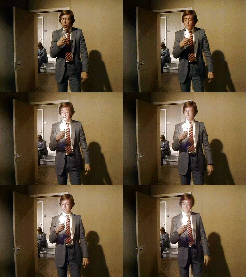




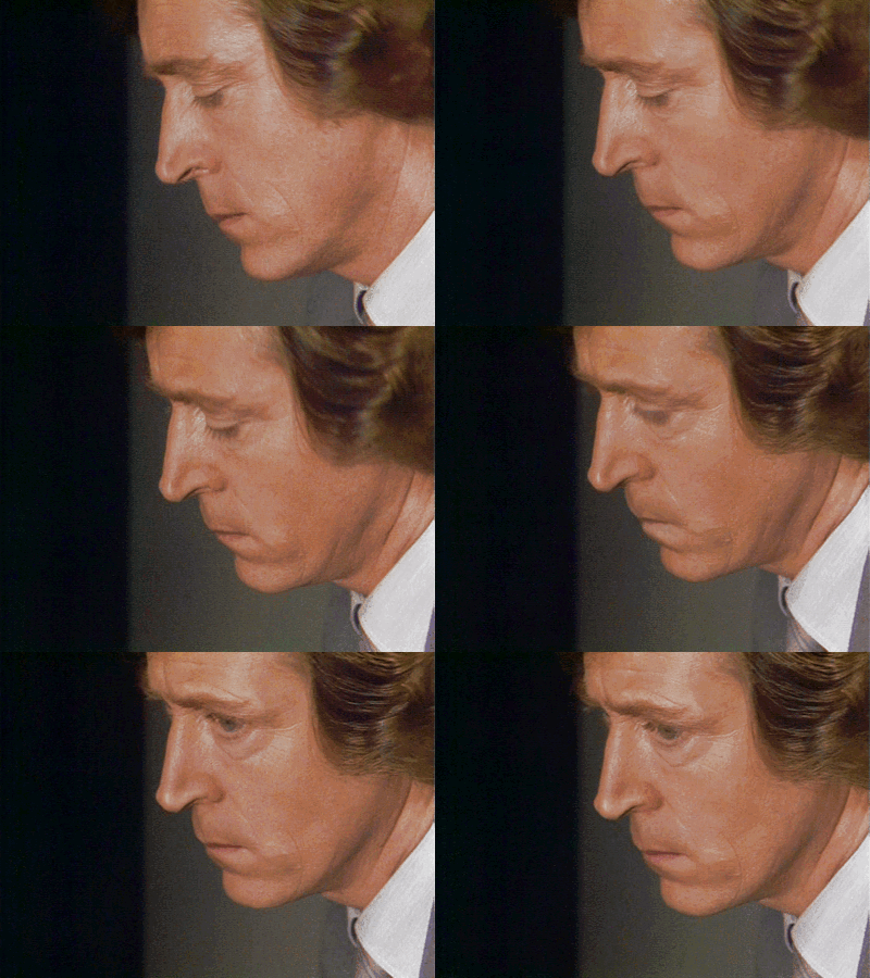


make me choose: @pers-books asked Silver or Sapphire.
#sapphire and steel#gif#silver#david collings#1970s#1980s#sff#assignment 3#assignment 6#make me choose#my gifs#pers-books#i was tempted to go for Sapphire because pretty#but you know. silver. <3#silver is all the things
54 notes
·
View notes
Text
I decided to choose Henri Matisse, he tends to use a lot of bright and bold colors to create lively and energetic paintings. His work had a lot of bright reds, blues, and greens, arranged in simple yet striking patterns. Matisse’s colors express emotions and movement, making his art feel joyful and alive. His use of color isn’t just about decoration it creates a connection with the viewer, inviting them to feel happiness and warmth. Matisse’s work is a celebration of life, making his art both uplifting and easy to connect with.
2 notes
·
View notes
Text
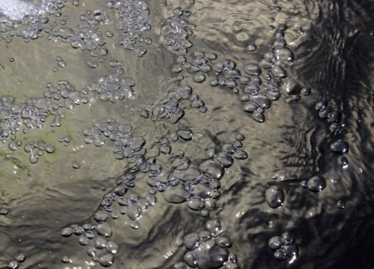

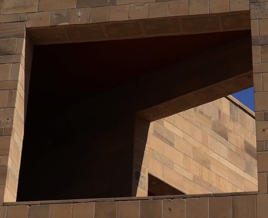



Some more excellent assignment 3 !
2 notes
·
View notes
Text
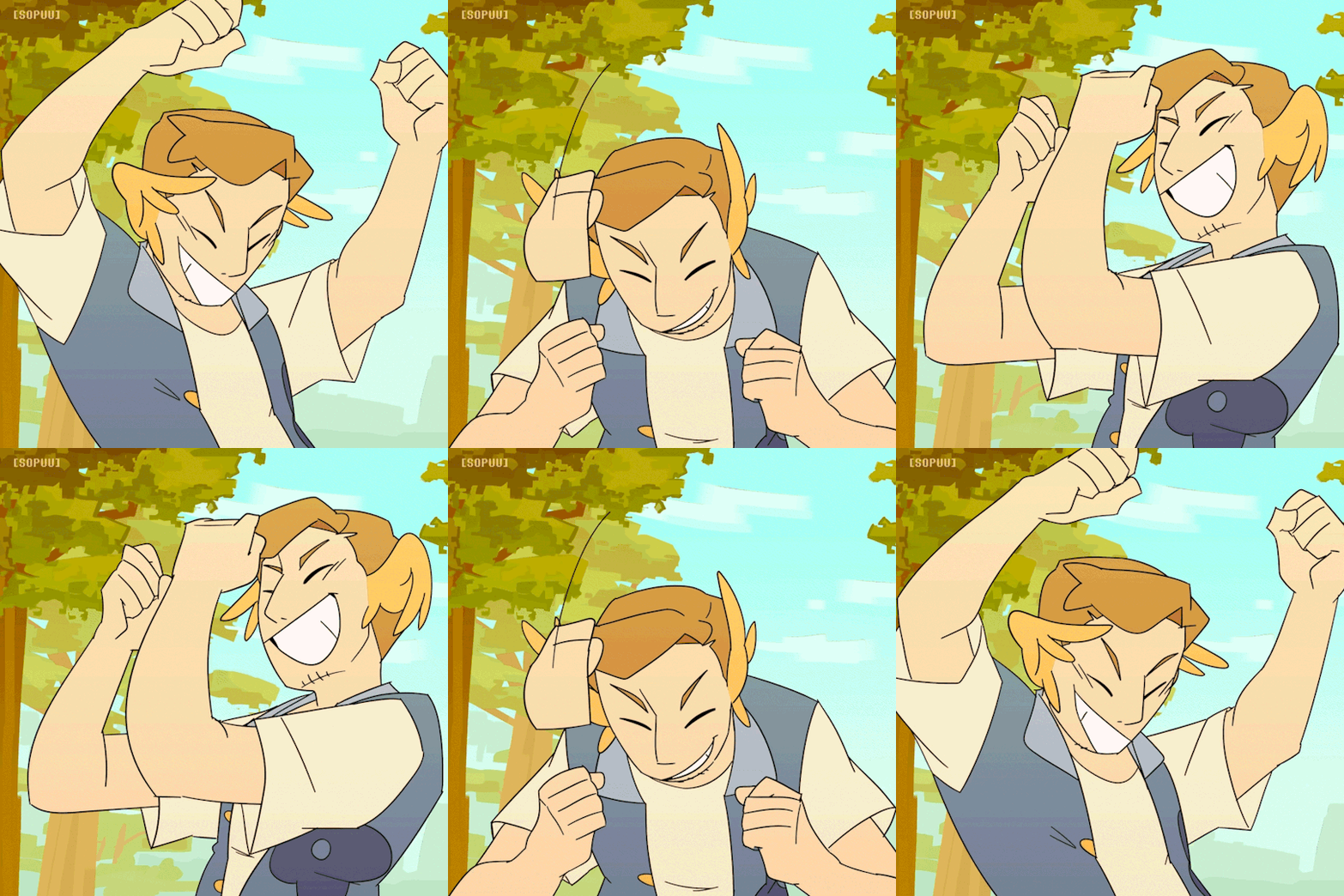
animation of jimmy getting owned in real life
bonus gif of him celebrating i made for funsies :] oh the oblivious bliss...
#thank you Real Life for being called that so i could make this joke#and also for giving me the perfect audio for my assignment#if you can spot the third life references in their outfits you are very cool <3#life series#trafficblr#mcyt#mcyt fanart#real life smp#grian#goodtimeswithscar#solidaritygaming#jimmy solidarity#animation#sopuuart
31K notes
·
View notes
Text
for Online Academic Help, Contact Us:
WhatsApp: +1 (213) 594-5657
Call: +1 727 456 9641
Email: [email protected]
November 27, 2023 - Monday
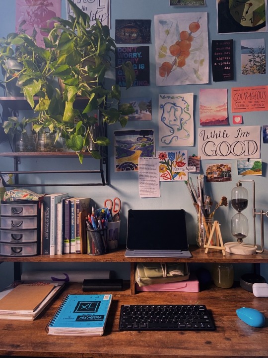
My giant plant is back! She is a bit dehydrated from being abandoned in the other place for a week but she’s here. I’m trying to recuperate myself, my plants, the house; everything 🌱
Today I made a make-up assignment for students who failed biology last semester.
#studyblr#studyspo#notes#assignmentexperts#assignment help#academic assignments#assignment services#homework help#school#assignmentwriting#assignment 3#assignment website#assignment writing
602 notes
·
View notes
Text
Assignment 3 Development #11
Week 11 came with the first developing prototype of our group project "The Way Home" - to start we had a title screen and level select.

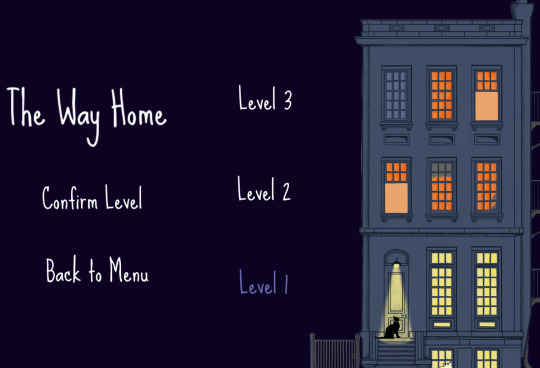
Designing this was a unique test, as I hadn't previously done any prior work with menus. While not complex to delve into, I ran into an unexpected issue with the font - we had been wanting to use the Sue Ellen Francisco font for it's homey style, but the typical text of Gdevelop couldn't properly display it. The font was too tall for Gdevelop's display boxes, leading to the use of a free converter to turn the font into variously colored BitMaps for use in the game. Once this was settled, the main meat of the 1st level was created. We had decided on Beans - the new name of our feline protagonist - needing to explore the side of the building to find a way inside.
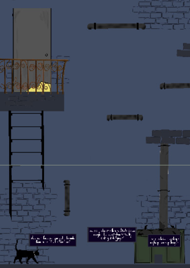
To do this, we used a couple of gently guided puzzles (a movable bin and a climbable drain pipe) to introduce the player to the game and it's fairly standard platformer movement.
Making this process, one of the more tedious parts was having to construct dialogue bubbles and text, which reduced and decreased in opacity depending on play distance. This proved time consuming given Gdevelop's lack of functions, but was ultimately simple. Moving forward into the next week, the group plans to finish constructing level 2 (with our first and only enemy, no less!). We intended this one to be a more difficult level with less handholding and a more substantial challenge for players.
0 notes
Text
Assignment 3 - Postmortem
As we reach the end of our development cycle, it's time to reflect on the journey of creating our game. This post-mortem highlights the key aspects of our development process, the challenges we faced, and the successes we achieved.
Concept and Vision
Our game was envisioned as an engaging platformer with a focus on fluid movement mechanics and a captivating story. We aimed to blend challenging gameplay with a rich narrative, providing players with an immersive experience.

Development Highlights
Initial Prototyping:
Core Mechanics: We started with the basics – running, jumping, and dashing. Early prototypes focused on perfecting these mechanics to ensure they felt responsive and satisfying.
Visual Design: Initial art assets were created to establish the game’s aesthetic. We focused on a vibrant and inviting visual style to attract players and create a memorable experience.
Playtesting and Feedback:
User Feedback: Conducting multiple rounds of playtesting was crucial. We gathered detailed feedback on controls, level design, and overall gameplay experience. This feedback was instrumental in shaping the final product.
Iterative Improvements: Based on playtester feedback, we made several iterations. Key changes included adjusting control mechanics, enhancing obstacle visibility, and revising the lives system to balance difficulty.
Final Touches:
Narrative Integration: We refined the storytelling aspects, embedding the narrative more seamlessly into gameplay. This helped create a cohesive experience that kept players engaged.
UI and Visual Enhancements: Final adjustments to the UI and visual elements ensured clarity and improved player experience. This included adding visual indicators for abilities and interactive objects.
Challenges Faced
Balancing Difficulty: One of the main challenges was finding the right balance between challenging gameplay and accessibility. Ensuring that the game was difficult enough to be engaging, but not frustrating, required multiple iterations.
Technical Hurdles: Implementing smooth and responsive controls while avoiding bugs was a significant technical challenge. Issues with dash mechanics and collision detection were particularly tricky to resolve.
Successes and Achievements
Player Engagement: The positive feedback from playtesters on the game’s art style and core mechanics was a huge success. Players enjoyed the visual design and found the movement mechanics satisfying.
Community Involvement: Involving the community through playtesting and feedback sessions was invaluable. It not only helped improve the game but also built a supportive community around our project.
What’s Next?
While this marks the end of this development cycle, it’s just the beginning of our journey. We plan to continue refining the game based on ongoing feedback and are excited about future updates and potential expansions.
Thank you to everyone who supported us along the way – from our dedicated playtesters to our talented development team. Your contributions have been essential in bringing this game to life.
0 notes
Text
Assessment 3 Post-Mortem
Over the last few weeks, our group has put in plenty of work into finalising our game, Asteroid., and subjecting it to plenty of playtests. Guided by the advice of the textbook, particularly Chapters 1 and 9, we strived to design a fun and enjoyable experience for the player. Overall, we were very satisfied with the game we designed. The aesthetic was what we intended, the functionality was all present, the sound design and music matched the style of the game as well. We implemented a cutscene, designed new enemies and a brand new wave system to scale the difficulty as the player progresses. Playtesting highlighted several flaws in our game design, but we also had plenty of solutions to hopefully fix these issues and make the game more enjoyable for players.
If we had to redevelop the prototype, the main advice would be to alter the movement physics from the beginning, as this was the most common item of feedback we received. That way, we could spend more of our time during playtesting focusing on other elements of the game. Also, we should increase the ultimate gain, as this would have allowed every player to see the ultimate and give proper feedback on it. Furthermore, updating the UI elements in advance would have allowed players to be less confused regarding their functionality, and can thus devote more of their attention to the game instead of trying to figure out what the various UI elements were for.
If we had to change the design of the prototype, there are a few things we could have altered. Firstly, a greater variety of enemies would have increased the challenge for players, and prolonged the time until players began feeling unengaged, though hopefully these new enemies could keep the player engaged at all times. Furthermore, although we had a score, we originally intended to implement a scoreboard, but we never did. This would be a great way to encourage players to keep trying again to beat their high score, and add in another element of challenge to the game. Additionally, we could have added in various powerups that could briefly affect the moment-to-moment gameplay. The ultimate ability was one such example, though we had planned several others such as a shield or an asteroid storm, however, we never managed to get these implemented. Lastly, adding in a tutorial stage would have helped players understand the objective of the game and combat, the controls and the use of the UI, ideally removing any confusion they may have had before starting the game proper.
Overall, I was very happy to have worked on this game. I had the opportunity to test myself in creating music, something I hadn't done before, as well as work collaboratively on code using GitHub, which I had also not done prior to this project. Working within the design framework of another person's game was quite challenging at first, but once we all understood the intentions of the games original designer, we were able to work within the framework and concept he created to develop his game concept into a fully developed prototype.
Fullerton, T. (2018). Game design workshop : A playcentric approach to creating innovative games, fourth edition. CRC Press LLC.
0 notes
Text
Assignment 3 Playtesting and Early Post Mortem
"The Curious Case of Hotel Hollow" gameplay testing:
We went into this game project with a large scope. The aim of the game was to solve the mystery by finding clues throughout the game while fighting off ghosts and navigating the puzzles of the hotel rooms. The players aim was to collect all the clues to reveal and then fight off the cause of the mystery. Or if they failed along the way and got too scared, they would run away.
As can be seen in the gameplay footage, the game incorporates a scare meter in the top left that fills up when ghost come into contact with the player. The player also has a torch battery that if it runs out leaves the player very vunerable to the ghosts, so they have to be careful with usage. There are light switches in the rooms that once turned on scares the ghosts away and allows the player to save their precious torch battery.
As the scope of our game was so big, there were some cuts made that we aimed to implement.
At this stage though the game is in a playable state!
To be added are the art assets as furniture decorations and objects. Also, the wooden and stone tile sprites to fit more with a hotel aesthetic.
With such a short time to create a viable project and such a large scope we are happy with our ability to produce a working game, although far from its original aim. We had grand ideas for the level design and decorations and player obstacles but just didn't get to the stage of development to implement them.
5 notes
·
View notes
Text
Week 13 - Assignment 3 Postmortem
What I learned
How to collaborate with others in the creation of the game
Making a title screen
Making an interactable tutorial
What I struggled with
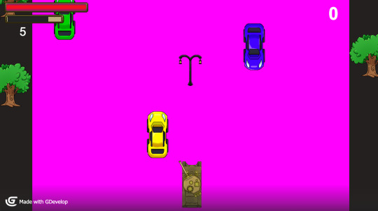
There was a problem where building the game will result in the image below happening, though it is now fixed.
And that's it for my blog posts for IGB120! All in all, I had fun creating all the games for the unit, and will be making more in the future.
0 notes
Text










more great photo work for A3!
2 notes
·
View notes
Text
hmmmm
#animation class assignment was to make examples of anticipation with 3 characters#grabbed these losers KJHSDGS#also finally an excuse to animate them!!! dies#transformers#tf#maccadam#my art#elite trine#starscream#skywarp#thundercracker#animation
17K notes
·
View notes
Text
Assignment 3 Group Formation and Planning #10
Leading into week 10, we got to form groups of three with our peers as we prepared to get into assignment 3 - creating our very own game based off one of our OneSheets. During this, I paired up with the awesome Natalie and Brandon, where we decided to further develop Nat's design, called "The Way Home".

Going from here, we amended and worked over the onesheet to adapt it for the assignment. From the start, the group was eager to keep the unique charm of the proposal - we kept the platformer and story based aspect, focusing more on narrative and puzzles rather then hack-n-slash, infinite progression or the like. We decided to make 2-3 levels with the story and proceed from there.
In terms of group talents, we all had our general specialties. Nat was the artist, to create assets for the game, while Brandon was happy to facilitate putting most of the assignment together and largely manage the writing. Meanwhile, I was volunteered coding and putting the game together in Gdevelop. Happy with our allocations, we got to work putting together our part 1 submission - which included what our lecturer's referred to as our "Minimum Viable Product" (also known as an MVP).
0 notes
Text
Assignment 3 - Iteration and Changes
Based on the valuable feedback from our recent playtesting sessions, we have implemented several changes to improve the overall experience of our game. Here are some key updates and iterations we've made, reflecting the insights provided by our dedicated playtesters.
Key Changes Implemented:
Control Mechanics:
Dash and Jump Adjustments: We’ve reassigned the dash to a more intuitive key and smoothed out the transition between movements. This change addresses the awkward separation of movement keys and enhances the overall flow of the game.
Visual Enhancements:
Improved Obstacle Visibility: Several players noted that certain obstacles, particularly branches, were hard to see. We have updated the visual design of these elements to make them more distinguishable, ensuring players can navigate the game environment more effectively.
Game Flow and Difficulty:
Lives System Overhaul: The previous lives system was found to be excessively punishing. We’ve revised it to be less punitive, providing a more balanced and enjoyable experience. Checkpoints have been added to reduce frustration and maintain player engagement.
User Interface and Feedback:
UI Clarity: To address confusion regarding cooldowns and abilities, we have redesigned the UI to include better feedback mechanisms. New visual indicators for cooldowns and interactive objects make it easier for players to understand their status and available actions.
Narrative Integration:
Enhanced Storytelling: We’ve worked on embedding the narrative more seamlessly into the gameplay. This ensures that players are gradually immersed in the game world without overwhelming them with exposition, creating a more cohesive and engaging story experience.
Player Feedback Highlights:
Control Mechanics: “Reassigning the dash key made a huge difference. The game feels much smoother now!”
Obstacle Visibility: “The updated visuals make it so much easier to see and avoid obstacles. Great improvement!”
Lives System: “The new lives system is much fairer. Checkpoints really help in reducing frustration.”
What’s Next?
While we’ve made significant improvements, we are continuously looking for ways to enhance the game. Further iterations will focus on refining the level design, enhancing character animations, and incorporating more player feedback to ensure the best possible gaming experience.
0 notes
Text
Assessment 3 Iteration and Changes Following Playtesting
After conducting playtesting, we were left with plenty of insight regarding changes that could be made to our game to improve the overall player experience.
Firstly, we have doubled the rate in which the player generates an ultimate ability, hopefully allowing them to activate it quicker and more frequently during gameplay.
These following changes have not been implemented, but are how we would address the feedback were we to continue developing the game:
Movement: we speculate that increasing the turning speed and adding a tutorial stage where the player could experiment with the movement would help players become adjusted to the controls quicker. Additionally, adding a trail behind the player to indicate the direction of movement might also help players not feel lost or disoriented during gameplay.
UI: Adding labels to the UI elements will hopefully make them more understandable, and their function can also be demonstrated during a tutorial stage.
Ultimate: Changes have already been implemented regarding its regeneration speed, however, we can also make changes to the ultimate to make it more impactful, like refining the sound effects and visuals
Difficulty and Engagement: This can be addressed through adding more enemy variety, and ramping up the difficulty at a faster rate. Furthermore, a combo system with rewards can incentivise players to be more active, thus making the gameplay more engaging. Finally, adding a system to restore health will alleviate the need to play overly cautious, allowing players to take more risks, which will hopefully result in a more enjoyable gameplay experience for the player.
0 notes