#artofdata
Explore tagged Tumblr posts
Visit Tumblr Blog
Explore Tumblr blogs with no restrictions, modern design and the best experience.
Last Seen Tumblr Blogs


Fun Fact
Forty percent of Tumblr users are between the ages of 18 to 25.
Photo

#artofdata #artbydata #dataart #datastorageart #computerart #straightgeometries #filledspace #visualize #data
#computerart#datastorageart#filledspace#visualize#straightgeometries#dataart#artbydata#artofdata#data
2 notes
·
View notes
Text
Which mix makes you,you.

As I take out a small part of my day to devote to this self-made project of mine, it dawns on me how extensive field of study this is, to which my contribution is a small one. In the recent days I found myself browsing through numerous personality tests that pop up on our internet feed every now and then, showing us the potential pros and cons in our personality, while advertising their skill development programs.
While I focused on the colorful aspect of personality, that is to say, if a personality had a color, it came to me repeatedly that a personality can never be just one color, much like the choice of colors of people.That’s why humans are so intriguing to me- we may look similar yet be so different with our choices and preferences.
Check out my Instagram page to know more about The ColorMood Project:
https://www.instagram.com/hina_akatsuki/?fbclid=IwAR1uKTqQ6C1TY-P6KG6WAP_41mq29wh4-mgru9y5a3eWxC4kMBZNv-X9DKw
0 notes
Link
Check it out. I did a thing with Pokemon.
1 note
·
View note
Text
A tweet
#Bestoftheday #DataArtist #ArtofData https://t.co/DZkInuN7B9
— David Castro (@davidcastroSM) November 7, 2017
0 notes
Text
Learn the Art of Data Visualization and Its Evolution

Don’t limit yourself to infographics and static charts. With the ZoomCharts interactive data visualization software you can bring your presentations to the next level through its speed and interactivity. Data visualization has become a big part of our everyday life because of the amount of information we have to accumulate and process on a daily basis.
Check out what you can do with ZoomCharts charts and graphs at http://zoomcharts.com
In this PBS Digital Studios Off Book video Edward Tufte - Yale University, Julie Steele - O'Reilly Media, Josh Smith - Hyperakt, Jer Thorp - Office for Creative Research explain the art of data visualization and its evolution.
Check out ZoomCharts products:
Network Chart Big network exploration Explore linked data sets. Highlight relevant data with dynamic filters and visual styles. Incremental data loading. Exploration with focus nodes.
Time Chart Time navigation and exploration tool Browse activity logs, select time ranges. Multiple data series and value axes. Switch between time units.
Pie Chart Amazingly intuitive hierarchical data exploration Get quick overview of your data and drill down when necessary. All in a single easy to use chart.
Facet Chart Scrollable bar chart with drill-down Compare values side by side and provide easy access to the long tail.
ZoomCharts http://www.zoomcharts.com The world’s most interactive data visualization software
#artofdata#edwardtufte#yaleuniversity#joshsmith#hyperakt#digitalstudios#presentation#bigdata#charts#zoomcharts#pbs
0 notes
Photo

At BMoCA // NetBlink - visualizes wifi traffic in its range. Photo by #RichardPeterson #bmoca #artofdata
1 note
·
View note
Photo

“Will I Make a Good Superhero?”
Source: Charley Chartwell
#artofdata#wordpressartofdata#hero#super#mar#dc#superhero#powers#good#poster#art#artporn#data#spiderman#thor#hulk#magic#batman#superman#supergirl#heroes#superheroes
3 notes
·
View notes
Photo

The Taxonomy of Typography
Source: popchartlab.com
#artofdata#wordpressartofdata#english#toefl#english language#letters#literature#typography#infographic#info#infoporn#writing#reading#font#fonts#fontcest#typophile#typodar#typo design#art#artporn#poster#taxonomy
2 notes
·
View notes
Text
Personality of many colors

This is one of the many illustrations I have been making for my self-made project, The ColorMood Project, where I am trying to explore the correlation between colors,emotions and the psychological impact it has on an individual. For the past three days, I have been browsing through numerous color personality tests available on the internet to acquire the interpretation of each hue provided by them. Not surprisingly, each website had a slightly different insight to offer. Which led to creation of this illustration. It exhibits the idea that an individual’s personality can comprise of a mix of many colors.
Although the ColorMood project is mostly revolving around illustrations using data that I have collected over the course of one month, I wanted to depict this concept which brings out the inner self of every human being.
Artwork by: hina_akatsuki
0 notes
Photo

Color psychology is the study of colors in relation to human behavior. While certain colors reflect a certain set of feelings and emotions, the psychology of color isn't a universal one. A difference in the geography,culture and beliefs can change the very colors we perceive. #thecolormoodproject #artofdata https://www.instagram.com/p/CCLOWoqjl2a/?igshid=1thkr5bhn5ha0
0 notes
Photo

Our color preferences tell a lot about our emotional state of being. With #thecolormoodproject I am attempting to showcase this relation. I had asked people to rate themselves(on a scale of 1-10) in terms of how emotional they are(ES), how often they have mood swings(MS), how often they express aggression(AS), how often they feel low or depressed(DS) and how frequently they overthink(OS). These questions may set a broad criteria to judge upon, but nevertheless they seem to hold meaning and reveal patterns which can ascertain an emotional state of being related to a certain colour. #artofdata #datavisualisation #dataart https://www.instagram.com/p/CB28sJqDjzx/?igshid=b0tg0yoz8bdp
0 notes
Text
World of Wallcharts Series #3 - LOVE
What else could it be for the third part of this #worldofwallcharts series today? In homage to St Valentine's Day, here is a curation of some beautiful love-related posters and infographics.
First up, a load of iconic heart beats from musical tracks, courtesy of Pop Chart Lab. Some of them are quite hard to figure out, but the icons look cool at least:

This begs the question ,what kind of heart are you? Perhaps you can find the answer on 20px's poster down here. I think I may be a couple of these...

If you're looking more for numbers and facts rather than cute heart emojis, then you'll be right at home with the "Facts of Love" infographic from Overstock:

And if you're more scientifically-inclined, then you can look at exactly how those brain hormones work in the following infographic from Adam Baumgartner

Finally, if you want to learn how to say I love you in 50 different languages, then Pop Chart Lab has the wallchart for you:

Hope you have a lovely Valentine's Day, whether with your loved one, with your friends and family, or alone.
#artofdata#wordpressartofdata#love#life#valentine#valentine's#valentine's day#st valentine's day#romance#wallchart#i love you#st valentines day#poster#chartporn#infographic#infographics
1 note
·
View note
Photo

First installation to #thecolormoodproject . Starting simple with getting to know people's favourite colors and each hue's popularity irrespective of age or gender. More artworks on the way! #artofdata #colorofdata #colorful https://www.instagram.com/p/CBdideDDMxw/?igshid=1fqtxrvffzk8z
0 notes
Photo
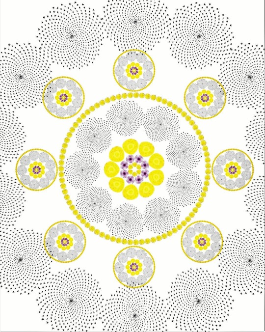
The Ubiquity of the golden ratio continues to be a topic to ponder upon. It is that one value that connects professionals from all walks of life, be it an artist or a mathematician. The patterns used in this art are generated using the golden ratio. #artofdata #R #mandala #goldenratio #datapoints #dataproject #datagraphics #dataart #datahumanism #dataaesthetics #beautifuldata https://www.instagram.com/p/B_sV_CpD9Ig/?igshid=xkiimip8fcy4
#artofdata#r#mandala#goldenratio#datapoints#dataproject#datagraphics#dataart#datahumanism#dataaesthetics#beautifuldata
0 notes
Photo

Cats Categorized
Source: popchartlab.com
#artofdata#wordpressartofdata#cats#catsofinstagram#catstagram#catlover#cat#funny cat#domestic cat#poster#info#graphic design#infoporn#dataporn#data#animals#feline#catlife#catlove#catlady#cat lady#cat love#cat life#cats are the best#cats vs dogs
16 notes
·
View notes
Photo

Magical Objects of the Wizarding World
Source: popchartlab.com and pottermore
#artofdata#wordpressartofdata#harry potter#pottermore#harry potter fandom#fan fiction#infographic#jk rowling#potterhead#emma watson#potterheads#daniel radcliffe#harrypotter#harry potter world#hogwarts#potter#jkrowling#hp#harry potter forever#dumbledore#snape#emmawatson#harry potter weekend#fantastic beasts#etsy#poster#info#infoporn#design#graphic design
3 notes
·
View notes