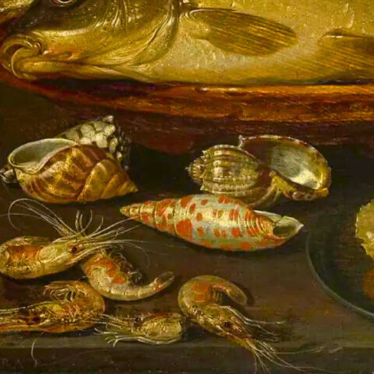
#artist is willem kalf-
Explore tagged Tumblr posts
Visit Tumblr Blog
Explore Tumblr blogs with no restrictions, modern design and the best experience.
Last Seen Tumblr Blogs


Fun Fact
Tumblr was the first site to host the blog for President Barack Obama in 2011.
Text


symbols in art: seashells
#artist is clara peeters#artist is pierre mignard#artist is simon renard de saint-andre#artist is jacques linard#artist is clara peeters-#-cant find artist#artist is philipp sauerland#artist is willem kalf#artist is willem kalf-
516 notes
·
View notes
Text

Willem Kalf (Dutch,1619-1693) • Still Life with a Chinese Porcelain Jar • 1669 • Minneapolis Institute of Art, Minnesota
#still life#art#fine art#painting#art of the still life blog#dutch art#dutch artist#dutch painter#willem kalf#dutch master
42 notes
·
View notes
Text
Caravaggio's Basket of Fruit
Caravaggio‘s Basket of Fruit, c. 1595–1596, oil on canvas, Pinacoteca Ambrosiana, Milan‘s Basket of Fruit, c. 1595–1596, oil on canvas, Pinacoteca Ambrosiana, Milan (Photo credit: Wikipedia) Vanitas After completing his apprenticeship [1] in Antwerp, Peter Paul Rubens spent nearly eight uninterrupted years in Italy. Rubens may have seen Caravaggio‘s Basket of Fruit, a painting that seems…
View On WordPress
#Baroque artists#Caravaggio#Caravaggisti#Chiaroscuro#Georges de la Tour#Henrick ter Brugghen#Italian Renaissance#Memento Mori#Peter Paul Rubens#Tenebrism#Vanitas#Willem Kalf
0 notes
Text
Still Life Painting: A Deep Dive into History, Techniques, and FAQs
Still life painting, often considered a simple yet profound art form, offers a chance to appreciate the beauty of everyday objects. From fruit arrangements to vases filled with flowers or a collection of antiques, still life paintings capture moments of stillness and simplicity. In this post, we'll journey through its history, share essential techniques, and answer some common questions. History of Still Life Painting Still life painting, as a distinct genre, dates back to ancient times. Ancient Civilizations: The earliest examples can be found in the frescoes of ancient Egyptian tombs, depicting food items that the deceased might need in the afterlife. Middle Ages: The genre went dormant during the Middle Ages when religious themes dominated the art scene. However, elements of still life could be found hidden within larger religious or historical works. Renaissance: The rebirth of interest in the natural world and classical art in the Renaissance revived still life painting. Artists began to appreciate the potential of everyday objects as subjects, and the depiction of these objects became a study in form, texture, and light. 17th Century: The Dutch Golden Age marked a peak for still life painting. Artists like Jan Brueghel and Willem Kalf portrayed lavish banquet tables and intricate floral bouquets with astonishing realism. Modern Era: The genre evolved further with the likes of Cézanne and Picasso, blending abstraction with realism, challenging the traditional norms, and infusing deeper meanings and symbolism into their works. How to Start with Still Life Painting 1. Choose Your Subject: Start simple. A solitary object, like an apple or a vase, can provide a strong foundation. As you gain confidence, you can introduce more objects or complex arrangements. 2. Setting Up: Use natural light when possible. Position your subject near a window and use white boards or sheets to reflect or soften the light. 3. Composition: Arrange the objects to create balance. Think about the 'rule of thirds' and experiment with different placements until you find a pleasing composition. 4. Observe and Sketch: Before diving into painting, spend some time observing your setup. Sketching can help you understand shapes, shadows, and relationships between objects. 5. Painting Techniques: There are various methods to approach a still life painting: - Layering: Start with a thin underpainting and gradually add layers. - Direct Painting: Paint in one layer, refining as you go. - Gridding: Use a grid to help translate the scene from your source to the canvas accurately. Having delved into the history, and techniques surrounding still life painting, it's only fitting we further unfurl this artistic tapestry. The profound art of still life painting offers more than just static representations of objects; it’s an exploration into the soul of everyday life. Symbolism in Still Life Throughout history, artists have used still life to communicate deeper meanings: - Fruit: Often a reminder of life's fleeting nature. A ripe fruit might symbolize the peak of life, while a decaying one can signify the inevitable passage of time. - Clocks and candles: Used to represent the passing of time and the fragility of life. - Skulls (or Memento Mori): A reminder of mortality, common in 17th-century vanitas paintings. - Books, musical instruments: These might symbolize the pleasures of life or the transient nature of knowledge and fame. Influential Still Life Painters While we've touched upon a few key figures, the world of still life painting boasts an array of maestros: - Giorgio Morandi: Known for his muted color palettes and repetitive subjects, Morandi's paintings are meditations on simplicity and form. - Juan Sánchez Cotán: A Spanish Baroque painter who created strikingly minimalist and somber compositions, such as his famous "Quince, Cabbage, Melon, and Cucumber." - Paul Cézanne: While mentioned previously, it's worth noting that Cézanne’s innovative approach to form and color heavily influenced 20th-century abstract art. The Modern Still Life In the age of photography and digital art, where does traditional still life painting stand? It remains a beloved genre, with artists finding new ways to reinvent and reinterpret it: - Photorealism: Artists like Ralph Goings and Audrey Flack take still life to a new dimension, creating paintings so detailed they rival photographs. - Conceptual Still Life: Contemporary artists merge still life with conceptual art, often making political or social commentaries. - Digital Still Life: With the rise of digital art tools, artists now create still life pieces in the virtual realm, providing new perspectives and techniques. The Allure of the Ordinary In a world that often rushes past the mundane, still life painting invites us to pause. It reminds us that beauty exists in the ordinary, and profundity can be found in the stillness. Whether it's the intricate reflection in a glass of water or the soft gradient of light on a fruit, still life speaks to the soul in whispers, urging us to appreciate the present moment. Frequently Asked Questions Q: Why is it called "still life" painting? A: The term "still life" is derived from the Dutch word "stilleven", which essentially means "motionless" or "lifeless". It aptly describes the static, inanimate subjects of this art genre. Q: Is still life painting a good starting point for beginners? A: Absolutely! Still life painting allows beginners to focus on observation, composition, and technique without the complexity of moving subjects. Q: Can I use acrylics for still life painting? A: Yes! While many historic still life paintings were done in oils, acrylics are perfectly suitable and offer faster drying times. Read the full article
0 notes
Photo
Jasper Geerards, Jasper Geerardi or Jasper Geeraerts (c. 1620 – between 1649-1654) was a Flemish painter who specialized in still lifes and in particular pronkstillevens (ostentatious still lifes). He was active in Antwerp and Amsterdam.
Pronkstilleven (Dutch for 'ostentatious', 'ornate' or 'sumptuous' still life) is a style of ornate still life painting, which was developed in the 1640s in Antwerp from where it spread quickly to the Dutch Republic.
Flemish artists such as Frans Snyders and Adriaen van Utrecht started to paint still lifes that emphasized abundance by depicting a diversity of objects, fruits, flowers and dead game, often together with living people and animals.
The style was soon adopted by artists from the Dutch Republic. A leading Dutch representative was Jan Davidsz. de Heem, who spent a long period of his active career in Antwerp and was one of the founders of the style in Holland. Other leading representatives in Flanders and the Dutch Republic were Rachel Ruysch, Nicolaes van Verendael, Alexander Coosemans, Carstian Luyckx, Jasper Geeraards, Peter Willebeeck, Abraham van Beyeren and Willem Kalf.
Cornelis Norbertus Gijsbrechts developed the style further by incorporating pronkstillevens in the trompe-l'œil compositions for which he was known. An example is his Silverware in an Open Cabinet at the Museum of Fine Arts, Ghent.

Jasper Geeraerts (c1620-before 1654) A Lobster, A Partly-Peeled Lemon, A Basket Of Fruit, Bread, A Conch Shell And An Upturned Roemer (74,4 x 97,3 cm)
59 notes
·
View notes
Photo

Still Life with Columbine Goblet, Willem Kalf (Dutch, 1619-1693), ca. 1660
Oil on canvas
#art history#willem kalf#dutch art#dutch artist#dutch golden age#dutch baroque#baroque#baroque art#oil on canvas#oil painting#painting#paintings#still life#17th century#17th century art#1600s#1600s art#Detroit Institute of Arts#Detroit Institute of Arts Museum#uploads
129 notes
·
View notes
Text

Willem Kalf (1619-1693) "Still-Life with an Aquamanile, Fruit, and a Nautilus Cup" (c. 1660) Oil on canvas Dutch Golden Age Located in the Thyssen-Bornemisza Museum, Madrid, Spain
#paintings#art#artwork#still life painting#aesthetic#willem kalf#oil on canvas#fine art#dutch golden age#baroque#art gallery#madrid spain#dutch artist#fruit#white and blue#orange rug#aesthetics#cups#1660s#mid 1600s#mid 17th century
178 notes
·
View notes
Text

Still Life with a Pilgrim Flask, Candlestick, Porcelain Vase and Fruit
Willem Kalf (1619–1693)
#Willem Kalf (1619–1693)#art#artist#painter#still life#still-life#Still Life with a Pilgrim Flask Candlestick Porcelain Vase and Fruit#painting
3 notes
·
View notes
Text
APPRECIATING PAINTINGS
Paintings can be complex things to appreciate in an informed fashion. Such informed appreciation can be undertaken via a number of different methods:
Firstly, the artistic methods and techniques undertaken can be examined. Thus, Jan Van Eyck was famous for his oil painting technique, which produced a characteristic luminous finish. Michelangelo was renowned for his fresco technique, and for his skill with anatomy and male nudes. Leonardo da Vinci was famous for his sfumato, and Rembrandt for his chiaroscuro. Titian and Matisse (amongst others) were distinguished by their colourism, Caravaggio for his Tenebrism, and Frank Auerbach for his impasto. These techniques, and many others, are an important feature of informed art appreciation.
Secondly, COLOUR has always been a very important aspect to consider, and often, throughout history, the use of colour has been subject to certain rules and conventions. For example, Ancient Egyptian paintings only made use of 6 colours – red, green, blue, yellow, white and black. Red was the colour of power and authority. Green was used as a colour to indicate new life and fertility. Blue was the colour of rebirth, while yellow was used to represent eternal things like the sun, and gold. White was indicative of purity, and black was the colour of death. As an extension of some of these principles, male bodies were painted in darker colours than female bodies.
Byzantine icon paintings followed similar conventions: Blue was the colour representing human life, while white became the colour used to represent the resurrection and transfiguration of Christ. In icons of Christ and the Virgin Mary, Christ was usually depicted wearing a red undergarment, together with a blue outer garment (symbolising the idea of God becoming a man). Conversely, Mary was usually depicted wearing a blue undergarment, and a red outer garment (indicative of someone starting off entirely human and mortal, but moving closer to God).
During the Renaissance, burgeoning European art academies restricted the use of bright colours, which were only to be used in the most appropriate contexts. It is only much later in European history, with the advent of the French Impressionists and the Fauvists, that colour really became utilised independently, and without restriction. Of course, the development of new colour pigments also had a significant impact on the tonal range available to painters. – After all, a Renaissance colour palette was a very different thing to the palette available to a 19th century artist.
The narrative content of a painting (How to appreciate it).
In order to make an informed judgement, we can subdivide the narrative content of a painting into 4 parts: a) The main message. b) Subsidiary messages. c) Symbolism. d) References and analogies. (At the end of this section, under Activities, you will be given the opportunity of carrying out some research, and completing an initial assessment of the narrative content of a famous Renaissance painting, using these 4 subheadings).
Interpreting Western art (c.500 – 1700).
Byzantine art, and its icons, together with other hieratic styles such as the Gothic, was packed with narrative meaning and symbolism – but all of a Christian kind. This exclusive focus on Christian symbolism makes the art somewhat easier to decode, though the fantastic imagery of Renaissance alterpiece art of the sort produced by Bosch and Pieter Brueghel the Elder can be more difficult to work out. Much baroque painting was more straightforward, as (during the era of the Counter Reformation) its focus was mostly just on the promotion of Catholicism. Its best works consisted of trompe l’oeil ceiling frescoes and other monumental religious works. Even here, there were some exceptions, such as the Realist School within Dutch Baroque art, which possessed much complex imagery and symbolism.
Dutch Realism 1630-90.
Some exceptional schools arose in the newly independent (from Spain) protestant areas of the United Provinces, such as those in Amsterdam, Delft, Utrecht and Haarlem. Dutch realism really developed as a result of the historical context. – The 17th century was the period of the Dutch ‘Golden Age’ in which trade grew with the East Indies, and other areas of the world, and Dutch merchants grew rich on the profits. These merchants were a new type of art buyer, requiring a new type of painting, and they commissioned some of the most complex still life paintings ever produced, by the likes of Vermeer, Rembrandt, Willem Kalf, van Hoogstraten and others.
The Decline of Religious Paintings from 1700.
Religious art declined elsewhere (not just in the United Provinces) because of the decline in the number of ecclesiastical patrons available, and the rise of the secular, middle class/professional patron, who wanted – and paid for – small scale portable paintings which could be displayed in their homes. Moreover, these new buyers wanted portraits, landscapes or genre paintings (rather than massive religious allegorical works) which showed off their newly acquired power and status. As a consequence, this ‘new’ type of painting lacked obscure religious symbolism, and can be easier to interpret.
Interpreting paintings from 1700 onwards.
For analytical purposes, these can be divided into 5 main types: i) HISTORY paintings ii) PORTRAITS iii) GENRE paintings (of everyday scenes) iv) LANDSCAPES v) STILL LIFE.
History Paintings:
This category of paintings can include mythological, religious and historical works with a ‘narrative’ which can be difficult to interpret when designed to convey inspirational or philosophical sentiments.
Portraits:
This category of painting is generally easier to interpret, though it must be remembered that the buyer of a painting often prefers to purchase a ‘manipulated’ image showing him/her at their best (e.g. Sir Thomas Lawrence’s portraits of the Prince Regent during the Regency period).
Genre:
These can be relatively straightforward to interpret, when the artist is focused, principally, upon portraying the social history of a particular scene. However, a genre painting can also be used to convey a philosophical message, making the interpretation more complex to determine.
Landscapes:
In the hundred years between 1700-1800, many landscape paintings were commissioned by landowners who wanted a pictorial record of their estates. Thus, such paintings can be relatively straightforward to understand and interpret. However, in the later 18th Century, as the Romantic movement began to take hold, many painters went into the countryside in order to ‘capture’ the essence and beauty of nature – adding considerably to the meaning and purpose behind such works. Impressionists like Pisarro and Monet can fall into this category. There are also landscapes with more of a philosophical message, which can be quite difficult to interpret fully.
Still Life:
Some of this type of painting can look very static when looked at in a superficial manner. Nevertheless, the best of Still Life painting can still be loaded with symbolism, and influenced by artistic traditions going back to at least the 17th Century.
How to appreciate abstract paintings.
The key principal behind a proper appreciation of abstract paintings is the realization that FORM is just as important as REPRESENTATION. Thus, a picture of a human face could be a very anatomically inaccurate, ‘bad’ one, but it could have a very effective and striking use of colours or shapes, and might therefore be adjudged to be a ‘beautiful’ picture/painting.
Thus, form is everything, and we need to look at colours, shapes and surface textures (and their relationship to each other) when assessing and interpreting a particular piece of work.
ACTIVITIES
Now that you have completed this introductory section, please have a go at the following activities. You can either talk to your tutor about the possible answers on the telephone, or via skype, or send written responses via email or post. Please enjoy thinking about your answers, and the initial research that this entails!
Task 1: Try and find out more about the artistic techniques of sfumato, chiaroscuro, colourism, Tenebrism and impasto. What did these techniques/skills actually involve?
Task 2: Try and have a look at the painting “The Garden of Earthly Delights” by Hieronymous Bosch (1500-05) either on-line or in a suitable textbook, which is one of the great Renaissance paintings. Once you have looked at a copy of the painting, and maybe read a little about it, try and complete a brief assessment of the painting’s narrative content, using the 4 subheadings described earlier in this Section.
Task 3: Using the information supplied above about the 5 main types of paintings produced from 1700 onwards, say whether you think the following 11 paintings are either history, portrait, genre, landscapes or still life works of art: Some are more straightforward than others!
Death of Marat (1793) by Jacques-Louis David.
The Third of May 1808 by Francisco Goya
The Morning of the Execution of the Streltsy (1881) by Vasily Surikov.
Arrangement in Grey and Black: Whistler’s Mother (1871) by James Whistler.
Portrait of Madame X (1883-4) by John Singer Sargent.
Man with a Hoe (1862) by Millet.
Marilyn (1967) by A. Warhol.
At the Moulin Rouge (1890) by Toulouse-Lautrec.
Ennui (1914) by Walter Sickert.
Mr and Mrs Andrews (1750) by T. Gainsborough.
Hannibal and his Army Crossing the Alps (1812) by JMW Turner
Adrian L. Bridge
2 notes
·
View notes
Text
Something Told, Research
Still life images and paintings are probably some of the oldest and most consistent forms of art. Its origins go back as early as the Roman and Egyptian times and was still as popular during the Middle Ages and Renaissance era. It was during these times that it was officially coined as a genre of painting. A lot of still life paintings fall under simple terms like ‘flowers, food, animals’, etc, however most of them convey a much deeper message and use symbolism to their advantage.
Still life painting was ranked at the bottom of the ‘hierarchy of genres’ by the great European academies of art. However it gained popularity over the centuries as more and more artists began to express themselves and use new techniques to establish the genre as one of the more unique and symbolic genres of paintings. Some of the most well known still life artists include people such as:
Rachel Ruysch
Ruysch was one of the most famous Dutch still life painters of her time. She was born in Haarlem and found herself banned from life drawing classes, so instead trained in still life painting under the flower artist Willem Van Aelst. She was also influenced by her father, Frederick Ruysch, an amateur painter and florist by trade. Ruysch’s paintings contain a lot of symbolism, as well as a variety of moral and religious messages.

Her signature style utilised techniques such as dark backgrounds, delicate colouring and fine brush strokes. Sometimes she even used things like moss and blade thin grass to achieve the level of detail she wanted in her paintings.
Jan Davidsz de Heem
Jan Davidsz de Heem was one of the best still life painter produced by the Dutch realist school. He was best known for his expressive and original use of colour and was renowned for the variety in his paintings. His work included beautiful flower pieces, arrangements of colourful tropical fruit and assortments of bugs like moths, butterflies and beetles.


De Heem was an esteemed painter and used a systematic approach where he built up his image by using identical layers and pigments for each specific flower, fruit and other food. He was almost obsessed with the finer details of his paintings, even moving to Antwerp earlier on in his life due to the country’s rare abundance of exotic, colourful fruits like large plums, oranges, cherries, lemons, peaches, etc. His compositions ranged from classic, simple still life paintings to expressive Madonnas surrounded by assortments of fruit and other exotic foods for the time. Similar to Ruysch and most still life painters, De Heem’s paintings included lots of symbolism, particularly with flowers and what they represent.
Willem Kalf
Willem Kalf is described by many as one of the greatest Dutch masters of the ‘Pronkstilleven’ still life painting style, which included arrangements of assorted material items such as gold and silver, Chinese porcelain, Turkish carpets and Venetian glass. He was born on the 3rd November 1619 in Rotterdam, Netherlands to his wealthy cloth merchant father. He spent his early years training in Holland before eventually moving to Paris in 1642, where he spent 4 years perfecting his craft and creating a large, impressive body of work before settling back in Amsterdam.

Similarly to Ruysch, Kaff commonly used deep, dark backgrounds as he felt the contrast played a crucial part in bringing out the finer parts of colour and detail in his subjects. He was also a master at painting curves and fine lines of things like metal and glass. Kaff, like many other artists was obsessed with the detail in his images, often studying how objects like bowls, cups, plates and glass reflected different kinds of light, carefully observing each glint and flicker he could see.
0 notes
Text
SOMETHING TOLD
“The painting generally considered to be the first still life is a work by the Italian painter Jacopo de'Barbari painted 1504. The “golden age” of still-life painting occurred in the Lowlands during the 17th century.”
“Willem Kalf was a 17th century Dutch painter, known for his amazingly detailed paintings. Today he's considered one of the greatest still life painters in all of art history.”
“In art history, "Old Master" (or "old master") refers to any painter of skill who worked in Europe before about 1800, or a painting by such an artist. An "old master print" is an original print (for example an engraving or etching) made by an artist in the same period.”
A still-life painting is a group of objects which are still or inanimate, designed to express an allegorical meaning or theme. The objects can be either man-made such as a bottle of wine, or natural, such as flowers and fruit, and in still life photography the same techniques are used from the very first still life imagery from paintings way back from the 17th century, how the objects are place and angled and also the depth created just like the old still life paintings.


0 notes
Text
Inspired by Art - Still Life

I like the work of this artist Jean Baptiste Simeon Chardon (1699-1779). He tended to chose items from his own home, chosen for their texture, colour and shape rather than for any deeper meaning. The backgrounds are subtle in tone.

This still life is by Willem Kalf (born1619) He uses deep backgrounds for contrast and liked to paint curved shapes of metal and glass. He liked the colours and reflections they gave.

This is a photograph by Levin Rodriguez emulating the work of Willem Kalf
I chose these images as I liked the use of colour and tone which I feel gives a richness and warmth to them.
0 notes
Text
RESEARCH REPORT
Name: George Towne
Working title: Synthetic Pictorialism, Synthetic Still Life or aynalitic still life
When looking at Picassos synthetic Cubism the thought struck me of what synthetic pictorialism would be. Would it be what I have been looking at when viewing Erin O'keefe’s work? It could be. But I would see it as more pictorial cubism. So, what would it be? Would it look similar to Picasso’s work? But it cannot without the cubism. I need to look deeper in to what these notions and movements were before I can decide on such things. It is also possible that I am rambling meaningless words. But that is no reason not to peruse this. This is a working title and will definitely change if what I am saying is in fact meaningless.
It also seems rather grandiose for my work.
Research Methods: In creating and developing my project I have used a few research methods. The first of which is Visual Research. On conducting this research, I went to a few galleries to view both paintings and cultural items from the time period I am interested in. As a starting point this time period is around the 1700. This was around the time that the Dutch still lives were created. But I was not beholden to this period as it was the still lives, I was interested in. Since this point I have both looked at older and newer paintings to enhance my work from both the Renascence and the twentieth century. Using visual research has gone hand in hand with my other research method throughout my project. Critical analysis. I have attempted to be as brutal, with my work, as I can be. In attempt to push myself.
Experimentation has also been an important part of my project. Trying new things and teaching myself new techniques, in attempt to improve my work. I have learned a great deal through doing this. Including editing and studio techniques to compositional and perspectival techniques. This aspect of my project has been bolstered by my visual research of more modern artists. For example, Femke dekker. These visual artists have made me re-think entirely, what a still life is. This in turn inspired me to try new more modern editorial and practical techniques in my project which has only improved it.
In congruence with this I have been conducting practical and technical research methods I needed to know to produce my project. I did this through both the internet and asking the technicians who were more than happy to help me. For example, printing, understanding different papers, printing techniques and how the proses works especially with large prints, such as mine. I have looked in to different studio techniques such as, lighting, composition, tethering, focus stacking, using capture one, using the phase one and photoshop. But most importantly to this project using the space of my image and attempting to distort perspective. My tutor has been of great help in this regard, pointing me to various visual artists and explaining technical information like the inverse square law.
Pilot Project: In my Pilot Project I have learned to be experimental with my work. To try different techniques and critically analyze the results before implementing them in my project. As discussed, I learned this through my visual research of contemporary visual artists. That research has taught me to be experimental in my compositions, perspective, in my editing and even to an extent with my lighting set ups.
My practical research has also taught me a lot. I have been pushing my self to re-learn the basics of photography and build up again to have a fuller understanding of what I am doing, especially within the studio. I have learned to use the capture one software, tethering, lighting setups, the inverse square law, studio safety, using the phase one camera, using fuji x series cameras, using the canon 5d series, photoshop software, light room software, software of both PC and Mac OS systems and general problems that arise in the studio environment. Such as working out why a camera isn’t picking up the radio signals from the flash kit, using tethered flash and spending considerable time deciphering fujis wireless tethering. I have learned various techniques to aid my project such as removing unwanted objects from my images, basic compositing and focus stacking.
In printing I have learned about different printing techniques and which paper is most viable for my project, sizing of large image files, about those types of paper (that I am still deliberating over), how to handle prints after printing and how to prepare a print file.
With regards to the content of my project I have learned many lessons. Some harder than others. In my initial visual research, I was overwhelmed with the mastery the paintings I viewed represented, this was continuous throughout my project. But it gave me a goal to aim for no matter how out of reach. Constantly looking and critically comparing my project to these great works taught me to use this humbling experience as a driving force rather than one to stifle me. Which it very well could have. By being extremely critical of every aspect of my own work in this manner pushed me to seek advice and constantly look for ways to improve what I was doing. Over all my pilot project has helped me improve my work ethic under the majesty of these grate paintings, and visual artists. I have learned a great deal from them. But I have much more to learn.
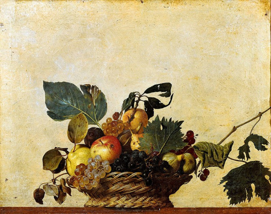
Audience and Context: In the context of a still life, originally, they were not supposed to have an audience as such. The early Renascence paintings were created predominantly as practice pieces for later great works such as Fruit basket to David and Goliath. They were not overtly for public appreciation. Though were in fact sold. Later on, still lives evolved in a sense to be works in themselves but were still predominantly studies. This changed over the years, especially in the twentieth century. In my own project I have been thinking about context of still life I am producing and what its audience might be. I have been attempting to emulate the process of early still lives by using it as a study. This is why, up until this point, I have not been overly concerned with the content of the still life. Using the still life as a study has taught me a great deal, but, was not intended for an audience. Other than when seeking criticism to improve them. However, I am moving to a point where I am thinking about the meaning and make up of my still lives which infers an audience. My proposed audience for my work would be a gallery.
Production and Presentation: In the production of my project, as discussed, I have utilized a great many techniques to attempt to improve my work. These various methods have allowed me to look deeper in to what a still life is. In doing so, I have been able to explore different concepts that would fit with my work. Though I am still exploring this aspect of my project. My plan going forward is to utilize all I have learned in the studio, in editing and practical to produce the best I possibly can. I have thought a great deal about how I will present my work. And have concluded that the best manner of presentation would be a large print in a gallery. In my case I am rathe fortunate as we are required to show our work in such a setting upon completing the project. I have been intrigued by using frames during my project. I am not quite sure yet how I will implement this, but my final image could very well be framed in some fashion. With printing in mind, the size of the print is important. Up until this point I have had in mind and in fact printed to A1 size at 300ppi. However, I wish to push myself and am interested in the concept of stitching images together. The camera I am using (the phase one) can comfortably print to A1 in full resolution. By using photoshop to stich multiple images together I could create a much bigger piece which would be rathe imposing in the gallery setting. This would be interesting to explore this. The down side is that it would be rather expensive. Over all my image will be a single large print in a gallery.
Visual References / Bibliography:
Frans Syders – Still Life with a Dead Stag 1640-50
Jacob van Walscapelle – Flowers in a Glass Vase 1667
Jan Jansz. Treck – Still Life with a Pewter Flagon and Two Ming Bowls 1651
Jan Jansz. Treck – Vanitas Still Life 1648
Willem Kalf – Still life with Drinking-Horn 1653
Willem Claesz. Heda – Still Life: Pewter and Silver Vessels and a Crab 1633-37
Adriaen Coorte – Still Life with Strawberries, Gooseberries and Asparagus 1703
Rachel Ruysch – Flowers in a Glass Vase with a Tulip 1716
Ambrosius Bosschaert - A Still Life of flowers in a Wan-Li Vase 1609-10
Gustave Courbet – Still life with Apples and Pomegranate 1871-72
Vincent van Gogh – Sunflowers 1888
Vincent Van Gogh – Two Crabs 1889
Paul Cezanne – Still Life with Water Jug 1892-93
Femke dekker
Erin O’Keefe
Laura Letinsky
Richard Kuiper - Dutch Still Life in Plastic
Picasso - synthetic cubism
Henri Matisse
Paul Cezanne
0 notes
Photo

(Oil on Canvas, 60.96 x 91.44 cm)
CONCEPT STATEMENT
The topic I explored for assessment 1 was creative rebellion. I commented on the lack of traditionally styled artworks in contemporary art galleries (and in contemporary art). My poster took a satirical and humorous tone and I wanted to carry that aspect into assessment two.
My final work is a still life, oil on canvas painting, of soup cans, a bowl, a soup and a pile of books. My idea was to try and take a contemporary art work and redesign it to make it fit into a more traditional form of art. I decided to use Andy Warhol’s “Soup cans” as a starting point. I chose this image because the pop art movement was quite humorous in its approach to consumerism, and that mirrored my approach to “creative rebellion”. I also decided on this image because although it was a contemporary artwork that moved away from traditional notions of art, it still had a recognisable and discernible figure, the humble soup can.
My initial idea for this work was to keep the composition of Warhol’s artwork but instead of the clean flat colours, I would add dramatic lighting and paint it realistically. Upon further research into Still life painting during the 16-18th centuries, I realised that my idea of one soup can didn’t properly conform with traditional oil painting just as much as Warhol’s didn’t. Those artworks have more that one object, so I decided to use 3 cans instead. Photographic experimentation was a key aspect of my art making process as it allowed me to change and switch around the positions of the cans quickly. This enabled me to continuously fix and adapt lighting and composition until I found a setting that suited my work. After editing the images (that featured just three cans) I felt like my painting wouldn’t have the versatility and interest of the original still life’s. So I did another photoshoot. This time I tried to incorporate more aspects of traditional oil paintings; bread, plates, bowls and even a peeled mandarin. I felt like this made the composition more visually interesting, but at the same time it took away from my main focus and idea. So I removed those extra bits, but I kept the bowl and added a spoon, since these two objects were relevant to soup. Referring back to my research into compositions, I realised that the thing my painting was missing was the incorporation of different heights. So I elevated the bowl.
During the painting process I constantly researched 16-18th century artists such as Willem Kalf and Francisco de Zurbarán, among other artists. As the painting developed from an initial sketch to the final piece, I photographed each stage, this allowed me to reflect on the work done, and see if there were ways I could improve it. One major change that resulted from this was the addition of books, under the soup bowl. This was a deliberate move that would help me reference traditional still life’s. I chose to keep the background clean and white in order to mirror the more neat aesthetics of contemporary art. This also worked to keep the artwork more bright and eye catching.
My final work aims to bring more traditional techniques and aesthetics of oil painting into a contemporary landscape. In using Warhol’s “soup cans” as a starting point I wanted to demonstrate that subjects in modern art can also be depicted in more traditional ways that are still visually appealing and interesting. I also wanted to reference the time taken to create and artwork. Historically oil paintings has been a time consuming process, often taking many months to creat one painting. Alternatively, contemporary is quite quick to create and execute. My painting was completed within a timeline of 2 weeks. My work is a mash up of different styles and techniques that work together in order to demonstrate the ability for technically charged art to still feature and have relevance in a contemporary art society.
5 notes
·
View notes
Photo


Inspiration for this photoset were baroque paintings of still life. Still life became one of popular topics during those times and they were often combined with technique called chiaroscuro, which was also introduced during baroque era. Painters that inspired me include Frans Snyders, Willem Kalf or Pietr Claesz. Symbolism played big part in still life paintings. The artists emphasized the meaning of “memento mori” - hints reminding us that death is inevitable can be found in most of them - whether it comes to not-so-subtle skull, slowly burning out candles, both rotten and fresh fruit, dying flowers and dried leaves or corpses of small animals like rabbits or turkeys. Next thing that was also very often found in baroque paintings - and not only in those of still life - was some sense of drama; theatre, even. Painters often portrayed curtains and movement in their work. In still life paintings this was often showed by tablecloth sliding over the edge, hunted animals with their heads falling down the tables, half peeled lemons and oranges with the skin hanging off, vase or a plate half over the edge making you feel like they will fall down any second.
2 notes
·
View notes
Text
Research Point
Research into the still life genre
Still life was only made a genre in the late 16th century when more western professional artists started doing it. Since then it’s been developed in different ways through different mediums and is still used now. So I observed some still life works from the 16th century to now.
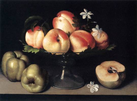
Fede Galizia, ‘Still Life’, 1607, Oil on panel
So what I notice first are the peaches in the dish. They are bright and stand out from the dark background. This makes me notice the artists arrangement. The peaches are the main focus of the painting with leaves and flowers to frame it right in the middle. The half cut apple and bell peppers (?) with one of the flowers helps to connect the main object with the background to balance out the painting. She’s made a clear choice of colours by keeping the warm peach colours together with the the dull greens, blue and grey around it. The placement of the green fruits create a rounded effect that makes your eye travel from left to right which complements the glass fruit stand.
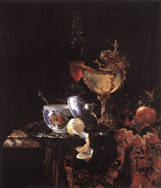
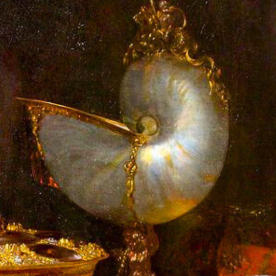
Willem Kalf, ‘Still Life with a Nautilius Cup’, 1662, Oil on canvas
I noticed a lot of artists liked to use a half peeled fruit, a lemon or orange. I guess it looked fancy. The spiral is interesting to paint and the inside of the lemon too. It’s almost too bright here. The dish and platter reflect light to try and balance it out but I don’t think it worked. It looks like it was cut and pasted there. It’s like the artist wanted to show off by focusing on these three objects mainly and how well they are painted. The other objects are painted nicely as well but the lighting or something is off for me.
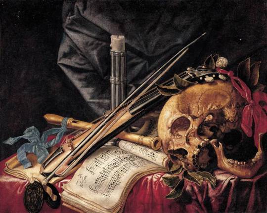
Simon Renard de St. André, ‘Vanitas Still Life’, oil on canvas
I like the still life paintings that have instruments and music sheets in it. They’re more interesting for me. A lot of the paintings like this one have skulls in them. I found that it’s called ‘vanitas’ which I think literally means vanities. It’s originally a term from the bible but it was used as an art term to describe a still life artwork which has objects designed to remind the viewer of their mortality and of the worthlessness of worldly goods and pleasures. This also linked to another art term called ‘momento mori’ which is supposed to remind the viewer of the fragility of human life. The objects chosen by the artists, in these paintings, would have to symbolise material wealth or the attachment to material objects that in reality aren’t worth anything.
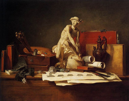
Chardin, ‘The Attributes of the Arts and their Rewards’, 1766
The sculpture of the man is nearly in the centre and the colour allows it to catch the most light but also have a lot of shadow. The sculpture is like an excuse to draw a person in a still life. I think with the lighting and the warm colours it gives a homely sort of feeling. I notice that some still life paintings look like just an observation while others seem to connect different objects to tell a story or a message.
Paul Cezanne, ‘Still Life with Apples’, 1893-1894, Oil on canvas
From the sixteenth century to the seventeenth, the still life works still look very similar. It started with just objects then moved on to symbolical objects. This eighteenth century still life by Cezanne shows an immediate change from the older paintings. The choice of objects and arrangement are still the same but the way it’s painted is very different. While the older paintings focused on portraying the objects realistically, Cezanne seems to focus on how he paints the objects. It’s like he looked at the apples and thought “ if I get the shape, colour and texture right without going into detail, it will still look like an apple”. He picked out the main colours and tried to simplify a still life.
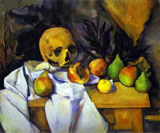
Paul Cezanne, ‘Still Life with a Skull’, 1895-1900, Oil on canvas
In this piece I can see that he has expanded on the idea and simplified it even more. The shadows around the objects have become harsh lines and give an almost flat look if it wasn’t for his colour blending. It almost looks like a cartoon. It’s hard to tell what the background is but it makes makes everything look distorted. Theres shadows in the back that look like pineapple leaves but there’s also hint of actual pineapples behind the other fruits.
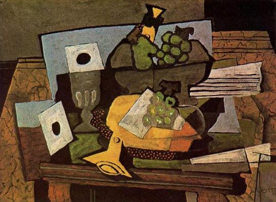
Georges Braque, 'Still life with clarinet’, 1927, Oil on canvas
Moving into the nineteenth century there’s another drastic change. Braque has broken down the dimensions of the objects into shapes. You can make out different sides of the cup. The colours are mostly natural but you have to look closely to notice the shadows. The overlapping of some of the objects helps to distinguish which objects are closer and which objects are behind. Some things are hard to make out but you can still get a realistic image in your mind of what the setup might have looked like.
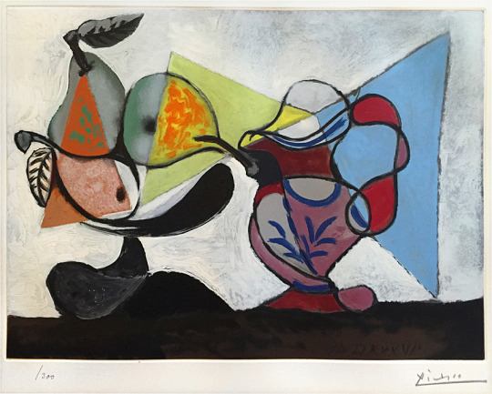
Pablo Picasso, ‘Nature Morte’ (Still Life), 1960, Colour Aquatint on Arches Paper
True to his cubist style Picasso brings out a still life like no other. At first glance it looks like a bunch of shapes and loopy lines but after that it’s easy to see three pears, a fruit bowl and a jug on a table. The pears actually have more detail than Braque’s fruits in the previous painting. He’s given two of the pears a rounded shape which lets you see the third pear the same way even though it doesn’t have the same shading to make it pop out.The jug seems to be flat but Picasso used darker colours at the top and bottom of the jug which makes the lighter colour in the middle stand out. By doing this he gives the jug dimension. The three triangles are like lenses. They stand out from the white background and the grey pears so they look like the first layer of the painting. It’s like you’re looking through them to see the dimension of the objects. It bring colour to the pears and even the handle of the jug is brighter. They tie the three dimensional pears to the two dimensional jug which balances out the whole painting.
Still life today
At first I couldn’t think of any examples of still life today. It’s actually very silly. My mind got used to seeing still life as paintings that I forgot that still life is around us all the time.
“Essentially, the subject matter of a still life painting or sculpture is anything that does not move or is dead”
We’ve come really far from the sixteenth century and things are changing a lot faster. Still life can be seen in photography and sculptures. There are still artists who paint it however the subject matter is very different to traditional still life. Traditional still life started with painting objects as they are, there were a lot of fruits involved and flowers involved. It then moved on to changing the objects to symbolise and represent different things that were important at the time and to give a message to the viewer. Then it went on to changing the way in which the objects are painted. An experimental style which really changed the traditional way of doing a still life.
I think it was the cubist approach that really allowed people to confidently take on still life in different ways. The change of subject matter is definitely due to the time period. The traditional still life have similar subject matter because the interests at the time and what artists wanted to portray were mostly the same. I haven’t seen any older still life that steps out of the box. The cubist still life works look different but use similar objects to the older still life.
Now we can see artists from different countries and cultures using still life in completely different ways. There’s such a variety of artists that we can see many different approaches. This could also be because we now have the internet, social media and books that gives us access to look at art from around the world.
Here are some examples I found:
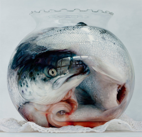
Cindy Wright, ‘Nature Morte 2′, 2010, Oil on linen
I think this painting is similar to older still life because it uses a fish and is painted very realistically like the original still life. It is also similar in that it is trying to give a message to the viewer. However the message may be different to the old still life. I am not entirely sure what the artist wants to say. From what I can see, the huge fish has been stuffed into a goldfish bowl and looks like it is staring at us (the viewer). It’s kind of disturbing. Is she talking about the way we view animals or is it for the people who eat fish or other animals?
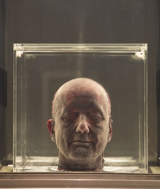
Mark Quinn, ‘Self’, 2011, Sculpture, Blood (artist's), stainless steel, perspex and refrigeration equipment
This has an element of momento mori in it as it’s literally a head made of blood. The description for this project says that the sculpture depends on electricity to keep it’s frozen appearance but it also makes you think of what would happen if the electricity was stopped. It would probably fall apart and I think this is what makes it moment mori. It’s like a reminder that death can come at any time.
0 notes