#art in overalls
Explore tagged Tumblr posts
Text

Potters wear bibjeans!
#potter in overalls#potery in overalls#artist in overalls#art in overalls#creative in overalls#bibjeans#dungarees#overalls#denimoveralls#overalls obsession#sexyinbibs#babes in bibs#overalls are hot#hot in overalls#bad ass babe in bibs#sexy ass in bibs#bad ass babe in bibs!#sexy in overalls#overalls are sexy#overalls are smart#overalls are cool#bib overalls#teacher in overalls#professor in overalls
12 notes
·
View notes
Text
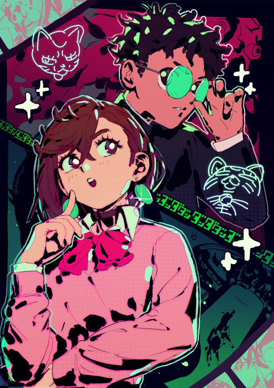
DANDADAN
#my art#dandadan#momo ayase#okarun#for dandadan I wanted to make a picture that rewarded you for looking at it longer and longer#spent way too long on this one when I have MCM coming up haha#I got mixed feelings on this manga but overall I just love the relationship between these two#it's so refreshing and sweet
5K notes
·
View notes
Text
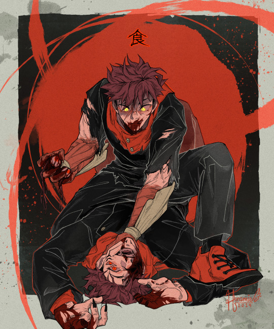
I'll rip in hands and teeth and take a bite
#my art#jujutsu kaisen#jjk#yuji itadori#ryomen sukuna#yuuji#sukuna#sukuita#fanart#jjk fanart#gore tw/#body horror tw/#blood tw/#YUUJIIII BABY BOYYYY BABYYYYYY#hes hungry :/#sukuna seems 2 be having fun gdjhfgsdf . boys when theyre bored.#so happy i wrangled this pose in2 something im happy with i almost abandoned the idea entirely#sometimes front facing is the answer.....who knew :'>#also#can anyone tell me. how far up yuujis fun arms go i had no idea so i just stopped them at the elbow#if im wrong that will b not swaggy :(#listening 2 sena's cover of butchers vanity on repeat btw VIBES#cannibalism motifs my beloved uwu#in other news this is the least amount of shading ive done in a very long time#and its been even longer since i pulled out th white lineart#but overall i like this piece so much yuuji is so cute and it doesnt make sense 2 me at all#edit changed the colour to make it more obvious whats sukunas legs vs whats yuujis back
14K notes
·
View notes
Text

All of them together!
Prints available 🌿
#art#nature#each individual piece is in my gallery in case you mised it#the only hue combo breaker is the purple one but im satisfied with the overall look#they group nicely as pairs!#edit: updated a link to my shop!
5K notes
·
View notes
Text

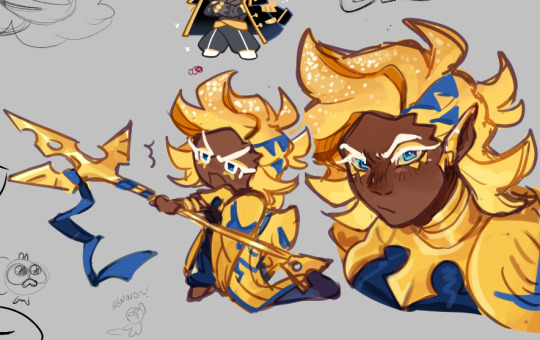

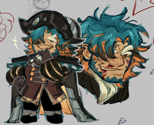
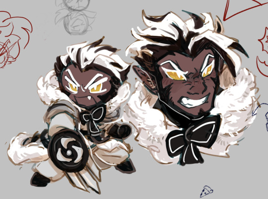
During an intense art block I took a stab at a couple of canon characters from crk!
#I dont draw fanart of the actual canon very often#I'd definitely change a few things stylization wise if I drew these guys in the future again#just making them more distinct in my art#ALSO in their humanized versions#still very proud tho overall#cookie run#cookie run kingdom#crk#cookie run fanart#cookie run kingdom fanart#crk fanart#my art#fanart#dark cacao cookie#rich cheese cookie#caviar cookie#captain caviar cookie#captain caviar#dark cacao crk#abalone cookie#crunchy chip cookie#crunchy chip crk
5K notes
·
View notes
Text
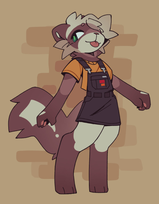
☀️
3K notes
·
View notes
Text

screen cap redraws
#I will always be thankful for WHA for not only giving us the silliest izukus but also the cutest bucket hat overall combo#bnha#boku no hero academia#my hero academia#my art#mha#midoriya izuku#deku#bnha fanart#deku fanart
6K notes
·
View notes
Text
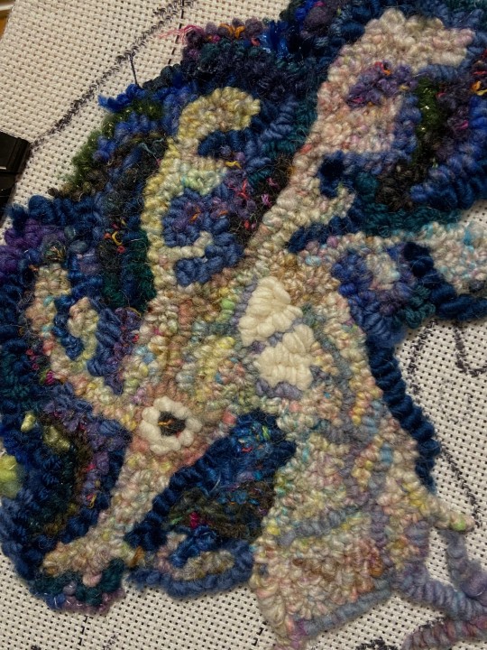
more wips
#wip#fabrication#rug hooking#fiber art#artists on tumblr#yarn's pretty uniform at least so far compared to bg#or like not a combo of a bunch of different yarns#plus I think it's sock weight? dk? so how the overall texture/actual loops look together is interesting#I guess for comparison the white yarn is bulky#like from a farther view they kinda blend together#also might take me longer than the other two since the yarn is thinner hshjfg
10K notes
·
View notes
Text

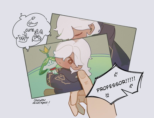
Cyno sq was so cute he is so loved
#my art#genshin impact#cyno#kaveh#al haitham#tighnari#kavehno#haino#cynonari#i love him so much#thank you for this quest#there were a couple of things i have complains about#but overall i think it was so so good#im just biased#sethos was amazing too
7K notes
·
View notes
Text

It's crazy how Dungeon Meshi's manga can feel more cinematic and emotional than the anime to me, even when they're practically the same. Compared to the anime, this moment is such a heartbreaking gut-drop. The way Kui uses negative space and flat compositions to create a sense of horrific stillness is so key.
The way the text (Senshi's monologue) is sequestered to an empty corner of a panel or huddled away from the edge of its text box is not only a great way of showing Senshi's headspace (fearful, isolated, dissociating), but creates a visual representation of pause, as if you hold your breathe after each line. The first panel puts us directly in Senshi's perspective too (compared to in the anime, which puts us as an outside observer over Senshi's shoulder). The detail of the door and bricks so effectively implies that he stared at it for so long, waiting and hoping, that its image is burned in his memory. The wood grain, the brick arch, the number of rivets. The lack of dialogue in the second panel shows a moment of realization too –– "he's dead" (also a great example of the Kuleshov effect). And it's that pause that creates a beat and sets a great rhythm to his headspace, like a music rest: "He never came back." (oh god.) "I'm all alone." Finally, the third panel's negative space, cropping Senshi, shows how truly alone he feels. Without his family, the world ceases to exists. Under shock, he traps himself in a 1-foot radius, too scared to even perceive a world outside its boundaries; a world that can hurt him, kill him, make him disappear with it. There is only his body, the stone beneath his feet and against his back, his thoughts, and that awful bowl of soup.
Even though they're a series of flat images, there's an implicit reading of silence in Senshi's realization and horror. Kui influences your experience to slow down and take your time.
Compare this to the anime, which fills every shot with dialogue. The pacing is fast; we never get to sit in silence like we do with the manga. The horizontal frame allowed the boarders to add Senshi, turning the composition into an over-the-shoulder shot, which takes us out of Senshi's POV. They also added a zoom-out in shot one, which adds unnecessary energy to a very somber scene. The tightening on Senshi as a close-up reaction shot also dulls the moment. In the original panel, Senshi stares ahead at the empty space to his left as a shadow surrounds his mind. It not only shows how Senshi's senses are dulling and his world is shrinking (setting up panel three), but shows how terrified Senshi is of what's in front of him, how the air itself becomes pitch black and opaque, how Senshi is surrendering himself to fear. The pacing is understandable and necessary; this episode packed a lot of story content together. It's just a shame because it really (imo) deflated one of the most nauseating moments in Dungeon Meshi.
#dungeon meshi#senshi#analysis#personal#long post#not art#because comics are inherently more abstract and rule-breaky the format thrives off show don't tell#i think trigger is doing a great job overall but they missed the mark on this scene#for me cinematic storytelling will prioritize rhythm; tension; and silence over plot. that's why the manga feels more “cinematic”#if you've been enjoying the anime i cannot recommend also reading the manga enough. it's a completely different experience with much more#subtext and emotion to draw from
4K notes
·
View notes
Text
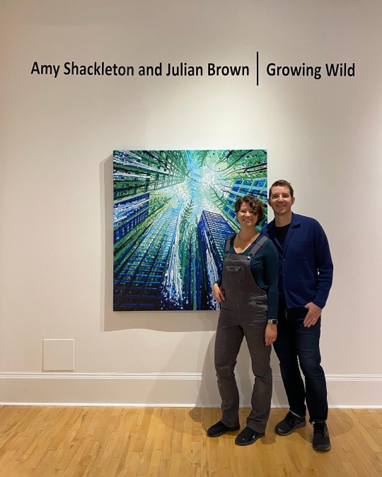
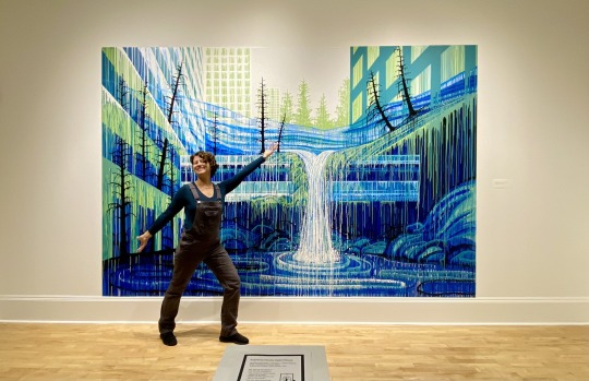
Artist in overalls!
#Amy Shackleton#dovetail workwear#freshly#dovetail#bibjeans#dungarees#overalls#gray overalls#denimoveralls#overalls obsession#sexyinbibs#babes in bibs#overalls are hot#hot in overalls#bad ass babe in bibs#art in overalls#artist in overalls
12 notes
·
View notes
Text
The sun and the sea ☀️🌊
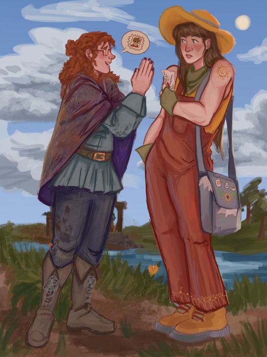
Anyone else wanna join me in thinking about the fact that they pulled opposite motifs ?!?? The horrors of the deep sea in contemporary/modernish time and the joy and brightness of a punk future with the power of the sun. This is so crazy to me. How do they do it !?
Anyways one reblog 1 Stamp for Gem (and pearl can avoid some uh. Well you know, fraud charges)
#art#fanart#chaos#hermitcraft#pearlescentmoon#geminitay#pearlescentmoon fanart#geminitay fanart#hermitcraft season 10#hermitcraft season ten fanart#hermitcraft fanart#hermitcraft gem#hermitcraft pearl#shiny duo#hermitblr#anyways you have no idea how much I ADORE drawing these guys#im still getting the hand of some designs#but the people voted overalls and who am I to deny them
4K notes
·
View notes
Text

I'll give them shelter like you've done for me
#my art#jujutsu kaisen#jjk#jjk fanart#jujutsu kaisen fanart#megumi fushiguro#yuji itadori#itafushi#jjk spoilers#jjk manga spoilers#jjk leaks#jjk art#fushiguro tsumiki#took all afternoon but we wrangled the colours in2 submission#it was looking very green and kind of muddy#so i toned down the saturation in a bunch of places pulled in a lot more grey#kept a lot of the shadows Hard#i think it works#not sure it's the absolute best it cld be but i am Satisfied with it#overall i ws just kind of worried that it was looking rly similar to past pieces colour-wise#i think it kind of still Is but not as much as it would have been had i not made those edits#anyway. emo hours#ive been listening to jubyphonic's piano arr of shelter and thinking abt megumi#thinking abt him growing up n looking back on himself n seeing himself in tht lonely little boy#'it's a long way forward so trust in me' smth smth finding the strength to guide that kid forward even though both of u are scared#bc at the end of the day u Are still that kid#inner child stuff usually doesnt resonate much with me bc i don't like who i was/am/whatever this aint abt me#but in regards to megumi????? OW#in lighter news i remembered at the absolute last minute to lob off the top of yuuji's ear#bc that injury at least i think he keeps ghfssdfhfgsj
5K notes
·
View notes
Text
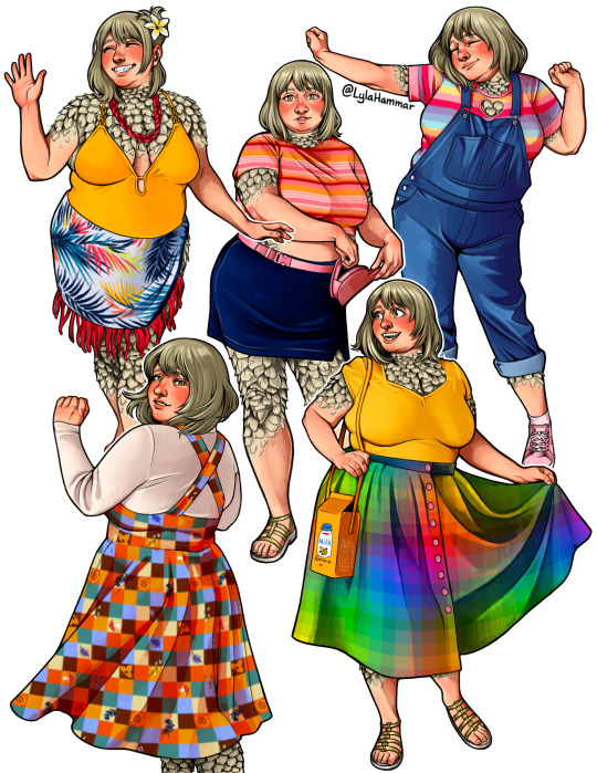
Falin isn't comfortable in these kinds of clothes but I'm a big fat Falin kinnie so I had to draw her in some of my outfits anyways ✌️😗
#the overalls is the only one of these outfits that she'd be kinda okay with 😂 but whatever#me @ falin: (points) go there. in the clothes#also her feathers ended up looking more like scales so >:T I think I'm gonna do some studies#my art#dungeon meshi#delicious in dungeon#falin touden#farlyn touden#farlyn thorden#man maybe I can stop tagging all her different name translations now that the anime is unifying everyone LMAO#dungeon meshi spoilers#delicious in dungeon spoilers
4K notes
·
View notes
Text

Messmer, the Impaler
#messmer#messmer the impaler#elden ring messmer#elden ring#shadow of the erdtree#sote#elden ring sote#sote spoilers#artists on tumblr#digital illustration#digital art#m1nsur0#illustration#art study#art#fave boss in the game overall#close second is malenia
2K notes
·
View notes
Text
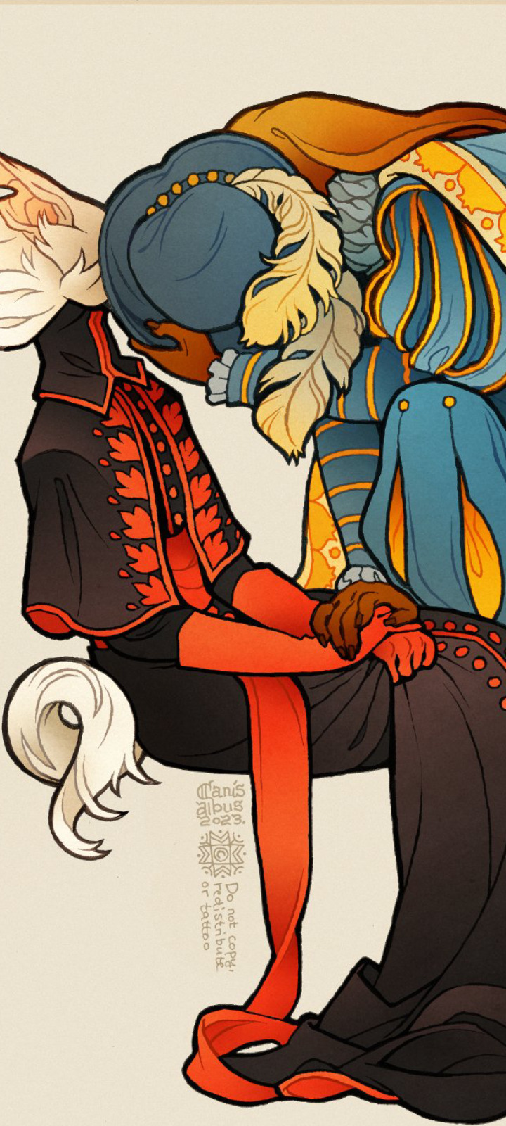
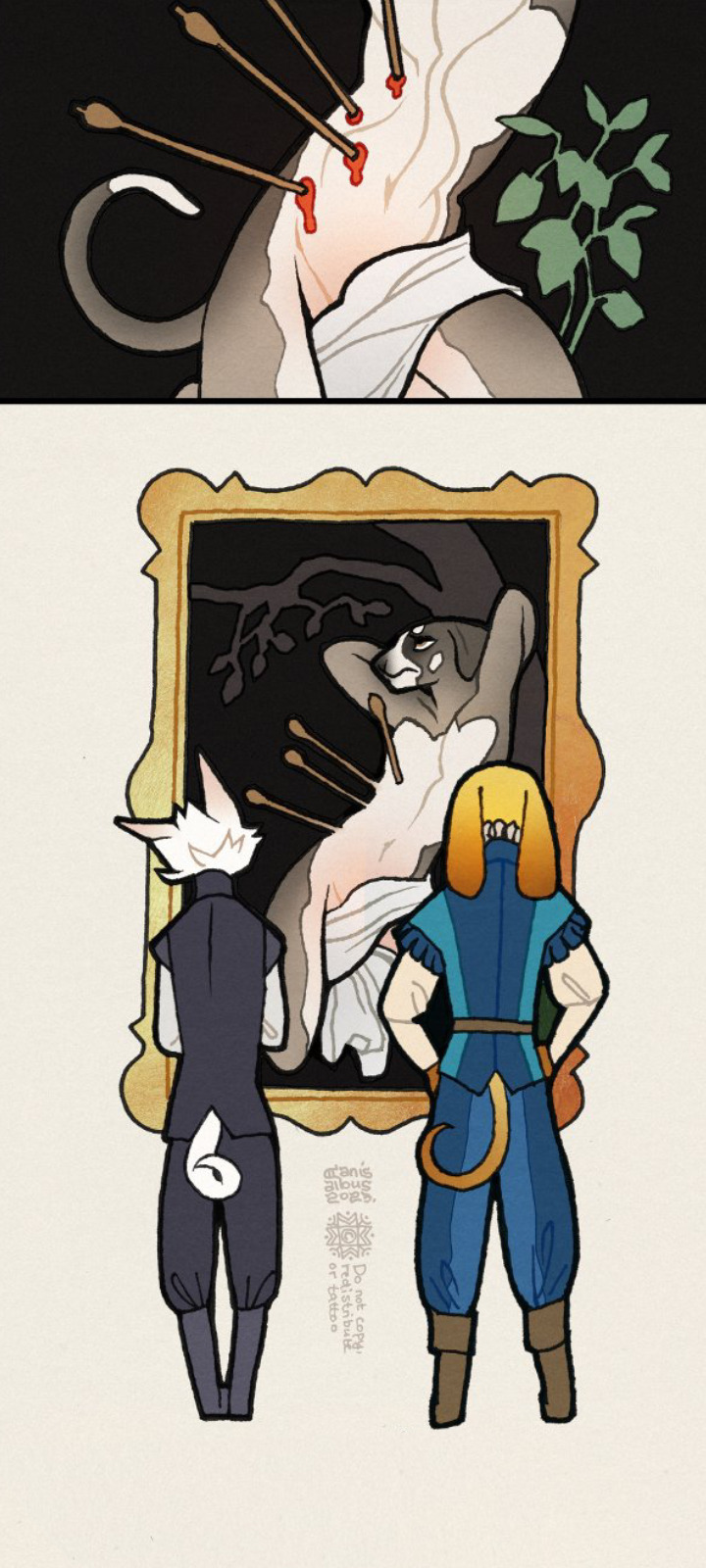
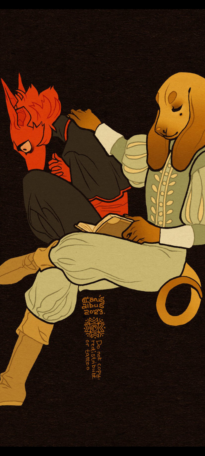
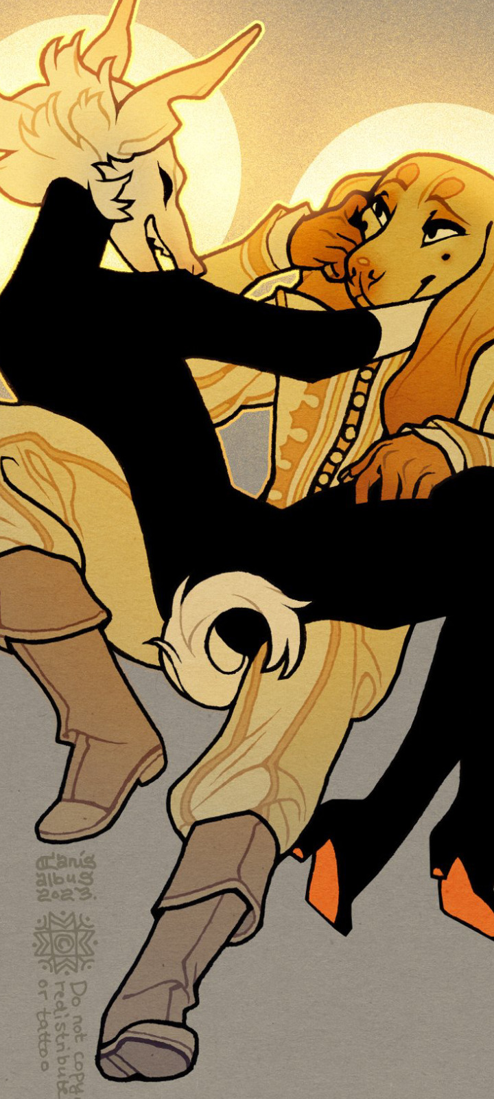
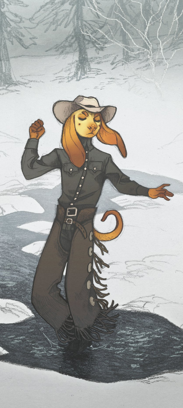
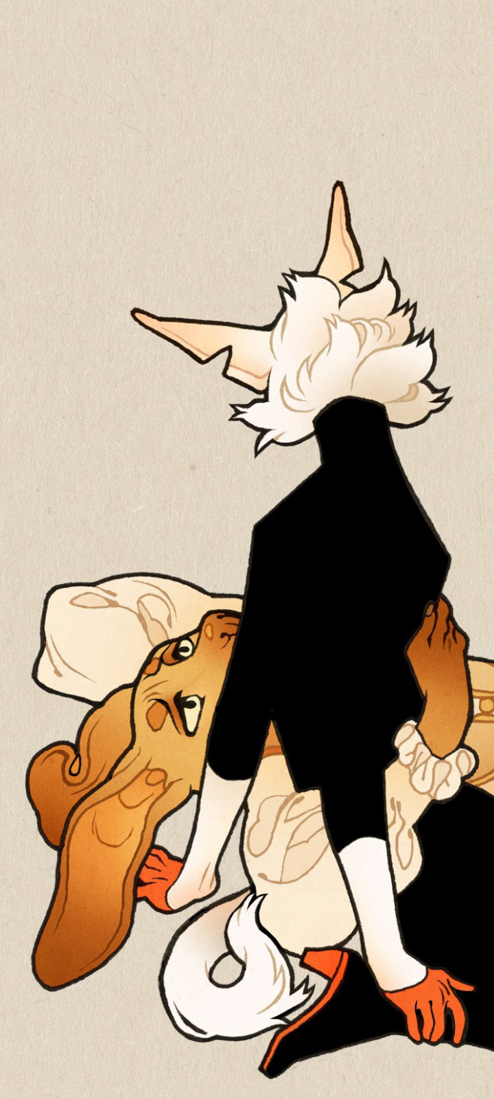
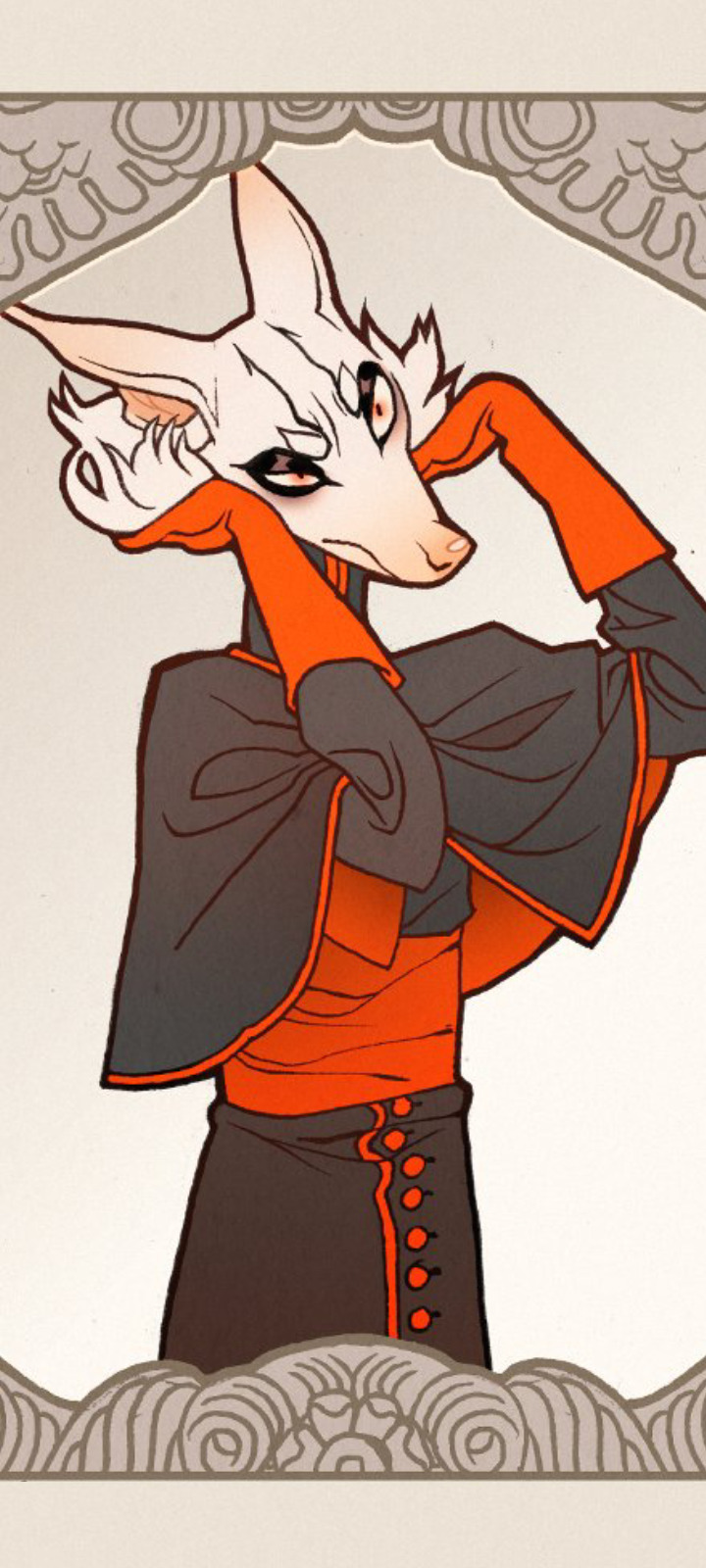
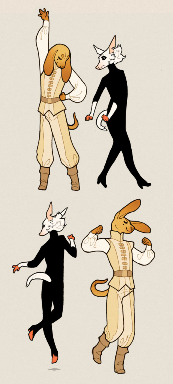
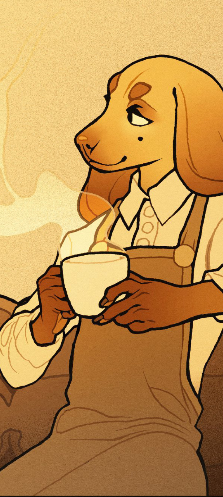
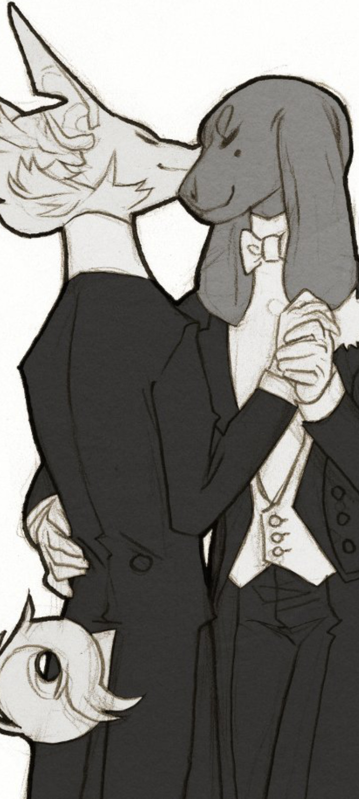

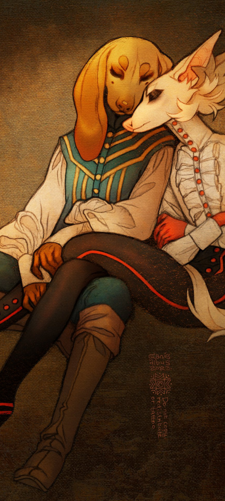
✦ Milk and Honey ✦
#I've been going through some of the pieces from the past few months#the oldest of these are from... late may early july I think? felt like making a little compilation to get a better overall picture#fixation has been strong this is just a fraction of them all#gay catholic dog era#own art#own characters#CanisAlbus#art#artists on tumblr#Vasco#Machete#anthro#sighthound#dogs#canine#animals#I think my personal favorites this far are the body heat piece and the bathtub scene#but their composition didn't work with this format so I left them out
9K notes
·
View notes