#arrighi type
Explore tagged Tumblr posts
Visit Tumblr Blog
Explore Tumblr blogs with no restrictions, modern design and the best experience.
Last Seen Tumblr Blogs


Fun Fact
Mobile Tumblr US users spend an average of 4.04 minutes per session on the app.
Text
Foods of the Ancient World: Ötzi's Last Meal
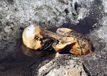
Fair use, https://en.wikipedia.org/w/index.php?curid=11187909
On 9 September 1991, two German tourists were hiking in the Ötztal Alps on the Austrian-Italian border when they found a body, thinking it was a recent death. A mountain gendarme came the next day to remove the body, which was in ice below its chest, only to be thwarted by weather so that it wasn't until 22 September that the body was salvaged. On the 24th, it was examined by an archaeologist who said it was at least 4,000 years old based on recovered objects. Later, that would be revised to about 5,000 years, with the most likely time of death being between 3239-3105 BCE.
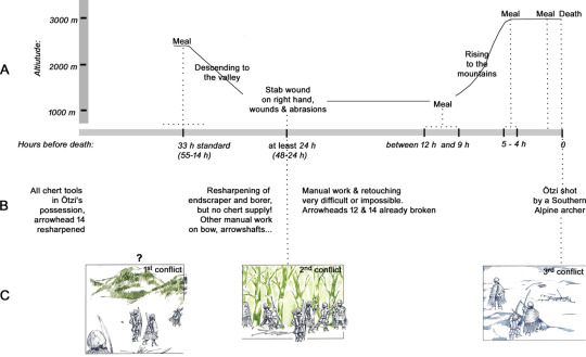
By Wierer, U., Arrighi, S., Bertola, S., Kaufmann, G., Baumgarten, B., Pedrotti, A., Pernter, P. and Pelegrin, J. - https://journals.plos.org/plosone/article?id=10.1371/journal.pone.0198292, CC BY-SA 4.0, https://commons.wikimedia.org/w/index.php?curid=124578050
Ötzi is the oldest natural mummy that we currently know of. He was covered in ice shortly after his death, preserving him, allowing us to find out a great deal about his life, how he lived, where he lived, his health, what the world was like around him, and what he ate just before he died one spring day or early summer day in the Copper Age. Analysis of his hair and stomach showed that Ötzi was an omnivore, that he likely consumed diary of some type, and several high nutrition herbs. Within his possessions were two birch bark baskets with some berries and polypore mushrooms on a leather cord.
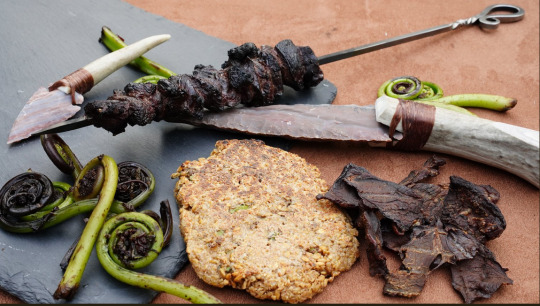
We know that Ötzi died with a full stomach, having eaten within two hours of his death, so his meal hadn't had time to digest, so we know what he'd eaten most recently. His final meal consisted of either fresh or dried goat and deer meat with einkorn cakes. We also know that a bit earlier, he had some fruit, roots, and nuts with his penultimate meal.
Should you want to try it, you can find a recipe at Tasting History.
72 notes
·
View notes
Text


It’s Fine Press Friday!
The Kasidah of Hâjî Abdû el-Yezd was published by Limited Editions Club in 1937, printed by Yale University Press in New Haven, Ct, and released in a limited edition of 1500 copies. Valenti Angelo (1897-1982) decorated, illuminated, and illustrated the poem by Sir Richard F. Burton (1821-1890). The type is Centaur roman and Arrighi italic; the double-folded paper is Japanese Yamane. A petite book, it is but 4 x 6 inches. Its colophon is signed by Angelo.
The text of this beautiful object is a long Persian poem by Hâjî Abdû El-Yezdî and translated by “F.B.” – which is to say, that it was, in truth, an English poem written by Sir Richard F. Burton, who claimed to serve as its translator. This edition suggests, with plausible deniability in its vagueness, that it was merely “written down” by Burton; but a long note at the end of the text fully embraces the deception of Burton's Hâjî Abdû. Burton was an explorer, soldier, Orientalist, translator of One Thousand and One Nights, and he is said to have spoken upwards of 29 languages. He disguised himself as a Muslim and participated in the Hajj. He wrote extensively of his travels, and in particular about the sexual behavior and penis lengths of the people he met.
Burton looks exactly as you might expect.

See more beautiful work by Valenti Angelo.
See more books from Limited Editions Club.
See more National Poetry Month posts!
--Amanda, Special Collections Graduate Intern


#fine press friday#national poetry month#fine press fridays#finepressfriday#limited editions club#The Kasidah of Hâjî Abdû el-Yezd#Yale University Press#Valenti Angelo#Arrighi Italic#Centaur Roman#Orientalism
36 notes
·
View notes
Text
Italian Literature Tournament Masterpost: rules and final list of partecipants!

The Story of Nastagio degli Onesti (forth episode) - Sandro Botticelli. Do you see how much they're happy after having experienced the horrors? You'll be like them from monday, yay!
👉 After almost three months from the first post, the first edition of the Italian Lit(🔥)erature Tournament is about to start Monday 21 October!
👉 The rules will be presented in this masterpost with the final list of authors under the cut.
👉 We arrived at 96 authors partecipants: actually, between the original list and the new names added with this poll (closed yesterday, October 10th at 14,45 CET), the number of names exceeded quota 100, so I had to remove some of them for time matters and to achieve a number divisible by 2, if not by 16, the exact amount which is possible to create a challenge of this type. To make this, without removing the names proposed on the google fom (I accepted all of them, considering that if they have been proposed it means that a least they can achieve one vote) and triying to keep the male/female -nothern/southern authors balance, I removed many of the philosophers/essayists names (lefting only the ones from the google form, as I have specified). It's been a painful choice but, as I already wrote, it's caused by time and organizational matters. If the next year a new edition of this challenge will succeed, I could organize different mini bracket each for century or historical era (like for example: Best Medieval Italian Lit Act, Best Renaissance, Best 20th Century, Best Playwriter, etc), so there will be more space for more authors who didn't manage to being part of this challenge.
👉 The combinations for the first round, which will start Monday 21, is already created and will be published by Monday 14th. At each round start, the combination list will be fixed as the first post with the links to the surveys, so anyone who wants to reach a specify author to vote can do it without much issues. In any case, any post regarding a partecipant will be tagged under it's name.
👉 The list with the 96 names is under the cut, organized with the surnames in alphabetical order. To create the various combinations, I chose the most basic of the software (usually I use excel, but on my pc sometimes it goes down and to manage 96 variables is hard, at least I want to make it with a simple tool). For the first three rounds, due to the great number of partecipants, the combinations will be sorted randomly each time: by the fourth round, it will be created the semi-final bracked. Always due to the large number, the final round will not have two partecipants, but three. I already thought how to organize it and make it to the final winner so don't worry, but for now it's a spoiler 🤫
Dante Alighieri
Sibilla Aleramo
Vittorio Alfieri
Cecco Angiolieri
Pietro Aretino
Ludovico Ariosto
Cletto Arrighi
Matteo Bandello
Anna Banti
Giambattista Basile
Giorgio Bassani
Pietro Bembo
Luciano Bianciardi
Matteo Maria Boiardo
Giovanni Boccaccio
Giordano Bruno
Dino Buzzati
Italo Calvino
Luigi Capuana
Andrea Camilleri
Giosuè Carducci
Carlo Cassola
Guido Cavalcanti
Carlo Collodi
Vittoria Colonna
Gabriele D'Annunzio
Giacomo da Lentini
Tullia d'Aragona
Alba de Céspedes
Cielo (Ciullo) d'Alcamo
Jacopone da Todi
Edoardo De Filippo
Federico de Roberto
Antonio Fogazzaro
Grazia Deledda
Umberto Eco
Beppe Fenoglio
Dario Fo
Ennio Flaiano
Ugo Foscolo
(Carlo) Fruttero & (Franco) Lucentini
Veronica Franco
Carlo Emilio Gadda
Natalia Ginzburg
Carlo Goldoni
Guido Gozzano
Carlo Gozzi
Francesco Guicciardini
Tommaso Landolfi
Giacomo Leopardi
Carlo Levi
Primo Levi
Niccolò Machiavelli
Alessandro Manzoni
Giovanbattista Marino
Giovanni Meli
Alda Merini
Pietro Metastasio
Eugenio Montale
Elsa Morante
Alberto Moravia
Anna Maria Ortese
Giuseppe Parini
Goffredo Parise
Giovanni Pascoli
Pier Paolo Pasolini
Cesare Pavese
Francesco Petrarca
Luigi Pirandello
Angelo Poliziano
Luigi Pulci
Salvator Quasimodo
Gianni Rodari
Lalla Romano
Amelia Rosselli
Umberto Saba
Emilio Salgari
Jacopo Sannazaro
Goliarda Sapienza
Giorgio Scerbanenco
Leonardo Sciascia
Matilde Serao
Gaspara Stampa
Mario Rigoni Stern
Italo Svevo
Antonio Tabucchi
Elena Cassandra Tarabotti
Igino Ugo Tarchetti
Torquato Tasso
Giuseppe Tomasi di Lampedusa
Pier Vittorio Tondelli
Sebastiano Vassalli
Giovanni Verga
Renata Viganò
Elio Vittorini
Giuseppe Ungaretti
26 notes
·
View notes
Photo
la operina
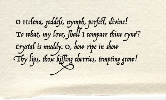
demetrius’ words in shakespeare’s A Midsummer Night’s Dream, act 3, scene 2. set in trattatello, apple’s own, abbreviated, yet still well appointed, version of p22 operina. designed by james grieshaber, operina is not adapted from printing types but rather from xylographic exemplars [probably the work of ugo da carpi] depicting the chancery cursive as practiced by a 16c scribe in the apostolic chancery, ludovico degli arrighi, & appearing in the first printed specimen of cursive calligraphy, La Operina di Ludovico Vicentino, da imparare di scriuere littera Cancellarescha [rome, 1522]. arrighi, also publisher, had proprietary types cut after his designs—for details of a modern recutting vide ‹o lovely hand›.
7 notes
·
View notes
Text
Interesting Papers for Week 31, 2018
Spatiotemporal encoding of search strategies by prefrontal neurons. Chiang, F.-K., & Wallis, J. D. (2018). Proceedings of the National Academy of Sciences of the United States of America, 115(19), 5010–5015.
Vision and Locomotion Shape the Interactions between Neuron Types in Mouse Visual Cortex. Dipoppa, M., Ranson, A., Krumin, M., Pachitariu, M., Carandini, M., & Harris, K. D. (2018). Neuron, 98(3), 602–615.e8.
Decodability of Reward Learning Signals Predicts Mood Fluctuations. Eldar, E., Roth, C., Dayan, P., & Dolan, R. J. (2018). Current Biology, 28(9), 1433–1439.e7.
On the Flexibility of Basic Risk Attitudes in Monkeys. Farashahi, S., Azab, H., Hayden, B., & Soltani, A. (2018). Journal of Neuroscience, 38(18), 4383–4398.
Motion-induced compression of perceived numerosity. Fornaciai, M., Togoli, I., & Arrighi, R. (2018). Scientific Reports, 8(1), 6966.
Electrical Stimulation in Hippocampus and Entorhinal Cortex Impairs Spatial and Temporal Memory. Goyal, A., Miller, J., Watrous, A. J., Lee, S. A., Coffey, T., Sperling, M. R., … Jacobs, J. (2018). Journal of Neuroscience, 38(19), 4471–4481.
Action-effect related motor adaptation in interactions with everyday devices. Horváth, J., Bíró, B., & Neszmélyi, B. (2018). Scientific Reports, 8, 6592.
Novelty-Sensitive Dopaminergic Neurons in the Human Substantia Nigra Predict Success of Declarative Memory Formation. Kamiński, J., Mamelak, A. N., Birch, K., Mosher, C. P., Tagliati, M., & Rutishauser, U. (2018). Current Biology, 28(9), 1333–1343.e4.
A Task-Optimized Neural Network Replicates Human Auditory Behavior, Predicts Brain Responses, and Reveals a Cortical Processing Hierarchy. Kell, A. J. E., Yamins, D. L. K., Shook, E. N., Norman-Haignere, S. V., & McDermott, J. H. (2018). Neuron, 98(3), 630–644.e16.
Rat anterior cingulate cortex recalls features of remote reward locations after disfavoured reinforcements. Mashhoori, A., Hashemnia, S., McNaughton, B. L., Euston, D. R., & Gruber, A. J. (2018)e. Life, 7, e29793.
Adaptive and Selective Time Averaging of Auditory Scenes. McWalter, R., & McDermott, J. H. (2018). Current Biology, 28(9), 1405–1418.e10.
5-HT2a receptor in mPFC influences context-guided reconsolidation of object memory in perirhinal cortex. Morici, J. F., Miranda, M., Gallo, F. T., Zanoni, B., Bekinschtein, P., & Weisstaub, N. V. (2018). eLife, 7, e33746.
Diametric neural ensemble dynamics in parkinsonian and dyskinetic states. Parker, J. G., Marshall, J. D., Ahanonu, B., Wu, Y.-W., Kim, T. H., Grewe, B. F., … Schnitzer, M. J. (2018). Nature, 557(7704), 177–182.
Ultra-slow mechanical stimulation of olfactory epithelium modulates consciousness by slowing cerebral rhythms in humans. Piarulli, A., Zaccaro, A., Laurino, M., Menicucci, D., De Vito, A., Bruschini, L., … Gemignani, A. (2018). Scientific Reports, 8, 6581.
A Bayesian Approach to Policy Recognition and State Representation Learning. Sosic, A., Zoubir, A. M., & Koeppl, H. (2018). IEEE Transactions on Pattern Analysis and Machine Intelligence, 40(6), 1295–1308.
The Medial Prefrontal Cortex Shapes Dopamine Reward Prediction Errors under State Uncertainty. Starkweather, C. K., Gershman, S. J., & Uchida, N. (2018). Neuron, 98(3), 616–629.e6.
Refinement of Spatial Receptive Fields in the Developing Mouse Lateral Geniculate Nucleus Is Coordinated with Excitatory and Inhibitory Remodeling. Tschetter, W. W., Govindaiah, G., Etherington, I. M., Guido, W., & Niell, C. M. (2018). Journal of Neuroscience, 38(19), 4531–4542.
The threshold for conscious report: Signal loss and response bias in visual and frontal cortex. van Vugt, B., Dagnino, B., Vartak, D., Safaai, H., Panzeri, S., Dehaene, S., & Roelfsema, P. R. (2018). Science, 360(6388), 537–542.
Long-Term Temporal Convolutions for Action Recognition. Varol, G., Laptev, I., & Schmid, C. (2018). IEEE Transactions on Pattern Analysis and Machine Intelligence, 40(6), 1510–1517.
Control of motor coordination by astrocytic tonic GABA release through modulation of excitation/inhibition balance in cerebellum. Woo, J., Min, J. O., Kang, D.-S., Kim, Y. S., Jung, G. H., Park, H. J., … Yoon, B.-E. (2018). Proceedings of the National Academy of Sciences of the United States of America, 115(19), 5004–5009.
#science#Neuroscience#neurobiology#computational neuroscience#cognition#cognitive science#research#Brain science#scientific publications#machine learning#psychophysics
10 notes
·
View notes
Text
Type Report 2 - Helen Qiu
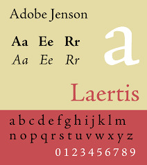
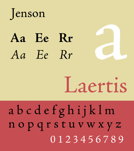
Adobe Jenson:
Adobe Jenson is an old-style serif typeface created by Robert Slimbach and drawn for Adobe Systems. Its Roman styles are based on a text face cut by Nicolas Jenson in Venice around 1470, and its italics are based on those created by Ludovico Vicentino degli Arrighi fifty years later.
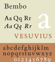
Bembo book:
Bembo is a serif typeface created by the British branch of the Monotype Corporation in 1928–1929 and is most commonly used for body text. It is a very legible typeface that is frequently used for books. You can, however, use Bembo for any type of project in which you need a classical yet stylish look. If you are looking for an alternative, try Adobe Garamond or Minion. Bitstream’s Aldine 401 is a Bembo look-alike.
The first version of Bembo was cut by Francesco Griffo around 1496 for use by Venetian printer Aldus Manutius. The typeface got its name from being used in a book authored by Cardinal Bembo. It appeared in its full form in a later book called Hypnerotomachia Poliphili, one of the most celebrated book designs of the Renaissance.
1 note
·
View note
Text


It's Fine Press Friday!
Veteran letterpress printer and fine press publisher Richard Bigus founded Labyrinth Editions in 1977 in Torrance, California. He learned his craft under the tutelage of noted California poet and printer William Everson and printer and educator Jack Stauffacher at Cowell College, University of California, Santa Cruz. In 1980, Bigus designed, printed, and bound this exquisite edition of Everson's anthology of pacifist poetry, Eastward the Armies, in an edition of 250 copies illustrated with linocuts by California artist Tom Killion, another student of Jack Stauffacher, and signed by the poet and artist.
Bigus handset the type in 18-pt. Centaur, with Arrighi italics and Castellar initials and titling. Other text was set in 12-pt. Centaur and Arrighi italics. The illustrations are printed directly from Killion's linoleum blocks. The book is quarter-bound with leather-thong side stitch in linen and decorative paper marbled by Bigus over boards. Of the 250 copies, ours is one of 50 printed on handmade Japanese Hosho Professional and Suzuki papers. Our copy is another donation from the estate of our late friend, art professor, painter, collector, letterpress printer, and book artist Dennis Bayuzick.

View other posts on books by Richard Bigus.
View other posts on books illustrated by Tom Killion.
View other posts on works by William Everson.
View other books from the collection of Dennis Bayuzick.
View more Fine Press Friday Posts.
#Fine Press Friday#fine press fridays#Richard Bigus#Labyrinth Editions#Tom Killion#linocuts#William Everson#Eastward the Armies#poems#poetry#anti-war poems#Jack Stauffacher#Centaur type#arrighi type#Castellar type#Hosho paper#Suzuki paper#Dennis Bayuzick#fine press books#letterpress printing
25 notes
·
View notes
Text
Final say
Language is one of those things that I have personally never given much thought about in regards to its origin. This class was such an eye opening experience to the world of design and to the people that have created everything from the basics of language and speech to the font that you see on this document. To have innovated so quickly from the Industrial Revolution to now, in a little over a couple hundred years is truly amazing.We live in a time where information is readily available at any given moment. We literally have the freedom of knowledge in our pockets and also the freedom to say basically anything we want, no matter if it’s true or relevant. The desire to create and share information is what I believe started humans on the path to where we are today.
The earliest known form of written communication was discovered in caves, much like the caves in Lascaux, France. The earliest known writing was known as Cuneiform and was created by the Sumerians and ancient Mesopotamia. From the Sumerians, language and writing changed at the hands of the Egyptians and their hieroglyphics. For the first time, we had pictures and shapes that could be determined to be a language spoken by an ancient civilization. This wasn’t the only great innovation by the Egyptians as they were master architects and savvy business people, thanks to the near by Nile river. Waterways played an interesting role in the expansion of language, culture and graphic design as a whole. Another masterful civilization, and one that is known be one of the greatest era’s in mankind was the Greek innovations for language, and letters. Specifically, a written alphabet known as the Phoenician alphabet. This alphabet coincides with the North Semitic alphabet of the same time period.
After the fall of Greece, the spread of cultures was reaching far and wide, soon reaching a place Italy, or the Etruscan people which lead to the creation of the Latin alphabet. The latin alphabet is was most closely resembles the alphabet we know today, and is what allows for us to read the words I’m typing. Originally the Latin alphabet had 21 letters, but advances and adoptions from other cultures stolen by the Romans in their rapid expansion grew the alphabet to the letters we have today. Roman letters also had a major influence on the creation of typography and the beauty that most would try to achieve. One area that I never realized was such a large contributor to the world was China. The Chinese invented paper. Paper may be obsolete by the time I’m an old man, but the creation of paper is one of the most important inventions to ever be created. Chinese Calligraphy played a major role in what it means to create words and sounds and what it means to create art as calligraphy was an art form, not just a means of communication. According to our book, Megg’s History of Graphic Design, Chinese calligraphy had 5 stages: Chiaku-Wen, Chin-Wen, Hsiao-Chuan, Lu-Shu, and Chen-shu. An amazing exmaple of chinese calligraphy can be seen in the Album of 8 Leaves by Li Fangyang.
Along with the creation of paper, the next major innovation that would be the catalyst for hundreds of years of artists and educators was the creation of printing. Done with wooden blocks, printing was a way to replicate symbols and characters and not have to write them over and over, one could simply stamp them. Of the earliest known graphic design examples is of Chinese scrolls and playing cards.
Following up and building upon the Chinese printing invention, illuminated manuscripts were now present in Western Europe and Eastern Islamic areas. A wonderful example of the these illuminated manuscripts were the Book of Kells and the Qur’an. Also the medieval manuscripts are most likely what most of us think about when we hear manuscripts, at least that’s what I thought of, that could possibly be Monty Python and the Holy Grail’s fault though.
The next innovation that truly had the largest impact on the history of graphic design was the innovations of typography. Block printing was now the means of creating books, and general communication for the public. But it wasn’t moving fast enough for the expansion of the languages. That’s when Johan Gutenburg created the movable type for block printers. There is a theme that I’ve learned about graphic design and it is that every country and every generation seeks to take what the previous innovators have done, and improve upon them and make them more concise and more importantly make them their own. Albrecht Pfister was the first to print illustrations with typography. Soon Nuremburg would become the printing capital of the world. During this expansion of typography, the Italian Renaissance was going on at the same time and people like Johannes da Spira were able to take advantage of the slow acceptance of this new method of printing as many believed it wasn’t as great at manuscripts but arguably the most influential typeface designer came out of this era and that was Nicolas Jenson. Jenson was the subject of numerous typeface inspirations for generations after he created over 150 books and he opened a second press as da Spira died. Other notable designers were Aldus Manutius and the Italian writing masters: Arrighi, Sigsmondo Fanti, and Giovantonio Tagliente.
There was a bit of a lull in designer innovation for a while, but in the 1700’s France’s Louis the XIV commissioned a new typeface. William Caslon took the task and created the Romain Du Roi. Moving over to the other side of the pond with a more familiar name. Benjamin Franklin, yes that one dude on the bill that I never have, printed Cato Major which was to be one of the first writings distributed among the new colonies in a tiny place called America. With these innovations in art, it is no surprise that others were excited about this technology and were looking for ways to use it for their own purpose. William Playfair was a scientist and created one of the first information graphics about his work. Another prominent designer was Giambattista Bodoni. Bodoni also has numerous typefaces to his name, and also a typeface named after him.
In the late 1700’s things changed. The birthplace of the Industrial revolution is said to be in England. This expanded to other areas and this growth came with both grand vision and terrible downturns. The grand vision was to create mass produced goods for people, the issue was now with mass production the need for graphic designers was basically non existent. They had machines doing everything and artists were scarce and frankly not wanted. This did however drive a need for mass communication among the people that went from working in fields to working in factories in terrible conditions. This need for mass communication was met by a man named William Cowper. Cowper patented a machine that could be mounted to a cylinder and rotate creating impressions on paper. This first invention was revolutionary in the creation of mass production. It would make 2,400 impression an hour and use 1,200 sheets of paper. As the demand grew so did the machine. Soon his printing press could create 4,000 sheets of paper an hour. That’s insane.
The first person to take a photograph was credited to Frenchman Joseph Niepce. This was deemed to be the end of printed word, much like the quartz crisis that hit all major wristwatch brands in the late 70’s and early 80’s. Nobody was going to want a mechanical watch after a battery operated one hit the market. Luckily for graphic designers everywhere, it was just another medium to create art with. Probably my favorite photographer is Eadweard Muybridge, not only because his name is impossible to spell, but because he is credited with creating the first moving picture of the running horse.
Soon after photography was created, lithograhy took off as the main source of creating images. All those PT Barnum circus posters, and Annie Oakley and Wild Bill Wild West Show evoke this short of wild west, lithography rough and tumble kind of world. Things were simple and yet not everyone was excited about lithography and chromolithography. Letterpress was still holding strong against the chromolithography craze that lasted 40 years from 1860 to 1900. Once 1900’s hit, everything just went wild. Graphic Design was really now turning into an artform and was no longer just letters. It was wild pictures seen in Harper’s Bazaar and William Morris was heading up private presses to create beautiful book designs. It was no longer a means to create mass communication, now it was that PLUS being able to do it in the most beautiful way possible. Art nouveau took hold and always evokes a sense of Victorian propriety and elegance. But North America wasn’t the only place having an art renaissance. Back in Europe…
Germany had the Jugendstil, or young style or art. It was a new movement that sought to learn from the past but to create new and exciting art, you know until World War 1 started. With these art movements you had some of the most famous names in all of art history arising during this time. Frank Lloyd Wright was a magnificent architect who would use nature as inspiration and decide how architecture could move with, not impede nature. There was a revolution of the arts in Vienna known as the Vienna secession where Peter Behren’s started his own movement. With these movements came cubism with Picasso as the most famous innovator, futurism, Dada which gave birth to surrealism for which Salvador Dali was it’s most well known contributor. I once heard a story that Dali would stay up for a few days and then paint his hallucinations. I don’t know how true that is, but I figured a final paper would be a wonderful place to mention that!
Circling back to photography, it was now just part of the movement that photography could take a more centralized role and could be manipulated. War posters were extremely popular and really weighed heavy on America and heavily influenced how people felt about the war. They didn’t have Twitter, they just had birds. Of this time period however one of the most iconic American symbols was born from James Montgomery Flagg, Uncle Sam saying “I WANT YOU!”
Powerful image. That was copied by the English with Britons Wants You. Get your own mascot!
Bauhaus was huge movement after World War 1 ended. There was a call for unity among artists and the idea was to create a Utopia of peace and everything would be great. Which really caught on, especially among Laszlo Moholy-Nagy and his belief of technology and the arts living together. He believed that when applied in the correct way, they could compliment each other and not be mutually exclusive. Then World War 2 happened, and at this point you really saw graphic artist taking liberties with their art. John Heartfield, who took an English name because he wanted to boycott his German roots, depicted Hitler on a poster under an x-ray that showed his spine and stomach were full of money and his heart was a Nazi symbol. Anti-Hitler poster is an interesting search on Google.
After the war, Jan Tschichold was experimenting in new typography. Arranging words and graphics that hadn’t been done in such a way before. This was another turning point for graphic designers. Along with this was the creation of people targeted advertisements in America. Companies like Doyle, Dane and Bernbach ads were really on the forefront of advertisements in the post war years. This advertising blast was also helped by magazines such as Eros, Avant Garde, Esquire, and Playboy to name a few.
Another movement was the International Typographic style which found its base in Basel at the School of Design and Hermann Zapf was a proprietor of this style. Many people rejected this style as their own movement and would allow them create something different from the norm, which I feel is the basis for really influential design work. No one is different if they’re all the same! These graphics lead to logo designs, simple easy to remember emblems for a company, Paul Rand was a major contributor to this type of design. The determination to be different than the Swiss style gave birth to conceptual style like Milton Glasser who designed the Bob Dylan cover to our book or Wes Wilson who created the psychedelic typeface we see plastered all over San Francisco on Haight and Ashbury.
Post Modern, or Modernism as some would say because post-modern doesn’t make any sense is probably coming to its end soon but it really took off with people like Dan Friedman and April Greiman. Modernism can now run side by side with the digital revolution. The digital revolution changed mankind forever. Is it for the better? Probably not, because who knows what waste is created by technology, but it does make life easier. It’s the reason I’m able to write this on a laptop on a screen instead of in person and having my hand cramp until it only makes a claw like shape due to holding a pencil for 47 hours. With the combination of computers, painting, photography, and writing graphic design is at an all time diverse point I believe. As I stated before, people can create apps and website and user interfaces. Everything we look at now has a graphic designer behind it saying this could look good, this could look different, this could be cool. People like Matthew Carter who is responsible for creating a lot of the fonts in word processing programs to Paula Scher who has done everything from book design to interior design and decoration. The possibilities are endless with technology. I feel the biggest takeaway from this class is my appreciation for all that have contributed to make graphic design what it is. It’s a culmination of human ingenuity, discipline, craziness, critical thinking and social awareness that has beckoned all of us to respond to art in a manner that we can appreciate it yet want to change it and make it better for the next generation to make it even better than we did.
Meggs’ History of Graphic Design, 6th Edition. Megg’s, Philip. Purvis, Alston.


1 note
·
View note
Text


Roman styles are based on a text face cut by Nicolas Jenson in Venice around 1470, and its italics are based on those created by Ludovico Vicentino degli Arrighi fifty years later.
Many other typefaces have been cut based on the work of Jenson. William Morris's Golden Type created the trend in the 1890s; his design is known for its emboldening of Jenson's original design, giving it something of the feel of blackletter. Popular since the 1930s, Bruce Rogers' Centaur is a much more slender revival in the same style. ATF's Cloister Old Style was created by its design team led by Morris Fuller Benton around 1915, during the same period as Centaur. Tobias Frere-Jones created a revival in 1994 named Hightower Text that is bundled with some Microsoft software, adding his own italic design.
#jenson#foundry: adobe#designer: nicolas jenson#designer: robert slimbach#1470#1995#vox: venetian serif#sample
0 notes
Photo
belle sauvage (bootleg block)
print from a block purchased in a market at st james’s church, piccadilly, london: this is the best i could get it to print. the image was originally engraved by eric gill & is called Belle Sauvage. the model was gill’s mistress of the moment, the typographical scholar beatrice warde. warde made an important discovery concerning the garamond types—vide ‹bounded in a nutshell›; & was married to the typographer frederick warde, known for his fine arrighi types—vide ‹o lovely hand›. the original Belle Sauvage wood cut appeared on the title-page of gill’s Art Nonsense [cassell & co, london, 1929], which was also the first commercial showing of his perpetua types—vide ‹eric gill on typography›.
letterpress on mohawk superfine softwhite eggshell.
143 notes
·
View notes
Photo


The Italian humanist Gian Giorgio Trissino is perhaps best known today for his tragedy Sophonisba, which provided a model for much subsequent drama.
In his own time he was just as well known for his ideas on linguistics, and especially for his attempt to reform Italian orthography by adding a number of new letters. One of the works that he had published using his extended alphabet was this translation of Dante’s De vulgari eloquentia. The Greek characters ε and ω (for closed e and o respectively) are particularly prominent, but Trissino also added the consonants j and v (which previously had not been distinguished from i and u), as well as ç (voiced z).
The book is printed in the beautiful chancery type designed by Tolomeo Janiculo on the pattern of the type cut by the famous calligrapher Ludovico degli Arrighi.
- Tim
Dante Alighieri. De la volgare eloquenzia. Vicenza: T. Ianiculo, 1529. Special Collections Rare PQ4311 .D7
#gian giorgio trissino#dante alighieri#de vulgari eloquentia#linguistics#orthography#tolomeo janiculo#ludovico degli arrighi#book history#university of missouri#mizzou#special collections#rare books#libraries#tim p#fb#ifttt
35 notes
·
View notes
Text
Plymouth Rock, the monument marking the landing site of the Mayflower in Massachusetts, has been covered in red paint, officials confirmed.
The rock is one of several monuments around the Plymouth waterfront found vandalized on Monday morning.
It is unclear if the incident is connected to the 400th anniversary this year.
It is not the first time a monument to the pilgrims has been damaged in the Massachusetts town.
The Mayflower sailed from Plymouth in 1620, with 12 fathers bound for a new life.
The rock is located in the PMSP by the waterfront of the US town. Images posted to social media show several sites now covered in red paint including the rock, a pilgrim statue and four others.
Lea Filson, executive director of See Plymouth said: “Seeing this type of disrespect for the historic reminders of the Mayflower story is both sad and unsettling.
Melissa Arrighi, Plymouth manager, said on Twitter that she was saddened by the recent vandalism.
Town officials confirmed on Facebook that a clean-up operation is already underway.
0 notes
Text
Compare The VR Kit
There are many websites that compare various products and deals so consumers can match up various features and prices and decide which product is right for them. Thanks to a recent injection of seed funding, start-up company Aniwaa is preparing to offer the same type of service for comparing virtual reality (VR) and augmented reality (AR) headsets.
Aniwaa has built a database which is devoted to VR, AR and mixed reality head-mounted displays (HMDs). To mark this achievement, Aniwaa is unveiling a major update to its website which will add new filters and consumer guides.
The AR and VR comparison engine indexes over 100 VR and AR devices, and has filters to help narrow the field. Users can directly compare up to three products at a time, and get a comprehensive view of products that they find of interest. To further help users choose the right product, a series of best-of lists and consumer guides have been added.
Pierre-Antoine Arrighi, Aniwaa’s co-founder and technical advisor, said: “There are many overlaps between VR/AR and 3D printing so it was a logical choice for us”, he comments. “New hardware is being announced almost every week now, which is great, but it’s also creating a very fragmented space. The number of headsets more than doubled since we started discussing this project at the beginning of the year and this is where we can make a difference.”
“I’m really proud of what we’ve achieved,” shares Martin Lansard, Aniwaa’s CEO and co-founder. “We applied the methods and processes we developed with 3D printing to this new category of products. Emerging technologies are everywhere and we are now ready to cover even more verticals and make it easier for our users to embrace the future.”
The VR and AR comparison engine is available now at Aniwaa.Com. For future coverage of new VR and AR tools and services, keep checking back with VRFocus.
from VRFocus https://ift.tt/2L5wFQY
0 notes
Photo

Oh but, look! The English edition’s cover is also pretty cute (and very British, very sober if compared to the joyful light-blue and black ink french one)
~
Le Cimetière Marin. The Graveyard by the Sea. English translation by C. Day Lewis.
Paul Valéry.
London: Secker & Warburg, (1945). 8vo. 24 pages. Marbled wraps. Printed at the Officina Bodoni in Vincenza (Arrighi) type on Magnani paper. No. 296 of 500 copies signed by C. Day Lewis.
this one was found here
0 notes
Photo


Typography Tuesday
Last #Feathursday we posted a folded broadside featuring nursery rhymes and wood engravings by Enid Marx from a collection of forty broadsides entitled Forty Sheets to the Wind, printed by Graham Moss and Kathy Whalen in 1999 to showcase the enormous collection of typefaces at their Incline Press in Oldham, England. The portfolio is part of a set of 150 copies that also includes a letterpress-printed introductory booklet.
Today we present ten more typographic broadsides from this collection. Here is some commentary on each broadside from the booklet, from top to bottom:
Forty Sheets to the WInd: “Focusing on bookwork we have little use for wood type as even the smallest sizes then to be too large for our use. . . . But somehow a few cases have slipped in and stayed, The two colour face is above a line of Cheltenham . . . .”
Beatrice Warde. Verses Written to the Sound of Fire Engines: The line drawing of Beatrice Warde is by Eric Gill, and is printed from a zinc plate. The hair color is produced by pochoir. Gill also designed the Perpetua type that the verses are set in .
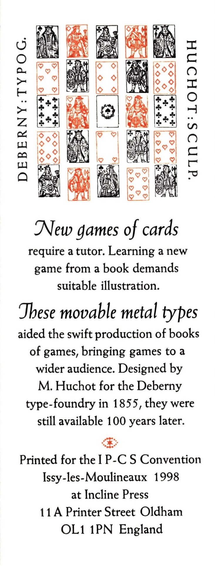
New games of cards: printed in 24 pt. italic and 14 pt. roman Weiss as a keepsake for the International Playing-Card Society Convention.
Hung Out to Dry: chiefly printed in Goudy Old Style, 18 pt. roman and italic with a little 14 pt. bold. The display face is Castellar 30 pt., surrounded by an illustration by Philip Woollard printed from a zinc plate.
Little Fishes: printed using 36 pt. Centaur roman, with a line of 12 pt at the foot, designed by Bruce Rogers, and Frederic Warde’s Arrighi italic. The wood engraving is by Anna Ravenscroft.
Spirit of Joy: The caption line is set in Fry’s Ornamented from the Stephenson Blake foundry, in 36 and 30 pt.; the rest is in 24 pt Fry’s Baskerville with some Monotype Baskerville italic, printed on Fabriano Rosapina. The drawing is by Claud Lovat Fraser with pochior coloring.
Some Papers Are Not Used: 24 pt Hadriano Stone Cut and 12 pt Hadriano designed by Frederic Goudy printed on Fabriano Ingres paper over a course handmade paper from La Papeterie St-Armand in Montreal.
Sonnet Thirty: 18 pt Monotype Garamond italic with Stephenson Blake borders on handmade paper from Griffin Mill.
The Fist: 18 pt Scotch type printed on Fabriano Ingres. The large manicle or “fist” at the bottom is a wood cut from Delittle of York.
I Like Discipline: 30 pt. Monotype Bembo and 12 pt Monotype Bembo italic on Fabriano Artistico. The circular decorative borders were made of four pieces designed for Monotype by David Bethel, lined with some Linotype fleurons.
Our copy of Forty Sheets to the Wind is a gift from our friend Jerry Buff.
View our other Typography Tuesday posts.
#Typography Tuesday#typetuesday#Forty Sheets to the Wind#Incline Press#Graham Moss#Kathy Whalen#wood type#Cheltenham#Perpetua#Weiss#Goudy Old Style#Castellar#Centaur#Arrighi#Fry's Ornamented#Baskerville#Hadriano#Garamond#Scotch Roman#Bembo#Monotype#Stephenson Blake & Co.#beatrice warde#Eric Gill#Frederic Goudy#Bruce Rogers#Frederic Warde#Anna Ravenscroft#Claud Lovat Fraser#Fabriano
67 notes
·
View notes
Photo


It’s Fine Press Friday!
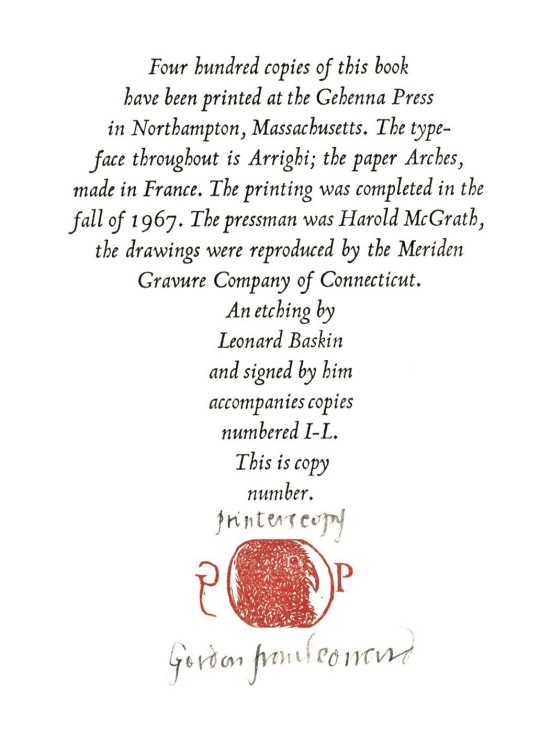
Noted American sculptor and graphic artist Leonard Baskin was one of the first artists in the United States to turn letterpress and the book form into art media, founding his Gehenna Press in 1942 and printing fine-art publications until his death in 2000. This week we present pages from his 1967 imprint The Matchmaker's Lament and Other Astonishments with poems by Leonard Nathan and reproductions of drawings by Baskin, printed in an edition of 400 copies at his Gehenna Press in Northampton, Massachusetts. The type is Frederick Warde’s Arrighi, originally issued by Lanston Monotype in 1929, and the edition was printed by the incomparable master printer Harold McGrath.
The illustrations, reproduced by the Meriden Gravure Company of Connecticut, include Baskin’s usual parade of bloated characters, distorted figures, and human/animal hybrids. Those who know his press work, however, will note the lack of balance between image and typographical presentation that are the hallmark of his later work. It was this publication that served as a turning point in Baskin’s aesthetic approach. Of Matchmaker’s Lament, Baskin writes:
I was moved by Nathan’s trenchantly ironic poems and was pleased to have the chance to make drawings for them. I rather think the book is too heavily freighted with drawings. The beautiful, light Arrighi types seem battered, assaulted, overwhelmed by them. . . . A great lesson was learned from this overloading, the urgent necessity of spatial relationship was borne upon me & the interaction of space & weight, the sizes of type, the density of paper, the number & range of illustrations, & how they work one upon the other.
Our copy is a printer’s copy, separate from the edition sequence, and bears a signed presentation from Baskin to a friend named Gordon.
View more posts on Leonard Baskin.
View more Fine Press Friday posts.
#Fine Press Friday#Fine Press Fridays#Leonard Baskin#Gehenna Press#Leonard Nelson#Matchmaker's Lament#Arrighi types#Harold McGrath#Meriden Gravure Company#fine press books#artists books#Pioneer Valley School
27 notes
·
View notes