#anyways this looks like it was done with a pixel brush but it's actually a sumi brush i downloaded on medibang shrugs
Explore tagged Tumblr posts
Text


the day i got this thing compared to today is just a bit funny
#i know i got it A WHILE ago but i've only had the time to use it four times so. crazy difference considering that lol#see this is a ''new'' ''christmas present'' that will be put under the tree. so i need to use it only when my dad cant see me#my mom knows about it but my dad gets pissed when christmas ''doesnt look like it used to'' so we just. fake a bunch of presents lmao#yea christmas doesnt look like it used to bc my toys arent cheap plastic now and we dont make that much money-#anyways! i havent used this new brush to draw him yet it's sooooo fun#but my creative well has run INCREDIBLY dry with him so i dont really have any ideas :V tragic#i think i might actually take that wip i have and completely start over lining it#as cool as it looks in pixel art. i just really love this brush#and i just cant see myself doing super precise pixel art like this anymore... at least not BIG pixel art#that's one of the biggest drawings i've made TO DATE. no way in hell it's getting done on a new device 😭#so i think that will be my project for the next few days >:)#that and drawing more m&l stuff kjfhkg i've done sooooo many doodles of the final boss#i need to draw him playing balatro...#awa
10 notes
·
View notes
Text

Here’s some TMMT doodles. At first I wanted to draw Donnie with a bulbasaur, but then it spiraled out of control and I went crazy. I tried to make the Bulbasaur’s spots look like pixels. OK HEAR ME OUT I saw that icebreakers commercial where they put a little top hat on the gum and it reminded me of Donnie and I was drawing this so I put it in here. Donnie is so done with me, lol. Let’s just pretend that size difference is a thing for that bottom one. I tried a different brush instead of what I usually use and didn’t completely fill it in. I actually like what I did. It went a lot faster than usual. Anyways, thank you @kaysdenofchaos for my new obsession. I love your turtles ❤️
191 notes
·
View notes
Text
I made the unfortunate decision to comment on a tiktok saying
"Blitz has every right to doubt Stolas' intentions and I will di on this hill defending Blitz"
Which made me actually realize in the context of Stolitz how much the fandom vilifies Blitz.
Upon rewatch I realized that he is actually kinda innocent lmao. So here comes the rant hop on in Verda rants at 4am again train.
The thing is first of all we need to work our media literacy muscles. So Stolas stans who think he is a uwu babygirl that dod nothing wrong repeat after me. "Blitz didn't watch "just look my way", "owl in a cage" or any other Stolas longing scene that we cried over"
Now that thats setteled I don't want to hear any "he is trying" bs because as of now (pre full moon s2e8) he hasn't actually done anything that Blitz is aware.
Lets start from the top my initial comment was about how Stolas treated him for so long before actually catching the feelings and how Blitz has a right to think he is not genuine.
Up top lest start with the condescending pet names and I won't be hearing Blitz cant be mad at that Stolas does it bc he thinks he likes it... jesus okay s2e1 when stolas starts the imp dirty talk what does blitz do a) encourage him b) get naked and dtf bc that was hot, c) shuts him up
Ding ding ding C. Stolas can still take this as bedtime play sure but we have a case for Blitz not liking it from day one. Other than that we all know he views Stolas' (perhaps in his mind endearing) pet names as condescention.
Secondly even if we ignore the power imbalance Stolas is the one to suggest the transactional fucking... s1e1 even tho in the forst time it was Blitz's doing, sorta. So don't at me saying well Blitz just uses him for the grimoire, like girly duh that was the premise. But Stolas also uses Blitz. Imo lending a book vs fucking in payment is a bot excessive but for Blitz's case beggars cant be chosers.
Now to the elephant in the room... Ozzie's. Does Blitz invite him (Stolas) purely out of selfish intentions that has nothing to do with him? Yes. Is he a dick? Yes. But Does Stolas hide his fucking face when he has a reality check? Yes. But then y'all be mad bc Blitz pulled his hand back.
That night Stolas was read once, Blitz was like at least 2 times... if we don't count the stuff for Stolas by proxy. He was having a hard night bro. And after Stolas invites him he is like no and Stolas respects that. Which if the show didn't add s2e2 in between it wouldve been a perfect stepping stool to get the Stolitz on healthy communication territory but that didn't happen.
I cannot for the life of me pin point when Stolas genuinely falls for Blitz. If its from day one damn it took him long enough to understand what he was doing was wrong.
Anyways we as fans can't be mad at Stolas because we know he is starting to understand the absolute power imbalance he created and the position he left Blitz in. He has realized that the thing is lets remember and repeat "Blitz is not watching the show with us". Blitz doesn't know of this sudden change of heart.
Now to adress a few meaningful interactions we have after ozzies. The fucking pixelated phone texts from s2 western energy.
Stolas apologizes but in that way that I look down upon. "Sorry if" like girl own it up anyways Blitz brushes it off and Stolas instead just goes hehe I didnt care either. Yall need relationship therapy my god. Important thing is Stolas was trying to reach out. But instead of going anything I said that made you upset etc he could've actually apologize properly for getting ashamed. Tho Blitz should also apologize for inviting him on a date for his own gain but thats another bag of worms I won't open tonight.
Other than that he has put off seeing him and doing the transactional fucking for a while. During those times. And as we know from all the phones Blitz breaks after talking to Stolas and hearing hus dirty talk he isn't too excited about. We don't exactly know if he comes or not on those nights. But he is also showm to be quite comfortable in s2e2 with the "my dick is good but its not that good" comment so maybe they do continue the arrangement... idk. Either way we know they haven't really talked.
All I am saying is that both parties of this ship are guilty af of hurting eachother and taking advantage of eachother. But as the power house of this power imbalance, Stolas needs to be held accountable. And he is doing that now!! Or will, in s2e8 and I can't wait to see how that goes. Overall, I can see totally why Blitz shuts down any signs that Stolas might actually be into him. He has a good bunch of reasons too. And as far as we've seen from the trailer we will get to hear him say it out loud as he should.
34 notes
·
View notes
Note
sometimes i struggle with reading fics because i feel like the onus on me to relate — especially with a reader/second person POV fic! — feels so fragile. i think part of it is just my general disconnect with stuff, but generally i just have a really hard time getting fully and completely immersed in something. it's ruined my ability to read for years, and is why i can kind of only consume fanfiction the way i did books when i was a kid. immersion/familiarity + a world/characters i know already. but then you have the issue of trying to find someone who can write those familiar characters with a voice you recognize. that can break the immersion too, i think, to an even worse degree. if i hear a character say something i can't hear in their voice, it rips me right out of my own head and puts me back wherever i am. he would not fucking say that, and all that jazz.
long and kind of stupidly purple pre-ramble aside, i wanted to say all that because i don't know quite how else to tell you how good all of your fics are. your writing kind of tends to take me places that i've never even brushed elbows with; makes me feel like i've walked with these characters and named protagonists like i've done it a thousand times. and obviously there's some wish fulfillment there, but i feel like even wish fulfillment can be so fragile if you aren't careful with it. something that feels too unrealistic to be bought always feels like it can be swept away afterward, but you have this way with words that makes them feel so grounded. your writing is so smart, and it feels so quick, and genuinely funny. i've laughed at jokes in these fics out loud. not the little air-puff snort, but an actual laugh. my cheeks have hurt from smiling. i get that physical pain during the angst that i crave.
i spent basically the entirety of reading your fic library kind of spinning out, thinking and feeling the same way you do when you watch a really good movie and forget that it might still be daylight outside. i don't even really know if i read these fics as a self-insert so much as a really immersive, relatable window to an alternate universe? it's like you're writing down the accounts of alternate "me" or "you" or "us" falling in love across the multiverse. sometimes i even imagine different faces. joel, for example, looks like the pixel and the show version for me depending on the moment, and yet it still feels tangible. kind of amazing. half the fandoms you write for i've literally never seen even once in my life, and here i am, having read them all. whoops.
anyway, jesus. that was long and rambling. i mostly wrote it because as a very, very amateur fic writer myself, i think i've always liked the long comments the most. i try to condense my thoughts as much as i can, but when it comes to something that means something, i also want someone to find a bit of the joy they give to so many other people out of the kindness of their heart. writing is an art form, and you're really, really good at it. i hope you know that.


sweetheart, I have been staring at your asks for a day unsure how to express the depth of my gratitude - I think I'm going to fail to convey it wholly, but please know that this had me properly crying (like, had to get up to blow my nose) because it's so kind. I can't believe you've read it all?? and to send this too is just so sweet and so thoughtful and so above & beyond.
I'm so fucking touched that you've enjoyed my fics and felt close to them (laughing out loud and that angst ache are the highest praise omg) - that's my favorite feeling when I'm reading, so it means so much that you felt that way about something I wrote!! I love the idea of falling in love across the multiverse - what a beautiful thought :,)
see you at three!joel is a mystery to me, honestly!! I don't know where that man came from but he has replaced my brain with lovey-dovey mush. I'm so glad you love him too :,)
thank you infinitely for reading my fics and for sending this incredibly generous ask. please know this touched my heart so deeply and that I am so infinitely grateful to you. I'm sending you the biggest hug and hope I can bring you some more laughter soon :,,) ilysm <33
#asks#saved sweets#freya speaks#actually cried again answering this AH IT'S SO NICE#thank you anon pls know im kissing ur cheek in my mind <33
7 notes
·
View notes
Note
hi!!!! i really really love your art and it's been a really big inspiration for me lately ^_^ i just wanted to ask if you'd be okay with maybe going through your usual art process?? every time i try to draw i just end up getting frustrated since i never know where to start 💔if this is too much to ask for feel free to ignore me and i hope you're doing well regardless!!! 💕
thank you for such a sweet ask wow what the heck ૮(꒦ິཅ꒦ິ)ა❤️🌈 i hope you’re well too and i’ll gladly share my process!! i love oversharing anyways….!!! (although i often dont know where to start and it takes weeks for me to gather up the energy to even start aufhijfjghhh)
💖CRITICAL STEP before i do anything at all: surf pinterest for inspo!! 💞💕 it can be inspo for art styles, ideas, or just ~vibes~ (if that makes sense lol?? 😸) but ever since i started actually sorting my boards my feed has become a lot more colorful and cute and inspiring…! 😸😸 i especially like seeing all the unconventional art styles on there!! it’s where my cartoony-ish style originated from ( •ૢ⚈͒⌄⚈͒ •ૢ)💖💓🌸🌷🍃
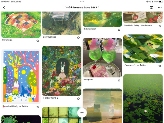

sometimes i come across a post on twitter that i GOTTA manifest into a drawing, so even though twitter is very rancid and negative, it can be good! sorta!! but yeah i try to start out drawing with a solid idea of what i wanna do in mind, or else it’ll just end up being a generic right-facing 3/4 portrait LMAOoo…….. 🤠👍
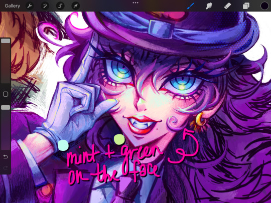
❤️colors: generally i will give up after i have a sketch and slither off to binge horror novels, but RARELY i might proceed onto the coloring stage… i have this disorder in which i need to maximize the vibrancy of every pixel on my screen or i’ll Die. 🪦(ɷ ꒪ཀ꒪)ɷ for shadows, i rarely use black unless i reallyyy need to; i just do dark purple! 🦄💜🔮🪄 for highlights, i never go for pure white; usually it’s cream or neon yellow, but sometimes skin will have these little light green spots to stand out (this is actually a color theory thing i learned from oil painting… green vs. red!) 😸🍏🤝🍎😸
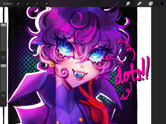
🧡overlay: i have at least 2 different layers set to overlay, so i can augment color vibrancy EVEN MORE and make things ✨glowy✨ like a 💥flash bomb💥!! on my first overlay layer, i go over dark colors with either dark brown or dark purple, set to a very very low opacity (practically transparent) to make things DRAMATIC, and then lose all my marbles on highlights at regular opacity!! my other overlay layer is for me to go crazy with the rosette brush, which looks like those comic book dotsies! ٩(๑′∀ ‵๑)۶•*¨*•.¸¸♪
💚touch-ups: after i’ve given up on my drawing and accepted that this is the most i can do, i proceed to do even more to it by slapping filters on it in picsart and picmonkey. my go-to filters in each app:
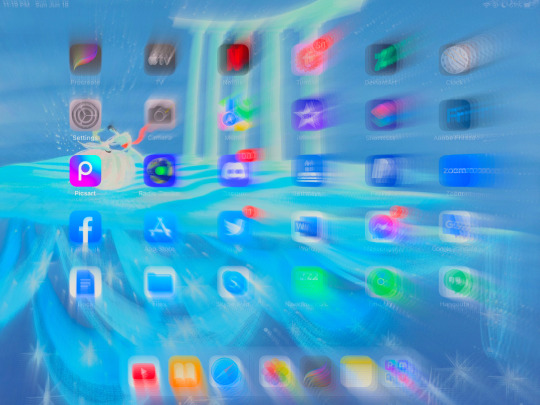
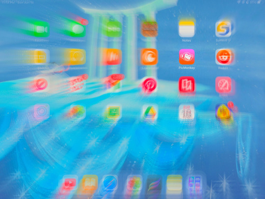
💙picsart: indie 2, usually set at 30% (it makes colors EVEN MORE NEON as if they weren’t eye-searing enough QAQ💧). i used to bypass their dumb af membership thing to access their gorgeousss glitch filter for my backgrounds, BUT THEY REMOVED THE ABILITY TO SCREENSHOT INSIDE THE APP so i hate picsart lol 😸🫶 indie 2 slaps fat cheeks tho
💜picmonkey: my true love!! they don’t hide their BEST FILTERS behind pretentious subscriptions 😁 okay i’ll stop complaining… 😁😁 so much Good Kush in this thing like lux, lightleak (makes things purple and glitchy!), splendor, lush…

💖and then i’m done FOR REALS and i post it and i don’t draw for 3 weeks while i writhe in guilt nyahaha (ง˙∇˙)ว=͟͟͞͞➳❥
i hope this helps!!
32 notes
·
View notes
Text
Game Dev Update for June
Happy July everybody!! ??? Half the year is gone already oh no!!!
I hope you're all well and staying safe out there!

My month was going alright, but one of my housemates moved out so my rents went up, I should be opening some #commissions soon for #pixel #portrait #gifs!
Anyway, here's what I did in June!
(full quality version here: https://www.patreon.com/posts/83905870)
NPC Buildings
Since painting is done with Brushes (or bombs!) now, I took the menu option out of the House menu. In it's place I've added the option to change the Building materials.

1500
Even added a preview of the material change. It's actually just changing them and then reverting when you cancel, but don't tell anyone!!
I've taken out the floor and replaced it with a draw loop on the foundation, figured it saves the number of objects in existence.
Rebuilt how NPC Buildings are generated, they now use an array of strings as reference and loop a designated row/column if the size is bigger than the source size.

1526

1527
Used the same system to draw the NPC buildings when in the Build/Placement Menu!
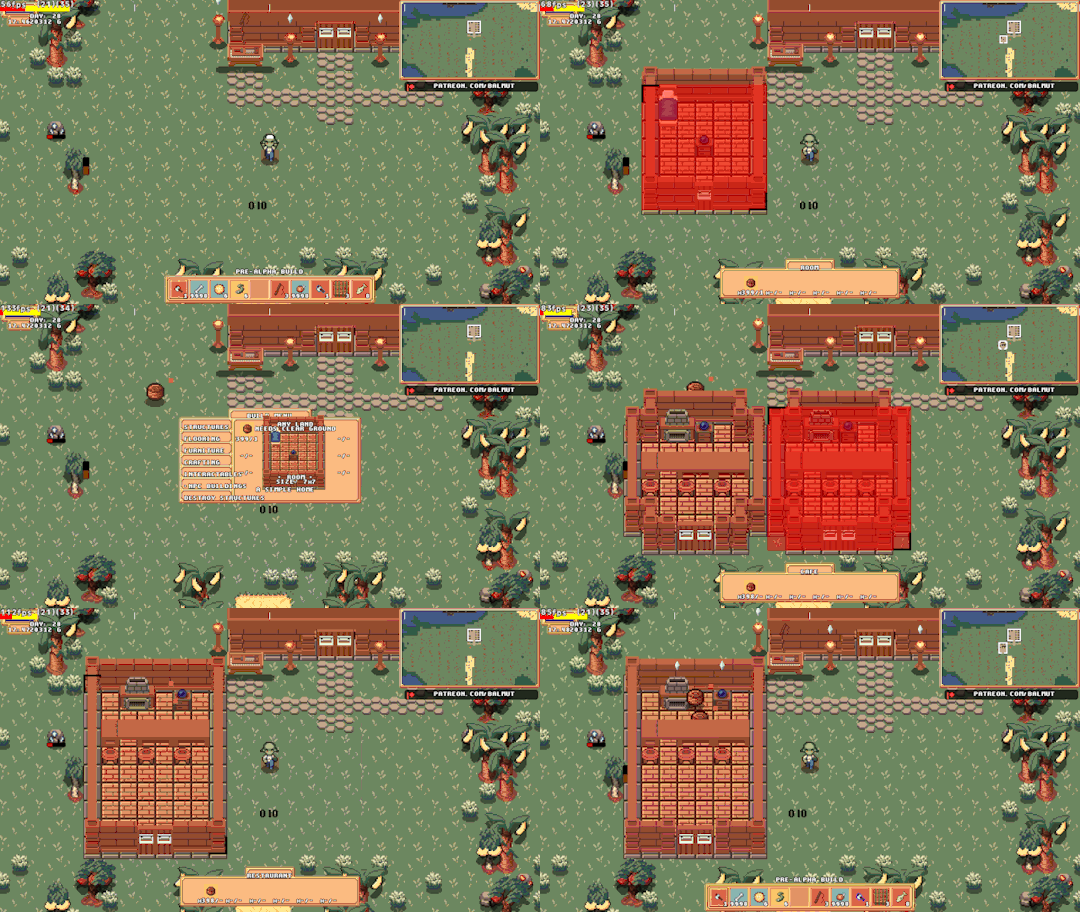
1536
Now I can just edit the array that stores the data and all 3 will change!
Updated the system for changing The Materials that Building parts are made from to no longer destroy and remake the Building. This means I can keep Painted sections if I bring that back.

1539
Reworked the Collision detection for when you're resizing Buildings, it now correctly detects the Buildings Objects, like Bed/Control Orb/etc
Also updated this so if the size hasn't changed it doesn't destroy and recreate the building again, which was always daft XD

1540
I guess I should do something about Rugs being placed in relation to the Building coordinates instead of the World coordinates ?:| Also I still need to save the location of the Objects for Save games, since when you load it will put them back to where they were in relation to the original shape/size.
Building Objects now have the correct position loaded on Save file load!
And I only broke rugs once in doing it!
1543
Found a slight issue, you can get stuck in the Bartop in Cafe's if you resize too much Upwards, so I've disabled that for them specifically. Guess you'll have to choose you placement more carefully!

1544
Goblin Schedules/Pathfinding
Updated Housed Goblins to go to their bed after 22:00, and wake up after 08:00.
[image too big for tumblr, see Patreon post for fullsize gif :(]

1509
Shortly after recording this gif I fixed pathfinding so they wouldn't walk too close to solid objects making it no longer look like they walk through them.
Gave Goblins a Sleeping bag in case they don't have a house! And you can see them sleeping in the NPC menu!
[image too big for tumblr, see Patreon post for fullsize gif :(]

1514
Fixed Farms not working after the first crop, updated Apiary code was clearing the soils connection to them so the Goblins would just stand there until bedtime.
Tools
Changed the controls, now I've got a designated [Item Action] button instead of it being an [Attack] button with with most other Items being used with the [Interact] button. Also upgraded the Shovel to have Charge up,kinda overpowered right now though!

1515
Also added the Watering Can to the Charged Tool system

1516
Added some Particle effects and scale tween to Mining. I'll adjust their appearance at a later date, they seem a bit chonky? Getting particles just right is finicky work.

1528
Also added Particles to Chopping Trees.
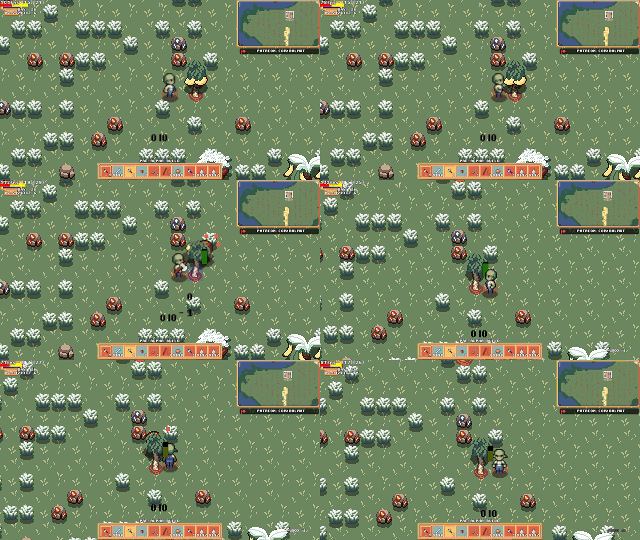
1524
...added Mirrorball item for...partying? I dunno, blame Bluwit she gave me the idea!

1534
It's basically a modified Glowstick, kinda want to make it bounce up and down?
...or make it continue to work when on a Pedestal?
I'm also conflicted as to whether the coloured lights should show in the white light areas?
Minor Changes
-Removed Flooring from NPC Buildings, now just drawing it instead of them being objects.
-Added NPC Buildings to the Minimap, including their culled parts list.
-Fixed Buildings expanding into Flooring/Paving
-Fixed Walls connecting to Buildings, this would cause problems if you deleted the building as the wall wouldn't autotile afterwards.
-Made Paving not qualify as "Indoor" for the purpose of Placing things.
-Cleaned up Minimap code, removing old array stuff.
Unrelated to Goblins
I made this as a small thanks to Bluwit for supporting me on Kofi, it's Nia a character from the game she's making. Please check out her stuff! https://gamejolt.com/@bluwit @pixel-bluwit

Thank you all once again, I really appreciate your support and couldn't do this without you.
Please stay safe out there and look after yourselves.
And please keep being awesome!
#gamedev#rpg#goblins#pixelart#farmingsim#farmingrpg#game maker#gms#gamemaker#indiegames#soloDev#patreon#kofi#indigames#goblin#goblin girl#indiegamedev#indiedev#indie games#video games#gaming#games#pc games#pc gaming#commissions#support
10 notes
·
View notes
Text
i've been going through some dreams i had that i wrote down as may be evident from my recent posts and i think i'm just gonna post this one from 2020-09-14 in full
watching some cis guy streamer, he was a white guy with a sort of rough round-ish face maybe with some beard shadow and i think like maybe chin-length curly light-ish brown hair, uh and he was doing like a vlog-style handheld phone stream basically, and i guess he must've been talking about how he was gonna get vaginoplasty??, and then he went to sleep but like somehow it was as if he was streaming through his eyes so like he closed his eyes to sleep and the stream went dark, and then also i guess the sleeping was as if from his perspective and he seemed to immediately wake up??, uh so then it was more like an actual camera again and he had the camera pointed at his face and he was, y'know, looking like he just woke up, and he brushed some curls out of his face and kinda like smiled and was like "well, that was a good nap" or something, idk it seemed like he was trying to be charming or something, uh but anyway then he revealed that he had gotten the surgery done, uh and i think i had a moment where i wondered if he'd next end up getting transfem hrt, but then i was like "nah c'mon he's still a guy you shouldn't make assumptions", um but anyway then the dude like…..pulled down his pants to check out the results of the surgery??, and he like, noted his vagina and was like "ok, got one hole, used to that" and then seemingly noticed his anus and was like "….but wait, there's another one?? i've got two holes, and i used to have just one!", with kinda this gleeful amazement, uh and then he was talking and he was like "you know, i kinda have to wonder if this was a good idea, i decided to do it while i was high on cleaning detergent--by the way, i would've vaped that stuff if i had the means--but anyway i wanted to do it so that i could cam for you all", uh and then he stuck the camera below his crotch but i think it got like automatically pixelated or something?, and then he was like "anyway here's a 50-use coupon code for a free subscription to my OnlyFans" (well ok i don't think he actually said "onlyfans" specifically, but y'know it was something analogous to that), and just ended the stream by displaying that, uh and i considered whether i should go use the code while i had the opportunity, but i was like…..i'm not really attracted to this guy, and like the genitals don't really make a difference, i probably shouldn't bother trying to get access to his onlyfans
#drafts queue#ok the ''recent posts'' thing is outdated now#also i did not originally have the dream pasted in i added that just now#space chirp
0 notes
Text
I think I may be the worst person to ask for art advice
Not only is my process for most art heavily dependent on the ability to erase, it’s also really heavily tailored to the fact that my hands shake and lack strength now, and that I don’t actually have much precision when it comes to gross OR fine motor control.
Not to mention that I’m awful at figuring out art programs and using them effectively - I’ve only just started using brushes and making custom ones, and up until recently I just avoided doing line work because despite being really adept at it in traditional media, my digital art setup is a touchscreen laptop and a 7$ stylus and also I can’t stabilize my hand on the screen. It took me. Nearly 10 years of dicking around with firealpaca and digital art to discover the auto-smoothing setting.
In addition like. I can’t actually visualize what I’m doing. I actually struggle a lot with digital art because using a reference leads to me basically tracing it a lot, and I end up having to go back and fix my lines so that I’m not literally just copying someone. Which, is why it’s so inconsistent.
I didn’t realize for the longest time that when people say they’re rotating a character in their mind they mean they can like. Literally do that. I cannot do that. Visualizing to me is a quick flash of a like 5x5 pixel png pixelated horror game 2d object that just turns to face you as you walk past. That’s as good as that shit gets. Sometimes I can like Frankenstein together the basic idea of what I want to do, but the reason that my Minecraft builds when I stream are done stream-of-consciousness and usually involve me backtracking is because I can’t for the life of me put together what I want before I’m doing it. And the doing it part is such an ordeal, there’s no way in hell I’m gonna do it twice. I love doing it but the doing it is also the hard part. Anyways.
Tldr you should like. Look up a guide to how to use your art programs. And also like. Plan them maybe. Do as I say and not as I do. Maybe consider also using that whole visualization thing that still seems fake to me
1 note
·
View note
Text

I'm bad at explaining broad processes, so this is going to be very... stream of consciousness. that being said, I'll try to explain a little bit of it!
also for disclosure's sake, this alt was actually earlier in the process than the final monochrome version, and I tend to destructively edit as I go without remembering to save different project files, so what I'm gonna explain here bounces around a bit
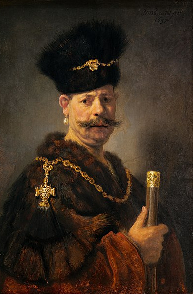
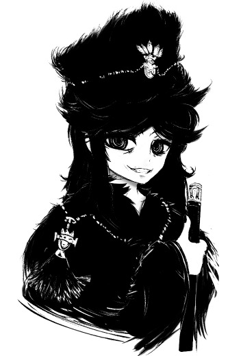
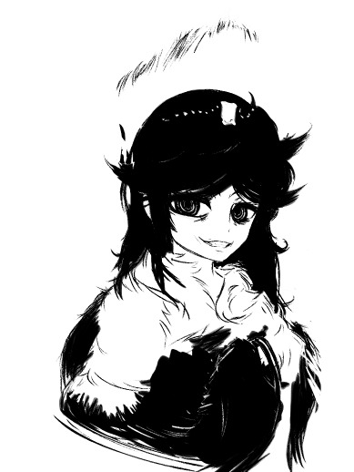
okay so, unfortunately, going through my layers raises more questions than answers without context lmao
when I'm doing inkwork-heavy pieces like this one, I usually work entirely in black and white, smearing the shapes together with a bleed-heavy pen and a slightly less bleedy brush
in general, I'm a firm believer in not fighting the texture of the brush you're using. if you need to a lot to get wispy shapes from your brush, you need to use a wispier brush
if it seems weird that I use a bleed-heavy pen but not a bleed-heavy brush, I think that's weird, too! the best way I can explain it is that I've always found it frustrating when my paints bled in unexpected ways, but associated an overbleeding pen with one that wasn't running out of ink
... not entirely rational, I'll concede.
but anyway, why black and white? why not use a slightly tinted dark tone, like shows up a lot in my finished pieces?
there's a lot of reasons I can make up for why I do that, but the most straightforward and (unfortunately) revealing one is that I do it because, if I'm drawing entirely in black and white, I never have to layer-hunt to erase
... I just make a new layer on top and paint white over the old one

this is also why I like using mspaint when I'm not really up for doing anything particularly advanced. layers are great and I love them dearly, but sometimes it feels like they're more annoying than helpful
so in general, my method for actually blocking things out can be roughly described as "start drawing it and don't stop until it's done, and if you don't like it, your wip is now a reference layer and it's time to use it to redraw the entire piece"
not... entirely good as advice
in fact, I'd strongly advise you don't internalise that. looks pretty cool, though, sometimes. maybe explaining myself here is a bad idea, because it's going to give other people my deeply unwell habits.
anyway.
when framing a piece, I'm usually just fucking with things by eye until they look about interesting enough to me. in general, I'm a big proponent of leaving tools around that can be generally described by "things you can fuck around with"
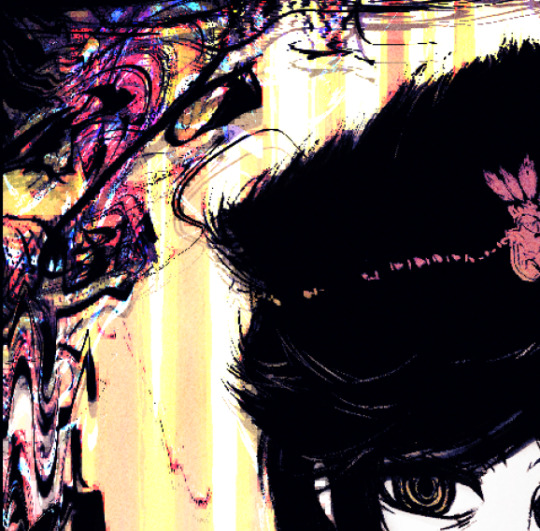
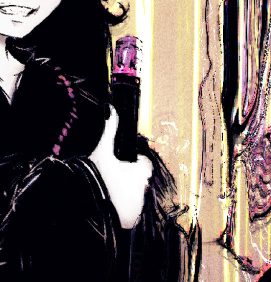
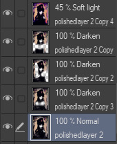
effects like this are achieved mostly by duplicating the image, filtering the duplicated layer, possibly gradient mapping it to get some colours, and then using that as a mask of some kind. this often entails deleting chunks of the new layer when things start overlapping in unpleasant ways
if you're willing to keep a folder of textures around, you can actually use posterisation + gradient mapping + blending modes to work your textures into some really weird setups
if I'm planning on using a really colourful background or frame for whatever reason, I find that one way to create a pseudo-depth effect is to duplicate the linework, mosaic it, layer the mosaic below your actual lines, and then erase all of the chunky pixels inside of the subject proper
in the process of making the final version of a piece I post, it's really not uncommon for me to have up to nine versions of the linework layered on top of each other, set to darkening different portions of the art
as for framing proper... sometimes it's literally just throwing things on the edge of the image until it looks balanced to my eye, then ctrl+a, then shrink selection [X] pixels until I get a border that looks nice
hope there was at least something of value in that! admittedly, it seems like it was mostly just a reveal of how messy my desk is
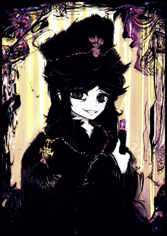
referenced from A Polish Nobleman (1637)
284 notes
·
View notes
Photo

“be still, my foolish heart
don’t ruin this on me”
#art#drawing#dragons#dragon#ocs#nathel#digital#digital art#flowers#my art#alternatively: i developed a crush this past semester and it Will kill me probably#anyways this looks like it was done with a pixel brush but it's actually a sumi brush i downloaded on medibang shrugs
45 notes
·
View notes
Note
How do you draw fire? (This is a question as well as a threat/lh)
Ah, the age-old question. Fire, a semi-transparent light source in constant motion, is a perfect combination of traits that make it an enormous pain in the ass to draw. As such, I have a few different methods I use depending on the individual scene - some versions work better in bright situations, others in dark ones, others when the fire is the center of attention and needs more detail and polish.
No matter what technique I'm using, some things don't change:
I build up a fire effect on several layers. All of these layers are set to the combine mode of Add (Glow).
I almost never use more than one color; for this explanation, unless specifically modified, I exclusively use a mid-range orange shade.
This is done in Clip Studio Paint EX. Most paint programs have parallels to the tools I bring up here, but I don't know the nomenclature, so you might need to do a little digging.
These properties don't change between effects, so if I don't say what layer combine mode or color I'm using, that's because they're always Add (Glow) and the same orange respectively.
I tend to do basic background fire the most vaguely, rather than using any hard-edged detailing. The process overall looks like this:

Starting with the Running Color Edge Watercolor brush, a rough-edged and semi-translucent brush effect that's good for fog, I lay down a base layer that's the most transparent and broad. We're basically not going to go outside the boundaries of this base layer except when we add the cinder effect.
I add a second layer and, using the same brush, brighten up the middle of the fire region a little.
On a new layer, I switch to the Paint And Apply brush, a rounded and more opaque option. I blob a bunch in the middle and add a few scattered smudges off the main light mass to produce the effect of curls of fire scattering away.
On a new layer, I switch to the Droplet brush, an airbrush tool that produces scattered and irregular dot patterns. It might not be super visible at the scale above. I use a small particle size and drop cinders over and around the mass of the flame.
I duplicate the cinder layer several times and blur each copy, starting with a 200px blur and working down by rounded halving increments to 10px. Sometimes I duplicate it one more time for good measure to make sure the cinders pop.
The final result looks like this:

Good for a campfire or torch, but not for anything that needs hard edges. When I want a more defined look but don't need much internal definition in the flame, like for Erin or Dainix's fire effects, I do this instead:

First I draw an outline for the flame using my standard pen tool. This is just eyeballed - real fire doesn't tend to look much like this, but in my experience these distorted claw-like formations tend to produce the right visual effect. I also make sure to add more wispy bits coiling off the main mass, as in my experience this is what makes the difference between fire that looks like a solid and fire that looks like it's actually moving.
I fill in that same layer. In some versions of this effect we might still use the outline layer, hence why I showed it as a step, but this is good for now.
I duplicate the now-filled fire layer and blur it 200px.
I fuzz out the blurred layer by painting on it with the Running Color Edge Watercolor brush more, just to make it look a little less overly smooth.
I duplicate the base fire layer again and blur it to 200px again. This one we'll leave alone.
I duplicate the base fire layer again and blur it 100px. Obviously these pixel values depend on the scale you're drawing at, but at the scale I work at I almost never need to blur them more than 200px, and for larger fire effects we probably want to use a technique with more definition anyway.
Finally I repeat the cinder effect described in step 5 of the previous technique.
The final result looks like this:

It gets the point across all right, but sometimes we want a fire effect that's got more internal definition - if it's going to be a large part of the shot, for instance, we probably don't want to just fill the frame with a mass of smooth glowing orange. More complex shapes of fire, like Dainix's hand or specific magical effects, also warrant more definition to avoid being visually confusing. For this, we need a defined outline layer and some internal variation in the brightness of the flame, like so:

This is where we start seeing one of the core difficulties of drawing fire: its own brightness can severely obscure the detailing.
I draw the outline of the fire with a standard pen tool.
On a new layer, I copy and fill in the step 1 outline.
I add a new layer and draw/fill a highlighting pattern in the core of the flame.
I repeat step 3 again, but fill much more of the flame this time, leaving only a few un-filled portions around the edges.
I take the base filled flame layer and do steps 3-6 from the previous solid-outline flame effect, blurring out the background glow. To avoid losing the definition in the center of the fire, I use a soft-edged eraser tool and erase some of the middle of the ambient glow layer until I can see the edges of the smallest, brightest part of the flame again. I also lighten the outline layer by overlaying a solid white layer at 50% opacity and masking it onto the outline, so the glow stands out against the rest of the bright mass.
I repeat the cinder effect from the first tutorial. This time I also lighten the base unblurred cinder layer by another 50%-opacity white layer so it matches the overall outline.
The final effect looks like this:

But we can also push it farther! If we take the highlighting layers and blur them, we can get an effect like this:

This isn't my favorite, tbh - it makes the interior of the fire look a little blobby and gassy for my tastes - but it's not too bad.
And if we want to make the center of the fire look even hotter, we can take the smallest highlight layer that forms the core of the glow and tint the shade up closer to white with another 50% opacity white layer, producing this glowing core:

I don't tend to do this, but if we wanted to and didn't mind losing the hard-edged definition, we could even blur our outline layer about 20px to get this more ethereal effect:

It also works with other colors.

Of course, there's a lot more to fire - this isn't touching on molten materials, burning/charring materials, explosions, smoke or anything. This is just pretty good for basic garden-variety fire.
284 notes
·
View notes
Text
Manga scanning: a practical example
Lately I've been getting a lot of people asking questions about how to scan and subtitle. And it's kinda hit me: there aren't a lot of visible, accessible resources for this, are there? As time winds by, the masters of these arts have moved on and vanished from the internet. So for posterity, I want to talk about my own work process. (Remember to save a backup of this post somewhere if you like it...)
Maybe someone else has already written this up better than me, but it's nice to infodump about the process regardless.
The book I'm scanning is Inazuma Eleven GO: Saikyou Senshu 100-nin Zukan. It was a magazine extra drawn by multiple artists, and to my knowledge it's never been rereleased in tankobon format. Which is a damn shame, because it's full of hilarious gags! Time to bring it back to the world. So, how do we start?
0) Tools and programs
Before anything else, ya gotta have a good, clean scanner. My actual scanning is done with a basic 11x17 flatbed scanner with 1200dpi max. Default OS scanning programs usually suck, so I always download the scanner drivers and programs from the manufacturer's site!!
Other physical requirements are a microwave and some black paper. The digital steps are all done in Photoshop and XNView.
1) Scan the cover
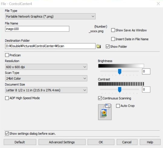
For scan settings, I default to 600dpi PNG. I used to scan things at 200/300dpi, and while this is quicker and more economical, it's not nearly as crisp! It can also cause some weird color banding, due to some scientific phenomenon that still confuses me! Basically, if a scan looks stripey, change the DPI. It's much better to work at higher resolutions and then shrink it down later. I don't have to fret over 100mb+ raw images anymore because I have plenty of external storage! Yippee!!

Before doing anything else, I scan the cover while it's still in the best possible condition. Obviously, opening the book too far will cause creasing near the spine.
Since my edition was a well-loved secondhand copy, there is a LOT of creasing. But I don't feel like spending 3k yen to get a mint copy that I'm just gonna rip apart anyway, so this is where Photoshop comes in!
2) Retouching cover damage
Fortunately, there isn't any color fading to deal with here. The majority of these imperfections were touched up with Content Aware Fill. It's a very powerful tool that assumes what the selected pixels *should* look like based on the surrounding pixels. Use the Lasso or Magic Wand to select the imperfections, and try to avoid selecting pixels you don't want fixed. Content Aware works best on small spots, so you kinda have to break it up by color blocks, but it's still a million times faster and way less depressing. Seriously, cleaning and typesetting let my mind wander too much.
I currently have two Actions shortcuts to make this process even faster:
1) regular Content Aware Fill
2) Expand by 5px > Content Aware Fill > Deselect

When Content Aware fails, this is when I have to go manual. Clone Stamp is my best friend ever. Carefully select a source with the Alt key, line up the dots over the touchup area (toggle Enter for better viewing), and keep brushing! This can be painstaking, but man, I love seeing and comparing the finished result.
Healing Brush is helpful when you have to clone a pattern but the color is different. It'll preserve the source pattern but adjust the lighting to match the surrounding pixels. It's a lot more finicky and will blur colors *too* much sometimes, especially near borders. This tool's really better on photographs, but it still comes in handy.
(I hear that Patch combines the functionality of these two! I wanna try it out next time...)
When Healing Brush can't blend colors well enough, using Clone Stamp in combination with Dodge (lighten) or Burn (darken), with strength adjusted accordingly, is the next best thing. Burn is GREAT on lines that aren't quite black enough! This technique works wonders when touching up gutter shadows especially. I will spend an exorbitant amount of time on retouching if it means I don't have to rip apart my nice books (that being said, it's important to really gauge whether it's worth retouching in the first place! I waste too much of my time on tiny details that nobody else cares about!!)
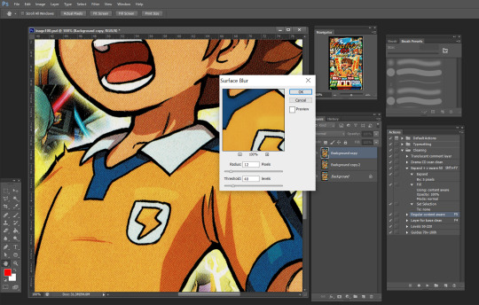
If being able to see the printer dots bothers you, there's an easy fix: the Surface Blur filter. This is one I've only discovered recently and I'm still playing around with it. On one hand, it gets rid of the tiny white dots and can make scan images look absolutely magnificent. On the other hand, it has some trouble preserving sharp lines and small highlights. Since I don't like altering the original image too much, the scans I post aren't usually blurred -- but it's something you can try out at home!
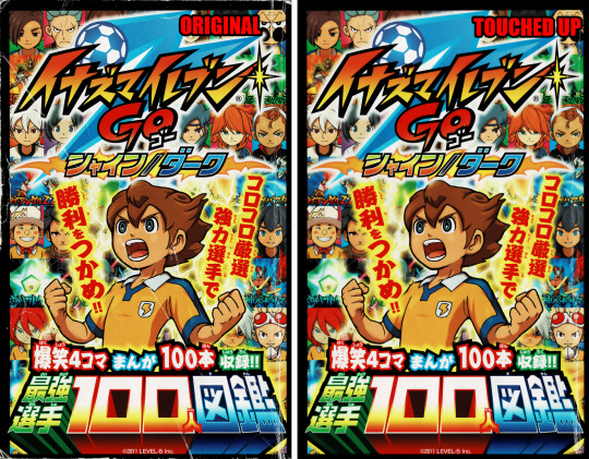
Hot damn! Look at the difference! Look at my boy Tenma! You'd hardly guess the condition the original is in!
Note that the final version does not have all the creases removed. At this point I had already spent a couple of hours retouching and decided nobody else was gonna care THAT much about the peripheral damage. If you do care that much, feel free to spend *your* time perfecting this.
3) Melt
Now that the cover's scanned... it's time to toss the book in the microwave!
vimeo
(Pictured is a *different* book, but you get the picture.)
No, seriously. Microwaving is the easiest way to warm up the glue enough to tear the pages out. Or more accurately, gently tug on the pages till they separate from the rest of the bunch. I start from the front cover and tease the pages out one by one. On thicker books, I'll alternate between front and back covers.
I set the initial heating count to 30-50 seconds, and sometimes I turn down the power level if I'm feeling apprehensive. Really gotta play it by ear depending on the book’s size and condition. After tearing out a couple dozen pages, the glue gets cool again and the pages start to resist again. Continuing like this results in the paper tearing!! This is when I chuck the book back in for another 10-15 seconds.
It's a little scary at first, but the toner on the pages heats up too! It doesn't bleed and it shouldn't be *too* hot to the touch though. So it's just something I've had to get used to.
This particular book kinda smelled when I heated it up! I blame either the paper quality or, y'know, being secondhand and maybe not being stored in perfect condition. But the stink was fortunately temporary.
Some people prefer ironing the spine (with a towel over it), but IMO that's more precarious and time-consuming. Maybe it works better for the middle pages though...? Worth trying out someday.
You could just slice out the pages with a knife or something, but with melting, it's possible to rebind the pages later! This is another thing I haven't done myself yet, but I'm excited to try it out with a nice archival glue. I'll update with the results eventually.
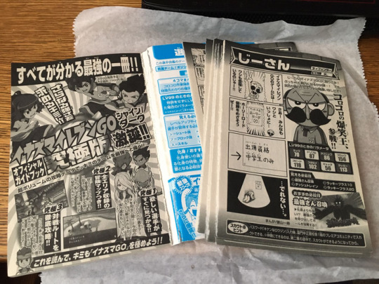
So, with the "how" out of the way, "why" would you take apart a book in the first place!? It still feels a little sacrilegious. But scanning pages one at a time gets you the best possible results.
It eliminates three major issues:
1) Gutter shadow
As mentioned before, shadows at the "gutter" (the inside spine) naturally happen because the page isn't lying flat there. It looks bad. And it takes a whole lot of work to retouch.
2) Angled pages
The cousin to gutter shadow, angled pages happen when the spine is a leeeetle more open/closed at the bottom/top. So with a spread, you've got the left page at -1 degree and the right page at .5 degree. Both of these pages are going to have things cut off when they're cropped. And it's going to look very weird when you're flipping through pages and have slightly alternating angles. Rotating these pages so that they're at the same angle is a lot more trouble.
It's really hard to keep the spine open exactly the same way for an entire book! The weight of the scan lid can throw off careful positioning anyway!
3) See-through pages
Manga in Japan is CHEAP and is not printed on the best paper possible. If you have the pages all bundled together, you can see large splotches of black or white from the spread that's behind the page being scanned. Leveling the image can fix this, but it comes at the cost of destroying midtones. Which is to say, any gray in the image becomes off-white or almost-black.
I hope you're beginning to understand how much effort and technical detail goes into the scans you enjoy.
4) Scanning
Same scan settings as the cover (600dpi PNG). I always scan in color, even for grayscale images. And I don't trust the auto settings enough to let the machine fiddle with colors and cropping.
You know how scanners have a little arrow at the corner saying "align here"? Don't do that. The ones I've worked with like to shave off a few millimeters from the edge because they assume there's a margin anyway. So I place my documents about 1cm AWAY from the edge just to make sure the whole page is scanned in. This inevitably causes some slight rotation, which will be fixed later.
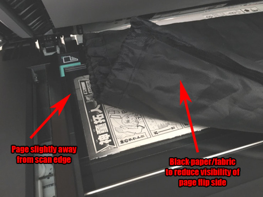
A new technique I've learned to reduce the effects of aforementioned see-through pages: use a black background! The toner blends in with the dark backing. This reduces the luminosity of the whites, but that's something that can easily be fixed via leveling later. I do not have black paper around the house, so I resorted to fabric.
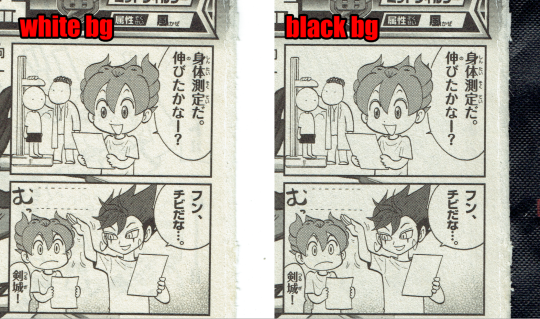
For comparison, here's the first page scanned with both a white and a black background. Note that white is slightly brighter, but there are some weird shadowy lines in the background. If you look really hard, the line goes through the screentone on Tenma's hair! Maybe it's excessive, but these tiny details can be weirdly distracting.
This book doesn't have page numbers, so I had to be extra cautious about missing pages (or accidentally dropping the stack)!
5) Leveling
Typically this step is something I leave for last, but since it significantly reduces file size, that's going to make the next steps easier.
So I've mentioned leveling before. But what is it?
Essentially, Levels make black *blacker* and white *whiter*. This is one very easy step to make pages look SO much better.
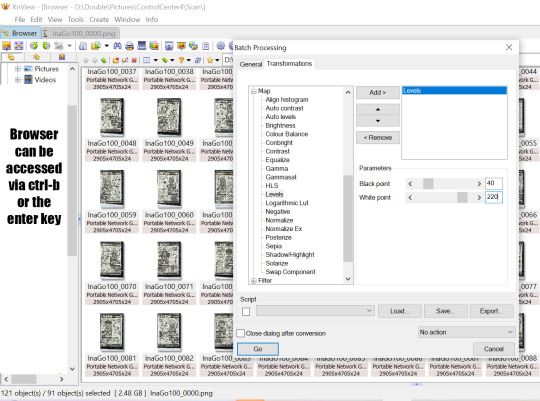
Switching over to XNView now, I'm setting these pages to about 40-220. Usually this would be a bit too heavy -- this could easily erase something light or turn something dark into pure black. But in this instance, the high dpi means individual screentone dots are visible and any grays are pretty well preserved anyway. So let it rip! XNView batch processing can run through all selected pages all at once and save the leveled copies to a new folder.
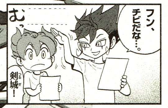
There's a ton of dust left still. Leveling gets a *lot* of it, but again, the paper quality is not great in the first place so it's kind of unavoidable. Resizing and cleaning the page later will help somewhat.
6) Rotate
This is the one step I do fully manually. I haven't had much luck with auto deskew/crop before, nor have I tried any different methods for it recently. Please tell me if there's a better way of doing this step that won't sacrifice border pixels.
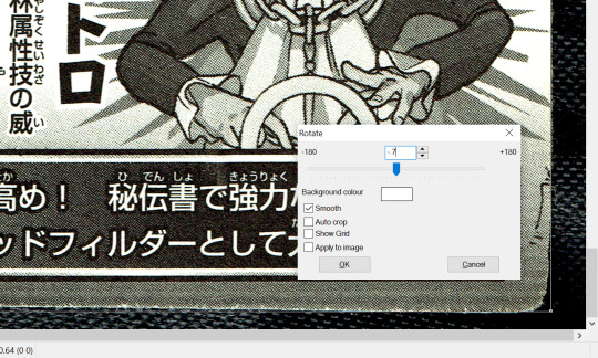
Anyway, since I scanned slightly away from the edges earlier, the resulting digital image is slightly rotated at a random angle! For some ungodly reason, Photoshop doesn't have a shortcut for custom rotation, nor can you really set an action for it. XNView once again comes in clutch here. The basic steps are:
5a) Click and drag to create a bounding box. This will be used as a guideline to check whether the digital image is actually upright.
5b) Shift-O and test out values from -3 to 3. Ctrl-Z and repeat until it's just right.
After a while, you get a hang for approximate values, but "just right" means getting within .05 of a degree!! Even the untrained eye can tell when something's off by a mite.
5c) Adjust the bounding box's borders to the edges. If the box is aligned to one corner and the adjacent corners *aren't* aligned too, that means you have to rotate until all four corners are aligned. Then crop and save and move onto the next one!
7) Align
This is a new step I've never done before! Given the number and size of pages I'm working with here, I had to think and plan out this process in advance for once. Basically, instead of cropping and resizing each individual file, I load them all in at once so that they're perfectly aligned with each other. This is gonna require a lot of Photoshop automation.

First off, I go to File > Scripts > Load Files into Stack. There are four types of pages here: 1 comic on the left, 1 comic on the right, 2 comics on the left, and 2 comics on the right. This process will have to be repeated for each type so that the automation doesn't get confused. Then we check the "Align Source Images" box and let the process run... for a while.
So now I have a single file with one layer for each of the pages, and the comics themselves are all nicely aligned! Yahoo! The edges are mismatched though, so it's time to crop again. There's gonna be some cutoff but that's acceptable in this instance since I just care about the small comics. If I was doing bigger, full-page manga, I'd probably *add* some margin after cropping.

The pages are approximately a 5:8 ratio, so I've decided to crop these down to 2550 x 4080. To make sure that the comics are at the same distance from the margin regardless of page type, I'm using Guides to roughly estimate the comic positions after cropping. I want them to end up at about 70px and 100px from the horizontal and vertical margins respectively. I could also change the size of the canvas instead of cropping if I really wanted to.

Once I'm satisfied with the cropping, I use the Timeline/Animations window to flip through (at about 0.5 seconds) and check that all of the layers look right. There are a couple tears and visible background instances which are quickly fixed with Content Aware Fill and Clone Stamp. Since the background's black, I even had to temporarily change the Photoshop interface color lighter so that I could detect the imperfections better.
Then at last I go to File > Scripts > Export Layers to Files and... wait for a while again. Now we have separate files! And now I have to repeat these steps all over again for the three other page types!

Lastly, it's time to rename the resulting files in order. I actually screwed up on this step. Photoshop exported all the files *backwards*, which gave me file names like "PSexp0025-InaGo01". This is an issue because it makes batch-renaming via XNView a whole lot harder!! Photoshop automatically adds a numbered prefix to all the auto-exported files, and XNView can't remove wildcards from filenames. The result is weirdly staggered out-of-ordered files. It took some careful manual work to fix this, but at long last, we have a whole folder of 90 beautiful pages!
8) Translate (FINALLY)
You see how long it took to get here!? This took at least six hours for 90 pages. After all that work with the raws, finally I can do something with them!
Guess what! If you have a digital edition, you can skip all of these steps! Instant gratification for five bucks! Buy digital editions when you can and give your money directly to the author!!
Anyway, further stages may be discussed in another post once we get around to them. Lassoing translators and typesetters is its own struggle. I hope you learned something new from this post!
43 notes
·
View notes
Note
Can I pretty pls ask you the name of the font you used in the Nick x Charlie “I wonder if he got the g or the b” gifset and how you do the colorful effect inside the font?
hi, yes of course!! the font is called Glamour Brush which you can get here
as for the second question, i am the WORST about saving psds (apparently i saved all the colorings for this set but not the typography 🤦) so i can't tell you with 100% certainty exactly how i did it, but i can tell you how i think i did it based on how i normally get this kind of effect and what i ended up with in trying to recreate it
the rest is under the cut! (the gifset in question)
fyi: i'm using photoshop cc 2019 on windows. also i apologize in advance for my tendency to over-explain
so the basics of what i'm about to explain are an easy way to make pretty much any text look nice. i start by typing out the text in white and setting the blending mode to difference. now if you click on the fx symbol at the bottom of your layer tab group, you'll pull up the style options. what we're interested in here is gradient overlay
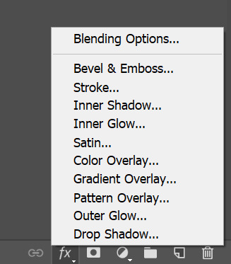
the style menu looks like this:

you can see i already have my gradient loaded up there, but if you click on the gradient you can play around with the colors until you settle on something you like. the main thing here is the blending mode. if you leave it on normal it's just going to replace your white text with the gradient, which can look nice but it's not what we're going for. i normally use hard light, linear light, or sometimes color. just play around with it till you find one you like. again, i can't be positive, but i'm like 95% sure i used linear light for this one, so it looks something like this at this stage:

then i also add a drop shadow to make the text pop more (this is done in the same menu we used to apply the gradient, you can see it at the end of the list on the left of that screenshot). you also want to do any distortion/rotation/resizing at this stage cause we'll be using the text to create layer masks in a second.
so this is what i have now:

and i could just leave it here but i don't like how dark the dark parts are, so i'm gonna try and fix that. there's no set way to do this so, as always, just play around with it till you land on something you like.
anyways, first i hold down the ctrl key and click on the T icon on my text layer, which will select the text pixels:

now any adjustment layer i create will be masked to the text (just make sure you drag it under the text layer). i ended up using both brightness/contrast and curves to get a look i was happy with:
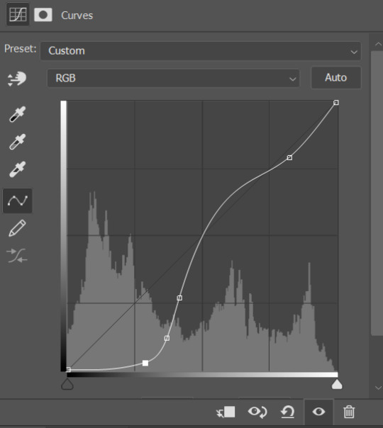
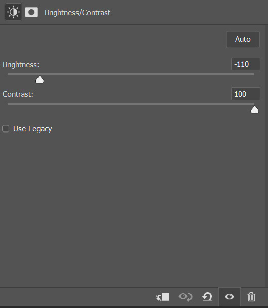
remember that since the text blending mode is difference, in order to make it lighter we actually need to make the image underneath it darker, hence these settings ^
and that's basically it! for the final touch i duplicated the text layer, set the fill level to 0 (this is like opacity but does not affect the layer style), and added an outer glow. then i nudged that layer down and to the right a few pixels so it was slightly offset.
and here's the finished product that i made for this tutorial along with the original! not an exact match but i think i got pretty close:


ps: because the lighting on all the gifs in that set is really different, i definitely didn't use the same blending mode for the gradient overlay or the same adjustment layers for each one. just something to keep in mind!
and as always let me know if i need to clarify anything or if anyone has any more questions!!
31 notes
·
View notes
Photo

Requested by @tennant!
For this tutorial you will need:
Some basic gif-making knowledge (see my last tutorial!)
I’ll be using CC 2017 to do this, but as long as you have the timeline option, this will work for you! 🥰
So, in a sort of part two to my other gif tutorial, (https://luke-patterson.tumblr.com/post/636980573506813952/) this is a slightly more advanced part of gif-making. But I promise it’s easy when you know how!
Assuming you followed the last one, you’ll already know how to make your gifs into a smart object, so we’ll start there!
PART ONE: BLENDING
Drag both of your gifs into the same file. For this to work, your gifs have to be the same number of frames, or at least cropped to the same length in the timeline window, otherwise one will loop before the other, and it will mess up the loop of the gif. (For when we get to the multiple gif part, I recommend having between 60-80 frames, so it stays under tumblr’s 10 MB limit.) As this tutorial uses smart layers, they can both be sharpened as well.
(I made this gif 540 px by 268 px, because I’m going to add more to it later. But we’ll cover that further down in part two!)
Honestly, I find it so much easier to put my colouring on top of both/all the gifs, and then clip individual layers down onto a specific gif, if that one needs more of its own colouring. That way, the extra layers don’t interfere with the other gif(s). It’s so much less confusing visually for me than having lots of groups with their own colourings, and it makes moving the gifs around simpler.

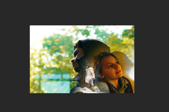
Position them side by side, one on top of the other. Obviously, you can play around with the positioning: this may be easier to do once they are blended, especially as some gifs may be smaller and you need to try them in different places. For example, this is a screenshot of a Lyra/Will set I made in the past, with three blended gifs of different sizes:
Add a layer mask to both of your gifs. You might not need to edit both, but I usually do, as I like to balance how much one gif blends into another! Using the brush tool (set to black, when you’ve clicked on the layer mask), we want the brush to be very big, and very soft.
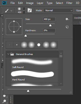
The bigger the brush, the more seamless the blending will be! By painting parts of the top gif away, the other gif will start to appear underneath. It’s not always necessary, but I usually like to set my top gif to ‘screen’ as well. This helps the gifs merge into one another even more, especially if you have one gif which is darker than the other!
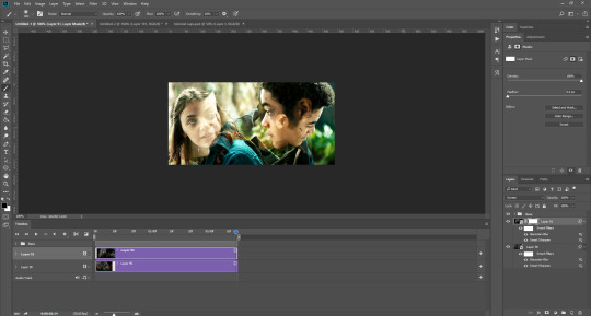
As you can see, by setting it to screen, the top gif has already started to look blended. Then, you can start to paint. As the brush is so big, you might end up painting away too much of the gifs, like so:
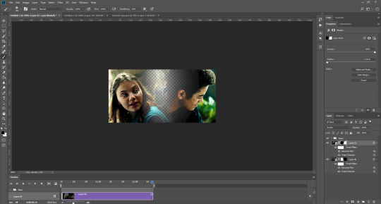
I usually go back and forth, switching between black to remove parts of the gif, and white to add it back (always painting on the layer masks). Sometimes, you might need to make the brush slightly smaller, just to fill in tiny gaps.
Another thing you can do is to add a solid black colour underneath all your gifs, just to fill in any spaces. (Sometimes, I do this on top of gifs too, to create spaces where I want blended gifs to go, like in my current header!):

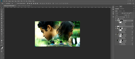
Anyway, back to the original gif. My blended gif is now pretty much how I want it to be, except Lyra is quite far to the left, and Will is taking up a lot of the screen:
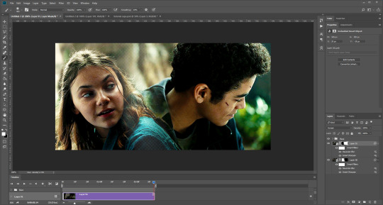
So I’m going to see how they look at the start of the gif, to determine how far right I need to move them both to get them mostly in the middle:
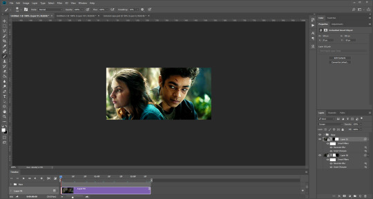

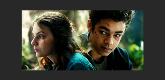
And that’s it! Now you can export them [file > export > save for web (legacy)] and you’ll have to change the timing back to 0.05, or use the action I introduced to do this in my last tutorial.
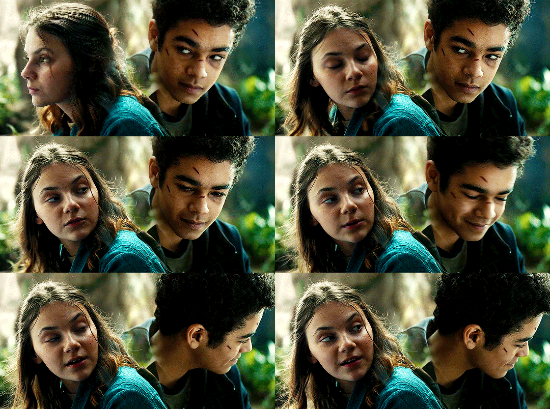
PART TWO: MULTIPLE GIFS
To put more gifs underneath this one I’ve made, I expanded my canvas. Go to image > canvas size. Make sure you click the little ball to the top in the anchor section, so the canvas expands underneath your gif. If you leave it in the centre, it will simply expand from the middle, or the left, right, etc.
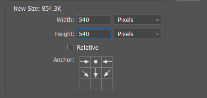
Next, we need to remove the black line at the bottom of the gif.
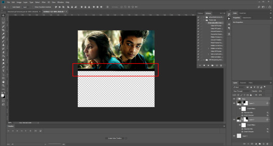
You want to select the space for cropping using the rectangular marquee tool, so in this case, 540 px by 268 px. The tumblr spacing is 4px between each gif in a set, so however many gifs you want, you have to account for 4px less pixels inside your one gif, to give the illusion there are multiple (unless you want them to touch).
For example, (there’s a little maths here: forgive me!) two gifs of equal size, placed side by side, must be 268px in width or length, because (268 x 2) + 4 = 540. (There is one 4px gap in between). For four gifs, it would be (132 x 4) + 12 = 540. (For the three, 4px gaps). For three gifs of equal size, it’s a bit different. These must be 177px, 178px, and 177px, to ensure there is 8px of space left over (two gaps).

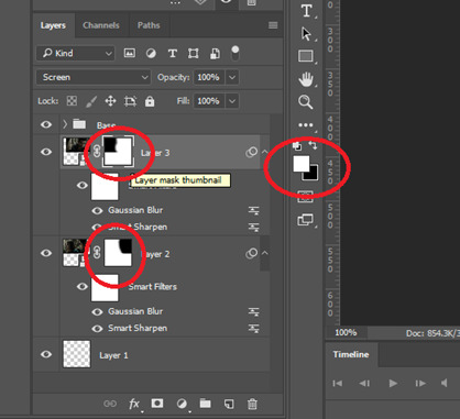
Then, make sure the colour white is the primary colour selected on the paint pad (this is vital) and (in this case), the layer mask from before when we blended, is selected. Press ctrl (command on mac), shift, and i to invert your highlighted area (or select > inverse) and then simply delete the excess line, (either using the delete button on windows, or fn + delete on mac, I think!) Then, do this again for the other gif.
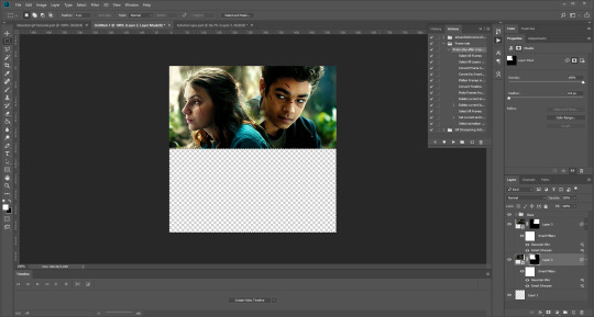
And voilà! It’s gone. You can also paint it out (using the black colour as the primary colour to erase), but I would still recommend highlighting the outline of the area you want to erase, using the marquee tool, so that you can paint it out in a straight line, and don’t paint into your gif and erase parts of that by accident.

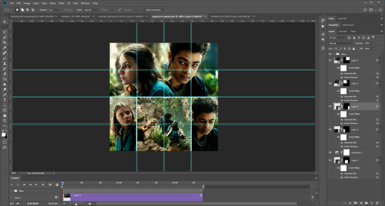
Now to add in the other gifs! To do this, I use guides, but you can also use lines at a size of 4px, to map out the spaces in between gifs. If you go with lines, just make sure you delete the shapes after. With guides, they are not actually ‘in’ your gif, so you don’t have to remove them before you save. However, guides only work for straight lines, so gifs with other shapes will need to be made using lines, (but I will touch on that at the end!)
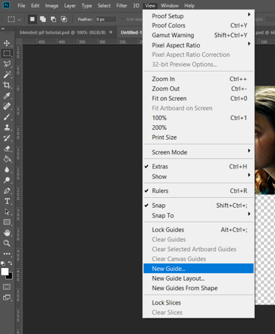
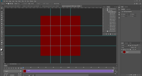
I actually have a few psds saved with guides already on, so that I don’t have to draw them out every time. If I was making a set with three gifs in a row, this would be different, but I usually stick to two or four (or three with one big square/rectangle, and two little squares), so this is my most used psd. The guides are set at: 132 px & 136 px, 268 px & 272 px, and 404 px & 408 px, both horizontally and vertically!
I have a red colour underneath just because I find it easier to see the lines between gifs this way - if you do the same, just remember to turn it off before you save your gif, otherwise it will have the colour red instead of mimicking the transparency between gifs.
Now, make a second gif! I decided to have a square in the middle as you can see in the title, and then two rectangles either side.
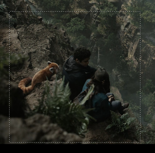
Then you want to resize it, in this case to 268 px by 268 px, and drag it across into your main file, or go to layer > duplicate layer, and move it that way. Don’t worry, when you move it, it will show the whole gif as if you haven’t cropped it. The reason I crop and resize it beforehand, is so that I can ensure it will be the correct size when I remove the excess parts of the gifs I don’t want, (rather than making it 268px including the black line for example, which would be wrong.)
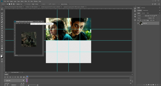
Then, as before, position the gif where you want it to go, and highlight the area you want to be in the gif. Whilst this is selected, (again ensure white is the primary colour on your paint pad), click the layer mask:

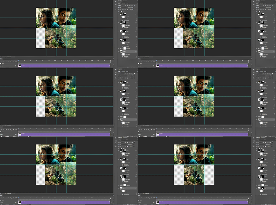
Then the excess around the gif should be gone! (Making a gif of a gif tutorial... meta, lmao.) This way, if you decide you want to change the shape of the gif, or move it slightly, you can just paint parts in and out, or delete the layer mask, move the gif, and reapply it!
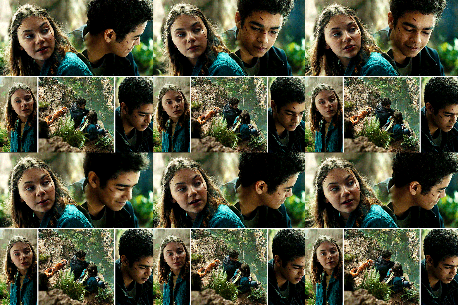
You can then sharpen and adjust your colouring to the gif as needed! Next, go ahead and repeat this process for your other gifs. Selecting the area, adding a mask, and sharpening. By the end, you should have something that looks like this:
PART THREE: OTHER SHAPES
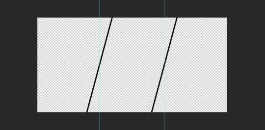
If you want to use other shapes (which I haven’t tried myself until now, but I can talk you through some thoughts!) You can use the line tool. So, for example you could make a layer with the lines at 4px, merge it, and then at the end delete it from your gif to leave the gaps transparent:
To make a gif any shape you want, choose a shape (either use the shape tool, or get a png of it), and using a clipping mask. Make sure your gif is above the shape layer, then right-click the gif layer, and select create clipping mask to clip it down:
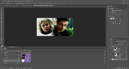
OR you could use a circle, and then delete the circle to make it look transparent:
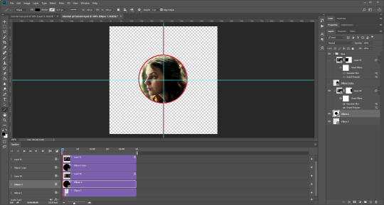
The best way to select items which are not rectangular, (so you can’t use the marquee tool), is to use the pen tool. Click around your gif so that it’s got a border of what you want selected. Once you have outlined your gif, right-click and choose make selection:
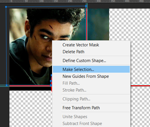
Then set the feather radius to 0, and then the area you want should be highlighted in the same way as with the marquee tool above, so you can add a layer mask, etc. However, as the pen tool is not always that accurate, there is a little white gap here where it’s not a perfect circle.
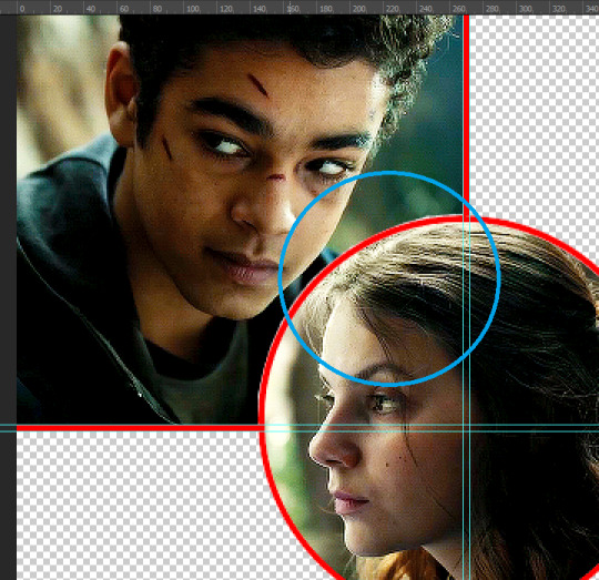
A way to overcome this could be to make all the gifs you want, and then simply add one on top with a white 4px border, so it gives the illusion of being transparent! (As I have done above, but save it as white rather than red!)
If I find a better way to do this in the future, I will update this tutorial. I hope this is helpful, and thank you for reading 🥰💖
#gif tutorial#tutorial*#completeresources#yeahps#chaoticresources#allresources#mikesmom#usertom#usersmile#heavensentnetwork#if there's any mistakes pls let me know#i am so tired rn fjghfjhgfjgh
707 notes
·
View notes
Text
gif cut-out tutorial
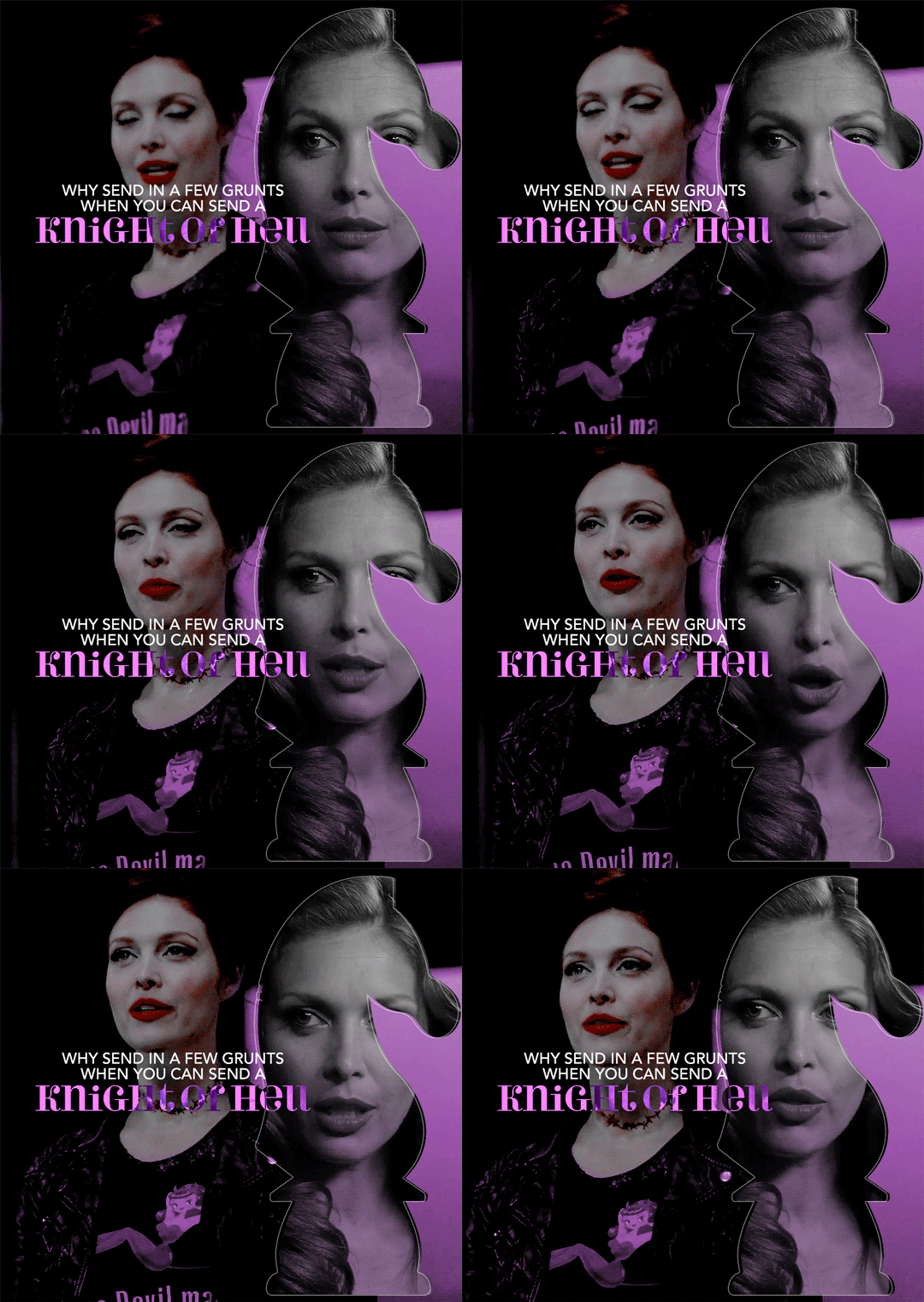
ok ok so @subtledean requested a tutorial on how to do stuff like this post with the gif cutouts and the text effects. hopefully this helps aria ;w; i’m not the best at explaining things but i included some screencaps for clarity. i’ve tried to compress all the sample gifs and screenshots down to under 3mb to avoid tunglr compression on mobile so if they look a little different from the actual gifset, that’s probably why!
what you’ll need:
photoshop, i’m using PS 2021 but any version of photoshop will work out
a basic knowledge of gif-making (i’m assuming you already know how to make a gif and color it).
step 0: storyboard
this isn’t strictly necessary but i HIGHLY HIGHLY recommend it. you don’t have to do any photoshopping this first step, but it’s really important to check out your footage and the shots you have gathered to see what works, especially if you’re trying to combine three or more gifs onto the same canvas. like literally take a piece of paper and draw out where you want the character’s faces to be, where you want the cutouts to be in relation to their faces, and think about whether or not there’s enough empty space to the right or left of characters heads for a cutout to be placed. is there too much movement that would be distracting or messy in an already busy gif?
things like that really help, and it also makes you double check on your footage quality and feasibility. if you end up making a gif where you want one character’s face to be on the left side of the gif but it turns out there’s not enough empty space on the right side of their face to place a cutout and you then have to hunt for new footage or start all over, it’s kind of a trainwreck and you just waste another hour of your time as you deepen your procrastination hellhole. that’s not a real story—
step 1: make the base gif
i’m assuming you know how to color it already. and aria i KNOW you know how to color already so :) size it accordingly to your desired dimensions.
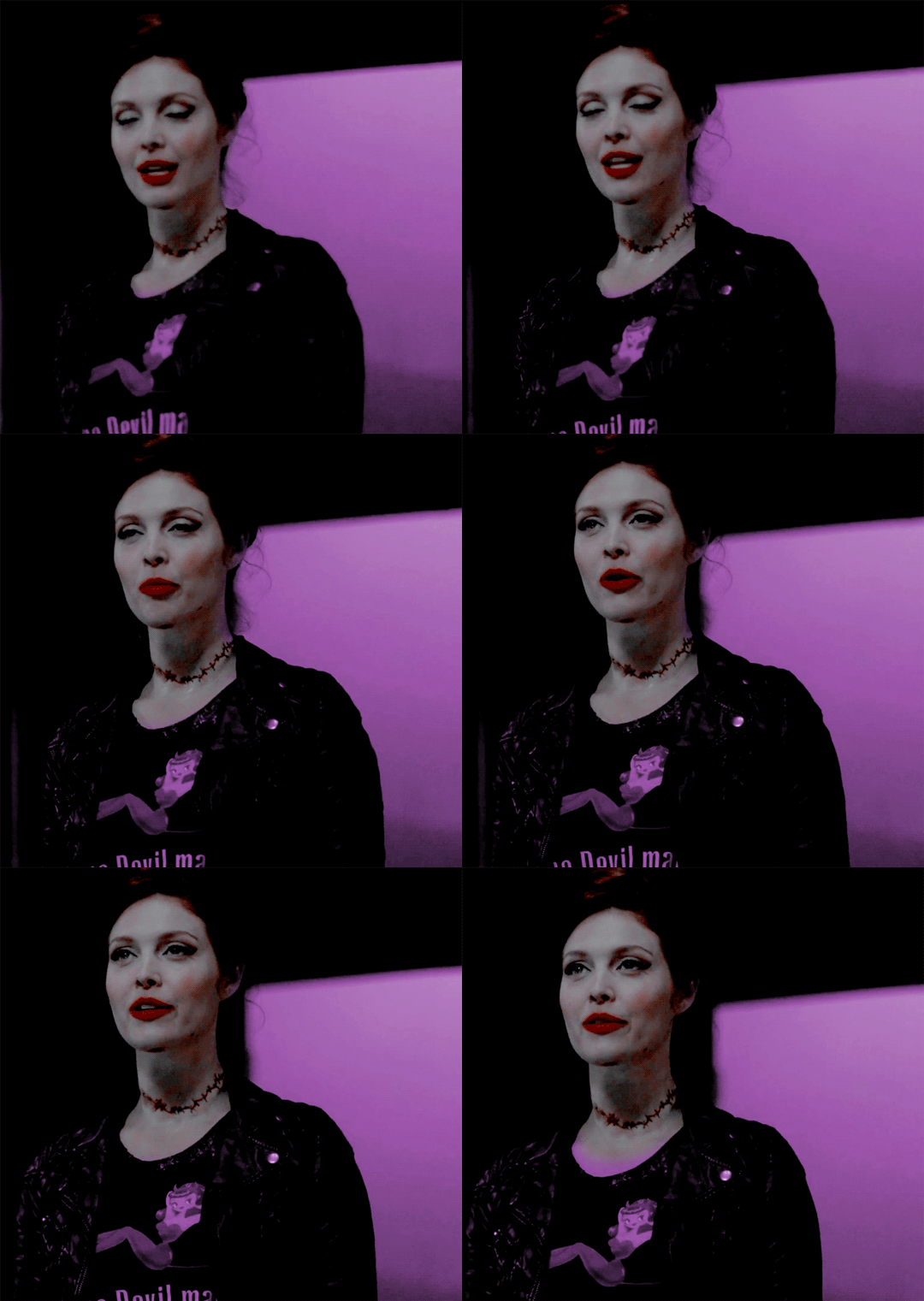
as you can see, i left enough space on the right side of abaddon for the knight cutout to be placed.
save this as a .psd file. you don’t actually have to sharpen and do everything that comes at the end of making a gif right away, but make sure your layers are clearly labeled. do NOT convert to video timeline/smart object just yet.
step 2: make the cutout gif
this is critical: make absolutely certain your cutout gif has the same number of frames as your base gif. otherwise it could get really messy! abaddon has 20 frames, so the cutout will also have 20 frames. again, do not convert the cutout gif to a video timeline/smart object. just keep it as a frame animation. here’s my cutout gif. it’s just a simple b&w gif but i added a touch of purple for color consistency sake whatnot.
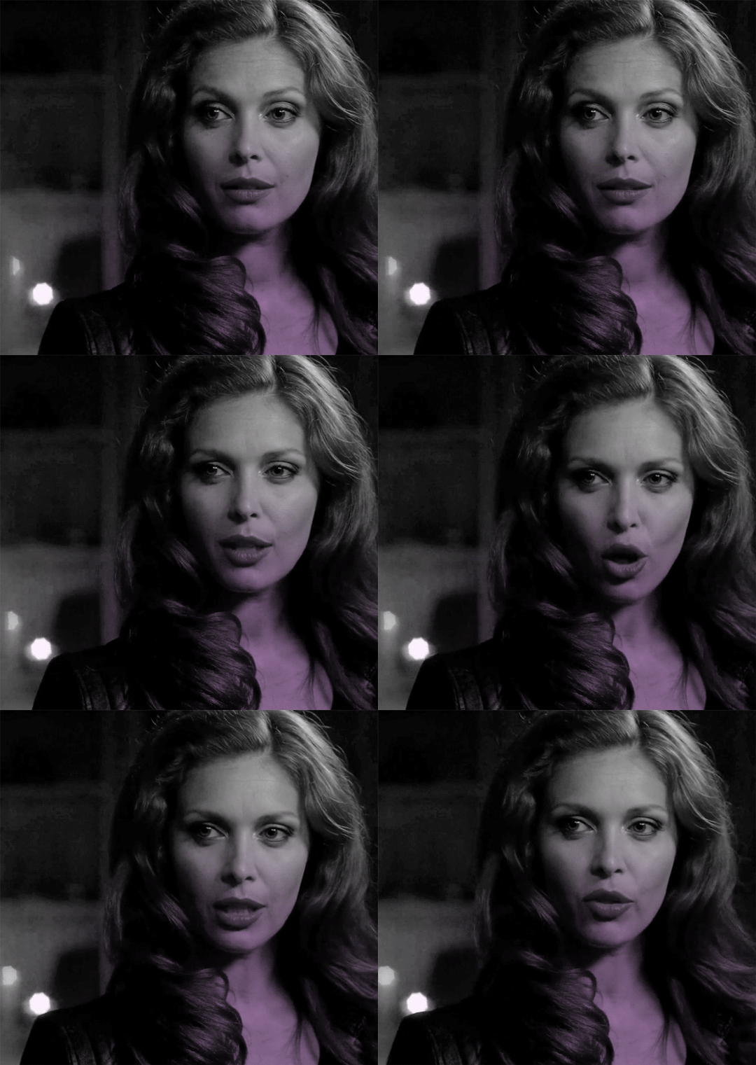
now for this particular gif i’ve actually cropped abaddon to be roughly exactly where i would want her face to be in relation to the first gif, but that is unnecessary. helpful, but unnecessary. you do NOT need the cutout gif to be cropped exactly perfect in order to make this work.
step 3: combining the two gifs
there are many different ways to combine two gifs onto the same canvas. some people like to do it via video timeline. i prefer to do it by frames and convert everything to a video timeline only at the end (it’s just a personal preference). here’s a tutorial if you prefer working with timelines, but i’m gonna go over how to do it by frames.
first group everything in your base gif into one folder. then group everything in your cutout gif into one folder as well. you can name them however you want to keep track of things.
then, select all of the frames in your cutout gif. in this case, all 20 of b&w abaddon get selected. make sure its not just frames 4-20 or whatever, but all the frames you made. you can click frame one and then shift-click your last frame to double check.
click the timeline tab group options bar and then go to options > copy frames
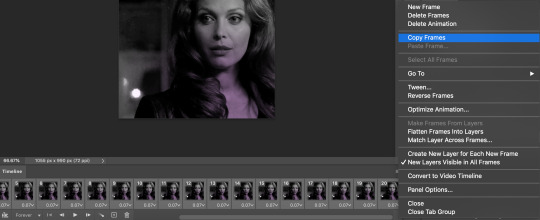
now go to your base gif canvas. select ALL the frames of your base gif as well (it’s critical that all of them are selected).
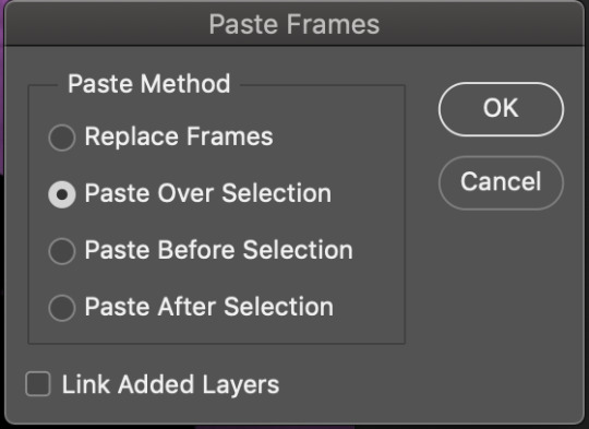
now do options > paste frames.
a popup should appear and you’re going to select the “paste over selection” option. do not link layers.
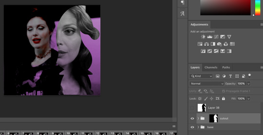
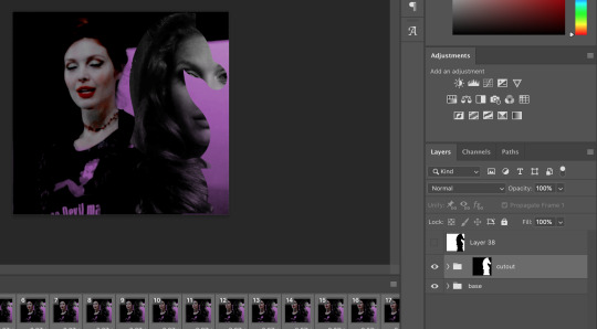
your cutout gif should now be completely or partially obscuring your base gif. however, now you should see two groups on your sidebar of layers. one for the base, one group for the cutout. if you labelled them with names you can tell which one is which.
step 4: creating the cutout
in order to create the cutout, we use my favorite thing in the whole world of photoshop. layer masks.
to make a layer mask, you simply select a layer or group you want to mask and then click this little icon on the row of icons at the bottom of your layers panel.
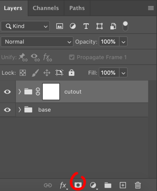
white on a layer mask means whatever group or layer is getting masked is completely visible. black on a layer mask means that the group or layer is invisible. if there is 50% gray on a layer mask, then its 50% visible. so on and so forth.
i love these so much i abuse them on the daily. i’ve made a few gifs where i’ve masked every frame one by one because i wanted to get some cool effects. admitting that kind of embarrasses me but oh well.
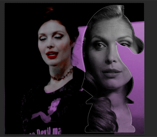
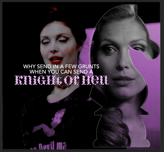
anyway this is simple though. just find a picture or an outline of a knight. i used these boyes:
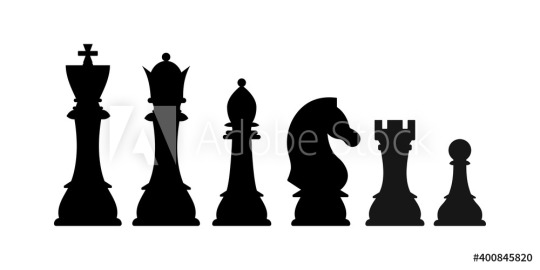
obviously i cropped out the knight of the bunch, got rid of the watermark, and then i placed it on the canvas where i wanted it to go.
select the interior of the knight with the magic wand tool. should be pretty simple since it’s all black.
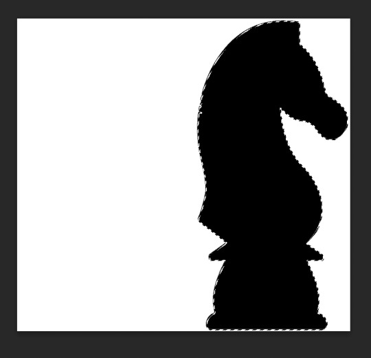
now click over to your layer mask. make sure you have selected the mask and not the group. you can tell you have selected the mask when a little white rectangle pops up on it.
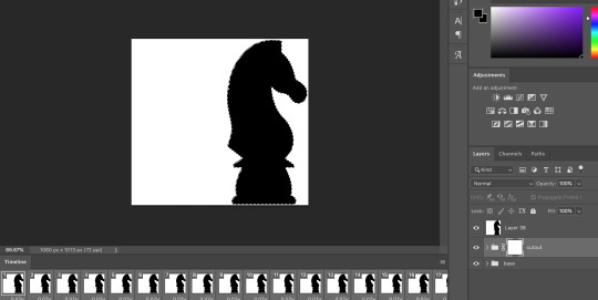
when you know you have the mask selected, click command+i or control+i to invert. if for some reason you do not have this keyboard shortcut, just take a brush tool and color over the area in complete black. as long as the magic wand tool is still selecting just the interior of the knight, it should be fine.
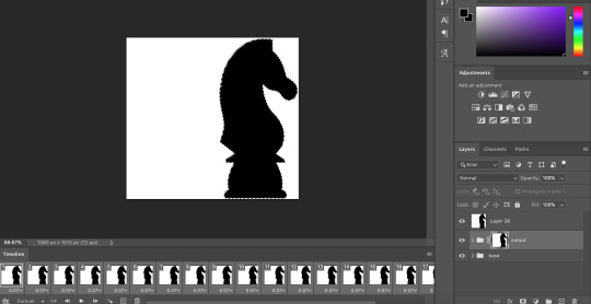
now once again, black means a layer will NOT be showing, white means a layer will be showing. so right now after i disable the visibility of the top layer we used as a reference for the silhouette, it looks like:
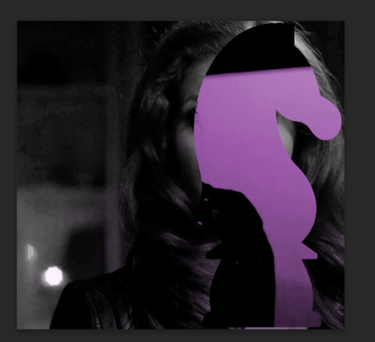
do not fear the clownery. layer masks are great because they are always non-destructive. meaning that even if you somehow mess up and your canvas is showing something completely gross, you can always go back and edit your layer mask and your original gif would be unharmed as long as you did not touch any layers in the group, only the mask. simply invert the mask (again, make sure your mask is selected and then command+i or image > adjustments > invert) to get:
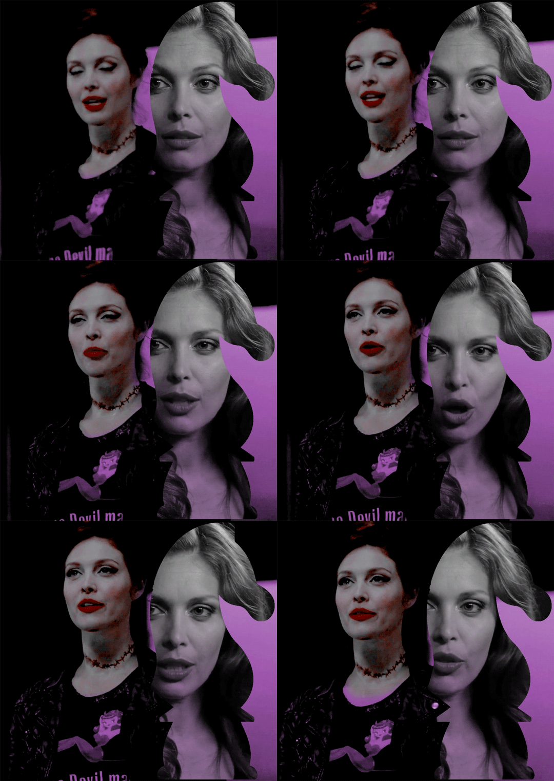
for a layer mask that looks like:
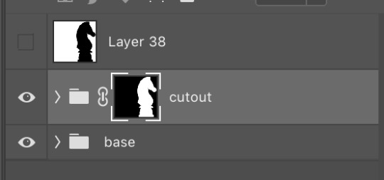
you could have also just made a black layer mask to begin with and then inverted the knight outline to be white. many different ways to do the same thing.
another tip: if you select your outline and then click layer mask upon a group or layer with no mask at the current moment, it will automatically make a layer mask with your selection as white and the unselected pixels as black. this is normally how i do my cutouts, because it’s a time-saver even if it like. saves a few seconds max. but i typed out the above for explanation and clarity, so hopefully i didn’t just make anyone more confused.
anyway.
now say you don’t like where the cutout abaddon is positioned. layer masks can also be linked or unlinked, depending on the little link icon you see between the group and the layer mask in the image above. if the icon is visible, the layer mask and the group are linked. if you cannot see the link icon, they are unlinked.
linked layer masks will move in conjunction with the group if any type of transform is done upon them. if the group moves, the layer mask also moves. but if a layer mask is unlinked, you can move the mask and the group independently of one another. for instance, i can change where the cutout is located on the overall canvas of the gif by simply moving ONLY the layer mask (and thereby changing where the blacks and whites of the layer mask occlude the cutout gif contents). but i can also transform the cutout gif layers without changing where the overall outline is located relative to the canvas itself. basically, i can transform the interior contents of the cutout independently. so here (make sure all of your frames are selected):

group unlinked. i’m also making sure that now i am selecting the GROUP (ie. the frames of the layers you are actually going to move) and not the layer mask. you can tell because the little white rectangle around the layer mask can no longer be seen.
now i can transform/adjust the contents of the cutout solely “within” the cutout, and i don’t have to worry about changing where the cutout is located in relation to the overall gif. when transforming, make sure all the frames of your gif are selected. like select the whole group and not just an individual layer, basically.
i’ve seen a lot of how to combine and cut out gifs tutorials on this website, and here is a really good one that i know sully also used <3 big shoutout to all the photoshop queens being inspired by each other!! however i haven’t seen anything that mentioned the linked vs. unlinked layer masks, which i really feel like deserves a shoutout. you don’t have to crop your gifs out perfectly every time, you can always adjust them later. for demonstration, i’ve positioned abaddon in a few different positions with an unlinked layer mask.
step 5: creating the outline
so in order to emphasize the shape of the cutout (the knight), i simply delete the white space surrounding the picture of the knight in the original silhouette that i used. magic wand tool + delete. you can also make a new layer, then paint bucket tool it. many ways to do the same thing.
now with only the knight on a transparent background, i double click the layer to pull up the effects. select outer glow. i used these settings:
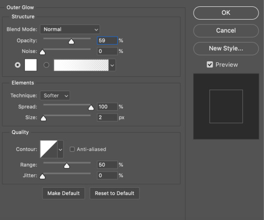
when you are doing this, make sure you are on frame one of the frame animation and the “propagate frame one setting” is selected, otherwise you might end up only applying the effect to one out of your many frames, which blows.
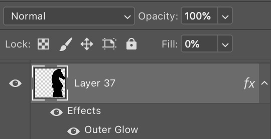
then i go change the fill setting to 0%, BUT i leave opacity at 100%. fill is basically like opacity, but it doesn’t affect layer effects (whereas opacity does). so you basically get only the outline but not the black. you can also set the blending mode of the layer to screen and get the same effect, etc, etc. feel free to adjust however you see fit, in addition to the outer glow settings.
i move this layer over a couple pixels to give it the little offset effect, but you don’t have to.
step 6: adding the text
okay the two fonts i used are avenir and perla. i think a LOT of gifmakers use them because they’re really pretty.
i make TWO different text layers, one with avenir in a smaller size and one with perla in a bigger size. this is because for the perla one, i’m going to be changing the blending mode whereas i don’t want to be changing the blending mode for the smaller text. i position the text where i want it to be and make sure the perla font is in the color i like:
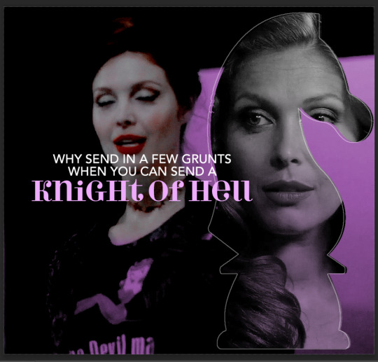
then i change the blending mode of the fancy text (perla) to difference. ONLY that layer, and again make sure to check “propagate frame 1″ and make changes on the first frame to apply the change to all of your frames.

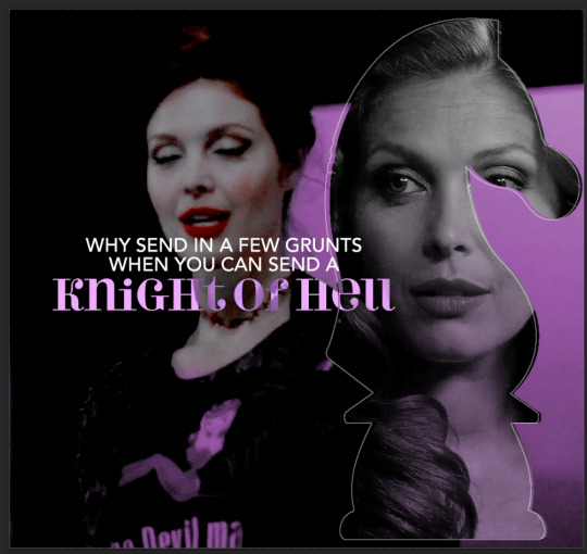
but i still don’t think it produces enough of a difference. so i right click on the text layer for knights of hell, and then go to: select pixels.
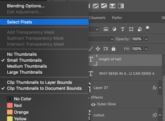
then i click the curves adjustment layer. this will automatically make a curves layer with a layer mask that occludes everything BUT the area you selected. beautiful. i drag the curves around until i get enough of a difference that i like. normally i make the lights lighter and the darks darker. yeehaw.

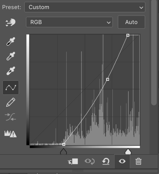
again there are sooooo many different ways to achieve the same effect on photoshop. this is just want comes easiest to me, and it’s totally okay if you find a different way that works better for you at producing the contrast you want or the colors you want.
step 7: export and cry
NOW you can convert everything to a video timeline, put your video frame layers to smart objects, and then apply your finishing sharpening filters. export, cry, and hope tumblr compression doesn’t screw you over.
hopefully this was helpful! pls like... idk support my edits if you found this helpful or reblog this post. feel free to dm me about how u do some of the text effects as well bc i’m always trying to learn new things and i am by no means an expert on like. any of this.
aria please go write your fucking thesis before i delete this entire tutorial challenge. :D
#subtledean#THIS IS FOR YOU#I FEEL LIKE THIS TUTORIAL HAS MORE WORDS THAN UR THESIS ATM SO!!!#tutorials#mine#idk what to tag this but PLS pls pls feel free to talk to me abt ph*toshop#or ask for help or point me towards other tutorials <3#shoutout to sully too its in there somewhere#resources#100n#ps
190 notes
·
View notes
Text
Okay, I wanted this fic to be a thing for a while, but I just now got a good idea on what I wanted it to be about. So....enjoy, and if you want me to branch out on this AU in any way or have any other requests, just hmu! Always happy to do stuff for you guys! ♡
Yan!Poly Senpai & Spirit • Reader
( :̲̅:̲̅:̲̅[̲̅:♡:]̲̅:̲̅:̲̅:̲̅)
You shouldn't have done it. You tortured yourself by thinking of what your life could've been, as your slightly trembling hands gripped at your kneecaps. You really shouldn't have done it. You thought hopelessly to yourself as you glanced over at the PlayStation collecting dust in the corner. You scoffed, actually quite surprised that neither of them had disposed of it by now. You should have let them rot in that damn game. But, their pleas were just too...convincing. The way Senpai (the first one you met of the two) sighed and pressed his pixelated palms against the glass screen of the television, telling you that it was only a matter of time before the broken coding of the game they were in consumed them completely. At the time, you didn't want that. What sane person would? Senpai was, as far as you were concerned, a sentient being, and so was the other one of the two. As far they let you know, they were imprisoned cruelly and left to die. And, as tears pricked your eyes, and as those tears made the PlayStation look as if it was shining, you had a good feeling as to why they were put in there. You had a good feeling as to why that girl with the pretty red dress handed you the console and the game with such a pained and desperate look in her eyes, expressing her "guilt" towards whatever the game happened to inhabit. The game and the memories that came along with it are burned into your brain. The way the words "Hating Simulator" were scrawled so messily onto the game cartridge, the way the console was kept so well cleaned, like it wasn't nearly as old as it actually was. And of course, how could you ever cease to remember the game itself? The glitches, the cutesy music you could expect from a dating game like that one, the hours of dialogue you somehow sat through, all of it was forced into your brain so deep that you couldn't forget it no matter how hard you tried. You shouldn't have taken it, you thought. Things would be so much better for you if you just didn't do it. If maybe, just maybe, you smiled at her just like you did anyways, and trashed the console and went on with your life, then maybe your life would be a lot more brighter than it was. Maybe you wouldn't be sitting prettily on the couch waiting for your personal hell to pick up where it left off. Just like clockwork, both or just one if you somehow got lucky, Senpai or Spirit, would enter the house you were confined in, to "spend quality time with you". Just the thought made you sick. You, for whatever reason, put some of the blame onto yourself. How did you not notice the signs? The way Senpai would angerly confront you while he was still inside the game, all because you were an hour later to turning on the game than you said you would be, only for him to turn into a sickeningly sweet pile of putty as you explained the reasoning - you got too absorbed in trying to figure out a way to free him and Spirit, and lost track of time. You should have noticed it when you freed the two of them both, and their protectiveness increased tenfold. The way the two of them would almost be at each other's throats at first, arguing at who would get to spend the most time with you, before they eventually stopped fighting after seeing your fearful and tear soaked face. You should have noticed it when Spirit insisted on temporarily ditching his more humanized form in favor of the one he used in the Hating Simulator so he could hitch rides in your backpack, to accompany you to school and whatnot. The world was scary, he told you as he cupped your cheeks in his hands, and he wants to make sure not a single soul will be given the opportunity to harm you. Senpai even offered to enroll to the same college, but you turned down his offer. But, now that you think back on it, you wouldn't be shocked if Spirit and Senpai arranged for him to go anyways. Spirit had his ways, which he always bragged about like the sick bastard he turned out to be. You can remember it like it was yesterday, holding him in your arms as he was in his tiny spirit form. Placing him inside your backpack and giving him a gentle kiss on his forehead as he looked up at you.
This form, being a direct copy of his form of the Hating Simulator, held that same look of pixelated, twisted agony. But even still, you could tell he was looking up at you with pure love and adoration. He loved you, he wanted to make sure you were safe, you told yourself. Wasn't that cute? He really cared, didn't he? If only you knew. If only someone was there to really warn you. It was after you started bringing Spirit along with you, that everything started going dark. Since he was right there in your backpack, he could hear everything going on. All the laughs you had with your friends, all the interactions, everything you did with others, he saw as "too much". They were clearly flirting with you, or, they sounded too suspicious. You were lucky Spirit was there to make sure they didn't do anything to hurt you, they were clearly getting too comfortable around you! You brushed it off, as stupid as that was. You still loved him and Senpai dearly, so you made excuses for the both of them. Spirit just didn't understand human interaction, since he was a demon. He just didn't get it, but a little bit of empathetic explaining could do the trick. However, no matter how much reassuring you did, it just never soothed him. There was always something else. Something more. Senpai and Spirit started getting closer and closer. At first, you were glad. They've been through a lot together, and you knew they could be really good friends if they tried. You were happy for the two of them. But, you couldn't help but feel uneasy every time you entered a room and saw the two of them sitting together. Their bodies close and their voices quiet, only ceasing their speech as one of them was the first to notice you, smiling sweetly, a lip movement which the other soon copied. You smiled back, but even in that moment, you couldn't help but wonder if that smile was genuine or not. The arguments became more frequent. But, now, much to your own shock and dismay, it wasn't one against one as the third person watched in fear like before, it was two against one. You just didn't get it, they thought. You were so stubborn, so hopelessly brainwashed by mortal society. You couldn't see things their way because the world wouldn't let you. Of course, logically, you called bullshit. You had genuinely no clue what they were going on about. The people they were suspicious of, they were nothing more than acquaintances and friends. The brainwashing they claimed you were going through, was just you finally seeing through their lovesick bullshit. Alas, you just couldn't make them see the way things really were. Their little kinship became your downfall. And soon, they put the plan they were whispering about into action. You couldn't leave now, you had absolutely no chance against them. Not when you barely even put in the effort to figure out explanations for your friends and other loved ones strangely vanishing with only weak and unfounded excuses to explain their disappearances. Spirit and Senpai both had you trapped, mentally and physically. You sat in despair, wondering what things would be like if you took a left instead of a right that day, if you took a mallet to the damn console instead of giving those sick fucks any of your compassion and time. Soon, the door creaked open which interrupted your thoughts, but you were too broken mentally to even look up. "You alright, dear?" You weren't alright, but you didn't want to give him the satisfaction of knowing he got a response out of you. You could recognize his voice, it was Spirit. You especially hated him, he was far more agressive than Senpai. More demanding and possessive. Senpai was as well, but he was far more passive than Spirit was. Your eyes could see him crouch down to your level, but you refused to look up from your lap. Why give him the satisfaction? It will only make your situation worse in your eyes. You couldn't help but cringe as you felt Spirit's fingers grip the soft skin on your chin and lifted your head up to look him in the eyes.
"Still acting all upset, hm?" He mumbled to himself, looking at your features as if he was studying you. It made you want to vomit. He made you sick. Him and that prissy bastard Senpai. "Me and Sen have been trying so hard to keep you safe, (Y/N)...don't you think we deserve a little gratitude?" Spirit asked in a soft, comforting tone. You looked at him in disgust, anger coursing through your veins. That sick mother fucker. That sick bastard. You can only take so much of his delusional bullshit without rage building up in your entire body. How dare he? Does he and Senpai genuinely rationalize this as love? Murder, kidnapping, abuse and manipulation? Yeah, sure. Maybe in Hell this could be considered love, but not in any place you ever lived. Spirit continued on with his sick rambling, but his words fell on deaf ears. All you saw was a deep red, and you couldn't help but notice your body beginning to twitch. Looking back on it, you really shouldn't have done it. But, you couldn't blame yourself, and your body just couldn't allow yourself to refuse. The moment you felt yourself returning to your normal vision, your fist was already slamming into the middle of Spirit's face. He yelped, clearly not expecting the impact, and actually stumbled back slightly. Seeing him holding his tiny nose and seeing his chest rise and fall in a rapid motion, you then realized just how badly you screwed up. He's a demon, a simple punch from a mere human wouldn't do anything but anger him. And, anger him it did. The room was so silent that you could probably hear a pin drop, the air was heavy and cold. It was silent, completely so, until your ears picked up on what was the sound of a low growl coming from the entity you just punched in square in the nose. Fuck. Spirit slowly got up, resulting in you scrambling to the back of the couch cushion and sitting in the fetal position as your body trembled violently. It took him a few deep breaths to regain his composure, but when it did, it was arguably more terrifying than if he were to stand screaming at you in rage. Senpai did just that all the time, you were damn near completely used to it. "Well, we can't have you acting like that, can we?" Spirit sighed, his hand twitching as he once again felt his nose. You couldn't help but wonder, did he actually have cartilage in there? If so, did you break his nose? It seemed like you did, considering how Spirit was consistantly holding it as if to check it. Your thoughts were cut off, as he made his way towards you, grabbing you by your ankles and ripping away their protective shield for the rest of your body. He hummed, his eyes piercing your body like a hot blade. "Sen won't have to know about this if you're good for here on out, you wouldn't want him to join in. He'd probably be a lot less easy on you then I." You were about to verbally call bullshit once more, until your bodies nerves were stimulated in the most painful way you could possibly imagine. The last thing you could remember before everything went white, was your own agonized screams, and the psychotic giggles of a demon enraged. You shouldn't have done it. You really shouldn't have done it.
#yandere x darling#yandere senpai#yandere headcanons#yandere x you#yandere imagines#yandere x reader#yandere friday night funkin#yandere fnf#yandere spirit#fnf senpai x reader#senpai x reader#yandere senpai fnf#yandere senpai x reader#fnf senpai#senpai#spirit fnf x reader#friday night funkin spirit#spirit friday night funkin#spirit fnf#fnf spirit#spirit x reader#friday night funkin x reader#x reader#fnf x reader#imagine#friday night funkin imagine#friday night funkin imagines#imagines#fnf imagines
69 notes
·
View notes