#anyway practical tag time
Explore tagged Tumblr posts
Text
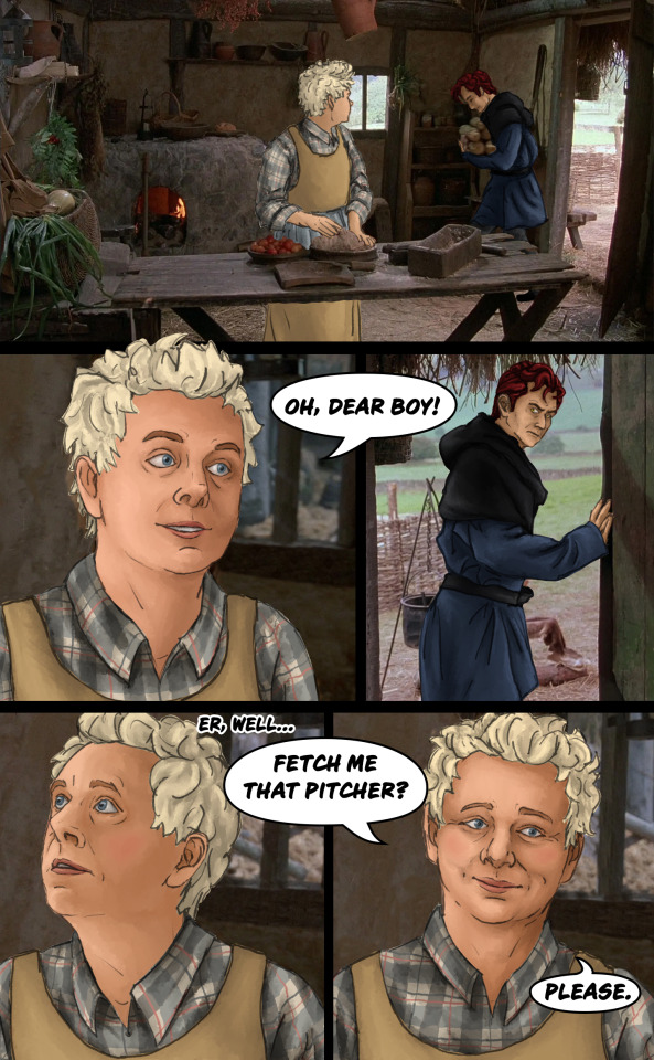

That day, she was amazed to discover that when he was saying "As you wish," what he meant was, "I love you." And even more amazing was the day she realized she truly loved him back.
i'm back with the sillies!! they're smitten, i believe :)
i still have a bunch of scenes i want to draw so stay tuned for more princess omens!! (this one forced its way in front of 2 other WIPs oops)
#CUTIES#tbh i feel like i was a little lazy with the shading and stuff#but also the lighting in this scene is very ambiguous so#whatever all my focus went into drawing azi's tartan dress 5 separate times#of course there's an easier way to do it!!#but i actually found it fun to do it by hand#anyway practical tag time#sara does art#princess omens#good omens#good omens fanart#aziraphale#crowley#aziracrow#the princess bride#as you wish#SMITTEN I BELIEVE#the as you wish gets a pretty font#to show it is said with a certain flourish#hehehe#i think that's it#wahoo
148 notes
·
View notes
Text
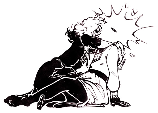
leering
#its MYYYY flat fuck friday and IIIII get to post the trans women#in stars and time#in stars and time fanart#isat#isat fanart#isat siffrin#isat loop#sifloop#lucabyteart#anyway this was fabric practice because as a silly funny animal artist i dont draw clothes often especially not dresses#so here i will indulge the transfem sifloop truthers because hello comrades i mean what i said in my essay after all#so know that this was the intent with which this img was drawn its not just nonbiney its something specific for you lot#<- (to find said essay. look in the lucabytewrites tag. thanks! its a few months back. it opens with a joke about shredded cheese)#(youll know it when you see it. hopefully.)#edit: lmao i drew and queued this before that anon asked adrienne if theres any transfem characters. and like. head housemaiden win#but also anon. pspspspspss. come here. come closer. join me. Join Me.#we can be Right. Together. 🫴
774 notes
·
View notes
Text


Wonder what it's like to feel grass under your feet for the first time in your life. Wonder how it feels knowing you'll be the one to destroy it.
#seconds later shadow discovered mosquitos and his resolve hardened once more#but YEAH still thinking about The Island and it's Implications#lotta good shit on that island man#so you wanna destroy the world cool let's start small and see how it feels#shadow the hedgehog#sonic#sth#is a tag I've also seen?#don't worry done with more serious stuff for now haha I just wanted to practice backgrounds a bit more (need to practice more tbh got lazy)#I have a couple shitposts I've been meaning to get to <- my constant state of being#comic#kinda#my art#doodles#just realized how well this parallels maria's little naming monologue in sxsg lmaO#unintentional I promise but very apt regardless#anyways next time I do this I should pull up more references I get so hand wavy without them haha
592 notes
·
View notes
Text

i thought i felt your shape, but i was wrong. really all i felt was falsely strong, i held on tight and closed my eyes. it was dumb, i had no sense of your size. it was dumb to hold so tight.
also on inprnt :]
#tumblr murked my quality so bad MY GODDDD please click on this i promise i have somewhat of an idea of wht im doing. kinda#anyway i once again have no idea what i was doing here but i did have fun. they make me miserable in the best way possible#im trying to be a bit more experimental both in style and colour... well. half on tht last one (guy who really likes reds and blues)#but im trying out line weight a bit more. hooty hoo. going to try drawing some more practice portraits n stuff soon#link#zelda#loz#botw#zelink#(a smidge bcus im insane. as usual)#princess zelda#zelda botw#link botw#loz fanart#tloz#i add new tags each time. i just like to get silly with it sometimes tbh :]#my art
2K notes
·
View notes
Text

saw this post and went ''i have to draw this.''
#look at him. small thing.#also i would like to formally thank 2bdamned my beloved for ending my depression#literally havent been able to draw aside from practice for about half a year. routine is killing me. art feels so pointless...#anyways tag time#2bdamned#madness combat#art#hyponauticart#madcom
601 notes
·
View notes
Text
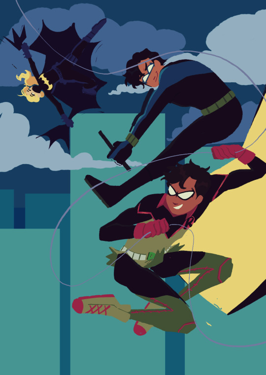
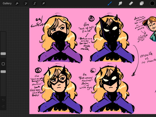

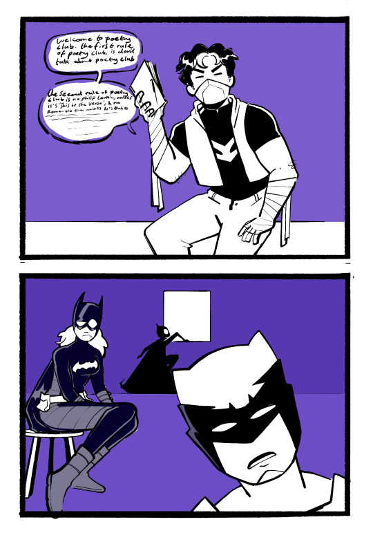
ANOTHER SKETCH DUMP! Featuring more of me playing with lineless art. Batman reborn era trio (dick, damian and steph) I miss you...when will you return from war. Also featuring Steph designs bc I've seen ppl dissatisfied w/ her current look, some good mom Talia, and Jason Todd poetry club. Duke is confused not that Jason would start a poetry club but that he'd have such mid poetry opinions. (ID in Alt)
#dc comics#batfamily#damian wayne#stephanie brown#dick grayson#talia al ghul#duke thomas#cassandra cain#mine#woo new art tag. please god let me keep this up all year#uhh anyway yeah! still a big backlog of sketches but i got burnt out which means i had time to collect some#i feel like my art looks. extremely different w/o lines compared to with? idk i worry that's it weird/off-putting#but hey at the end of the day I'm hardly worrying about my brand integrity on tumblr dot com#duke and cass being at poetry club is based on them canonically being into poetry and for a good while duke and jason got along well#Steph is there for both jason and cass' emotional support (unfortunately there's a design flaw. she can't do both simultaneously)#(which is fine bc cass is fleeing the scene at the idea of having to casually hang out with jason)#(they're the exact amount of similar and more importantly different that it's like putting two firecrackers together. bad)#i really like the steph mask designs... it'd be fun to do something with them but idk what y'know?#I'm just like. if we're assuming that her mask has to be different from both babs and cass then this is what I've got as alternatives#i mostly wanted to practice character interaction with the talia and damian one... and also i love them#looking at james gunns batman movie proposal. you keep your hands OFF HER MR GUNN#please if shes evil in a movie they're never gonna let her be good in the comics again 😭#dc when you inevitably cave and do your next big reboot let the ppl finally have the son of the demon origin (w/ tweaks of course)#idk it's canon in my heart. heartcanon if you will <3#anyway yeah uhhhhhh enjoy?
2K notes
·
View notes
Text


days 4-8
#orangetriestoart#isat#blood tw#self harm tw#finally got around to these aAAAa AAA#cheating a little bit with color so i can do it faster >:]#having a lotta fun with these though theyre a v nice stress reliever but also wowie as soon as i have free time i need to practice more#anyways have a good one if ur reading this!!!#also if the glass one needs another tw please let me know and ill add it! im not fully sure if i tagged that properly
360 notes
·
View notes
Text
if I asked very nicely would you all be willing to take a one minute anonymous survey for my linguistics class. if the answer is yes, please click here. thanks :)
(sharing for a better response size would also be very appreciated)
#linguistics#quil's unholy underworld#i have no clue how to tag this#it is quite literally 2 multiple choice questions#keeping it real simple#it's a required project in an intro class#we didn't even get to choose the topic#anyway#it's less important the results#it's intended to teach us the scientific method in practice#which I have done. like 5 times now in different classes it feels#i literally studied the demographic of the library by age an entire summer once#anyway. here's hoping this is worded and structured well enough to do what I need it to#take my survey boy#please
1K notes
·
View notes
Text
DP x DC, revenant!Jason Todd
Shortly after meeting, Danny and Jason have a late night conversation about what it means to come back. 1281 words
On AO3
-
Danny woke groggily, in a dark place that he didn't recognize, and took a moment to get his bearings.
He felt the warning ache in his neck that came from being propped up against an arm rest. There were two sources of dim light in the room—the glow of city street lights, muffled behind a curtain, and the green eyes of the man whose lap Danny's feet were propped on.
Right. Danny hadn’t meant to fall asleep on the revenant’s—on Jason’s—couch, but they’d been talking for so long, he must’ve dozed off.
Jason had had so many questions, about ectoplasm, about the zone, about Danny’s own experiences. Danny had done his best to clear up everything he could. A revenant may not be quite the same as he was, but still, it made Danny happy to be able to pass on his hard won knowledge and maybe save someone else a bit of the hurt and confusion that he’d gone through. It was what he’d always wished someone would do for him.
Jason was slumped into the couch, but he didn’t look relaxed. Danny examined his still profile, cast in strange shadows by its own green glow, and wondered how long it had been since he’d moved.
Danny shifted slightly, purposefully producing the fabric sounds of a body against upholstery, to make sure Jason knew he was awake. No reaction. Danny gave him one more moment, then asked, “You okay?”
Jason didn’t look at him when he answered, “You told me I’m basically possessing my own corpse, and I’m supposed to not be upset about that?”
Really, Danny should’ve predicted something like that. How long had he spent, trying to pretend that death hadn’t really touched him? It wasn’t an easy thing to accept.
“What’s the difference between a body and a corpse?” Danny asked.
Jason’s eyes snapped to Danny, their glow intensifying. “I am not dealing with riddle bullshit right now, I swear to-”
“No, I’m being serious,” Danny interrupted, pulling his feet from Jason’s lap and sitting himself up. “There’s one difference between a corpse and a living body, and that’s that someone is living in it. Jason—” he reached out, gripping one of Jason’s hands in his “—you’re alive. That’s what matters. The rest is details.”
Jason’s shoulders bent inwards, his other hand raising to rub at his chest. “You don’t get it,” he said, quiet. “People don’t just come back from what they did to me. It doesn’t make any sense.”
“However you died, it’s not-”
Jason huffed an ugly sound, a short and bitter laugh that Danny hurt to hear. “Is it crazy that that isn’t even what I was talking about? I meant after.” The motion on his chest was repetitive, like he was tracing something underneath his shirt, and Danny got the sinking feeling that he knew just what sort of scar it might be. “I was gone, okay? I was gone, and this body was still here. And they took it, and they cut it open and rummaged around inside to figure out what happened. Which is—” he cut off, sniffed, and Danny gripped his hand tighter “—which is stupid, right? It’s not like it wasn’t obvious.” His fingers twitched, and he continued, haltingly, “I mean, I’ve read the report. Pulled it off his stupid files. The smoke inhalation did me in. After everything that happened, it was the smoke.”
Jasons’ hand pulled out of Danny’s, and they both rose to cover his face, cutting off the glow while he curled in on himself even tighter. His voice was slightly muffled when he said, “And then they had to ship me home, right? So they bled me dry and pumped me full of formaldehyde, and they prettied me up so they could pretend I wasn’t just some empty thing, and Bruce held the tiniest most depressing little funeral known to man and put my ass in the ground, and I had to wake up down there.” His words and his breaths were coming too quick, and Danny didn’t know how to help. He didn’t want Jason to stop, not when it seemed like he needed to say all of this, but he could see just how badly the revenant was hurting.
“But you did wake up,” he whispered.
“Woke up in my own mutilated corpse!” Jason snarled. “Everything I’ve forgotten, and that memory is still crystal fucking clear! It stank in there, like death and vinegar and mud, and it was so small, and I couldn’t even try to scream for help because they sewed my fucking mouth shut—!” He broke off into a sob, and Danny couldn’t stand it anymore, had to lean into Jason’s side and wrap an arm around him as he shook with all the emotion he couldn’t reign in.
“Okay,” Danny said. Not you’re okay, just okay. “Okay, so that’s the most horrible thing I’ve ever heard, and I regularly hang out with a guy who wants to skin me.”
Jason sniffed. “What?”
“Nevermind. It’s just-”
“No, I think we should go back to the skinning thing-”
“I just don’t want you to let it define you,” Danny interrupted. “I did that. I got into my head about it, the whole ‘being dead’ thing, feeling like I was…” Danny gave himself a second, swallowed, “like some sort of freak. A thing that didn’t belong anywhere. But I’m still alive, and you’re alive, and even if we weren’t, it wouldn’t matter, because we’re still here, and as long as you’re here you can find something that’s worth staying for.” Danny rubbed what he hoped was a soothing pattern into Jason’s admittedly impressive bicep.
Jason let out a sigh. “I must really be pathetic if you’ve gotta pep talk me like that, huh?” he said, and Danny pretended not to see him wiping at his eyes. “Sorry,” he added, “about all this. I’ve got some shit I haven’t dealt with, and this ‘revenant’ stuff brought it up pretty bad.”
“I get it,” Danny said, and hoped Jason could tell how much he meant it.
Jason sighed again, heavy, like he was trying to release something else with his breath, and said, “It still doesn’t make any sense. Logically, I can’t be alive. Where did my blood come from?”
Danny shrugged. “Do you have blood?”
“I definitely have blood. I’ve seen a lot of it.”
That gave Danny pause. “Just like, around?” he asked.
“Yeah,” Jason said, deadpan. “I’ve got a surplus, so I like to leave some here and there, make sure everyone gets a chance to appreciate it.”
“I have no idea how much you’re joking and it frightens me,” Danny told him.
“Weak,” Jason replied.
“Anyways, you gotta not think about it too much. The interdimensional goop is already logic-defying, and you’re mixing magic with it with your special soul willpower or something. Your brain will explode if you try to make it make sense.”
Jason huffed a little laugh, bouncing Danny on his shoulder, and this time it made him feel lighter. “Can I just say that I hate that I’m full of interdimensional goop?”
“Valid,” Danny said.
Even without looking at Jason, Danny could tell that he just rolled his eyes by the way the soft green light moved.
Danny had his ear pressed to Jason’s shoulder, feeling his warmth, and if he focused, he could just make out the revenant’s pulse. Personally, Danny thought it was pretty cool to be full of magic and goop and blood. Much cooler than Danny, who was way more science goop than magic goop. They’d have to compare notes on that sometime.
Maybe Jason would come around to it.
#not me writing a short piece that heavily relies on my own headcanons and never explaining them#it wasn't supposed to be like this guys it was gonna be a little easily digestible text post but they just kept talking#i just wanted the 'what's the difference between a body and a corpse' bit and then next thing you know i'm googling embalming practices#bit that I didn't manage to fit in: 'Jason you're allowed to be mad that somebody stole your blood.'#'Like. They didn't know you were gonna need it. But you get to be mad anyway.'#don't worry about that stuff about jason's soul being magic. it is though. that's why he can get swords out of it.#pit rage is technically not mentioned in this fic but also Jason's eyes are doing the thing the whole time#so make of that what you will#dpxdc#dp x dc#dc#batfam#jason todd#danny phantom#danny fenton#revenant jason todd#my writing#could be friendship could be preslash I think it's legitimately ambiguous#i just really like gentle little intimacies i guess#okay maybe i will tag the ship#dead on main
150 notes
·
View notes
Text
Meet the Saber-Skins


Helga is the companion of sorts to my Last Dragonborn, Elisere, and a few months ago I went a little ham developing her husband and kids. I've been meaning to draw them and introduce them for awhile now and thought this would be a fun way to do it!
I am incapable of just creating one single OC with no relatives. I always gotta give them a whole family. But this family is thematically important so I've put a lot of thought into them
#honestly this doubled as body hair practice lol because i always struggle with facial hair#tes#the elder scrolls#skyrim#tes ocs#skyrim ocs#nord#mine#my art#my ocs#i cant for the life of me draw elisere right. i have drawn her ina way i like once (and it was not this time)#but i get closer every time i do#oc: helga#oc: elisere#oc: helges family#im just gonna give them that tag because i dont think im going to be posting about them often enough anyway to justify them all getting#their own tags#i should do this same thing with el's real family at some point too
284 notes
·
View notes
Text
why Aurora's art is genius
It's break for me, and I've been meaning to sit down and read the Aurora webcomic (https://comicaurora.com/, @comicaurora on Tumblr) for quite a bit. So I did that over the last few days.
And… y'know. I can't actually say "I should've read this earlier," because otherwise I would've been up at 2:30-3am when I had responsibilities in the morning and I couldn't have properly enjoyed it, but. Holy shit guys THIS COMIC.
I intended to just do a generalized "hello this is all the things I love about this story," and I wrote a paragraph or two about art style. …and then another. And another. And I realized I needed to actually reference things so I would stop being too vague. I was reading the comic on my tablet or phone, because I wanted to stay curled up in my chair, but I type at a big monitor and so I saw more details… aaaaaand it turned into its own giant-ass post.
SO. Enjoy a few thousand words of me nerding out about this insanely cool art style and how fucking gorgeous this comic is? (There are screenshots, I promise it isn't just a wall of text.) In my defense, I just spent two semesters in graphic design classes focusing on the Adobe Suite, so… I get to be a nerd about pretty things…???
All positive feedback btw! No downers here. <3
---
I cannot emphasize enough how much I love the beautiful, simple stylistic method of drawing characters and figures. It is absolutely stunning and effortless and utterly graceful—it is so hard to capture the sheer beauty and fluidity of the human form in such a fashion. Even a simple outline of a character feels dynamic! It's gorgeous!
Though I do have a love-hate relationship with this, because my artistic side looks at that lovely simplicity, goes "I CAN DO THAT!" and then I sit down and go to the paper and realize that no, in fact, I cannot do that yet, because that simplicity is born of a hell of a lot of practice and understanding of bodies and actually is really hard to do. It's a very developed style that only looks simple because the artist knows what they're doing. The human body is hard to pull off, and this comic does so beautifully and makes it look effortless.
Also: line weight line weight line weight. It's especially important in simplified shapes and figures like this, and hoo boy is it used excellently. It's especially apparent the newer the pages get—I love watching that improvement over time—but with simpler figures and lines, you get nice light lines to emphasize both smaller details, like in the draping of clothing and the curls of hair—which, hello, yes—and thicker lines to emphasize bigger and more important details and silhouettes. It's the sort of thing that's essential to most illustrations, but I wanted to make a note of it because it's so vital to this art style.
THE USE OF LAYER BLENDING MODES OH MY GODS. (...uhhh, apologies to the people who don't know what that means, it's a digital art program thing? This article explains it for beginners.)
Bear with me, I just finished my second Photoshop course, I spent months and months working on projects with this shit so I see the genius use of Screen and/or its siblings (of which there are many—if I say "Screen" here, assume I mean the entire umbrella of Screen blending modes and possibly Overlay) and go nuts, but seriously it's so clever and also fucking gorgeous:
Firstly: the use of screened-on sound effect words over an action? A "CRACK" written over a branch and then put on Screen in glowy green so that it's subtle enough that it doesn't disrupt the visual flow, but still sticks out enough to make itself heard? Little "scritches" that are transparent where they're laid on without outlines to emphasize the sound without disrupting the underlying image? FUCK YES. I haven't seen this done literally anywhere else—granted, I haven't read a massive amount of comics, but I've read enough—and it is so clever and I adore it. Examples:


Secondly: The beautiful lighting effects. The curling leaves, all the magic, the various glowing eyes, the fog, the way it's all so vividly colored but doesn't burn your eyeballs out—a balance that's way harder to achieve than you'd think—and the soft glows around them, eeeee it's so pretty so pretty SO PRETTY. Not sure if some of these are Outer/Inner Glow/Shadow layer effects or if it's entirely hand-drawn, but major kudos either way; I can see the beautiful use of blending modes and I SALUTE YOUR GENIUS.
I keep looking at some of this stuff and go "is that a layer effect or is it done by hand?" Because you can make some similar things with the Satin layer effect in Photoshop (I don't know if other programs have this? I'm gonna have to find out since I won't have access to PS for much longer ;-;) that resembles some of the swirly inner bits on some of the lit effects, but I'm not sure if it is that or not. Or you could mask over textures? There's... many ways to do it.
If done by hand: oh my gods the patience, how. If done with layer effects: really clever work that knows how to stop said effects from looking wonky, because ugh those things get temperamental. If done with a layer of texture that's been masked over: very, very good masking work. No matter the method, pretty shimmers and swirly bits inside the bigger pretty swirls!
Next: The way color contrast is used! I will never be over the glowy green-on-black Primordial Life vibes when Alinua gets dropped into that… unconscious space?? with Life, for example, and the sharp contrast of vines and crack and branches and leaves against pitch black is just visually stunning. The way the roots sink into the ground and the three-dimensional sensation of it is particularly badass here:

Friggin. How does this imply depth like that. HOW. IT'S SO FREAKING COOL.
A huge point here is also color language and use! Everybody has their own particular shade, generally matching their eyes, magic, and personality, and I adore how this is used to make it clear who's talking or who's doing an action. That was especially apparent to me with Dainix and Falst in the caves—their colors are both fairly warm, but quite distinct, and I love how this clarifies who's doing what in panels with a lot of action from both of them. There is a particular bit that stuck out to me, so I dug up the panels (see this page and the following one https://comicaurora.com/aurora/1-20-30/):

(Gods it looks even prettier now that I put it against a plain background. Also, appreciation to Falst for managing a bridal-carry midair, damn.)
The way that their colors MERGE here! And the immense attention to detail in doing so—Dainix is higher up than Falst is in the first panel, so Dainix's orange fades into Falst's orange at the base. The next panel has gold up top and orange on bottom; we can't really tell in that panel where each of them are, but that's carried over to the next panel—
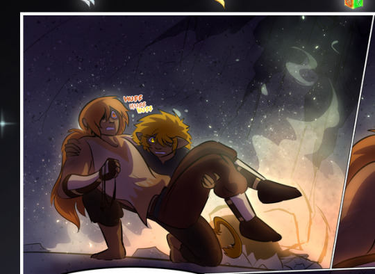
—where we now see that Falst's position is raised above Dainix's due to the way he's carrying him. (Points for continuity!) And, of course, we see the little "huffs" flowing from orange to yellow over their heads (where Dainix's head is higher than Falst's) to merge the sound of their breathing, which is absurdly clever because it emphasizes to the viewer how we hear two sets of huffing overlaying each other, not one. Absolutely brilliant.
(A few other notes of appreciation to that panel: beautiful glows around them, the sparks, the jagged silhouette of the spider legs, the lovely colors that have no right to make the area around a spider corpse that pretty, the excellent texturing on the cave walls plus perspective, the way Falst's movements imply Dainix's hefty weight, the natural posing of the characters, their on-point expressions that convey exactly how fuckin terrifying everything is right now, the slight glows to their eyes, and also they're just handsome boys <3)
Next up: Rain!!!! So well done! It's subtle enough that it never ever disrupts the impact of the focal point, but evident enough you can tell! And more importantly: THE MIST OFF THE CHARACTERS. Rain does this irl, it has that little vapor that comes off you and makes that little misty effect that plays with lighting, it's so cool-looking and here it's used to such pretty effect!
One of the panel captions says something about it blurring out all the injuries on the characters but like THAT AIN'T TOO BIG OF A PROBLEM when it gets across the environmental vibes, and also that'd be how it would look in real life too so like… outside viewer's angle is the same as the characters', mostly? my point is: that's the environment!!! that's the vibes, that's the feel! It gets it across and it does so in the most pretty way possible!
And another thing re: rain, the use of it to establish perspective, particularly in panels like this—

—where we can tell we're looking down at Tynan due to the perspective on the rain and where it's pointing. Excellent. (Also, kudos for looking down and emphasizing how Tynan's losing his advantage—lovely use of visual storytelling.)
Additionally, the misting here:
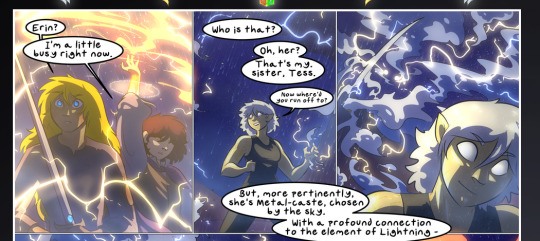
We see it most heavily in the leftmost panel, where it's quite foggy as you would expect in a rainstorm, especially in an environment with a lot of heat, but it's also lightly powdered on in the following two panels and tends to follow light sources, which makes complete sense given how light bounces off particles in the air.
A major point of strength in these too is a thorough understanding of lighting, like rim lighting, the various hues and shades, and an intricate understanding of how light bounces off surfaces even when they're in shadow (we'll see a faint glow in spots where characters are half in shadow, but that's how it would work in real life, because of how light bounces around).
Bringing some of these points together: the fluidity of the lines in magic, and the way simple glowing lines are used to emphasize motion and the magic itself, is deeply clever. I'm basically pulling at random from panels and there's definitely even better examples, but here's one (see this page https://comicaurora.com/aurora/1-16-33/):

First panel, listed in numbers because these build on each other:
The tension of the lines in Tess's magic here. This works on a couple levels: first, the way she's holding her fists, as if she's pulling a rope taut.
The way there's one primary line, emphasizing the rope feeling, accompanied by smaller ones.
The additional lines starbursting around her hands, to indicate the energy crackling in her hands and how she's doing a good bit more than just holding it. (That combined with the fists suggests some tension to the magic, too.) Also the variations in brightness, a feature you'll find in actual lightning. :D Additional kudos for how the lightning sparks and breaks off the metal of the sword.
A handful of miscellaneous notes on the second panel:
The reflection of the flames in Erin's typically dark blue eyes (which bears a remarkable resemblance to Dainix, incidentally—almost a thematic sort of parallel given Erin's using the same magic Dainix specializes in?)
The flowing of fabric in the wind and associated variation in the lineart
The way Erin's tattoos interact with the fire he's pulling to his hand
The way the rain overlays some of the fainter areas of fire (attention! to! detail! hell yeah!)
I could go on. I won't because this is a lot of writing already.
Third panel gets paragraphs, not bullets:
Erin's giant-ass "FWOOM" of fire there, and the way the outline of the word is puffy-edged and gradated to feel almost three-dimensional, plus once again using Screen or a variation on it so that the stars show up in the background. All this against that stunning plume of fire, which ripples and sparks so gorgeously, and the ending "om" of the onomatopoeia is emphasized incredibly brightly against that, adding to the punch of it and making the plume feel even brighter.
Also, once again, rain helping establish perspective, especially in how it's very angular in the left side of the panel and then slowly becomes more like a point to the right to indicate it's falling directly down on the viewer. Add in the bright, beautiful glow effects, fainter but no less important black lines beneath them to emphasize the sky and smoke and the like, and the stunningly beautiful lighting and gradated glows surrounding Erin plus the lightning jagging up at him from below, and you get one hell of an impactful panel right there. (And there is definitely more in there I could break down, this is just a lot already.)
And in general: The colors in this? Incredible. The blues and purples and oranges and golds compliment so well, and it's all so rich.
Like, seriously, just throughout the whole comic, the use of gradients, blending modes, color balance and hues, all the things, all the things, it makes for the most beautiful effects and glows and such a rich environment. There's a very distinct style to this comic in its simplified backgrounds (which I recognize are done partly because it's way easier and also backgrounds are so time-consuming dear gods but lemme say this) and vivid, smoothly drawn characters; the simplicity lets them come to the front and gives room for those beautiful, richly saturated focal points, letting the stylized designs of the magic and characters shine. The use of distinct silhouettes is insanely good. Honestly, complex backgrounds might run the risk of making everything too visually busy in this case. It's just, augh, so GORGEOUS.
Another bit, take a look at this page (https://comicaurora.com/aurora/1-15-28/):
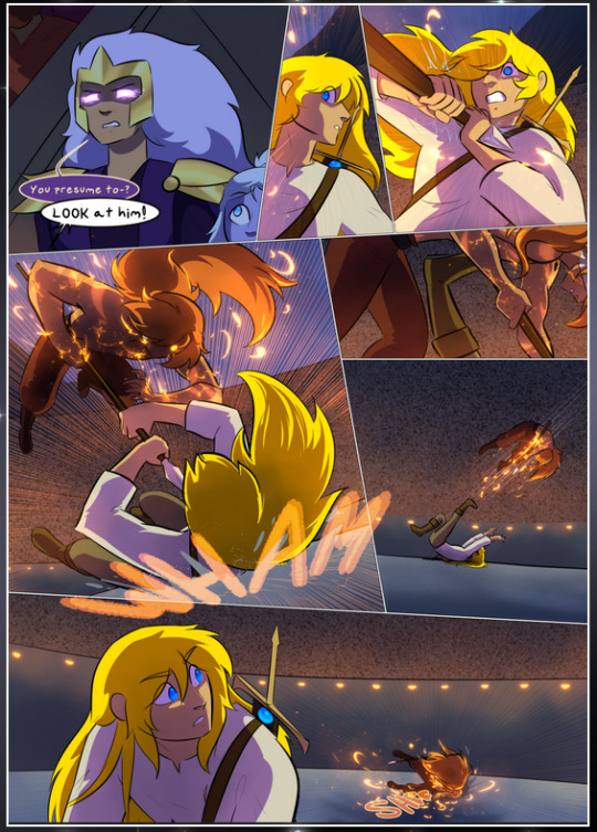
It's not quite as evident here as it is in the next page, but this one does some other fun things so I'm grabbing it. Points:
Once again, using different colors to represent different character actions. The "WHAM" of Kendal hitting the ground is caused by Dainix's force, so it's orange (and kudos for doubling the word over to add a shake effect). But we see blue layered underneath, which could be an environmental choice, but might also be because it's Kendal, whose color is blue.
And speaking off, take a look at the right-most panel on top, where Kendal grabs the spear: his motion is, again, illustrated in bright blue, versus the atmospheric screened-on orange lines that point toward him around the whole panel (I'm sure these have a name, I think they might be more of a manga thing though and the only experience I have in manga is reading a bit of Fullmetal Alchemist). Those lines emphasize the weight of the spear being shoved at him, and their color tells us Dainix is responsible for it.
One of my all-time favorite effects in this comic is the way cracks manifest across Dainix's body to represent when he starts to lose control; it is utterly gorgeous and wonderfully thematic. These are more evident in the page before and after this one, but you get a decent idea here. I love the way they glow softly, the way the fire juuuust flickers through at the start and then becomes more evident over time, and the cracks feel so realistic, like his skin is made of pottery. Additional points for how fire begins to creep into his hair.
A small detail that's generally consistent across the comic, but which I want to make note of here because you can see it pretty well: Kendal's eyes glow about the same as the jewel in his sword, mirroring his connection to said sword and calling back to how the jewel became Vash's eye temporarily and thus was once Kendal's eye. You can always see this connection (though there might be some spots where this also changes in a symbolic manner; I went through it quickly on the first time around, so I'll pay more attention when I inevitably reread this), where Kendal's always got that little shine of blue in his eyes the same as the jewel. It's a beautiful visual parallel that encourages the reader to subconsciously link them together, especially since the lines used to illustrate character movements typically mirror their eye color. It's an extension of Kendal.
Did I mention how ABSOLUTELY BEAUTIFUL the colors in this are?
Also, the mythological/legend-type scenes are illustrated in familiar style often used for that type of story, a simple and heavily symbolic two-dimensional cave-painting-like look. They are absolutely beautiful on many levels, employing simple, lovely gradients, slightly rougher and thicker lineart that is nonetheless smoothly beautiful, and working with clear silhouettes (a major strength of this art style, but also a strength in the comic overall). But in particular, I wanted to call attention to a particular thing (see this page https://comicaurora.com/aurora/1-12-4/):
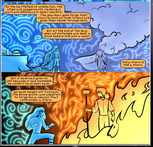
The flowing symbolic lineart surrounding each character. This is actually quite consistent across characters—see also Life's typical lines and how they curl:
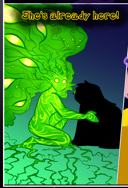
What's particularly interesting here is how these symbols are often similar, but not the same. Vash's lines are always smooth, clean curls, often playing off each other and echoing one another like ripples in a pond. You'd think they'd look too similar to Life's—but they don't. Life's curl like vines, and they remain connected; where one curve might echo another but exist entirely detached from each other in Vash's, Life's lines still remain wound together, because vines are continuous and don't float around. :P
Tahraim's are less continuous, often breaking up with significantly smaller bits and pieces floating around like—of course—sparks, and come to sharper points. These are also constants: we see the vines repeated over and over in Alinua's dreams of Life, and the echoing ripples of Vash are consistent wherever we encounter him. Kendal's dream of the ghost citizens of the city of Vash in the last few chapters is filled with these rippling, echoing patterns, to beautiful effect (https://comicaurora.com/aurora/1-20-14/):
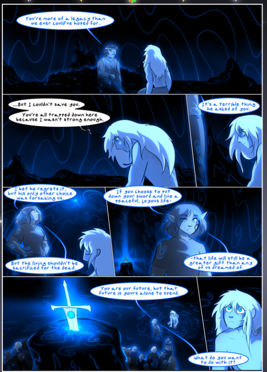
They ripple and spiral, often in long, sinuous curves, with smooth elegance. It reminds me a great deal of images of space and sine waves and the like. This establishes a definite feel to these different characters and their magic. And the thing is, that's not something that had to be done—the colors are good at emphasizing who's who. But it was done, and it adds a whole other dimension to the story. Whenever you're in a deity's domain, you know whose it is no matter the color.
Regarding that shape language, I wanted to make another note, too—Vash is sometimes described as chaotic and doing what he likes, which is interesting to me, because smooth, elegant curves and the color blue aren't generally associated with chaos. So while Vash might behave like that on the surface, I'm guessing he's got a lot more going on underneath; he's probably much more intentional in his actions than you'd think at a glance, and he is certainly quite caring with his city. The other thing is that this suits Kendal perfectly. He's a paragon character; he is kind, virtuous, and self-sacrificing, and often we see him aiming to calm others and keep them safe. Blue is such a good color for him. There is… probably more to this, but I'm not deep enough in yet to say.
And here's the thing: I'm only scratching the surface. There is so much more here I'm not covering (color palettes! outfits! character design! environment! the deities! so much more!) and a lot more I can't cover, because I don't have the experience; this is me as a hobbyist artist who happened to take a couple design classes because I wanted to. The art style to this comic is so clever and creative and beautiful, though, I just had to go off about it. <3
...brownie points for getting all the way down here? Have a cookie.
#aurora comic#aurora webcomic#comicaurora#art analysis#...I hope those are the right tags???#new fandom new tagging practices to learn ig#much thanks for something to read while I try to rest my wrists. carpal tunnel BAD. (ignore that I wrote this I've got braces ok it's fine)#anyway! I HAVE. MANY MORE THOUGHTS. ON THE STORY ITSELF. THIS LOVELY STORY#also a collection of reactions to a chunk of the comic before I hit the point where I was too busy reading to write anything down#idk how to format those tho#...yeet them into one post...???#eh I usually don't go off this much these days but this seems like a smaller tight-knit fandom so... might as well help build it?#and I have a little more time thanks to break so#oh yes also shoutout to my insanely awesome professor for teaching me all the technical stuff from this he is LOVELY#made an incredibly complex program into something comprehensible <3#synapse talks
786 notes
·
View notes
Text

i finished it, was kicked out of the game, and then spent the next 10 minutes drawing this. i will now go take a shower, most likely cry, and then go through the emotional turmoil of convincing myself to reset so i can do a geno run. i hate it here :D
#undertale yellow#uty#my art#<- ifg#spoilers under these tags beware. although it is mostly just me being very very sad#that entire thing was heart wrenching. anyways#CEROBAS FIGHT??? HELLO???#i had to exit out of it the first time (i got to the last phase) to get better items but i came back and won pretty quickly#but THE CUTSCENES?!?!?#JFC NO WONDER THIS WOMANS SO MESSED UP. HER HUSBAND PRACTICALLY DIED IN HER ARMS AND THE LAST THING HE LEFT HER WITH- HIS DYING WISH- COULD#ONLY BE FULFILLED BY PUTTING THEIR ONLY CHILD IN DEATHS WAY. AND THEN WHEN SHE TOOK THAT RISK THE WORST THING HAPPENED AND SHE NOW HAS TO#LIVE WITH THE GUILT OF BEING THE ONE TO. MOST LIKELY. KILL HER ONE AND ONLY DAUGHTER#ALL THE WHILE SHE WAS PUSHING AWAY HER CHILDHOOD BEST FRIEND AND CONVINCING HERSELF THAT SHE WAS IN THE RIGHT TO SACRIFICE CLOVER WHO HAD#BEEN ONLY KIND MERCIFUL AND JUST THIS WHOLE TIME. EVEN TO THOSE WHO WERE TRYING TO KILL THEM. FUCK.#AAND WHEN CLOVER HUGGED HER I DOUBLED OVER IRL BC *THATS EXACTLY WHAT I WANTED TO DO IN THAT MOMENT* I HATE IT (read: love it) HERE#n dont even get me STARTED on after that. when clover started moving on their own and the gd white screen came up and we got flashbacks of#everyone's words. thats when the tears rlly started coming bc it clicked for me. 'oh. this is it. isn't it?' and IT WAS#WHEN THEY GAVE THEIR FUCKIGN HAT AND GUN AWAY TO MARTLET AND STARLO WELL THATS WHEN I REALLY STARTED CRYING#AAND THE GROUP HUGG#I WAS SOBBING WHENEVER I HAD TO WATCH THEM CRAWL UP AGAINST THE WALL AND DIE AND HAVE FLOWEYS WORDS PLAY OVERHEAD#AND THE FUCKOGN#THE F U C K I N G#AFTEWRCREDITS SCENE WHERE WE GOT THE 'You heard someone calling for help. You answered.' I GOT CHILLS SO BAD#to think that all the other souls have stories just as expansive and emotional as clover n frisks. how fucked up is that. in a good way tho#and finally the last scene where we got all 4 of our main friends sending us off in waterfall and we see clovers items end up in the dump#just waiting to be found by bratty and catty. fucken hell man this was a masterpiece#anyways time to reset and obliterate everyone and never emotionally recover from that ever!! really is feeling like 2016-17 again w the way#this game has me sobbing my eyes out and feeling the guilt of knowing that i dont HAVE to kill them all but im too curious not to#oh well. at least i have the balls to do it this time around instead of letting a youtuber do it for me ig
731 notes
·
View notes
Text
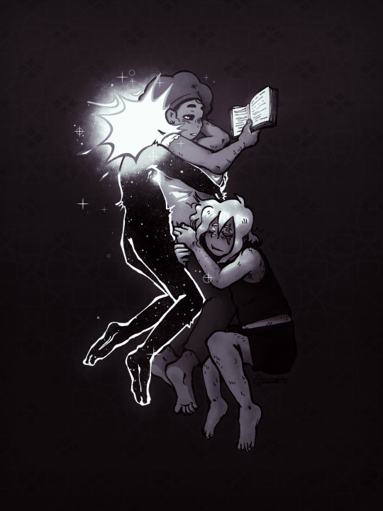
times ive drawn loop being used as a reading light: 2
#practicing my body mechanics knowledge by putting the scrunklies in a void yaaay#anyway idk if theres a name for this grouping yet. theres gotta be right. sifmiraloop i guess? tag empty..... whadda hell#sifmiraloop#mirasifloop#miraloop#mirasif#isat fanart#isat#in stars and time#in stars and time fanart#lucabyteart#isat mirabelle#isat loop#isat siffrin#someday ill do something with my hc that mira and loop pretend to be dating in a very theatrical manner at Events so nobody hits on her but#for now my beautiful vision of 'worlds funniest intentional antiwingman beard loop' lives in the tags only. moirallegience ass relationship#also the creature lovingly dubbed 'frog ass loop' returns. funny to draw them like this. no ass. negative ass. frog ass.
625 notes
·
View notes
Text
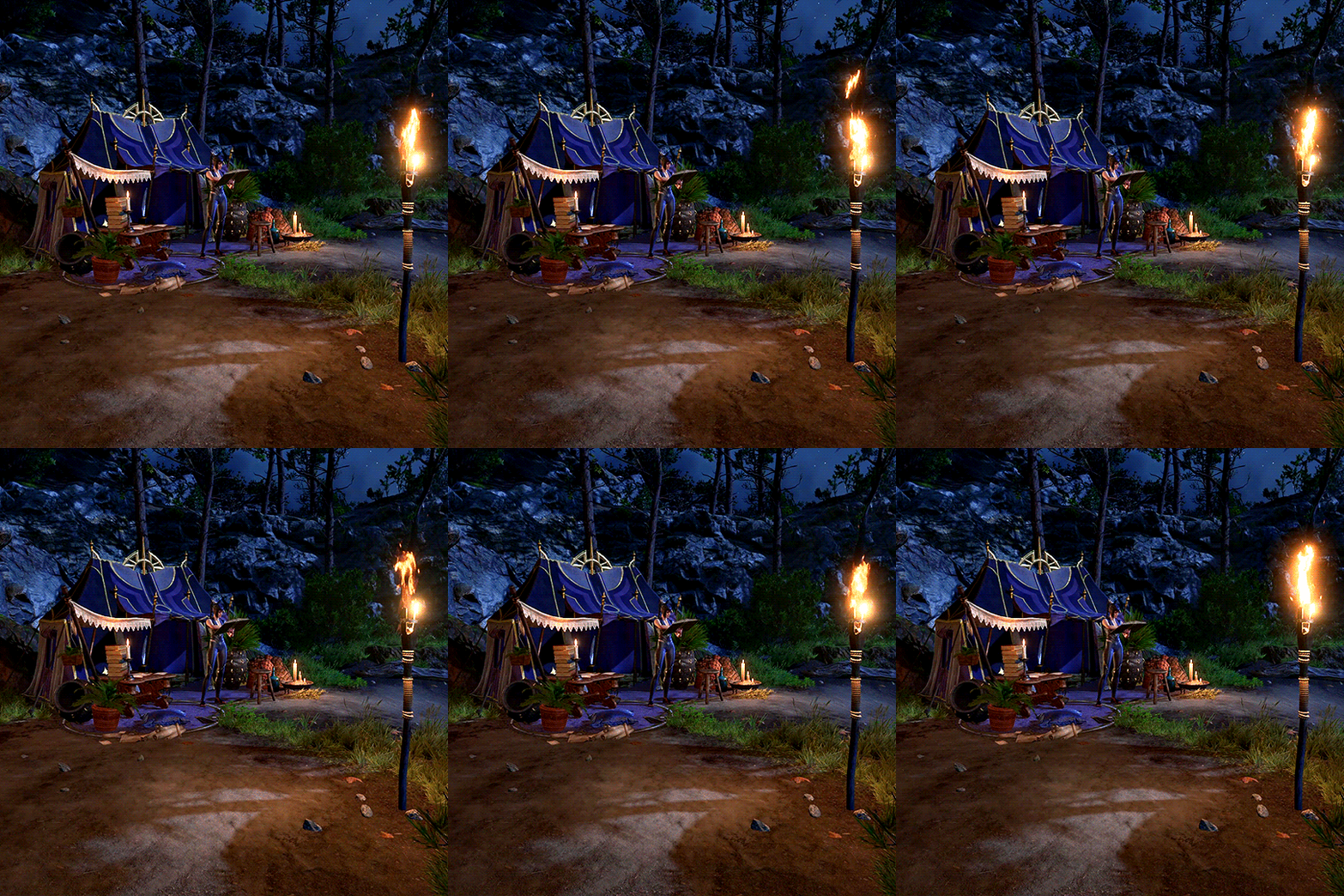
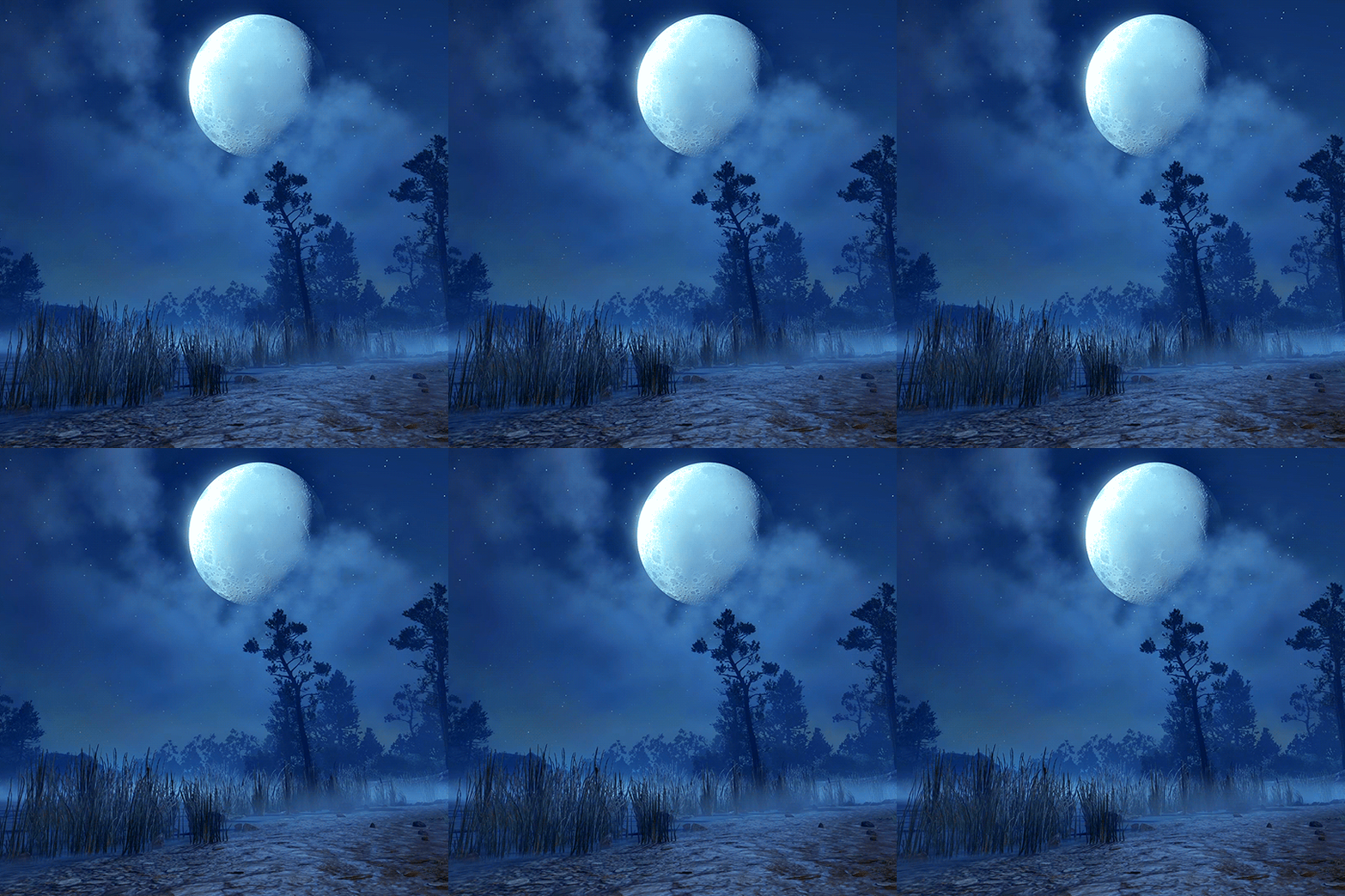
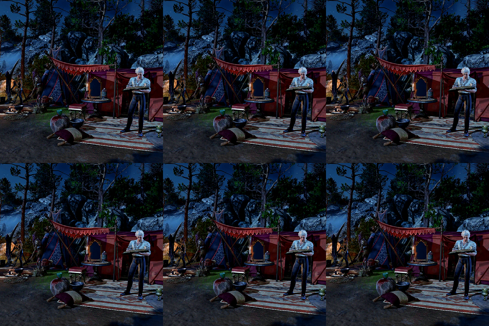
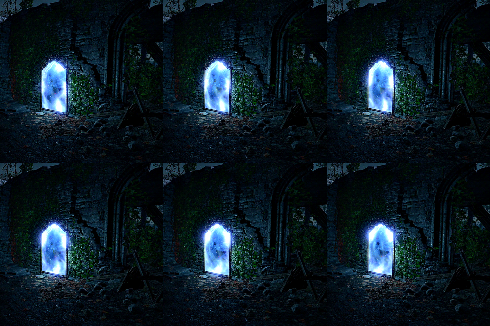
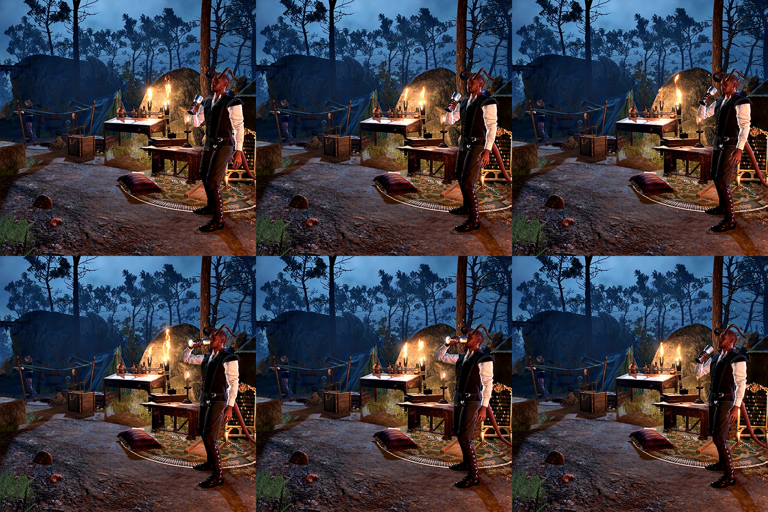
BALDUR’S GATE 3 CHALLENGE 1/3 Camp Locations: Wilderness
#bg3edit#dailygaming#gamingedit#videogameedit#userfray#bg3challenge#baldur's gate 3#bg3#baldur's gate iii#bgiii#mine#after the shock of gale practically standing right behind me the first time i long rested wore off i was immediately#drawing similarities to the dao camp.#if sten had a grindstone i think he would've been at it just like lae'zel#don't mind these tags i'm just thinking...#lae'zel / sten. wyll / leliana. shadow / morrigan. astarion / zevran. gale / alistair. karlach / oghren. withers / wynne.#crazy: halsin / eamon. minsc / loghain. jaheira / flemeth. minthara / anora.#anyways. enjoy the set lol
447 notes
·
View notes
Text

brush test slash rendering practice with ayem
#morrowind#almalexia#the elder scrolls#tes#tes fanart#art#id in alt#ok that's all the tags this needs ANYWAY#i started this 1. for experimenting with coloring from dark to light#2. because i wanted to draw someone kind of back turned to the camera#3. rendering practice for hair particularly#4. to go from sketch to rendering rather than doing lines to see if that doesn't smooth out my workflow a bit#5. because i've never actually used this brush past flat coloring#and out of those 1. i don't think i had enough of an idea of the palette or process to jump into dark to light painting so i did scrap that#and go with my usual “flat color with one of the mid shadow tones add shadows add light”#i do think that painting from shadows out is a thing people do digitally i just think this wasn't the drawing to test it on for me#i think i'd need to look at some other peoples processes and start with a more fleshed out idea of where to go#2 and 3 i think worked out. i'm gradually figuring hair out which i think is sick#4 i also think worked out for me which is also sick because i do get caught on lines a lot. they're fun sometimes but i think some drawings#benefit better from not having them and that it might be a bit faster#and of course everything i do is so that i can draw slightly faster and better for next artfight#as for 5. i have mixed feelings on this brush but that might be because i hate change. and also because i started this drawing on the 15th#of november and finished it yesterday. so im kind of just sick of working on and looking at it#it was a valuable learning experience and i think it came out well! i am also going to drop to my knees and rejoice when i can finally#close this file out and free medibang paint from under it so i can work on Literally Anything Else#thank you almalexia for being my test subject i should've used a reference for your armor when i did the sketch but i didn't#maybe the crown looks weird because of it maybe it doesn't. not my problem anymore i can draw other elves again#my art#iiii think i forgot a my art tag last time
110 notes
·
View notes
Text
okay so I talked about EPIC being in pjo but there's a popular headcannon that the Percy Jackson musical was made by the Apollo and (probably) Dionysus cabins so...that means that the pjo musical is canon to pjo...that means that Estelle would have to do productions of the musical in school...do you see the vison????
#just the idea that she plays percy is SO cool like themes wise#bc she'll never have to experience what percy and sally did#and they know that bc they're sobbing in the first row and cheers the loudest after every song#even if they've heard it 100 times with her practicing#every joke is still the funniest to them#*sighs pathetically*#i love these idiots#anyway tag time#percy jackson#rrverse#pjo fandom#pjo hoo toa#percy jackon and the olympians#percy jackson fandom#sally jackson#lightning thief#pjo#percy jackson headcanon#percy jackson musical#apollo cabin#pjo headcanon#dionysus cabin#mr d pjo#paul blofis#how I love you#estelle blofis
143 notes
·
View notes