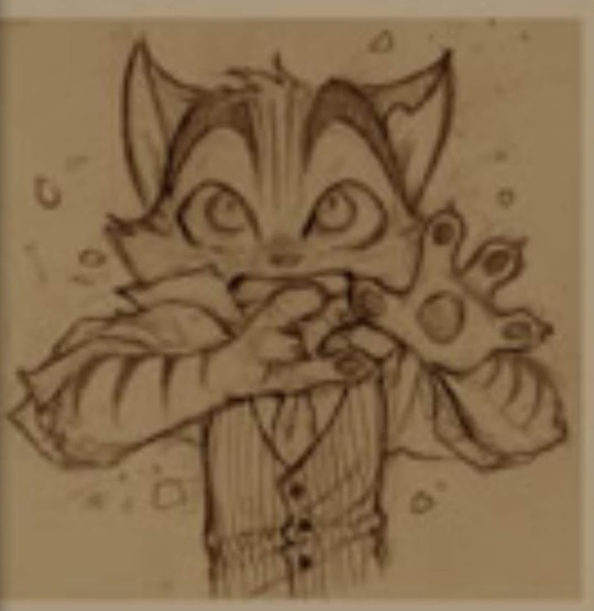
#anyway i doodled a bunch of little references to things i liked after i added that signature. bonus points if you know them ♡
Explore tagged Tumblr posts
Visit Tumblr Blog
Explore Tumblr blogs with no restrictions, modern design and the best experience.
Last Seen Tumblr Blogs


Fun Fact
Women make up for the other 50% of Tumblr’s audience.
Text

you ask sun what they think about valentine's day and they start ripping heads off of things rabid animal style (correct response)
#my art#dca fandom#daycare attendant#sundrop#sunnydrop#ft. an unfortunate plushie who i shall not be tagging#anyway i doodled a bunch of little references to things i liked after i added that signature. bonus points if you know them ♡#in terms of the Actual Main Drawing tho i just wanted a valentines themed drawing of the dca that was explicitly not romantic#to contrast the one i did last time lol#this was alsoooo an experiment with a new pen i made (its just an airbrush)#and alsooo an experiment with not shading something LOL#cuz coloring and shading gets soooo boring for me#i was also messing around with their face again ofc.. the rays specifically cuz i like this look!#the white outlines around everything were a super last minute impulsive thing but it makes everything look so nice ♡ yay!!#everything always works out for me because i am god's favorite! ♡
573 notes
·
View notes
Text

LET'S GO OUT WITH A BANG 🚦
taglist:
@ashiyn @single-malt-scotch @goodtimeswithetho @pebbltree @crabbunch @catmaidetho @amethyst-allium @stitchthesewords
sooooo ermm i guess i get to talk about this piece now YIPPEE
i am one of those people who's constantly trying to figure out what their own art style looks like LMFAO. i take frequent breaks from art due to mental health shit so it feels like every time i come back i'm trying to find my footing again.
that being said, i had a lot of caffeine yesterday and started this on a whim and it ended up being something i'm incredibly proud of. i think it helps that i've been redrawing old emotes for a friend's twitch channel, so figuring out which brushes i like right now was really helpful, and i ended up using my personal emote palette like...a lot. that pink in Etho's eye, the purple used for shading, most of the browns are all used in my own emotes. it's wild how much having colours already picked out streamlines things!
Etho is the one i started with, of course, and ended up being one that i went back to re-draw after i'd done...three? or four? more, because the sizing wasn't right and i wasn't happy with the posing. i still wish i could have conveyed him dipping his chin into his coat fluff a little better, but oh well. i thought of the little detail of him looking at Martyn's drawing at the last second (#ethtyn4life) and it made me laugh so i did it. points to you if you caught that!
Joel was the second - life!Joel has always been fey in my head, especially after that season when he just went batshit insane the second he turned red. can't explain it, that's just how it be. i tried to give him an air of subtle menace about him but i think he just looks sleepy 💀 i'd like to do these as individual, larger pieces at some point, so maybe i can work on that more then.
Grian was the third - he reminds me of a Lost Boy here and that wasn't intentional but the Lost Boys always kind of freaked me out and life!Grian's kinda freaky so i think it fits. his little smirk is so creepy and i love him.
i don't remember who i did next after this so we'll just go in order pfft
Bdubs is SO CUTE look at him. one of the few where i couldn't make a menacing expression work, and honestly with how good his profile turned out i barely mind. i did that side profile with no reference, y'all, idk what kind of crack i was on last night. what the hell. this was about the point where i started wanting to do little lore doodles for everybody so i added the clock face - i think it clashes with the red background but what can you do.
CLEOOOOOO CLEO CLEO. i LOVED drawing them, i think their design is one of my favourites of the bunch. her hair has always been snakes in my head and AGAIN i drew those with no reference, can you fucking believe that. i loved the little detail of some of the snakes poking at the people next to her, they're so cute hehe. also Cleo has freckles now, i'm so sorry but i don't make the rules. someone complimented the teeth in the reblogs and THANK YOU!! they're not quite anatomically correct but fuck it we ball and they look cool as hell anyway.
Martyn is so smug, i love him. points if you caught that he's looking at Cleo bc Double Life, i wanted to do something a lil different with him than just another straight up symmetry tool drawing and i think it fits. he is so eye-searing tho sir please tone it down.
Lizzie is fey just like her husband, and also she is smol. i don't think it's conveyed as well as i'd like here but i also didn't want her to look like a straight-up child so i did what i could. she is So Scary with those vacant blue eyes oh my god. and drawing her hair was sooooo fun i love long hair ahh
with Gem i basically smoothed out a rough design sketch i posted awhile back and i'm so proud of the little head cock she's got going on, she looks so cool. also her hair?? idk how i did that. i love her swoopy bangs so much.
Pearl is moth. Pearl will always be Moth. so she got lil antennae and big buggy eyes. drawing that hood was so satisfying, i used to try and draw Raven Teen Titans in high school and could never get the hood to look right so seeing this one come out perfectly was sooooo good. and of course had to include a teensy moon.
that's all i've got, i think - i feel myself crashing LMFAO. maybe at some point i'll come back and say more but here's this for now!
#smallishbeans#ethoslab#bdoubleo100#grian#zombiecleo#inthelittlewood#itlw#ldshadowlady#geminitay#pearlescentmoon#trafficblr#life smp#🚦smp#vse.art#*#image description in alt#y'all doing the alt text for this was an ADVENTURE lmfao#popular? i know about popular.
233 notes
·
View notes
Text
rocky and his water motif
ive seen a few people analyze rocky and his symbolism with water, and i thought id jump on the train and contribute what ive found. i looked through every piece of art in the gallery and messed around with the dead drop to find everything here! with that being said…
obvious spoiler warnings! and warning for a lot of speculation and over analyzing! a lot of things i mention are really big stretches but i added them anyways incase anyone else wants to look into it more
starting where the pilot starts and near the start of the comic (the page “lackadaisy dithyramb”), right off the bat we have an entire poem from rocky dedicated to the mississippi river. this iconic poem is literally just about the river, and he recites it in both scenes from on the bridge over the river.
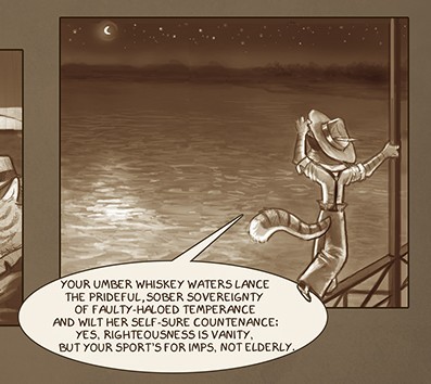
note that in both cases there is also a crescent moon featuring in the background
more poetry! this one is from the comic on the page “lackadaisy doggerel”. this is actually one of my favourite pages in the comic, its very cool! we have this poem that, again, is entirely about water. it talks about water in a metaphorical way, comparing it to memory and the passage of time. maybe ill try to analyze this poem sometime but idk im not very good at that stuff. seems to talk about rockys past but im not sure
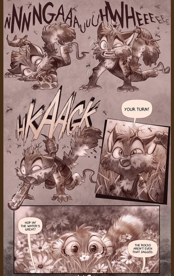
i didnt want to just put this entire page here but i will note that the page has a raging storm, an ocean, a water mill, another storm cloud and a waterfall all picured above rocky, who, in this case is ahem under water, in a way.
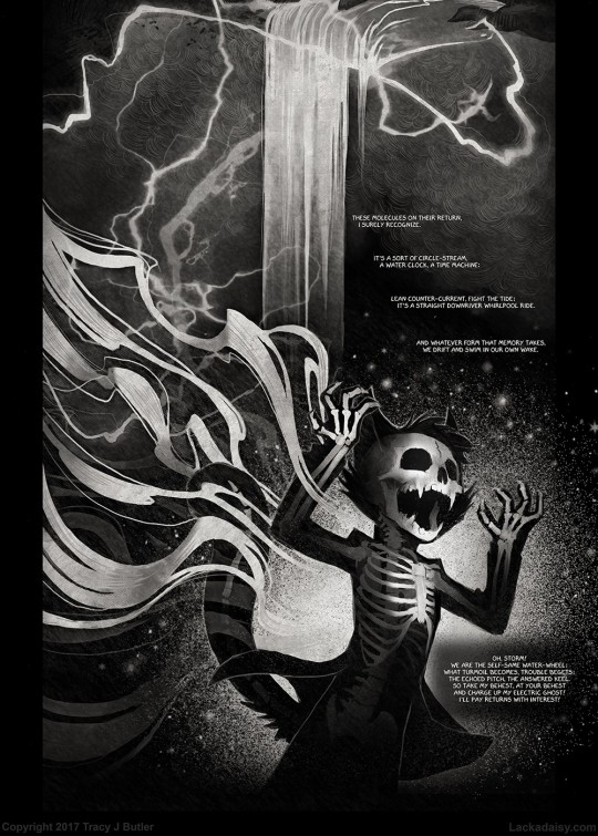
last bit of poetry im talking about is probably the most relevant. rockys feauture in the “lacrimosa” poem/halloween artwork shows him seemingly drowning outside a window.
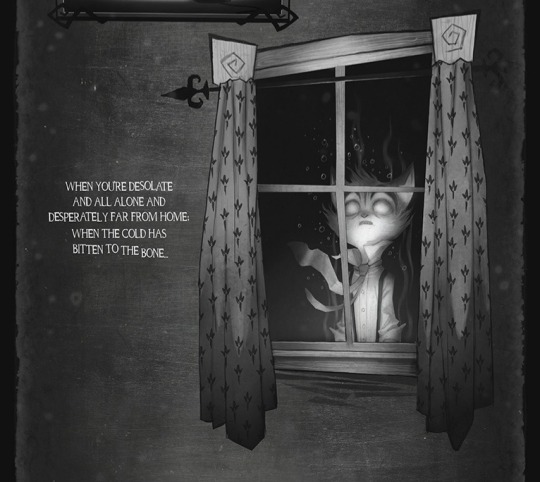
the significance of it being outside a window is somewhat unclear to me, as every other character appears in something reminiscent of a picture frame. my only idea is that its meant to show him outside of what could be a home, in reference to him getting the “unceremonious boot”. the text emphasizes this idea, saying hes away from home
this next one is more obscure and much more of a stretch! after digging around in sketchbook pages, i found this tiny little sketch on a page simply labeled “lackadaisy preview 0018”. the sketch page features sketches that were used for the page “lackadaisy palaver” in the comic, and a few bonus doodles. this was one of the bonus doodles, and i cant seem to find a comic pannel that matches it anywhere.
this sketch could be a lot of things, its a bit hard to tell. most likely, its an unsused pannel of rocky that was going to be used on the comic page. maybe him on whe windshield, or something like that. that being said, the first thing i thought of was the lacrimosa art. its a stretch but i thought id add it, just in case! who knows really
next up is rockys character artwork, which features him standing on a barrel floating in a river.
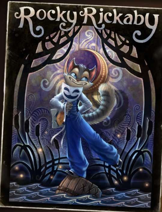
be careful rocky, you might fall! one little detail about this art that i like is that hes quite literally hiding his sadness behind his back. and again, the crescent moon motif features in the background. the cattails in this image also remind me of this scene in the pilot

…but i mean cattails do grow near water so i dont think that means anything
speaking of the pilot, this scene has rocky accidentally blowing up a water tower and flooding the area, and getting a whole bunch of water dumped on him

be careful rocky, you might get hurt! ...i dont think he cares
one last note from the pilot (for now) is a line from mitzi after rocky comes back with alcohol for them. it could mean nothing, could be foreshadowing, who knows


note in the second image: “rest” as in the rest of the alcohol they were meant to bring back
the music video for liquid gold ends with rocky dropping a bottle and the golden liquid flooding the room
i wasnt even looking for water symbolism when i found this, i was just rewatching the music video for fun! i just about had a heart attack when it ended like that D: rocky please dont drown
back to the comics! sorry this is a bit all over the place. forgive me for just uploading an entire comic page, but the page “lackadaisy thunderhead” features rocky standing over a river. at the bottom of the pannel on the right there are daisys, a symbol that features in a lot of rockys artwork and is generally associated with the lackadaisy speakeasy. the daisys could just be for aesthetics or to frame the pannel better, but its also notable that they appear where the water is.
the name “thunderhead” is interesting given some other pannels
not sure what it means though
the very first scene in the comic aside from the introduction shows rocky at the river.
in the page “lackadaisy trouble boys” from the early concept art mitzi makes a comment about rockys aim, and makes an… interesting metaphor
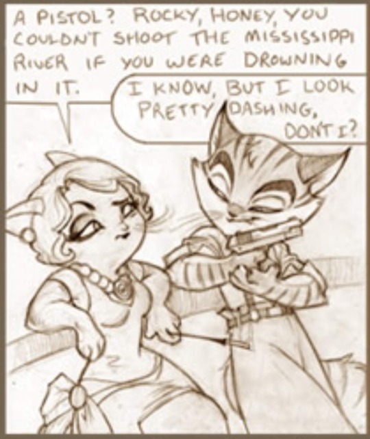
side note: im gonna cry is that actually how rocky gets the little hole in his ear lmao

the mini comic “wilderness” has rocky climbing out of a small muddy pool of water claiming “the waters great”, despite looking absolutely horrible. isnt shown here, but he says he cant feel his legs and calls for freckle to come back.
knock knock! its time for the playing cards! rockys card depicts him as the 8 of spades, although hes also been shown as the ace of clubs multiple times.
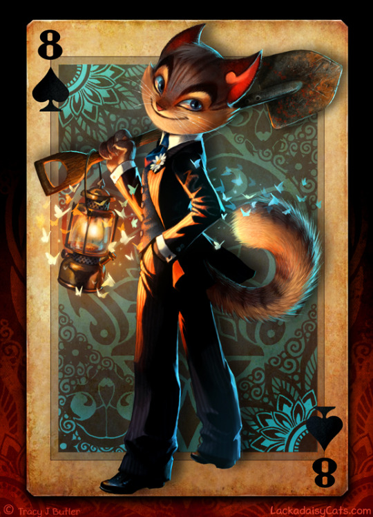
first up, 8 of spades! i really like this art but i have a lot of questions. for one, why is rocky holding a shovel and whats with the lantern? theres nothing wrong with it, just caught my attention since i think freckle is drawn with shovels a lot more than rocky (might be wrong on that though) second, this is the only picture i can find where you can CLEARLY see rockys head injury healed. cool! third, the outfit hes wearing is… atypical for rocky, you could say. for obvious reasons. he always wears blue, why suddenly the change to black? and obviously, the choice of making him the 8 of spades. some quick google searches and this is what i found: from various websites (the first things that popped on on google), apparently spades symbolizes the winter season and the water element. it seems to represent old age, change, wisdom and acceptance. the number 8 supposedly represents victory, prosperity and overcoming. i was going to put images, but i could only have 30 and i ran out of space lmao im so sorry this is SO LONG djfjsjnrfj
make of it what you will. as for the ace of clubs:
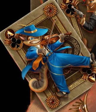
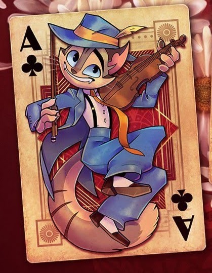
my google searches were much less interesting so ill just put my own thoughts. the clubs is likely just for the association with the lackadaisy speakeasy, as in both of these cases he is shown alongside other characters from the lackadaisy and everyone has clubs. as for him being the ace, the main notable thing about the ace is that its generally the highest card.
the main idea i personally took from these cards is the idea rocky will possibly not be a part of the lackadaisy in the furure. we see him in his classic outfit, no head injury as the ace of clubs, with clubs being associated with the lackadaisy. but we also see him with a healed head injury (so clearly in the future) with a new outfit and no more clubs suit.
not sure if this is even notable but this entire (very iconic) scene in the comic takes place in the rain
be careful rocky, you might get shot!
and now, even more crescent moon motifs
so why have i been pointing this out? well its undeniable that rocky also has motif with this crescent moon. i have no idea what it means but heres my very quick five minute thoughts on it: one: the moon controls the tide. obviously a river doesnt really have a tide, but still! theres some association with water there, so its notablea. two: this might be a stretch but in the pilot theres this very memorable frame where it shows the reflection of the moon (which initially looks like a cat) ahem in the water. obviously water reflects stuff so its not abnormal for the moon to reflect in the water but i just thought it was cool!


aaaand last but not least

this analysis was brought to you while listening to hatsune miku, i probably made a lot of typos so yell at me and ill fix them but not my grammar its terrible and im not fixing that, lmk your thought and if i missed anything, thank you for reading have a nice day sorry it was so long <3
83 notes
·
View notes
Text
Info Post!
Current status: new job, new responsibilities 😅
Hi, my name is March, I'm a 22 yr old masc non-binary guy. I’m an artist, but I’m also an ecology and conservation major with a big interest in spiders n stuff.
Since I am still in college, I am constantly very busy and overwhelmed so don’t expect me to post super frequently 😓
My pronouns are they/them and it/its but I am also ok with he/him
Current interests: Sonic, FNAF, MLP, and Spiders
Hibernating interests: Deltarune, Undertale, Gravity Falls, Steven Universe, Marvel, Transformers, TMNT, and a bunch more I’m forgetting rn
Welcome! I post my art, and occasional bug/spider photos here!
Here are some of my most-used tags:
My Art - any of my art or doodles!
DJ Music Man - only the best character 😁
Sonadow - a newer interest of mine so not much in here yet!
OC - any posts that focus on some original characters of mine ^^ (or others')
My Spider Pics - If you want to see pictures and videos of my irl spiders, or any that I find. You can see them here!
and here is my linktree if you would like to find me on other platforms and/or support me!
My ask box is always open! Feel free to send me an ask anytime, and/or a doodle request! No promises that I will draw the thing you ask though. And sometimes I might just take a while to respond!
@artastic-foe is my reblog/spam account! I like to reblog a lot of stuff but also don't want to spam my followers with it, so most of the stuff I reblog will be over there haha! Though recently I’ve been trying my best to reblog on my main more! Especially stuff from mutuals ^^
Here is my persona.

This is how I draw myself. To clarify, I do see this character as an extension of myself, and they are very personal to me. I like to creature-ify them at times and sometimes will even make alternate versions of them for fun.. but in the end I still see them as a representation of me. They share my name and are designed after me (but with added features) after all!✨
I'm honestly not too sure of what my sona is meant to be- but I see them as like... A satyr?? but if the goat aspect of said satyr was actually a deer mixed with a unicorn?? Hence the long tail and single "antler"..
Idk lol. Just.. I guess be careful with how you treat this character, because whatever you do with them I will interpret that as something you are doing to me 💀
Anyway!!! I'll also clarify that I don't mind people drawing this character! If you do, I will actually be eternally grateful! Just don't draw them doing anything weird or sexual💀
speaking of which..
Boundaries:
I am a sex-repulsed Asexual! So please do not comment or send me anything implying sex or sensual activities.. It makes me very uncomfortable. If it's low-key and just light joking then that's fine, just nothing explicit please. (For clarity, bodies are not sexual on their own. Nudity does not bother me. It is the sexual implications and behaviors and acts that bother me personally TvT)
Do not steal and re-upload any of my art! Even if they are just little doodles. If you would like to for any reason, DM me about the specifics, but If I do not respond, that is not permission to do so anyway!
Please do not refer to me with feminine terms. If it’s an honest mistake, you’re ok, but if you are doing it on purpose, I will either not acknowledge you, or if you continue to do so I will block you.
Just… don't be weird lol- Be kind and respectful of people!
36 notes
·
View notes
Text
@relientk @i-liked-these-posts My reply feature is broken but I'm Moonflight! The most popular pet I made gets referred to as the "kiss PPS" but most of them are honestly pretty unremarkable. I was a teenager experimenting with a drawing tablet for the first time (and my first few were just colored with a mouse) and since pet creation wasn't a designated job yet Nick and Tess released them with everyone else's 😅
Anyway, the site started out as just a little forum with an adoptable pet feature (sort of like Dragon Cave). There wasn't an adopt limit or a way to bind pets to your forum account, you just wrote your name when you adopted stuff so it would be on the image and then made a forum post to compile them all, and the forum was used mainly for random chatting, compiling other adoptables, and trading art. I think Nick set up the ownership system in September and manually added everyone's pets to their accounts which I'm sure was a lot of work, though there weren't that many people yet. I'm not sure when we got the ability to trade stuff but that came later. The forum appears culturally and demographically almost unchanged which is really cool since forums are an "old web" thing and I had no idea younger generations used them. I think the only difference I can see is that there's way more of a restriction on what you're allowed to talk about, which I'm sure is the result of 15+ years of the kinds of mishaps and drama that can occur when a forum has a ton of kids on it. We used to talk about basically anything on there.
The staff was originally a handful of forum moderators if I remember correctly, but I got officially added in December to run the archive. I was sort of a half staff member prior to that since I'd been making little gif avatars for people with their favorite pets and Tess asked if I wanted to make some that users could select (they're still the majority of the ones on there!) which is why I have a custom from October. After becoming official staff I ended up making some items and pets for fun and helping Nick add pets and items to the internal system which resulted in an item release mishap once since they live on the opposite side of the world and I forgot they were 12hrs ahead of me. I'm definitely the most random staff member the site ever had since my role was essentially "odd jobs" lol
It's so cool to me that a little community I joined bloomed into this fully functioning pet website, since it just started out as a bunch of us messing around and keeping ideas that people liked. So many little things I did or said or made have been immortalized into site features or culture and it's really touching. The "pet army" concept, for example, came from a topic I made encouraging people to turn their PPS cocoons into weird sheep creatures (linking because it apparently still exists holy shit) and then the idea caught on and just kept going. The 2009 unreleased dog was a random doodle I put on the staff pet design topic. The highest rarity rating was an offhanded comment I made that we needed an "omg so rare" bracket for the unreleased pets and Nick decided it was a good idea and just used it verbatim when he implemented the rarity system.
If you snoop around the pets of old staff you'll probably see some custom moose plushies I made; I know Dianne's is still on her lion. I also made Tess a custom pet with my pangolin lineart :)
This was way more than I expected to write, whoops... Having a good time reminiscing I guess 🥰
Randomly decided to go through all my old pet site accounts for fun since all the websites amazingly still exist and it is so surreal and delightful that photoshop doodles I made 15+ years ago are being traded around as high-value currency (and have fanart made of them!) on Chicken Smoothie. It's like part of my teenage self is encased in amber. The website is exactly the same as it was 10 years ago and some of the staff I was Internet Teenagers with are even still working there? All the little animated avatars I made are still available for members to choose? I might have to start playing again just for the nostalgia.
#I'm sure there's tons of drama over staff stuff in the userbase but Nick and Tess are really nice people#and the staff culture always prioritized whatever people would enjoy the most#because unlike sites that have Official Lore this place was always just a little art community#and I love that about it#oh to be clear I had no idea my doodle was going to be used anywhere they just stuck it in there since it was homeless I think haha#and now there's like. other pets and items and fanart of it. it's wild.#chicken smoothie
17 notes
·
View notes
Text
Avengers Assemble - Feral Outlaw Stony
So I've been expanding on this concept I doodled before Christmas, where Steve goes with Tony into the no-tech dimension at the end of season 3. Probably a lot of stuff isn't canon-compliant (beyond the obvious change that is), but "It's an AU so I do what I want" rules apply. Anyway.
The tl;dr is: The two of them spend a little time puttering around the weird no-tech dimension, and then get absorbed into Battleworld. They become explorers, helping people out and falling in love along the way.
(Once again, I feel like someone must have had this idea already, but I’ve never looked.)
Cut for excessive rambling.
~~~
Not all the areas we see in the show are present in Battleworld when Steve and Tony first arrive, so the boys spend most of their time traveling around, mapping the place out as it expands. A lot of my ideas rely on them still having little-to-no access to modern conveniences. Obviously someplace modern has to show up for them to get their hands on a pickup truck and a motorcycle, but I’m picturing a post-apocalyptic junkyard that’s been picked clean of anything obviously useful. They get the vehicles working by sheer force of “I’m Tony-fucking-Stark.” But like that fully functional NYC area is way too convenient, so it’s not around yet. (tbh I’m not even sure if it’s an alternate NYC or theirs, in which case it wouldn’t show up until the other Avengers do anyway)
They get the low-down on the "Battleworld" concept by eavesdropping on one of Beyonder's* welcome speeches. They realize that they are uniquely off the grid, because Beyonder didn't know they were in the no-tech dimension when he added it to Battleworld. They decide it's advantageous to maintain this secret status, but they're still Avengers™️ so they can't NOT help out wherever they can. But they don’t stick around any one place for long. Basically, they become vagrant vigilantes in addition to surveyors. They get a lot of their “stuff” (clothes, tools, toiletries, etc) as payment for odd jobs, or gifts from grateful locals they rescue. They get some food from populated areas as well, but also rely on foraging and hunting while on the lam. They have definitely eaten dinosaur at some point.
(*He doesn't get the nickname "Beyonder" until the other Avengers show up. In this AU Steve and Tony refer to him as "The Entity" or "Suspenders." You can probably guess who tends to use which.)
On top of the survival story, it's also a getting-together story. Steve and Tony flirt and pine and bicker and flirt some more, until a squabble turns into a confession and they finally start kissing. There’s plenty of time for “it’s cold in this wasteland and we only have one blanket, oh no,” but they’re firmly established as romantically involved by the time the other Avengers show up and they have the final showdown with Beyonder.
Anyway a lot of the AU notes I've been making are about the functional side of their Big Camping Adventure. So here's a bunch of lists about vehicles, gadgets, and navigation.
~
Vehicle stuff:
If Tony is riding passenger on the motorcycle, he can clip his repulsor boots into special footrests that reroute the energy and give the bike a speed boost.
The bike has a tow cable. Steve can harpoon things using a spring-action firing mechanism, including cliff faces to help him scale steep terrain. The cable can also be uncoiled manually, like when Tony takes flight while holding the end so he and Steve can clothesline hostiles.
Steve can stick his shield several places on the bike depending on what’s convenient. On the front as a windscreen/battering ram, on one side for easy grabbing, and even on Tony’s backpack so Tony can snuggle in properly while riding passenger and keep both their backs protected.
They probably don’t even need a ramp to get the bike into the bed of the pickup. Steve just picks it up and puts it there.
The evolution of Marsha (the truck) into a full Hulkbuster-style mech takes a long time. For the majority of their time in Battleworld, it’s just a truck with an ever-increasing number of weird add-ons.
Marsha can function as a tiny camper home. The cargo bed liner is a false bottom, which can be pulled up and rearranged to form a cover/roof. Underneath the liner, the actual truck bed is about a foot deeper, with most of that storage space taken up by a mattress and bedding.
Tony can pull a cable out of Marsha’s steering column and plug it directly into his arc reactor. This unlocks extra features and weapons. He generally has things balanced so that Marsha drawing power doesn't affect him any more than his armor drawing power would. But on rare and desperate occasions, he can overclock and hurt himself. Steve of course hates when he does this.
Turnabout is fair play though: at least once, something else damaged the arc reactor, so Tony plugged into Marsha to draw power from the battery for his electromagnet while he repaired the arc.
Gasoline can be difficult to procure, so both vehicles are hybrids. Tony just keeps adding new power conversion elements as they go along, based on what they can find.
~
F in chat for Tony’s armor:
Tony dismantles the armor he’d been wearing when they first went into the no-tech dimension.
Obviously he keeps skeletal versions of the repulsor boots and gloves in-tact enough to function.
He also keeps most of the helmet, for when he’s riding with Steve on the motorcycle. Mostly because Steve insisted. It's gutted of tech though, so if the faceplate stays as part of the design, the eyes are just holes (like in the classic comics).
The rest of the pieces are kept in a large packing trunk.
Tony repurposes some parts into useful gadgets for himself and Cap, plus the odd toy for other Avengers (like Widow’s new stinger gauntlets) because he’s optimistic like that.
Electronics use precious metals like gold and copper, so Tony scrapes some out to pay for things in certain areas of Battleworld, like the cowboy town or the pirate area. He might also barter with other general bits like wires and screws, but he avoids parting with any actual full tech.
~
Plug-n-play Gadgets
Since the power draw for Tony's electromagnet is actually fairly minimal, Tony makes use of the arc reactor as a charging station, mostly when he sleeps. It's not like there's a corner store they can drop by to get a pack of batteries. Things he charges include (but are not limited to):
Flashlight for Steve. The bulbs for it came from the eyes in the Iron Man helmet. Note: Tony doesn't need a flashlight himself because he can turn up his arc brightness apparently, lmao.
Camp stove. Steve questioned Tony building one for a hot second because hello we can build campfires to cook over? But then it’s raining and they're in a cave and Tony is like, "if you fill this space with smoke I will divorce you before we're even married." And Steve is like "camp stove wow yes okay." Also they had camp stoves in WW2 so honestly it was simply a Himbo Moment to disregard the virtues of one in the first place.
Walkie talkies. I know they had Avengers comms but I like the aesthetic of walkie talkies more. Maybe the comms relied on satellites that they obviously don't have anymore or something.
~
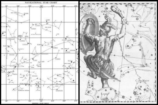
Navigation:
Speaking of a lack of satellites, the GPS in Tony’s armor is rendered useless. Steve is real smug about it and pulls out his old-fashioned compass. But Battleworld also doesn’t have proper poles, so it just spins wildly for a few seconds and then points at Tony’s electromagnet. Not to be deterred, Steve declares, “Well, you’re never lost if you can find Polaris.” They look up and realize that the night sky, despite having stars and a moon, is not at all arranged the way it is on Earth.
Tony takes this as a Challenge. He builds a sextant, then spends the next several nights in a row muttering math under his breath as he painstakingly creates a hand-drawn star chart. This, combined with landmarks, becomes the primary way they orient themselves as they roam around Battleworld.
Many nights, Steve and Tony lie in the bed of the pickup together and make up constellations named after other Avengers and friends. Steve makes a copy of Tony’s star chart and sketches artistic renditions of the constellations on top. To close this post with an interesting visual, here’s an example of what Tony’s star map might look like vs what Steve’s would more resemble:
#avengers assemble#avengers assemble AU#battleworld AU#Feral Outlaw Stony AU#stevetony#dakity yaks#Dakt rambles about Avengers stuff#long post
67 notes
·
View notes
Photo
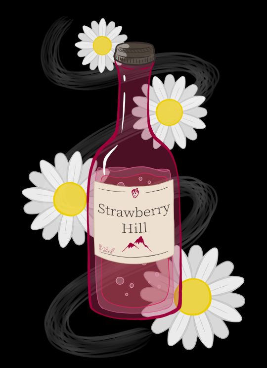
Daises on Strawberry Hill
Well, this looks a bit different from my usual content, doesn't it? Full disclosure that this art was made primarily as art inspired by one of my favorite books of all time (seriously, I have three different editions of this thing)--Looking for Alaska by John Green--as an excuse to talk about the new Hulu series of the same name that's based on the book. Because if you know me at all, you know I am notoriously hard on book-to-screen adaptions, particularly those based on books I love as if they were family members. And originally, this description was going to include a pretty blow-by-blow, lengthy review of my thoughts on the series. However, it's been quite a while since I first started trying to type out said review, and frankly, I've decided instead to, after I talk about the art, to just give some general, spoiler-free thoughts; the most important opinions I have on the series and leave it at that. I am still planning on completing and putting my full-length, in-depth thoughts out, but that'll be at some other time. Perhaps I'll put them in a journal/blog post instead of adding to the description here. Whatever happens, I'll update this description so that those who are interested in my deep-dive can find it when the time comes. That said, let's talk about the artwork now :) LfA isn't a fantasy or sci-fi book, so it doesn't have any cool dramatic scenes or neato devices/objects that have a lot of significance to the plot that would be fun to draw, which is why I never made any fan art or inspired-by-art for it before. But I really wanted an excuse to talk about the series, and so I pondered what symbols or imagery the series might have that I could make into art, even if none of it was terribly relevant to the plot or exciting on its own. This led me to the cheap wine that's mentioned a few times throughout the book: Strawberry Hill. Drawing just a bottle of wine seemed kind of boring and not very specific to the book/series, so I ended up adding in some white daisies since white flowers and daises specifically do have some significance to the plot. (In a way, they're a bit of a crux to it, at least for a key epiphany moment.) Originally, I was going to make this piece traditionally, and I did start with a traditional sketch of the wine bottle and one daisy to use as a template for more to follow. However, I pretty quickly got the idea for doing something more line-art heavy on a black background, as the cover for the book is black and the sort of chalkboard/blacklight look I was picturing in my head seemed fitting for the tone of the story, and despite my best efforts I couldn't think of a way/combination of media to accomplish what I wanted traditionally without also giving myself a major headache and making the project take infinitely longer than I wanted it to. So while I stalled in production, I ended up on my tablet for something else and figure I'd scan in my sketches and maybe make a line art to print off and manipulate into what I wanted traditionally later. But then, just as I started working on that, I figured, "You know what, if I'm going to go through all of the trouble to ink/line this digitally and I wanted it to be more line-focused anyway, I might as well take a crack at just doing the full artwork digitally. I'll get the lines done either way, and if it doesn't work out then at least I can say I tried, I know some of what not to do, and I end up with a digital mock-up for the final version." Fortunately, things ended up working out much better than I expected. I purposefully wasn't too fussy about the lines, partly because I just didn't have the patience at the time to be super precise about it, and also because for this specific project I kind of liked the idea of a more doodle-ish look (even though it's not super doodle-y in the final product). This also made things move a lot faster, which was nice and pretty satisfying. I started with the wine bottle from my sketch, including trying a new liquid drawing technique I half picked up from an art Youtuber I just recently started following that makes drawing liquid in a style similar to this look like a lot of fun. I knew I wanted the bottle to be mostly transparent/just lines, so the goal here was more about getting the wine bottle shape/structure familiar enough than it was about anything else. The label took a bit more though since in my mind, ever since I read the book, I had a pretty specific image of a pinkish bottle with a yellowish liquid and this cream-colored label with dark brown/sepia text, and I had not previously considered the label into that whole primarily line-focused image in my mind. So in the end, I decided the label would be solid so I could get the proper imagery across and the text and stuff could still be seen properly. Additionally, you'll notice I couldn't help myself being a little on-the-nose and sticking a tiny strawberry and mountain/hill on the label for good measure and to fill some space without having to look up wine bottle references just to stare at the labels for a ridiculous amount of time. The daises were also infinitely easier to do digitally since I could just copy, paste, and rotate first the petals to make one flower, and then copy, paste, rotate that one flower a few more times, instead of having to draw individual petals and flowers every time. This also gave me a little more freedom in that I could re-size the flowers pretty easily to make it more visually interesting than just a bunch of flowers that were all the same size. All that ended up being less line-focused than I originally intended, but I acknowledged that happening as I worked, and I'm not upset about the shift in focus. I think what I ended up with still has about the same visual impact I was hoping for, and that's all I really wanted anyway. And as sort of the icing on the cake, I ended up adding in that wisp/smoke trail in the background because of 1. It seemed kind of empty and unfinished with just the flowers and wine bottle and 2. When I tried adding a green vine to fix that issue, it just wasn't working for me. That's when I realized I could have a stronger reference to the book by putting something similar to smoke in the background since the original cover of the book has a smoke plume front-and-center. It took a few tries and some tweaking to get something I was happy with on that front, but I am so glad I stuck with the idea. It just adds something I can't quite place that the piece really needed before. The content is pretty different for me--I don't drink and I don't really endorse the idea--and the style is a little beyond my usual realms, but I do really like how it turned out. I feel like it's done well enough that you can appreciate the symbols and references if you know the book, but it also works as just a kitsch art piece if you're completely unfamiliar with the source material too. I don't think it's super accurate to when a bottle of the stuff shows up in the Hulu series, but it was on screen so briefly and my mind was focusing on other aspects while I was watching, so I didn't get a super good look at it. But I still think it'll suffice well enough despite that. I'm happy with how it turned out, and that's all that really matters, right? Now, then, as for the thoughts I have on the Hulu series that I think need to be shared sooner rather than later. I'll start by going on record to say, as someone that is notoriously hard on book-to-screen adaptions, that I did actually like the LfA series pretty good. I'd say it's about a 7 out of 10, which an exceptionally good score coming from me. It's not my most favorite show of all time, but it's notably better than "just okay," which is historically the highest praise I've ever been able to give a book-to-screen adaption. It had its faults and things I would've done differently if it were up to me, but fortunately, it did an infinitely better job than I was expecting. My main issues, as with all book-to-screen adaptions, come in the form of some of the changes that were made between the book and the screen. Fortunately, this time around the problems I do have are not egregious offenders. Most changes that were made still make sense within the story and while the overall message isn't quite the same as the book, it didn't totally squander what the book was trying to say. All of which are problems that most book-to-screen adaptions suffer from horribly. And while I won't talk too much at length about this (that's for the long-form review later ) I think this has a lot to do with the series being roughly 7-8 hours of content, as opposed to the either extremely rushed 2-hours-or-less a movie would've been, or the more-time-than-we-know-what-to-do-with 13+ hours of...certain book-to-screen adaptions that failed miserably at their job. (*cough* 13 Reasons Why *cough*) As I said, it's not perfect, but I do think as far as allotted time and time-management that they hit something of a sweet spot so that they'd have enough time to give the plot the room it needs to breathe without having so much time that they have to start making stuff up to fill it all. The other thing I'd like to point out is that, honestly, they did what 13 Reasons Why wanted to do way better than that series could ever hope to. They told the story of teenagers experiencing darker themes and elements of life so much more tactfully, and, in my opinion, more realistically. And they didn't wait for a controversy to spike and then do something about it--they didn't bank on the publicity of a controversy. Right from episode one, every episode starts with a warning that this series is meant for an adult audience (because of its themes) and viewer discretion is advised. And at the end of every episode, as the series does featuring smoking and drinking on more than one occasion, they provide resources to visit if you or someone you know has a problem with either of those things. I don't know if the people at Hulu saw what happened to Netflix with 13 RW and learned from their mistakes or if they just knew better, but either way, I'm so glad it was handled so much better, regardless of why or how it happened. As far as recommendations, if you're a John Green and/or Looking for Alaska book fan, I'd say it's definitely worth the watch. For outside viewers...I think you have to really be into the YA drama scene to appreciate it. Just be prepared for some more adult content than you might typically find in a YA movie. It's all done pretty tastefully and the majority isn't there senselessly; most of it serves some kind of purpose to the story, which is why it doesn't bother me (a very prude-ish person) all that much. I think that's everything I feel like needs to be said right now about the series until I can get the long-form review finished. (It's maybe 1/3 of the way done currently...and already getting on the long side ) I have to admit, this does make me more hopeful for the future of book-to-screen adaptions, at least those that end up being handled the way this one was. In fact, I'm actually really hoping that if Turtles All the Way Down, John Green's newest book, ever sees a screen adaption that it's handled in a series form and is done at least as well as LfA was. Time will tell, I suppose. In fact, I believe any day now, Let it Snow, a book that John Green wrote 1/3 of is supposed to have its movie adaption dropped on Netflix. I'm not super confident in Netflix's handling of adaptions for reasons mentioned earlier, but maybe just maybe it'll be okay? ____ Artwork © me, MysticSparkleWings I do not own Looking for Alaska and/or associated content ____ Where to find me & my artwork: My Website | Commission Info + Prices | Ko-Fi | dA Print Shop | RedBubble | Twitter | Tumblr | Instagram
#lookingforalaska#johngreen#hulu#hulu series#lfa#lfa hulu#book#book adaptation#fan art#art#digital art#photoshop#photoshopcc
2 notes
·
View notes
Text
And now we come to the final piece of Walt Disney’s original animation trifecta, Fantasia, and it’s one I’m both anticipating and dreading. Fantasia isn’t just one of the crowning jewels in Disney’s canon, a landmark in motion picture animation, and second only to Snow White in terms of influential music and storytelling in the whole medium, it’s one of my top three favorite movies of all time. Discussing it without sounding like an old history professor, a pretentious internet snob, or a hyper Disney fangirl is one hell of a daunting task.
“Did someone say hyper Disney fangirl?! I LOVE Disney!!”
“I thought you only liked Frozen.”
“Well, DUH, Frozen is my favorite, which makes it, like, the best Disney movie ever! But Disney’s awesome! There’s a bunch of other movies I like that are almost as good!”
“And Fantasia’s one of them?”
“Yeah!!…Which one is that again?”
“The one with Sorcerer Mickey?”
“Ohhhh, you’re talking about the fireworks show where he fights the dragon!”
“No, that’s Fantasmic. I’m referring to Fantasia. Came out the same year as Pinocchio? All done in hand-drawn animation…has the big devil guy at the end?”
“THAT’S where he’s from?! Geez, that’s some old movie. Why haven’t I heard about ’til now?”
“Probably because you spend twelve hours a day searching for more Frozen GIFs to reblog on your Tumblr.”
“Ooh, that reminds me! I need to go post my next batch of theories about the upcoming sequel! Toodles!!”
“Thanks. Another second with her and I would’ve bust a gasket.”
“Don’t mention it.”
Anyway, it’s no surprise Sorcerer Mickey is what people remember the most from Fantasia, and not just because he’s the company mascot. “The Sorcerer’s Apprentice” was the reason we have the movie in the first place. It began as a pet project between Walt Disney and renowned conductor Leopold Stokowski.
youtube
“Yep. THAT Leopold.”
However, between the upscale in animation and the use of the Philadelphia Orchestra, the cost grew too high to justify the creation of only one short. Over time more sequences featuring animation set to various pieces of classical music were added in what was initially dubbed “The Concert Feature”. Later it was wisely changed to the more memorable “Fantasia”. It works not only because it’s derived from the word “fantasy”, but because “fantasia” is a term for a musical composition that doesn’t follow any strict form and leans towards improvisation. Combine the two meanings and you get the whole movie in a nutshell.
And this leads us to –
Things Fantasia Fans Are Sick of Hearing #1: “It’s SOOOOOO boring! Nobody’s talking and nothing ever happens!”
You know, few recall that decades before Warner Brothers was known as that studio that made rushed prequels to beloved fantasy franchises and a hastily cobbled together superhero universe, it had humble origins in the music business; their Merrie Melodies and Looney Tunes shorts began as music videos made to sell their records. Disney’s Silly Symphonies followed in the same vein, though they focused more on pushing the envelope in animation technique and character resonance than selling music, as did the lesser known Harman-Ising Happy Harmonies.
And if that’s the case, then Fantasia is the Thriller of animated music videos. It’s the result of years of technological advancement and trial and error, all culminating in the flawless weaving together of visuals and some of the greatest music mankind has created to tell seven stories and elicit an emotional response for each one.
Let me repeat that: FANTASIA. PREDATES. THRILLER.
“And unlike Thriller, Fantasia has the advantage of NOT being directed by a man who literally got away with murder or involving an artist whose pedophilia accusations are still discussed a decade after his passing…at least as far as we know.”
By the way, if you’re watching the current version of Fantasia that’s available, do me a favor and pause the movie to watch the original Deems Taylor intros; while they’re shorter than the ones on the blu-ray, they have Deem’s original voice. All later releases have him dubbed over by Corey Burton because the audio for these parts hasn’t held up as well over time. Now Corey Burton is a phenomenal voice actor who’s done countless work for Disney before, but there’s a problem I have with him taking over these segments: One, he and Deems sound nothing alike, and Two, he makes him sound so dry and dull. Not to mention the longer intros practically spoil everything you’re about to see whereas the cut versions give you just enough to build some intrigue for what’s to follow.
youtube
Regardless of whichever one you’re watching, Deems gives us the rundown on what Fantasia is all about and lists the three categories that the sequences fall under.
A concrete story
Clearly defined images with something of a narrative
Music and visuals that exist for its own sake
And the very first of these parts falls directly into the last one.
Toccata and Fugue in D Minor – Johann Sebastian Bach
Some hear this tune and attribute it as stock horror music, but for me it’s the start of a grand, dark, fantastical journey through realms of the imagination. While it is intended as an organ piece, this full orchestration blows me away. Capturing the orchestra in bold hues and shadows with colors specific to certain highlighted instruments was a brilliant move, setting the stage for what’s to come.
And if the previously referenced Bugs Bunny cartoon was any indication, the real Leopold Stokowski is one of the main draws to this segment. Stokowski’s claim to fame was that he ditched the traditional conductor’s baton and used his hands to guide the orchestra. His passion and restraint is plain for all to see, even in silhouette.
Ultimately Stokowski and the orchestra fade away into the animated ether. The idea behind Toccota and Fugue was to show a gradual transformation from the conscious world to the subconscious, providing a literal and figurative representation of what you see and hear with the music. That’s why the first animated images resemble violin bows sweeping over strings. Over time those distinct objects evolve into abstract geometric shapes.
Honestly, no amount of stills can capture what it’s like to watch this sequence play out. It’s a radically unique experience, almost like a dream.
Things Fantasia Fans Are Sick of Hearing #2: “It’s the world’s first screensaver/musicalizer!”
This is something I hear often from people (ie. the people making the complaints I’ve chosen to highlight). First, read the previous Thing. Second, Toccata is not so much about recreating a story as it is capturing a feeling. And yet a story isn’t out of the question. I always saw at as glimpses of a battle of light versus dark, heaven versus hell, albeit not as overt as the opening of Fantasia 2000. That’s the beauty of this segment. It’s all up for interpretation. You can let the images and sounds wash over you as if you were dreaming it, or attach whatever meaning you find.
And on that note (ha) –
Things Fantasia Fans Are Sick of Hearing #3: “God, all these animators must have been so fucking high to come up with this shit.”
I tell ya what, if you’re one of those people who think that, take whatever drug is handy, grab some crayons or whatever you feel comfortable doodling with, and when you’re comfortably high, draw one full second of animation. That’s 24 consecutive drawings that need to flow, squash and stretch into each other realistically. It doesn’t have complicated; it can be a ball bouncing, a flower blowing in the wind, an eye blinking, but it has to work.
Not so easy, huh?
Classic Disney animators who lectured at art schools received comments like this all the time. While there were some like Fred Moore who would go for the occasional beer run on breaks, there’s no record of narcotic or alcoholic influence on the animators’ turnout. I’m pretty sure Walt would’ve fired anyone who turned in work produced while high because it’d be awful. Animation was still a fairly new medium at the time, and Disney was constantly experimenting with what it could do, which is why we got things like this, the Pink Elephants, and other delightfully trippy moments throughout the 40’s, not because of drugs. Isn’t that right, classic Disney animator Bill Tytla?
“Of course! I’ve never done drugs, and I never drink…wine.”
The Nutcracker Suite – Pyotr Illich Tchaichovsky
Things Fantasia Fans Are Sick of Hearing #4: “Yawn. Nutcracker is SO overplayed. Of course Disney had to jump on the bandwagon with their version!”
Ironically, the extended Deems Taylor intro has him mention how nobody performs Tchaikovsky’s Nutcracker; in light of its modern seasonal popularity, the sentiment is rendered archaic. True, the ballet wasn’t an initial critical hit and Tchaikovsky himself virtually disowned it, but much of its ubiquity is largely due in part to Disney adapting it for Fantasia. It eschews the title character in favor of a nature ballet portraying the cycle of seasons. Initial planning included the overture and the famous march featuring woodland critters, though they were eventually cut. Walt considered pumping scents into the theater during this part, but was unable to figure out how to do it naturally. If they had Smell-O-Vision that might work, but what scents would you have to scratch off for the other Fantasia segments? Wood resin? Wine? Wet hippo? Brimstone?
The sequence begins with The Dance of the Sugar Plum Fairy. In the night a group of fairies dance like fireflies, gracing spring flowers and spiderwebs with delicately timed dewdrops.
“Any of you girls seen Tinkerbell?” “She ditched us to hang out with that obnoxious flyboy.” “Again?! That’s the third time this month!”
The scene is atmospheric with beautifully rendered pastel backgrounds. After the fairies comes The Chinese Dance performed by a group of little mushrooms. It’s a cute number, and just another that was parodied more than a few times in other cartoons – wait do those mushrooms have slant eyes? And they’re prancing around nodding like extras in The Mikado…
You fungi are lucky you’re so darn adorable otherwise I’d sic the self-righteous side of Twitter on you.
Dance of the Reed Flutes follows. Lilies gently float on to the surface of a pond before inverting themselves to resemble twirling dancers with long, flowing skirts. And since I’m not always one to take the easy route, enjoy this niche reference instead of “You Spin Me Right Round”.
youtube
A gust of wind blows the spinning lilies over a waterfall into some moody underwater caverns, where a school of unusually sultry goldfish perform the Arabian Dance.
Cleo, does Gepetto know about this?
A novel idea, using the basic swimming motions of a goldfish and their naturally diaphanous tails and fins as veils to resemble exotic dancers, though like other animated characters in a similar vein, this has led to some…”interesting” reactions from certain people.
Right, well, bubbles transition us into the penultimate movement, the Russian Dance. Thistles and orchids resembling dancers clad in traditional Russian peasant clothing spring to life in this brightly colored energetic minute. You’ll be chanting “hey!” along with it.
And finally, the Waltz of the Flowers. As a little girl I would often hold my own “ballets” to this scene, which mainly comprised of me in a ballet costume or fancy nightgown spinning around in circles for family members with this playing in the background. Top that, Baryshnikov.
Fairies similar to the ones from the beginning transform the leaves from fresh summer green to autumn orange, brown and gold. Milkweed seeds blossom forth and float through the air like waltzing ladies. This piece above all else is what really shows the beauty of nature. I feel more emotion watching the leaves pirouette in the wind than any plain live-action drama.
Fall turns into winter, and the fairies, now snow sprites, skate across a pond creating ice swirls while even more spiral down from the sky as snowflakes. The secret of animating these snowflakes was nearly lost to time. Several years ago a notebook by technician Herman Schultheis was rediscovered, revealing how many of the special effects in Disney’s early films – Fantasia in particular – were brought to life. The snowflakes were cels on spools attached to small rails from a train set that were filmed falling in stop motion and black and white, then superimposed on the final picture.
In conclusion, The Nutcracker Suite is a lovely piece of animation and music, and I’ll pop in Fantasia at Christmastime just to watch it. This was my introduction to The Nutcracker, and it’s an excellent and unique one.
The Sorcerer’s Apprentice – Paul Dukas
The symphonic poem of the same name now gets a proper name with Mickey Mouse stepping in the title role. It’s impossible to imagine any other character in his shoes, but for a time there were other considerations.
“Nope. Too wooden.”
“Too angry.”
“I’m sorry, but you’re just too darn loud.”
As we all know, Mickey was given the part since his popularity needed a boost. He doesn’t talk here, and I know those who find his voice grating wholeheartedly embrace that fact, but what we’re given is proof that Mickey works just as well silently as he does speaking. Very few cartoon characters can pull off that kind of versatility.
And while we’re on the topic of sound, Walt was so determined for the sound quality to match what was happening on screen that he devised a system he dubbed “FantaSound”, where it would seem as though the music would move around the the theater instead of just blare out from one speaker.
You read that right. Fantasia is the movie that invented SURROUND SOUND.
But that’s not the only technological leap Fantasia is responsible for – this is the first time we see Mickey with sclera.
That’s the white of the eyes for those who don’t speak science.
Before Fantasia, Mickey had what we refer to today as “pie eyes”, a relic of the era he was created in. As the art of animation progressed, animators found it increasingly difficult to create believable expressions with two little dots. Fred Moore is responsible for the mouse’s welcome redesign. Mickey as the apprentice serves the sorcerer Yen Sid, named after his real world counterpart.
“Hey! I didn’t teach him that!”
Mickey’s craving a taste of his master’s power, so he borrows his magical cap after he goes to bed and enchants a broom to finish his work of gathering water. It’s fun and bouncy, though the part where Mickey dreams he can control the cosmos, seas and sky is something to behold.
“The power! The absolute POWER!! The universe is mine to command! To CONTROOOOOOL!!!”
But Mickey is jolted from his dream of ultimate conquest when the broom begins flooding the place. Unfortunately the sorcerer’s hat doesn’t come with a manual so Mickey doesn’t know how to turn it off. He resorts to violently chopping the broom to pieces with an axe. The animation originally called for the massacre to happen on screen, but was altered to showing it through shadows instead. I think it’s much more effective this way. The implied violence is more dramatic than what we could have gotten.
youtube
One of my favorite stylistic choices in Fantasia is what follows. The color is sucked out, drained if you will, mirroring Mickey’s exhausted emotional and physical state after committing broomslaughter. But it slowly returns as the broom’s splinters rise up and form an army of bucket-wielding drones. They overpower Mickey and catch him in a whirlpool until Yen Sid returns and parts the waters like a pissed off Moses.
“You! Shall not! SWIM!!!”
Mickey sheepishly returns the hat, and I have to give credit to the animators for the subtle touches on Yen Sid. He appears stern at first glance, but the raised eyebrow borrowed from Walt? The slight smirk at the corner of his mouth? Deep down, he’s amused by his apprentice’s shenanigans. Even the backside slap with the broom, while rendered harshly due to the sudden swell of music, is done less out of malice and more out of playfulness.
The piece ends with Mickey breaking the barriers of reality to congratulate Stokowski on a job well done.
“Hey! I didn’t teach him that!”
If you haven’t already guessed, The Sorcerer’s Apprentice is easily one of my preferred sequences. It’s energetic, perfectly matches the music, and features my favorite mouse in one of his most iconic roles. I joke about the scene where Mickey controls the waves and the sky due to Disney’s far-reaching acquisitions in the past decade, but within the context of the film it’s one of the most magical moments. Some theorize that The Sorcerer’s Apprentice is an allegory of Walt’s journey to create Fantasia itself, and there’s some merit to it – Mickey’s always been Walt’s avatar after all, and here he dreams big only to wind up way in over his head. But you don’t need to look for coincidental parallels to enjoy this part.
Rite of Spring – Igor Stravinsky
Stravinsky’s Rite of Spring is admittedly my least favorite part of Fantasia, though I don’t hate it by all means. Thematically it’s the furthest from the original work’s intent: instead of a pagan ritual involving a virgin sacrifice, we witness the earth’s infancy. I was never really into dinosaurs as a kid (I didn’t even see Jurassic Park until I was in fourth or fifth grade), and the thundering, threatening music put me off. I found it too long (twenty-two minutes is an eternity in child time), uninteresting, and dour compared to the other sequences, with the exception of one moment. I can appreciate it now that I’m older, though.
A solitary oboe echoes through the vast darkness of space. We soar past comets, galaxies, suns, and down into our lonely little planet still in the early stages of formation. Volcanoes cover the earth. They spew toxic gas, but their magma bubbles burst in precision with the music. Once again this is due to Herman Schultheis. He filmed a mixture of oatmeal, coffee grounds, and mud with air pushed up through a vent, and let the animators go to town on it.
The volcanoes erupt simultaneously. Lava flows and the ensuing millennia of cooling form the continents. But deep in the sea, the first protozoan life wriggles, divides, and evolves into multi-cellular organisms. One of them crawls up on to land, and finally we’re back in the time where dinosaurs weren’t just confined to zoos.
Things Fantasia Fans Are Sick of Hearing #4: “Dinosaur inaccuracies…brain melting…”
True, most of the dinosaur and plant species here never shared the same period of existence, but try telling that to the animation studio or John Hammond. They mostly went for whatever looked cool and prehistoric regardless of scientific accuracy. Some of the designs themselves are a bit off, but the animators did their best considering how much we knew about the creatures in the 30’s and 40’s. Heck, we’ve only recently discovered that most dinosaurs were covered with feathers or fur, and I don’t see anyone harping on Jurassic Park for omitting that detail. Thank God Steven Spielberg doesn’t harbor George Lucas’ affinity for reworking his past movies with extra CGI.
Believe it or not, this scene was once considered the height of accurate dinosaur depictions on film, because nobody else had done it before with this level of research and care in animation. Without Rite Of Spring, we wouldn’t have The Land Before Time or Jurassic Park in the first place. Look at Land Before Time’s bleak, orangey atmosphere and the Sharptooth fights and tell me this didn’t influence it in any way.
The dinosaurs themselves have little character and, while fascinating to see how they might have lived, are not particularly engaging. Until…
youtube
Yes, when the king of all dinosaurs makes his entrance, bringing a thunderstorm along with him no less, all the others are wise to run and hide from him. I would hide under a quilt but still peek through the holes in awe. He snaps about throwing his weight around, but when it goes toe to toe with a stegosaurus? That’s when things get real.
This battle, by the way, is animated by Woolie Reitherman, who had a knack for bringing gargantuan characters to life. He was responsible for animating Monstro in Pinocchio, and was behind Maleficent’s dragon form in Sleeping Beauty.
Though what follows is far from triumphant. The earth has become a hot, barren wasteland. The dinosaurs trudge through deserts and tar pits, their fruitless search for water turning into a slow death march. Not even the mighty T-Rex can survive this.
California: present day.
Some time later, the dinosaurs are all gone. Only their bones bleaching in the sun remain. Without warning, a massive earthquake hits and the seas flood through, washing away the remains of the old prehistoric world. The sequence comes full circle as the lonely oboe plays over a solar eclipse, which sets on an earth ready to step into the next stage of life.
If Walt had his way, the segment would have continued with the evolution of man and ended on a triumphant note with the discovery of fire, but he was worried about the possible backlash from zealous creationists. And I don’t blame him for wanting to avoid a confrontation with that crowd.
“It’s bad enough he makes a mouse act like a people with his dadgum pencil sorcery, but propagandizin’ evil-loution in mah Saturday mornin’ toon box? That’s just plum un-okkily-dokkily!”
“…You wouldn’t happen to have a dictionary on hand, would you?”
“DICTIONARIES ARE THE DEVIL’S BOOSTER SEAT!!”
Subsequently, those edits made to Stravinsky’s score pissed off the composer so much that he considered suing Disney for tampering with his work. He opted not to, yet the experience turned him off animation for good. A crying shame; Stravinsky, apart from being the only classical composer alive to see his work made part of a Fantasia feature, was excited to work with Walt. The two deeply respected and recognized each other as artists ahead of their time. Who knows what else could have come from their collaboration if things ended better?
With that knowledge, it makes sense that one of Stravinsky’s most famous pieces, the Firebird Suite, was included in Fantasia 2000: perhaps on some level Disney wanted to apologize for how the finale of Rite of Spring was mishandled by making Firebird the grand finale (though knowing Stravinsky he would have hated the little changes made to his music there as well).
Following the intermission, the orchestra reconvenes and has a fun little jam session. Deems Taylor takes a moment to introduce us to the most important – but rarely seen – figure that makes Fantasia and most music in movies possible, The Soundtrack.
youtube
Once again, Disney does what it does best and anthropomorphizes what no one thought was possible. Think about it: giving personalities to animals is one thing, but they’ve successfully done the same for plants, planes, houses, hats, and here, sound itself. It may seem silly and out of place, but I think it’s brilliant and charming. The visuals it creates to represent different instruments are perfectly matched; some of them harken back to Toccata and Fugue. This, combined with the improv from the orchestra, is a good way to ease us back into comfort after the harshness of Rite of Spring.
Pastoral Symphony – Ludwig Van Beethoven
There’s a famous story about Walt Disney while he was pitching this segment. When met with complaints that it wasn’t working, he cried out This’ll MAKE Beethoven!” In a way, he was right. This was the very first piece of Beethoven I ever heard, even before the famous “da da da DUUUUUN” of Symphony #5. And as far as I know, it was for a good many Disney fans too. We still get a romantic depiction of the countryside as was the composer’s intent, but instead of an rural utopia, we see the Fields of Elysium at the foot of Mount Olympus. It’s home to a variety of mythical creatures from the golden age of Greece: fauns, unicorns, cherubs, centaurs and Pegasi.
If there was ever a Disney world I wanted to spend a day in, this would be it. It’s so innocent, laidback and colorful; it takes me right back to my childhood. A great portion of this sequence was used in my favorite music video in the Simply Mad About the Mouse anthology album, “Zip A Dee Doo Dah” sung by Ric Ocasek from The Cars. Whether that was my favorite because it featured Pastoral Symphony or Pastoral Symphony was my favorite because it was featured in the video I don’t know. There’s nothing that could ever destroy it for –
Oh son of a…
Things Fantasia Fans Are Sick of Hearing #5: “RACIST. FUCKING. CENTAUR. EQUALS. RACIST. DISNEY… RACIST!!!”
Yes ladies and gents, that image is real. Meet Sunflower (or Otika, I’m not sure which one she is) one of the the censored centaurettes (for very obvious reasons). I’m of two minds when it comes to their inclusion. First off, yes, they’re crude and demeaning blackface caricatures that have no place in a Disney movie, let alone one of the best ones and in one of my favorite sequences. But my inner art/film historian that despises censorship feels that erasing these depictions is the same as pretending they and other prejudices of the time never existed.
Thank you, Warner Bros.
As time and the civil rights movement marched on, all traces of the Sunflower squad were removed from later releases of Fantasia. The downside to that was editing techniques at the time weren’t as high-tech as they are today; I was lucky to see a film print of Fantasia at the Museum of Modern Art in 2015 that must have dated as far back as the ’60s because she wasn’t there, but the cuts were very noticeable. Sad to say the amazing remastered tracks done by Irwin Kostal in the 80’s used a similar print because the shift in the music is very jarring at points in this segment. It wasn’t until Fantasia’s 50th anniversary that they were able to zoom in and crop the scenes that had Sunflower in them while recycling other pieces of animation over parts where they couldn’t get rid of her, eventually managing to digitally erase her from some of the film entirely (look carefully at the part where the red carpet is being rolled out for Bacchus on the blu-ray. Unless he got it from the Cave of Wonders, carpets normally don’t roll themselves…)
I completely understand the reasoning behind Sunflower’s removal, but can also see why animation aficionados would try to pressure Disney into bringing her back with each new re-release for Fantasia, possibly with one of those great Leonard Maltin intros putting everything into context like in the tragically out-of-print Disney Treasures dvds – though the chances of that happening are as likely as Song of the South being made public again (the Disney+ promo should have made that clearer when they claimed Disney’s entire back catalogue would be available for streaming, but I doubt the tag line “We have everything except Song of the South” would hook people). It’s an issue I’m very torn on. So if there was ever a chance that a version of Fantasia with a restored Sunflower was possible, either through Disney themselves or fan edits, my thoughts on it would be a very resounding…
The first movement of the symphony is “Awakening of Pleasant Feelings upon Arriving in the Country”, and this part does just that. As the sun rises and we get our first glimpse of the technicolor fantasyland. Pan flute-playing fauns and unicorns frolic with each other while a herd of Pegasi take to the sky. Again, going back to other notable movies taking cues from Fantasia, Ray Harryhausen carefully studied the movement of the Pegasi here when creating his stop-motion Pegasus for Clash of the Titans. They canter through the air as they would on land, but in the water they move with the grace of a swan.
And look at the little baby ones, they’re just too cute!
The second movement, “Scene by the Brook”, takes place exactly where you think it does. A group of female centaurs, named “centaurettes” by the animators, doll themselves up with the help of some cupids (and the aforementioned Sunflower) in preparation for mating season.
“”I used to like the centaurettes not just because they were pretty but because each of them having different colors could be interpreted as women of all colors hanging out together and finding love. But no, having Sunflower there confirms that they’re all supposed to be lighter-skinned ladies. Racism given context makes it no less of a pain in the ass.”
The male centaurs arrive and hook up with their conveniently color-matching counterparts. The cherubs help set the mood for their flirting interludes until they discover two shy, lonely centaurs (Brudus and Melinda, because I’m that big of a Disney nerd that I know their actual names) who haven’t found each other yet. They lure them to a grove with some flute music a la The Pied Piper and it’s love at first sight.
One of my favorite details throughout the Pastoral Symphony is that we keep coming back to Brudus and Melinda. They’re a cute couple, one of the closest things we have to main characters in this sequence, and it’s nice to follow them.
Our third movement is “Peasants’ Merrymaking”. The centaur brigade prepare an overflowing vat of wine for Bacchus, god of booze and merrymaking. Bacchus, forever tipsy, arrives backed up by some black zebra centaurettes serving him. Maybe they were considered attractive enough to avoid being censored.
The bacchanalia is in full swing with everyone dancing and getting loaded. But Zeus, who appears more sinister than Laurence Olivier or his future Disney counterpart, crashes the party with a big thunderstorm. I used to think he was a jerk for endangering his subjects just for kicks, but in light of recent revelations maybe he had ulterior motives.
“Feel the wrath of the thunder god, you fucking racists!”
“Come on, dad, you used to be fun! Where’s the Zeus turns into a cow to pick up chicks?!”
“He grew up. Maybe you should too, son. Now EAT LIGHNING!”
“The Storm”, our fourth movement, provides some stunning imagery against the torrential backdrop, from the centaurs being called to shelter to the pegasus mother braving the gale to rescue her baby.
Ultimately Zeus grows tired and turns in for the night, ending the storm. Iris, goddess of the rainbow, emerges and leaves her technicolor trail across the sky. The creatures revel in the effects it has on their surroundings, then gather on a hill to watch the sunset, driven by Apollo and his chariot. Everyone settles in to sleep, and Artemis, hunting goddess of the moon, shoots an comet across the sky like an arrow that fills the sky with twinkling stars.
Pastoral Symphony was the one part of Fantasia that always received the most derision from critics, but racist characters aside I simply don’t get the hate for it. It may be longer than Rite of Spring but feels nowhere near as drawn out. I love the colors, characters, and the calm, bucolic fantasy world it creates. This was my first exposure to Beethoven and the world of Greek mythology and I still hold plenty of nostalgia for it. I admit it’s not perfect, and not just for the reason you think. Out of all the Fantasia pieces, this is the one whose quality is closest to an original Disney short than a theatrical feature. It’s a bit more cartoony and there’s some notable errors, particularly when the baby Pegasi dive into the water and emerge different colors. Also, Deems and the animators flip between using the gods’ Greek and Roman names, and the stickler in me wants them to pick a mythos and stick with it. But for all it’s flaws it’s still among my very favorite Fantasia pieces and nothing can change that.
The Dance of the Hours from the Opera “La Giaconda” – Amilcare Ponichelli
Like I said before, Disney was a master of the art of anthropomorphism. And nowhere is this more true than Dance of the Hours. Animals portray dancers symbolizing morning, noon, dusk and evening – only they’re the most unlikely ones for the job. The characters of our penultimate act are as cartoony as any you’d see in a Disney short from the era, but what puts the animation above it is the right balance of elasticity and realism. The exaggeration is on point, but there’s enough heft and weight to the animals that I can buy them being grounded in (some semblance of) reality. The animators studied professional dancers and incorporated their moves and elegance flawlessly. Half of the comedy derives from this.
The other half comes from how seriously the mock ballet is treated. We’re never informed who the dancers will be, leading anyone who hasn’t seen this before to assume they’re people. The ballet itself is a parody of the traditional pageant, but the performers carry on with the utmost sincerity. It doubles the laughs when it comes to moments such as Ben Ali Gator trying to catch Hyacinth Hippo in a dramatic pas de deux or an elephant getting a foot stuck in one of her own bubbles as she prances around. The familiar lighthearted refrain of the dance provides wonderful contrast to the caricatures on screen, particularly if you recall its other most famous iteration beyond Fantasia.
No one ever told me Camp Grenada was this Arcadian or zoological.
Morning begins with a troupe of uppity ostriches in ballet gear waking up, exercising and helping themselves to a cornucopia of fruit for breakfast. They fight over some grapes only to lose them in a pool. Something bubbles up from beneath and the ostriches run away in terror, but it’s only the prima ballerina of the piece, Hyacinth Hippo. She prepares for the day with help from her handmaidens and dances around a bit. Then she lies down for a nap, but no sooner do her ladies in waiting leave than some playful elephants come out of hiding and dance around Hyacinth unawares.
Elephants blowing bubbles in a Disney feature…nah, it’ll never catch on.
The elephants are blown away by a gust of wind (must be a really strong breeze), and with the coming of night a sinister band of crocodiles sneak up on Hyacinth. They scatter at the sudden arrival of their leader, Prince Ben Ali Gator, who immediately falls in love with Hyacinth. Surprisingly, the feeling is mutual.
I’m calling it – first body positivity romance in a Disney flick.
The climax of the piece has the crocodiles returning to wreak havoc on the palace and pulling the ostriches, elephants, and hippos back into a frenzied dance which brings down the house.
No bones about it, Dance of the Hours is a comic masterpiece and one of Fantasia’s crowning jewels. And the moment it ended was always the signal for younger me to stop the tape and rewind it to the beginning, due to what follows making a complete and terrifying 180…
Night on Bald Mountain – Modest Mussorgsky / Ave Maria – Franz Schubert
At last we come to our final part, two radically different classical works that blend perfectly into each other. And brother, what a note to end on.
Composer Modest Mussorgsky passed away before completing his masterwork “Night on the Bare Mountain”, a tonal poem depicting a witches’ sabbath from Slavic mythology. His friend, the great Rimsky-Korsakov, finished it for him while adding his own personal touch. The result is some of the most iconic and terrifying music ever created, and the accompanying animation, with the exception of The Sorcerer’s Apprentice, is the most faithful to its source material.
The scene takes place on Walpurgis Night, which is the closest thing Europe has to a real-life Summerween (those lucky so-and-so’s), on the titular mountain. The mountain’s peak opens up revealing Chernabog, the Slavic deity of darkness.
Chernabog is a masterclass in design and form. It’s easy to mistake him for Satan himself – Walt Disney and Deems Taylor both refer to him as such – though considering he’s technically Slavic Satan, there’s not too big a distinction. Chernabog radiates power, terror and pure darkness from his intro alone. You can imagine him influencing all other Disney villains to do his will, essentially filling in the horned one’s hooves. Chernabog was skillfully handled by Bill Tylta, an early Disney animator with enough talent to create characters as diverse as Stromboli and Dumbo. Bela Lugosi, the original Dracula, posed for reference pictures in the early design stages, though Tylta ultimately discarded them in favor of some different inspiration – sequence director Wilfred Jackson as model, and Tytla’s own Czech heritage. He grew up with folktales of Chernabog, which served him well during the production.
“Soon, master. The one known as Jackson shall take up your mantle and we shall feast upon humanity yet again.”
Chernabog unleashes his might on to the sleeping village below and raises the dead from the cemetery. A cabal of witches, wraiths and demons gallop on the wind and take part in his infernal revelry. Yet they are but playthings to the evil being. He transforms the creatures into alluring sirens and wretched beasts, sics harpies on them, condemns them to the flames, and lustfully embraces the hellish blaze. It’s an in your face pageantry of pure malevolence that you can’t look away from
Things Fantasia Fans Are Sick of Hearing #6: “This is too scary for kids!! What the hell were they thinking?!”
I think it’s time we made one thing clear: Fantasia was NOT made for children – or to be more accurate, not EXCLUSIVELY for children. While Disney movies are made to be enjoyed by both kids and adults, Fantasia is the only one who dared to appeal to a more mature audience, and Night on Bald Mountain is proof of that. It had the audacity to explore some of the most darkest, ancient depictions of evil in a way that no Disney feature has before or since. Most importantly, it’s not done for shock value like any random horror movie you could name. It’s meant to show the juxtaposition between the darkest depravity and purest good; combined with Ave Maria it makes for the perfect symbolic climax to Fantasia. Light versus darkness, chaos versus order, life versus death, profane versus sacred, and the quest to master them all are the themes that unify the seemingly disparate sequences, and this finale is the apotheosis of that.
I stated in my Mickey’s Christmas Carol review that Bald Mountain was one of my first introductions to the concept of eternal damnation at the tender age of…I wanna say four, five? It was easily one of the most petrifying things from my childhood, but at least I could avoid some exposure to it thanks to its position at the very end. Though now I adore Night on Bald Mountain for how bold and striking it is. Tytla’s animation, Kay Nielsen’s stunning demon designs, and Schultheis’ effects culminate in harmonious diabolical artwork that’s impossible to extricate from the music. It’s a shame Schultheis left the studio after Fantasia. He met a mysterious, tragic end in Guatemala, right around the time Bill Tytla left too as a matter of fact…
“He knew too much…about the secrets of animation, I mean. Nothing at all about das vampyr walking the earth. No sir.”
Yet at the height of his power, one thing stops Chernabog cold – the sound of church bells. Disney historian John Culhane saw Fantasia during its original theatrical run (lucky so and so…) and he recalled how much having FantaSound affected his screening: when the bells rang, he could hear them coming from the back of the theater and slowly course their way up front as their power grew. It was an awe-inspiring moment that took the Bald Mountain experience one step further into reality.
The bells and the rising sun drive Chernabog and his minions back into the mountain and the restless spirits return to their graves. In the misty morning a procession of pilgrims glides through the woods like a parade of tiny lights, and thus the Ave Maria begins. It’s one of the rare times Disney has gone overtly Christian. Maybe Walt wanted to get back into the God-fearing American public’s good graces after the sorcery, paganism, devil worship and evolution theory we’ve witnessed in the past hour and fifty minutes. It does relieve the tension from the previous turn of events.
The first pitch had the march enter a cathedral, but Walt didn’t believe recreating something people can already see in Europe. So instead they move through a forest with trees and natural rock formations resembling the Gothic architecture of a cathedral. It’s the stronger choice in my opinion. The implication speaks greater volumes than a specific location, subtly connecting nature to the divine. It’s difficult to make out most of the hymn’s words, but regardless it sounds beautiful, especially those final triumphant notes as the sky lights up over a view of the verdant hilltops.
“When the sun hits that ridge just right, these hills sing.”
And with that, Fantasia comes to a close.
Really, what else can I say about it at this point. I keep forgetting this movie came out in 1940. It’s virtually timeless, and a must-see for anyone who loves animation and classic film and wants to jump into either one.
Fantasia was a critical and box office success…sort of. Despite the praise and high box office returns for the time, it sadly wasn’t enough to make up for the cost of putting it all together. Like Pinocchio before it, the war cut off any foreign revenue. And not every theater was willing or able to shell out for that nifty surround sound so the effects were lost on most people. Then there’s the audience response, which is the most depressing of all. The casual moviegoers still viewed Walt as the guy behind those wacky mouse cartoons and called him out for being a pretentious snob, while the highbrow intellectuals accused Walt of debasing classical music by shackling it to animation. The poor guy just couldn’t win.
Fantasia marked the end of an era. Never again would Walt attempt a feature so ambitious. His plans of making Fantasia a recurring series, with old segments regularly swapped out for new ones, would not be seen in his lifetime. There’s been the occasional copycat (Allegra non troppo), a handful of spiritual successors (Make Mine Music, Yellow Submarine), and of course the sequel which I’m sure I’ll get to eventually, but through it all, there is only one Fantasia. And no amount of my ramblings can hope to measure up to it. Fantasia is one of those movies you simply have to experience for yourself, preferably on the biggest screen available with a top of the line sound system. I know it’s a cliche for Internet critics to name this as their favorite animated Disney movie, but…yes, it’s mine too. It opened a door to a world of culture and art at a young age. The power of animation is on full display, and it’s affected the way I look at the medium forever. Fantasia was, and still is, a film ahead of its time.
Thank you for reading. I hope you can understand why this review took me nearly three months! If you enjoyed this, please consider supporting me on Patreon. Patreon supporters get perks such as extra votes and adding movies of their choice to the Shelf. If I can get to $100, I can go back to making weekly tv show reviews. Right now I’m halfway there! Special thanks to Amelia Jones and Gordhan Ranaj for their contributions.
You can vote for whatever movie you want me to look at next by leaving it in the comments or emailing me at [email protected]. Remember, unless you’re a Patreon supporter, you can only vote once a month. The list of movies available to vote for are under “What’s On the Shelf”.
Artwork by Charles Moss. Certain screencaps courtesy of animationscreencaps.com.
To learn more about Fantasia, I highly recommend both John Culhane’s perennial book on the film and The Lost Notebook by John Canemaker, which reveals the long-lost special effects secrets which made Fantasia look so magical.
Now if you’ll excuse me, I’m going to be spending the rest of the month with my handy dandy garlic, stake and crucifix and pray Bill Tytla doesn’t visit me this Walpurgis Night. I suggest you do the same.
March Review: Fantasia (1940) And now we come to the final piece of Walt Disney's original animation trifecta, Fantasia, and it's one I'm both anticipating and dreading.
#abstract#adventure#alligator#animal ballerinas#animated#animated movie review#animation#Arabian Dance#Ave Maria#Bacchus#bald mountain#ballerina#ballet#Beethoven#bells#Bill Tytla#cartoon review#cathedral#centaurettes#centaurs#Chernabog#cherubs#Chinese Dance#classic disney#classical#classical music#crocodile#Dance of the Hours#Dance of the Reed Flutes#Dance of the Sugar Plum Fairy
9 notes
·
View notes
Note
YESSSS OH MY GOD. I was so hoping for a bunch of little lore tid bits. I am crazy with people just info dumping to me about something they love and it’s 100 times better when it’s something I’m OBSESSED with!!!! Like I love fandoms especially small ones coming together and just filling in the gaps or adding alternative versions of the piece of media(aus and hcs obvi) also also also PLEASE. go in depth about your ideas and concepts you have no idea how much I am loving your interpretations!! ALSO ALSO ALSOOO so sorry about taking so long to reply but I had to gather up some doodles to kind of capture what I’m picturing in my mind alsooo I’m just very tired after doing stuff all day…
Eruhm more under cut … WARNING!!! Gore but not like GRAPHIC just like pretty beat up but still a little bloody
I am crazy with the wacky 60s comic style but I cannot for the life of me use bright colors well and I’m literally booty cheeks at clothes designs and it is KILLING ME. because I want to capture that silly goofy comedic series art style… for example, how deranged Dinah, Harley, and ivy look in some of my art I SWEAR they’re much more sillier than they look!! I’m pretty decent with the “holy mackerel Batman!!” Talk if you give me a minute to brainstorm dialogue though!! Also you’ll notice that I sometimes vary their ages with like the wrinkles and such but I’m trying to focus on the golden age Batman vibe with shooting star and like year one with dick Grayson robin if you get what I mean.
ANWYAS. here is shooting star and sunshine supes!! Bare with me, despite being quite a spring chicken, I have no idea how to work tumblr. WHY ARE THE IMAGES SO BIG!!!

I want sun to look more “bland” and basic in his secret identity!! I’ve been trying to work on drawing happy fun characters so erhummm yeah!! I don’t have much to say about them except I wish they gave of a more 60s/70s vibe

THIS IS!!! DINAH!!! BLACK CANARY!!!
She may look pretty mean in the art above but she’s actually pretty level headed and such!! I’ll get more into the lore later…She’s inspired by the typical boxers/wrestles of the 60s and I’m thinking she’s like, the raining champ of the fighting ring they got going on here!! Speakinggg of that her introduction kind of mixes with that of this versions Wonder Woman. I’ll go in more depth in it if you’d like but it’s not a sure thing because it’s a fun concept but there’s already a lot of characters and these gals are more similar to their original counter parts than I’d like so she’s probably not gonna stick around for long.ANYWAYS. I wanna keep her powers with sound. Maybe make her like a siren or something… as well as fighting in the ring she also sings!!! I think she wanted to become a show girl of some kind, like a famous singer song writer!! butttt despite her immense talent, she fell into the wrong crowd, probably by trying to make connections in the industry I don’t know!! And she eventually became the boxer/vigilante she is right now!! That’s the basic idea but if you want me to into more detail like specific events let me know!!
FUN FACTS!!! Slash random tidbits and concepts
1. She has a very set moral code!!
2. She was mentored by this worlds version of wildcat!!! Along side with shooting star, both of them as apprentices and wildcat acting as a mentor!! (Brave and the bold reference teehee)
3. I think she would have a love hate relation with the love syndicate, she’s more vigilante than hero, like full rebel.
Anyways eruhmm here’s some of the images I based her design off of (all found on google and can be found by reverse image searching)


WOOOO!!! Love her. Obsessed.
Anywaysss moving on IVY AND HARLEY!!! They aren’t as fleshed out as the other silly guys but I still like them a lot!! As I said a bunch of times already I’m not good with character design!!! I’d like for them to be more original and such you know the deal. Ivy is ummm a biologist of some kind. I feel like she worked for a chemical plant until she realized how corrupt it was!! This post is getting really long and there’s so much lore I’m just gonna summarize because it’s literally been three days since you replied to me and I have to get ready in a few minutes sighuhhh. Harley is a physiologist before she is turned!! I feel like she goes more punk rock after entering her villIain era you know

AAAAAH!!! IM SO SORRY THIS TOOK SO LONG!!! I started drafting my reply as soon as I saw yours but I got a little busy and caught up in my schedule soouh ANYWAYS. I’d love to hear more of the stuff you though up of because it seems like you have more of a grasp on the characters than me!! You’ll notice how I haven’t drawn any actual characters except for speed freak sunshine Superman and shooting star and that’s because I don’t actually draw a lot and this is the first time I’ve actually put my thoughts down so you’ll notice how rambly and off pace I am!! Anyways anywaysss I’d love to share my thoughts with you!! Your so cool!! I love your art!!!!!!
Are you still interested in that silly little 60s dc comics thingie? I became a huge fan of your work from TikTok and I’m just wondering what happened!!! If you don’t mind could you elaborate on your head canons and story you got going on? Your art is so pretty and I adore it so much!!! No pressure of course.!!!! I also made a bunch of fanart based of your interpretation teehee but I don’t want to make you uncomfortable so eruhmmm yeauh


YES YES I AM YESSSSS CORRECT YESSSSS I LOVE THESE IM LOSING MY MINDDD OH MY i am LIVING THANK YOU THANK YOU THANK YOU I LOVE IT!!!!!!
but first off! if ur wondering where all my posts went everywhere other than tumblr, thats just cuz ik not feeling my art atm ^^" DON'T WORRY THO THEYRE JUST PRIVATED/ARCHIVED i will probably put them back up in the future!
and im also loving not being online often. just lurking in the #shadows. but i still do ADORE the LSD i think about them every single day at least 3 times a day it's cray cray i just doodled them some time ago in the midst of working on comms gonna sprinkle some stuff I haven't posted in here teehee

ohkay erm elaboration time i have 3 different interps of them & so many hcs in my sskel brain and i can never pick which one i enjoy the best so i take a bit from everything and ALSO my buddy john (who may or may not want to he tagged in this post) has been really awesome and has thrown fun concepts and ideas at me (i.e., astrolad was coined by him! he also gave sunny & magic lantern names! it's kieran & hartley btw so awesome i love it)

i think inherently the LSD is comedic. so firstly i think of them being way more lighthearted characters. i mean at the end of the day they play into that hardcore with the character lineup (shooting star, brother power, and prez are crazy deep cuts btw.) and how they're often written and how much they play into that 60s hippie shtick (read Morrisons green lanterns and just look at ML LMAO). sunshine superman is lich-er-ally named after a DONOVAN song like... alright buddy
so when i think of sillier stuff, i think of them in just some perma 60s-70s kind of world. beautiful colors, patterns, and fashions. lots of vibes from hanna-barbera cartoons from that era. (assigned them all scooby for characters for kicks. spoilers! )

but i also think they are capable of some serious storytelling. i mean come on. it's the 60s-70s you already have a to work with in terms of setting. but then you also look at some of the characters they chose and it's like! man! (have you READ brother power stuff post his debut series... my god. that guy is so sad! same with prez! jesus! so cynical!)
and also I just desperately want to develop these characters bc at the end of the day we don't know jack abt them! and they jusy gave us the most RANDOM stuff to work with. (prez being immortal on this earth is inherently fucked up i think but also thats so funny)

I try to split my hcs/interpretations of the lsd based on how self-indulgent i am with them (aka if this were an actually series of comics how much could i get away with) so something carry over and some don't and you can kind of tell based on the tone of some drawings.
some ultimate hcs that are consistent in all my interpretations regardless of how serious or silly i get with them are the following:
they all have toothgaps. all of them. (the core LSD anyways. other characters i flip around with) INCLUDING shooting star (sorry john, it's too funny and too charming and too cute. also that bit started cuz i gave him one first it's criminal to get rid of his.)
speedfreak is bisexual (johns idea) & magic lantern is trans! this makes me happy so happy its not funny
brother power is black. he's still like. a dummy (not in the intellectual sense like literally) but he's black you just have to understand me. we are the same
pow also has a lazy eye. i imagine it's like a face misprint/painting mistake that carried over when he came to life
the earth 47 trinity is Sunshine Superman, Speed Freak, and Magic Lantern (i have my reasons for this)
sunnys Kryptonian name is Kyr-Ral! (kyur-rahl) ill explain it if asked this post is getting LONNGG
everything else is just depending on what im feeling that day, if a song inspired me or if it would be funny for the joke LMAO


there's no one "story" i dont think. just a buncha mishmash of ideas. but i have been thinking abt making a fan comic series for them for a while. just like a mini anthology about each member that i could compile. and also show off the characters we made up LOL) but i can go into depth and talk about them all day so don't be afraid to ask


THANK YOU AGAIN THE NICE WORDS. ADOREEE THE ART!!!!!!!!!! i had to stop everything to reply to this when i saw it. the way you draw shooting star ?? showstopping. i might have to steal from YOU (kidding! but its still beautiful) and omg the harley and ivy lets TALK ABT ITTT KILLER WORK!!!! LOVE LOVE LOVE!!!!!!!!!!!!
#this was so fun#by the way you can abstolutely steal these designs for your own projects and such#like unless I state otherwise all you need to do is add credits if asked and stuff!!#like this is public property basically it’s free use just don’t claim it’s yours you know#I left out a LOT of stuff about these characters#I didn’t even touch the quote on quote main characters#this post is already longer than I’d like#if asked I will go in full depth about my ideas though
24 notes
·
View notes
Photo
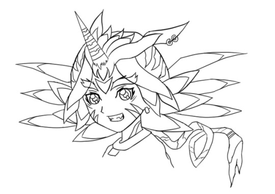
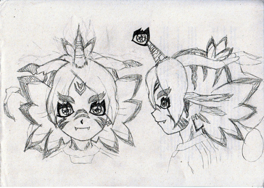
Happy birthday to me. /o/ And that’s the first and last time I mention it in this post. I don’t care and you shouldn’t either—I just want cake.
FubuGabu is back! Not by popular demand because, well, no one has asked for it, although the feedback I got was lovely. But, hey, I had this material ready, so might as well do something with it, lame as it might be.
These are some early and not-so-early doodles of FubuGabu. The latter was pretty much the base of the final design, but the former… that’s from 2014 or something wild like that. I actually had many more doodles and concepts, but I hated them all so much that I erased most of them. I’m surprised I could save that one. I might have kept it because it was a full lineart, I guess. In any case, I’m glad I could find that much.
Since it’s fitting to do, let’s talk about FubuGabu’s design today! There’s a lot to talk about, but my memory is awful, so I’m sure I’ll forget about some things. I hope it won’t betray me too much.
Anyway, as usual, more under the cut.
Well, well, well. Ain’t this boy one little shit. Fudou gave me nightmares. Kidou is still giving me nightmares (to the point where I’m considering changing the idea I’ve had for around a year now). Someoka was awful to draw and make sense of. Max’s tail was awful to work with. But Fubuki? Fubuki is on a whole different level.
Let’s start by talking about the final design, since that’s the better one. Not even good, just better. That’s an epic victory as it is, so who cares.
FubuGabu’s design, as the reference sheet and my last post states, is not based on Gabumon, but on Gabumon’s line. What this means is that it has elements from (almost) every single one of Gabumon’s evolutions. Just for the sake of satisfying people’s curiosity, namely @IshidoShuuji’s, I’ll list the different elements here, since that’s the easiest and most straightforward way to explain it:
Tsunomon: eyes, colour of the face.
Gabumon: horn, face stripes, teeth, hair ears.
Garurumon: eyebrows, pretty much all of the hair, hair tail, forehead marks.
WereGarurumon: nose stripes, pretty much all of the hair, earrings, eye scar.
So, no, MetalGarurumon, Punimon and Omnimon/Omegamon aren’t part of the design. …Or are they?
Just kidding. They are not. ww But you shouldn’t rule them out just because of that. Well, no—rule Omnimon out. There will be no Agumon miximax, so that isn’t going to happen. I don’t want to keep people’s hopes up for nothing. I made it pretty clear from the start that I wouldn’t use a franchise twice, but I bet most people don’t know that. So, yeah.
Now that I have broken down the elements, let’s look at them from up close. This is truly a difficult design to understand, so I’ll get the explaining done as I move along.
Let me start with Tsunomon’s part. I used the colour of Tsunomon’s skin because it looks human: I didn’t want to turn Fubuki into a furry—I mean, have him all covered in hair, because it just looks weird. It was either Tsunomon’s skin or Gabumon’s, and he’s BRIGHT YELLOW. So you’re welcome.
The eyes have changed very dramatically. Tsunomon’s aren’t all that complex compared to Gabumon’s, for example, so it was easier to pull off without screwing up too much. That’s in the early concept you can see above, Fubuki has eyes based on Gabumon’s instead and it looks like he’s using about 4kg of eyeliner, hah— You’re gonna run out of money if you wear so much of it every single day, pal.
They’re not exactly Tsunomon’s eyes, although it’s a rather radical change. As I mentioned when I talked about Creature miximaxes, eyes get rather distinctive shapes when animals (or monsters) are involved. I did something that goes against my analysis, though: I added light to FubuGabu’s eyes. Just because I hate myself and because it looked kinda weird without it.
While Tsunomon’s eyes are completely round, FubuGabu’s actually follow the shape of Fubuki’s eyes, although vaguely. The irises are Fubuki’s, period. I simply extended the lines to match the new shape of the eye. The lower eyelid creates a straight line based on the hypothetical line of Fubuki’s eyes, which is visible in coloured art. The outer part of the eyes also matches that of Fubuki, not to mention that I kept the fold over the upper eyelid and the little marks below the eyes. The main difference, therefore, is the thicker contour (which is linked to the spikes) and the curve that replaces the right angles on Fubuki’s usual eyes.
Let’s move on to Gabumon. His marks were probably the toughest to place, and it doesn’t help that Fubuki’s refs are so BAD. REALLY. Many, most characters have references that match. Maybe not perfectly, but almost. But Fubuki? Fubuki ain’t need none of that crap. When you are this FABULOUS, no one cares about your face changing size and shape in every screenshot or your hair going longer and shorter every 5 seconds. Everyone is blinded by your sparks, anyway, so who will notice?
I noticed. But anyway. ww
Since Gabumon only has markings on half of his body (since the rest is all yellow), I let FubuGabu borrow those on Gabumon’s nose. Actually, if you were to strip FubuGabu (please don’t do that), you’d see that his whole body is covered with markings. I like to think that those belong to Gabu, even if they could easily belong to Garuru or Were instead. Still, that means that the marks on his neck are Gabu’s.
As for the marks on his cheeks, they were very easy to place on the front view and frustrating to figure out elsewhere. I just gave up on them at some point and thought, “meh, Inazuma has pulled off weirder stuff!” They’re supposed to end somewhere behind the jaw, though, but before reaching the neck. Hence why I actually drew the jawline ww
The horn and the teeth are pretty self-explanatory, but I’ll point something out about the latter: I only added two teeth even though Gabumon has many because I wanted some kind of parallelism with Someoka. He, too, has two teeth, but they grow on the opposite direction. True teammates who complement each other!
Now, for the hair ears, aka those things growing from the sides of his head. Those are 100% hair—they don’t really serve a purpose. As such, using Gabumon’s seemed like the best idea. After all, what makes WereGarurumon’s ears interesting are the earrings, but how do you put an earring on hair? As for Garurumon, his ears are just more boring than Gabumon’s. Gabu’s ears are kind of quirky and worn out, which is a cool little thing that I felt like adding. Also, Garuru’s ears go upwards and I didn’t dig that.
Regardless, Garurumon is probably the star of this design. Most of the bigger elements are based on him, after all. You could argue that many of them also belong to Were, but I was looking at Garuru when I designed them. I guess that’s enough of a reason. I guess.
There was an element of Garuru’s design that I really, really wanted to add to Fubuki: the feather-shaped hair growing from his back. You know, these things:

After fiddling with that idea a whole lot, I eventually realised that it was best to keep it simple and shape Fubuki’s hair to look like those… however you wanna call them. I’ll just call them feathers. It may not be a perfect resemblance (and it may not make perfect sense either lmao), but I definitely thought it looked the best. These are actually not too hard to draw:
The first feather (from the top) follows the natural curve of Fubuki’s hair, but instead of curving down again, it creates an arrow-like shape.
The second feather starts and ends in the exact same spots as Fubuki’s, but instead of curving upwards, it’s completely horizontal.
The third one is the trickiest: it’s long and doesn’t match Fubuki’s normal hair. The part that touches the second feather starts where it should, but the part that touches the fourth one doesn’t. It’s tough to explain, so here’s a picture that will hopefully make it all clear:

The last feather is shorter and isn’t as diagonal as the third one, but it does start and end at odd places, too. The “trick” to draw it is keeping in mind that the third and the fourth feathers end at pretty much the same height:

The fifth feather isn’t even a feather; it’s just a simple spike. Nothing relevant there ww
Garurumon is also responsible for the marks next to the ears and the one on the forehead, not to mention the top of the head in general. The ones on the ears weren’t too bad, but the forehead was frustrating. As I mentioned, Fubuki’s references are a mess and I draw over them for the sake of keeping the original proportions, but it backfired in this case. Since they’re all so different from each other, Fubuki’s forehead grows bigger or smaller depending on the view, so the forehead mark is radically less visible sometimes, even though it technically shouldn’t be. Still, rather than repositioning it every time, I thought it made more sense to place it correctly to settle for a specific place, so that’s what I did.
Now, the top of the head is tricky. Let’s start by saying that it’s based on Garurumon’s back. Maybe WereGarurumon’s too, but I couldn’t find a single picture of Were’s back, so who knows. As you can see in the following image, Garuru’s back has a long, thin line that goes from his head to his tail, and that’s exactly what happens to FubuGabu too. You can’t quite see the end of the line because of the hair, but it’s still there… technically.
That thin line sprouts into a bunch of rugged lines, and that’s exactly what happens with FubuGabu too. The lines are rather random (and I didn’t spend much time figuring the size out, whoops), but they do follow some certain shapes. The closest line to the face might be rugged, but it goes straight down. The second one starts from way back, but it’s shaped like an arrow pointing at the face. The tips of both lines are fairly close, too. The third line is way smaller than the rest, and is also the last one you can see, but definitely not the last one in general.
Let’s talk about Fubuki’s little sprout as well. As you know, Fubuki’s sprout has two locks of hair, but FubuGabu’s has three. That’s because FubuGabu’s is also based on Garurumon: to be more specific, on this part:
I tried adding that part just the way it is by sticking it to the forehead, but I didn’t like the result at all, so I figured it was best to do something funny with Fubuki’s sprout instead. Oh, well. Choices! And talk about choices, I added Garurumon’s tail simply so the hair would be a complete portrayal of his figure. As I mentioned in the post I linked to above, miximaxing with creatures often leads to that, so yeah.
The hair is obviously the biggest and most visible part of FubuGabu’s design, but Garuru hogs quite a few other spots. Not Gabumon, nor Tsunomon, nor WereGarurumon (nor Punimon) have eyebrows, so I was pretty much forced to use Garurumon’s. Not like I mind, because they’re pretty awesome. It’s kind of sad that they’re usually not visible, but, to be honest with you guys… they’re kind of a pain to draw because of their very specific shape. So I’m secretly glad. ww
And last, but not least, WereGarurumon. Ah, what a little shit. How come there are official linearts for MetalGarurumon, but not for WereGarurumon? Anyway. ww
Were’s contribution is pretty straightforward. Earrings, a scar and marks. There are a couple of things worth mentioning, though.
For the earrings, I noticed too late that Were has both white and red earrings. I was going to use the red earrings because they stand out more, but I noticed that the visible ear was on the side of the white ones… And it was too late to change the design completely, so I just went for the white. Too bad, but life is simply unfair. Especially when you don’t pay attention.
Now, the nose marks are funny. I struggled so much with those. As you can see on the second picture of this post, they were originally going to be shaped like triangles, but I didn’t dig that. And even after I changed the design, I couldn’t get them right, which was… frustrating.
(Also, it took me a long time to realise that the bridge of the nose would be hiding one half of the marks in every view except the front one. After I did, though, everything finally looked better. Thank goodness.)
Anyway, I think that pretty much covers the final design, but let’s also talk about the early designs real quick.
Nothing much to say about the second picture of the post. I just made sure to make some sense out of the markings and retouched the elements I mentioned above. Well, I tried to polish everything, really.
Now, the first picture of the post is easily over 2 years old. It was one of the first, if not the very first, concept of FubuGabu. And, man, what a mess.
It was like, “what does Garurumon have? Feather thingies! SO LET’S ADD THEM EVERYWHERE.” The feather thingies appear on his forehead, the locks of hair over his face, on his hair and even behind his head. I could never figure the latter out—but, man, did I spend hours trying to make those work. And all because Garurumon has feather on his face and on his back, so I felt like FubuGabu needed two layers of feathers too. Thankfully, I eventually realised many of these elements simply weren’t needed, like that second layer of feathers, the earrings on Garurumon’s ear (which, again, are made of hair, so wtf), and… the ring at the end of the tail? Where did that come from? This is Garurumon, not Gatomon! Geez, self!
Some of the early elements made it to the final design. The overall shape of his eyebrows, the markings on the head, the neck and the cheeks and even the horn, just to mention a few. The final feel to it is completely different, though.
This is probably because of how different the hair looks. FubuGabu’s original hair was full of feathers, but they didn’t fit Fubuki’s normal hair. They were randomly coming out of his head for whatever reason. Not to mention that the hair falling over his face looks like tentacles rather than anything else. It looks like a miximax with Squidward rather than with Gabumon. Ugh, I hate myself. XD
One last note: I don’t know where the forehead mark on that first design comes from. I guess it’s meant to be Gabumon’s, somehow? I forgot and I’m too tired to investigate it. It probably never made sense, anyway. XD
I think I covered everything! But, phew, that took long. Still, if anything isn’t clear or there’s something I forgot to mention, please let me know!
(Also, I’m too tired to re-read this post, so excuse the many typos that I probably made. I’ll check it out... eventually.)
25 notes
·
View notes
Text
Paul Michael Anderson is a new friend and writer to me. I am enjoying getting to know him. He has a delightful sense of humor and makes me laugh. He is passionate about his writing and his life. He loves his wife and daughter and I loved to hear him talk about them. He tells me that he is boring but I doubt that to be the case. I haven’t read his stories yet but have added his book Bones Are Made To Be Broken to my to be read pile. If you haven’t met him you are missing out on a really great guy. Please check him and his books out and say hello. Please welcome Paul Michael Anderson to Roadie Notes……
1. How old were you when you first wrote your first story? I have no idea, really; I’ve always written something. My first published piece, ever, was when I was eighteen–a music review, I think. I started out as a journalist, in college. My first published fictional story was called “The Migration of Birds” in a small digest called BLACK INK HORROR, back in 2008.
2. How many books have you written?
I’ve dallied around with novels, but I’ve focused for the past few years on short fiction. My book BONES ARE MADE TO BE BROKEN is a kind-of “best-of” collection of the past five years.
3. Anything you won’t write about?
Not that I can think of—I won’t write anything that exploits a stereotype or a child or a woman, though, but those types of “stories” don’t interest me much, anyway. Horror, which I tend to traffic in, only works when the reader can place him or herself in that situation and relate to the reactions of the participants. You can’t do that when the characters—both good and bad guys—are one-sided or used to push forth a noxious ideology. Stories need to be populated with real people, whether they be victims or heroes or villains, and there’s a whole ball of virtues and flaws in each one. I’ve written about fairly heady subjects—abuse, neglect, the breaking-down of marriages and relationships—but while those things, when dealt with head-on, are controversial in and of themselves, I keep the focus on the people and how they adapt to those situations. I guess that’s the difference between exploration and exploitation—exploration cares about the people and how they adapt; exploitation cares about the controversial subjects and what they do with people.
4. Tell me about you. Age (if you don’t mind answering), married, kids, do you have another job etc…
I’m in my mid-thirties, with a wife and five-year-old daughter. I’ve taught English and journalism for the past ten years (it’s what I went to college for, natch), and I enjoy the hell out of it.
5. What’s your favorite book you have written?
I have stories that are my favorites right NOW, but that’s like picking your favorite kid for all time and not just being proud of a particular current achievement. Right, in print, I’m loving a story I wrote called “All That You Leave Behind”, which you can find closing both my book and the anthology LOST SIGNALS, edited by Max Booth III and Lori Michelle for Perpetual Motion Machine Publishing; as a parent, I’m terrified of a whole bunch of stuff relating to my child and being a parent, etc. That story asked the what-if of picking up the pieces after a miscarriage and brought in parallel universes.
In the pipeline, I wrote a Lovecraftian-esque novelette called “I Can Give You Life” that I’m digging because I had to stretch a little (I don’t tend to write Lovecraft and, also, I set the story during a non-specific time in the late-1950s in Northern Virginia) that’ll be showing up in a year or so. Another story, “How I Became a Cryptid from a 1980s Horror Movie” will be showing up in SPACE & TIME magazine early next year—I love it because it’s so goddamned weird (a guy is cursed to being a sentient lake and it only goes downhill from there).
6. Who or what inspired you to write?
I like telling stories and getting a reaction, a connection, with an audience; I’ll be elucidating on some point in the classroom, or connecting a concept to an anecdote and I try to make the students laugh because, if they laugh, they’re absorbing the concept, at least on a minimal level that I can use as leverage to go deeper.
But, reading books like THE TALISMAN by Stephen King & Peter Straub or ANOTHER DAY IN PARADISE by Eddie Little or FIRST BLOOD by David Morrell had me cock my head at a young age and go, “THAT seems like a good job.”
7. What do you like to do for fun?
I’m a horrendously boring mid-thirties parent. All the out-of-control, nihilistic wild stuff I got out of my system when I was in my teens and early twenties. Hell, my only vices are coffee and cigarettes.
Saying all that, if I’m by myself, I love cruising bookstores and junk shops and thrift stories. I love reading and playing my guitar and doodling. With my kid…hell, doing whatever a five-year-old girl who likes to pretend she’s a “vampire princess pony with FROZEN powers, Daddy” decides to do.
8. Any traditions you do when you finish a book?
Not really; I wrote, in the introduction to BONES ARE MADE TO BE BROKEN, that writing is a job to me—not much different from when I was a landscaper or waiter or reporter. I mean, there’s sentiment in what I do and if I’m not feeling anything about a scene or a conflict, then I can’t expect a reader to, so I’m emotionally invested in the writing. But, at the same time, it’s a job and, when I finish, I save, I print, I shut down the computer, and go back to my life as a parent and husband. I have routines—I always have coffee on-hand when writing; I always listen to a certain mix of music—but I try not to be overly superstitious about the whole thing because, to me, that makes it all mystical and hokey and, really, it’s me using a muscle—a muscle with some talent (I hope) but it’s still me at the controls and, ultimately, me responsible for something good or bad.
9. Where do you write? Quiet or music?
When I was fucking around with writing—liking the idea of being a writer but not putting in the hard work of doing the writing—I had an office, but, not long before I found out my wife was pregnant, I chucked it in favor of writing in more populated areas of the house—the bedroom, the kitchen, etc. I didn’t want to put myself away from others because it’s others that I was writing about. Consequently—this was in mid-2010—I began selling a metric shit-tonne (to accurately measure in Canadian terms) of work.
Currently, I write in my kitchen, after my daughter goes to bed and while my wife surfs Netflix or prepares for the next day. I set my laptop up on the table, get my coffee, have a cigarette (outside), and get to work. I have a mix of two Foo Fighters’s albums—WASTING LIGHT and their ST. CECILIA ep, totaling about 70 minutes of hard rock—that I listen to with headphones. It’s pretty low-tech. If I’m revising, I have a physical marked copy on a stand that I refer to, but I’m pretty minimalist and mobile. I can write pretty much anywhere as long as I have headphones, music, and a computer. And coffee, too.
10. Anything you would change about your writing?
HAHAHAHAHAHAHAHAHAHAHAHAHAHAHAHAHAHAHAHAHAHAHAHAHAHAHAHA!
Sure. Of course. Writers, like any creative type, can be neurotic, self-doubting mental cases, and I’m no exception. When I’m reviewing the previous day’s work—some call it “fractal editing” but I have no idea if that’s the right term, and couldn’t care less—I’ll find myself wishing, goddammit, why couldn’t I put down exactly what I saw in my head? How could I miss this detail? Why didn’t I know this word?
But then I simply delete and revise and try again.
I wish I wrote faster, I guess. I, when on a hot streak, can lay down between 2k-3k, but that’s on a hot streak. I have writer’s laze, I guess; I might be working on something but, at 9:45, when my daughter’s finally asleep, I’ll find myself thinking, “Man, I just want to zone on Facebook, or watch this movie with my wife, or—shit—I have to get these dishes washed,” and I have to fight that. I don’t always win that battle, which is annoying.
11. What is your dream? Famous writer?
In a business-sense, I dream of making enough to sustain myself and not put publishers in the red; I already mostly do that, so, y’know, achievement unlocked and all that. I dream of making a reader react on a deep level to some situation I write about—make a parent cry at the end of “All That You Leave Behind” or a sibling gasp at the situation in “The Agonizing Guilt of Relief (Last Days of a Ready-Made Victim)”—but make them unable to stop reading. I can manage that, sometimes.
I don’t worry about fame, and I don’t say this in a hipster-sort-of-way. I want to make a living and, right now, writing’s a nice supplement (my income this year is paying for Christmas and some light house remodeling, for example). If I get “known” for it, cool, but that wouldn’t stop me. I’d write and tell stories even if no one was listening. At the end of the day, you want to make a reader pick up your story, but, at the beginning of that day, that hypothetical reader shouldn’t mean shit to you. At the beginning of the day, you write for yourself because it makes you feel good and you want to follow the thread of whatever popped into your head. If you keep true to that concept at the beginning of the day, that hypothetical reader will stay with you at the end of the day.
12. Where do you live?
Northern Virginia, currently, but I’ve lived all over the Eastern Seaboard. I’m a city kid, but have been hiding out in the small towns of the Shenandoah Valley.
13. Pets?
Two dogs, three cats, and one turtle. All rescues. The dogs and one of the cats came from the local Humane Society, while the other two cats were strays and the turtle was a very-late hatching my daughter found in the front garden. They’re all neurotic as hell.
14. What’s your favorite thing about writing?
In the moment of actually telling a story, I love that frisson when the words and the concepts and the action come together beautifully and I knew I couldn’t have put something better and that’s okay because what you put down was good enough. There’s a moment, in the title novella for my collection (I wrote the novella specifically for the book; it’s one of two original pieces) that pops into my head. The novella isn’t supernatural and the horror comes, for me, at the idea of things spiraling out of control. It takes place in the fall of 1991 and concerns itself with a single mother trying to make ends meet in the city. She hides how she feels from her son and her ex-husband, whom she sees when they do the pick-up/drop-off of custody visits, and takes to cutting. She hides the marks, out of shame, but there’s a moment, where she slips up, and this stranger sees it, and looks at the mother differently. The moment pauses, elongates, becomes torturous. This moment reverberates throughout the entire story.
I think that’s neat.
15. What is coming next for you?
I have a handful of stories coming out in various places over the next year or so. I wrote an essay for StephenKingRevisited.com about one of the books whenever Richard Chizmar gets around to finishing said book. My author bio says I’m working on my first novel and that’s true-ish; I’m working on a psychological horror novel tentatively titled BETTER PEOPLE and we’ll see where that goes.
My bio: Paul Michael Anderson is a short story writer and editor. A teacher and sometime-journalist, he lives in Northern Virginia with his wife and daughter. You can visit him at his website The Nothing-Space (paulmichaelanderson.wordpress.com) or follow him on Twitter, where he posts under the inspired handle of @p_m_anderson.
You can connect with Paul Michael Anderson here:
BONES ARE MADE TO BE BROKEN: http://www.darkregions.com/books/new-releases/bones-are-made-to-be-broken-by-paul-michael-anderson
Twitter: https://twitter.com/P_M_Anderson
Website: https://paulmichaelanderson.wordpress.com/
Some of Paul Michael Anderson’s books:
Getting personal with Paul Michael Anderson Paul Michael Anderson is a new friend and writer to me. I am enjoying getting to know him.
0 notes