#animation skills
Explore tagged Tumblr posts
Text
I'm an animation student and I made this incredible animation of Turbo....
Hope you enjoy....
#wir#wreck it ralph#turbotime#art#turbotastic#animation#adobe after effects#turbo wreck it ralph#turbo#turbo wir#incredible animation#animation skills#this is satire#i made this in class in my free time
74 notes
·
View notes
Text
Emile Cohl
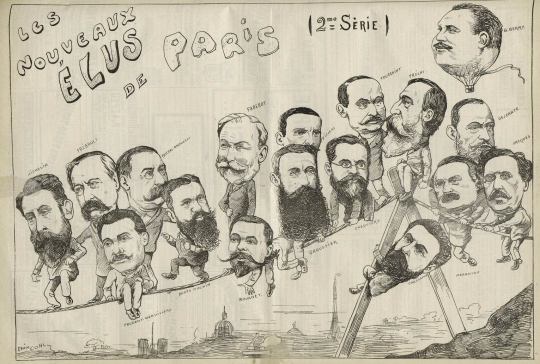
Emile Cohl was born in 1857, his father was a rubber salesman. In 1863, when he was 6 years old, he was sent to the boarding school Institute Vaudron. This is where it was discovered he had a talent for illustration and was encouraged for it, however due to the Franco-Prussian War in 1870 his father had to shutdown his rubber factory. This led Cohl to be sent to a less expensive boarding school, Ecole Turgot, where he would attend marionette theaters and work as a poltical caricaturist. In 1878, he became an assisstant under Andre Gill, a famous french caricaturist, who would become Cohl's mentor and close friend. Cohl would become instantly famous when he would make cartoons insinuating that the then French President Patrice MacMahon was the reason the french lost the Battke of Sedan agasint Prussian forces. This led him to be fined and imprisoned for 10 days, on the 11th of October 1879. This skyrocketed Cohl's popularity.
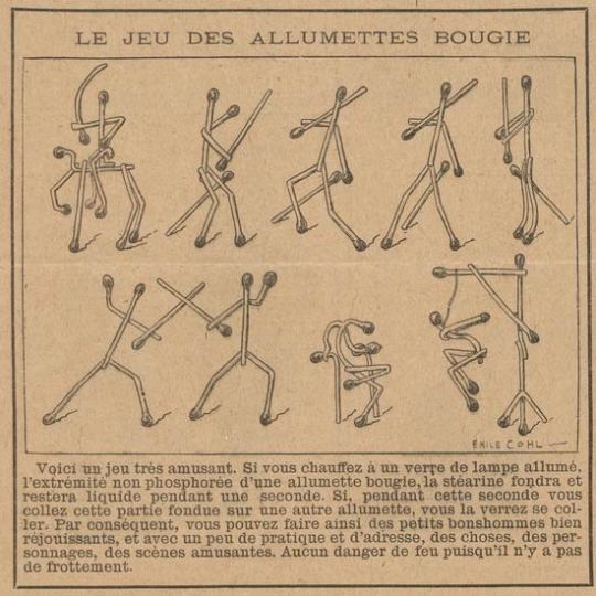
In 1907, Cohl changed careers at the age of 50, becoming a scriptwriter for the film company Gaumont. He was inspired by John Stuart Blackton, who had already made several animated comedies, and studied his work in order to make his own animated films. Cohl deviated from Blackton's methods, while Blackton would draw with a chalkboard and chalk, Cohl drew each frame individually on hundreds of pieces of paper. This would make Cohl's method far closer to modern animation methods compared to Blackton's. In 1908, Cohl made his first animated movie "Fantasmasgorie" and it is considered the first genuine animated movie. It's success paved Cohl's way into making an abundance of animated films for various studios,even travelling to America for work.
9 notes
·
View notes
Text
8 Tips to Create a Different Animation Portfolio
An excellent animation portfolio is essential for showing off your skills and attracting potential clients or employers. It's not just a collection of your work, it reflects your style and creativity. In this blog, we'll explain what an animation portfolio is, why it's essential, and what makes a great one. Then, we'll share eight practical tips to help you create an outstanding animation portfolio.
What is an Animation Portfolio?
An animation portfolio is a collection of your best work as an animator. It showcases your creativity, skills, and style. It is a visual resume highlighting your projects, techniques, and abilities. A good portfolio usually includes finished animations, sketches, storyboards, and anything else that shows your creative process.
Why Do You Need an Awesome Animation Portfolio?
Having a solid animation portfolio is essential for several reasons:
⦁ First Impressions Count: Your portfolio is the first thing clients or employers will see. A well-made portfolio can leave a lasting impression and set you apart. ⦁ Show Off Your Skills: A good portfolio highlights your technical skills and unique style. It helps you demonstrate what you’re great at and what you can bring to potential projects. ⦁ Attract the Right Opportunities: A standout portfolio can draw in projects that interest you, helping you connect with clients or jobs that match your skills and passion.
Features of a Stand-Out Demo Reel/Portfolio
To make your animation portfolio shine, consider including these key features:
⦁ High-Quality Work: Only include your best work. Quality matters more than quantity! ⦁ Diverse Styles: Show a variety of animation techniques and styles. This helps you appeal to different clients and projects. ⦁ Narrative Context: Add some background about each piece to explain your creative process. This helps viewers understand the effort that went into your work. ⦁ Client Testimonials: Include positive feedback from clients to build trust and credibility. If you’ve worked with well-known brands, featuring their logos can also help. ⦁ User-Friendly Design: Make sure your portfolio is easy to navigate and looks good on computers and mobile devices. A clean layout helps people focus on their work without distractions.
8 Tips to Create a Different Animation Portfolio
1. Curate Your Best Work
Focus on quality over quantity. Select your best pieces that show off your skills in various styles. Choose animations that resonate with your target audience or the type of work you want to attract.
2. Showcase a Variety of Styles
Animation has many forms, from 2D animation to 3D to motion graphics. Showcasing different styles can attract a broader range of clients. If you specialize in a particular type, like educational animations, make sure to highlight that work.
3. Include Process Work
Clients love to see the thought process behind each piece. Include sketches, storyboards, or behind-the-scenes clips to show your creative journey. This not only highlights your technical skills but also adds depth to your work.
4. Tell a Story with Your Portfolio
Your portfolio should tell a story about your growth as an animator. Organize your work to showcase your skills and unique style. Provide a brief narrative for each piece, explaining the challenges you faced and how you overcame them. This highlights your technical skills and adds depth to your work.
5. Choose Quality Over Quantity
Pick your best work that shows your skills in different styles. Focus on quality, not quantity. Choose animations that fit the audience or jobs you want to get.
6. Host Your Portfolio Online
Choose a reliable platform to host your portfolio. Whether it’s your website or a dedicated portfolio site, make sure it’s easily accessible and user-friendly. This is where potential clients will first see your work, so it’s essential to make it inviting.
7. Keep It Updated
An outdated portfolio can make you seem inactive. Regularly update your portfolio with new work, and consider removing older pieces that don’t reflect your current skills. Set a schedule to review your portfolio every few months to keep it fresh.
8. Include a Call to Action
Make sure potential clients contact you easily. Include a clear call to action on your site, inviting viewers to reach out for collaborations or inquiries. Ensure your contact information is easily accessible and linked to your social media profiles.
Where to Host/Upload Your Animation Portfolio
Selecting the right platform to showcase your portfolio is essential.. Here are some options:
⦁ Personal Website: Building your website gives you complete control over how your portfolio looks and feels.
⦁ Portfolio Websites: Platforms like Behance, ArtStation, and Dribbble are great for creative professionals. They provide a community and help you get noticed.
⦁ Video Hosting Platforms: If your work involves video, consider uploading your animations to Vimeo or YouTube. These sites allow for high-quality playback and can be embedded in your site.
⦁ Social Media: Use social media platforms like Instagram, LinkedIn, or TikTok to showcase your work and drive traffic to your leading portfolio site. It's an excellent way to reach a wider audience.
Conclusion
Creating a unique animation portfolio takes creativity, planning, and attention to detail. By curating your best work, showcasing a variety of styles, and telling a compelling story, you can craft a portfolio that truly represents your artistic vision.
Remember to optimize for web accessibility, include high-quality work, and keep your portfolio updated to stay relevant in the changing animation industry. With these tips, you'll be well on your way to making an impressive animation portfolio that stands out.
For more insights on animation techniques and tips, check out other articles at Best Animation Studios. If you're looking for budget-friendly animation services or collaboration opportunities, please get in touch with us!
Don't forget to share this post!
#animation#animation portfolio#tips to create animation portfolio#animation skills#animation software#creativity#animators#animators skills#best animation studios
0 notes
Text
Adobe After Effects 2
I did a second test with Adobe After Effects, again with the Assets provided on Canvas. This time I created another path animation however this time we learned how to use the camera. I added a camera into the scene, and then was able to turn on 3D editing for the assets I imported. In a second window which had view from the top, I was able to move objects closer or further away from the camera. Here I have the buildings in the mid/ background and trees much closer to the camera. By enabling depth of field, and setting the focus distance and apature to what I needed them to be, the camera would automatically apply blur to objects that aren't in focus.
youtube
To create the animation, I didn't need to animate the individual assets as they were static in the scene, and instead animated the position of the camera. Since I had depth of field and 3D layering enabled, the camera automatically calculated how objects should appear to move in relation to it and created a paralax scrolling effect.
0 notes
Text
The final part of the Animation Skills module taught us to use After Effects by making a moving background. We started by making moving trees and houses, and were soon called to make our own. I came up with an idea after getting this assignment, a shot of the prairie overlooking the mountains. Making the backgrounds was fairly easy, but I had an issue with making a loopable gif of one of the hillsides at first. Even so, I managed to upload all of my work onto After Effects and make a background. I then tried the camera out, changing the perspective of the shot over the course of the video, and then eventually added sound to make the final product.
0 notes
Text


hmmmmmmm
#kirammountains supremacy#arcane animators i bow to your god-tier skills#caitlyn kiramman#caitlyn arcane#league of legends#caitvi#arcane#lesbian#vi arcane#vi x caitlyn
7K notes
·
View notes
Text
Tris- 2
Week 12 Easter break (Final paths animation with sound effects)
The sound effects I wanted it to have some kind of busy and atmospheric sounds to it.
But, I didn't want the video to be overwhelmed with sound effects, having the white noise and the car horns on top with the birds flapping their wings. This really created that depth you hear.
Although, to improve this perhaps I could have people in the background talking, to further enhance that sense of atmosphere and immersion to the setting.
0 notes
Text
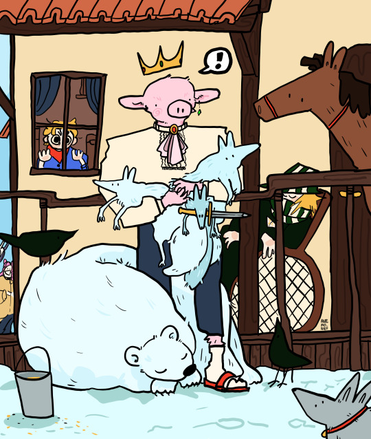
happy technoblade day for those who celebrate!!!
#brought to you by me crying sobbing#technoblade#mcyt#happy birtday techno!!!!!#out here showing off my animal drawing skills :D#inspired by those times you just need to stop and realise your surounded by those you love and your so happy to be there#but moslty tehcnos cabin becasue i miss that thing#anyhow!!!#techno :))))#we are listning to liana flores nightvision#also happy pride motnh and all that stuff#!!#my art#technoblade25
4K notes
·
View notes
Text


ron and hermione photographed on the steps of their first home together makes it into the Prophet

#(this is a draw this in your style challenge over on my instagram…. if you wanna hop over there and join the challenge…)#romione#harry potter#ron weasley#hermione granger#golden trio#the golden trio#ronmione#ron x hermione#hermione x ron#rita skeeter#the daily prophet#daily prophet#harry potter fanart#hp fanart#hp art#harry potter art#my art#artists on tumblr#character design#vis dev#visual development#in a just world where i didn’t have any self preservation skill and didn’t care about myself i would’ve animated this but alas..#i care about my wellbeing
2K notes
·
View notes
Text
I am not an animator but I cooked😎
#tma#the magnus archives#tmagp#the magnus protocol#jonathan sims#martin blackwood#jmart#elias bouchard#magpod#magnus archives#animatic#animation#tma spoilers#digital art#animated#artists on tumblr#when Magnus Archives fixation is strong#you create something like this in two days#with absolutely no skills in animation😅💅
1K notes
·
View notes
Text
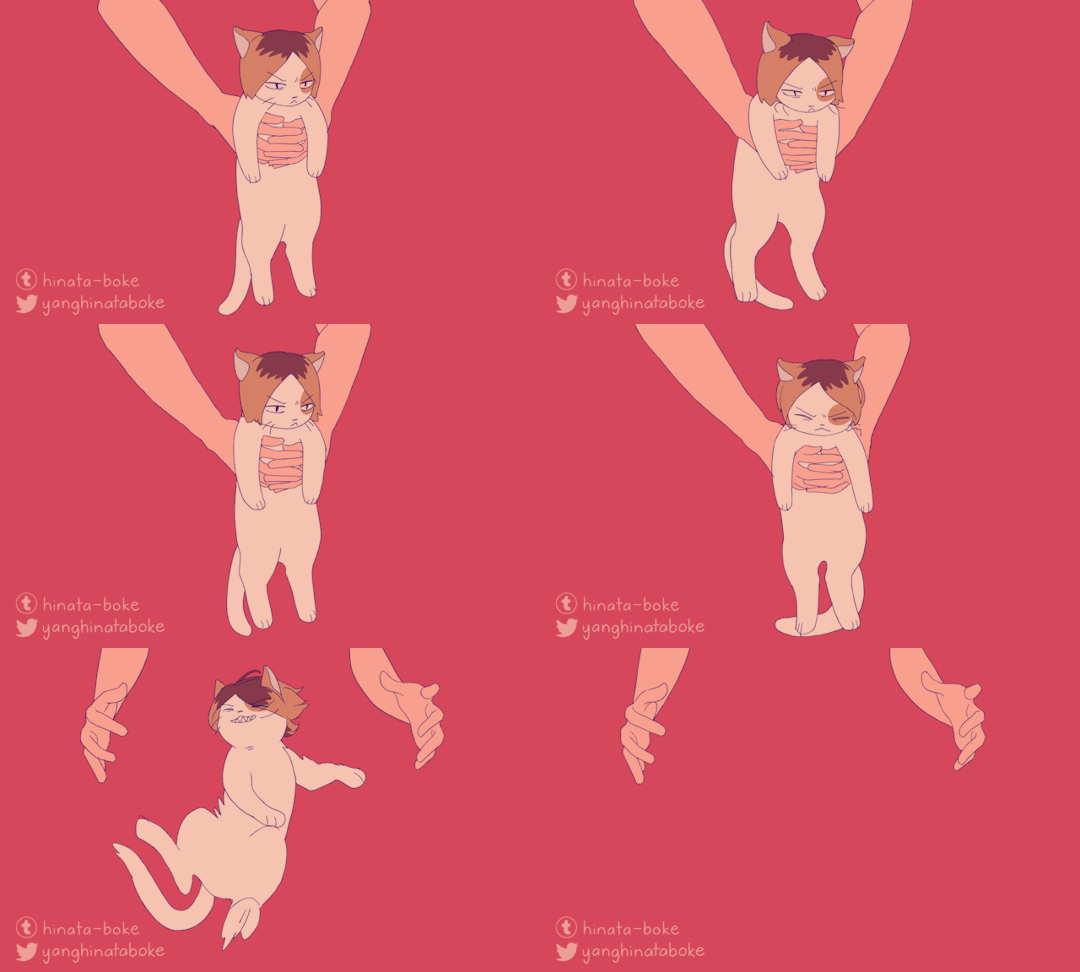
he does not wish to be held
#haikyuu#my art#kenma#animation#dusting off the animation skills with some more kitty kenma#ITS FUN BUT IT USES MORE BRAIN THAN I REMEMBER...#please enjoy#this was ~21 unique frames#woah why does it look so jank on mobile 😭😭😭#edit: i fixed it maybe the file was too big or smth#wait no its still weird AUUGHHHHH
5K notes
·
View notes
Text
Anticipation, The second principle of Animation.
In a nutshell, anticipation is the persistent sense that something "new" is soon going to happen. You need to keep watching to find out what that is. The 12 principles of animation depend heavily on anticipation because of this. If anticipation is not applied, the item may move in an abnormal way. The item will move in advance as a preliminary action before traveling at all (often quick or decisive movements). The anticipation phase serves to reserve energy for boosting movement.
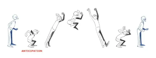
A very simple yet effective technique for letting your audience know that something is about to happen is to create anticipation. This can enhance the enjoyment of watching animation.
However, expectation serves to enhance movement interest rather than undermine the movement's "surprise" in any way. It might be viewed as a means of heightening the tension (for the impending action). Because of this, viewers of the animation will focus more on the action and not miss it.
Moving first in the opposite direction is the traditional strategy for anticipation. It will be a natural movement for the character to first lean slightly to the right if they are about to move to the left.
Physically, the idea of anticipation can be used to describe how an item prepares for motion and stores kinetic energy before it begins to move (as in the aforementioned cases).
However, timing, dynamics, velocity/acceleration, and the contour of the movement are some of the crucial elements animators need to focus on while using anticipation. In order for the movement to appear realistic to the spectator, the expectation and movement must coincide.
Many animated films, particularly superhero flicks, have this animation problem that may be pointed out. Animators frequently want superheroes to be "faster" and "stronger" to give the impression that they possess abilities. This is entirely comprehensible. However, if we overuse anticipation during the animation process, the character's movement will lose its organic logic. This frequently occurs in cartoons where the buildup is too brief or unimportant.
This flaw in animation can be pointed out in many animated films, especially superhero movies. To make superheroes look like they have superpowers, animators often want them to be "faster" and "stronger". This is completely understandable. However, during the animation process, if we use anticipation unreasonably, the character's movement will lose its natural logic. This often happens when the anticipation is too short or insignificant in the cartoons.
0 notes
Text

General's new halo! 👼✨
#honkai star rail#sunday hsr#hsr sunday#jing yuan#jingyuan#n4391#my art#fanart#chibi#animation#sunday's skill giving characters a halo is sooo cute
2K notes
·
View notes
Text
Adobe After Effects Brief (Path Animation with Own Assets) 1
For this brief, we were instructed to create a path animation and make our own assets. I was quite excited for this task because I immediately got ideas on how to use Adobe After Effect's tools (in particular its camera) to create atmospheric effects (such as with particles). I had tried to acomplish similar things with other software in the past (mainly with video editors) however found After Effects to be much better suited for this.
I knew immediately that I wanted to try and create something that could pass as an area in a video game.
0 notes
Text
"i don't ship laios and marcille-" oh yeah same, their relationship is so much more compelling to me viewed through a platonic lens than a romantic one
"-like, marcille clearly hates laios" are we reading/watching the same series??? did you just stop after the first couple chapters??? look at their relationship development, that's her friend! her bestie, even!!!
#eliot posts#dunme#dungeon meshi#marcille+laios are so barry+taako coded. to me.#the anime is only at the beginning of their friendship arc but it's already so good#and as someone who has read the manga it only gets better from here#they love each other so much and care about each other's wellbeing and trust each other and admire each other's skills so much#i want to eat drywall over these two they are best friends#basically i have more in common w someone who says those two love each other romantically#than i do w someone who says they don't love each other at all#(well. assuming the former is serious abt their characters and not just boring tropey shipping main guy w main girl yk)
3K notes
·
View notes
Text
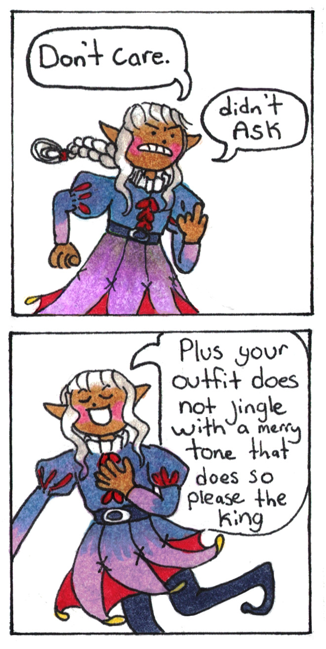
Happy Thistle Debut Day!
#dungeon meshi#Thistle#Old dungeon meshi fans remember the days when it was ambiguous what gender Thistle was.#Now we know Thistle uses he/him pronouns but in my heart Thistle is still non-binary. Clowngender elf with poor coping skills.#I hope the anime-only watchers know that this is a character to keep an eye on.#Love (in it's many forms) and desire (in it's many forms) is the main course of Dungeon Meshi and THIS silly jester?#My goodness. What a perfect encapsulation of how one can hurt other's so deeply in the name of love.#The actions we take to 'protect' other's is often the route to doing the most harm.#Love is letting go. Sometimes that means control and sometimes that means saying farewell forever to someone.
6K notes
·
View notes