#and you don't have to Set Up any art program to have the exact like. tablet settings you want
Explore tagged Tumblr posts
Note
Hey Sergle, how does one learn how to draw? Like, I am in my 20s, can barely draw a stick figure, and feel overwhelmed whenever I try to look up tutorials. Do you have any advice on how to start?
my Unprofessional advice on how to start in earnest, is to do it the way little kids do when they start learning to draw! which is to not approach it as learning at all. sitting down and scribbling out whatever comes to mind, reading a book or watching a movie and trying to copy the way the characters are drawn. draw a page full of cats. do it while you watch tv. doing all that w/o the Grown Up impulse to be embarrassed that you're new at a skill.
#I don't care if this advice isn't structured- i think this is the more fun way to learn!#I could send you a masterpost with links on tutorials and How Tos and Beginner Guides For Dummies etc but that's not.. the way I think#that it should work.#you could take a class or follow tutorials you find on yt and that's fine too. but like you said#it's overwhelming that way. bc then it feels like homework. and then it feels like there's a Certain Way to do it#and if there's a certain way to do it then that means there's a wrong way to do it.#oh the second part of this advice is to use physical art supplies. digital art is amazing#but traditional art and the practice of putting ink to paper is satisfying in a tactile way that digital art isn't#and you don't have to Set Up any art program to have the exact like. tablet settings you want#idk baby you should just pick up some art supplies that inspire you and get the ball rolling#steal some watercolor from hobby lobby if you must! paint some flowers. or some shit! have fun!#sergle answers
263 notes
·
View notes
Text
how to make neon signs in inkscape!
I lost my mind and spent a large amount of hours yesterday perfecting my methods and figuring out how to do this, so if you're interested in making something like this:

here's how to do that!
step 1: cover your workspace in a dark grey rectangle, and lock that layer down.
I've been using 80% or 90% grey - you want this so you can see your neon effect, but you don't want it entirely black at this stage, or you won't be able to see your shadow layer.

step 2: create some text!
pro tip: rounder sans-serif fonts look the best for this, because think about what a neon sign is made of - it's tubes, bent into shapes! so if your font or design looks too sharp and pointy, it'll feel unrealistic when you make it neon.
(this is, of course, a perfectionism thing on my end, so feel free to ignore any and all rules in order to make the thing that you want to make. as with all art, you can do whatever you want forever!)
bonus pro tip: if you, like me, have over 1400 fonts installed and programs tend to lag when you browse through all of them, nexusfont is a great free software that lets you sort your fonts into categories, search them, and preview what any text looks like in different fonts! I love it. it is my best friend
now I'm going to do this with a few different fonts, so that you can see how it works with them. so today, I'm picking Futura Round, Harlow Solid Italic, and then to challenge myself, Beauty School Dropout and Block

make the text white, and also select the text and go to Paths -> Object to Path, because some things don't work right if they're not paths.
let's start off easy with Futura Round!
Step 3: duplicate your text layer
now bear with me here. but you need to take the text you're working with, and either right-click duplicate or copy/paste the layer until you have seven total copies of the text you're working with.

arrange them like this, making sure the top one is the first layer on the list (and so on), and then in the layers tab, label them like so:
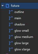
pro tip: if you don't have the layers tab open, go to Objects -> Objects and Layers, and that'll pop it right up
Step 4: blur time!
switch to the Fill and Stroke tab, and make these changes to the paths:
glow small: 15% blur, 100% opacity
glow medium: 20% blur, 90% opacity
glow large: 50% blur, 70% opacity
glow xlarge: 70% blur, 70% opacity
your workspace should now look like this:

this is good!
pro tip: these numbers are just loose guidelines! at the end, mess around with everything to make sure that the glow looks right to you! nothing is an exact science
Step 5: shadow and outline
for the shadow layer, make it solid black, and then change the opacity to 50%
for the outline layer, we're doing something fun and weird. so right now it's a fill object, but we want it to be an outline instead! so let's hit the X in the lower left to make it empty, and then shift-click on...for the sake of this, let's say blue. to make our nice blue outline.
now's the weird part
now. use the align tool (Objects -> Align and Distribute), select the outline layer and the main layer, and align them so the outline text is exactly centered on the main one.
then go to Paths -> Path Effects, and when the tab opens, select just the outline layer, then click the drop-down arrow in the Path Effects tab and select Offset
here's our goal right now:
we want to offset the outline until it fits inside the text underneath it, and also mess with the stroke layer settings until you have a nice thick outline that doesn't overlap itself.
mess around with the plus and minus buttons. there are no exact numbers here; you just have to know when it looks good! but for me, the settings were a -0.34mm offset, with a stroke width of 0.700mm
this is roughly what you want it to look like:
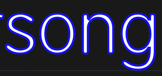
now, with the outline layer still selected, blur it out just a bit until it looks fuzzy, and like the white center is a highlight rather than a separate layer. for me, the right number was about 8.3% of blur, to get a result like this:

Step 6: layering and changing colors
okay! at this point your work should look something like this:

you now want to select every layer except the shadow layer, and use Align to center them all on top of each other.
pro tip: make sure to untoggle "move/align selection as a group", otherwise this will not work.
you should now have something that looks like this, with the shadow layer sitting all by itself somewhere off to the side

now's the fun part: colors!
since we've decided that this neon light is going to be blue, it's time to change the glow to reflect that!
here's what it looks like when you change all of the glow layers to be that same, #0000FF blue as the outline layer
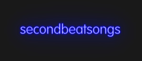
and here's what it looks like when you take the glow small layer and make it just a bit lighter (#4343FF) using the stroke and fill tab

in general, mess around with the layer colors until you like how they look! I find that it generally looks better if the glow small layer is a bit lighter, and the glow medium layer is as dark as the original color. everything else is fair game.
also the main layer can stay white (if you want it to seem very bright), or you can make it a very very light blue if you want it to be a bit more subdued.
Step 7: final steps
take your sad, neglected shadow layer, and move it slightly up and to the right of your main layer, so that it works...well, basically like a drop shadow.
then take your original rectangle, and switch it to 100% black.
now. gaze upon your masterpiece

that's a good neon sign if I've ever seen one.
but now. now's when we lose our minds
Steps 8-??: perfectionism and nonsense
so let's move the Futura one aside (and hide it! inkscape lags if there are too many blurry layers visible at once, so hide anything you're not using!), set the rectangle back to grey, and move on to Harlow Solid Italic.
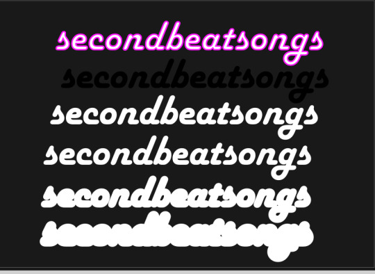
I've sped through a few of the steps here (out of order) so you can see what I'm doing. I've added outlines to the large glow and xlarge glow, and bumped them up a bit so they'll have a larger glow area in general
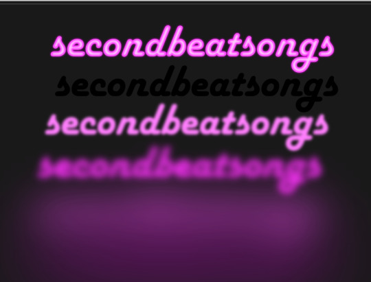
this time I've made the large glow a little bit lighter than the xlarge glow and medium glow, and made the main layer a very pale pink instead of just white. I also blurred the outline layer just a bit more, because this font needed a bit more fuzz to make it look good.

hell yeah. this rocks.
now, one detail for perfectionism: in neon signs IRL, if you look closely, there are wires attaching them in the back, often connecting each letter to the next. so...let's do that!
get your pen tool, set it to spiro path, and then make little droopy lines connecting each letter.
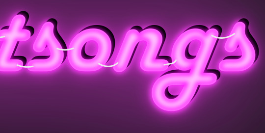
make these thin, 100% opacity, and a very light (almost white) grey color. then group all of them together, and move this group under the small glow layer
pro tip: some of the cords might go mostly through the shadow layer. if this is the case, just put the cord group one layer above the shadow layer instead, and then it'll be fine. but you might make the cord color a pale-greyish pink to make it look like there's glow hitting it.
ultra advanced technique: duplicate the cord group, make it black and 50% opacity, position it slightly up and to the right of the original, and then move it one layer below it. you've got cord shadows babey!
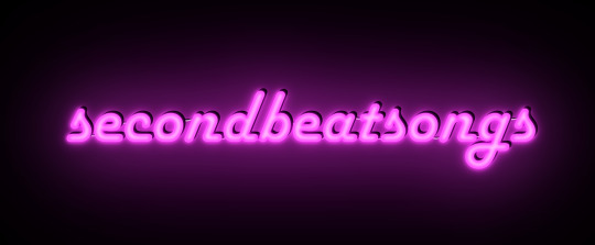
lookit that. stare at that beautiful perfection. I love it. this brings me joy.
and now: the one that will be the most work
let's gooo Beauty School Dropout!
this one I'm using as an example for what to do with a font that's a bit too pointy to look realistic

this font is really fun and bendy, but the ends of the letters are flat instead of rounded, and the corners are a bit too sharp. so...let's fix that!
now, there are several ways we can do this (after doing Object to Path ofc).
one way is to edit the path yourself, going slowly, and making sure everything is perfect, editing the nodes individually.
or, you could select the text layer using the node tool, then click the button in the top bar labeled Add Corners LPE, and then drag the little circles and triangles around to smooth out the corners
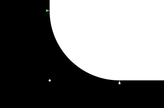
I've decided to do the LPE method, but the problem here is that if you apply the LPE effect before making sure all of the corners look good nodes-wise, it's hell to try and fix it. so before LPE-ing, look at all the spots that you're going to apply the effect, and make sure each has one point at each sharp corner, with no weird overlapping bits. okay? okay.
also for the line beneath the text, it looks like it's made up of a bunch of different segments

and since I want to keep this line because I think it looks cool, we're going to have to deal with that, and make sure that it's all one solid piece, otherwise the outlining won't work. so I've gotta delete all the extra segments, and then move the points on just one of those segments until it's the full original line width, before rounding those corners as well.
basically I've got my work cut out for me here, this will all take a bit.
...aaand an episode and a half of Supernatural later, here's this!

look at how nice and round that is! perfect for the rest of the neon process
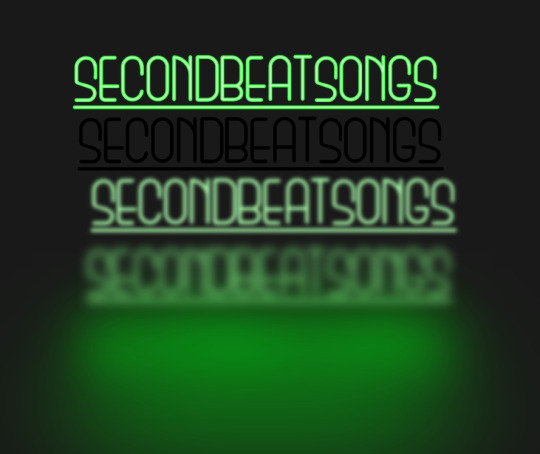
and with cords, shadows, layering, etc

hell yeah.
more things: it's block font time
let's make an outline-style neon sign!
my seven layers:

for all but the last two, I've not used the fill option with them at all - I have simply used the stroke outline.
now don't be worried! the stroke-to-path still works just the same way even using an outline to begin with! so it's easy to get an outline of an outline, and do the offset thing just like you did before
however, because this font is more complex-looking, there will probably be some errors when you offset it

for example, it didn't fully outline the second half of the Os, so I just copied the left halves, mirrored them, and replaced the right half with the complete left half
pro tip: keep in mind that you have to re-apply the offset to any bits that you add to the outline layer!
doing the same steps as last time, editing the glow blurs as I see fit, once again we end up with beauty and perfection.

another thing you can do: turn off the lights!
I'm going to use Beauty School Dropout and Harlow for this, but after making your beautiful neon signs, here's how to make it look like a turned-off sign, for if you want to make...idk, a gif of a light turning on and off, or a burned-out sign, or something like that.
so start with (ideally, duplicated copies of) your neon signs:
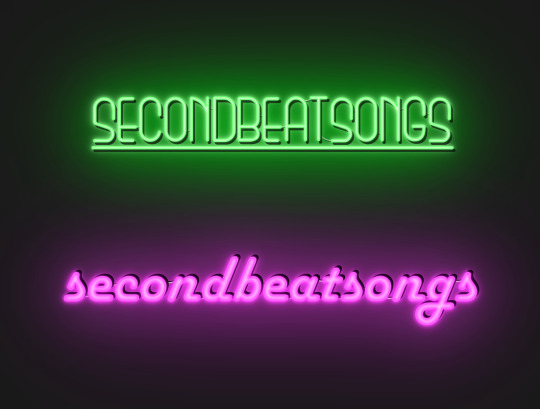
and then simply delete every glow layer, change the outline layer to 90% grey and your main layer to 70% grey, change the cords' color to a darker shade of grey than whatever it already is, and lower the opacity of the shadows by about 10-15%.
doing that, you end up with this

bam! lights turned off!
last thing: logos and other stuff
you can make neon signs with images as well as with text! the steps are essentially the same, though you may have to do more editing to make it look good, and use simplify on the path if it's too detailed.
and if you're using anything besides an .svg, you first go to Paths -> Trace Bitmap to turn your image into a vector! but unfortunately I've already used 29 images in this post, so here, just look at this Keith Haring thing I made as an example:

is it messier than the text? yeah for sure. does it have some pointy bits I could smooth out more? definitely. but, I've watched three episodes of Supernatural today, and that is more than enough time spent on this. so this is what you get.
but yeah, that's how I make neon signs in inkscape! I used to do it in GIMP, but this works much better, and looks so nice and clean! <3
(man, graphic design really is my passion)
#tutorials#inkscape#reference#neon#graphic design#tbh this is definitely for my own reference too because I know I will eventually forget this process#but I want it to also be useful to other people#so here!#inkscape tutorial#enjoy#graphic design is my passion#tutorial
136 notes
·
View notes
Note
Hey! I love your art so much and was wondering what brushes and/or art programs you use, I'm an artist myself and am just genuinely curious. Sorry if this is a strange ask or anything... I don't use or get on Tumblr too often. Thanks for reading this ask and have a good day/night. (This is my first ask to anyone I think)
hey!!! i use Paint Tool SAI 2!
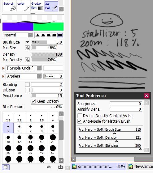
as of the moment (which means i constantly change it) here is my main doodling/sketching/lineart brush:
my coloring brush: any hard edged basic brush will do, you can also use the bucket tool or the lasso tool, it's simply for coloring
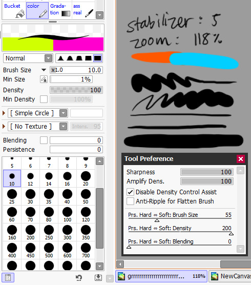
my blushing brush: i blend this brush out by switching to transparency (making it an eraser) and lightly tapping the outside of the paint! (sai users, do this by pressing C on your keyboard. lifesaver been using this shortcut for years) it's versatile, i love using it for gradients
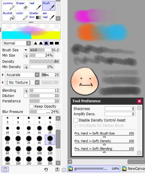
marker brush (usually for ecto): i use this brush only when i want to paint ecto (which i don't do often) but you can use this for other purposes too! it's not my favorite, not even good enough for ecto imo, because my sai 1 version is much better i blend things out the EXACT SAME WAY as the blush brush so please keep that in mind!

a basic brush im testing out for shading purposes: it has a little bit of texture and is made for baaasically cel shading but slightly softer and has the tiniest bit of color mixing

blending brush i barely use and don't actually really like that much: i'm still testing out blending brushes that i like because i can't find one that i like that isn't just blurring colors together or making them muddy when mixed together. if anybody has suggestions, PLEASE let me know! anything like a procreate or csp blending brush that can be recreated would be great
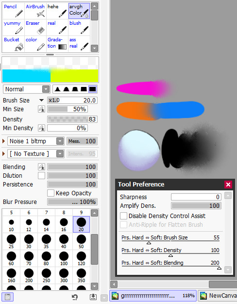
and finally, my rendering brush: it's basically a basic hard edged brush that can pick up the smallest bit of color i use it to clean up and add final touches by using the drop picker often and over the entire artwork

ofc, change anything to your preferences. that's how it goes these are just the settings that work for me :) this also goes for the program LOL i know sai is not for everyone (but it's my baby my bestie my 5ever so like this is about ME)
i have an in-depth post about my CSP brushes and how i work with them (and i don't really ever use csp unless it's a big piece so it's not changing anytime soon) if that's what you have or prefer
my #ref tag is also a treasure trove of my old settings over the years if you'd like to see those too
81 notes
·
View notes
Note
Hi, your art is stunning. May I ask what program you use to draw digitally, and if you have any tips on how to get the forms and colors as incredibly accurate as you do?
Aw, thank you! I still feel like very much an amateur at this; my first digital painting of this type was this one, a month ago, and I don't really know what I'm doing, so take my advice with a grain of salt.
I use Clip Studio Paint currently, though an older version from when it was a one-time purchase instead of a subscription. (Why is everything subscriptions these days.) In the past, I've used Krita, which was free, but I haven't used it for this kind of painting per se.
For these paintings I've been using the default "Dense watercolor" brush for laying out blobs of color and the "Transparent watercolor" brush for subtler shading and smoothing. I expect these are not the ideal tools for this or anything, just sort of the brushes I've gotten most used to working with in coloring in CSP, which I stumbled into kind of randomly while messing around.
To get the forms right: something I started doing for my Good, the Bad and the Ugly kick early when I'd started on that in September was to do a rough sketch with the screenshot on the canvas at the same size and every now and then drag the sketch layer over the screenshot to check myself off - see if I'd made some feature too small or positioned it weirdly, etc. This felt a little like cheating but it did also just kind of help give me a better sense for it and for the ways in which my initial eyeballing tends to be off so I can adjust for it, and then once I had the very rough sketch of where everything is, I could detail freehand on a second sketch layer from there which feels a lot less like cheating.
However, for the last three paintings I did, instead of doing that I have been using a trick I saw my dad using when doing traditional oil painting, namely using a grid: enable the grid option in the CSP view settings, line the reference up with the grid, and then focus on each individual 'tile' of the grid. While working on this latest one, my canvas looked like this, for example:

So when sketching and while working on it from there, I could look at the individual square on the grid that I was working on and try to match it to that individual bit of the reference, which is a lot easier than trying to eyeball the whole thing at once.
As you may be able to tell, the colors don't feel super accurate to me when I'm working on it and actually looking at the screenshot beside it; it's all a little off and less detailed, but then it looks a lot nicer once you crop the reference out of the canvas. For this one I actually experimented with using the color picker tool to pick out some of the extremes of the colors I worked with for each given area - some of the brightest highlights on the face, a nice midtone, some of the deepest shadow - but this isn't all that helpful because film grain means the overall impression of the color is different, and there are a lot of nuances. Something I did do, also for some of the previous paintings where I specifically didn't use the color picker as a challenge to myself, is try painting a brush stroke on top of the area in the screenshot whose color I'm trying to replicate and keep adjusting until it feels like it just about blends in. But even then color is very hard. There are so many subtle nuances and shades and it's hard to adjust the exact shade of some color I've already put down other than by just painting over it again and then redoing the details - unless, of course, I just put another layer on top and set it to Hue or something. I did that a little with the barbed wire around his neck on this one, to make it less blue after I'd first put it down.
Buuuut mainly I think the key to making these sorts of things look good, as far as I've felt, is just to be willing to spend a whole lot of time noodling on them. There's always more you can do with it to make it better.
I found the checking myself off by dragging the sketch on top of the screenshot trick very helpful, even if it does feel like cheating, just by virtue of the fact it makes the outcome look better, which makes me less likely to ultimately go "ugh, this isn't right" and just want to stop working on it and move on. And that's very helpful, at least to me.
Finally there's the general just draw a lot, etc. I have been posting art daily on this blog since the beginning of 2016, and it's been a slow journey of my very intermittent efforts at human portraits getting slightly, slightly, slightly better each time. Just these feel like a pretty massive level up in the space of a couple of months, though, and I think that's largely just because I got obsessed enough with a movie to want to spend the time to draw one million cowboys instead of doodling Pokémon, and also allowed myself to use whatever neat tricks would help me make them come out well enough to stay motivated on it.
7 notes
·
View notes
Text
how i fuck with color like that: a hopefully helpful guide

STEP 1: SUSPEND YOUR DISBELIEF
skin doesnt have to be skin color. grass doesnt have to be grass color. free yourself from these shackles.
STEP 2: PICK COLOR PALETTE
pick 3-4 colors you want to be the main colors of your piece, but know you can use transitional shades and stuff like that as well, so you arent limited to those exact 3-4 colors

for this piece, this was the color scheme i went with, but obviously a lot more colors show up! general rule of thumb i follow is 1 dark tone, 1-3 mid tones, and 1 light tone. if you're painting digitally, you can reduce the saturation to check that your values are distinct :3
also if you're painting digitally!! you can use tonal correction (or whatever its called in your art program of choice) to adjust the hue/saturation/luminosity of an entire layer :3 which can be pretty helpful if you think your colors are a liiiittle bit off, but you want to keep the relative saturation/luminosity/etc the same
sometimes i will go to sites like this one for inspiration, but other times i just know what i want to do
STEP 3: FUCK AROUND?? IDK WHAT TO CALL THIS STEP
start slapping down color in the places you want it to go. uhhh i have no good advice for this part i just feel it in my bones. which i know is not super helpful. if you have a reference image, USE IT. its your reference for a reason. you can turn the saturation of it all the way down so you're not distracted by the hues, just pay attention to the value and stuff. don't worry about it looking realistic or smooth, in my experience the blockier the chunks of color, the funkier the piece will look.
STEP 4: FIND OUT !!!!
does it look good! hell yeah! good job! does it not look good? hell yeah! that means you're practicing! identify what you think works and what doesn't, and apply that knowledge in the future! working with a limited color palette definitely takes practice, but if you know basic color theory then you should be in a good starting position (if you dont um. you should learn that? i dont think im qualified to teach that) yeah idk basically you can just refine your piece a bit, i would recommend using a brush that has built in color mixing if you can find one of those, those are good :3
STEP 5: OVERLAYS
if you're painting digitally overlays are YOUR BEST FRIEND!!!! fill bucket tool a whole layer with one of your midtones, reduce opacity, set it to overlay (abt 20% in my experience), this will really unify the colors of the piece
get funky, get fancy, create visual interest. what i do is similar to the first thing, but i take this like. sand tool?

its one of the defaults on csp, but what ill do is i'll draw squiggles with this on a separate layer with all the colors of my color palette, then set it to a 10-20% overlay, and it gives it this grainy texture i think is really cool


piece linked above without any overlays versus with both a plain overlay and grainy overlay
STEP 6: PAT URSELF ON THE BACK FOR DOING SUCH A GOOD JOB AT ART !!!!!!!!!
^ do that. you are awesome and every thing you create is valuable even if you dont like how it turned out. you need to make mistakes to get better and you did such a good job and im proud of you for creating. <3
16 notes
·
View notes
Text
had someone ask about my glitter GIFmaking process so i will give! i exclusively use web-based programs, so you don't need to download any software for this!
to preface, my process is a bit convoluted but it's so my images aren't compressed or made fuzzy. ALSO, these steps are for PC.
this is the final result, but you can make basically anything [and probably something prettier than this, i just made this image to demonstrate rotating & resizing pixel GIFs]
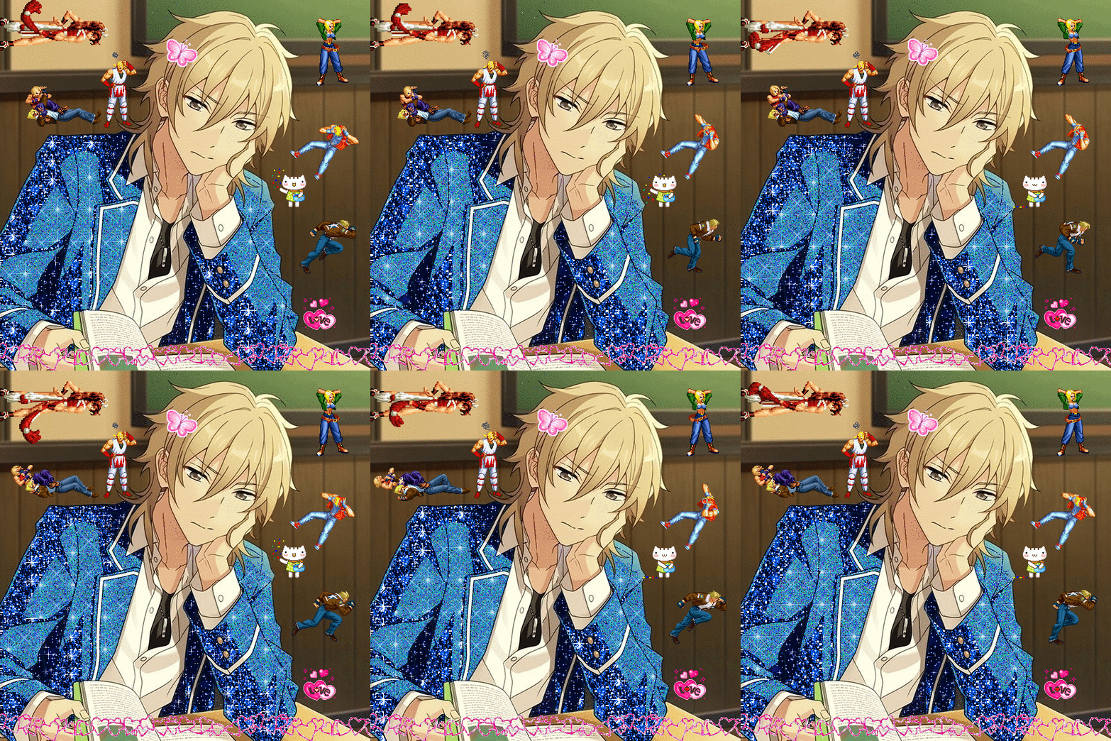
tutorial below!
the site i use for glitter backgrounds is online-image-editor.com

click "UPLOAD AN IMAGE" to get your picture in, then click the "Animation" tab. it'll take you to "Add Glitters". click that!

if your image is over 650x650 pixels, it WILL be rescaled. this is why i only upload images below that size, but it's up to personal preference and the compression isn't that bad unless you're using pixel art.
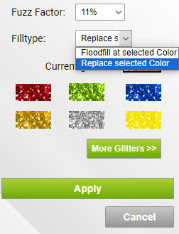
here are the settings i use when filling with glitter. i always change "Floodfill at selected Color" to "Replace selected Color" because it makes it faster, but it really depends on what you need to be filled. you just click the area on the image that you want to be filled on the preview and it'll be filled
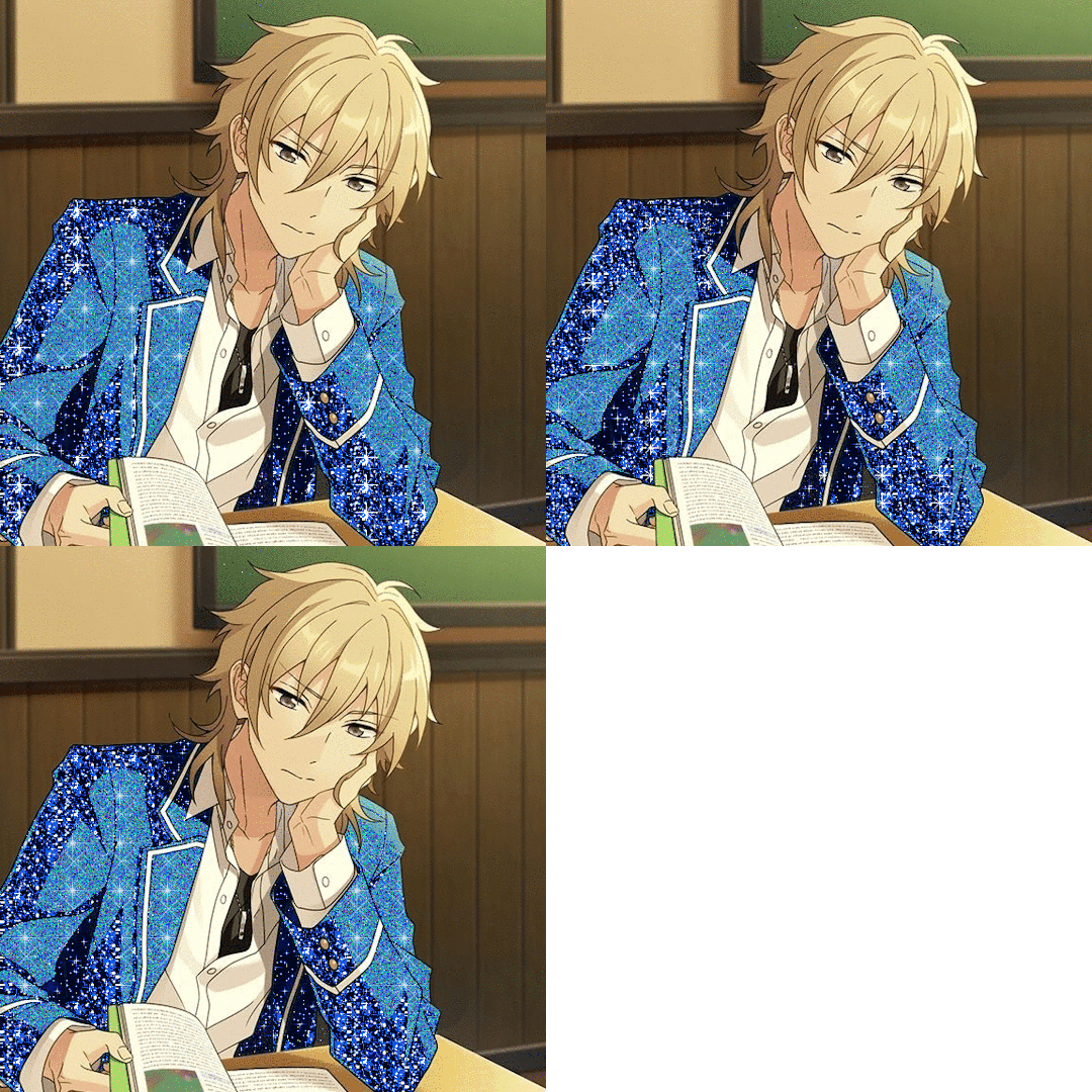
kaoru jumpscare! here's my image so far! i just open the preview into a new tab to save it. it won't be PERFECT but it'll look presentable and that's all that matters.
NOW, for adding GIFs to this unsuspecting kaoru, i use photopea.com. i usually use GIFcities.org, glitter-graphics.com or tumblr to find GIFs. where the GIFs are from doesn't matter, just make sure you save them as GIFs onto your computer.
when you upload your GIF into photopea, you might realize that it's not moving anymore!
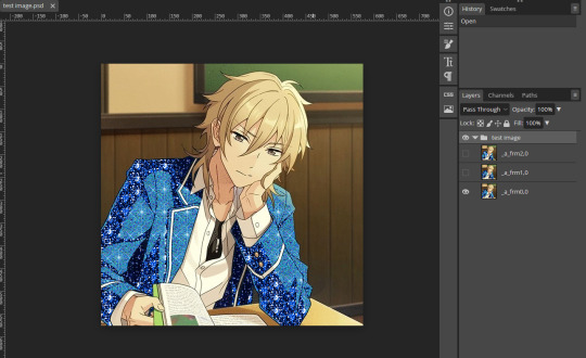
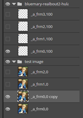
this is OK, it will be a GIF when you export it. if your image is not exported as a gif, make sure that all the frames of each single animation are in the same folder, and all begin with "_a_".
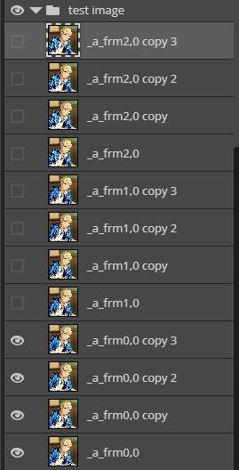
IMPORTANT because i didn't initially include this, but i recommend you duplicate every layer of your background image 1-3 times if you're inserting GIFs with a relatively higher count of frames so the glitter doesn't flash like crazy when you export. to duplicate layers, select a layer and "Ctrl+J". do this for every layer that doesn't have "copy" in its name first then repeat so you don't duplicate the wrong layers.
to open a new GIF or image, you go to "File", then "Open..." . note that you can do this with multiple images/GIFs in one go!

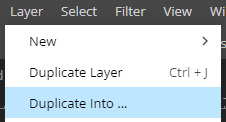
to add the GIF to the image you want edited, make sure you have selected the folder. go to "Layer" then "Duplicate Into ..." and make sure you duplicate to the image you are editing.
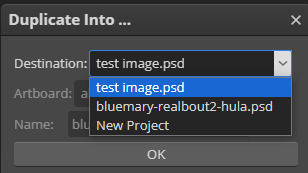
if you go to the image, it should contain a new folder containing all the layers from the image you duplicated from.
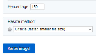
if you want to move the GIF, select the folder and use "Ctrl+Alt+T" to transform. if you only move the GIF it should not turn fuzzier, but if you want to resize the GIF i usually use ezgif.com/resize with the Gifsicle setting for "Resize method".
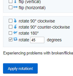
you can rotate GIFs by exact 90 degree increments if you hold the "Shift" key while rotating in photopea, however any other rotation WILL make your image fuzzier, and it's a bit harder to rotate the GIF but is possible!
i use ezgif.com/rotate for this, you can do any rotation you want but i did this one.
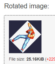
OK! it's rotated, but there's an annoying navy border so i'll show you how to get rid of that! DON'T bother saving the GIF you have just made, go from "Rotated image" and click "more tools", then "Remove background"
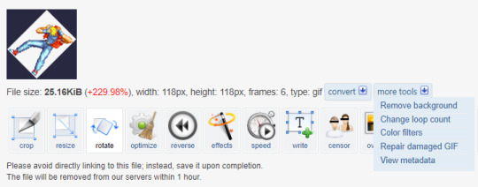
assuming you get the same navy as i do, the HEX code is #282840, but you can get you own hex code by converting the RGB to HEX [or getting a hex colour picker to work, didn't work for me. you can get the RGB by screenshotting and using MS paint]
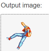
voila! it is now transparent!
after you've added all your images in and you're satisfied with your image, you should select all the layers by holding "Shift" and selecting the top and bottom folders
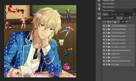
and then, you go to "Layer", "Animation" then "Merge". you can always undo this and make edits so do not freak out if you've realized you want to edit parts

now, your GIF is ready to be exported!

go to "File", "Export as" and select "GIF"!
it'll take a while for it to load in, and you might notice an immediate issue! the GIF is too fast! you can fix this by messing around with the speed dial. this is the most frustrating part of GIF making for me because my computer is slow and freezes a lot. just stay patient, and do NOT reload your browser or you'll lose all your hard work!
annnddd that's it! bye bye!
#tutorial#glitter gifs#glitter graphics#glittercore#GIF#gif tutorial#kaoru hakaze#ensemble stars#fatal fury#hope this is helpful
22 notes
·
View notes
Text
Also I think that both genAI and Large Language Models don't add anything of value. If I want to get certain pieces of art I can commission someone. That way I don't have to go into Photoshop myself and fanagle it so it looks like it was drawn by someone who knows that the average human has 5 fingers on 2 hands, and I don't commit to art theft. And Large Language Models are as good as a lucky 10 year old because they just guess what word would be the right one to say next. Fundamentally they are designed to mimic how we speak. Incidentally when you ask it something surface level chances are that it says something correct but thats because thousands or millions of people said it in the training data. Not to hit on crows but llm's are Digital crows, it mimics our speech but without the knowledge of the meaning behind it, it just knows which words coincided more often and guesses based on that information.
Whenever I see a youtube video called "I asked an AI to make x y z" I am extremely bored by it because most of the time it will be more or less random as it is not designed to write a meaningful character build for dnd. It is only designed to mimic the language of it.
Also if I want to know something I can look it up on the internet or in books myself, that way I can vet the trustworthiness myself AND I can participate in the process of learning. I think that the easy way out of learning something meaningfully can be really hurtful to us down the line.
Colleagues of mine started learning R (a statistics programming language), I have expertise in it because I use it for multiple years now and started with a year of lectures and seminars on it, I gave them resources on where to find help if they have any problems when coding. However, they decided to go the easy rout of chatgpt. It is often correct in regards to the syntax of the programming language as that is the exact thing a llm is designed for but it still makes easy mistakes that should not be done. I can for the life of me not design an effective for loop but i know that you have to give it a starting and end point. But because my colleagues don't want to read into how to code, they don't know it and struggle to get it working for a day until they ask me. They go the easy route but because of that they don't learn how to search for fixes in their code, or how to understand what is happening.
So please with that knowledge in mind and that we are setting our planet on fire stop using genAI and Large Language Models!
Y'all I know that when so-called AI generates ridiculous results it's hilarious and I find it as funny as the next guy but I NEED y'all to remember that every single time an AI answer is generated it uses 5x as much energy as a conventional websearch and burns through 10 ml of water. FOR EVERY ANSWER. Each big llm is equal to 300,000 kiligrams of carbon dioxide emissions.
LLMs are killing the environment, and when we generate answers for the lolz we're still contributing to it.
Stop using it. Stop using it for a.n.y.t.h.i.n.g. We need to kill it.
Sources:
62K notes
·
View notes
Text

Me latest experiment \ouo/
I wanted to try making a magical girl with fancy transformations and physics :3 also tried recording it as a MP4 this time so it's hopefully less compressed.
Yapping ↓
I'm ridiculously happy with the little side hair doot :3 Only real regrets with this one:
I forgot to do anything in the art with the boots when the body Y is down so her legs just awkwardly slide down into them when she crouches...oops xD
I only noticed it when trying to record the movements but in a few poses the hair at the back seems disconnected from the head. The amount of times I've made this exact same mistake agdjfk give me fifty years I'll finally get the model art right the first time for this xD
One big improvement on this one though, it's the first model I've tried to optimise. It ended up only having 655 parts.. which still feels like a lot but in comparison, the chibi dragon girl, which also had a transformation effect and alternate appearance, had 1077 pieces,whilst having less toggles and less movement so I feel like I'm at least getting a little better :3
As an extra experiment, once I'd finished rigging the model as I'd planned, I tried messing around with using the deformers the way l2d intended xD when I'd seen other pixel art vtuber models before, it bugged me how the movement usually distorted the pixel look? No hate to the artists/riggers their work is lovely and expressive, it just bugged my pedantic ass that you could tell it was clearly an image being warped (you know, like an l2d model xD), rather than acting like a pixel art animation that stayed on a grid. So when I tried l2d , I almost entirely avoided any of the deformers , and made the movement more like a frame by frame animation, but I've been trying to rig some non pixel art models and I like the extra liveliness and flexibility you can get by using the program as your supposed to, so I wanted to see if could combine the two without hating it. It's very subtle, you might need a magnifying glass xD but I was able to add a bit more tilt to the model and fix issues like the boots. I couldn't push it very far without breaking it as I hadn't set up the art with it in mind and I didn't want to spend hours and hours testing it, but my current hypothesis I want to test on my next model:
If I keep the frame by frame style for specific physics things, but rely more on the deformers for movement, maybe I can satisfy my own pedantry over pixels whilst making an overall more fluid character with hopefully even less layers- which should also help make them quicker to make. \ouo/
Will see how it goes \o-o/ so long as I don't catch the plague again I'll hopefully have this or one of me other experiments done soon :3
2 notes
·
View notes
Note
i've been wanting to get into digital art for a while, and I'm thinking of getting myself a tablet for this christmas. Any product recommendations?
i would say, particularly for a first tablet, i don't recommend a wacom, even though it's what i use currently (and what i'll probably get again if/when i eventually upgrade to a screen tablet). this is because, while the quality is great, they're very pricey in a way that isn't proportionate compared to other brands. it was one thing a decade ago when wacoms were often much better than other options, but now other brands have caught up and there's no reason to shell out that much extra unless there's a reason u need a wacom specifically. (i.e. i got my current wacom tablet as a gift years ago, but i would spring for wacom as a screen tablet bc i've done a lot of research on cintiqs vs other options and i think for my job i do need the extra oomph in terms of stuff like screen resolution/latency/parallax — not because a more expensive tablet/better performance will make me "draw better" but bc i spend so many hours drawing per week that better performance will reduce friction and make my job easier. if you're not concerned about "this device is about to be a massive part of my life so it had BETTER be the best machinery i can afford," i don't think the extra expense is worth it.)
also, specifically, the wacom intuos 4 pro is a piece of steaming fucking garbage from hell and its cord port WILL eventually die for no reason, and wacom support will not help you because how do you prove it died for no reason even though dozens of other ppl online have clearly experienced the exact same hardware failure, and then you will have to buy an external universal camera battery charger and remove the fucking tablet battery and charge it once every other day at an outlet BECAUSE YOU CAN'T CHARGE IT WITH THE CORD ANYMORE and only use the thing wirelessly. not that i know anything about that
so!!! with that said. my very first tablet was a tiny wacom bamboo (idk if they even make those anymore?), and after that when i had to replace it i got a monoprice. that was a long time ago so i can't vouch for current quality — pls look up recent reviews and do research on anything u pick — but my exp w monoprice was that it was crazy cheap and perfectly good quality. setting up the drivers was a complete nightmare, but once it was working it ran like a dream without any problems and i don't remember ever having to fuss repeatedly with driver resets, reinstalling shit, losing pen pressure, etc (all problems i have had with wacoms, and still do occasionally). that thing took me through several years of art school and then several more years after without an issue and only gave out when the actual hardware was starting to go from wear and tear, i.e. wires were getting loose and it had been dropped a few times.
those are the only ones i have personal experience with, but i've heard very good things about huion tablets, and they seem like a good middle ground of higher quality than monoprice vs cheaper than wacom.
general tips: get the biggest one you can afford, you'll be using it for a long time anyway and the very small ones are hell on your wrist. consider getting one with shortcut buttons; if you end up liking them you'll use them all the time, but if you don't (i never personally got into using mine!) they don't get in the way, so it's no harm. and when you get your tablet, find the pressure settings (there will almost definitely be a menu that comes w your tablet software, but also check your drawing program as well) and adjust the pressure sensitivity so you don't have to press down super hard!! this will save ur wrist.
69 notes
·
View notes
Note
I struggle doing art but I wanted to let you know that your work is a big inspiration to me. I love how warm your art looks!
Thank you!!! I really appreciate hearing stuff like that, there's a lot of artists I look up to and it feels really good and makes me feel accomplished to know there's also people who are inspired by me :')
To be honest, idk what I'm doing really. I'm just out here, I dont follow tutorials, I don't look stuff up, I don't watch how to vids, I just take screenshots in my dumb little games or take pics of myself in the mirror and have it up on my second screen while I draw stuff. Sometimes I search for ref pics if I'm really not sure how to draw stuff (hair braids......) but here is a tip fresh from my brain about warmth:

I use an overlay layer above everything, in warm yellow/oranges. I do this even when I don't shade anything at all, it still gives the same effect and helps everything look pulled together imo. Shading does help but it's not necessary at all. I use orange-y colors, sometimes yellows on an add layer for highlights (it's a setting in the 'blending' option, normally it will be set to 'normal' but you can change it to 'Add'. The same menu will also show the overlay option, multiply, darken, lighten, screen, ect. I use firealpaca so idk where this menu will be or say in any other program) And a deeper red, sometimes dark orange for shadows with a layer set to 'multiply'. Then adjust the transparency of each layer to whatever you feel looks the best! If you want colder looking things, just do the same exact things but with colder colors :) Coloring your lines can help, but honestly I hate actually coloring lines so I dont always do it. Also, clipping your shading layers over the base colors is life saving
Also shading, literally who cares at all where the lighting is coming from. It straight up doesnt matter, the only people who care are art snobs and nothing they say means anything anyway. Do what YOU think looks best
7 notes
·
View notes
Text
Wrapping up July a day early because nothing else on this list is getting done before August!
The two un-highlighted general goals are iffy. Definitely didn't show being comfortable with not going for longer fics since I published *reads note on hand* two new fics, which ranked #3 and #7 of my 61 currently published AO3 fics when ranked descending by total word count. I resisted the urge to end yet another chapter with someone passing out a few times, so I think that's enough of a win. (It's a crutch and I swear I'm trying to minimize it.) Met the rest of my general goals, and I'm especially proud of going over my word count goal even though I purposely set it higher than I thought I'd hit.
Whumperless Whump Event was a success as far as I'm concerned! I originally hoped to cover more of the prompts, but I was expecting to do much shorter fills if I did that, and I'm much happier coming out of the event with two new chapter fics even if I only used six prompts.
I'm running behind on the bingo prompts, but they'll stay on the backburner. There's nothing screaming to me from them just yet, and I don't want to write something mediocre for the sake of filling a prompt. Pretty sure my brain just needs some time to rotate them in the background and come up with something I like.
I overachieved on Augusnippets because I'm weak to dares, and a little Excel program I made dared me to finish the damn thing in one sitting after I'd done the rough drafts. Those are all queued up for August now. On the personal side, I got a promotion and a pay raise (and my department is restructuring, so I suspect another promotion is coming by the end of the year), so I'm talking to someone about making some art for the Augusnippets fic! It won't be ready by the initial post dates, but it'll be exciting to come back later and get to add it.
With Augusnippets done, my new focus for August is the series I've been working on. I'm still aiming for the original time estimate and just taking this surprise extra month as time to 1) slow down a little bit and 2) prep ahead for unexpected delays later. I am hoping to publish about 5k words more than my Augusnippets prompts covered next month, so you'll probably see either a random oneshot or a third chapter for Chemicals, chemicals in my brain if I get the inspiration for that. I've found in the past that counting drafted word count doesn't hold me accountable the way having a goal for published word count does, so that's what I'm sticking with for now.
I also added a new personal goal to have my total published word count for VLD surpass my published WC for Spider-Man by the end of 2025 because man... I think people see that and think I still focus on Peter when I don't. I had 100k of love for him once and it's unfortunately faded away since!
July's AO3/FFN stats will get their own post tomorrow because given the chance, I would nerd out and make this post way too long by bundling them in here. I might be a litttttttle vague about my methods because the exact tools I use are publicly associated with my real identity at this point, but if there are any other stats nerds out there, you are welcome to PM and discuss it privately! Every tool I used was free except Excel. You can block the tag #stats update if seeing that kind of thing will bother you! (It's currently just me celebrating my little baby wins since I'm not in a huge fandom anymore lmao)
July 2024 Plans!
I'm trying something new to see if it works for keeping me more consistent, so don't mind me.
Still insanely obsessed with Keith Kogane so uhh... sorry, that's all you're probably going to see from me this month if you read my stuff.
General Goals:
Get more comfortable with writing shorter fics instead of pushing for record word counts
Work on finding better end scenes for fics
Brainstorm for some longer multi-chapter fics for the future
Newly published word count: 19,920/15,000
Come up with a consistent writing schedule before August
Drafting priority - aim for the minimum viable amount of initial editing (then go back and refine everything in September)
Whumperless Whump Month:
7/1 (emergency first aid) - published
7/3 (like a record, baby) - published
7/10 (your work is never finished) - published
7/16 (say goodbye to filters) - published
7/19 (the whump morning after) - published
7/30 (I don't mean to get emotional) - published
Looking into 1 or 2 more days between the 19th and the 30th, but I haven't picked any yet! (Got sucked into another project and moved on to that!)
Really pushing to finish the days on time for this and move on no matter what at the end of the month. No completionist attempt here!
Bingo Prompts from @builder051:
Addiction/withdrawal - published along with whumperless whump fill
Self-surgery - published along with Whumperless Whump fill
Outlines for 3 other TBD squares, but unlikely to finish those fics in July (I'm short on my projected word count goal for August, so I'm expecting to get these finished and posted then)
Apologize profusely for taking 6 years to get to this
Augusnippets:
By mid-July, decide between path of hurt and path of whumperless whump
Resist urge to say I can do both because I simply cannot
Complete all outlines for chosen path by end of July (did I say outlines? because I accidentally made rough drafts for all of these instead)
Draft the first week by the end of July (I suspect work will be busy in August, so we're getting a buffer ready)
July and August are both planned writing months, but I'm expecting to take September to publish less and focus more on editing some stuff I've posted in the past without polishing as well as I could have. I also think I'll burn myself out if I try to write a ton three months in a row, so this just works out well.
Quick overview of the rest of 2024:
July - Whumperless Whump Event focus
August - Augusnippets focus
September - 1 or 2 short fics and a big round of editing my backlog; start to get a detailed outline on my Klance series
October - Whumptober focus
November - NaNoWriMo (either original fiction or a longfic I've been outlining, depends how I feel by October)
December - probably a heavy editing month (I want to get that NaNoWriMo fic edited so it can start to be published as we ring in 2025, but that probably means I won't publish anything new in November or December)
7 notes
·
View notes
Note
Hi, this is an art-related question. I thought of asking you for advice since you seem pretty polished in making commissioned art ^^. Do you take the canvas size into consideration when someone commissions? Like, does it affect the price or anything. Sorry, I'm still learning how to do commissions and I'm trying not to mess up.
i tend to stick to a similar canvas size with most of my art, both commissions and personal work. the exact dimensions that i have my program set to as the default is 2500x2000px, and i'll sometimes mess with the dimensions a bit if the composition requires a wider, taller, or square canvas, but the number of square pixels doesn't often change by too much.
i can, of course, make the canvas larger or smaller than my standard if the client asks, but i don't see any reason to adjust the price in accordance to the canvas size and shape. in my experience, it doesnt change the amount of time and work that goes into a drawing.
17 notes
·
View notes
Note
Hi! You work a lot with prints and that stuff so i wanted to ask you if there are important things i have to take into consideration when printing? I recently test printed a 2000x2000 piece (i think that's around 6 inches) and at 300 dpi but for some reason the colors look off? It also looks like when a picture has a lot of noise, like the colors don't look very smooth, maybe it was because of the printer but i don't really know
Hi! I’m not an expert when it comes to print making by any means but I’ll try to let you know what I know!! gonna put it under the cut since it got quite long!
I’m not sure about the noise, if your piece was at 300dpi and looks smooth digitally then it should translate over to print just fine! That’s only if your drawing was //drawn// at 300 dpi and not converted later. If that’s the case, then it might be an issue with your printer! If you’re using a local place like Staples or OfficeDepot, or using a bad quality printer at home then you’re likely to get a low quality print that will have some grain to it! It is possible to make nice prints with a printer at home, but you have to consider the paper and print settings. Settings for printing a black and white document on printer paper are gonna be completely different from printing a full color image on glossy photo paper!! dfkljfsd that might be a little obvious, but I wanted to mention it jic since I don’t know where you printed your test! Also, if your canvas was originally around 6x6 inches and you’re trying to print it bigger, you’ll run into the same loss of quality. I always reccomend drawing bigger than you plan to print (or at least at the same size for bigger cavnases) since sizing down is better than sizing up! As for the colors, what you’re probably noticing is the difference between RGB and CMYK! RGB refers to the colors we see on monitors and screens, while CMYK refers to actual print colors. When you try to print RGB colors, especially bright neon-y ones (or sometimes specific hues like purple), they often come out looking more desaturated or in a different tone than the original art piece as the printer ink cant make the exact colors. CMYK basically just refers to the ink cartridges in your printer! A lot of artists use programs like Photoshop (and maybe Clip Studio?? idk) to convert their pieces to CMYK as they work in order to see how the colors will transfer over irl. Some prefer to simply work just in CMYK as it makes it easier and there are no nasty surprises after printing. Personally? I kinda just ignore it sdksdfjkl, the printer I work with for my prints converts my artwork from RGB to CMYK better than when I try to do it myself with a program, and I’m satisfied with that. Printers tend to convert things to CMYK automaticallys, and personally I find my art comes out brighter than if I convert it to CMYK beforehand. So its really a matter of preference, but once you adjust to the initial shock of having your colors changed, its not a huge deal imo (my very first print ever had a neon pink background and you better believe i was so disappointed when it came out looking grey af sdfkjlldfks) I know some home printers are pretty good at replicating RGB colors. My friend had like a 5ink cartridge printer and she used it to print stickers and they turned out a lot brighter. So, that’s a possible advantage to making prints at home if you’re willing to invest in a nice quality printer. Lastly, bleed is very important. Full bleed refers to when the artwork on a print goes to the very edge. Without full bleed your art will have a border around it. Its important to make sure your art doesnt have important text or graphic elements too close to the border as they could potentially get cut off when cropping the print. Every printer will have their own specifications, but most will recommend that you work with a canvas that is slightly bigger than the size you are printing in order to account for bleed. Ex: If you want to make an 8.5″x11″ print with full bleed, you’d wanna draw on a canvas that is a quarter inch bigger all the way around (or whatever the specification that you printer requires). So you’d draw on an 8.75″x11.25″ canvas instead, making sure that important details dont touch a 1/2 inch safety border around the whole print. (The safety border includes the quarter inch that gets cut off and then another quarter inch inner border just in case.) I know all of this might sound confusing and overwhelming but its really about trial and error. Take advantage of ordering sample prints/soft copies before you order a bunch in order to ensure that your print turns out nice! Once you get the hang of it its really not that much work to format! The company I use is called CatPrint, and while they have their ups and downs, I’m familiar with working with them and their quality is usually pretty good. If you order from them, please use my referral link as it helps me out and will get you $10 off your first order!
#FAQ#sorry if there r any typos i dont have time 2 proofread this rn but i hope this helps a little!#Anonymous
41 notes
·
View notes
Text
Juilliard is the tip of the iceberg. If Juilliard grads are struggling to find work – coming from one of the the most prestigious and well funded programs in the country, with some of the most high profile instructors – imagine the job prospects of all the state school grads. It's hard to imagine any scenarios where potential employers are going to take a ***** State University candidate over someone from Juilliard.
What follows may be my longest tumblr essay ever, buckle up for a ride through the perils of music education and a few ideas and solutions along the way!
And yet music programs around the country continue to expand the number of students in their programs – more students is after all in best interest of the institution (more students=more funding) – somehow without much regard to the hard numbers of how well these graduates will do in their careers.
Now, I work in music education and I readily acknowledge that changing this system is like changing the course of a glacier. For over two hundred years the higher education system in music has focused on a relatively narrow range of topics and techniques to train musicians. Berlioz's irreverent send-up of scholastic fugues during the finale of his 1830 Symphonie Fantastique is just one early example of students rankling at the limits of what was taught in school.
And for the first hundred or so years of the conservatory system (the 1800s), especially when it came to orchestral musicians, the product generally matched the demand - well trained musicians to play the music of the times.
On the other hand, I defend the traditional idea that not everything about a music education in a university has to be about job preparedness. For example, whether or not a musician teaches music history or theory for their career, I believe they should be well rounded and have a knowledge of those things. I tell my students: you want to be the whole package. And no matter what innovations come in music education, it would seem unquestionable that certainly the program should train musicians in excellent technique and performance.
I don't have the answers. I wish I did. I wish every person who wants to make music for a living could go to college and leave prepared to have an enjoyable, reliably profitable career in making the music that makes them happy. But right off the bat if you want to make pop (or any popular genre of) music or video game music or movie music – most university programs can hardly begin to help you with that. While some few specialized programs exist, you've really got to be the cream of the crop in the first place to even get your foot in those doors.
But where are the musicians making the money today? What skills do they have that enable them to make this living? And why does a music education have so little to do with either of those answers?
Many first year music students are surprised and disappointed to find that unless they want to be a band conductor, an orchestra musician, or a private instructor, being a music major may not be for them. And indeed it may not be! Many of the 20th century's and now 21st century's most wealthy and successful musicians became so without a formal music education behind them. Same for many of the ones who, while not wealthy, are working in studios and in live gigs with a steady income. Talent, work and creativity have always mattered a lot more in music than a piece of paper from an institution.
I have been wondering lately whether all of this really boils down to the fallout from the invention of recording technology over a century ago. Prior to the age of recordings, western musical notation had had a thousand years to develop and influence the way music was made, performed, and disseminated. Simply put, if you wanted to write, share, or perform music widely, then written music notation was pretty much the only way to do so. The accumulation of this tradition lead to the heights of late 19th century romanticism and the dawn of musical modernism. It's a staggering artistic achievement for humanity, no doubt about it, and it was all made possible because each generation could build on the written tradition of the previous one.
However, the advent of audio recordings abruptly interrupted (and/or accelerated) this progression/fragmentation. The need for creating and reading sheet music has gone from being universal to being niche - as long as the song can be performed, it can be recorded. The middle-man of notation no longer has a monopoly. This has led to the rise of new genres and commercial aspects of music that have fluctuated with the changing times and technology.
Jazz is an interesting case – an entirely new musical genre whose rise I would credit to recording and broadcast technology. Suddenly you didn't have to have tickets to an exclusive venue, training at a fancy school, or even the sheet music. You copied and learned from what you heard on the radio or recordings. You learned right from the best, right in the comfort of your home. You got playing experience doing live gigs. The genre evolved rapidly from Jelly Roll Morton to Louis Armstrong to Duke Ellington to Charlie Parker to Miles Davis to John Coltrane in just a few decades, becoming a well established and vibrant musical language – so well established that it can now retroactively enter higher music education. Those early jazzers would be quite amused, I think, that you can now (as I once did) get a degree in jazz.
Unfortunately, the same effect may be happening to Jazz education as happened to classical music education – the education becomes more about preserving the past than about keeping the music itself alive. (Have you heard some of the things the best jazz musicians are doing today? It is as far from even the wild jazz of the 60s as the earth is to the moon. Still recognizably jazz but not anything you'll learn in school!) Perhaps by its nature, a music education is only capable of teaching about the past. But I think that's an assumption worth challenging.
We may expect a trained jazz musician to be able to play big band styles and bebop with equal fluency, much the same way a violinist may be expected to play Bach and Brahms and Boulez. But is there a point at which a music education becomes too fixated on the past without adequately preparing for the right now, let alone the future, of life as a musician?
In fact, every non-notated music tradition is at risk of the same effect due to recordings. Say you recorded a native music maker from an endangered tradition in the early or mid 1900s. Now for all time, to make music in that tradition there is this temptation to calcification - hardening the whole style around a few interpretations just because they happen to be the earliest of which we have record. The reality is that no musical style ever stays the same forever. Those recorded in the 1900s were not even doing the music in the exact same as their parents, let alone 50 or a 100 years prior. The times changed, the people changed, the music changed.
It will always be that way. Music education may be a glacier set on its course but the flow of music increasingly is finding its way around and beyond it in terms of the art, the artists, the culture, and the money. Now, the times still change, the people still change, the music still changes, while the cultural and practical relevance of a formal music education wanes and wanes.
Man, I hate being so negative about this, but to fix things you have to first diagnose the problem. So let me propose a few solutions or at least work-arounds, especially for music majors.
- don't go into a music degree expecting it to do everything for you. Understand what it is and what it isn't. It will help you be a good musician. It may not prepare you for many other aspects of the career. You can do everything right in a music degree, pass with 'top marks', and still not be ready to go to work in your field.
- do look for opportunities to perform and make music outside the university. How do you expect to suddenly have music making be a money-making enterprise if you haven't already been practicing that? Why wait until you are a 'pro' to start a youtube channel, self release recordings on bandcamp or soundcloud, to self publish sheet music on sheetmusicplus.com? It takes time to build up a following and a reputation and it doesn't come automatically just when you get a diploma.
- do everything you can to learn about music business, copyright, contracts, recording, sound engineering, advertising, etc. whether or not it is required for a class. Learn what you need to know, not just the minimum for the grade or degree.
- be disciplined with your time. Give due diligence to your classes and practice but don't let those things take over the rest of your time. Balance your life and your art. If you don't learn to do that in school you'll have to learn it while trying to start your career...and why wait until that crucial period?
- you've got to be quite committed to make a music career work. It may involve participation in a combination of money-making streams - academia, private lessons, performances, recording, etc. You may even have to balance music making with other non-music income (I know of a successful composer who loves her second career as a yoga instructor). Carefully consider if all this is for you. You can have a lifelong, satisfying and fulfilling engagement with music making without ever making it the sole focus of your study or employment. There is no shame in seeking stability in a career, which music just can't promise.
- don't dismiss the value of the things in your college education that may not be "directly" relevant to the functioning of your music career. Modern college education has a foundation in the ideal that each person should have a well rounded grasp of some of the basics of the world. There's a reason all college grads are required to take classes like math or sociology or science. Practice finding that reason with each class and you'll have a happier time getting through those hoops. There can be relevance in pretty much any topic but don't expect college to spoon-feed you the application of that knowledge.
- Same goes for music topics that seem irrelevant. Just because the class is talking about music history, theory or repertoire that seems useless to you, it doesn't mean that you don't want to know those things as a musician. As I wrote above, you want to be the whole package: a well rounded musician who understands a thing or two about many aspects of life, the world, and music culture specifically.
- do take advantage of every resource that is available for your success. This may not be only within the university system. Look everywhere for mentors, professional contacts, grants, support, performance opportunities, learning opportunities and creative outlets. If you meet somebody who is making it work, pick their brain, ask for their help! If you aren't a voracious type of learner inside and outside of school, being a music major is going to be a tough road. Why suffer through four plus years just to eke out the degree that may not even lead you to a job?
- make the music of TODAY, of RIGHT NOW. Make music that matters to you and to your peers. Make music that is relevant and current and is more than a living museum. Don't be afraid of new music, be afraid of a world without new music!
- keep up with changes in the industry, especially paying attention to where the money is coming from and going. A music career doesn't have to be all about money but, you know, making a living matters unless you are 'of independent means'. Could be NFTs, could be grants, could be (as in the article above) playing your instrument with unusual ensembles. Be as creative with your income pursuits as you are in your art and I bet you can find a happy balance between making the music you like and making money in the process.
- don't give up hope that all the brokenness I mention above can be fixed. Total cultural change is possible and perhaps inevitable within a generation. Balance learning from the past with a push to make a difference in the directions you want to see.
I'll see you in a more vibrant and sonically rich world!
R. Michael Wahlquist | March 2021 | Rexburg, Idaho
10 notes
·
View notes
Text
Sunflowers (pt. 1)
Summary: The reader has been with the Avengers since they rescued her from HYDRA. She has joined them on countless missions since then but this may be the hardest one yet. Set in 2016 CA:CW.
Disclaimer: I do not own any of the characters in this story. It’s purely fiction.
Characters: steve rogers, tony stark, natasha romanoff, bucky barnes, sam wilson, wanda maximoff, clint barton, peter parker
Word count: 4.5k
Warnings: angst, depression, violence, death
a/n: hey!!! i did it! my first fanfic.

When the Avengers raided the HYDRA base you were kept in, they found you inside a cryo-chamber sleeping peacefully. After every personnel was captured, they transferred you to the compound along with artifacts and files of experiments they performed. Eventually, they found your file. It was quite lengthy. Your father was working for HYDRA but he turned on them and planned to take them down. As a result, they silenced him and your mother. They knew that whatever he knew about HYDRA, he told her. They spared you because you were just a kid. Instead, you were out on the Thanatos program. It was your father's project and it was almost done up until his betrayal. They thought you would be perfect for the program. They could groom you to the perfect obedient soldier they needed. On top of that, what could be more cruel than using your father's work to torture you?
They gave you a version of the serum used on the winter soldiers, with their own upgrades of course. They incorporated it with the Extremis serum and that left you with a super soldier that can breathe fire. Phoenix, they called you. The ultimate weapon of death.
After briefing everyone on your situation, they woke you up. You stepped out of the chamber confused. You were met with unfamiliar yet kind faces that it overwhelmed you. You made a run for it and nearly burned down the entire medical wing before they tranquilized you again. You woke up in a small glass cell where they told you that they meant no harm. Somehow, you believed them.
That was a year and a half ago. Now, here you were walking around New York and trying your best to be part of society. After extensive amounts of therapy of course. You were on your way back when you saw an old man in a flower shop organizing his stalls. You were mesmerized by the flowers' beauty and found yourself crossing the street to get there.
"Looking for anything specific, ma'am?" he asked
"No, not really. Maybe something cheery?" God, why are you so socially awkward?
"Well, in that case," he said, "here are some sunflowers." He handed you a bouquet.
"My wife loves them. When she's upset, I get her these because they always look towards the sun and the color brightens up the room," he said with a smile.
"Thank you so much," you said as you handed him a $20 bill "Keep the change"
You were now back at the compound and you were rummaging through the kitchen in search of a vase. You didn't find any (Seriously? a state of the art training compound owned by a billionaire doesn't have a vase?)
"I guess a pitcher would do," you whispered to yourself as you headed to your room.
"What is that?" asked Tony.
"Sunflowers. Got it from the guy near the train station. It's a good metaphor when you think about it. They're always looking on the bright side. I didn't get many opportunities to go sunbathing when I was at HYDRA." you said with an awkward chuckle.
"Alright. Fair enough. I'm headed to MIT for the speech thingy. Wanna come?"
"Nah. I still have to catch up on culture." you giggled. Years of working for HYDRA also didn't give you a lot of me-time.
"Okay well if you change your mind, you know how to get there."
"Copy that."
You headed to your room. Yours. You actually owned something. You turned on your TV and scanned through the channels. Doctor Who reruns? Sure. Hours had passed and you've scanned through hundreds of channels. You decided to turn on some news in the background while you read.
"On breaking news, eleven Wakandans are amongst those confirmed dead after a violent clash between the Avengers and independent mercenaries in Nigeria." Your head bolted up and you reached for the remote to turn the volume up.
"Brock Rumlow, former SHIELD agent, led the team of mercenaries to procure a biological weapon being tested at the Center for Disease Control Nigeria Division. It was believed to be a suicide mission as eyewitness account said Rumlow wore a type of bomb in his vest. Avenger Wanda Maximoff contained the explosion only to have the blast thrown into a building killing a total of 30 people. We have yet to receive an official statement from the Avengers. More details tonight only on Channel 6 News at 8." You listened with intent and your heartbeat was beating fast. Those poor victims. Is the team on their way home? Are they okay? How is Wanda doing? Your mind formed a million questions.
"FRIDAY, call Steve Rogers." a faint ding let you know that your request is being done.
"Y/n." Oh, thank god he's okay.
"Steve! Are you guys alright? I saw what happened. I am so sorry."
"We're alright. Search and rescue was already on the scene when we left."
"How's Wanda? Do you need me to do anything?"
"Physically, she's safe, y/n. Emotionally? This is gonna take a toll on her."
"What about the others? Nat? Sam? You?"
"We're gonna be fine. We're on our way home."
You met the team on the law of the compound. They were visibly stunned and you cut through them to hug Wanda. She was your best friend and you know that this was going to affect her greatly. You were right. She locked herself in her room and the only thing you heard was the sound of the news and sobbing.
In his office, Steve kept replaying what had happened in Lagos. Knowing him, he was gonna blame himself for this. You wanted to leave him be but your concern for Wanda kept you standing by his doorway.
"Steve? You got a moment?"
"Y/n. Do you need anything?" he said as he paused the video on his computer.
"No. I just wanna say I'm sorry about Lagos. Sam and Nat told me what happened."
"It's not your fault, y/n. It's mine. Rumlow mentioned Bucky and all sense of the mission disappeared in my head."
"Don't blame yourself. Bucky was or is, your best friend and he's still missing. You have a right to have emotions."
"Thanks. I... uh... I needed that. Have you talked to Wanda yet?"
"No. Her room is locked. Maybe you should try talking to her. Both of us saw you as a mentor. She'll listen to you."
You gave him a faint smile and headed for the kitchen. Maybe some food could help them. You moved the vase of sunflowers from your room to the middle of the large dining table.
Tony walked in and asked everyone to meet in the conference room. He got the news as he was coming home from Massachusetts. After a brief interaction with a grieving mother and the news of the mission, he knew what he had to do.
Inside, you were met by General Ross and his assistant. Rhodey was already inside and the rest of the team followed suit. Wanda had stopped crying but you knew she would never get over this.
The general discussed the Sokovia Accords with the team. As much as you'd like to be on Steve's side, you knew the team needs to be put in check. One more incident like this and the world might lose their trust in you. You agreed with Tony. Rhodey and Sam were discussing, or perhaps fighting would be a better word, over the Accords. Tony just sat there looking like a rebellious teen listening to his parents' lectures.
To prove a point, Tony showed the team a picture of Charlie Spencer. He died in Sokovia after Ultron planned to drive the human race into extinction. You felt your heart drop. He just wanted to do some good and he was caught in the crossfire.
At that point, the fighting and bantering was too much and you just zoned everyone out. You wanted to cry and you knew that the team was slowly drifting apart. Steve walked out after receiving a text. You didn't ask why. He has a private life after all.
You decided to take your frustrations out on the punching bags. You finally had a home. A family. But you feel the world caving in around you. With one last punch, the punching bag came flying through the room engulfed in flames. You fell to your knees as tears clouded your vision. Dum-E, who Tony programmed to follow you around with a fire extinguisher as a joke, finally put his programming to use.
"Y/n." a familiar voice called to you
"Nat. Hey." you struggled through the tears.
"Talk to me."
"I- I just want the team to stay together. You guys are the only family I have."
"Me too, y/n. I used to have nothing till I found this family."
"I want to help. What can I do to help?"
"I'm off to Vienna for the signing of the Accords. I'm meeting Steve on the way to try and change his mind. Maybe you can help."
"I'll try."
Nat took you to a cathedral. Steve was on the other end by himself. He looks... tired. On the altar was a picture of Agent Carter.
"Oh. That's why he left."
"Hi, Steve. I just wanna say I am so sorry for your loss," you said as you walked towards him.
"Nat. Y/n. What are you doing here?"
"We didn't want you to be alone and I'm also taking y/n with me to Vienna for the signing of the Accords."
"There's plenty of room on the jet," you said
"Who else signed?"
"Tony, Rhodey, Vision."
"Wanda?"
"TBA."
"Clint?"
"He said he's retired."
"There's still time to change your mind, Steve. Come with us to Vienna." you pleaded one last time
"You know why I can't do this y/n. If I sign, we're surrendering our freedom to people with agendas different from ours."
You felt a lump in your throat. "I'll be in the car." You said to Nat as you turned around not looking at Steve once as you walked out of the church.
"She hates me now, doesn't she?"
"No, she doesn't. She's just scared."
Nat was right. As always. You got in the car and tried to meditate. You didn't want to cry. Not when cameras surrounded you. You tried to steady your breathing but your brain seemed to do the exact opposite.
~~~Flashback~~~
"Injecting serum in five seconds." an emotionless voice said. You tried to break free but you were strapped down to the table. Even if you weren't, it was like you were trapped in your own mind. You couldn't move. The next few hours were a blur to you. The only thing you remember was the excruciating pain coursing through your veins.
"Serum successfully administered."
"Good. Take her to the cell for the remainder of the process."
You woke up in a pool of sweat inside a dark room. Alone. Like you have been since you were a kid. You don't remember much of it. Sometimes you see your parents in your dreams. You were 5 years old and they took you to the park. Your mom was helping you get to the other end of the monkey bars while your dad went to get snow cones. You were happy. But that memory was soon followed by the sound of gunshots and screaming. You couldn't understand what was said but you didn't need to be a genius to know it was full of anger. Your mom told you to hide and you did. But they found you anyway. Since then, you were subjected to vigorous training. You now know 30 languages and deadly fighting skills. You became a weapon and today was the final step of your transformation. Eleven years of training and they deemed you ready. After they reprogrammed your brain to be obedient, of course.
The man in the army uniform handed you a folder. "Your first mission, soldatin," he said, "Procure the obelisk. No survivors. No witnesses. You have 48 hours. Report back here as soon as it is finished." You nodded and opened the folder. It was of a tiny village at the base of the Swiss Alps. In the middle of it was the said obelisk encased in glass. You took a handful of soldiers with you and you headed for the village.
You succeeded in your mission. The obelisk was safely placed inside a containment unit in the jet. The village was burned to the ground. Bodies were piled on the streets and the only sign of life was your team and a handful of livestock the villagers kept. With that, you headed back.
"Very good, soldatin. Go with the doctor." and like the good soldier that you were, you walked behind the man in the lab coat.
You passed by a few offices on your way to the medical wing. Amongst other things, the serum enhanced your hearing. The faintest whispers sounded like normal talking.
"You heard about the mission?"
"Yeah. I heard y/l/n didn't even show mercy for those villagers." the voice chuckled.
"Bettenhauser's gonna be pleased." said another.
"I bet. He and y/f/l/n worked together on the program and seeing it do its purpose mus be so satisfying"
"Her father was an asset for us. That was before he betrayed us, though."
"Well, we got her now. She is an even bigger asset than her father ever was."
You kept walking and you ended up in a room with four other people in coats. In the middle of a room was a large glass case with a chair.
"Step inside the chamber, soldatin. You need to rest." and just like that, your feet dragged you inside. One of the coats placed a mask on you amongst other things. You felt your eyelids getting heavier and heavier and heavier. Gone.
The glass chamber now safely enclosed your unconscious body. Your body was now as cold as ice.
~~~End of flashback~~~
Since that first mission, you had killed hundreds of people for HYDRA. Innocent people. They haunt your dreams to this day but what's done is done. All you could do is help as many as you can.
You were taken out of your trance by the sound of the car door closing. Nat now sat beside you.
"Eagle Hangar please," she said to the driver
The drive to the hangar was silent. So was the flight to Vienna.
"Here goes nothing," you said to Nat as the elevator doors opened. World leaders were gathered in the room and cameras were flashing everywhere. A lady with a clipboard checked you in and quickly walked away.
"I see you are not fans of the spotlight." said the man in the suit. You later learned his name was T'Challa. Prince of Wakanda.
"It isn't very flattering," Nat said to him.
"Well, considering your last trip to Capitol Hill, you seem to be doing great so far." you chuckled at his response. You read about that months ago. You even saw it on YouTube on "Black Widow most iconic moments compilation.
"You don't seem like a big fan as well." You told him
"The accords, yes. The politics? not very. Two men in the same room can get more done than a hundred."
"Unless you need to move a piano." the voice behind you said
"King T'Chaka. This is Y/n Y/l/n. Allow us to apologize for what happened in Nigeria."
"Thank you, Ms. Romanoff. I'm sad to hear Captain Rogers won't be joining us."
"That makes three of us." You replied to him.
Just then, you heard a voice come on through the speakers asking everyone to take a seat. King T'Chaka was giving a statement when both yours and Nat's attention was drawn to his son who was looking out the window.
"EVERYBODY GET DOWN!" He screamed as he bolted for his father.
Like instinct, you threw yourself in front of Nat. It's something that you started doing after you joined the team. You thought after all the lives you've taken, protecting as many as you can could "wipe the red off your ledger" as Nat put it. You were a very effective human shield as a result of the serums. You weren't immortal nor did you have instantaneous healing due to the reaction between the two serums but you still healed faster compared to average humans. You felt a spray of glass cut through your skin and a searing heat touched your skin. Search and rescue came after the explosion and took you and Nat to get medical attention. You were perfectly fine but Nat had a few cuts and bruises. In typical Nat fashion, she walked it off like it was nothing.
You were taken to a tent to get a fresh set of clothes while Nat talked to Prince T'Challa, now king under horrible circumstances. When you got out, he was gone and she was on the phone.
A few minutes later, your phone rang.
Captain Grandpa calling...
you dropped the call and went to check on NAt
~~~BUCHAREST~~~
News outlets revealed Sargeant Barnes, Bucky, was behind the bombing. You knew Steve was gonna go after him. He'd been looking for Bucky since SHIELD fell. Now, he found him in Romania. Orders were given to shoot him on sight and Steve wouldn't let that happen.
~~~BERLIN~~~
Bucky was now in custody.
"What part of don't make things worse didn't you understand?" you asked Steve
You were in one of the offices watching Bucky getting evaluated by the doctor. You were in the other room talking to Tony about what would happen to your teammates.
"We're lucky they aren't in jail," he said
This was all too much. You went to the bathroom to splash some water on your face. You hadn't slept in 24 hours nor eaten anything. You looked in the mirror and fixed your hair as best you could.
BLACKOUT.
What was happening? You ran out and saw a lot of commotion.
"Get me eyes on Barnes," yelled Everett Ross.
You saw Nat and Tony walking towards the exit.
"What happened? What can I do?" you asked
"Don't know. We need to find Barnes." Tony said
"Please tell me you brought a suit," said Nat
"Sure did. It's a lovely Tom Ford three-piece two-button. I'm on active duty non-combatant."
Just as he said that Agent Carter, the younger, ran past you "follow me," she said. The three of you did and she led you to the facility's lobby.
You had never met Sgt. Barnes but from what Steve told you, he was a good man. The person you saw in the lobby was not him. He reminded you of your time at HYDRA. Cold and merciless. A soldier.
Sharon and Nat ran in and tried to fight him to no avail. You managed to get him down but he pinned you n the floor. He was trying to choke you and as a last effort to break free, you took a deep breath and exhaled a stream of fire. He dodged out of the way and you managed to get up. The next thing you saw was T'Challa going after him. You set fire to the staircase to slow him down but he still got away
You went outside only to see Steve on the rooftop pulling a helicopter from the sky. Sometimes you forget that he's a super-soldier just like you.
"Y/n coordinate evac. Get civilians as far away as you can," said Tony through comms. You wanted to help Steve but you got your orders.
~~~Fast forward to Berlin~~~
You did what Tony said and got civilians to a safe distance. When you went to meet with Nat and Tony, they told you Steve and Bucky were gone. They assumed Sam was with them too.
~~~Steve's POV~~~
"This would've been a lot easier a week ago," said Sam
"If we call Tony or maybe y/n--" he cut you off
"Who knows if the accords will let them help." he had a point. After everything that's happened, the UN would not listen to them even if they found out about Zemo.
"We're on our own."
"Maybe not." you looked at him questioningly. "I know a guy"
~~~End of POV~~~
You were now back in a conference room with General Ross. He gave you 36 hours to bring the three men in. He wouldn't hesitate to kill Steve if it meant bringing Barnes in.
"My left arm is numb. Is that normal?" he asked. Nat put her hand on his shoulder.
"You alright?" she asked
"Always." you knew that was a lie. Numbness in the left arm was a sign of a heart attack. But he's Tony. he could be bleeding to death and still say witty sarcastic remarks. You wish he didn't do that. You wished he'd open up to you more. "36 hours. Geez."
"We're seriously understaffed," said Nat. It was just the three of you there now.
"Would be great if we had a hulk right about now. Any shot?" Nat shook her head
Not even the Hulk. It would be nice if just Bruce and Thor were there. Maybe things wouldn't be as bad. Bruce and Thor would've deescalated matters before you could say Mjolnir.
"You really think he would be on our side?" she asked. You hadn't thought of that but knowing Bruce, he would want the team to be together.
"I have an idea." Said Nat
"ME too. Where's yours?
"Downstairs. Where's yours?" said tony.
~~~QUEENS~~~
"Spiderman? really?" you asked Tony in the car.
"HE stopped a 3000 lbs car going 40 miles an hour wit his bare hands and he swings from webs."
"But he's dressed in a red hoodie and swim goggles." you chuckled. It was probably the lightest moment you had in the last week alone.
You and Tony knocked on the apartment door. It was answered by a middle-aged woman. She was beautiful honestly. She had those kind motherly eyes that reminded you of your mom.
"Hi. I'm Tony Stark. This is y/n y/l/n. Is Mr. Parker here? we have some good news for him." Tony sad
"I'm May., his aunt and no he's not here. He should be home soon though. You're welcome to wait." she invited you in and served you some walnut and date bread. It was horrible but you didn't have the heart to tell her. she was so nice.
"So what is this good news you're here about?" she asked. Tony didn't actually tell you what his plan was. Not in full anyways so you were just as curious as her.
"Oh its a grant from the September foundation that he applied for. I approved." as far as bullshit made-on-the-spot excuses go, that was pretty good.
"Oh, he never told me that.
"He probably wanted to surprise you," you said to her
"Probably. Are you also a receiver of the grant?" she asked
"No. I'm interested in how the foundation is run so I asked to be here" she nodded. You didn't think she'd buy it but she did. Just as he said that the front door opens and a young guy walked in. He couldn't have been much younger than you. He had his earphones n and he was going on about this nice car parked outside. Tony's of course.
He saw the three of you on the sofa and he was clearly starstruck upon seeing Tony. He couldn't even speak without stuttering. He repeated his excuse to Peter and he surprisingly went along with it. Tony asked for five minutes alone with him and you were left in the living room with Aunt May. When they got out of the room, Peter informed his aunt that Tony invited him to the compound to talk more about the internship. You knew it was a lie of course because just a few hours later, Peter was standing next to you on the car to the airport.
~~~BERLIN~~~
Vision informed you that Clint came to get Wanda at the compound. Immediately, you knew this wasn't gonna end well. You don't want to fight her but you don't have a choice
As a last effort, you tried calling Steve but hews just declining your calls. Eventually, none of them would even go through.
~~~Fast forward~~~
"Steve, you know what's about to happen. Do you really want to punch your way out of this one?" Nat said.
"Just come with us. Please," you pleaded. He looked at the both of you
"Alright, I've run out of patience. Underoos!" yelled tony. just as he did, Peter grabbed Steve's should and landed on top of the helicopter
"Nice job kid"
"Thanks. I could've stuck the landing a little better. It's just the new suit but it's perfect, Mr. Stark" he went on this babbling for about 45 seconds. You thought it was funny.
~~~
"I'm trying to keep you from tearing the Avengers apart," Tony said. You wanted the same thing. You all do.
"You did that when you signed," said Steve
"You're gonna turn Barnes over and you're gonna come with us now because it's us" You could hear the sadness and frustration in Tony's voice. "Come on" he whispered
You heard Sam's voice through Steve's earpiece "We found it. The quintet is in hangar five. North runway." you let out a deep breath. This was it. Steve raised his arm as Redwing cut through his restraints.
"Alright Lang," said Steve
"What the hell was that?" asked Rhodes
"I believe this is yours, Captain America"
"Oh great. There's two on the parking deck. One of them is Maximoff. I'm gonna go grab her. Y/n come with me. Rhodey, wanna take Cap?" said Tony as he grabbed you by the arm and flew towards Wanda... and Clint?
"There's two on the terminal. Wilson and Barnes"
"Barnes is mine," said T'Challa
~~~Fast Forward~~~
"Wanda. I think you hurt Vision's feelings"
"You locked me in my room."
"I did it to protect you."
"Wanda, stop this now. I don't want to fight you but you know I will."
"I can't live in fear anymore, y/n." and with that, she used her powers to drop cars at you.
"I'm done playing nice. You want a fight? I'll give you a fight." you said as you aimed fireblasts at her and Clint.
A fight has now ensued between the two teams. Tony attached a miniaturized jet pack to your back so you could chase after the others. Steve and the others were making a run for the hangar when Vision used his laser to stop them in their tracks. You landed in front of them, skin now glowing red from the fire inside you. The others followed suit.
"You must surrender now." Vision's voice thundered over you despite being in an open space. You were now face to face with your friends.
"What do we do, Cap?" asked Sam
"We fight."
"This isn't gonna end well," whispered Nat
"They're not stopping," said Peter
"Neither are we."
a/n: what do you guys think? I hope you like it. it's my first time writing fanfic. criticism would be greatly appreciated. part two coming soon depending on the response to this...
#steve rogers x reader#tony stark x reader#natasha romanoff x reader#bucky barnes#sam wilson#natasha romanoff#wanda maximoff#tony stark#steve rogers#peter parker#marvel fanfic#avengers x reader#captain america civil war#cacw#black panther#tchalla#sharon carter#ant man#scott lang#vision#avengers fanfic#marvel#iron man#captain america#black widow#winter soldier#falcon#spiderman#scarlet witch
30 notes
·
View notes
Note
I haven't seen All These Aus so I cant really talk about how respectful they may or may not be but - fandoms using the same ideas/tropes isn't an uncommon thing. Like yes credit if you're pulling the majority of the story/set up (like in this instance where its not something v basic like 'hlvrai but college') but I don't think its necessarily a bad thing. Like will some stuff be unoriginal, yeah, but thats.. kind of the thing that there's always going to be unoriginal fancontent (1/2)
“Like a fandoms content is really self interactive and derivative off of each other. Like I get what you're saying w 'make your own ideas' but this is something that is also happening with other universes/ideas I've seen in the hlvrai fandom. And w every big fandom, especially ones with a young fanbase. Like ik you're saying 'you don't have to stop' but this is also a result of fan community working off of fellow fan ideas. Not everyone is gonna be skilled enough to build much onto the idea (2/2) Which isn't saying that people shouldn't try or whatever. Point is really just this echoe chamber deal happens w every fandom really and especially with hlvrai's young fans its gonna be more often and with less instances that add much. Its hard to avoid that sort of thing though without discouraging a fandom's collaboration and spreading/sharing of ideas which is what results in some amazing building contributions, but also the echo chambers. (3/2) [sorry theres gonna be 1 more, I know] I actually 100% get the frustration and I've tuned out of the tags bc it has turned into that echoe chamber of like ask blogs and some other stuff. But I don't think this is something malicious, its really just... people doing usual fandom stuff of seeing an idea they like and making their own thing with it, and in this instance has led to this, but I don't think it's really deserving of a finger wagging or shaming just bc its not producing great content. (4/2)” ---------- yup, dont disagree with you there; ive seen this kind of thing plenty in other fandom spaces and my intention in sharing my thoughts on the matter was not to shame young artists from deriving inspiration from the work of others, but in this specific instance there's almost an over-saturation of this one idea of which is very articulately crafted by the original writer, quote “protag gets trapped in an old fashioned computer program and interacts with the cast in a 90s webcore environment, cast tries to help protag escape the computer with the eventual help of an outside source partially at fault for the main antagonist - and by extension the protagonist’s plight, in initially helping work on the program, among other things”. this is a very hand wave-y synopsis but u get the idea almost every re-imagining of this au follows that exact formula, tells almost the exact same story with little deviation, and that under normal circumstances would not be a bad thing for most of these swap aus if there werent, like, literally a dozen of them now. i know for absolute certain no one copy of this idea has ever had malicious intention, and it’s definitely not any one particular person’s fault for contributing to any degree, but it does tend to encourage a bit of piggybacking off of the ideas of other people by copying, rather than taking inspiration from a given piece of media and applying it to their own work, which isn’t necessarily a problem with an immediate (or necessary) solution, if there even is a solution to begin with as i’ve said i’m not asking people here to drop everything they’re doing and start working on something different, at this rate the hlvrai fandom is so saturated with hundreds of au ideas that if i were to ask you to name one completely random idea offhand i could probably find at least one art piece or a blog for it by now - and that on it’s own is entirely fine! multiple renditions of a similar concept is fine, so long as it isn’t a premise as hyperspecific as y2k’s, imo i think a good example of “same concept, personal rendition” that’s been relatively harmonious (from what i’ve seen at least) has been the merfolk aus. ive seen at least 3 different fics for that on ao3 all of which i follow and they take the same general ideas (and mer species, oftentimes) and run with it in completely different directions. there are probably tons of other writers and artists for that medium too and i think its fucking great! its really awesome to see peoples individual takes on a concept like that, au wise, and while the core concept is the exact same there’s not too much overlap in environmental premises the issue i take with people doing similar for the likes of y2kvr is that y2kvr in and of itself is a very unique take on the general, webcore “trapped in a computer/game/etc” theme, it has it’s own unqiue premise, nd i feel like people have overall honed in more on said premise and setting rather than the core concept itself, which has churned out a lot of spinoffs of something much more hyperspecific per result. in general i think people have taken sub-aus a bit too far for this specific concept and i wanted to try and maybe discourage anyone else from jumping on the train at this rate without permission, since mothra has pretty clearly expressed a sense of discomfort towards it now regardless of my thoughts and opinions on the matter comparative to others, at the end of the day it’s more important to listen to and respect the wishes of the creator, whether it be asking permission first or holding off entirely from here on out . thank you for the ask(s)!
1 note
·
View note