#and you decide to do it with negative photoshop effect
Explore tagged Tumblr posts
Text
Naturism as social justice
← Part 1, Part 2
Part 3: Mental health
Guess what kind of mental illness has the highest death rate? No, it's not suicidal depression, it's eating disorders. Anorexia in particular is deadly.
It's usually not a great idea to blame mental illnesses on things in society or the media that we don't like. In most cases it's either wrong or over-simplistic. But eating disorders are the one big exception. Eating disorders are caused by having a negative body image (plus the usual predisposing factors), and negative body image is caused by the depiction of a few idealized body types in the media to the exclusion of all others.
If your own body is a bit saggy and pudgy, and no other body you get to see is even the least bit saggy or pudgy, you start to get the idea that you are a pathologically saggy and pudgy person.
Most people are pretty saggy and pudgy by the standards of the media. These days even supermodels' bodies are Photoshopped to within an inch of their life before they'll let us see them. Whether in sports or ads or movies, we get a very small and idealized selection of the range of human body sizes and shapes held up for us to admire.
And to a point, we can blame capitalism for that. Idealized bodies sell. It's how media companies make money.
But only to a point. Capitalism is riddled with problems, but I'm afraid I hold the unpopular opinion that "Stop capitalisming!" is not a helpful solution to them. There are multiple different problems that will require multiple different fixes.
Idealized bodies sell because we pay to see them. It's hard to think of an alternative that doesn't involve some authority deciding what kind of bodies we shall be allowed to see; and I for one can't imagine how that ends without the authority becoming at least as bad a source of body-shame as what we currently have.
Now there are some who would argue that body-shame is a good thing, because idealized bodies are healthy and shaming people for having un-ideal bodies will motivate them to get healthy. This is wrong on several levels at once.
Weight and fitness are two different things. Fitness is far more important to your health outcomes than weight. Even the smaller difference that weight does make, it only makes if you're unfit -- if you're fit, your weight has no bearing at all on your health.
And at least some of the difference that weight makes, even if you're unfit, is caused by society's perception of weight rather than the weight itself.
How does that work? Well, suppose an obese person goes to a doctor with a moderately serious illness. Suppose the doctor prescribes a weight-loss programme.
Suppose the illness actually has nothing to do with the obesity, and the real cause is missed, and the illness gets worse and the person dies. They're now a mortality statistic because of the misdiagnosis.
But doctors won't make that misdiagnosis on people with "healthy" BMIs. So obese people have a worse shot at being correctly diagnosed and properly treated and surviving.
How will this show up in the statistics? Why, it'll show up as an association between obesity and poor health outcomes. Rinse and repeat.
On top of that, the actual effect of fat-shaming is to discourage obese people from getting fit, because you get fit by exercising, and exercise is when your fat body is most open to being seen and shamed.
I'm sure you can figure out for yourself what effect that has on obese people's fitness, and what effect that has on the statistical association between obesity and poor health outcomes.
Yes. If you shame fat people for being fat, you are not just not helping, you are actively making the problem worse. Don't do it.
I'm afraid that logic still applies if the fat person you're directly shaming is yourself. Other people hear you and infer what you value, and it confirms their own shame.
As I said, I'm not sure we can police the media's depictions of bodies without just creating another source of body-shame. So perhaps the solution lies outside of the media: not in the bodies we see on screens, but in the bodies we see in everyday life.
You know what's been shown by a recent study to help with body image? That's right, naturism. If you grew up seeing naked people a lot, you have a lower risk of developing negative body image.
As far as I know, no study has yet drawn the connection all the way through and shown that naturism helps prevent eating disorders, but given what we do now know, that seems likely.
Part 4 →
#naturism#normalize nudity#naturism as social justice#a human body is a human being#obesity#body-shame#fat-shaming#eating disorders#mental health#fitness#exercise#capitalism#mass media#there are no wrong bodies#nonsexual nudity#legalize public nudity
13 notes
·
View notes
Text
The Images That Always Lies (Original)
Tw: Insecurities, Starving (Maybe ED??), bullying, mental health
Please don’t read if any of these trigger you. I’m sorry if the TW is either wrong or there isn’t enough or not more.
Everybody’s bodies are perfect and beautiful, please don’t change your appearance. Love yourself because there is only one version of you.
Credit: Fantasy-nightcrystals
Don’t repost please. :)
————————————————————————
I’ve always been insecure about my body, since the age of thirteen. My body was never like those models that were on the internet, especially Instagram. The models on Instagram are all so beautiful with their perfect slim bodies, perfect eyes, mouths, nose, cheeks and everything else that’s perfect about them. School was no different with all those girls and guys having such amazing bodies that make me envy them so much. The difference between social media and school is that they act so nice, sweet and pretend to be someone they are not. In school they call me every name in the book and compare my body to others and themselves. In the past I’ve tried to starve myself, go on a strict healthy diet and extreme exercises but then I still cannot look like them. No one knows my insecurities and how I feel and if I were to confide in someone it would be my older brother James but he’s busy with his own life and works as an Oceanographer and I don’t want him to worry about me.
Recently I joined the photography class at school, and we’ve been learning to use photoshop. I have learnt…
To use filters, to edit my body shape, to change backgrounds, to manipulate the colour of an image, cropping images, removing people or objects within an image, adding text to images, organising photos for quick access, repairing flaws, such as dust on the lens or red eyes and drawing on an image with a pen or pencil.
I’ve been applying some of these skills to some of my recent posts, only small modifications, nothing too drastic yet I do not want it to be obvious. I have been getting a lot of likes and comments, but I want more. So, I decided to post a picture of James and I by using photoshop to change myself to match all the other photos that I have edited. This got the attention of my brother’s best friend Colby who commented tagging my brother and said, “What’s going on here?” to which I then replied “Nothing?”. To this, let’s just say this got my brother’s attention.
My brother came over to see me on the weekend. He suggested we go for a walk with the dog and have a chat. He asked me about the picture. He was worried that I was perpetrating a lie by making all those edits. I just want to look like all those models on Instagram and its working. I’m getting a lot of attention. What does it matter if it does not look like me? He kept telling me I was beautiful just the way I am. He just says that because he is my brother. He says that he is trying to help. He says that he is someone I can trust. I do not believe him.
After I go home, I lie in bed thinking about what James said on the walk. I flip over and flick through Instagram looking at the photos thinking about what James said. Maybe I was a little too harsh on him, I realise that social media has had a negative effect on me and has made me feel bad about myself. I realise all those pictures preserve lies and that those girls do not actually look like that.
It was hard but eventually I deleted the filtered photos and unfollowed all the people that made me feel insecure and then posted a photo of myself without any editing and with the caption “we are who we are!” After this, I am finally accepting who I am. The bullying at school has not really stopped but my reactions to it have changed. Even though everyone at my school sees me as the ugly duckling, I see myself as a swan that will not be broken or hurt by the cruel words and those images that made me judge who I was. Their mean words are like water rolling off a beautiful ducks back.
0 notes
Text
Internet Culture Art Assignment (Draft)
For this assignment, you will create your own Internet Culture Artworks.
Analyze and question some part of Internet culture ie: how we use the internet in our daily lives and how that experience influences us offline. (this should be more than a simple collage or slideshow )
Create your own Internet Art 3 (minimum) . Note: video/audio works should be no longer than 3 minutes.
For each artwork, explain your intended goals, describe the techniques and tools you used(e.g., Photoshop, apps, video, still images, programs), and evaluate what additional steps you will take to further develop your concepts and finish your work for next week.
Then, respond to 3 classmate's (minimum) post providing feedback peer review on what they have done right and what they can do to improve their work.
6de09c799ee9cc98a01537acd868b3e4d4162a8d-48-vvebcam5webcam.tifDownload 6de09c799ee9cc98a01537acd868b3e4d4162a8d-48-vvebcam5webcam.tif
To be honest, I didn't really know or have any idea of what to do for this project, but I am glad this assignment is a draft, because I feel like maybe I could have done a little better with these. The whole idea of this vibe of project I wanted to do is a computer type thing. Since I am a photographer, I decided to do a little bit of my workspace, but add some type of environment for this project and do it Internet Art wise. If you can see into details, I added a screenshot of my website, since I am a freelance photographer and have a website of my own. My cameras on the side of my workspace, and negatives on the table. I found all these images on google and added them all up on Photoshop to create this final image. What I would do to further this artwork of mine, is maybe somehow see if I can add an effect to it and make it as a gif so the image itself can have something that has to do with movement.
210921222234-7-9th-gen-ipad-review-underscored.tifDownload 210921222234-7-9th-gen-ipad-review-underscored.tif
I think for this second one I decided to do something different and include an iPad to it since I also sometimes work with my iPad when it comes to specific details on images since I am a photographer. I love how I added the notepad on the right side of the image and how I also added the rainbow snapchat effect on the top left, but added a cool filter to it, to make it somehow camouflage with the background itself. I added the background of the iPad with different screens because I feel as if when I work with it, I have so many apps open and I am basically doing so many things at once. I also used google to find the images I wanted to create on this artwork and added them all on Photoshop. I am actually so proud of myself because this is the first time that I actually took my time and created these images from scratch with some help from google images. If I had more time and for my final, I can definitely think outside the box and maybe add a cool effect to this artwork or even make it move somehow.
f974c8dvsbj71.tifDownload f974c8dvsbj71.tif
For the last and final image, in all honesty, this was my second artwork that I did and I'm actually proud of it. It could have done a little more of work and I could have added a couple of more aesthetics, but I feel like I was all out of ideas and wanted to keep it simple. I added a game as the background of the computer and added some errors to give it a little touch. I also added a PC to the artwork because I feel like that would just make the image perfect, as well as a camera on the right side of the image. Now that I see it, it is more on the simpler side, and maybe I could have added a couple of more things, but I felt as though the image was already full because of the computer. I did this artwork also on Photoshop and used google images as well. I could have taken this image a little further and probably could have used Illustrator and other apps from Creative Cloud, but that would mean that I have to do some more digging and create something that I haven't before. Maybe also used a little bit of cool effects and bring the image/artwork out a little bit more. Other than that, I now know for next time that this project/assignment is definitely time consuming and not easy to do under pressure.
0 notes
Text
How photographs can tell lies
youtube
Context in photography is one of the most important aspects to the trade as it is the entire meaning of the photograph. Bias from photographers beings a subjective perspective into the photographs they create and may be used to skew the meaning or interpretation to people viewing the image. On the contrary, people may make their own bias or judgement of the image based on how they might view it.
Photography is made by people, therefor it can be manipulated through the use of subjects or what has been chosen to include in frame. It is impossible to take an unbiased photo in photojournalism as there will always be a person behind the camera making decisions on how they want the photograph to look and be percieved.
The observer effect is a physics term that has been applied to photography through its meaning. In an experiment, electrons were observed to perform differently when being observed, much the same way people respond in the presence of cameras.
Photography can tell subjective truths or the interpretations of what someone believes to be truth. This brings a responsibility to the photographer to understand the importance ethics and power photography holds. Using photography to spark discussions about issues is a positive use of bias of the truth. However, this can be taken negatively through the use of disinformation and misinformation.
Disinformation is fabricating lies to deceive people, while misinformation is the unwilling spread of a lie. Disinformation can be used to skew other peoples interpretations of the truth to better one's argument, or persuade other peoples opinions. This can be done through the use of false equivalency (memes) by combining two images to create a different meaning. Staging images is also a way to spread disinformation and misinformation, by staging a lie to photograph. This can create a symbolic meaning or tell a story and spread a hoax. This can also be done in small ways by changing a small detail to make an image appear more dramatic.
Conformation bias stems from the human tendency to seek out information that favours one's values or ideas that one wants to believe in or already values.
Many people believe physical manipulation is a new age thing brought on by photoshop and the digital age. This is not true and has been happening for as long as photography has been around.
Deep and shallow fakes are other using of spreading false information. Deep fakes make manipulation widespread and can be hard to discern from reality. It is mostly done through ai and can be accessed by anyone. Shallow fakes are crude edits that change a small detail on an image to give it a new context.
With many ways manipulation can be used to change the truth of a photograph, how can we spot reality from fakes?
Check the source, read beyond the headline, consider your emotions and how you feel after reading a headline, research the author do decide if they are credible, do they use supporting sources? check dates on stories to ensure old news isn't being spread to back current events, consider if it is satire, consider your own bias and how you may judge the image, ask a librarian or use fact checkers to see if it is credible.
0 notes
Text
Experiment / Iteration

i made a mock-up in photoshop just to get a visual gauge on positioning, scale, colour
i knew i wanted to add an image i just wasn't sure what so i stuck to the lines of my previous work Untitled Bear to see how things could look if i were to add it
i then decided that if i just had balloons spray-painted on by stencil would go well. (with no additional imagery but the balloons.
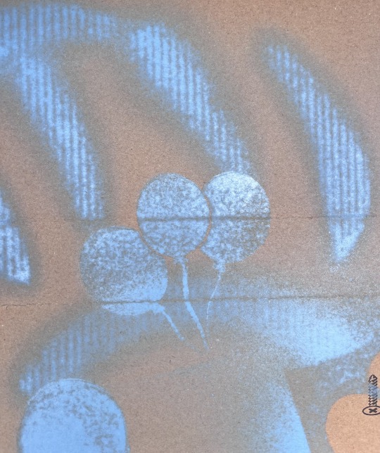

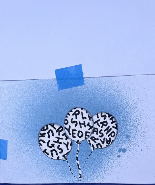
trialling the stencil on cardboard to see the outcome of using this particular stencil
i knew the stencil might be an issue, particularly the bottom end of the paper.
the cuts were to skinny which led to the paper flying around whilst spraying
i also knew that over spray would be somewhat of an issue, particularly when i applied it as the stencil was not glued down to the canvas, it was just hovering leaving open gaps for paint to travel through
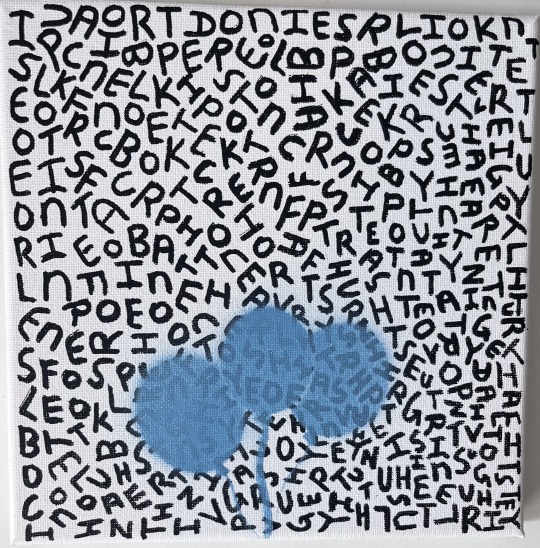
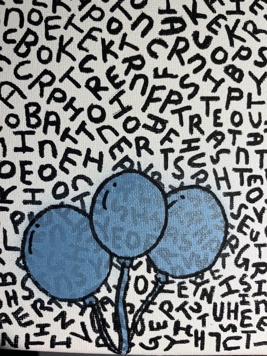
i wasn't to happy with the strings of the balloon being so skinny and also that they held no weight colour wise
i also knew that i had to outline the balloons, because if i left them untouched there wasn't enough separation between the balloons for them to be distinguishable, alongside this i realised that the balloons had to have some form of shape to them and not be this plastered on image hence the added detail lines
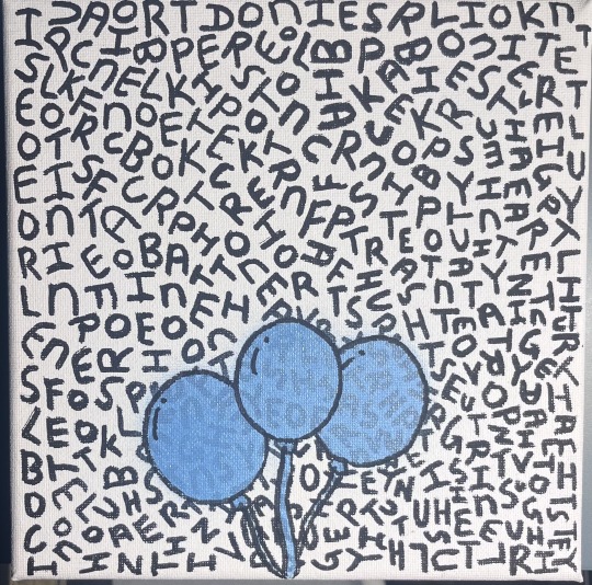
i do feel like i minimised overspray through the use of taping down the sides of the stencil as well as adding paper to cover the background from the overspray
i actually like this work and the process it took to create
there was a lot of trial and error with the stencils, especially to figure out if i should use negative or positive space, alignment
i chose to stick with just a bunch of balloons and no other imagery for the sole purpose of sticking to the theme of the text
i felt that the text provided or alluded to this space in which one is free and floating high above not bound or held down by anything
i don't know, to me it's sort of like this visual symbolism of escaping or being free, like this balloon is pulling you out of the 'normal'
i mean the text says " in space lookin for better " and " intrusive thoughts they paralyze" so i felt that the balloon would be the best or most appropriate symbol i guess, to push across this notion of being free or unbound by all the problems, issues etc.
i was going to add hands just around the strings of the balloons but i opted not to as i felt that the hands would be to clear or rather to simple if that makes sense
i like that the effect of having no hands alludes to this open interpretation, you know like theres no specific being holding on to them.
i don't know, its sort of freeing i guess, you can see the close compacted nature of the text that kind of gives of this claustrophobic feel however is juxtaposed by this balloon
reminds me of Charlie brown
also i am i guess furthering my knowledge in the applications of spray-paint
0 notes
Text
Rezzorh the edgelord

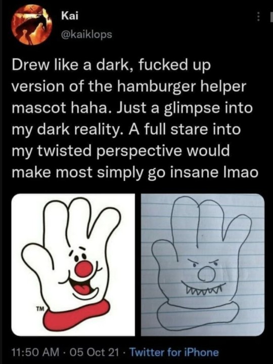
#tlkoe#the last kids on earth#jack sullivan#imagine you're an ultra powerful interdimentional being#and you gotta scare a 13 yo#and you decide to do it with negative photoshop effect#and creepypasta smile#i mean of course it's moreso cause its the show for kids but#like#still find it very funny
47 notes
·
View notes
Photo

Some of my lovely friends asked to show how I do my blending, so here is a very long tutorial! I will explain how to:
Blend GIFs with lots of movement
Blend three or more GIFs on one canvas
You will need:
Any version of Photoshop with a timeline
Basic-intermediate knowledge of GIF making (including cropping, how to use adjustment layers for color correction, applying layer masks, and placing multiple GIFs on one canvas)
Since the way I blend depends on the footage I'm able to work with, I often end up going in a different direction than I first planned. So this isn't a strict step-by-step guide that can be applied to everything you make. These are just some tips!
Read the rest under the cut.
TERMINOLOGY:
(Pretty sure you already know this but I will be repeating these a lot here, so just in case!)
Highlights & Shadows - The highlights are the brightest parts of the image. The shadows are the darkest parts. Remember that just because it's bright doesn't mean it's actually white, and just because it's dark doesn't mean it's actually black!
Negative Space - This refers to empty space around your subject. When there's negative space, it's easier to spot the focal point of the image.
BLENDING GIFS WITH LOTS OF MOVEMENT
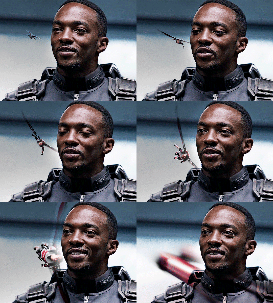
Number of GIFs: 2 Main GIF: Closeup of Sam (“big!Sam”) Secondary GIF: Sam flying (“flying!Sam”)
STEP 1: Find the right scenes Since the subject of the secondary GIF is much smaller and basically cuts across the frame, it’s important (but not always essential!) that the main GIF has less movement and a decent amount of negative space.
STEP 2: Make your individual GIFs Make your GIFs like how you usually do (Important:��Remember that your GIFs need to have the same number of frames). When it’s time to crop, it’s best to have the two files opened in Photoshop at the same time so you can compare them against each other. It’s absolutely fine for them to overlap because that’s the whole point! The secondary GIF has Sam flying in from the top left to the bottom right, so I cropped the main GIF with him off-center so there would be space to see flying!Sam.
Now we have these two GIFs:


STEP 3: Combine your GIFs Place the secondary GIF over the main one and adjust the blend mode. Setting the blend mode to Screen usually works, but in this case, this is how it looks:

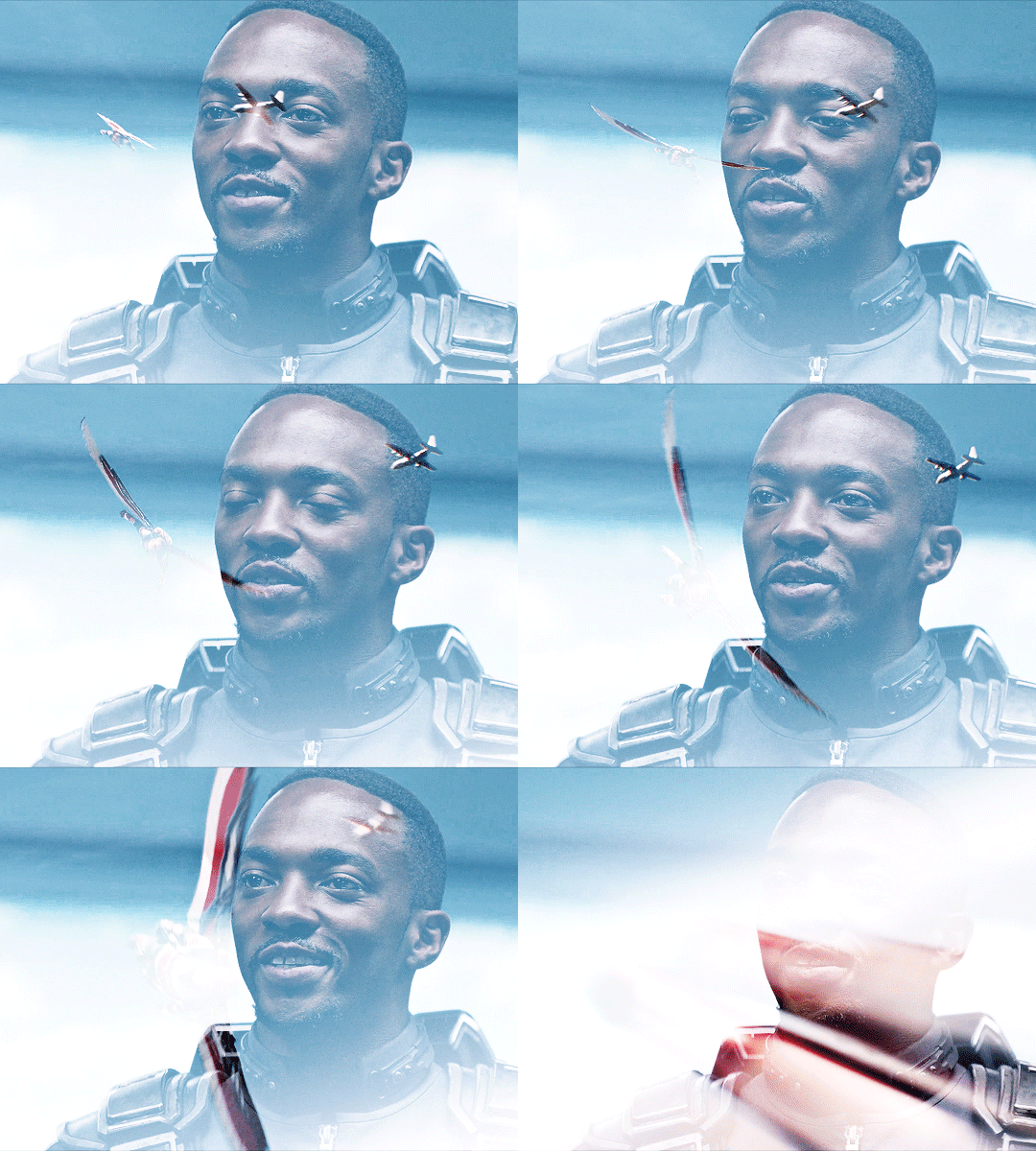
As you can see, the highlights in the main GIF are obscuring flying!Sam in the first frames. You can only see him clearly when he’s flying over big!Sam’s face. This is because the shadows on the top GIF will lighten and/or disappear against the highlights of the bottom GIF when set to Screen. It would be too complicated to fix this with a brush (which we will get to later) because of the movement in the secondary GIF, so instead I set the blending mode to Multiply, which is the opposite of Screen. Now here is the GIF:

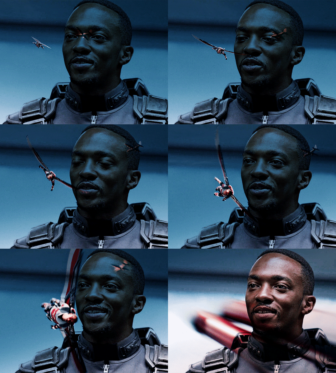
We can now see flying!Sam. But the blue of the sky is now a pseudo-filter over big!Sam’s face up until the last frames. So I applied a Hue/Saturation adjustment layer over the secondary GIF to remove those colors. The sky in the GIF is made up of cyans and blues, so I dragged those sliders down to -100. Here is how it looks now:
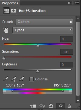
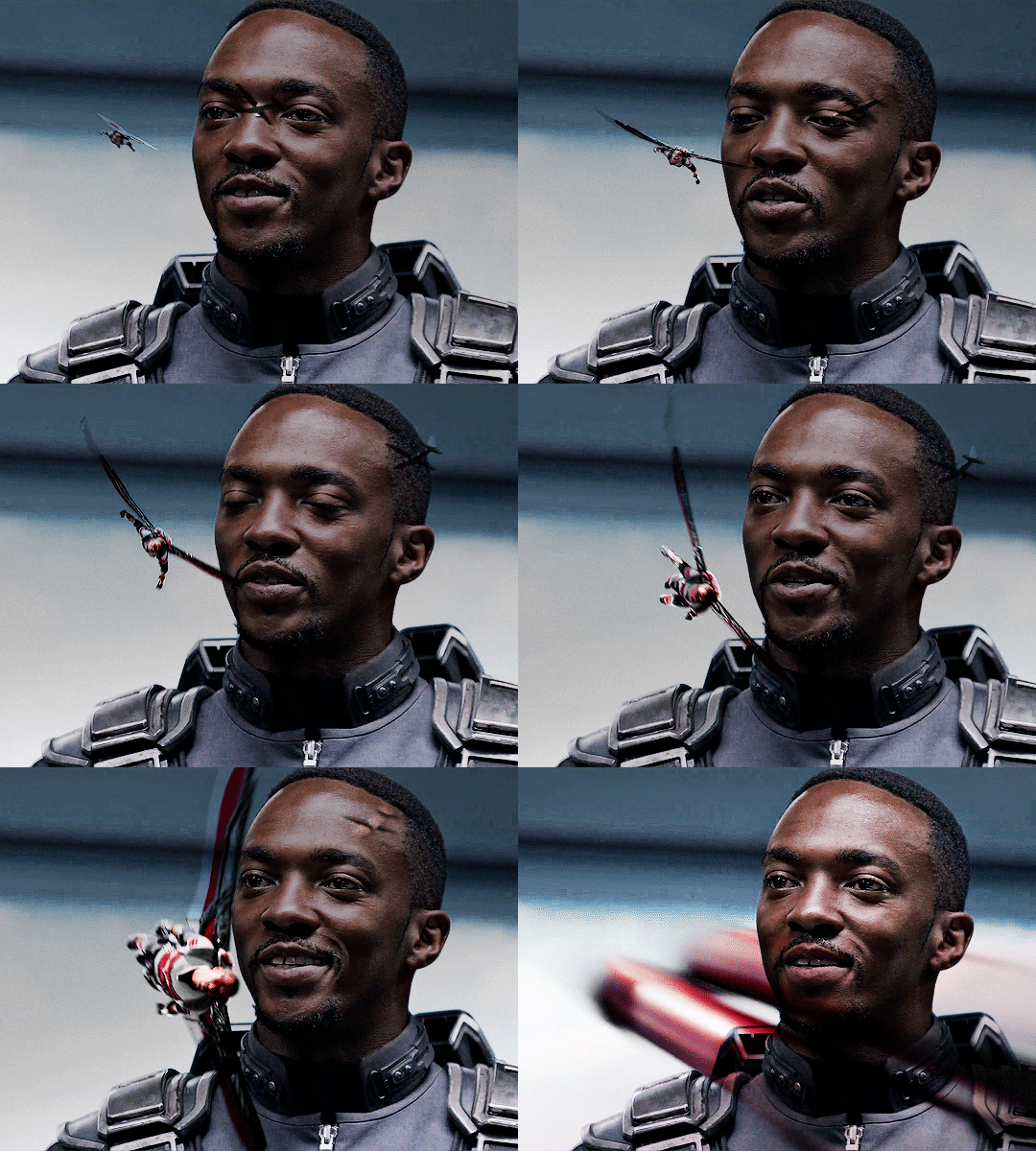
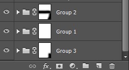
STEP 4: Erase the bits you don’t want So that big!Sam’s face isn’t covered by flying!Sam’s wings and that pesky airplane up top, we have to use a brush to erase those parts. In the Layers panel, make sure your GIF layers (in this case, groups/folders) are selected and click the Add Layer Mask button. A little rectangle next to the layer/group name will show up like so:
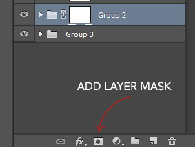
Then in the Tools panel, click the Brush tool, pick a soft brush and set the size to around 180-210px. The larger the brush, the softer the look. I learned this from Becca (@inejz-ghafa) who made an amazing tutorial a while back (will link it in the source at the bottom)! Adjust the brush size if you have to.
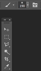
Now click on the little rectangle layer mask of the group you want to erase (in this case, the secondary GIF). When you do this, the Foreground and Background Colors buttons in the Tools panel will revert to the default black and white.

Painting with black will erase and painting with white will undo the erasure. So I erased the airplane and the bits of the wings covering his face. I didn’t erase the parts that overlap with his uniform, just to keep the effect of flying!Sam zooming across the GIF. And here is our finished product:


BLENDING THREE OR MORE GIFS ON ONE CANVAS
We will be working with these two GIFs since they use different techniques:

STEP 1: Compose your image Find the scenes you want to put in your GIF and choose which of those is the most important. Once you've decided on that, you can build the rest of the elements around it.
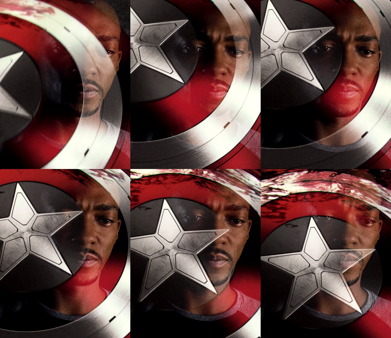
Sam's GIF: Multiple Exposure Effect
Number of GIFs: 3 Main GIF: Bloodied shield Secondary GIF: Closeup of Sam Tertiary GIF: Bucky with the shield
STEP 2: Make your individual GIFs Since the shield is the most important part, I made it the largest GIF and cropped it close to emphasize the star and the blood. I made Sam's GIF the same size, but cropped it with his face off-center so that the star wouldn't completely cover his face. Again, it's totally fine for the images to overlap! The tertiary GIF is the least important so I cropped it smaller. To determine the size of that GIF compared to the shield, I made the Rulers visible (View > Rulers; or Ctrl+R) then clicked the top ruler and dragged down to create a guide to where I wanted the smaller GIF to end. Then I measured from the bottom of the GIF up to the guide to determine the height of the smaller GIF. (Tip: It's better to make the tertiary GIF too large than too small. That way, you have more to work with. So size it larger than it will appear on the final GIF.)
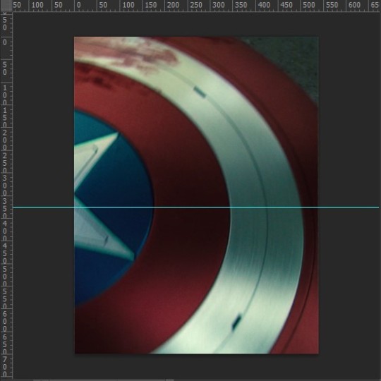
This is only a stylistic choice for this particular set, but I removed the blue from the shield and set the tertiary GIF to black and white, so that the only notable colors in the GIF are red, black and white. Varying up the coloring of each GIF (i.e. color vs. monochrome) adds some spice to the image, so play around with these different styles if you like!
Here are our three GIFs:
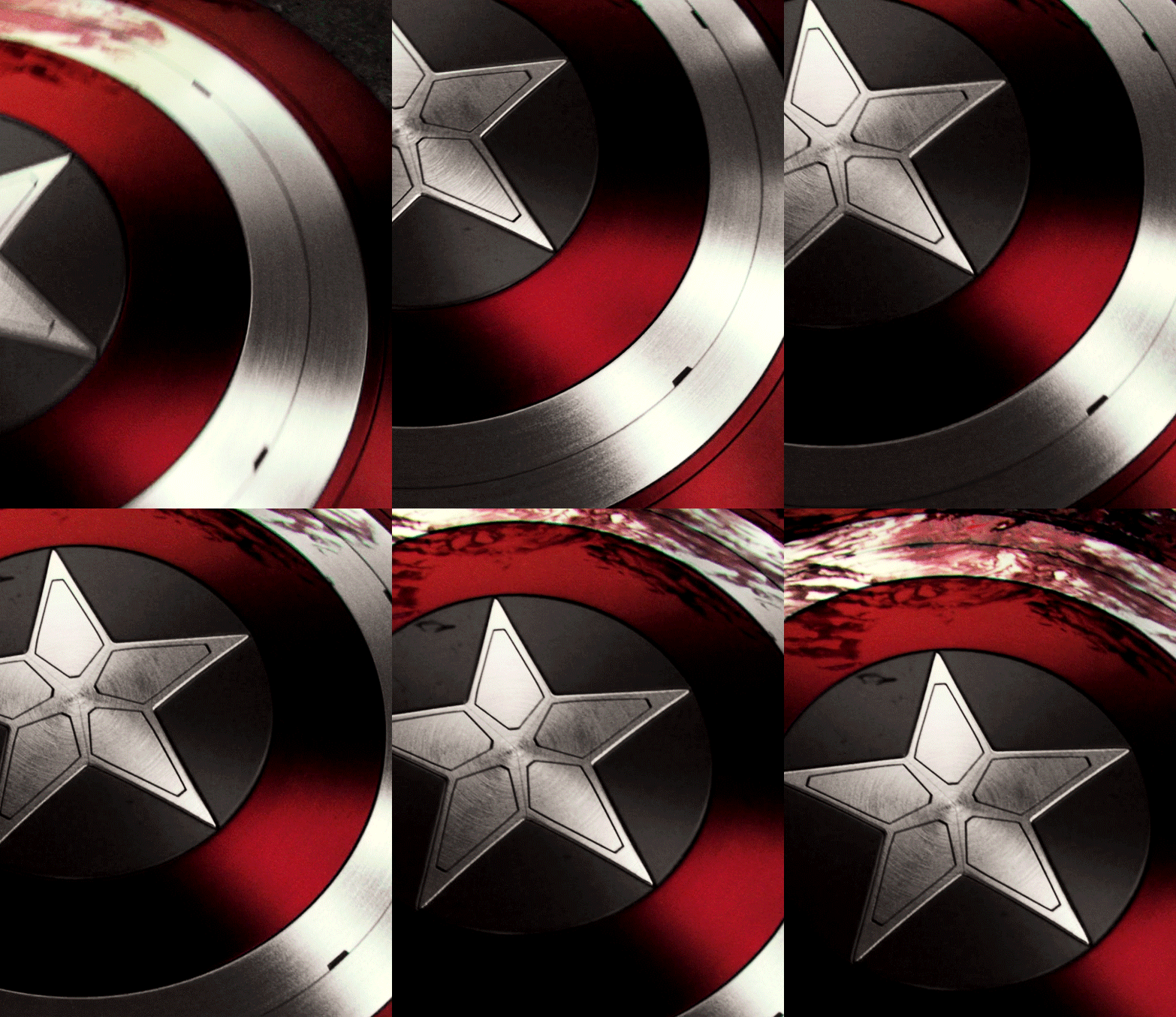
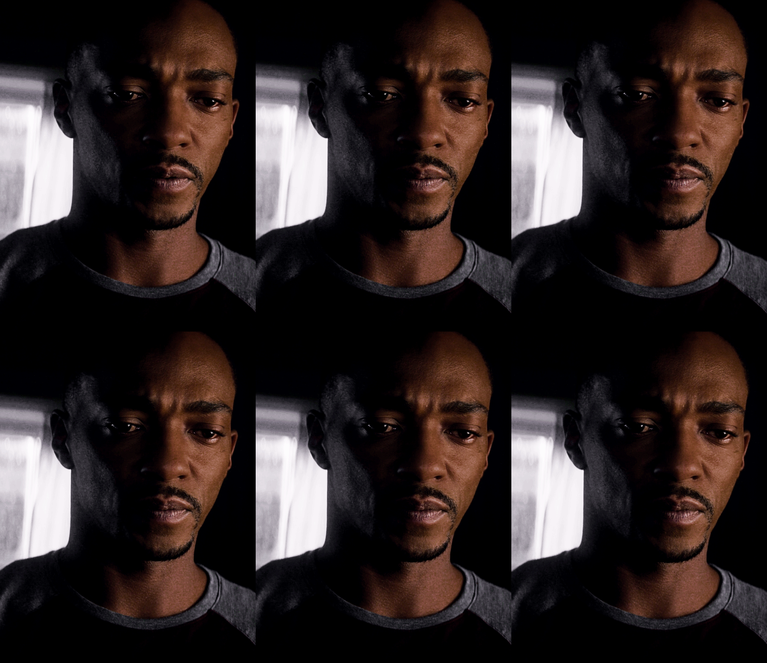
STEP 3: Combine your GIFs At first, I made the main GIF of the shield the bottom GIF. Then I placed the secondary GIF over it and set the blend mode to Screen, but found that it lacked depth. So I switched them and made the Sam GIF the bottom GIF (blend mode: Pass Through) and placed the shield GIF (blend mode: Screen) over it. And this is what I got:

Notice how the window behind Sam on the left side is distracting? It also partially obscures the star. So I went back to Sam’s GIF, created a New Layer and painted over the window with a black brush. Now here is our GIF:

This is just my personal preference, but I wanted the area around the star to be a solid black rather than gray, so this time I created a New Layer over the shield GIF and applied a layer of black with the Paint Bucket tool, setting the blend mode to Soft Light. Now we’re done with the main and secondary GIFs:


Now let’s add the last GIF:
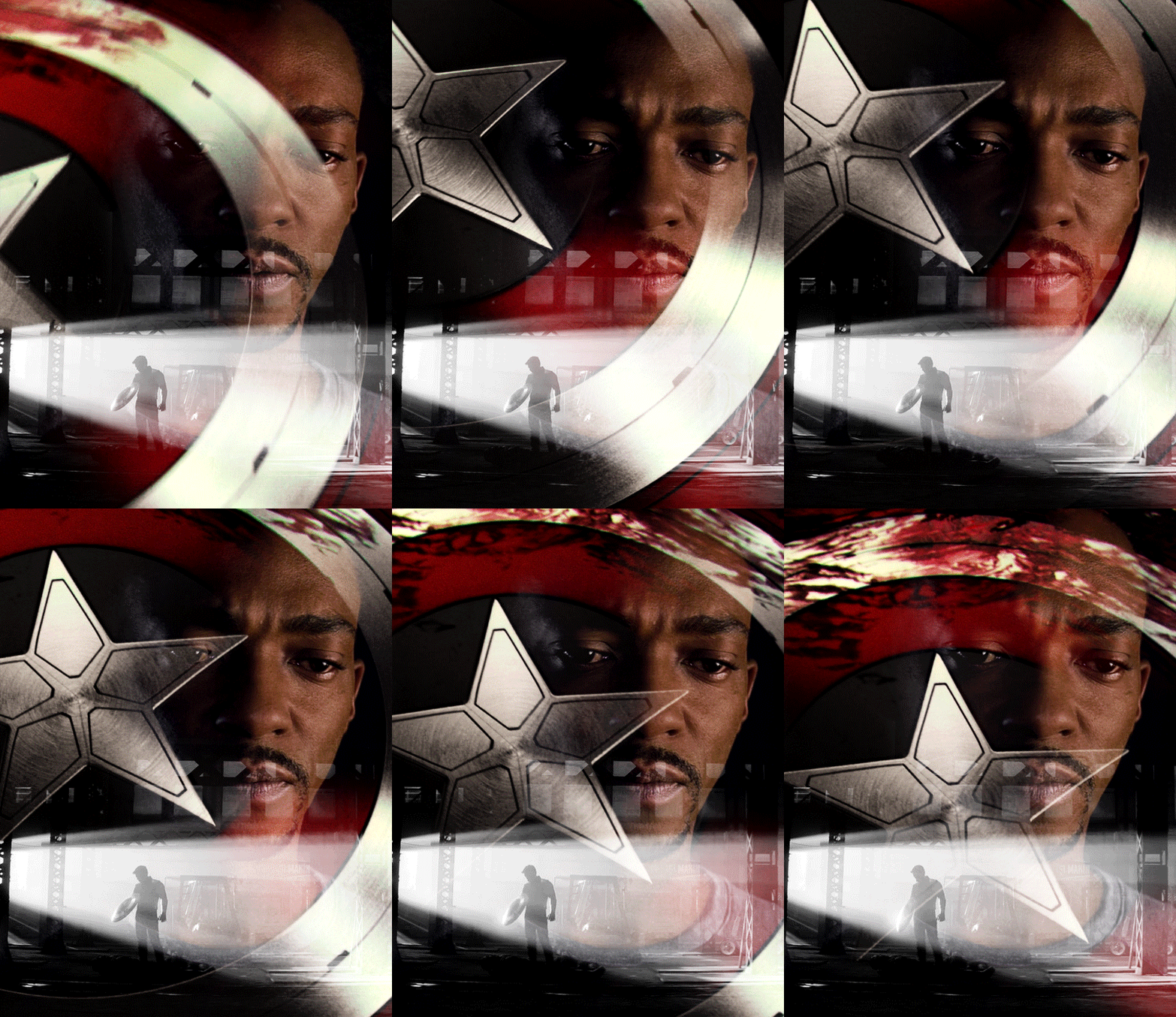
STEP 4: Erase the bits you don’t want Lastly, I erased the warehouse rafters over Sam’s face and a bit of his shirt and the warehouse floor on the bottom right corner using Layer Masks and a soft brush (like in the first tutorial). And we’re done!

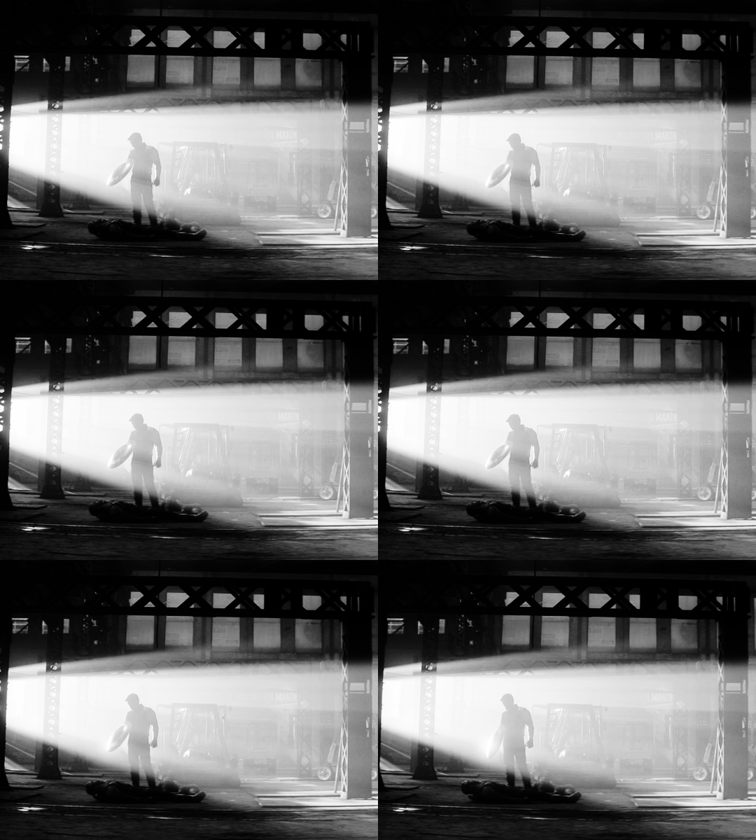
Bucky's GIF: Silhouette Effect
Number of GIFs: 3 Main GIF: Bucky holding the notebook Secondary GIF: View of the sunrise from the boat Tertiary GIF: Sam and Bucky walking away
STEP 2: Make your individual GIFs To achieve this silhouette effect, the main GIF needs to have a clear focal point, which means it’s better to have negative space around the subject and for there to be minimal movement. In this case, the subject is made up of Bucky’s hands, notebook, and part of his shirt; and there’s some movement but we can still work with that. The other two GIFs will then be placed “inside” the subject. Because the negative space in the main GIF consists of highlights, I chose a secondary GIF which emphasized the shadows. For the smallest GIF, I used a guide like in the previous tutorial to measure its size.
We have these three GIFs:

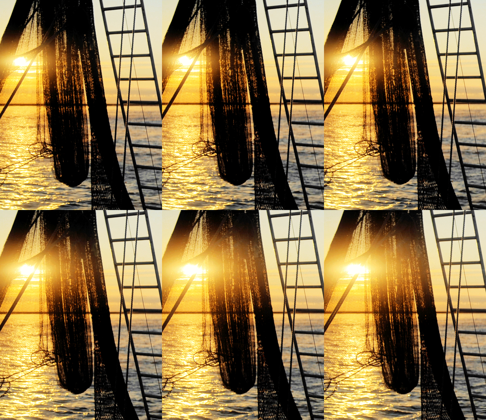
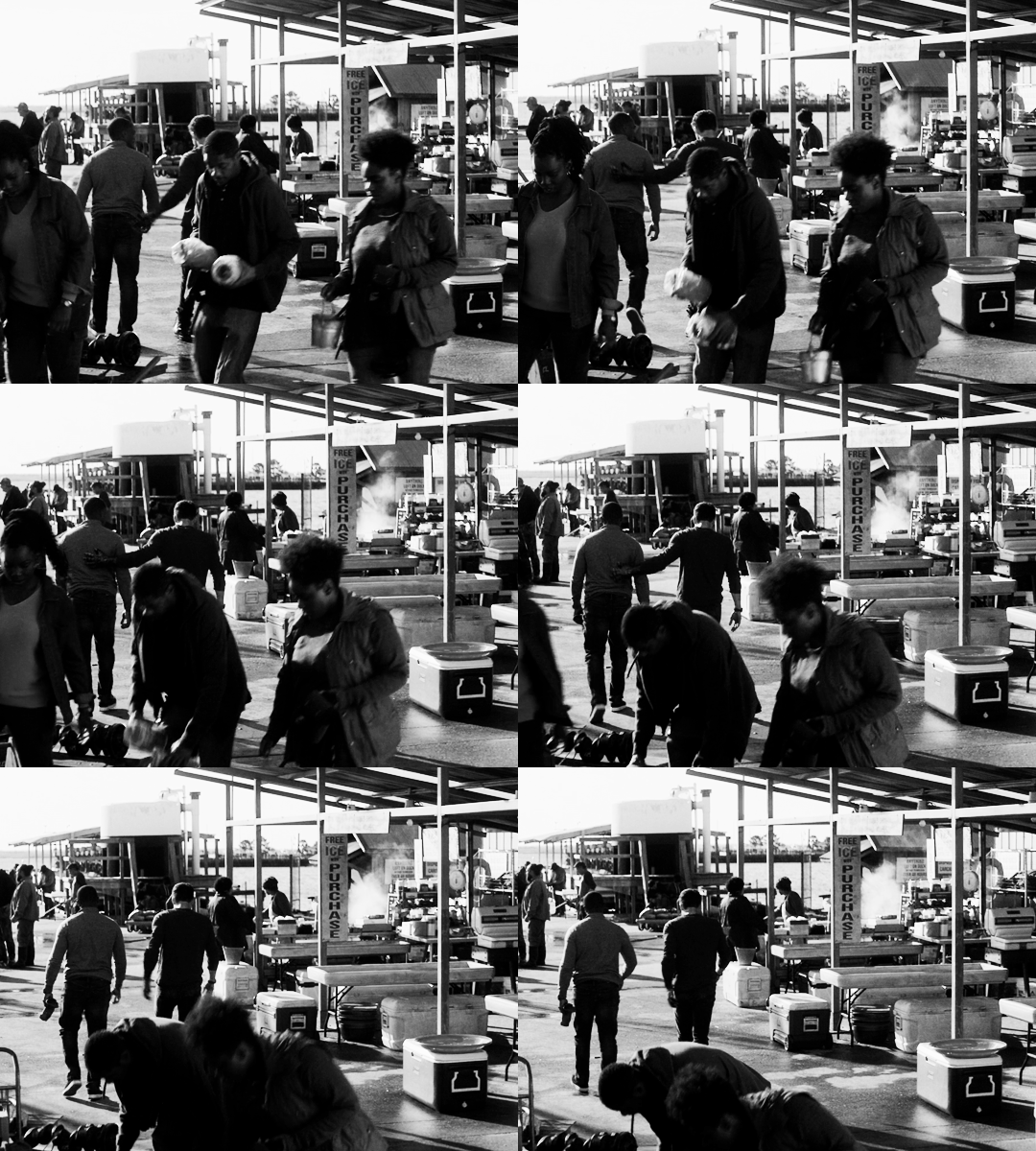
STEP 3: Combine your GIFs Place the secondary GIF over the main one. In my case, I didn’t measure it right so I had to nudge the top GIF a bit to the right to fit it inside the silhouette. The important thing is that the edge of the secondary GIF should not overlap with the silhouette itself, or else the illusion “breaks.”
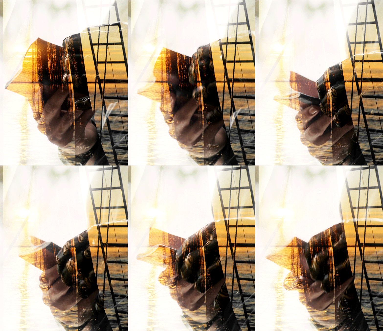
Now let’s add the third GIF:
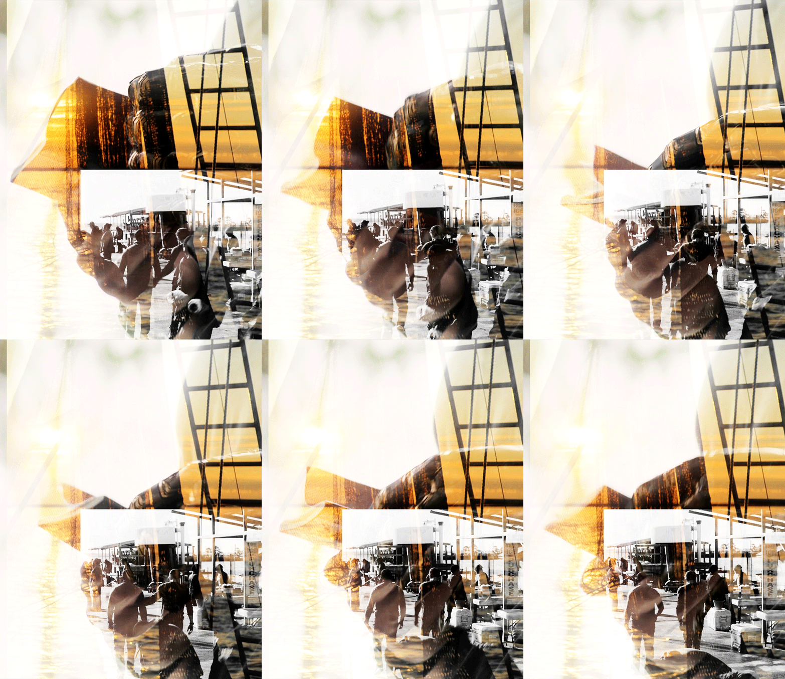
STEP 4: Erase the bits you don’t want For this GIF, there’s a lot we need to erase! Using Layer Masks and a soft brush again, erase the parts of the secondary GIF that extend beyond the silhouette. It’s entirely based on personal preference if you want to keep some parts of the secondary GIF outside the silhouette (like I did here) or if you want them completely removed. And for the small GIF, erase the edges for it to blend with the secondary GIF while also staying within the silhouette of the main one.
Now here is our finished GIF:

And that’s it! If you’ve made it this far, thank you for reading. I hope this was useful! Remember, there is no definitive way to blend GIFs, so keep experimenting. And don’t be afraid to make mistakes either, because we learn a lot from those. Happy Photoshop-ing!
- Elle
#completeresources#allresources#blending tutorial#photoshop tutorial#userpavi#tusergabriela#usersae#userrex#usertk#supervalcsi#usernums#userringo#userkraina#usersmile#tuserlouise#usersof#mine#my tutorials
2K notes
·
View notes
Text
#ShowYourProcess
From planning to posting, share your process for making creative content!
To continue supporting content makers, this tag game is meant to show the entire process of making creative content: this can be for any creation.
RULES: When your work is tagged, show the process of its creation from planning to posting, then tag 5 people with a specific link to one of their creative works you’d like to see the process of. Use the tag #showyourprocess so we can find yours!
@lan-xichens tagged me and choose this gifset of mine. Thank you so much!
I’m tagging:
@cuddlybitch with this set
@mercurialhigh with this set
@therukurals with this set
@baijingting with this set
@moonlightsdream with this set
My process is below the line!
1. Planning
I’ve made this gifset as a gift for a kdrama secret santa. I knew I wanted to gif Healer because both my santee and I love this drama. As for the format, I had no idea what it would look like except that I wanted to make a gifset that would look like a graphic. At the time, I was really into experimenting graphic-like gifsets! To get me inspired, I’ve decided to search for a quote to include and found this one from Caitlyn Siehl. This gave me the direction to follow: I wanted to find soft scenes with the couple but also a shot of Young Shin because she would be the center of the gifset.
I don’t remember much since it was a long time ago but I’m pretty sure the first scene I’ve selected was the first hug because I’m very fond of this shot and I always want to gif it lmao. The second hug serves as a parallel because in this one, he is the one to embrace her and they both are at peace (if you’re seen the drama, you know this wasn’t the case in the first hug scene). I wanted to pick a full body shot of Young Shin without really knowing what I would make with it and ended up selecting this one!
2. Creation
I am not sure which version of Photoshop I was using but I also used Avisynth to process my video and help me make gifs with a better quality (now, I actually use Vapoursynth instead).
1st part: the middle gif
The first gif I’ve made was the middle one. I wanted the text to be big so I decided to make a big gif (which was quite rare back then) with a lot of negative space so the text would look great in the background. I wasn’t really sure how to include Young Shin but I ended up deleting the background around her (which took a lot of time!). This is how it looks like for now:
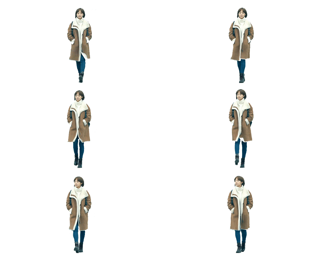
Then, I add a background with a cyan/greenish blue gradient (I always gravitate towards those colors when I’m giffing Healer) and put the text behind her. Once the composition is done, I color the gif to make it more vibrant and to increase the yellows (the main color of my set is cyan but the color accent is yellow, this is a color combinaison I often use). Then, I add some overlays I’ve found here (i’ve added an embossed effect to it) to both make it a bit more dynamic but also so I can use my accent color!

2nd part: the last gif
Yes my process is messy!!! I actually didn’t really know what to do with the last gif. I initially meant to use that scene horizontally, the way it was in the show
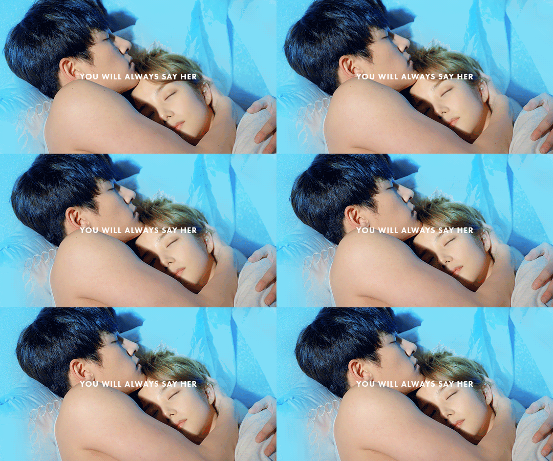
But the ratio felt off because of the previous gifs... And I didn’t want to crop it because I thought having a close up on their faces would also feel weird. So I just turned it to the side! You’ve probably noticed both this gif and the first one of the gifset do not have a 540px width: I just wanted to experiment using different widths and thought it was quite harmonious because it gave some movement to the gifset!
As for the text, I had to find another solution. I ended up “cutting” the gif so the text images would show up between them (this sounds weird but if you click on the images of my gifset, you’ll see that the last gifset is actually 5 images : the main gif in the middle, the small gifs at the top and bottom and the two text lines in between the gifs. Back then, tumblr’s gif size limit was still 3mb so gifmakers would be creative to subvert it). The coloring is quite simple but I’ve made the background cyan to match my color palette for this gifset and the text highlights are yellow, of course!
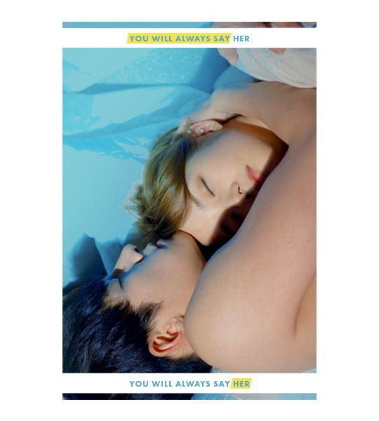
3rd part: the first gif
The last part! This was actually probably the first gif I’ve colored but i didn’t know how to include the text so it was the last one I’ve finished. I struggled a lot with this one and tried many ways to put the text but none looked right to me. And then I’ve randomly put a circle around them because a lot of things in this shot are circular: the way Young Shin holds Jung Hoo (her hands around his head but also her body curled around him), the line of the blanket, the camera movement (which you can’t see because i had to cut it but it spirals). Here’s the uncolored shot so you can see what I mean about the lines:
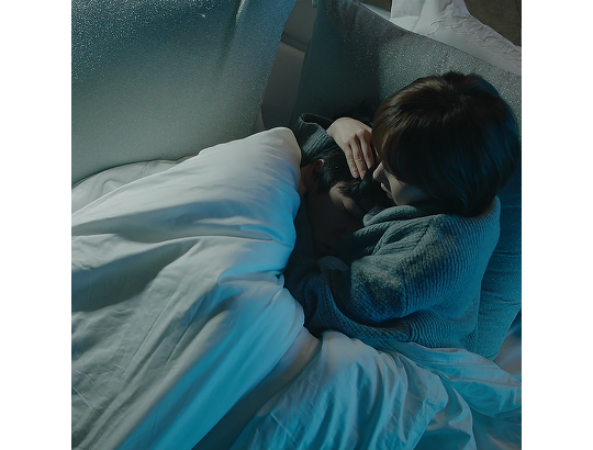
And then, I realized I could just put the text on the circle to emphasize the lines of this shot ! Once again, I’ve added a yellow highlight which was very useful since the word “favorite” was actually quite hard to read because of the background! And I’m done!!

3. Posting
Well this is quite embarrassing but I tend to be quite anxious about what I create/post so I always keep my sets in my drafts for some time. When I finish a gifset, I put it in my drafts so I can look at it a few days later to make sure I didn’t make any typo or any technical mistake (you know like when your coloring doesn’t show up on one of your frame? or when there’s a layer that moves without you wanting to?). This one was meant to be a gift for the 2019 kdrama secret santa so I didn’t keep it very long in my drafts because I had to post it before the deadline ended. I’ve used my usual creation tags and the secret santa one. Once it’s posted, I’m usually done with my set (even tho I’ve recently started self-rebloging and using the post pinning!)
#showyourprocess#lan xichens#challenge#cuddlybitch#mercurialhigh#therukurals#baijingting#moonlightsdream#text
15 notes
·
View notes
Note
HELLOOO, I just discovered your blog, shame on me. So, I read your masterpost about the stunts in the industry (great work btw) and was wondering how to tell if something is real or purely pr. Would you mind giving me a few pointers ?? Answer however and whenever you can.
Hello Sweetie,
Thank you so much for your lovely words. I would love to help you dig deeper into the PR industry. In fact, I did some research myself and I stumbled upon a great confirmation on how everything works. I think it is just the right fit for you, sweetheart.
Please take your time reading the post and if you have any questions or suggestions, please do not hesitate to ask me. Have a great day and enjoy!
Kisses,
Suman 😊
-----------------------------------------------------------------------------------------------------------
How to spot a PR relationship?!
This post is made for everyone who would like to learn how to spot a fake relationship in Hollywood. This information is supported by a very reliable source. The name of the source is Jack Ketsoyan, he set up two PR relationships himself. If you would try to compare this to your favourite Hollywood couple, you might be surprised of the outcome. I wish you all the best while reading this and if you have any questions/suggestions please do not hesitate to ask. Enjoy! :)
This is the link of the podcast about the PR relationships (skip to 5.40). I will make a little summary of the very important things Jack said. There is also another man who is speaking about this subject. His name is Christopher and he is a lawyer who has worked with cases like these for a long time.
(Please note that I am in no way hating on anyone. I have a strong dislike for all ‘’beards’’, but what they do with their lives is their responsibility. Therefore I mean no harm to any of these people. It would be very sad if any of these people would do it because they needed money for their families. If that was the case I would truly feel sorry for them, but the thing is they want to become famous by dating someone else who put his/her hard work in his/her career. That it just not fair. There are plenty of ways to become famous by dedication, hard work and staying yourself.)
I want to give compliments to the lovely @Totallylost4you on twitter. She made me aware of the podcast.
----------------------------------------------------------------------------------------------------------
-’’To hide the artist’s sexuality; boosting of the careers.’’ --> (Louis, Harry, Zayn, Liam and Niall. Also, Kristen Stewart, Cara Delevigne and Taylor Swift) -->
‘’It is more common on the male side than on the female side. There are certain celebrities who were, back in the day, in the closet and it was not okay to be out. We live in a completely different time nowadays, these days being gay is okay. So back in the day that was the biggest secret, it was a big taboo, if a certain high profiled male, the heartthrob is all of a sudden gay, they were not going to get the bigger roles anymore. They were going to be type casted, so that was the big way of hiding things. Them hiding their sexuality was dating a female who would keep them in the limelight basically and cover it up.’’ [about closeting] ‘’Times have changed, it still happens, but a lot has changed.’’ --> There are still people who would not like attending a Harry Styles (the heartthrob) concert when he comes out as gay.

-----------------------------------------------------------------------------------------------------------
-’’To be able to sell the hype of it.’’ --> (Whenever a picture of Taylor and Tom or Louis and Eleanor comes out, people are quick to retweet, post and talk about what happened. Within no time the pictures have traveled through the internet. Which automatically means that a lot of people have seen it. All of this gives the label/couple/artist attention and money. --> Whether it is bad attention or good attention, attention means money.) a few examples of these couples are also: Haylor, Zigi and Elounor.

-----------------------------------------------------------------------------------------------------------
-’’To sell tickets to concerts or movies.’’ --> 1D world tours and solo tours. That is also why beards like Camille Rowe, Eleanor Calder and Maya Henry attend their concerts. As for movies think about Robert Pattinson and Kristen Stewart (who is gay) fake dating, moments after Twilight came out. Think about 1D bringing their fake girlfriends to the world premiere and Zayn and Perrie getting engaged a second after. The purpose of these events are attention. Sweethearts, whenever people go to these shows/movies all they will focus on is 1D and their ‘girlfriends’. Photos will spread faster than ever and people will talk about how ‘real’ they are. Their aim is to kill two birds with one stone; making them look like a ‘real’ couple whilst promoting their movie/album.

-----------------------------------------------------------------------------------------------------------
-’’To sell albums.’’ --> (Zigi, Chiam, Elounor, Hamille, Nailee, Haylor.) Let us be honest, are they not the biggest reasons why antis buy the album? Just to see what stuff they write about their fake girlfriends/boyfriends. Just to see how ‘Camille’ pronounces ‘’Coucou’’or just because Gigi Hadid starred in Zayn’s music video. Or maybe to finally know the ‘truth’ about Taylor’s fake relationships.

-----------------------------------------------------------------------------------------------------------
-’’It's all about the hype at the moment. Especially with the social media world.’’ --> I am going to point out an important thing Jack said. He said ‘’especially with the social media world.’’ Remember when there were only rumours of Louis and Eleanor being back together? The whole fandom tweeted about it. This made it popular and that was the solid moment 1D’s label knew that Elounor 2.0 would do it for them. They would earn a lot by it. The same thing counts for Zigi, Chiam, Haylor, Hamille. Hamille is a good example too. When all of you heard that Harry wrote a song about her and that her voice was going to be included in his song, what happened? Exactly, everyone went nuts and made sure to listen to that exact song. That is exactly what they want. They want that power over you, that is what gives them the money. Another example, how fast do you think solo Zayn stans and Directioners tweeted about a ‘power couple’ when the news broke that Zayn and Gigi are ‘expecting a child’? How fast did people open their social media accounts when Kylie Jenner was pregnant for the Kardashian’s 10th anniversary? (Social media does A LOT. Whenever a picture of Eleanor (beard) and Clifford (Louis’ dog) arrives on the internet, people automatically assume they are together in a room. This, is not the case. That is how convenient social media is to arranged relationships. Why start a rumour by hiring newspapers instead of posting a message on social media? It is much cheaper and more people will know about it in less than four hours.)
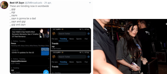
Promoting certain brand like Coca Cola (Elounor), YSL, Gucci, Vogue (Zigi) and Hugo Boss are also a part of it. Celebrities wearing those brands make their fans want to buy it too, think of the Kardashians promoting Adidas and other expensive brands. Also think of people like Briana Jungwirth promoting flat tummy tea. This is called ‘celebrity branding.’
Tell me, how many times do you get HQ pic of your PR couple on your phone? People tend to go out of their mind when pictures come out. That is the immediate effect Hollywood has on social media/ you. That gives them the promo they need, even during quarantine the beards post pictures of themselves, making you think they are together when in reality they are not. :)

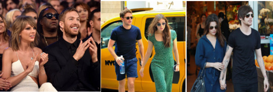
{About why Jack hooked an arranged relationship up himself} --> ‘’It was more of a mutual agreement between the agents. {Tells a story about an actor getting bad reviews for a movie and in order to let people focus on something else they got the actor a girl, so the media would focus on the girl instead of the bad movie.}’’ --> ‘’Just a one year deal. Basically they finished of the press and the international press and then they went their separate ways, because she did not want to do a two year deal.’’ {interviewer asks if it worked} --> ‘’It worked.’’ --> A few examples of (approximately) a one-year deal: Calvin Harris and Taylor Swift, Niall Horan and Hailee Steinfield and Louis Tomlinson and Danielle Campbell. It is also good to point out that the beard can decide whether she wants to continue or not, but the celebrity has to do what the agent arranges.
-----------------------------------------------------------------------------------------------------------
{Interviewer asks what reasons people might have to agree to one of these PR relationships} --> Different reasons, that could be to deflect attention away from a controversy (damage control. think of something Larry or Ziam related happening and the next day Zigi and Elouno are papped. Or fans finding out Louis is in the same country as Harry and the next day they will let Elouno do a pap walk. Another example is when Ziammies find out a Zigi picture is photoshopped, the next day you will see Zigi in person. This happens when their stunts fail). So if an actor has drugs and alcohol problems they may want to give the appearance that they have settled down and are in a committed relationships so that they can banked for films. Or they are going to be able to get bonded and get work and people will trust them, because they have settled down. It also could be done to create a brand. Two celebs getting together and 'now there's this tremendous interest about them being a power couple.' [...] We create strong provision against the disclosure of any negative facts against the celebrity - with consequences. So these agreements need to be structured with a hold back of money so that over time if they have complied with the agreement and not disclosed ehh no personal information and violation the agreement then they would be entitled the payment, so under the agreement. " --> The last part might be difficult to understand, because the lawyer uses difficult words, but what he is actually saying is very important. He says if the celebrities who are in the PR relationship have done their part (parading around with each other) then they will receive their money (please correct me if I am wrong). The host also confirmed that contracts like these are the reason why a lot of celebrities do not admit they had a PR relationships.
----------------------------------------------------------------------------------------------------------
Clues on how to spot a PR relationship:
-‘’The main clue you would see is if, you know, a certain high profiled male is dating a female (or when a high profiled female is dating a regular male), who was not high profile. All of a sudden, she is, overnight, the most talked about girl in Hollywood and everyone want a piece of them. That is the biggest thing, you know, it is such a career boost for the female that some females end up taking the deal.’’ --> Zigi, Elounor, Chiam, Brouis, Haylor, Taylor and Calvin. How does the world know Eleanor Calder? Because of Louis Tomlinson. No one knew her before, except her family. How did Gigi gain so many followers? Because she started dating Zayn Malik. Gigi already had a platform for herself, but she gained a lot of followers by dating Zayn. Zayn also gained followers by dating Gigi. Gigi needed promo and Zayn was in the spotlight, because he just ‘left 1D.’ This made him the perfect target. I hope all of you also notice that when beards/fake girlfriends post pictures of them with their fake boyfriend, it gets way more likes than their usual pictures.
{What was the benefit for the girl in the scenario?} --> ‘’Ehm, she has a huge career at the moment. She benefit from that by becoming a household name (someone that is well known) and getting bigger roles than she would have. She would use to be the 3rd or the 4th lead in any auditions or any jobs that she was getting. She then became the first lead. She got a great career boost out of it, for sure.’’ --> Gigi Hadid, Eleanor Calder, Sophia Smith, Cheryl Cole, Maya, Camille Rowe and Kendall Jenner are just a few examples.

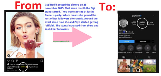
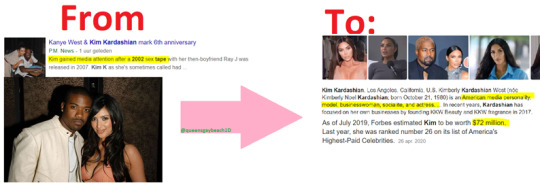
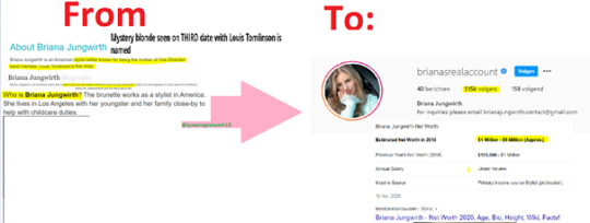
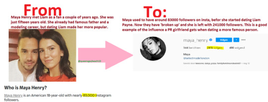
How did the world know Townes? Because ‘Harry named’ her in one of his songs. How did the world know about Maya Henry? Because Liam Payne started dating her. Before this, she was just a fan. How did Cheryl Cole get the attention back? Because of baby gate and by fake dating Liam Payne. How did Briana gain so many followers? Because Louis Tomlinson fans gave her the attention and because she participated in faking a pregnancy. How did Shawn and Camilla become a couple in the spotlight? Because people have always shipped them, ever since the beginning and their label gave the fans what they wanted. How did Kim Kardashian become famous? A *** tape of her and Ray J leaked and she became famous. Now, she is a lot richer and more famous than he is. A quick note, not many people know how Kim Kardashian became famous. They only really know her from Keeping Up With The Kardashians. The newer generation does not know about the tape scandal, and that is what they do. You need to dig a little deeper to see that. This all is an on-going cycle and it will not stop unless we all stop believing it. 😊
-----------------------------------------------------------------------------------------------------------
What do they do in order to make a PR relationship look real?
{Interviewer asks what the clauses in an arranged relationships contract are} --> ‘’An arranged relationship is estranged by definition. So certainly we are going to see requests that are equally odd. They are certainly going to have requirements as to how they hold themselves out to the public as a couple. This would mean appearances at award shows, parties or events together as a couple and that there would be requirements maybe for specific events.’’ --> Eleanor attending Jay’s wedding and being ‘maid of honor’, Calvin and Taylor at Award shows, Elounor at the fashions show 2013, Haylor and their NYE ‘kiss’, Zigi at the MET gala and Chiam at the Brits, celebs at after parties with their ‘girlfriends’. All of these couples have also pictures with each other’s family members. That made a lot of you think they are close and real, well my loves, now you finally know that it is all part of a PR stunt. The fake girlfriends also have to look supportive, that is why they have to be there at concerts, soccer matches, award shows etcetera. 😊
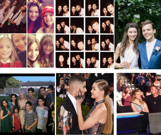
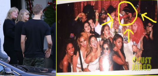
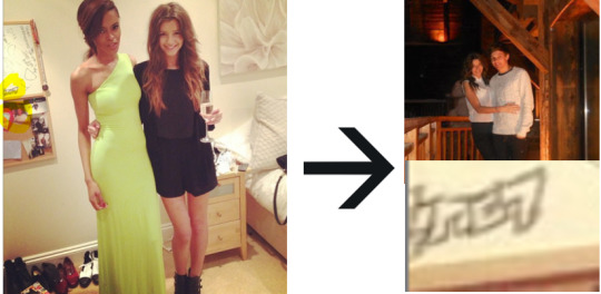
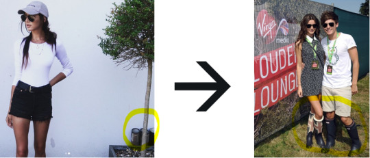
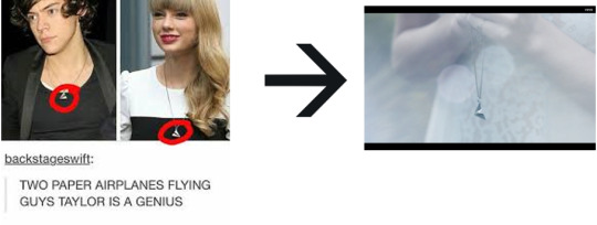
Remember when Eleanor (beard) posted a picture of herself and in the background you could see a picture of her and Louis in 2012 and ‘Louis’ written on a board? Remember when she posted a picture of herself with her and Louis’ boots in the background in 2018? All of these things are there to make it look like they truly live together and that they truly own each other’s stuff. The same thing counts for Haylor’s airplane necklace. Do you genuinely think they did that by accident? No, that is the purpose of the whole picture. 😊
-----------------------------------------------------------------------------------------------------------
‘’Then there is going to be particularly some none disclosure issues surrounding them as to what cannot be said about the relationship and what needs to be said. There could be a script even as to what they have to say if asked about the relationships. There would be photo sessions showing them as a couple. And then I have seen issues of sexual relationships and specific whether this would happen or not happen in an agreement. But if it is truly a PR relationships then sex would not be a part of that relationship, because it is not real.’’ --> Loves, do you remember a moment when someone asked a celebrity about his/her relationships and they stuttered and looked uncomfortable, or they just said something wrong or embarrassing or tried to talk themselves out of it? Well, that happens when you have to make up stuff that never happened. Louis Tomlinson confirmed his interviews are scripted, so this one is just an extra thick layer of confirmation. I also recall Gigi doing a live and someone asked about Zayn and she just stuttered and looked away, not knowing how to answer a question. (I think there have definitely been times when two people who were in an arranged relationship gave different answers to the same question, why? Because they do not know anything about each other.) Here is an example of a moment that is repeated and scripted about Louis’ ‘relationship’ with Eleanor, even know we have legit proof that is not what happened:

-----------------------------------------------------------------------------------------------------------
Now I can hear all your lovely brains working and thinking whether a celebrity is willing to sign a contract like that or if their label is making them sign it. Well, if you have read my previous masterpost about the music industry you can see confirmations of the label making the artist their puppet. They own you, so if they think you should have a girlfriend to hide gay rumours then they will give you one. ‘A label cannot force you anything’, but it does make you sign a contract. When you sign the contract without reading it carefully, then your label will mess you up. In those contracts they do not write ‘’Taylor Swift has to agree to arranged relationships.’’ They write stuff like ‘’When signing the contract, Taylor Swift allows the label to make changes in order to get her to fame.’’ Of course Taylor (and other artists) would think that they mean changing her outfit and looks, but no. The label thinks being gay is something that will not get people enough fame. So what do they do? They change her, they change her sexuality. They closet her and even though Taylor and other LGBTQ artists do not want that. You cannot deny because when you do so, the label will show you the contract you signed. A contract like that is never written literally, they can manipulate their words. To the label ‘’being gay or a part of the LGBTQ+ community’’ falls under ‘’making changes’’ in order to make her famous. Of course there are celebrities who willingly closet themselves for various reasons. I hope to create a single post about how devious these contracts are for you all! 😊
-----------------------------------------------------------------------------------------------------------
Here are a few things I hope you have learned from this: 😊
- Fake relationships still exist and they will always exist. It has been confirmed, so no one can deny this anymore.
- The girl and boy have to go to special events, such as award shows, family dinners and weddings in order to make it look real.
- Homophobia is still a thing and the biggest reason why arranged relationships exist.
- The beard has a contract too, so your idol has no say in how long she can or cannot stay. If she does good then she will stay. (I see many people say that Louis chose Eleanor because they are friends and that is why she is back, but he actually has no say in anything. Your idol is their product to sell. Your idol is basically a marionette.)
-The PR team does everything to make it look like they are truly together, think of photos of each other in each other’s homes and ‘personal gifts.’
-Celebrities get an enormous boost on their social media accounts when they start being part of an arranged relationship. Something I have always thought was a bit odd, is the fact that Eleanor never created an insta account until her and Louis’ ‘relationship’ had its peak; in the middle of June 2012. When in reality, insta was created in 2010. She also created twitter in 2012. Exactly when the first few big events were attended by them. (I genuinely think she did that, because everyone wanted to see more of her. Plus, she has always wanted to be a fashion blogger and this was her ‘big moment’ to do so.)
-----------------------------------------------------------------------------------------------------------
The credits for this post go to @Totallylost4you. They made me aware of the podcast and they continue to shine light on hidden treasures like this one. They also hardly get credits for their solid hard work and I hope they will continue doing this! Thank you!
Thank you so much for your attention. If you have any question/suggestion, please do not hesitate to ask/tell me! I wish all of you the best and please stay safe. Have an amazing day!
#pr stunt#pr industry#music industry#pr relationships#damage control#arranged relationships#celebrities#fake relationships#zerrie#elounor#hamille#hendall#haylor#chiam#zigi#masterpost#masterproof#closeting#homophobia#hollywood#secrets#jack ketsoyan#pr strategy#brands#taylor swift#kylie jenner#kardashians#one direction#celebrity branding#label
238 notes
·
View notes
Text
Passion Project: Inspiration
I don’t think I’m starting at the beginning with this post. Keep your eyes peeled for later posts that explain what I’m doing and why.
After a month of thinking about, sketching and painting designs, I have finally done something. Essentially, recently watching two films has pushed me into action, and a part of me is ashamed to admit it. There isn’t a word count or any typesetting to curtail my thoughts here, so strap in.
When I created this brief I figured I’d draw a million wee skateboards, colour a few of them in, then fling my favourites into Adobe illustrator and make them look good. From there I would take the 5 best up to the skatepark and ask some of the patrons there which designs stood out to them. Next, I would adapt the three front-runners and create sweet PhotoShop mockups that would show what my designs would look like as skateboards. If I had the time, inclination or money by the end of the project, I would have the design laid onto a real skateboard (I’ve been looking to buy a new one for some time) and then be proud of myself.
So I’ve drawn some wee skateboards. Then I started upscaling the designs onto the floorboards of my loft:
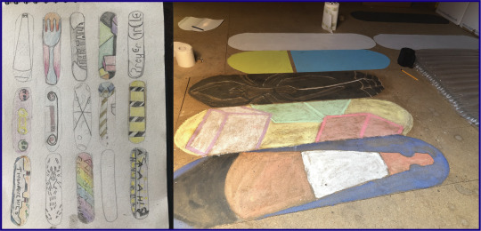
This was an exercise to let me see how small things need to be adapted to be blown up. Skateboards can have any level of detail that you like on them, I hadn’t considered this until I was trying to draw a semi-perfect triangle for the traffic cone, or until I was using chalk to recreate four cubes. It’s also been fun to work with different media on chipboard - I have learned that most kinds of pencil, paint, chalk and charcoal do not like being used on chipboard. Decorating paint, however, has no such issues. Thanks, Dulux!
And so, with a few of these under my belt, I decided to try some digital designs. So I jumped into Illustrator and totally ignored my sketchbook, coming up with three designs that were all inspired by the day I had just had. The top design, I’ll focus on last, for reasons that will become apparent (unless you follow me on Instagram, where you’ll already know that it’s an absolute hit, with over 19 likes already!). I was told by a guy at the skatepark that he likes decks with very basic designs, just a colour or two, nothing overly detailed. Another skater told me that he often likes the basic wood background with one small emblem or sticker just beside the wheels.
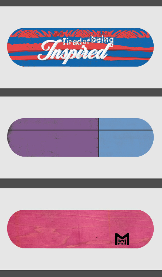
The duo-tone design felt nice, I’m usually one for over-complicating things. I definitely have an attitude of “If there’s more in it, there’s a greater chance someone will find something they like”. The first colour choice put my girlfriend in the mind of a hand-bag she had seen photographed in the arms of Carrie Fisher - it was designed to look like a Prozac pill. So I changed the colours up, and added the separating black lines and textures to give it some subtle character. I then went full meta with the Minimal design. And, if I’m being honest, I’m incredibly happy with how it looks like a wee character. Expect to see that making a comeback in the very near future. But the top design is what really got me going.
I’ve recently been watching...
...Spider-Man: Into the Spider-Verse, and have been loving Miles Morales’ multiple hobbies of graffiti, mixing beats and saving his neighbourhood from a variety of dangers.

I then went to the cinema to see In The Heights, telling the tale of the Latin community during a blackout in North Manhattan. I found myself wrapped up in the romance, tribulations and music of the cast, and was felt oddly proud of Lin Manuel Miranda - who wrote this as a stage-musical while he was in college, had a modicum of success with it, then went on to create Hamilton, one of the most important musicals of our time. With the success of that particular show taking the entire world by storm, he was given the opportunity to make his old, relatively only semi-popular play into a blockbuster film. You can’t help but be inspired by someone like that.
I often find towards the end of a film I’m inspired by the characters’ journeys: be that from zero to hero, from lonely to loved or from rags to riches. Then I walk out and carry on with my normal life doing normal things. And as the hero of the story’s dreams all came true in the closing minutes (sorry for the spoiler, but it’s a musical, they rarely end in despair), a thought floated across my mind:
I’m utterly sick of being inspired
Now, to my credit, I did figure out in the car home that ‘tired’ would be a far more fitting and rhythmic word to use in this sentence, but this was a mentality that I found resonated really strongly with me. I’m very good at being inspired, I think most people are. We hear stories of people starting their own business, achieving some sporting brilliance or overcoming a personal hurdle and we say “Wow, isn’t that inspiring?” or
“It really inspires you to go out and make a difference!” or
“They are such an inspirational speaker!”
Then we go off about our day, not acting on the inspiration, and, for the most part, remaining uninspired. So I decided to act.
I did some very quick research (/acquiring of images of graffiti) in order to get the right shapes and textures to create a spray paint effect in Illustrator. I did some very quick research (/confirming the colours) of South American flags, taking the blue and red used in flags of the home nations of Miles Morales from Spider-Man and Usnavi from In The Heights. And I created the top design.
YES! I had been inspired and I had drawn a wee picture to show that - I had acted on my inspirations!
Then I looked to my left and spotted three, blank skate decks that I had bought on a whim from Re:Ply (a wonderful wee company who do a great deal of charity work supplying boards to people who need them, selling boards to people who can afford them, and for a very reasonable fee, providing unusable decks to people who want to use them for artistic purposes). I realised I hadn’t acted on my inspiration, I had just drawn a few pictures of skateboards with the eventual aim of PhotoShopping them onto other pictures of skateboards.
So I took myself...
... into the city centre with a shoddily prepared speech: “I’m looking for some cheap, small cans of spray paint. I’ve no idea what I’m doing, or if I’ll be good at it, so don’t want to invest too much into this.” Hiding behind this self-deprecating shield I barged into multiple art-, pound- and model-shops and pleaded with the staff to help a young idiot out. Amazingly, a very kind shop assistant pointed me in the direction of Fat Buddha, a clothes shop I’d always ignored as it seemed a bit to “...” for me. I don’t know what it seemed, but I knew it wasn't my kind of shop. Happy to prove me wrong, the guys in there were super helpful and they helped me buy my first cans of spray paint.
Now I’d spent money...
... and as a skinflint, that meant I had to get use out of my purchases. I had tricked myself into being inspired. Inspiration led me to the drawing, inspiration had led me to buy decks and the paint, now inspiration had to make me spray paint.
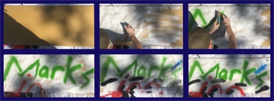
I’ll stop yammering on now. Essentially, I had planned on creating some analogue designs then digitising them (I’m guessing I should do a post on my brief, yeah? Might just upload the PDF to save me talking more), but then I found that I was doing the complete opposite. Genuinely accidentally. I had played with a few typefaces from various websites to get fonts that represented the ideas I wanted. The top one was semi-stolen (I can’t use the word ‘inspired’ any more in this post) from the end credits of In The Heights. The larger font is something of a nod to inspirational quotes you see on Facebook or on glittery frames in B&M.
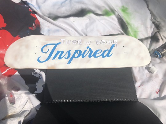
I printed those out and cut them into stencils (very impressed that my digital boards have been drawn to a workable scale, thanks Maths). And after putting down a tack-layer (GRAFFITI JARGON (I think)) I sprayed the whole lot in blue.
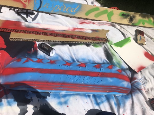
Next, I tried to get a little fancy. Using cardboard blockers to create straight lines I added stars* (borrowed from the Puerto Rican flag) and made the bottom stripes vaguely reminiscent of America’s Old Glory.
I peeled the lettering off, and I’d done it. I may have to explain the overtly-negative inspirational quote to people, but to me it’s a clear sign that there’s no point in just being inspired, and that’s all I wanted.
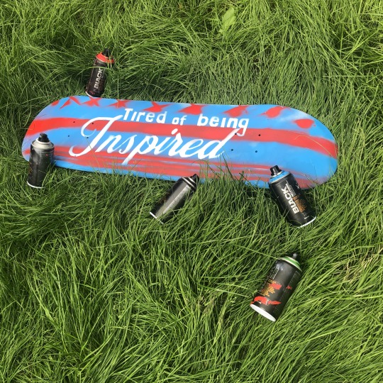
A weight I didn’t know I was carrying was lifted from my shoulders. The plan was to possibly end up with a self-designed skateboard. And now I have one.
*Yes, I know they’re crosses.
4 notes
·
View notes
Text
Sinful Delivery | Feitan Porter x Reader |
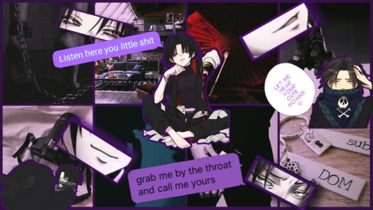
Word Count: 2709 Reader Type: Neutral Gender, Media Influencer, Model Story Type: Modern AU setting Beware: Sexual thoughts, BDSM, Curse words Summary: Reader is doing some media distancing due to harmassments. Feitan just happens to be the delivery guy on the day they wanted takeout.
Key terms: (Y/N) = Your name (H/C) = Hair Color (S/C) = Skin color (E/C) = Eye Color (F/F) = Favorite Food (S/F/F) = Second Favorite Food (S/N) = Screen Name (B/T) = Body Type (B/H) = Body Height
═✩══╡˚✧❨✧˚╞══✩═
A pair of empty eyes stared at the grimy ceiling. The pools of (E/C) reflected a blank canvas as they laid on the large bed. Their body felt frozen to the touch, almost as cold as a corpse. Taking in small breathes to fill their lungs, they closed their eyes and listened to the white noise of the room.
Their name is (Y/F/N) (Y/L/N). Yes, That (Y/F/N). The infamous media influencer who specialized in dark styles of romance. Hacking to the fetishes that everyone is too scared or embarrassed by and bringing it out with their photos. Posing and modeling from all levels. If there was something out there, they were the first to act on it. Taking photos for the eyes of the dark. From innocent acts of bondage in bed to heavy blood draining, (Y/N) had a photo for the media.
Then, why were they laying in bed? Why were they alone?
There were numerous rumors that the model was faking their stats. Editing everything to where it looked realistic. Each photograph was nothing more than a scam of a freak who sought attention. As the rumors spread like wildfire across the internet platform, (Y/N)’s publicist advised them to stay away from the media until everything settled down. Their whole career was on hold because some people thought they were posers.
So, here they are laying in their loft condo and keeping a low profile. The (H/C) would go out for the usual grocery trips and daily exercise. Despite the dark cloud of their career, (Y/N) was a humble person and had a simple lifestyle. They just happened to have an interesting career path that differs from the norms. Boredom had become unavoidable these past few weeks, taking a toll on their adventurous spirit.
“Maybe I should have taken Gon’s than the Troupe Café,” (Y/N) mumbled and slowly sat up. “But, I’m kinda tired of the usual (F/F).”
Finally getting up from the bed, they stretched their limbs out into the air as they let out a huff of breath. Shaking off the sleepy dust from their body while walking down the stairs. (Y/N) looked at the clock that hung by the staircase. Its second hand ticking away while the minute hand was just barely moving.
Knock Knock, knock
Three rapid yet vigorous knocks caught their attention from the time. A smile broke across their (S/C) face as they walked to the door. Turning the knob, (Y/N) was greeted by a rather gloomy looking male. Being (B/H), the model was puzzled by the rather short male. His grey eyes stared at them, waiting for them to make a move. An austere expression was painted on his pale face.
“Are you gonna take it or not, dumbass. I don’t have all day.” the monotone voice seemed to match his demeanor. He held up a black bag that contained (S/F/F).
Shaking their head, the model took the delivery bag and left the door open. They got a whiff of food before setting it down on the living table to get the money. (Y/N) hummed happily at the thought of eating the heavenly meal but also for the change.
═✩══╡˚✧❨✧˚╞══✩═
As (Y/N) was gone, the male’s eyes narrowed slightly as something felt odd about the whole situation. The customer looked strangely similar to someone he followed online. He dug his hand into his pocket just as his phone vibrated. Pulling out the device, he internally grunted at the notification from Phinks. He pressed the text chat to read what was sent, probably a stupid excuse for not wanting to work. Reading the text in the grey bubble, the gloomy dressed male blinked before realizing what was said.
Lazy Fucker, 2:55 pm
Dude! Feitan! I remember where I saw that name. Ya know the model whose fan base is rioting? THAT’S THE CUSTOMER WHO ORDERED!!! DO YOU KNOW HOW FUCKING LUCKY YOU SCORED?!?!
*read
Feitan felt a slight flinch in his gut. The universe had randomly granted him the opportunity to come across his favorite pastime. He knew of (S/N) and the alleged rumors against them. The short man didn’t care for what was said about the photoshopping because he knows real authentic torture when he sees it. Every drop of blood that dripped from their (S/C) (Y/H) body. Each cut that is made on their (B/T). He never doubted the reality that (S/N) performed.
When he heard and read about the accusations made about their work of art, his anger hit sky high. His blood boiled like magma, the more absurd every claim got. The day (S/N) went offline, Feitan’s hunger became unsatisfied. His entire Trevor Brown collection couldn’t fill the craving that rested deep inside his coal heart. There was just something in the model’s performance that made him growl in pleasure. His irritation followed him from home to work every day for the past couple of weeks.
“Here you go! I’m so sorry for making you wait this long. I misplaced my wallet.” they laughed and rubbed the back of their head due to the embarrassment.
He only grunted and took the payment, counting the bills to ensure it was correct. Underneath his bandana, an eerie smile made its way onto his apathetic face. Their voice was just so soothing and light, the perfect pitch to hear moans from in private. The more he stared at them, the stronger his desire grew. Feitan slipped the money into his pocket before deciding to speak.
“You’re (S/N), correct. Why haven’t you said anything about the bullshit,” he asked. Well, honestly, it was more like a demand than asking.
(Y/N) was about to close the door until he spoke up. Blinking at his bold words, they were confused about what told of them. Oh, he’s a fan… they realized. Placing a hand on their hip, the model gave his words some thought. They were surprised the delivery guy knew who they were, giving they weren’t exactly in costume. They were only wearing a plain (F/C) shirt and shorts while their (H/L) (H/C) hair wasn’t styled.
With a smile, (Y/N) answered, “I can’t change anyone’s mind on what they see. Our perspectives are different, so I rather just let them believe what they want to believe.”
Feitan frowned at them. Their answer didn't sound convincing to him. His grey eyes stared at them more, searching for something. “It’s obvious that those scumbags are just picking for a reaction. Probably waiting for a suicide announcement about you.”
This time, his words did make their stomach turn. It was unnoticeable when their account got negative comments or when their inbox was spammed with death threats. (Y/N) did their best to avoid them and ignore the pessimistic thoughts that came with every troll. Yet, the words aimed at them did hate their self-esteem. It was when the rumors started to take effect did they finally get time to feel peace. The media distancing helped the depressing cloud clear up above their head.
“Want to join me for lunch? My legs are standing to ache from just standing and the food is gonna get cold,” (Y/N) smiled while pointing at the couch behind them, “ I can ask all your questions while we eat if that’s okay with you.”
Feitan nodded and walked inside the apartment. He took a few glances around the place and took notice of how moderate it looked. If he could bluntly say it, the place looked like a boring image in a magazine you could find in an office. Taking a seat on the leather armchair, the gloomy male sat and waited for the other to join him.
Getting some plates and drinks from the kitchen, the (Y/H) model went to the living area and served him some (S/F/F). The two ate in silence for a bit and got acquainted with each other’s presence. Feitan observed them some more, his eyes never leaving their body.
"Well, are you going to talk or not." Feitan scowled, glaring menacingly as his patience was going thin.
(Y/N) sweatdrop at his impatience, but took a drink of their soda. Their mind playing back the beginning of the chaos and the events leading to isolation. Recalling the confusion when their publicist instructed them to make the accounts private and go offline. The devastation they felt later followed when they read the article claims against them. The model simply felt their heart crack from the madness.
"I was told to sit and be quiet until things settle. These few weeks haven't been great. The assaults are still going and I can't do anything," (Y/N) sighed and stared at their drink. "I am- sort of- at a breaking point. No matter how strong the bubble I'm in, the insults make me crack and it hurts. I had ideas! I was going for approval but then got told to be quiet so the adults can talk."
Feitan leaned back into his seat and listened to them rant out their pinned up frustrations. From what he saw, it seemed to bother them that they were seen as a fraud. He watched the way their arms moved as they spoke and how their clothes would reveal the hidden story. His grey eyes took in the faint scars and discoloration on their (S/C). Fighting back a growl, the gloomy male set his plate down and got the model's attention.
"Fuck what those bastards say. Do what you want and show them everything." he smiled at the visible shiver they had.
(E/C) eyes glanced up to meet with metal eyes. Despite the coldness in them, the model could see just a small flicker of light. It was a small light, small but it was enough to make something in (Y/N)'s mind snap. The small click of gears before complete clockwork began to shift inside them.
He was right! Why did they have to be put in the corner when all they were doing was their passion?! Why were they being punished?!
(Y/N) looked straight at the short male. Their eyes reflecting the newfound determination and that same emotion cause him to smirk with interest. What he heard did catch him and made his inner desire water with hunger.
"I want a tape of real-time punishment. So, seeing as you are well aware of my work, I take you to know what to do?" they innocently smiled.
The gloomy spider leaned forward from his seat. His eyes darkening with a cloud of cruel lechery with every passing moment he stared at them. His mouth watered at all the methods that came to mind with how he will have them beneath him. To hear their cries, witness their tears, the expressions that cute face can make... Oh, how fate gave him an angel in a devil's clothing. Pulling down his bandana, he smirked at the model.
There it was again!
The cold chill when he smiled at them. (Y/N) might have picked the perfect candidate for a partner. At least for the project... maybe. Getting up from their seat, they grabbed his hand and led him upstairs.
"Let's get started, shall we."
═✩══╡˚✧❨✧˚╞══✩═
Upon the release of the video, four months had passed by. The video had gained a couple of million views and thousands of comments. Whether the attention was positive or negative, (Y/N) had no clue but Feitan did. He read through the comment section and was amused by the words.
Feitan was on his break and sitting at a table, a cup of forgotten tea sat in front of him. He scrolled through the section with an entertaining smile on his face. His eyes squinted up as he grinned with each passing comment. The spider worker enjoys the memory of that evening. It was his absolute favorite and it was something he looked back to whenever he watched the video.
He can recall how he felt with each scene as it plays out. The adrenaline that coursed through his veins with burning aspiration. How he wanted to make (Y/N) submit and to feel those agonizing vehemence. He wanted to keep hearing the moans and cries they made with each whip. The lewd face they made when he flogged their bareback. The way their body tense and pull on the restraints when he made a deeper cut.
Phinks and Shalnark were a bit disturbed when the short man came back to their shared apartment into the next morning. He was grinning menacingly while his clothes were covered in blood. Who's blood exactly, that was unclear. Both males watched him enter the apartment before vanishing into his room for the rest of the day. Endless to say, they shrugged it off and believed some poor stranger just wasn't lucky.
"Hey, Feitan! Can you take my shift real quick? I need to use the restroom, please. Please! Please!" The blond whined a bit.
The gloomy male grunted before heading back into the kitchen to tag him out. As he worked, he didn't hear the bell chime of the front entrance. He cooked until a soft voice caught his attention.
"Ello! I'll like small grey ice cream with a dash of sadistic sparkles." they happily chirped. Smiling as brightly as ever from the other side of the bar window.
Feitan looked up from the stove and hummed in acknowledgment. He turned his attention back to the food as (Y/N) took a seat on one of the stools. Their (E/C) eyes shined with the same happiness while watching him cook. The comfortable silence around them was pleasant and neither wanted to break it too. Until Phinks came back and stared at the new face before realizing who they were.
"FEITAN!! It's that model!!" he managed to shout despite the small space.
The short man remained stoic while (Y/N) giggled at the blond's reaction. Feitan grabbed the blond's shirt collar and pulled him into the kitchen to take back his job. Feitan grabbed two drinks and walked out of the kitchen. Handing one drink over to (Y/N), the short man took a seat by them.
"What brings you here." he finally asked after a few sips of beer.
Setting their glass down, (Y/N) turned to face him before tilting their head a bit. They were a bit confused by his questionable demand but then sat up when they remembered the reason for their sudden arrival. Turning to pull out a notebook from their bag, the cheerful model set it on the counter and turned to the desired page.
"I got another idea and wanted to see if you could help. I was thinking of an ice bath this time, but I want your opinion since your nasty little mind was the brilliance behind the video," they showed the page to Feitan and slid the notebook to him. "The agency will cover the cost if you have something else in mind. They even want to ask if you wish to apply. Seeing as you like a natural on camera and how fans reacted."
Feitan looked over the information on the page while listening to the (B/H) model. He could get paid for tormenting them with his dark fantasies. He smiled at them and slid the notebook back to them. Nodding, he finished his drink and looked at them with the same eyes as the day they met.
"Yes! You're the absolute best! I'll text you when the due date is and we can meet up this weekend to see when you got." (Y/N) grinned before jumping off their seat.
═✩══╡˚✧❨✧˚╞══✩═
Feitan's smile vanished after they said goodbye. He returned to his expressionless husk and decided to clock back in. When he was about to get back to work, his blond roommate finally spoke up and questioned the gloomy spider on what had just happened.
He simply shrugged and went back to his job. His eyes squinted as a grin hid under his bandana. "Just my pet wanting approval."
The blond nodded but quickly snapped his head to look behind him and stare at the man in shock. Since when did he manage to hook up with someone before Shalnark or himself?! Turning back around, Phinks frowned and grudgingly had to pay Shalnark when they closed the café for losing the bet.
═✩══╡˚✧❨✧˚╞══✩═
#feitan#hunter x hunter#feitan portor#reader insert#feitan portor x reader#hxh 2011#hxh feitan#hxh fanfic#hxh one shot
116 notes
·
View notes
Text
Turn Your Photos Into Cash
Making money on the internet with digital photography is become way more accessible. Even beginner can make money with it. The only requirement is that you need to have a digital camera with at least 3.2 mega pixels. However, making money effectively is not that easy!Can the e-book 'Turn Your Photos Into Cash' written by Dan Fieldman help you with this? Well, you should answer this question yourself after you've read about the positive and the negative sides.
click here to learn how to make money with your photos
Free PreviewWhat I liked about 'Turn Your Photos Into Cash' is the free preview strategy. E-Books normally don't give a sample about their content. They can't offer a free trial the way software product can. Turn your photos into cash gives you a free strategy and after that you can decide if you want the product or if you don't need to purchase it.
click here to learn how to make money with your photos
No Effort Means No MoneyTurn your photos into cash is not a get-rich-quick scheme. The sales page might look like it makes you rich fast, but as with anything in life you must put effort into it if you want it to work. Personally I don't mind putting effort into a hobby that is very fun to do. It easier to make money with something you like, than to make money with a job you hate.
click here to learn how to make money with your photos
Free Image EditorYou will also get a free image editor that is suppose to let you edit your images faster. However, I found that Photoshop will work way better. This is a minor downside to 'turn your photos into cash'. I don't endorse illegal downloading, but there are a lot of image editors around, so if the free one that comes with the e-book doesn't suit you can always use any other editor.
click here to learn how to make money with your photos
The PriceThe price is a bit high compared to other photography product. Turn your photos into cash costs a one-time-fee of$97,95. For this price you will access to the membership area, the main e-book and a lot of bonuses. You will get to know how to successfully sell images, market them properly and make better pictures. So basically you will learn both the photography aspect as well as the marketing aspect.
60-Days-Money-Back GuaranteeYou don't have to provide a valid reason to request your money back. Just click on the refund button and you will get your money back. However, access to the members area will also be revoked. So you have absolutely nothing to lose if the product isn't what you expected or does not suit you.
You might want to have a look at this comparison chart [http://allowsurfing.info/cam/]. It contains the advantages and disadvantages of 'Turn Your Photos Into Cash' and two other good photography e-books.
click here to learn how to make money with your photos
#how to make money with photography#make money with photography#make money online#make money#how to make money in photography#how to sell photos online and make money#how to make money online#how to make money#how to make money selling photos#how to make money as a photographer#how to make money with landscape photography#how to sell photos online#making money with photography#make money from photography#make money as a photographer
1 note
·
View note
Text

Eugenia Cooney:
youtube
Above is a re-upload of Greg's 2019 video where he humiliates and kills a character he made to represent Eugenia which can be seen as a threat in some jurisdictions. I will note that it is disgusting to anyone with a heart so I do not recommend watching it fully but it's there as proof. He has also photoshopped her to be larger, something seriously triggering to those with anorexia or other similar body and eating disorders. In all his research there is no way he didn't come across this, especially if he read what actually triggers those with EDs when he made his claims Eugenia triggered people. In between this video and his tweet Greg has made many more videos as wonderfully cataloged here
PewDiePie:
Greg has spread malicious and hypocritical falsehoods that Felix is a pedophile due to a joke he made once with a friend on twitter. The gist of the joke is partly that some of their underage fans will unfortunately send them sexual pictures and also joking that "they all have ways of getting them". Not humour for everyone, quite dark considering those fans are commiting felonies and don't understand what they're doing. Possibly due to YouTubers like Greg who are willing to date and fuck underage fans giving them reason to think it is not as wrong as it is. However, not indication of being a pedophile himself, and not any indication of his friend being one either (though Greg never sought that route). Greg pushed that rhetoric for ages before finally admitting to the hypocrisy of calling Felix a pedophile for this joke when Greg has made similar jokes himself. Pedophile accusations are no joke and can ruin someone's life. If someone took Greg seriously or trusted him and this spread, Felix could have been in serious trouble. Greg should not have thrown them out like candy. Felix does not have a history of being with children, unlike Greg
Shane Dawson:
Greg has accused Shane of having sex with his cat, being a pedophile attracted even to babies, has harassed Shane due to his weight in spite knowing of Shane's body dysmorphia much like what he does with Eugenia (despite having a friend who is a larger fellow himself), has accused Shane of being unprofessional without any evidence, is willing to spread rumours about Shane because they "feel right", etc. These are all unsubstantiated claims that can also ruin someone's life and career
Shiloh:
Years later Greg continues to spread malicious information about Shiloh from when she was a child and very new adult. These stories include potential truths, lies, and revisionist history that removes Greg from any of the things he did with her and therefore acting as if he is not part of the story or equally to blame for some of the things they did together. He has sent his fans against her to ruin her chances of restarting the career he ruined of hers in person when they first got together. He has re-uploaded old videos of her on his channel despite legal counsel not to. It is a fact that association with the Onision brand is a taint on yours, this is another way he is actively harming her life. He is also bringing negative attention to her mental health (while simultaneously stigmatizing people with mental health issues) and, without any form of verification on his end (trusting someone random on the internet who has a restraining order on them and has been documented online and legally as a stalker and harasser of Shiloh), deciding that she cannot be trusted for literally anything she ever said because one guy who himself cannot be trusted said she cannot be and essentially said she's "cray cray" with not much else beyond that
Skye:
Before having his fans chase her off the internet, Greg pushed a false claim that Skye had no contribution to his channel, that she was lazy, that she was a talentless hack basically, robbed her of any credit for his one big successful video, and effectively ruined her ability to launch her own career in filmography despite him simply being the face of the channel while she had an equally important part. Greg has also insinuated she has lead him to becoming suicidal, that she is a thief, that she had no right to her minuscule alimony, nor any rights to the channel she helped create and the millions he made off their shared idea. Greg also delayed the payments as much as possible which could have seriously hurt Skye financially. Greg also barely paid her anything which likely made life difficult for her to start up a new life and create a new career outside of her dream one, especially as again Greg made millions off of their shared work.
When I document shit about you Greg, unlike you, I use actual facts. If your life wasn't filled you being rotten there would be no fuel to "ruin your life" would there? I also don't do this out of some pretty revenge because this isn't about me, it's about you and the lives you ruin. When you try to ruin people's lives it's because you're trying to get revenge on those you dislike and you use false equivalents, falsehoods, misuse of information, and the hiding of information to do so. If you ruined someone's life with a false pedophile accusation, that's nowhere similar to me talking about the fact that you have had sex with children. Teenage children, but children regardless. Children you admit were children when you met and had sex with. Both being children you eventually got engaged to and managed to marry one.
275 notes
·
View notes
Note
Looking to get into digital art. Any advice/sources/beginner tips you could share? Thanks a ton
Heyo! Thanks for your question! It took a while to get back to you, I know, but hopefully this lengthy post makes up for it, hehe. :D
Here’s some general advice/mini tutorials I thought might be useful for a beginner (some of it is just general art advice that I think is useful to remember when getting into digital art). Hope this helps and let me know how you go!
***
The boring important stuff
What kind of digital art do you want to create?
Might seem kind of redundant, but knowing what kind of art (highly realistic, illustration, manga etc.) will help you develop the right skills for you.
Focusing on one, maybe two, big styles/techniques/skills at a time will help you improve faster rather than focusing on a bunch of little things at once.
So just pick something you know you want to learn/improve etc. and go from there.
Draw. draw, draw. Play around and experiment.
The best thing you can do to learn and improve your digital art is draw a lot. When I first started there weren’t a lot of resources, especially the kind of stuff I wanted to do. And the tutorials I did find were so complicated I couldn’t do them anyway. Because of this, I think I did something like five drawings in three years. Pretty sad, huh? My work hardly improved at all and it felt demoralising. Sometimes I think back and wonder how much I could have grown if I had practiced regularly.
Resource: https://youtu.be/emcO79uteN4 (drawing advice)
Learn how to use your chosen tablet and program.
You don’t have to become a master at it, but learning the basics will go a long way. There’s a lot of tutorials for most of the digital art programs. You can just do a quick search and find videos explaining the basics. This will make your life easier!
Now for the basic digital art, mini tutorial stuff:
Linework basics:
Pen pressure
Each tablet will feel different, as will each program, so it never hurts to play around with your pen settings to find what’s comfortable. You can find quick tutorials that will show you how to adjust your specific pen pressure.
Stability
“Everyone has such clean, smooth lines! Except me! Mine are wobbly and terrible! They suck!”
No, friend, they have their pen stability adjusted to suit them, or have downloaded a brush set that helps them. Stability settings will depend on what program you’re using.
There are heaps of brush packs out there, but for linework specifically you’d want something that has a kind of slanted tip.
I often change what brushes I use, but some I like are:
https://gumroad.com/l/JYdba
https://sellfy.com/georgvw (lots of stuff here but costs a little. Inktober set it good)
They’re for procreate, but you could easily find some for photoshop or other programs too.
Inking/Line weight
This can be a little bit difficult to explain, and I’m not sure of any tutorial in particular that I think explains it completely. Your line work will add depth to your piece (unless the kind of art you’re doing is without linwork, then feel free to skip this).
The basics are:
Thicker lines are generally for things that need to be bolder, materials/substances that are more coarse or dense (e.g. thick jacket, boulders), for objects that are closer to you, and also for things that are more in shadow.
Thinner lines are generally for things that need to be more transparent, wispy (hair, for example), for light materials/substances (e.g negligee, leaves), objects that a further away or less important, and things that are in bright light.
Small example:
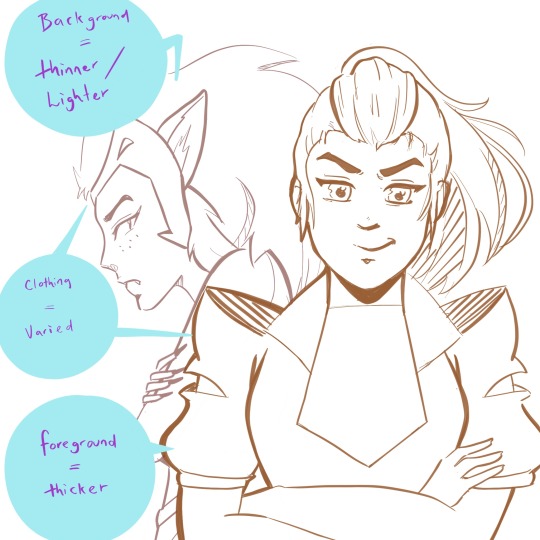
(yeah I couldn’t help but add a little she-ra to this post...)
The exception to the rule:
Overall, most people would agree that they want their art to look good/be compelling over something that is technically accurate. If this means making bolder lines on something that would typically be thin (maybe someone’s hair, for example) because it adds extra depth and an interesting look -- then you should do that.
Example, what I generally do with my lines:
Shadows/Light Source
This can make your art go up a notch, and give greater depth to your illustrations -- even if you’re doing just some sketching. Knowing where your light source is will add more depth to both colour and black and white works. It can be tricky getting them right sometimes, but here are some general examples/rules.
(also, I’m no expert at this. these are just some things that I find generally useful).
Light source/Shadow examples:
Depending on the direction of the light source, will depend on where the shadows are.
(and of course I had to use zuko too because the dramatic lighting is perfect on him)
Shadows will change depending on the object, and the direction of the light.
Some things to keep in mind:
Things in shadow will generally have less detail (unless you decide you don’t want to do that for certain effects).
Interesting shadow shapes will usually win over making things technically correct.
Even googling “light source references” shows some decent results:
https://www.google.com/search?rlz=1C1CHBF_en-GBAU805AU805&biw=1536&bih=754&tbm=isch&sxsrf=ACYBGNQPqF22f6P5Fsz2VnrUFzOJ-RV8TA%3A1574554362929&sa=1&ei=-srZXfmuOPSH4-EPwOWouAs&q=light+source+refernce&oq=light+source+refernce&gs_l=img.3...568.1258..1376...0.0..0.274.1470.2-6......0....1..gws-wiz-img.......0j0i5i30j0i8i30.X4dgUAjeEVQ&ved=0ahUKEwj5k-2LyIHmAhX0wzgGHcAyCrcQ4dUDCAc&uact=5#imgrc=_
Also, this is a good resource too:
https://youtu.be/ZJkIaMECW6c
Basic Colour Theory/Colour Tips
Complementary colours are those that are found opposite one another on the colour wheel. They go great together in work because it can add contrast, drama, intensity, and just some great colour design.
When using complementary colours, it’s easy to just pick two colours opposite each other and decide to colour with them in equal amounts.
While this can be nice, if it’s the look you’re going for, it can also be overbearing if that’s not the look you wanted. One of the things I was taught by an artist friend, was to try and use the complementary as an accent colour -- to make things pop and come to life in the work.
These are just some things to keep in mind, and either way is good.
Resources:
https://youtu.be/Qj1FK8n7WgY
Colour theory continued -- Building Palettes:
So, building palettes that work/using only a few colours (something I’m still trying to learn!). There are many ways to do this. You can use a complementary pallet, an analogous palette for a harmonious effect, or even a monochromatic palette .
There’s also a triadic approach (plus a few other ones I don’t often use), but I honestly haven’t thought much about this so I’m not sure what advice I can give.
It’s basically three colors that are equally apart on the wheel, for example: red, blue and yellow. If you find this interesting and end up using it, show me the results -- I’d love to see!
*I’m a big fan of doing things either complementary or analogue when building colour palettes, but monochromatic paintings can have an amazing effect and it’s something I will definitely be trying in the future.
note: colour theory is in-depth, and a lot more complicated than this (largely due to most of us being taught incorrect colour theory as children -- technically some of the colour theory above is not quite correct but a comprehensive colour theory guide would take tutorial of it’s own). So if you’d like to know more just let me know.
Resources:
https://www.google.com/search?q=color+palette+ideas&rlz=1C1CHBF_en-GBAU805AU805&sxsrf=ACYBGNQJtnt9SzKjFpxC-HXzuivXPW6vGg:1574906679811&source=lnms&tbm=isch&sa=X&ved=2ahUKEwjViNHJ6IvmAhUv6XMBHaaHAp8Q_AUoAXoECAwQAw
Over Saturation
Saturated work can look really great if that’s what you’re going for, but a lot of the time this is something that happens by accident when learning how to use colours and it can look quite garish.
There’s a few things you can do to help with this.
Make a colour palette or guide before you begin to colour so don’t accidentally over saturate
Find a colour palette that suits your work and use them as your palette
If you’ve finished a piece, and it’s already too late to change it you can play around with the colour settings in your program (photoshop and procreate both have some settings you can toy with that can reduce saturation intensity)
*just like using complementary colours as an accent, you can use minimal bits of saturated colour to draw attention to certain aspects of your work you want noticed
A few other little things
● Another thing to think about is composition -- planning how you want your art to look (which could be something like: including negative space, using the rule of thirds, making a specific feature the anchor of the piece, line of sight etc.)
● Make a pinterest board (or whatever else might help). I make boards for things that inspire me, tutorials I might like to try, references, and even separate boards for individual projects. It can be a great place to store your ideas!
● Also, remember that you don’t need to start doing all these things at once. Start small. Small is good. :)
● Every once and a while go over the things you think you know well. You’ll be surprised how much a little revision can improve your skills, even with something you’re good at.
● USE REFERENCES!!!
So how was this? If you’d like me to go more in-depth in a specific area, I can sure try! Excited to see how your journey goes and I hope this helped! ^_^
xoxo
Rora
7 notes
·
View notes
Text
ENC 1102 Final Project
For my final project in my Introduction to Inquiry Based Research course, I am writing a blog post about the research I conducted this Spring 2020 semester. It’s school related so I’m posting it here! This is going to be a long one so grab a cup of tea or a plate of fruits and vegetables and strap in.
TW: brief discussion of body image, mental health, addiction
Social Media: The Effects of Growing Up Online, and How We Can Use it for the Better
Introduction
I used to struggle with self control when it came to being on social media. Social media blew up and became a huge thing for seemingly everyone to have right about when I was growing up and going through the critical developmental stages of adolescence. Myspace was just before my time, it had left its glory days before I had any social media. But then came Facebook. And then Instagram. And Vine, Snapchat, Twitter, etc. My generation was the first to experience having social media from a young age and all the way through our teenage years, and then finally reaching adulthood. I never had anything like social media before. I barely had a phone and any contacts to message before switching to a smartphone and then having social media accounts, and I think that contributed to me not knowing what healthy limits were.
It came and went in phases. There would be a period of time where I would unintentionally spend hours on my phone every day, just scrolling through Instagram. I wasn’t using it in a meaningful way, like connecting with friends and family, I was just scrolling. Mindlessly, endlessly.
I realized at some point, probably in my early years of high school, that this was an issue. It wasn’t horrible, but I still was spending more time than I wanted on my phone, and throughout the years, I have become better at being mindful with how I consume and use social media, and I have noticed that I have become so much more present in general. I don’t know if this was directly because of the healthier relationship with social media I have now, or if it was just coincidence in timing. I was lucky that I wasn’t too negatively affected by social media, but many people have raised concerns on how it may affect our mental health, and I decided to look into it more and see if I could help even just one person with this.
Mental Health: Social Media as a Stressor
Social media platforms were created to connect us with our friends and family. That’s the “social” part of it. However, social media has become a place where people typically showcase the best parts of their lives. Some call this the “highlight reel” on social media. These snapshots of fleeting moments in our busy lives only show the internet what we want it to show. I am aware that there are exceptions though, such as spam accounts where people share their more vulnerable moments with a private following of their close friends and sometimes family, or social media personalities such as Trisha Paytas who share many vulnerable, not so picture-perfect moments publicly, but the average user doesn’t tell their friends and followers everything that’s going on behind the scenes. Therefore, the majority of posts don’t accurately portray our lives. This isn’t necessarily a bad thing - we all need boundaries and privacy - however, this can sometimes make users feel as if they aren’t enough, or that they aren’t doing enough.
Humans have a habit of social comparison. We do it naturally because it’s a way for us to “estimate one’s past and present social standings” as Tahir M. Nisar, an associate professor at the University of Southampton, wrote. Many people compare their own lives to the lives of others as a means to evaluate themselves and to measure whether they’re doing well or not (Nisar 55). This has been a generally known fact for a while, but when I conducted my own research via online survey, I asked the participants if they ever found themselves comparing themselves or their lives to those of others they see online, and 47.9% of them said “yes, often”, while 43.8% said “sometimes”, and a mere 8.3% said “no, never”. Comparing yourself to others is natural, and it isn’t always a bad thing, but for some it can become a dangerous rabbit hole.
Jeff Cain, an associate professor at the University of Kentucky, wrote that these comparisons “often result in envy, depression, reduced happiness, etc. because they perceive others’ lives more favorable than their own.” I’m sure most of us have experienced this at least once before where we wish our lives were more like someone else’s without even realizing it. It can be a hard thing to not do! The problem here is that that can lead to us setting unrealistic expectations for ourselves, and then us being too hard on ourselves when we don’t reach that level.
Some of the unrealistic expectations we may place for ourselves can be physical appearance. 8.3% of the participants in my survey said they often photoshop their appearance for social media, 10.4% said they sometimes do, 10.4% said they do but only rarely. This is one thing that needs to change.
A good sign is the rest (70.9%) said they never photoshop themselves. In recent years, body positivity has grown and become a more developed movement, leading the online community in a more positive direction. This is a great use of social media, using platforms to share positive, helpful messages to bring together a community and to spread awareness and knowledge of a particular topic.
Coping: Social Media Used as a Distraction
When I conducted my research, I asked the participants what the main reasons/purposes were that they used social media for, and the majority of them said something along the lines of “to connect with friends and family”, and many said they used it to pass the time, to stave off boredom. Sometimes, users will go on social media to distract themselves from negative emotions such as sadness, loneliness, anxiety, stress, etc. Although not a permanent solution, it’s a temporary relief, and this can be helpful. Sometimes, social media can be a distraction from important things though. I know I definitely get distracted from studying or doing homework by checking social media. I’ve already done it once while writing this, yikes. But don’t worry, it’s not all bad!
Ahmad Mushtaq, an academic Vice Chancellor at Alberoni University, and Abdelmadjid Benraghda, a professor at Universiti Malaysia Pahang, found that students mostly used social media to “improve their knowledge and information.” They found that social media was actually a useful tool in education, because it allowed students to find information easily and connect with peers and instructors.
In my research I asked if participants find that they get distracted by their phone and go on social media while doing tasks such as homework or watching movies, and a whopping 77.1% said “yes, often” while the remaining 22.9% said “sometimes”. No one said “no, never”. This may be connected to how many people find it difficult to focus. Using apps that don’t allow you to check your phone for a period of time can help reduce the amount of times we get distracted by social media. One of my favorites is an app called Flora, where you can grow a little tree for staying off of your phone for the chosen amount of time.
Addiction: Excessive Social Media Usage & Reliance
When we think of addiction, we often think of substance abuse, but it can also happen in areas such as social media usage. Within the millennial generation, substance abuse has actually decreased, but smartphone use has increased and continues to do so. Researchers believe that “those susceptible to addiction have simply shifted to a new drug: smartphones” (Cain 739). Cain also writes about how “neuroimaging studies show that Internet addiction...shows similar increases in activity in brain regions associated with substance-related addictions”. Several studies have indicated that as levels of depression and anxiety of an individual increase, they become more inclined towards social media addiction (Simsek 115). One study showed results of a “positive relationship between social anxiety and social media addiction” (Baltaci 78). Although my study was not nearly extensive enough to determine if any of my participants suffer from social media addiction, I did find that the majority of them spent 3 or more hours on social media a day. In fact, four of those participants responded that they spend 9 or more hours on social media a day.
One thing that many users have experienced is FOMO (the fear of missing out). I have experienced this myself, especially in middle school and early high school. A user who experiences FOMO may feel that if they don’t check their phone, they might miss out on conversations, like in group chats, or things like recent events, opportunities, etc., so it may cause them stress or anxiety if they don’t regularly go on social media. On the other hand, some people get stressed/upset when they do go on social media, because they see photos or posts in general from an event or get-together that they either weren’t invited to or couldn’t make it to. Because of these negative feelings related to social media, FOMO has been associated with unhealthy smartphone use (Cain 739).
That was a lot, so what do we do?
Ok, so I know that was a lot of information, probably too much for a blog post on tumblr, but since I wrote all that out anyway, what do we do with it?
Although there were many negative responses indicating that certain uses of social media had harmful effects on mental health, including studies and results that I didn’t mention, there were also results that showed that many people felt indifferent with social media, and it was sometimes even beneficial (such as the academic use of it).
Those who spent longer amounts of time on social media tended to also feel more negatively when using it, and felt better when they used it less, so I would recommend monitoring your usage time and being careful of spending too much time on it. “Too much time” is very subjective though, so perhaps logging how you feel in relation to how long you spend on social media can give you a good idea of what a good amount is for you personally. Spending more time doing things with our hands/bodies, like physical activity or hobbies, can be very healthy ways of spending our time instead of being on social media. It can help distract us from the urge to check our phones, a distraction from a distraction if you will.
When it comes to content consumption, we all must be careful of what we expose ourselves to. Reducing or even completely cutting out certain content that stresses or upsets us can help tremendously. This can even mean unfollowing certain people who’s posts may make you feel upset, even if you know them personally, were friends at some point, or are just acquaintances. Even though it may feel awkward or even mean to do that, it might help in some cases.
Maybe you could relate to some of the things I wrote about in this post, maybe you didn’t relate at all, but I just want to thank you for reading all the way till the end, and I hope this helped share interesting information that can be useful to you.
#socialmedia#english project#research#research project#social media and mental health#mental health#fomo#growing up with social media#social media#how social media affects us#body image#body positivity
1 note
·
View note
Text
24/3/20_Illustrator2
In this weeks session we explored Illustrator further by rendering using the pen tool and different colour options, creating a personal monogram and the use of Ai and Ps as a fluid pair.
This weeks session was a little different, being an online session using Adobe Connect, raising its own issues and tasks despite the lesson itself. Please bear this in mind when moving forward with my blog and thank you for your understanding.
-- stage 1 --
Renderings:
We started the further exploration into Illustrator through the pen tool. When manipulating a shape or drawn line, the direct selection tool is perfect. You can select individual points of a shape, or multiple at a time in order to create the perfect lines.
In order to directly copy a shape inside another, with perfect distance between the two lines, you can use offset path. Its a tool that isn't used that much, but when you need it you can create absolutely perfect lines.
When using the pen tool, both Alex and I usually draw half of a mirrored shape and then copy and mirror the drawn line using TransformReflect. You can then press Cmnd Y to bring us the wireframes up, you then can select the two mirrored points with the direct selection tool, use Cmnd J and join the points together.

The final step to the renderings is to add colour and keep in mind the order of the layers when colouring. To move the layers about you can use Cmnd [ ] to get them into the right order. Remember to have a play around with the thickness of the lines to get a sense of depth and dimension.
Instead of the Apple Watch task I decided to do the iPhone task instead, as I have used rendering in Adobe Illustrator quite a lot and wanted a bigger challenge. In the time given in the lesson, I was able to render the back of the iPhone with fairly accurate gradients. I don’t use the gradient tool very often but I learnt quite a lot when playing about with it today.
Below: On the left is the example and on the right is my rendering.
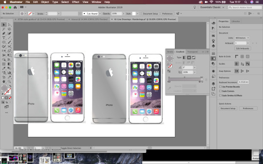
-- stage 2 --
Monograms and the Gestalt Principles:
The Gestalt psychology is the theory that we see things as a whole rather than individual objects. Gestalt psychology or gestaltism is a school of psychology that emerged in Austria and Germany, based on work by Max Wertheimer, Wolfgang Kohler, and Kurt Koffka.
It gets us thinking about principles of layout and why things look right or wrong, we can use these principles to get us out of a design jam and prompt us to think about what might not be working. Rather than seeing individual elements we see the relationships between them, objects will be perceived in their simplest forms. When designing we need to think about context and what helps our brains perceive the world around us.
The six main principles are:
-Figure-Ground
-Similarity (relationship between objects through similarly in shape or colour)
-Proximity (how close a shape is to another)
-Closure (negative or blank space, filling in the gaps)
-Continuity (guiding the eyes)
-Order
By human nature we perceive lines and curves as a single element, e.g. a roundabout. The mind will attempt to fill in details that aren’t actually there, meaning that white space or negative space design can work. According to Gestalt psychology, the world is different from the sum of its parts. The mind will always attempt to fill in gaps or work through continuation, when the eye is compelled to move through one object and continue to another object (often used in typography based logos). With continuation you can guide the eye from one object to another through compelling with guidelines or gestures. With continuation the design implies that an element is there when isn't really, allowing our mind to fill in the gaps through implication.
Using implication and negative space is so simple but so effective, thinking about the shapes and context you are working with will allow you to create a thoughtful and unique logo.
Using my initials, NB, I created a few monograms in the lesson. I only managed three in the time given for the exercise. I like the third logo and it goes to show how developing an idea over and over gets you to a better final render.
Inspired by modern minimalist design, my logo would fit in well in a sports scene, being very sleek and masculine looking. It is important to keep in mind how something relates to its context and how it visually fits into it.
-- stage 3 --
Using Photoshop and Illustrator together:
When creating a workable document, it's important to use layers, grids and guides. This will help us get an accurate document to work with across the above suite.
In Illustrator, we can create a grid bu going to object-path-split to grid. With this we can the create a gutter (InDesign usually uses 4.322mm gutter). Adding these grids to the top layer and locking them will show a guide over the image, with accurate layout.

Working with Photoshop and Illustrator together, rather than saving the file as Jpegs and placing them as Jpegs, you can move a .psd file straight into Illustrator.
Cmnd+Tab scrolls trough apps quickly!
To find a file from another Adobe software, press ALT and double click it to open the original file.
-- reflections --
I will definitely be updating this blog in the future with my own personal branding. I really enjoy creating logos and although it is difficult to create something for yourself, it is important to have your own personal brand.
The essence of personal branding is reducing a persons whole career, identity and skillset into its visual essence. My client has a background in design and works as an in-house graphic designer for a gaming company. This will require an insight into both the design and gaming world in order to marry the two fields together and create an effective personal brand.
-- inspirations --
One logo designer that inspires me is Paul Rand:

Left: Logo for IBM, 1956; right: 8-bar version 1972
He skilfully uses contrast and minimalistic colours alongside negative space to create memorable brands. His work isn’t exactly colourful, but he notably followed the Gestalt principles and from this created some of his own:
“A logo derives meaning from the quality of the thing it symbolises, not the other way around.”
Designers should see logos as a means of converting messages. Rand however sees a logo’s meaning by association with the brand or product itself. Not that logos are insignificant, but that they are free to be designed however one chooses. They are visual language of marking something, not the context itself.
“The only mandate in logo design is that they be distinctive, memorable and clear.”
This means a logo doesn’t necessarily have to directly visually depict the company it is trying to represent. The subject matter of the logo has relatively little importance, and sometimes it is better to have a completely free logo!
“Simplicity is not the goal. It is the by-product of a good idea and modest expectations.”
A logo has capabilities, but like everything these are limited. Trying to sum up every point, key detail and context of a brand will create a cluttered logo. Focusing on key points or elements will in itself generate beautiful simplicity. Don’t strive for the end goal, instead create a considered and refined concept and simplicity will naturally derive from this.
-- further development --
To further develop my monogram branding, I created a few more logos that I could possibly use or use as inspiration in the near future.
Working from the Gestalt theory and Paul Rand’s principles, I created a personal logo based on my initials, nicknames and current brand name.

Above: An idea I tried based on the morse code for the letter N. I like the look of it, but think it could use a little more creativity. The logo idea and execution is a little basic for my liking. Maybe generating an idea around iconography will work more in my favour.
Two other concepts I created were edits of the N shape. I wanted my logo to look fluid and Nimble, like the name of my personal brand. Creating a sense of movement and speed was important to me when creating this logo. I think I created good sense of movement through the implication of arrows, giving my design a sense of direction, literally.
I created two styles of this directional logo, matching bottom text with the weight and style of the logo. I think I prefer the second logo as it has a more clear sense of direction and movement. Although I like these logos, I am still not satisfied with them as a final design.

I ended up revisiting my third logo to make the N and B lines match, I much prefer this as a logo, and though there are still a few edits I would make, I am pleased with my exploration of Illustrator rendering.
1 note
·
View note