#and when it comes to the 3D models for puzzles its like
Explore tagged Tumblr posts
Text
finished playing KEY and had a good time. its a definite improvement over MID, but the new controls definitely take some getting used to. one i always had trouble with was rotating objects to observe them, because once it got slightly out of my control i couldn't reorient it easily.
otherwise, i enjoyed the puzzles (and how many more there were compared to MID. one of my favorites was the play script puzzle), even if some were definitely not the most intuitive/i needed more information for them. some of the new functions, like texting, are fun additions
my major complaints honestly were that despite adding in a bunch of things, the game felt emptier than, like, SEA, especially when it came to the phone calls. why do you keep sending me to voice mail boys. and i think the ending had a lot that was thrown at once, but it didnt ruin it for me/i think other games have been equally as rushed/busy
point is i'm interested to see where they go next with these games
#i didnt want to be too negative because like#at this point comparing them to the old games is something i will do but#doesnt seem actually that useful of a metric anymore considering how things seem to be going#another thing is that its visually busier but you cant interact with half the things#and there's no real way to distinguish between things you can interact with and things you cant#and when it comes to the 3D models for puzzles its like#okay where do i click on you because im having trouble figuring it out#on the other hand if im trying to be positive its more like 'wasn't as bad as MID!'#because otherwise it doesnt stick out that much to me as unique from other games#im slowly becoming a nancy drew game blogger#nancy drew#KEY#blue talks#anyways curious what other people thought of it so far
3 notes
·
View notes
Text
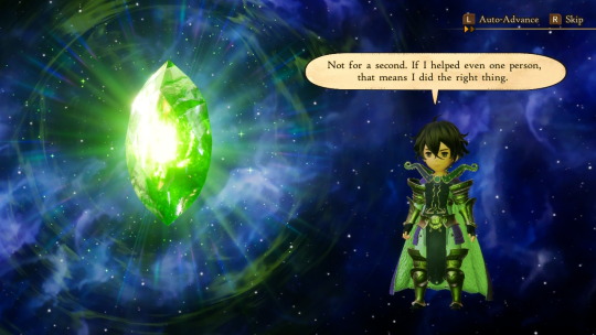
Time for the first backlog report of the new year! I didn’t actually finish as many games this month as I thought I would. I was intending to put Octopath Travler 1, The Lost Child, and Pokémon Black on this list, but such has eluded me.
Bravely Default II:
I gotta be honest. This game isn’t on here because I completed it. It’s on here because after several years of playing on and off, after having been stuck on optional bosses one too many times, after reviewing the fact that it is number five on my longest played Switch games (sandwiched between Dragon Quest XI and Trails of Cold Steel 3 if you’re curious), I still find myself not liking this game. I played for more than ninety hours, but only rarely in that time did it ever feel like I was having fun. I have many, many issues with this game, which probably deserves its own post.
What I’ve learned from this game is this. 1.) If you don’t like the demo of a game, don’t purchase the full game in the hopes that it will get good. It won’t. 2.) You can disagree with literally everyone else without being a contrarian if you have actual beef. 3.) Sunk cost fallacy is a bitch. If it sucks, hit da bricks!
Ghost Trick: Phantom Detective:
Now for a game that is perfect in every way! :D
The music, the rube-Goldberg puzzles, the story, they’re all great! Every single character has unique motion to them, from Inspector Cabanella’s style to Bailey’s Panic Dance, to *Spoilers* unnerving self-manipulation. The amount of character packed into this game is untouchable. It stole my heart so completely that it’s become one of the few games I’ve ever 100%’ed.
Now go play it for yourself! It only took me like two or three days!
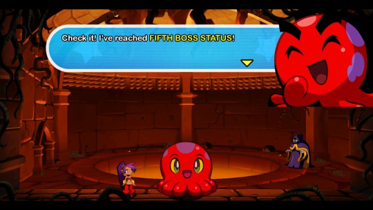
Shantae, Half-Genie Hero:
This game has been sitting in my Switch Library for quite a while. I’ve enjoyed the Shantae series since Risky’s Revenge, on the DSi.
Wayforward seems to have put significant effort into the presentation. The 3D modeled environments actually help the platforming in a way, making it easier to distinguish background from interactive elements. The music is nothing short of great.
I do find the plot to be a bit thin however. I hopping across levels to fulfill Mimic’s grocery list isn’t exactly high-stakes adventure. They try to tie this all up with a supposed threat to the realm of magic, but it only comes up at the beginning and end, making the individual ‘episodes’ feel disconnected. I also find it odd that they try to put in a ‘You can rely on your friends’ Aesop when in this game they debatably do the least, outside of Sky and Wrench being your taxi.
On that note the whole ‘Shantae is fired’ bit would have hd more weight to it if we visited more than one town.
Regardless, I do think it’s a fine game, and one worth the time spent on it.
Bayonetta 2:
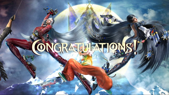
As long as there’s music, she’ll keep on dancing! And there is music and dance aplenty in this game!
The combat is just as smooth, with the introduction of the Umbrian Climax only adding to the experience. The music and visuals are both crisp and clean, though I have to say that I prefer the first game’s soundtrack overall.
The plot is good, with plenty of twists, but I find that they should perhaps have split the ‘Jeanne must be rescued from hell’ and ‘amnesiac kid gets involved in supernatural family drama’ should have perhaps been saved for different games. I like Loki, (breakdancer who fights with a tarot deck is such a fun character idea)but we came for the girlfriends. I also wish they leaned in more with being able to fight demons. Having a separate enemy category for them is a nice step, but less so when there’s only like, ten or twelve of them.
#backlog report#bravely default#bravely default 2#bravely default ii#ghost trick#ghost trick phantom detective#shantae#shantae half genie hero#bayonetta#bayonetta 2
10 notes
·
View notes
Text
[Review] The Legend of Korra: A New Era Begins (3DS)
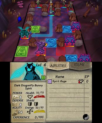
A cromulent companion game.
Platinum's console/PC Korra game was accompanied by a 3DS release. Well I say accompanied; unlike that game, Activision only bothered to release this one in North America. Now I finally have a chance to play it thanks to custom firmware! I know developer Webfoot Technologies best for their Legacy of Goku GBA games, and now here they are with another handheld game based on an animated licence. But how does this tactics RPG stack up against its action sibling?
Despite the new subtitle, this game is built on the same story as the console game. Creepy old guy blocks Korra's bending, the alliance of Triads/Equalists/dark spirits, returning to the Spirit World via the South Pole. But this version has some additional details, like the inclusion of Amon's lieutenant as a miniboss, Korra seeking the advice of spirits in Republic City's spirit wilds only for them to turn dark and attack, or visiting Wan Shi Tong's library for help relearning spiritbending (complete with a boss fight against the big owl himself!) I also enjoyed entering the cosmic universal energy dimension for little puzzle challenges when Korra was regaining her bending powers. In addition to these additions, a big change in how things play out is the extended cast joining her on the adventure, an upside to the shift in genre.
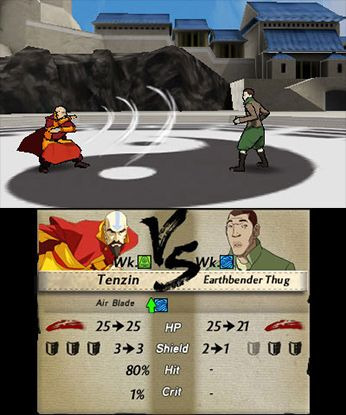
From the start, Bolin and Mako are with Korra, then Tenzin and Kya join in, and finally Lin making for a team of six bending powerhouses. Bumi and, sadly, Asami are still conspicuously absent. But the extra tag-alongs make for actual conversation and more convincing bridging exposition in cutscenes, more appropriate elemental tutelage as Korra relearns her bending styles, and some choice quips. For example, we learn that Bolin named his fists Juji and Roh-tan after Nuktuk's animal sidekicks, and that he has become genre-savvy as a result of his mover career: "when there is fog, something bad happens."
There are understandable presentational drawbacks that offset this. Gone are the full animated sequences, replaced by brief motion comic-style cutscenes. There’s no voice acting either, which is fair enough. And gameplay just cannot look as flashy when you’re just moving sprites around a grid.

To be fair, the sprites look very good. And you get an adorable graphic of Korra riding Oogi on the menu screen. When it comes time to make an attack, the game cuts to a short (and skippable) 3D sequence showing the results, complete with decent little models doing mocapped martial arts moves. The spirits and the main antagonist Hundun can look a bit goofy in these but the mecha tanks are pretty cool if low-detail. The latter in particular have hilariously tiny sprites on the battle map, a stark contrast to their humongous chungus depiction in Platinum’s game.
The tactical gameplay is competent for the most part with decent map designs. The controls and interface can be a bit clunky but they get the job done. There’s a shield mechanic that’s a neat twist, as well as an elemental weakness system that lets you bypass the shields. I liked how each character had their own niche: Mako has many ranged attacks, Lin and Bolin get area effects, Kya can heal, and Tenzin can replenish mana energy points which I had him doing almost every turn once he learned it.
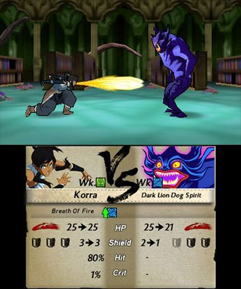
Any attack or even healing and support moves get you experience points which is nice, and every other level-up you get to choose between two skills. These can be new moves or passive bonuses but choose carefully because you can’t change them later! I found myself with a Korra who only knew waterbending for the vast majority of proceedings, and you only get one shot at each other element. Everybody was max level (15) a few stages before the end, but if you’re having trouble with a battle there’s a training stage you can do freely for some extra XP and money (used for buying healing items). You can’t replay completed levels though, even though you get graded on side objectives.
I was pleased by this little tie-in. I’m not a huge expert on tactics RPGs but this one seems good for intermediate gamers like me, not too punishing. There’s some amount of crunchy depth to the elemental system and using each character effectively. And as a Korra fan it’s nice seeing the characters and world rendered in a different style, especially those cute sprites. Not to mention the slight expansions to the storyline. If you’ve got a 3DS, there’s no reason not to head to your local flea market hShop to pick this up!
#the legend of korra#avatar the legend of korra#avatar the last airbender#avatar#webfoot technologies#review#3ds#the legend of korra a new era begins
9 notes
·
View notes
Text
PS2 Review: Katamari Damacy Rolling Rolling Rolling Rolling Star
In an ocean of classic and well remembered titles like the PS2’s library sometimes it’s hard to pick out specific examples of what made the console stand out. Other times it jumps right to the front of your mind almost immediately. This is one of those times, because when I think “best games on the PS2” I never fail to think of one game series: The Katamari games. Now today I’m only going to be talking about the very first title, Katamari Damacy, but nonetheless would like to drive home just how incredible this title is both as the first game in its series and as one of the most cosmically fun PS2 titles in the entire library.
Visuals
Where do I even begin? Katamari Damacy boasts one of the most endearing art styles to date. With a gorgeously wacky intro video featuring a bizarre cast of characters and scenes to its endlessly charming low-poly models and bright popping colors. It’s an understatement to say that the game’s visuals were built to last. Objects and environments in the game are mostly based on modern (at the time) everyday objects and locals from Japan. Some interesting trivia on the timeless art style is that it was created due to the maker of Katamari, one Keita Takahashi, was suggested by his former boss, Mitsutoshi Ozaki, to approach a senior class of the Konami Computer Entertainment School who at the time was being trained on 3D modeling for possible game prototypes with other Namco employees. Takahashi approached the class about creating the multitude of 3D objects and models needed to populate the wonderful world within the game, ultimately resulting in the charming art style we’ve come to appreciate the series for. I really can’t understate just how well the visuals have held up for how simplistic they are. Without much else to say, they’re a staple of the series for a very good reason.
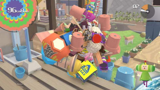
Level design
What could easily be considered the real meat of the Katamari experience is its delightfully designed levels. From a cluttered living room to a scaled down version of the entire world, there’s no shortage of fun to be had within the level design itself. Levels range from smaller scale and cluttered for the smaller rolling goals, to large open spaces that may even have their objects replaced via a loading screen halfway through. Levels are well made with large stretches packed with clutter (and often people/animals) and small vertical climbs/ramps for some more puzzling rolls. The game’s very first proper stage, Make a star 1, takes place inside that cramped living room I mentioned later. However, the size of the room is no object when it comes to just how packed it can get with objects to add to your ever growing rolling cluster.
Between being able to roll on, over, and under the kotatsu in the center of the room, the floor is positively littered with tiny objects such as coins, buttons, and batteries, and taller places like the couch and cupboards to roll across, the room has does a stellar job of being an introduction to the addictive gameplay loop of rolling. On top of this tight level design are the special levels, the constellations, which range from freeform fun to sometimes maddening precision. These stages are centered around collecting particular things to make specific constellations. Take Signus for example. That stage has you rolling up swan eggs in the backyard map, however, the eggs look exactly the same as every other type of egg in the stage. This includes chickens, crabs, fake plastic eggs, and some others that might trip you up, encouraging the player to make a mad dash to collect as many eggs as possible to maximize the number of swans you collect.
On the opposite end of the scale are the infamous cow and bear stages, taurus and ursa major respectively. But what’s so different? These stages are designed to test your rolling skills on an entirely different level. The goal of these two stages is to roll up only the single largest cow or bear. That being said, the maps these take place in are not only littered with clutter to improve the size of your Katamari, but also with cows and bears of far inferior size to what you’d need to get a good score. Meaning if you want to do well you have to bring your absolute best. Rolling into a single cow/bear item will end the stage instantly and stick you with whatever score that item would give you, unless you retry of course. It’s this fine tuning and pure focus on fun that makes the level design so freeing in a game that already feels fast and loose in the best way possible.
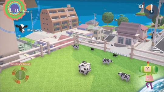
Gameplay
Here’s where the game can sometimes show some of its rougher edges. While most of the game is very smooth sailing, rolling around collecting to your heart’s content, it’s during these sessions of rolling action that you can sometimes get tripped up. The game’s control scheme, for example, is sometimes considered a bit clunky by modern standards. While I personally enjoy the feeling it provides of rolling your Katamari around just like the little prince you play as, it’s definitely unorthodox. To move you press both thumbsticks on the DualShock together in tandem as if they were your hands. This doesn’t seem too complicated until you need to alternate them to turn, or shake them back and forth for a boost. It’s not terrible, but can certainly feel like it results in some unpleasant navigation around areas that aren’t just straightaways.
Along with this are some of the game’s traversal mechanics themselves. In particular, climbing has never worked well for me. You’re supposed to be able to gently run your Katamari into shorter walls and sloped surfaces and have it magically stick and roll its way up. Useful, right? It would be if the game’s collision system didn’t register some objects hitting the walls as a full speed slam, making the object fly off with other smaller ones and your Katamari go spiraling away from the wall.
At worst it’s frustrating, but at best it’s a relatively smooth experience that sends you rolling and climbing over everything in your path to collect as much as physically possible. Everything else I could say about the core gameplay is to put it simply, unabashedly fun. With such a simple loop of roll, collect, repeat, it’s very hard to mess up. Even with the aforementioned hiccups the game provides such a solidly simple foundation that they come more as unpleasant bumps in an otherwise flawless road.
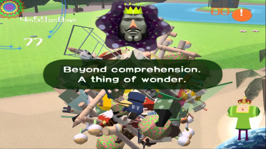
Story
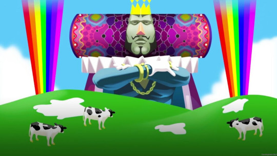
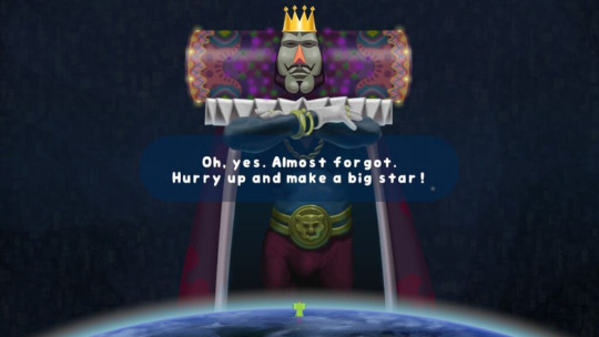
The shortest part of this review by far. Katamari’s story was never its focus. The game was made more to put emphasis on the joy and fun of playing it rather than any sort of gripping narrative. But as the simplistic story goes, your character (The prince of all cosmos) is the son of the strange and rather pompous King of all cosmos. Some time ago the king went on a bit of a bender where he destroyed all the stars in the sky for fun. Brushing right past how horrifying that has the potential to be, you’ve now been tasked with collecting items from Earth with your Katamari to throw up into the sky and replace the lost stars. Meanwhile on Earth, the Hoshino family follows a loose narrative of going to see the father of the family, an astronaut, blast off before the launch is canceled due to the sudden lack of stars. There’s not much else to the tale, unfortunately. You as the prince make your way through the game and replace all the stars, and celebrations ensue. Like I said before, it’s simple, serviceable, and an overall perfectly harmless narrative in a game that really didn’t need one.
Soundtrack
One cannot simply make a review of Katamari Damacy without dedicating an entire segment to the absolutely stupendous soundtrack. Wildly praised for being inventive and imaginative within the genre of video game OSTs, it’s stood the test of time better than just about anything else from the game. Most of its tracks were composed by the now legendary Yuu Miyake better known at the time for his work on the Tekken and Ridge Racer series, as well as featuring vocal performances from then-popular J-Pop stars such as Yui Asaka and prominent anime voice actors including Nobue Matsubara and Ado Mizumori. One track was even composed by Charlie Kosei of Lupin III fame. Much like the visual portion of this review it really cannot be understated just how stellar the soundtrack is. The game’s official theme, Katamari on the Rocks, reverberates from the very start with bombastic horns and chorus lines to punctuate the fantastically overstimulating opening. The game’s unofficial theme however, Lonely Rolling Star written by Yoshihito Yano, composed by Yuu Miyake, with vocals by Saki Kabata, has gone on to be one of if not the most popular pieces of music from the score. And for a very, very good reason. With a mix of electronic “video-gamey” sounding tracks and jazz ranging from smooth to wild, the music of Katamari Damacy stands as a testament to its place as a work of art among the best of the best on the PS2. The soundtrack would go on to win both IGN and Gamespot’s “Best soundtrack of 2004” award. It also saw a release as a standalone album sparking a trend that would follow well into its sequels. It’s incredibly plain to see just how passionate and vibrant the compositions are in tandem with the game’s endless charm.
youtube
Lonely Rolling Star from the Katamari Damacy soundtrack. Largely considered one of the game’s best tracks.
Conclusion and comments
Katamari Damacy isn’t a cult classic, and it certainly isn’t an underrated gem. It’s seen praise for years and years, spawning several sequel games and a full remaster/rerelease on all platforms in 2018 as Katamari Damacy Reroll. What Katamari Damacy is, is a work of art. An epitome of what video games should all strive to be at their core, fun. Endlessly charming, nearly infinitely replayable, and only topped by it’s the very next game in its long lineage of delightfully weird fun. But that’s a story for another time. This game stands tall among the other giants of the PS2’s already fantastic library and is a surefire addition to any collection looking for the best and brightest on the system.
#my stuff#my writing#video games#ps2#playstation 2#katamari#katamari damacy#katamari ps2#article#review#Youtube
10 notes
·
View notes
Text
Navigating Blender: A Gateway to Creative Careers
The Intimidating, Yet Rewarding World of Blender
For newcomers, Blender can appear as an intimidating labyrinth of functions and tools. However, this open-source 3D creation suite is more than meets the eye. It's a gateway to endless creative possibilities, paving the way for careers in various digital fields.
Mastering the Basics: The Foundation of 3D Artistry
Before delving into the complex features of Blender, understanding its basic functions is crucial. These include:
Modeling: The core of 3D creation, where you sculpt your ideas into tangible models.
Texturing: Adding colors and patterns to give life to your models.
Rigging: This is like digital puppeteering, where you create a skeleton for your model to move it around.
Animation: Bringing your models to life by creating motion.
Rendering: The final step where you turn your 3D scene into a 2D image or animation.
These foundational skills are essential for creating a 3D image and form the basis for more advanced projects.
Blending Software: When Blender Meets Complementary Tools
While Blender is incredibly versatile, certain projects require the integration of additional software, especially in the realm of 2D video production. Programs like Adobe After Effects or Photoshop often come into play for post-processing and fine-tuning, adding to the overall cost and learning curve.
The Leap into Game Development: Programming Meets Artistry
For those eyeing a career in game development, Blender serves as a valuable asset. However, it's just one piece of the puzzle. Understanding game engines like Unity or Unreal Engine is crucial, and this often requires programming knowledge. Languages like C# for Unity or C++ for Unreal Engine become essential tools in your arsenal.
Conclusion: A Journey Worth Taking
Blender might be daunting at first glance, but it's a journey worth embarking on. The initial challenges give way to a world of creative freedom, with opportunities in animation, game development, and beyond. While the need for additional software and skills like programming can add layers of complexity and expense, the investment in learning and tools is a stepping stone to a rewarding career in the digital arts.
As you master Blender and its accompanying skills, you open doors to a realm where imagination meets reality, transforming daunting beginnings into the start of an exciting, creative career.
#blender 3d#game development#game design#game developers#game dev stuff#game dev blog#unity engine#unity3d
7 notes
·
View notes
Text
Signalis
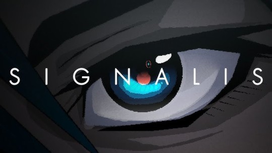
Playtime: 8h50m Completed: October 27, 2023
My initial impression of Signalis was...mixed.
Its classic survival horror PS1 aesthetic was exquisite in its presentation. The UI and blocky character models were all spot on, retaining the chonkiness of CRT-era games of yore while making the whole package just more accessible and smoother to play. The lighting in particular is masterful, bringing bloodstained hallways and derelict spaceships to new horrifying light in ways original hardware couldn't.

All the pieces of a survival horror classic were there, which is why the game frustrated me with its neverending references to other horror titles. The rugs in The Shining making a few appearances. Direct dialogue from Silent Hill 3 was injected into the game that served no purpose other than to be a reference. Some sound effects come right from Alien. The game can be anchored down by being a homage to everything that came before it.
I suppose this had a purpose. Like the mangled memories of the anime androids we were unearthing, these references are made to reflect the memories of the players back at them, intentionally invoking a feeling of "wait...have I been here before?" I'm sure there's no shortage of spilled ink about these references and the games overarching themes of cycles and memory, but I had very little interest in that dead-end commentary as I was playing the game.
Instead, when the game does attempt to make something new, it almost always succeeds. The radio-based puzzles were fresh and unnerving, and the handful of boss encounters are clearly well thought out. The presentation, which almost too often had an air of unearned pretentiousness, still manages to make the game stand out and resulted in a few chilling sequences.
When I think back on the game after it's distilled in my mind, those unique moments are what float to the top. Signalis is overall great, certainly one of the best survival horror games of the last few years. I just wished that it pulled more on its own unique style instead of being stuck in the past.
Also it made me lose it every time the game would cut from gorgeously rendered 3D scenes like this:

To C-tier anime art like this:

Just took me right out of the game...
11 notes
·
View notes
Text
Virtue's Last Reward
In some ways it's better than 999 but in some it's worse.
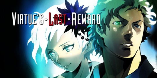
The characters are pretty memorable, I was afraid it'd be staler than the eccentric personalities of the first game but it remains. A plus is that our new main character, Sigma, doesn't talk. (Well, he does, but he has no audible dialogue so he's not as annoying.) It carries over that problem from the last one too where they overexplain things like it's a children's game but it's rated M otherwise. Visually, it switches the 2D sprites with 3D models, which can be considered a downgrade in some ways but it's easier to navigate the rooms though with proper 3D environments versus simulated for the DS (it's the 3DS now) but it's put on this nice collection on the PC so it looks smoother and cleaner.
The one complaint I have about the port in general is that it could've cut some things out. I imagine the transition scenes were made to mask loading screens but we don't need them anymore and they're more tedious than Resident Evil's. While not as often, they take longer because they'll go somewhere and it shows them as a blinking dot on the map and the route they're taking (not that it matters most of the time, when it does matter, they reiterate the sequence anyway) but they'll show them going across an entire floor, go to the elevator, stop, show them pressing the button, the elevator comes, wait for the elevator to descend, beep, open doors again, back to map, show them moving to their destination again, it's just meaningless. And there's a skip but it's only for stuff you've seen before (in any route) so it usually doesn't include the transitions and when it does, it needs to be activated before it starts because it doesn't give you the option during.
And also (...) they have a tendency to (...) whenever (...) there isn't anybody (...) saying anything and (...) they'll show it (...) for each character. There were some parts where my experience was an error but I couldn't find proof of others being that way. Gaulem Bay for example, there are rows of (nonspoiling here) "lights" that some are on and some are off and you use that pattern to activate a puzzle, however, mine spelled out something different than what it was supposed to, I double and triple checked in game even after I looked up the result and the same answer got back to me every time.
All that remained was the ending. Would I find the outcome better than the last one? Because the other one reached a little too far in terms of what you could've predicted with the face thing. Well...this ending isn't much better. I actually had this game pegged as "great", I even accepted as far as the Phi ending and would've given it a 3.5/5 but it was afterwards that reversed everything.
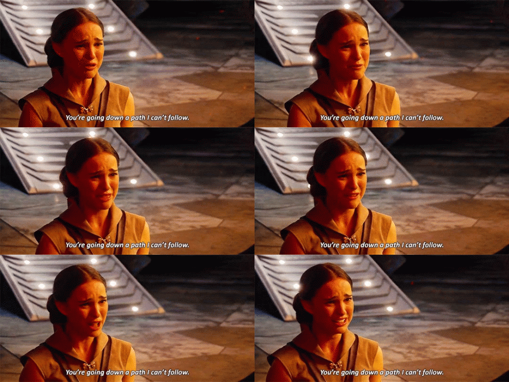
Literally. It's like Meet the Robinsons but not as a good thing. It takes the time to explain every aspect of it and it's boring, because it's a large infodump and exposition for the next entry in the series...as an ending. So yeah, it seems like it's going to be a complete package but it's not a complete story, while 999 was at least contained enough to seem satisfying. And I mean it really threw the kitchen sink at you too. It has the regular endings and then two hidden ones before credits roll but then two more after credits roll so it never really knows when to stop either. People complain about Kingdom Hearts but that's nothing, this is the real menace, overcomplicating and recontextualizing everything. Kingdom Hearts explains its way over a whole series of games, that's people's only problem and it's an outdated problem now that all the games can be bought in one package for the same system but imagine taking the plot and obscurities of those games and doing it all at once at the end of just one game. "Imagine a cat. Imagine a truck. Imagine a line. This is my name. This is my actual name. This is what I am. This is what I actually am. Let's review our history. Just use E = mc2. Imagine the relationship between classical mechanics and modern physics"....You think I'm joking? You think I just pulled all those out of my ass?!
So I don't think I'm going to play Zero Time Dilemma anymore.
3 notes
·
View notes
Text
Promenade Showcases its Gameplay in a Brand New Demo
- Promenade is a model new and impressive collectathon coming to Xbox consoles. - Obtain the Promenade demo and check out 4 completely different gameplay sequences. - Play as Nemo as he goes on an exquisite coming-of-age journey. Promenade is coming to Xbox Collection S|X and Xbox One on February 23. And we at Purple Artwork Video games are so excited that we needed to provide everyone the chance to check out the sport earlier than it comes out. That’s why we put collectively a playable demo that give gamers a style of what we imagine makes Promenade so good. That demo is obtainable proper now! However earlier than we get into the demo’s content material, allow us to let you know a bit extra about Promenade.
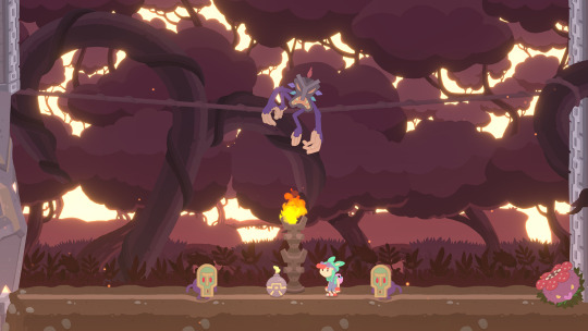
In Promenade, you play as Nemo, a child who finds himself dropped right into a world that's as mysterious as it's colourful. Fortunately for him, he received’t need to make his method by this magical place alone. When issues appear like they couldn’t get any worse for him, a cute, and really expert, octopus swoops in to save lots of the day. Joined by his new cephalopod sidekick, Nemo is tasked with the mission to restore the Nice Elevator whose cogs have been scattered all around the globe by a scary character. Why did that imply trying man break the whole lot you ask? You'll have to play Promenade to search out out!
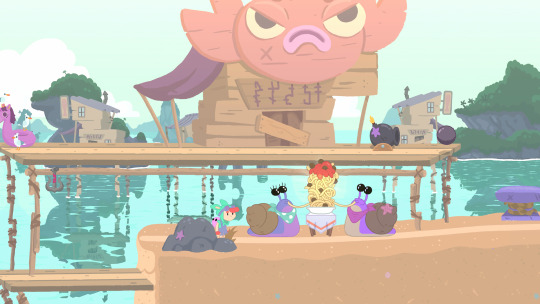
What we will let you know is that to place the all necessary elevator again in working situation, the courageous duo should go on a life-changing journey throughout a mysterious world stuffed with challenges, puzzle, races and humorous trying creatures. With a view to gather the 180 cogs wanted to completely restore the elevator, Nemo and the octopus should face many challenges. However it will likely be value it ultimately.
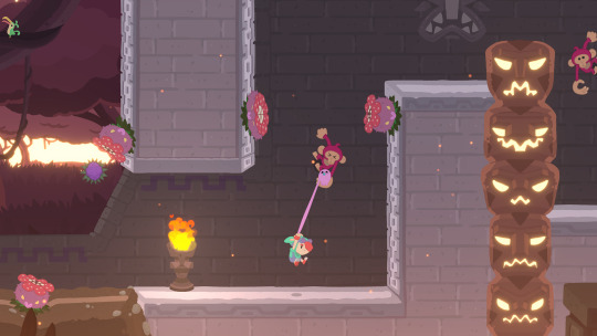
Promenade is a captivating 2D Collectathon stuffed with gameplay concepts and memorable scenes. Its story, advised by environmental storytelling, is certainly one of development. All through his journey, Nemo will be taught to beat his fears and self doubt. Promenade’s creators have been impressed by quite a few and diversified items of labor similar to “Alice in Wonderland” , “Little Nemo” – after which the protagonist too his title – “Journey Time” , “Peter Pan” , “Gravity Falls” and “Over the Backyard Wall” . And although it's a 2D sport, Promenade has additionally been impressed by 3D gaming classics similar to Banjo-Kazooie and Spyro the Dragon. The sport’s creators labored tirelessly to reinvent as a 2D title a style that's intently related to 3D video games. Within the Promenade demo, gamers get the chance to check out 4 completely different gameplay sequences, as many occasions as they like. We rigorously chosen these sections of the sport as we imagine that they present what Promenade has to supply with out spoiling the latter ranges. The primary sequence, referred to as ”Cavern of Awakening” begins off with the opening cutscene and leads into the tutorial stage. Once they attain the top of the extent, gamers have grasp of the sport’s controls.
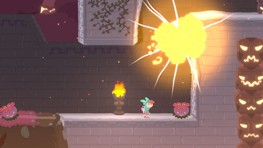
The second sequence, “Sandy Stroll”, is Promenade’s first full stage. On this sunny stage, gamers will get to select ups a number of the sport’s very first cogs. Some are simple to identify, others are effectively hidden… Sandy Stroll offers gamers an concept of the varied sorts of conditions they'll discover themselves in throughout Nemo’s journey. The third sequence, titled “Slinghops”, is a trial-type stage. The trials are skills-based ranges and are usually essentially the most troublesome ranges of Promenade. As soon as they’ve managed to get to the top of trial ranges, gamers can do it once more. However this time, with a time restrict…
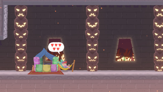
The fourth and ultimate sequence, “Masked Demon’s Lair”, results in a boss combat. With a view to full their cogs assortment, and achieve entry to some very particular mini-games, Nemo and his companion should face a set of bosses. Every boss combat is completely different and the heroic duo should use their abilities and reflexes to defeat them. Whereas Promenade’s creators developed it with speedrunners and followers of difficult video games in thoughts, extra informal gamers may even find a way their time with Nemo and his octopus pal. It's doable, and completely nice, to give attention to more easy cogs to get to Promenade’s ending. That being mentioned, gamers who handle to gather all 180 cogs will get to see one thing really particular…
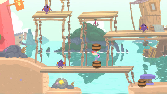
Promenade invitations gamers to search out out on their very own what makes every a part of the world and object distinctive. In Holy Cap’s debut title, making an attempt issues can result in stunning outcomes. However as we mentioned beforehand, don’t let its pastel graphics and humorous trying characters idiot you. Promenade has been rigorously crafted with skilled gamers and completionists in thoughts. Achievement hunters who need to get the 1,000 GS on Promenade can have their palms full for some time. We will promise you that! Ported to Xbox consoles by Purple Artwork Studios, Promenade is coming to Xbox Collection X|S and Xbox One on February 23. Its playable demo is obtainable now.
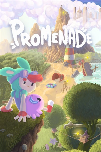

Promenade – Demo
Purple Artwork Video games ☆☆☆☆☆ ★★★★★ Oh no! The Nice Elevator has been damaged and its cogs have been scattered all around the globe! Journey the world together with your poulp utilizing a dynamic moveset to search out all of the cogs! Work together with colourful characters and remedy puzzles! Discover dungeons and face the bosses that dwell there! Use completely different objects and their properties to your benefit! Accumulate the misplaced cogs, restore the Nice Elevator and unlock new ranges on this collectathon immediately impressed by 3D platformers! Source link Read the full article
0 notes
Text
Personal Projects
Day 35 - Dec 10th, 12.023
I really don't know if I should separate them from "normal ones".
This is something which I can't decide now when I'm trying to organize more my "free-time", personal projects never really worked well for me. Outside of projects for people around me, gifts, etc. most of my projects I like to add the same amount of effort and brand in them, because like I said in some previous posts, I like branding and creating logos and good-looking projects. But does it make me really be resting when every project looks like a work project?
The problem with coding
Coding is one of the most enjoyable things that nowadays I do, I simply love how puzzle-solving-like it sometimes feels, and it's probably one of the best types of creative things you can do, because not only you have a fast feedback and see your work being built in front of your eyes, but also having it be interactive and probably something you want to use on your life is really a rewarding experience.
However, this is not the same experience that you will have when you're working with code in a professional environment. Most of the time you will be doing tasks for a product that you don't use, or even like. Which is... Ok, really, you can still do the projects that you like after work. Still, there's something which I can't really explain, but in this part of my life, coding always feel somewhat work-ish in every way, and also, having just code related projects for my hobbies and work feels almost a prepared recipe for burnout and boredom.
It's clear that coding projects are projects and not "personal projects".
The problem with hobbies
But, hobbyist projects shouldn't be put in a different category, personally. Why? Because every project nowadays can become a work and/or have and need the same amount of effort as the other ones, even more when you like to make them public and "marketable" like I do. With things like social media, my like of open-source, of brand and logo design, the Capytal dream, every project can and probably will become its own thing in the future.
I'm not even touching the monetary part of things and how hobbies can turn into profitable "side hustle". Yes, you are doing a hobby because you like it and have a passion, but liking or not, the idea of making it into an actual thing will always come to mind when you're creating it. Nonetheless, side-hustles still are a bad idea for me and I don't like them, the point I wanted to make is more about recognition and showing your work publicly in a nice way.
A solution[?]: intention
It's kinda obvious, this "solution", but I can't really think of anything better. But separation of intentions instead of projects themselves is probably the best solution for me. Not only that, but also the focus that I want in my life right now.
Coding is still a hobby for me, but it's also the focus of my life nowadays. Independent if it is a project created by me, one created by a boss, or one that won't help me get a job/work somewhere, coding is the focus of my life because I need a job, and what is driving my life in the future days to months. So, said projects related to it are the ones which I will work Monday to Friday, giving the most time of my days. Everything else is what's help me break the routine and help my creative mind still be able to work with different areas of my life.
The only thing I actually need to do is balance, and oh boy it's hard to do it. I have a lot of projects and hobbies, from creating a fictional world and drawing its characters, to creating modpacks and resourcepacks with custom 3D models for Minecraft, so the thing which I need to take care of if it's these "secondary focuses" are balanced in some way, so I don't end up just coding during the week, and drawing during the weekends. Do I really know how to do it or program it on Obsidian? No really, but for some time now I had the #scope/ tag group lying around, so maybe I could do something like Quarter's or Month's scope or something like that, so I can filter them when choosing my projects and days in general. I will make an update when this feature become added to the system.
However, there's a footnote: relationships. This is the only part of my organization and workflow which I still don't know how to organize. Yes, it can feel unnatural to "organize people in my life", but I'm not the best person when trying to pull conversation with friends and sometimes even save some hours to be with my girlfriend, so yes, I need some way to at least see if I'm giving attention to the important people in my life. This system probably will be best implemented when I start using some sort of time tracking software, so I'm able to actively see and choose to be with someone in that day. I just want to be a good friend and boyfriend, y'know?
---
Today's Artists & Creative Things
Creator: Aarthificial This is a creator that I have been watching for a very long time, since it's first video, actually. And it's a big inspiration for my interest in video making, creation and even game development and devlogs. Just the idea that he actually created an entire library/application to edit his videos and make the graphics that you see in his videos, explaining the logic and systems of his game in a visual way that I have never seen before, really makes he stands out from the rest for me. I know that I don't have a big influence or number of people reading these entries, but even then, subscribe to his channel, he's having just 100k is a disservice.
---
Copyright (c) 2023-present Gustavo "Guz" L. de Mello <[email protected]>
This work is licensed under the Creative Commons Attribution-ShareAlike 4.0 International (CC BY-SA 4.0) License
0 notes
Text
Art is not a carriage, it's not a vehicle. Its purpose is not to be efficient, to do a practical job with as little effort as possible.
Oh okay, here we go into the ableist diatribe of "effort" and "blood sweat and tears" to justify art's "value" in our labor-centric capitalist society.
Art is wonderful, from a baby's first drawing, inexperienced and unskilled, to the paintings adorning the ceiling of the Sistine Chapel.
I thought you just said art shouldn't be as little effort as possible? Do you think a baby scrawling with a crayon has any effort or intention behind it? (besides the obvious "this stick is cool and I like making cool lines on surfaces with it")
If you consider yourself an AI artist, I ask you: are you proud of yourself when the computer has completed another image that you will claim as yours? Do you look at it and feel the joy of having created something?
As an artist and designer that uses a stable diffusion tool, yes: after two hours of developing words that trigger the right understanding in the model set, weighting words so it properly picks up on certain details, configuring how far it can venture outside of the prompt, creating negative prompts to put up some guard rails, maybe utilizing a Lora for more style and subject focusing, making tweaks after every set of 4 come out, and then curating a final pack of images, yes, I look at it and feel joy that I created things.
Does the generative process teach you how to see the world better?
It teaches me how to envision and describe it better, yes. It helps me translate my mental images into art direction in a very fun way, like a thought puzzle.
With every image created, do you evolve?
I do! I get better at utilizing the GUI and I get faster at boiling down to what I want. I get familiar with different models and how they excel in different types of imagery (more painterly vs photorealistic, for example).
Do you understand the planes of the face better now than 1000 images ago?
Do photographers? Do poets? Do lighting designers? Do generative coders? Do cartoonists? The answer is yes, but in very different ways, so why does that matter?
Do you know what rim light is, and where to put it?
I just googled it, so thanks for the tip! Yeah I know where it goes now.
Do you understand light sources?
Here's a prompt for that:
"a polished ((glass)) pyramid sculpture (((refracting))) warm hazy (light) into a cozy bedroom during golden hour"
Tones?
Can you tell me an rgb hex value by looking at it? (this whole part is so gatekeepy btw)
Could you take a piece of paper and shade a portrait by yourself?
Yeah I did that a bunch for my BFA.
A digital artist uses a pen to put colors on screen, chooses where to put each brush stroke, when to smudge or use the liquify tool. A 3D sculptor manipulates basic shapes into characters just like a traditional artist molds clay. An AI "artist" doesn't make any of the thousands of choices that lead to the creation of a real piece of art.
Ahh, this is where you truly don't know what you're talking about. Inpainting, outpainting, using images as sources, training custom models, and literally any hardcore stable diffusion tweaking make these statements woefully ignorant.
"But art is hard, and I'm not good enough."
Art isn't hard, art is actually very easy. Like a baby that's drawing! "I'm not good enough" is toxic as fuck. "Good" is so so subjective. For most people what they're really trying to say is "there is a gap between what I'm imagining and what I'm rendering." "Good" shouldn't fall into that. "Good" is a trap. "Personally satisfying" should be what people aim for with their art. Fuck "good."
I've been drawing since I was a baby, and I still have a long way to go. And that is also fine, because art is a lifelong pursuit, growing, changing, just as I am.
I'll take this on the side of good faith because it honestly could sound more gatekeepy than not ("well I've spent my whole life doing art, how dare you dabble in it"). That's genuinely really awesome that you have that passion, man. This AI thing is one point in a lifetime's worth of human innovations that give ideas to artists for new work. 35 years ago, people were scanning themselves into Macintoshes and printing themselves out life size on dot matrix paper reels. 50 years ago, a woman led a performance piece involving scissors that changed the world. 60 years ago, people were photographing dirt trails that they formed themselves in the middle of nature. 100 years ago, a guy put a urinal sideways on a pedestal in a gallery and it's still talked about today. Art isn't just about illustration. And sometimes laborious effort is barely required to make good art.
You could draw a crooked circle on xerox paper and it will look better than all the AI art in the world. Because you made it. Have some faith in yourself. Your vision has more artistic value than what that computer generated.
The people who want to draw will still keep drawing. The people who want to casually prompt things will casually prompt things. The people who will utilize AI as a professional tool will continue doing so (it's now becoming a trend in concert visuals because of how naturally trippy it is). People make computers generate all kinds of beautiful things and there's no reason they should stop just because you prefer a pencil.
I'm trying. Are you?
"My art has effort. My art has provenance. I'm working hard at it. Hard work means value. Mine has more value. So you think yours is as valuable as mine? I've worked my whole life to make my art valuable. Since I was a baby. If it's not valuable, than what did I work so hard for??"
I dunno tbh. I don't think anyone can answer that except yourself. Art at it's most revered should be valuable to you. Anyone else is just a bonus. This isn't a competition. Or is it? Is everyone's art beautiful because they expressed themselves in a way, or are we going to shun the quadriplegic who has been more elated in the past year using midjourney than they ever were trying to paint with their mouth? Are we going to shun the pre-teen generating anime costumes who will develop an interest in fashion design? Fuck all that. Art is for everyone. Tools are for everyone. There will always be levels of bespoke craft and talent. There will also always be levels of thought, theory and ideation. Let people make their art. Let people be happy with their art. Just because AI reaches levels of talent that you worked hard on doesn't mean it's the same value. Value is meaningless. Focus on your art. Let others make theirs. I promise that whatever issues you're having with your art is a you problem, not an AI problem.
EDIT: and thanks for taking this off your reblogs 🤣
"Why are artists so butthurt about AI art? Horse carriage drivers didn't complain when they invented the car, they were just grateful that the technology evolved and made it easier to get around."
Art is not a carriage, it's not a vehicle. Its purpose is not to be efficient, to do a practical job with as little effort as possible. Art is not something that can be automated, because its artistry lies in the humanity of its creator. Art is wonderful, from a baby's first drawing, inexperienced and unskilled, to the paintings adorning the ceiling of the Sistine Chapel.
If you consider yourself an AI artist, I ask you: are you proud of yourself when the computer has completed another image that you will claim as yours? Do you look at it and feel the joy of having created something?
Does the generative process teach you how to see the world better? With every image created, do you evolve? Do you understand the planes of the face better now than 1000 images ago? Do you know what rim light is, and where to put it? Do you understand light sources? Tones? Could you take a piece of paper and shade a portrait by yourself?
"AI software is just like Photoshop or Blender, the next step in artistic technology".
It's not though, is it? A digital artist uses a pen to put colors on screen, chooses where to put each brush stroke, when to smudge or use the liquify tool. A 3D sculptor manipulates basic shapes into characters just like a traditional artist molds clay. An AI "artist" doesn't make any of the thousands of choices that lead to the creation of a real piece of art.
"But art is hard, and I'm not good enough."
Neither am I! Man, I'm not the worst artist in the world, but I'm not great, still not at the level I would like to be. Sometimes I draw something and I look at it and realize that it sucks ass! Sometimes I post a drawing online and realize that I drew a character out of proportion, that the light source is not consistent, that I've shaded outside the lines! And you know what's great? That I get to have an understanding of what I did wrong! I get to evolve! I redraw something from 5 years ago and realize that my composition is much better, my shading more believable. And I know that in 5 more years, I might redraw it again and pride myself in how much I've evolved.
I've been drawing since I was a baby, and I still have a long way to go. And that is also fine, because art is a lifelong pursuit, growing, changing, just as I am.
It's okay to not be good. Hell, it's okay if you don't even try to get better. By drawing, you WILL. It's inevitable that, by practicing, you'll learn.
You know what will not make you a better artist? Software that will generate your "art" for you. The result might look more complex than what your skill level allows you to create right now. But it doesn't look better. You could draw a crooked circle on xerox paper and it will look better than all the AI art in the world. Because you made it. Have some faith in yourself. Your vision has more artistic value than what that computer generated.
"If you're afraid that AI will steal your job, learn to draw better!"
I'm trying. Are you?
#Ai art is totally art#Ai art is not made in a vacuum#Ai art can be a powerful gateway to handmade art#gatekeeping#Dissing the course#reactionary politics
486 notes
·
View notes
Text
MagicaVoxel

I've never used this software before and I haven't really thought about creating in 3D as Im more used to creating 2d drawings/illustrations.

Minecraft basically uses its own type of voxel software developed specifically for the game. I have played minecraft before but never really got into the building side of it and only ever made small houses that were quite simple in design. I do think minecraft is an interesting game and quite fun when playing with others as you can work together to create complex structures.
Examples of games that use Voxel:

Crossy Road has a unique style when it comes to using Voxel as the overall look of the game is quite simple. I've played this game before and quite like the look it has as everything looks uniform. I think the use of 3D is really showcased in how the characters move in the game as it lets the player get a good view of the whole design of the character whilst playing.

I had never heard of this game before but I like the design of the buildings and the overall visuals of the game look really nice. I think use of Voxel in this game makes it standout for the rest as all the models in this game have a soft look about them and the colours used also help portray this over all calm vibe.

Never heard of this game ether but the design and plot seem fun and interesting. I've haven't really played many puzzle games before so that might be why I haven't come across this game. I think the design of this game is similar to that of Monument Valley in how its presented and how the structures are ruffly designed in the same way (tall, wide camera angle ect..).

Sir Carma is a voxel artists who works as an art director. Some games they worked on include "Industries of Titan" which was published by "Brace Yourself Games".
Sir Carma's work is incredibly complex and detailed which isn't something Voxel is often used for as many people adapt a certain unrealistic style that compliments the models and buildings they create with this program. The use of lighting (which is created using other software) paired with the colour palette creates a complicated and deep atmosphere. From a distance, the piece looks smooth and almost realistic which makes this cityscape look almost believable however, a it's examined further, its easier to see that the building is made form cubes.
More examples of Sir Carma's work:


0 notes
Text
How Lu Interactive Effectively Engages Students
Built for high activity spaces, the Lü Interactive is an immersive, interactive learning technology that fits perfectly in K-12 school gymnasiums and recreation centers. As soon as it's switched on, the Lü fills the room with compelling audio and visuals, delivered through a mix of hardware and software components. What really drives the Lü, though, are the activities that the system comes with. These activities can be seamlessly integrated into physical education classes because they combine movement and games - two things all kids enjoy. Interactive Activity Spaces Like the Lü Interactive Encourage Children to Move According to a report by the World Health Organization, 80 percent of children between 11 and 17 do not get enough exercise. Another report, by the CDC, states that 18.5 percent of children are obese. Compounding this problem is the lack of physical education in schools. Cuts in P.E. are affecting schools around the U.S., driven by increased standardized testing and additional academic programs. There's nothing wrong with an academic focus, of course, but CDC research shows that higher physical activity levels also correlate with better cognitive performance, including memory. By prioritizing better physical education, students will do better in their classrooms. Where Does the Lü Interactive Fit in K-12 Schools? The challenge is coming up with an engaging form of physical education. P.E. can be intimidating for students that don't thrive in a competitive environment, but the Lü is an effective solution to that problem. That's because the Lü comes with a collection of activities, including competitive and cooperative applications. With its versatility, this technology fits well in any K-12 gym, no matter the size or layout. It's also a fit in fitness centers, recreation centers and as a rental service. In any space, the Lü is an effective activity-driving tool. What Does a Lü Interactive System Come With? The Lü Interactive is available in three models - the UNO, the DUO and the MOBIL. Between the three, it's a difference of scale. The UNO is designed to run on a single wall, the DUO runs on two facing walls and the MOBIL is a portable version that can be run on a single wall. Both the UNO and DUO are designed for permanent placement. All three come with the following components: - One or two video projectors - One or two computers (to run activities) - One or two 3D cameras - Static lighting - Computerized lighting (responds to student actions during activities) - Speakers - One or two remote controls - Hanging and installation hardware During operation, the 3D cameras and projectors work together to detect when an object touches something projected on the wall. This can be used to drive a variety of activities, though many of the applications do not require interaction with the projection. What Activities Can the Lü Interactive Run? What makes the Lü an engagement engine is its activities. The system comes with dozens of activities and utilities, designed to either engage students with fun and action, or facilitate other P.E. tasks. Some of those activities include: - WALL - During WALL, students work together to knock down walls by throwing balls at them. Educators can change the strength of each wall, so groups of all sizes can succeed through proper collaboration. - NEWTON - NEWTON is a math-focused activity that challenges students to answer math questions by throwing a ball at the right solution. The competition is friendly and fast-paced. - SHAPES - During SHAPES, students compete with each other to bump the right shapes into the opponent's goal. Like with other Lü activities, this is done by throwing a ball at the right shape, at just the right spot. Precision, shape recognition and quick action all in a single game. - PHYS - PHYS tasks students with helping Newton the mouse reach the cheese. To do this, students solve physics puzzles by throwing balls at the right objects and starting chain reactions. - DANZA - DANZA gets students moving and moving quickly. During a DANZA session, an on-screen guide dances along to music, and students are encouraged to match its moves to the rhythm. - GAIA - While most Lü activities encourage movement, GAIA uses lights, sound effects and geometric projector designs to lull students into a meditative state. During this 12-minute cooldown period, teachers help students progress through a series of meditative movements, which produce a state of relaxation. - TARGET - TARGET is a simple activity that can be tailored to students of all ages. During operation, students take aim at targets as they appear on screen, which works out that hand-eye coordination. - GALACTIC - GALACTIC is a throwback, Asteroids-like game that requires students to work together. During a GALACTIC session, students throw balls at asteroids as they careen forward, aiming to turn them into space dust. - PUZZ - PUZZ is more of a thinking game. A jumbled puzzle needs to be put back together, and students do this by throwing a ball at each piece and rotating it until it fits. In addition to the above activities, the Lü also includes several utilities that can help coaches organize other P.E. activities. Those utilities include: - BRACKET - BRACKET makes it easy for coaches to set up a tournament-style competition, as it automatically builds and fills out brackets. Merely enter the names of all participants and BRACKET does the match making. - SCOREBOARD - For those times you need to keep score, SCOREBOARD provides a handy way to track a game's progress. - VOTE - With VOTE, teachers can survey the class for what to do next. Decide between different exercises, team formats or types of competition - and allow students to direct some of the action. - CHRONO - CHRONO is a simple time-keeping application. It's perfect for timing exercise sets, rounds of competition, or to keep track of the class. - TACTIK - Coaches can use TACTIK to build out team strategy, just like they used to do it on old school chalkboards. Put together custom teams, position them on the court, and save plays for future reference. - WORLDS - WORLDS cycles through a series of ambiance-enhancing images and sounds, which is perfect for supporting other activities. An Active Student is an Engaged Student, and Lü Interactive Can Fuel That Activity Research is clear that children need more movement, for their health and to support their academic progress. The Lü Interactive can be one of your school's most powerful tools in this regard because it engages while it encourages activity. With Lü's immersive sound, lighting and interactivity, no one will want to be left out of P.E. class. Read the full article
0 notes
Text
Game Recommendation for Fellow HeR Nancy Drew fans!!
I know I can’t be the only fan of HeR Interactive’s Nancy Drew series searching for more games with adventure, mystery, and intrigue, right? So I figured: why not? I’ll just throw up a post talking about one of my Special Interest™ games that isn’t one of the Nancy Drews: The Last Express.
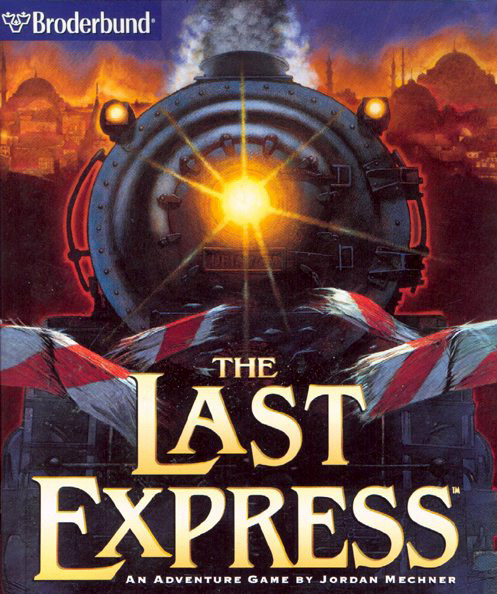
If you just want the quick TL;DR version, I would summarize it with: captivating artwork and animation, excellent score and sound design, intriguing mysteries and storylines, brilliant writing and character dialogue, superb acting, and literally the most in-depth real-time mechanic I've ever seen. If you purchase a copy, I would urge you to get the original version on GOG, not Steam’s “Gold Edition” of the game which fubbernucked the menu and has tons of audio glitches. Also: be sure to check the game’s ratings and content warnings beforehand, to make sure you’re a player of appropriate age. Enjoy, friends!
Back to the main post. So, just for a quick bit of backstory: I first got into the Nancy Drew series when I was around 8-years-old, thanks to the recommendation of a friend I had at the time, and I also somewhat got into more difficult puzzle games like those from the Myst series as I got older. Around 11 or 12, my parents brought out an old copy of The Last Express and said they figured at that point I was probably old enough to play it without being scarred for life by its more mature themes. So one night, I popped the first of three discs into my mom’s old Windows Vista (barf), and within mere seconds of the opening, it became one of my favorite games of. all. time. No, really: this game completely changed my understanding of exactly how good storytelling in games could actually be, if done right. I have seen so many games try (and fail) to do what The Last Express does seemingly effortlessly: blend together cinematic storytelling and gameplay in a smooth and balanced way.
(Trigger warning for the trailer!! Contains a few brief shots of blood and violence.)
youtube
youtube
Seriously, I don’t understand how underhyped this game is. Supposedly the company that released it, Broderbund, really screwed it over by giving it basically no advertising or exposure at all leading up to, and even following its release. My main theory is that this may be due to possibly believing it might not turn out profitable enough to make up for such expenses, since it’s a game that was highly experimental for its time and dabbles in rather niche and esoteric interests, making it a rather enigmatic piece even to this day. I guess the, “Why?” doesn’t really matter now, though.
Either way: I feel that truly did both the game itself and the gaming community as a whole a disservice, since I firmly believe that if this game had been successful, it could have changed the entire frontier of gaming for years to come, particularly in terms of storytelling and character writing. (This game also really makes you appreciate how much “small” details actually matter, modern BETHESDA / HeR.) A big part of the reason I'm writing this review is that I'm hoping at some point this game will get a second chance at glory with the help of the internet.
Now what’s so great about it? Well probably the very first thing you’ll notice about this game is its rather unique art style. The technique used was a blend of rotoscoping both still shots and filmed sequences of live actors and props against blue-screened sets, which were later filled in using digital 3D modelling.

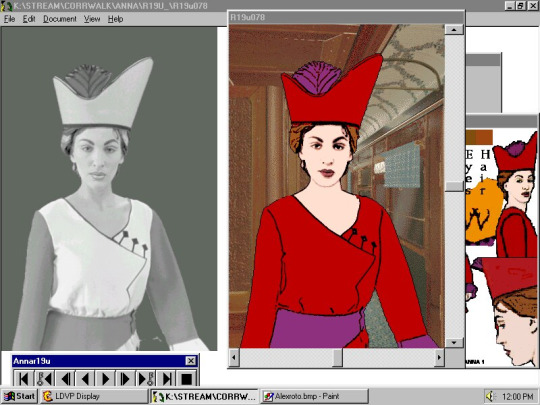

I’ve heard some people describe the art in this game as “ugly,” and while I can agree that it is certainly dated by both modern rotoscoping and 3D modelling standards, personally I can’t say I agree that it’s “ugly” by any means. This was incredibly revolutionary for the time period the game came out in, and while not all of it looks flawless, the game still manages to achieve some truly visually stunning moments. Not to mention, seeing characters that appear so much like real people makes the game incredibly immersive, to the point that once, while waiting in the corridor for a specific time of day, a woman walked past me and excused herself, and I actually replied, out loud, to my computer, “Oh, sorry,” and it took me a solid minute after that to even realize what had just happened.
Don’t worry, though: if the visuals alone aren’t enough to grab you, more good things are on the way.
Another great thing about this game that you’ll notice straight-away is the score: this is hands-down one of the best soundtracks I’ve ever heard in a game. It sets up the tone and emotions for every moment perfectly, and can be quite chilling during the more dark scenes. The music in particular is one of the aspects that I think will appeal highly to fellow Nancy Drew fans, since it’s in a similar vein to many of the soundtracks in the ND series.
youtube
In fact, the all-around sound design for this game deserves praise. The sound effects used were all perfectly balanced and created a palpable ambience to the game, making you effectively feel like you’re really on the train. There’s also a very effective use of train sounds in general, particularly in regards to the sound of one braking hard. I swear, this chilling stinger that is heard each time you get a game over is permanently seared into my brain. (As heard in the trailer video, for those curious.)
So brushing away the game’s more “superficial” pros for a moment, what’s it even about? Well, the year is 1914, and you play as an American doctor named Robert Cath, who has been wrongly accused of murder and is currently on the run from both the British and French police. Prior to the start of the game, Cath received a telegram from an old friend, a fellow American traveling abroad named Tyler Whitney, claiming he had come across something “exceptional” that required Cath’s assistance. Managing to hop aboard the Orient Express, Cath eventually discovers that Tyler has been murdered, finding him dead and bloody on the floor of his compartment. The rest of the game is a dive into the deepest secrets and personal lives of the other passengers while you, as Cath, adopt Tyler’s identity and attempt to figure out who killed him, why, and where his “exceptional” finding has disappeared to.
The story is a complex web of secrets, lies, puzzles, romance, political conspiracies, art, war, and bloodshed. To give away anything further would enter dangerously into spoiler territory. It’s best to go into the game as blind as possible so you can be totally swept up in its many twists and turns.
This game also has excellent writing, particularly in terms of character interaction and dialogue. Each character is uniquely written and memorable, making it very easy to want to engage with them and learn more about them.
I also have to give praise to the acting. Every single actor gives a stellar performance, even in the more “modest” roles. There’s not much more to be said there; it speaks for itself.
youtube
But by far the biggest selling point to the game, at least in my opinion, is its real-time mechanics. This is a game that has a great deal of replayability since every character operates on their own schedule of events. The ability to rewind and, to a limited degree, fast-forward time in the menu allows you to explore multiple possibilities, as different events are taking place at the same time all over the train. Not only that, but the creators were quite thorough in making sure that players could explore every single possible decision, which resulted in a highly detailed script at nearly 800 pages long. I am not exaggerating the least bit when I say I have played this game to completion more than a dozen times, and have discovered something new I'd never seen before every time I've played it. Even to this day, I’m still learning things about this game I didn’t know before. The game itself is a mystery begging to be unraveled, yet the likelihood we will ever have all the answers is quite low.
Much like the artwork, the real-time and time-rewinding mechanics were both revolutionary in the industry at the time of this game’s release. Jordan Mechner, the game’s designer, was the original creator of Prince of Persia, and implemented similar time mechanics in that series to those he would go on to use in the Last Express, albeit with a heavier emphasis on storytelling than action in the latter.

Two very important things to note before I wrap up this little review. First of all, while I do recommend this game to fellow Nancy Drew players, I'm recommending it specifically to older players. While I wouldn’t describe this game as particularly “edgy,” it does contain a fair amount of adult themes, such as nudity, low-level (mostly implied) sexual content, smoking and drinking, a few mild profanities, onscreen violence and bloodshed, and some very grim deaths. It is not child-friendly, so be advised of that.
And secondly, be careful about where you purchase this game. GOG and Steam are the two main sites peddling it, but they’re both selling versions that are different enough to really impact your gameplay, depending on which one you choose. GOG’s version is completely faithful to the original and far less buggy, but Steam has what it calls, “Gold Edition,” and while it cleans up the UI a little and comes with a Hint System to assist players, (as well as the admittedly interesting addition of character screens, though I prefer the mystery and intrigue of not knowing the other passengers’ backgrounds, getting to learn them for myself as I play and explore) I can’t recommend it on the grounds that it’s super buggy, particularly with audio, and completely ruins the charm of the original menu screen. Obviously whichever you choose is your decision, but I would strongly advise purchasing The Last Express on GOG, rather than Steam.
youtube
So if this little review persuaded any of you to try it, please feel free to reply to this post, or reblog it and share your opinions and theories! I’d love to see what response my fellow members of the Clue Crew have to it in particular!
85 notes
·
View notes
Text
|| Tony & Ryden ||
Ripping the door to his apartment open after the first couple of eager knocks against the painted wood, Ryden let the other man through without much of a greeting since his visit was expected, their plan to hang out and watch Jujutsu Kaisen long awaited and prearranged. Ryden had been looking for someone to watch anime with like the nerd that he secretly was and meeting this dear friend of Bellamy’s opened up the opportunity. Because watching animated series was at least ten times more fun in company than alone.

“Come in. I got popcorns and beer ready.” Ryden informed, leaving it up to Tony to close the door behind him and make himself comfortable in whichever way he wanted. Inside, Ryden’s apartment was a punk-rock biker fairytale dream come true, an alternative kid’s sanctuary when he got too tired of playing a proper grownup. Walls were painted insultingly black, fading into grey in a subtle gradient near the floor. Posters and wall art were scattered all over, in a chaotic but still somehow aesthetically appealing disarray, not merely a cover-up for a bad paint job or holes in the walls Ryden might’ve punched in for some recreational anger venting - which he never actually did although he looked like a bloke who regularly punched holes through walls. Almost everything was carefully framed, purposefully hung up, especially the limited editions hard to come by and therefore cherished and given special spotlight places. Iggy Pop, Nick Cave, Leonard Cohen, Johnny Cash, David Bowie; faces of many a legend watched on from their lofty vantage points, cozily observing in between framed movie prints and comic book covers. Flat surfaces had picture frames of more real people, ones Ryden encountered daily in his life and kept them there, and artwork or mementos made or gifted by them. Taking up an honored place on the TV stand against the central wall, among Alien and Predator figurines, were framed hand-done doodles and drawings in charcoal or pen, shiny little car models and wooden 3D train puzzles Ryden assembled himself in what little free time he had.
The furniture arrangement was where one would expect it to be in a space as small and predictable as this. The kitchenette was tiny, separated from the rest of the living space by a large kitchen island with rusty-colored countertop, tall leather-dressed barstools tucked under it. Ryden’s precious curved plasma TV was huge and very likely the most pricey thing he had ever bought with decently earned money, taking up most of the wall opposite to the black leather couch matching the barstools. The coffee table was Ryden’s own invention - a couple of beer crates and a wooden panel over them all securely nailed together, spray painted a glossy black, with stylized pair of claw mark engraved across it. Two Pacman-shaped lazy bags were shoved into a corner, stacked one on top of the other. An Xbox and a PlayStation sat under the TV.
Most blinds were shut and the only source of artificial light was a red lava lamp strategically placed where its crimson illumination would be at its best. A rosewood guitar sat in another corner on its stand, the amplifier connected, stereo mounted on the wall. An old jukebox was next to the instrument, still recuperating from when Ryden had salvaged it from a dumpster. He’ll fix it eventually and make it work. Heavy hand weights were stacked neatly on their rack, proudly being the reason why Ryden didn’t have a dining table. Instead of any ceiling lights hanging, there was a very professional looking punching bag, definitely sand-filled. The door to the bathroom was open and a sneak peek would reveal that it was kept pretty neat, yet sadly only large enough for a shower stall. Aside from that particular space dedicated to cleanliness, Ryden didn’t believe in storing everything away immediately after use - anything that might belong in a drawer was equally comfortable on the floor.
@tony-baxter
15 notes
·
View notes
Text
The ones that suffer the most
I wanted to talk about this for a long time.
I’m a Resident evil addicted, I finished almost every RE game released and I must say that Capcom made some poor choices regarding Jill and Chris, they are EASILY the most mistreated characters in RE Franchise.
But let’s explain why is that:
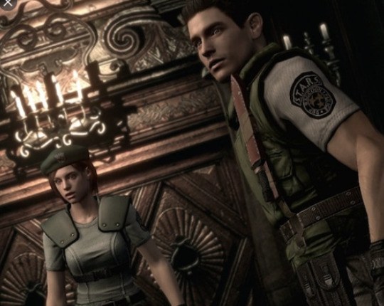
Jill and Chris are survivors, they had to survive in a mansion with a lot of puzzles and zombies, while looking for items that could help them to progress and find a way to reach Brad.
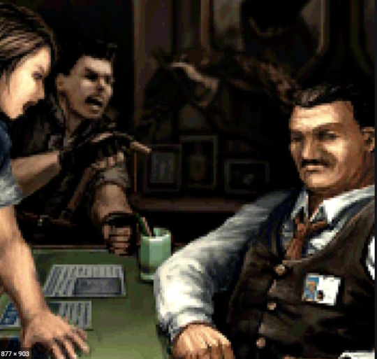
When they arrive at STARS Office, they are revolted that Umbrella did all that under their noses and innocents were dying because of that and they explained EVERYTHING in a report - but Irons made that go away.
In the ORIGINAL RE3 we had this special file (Jill’s Diary)
August 7th Two weeks have passed since that day. My wounds have been healed, but I just can't forget it. For most people, it's history now. But for me, whenever I close my eyes, it all comes back clearly. Zombies eating people's flesh and the screams of my teammates dying. No, the wounds in my heart are not healed yet...
August 13th Chris has been causing a lot of trouble recently. What's with him? He seldom talks to the other police members and is constantly irritated. The other day, he punched Elran of the Boy's Crime department just for accidentally splashing Chris's face with coffee. I immediately stopped Chris, but when he saw me he just gave me a wink and walked away. I wonder what happened to him...
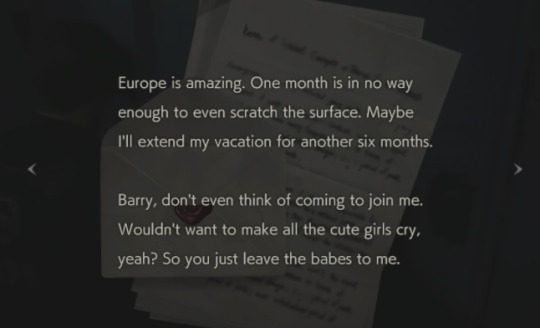
August 15th Midnight. Chris, who has been on a leave of absence for a "vacation," called me so I visited his apartment. As soon as I walked into his room, he showed me a couple of pieces of paper. They were part of a virus research report entitled as simply as "G". Then Chris told me that, "The nightmare still continues." He went on to say that, "It's not over yet." Ever since that day, he has been fighting all by himself without rest, without even telling me.
August 24th Chris left the town today to go to Europe. Barry told me that he would send his family to Canada and then he would follow Chris. I decided to remain in Raccoon City for a while because I know that the research facility in this city will be very important to this entire case. In a month or so, I'll be joining with them somewhere in Europe. That's when my real battle begins...
For some weird reason this file isn’t available in RE3 Remake.
But ok, here we see that Chris was doing some investigation - in the RE2RMK you could see this letter that Chris left in a way that normal people wouldn't understand - the only thing that Claire says is that “doesnt look like him” but how normies would understand what Chris is like is he is not well represented in media ??????????????????
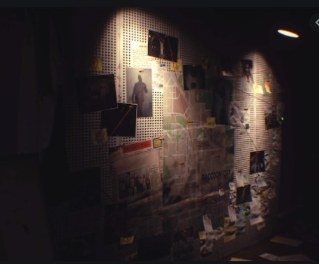
And Jill had all the detective work in her wall.
So far so good - we understand the basics about them - they are Special police force, the elite, they had a traumatic experience and they survived to tell the story.
Some problems until now:
Jill had a MAJOR personality change in RE3 RMK- I honestly like most of that, she is a badass in the originals and she is a badass in the rmk but I still dislike the fact that she swears all the time (specially because in RE1, RE Rev, RE5 she doesn't do that)
We can tell a lot about her personality just looking at her room, but I still miss some stuff (I had expectations - so this is not a real problem. but still) like a Vinyl player (since she is probably into classical music), some letters from her father so new players can understand her origin and why is she so good in lockpicking and more about her dog (she had a pic in the original that could’ve been her boyfriend but it was replaced by a dog in RE2 rmk but in RE3 Rmk there in no dog)
Okay - after you finish the game the only thing we see is this:
In my opinion this is Chris since he is always associated with Green colors while Jill is associated with blue.
So my speculation here is that she found him while in the original we had this:
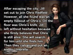
This is not a major chance but still is important (lore of course - duh) but the problem here is that while Jill is looking for him - Code Veronica is happening.
So I can only assume two things, they did not show him because they DON’T HAVE A FACE FOR HIM or I am wrong and that is Jill, but if that is Jill so why there is no decent epilogue like the original ?
Okay, now we are arriving in the real trouble area
I will do RE5 first and the Wii and Rev1 (even tho those two comes first in the lore)
RESIDENT EVIL 5
So before the game was release we had some propaganda, including this:

So have in mind that Jill was dead, I thought that she died and RE5 would explain that shit.
But in the beginning we see that Chris is looking for her and have in mind that Chris HAD A MAJOR CHANCE IN HIS APPEARANCE, and I’m not talking about his muscles.

I will not address Chris in CV since he was good in that game but I the team that made CV also made the original, it had CONSISTENCE.
Here we have Chris, he’s THE classical american soldier protagonist from Hollywood in the 80′s/90′s and he had some omage to TOPGUN

He also shares some traits with his sister
A major trait here is that HE HAS BLUE EYES, typical good looking soldier from US.
and now let’s have a look at Chris in RE5...

Yeah... I still hate this face even tho I love his Character in this game, this ugly a** monkey looking mf and he had a lot of steroids
So we have some lore to him in RE5, Jill and Chris went to a mansion looking for Spencer (one of the fathers of Umbrella and the one that was behind project Wesker, he wanted to do this Virus so he could live forever, so RE has a good lore, it’s not just about zombies) but when they found him, he was dead and Wesker was by his side, in a fight Jill sacrificed herself to save Chris’s life.
Chris started doing mission after mission because her body was never found, and he made a name for himself, he became a ‘legend’ inside BSAA and you can see that in the beginning of RE5.
The reason behind the muscles was probably to fight Wesker mano to mano but still is not well made, it really felt weird playing for the first time.
So now we have a problem here, there is thing that you use in a narrative that is to make someone strong af powerless, and they did that to Jill. (a good example of this is in TWD- Ricky is a fucking legend and Negan made him powerless in the face of a event)
Jill was used in a Boss fight and that is it... She is not in the game as a character, she is being manipulated and her whole design was changed, she looks like Nina from Tekken. WTF. - BTW, the fact that Wesker had mind control over her created 1000 fics of sex
So that is it, my main problem here isnt Jill itself, but it’s the fact that they used her character as a boss even tho she is the heroine, she never appears in RE lore again until some guy inside Capcom said “Well people are asking about Jill so let’s place a file in Rev2 saying that she is in rehab”
The only time that she appears again is in a 3DS NINTENDO ONLY game, it felt that Capcom simply don’t care about her character.
By the way Revelations 1 is a great game and was adaptable some years later for PC and consoles
But you think that this is bad, wait until we arrive at RESIDENT EVIL 6
When I learned that Jill was not in RE6 I was mad... But after I played that game I said “thank you God” that game was bad, transformers kind of bad, it had bad writing, the lore was all over the place and Chris was the one that suffered the most in this game.
He was responsible for the death of an entire squad, suffered amnesia and people still wanted him in the command
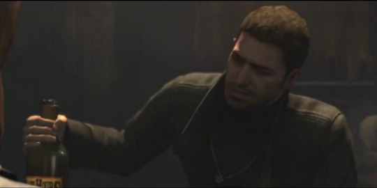
THEY MADE HIM AN ALCOHOLIC
The golden boy of BSAA reduced to THIS.
By the way, the director said that HE WANTED TO KILL CHRIS IN THIS GAME to SUBVERT EXPECTATIONS - so if you liked Piers now that he died only because of that.
So now let’s analyse what we know:
The first 2 main characters are not well represented in media until RE6, they don’t know how to re introduce Jill in the games and Chris was reduced to a normal guy at a Russian bar;
But it gets worse...
Capcom LOVE Leon, we know that. he is always the hero, he is the protagonist in almost every movie and he is always the cool guy so when he get’s a new model, he looks like this:

But When Chris get’s a new face he look like this:

WHO DAFUQ ARE U, no offense to the model but he has NEGATIVE JAW LINE.
And still he doesn't look like Claire’s brother, there is no blue/green eyes and he looks younger that he was in 6 (and 6 still uses that ugly character model)
But let’s go in the lore- we HAVE 0 info on Jill in RE6 / RE7 and no sight of her in RE8
And speaking of which, they tried to make Chris the bad guy in the trailer so when we play we see “Ohhhh he was not the bad guy, that happened and that is why he did that”
But still...
If they are going to do that to his character don’t use this character, shit ! Do something with that Wesker’s son that made 0 sense in RE6 but leave Chris out of this - it really feels that they simply don’t know how to treat him right
And you may think that I may be complaining a lot because of his appearance
But this is him in RE8
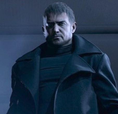
(to me this is some random dude from Russia)
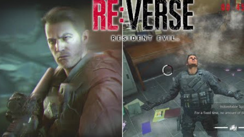
And this is him in RE:Verse (that is going to be release TOGETHER)
So this tells me that they have 0 clue of how to handle his looks
Jill got RE3Rmk but it felt like a cheap game compared to RE2Rmk where the original RE3 was SO MUCH BETTER
And this is bad because there are so many new fans joining the fandom only to see 2 great characters suffering from poor director’s choices.
I’m sorry about this rant, if you like Chris face and looks its okay, really, but dont tell me that Chris from 5/6/8 is the same from 1/CV and if you think im wrong about Jill its fine, but she is an amazing character that could have so much more impact in RE universe (I mean, she never even appeared in a RE movie - animations)
But it’s sad to see so many characters that receive good representation in media and good games/lore while Jill get’s almost none and Chris is handled like random face guy.
I was going to talk a little bit more about Rev 1 and RE Umbrella Chronicles but there is no need since Im mad right now and it seems that Capcom has 0 interest in making Code Veronica and Umbrella’s fall after that since their fav boy Leon need a rmk in RE4 even tho RE4 is not that old.
Bonus:

Fun fact: Chris served in the Air force, so yeah, to me even Tom Cruise looks more like Chris than Chris from the games
#resident evil#resident#evil#chris#redfield#Jill#valentine#resident evil 8#rant#capcom#Claire Redfield#leon scott kennedy#visual#valenfield#topgun#capcom dont know how to handle good characters#directors wanting to kill chris#now he could be a werewolf#for fucks sake#at least#ethan#is being handled better#than they are#good job capcom#very nice indeed#now im going to watch top gun#just for fun#reverse#re verse#resident evil 3
122 notes
·
View notes
Text
ok so I went to the NASA space station place in Austin a few weeks ago, and I bough this small metal Apollo rover thing that I can build, like the package comes with two metal sheets and you pop out the pieces and it has instructions to put it together. A 3D puzzle thing. There were other designs too but I got that one cause it was slightly cheaper, I think the stuff is called metal earth, something model kit-
Anyways- Why do I mention this?
1, Well if I’m not wrong, Leo used to live in Austin back when his mom was alive. 2, he has ADHD and it’s common for people with ADHD to have hyper fixations on things. So who’s to say that there wasn’t a point in which little Leo got hyperfixated with space related stuff, like the satellites and the rovers and the rockets and how they’re built, the mechanics behind it and he would draw them. And because of this he would always ask his mom to take him to the NASA Space Station.
So his mom obv took little Leo to the Space Station one day and it was like the best day of his life. And then she bought him a bunch of the metal thingys that I mentioned earlier, cause there’s also satellites and rockets and other stuff. Like the package said 14+ but Leo was a very smart kid, he could build them by himself. Also he and his mom would build them together.
Also this one time he told Piper about how much he loved space stuff as a kid so she and Jason take him back to the Space Station and it means a lot to him cause Piper and Jason are like family to him.
He buys a lot of the 3D metal puzzle things to build them and because they remind him of his mom and he thinks it’ll be good for him, but whenever he would try to assemble them he wouldn’t stop thinking of his childhood and Esperanza and it was too much for him so he just gave up and kept everything in its package
It wasn’t until he became like Georginas brother, and she found them asked him what they were and that she wanted to build one so he helped her build some of them and later Georgina started draw planets and rockets and also started liking space stuff, and eventually Leo takes her to the NASA place
Here are some pictures of the metal things I’m talking about, I just know that Leo would love building them
I was just gonna write that Leo has prob gone to the space station before and about the 3D metal thingys and I ended up writing PARAGRAPHS-
#leo valdez headcanon#hoo#leo valdez#heroes of olympus#riordanverse headcanon#toa#heroes of olympus textpost#piper mclean#esperanza valdez#pjo hoo toa#the lost hero#trials of apollo#riordanverse#heroes of olympus headcanons#percy jackson#jason grace
31 notes
·
View notes