Don't wanna be here? Send us removal request.
Text

Film: Who framed Roger Rabbit?
Story: 9/10, Characters: 10/10, Sets and locations: 9/10, Sound design and music: 8/10
I really enjoyed this film and how it incorporated animation and live action together in the same world. The way comedy was used made the movie even more entertaining especially when the animated characters were interacting with the actors. I don't think this movie needs any improvements as I like how everything looks and how it was done at that time.
1 note
·
View note
Text
Finished Comic Cover

Quite pleased with how this turned out (especially the dramatic lighting) but I think there are some areas that could be cleaned up so the whole piece looks neater (like the writing/typography) . I'm happy I could present a sort of sinister feeling with this drawing as it's not something I portray in my art often.
(Alternative layout)

Finished piece

0 notes
Text
Plushie foods :)
I don't think plushie food can be made that creepy as both links show really cute designs of food and dishes. Personally I quite like this idea and I think theres quite a big market for these types of cute things now a days. Out of all of the designs I especially like the "Jellycat" ones as they just look adorable.
Jellycat:


Ikea:

1 note
·
View note
Text
Makers and sculptors
Guillermo del Toro:


In the film "Mimic", a specific breed of bug ("Judas") begins to evolve rapidly after helping to fight a disease 3 years prier. These adaptations lead them to get bigger and begin to mimic their human prey. The design for these bugs are really creepy and unsettling as they're beginning to develop human faces as a form of camouflage and the overall size of them is intimidating. I think it's cleaver that Guillermo based these creatures on bugs as many people fear them (even when there not human sized).
H.R Giger:


H.R Giger was a Swiss artist, set designer and film director who was apart of the special effects team on the film "Alien" and was the one actually created the Xenomorph. The design of the aliens look somewhat humanoid but also mechanical. I like how the upper half of the face is obscured as it just leaves their animalistic sharp teeth on show. I also think one of the most iconic thing about this design is the head shape he used.
All the designs and sculptures on this site are very detailed and high quality. The pricing for all of the products is reasonable as some are incredibly detailed and you can tell a lot of time has been spent on them. This site also sells sculpting tools in a set or separately.

Gemma Goodridge:
Goodridge's pieces look really high quality and professional. The scale of her creations range from being life accurate to small sculptures and busts of various creatures. There are many pictures of her work in progress/unpainted but her finished pieces have really nice looking paint work and detail.


0 notes
Text
Food vendors and markets in media
Star Wars
Mos Espa marketplace:
This vast market is located in the planet of Tatooine and is split up into several specialized areas that offer services or sell things like fruits, meats and beverages. Some of the vendors and shops at this market include: Gragra (who sold gorgs) , Akim's Munch outdoor cafe and Jira's fruit stall.
HellBoy 2
the Troll market:
youtube
The set for the market was made in a Hungarian mine cave.
Characters:

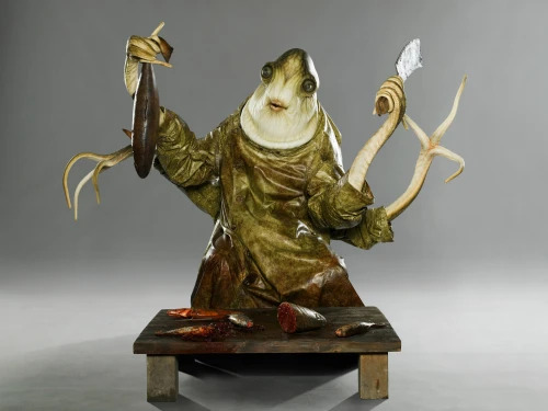
Silkard the fish vendor: I think the design of this character is very interesting as it has a frog-like, fishy appearance along with tentacle like arms, almost combining multiple different animals together. I also find it slightly funny that an aquatic looking creature is selling fish.

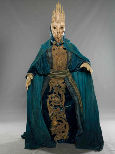
Cathedralhead: I really like the stone like texture and pattern this character has and how it looks as if some parts of it's face/chin is missing which draws the viewers attention to its big eyes owl-like eyes. I also like the design of the cloths and how detailed they look along with the turquoise and gold colour palette.

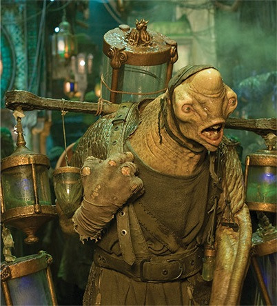
The Tadpole vendor: This characters design has a rugged nature about it that helps it fit in nicely with the the overall feel of the market setting. I like how the jars of tadpoles have been incorporated as something the creature carries around instead of them simply being on a market table.
These note book pages include concept sketches and research for character and designs done by Guilermo del Toro.
.
0 notes
Text
Food sustainability
This French delicacy involves eating the ortlolan bird whole and has lead to hunters harvesting up to 30,000 ortolans every year during their autumn migration. Although many professionals are concerned at the species dropping population this practice is still one of Frances traditions. I think there is always going to be problems and opinions when it comes to sustainable hunting and meat consumption but I think there a difference between farming animals to eat and hunting wild animals that aren't meant to be eaten.
0 notes
Text
This link tells the story of two infamous grave robbers and murderers who killed and stole bodies form 1827-1828. One of the main reasons why they did this was to combat the shortage of dead bodies that could be used in medical schools.
0 notes
Text
Finishing the shrimp
I carried on the painting process and began by layering a better "shrimp orange" colour over the base colour I had previously put down. For this application, I used a sponge to minimize the amount of visible brush strokes and add texture to the piece whilst also adding the paint in thinner layers so the base colour could show through a bit. This method turned out great but it did become difficult to reach smaller parts of the shrimp so I had to go in with a really small paint brush. I also deepened the shading in between the shell segments with a slightly watered down brown and also added lighter shades of orange to highlight the edges and planes of the shrimp. After working on the shrimp I moved on to painting the pie top using the same method I used for the shrimp.


After the shrimp body was dry I was able to re-attach it's broken limb and finally add its beady eyes and I think the eyes give the shrimp a lot of character. I then coated just the shrimp in some varnish just to give it more of a sheen and I especially love how the varnish made the eyes look super shiny.

Decided to create some sort of simple logo which turned out slightly like an old fish and chip shop sign. The line "Just a shrimp in a pie" links to how the unwary consumers may just think it is a regular shrimp pie but could be in for a surprise when the pie tries to bite back.
0 notes
Text
M.A.R.S event
Presenters: Henry Driver, Adam Bridgland, Hannah Nicklin, Charlotte Dalton, Craig Bloomfield, Vic Lee, Fred Hoffman, Sophie Baverstock, Kit Miles, Chris and Emily, Mary Imhogiemhe and Gianni Notarianni.
The guests talked about there own personal experiences and journeys in different parts of the art industry. The jobs ranged form graphic design to fashion and makeup/SFX which helped in getting a grasp of how diverse jobs in art can be. Some presentations included other subjects that the speaker had an interest in,like maths or climate change, and how they interweave that into their work. It was also nice to see that some of the speakers started there career in art later in life, having experienced other ares of work before moving to art.
0 notes
Text
Comic cover progress

Added the main aspects of the design and fixed the chair (made it more accurate to the original). I obviously have more tweaking to do when it comes to the overall sketch but I'm happy with how this composition is coming out.
reference:

0 notes
Text
Stories that include humans in food
Soylent Green (1973) directed by Richard Fleischer:
youtube
This is a dystopian story were society falls apart leading to many people turning to un-orthodox ways of survival.
Snowpiercer (series) food bars:
This show also includes the themes of the dystopian and post-apocalyptic genre.
Hannibal Lecter novels by Thomas Harris:

In this book, one of the main characters is a cannibal.
0 notes
Text
Alex Moy:
These are images were created for the film "Love and Monsters" and were used in the credits and in the movie.


The journal pages help give more information on these creatures and what there like. Deepening the knowledge the viewer has on the plot and story line helps in creating a believable character or world.
0 notes
Text
Modeling tips and tutorials :)
David Neat:
This site include all the tips and tricks that go into and help make realistic looking textures for your sculptures. These tips range from which materials work best for specific things too what tools you will need to use and the methods recommended to create these textures.
youtube
This "tutorial" is more like a process video of how the creature was made and less like step by step explanation as to how it was done and what methods were used. There were a couple of notes and tips throughout the video that were shown at the corner of the screen but it was mostly just a video showing how they got to the outcome. Overall the quality of the sculpt is very good and it look like it has been planed out well but it wasn't a very informative tutorial.
youtube
This video was entertaining and has a good balance of comedic elements and information, including semi-detailed instructions so that you can follow along more clearly and create similar outcomes as seen in the video. The creator explains why he has chosen certain materials and explains what properties they have and also shows the mistakes that were made during the process. The quality of the sculpt is good and the overall concept is interesting and unique.
youtube
This video is a time laps of the creation process of the sculpt so it's less like a step by step tutorial however in the beginning, the tools and products the sculptor used were shown. This video being a time lapse helps in seeing how they went about each part of the piece and what tools they used. The end product of the video is very nice and super detailed.
youtube
This video is a nice mix of a time lapse and a tutorial as he's explaining what hes doing and his thought process whilst it's happening. I also like how he goes into some detail of the methods hes using. The overall final product looks really good and unique, having a very well thought out design.
McKenzie has a very nice and universal style when it comes to his sculptures with all of them having really well thought out designs that are full of detail and look professional. His work ranges from stylized pieces to more realistic looking ones that still have that whimsical nature to them.
0 notes
Text
A brand which uses the idea of Sweeney Todd and his pies as the main part of their business and products :)
0 notes
Text
Charles Darwin's "Origin of Species" (1859)
The Origin of Species refers to the means of natural selection and evolution were a certain species of animals would breed for specific characteristics so the species without those characteristics end up dying out (an example of this would be the Giraffe).

Darwins discoveries didn't go down well with the pubic as most people were highly religious and suspicious of science as a whole as it went against the story of creation and the existence of God.
0 notes
Text
Penny Dreadfuls
Varney the Vampire:

Ran form 1845-1847 and was of epic length having 232 chapters totaling nearly 667,000 words. This story introduced many tropes seen and used in vampire fiction today.
"The plot concerns the troubles that Sir Francis Varney inflicts upon the Bannerworths, a formerly wealthy family driven to ruin by their recently deceased father" (source Wikipedia)
The Accidental murderess:

This story follows the unfortunate events caused by an unhealthy relationship involving the main character, Miss Hermione Tandy. This resulted in her father disproving the couple and killing her partner which then lead to Miss Hermione accidentally killing her own dad as she had followed him to the docks (were her partner was).
I Am:

This is a poem said to be wrote in late 1844 or early 1845 by English poet John Clare (later published in 1848). It was composed when he was in an asylum. The poem focuses on the ideas of loneliness and depression and how the speaker wants to find peace in heaven.
0 notes
Text
The finished sculpt and the beginning of the painting process
Made the pie top and attached it onto the case. To give the inside of the pie some stability I added some tin foil which helped in supporting the shrimp when it was attached but it ended up moving to one side of the case, slightly warping one side.


I then baked the pie and as expected the legs of the shrimp were very fragile and one ended up braking off along with one of the shrimps teeth. These pieces (probably just the leg) will hopefully be stuck back on when the painting process is done.


I began painting by going in and painting the whole pie this brown-orange colour which will be the darkest parts of the shrimp (the groves in then shell). I then had to try and dry brush an orange on top to get the main colour of the shrimp but I don't think it went too well as I wasn't that confident in what I was doing as I have never done this painting process before. I also found this process challenging as there are many hard to reach areas and areas that could potentially get broken if I'm not too careful, (like the mouth). I hope, as I continue, the shrimp will begin to look better :)

0 notes