#and uglier
Explore tagged Tumblr posts
Text
dont read if sensitive
#.#i uhm#dontnfeel good about anything right now#at all#i hate myself actually#like#desperately so#i relapsed#on purpose i guess?#it felt like the only thing tha could make me breathe right again#it worked#i can breath#but#i fee horrible#i hate myself#i want to finish the job#how do you move on from this shit#i cant tell anyone#im scared#i wasnt th inking#ive got a swim meet and i hope its high enou gg up so no one can see it#i hte myself#i hte everything#nothing has a point anymore#i dont see the end goal anymore#i just keep getting stupider and stupider#and uglier#and more disgusting#tw sui talk#tw sh in tags
2 notes
·
View notes
Text
also other weird cartoons that ive overlaid on stormlight characters in my mind:

cortes from road to el dorado as sadeas
#he looks just like this in my mind but with weird alethi fashion dhjdhfjdjd#and uglier#readin words of radiance
12 notes
·
View notes
Text


Such a familiar situation.
This is for the Harry/Klassje swap au by @theinkyfrog check it out I think its so interesting with the parallels they do have.
Is the hanged man still Lely or is it someone else? I do like the idea Kim being in Ruby's place. What about Jean? How would he play in this? If at all? THE POSSIBILITIES ARE ENDLESS. awesome au concept!!!
#de#disco elysium#harry du bois#klassje amandou#digital illustration#art#swap au#Harry/Klassje swap Au#sucker for longer hair Harry#should i have made him uglier?
2K notes
·
View notes
Text
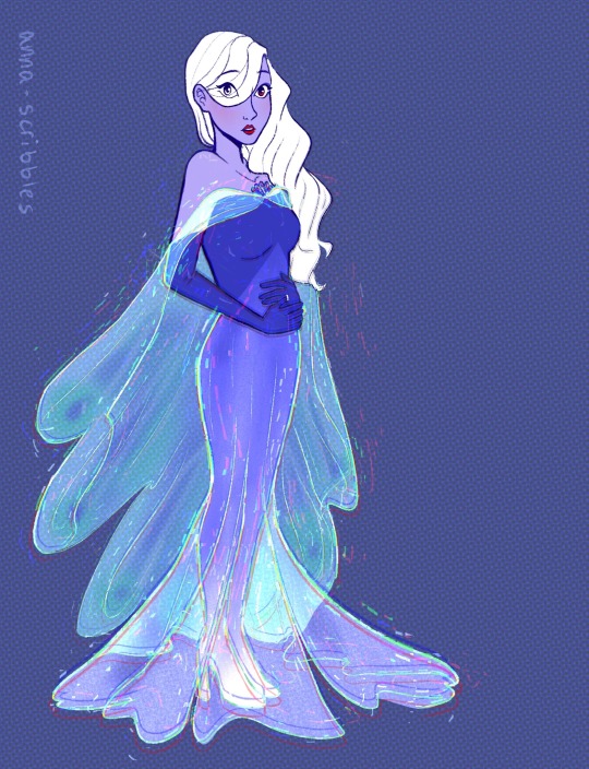
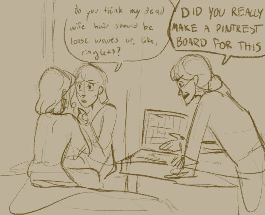

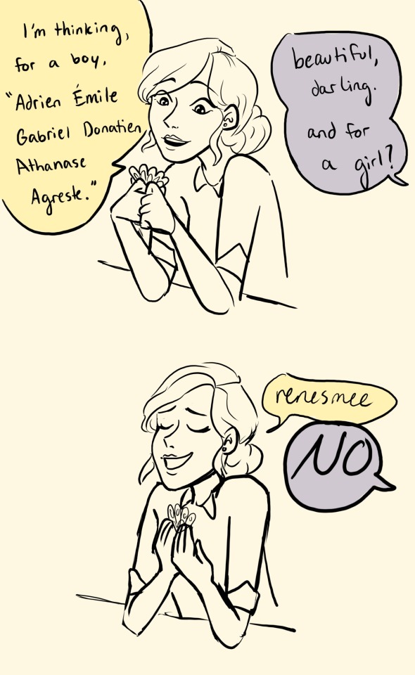
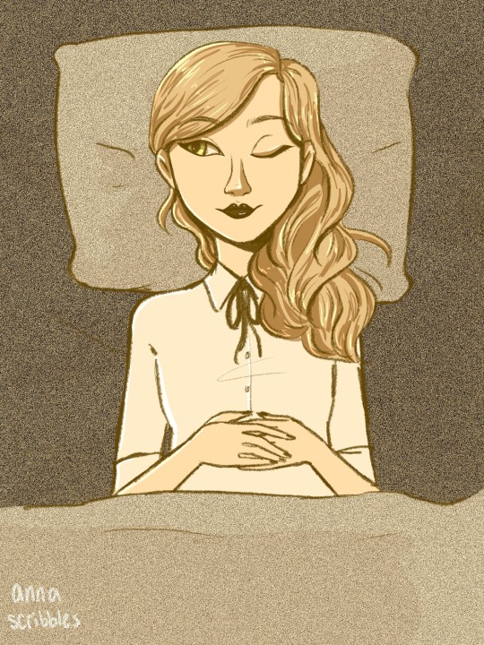
adrien tell ur mom to leave me alone !
#rip emilie agreste u would’ve loved breaking dawn pt. 1#and family vlogger youtube channels#and AI#my art#emilie agreste#ml#she’s plaguing me. can you tell#miraculous#miraculous ladybug#gabriel agreste#nathalie sancoeur#i think it’s so swag that peacock holders don’t get masks#they just turn purple#the peacock miraculous made everyone slay#except for gabe. that man couldn’t slay if his life depended on it. he only knows how do get uglier.#anyway shout out to the emilie agreste who lives in my brain. that girl is crazy#thirteen#eye strain#tw eyestrain#eyestrain
5K notes
·
View notes
Text

more scummy meme, this time featuring this post by @mohglet
#the peak of comedy to me is SQQ looking at Binghe and TLJ and thinking they look exactly the same#and then two seconds later TLJ calling Binghe uglier#s tier character no notes#SVSSS#tianlang jun#scum villian self saving system#svsss fanart#svsss meme#tlj
1K notes
·
View notes
Text

go to bed man
#fnaf#security breach#fnaf security breach#moondrop#the daycare attendant#moon fnaf#he’s so gorgeous#working on making him gradually uglier#if he’s not ugly its not him#yeah im talking to you people who give him bedroom eyes and sharp teeth
960 notes
·
View notes
Text

art style test with my sillies
#kostik draws#i had fun with this im not going to overthink where it looks awkward#something to fix next time!#yttd#midori yttd#shin tsukimi#sou hiyori#kimi ga shine#your turn to die#fanart#its telling that i prefer this (rougher and uglier) over my soulless (but pretty and more polished) unposted piece
1K notes
·
View notes
Text
christian men will say shit like "my rib :)" to their wives and christian women will be like "tehee, uwu" as if they aren't descended from a lineage of creators on this planet which the god of their pathetic religion is cosplaying because men still can't fucking handle the fact that they aren't the creators of life
#radblr#feminism#saw some christian guy literally propose to his girlfriend using that line and it made me want to throw up#as if a man's rib could ever create something as fucking beautiful and fearful as me#fuck off#men wish they could but all they do is make the world uglier#christianity#religion#anti religion
853 notes
·
View notes
Text


KATE BECKINSALE as SELENE
in UNDERWORLD: EVOLUTION (2006) dir. Len Wiseman
#underworldedit#horroredit#kbeckinsaleedit#filmgifs#moviegifs#underworld#underworld evolution#underworld series#kate beckinsale#selene#selene underworld#vampires#blood#mine#gif:mine#gif:underworld#why does this look greener and uglier on mobile??? i hate how my gifs never look the same on desktop vs mobile AUGH
549 notes
·
View notes
Photo
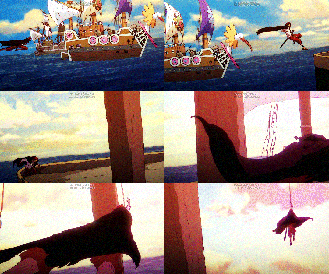
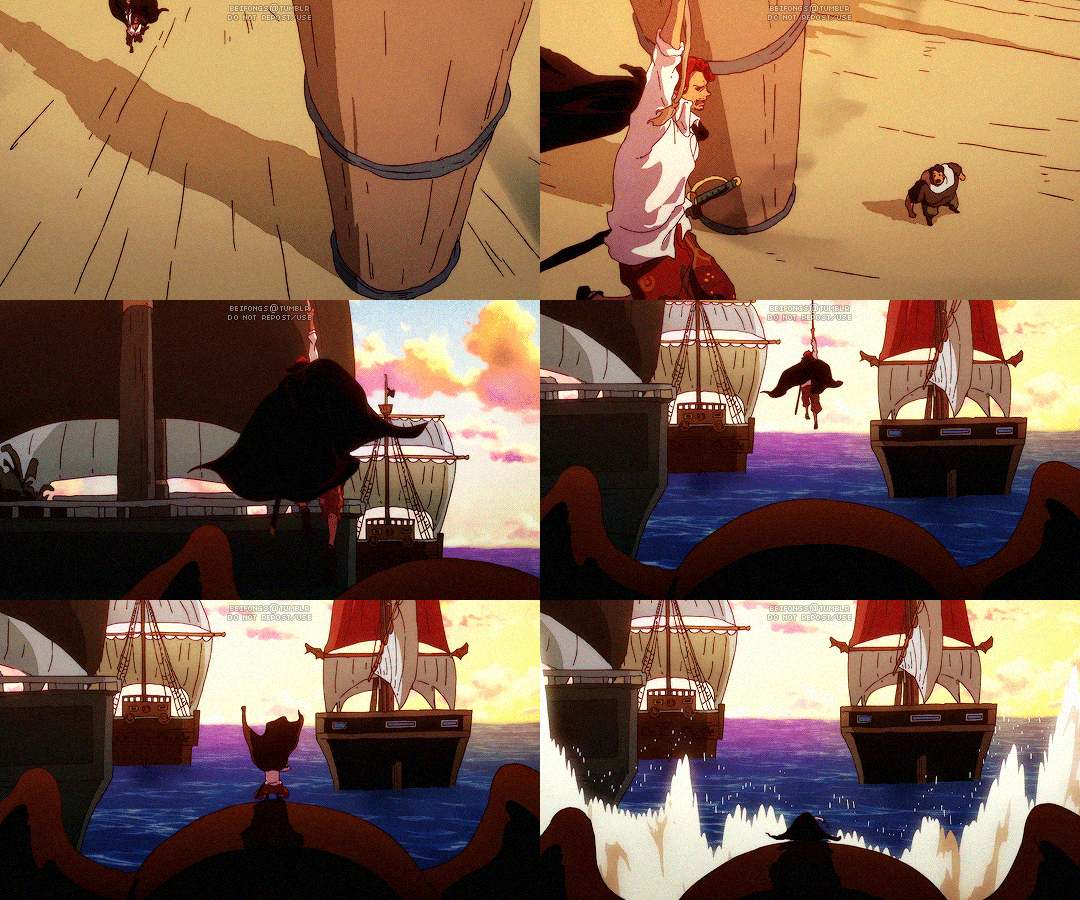
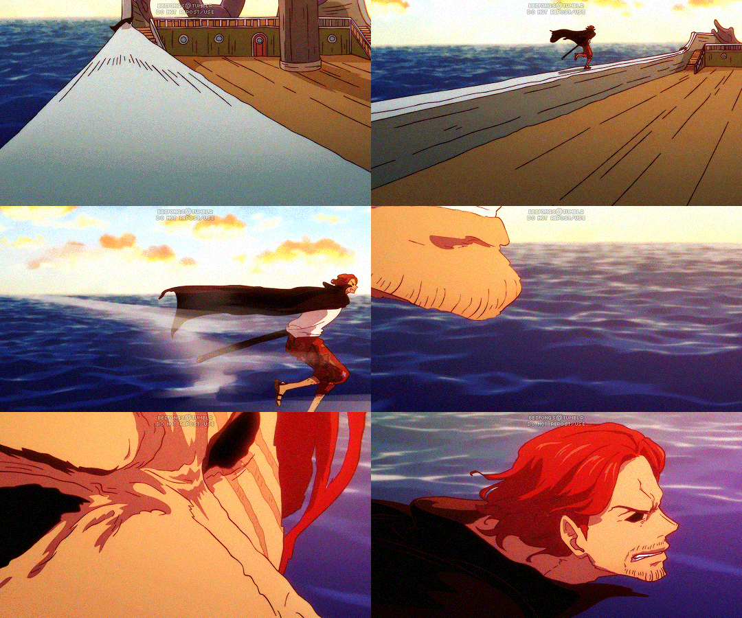
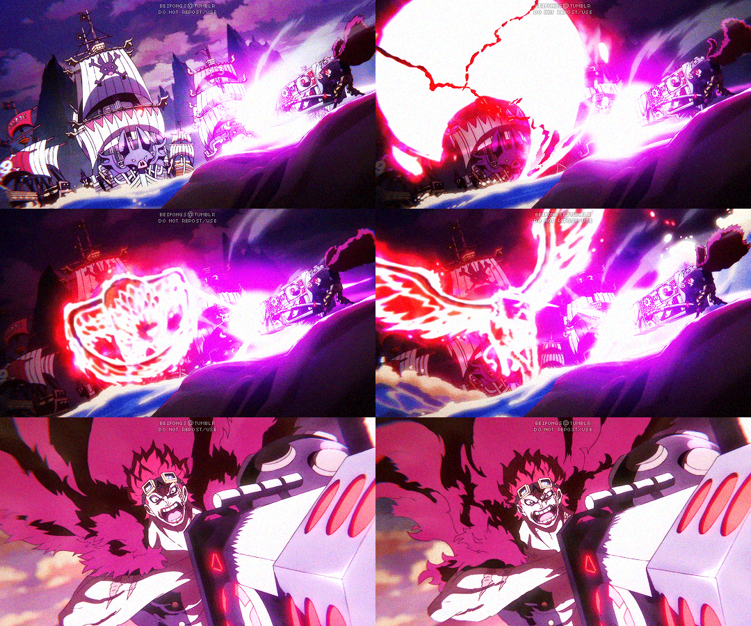
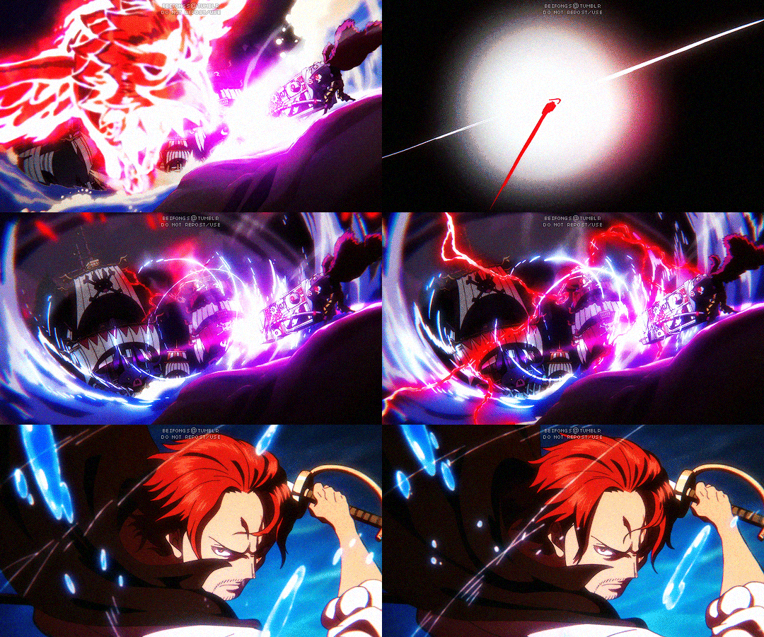
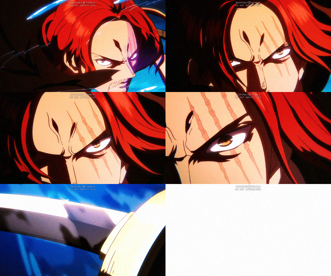

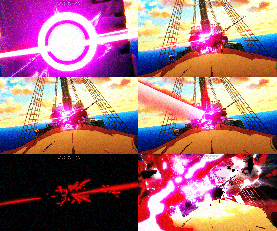
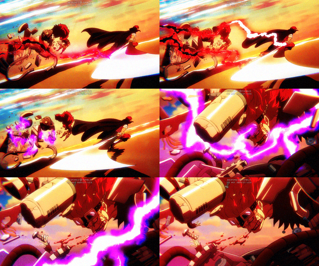
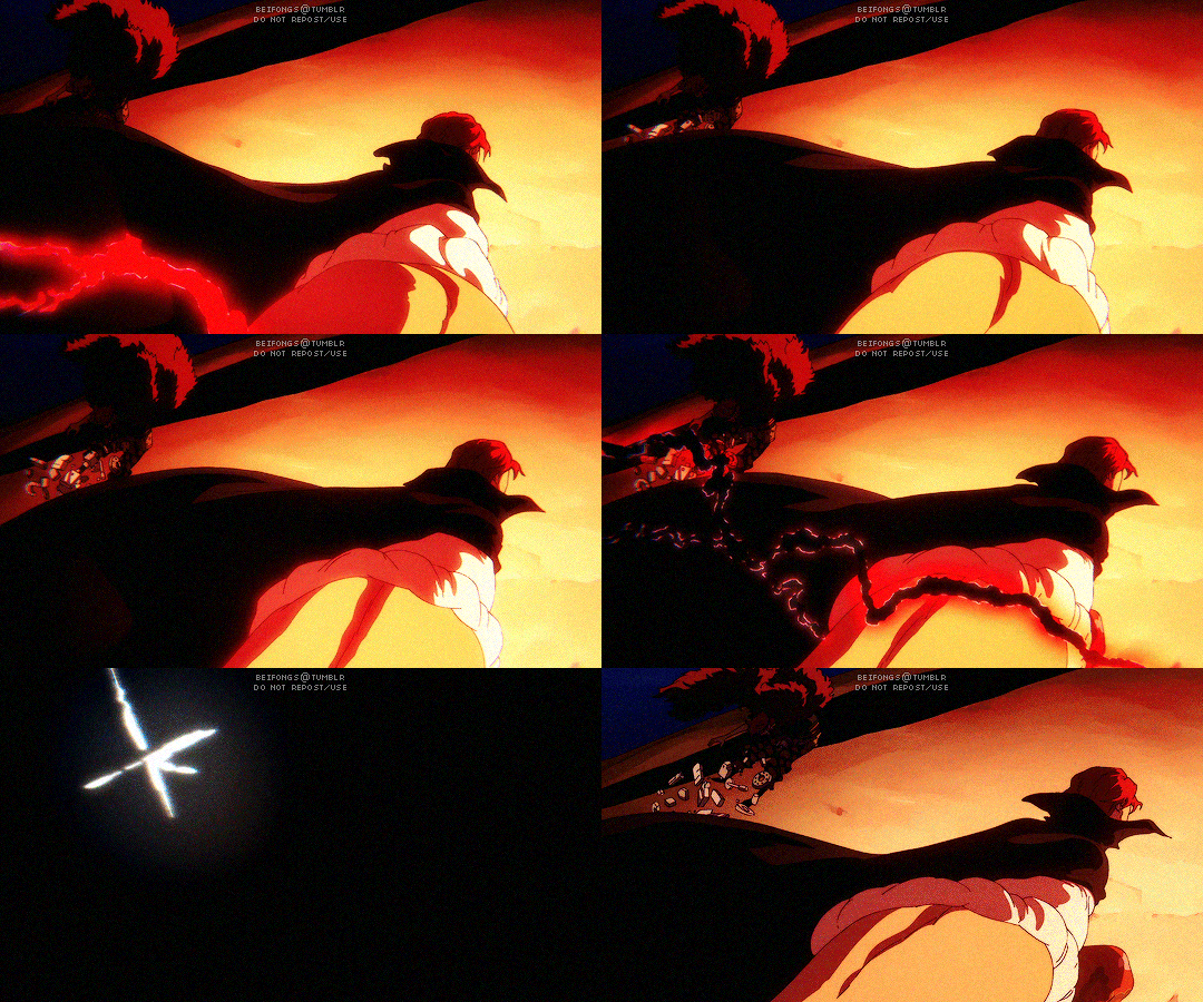
DIVINE DEPARTURE
#One Piece#opgraphics#Shanks#Eustass Kid#*mine#sorry for the uglier gifs than usual 😓#anyway yOOO THE WAY THEY ANIMATED THIS ENTIRE SEQUENCE WAS F*CKING INSANEEEEE#SCREAMING CRYING SHAKING#Shanks may not appear a lot throughout the series but when he does OOF he sure leaves an impact#i can't tell you how many times i rewatched this scene specifically#like the whole bit where he runs up towards Kid??#AMAZING BRILLIANT SHOWSTOPPING SPECTACULAR!!#RIP Kid didn't even know what was coming until it hit him...
621 notes
·
View notes
Text
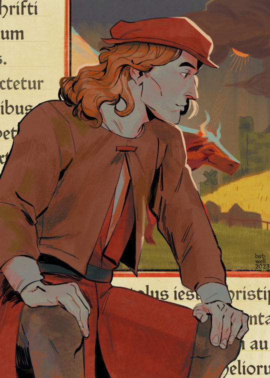
andreas
Image description by @anistarrose: digital art of Andreas Maler from Pentiment, as he appears in the first act. He's seated with his hands on his knees, and with a slight smile. The background is zoomed-in on a manuscript, featuring an illustration of a cow in a field, and some cut-off Latin text. End description.
#pentiment#andreas maler#birbwelldraws#hes weirdly handsome. he should be uglier. for me#edit: thank you for the desc! im not in the habit of making these but i really should ;;
3K notes
·
View notes
Text

VOYAGER WEEK - DAY 4 - TIME TRAVEL
“I know this is going to sound strange to you both, but I don’t belong here.”
#my sweetie pie!!!!!!#voyager week#I love drawing you my sweetie pie I love before and after#the situation was so desperate out there that she settled for Tom Paris#it was fun to get to try to draw her throughout#my art#doodle#Kes#kes Star Trek#VOY#star trek voyager#star trek#star trek fanart#st voyager#tbh I think she left voyager so she wouldn’t fulfill the prophecy of having sex with Tom#again and again and again and again do it again do it again#believe it or not but there is actually a wayyyy uglier version of this drawing directly under what you see
227 notes
·
View notes
Text
sharing my opinion here about serizawas design inconsistencies over time (spoilers for mp100 ending) i feel like in each new rendition of serizawa weve seen in official art ever since the start of S3 something feels off in a different way with every new merch release
lets start here ⬇ serizawa looks like,, himself. accurate to how hes drawn since his first anime appearance


⬇⬇⬇ and then slowly,,, things start to look off. his jawline is slowly getting slimmer, his eyes look wider (same with mobs too)

AND DONT EVEN GET ME STARTED ON THESE. especially the one on the right my god. who is that


every new promo art that comes out just feels very careless. I think you could say so for all the characters (mobs giant eyes, reigens waist getting skinnier/pointier features. the PROMO art of dimple that was literally FULLY TRACED OFF OF A TEMU PIRATE HALLOWEEN COSTUME. they all look bad here)

it just feels a little depressing how little they seem to care anymore, like theyre just trying to pump out merch without bothering to use a character reference.
i notice the changes the most with serizawa. every promo art looks like theyre playing a game of telephone. each version of him is based on the last, instead of his initial design (shown below)

at the end of S2, when reigen cuts serizawas hair, he still looks like himself. they did a great job of showing "how serizawa would look underneath his moustache and big hair". In S3 it feels like they've lost that mentality completely. like he's no longer based off of his original design, but an entirely new reference of his salary man look. some comparisons between S3 vs S2 and OVA down below


I find that the line weight in S3 is much heavier and unfocused. but what bothers me most of all is that... Serizawa looks different in nearly every scene... as if they're undecided on what he should look like. the shape of his nose and jaw, his hair all change depending on the episode entirely.


The art style change for S3 was meant to be "more accurate to the manga", but I find that it had the opposite effect. especially how serizawas and ritsus eye shapes changed. ritsus large pupils and serizawas more almond shaped eyes were more reflective of their manga designs there are plenty of inconsistences in S1 and 2, but they're clearly done with purpose to reflect on ONEs art style (my beloved). I feel like the thinner lines allow more room for detail and extreme facial expressions that truly hold a candle to ONEs insane talent for capturing emotions.


these ^^^ compared to..
erm.. this.. ⬇


just felt very underwhelming... and serizawa certainly does mellow out once he starts working at S&S, but that doesn't mean that there's less opportunity for detailed expressions !!
the yokai fight scene was beautifully made i have no qualms.. but the amount of serizawa lore and dialogue in the manga that got cut from the anime just made him look like a cardboard cut out standing behind everyone. lots of funny and interesting moments cut to make room for the moefication of serizawa katsuya..
I feel like there's a lot of important moments that were cut, (reigen "i hope i can become a partner like that" arataka, serizawa "ive had a similar experience myself" katsuya )
or sad, intense scenes that were made lighthearted (the body improvement club trying to help mob, mob and ??? dialogue being cut, reigen removing his shoes in the final arc made to be meant for better grip rather than... his passively suicidal tendencies )
i think the people at bones are very talented dont get me wrong, i just felt like S3 could have been adapted better. this keeps me up at night its like 1am :) anywhosies thank you for listening to my ted talk i love you
#make everyone a little uglier again. my message#rudies ted talks#mp100#serizawa katsuya#serizawa#kameda come back for reigen ova my love
384 notes
·
View notes
Text
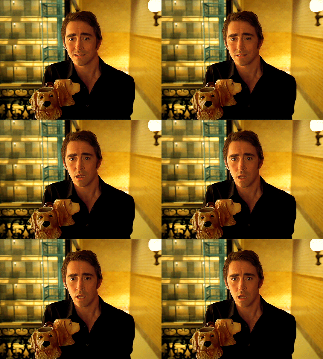

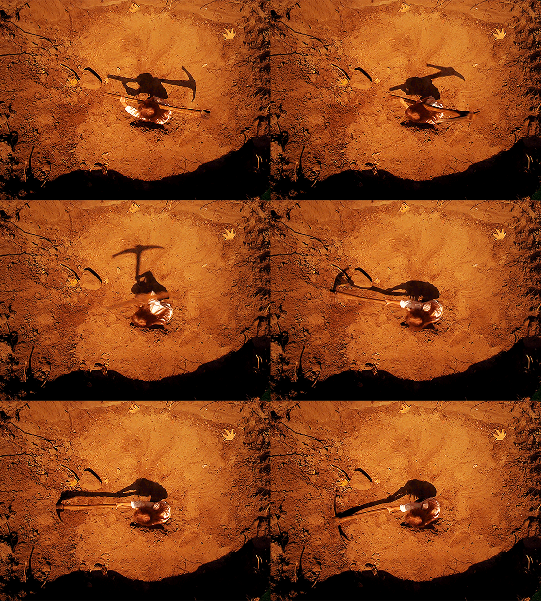


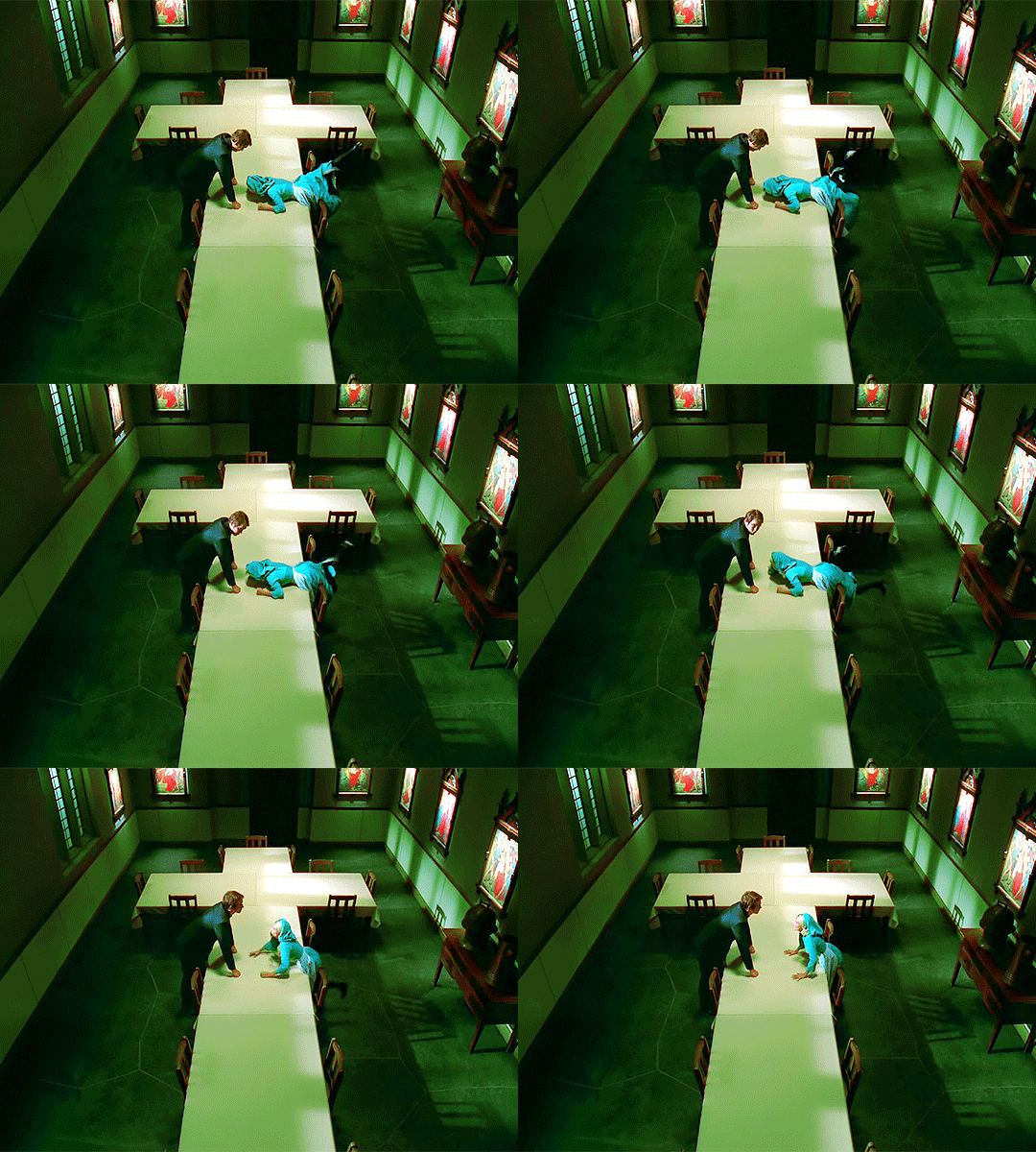
pushing daisies season 2 episode 3 – bad habits
if you ever want to change you've got to rectify your past. otherwise you won't have a future.
#pushing daisies#pushing daisies edit#pushingdaisiesedit#tvedit#mine#not sh*#the prettiest gif i made for this episode not matching the rest and therefore not getting posted is my villain origin story actually#i feel like my colouring gets uglier every episode anyway#brb gtg kms#should do a gifset with all the gifs that didn't get posted at the end of this
390 notes
·
View notes
Text


Also, thought I'd share this ugly ass doodle I did at 3am. This is what I thought could happen in ch58 💀💀
#cinderella boy#original art#is this even considered fanart?#I swear I draw better than this lol#also#second part looks UGLIER bc my digital tablet DIED#they're so dumb lolol
212 notes
·
View notes
Text

The Titans #25
#ughhh nevermind i wanted to add this to the other post#but it's so long and ugly#i hate when i need a panel that's super lengthy#i need more width!!!#but then it gets uglier when you widen it to other parts of the scene that don't go w it#Dick Grayson#Donna Troy#the bestiiiies
162 notes
·
View notes