#and then you write two (2) adjectives to differentiate them
Explore tagged Tumblr posts
Text
Trying to write a fic about Wyvern gargoyle culture is really fun and interesting, but oof, the no-names thing, in a prose-only format… can be a real struggle.
It requires one to get creative, and somewhat encourages one to keep the cast list as small as possible… but also it’s been a good exercise to give just a teensy bit of characterization and personality to some incredibly minor scene-filling OCs.
#gargoyles#disney’s gargoyles#do you ever make a couple of characters just because you need some sentient decorative furniture to move around a scene#and then you write two (2) adjectives to differentiate them#and all of a sudden their place in the story and their relationship to each other becomes crystal clear and you’re like OH.#you ARE characters now#shit. let me mention you a couple more times because that’s really good actually#as if the whole fic wasn’t me trying to flesh out minor canon characters sfggdsffddx#all that to say: I did some more writing today#yay!#the cactus speaks
14 notes
·
View notes
Text
Okay, so. I had a dream.
I was playing a card game featuring DC (Detective Comics) heroes and villains. There were different versions of the villains/heroes (era or arcs with different personalities) and there were henchmen cards.
It was pretty simple: You'd put a card in front of you to defend yourself, and the card put on the discard attacked. (In my dream, each person took their first turn separately, so I guess the first round was set up? Or just didn't account for mechanics. It also felt like you could only pick one defense, because no one ever played a second one even on a new turn.) All cards only had one number, which tended to be higher for heroes and some villains. So there was a risk/reward for whether to use the higher cards to be excellent defenders, or deal a lot of damage. (Due to the nature of the dream, I don't know if each person had a life point system where damage that got through the defender counted against them. It felt like a 'if you're out of cards, you lose' game sometimes, so maybe making people run through defenses was to take out more cards.)
There were special effect cards, though my dream only had one: A surprise visit from Batman - Discard two low level cards (1-3) and choose a character card, and all of the chosen character cards take 2 damage. Implied to be the defenders, so it worked best if your opponents were using the same type of card as their damage sponge, and in my dream three-person game, my two opponents were using two different Jokers, so I got rid of two henchmen to hurt their Jokers. One only had 3 points, and had already taken damage and was removed, the other had about 5 and got to keep theirs out. I had a Superman defender, who seemed to have the most points, at 19. If there was some unseen (because dream) attack vs defense system, then it'd be about number placement. Cards we were discarding I only saw a number in the top right. My Superman's number was in the bottom left, and defending cards were tucked into a board. (That we didn't really seem to need, since it was purely a card game, and the only thing on the board was the discard.)
(There is also a very high chance that there was more going on, because I don't know if important people who wouldn't be too strong would be effects or boosts or what. My dream was very Batman card focused, outside of my slightly op Superman. If nothing else, there would have to be item cards, for balancing. Weapons for number boosting, gadgets for effects, general weaknesses, just something to level the field even when dealt low number cards. Maybe heroes can't make use of support cards as well as villains and weaker characters.)
I don't know if there was a draw pile, I don't know how the cards were dealt. I remember having 9-ish cards while playing, but I don't know when we started, because there was already cards discarded face-up. For all I know, all the cards get divvied up to begin with, and you play with a certain number in your hand and replenish from your stack. It'd make sense, with how few cards we were holding vs the pretty-much-deck-sized discard pile.
None of the cards were complicated at all, just a title (differentiating adjectives given to characters that had multiple versions of themselves), full card detail art for the given character, and the numbers in small squares with rounded edges. The only cards with descriptions (the one I ever saw) had two small boxes side-by-side that weren't solid, but lighter over the background art (which for my card look like comic book bat signal on the clouds), the first box being the cost (getting rid of two small cards) and the second being effect (doing two universal damage to a character of choice). It had the most difficult to read thin black text with super thick yellow outline, but the reading difficulty may have been more because. I can't read in dreams. So it just took longer to rationalize seeing something.
...It seemed really chill and fun, so I really felt like I needed to write it down while I could still remember the gist of the game. It'd need tweaking, but the vibe was really simple and easy to understand, with only mild strategy.
#I'm not actually a big comic book/superhero person#They're cool and all; I've looked up things on like. Wikis#And seen (mostly Marvel) films#So it's a little odd for that to be a dream event but -shrugs-#It has made me wish the actual card games that exist with characters were. Not complex#I know that's the appeal of a lot of that type of game but#A new type of simple card game that's more art appreciation than much else
1 note
·
View note
Text
I see an image and want to describe it: a step by step guide
I've seen a lot of guides explaining why image descriptions are important, or vague things like "describe the text!!", or extremely detailed guides that might be confusing for someone just starting out. I wanted to make a specific, step by step guide that I feel comfortable sending to someone regardless of their experience.
Note: This post might seem long. That's because I explain some Tumblr features for people who might not know them. If you don't need me to explain how notes and reblogging work, you can skip steps 1 and 2.
The format I describe in steps 4 and 5 is the simplest version of how I normally write IDs. I'm calling it Aure's 2-sentence IDs.
This guide is written with the assumption that the reader already knows what image descriptions are and why they're important - if you don't, here's an explanation. I wrote instructions specific for Tumblr, but the format works for other sites as well.
Everything from this point on is written in first person. So "I" refers to anyone doing an ID, and "Aure" is me, the writer of this post.
TL;DR: When I see an image, I
1. Check the reblogs to see if someone else has IDed it
2. If someone hasn't, I hit reblog and start typing
3. I start with "[Image description:"
4. Then a sentence that's "(Image type) of (subject)."
5. A sentence with one verb or adjective about the image (info about when it needs to be longer than 2 sentences under the read more)
6. I end with "End ID]"
So
[Image description: (image type) of (subject). (Subject) is (adjective and/or verb). End ID]
The detailed guide:
1. I am scrolling through my dashboard and see an image without an ID (if I'm just here for the ID tutorial, skip this)
Before I go "time to write one myself," I stop and remember that I might not have to!! If someone else has done one, there's an easy way to find it and reblog that version.
Say I come across this meme on my dash. (note: the version linked does not have the ID attached.

[Image description: Cropped screenshot of an image on Tumblr, with a caption and tags. Underneath on the left is a link that reads, "152 notes" and on the right are different buttons. End ID]
I click on the bottom-left link that reads, "X notes"
That takes me to a little box that shows me information about other users' interactions with that post.

[Image description: A notes box. It shows the total number of notes, the number of individual likes and reblogs, as well as every reblog with comment on the post. End ID]
Whenever someone reblogs a Tumblr post and "adds" something as a comment, it'll show up here. This is slightly different from replies, where reblogging isn't necessary. The image above has no replies, only reblogs with comment.
In the notes, I see a reblog that starts with "[Image description:"
so I click on the URL of the person who wrote it.

[Image description: a cursor on the url of the blog that wrote the ID. End ID]
I then reblog that version.
If I don't see an ID in the notes, I move to step 2.
2. I need to describe the image and attach my description to the post
I click the reblog button.

[Image description: the Tumblr reblog button, a rectangle made of two bent arrows. End ID]
I'm taken to this field:

[Image description: The Tumblr addition box. End ID]
The field that says "go ahead, put anything" is where I type my ID.
3. I start it with a bracket, identifier, and colon
My description should start with "[Image description:" or "[ID:"
This helps differentiate my image description from a usual caption. A screenreader won't pick up the bracket, but it will read "image description" so make sure that's there. The bracket and colon aren't entirely necessary, but it looks neater and helps sighted users.
4. First sentence: (image type) of (image subject)
Categorize the image. If I'm stuck, it's probably one of these:
Meme
Reaction meme
Fill-in-the-blank meme (describe this with the meme name. For example, "'is this a pigeon' meme"
Screenshot + text post meme (these are the ones where you have a screenshot from a show, and a Tumblr or Twitter post edited over it)
Art
Digital art
Comic
Paper and pencil art
Painting
etc
Graphic
Infographic
Photo
Black and white photo
Gif
Screenshot
and if I can't tell, "picture of" works fine.
"Subject of the image" just means what's the main thing in the image. It's what I would mention in passing to a friend, like "oh I saw this drawing of a cat yesterday." The type of image is a drawing, and the subject is a cat, so this would be "[Image description: Drawing of a cat"
5. Second sentence: Something about the image.
Either something the subject is doing, an adjective about the subject, or an adjective about the image in general.
For example, here are 3 ways this image could be described:
Verb: what the subject is doing
[Image description: Digital art of Roy Mustang. He's showing off his top surgery scars.
Adjective about the subject
[Image description: Digital art of Roy Mustang. He has top surgery scars.
Adjective about the image in general
[Image description: Digital art of Roy Mustang. The background is the trans flag.
Aure's ID above didn't follow this format exactly, and had two of these three pieces of information. I definitely don't have to follow this format exactly if I want to include more info, but if I'm in a rush and/or am just starting out then this is how I identify the essentials.
What if it needs to be longer than two sentences?
Sometimes my ID can't be pared down to two sentences. Some gifsets need more, as do most screenshot + text post memes, comics, and other images that need text transcribed.
When describing a series of images, such as a gifset or a screenshot + text post meme, I number the images. Here's an example with a gifset, and here's an example with a screenshot + text post meme.
When my main thing is transcribing the text, I format it however seems simplest. @princess-of-purple-prose described this lovely poem snippet dump using indent to differentiate every snippet. Aure is a fan of "[Text: XXX End Text]" as shown here.
Here's how to do graphics and comics.
6. I end it with an ending tag and a closing bracket
The most most common one Aure has seen is "End ID]"
I've also seen "End description]" or "End image description]"
Aure uses "End ID" because it's shorter. I just need to make sure it has the word end and closes the bracket. This specifies when the image description ends and when the next content begins for someone using a screenreader.
After that, I add my tags, hit "reblog," and I'm done!
In conclusion
Aure's 2-sentence ID format:
[Image description: (image type) of (subject). (Subject) is (adjective and/or verb). End ID]
If there's an image I'm not sure about, anyone can feel free to send Aure an ask. She can either ID it for you and answer your ask explaining what she did, or just give a suggestion, depending on what you prefer.
If I've been doing IDs for a bit and want to look at a more detailed guide, @thequeerwithoutfear has an excellent one here. They talk about context and purpose of images, which Aure didn't really do in this guide.
Perkins also has a guide that talks about alt text here.
Lastly, please boost this! This post is chock full of links, meaning it'll never show up in search. But it'd be awesome for people to see this if it helps them get started. So a reblog is appreciated!
2K notes
·
View notes
Text
Academic writing advice inspired by Umberto Eco’s ‘How to Write a Thesis’:
Planning
Determine primary sources/bibliography.
Determine secondary sources/bibliography.
Find title.
Brainstorm a table of contents with as much detail as possible (with chapters, sections and even paragraphs and sub-paragraphs - see How to Write a Thesis’ own table of contents as an example at the end of this document) (if the first drafted table of contents is good enough, it will not be necessary to start the writing from the beginning).
Do a first draft of the introduction.
Note-taking and research
Use Google Scholar to make sure you do not miss important sources.
Keep the table of contents in mind when researching and take notes of which sources could go where.
While note-taking, differentiate which parts could be used as quotations from the ones that are simply important for the argument.
Eco underlines the importance of what he calls reading sheets, which can be understood as your notes on your readings. According to him, these should contain:
information about the author if he is not a well-known figure;
a brief (or long) summary;
they should mostly consist of quotations (accompanied by all the corresponding page numbers)
any commentaries you might want to add;
an indication of which part (or parts) of your table of contents the information mentioned belongs to.
Keep reading sheets on primary sources (which should be the longest) separate from those on secondary sources (which should only be 1-2 pages long).
In the end, re-read the notes and color-code all the different parts according to where they would fit in your table of contents.
Writing and editing
A good place to start would be by redrafting the introduction.
Define every key/technical term used/mentioned unless indisputably obvious.
General writing tips:
keep sentences short;
do not be afraid to repeat the subject twice (ex: Roberta went to the shop (...) Roberta bought carrots and tomatoes);
avoid excessive details;
avoid subordinate clauses (orações subordinadas);
avoid vague language;
avoid unnecessary adjectives;
avoid the passive voice.
While drafting, write everything that comes to mind. Leave the editing for the end.
Use your tutor as a Guinea pig. Make them read your first chapters (and, progressively, all the rest) well before delivery is due.
Ask for as much feedback as possible. Ask colleagues, friends and/or family to read your work. They will provide you with more diversified feedback, as well as allowing you to know if your writing is clear to anyone.
Stop playing ‘solitary genius’.
Don’t insist on starting with the first chapter. Start with what you know best and feel more comfortable writing about, then fill in the gaps.
Leave time for editing and try to take at least a one or two days long break in between writing and editing.
Do not forget to fill in the gaps. When you revisit your writing, go through it with all these writing tips in mind as well as a conscience of what your most common mistakes are.
Use Hemingway in the final editing phase.
Quotations and footnotes
Since there are two kinds of sources (primary and secondary), there are also two kinds of quotations: either we quote a text which we will interpret, or we quote a text which supports your interpretation.
Some quotation rules to know:
“Quote the object of your interpretive analysis with reasonable abundance.”
“Quote the critical literature only when its authority corroborates or confirms your statements. (...) when quoting or citing critical [aka secondary] literature, be sure that it says something new, or that it confirms authoritatively what you have said.”
“If you don’t want readers to presume that you share the opinion of the quoted author, you must include your own critical remarks before or after the passage.”
“Make sure that the author and the source of your quote are clearly identifiable.”
“When a quote does not exceed two or three lines, you can insert it into the body of the text enclosed in quotation marks. (...) When the quote is longer, it is better to set it off as a block quotation. In this case the quotation marks are not necessary, because it is clear that all set-off passages are quotes, and we must commit to a different system for our observations. (Any secondary developments [like the quote’s reference] should appear in a note.) (...) This method is quite convenient because it immediately reveals the quoted texts; it allows the reader to skip them if he is skimming, to linger if he is more interested in the quoted texts than in our commentary, and finally, to find them immediately when need be.”
Some footnote rules to know:
“Use notes to add additional supporting bibliographical references on a topic you discuss in the text. For example, ‘on this topic see also so-and-so.’”
“Use notes to introduce a supporting quote that would have interrupted the text. If you make a statement in the text and then continue directly to the next statement for fluidity, a superscript note reference after the first statement can refer the reader to a note in which a well-known authority backs up your assertion.”
“Use notes to expand on statements you have made in the text. Use notes to free your text from observations that, however important, are peripheral to your argument or do nothing more than repeat from a different point of view what you have essentially already said.”
“Use notes to correct statements in the text. You may be sure of your statements, but you should also be conscious that someone may disagree, or you may believe that, from a certain point of view, it would be possible to object to your statement. Inserting a partially restrictive note will then prove not only your academic honesty but also your critical spirit.”
“Use notes to provide a translation of a quote, or to provide the quote in the original language.”
#studyblr#study motivation#studygram#writblr#writeblr#writing#writing tips#essay tips#dissertation#umberto eco#advice#writing advice#dissertation advice#academic#university#humanities#essay writing#academia#dark academia#light academia#literature#anthropology#history
10K notes
·
View notes
Text
Sentence Structure
Korean sentence structure differs from English in that verbs and adjectives are placed at the end of a sentence, and subjects and objects are marked with particles to differentiate between them. Every Korean sentence and clause must end in one of the following:
A verb
An adjective (function like verbs in Korean), or
이다 (to be) - neither a verb nor an adjective, but it behaves like them
The subject refers to noun that does the action of the verb and, in English, always comes before the verb.
I ate rice
The object refers to whatever the verb is acting on and, in English, always comes after the verb.
I ate rice
However, a sentence with a verb does not require an object. Sometimes, this is because it has simply been omitted from the sentence.
I ate (rice) - rice can be omitted and the sentence is still correct
Other verbs, by their nature, cannot act on an object. For example, you cannot place an object after the verbs “to sleep” or “to go:”
I sleep you
Subjects are also present in sentences with adjectives. However, there is no object in a sentence with an adjective.
School is boring I am pretty
In Korean, particles are attached to these subjects and objects that indicate the role of each word in a sentence – that is, specifically which word is the subject or object. There is no way of translating these particles to English, as we do not use anything like them. The most basic particles to know are:
~는/은: subject
~ 를/을: object
~ 이/가: can act as both a subject or object marking particle
Thus, Korean sentence structure looks like this:
Subject은 Object을 Verb (for example: I는 hamburger을 eat) Subject은 Adjective (for example: I는 beautiful)*
*Sentences with adjectives will not have an object
Korean also has a formality system built into the language: how one speaks to an older person who deserves high respect is different to how one speaks to a friend. There are many ways a sentence can change depending on the formality, but the two most common, basic and important things to be aware of are:
1) There are two ways to say “I” or “me” in Korean:
나 = informal
저 = formal
2) Conjugation of a word changes based on the formality of the situation, and it is important to know which conjugation applies in any situation.
Verbs and Adjectives
There are a few things to know about Korean verbs and adjectives:
As mentioned above, every Korean sentence must end in either a verb or an adjective (includes 이다 and 있다).
Every Korean verb and adjective ends with the syllable 다.
In addition to ending in 다, many verbs and adjectives end with the two syllables 하다 (to do). For these verbs, you can simply eliminate 하다 to make the noun form of that verb/adjective. (eg: 행복하다 (happy) → 행복 (happiness); 말하다 (speak) → 말 (speech/words))
Verbs/adjectives that end in “~하다” are typically of Chinese origin and have an equivalent Hanja (한자) form. Verbs that do not end in “~하다” are of Korean origin and do not have a Hanja form.
Verbs
If you want to say “I eat food” you need to know how to use the particles 는/은 and 를/을.
I eat food I는 food를 eat 저는 + 음식을 + 먹다 저는 음식을 먹어 = I eat food
Sentences with verbs don’t necessarily need to have an object in them if the context allows for it.
나는 이해해 = I understand
Some verbs by default cannot act on an object. Words like: sleep, go, die, etc. You cannot say something like “I slept home”, or “I went restaurant”, or “I died her.” You can use nouns in sentences with those verbs, but only with the use of other particles to say things like:
I slept at home I went to the restaurant I died with her
Adjectives
Korean adjectives can be placed at the end of a sentence. The main difference between verbs and adjectives is that an adjective can never act on an object.
나는 아름아워 = I am beautiful
In the example above, “am” is needed. The translation for “am/is/are” in Korean is 이다. However, you do not use 이다 when writing a sentence like this in Korean. Within the meaning of a Korean adjective is “is/am/are.”
Resources:
How to Study Korean: Unit 1 Lesson 1 How to Study Korean: Unit 1 Lesson 3
3 notes
·
View notes
Text
Thursday Thoughts: Writing Advice (Part 1 of 3)
I recently stumbled across this writer ask meme about pieces of writing advice, and I was having so much fun thinking about it that I decided to just respond to them all!
1. Nothing is perfect
This is one of those truths that can be used for good or ill.
It’s easy to see the flaws in your own work, to hold your own writing to a higher standard than literally anyone else would. It’s good to say “nothing is perfect” to assure yourself that your work is good enough.
But if someone has called you out for using racist stereotypes in your writing, and your response is, “Well, nothing is perfect! So leave me alone and don’t tell me to fix it!” That’s bad!
Allow me to misquote the Talmud and tell you to keep two pieces of paper in your pocket, and take each out as you need it. The first says “nothing is perfect.” The second says “I can, and should, always do better.”
2. Don’t use adverbs
Adverbs are tools. Understand their purpose and use them wisely.
To prove my own point, I could not have written that second sentence without an adverb – “wisely.” The purpose of an adverb is to modify a verb or an adjective. It wouldn’t be enough for me to just say, “use them.” How should one use them? Wisely!
The best advice I ever got about adverbs is that they should be used when they are necessary for clarity.
If I write, “Sophie smiled happily,” that is not a necessary adverb. It is already obvious from the fact that I am smiling that I am happy. Using “happily” is redundant and uninteresting.
If I write, “Sophie smiled sadly,” on the other hand – that is necessary. The adverb changes the picture that you make in your head, and the sentence is more interesting as a result.
3. Write what you know
I get why people use this as advice. I’m much more a fan of saying “know what you write.”
Feel free to go beyond your own individual experience when you write – but for god’s sake, do your research. Expand what you know, so that you can write.
4. Avoid repetition
Like adverbs, repetition is a tool. Use it wisely.
What can repetition accomplish?
Emphasis – highlighting something as important.
Memorability – helping the audience remember.
Familiarity – we tend to like and believe what we hear over and over.
Musicians understand this. Listen to the Hadestown soundtrack and keep a tally of how many times Orpheus is referred to as “a poor boy” or Eurydice as “a hungry young girl.” Listen to the Hamilton soundtrack and count how many times Burr opens a song with ��How does a –?” Think back on all the times you heard the new hit song of the year and you shrugged it off, but a couple weeks later, after you heard it on every radio station, on everyone’s Spotify playlist, in every YouTube ad – it “grew on you.”
The trick is using repetition just enough that it provides a useful structure, but not so much that it’s noticed to the point of instilling boredom.
5. Write every day
Sure, why not. If you write just ten words every day for a year, you’ll have nearly 4,000 words at the end of it – a short story. If you write a hundred words every day for a year, that’s almost 40,000 words – a decent novella. Writing every day is a good way to end up with something written.
But don’t beat yourself up if you don’t or can’t write every day. Writing takes effort. You have other things to devote energy to – work, school, groceries, cleaning, socializing, confronting your own mortality, finding out how season seven of Clone Wars ends.
I encourage you to notice all the things that you do every day which isn’t officially “writing” but is still a part of being a writer.
Now, this is something I struggle with. I go months without touching my novel, and it’s easy for me to dismiss that time as “not writing.”
But I send emails. And I write essays for school. And I jot down thoughts and dreams in my journal. And I read – you have to read in order to write. And I spend time on my walks and in the shower imagining dialogue and figuring out character paths and themes for my novel, all things that will help me when I do get back to writing it. And I have all the smaller projects I gave myself – this weekly blog post, my weekly poem or quote, my fanfiction.
If you’re a writer, then you’re a writer, whether or not you write every day.
6. Good writers borrow from other writers, great writers steal from them outright
I’m not sure what the distinction is here between “borrowing” and “stealing.”
Stealing is definitely a part of writing, though. I’ve written about this before – check out my old article on stealing bicycles as a writing metaphor.
7. Just write
Oh I am a BIG fan of this one. Even if you don’t know what to write, just write. So many pages of my journal open with the line “I have no idea what to write about.” Eventually, as you ramble, you start writing about what you wished you would be writing about. And then you find yourself actually writing.
8. There’s nothing new under the sun
Sure, but the art is in making something familiar feel new. I wrote about this a couple weeks ago in this Thursday Thoughts.
9. Read
Yes, yes, yes! Read to find out what’s out there. Read to learn the conventions of your genre. Read to ignite your love of the craft. Read to discover your people. Read to add tools to your toolbox (or pieces to your bicycle). Read to find agents and editors and publishing imprints. Read to learn what stories are not being told. Read to be a writer.
10. Don’t think!
Thinking is a tool. Use it wisely.
The best parts of my writing I’ve discovered not while writing, but while thinking about writing.
Just don’t think yourself out of writing altogether.
11. Write what you love
You’ll certainly be happier writing something you love than something you don’t love. You won’t love everything you write, though. It can still be good and valuable even if you don’t love it. But if you love it, or if you can remember why you loved it, you will come back and finish it.
12. Never use a long word where a short one will do
Forget the length of the word. Is it the right word?
To paraphrase Mark Twain and Josh Billings, the difference between the right word and the almost-right word is the difference between lightning and a lightning bug.
If you do find yourself needing to choose between two words with identical definitions, and the only difference between them is their length, then think about the effect of the word on your reader. Read the sentence aloud a few times with either option. Different words have different connotations; they evoke different moods. It may in the end just come down to which word feels right for this moment.
13. Less is more
No, it definitionally is not. See my above thoughts about adverbs, repetition, and long words vs short words.
All words are tools. All words have a purpose. Is it the right word for this moment?
14. Never use the passive when you can use the active voice
Again, active voice and passive voice are tools! They have purposes!
The simplest way to differentiate between the two is that active voice is “the girl threw the ball” and passive voice is “the ball was thrown by the girl.” Both make sense. Both describe the same action. But one places the emphasis on the girl – the subject – while the other places the emphasis on the ball – the object.
Are you trying to create a sense of immediacy, to immerse the reader in the moment? Use active voice. He did this! She did that! Bam! Pow! It’s happening right now, and we know exactly who did it!
Are you trying to create distance between the reader and something in the moment? Use passive voice. He was being followed – by who, we don’t know. Passive voice adds a touch of mystery or disassociation.
15. Show don’t tell
How do you show? How do you tell? There are engaging ways to do both, and boring ways to do both. Do what the moment needs.
In prose, I recommend setting up with showing and then hitting your reader with a tell. Say your protagonist is standing alone in a room. Then, a woman enters. Show the protagonist’s reaction to that woman – their heart pounds, they tear up, they grab a chair for support…
And then, in the narration: “Her mother had been dead for five years, and yet there she stood.” Bam! A well-placed tell which contextualizes the reaction.
Plays and screenplays come down on different sides of the “show vs tell” debate. Film usually does more “showing,” while a stage play usually has more “telling.”
This comes from writers leaning into the limitations of the mediums. The first few lines of any scene in a Shakespeare play lets you know the location and time of day, because they didn’t have the scenic or lighting elements available to show it.
While a film can cut to different places and times quickly and easily, many plays are set in just one or two locations to remove the need for frequent scene changes. A play will capitalize on the characters’ reactions to and conversations about unseen offstage events, while a film will show these offstage events.
These are not hard and fast rules, of course. Plenty of films stay in one location, and plenty of plays jump around from place to place. It’s worth noting that standard formatting for plays and screenplays highlight this typical difference. In a stage play script, the dialogue (what we’re told) is left-aligned while the action (what we’re shown) is indented. In a screenplay, the action is left-aligned and the dialogue is indented.
Neither showing nor telling is superior. They are both tools. Use them wisely.
To be continued...
#writing#advice#writing advice#writblr#writers#writers of tumblr#show don't tell#thursday thoughts#listicles#shakespeare#active voice#passive voice#word choice#just write#write what you know#adverbs#write what you love
1 note
·
View note
Text
Book Review Pt 1
The Wisdom of the Myths: How Greek Mythology Can Change Your Life (2014) by Luc Ferry
I discovered Hellenic Polytheism around this time or earlier last year and this book was one of the first I picked up to learn more detail about the myths. It was simply convenience that led me to it - it was available at my local library and sounded interesting. It has ended up being an important part of my understanding of Hellenic Polytheism, even though that is not the original intent of the book. I’ve been meaning to write about it and review it, and now that I’ve purchased a copy and I’m re-reading it, there’s no better time.
I originally wanted to review it as a whole but after starting the prologue I realized it’d be better to break up my reviews into parts. This won’t be entirely just a review, but also a break down of key points I pulled from the section. If any of this interests you, I highly recommend reading the whole book!
Before I start in on the review/break down I want to make the focus and intent of this book clear. This book is not about contemporary Hellenic Polytheism, the religion of ancient Greece, or a simple compendium of the myths. It is a study of the myths and what we can gain from them today; their philosophical meanings as interpreted by Luc Ferry. There are definitely some parts I disagree with (and we’ll get there in due time) but overall I think he gets a lot of things right. It may not be 100% right with regards to how the Greeks themselves intended the myths but I think it’s rather close and either way, extremely beneficial.
With that said, onto the actual review!
Prologue - Greek Mythology: For Whom? For What?
Review: While I said this book is not about Hellenic Polytheism or Greek religion, I think it is an extremely valuable book for Hellenic Polytheists or polytheists in general to read. A question often asked is: how should we view the myths? and I think this book gives a good approach to them, acknowledging them not as biblical fact, but stories to teach us how to live and to entertain us. He does not muddle the myths into one single story, and acknowledges where myths have multiple versions including contradictions. The book is dense, and some sentences wander off - but as a whole the content is easy to follow and to the point. His ideas with regards to the meaning behind Greek mythology is enlightening, almost Buddhist in some ways (as far as accepting your mortality and living in the present moment - this is my own interpretation) but stays true to Greek Mythology. Overall I enjoyed the book on my last read, but I’ll be able to give a more detailed review of each section once I’ve fully reread it.
After the cut follows a more detailed breakdown of the prologue as well as some excerpts.
If reading this book, the prologue is not optional. Ferry uses this section to break down his key ideas of this book. The main question he seeks to answer is - What is the Good Life? How does one live a Good Life? He’s answering this through the lens of Greek Mythology - an attempt to try and form what he himself calls “a doctrine without god,” a “secular spirituality,” or a “wisdom for mortals.” When he says “without god” - he does not mean atheistic. He specifically differentiates the idea of a monotheistic god - including ideas of salvation from death - from the idea of polytheistic gods of ancient Greece. The specific difference being in that salvation:
“...they [the gods] leave mankind alone to resolve, in lay terms, the question of “how to live” - in stark contrast to the Immortals themselves, and with no hope of joining their ranks, [note: meaning salvation/immortal afterlife as is offered in other religions] but with full knowledge of the limits to their own mortal condition, which they must try to make sense of as best they can.” (P. 18 - 19)
As far as his use of the work secular:
“The adjective “secular” may seem surprising, given the quantity of gods and goddesses is classical mythology. It is nonetheless justified by the fact that Greek wisdom, as embodied by the major myths, accepts death as a nonnegotiable fact of the human condition, so that these gods have none of the consolatory and salvation that they represent in the great monotheistic religions: with very rare exception, the Greek gods leave the mortals to get on with their mortality.” (footnote on P. 17)
I love this distinction and appreciate his understanding of mortality in Greek mythology. Like most human beings, I suffer from existential dread - but mine is a bit more intense than for others, perhaps. My fear of death/existential dread has at times even led to panic attacks - it’s an unfortunate topic my anxiety disorder likes to latch on to. Usually for me - anything to do with death causes severe anxiety because of this. Any acknowledgement of my mortality is terrifying for me. Having picked up this book as my first for learning about Greek mythology and religion, the bluntness with which is approached mortality was oddly refreshing. It was the first time something about my mortality was not terrifying but, simply accepting of it. And it was this about the book, and the religion of Hellenic Polytheism, that pulled me in more than anything else.
He goes on to break down what most would say the Greek myths/culture has presented as an alternative to salvation from mortality: progeny (descendants/children) and heroism (earthly renown). However, he argues that this cannot truly be. Our children cause is similar anxiety, about their own death. And the myths themselves say that heroism is no salvation - Achilles would rather be a living slave, than a hero among the dead. Ferry instead argues that the “good life” as presented in Greek mythology is a life lived in harmony with the cosmos. He talks about this in great detail in the book and there are multiple excerpts I could cite - but the easiest way to explain it is that our place in the cosmos is as mortals so accepting that place and doing with it what we will is our path. Again, he goes into much greater detail and without just copying paragraphs into this post, that’s the most basic way I can present it.
He lists five questions that he intends to answer throughout the course of the book - these are direct quotes that are interspersed in the prologue:
1. What is the origin of the world and humankind? 2. How are men going to insert themselves into this universe of gods that does not seem, in any a priori sense, to have been made for man kind? 3. Once mortals appears on earth and are thereby integrated into the universe, what then happens to those individuals who, contrary to Odysseus, do not tune themselves to this harmony and, through pride or arrogance or immoderation - hubris, in other words - revolt against the cosmic settlement established through the wars of the gods? [He uses Odysseus as an example of striving for the good life, in order with the cosmos.] 4. Between these two possible trajectories, that of Odyssean wisdom and that which yields to the folly of hubris, how do we situate those out-of-the-ordinary heroes or demigods who populate nearly all of the major Greek myths? 5. How do we explain to ourselves that a supposedly harmonious world, a cosmos that we are told is just and good, established and maintenance by the all-beautiful and blemish-free Olympians, can allow misfortune to strike the good and the evil indifferently?
There’s so much more I could pull from the prologue alone to quote, but all I can really say is - read it for yourself! I’d love to have someone else to discuss it with an see if other Hellenic Polytheists find it as valuable a book as I have.
#books#hellenic polytheism#learning resources#book reading#luc ferry#the wisdom of the myths#greek mythology#philosophy
10 notes
·
View notes
Text
[TEXTBOOK REVIEW] Integrated vs. EWHA
In the 5-ish years I’ve been off and on studying Korean, I’ve largely worked with Talk to Me in Korean, Integrated textbooks, and EWHA textbooks. I’ve never felt the need to venture into other textbook series (though I’ve been peeking through and I guess technically working with another since coming to Korea, but only in a sense of review.) Good textbooks differ for person to person - we all learn in our own styles and need things presented to us in different ways.
This system has been invaluable to me. As a self-studying learner, the kind of textbook you use is really important, because most of us don’t have a teacher to correct us or further explain things, and likewise, many of us don’t have a Korean friend or Korean-speaking friend to assist along the way. I’ve been lucky to have friends to help, but still, the textbook I used was very important for this.
Thus, I have a hopefully detailed and terribly picture heavy review of both Integrated and EWHA textbook series and how they compare to each other or how you as a learner can utilize them together or with other books!
When I got my first textbooks, I’d already taught myself to read and write Hangul and had been working quite a while with Talk to Me in Korean. As a result, I was a bad student and skipped a lot of the stuff at the beginning of the textbook. If you’re a new learner: DON’T DO THIS! There’s a lot of invaluable information, especially in the Integrated series. I’ve brought my beginner book to language exchanges before and have swayed a few people into buying some of the books I use because they found the beginning information alone to be hugely beneficial.
My first textbooks were the Beginner Integrated series. My decisions were based on the fact that I already had friends using these books - it would make it easy for me if I had questions, as they’d already worked with these before - and also the price. At the time I got them, I was able to get both Beginner 1 and 2 for about $35. Unfortunately, that was 5-ish years ago and the price isn’t quite as low and is much more on par with other textbooks.
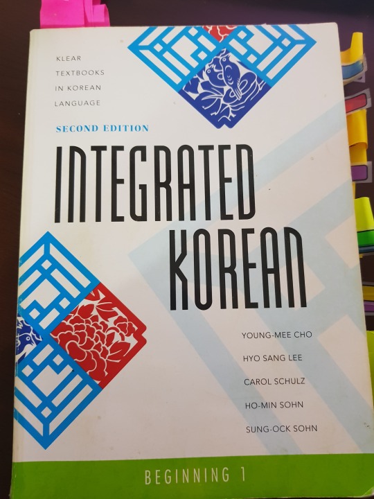
Please don’t mind how old and beaten up looking it is; this guy and I have been through a LOT together!
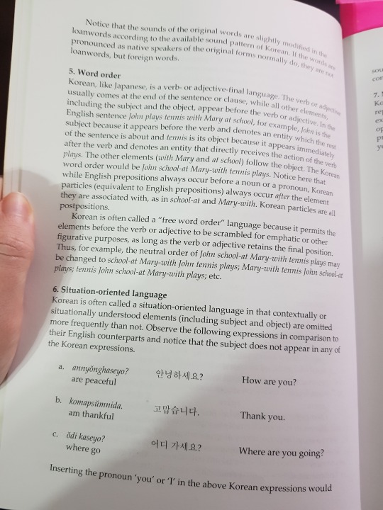
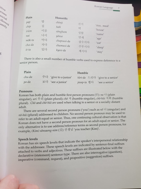
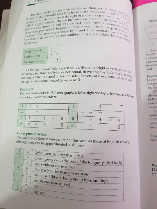
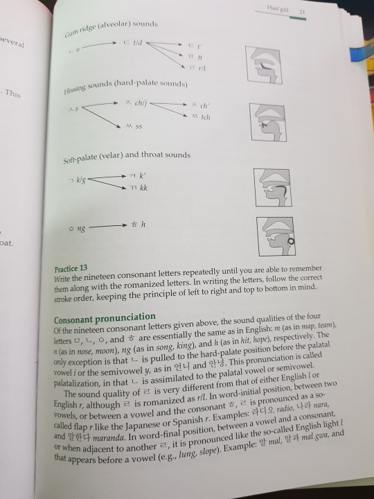
This is the stuff I skipped when I first got the book, and frankly, would have been invaluable to my learning. From the way I taught myself to pronounce Hangul, even these days I still have to push myself to differentiate my 으 from 우. But visually seeing how these sounds are formed is really important, especially for beginners. There’s a lot of sounds we as foreigners and especially as beginners struggle to differentiate. When I help at Diana’s classes, I find a lot of people have issues with 어 and 오 - let alone 에 and 애 and further 스 or 쓰. Of course it’s not a foreigner only thing; at the language exchange, while helping Koreans with pronunciation, I’ve found they sometimes hear things that aren’t there or can’t differentiate certain sounds, either. That’s just language. But knowing how to say things not only helps your pronunciation but when you’re talking to someone, watching the way they speak can help you differentiate sounds as yours ears get used to it.
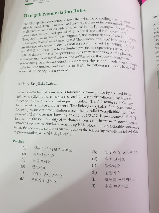
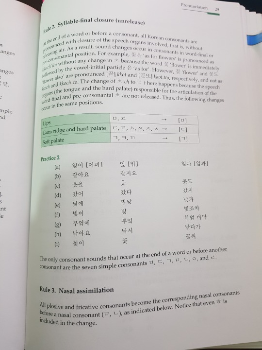
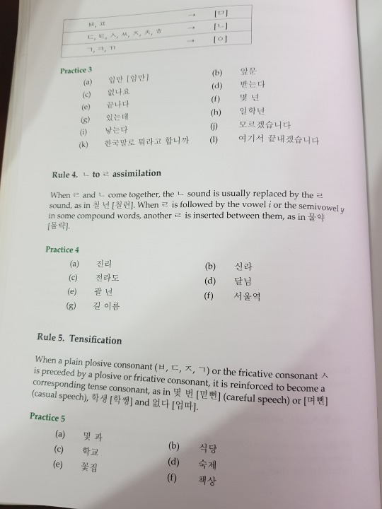
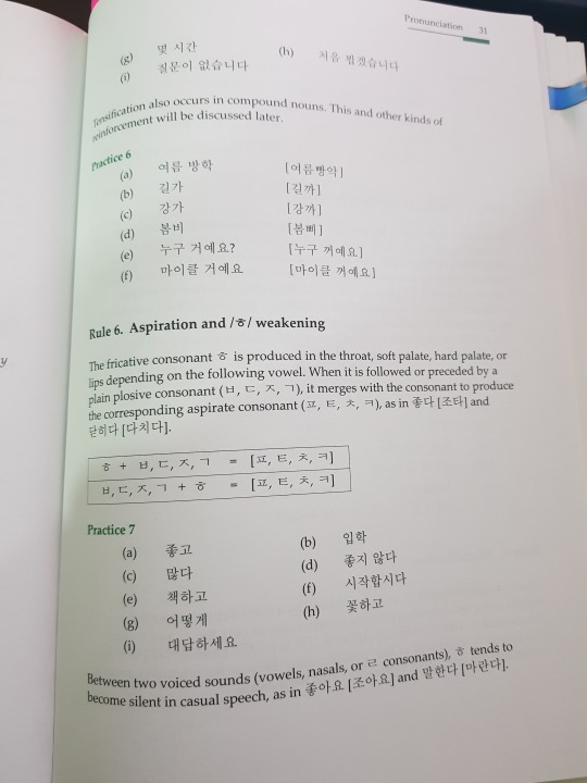
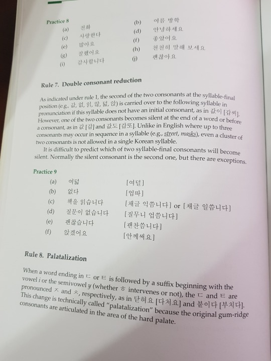
It’s actually quite extensive. Again, if I’d read the beginning, I would have figured out things like resyllablfication - a mouthful that simply means consonants carry over into empty spaces to make pronunciation MUCH easier. Instead, I spent a good while mispronouncing everything and wondering why speaking was so difficult.
Now let’s get into the good stuff!
Integrated is set up into Lessons that are then broken up into 2 conversations/dialogues. After each conversation, you’re given a new word bank, and some new words and expressions in your notes. After that it’s a couple to few pieces of grammar. Sometimes that grammar is a full grammar piece (like a sentence ending), sometimes it’s a particle, sometimes it’s about irregular /ㄹ/ or /ㅡ/ or something.
Typically, integrated is very detailed. There’s usually a lot of notes, examples that show varieties of way of use, and then exercises! I never got a workbook with Integrated so I can’t tell you much about it, but because a. I had no one to check it and b. I have so many exercises in the book, I didn’t regret this. A friend of mine who has used integrated told me that she feels the exercises in the book are sufficient enough because they’re very similar to what you see in the work book anyway.
Let’s have a look!
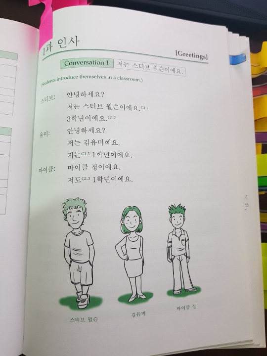
Look how short these dialogues start out. Ahh, nostalgia~
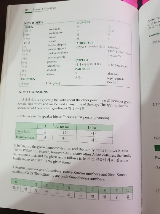
The word bank is always sorted by word type, which becomes useful when you get further in and realize that sometimes adjectives are conjugated differently from verbs! The New expressions heading usually is followed by really useful stuff that doesn’t always warrant its own grammar lesson but still is relevant to your learning.
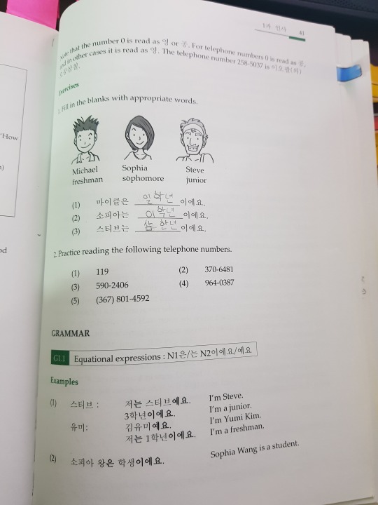
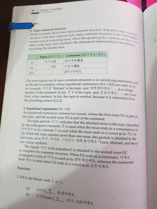
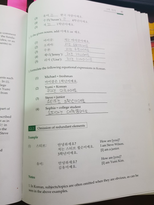
Grammar is always introduced first by examples and then explained in the notes. As you can see, Integrated can be very verbose in its explanations. For some people, this is beneficial. Others, not so much. I tend to like to learn my grammar inside and out; I’m not that great at learning by example or inferring reason, so this very verbose manner of explanation is great for me. Also, I have a tendency to overthink things, so when it’s laid out, it helps.
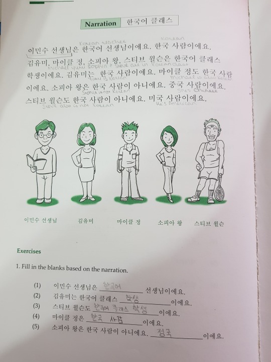
The end of the lesson is always presented with a narration that uses all of the grammar you learned in the past lesson and whatever the lesson’s central theme was (university life, transportation, food, etc.) There’s comprehension questions and activities. But the best part of the end of the lessons is all the stuff they tack on!
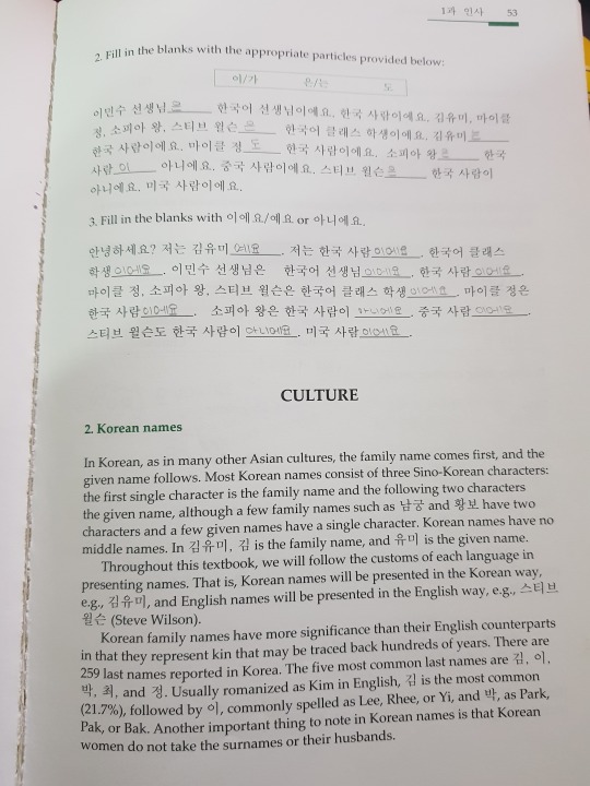
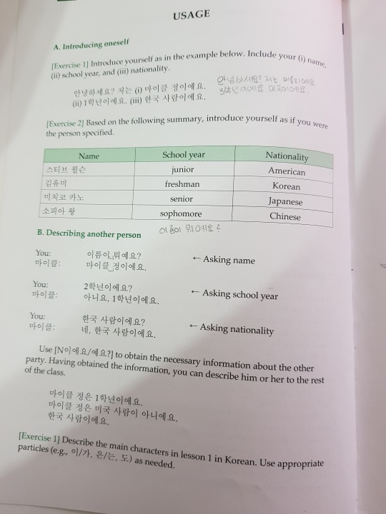
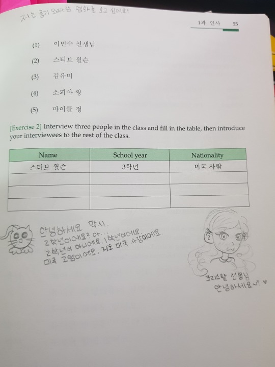
Ignore the doodles, pls. And the notes. I was a mess, okay!
The end of the lesson always features some kind of culture lessons where they teach you various matters about life in Korea and Korean society. It also goes further into detail about usage. Language is not a one way kind of thing. The way initially presented in the textbook is not the only way to say or express things. Further, it has more activities that build upon what you’ve done throughout the lesson. See why a workbook is virtually unnecessary?
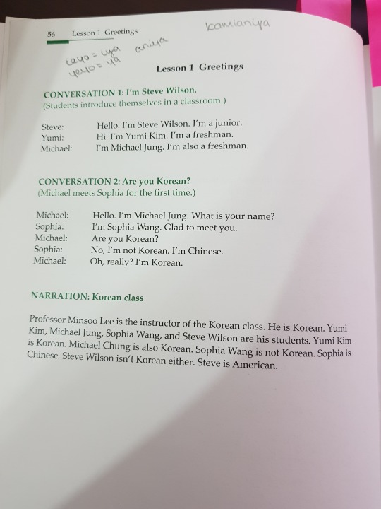
Importantly, the end of the lesson has conversation translations. As you can see, there’s no answers for the exercises, which could be a make or break thing for people. Having no one to correct it makes it hard to utilize the exercises.
Despite the fact that the book lacks answer keys, I find Integrated has been invaluable to my learning. Admittedly, I may be biased because of the time I’ve spent with these books, and thus I’ve grown fond, but even in retrospect I still feel they were and are incredibly useful.
Integrated textbooks are thicker than my EWHA textbooks - they're roughly the size of 2 EWHA books, which seems to make sense because Integrated has two beginner books and I believe for EWHA, level 1 and 2 are considered beginner and 3 seems to start on an intermediate level. As Integrated books are so big, they’re full of information. FULL! The first beginner book alone presents quite a lot of conversational grammar and vocabulary and beginner 2 (what I would think of as high beginner to myself) further expands on it.
Admittedly I was the most inconsistent studier until I came to Korea, so it’s probably unsurprising that I’ve worked out of these two books for the entirety of the time I’ve been learning. In fact I only JUST made it into my Intermediate books. I have a lot of reasons for that, but the point I’m trying to make is that I’ve spent all these years able to use the grammar and vocabulary from these books, so it’s really quite beneficial in my eyes.
(A comparison, for example, is the book my friend teacher Diana uses. Her lessons follow Beautiful Korean, a book that has 3 books in the beginner series, I believe, and each costs 16,000 won. Considerably cheaper, sure, than Integrated Beginner coming in at 30 a piece. But when you consider again that Integrated is the size of 2 textbooks, the price seems to even out. Further, Through us using Beautiful Korean, most of what we learned was only pronunciation and vocab. Only at the beginning of the 1-1 lessons were introductions and the most basic sentences and structures introduced. The actual act of making sentences and grammar doesn’t show up until 1-2. So further, if you consider comparison, you need all 3 books from the beginner series of Beautiful Korean to possibly probably equate to Beginner 1 and maybe 2? idk I haven’t seen what comes after Beautiful Korean 1-3; it might still be beginner level for all I know! That’s not to put down the Beautiful Korean series at all but as far as values, when you consider all 3 books will cost about 48,000 won, Integrated, to me, seems more valuable. But I digress.)
Integrated Beginner 2 stays much the same and follows this same format. In fact, even in Integrated it does, though notably the conversations grow longer and now after each conversation there’s comprehension questions, which is a welcome addition!
That said, EWHA certainly has it’s merits, and my shallow self will admit the fact that they are ever so pretty certainly endears me towards them - but I promise it goes well beyond shallow reasoning.
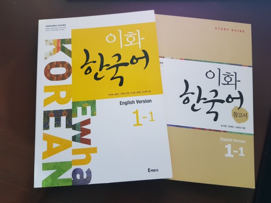
EWHA is best paired as a set with it’s companion study guide. As you will see, EWHA does not go as deeply into explanation about things as Integrated - and thus we have the study guide. Sometimes the study guide doesn’t offer a deeper explanation, either; often it’s unnecessary and as I’ve mentioned before, EWHA seems to want you to understand things through context and by gleaning things yourself. The study guide provides more examples, though, in case an explanation isn’t quite enough; you’re supposed to figure out usage and context with those examples. Sometimes it’s great! It depends on how you learn, to be honest. I find I need lots of examples AND lots of explanation, but I’m trying to learn to mine more from examples without being handheld and spoonfed, but like I said - we all learn in different ways.
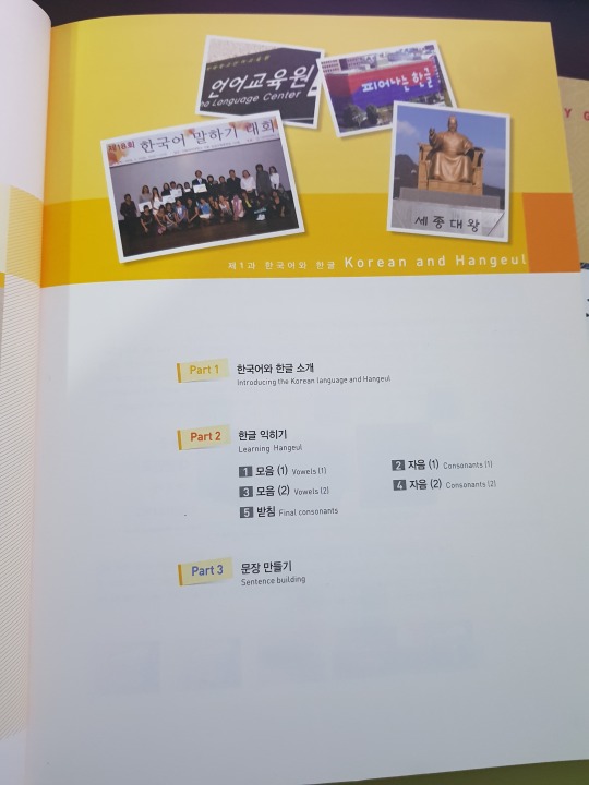
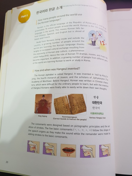
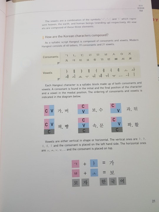
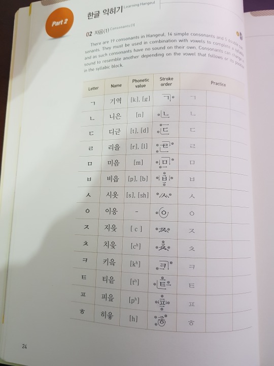
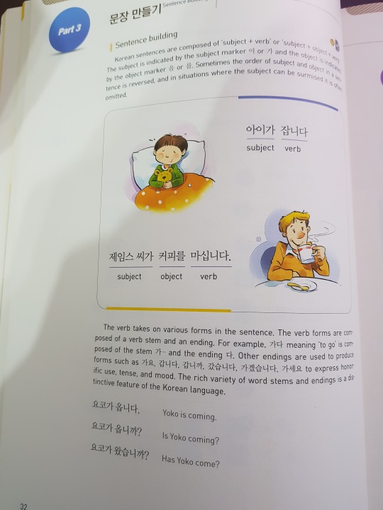
Much as Integrated does, EWHA has a good introduction to Hangeul in both pronunciation and construction. Though I don’t find it QUITE as indepth as Integrated is, EWHA tends to throw little tips at you as you work through the books that Integrated introduces in the beginning, and really you don’t miss much by getting them later.
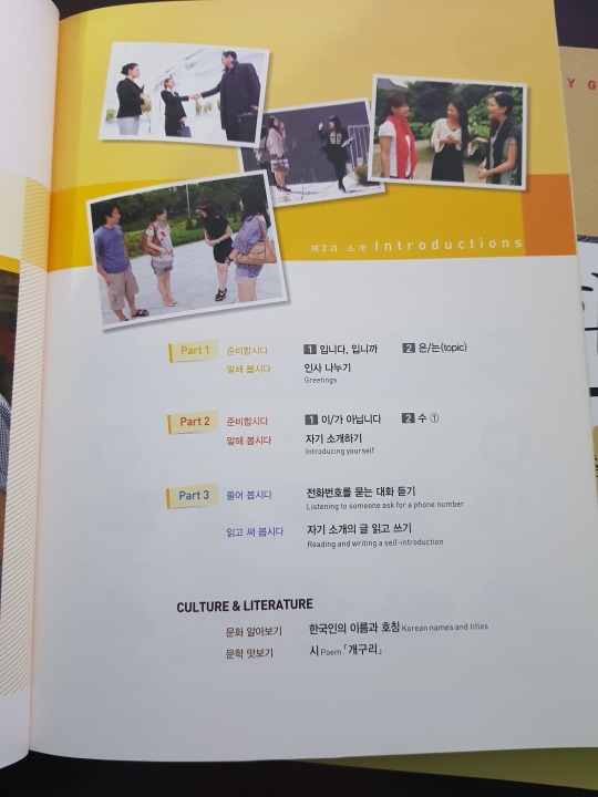
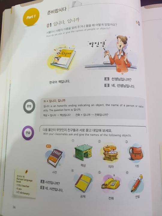
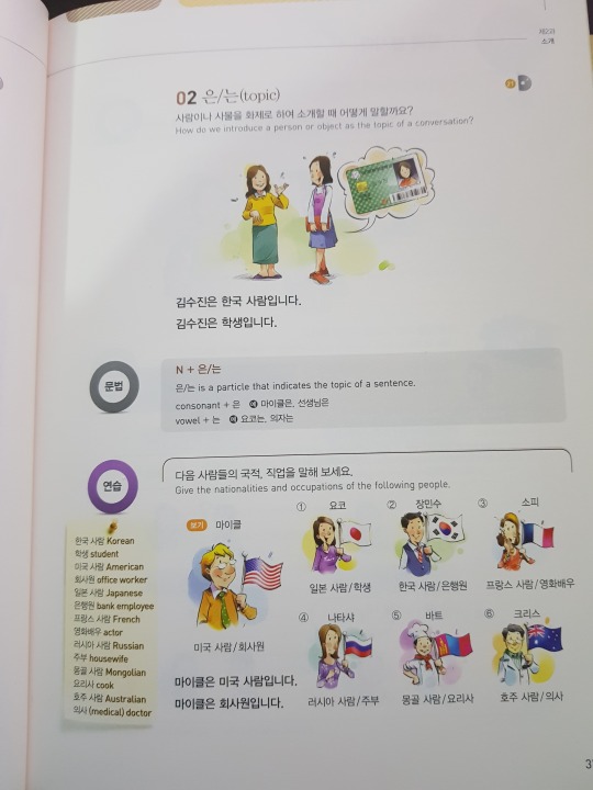
So Integrated is set up in lessons with conversations per lesson. EWHA instead gives you two prep lessons which will lead to a conversation practice. And where Integrated introduces one big word bank per conversation, Integrated just throws them all into your prep lesson. Sometimes it’s big, sometimes it’s small. Something useful that I didn’t do but probably should have was going through the entire lesson and write down the vocab or make flashcards if that’s your thing and review them before you get to them that way they have some familiarity to you. Or, on the other hand, you can go through at the end of the lesson and see which words you remember and then play with the ones you don’t. Your call!
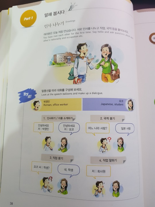
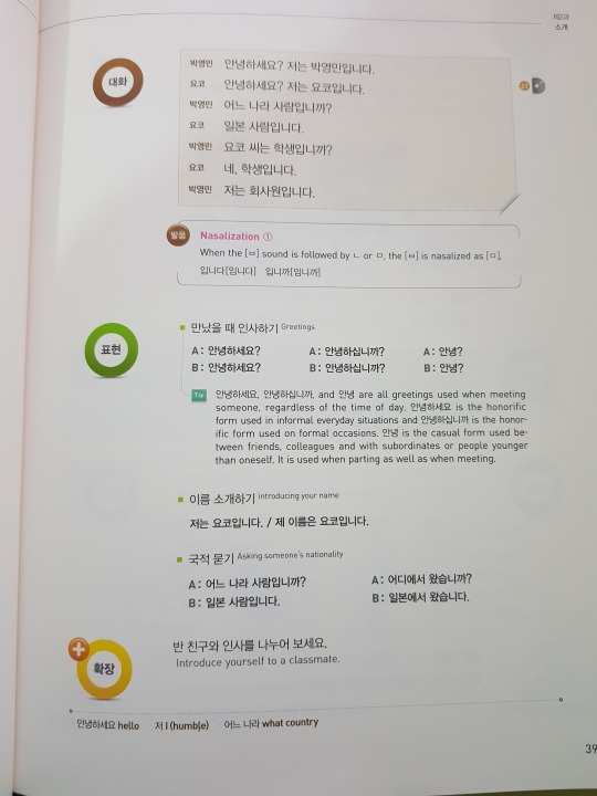
The prep lessons build up to a practice conversation! You get a little information about your roleplay characters and what you’re supposed to be talking about. Basically it’s guiding you and nudging you to use the grammar it’s just introduced to create a conversation. It tells you things like “make a greeting and introduce yourself” “ask their nationality” blah blah and you’re supposed to construct the conversation. On the next page they’ve written out the conversation how they want you to follow it, so don’t look! Cover it up as you try to do it so you don’t rely on just reading it. It’s a really beneficial way of learning to make sentences and especially to think outside of the box of what you’re used to!
As you can see on that page, sometimes they throw in pronunciation tips, which I definitely needed when I first started out! I was lucky I started with TTMIK who do a good job of explaining why ~습니다 is pronounced as ~슴니다 but other things I didn’t learn about until later.
They also give you conversational tips! Obviously you might not be able to figure out the conversation fully on your own, but the book has extras for you. It’s good to try your best and then to check the dialogue and see how or why they came up with what they did. I really like this part, because sometimes I get fixated on one way to say or express something, but as with all languages, there’s many ways to say things! I don’t know why I become so uncreative when I’m trying to construct things in Korean; I guess a sense of unfamiliarity where with English I know exactly how to throw things together. So these are parts are VERY IMPORTANT in really expanding your manner of speech and understanding!
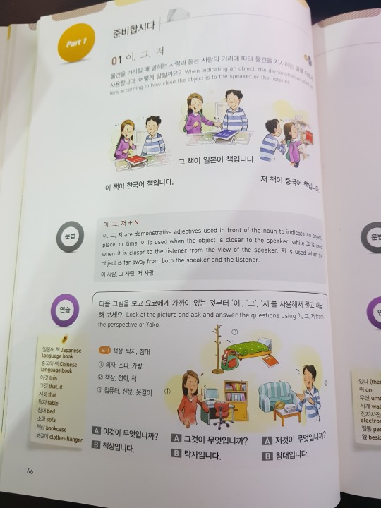
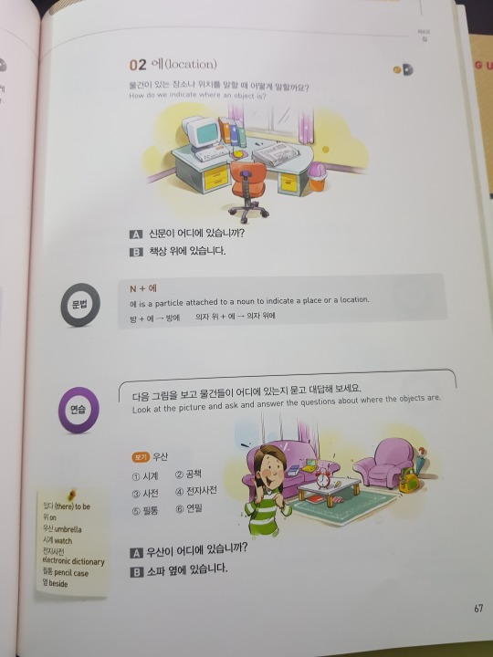
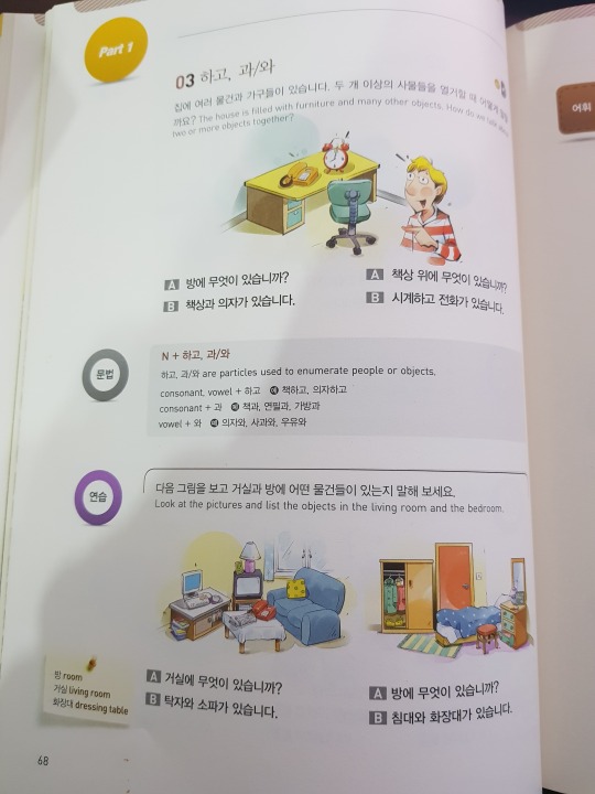
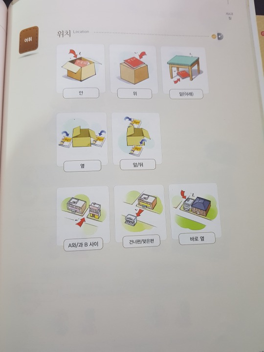
As you can see, it continues this way, following this sort of pattern of prep lessons leading up to a conversation practice. Occasionally, EWHA will throw in a page with images and what they are in Korean. Obviously, you’re supposed to figure out what they are visually but I’ll confess sometimes I’ve had issues with that, but don’t worry; the study guide has you covered! We’ll get to that soon, I promise.
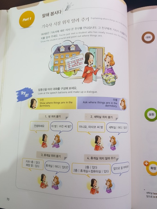
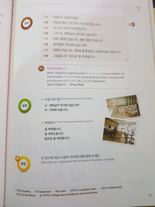
Another example of the conversation practice. Note there’s even MORE vocab at the bottom!
Towards the end of the lesson, there’s always an audio piece that you listen to and answer comprehension questions over and you get MORE fun little expressions like above, except these you’ll have to find in your study guide. It’s really important you get these as a set because if you don’t, you’re lacking an entire half of your EWHA experience - and the study guide just makes it better for self-learners.
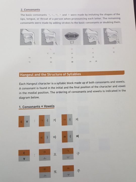
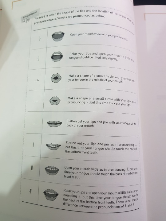
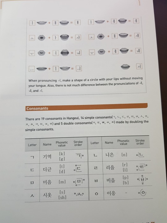
Like the textbook, it also opens with some pronunciation and intro to Hangeul type things. You really aren’t lacking for this kind of stuff, when it comes to these books! It’s also why I always recommend these to beginners! While I am fortunate to currently be in Korea where I can practice and have people help correct me, when I started out self-learning there was no one to do that and I was going off of (terrible) romantization to figure out how to say things. It was bad!
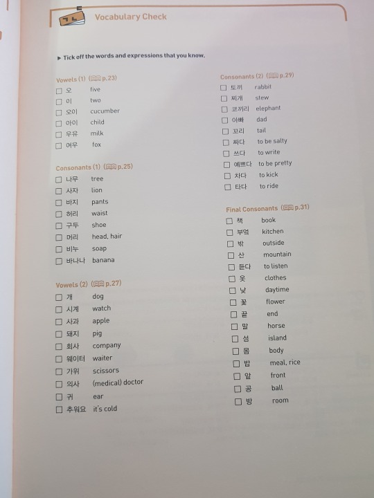
At the end of every lesson, the study guide has a vocabulary check and this! Is! One of my favorite! Things about the study guides!!!!! In the series 1 books it’s very often just words but as you get into series 2, you get phrases and the such which is useful because, again, sometimes I just forget how to construct things I know and it’s nice to see it used in ways that makes you go “ahhh” and helps you make better use.
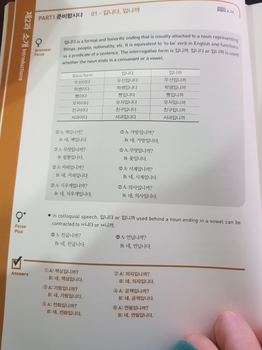
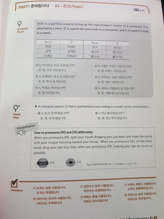
The study guide always shows which pages of the textbook it corresponds to. You can see how there’s a tiny bit of extra information in here; there’s not a lot at this point, because these things don’t necessarily need as much explanation - but there’s plenty of sample sentences! Read the sample sentences! If you’re having a hard time understanding something, reading the samples might be able to help you glean what you’re supposed to be understanding.
As you can see, there’s also an answer key to the activities in the book, which is really great if you don’t have anyone to check your work!
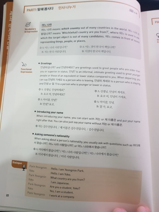
Remember those little expressions in the conversation practice pages? The study guide goes further into depth on them and helping you with your usage. This is the second best part of the study guide! It’s just really full of extras to help you out!
You can also find transcripts for the audio dialogues in here!
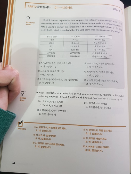
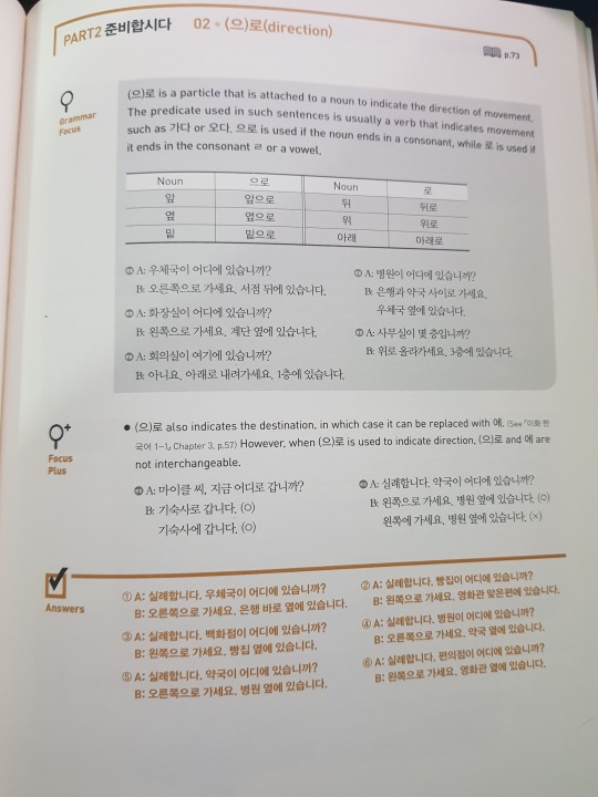
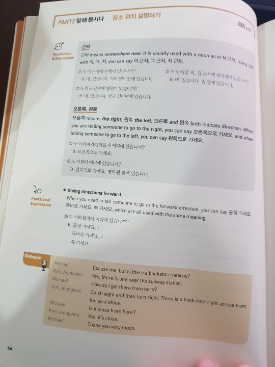
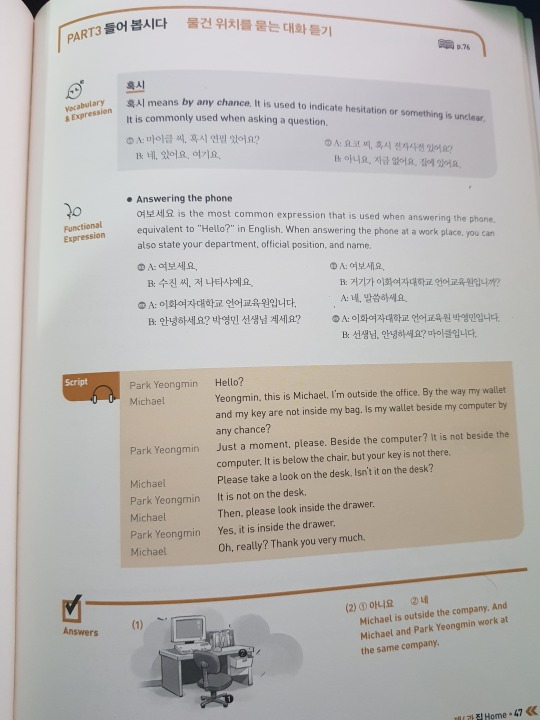
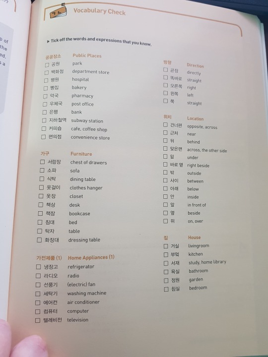
Just a few more samples!
Both sets are really wonderful for learning Korean. I maintain that the “best” one is whichever adheres best to your learning style. If you, like me, require lots of explanation, then Integrated might be best for you. It’s extra full of activities which really negates the need for a workbook. Unfortunately, you need someone to check your work, because while there’s translations for dialogue, there’s no answer key for your activities. EWHA is great for a self-studier in the manner that they DO provide not only transcripts/dialogue translations but also answer keys. Someone who doesn’t necessarily need things explicitly laid out can benefit from EWHA and to be honest, it could probably help people learn TO take meaning through context. Again, if you go with EWHA, you really need the Study Guides as well for the entire experience.
Some things: re EWHA. As you can see above, in books 1-1 and 1-2, your instructions and lesson introductions are written in both English and Korean. By series 2, the English there disappears. You still have English explanations and vocab translations, but your activity instructions and lesson intros are entirely Korean. By series 3, it’s FULL Korean. Your study guide still has English!!!! But your books? Korean! Even the vocab!!!!! I’ll try to remember to add pics of that later. But the idea is, of course, that you’ll learn as you go and eventually you won’t need it entirely written in English. I’m certainly not at that point yet, but I hope I’ll be able to get there soon!
Obviously, textbooks don’t come very cheap, so if you have to choose between the two sets, weigh your pros and cons. That said, the way I use them typically is that Integrated gets prioritized and then when I need a break or a review, I use EWHA. I used to review through Integrated but I find I’m not really taking in anything new when I’m just going over something I remember. By using both sets, I get different vocab sets, different situations, different kinds of usages of the grammar I’m learning. Both introduce things at different times. I’ve learned some things from EWHA that hadn’t been introduced to me at the time in Integrated where sometimes Integrated introduced to me things EWHA wouldn’t for a LONG time get to. But they both give me unique, fresh takes on things I’m learning. I’ve bought my books over a long period of time, so if you DO want to play with both, I’d say start with one set and later on down the line, add the other, so you can spread out the purchases.
Regardless, even if you can only choose one, I think they both have very strong merits as learning tools - and there’s always additional (free) options to help pad out your learning. I still make use of Talk to Me in Korean when I need to review something or I want another take on it or I need another explanation. When I REALLY want to get in-depth with things, I hit up How to Study Korean, where things are really broken down and in-detail explained. Don’t rely on just one study option. If you choose to use a textbook series, pad it out with the free online resources as well! The more ways you can see things used, the better it will stick with you!
I hope this is able to help a little! If you have questions, feel free to ask me! I can try to get some simple comparisons later of Integrated Intermediate level and EWHA series 3 books, and eventually I’ll do some write ups about the TTMIK books I own and the ways I find them useful!
12 notes
·
View notes
Text
Using relevant data, investigate and evaluate how punk music lyrics have changed over time to convey political ideologies and identities.
An essay I wrote for my English language coursework two years ago where some of the songs have now become kind of relevant
The punk scene exploded in the mid 70’s, with influences from 1960’s ‘garage rock’ along with a need to rebel against the expectations of society. Bands such as The Clash and Sex Pistols drew attention to themselves by unapologetically expressing their controversial political views, they provoked thought in people, encouraging people to explore their individuality and question authority. I chose to investigate this topic because although the word ‘punk’ means something different to everyone, there are common connotations that are universal across the scene. I am personally quite involved in the Punk scene so I get to witness modern day punk first hand; therefore, I can see any changes in the language or general culture over the last fifty years; the diversifications and the ways in which it has stayed the same.
I am going to be investigating how much the language used in the punk scene has been affected by the politics of the time. Has it changed that much over the years, and if so why? What drew the members of this scene to using such language? I expect that during this research I will find lots of politically themed lexis during times of more republican and conservative government. I think I will also find some taboo lexis, as coming from a working class majority, the punk scene has often been heavily influenced by drugs, and taboo lexis was traditionally language more typically used by working class citizens. It will also be interesting to look at grammatical structures such as imperatives, pronoun usage and modals to see if the lyrics aim to involve the audience.
To gather the data for my investigation, I picked out songs I already knew, and took some suggestions from other people I know who listen to this genre of music. To help with the political and social contexts, I asked family members who were around at the time of the release of the song.
Musicians in the early days of the punk scene used their songs as a way to educate people about contemporary politics. Because information wasn’t as readily available as it is today, they used their music as a platform to make it available. ‘Know your rights’ by The Clash, starts off with “this is a public service announcement” this phrase denotes important information due to its earliest use being in World War 2 as a way of informing the general public of important events. This pragmatically suggests that the band are like another government, or in a position of power, as usually it is these people making Public Service Announcements. This is followed up by a juxtaposed prepositional phrase “with guitar”. The addition of that phrase is putting emphasis on how popular music can be beneficial to the public, and how bands have a level of influence. Also by using the 2nd person possessive determiner ‘your’, they are addressing the listener personally. Both of these techniques create a sense of synthetic personalisation, where the band puts the audience in the position of active participants in political discourse, which is opposed to mainstream politics.
At the time of release in 1982, the U.K. Had a higher unemployment than there had been since the 1930’s, reaching 14% unemployment by September. The IRA were in a strong position because of hunger strikes the year before, leading to the deaths of 10 people. In this song, The Clash mostly use monosyllabic lexis, because the purpose was to educate the lower class citizens, and they were generally less educated, and wouldn’t trust the typical Latinate lexis associated with the formal register of mainstream political discourse. However, there is no use of taboo lexis in this song, because sometimes the lack of taboo is more powerful. They are trying to out across an informed opinion at the same time as informing people, so they want to sound educated, and taboo lexis was seen as the language of lesser educated people. By not including taboo lexis, the band ensure that their song will be played on the radio, reaching a wider audience – with less chance of being censored, they are making it easier for the young people who make up their target audience to discover. The imperative phrase “know your rights” is used frequently, and always followed up by “all three of them” and this juxtaposition gives the sentence more negative and critical meaning. The bald on record style of this phrase is an openly positive face threatening act towards the government and people in power. In the next verse, the band name the first right. This first right is a human right ‘right to life’, and again they have used very simple Germanic lexis, and are accommodating for their audience of working class citizens as well as differentiating themselves from political registers. The syntax choice in this sentence makes it a passive phrase, highlighting that the addressee is in the position of a helpless victim. The next ‘right’ mentioned is “the right to food money”. This listing of abstract nouns suggests that these two things are equivalent. This song was released not long after child benefits were introduced in the UK in 1970, because families would get money from the government to help feed themselves. The implications of this are altered in the next line; “investigation, humiliation” are what you have to experience in order to access this right. At the end, they use some ambiguous imagery “cross your fingers”. This phrase can have connotations of lying and also of hope. As this verse is a comment on benefits, and there is a stereotype attached to working class citizens who get benefits lying in order to ‘live off the government’. On the other hand, there are people who really do need the support, and so in this context would “cross their fingers” in hope that they get some financial aid to feed their family.
The third ‘right’ is “the right to free speech [unless you’re] dumb enough to try it”. This phrasing has some irony, as by writing these lyrics, and using them to criticize the government so openly, the band is practising their own freedom of speech. There is some underlying pragmatic irony used in the word ‘dumb’ as the originally, this referred to a person who was silent and unable to speak. In the last verse, they say “it has been suggested in some quarters that this is not enough”. By using the indeterminate pronoun ‘it’, the sentence is passive, and the person actually making the suggestion has been left out, creating a sense of mystery. The use of the adjective ‘some’ implies the people with this opinion are a minority.
Contemporaries of The Clash, Stiff Little Fingers brought out their song ‘Suspect device’ in 1979. The song title itself had strong political connotations as the band are from Northern Ireland and at the time of release, the Irish Republican Army (IRA) were still a prominent part of the politics. ‘Suspect Device’ was a euphemism used by police officers in reference to the bombs exploding more and more often in both Ireland and England as a result of ‘the Troubles’. The band then uses the phrase ‘suspect device’ in the second line, and say it has “left two thousand dead”. Over time, 1800 civilians have been killed by the IRA, so the band have used a dysphemism in putting a figure on the number of people dead to shock the audience into seeing the extent of the damage done during the conflict, and by not using a noun, specifying two thousand ‘people’ dead, there is emphasis put on the number.
Later in the song, the band use 3rd person pronouns to refer to the opposing side, however, don’t make it clear whose side (if any) they’re on. In the chorus, there is some use of colloquialism: “suss” was slang for ‘street smarts’ and could also have connotations of a law that was in place in the late 70’s until the early 80’s that gave police officers the right to arrest someone if they thought they looked suspicious. What with the dress sense and refusal to conform, there is a likelihood people who identified with the punk community would have been singled out with this law. In the first line, the lexical verb ‘planted’, is used and is a typical collocation with ‘bomb’. However, the meaning here is ambiguous as it has more than one possible meaning. They say inflammable material is “planted in my head”; this underlying metaphor suggests that ideas and thoughts can be just as dangerous as a bomb.
Throughout the song, pronouns and possessive determiners are used to create an ‘us vs them’ discourse. “They put up a wall…make sure we get fuck all”, this puts the government in a position of almost ownership, insinuating they can do as they please and make sure ‘we’, the citizens, get nothing from them, the government. By using a semantic field of a card game, the band are metaphorically implying the government is cheating them and “dealing them to the bottom”. In the second verse “they make us feel indebted for saving us from hell” is implying that life in Northern Ireland at the time was ‘hell’, and the British government are trying to put it right. However, from some points of view, the British government are the ones responsible for this ‘hell’. In the next line, a mild dysphemism is used, as during this time, more taboo lexis would most likely have them banned from the radio. As with The Clash, this song is meant to inform the listeners of the issues, and highlight another, less mainstream point of view, so radio play would have been essential.
In the next verse, they address the audience directly, with an imperative sentence “question everything you’re told” this is mild, and possibly unintended irony, as by questioning everything they’re told, the audience should be questioning the song and lyrics themselves. This could also be a reference to the typical punk nihilistic idea, and the rejection of fitting in that the punk scene promotes, encouraging the audience to think for themselves. Interestingly, during the last verse, they change the pronoun from 3rd person to 1st person, by saying ‘don’t believe us’, further encouraging independent thought. Using the phrase “we’re a suspect device if we do what we’re told” is further building this independent thought, as they are saying that if we try too hard to conform and fit it, we’ll eventually end up exploding. It is then implied that this is a purposeful act on the government’s part – they are building up these ideologies, trying to push people into becoming angry enough to fight. There is then a football related metaphor ‘score an own goal’, and this fits with the violence implied, as football fans have a reputation for violence, especially in the 70’s and 80’s. The closing line in the song is “we’re gonna blow up in their face”. The image used here fits with the semantic field of bombing that runs through the whole song, but could also be a metaphor suggesting that strategies put in place by the government are likely to backfire.
In 2001, the American people elected another Republican president, and this caused a re-sparking of angry political punk music. In ‘American Idiot’ by Green Day, they open the song with a negative face threatening act aimed at the government, and president himself: “don’t wanna be an American idiot”. The term ‘American idiot’ is allusion to George Bush Jr, who was the president at the time. In the first verse, there is a semantic field of media related panic. They are implying that the media stirs up anxiety (‘hysteria’) in a way that goes unnoticed by most of the American population – it is ‘subliminal’ to the ‘idiots’. “Mind-fuck” is an example of compound neologism to express an idea of emotional and mental manipulation. The verse as a whole is also commenting on how the population of America will believe anything they’re told on TV, and the use taboo lexis is to add to the feeling of severity and frustration at the population of their country.
In the next verse, they use the nouns “faggot” and “redneck”; these are an example of juxtaposing imagery. The liberal ‘faggot’ and conservative ‘redneck’ are opposite ends of the political spectrum, however both nouns are dysphemism, offensive terms used by the opposing side as an insult. There are underlying implications here that at the time, the US debates were very polarized, and the protagonist here can’t identify with either side, because the extremism on both sides are as bad as the other. However, the use of the slur against gay people hints that the protagonist is leaning more towards the ‘left-wing’ liberal view, labelling himself the ‘faggot’. It is also a reference to the band themselves, as all three members are openly bisexual. In the next two lines, the nouns ‘propaganda’ and ‘paranoia’, are used together, implying that propaganda causes paranoia. In the chorus they use a pun “alien nation” as it sounds like ‘alienation’, and that is what the protagonist is experiencing. The world ‘alien’ refers to a person or thing that doesn’t belong, or doesn’t originate in the country or place it is currently. In this instance, it is implying that the citizens of America are ‘aliens’ because the country has become a stranger to its own people. They use the word ‘dreams’ later in the chorus, though the implied meaning is ambiguous. It isn’t clear if ‘dreams’ is meant to be a verb or a noun, this adds to the sense of being alienated and distanced: does the protagonist know how it is meant? The term “television dreams” used with the previous line “everything isn’t meant to be okay” almost juxtapose each other, as in TV drama and advertising, life is often portrayed in an unrealistically positive manner. However, if a person switches the channel and looks at the news, they are faced with the harsh reality that the happy ending goal people strive for is rarely, if ever achievable. Also, the mention of the ambiguous noun phrase or clause “television dreams” alludes to the ‘American dream’, a very powerful inspirational ideology, which is being presented as reduced to an illusionary failure.
Moving forwards 12 years to 2013, a small band from Northern California – Emily’s Army – released a song called ‘Bad Cop’. The title of the song hints at the political problems the band are commenting on. The monosyllabic lexis used are one half of a common collocation ‘good cop, bad cop’, and by leaving off the ‘good cop’ part, it is implied that there is no longer a ‘good cop’ to counter the ‘bad cop’. In total in 2010-2011, 470 people were killed by law enforcement officers in the United States, giving the song its context. They use an oxymoron ‘police brutality and battery’ in the pre-chorus to outline this at face value. The brutality and battery parts are taboo topics, as this is a subject people usually tend to avoid. In the first verse, they talk about how the police man pulls out his gun instead of his stun gun, and they hint that it is an accident, but then follow up by pointing out the “stun gun is yellow, and his pistol is black.” The subtext here is saying that the officer knew exactly what he was doing. The use of the conjunction ‘but’ throws doubt over the first two lines – presumably the policeman’s explanation as to why he shot a person instead of stunning them. The parallel grammatical structure of a copular verb and colour adjective highlights this obvious contrast, implying it wasn’t an accident.
By using the abstract noun “police” as a modifier for the phrase “brutality and battery” creates powerful imagery, as stereotypically the word “police” has connotations of safety and protection, so the contrast of the phrase and the word is implying that the word is starting to undergo a semantic change, as people are associating the word “police” with violence and the things they’re meant to protect against. At the end of this verse, they use a common idiomatic expression that usually means to ‘finish something in a notable way’. However, in the context used here, it is also referencing the phrase to ‘top someone off’ – a common euphemism for killing someone, reinforcing the horror of a police officer doing these things. The shift to first person pronouns in the next verse is trying to give a voice to the thoughts of this sort of police officer. The word ‘mindset’ – used in the next verse has positive connotations, as a mindset implies having a beneficial approach to doing things. However the word ‘mentality’ has negative connotations, suggesting a detrimental approach to a situation, despite the two words being synonymous and carrying the same denotation. The juxtaposition used in the next line of ‘one hand on his gun’ and ‘one hand in his pants’ – here used as a euphemism implying masturbation – alludes to the common metaphor of a weapon symbolising a penis, and the penis as a weapon, and suggests the officer is getting an emotional response from the violence that is similar to sexual excitement.
While the language used in the punk music scene has changed since the 70’s due to the different political contexts, and its spreading to the USA, and although the purpose has changed somewhat, the overall intention hasn’t. The purpose of these kinds of songs has changed somewhat since the early stages. The Clash used their music as a way to inform people of political issues in a world where the information was not as readily available, whereas the more modern political punk music is trying to put things in a simple, factual form, because their listeners have almost too much access to information and it can get overwhelming. There is a semantic field of fighting against injustice and war across all four songs I have investigated, and there are common themes of the cultural encouragement to ‘think for yourself’.
The songs I have looked at and the culture associated with punk music overall is encouraging people to go against the grain of society and embrace their individuality. The common boldness when it comes to criticizing those in power is a part of what draws people to the punk culture, and throughout the years, bands have expressed their anger and distaste with the government and current political affairs in an open manner, all with the intention of shocking the listener enough to help make a change.
However, despite the similarities, the language used has changed over time. In the earlier days of the punk music scene, less taboo lexis were used in songs, as these would result in radio ban and the band wouldn’t be able to spread the information. In later years, swear words have become less of a taboo and wouldn’t shock people as much, so they can be used in songs and the message of the song wouldn’t become overshadowed by the use of taboo lexis. Although the critical nature of the lyrics used in punk songs hasn’t change too much, the ability to openly criticize people in power has increased the number of songs that directly criticize political figures. The generally more accepting state of the society we live in today has meant the punk culture has become less of an underground scene, it has opened the songwriters up to a wider audience, getting more mainstream media attention. Overall, despite the language changes in the songs over time, the semantics and overall messages have stayed relatively similar.
However, the sample, if typical for classic punk and more up-to-date American punk, is fairly small. So, it would be interesting to collect a lager sample from a wider range of performers to see whether these tentative conclusions would still apply; perhaps using some female fronted, or all female punk bands to see how the message they are trying to display differs.
0 notes
Note
Hey, how do you think Brittany and Santana being intimate with each other changed when they officialy started dating? I mean, we know that prior to that they still had more than just sex, they were cuddling and kissing each other's neck very very tenderly. Also we can safely assume that it was much better for Santana than it was with guys. Just like we know that Santana didn't do it because she needed something warm to digest her food, (Part 1)
i also don’t believe that she prefred doing it without eye contact. And sure, even if unspoken, there were a lot of feelings there. So what DID change? Also, do you think they were comfortable enough to experiment in that field with different kind of things before they admitted they loved each other or was it too much of gay panic for Santana? I hope it’s not uncomfortable for you to answer 😅 thank you (: (part 2)
DISCLAIMER: Here be talk about sex. Read at your own discretion.
Hey!
So I’m going to start out by saying that my whole understanding of Brittana’s sex life during S1 and S2 is firmly rooted in these two wonderful fics, which I very highly recommend and would suggest you read because they provide better and deeper insights into this topic than I ever could.
Note that the author has retired from fandom. Please respect her privacy while you enjoy her archived work.
Starting from there:
I tend to believe that despite what Santana tries to pretend (and despite the Glee writing staff’s overfondness for the term “scissoring”), even prior to the Hurt Locker, Brittana’s intimate encounters tend to be on the affectionate side.
While the girls undoubtedly sometimes scissor or even just plain fuck each other, there is a reason why Brittany’s chosen adjective to describe their interactions is “sweet”—and there is also a reason why Brittany knows that Santana is in love with her even though Santana keeps loudly protesting that she isn’t.
Baby Girl can talk about lizards and football players all she wants, but at the end of the day, the fact is that her actions speak louder than her words.
The reason that Brittany can be so reasonably certain that Santana is in love with her even before Santana is willing to admit as much is that Santana treats Brittany in a demonstrably loving way when they’re alone together—especially within the context of the bedroom.
What Santana won’t say with her words, she can’t help but say with her body language, and for as fluent in physicality as Brittany is, Brittany has no trouble parsing out just what it is Santana is actually telling her.
As I discuss elsewhere,
Santana behaves aggressively when she seduces Finn, and one can only imagine that her relations with Puck are anything but affectionate based on the disdain she shows for him in episodes 1x03 and 1x18. Given her behavior towards them, there is no way that either Finn or Puck could ever confuse their sexual encounters with Santana for love or even liking.
If there were nothing which differentiated Santana’s sexual behavior with boys like Puck and Finn from her sexual behavior with Brittany, Brittany wouldn’t have any reason to feel confused about the nature of her and Santana’s sexual relationship. She would just know, as Puck and Finn do, that Santana is only interested in her on a physical level, and there are no deeper feelings there.
But there is something fundamentally different about Santana’s sexual behavior with Brittany versus her sexual behavior with male partners, and that thing is intimacy itself. The physical gestures Santana makes to Finn and Puck are meaningless, but the gestures she makes to Brittany are not only meaningful but have a highly specific meaning—namely, “I love you.”
That being the case, it is no wonder that Brittany, who—at least with Santana—is never anything but honest, feels confused by the mixed physical versus verbal messages that Santana sends her. Ultimately, what Brittany seems to realize that Santana doesn’t is that there is a discrepancy between what Santana says with her body and what Santana says with her words.
Like I discuss in this post, though Santana takes a long time to consciously acknowledge her love for Brittany, the love itself is there from the very start, and, on a subconscious level, Santana knows as much.
Though her mouth may be saying “I’m not making out with you because I’m in love with you and want to sing about making lady babies,” that’s not how her body is behaving. The kisses she’s pressing to Brittany’s neck are soft. Her touches to Brittany’s skin are gentle. She’s trying to make Brittany feel good and is far and away succeeding. She’s not being mean or self-interested in the same way she would be with a boy.
There’s no doubt about it: She is making love.
Now, that said, even though Santana can’t really help but betray her feelings for Brittany when they’re in bed together, she still gives her best good ol’ college try at obfuscating the truth.
Though the only evidences I have on which to base my claim are the bedroom scene in episode 2x04 and the Flirt Locker scene in 2x15, I tend to think that pre-Hurt Locker, Santana is frequently the initiator when she and Brittany get intimate. She’s the one who sets the tone and the pace because doing so allows her to feel more in control.
For her part, Brittany allows Santana to be in the driver’s seat because that’s her m.o. at this point in her development: going along to get along and not doing anything to upset the delicate balance between her and Santana.
In order to remain in control, Santana requires that she and Brittany play by a very specific set of sexual rules:
They are not to sexually monogamous with each other. They always have to have sex with boys on the side, at least intermittently.
No conversation during.
No eye contact, either.
If Brittany tries to make anything of what they’re doing, then they’re done for the night, and Santana will bounce.
Though they can use their sexual relationship to titillate boys, they have to do so in a very particular way. Whatever they reveal has to be provocative, not demonstrative. Sweet lady kisses are for them only. Everything else has got to be a hot, hard show.
The thing is that Santana is a reactive person (see here), meaning that she exhibits a great degree of emotional and physical response to external stimuli, and she knows this fact about herself.
Simply put, it doesn’t take a lot to get Baby Girl riled up, to make her cry when she’s upset or fly off the handle when she’s angry or melt into a puddle of mush when she’s happy and contented and in love. It’s been that way her whole life, and she’s had to learn to work around this trait as she has clawed and scrapped her way up the social ladder.
For as cutthroat as the American public school system can be, it is in Santana’s best interest never to reveal the true depth of her emotions. She doesn’t want to be that kid who wears her heart on her sleeve, not when a heart can so easily be broken.
She carries this mindset into the bedroom with Brittany because for as much as she trusts Brittany, she doesn’t trust the wider world outside of them or even herself, and she can’t risk doing or saying something to Brittany that might eventually get her into trouble later on.
Santana is never more vulnerable than she is in Brittany’s arms, and she knows deep in her gut that if she were to gaze too deeply into Brittany’s eyes while they were making love having sex, she might blurt out words that she couldn’t take back. That’s why she claims that sex is better without eye contact.
Ditto for the moratorium on pillow talk.
She just can’t risk bringing feelings into the bedroom even more than she already has, not when she might accidentally slip and reveal something she’s not ready to face up to.
It’s a complicated dance, and it’s why for years Santana perpetuates the same cycle over and over again, one in which she turns to Brittany for comfort and affection, then panics once she realizes just how close she is to crossing a line, and subsequently throws herself at a male sexual partner to “reassert her heterosexuality.” Since her relationships with male sexual partners are doomed from the start, sooner or later they end up crashing and burning, and, when they do, she turns right back to Brittany, starting the cycle fresh.
Baby Girl is in a state of internal war with herself, with all these feelings—feelings for Britt—pushing up hard against the walls of her heart, desperate to pour out, while at the same time her head keeps screaming at her that she shouldn’t be feeling the things that she’s feeling or enjoying the things she’s enjoying.
Often, the feelings win out, and she’ll just give over to them, showering Brittany with all the affection and care that she feels inside, but she never allows herself to go on that way very long. She always has to rein herself in and pull back.
Nowhere is this pattern of behavior more evident than in the bedroom scene of episode 2x04, when Santana goes from pressing delicate butterfly kisses to Brittany’s neck to meanly telling Brittany that she’s just a temporary substitute for Puck all in a matter of seconds.
But just like Santana finds it increasingly difficult over the course of her junior year to go on pretending that Brittany is “just her best friend,” she also finds it increasingly difficult to pretend that her sex with Brittany is just sex.
Like I discuss elsewhere,
Perhaps ironically, when Santana felt assured that her sexual relationship with Brittany did mean something but wasn’t yet ready to admit as much, she could pretend it meant nothing. But now that Santana isn’t sure what her sexual relationship with Brittany means and she stands on the verge of finally admitting that she wants it to mean something, she durst not pretend that it means nothing, for fear that that might actually be true in Brittany’s case.
In the past, Santana always maintained that their best friendship and their sexual relationship were two completely separate things, and that neither one of them had anything to do with romantic love (“I’m not making out with you because I’m in love with you and want to sing about making lady babies”); however, the fact that Santana could not maintain a basic friendship with Brittany once Brittany started dating Artie speaks to the fact that, for Santana, a link exists between sex and friendship with Brittany—essentially, at this point, she cannot have one without the other.
To continue on from another analysis,
Particularly as Brittany starts dating Artie and Santana is left miserable and pining, she can’t just pretend that everything is okay. If Brittany were “just” her best friend, then they would be able to continue their friendship even with Brittany having a boyfriend. But they can’t. They either don’t talk at all, or they end up sleeping with each other on the side. The whole time, Santana feels awful inside. She just wants Brittany back, and she can’t deny why she does.
—which is why I tend to think that the first big step towards Brittana changing their patterns of intimacy occurs circa the Hurt Locker, when Santana finally admits to Brittany that her interest in their relationship runs more than skin deep, finally saying the words “I love you” out loud.
That moment is a watershed not because it’s a new revelation to either girl—both of them have always in their own ways known—but because it finally makes an explicit connection between sweet lady kisses and feelings, which is something that Santana has been denying for so long.
The question then becomes, what changes going forward? Is Brittana’s first time post-Hurt Locker markedly different from the way things were before?
As is so often the answer, “Yes and no.”
Brittana already know how to make love long before they say “I love you,” but they do so under Santana’s rules, never acknowledging the significance of what they’re doing or admitting aloud that there are feelings underlying their actions. There are gentle caresses, sweet kisses, and careful, concerned touches between them galore, but there is also no eye contact, no acknowledgments, and no exclusivity.
I tend to think that those are the things that change—that once Santana finally cops to her feelings, her old rules go out the window, and she can’t help but be more open to and vulnerable with Brittany.
All of a suddden, they are monogamous. All of a sudden, they can talk and make eye contact. Brittany can now initiate their encounters and fully express herself without fear of upsetting Santana. What happens between them is now just for them and never for the boys on the football team. Everything between them is suddenly infinitely more honest.
Back when S2 was still originally airing, a lot of a fic writers imagined the beauty of a “first time with eye contact” between the girls. I tend to believe that’s something that probably happens at some point during the canon timeline—that sometime during the Back Six, after the Hurt, Dirt, Shirt, and Blurt Lockers, Brittana finally get together again for the first time in months, and Santana can’t help but stare lovingly at Brittany the whole time they’re together because it’s a pleasure she’s denied herself for so long.
I also tend to think that whereas pre-Hurt Locker, Santana often runs the show in the bedroom—not that she always necessarily tops but that she tends to initiate and dictate the pace—afterwards, once she starts being honest about her feelings, she finds that she can willingly relinquish some of that control and allow Brittany to lead her, and it’s okay. She relaxes both body and heart, and, when she does, she finds that she can be more “in the moment,” which proves to be a good thing for both her and Britt.
In regards to the prospect of Brittana experimenting, I think they may try some different things during the pre-Hurt Locker days but always under the guise of the experiments being sexy, harmless fun rather than an exercise in trust or a way to strengthen their bond with each other.
Licking whipped cream off each other? Sure. Staging an elaborate romantic personal fantasy scenario? No.
As long as the experiment allows Santana to maintain the illusion that what she and Brittany are doing is purely physical, she can be cool with it, but if it requires her to acknowledge feelings or get close to breaking her personal rules, she shoots the possibility down, because, as discussed above, there was no way she is going to even get close to crossing those lines—not before she’s ready to.
Once she finally comes to terms with how she feels, she probably also relaxes a bit when it comes to what she’s willing to try.
Just as a matter of personal headcanon, I feel like Santana probably doesn’t allow for much oral sex pre-episode 2x15 because she feels like having Brittany close to her in that way is just too intimate. The first time she lets Brittany eat her out post-episode 2x15 represents an amazing act of trust on her part. It also is part of her coming to terms with her own sexuality.
Per the headcanon, one of the main reasons why Santana so opposes oral to begin with is because she feels like if she crosses that line, it will confirm that she really is gay, and she just isn’t ready to make that concession yet. It’s one thing to scissor or to use fingers, but letting another girl eat one out is something else entirely. It takes her a long time to get to a place where she’s okay owning that aspect of her sexuality.
In terms of what may change between Brittana specifically once they start officially dating in S3, the biggest thing I see is nonsexual in itself, though it goes hand-in-hand with their evolving sexual dynamic: Post-episode 2x22, the girls pretty much stop linking pinkies in favor of holding hands, showing that they are increasingly taking ownership of their feelings for and relationship with each other, in this case even in a public context.
Along those same lines, I think that as time goes on, Santana gets more and more comfortable engaging in PDA with Brittany—not in the bombastic, performative, “for the male gaze” way she used to when she would make out with Brittany just to titillate boys, but in an organic, “This is my girlfriend/wife, and I love her, so I’m going to express it” way that allows her to initiate handholding and quick pecks and wrapping her arms around Brittany’s waist when they’re standing in line together outside the movies.
It’s all a process, and it starts with Santana finally allowing herself to call a spade a spade—or, in this case, making love, making love.
Anyway, that’s all I’ve got.
Thanks for the question!
#Crazy Brittanalyst answers#dive-right-into-you#It's something about the hyphens in your URL that makes it so I can't @ you#I don't know why because I can often @ other people whose URLs are hyphenated#but in your case the second I hit that first dash it stops recognizing the hyperlink#Idk why tumblr is so finnicky sometimes
39 notes
·
View notes
Text
How to Define a Niche for Your Personal Brand
In a crowded market, sometimes it’s best to stand out. What’s your best tip for how to home in on your niche and define what’s unique about your personal brand?
These answers are provided by the Young Entrepreneur Council (YEC), an invite-only organization comprised of the world’s most successful young entrepreneurs. YEC members represent nearly every industry, generate billions of dollars in revenue each year and have created tens of thousands of jobs. Learn more at yec.co.
1. Develop a Consistent ‘Signature Move’
Most marketing and public relations outreach are the same across businesses in particular industries. To differentiate yourself and stand out in a niche or market, it is crucial to develop a signature move. This could be your branding or logo, or the use of paper materials such as handwritten thank you notes in the digital age. Always do the same thing, and be consistent with all your clients. – Ryan Bradley, Koester & Bradley, LLP
2. Find an Area You’re Passionate About
Start by choosing a niche that you’re truly passionate about, one in which you will aim for nothing but excellence. This will work in creating loyal brand ambassadors. It’s equally important to be completely authentic in your approach. Do not try to mimic other successful brand stories, because falsehood is not that hard to detect. Your voice, personality and values should be yours for real. – Derek Robinson, Top Notch Dezigns
3. Write Your Brand Story
To identify what makes your personal brand unique and convey it to others well, sit down and write your brand story. Just listing a bunch of adjectives on your LinkedIn profile or website won’t work. Writing your brand story will help you tell a cohesive story. Write a paragraph or two about how your values, beliefs, and passions have shaped you and how you use them to create value in your work. – Chris Christoff, MonsterInsights
4. Research Your Competition
Just like you would do with your company, you should do with your personal brand, too — you’ve got to research your competition to determine how to stand out. Do some digging online to find the profiles and websites of other personal brands in your niche or industry. Take a look at what they’re doing, and what they’re not doing, to discover how you can stand out from the crowd. – Blair Williams, MemberPress
5. Focus on Your Initial Purpose
Every company in a crowded market sets out with a plan to blow away the competition. Whether it’s alleviating pain points in existing alternatives, simplifying complicated features or adding missing options, there is always a reason for a beginning. Focus on your initial purpose to define what is unique about your brand. – Stephanie Wells, Formidable Forms
6. Go After a Sub-Niche
The secret to effective niche marketing is to be one step ahead of the competition. This means that you need to find a niche inside your chosen niche and appeal to that demographic. If your chosen niche is vegetarian recipes, for example, then focus on the sub-niche of vegetarian potato recipes. Once you’ve dominated that sphere, you can effectively branch out into other sub-niches and grow. – Bryce Welker, CPA Exam Guy
7. Ask Your Customers
Customer feedback is an important element to help you define what’s unique about your brand. Ask customers if they like your product and request feedback about what they would like to see you build next. You can then see if your competitors have some of the most popular features that they requested. If they don’t have one, you’ve found a new differentiator. Let your customers differentiate you. – Syed Balkhi, WPBeginner
8. Position Yourself as a Trusted Advisor
In the crowded business financing market, we’ve got to give our target market a clear reason to choose us over the competition. We do our best to stand out from the crowd by promoting our reviews/testimonials, being transparent and employing a more consultative approach. Everyone is looking for transparency, as well as a consultative approach versus an overtly sales-driven approach. – Jared Weitz, United Capital Source
9. Identify Your Strengths
Create a SWOT analysis for your brand, categorizing your strengths, weaknesses, opportunities, and threats. After you have written them down, take a look at your strengths and create a marketing message that really gets those across. Make sure all your strengths are included in videos and copy throughout your site, as well as ads on social media. – Jared Atchison, WPForms
10. Give Your Audience What They Want
It seems like everyone wants to build a brand to feel the “fame” — but go further than that. Do something more powerful and focus on the audience. Now my posts reflect what my audience wants to see and hear; simultaneously, I am authentic and myself. There will always be people who don’t like what you’re doing, but it’s OK because as long as the majority like you. That’s when you have a brand. – Sweta Patel, Startup Growth Mode
11. Gather Industry Recognition
Some of the easiest marketing collateral your company can acquire is social proof in the form of awards and industry recognition. There are awards for every vertical on every scale (national and local) and tons of partnerships you can enter into. Whether it’s “best of” awards for workplace culture or performance, these are excellent selling points to advertise your brand. – Kristopher Brian Jones, LSEO.com
12. Know Who You Don’t Want to Attract
The last thing you want to do with your personal brand is being everything to everyone. Get a very good understanding of your strengths and your weaknesses and double down on your strengths. Make sure to be clear about who you don’t want to attract and be very clear about it in your content and your imagery. – James Guldan, Vision Tech Team
The post How to Define a Niche for Your Personal Brand appeared first on Personal Branding Blog - Stand Out In Your Career.
0 notes
Text
Are You Looking For A Wikipedia Page for Your Business?

Answer: People often ask that whether having a Wikipedia page for brand or business helps them in promoting their website’s rank. Before coming directly to the answer let us first know what Wikipedia is actually and how it functions. Well, basically it is an online free dictionary just resembling to encyclopedia. It consists of millions articles on largely diversified topics. To be very honest it has nothing to do with rank of your site. Wikipedia links pointing the websites have a ‘no follow’ tag. This means Google will not authorized any link from Wikipedia to your business website.
However, it would be wrong to say that having a Wikipedia page is completely useless for the business. Here are some benefits-
Your business website or brand can do quite well in search result if they have a Wikipedia page. Thus, we can say that a Wikipedia page can improve the search result of your site.
Brand awareness could be created with the help of a Wikipedia page. We all know that it is a big animal in the world of Internet and large crowd visit it every day. There is a possibility that a user may get to your site after visiting the Wikipedia page you have.
Wikipedia is used as a sort of some ‘artificial intelligence’ for Google. Thus, it draws summarized information from the Wikipedia. This information helps in producing graph listings of Google knowledge.
As told above if there is graph knowledge of google for your business. You may influence the site content with the help of Wikipedia page.
There is not any kind of eligibility criteria for a business to have its Wikipedia page. But, it is a fact that well-built Wikipedia pages get sources of information from third-party. Here, by third-party I mean magazines or newsletters on internet, online published material of reputed authors or business publications. Having online published information makes it easier to have your own Wikipedia page.
It is important to have some online published material for your business, right. But if you don’t have then surely, there is some talks doing required with your PR team. Look how things may turn out well and in the favor of your business seek a nice writer or contact journalists. As soon as you have even a single published piece online your Wikipedia page will be created in no time. Start with a short Wikipedia page as soon as you have a couple of published articles regarding your business. The best thing about Wikipedia pages are that they could be built over time. This means you can revisit your Wikipedia business page any time and add or remove the content as per your choice. Now, when you have learnt so much about Wikipedia pages of a website and could create it. Here are few tips for making an appropriate business page on Wikipedia-
The layout of article: Tip no. 1
While creating a Wikipedia page it becomes quite essential to get a proper template for your article layout. This template should be good enough to meet the established standards of Wikipedia. It is advised to look for an idea from articles that have resembling content with yours and already exist on Wikipedia. It would be convenient to layout the base of your new article on an existing article’s layout.
Self- promotion could be ignored: Tip no. 2
The tone of Wikipedia page should be quite unbiased as maintaining an impartial content pattern would be appreciated. Having the tone of your Wikipedia page based on facts is just the right thing to do. The language of promoting your website or business should not be used along with that avoid extra adjectives as well. In case an article is noticed to be a promoting one, it could be removed from Wikipedia.
You have to explain jargon: Tip no. 3
An ideal article is one that could be understood by any and very user. It is not necessary that a person from same industry will only visit your Wikipedia page. It is highly recommended to ignore usage of abbreviations that a non-industrial person could not understand. For an instance, one can simply write the full-form first and the abbreviations in brackets.
Your article should link with other similar article: Tip no. 4
An ideal page on Wikipedia is linked with other pages related. Like, if there is an article of Microsoft it will be linked to articles of computers, video games, software. It is a precious advice to link some other article with every paragraph of your article.
Adding reference & citations will be good: Tip no. 5
In a good page on Wikipedia a reference or citation is included for every claim that could be challenged in the article. The references from reliable third-parties would be great. However, a reference from your own site or blog would be not that good.
Disambiguation: Tip no. 6
There are few pages on Wikipedia with a common name but completely different content. Thus, differentiation between two is required. In order to avoid this problem you can simply add disambiguation to your article’s title. This disambiguation can be easily added just after the initial title.
Disclosure: Tip no. 7
Wikipedia considers a disclosure policy that is a paid one. Under this policy editors are required to tell if they make edits on Wikipedia as paid arrangements. If there are paid editors then it is required to maintain the standards of the Wikipedia page.
Adoption: Tip no. 8
There is a program run by Wikipedia for the editors. This program is named as ‘adopt a user’ in this program the new editors will be guided by experienced ones. This program helps an individual to get to know more about Wikipedia.
These simple steps and you are ready to launch a Wikipedia page or you can hire wikipedia page creator india for your brand or company. It could be better to look on wikipedia at very low service charge.
0 notes
Text
Grammar lesson 5 : Types of Taa’
Previous lesson : [Tanween : the mark of the indefinite noun]
This will be a relatively simple lesson, but it’s still very important to know.
As we all know, the letter taa’ ت can be written in many different ways depending on its location in the sentence :

I mentioned previously that the letter ت at the end of the word can be written in two different ways : the first way is what we see in the first and second example : ياقوت (ruby) and بيت (home), this first type of taa’ is called تاء مفتوحة (taa’ maftouha, the open taa’).
The second way to write it is what we see in the two last examples دراجة (bicycle) and زهرة (flower), the second type is called تاء مربوطة (taa’ marbouta, the tied taa’).
Of course it’s important to stress that if the letter taa’ comes in the middle of the word or at the beginning, we won’t have taa’ marbouta or maftouha as mentioned in the table above.
I. At-taa’ al-maftouha/ at-taa’ al-maftou7a/ التاء المفتوحة
[audio]
This type of taa’ can be found in verbs, nouns and prepositions, but I will focus only on nouns and verbs.
a) Nouns
If the taa’ comes at the end of the singular noun, and the letter that comes before it has fat’ha (fat7a) on it, then the taa’ will be written as taa’ maftouha (maftou7a).
Examples :
ياقوت (yaqout)>>>>>> ruby [audio]
بيت (bayt)>>>>> home [audio]
بنت (bint)>>>>> girl [audio]
حوت (hout/ 7out) >>>> whale [audio]
Notice how the letter that came before the taa’ in all four cases does not have fat-ha (fat7a) on it.
The taa’ also comes at the end of the regular feminine plural noun which is preceded by alif like : معلمات mulaallimaat [audio], مكتبات maktabaat [audio] طالبات taa’libaat [audio].
b) Verbs
There are two cases :
Case 1: the taa’ can be in the origin of the word itself and not additional
For example :
مات (maata) >>>> to die[audio]
نبت (nabata) >>>> to grow [audio]
بات (baata) >>>>> to come to, to overnight [audio]
Case 2: the taa’ is additional to the verb
There are two taa’s that can be additional to the verb :
تاء الفاعل ال��تحركة Taa’ul Faa’il Al-Mutaharrika [audio] which is a pronoun that it added to the verb to mark the subject. For example : أكل akala (he ate), أكلت akaltu (I ate) [audio comparison].
تاء التأنيث الساكنة Taa'ut-Ta'neeth Ass-Saakinah [audio] it is not a pronoun, but it is a letter (حرف) added to the past tense of the verb to mark that the subject is feminine such as أكل akala (he ate) >>>> أكلت akalat (she ate). [audio comparison].
The verb in both cases is أكل akala (to eat) and it doesn’t have the letter taa’ at the end, the taa’ is additional to give some information about the subject.
Note : I will not elaborate much of these two types of taa’ at the time but I will make a detailed lesson about them in the future after I finish the basic grammatical notions. The aim here is to show you how the verbs can have taa’ maftouha at the end. In the meantime, read this small note about huroof.
II. Taa’ marbouta تاء مربوطة
[audio]
This can only accompany a noun, and it’s one of the marks of the noun (meaning, if you see it, you know for sure that the word is a noun).
It’s important to note that when this taa’ is in the middle of the sentence it’s pronounced as a normal taa’.
However, when the ـة comes at the end of the sentence or before a comma, it is pronounced as a ـه (ha’).
In words that end with taa’ marbouta, if you stop at that word you need to pronounce it as a ـه (ha’) with sukoon, however with words ending with taa’ maftouha, if you stop at that word you’ll pronounce it as a taa’ saakina, and not haa’.
Example :

Uhibbu haatha albait. (I love this house).
[audio]

Uhibbu haatha albaita alwaasi’. (I love this spacious house)
[audio]
Click on this link [link] which contains audio files for the pronunciation of the “taa’ al marbouta” in case it’s in the middle of the sentence and in case it’s at the end of the sentence.
Use the two sentences above and the information on the link to compare the pronunciation of the two types of taa’ when they are at the end of the sentence.
There are many cases for nouns with taa’ marbouta, but I will mention the most important ones
1- To differentiate the female adjective and the male adjective
لطيف lateef gentil (masc)>>>> لطيفة lateefa gentil (fem.) [audio]
طويل (taweel) tall (masculin) >>طويلة (taweela) tall (fem.) [audio]
2- Arabic nouns in which the letter before the taa’ has fat-ha فتحة
ابنة، حديقَة ، مدْرَسَة، فاطمَة ، زهرَة ، فَتاة [audio]
Notice how all these nouns which end with taa’ are preceded with a letter that has fat-ha on top of it.
Also notice how the word بنت bint (girl) has taa maftouha and the word ابنة ibna (daughter) has taa marbouta because of the haraka of the letter before the taa’.
3-The taa’ isn’t only to indicate female names, there are Arabic male names which end with taa’ marboota, for example : طلحة, خليفة، حنظلة، جمعة، حمزة [audio]
Note : the taa’ can also be used in irregular plural in case the singular does not have a taa’ for example : راعٍ raa’in >>>>> رعاة ru’aa. [audio]
Important note in case of noonation : in the case of tanween al-fat’h, the nouns that end with taa’ marbouta don’t get an extra alif, unlike the nouns that end with taa’ marbouta.
Example :
A noun that ends with taa’ marbouta + tanween fat-h

A noun that ends with taa’ maftouha + tanween fat-h

Next lesson : [Punctuation marks in Arabic]
References and more information [1], [2],[3], [4], [5]
86 notes
·
View notes
Text
Learn how to create a brand guide from scratch with this tutorial
Were you just commissioned to create a brand guide and you have no idea where to start? It’s okay, we’ve all been there. Just take a deep breath, grab a cup of coffee or tea (or wine) and get ready to find out everything you need to know about creating the raddest brand guide in Illustrator!
Logo design by top level designer Mky for doggy brand Radpaw.
First things first, what is a brand guide? It’s a document that captures a brand’s essence. It defines its personality, style and tone and it represents how the brand communicates. A brand guide should be clear, easy to understand and highly visual.
I believe what differentiates a rad brand guide from a brand guide that is merely okay is the fact that you don’t have to read a single word in order to understand the brand. An effective brand guide tells you everything you need to know about it using imagery and colors.
In this tutorial we will guide you through the following steps:
Research
Setting up your document
Cover
Contents
About
Master logo
Secondary logo
Logo variations
Logo usage
Typography
Color
Brand application
Designer contact
Glossary
Finishing touches
Saving your file
Let’s get to it then!
1. Research —
The first and most important step in creating a brand guide is research. You should start by writing down everything that comes to mind about the brand: style, tone, adjectives, related objects, colors or even actions. Think of the brand as a person: what would he or she be like?
Design by Mky for Radpaw.
Don’t try to make a pretty, presentation-like page for this, just let your ideas flow. It really helps to have the brand’s logo in front of you as you do this and write down everything related—and I mean everything, even if it sounds or seems unimportant at first.
Once you feel like you’ve noted everything about it, you can now use these keywords to look for images that reflect the brand’s image. If you have no idea where to look for these images, here’s a list of the best sites.
Via Unsplash and Pixabay.
2. Setting up your document —
Now that you have everything you need, let’s start designing!
Open Illustrator and create a new file, entering your desired page size and orientation (I will use 1280x720px in landscape mode for this tutorial).
Set the bleed to 12px (or ask your printer about what sizes they work with, it may vary slightly), the Raster Effects to 300 ppi and the color mode to CMYK.
Enter your desired number of artboards (you can add new ones or remove them later, too), name your document and click Create.
Next, you have to create the layout grid using guides.
Create a rectangle sized 20x20mm and place it to your page’s edge.
Hit ctrl+R to make the rulers visible, click it and drag to create your guide.
Place the guides to the inner sides of your rectangle.
Move the rectangle to the lower left side of your artboard and place the guides there too.
Make sure your guides are unlocked (to do this click View > Guides > Unlock Guides), select the two horizontal guides and copy them.
Click on the next artboard and hit Shift+Ctrl+V to paste them to the new artboard in the same place.
Repeat this with all the artboards.
Rename your layer containing the guides ‘Guides’, drag the rectangle out from your artboard (but don’t delete it, you might need it again for measuring) and lock the layer.
In the following steps, make sure you click on the next artboard and create a new layer for each chapter! This way you will be able to keep things organized, making your workflow easier and faster.
3. Cover —
Remember all those pretty photos you previously gathered?
After you choose the one you think is best for the brand guide’s cover, open it in Photoshop.
Then convert it to CMYK color mode and save it as a .psd file.
Go back to your Illustrator document and create a new layer. Name it ‘Cover’ (how creative, right?).
Click on the first artboard and place the .psd image using the shortcut Shift+Ctrl+P or File > Place.
Resize and position the image on the page.
You can use Clipping Masks if you need to. (if you are not sure how those work, this article on Clipping Masks will help you get started.)
It’s very important that the image fills in the bleed area, too!

Think about what you want the cover to contain. Obviously, the brand’s logo needs to be part of it. Import and place it wherever it feels right to you. The title is pretty important too, so type that in or letter it yourself (as I did in this case). And there you go, the base of your cover is done.
Design by Mky for Radpaw.
Leave it as is and once all the pages are done we will see if we can make it more fun and interesting.
4. Contents page —
This is probably the easiest page.
Just write down the chapter titles in separate rows and leave empty spaces for their corresponding page numbers—you never know how long a chapter will be.
By this point you will realize that you need a header for each page’s title. Fortunately, you kept that rectangle you created in the second step.
Unlock the first layer, create two more guides using that rectangle and lock it back.
Go to the cover layer, copy the title, click back to the contents’ layer and paste it. Resize it to fit into the header.
Under it type your current page’s title and arrange them as you wish.
Your page should now look something like this:
Design by Mky for Radpaw.
Leave it as is and let’s move on!
5. About page —
Start the page by copying the header from the contents layer to your new layer, called About Page (you can come up with more creative layer names). Just remember to hold down Shift+Ctrl+V to paste in place.
If you don’t have it already, ask your client for the business info that should go here.
Now just let your imagination run wild and use the previously gathered photos. Don’t forget to convert them to CMYK color mode in Photoshop.
You can crop them, cut them, make a collage of them—but keep the brand’s style in mind. Now place the photos, type in the info, add the page number (this is the 3rd page) and arrange them on the artboard.
Design by Mky for Radpaw.
6. The master logo —
Paste the header on the new layer. Add the page number, place the master logo on the artboard and note down a few of the logo’s main characteristics to emphasize them.
Design by Mky for Radpaw.
7. Secondary logo —
This page is optional, as not every brand will have a secondary logo. If it does, just repeat the steps from the master logo.
Design by Mky for Radpaw.
8. Logo variations —
Click on the next artboard, paste the header (guides and title) on the new layer and add the page number.
The logo variations include the logo’s color and format (vertical or horizontal). After you’ve gathered or created all variations, you have to arrange them on the page. Make sure you include both the master logo and the secondary logo. If you think there is something that the future guidelines users will have to pay extra attention to, you can always leave a note on the page.
Design by Mky for Radpaw.
9. Logo usage —
This chapter will define the minimum and maximum sizes the logo can be used in. This will prevent using the logo in such small sizes that it loses readability and becomes just an ink spot on a paper or an ugly pixel on a screen.
In this case I will use a minimum width of 25mm for the vertical logo format. As for the horizontal format, I will keep the vertical’s proportions, giving it a minimum width of 43mm.
Obviously, because this doggo logo is so rad, I will not have a defined maximum size.
Design by Mky for Radpaw.
You also have to define the minimum space that the logo needs around it. If you have text or other elements too close to the logo, you risk losing its charm, essence and again, readability. This space will help the logo breathe, keeping it clean.
Design by Mky for Radpaw.
For this logo I will use the differ from the slogan as a measurement. (You can use whatever you think is appropriate: an element from the logo, another word or just define a specific size).
Design by Mky for Radpaw.
10. Typography —
I didn’t mention it in the previous chapter because I wouldn’t want to sound like a broken record, but please don’t forget to click on the next artboard, paste the header (guides and title) on the new layer and add the page number.
This page presents the fonts that should be used for the brand. In this case I used my own (messy) handwriting to write the brand’s title in the logo, so I went with the same style for the headlines too. If you choose to do the same, just mention that you used a custom made lettering for it—this makes you really cool, apparently!
Obviously, you will need another font for text paragraphs. When you chose it make sure it’s readable and never use script.
Once you picked a font, type out the whole alphabet as well as all the numbers and punctuation marks using that specific font. Also, add a small text paragraph using the same font—for this I suggest you use Lorem Ipsum text (what is that, you ask? It’s placeholder text, with absolutely no meaning at all).
Design by Mky for Radpaw.
11. Color palette —
This is my personal favorite part (I really love colors and playing with them).
Here you should mention and present the primary colors of the brand. Include the ones that the logo uses, plus the blacks and whites, the secondary colors (in this case these are the colors from the secondary logo), and the accent colors—this is optional, it’s not necessary to have a separate category for these too, but you know, I’m a color fan so why not?
If you have trouble finding the proper colors for the brand, maybe this article on color meanings will help you. After you’ve decided on what colors are best suited, nicely arrange boxes or dots or splashes or whatever works best for the brand’s style to present the colors and add their corresponding color codes (HEX, RGB and CMYK). If you don’t know what these letters mean, I suggest you take a look at this article on color modes.
Design by Mky for Radpaw.
12. Brand Application —
In this chapter you present the brand’s stationary documents and social media materials (if there are any).
Simply arrange them nicely on the page and you’re done.
Design by Mky for Radpaw.
Design by Mky for Radpaw.
13. Contact the designer —
This page is all about you! Add your photo, some contact info and, of course, your rad logo design.
Design by Mky for Radpaw.
If this guide is to be used digitally, make sure all links work.
14. Glossary —
Most likely your non-designer client will have no idea what all the design terms you used in your brand guide mean. CMYK, vector, EPS, AI, RGB—there are tons of terms that might sound like gibberish to a layman. So create a glossary to explain everything your client needs to know about these terms.
Design by Mky for Radpaw.
Design by Mky for Radpaw.
15. Adding personality to the pages & finishing touches —
I know I said the colors page was my favorite, but this step is pretty fun too. After you’ve finished arranging all the elements and infos on each page you might want to jump back to the beginning of the document and make it as cool as possible.
Because this brand is a fun and nonconformist one, the client and I agreed that it should have a wicked, messy and punk image, so I had complete freedom to let myself go crazy. You should, obviously, discuss this with your client, but basically just follow your instincts and don’t overthink it.
Also, here is where you will have to add the page numbers to the Contents page, don’t forget that.
Design by Mky for Radpaw.
While you can totally get weird with this, you still have to follow some minor rules. For example, on your Logo Variations page make sure you don’t add too many things, to avoid it looking crowded. You still want to have the primary focus on the logos.
Design by Mky for Radpaw.
But on the Colors page or Designer Contact page, for example, you can add tons of fun elements like color splashes. After all, colors make the world go round, and the Designer Contact page is all about you!
Design by Mky for Radpaw.
Design by Mky for Radpaw.
16. Saving your file —
Now that your document is all done and ready to present, you’re going to have to save it so that you can send it over to your client or printer.
For this go to File > Save As, select Adobe PDF from the dropdown menu and mark All to save the whole document as one PDF file.

Then, on the window that will pop up go to Marks and Bleeds and use the document bleed setting with the trim marks.

Hit save and your pages should look like this:
Design by Mky for Radpaw.
Notice those little lines on the edges? That’s where the pages will be trimmed and what we needed the bleed for.
However, if your client needs the brand guide for digital use too, there are just a few little adjustments to make.
Go to File > Document Setup and remove the bleed (just type 0).
Go to File > Document Color Mode and select RGB color.
Now you will have to change the CMYK images to RGB images. For this you will have to go to your links panel (Window > Links) and relink each image that uses the CMYK color mode.
Then simply save it as a PDF file as explained in the previous step—note that you don’t have to set any Bleed related settings this time.
Alternatively, if you are going to send the editable file to your client, you will have to include a package of the images used, otherwise your client won’t be able view the file properly—both for the printable and digital files.
To do this you go to File > Package, select where to save it and click Package. This will create a folder with all the links used, so don’t forget to send that too.
17. Conclusion —
If you are reading this sentence, I want you to know that I am very proud of you, because you made it to the end of the tutorial. Congrats!
You now know the basic steps for creating your own rad brand guidelines. However, tutorials won’t make you a master, you have to actually get your hands dirty, experiment, fail, fail some more and then succeed. Remember, practice makes perfect!
Any questions? Let us know in the comments below!
—
This article was written by Andrea Stan (aka Mky on 99designs), a freelance graphic designer from Romania with a focus on logo design and a love for lettering and doodling patterns. The top three things she couldn’t live without are plants, sunshine and (loud) music.
The post Learn how to create a brand guide from scratch with this tutorial appeared first on 99designs.
via 99designs https://99designs.co.uk/blog/design-tutorials-en-gb/brand-guide-illustrator-tutorial/
0 notes
Text
Learn how to create a brand guide from scratch with this tutorial
Were you just commissioned to create a brand guide and you have no idea where to start? It’s okay, we’ve all been there. Just take a deep breath, grab a cup of coffee or tea (or wine) and get ready to find out everything you need to know about creating the raddest brand guide in Illustrator!
Logo design by top level designer Mky for doggy brand Radpaw.
First things first, what is a brand guide? It’s a document that captures a brand’s essence. It defines its personality, style and tone and it represents how the brand communicates. A brand guide should be clear, easy to understand and highly visual.
I believe what differentiates a rad brand guide from a brand guide that is merely okay is the fact that you don’t have to read a single word in order to understand the brand. An effective brand guide tells you everything you need to know about it using imagery and colors.
In this tutorial we will guide you through the following steps:
Research
Setting up your document
Cover
Contents
About
Master logo
Secondary logo
Logo variations
Logo usage
Typography
Color
Brand application
Designer contact
Glossary
Finishing touches
Saving your file
Let’s get to it then!
1. Research —
The first and most important step in creating a brand guide is research. You should start by writing down everything that comes to mind about the brand: style, tone, adjectives, related objects, colors or even actions. Think of the brand as a person: what would he or she be like?
Design by Mky for Radpaw.
Don’t try to make a pretty, presentation-like page for this, just let your ideas flow. It really helps to have the brand’s logo in front of you as you do this and write down everything related—and I mean everything, even if it sounds or seems unimportant at first.
Once you feel like you’ve noted everything about it, you can now use these keywords to look for images that reflect the brand’s image. If you have no idea where to look for these images, here’s a list of the best sites.
Via Unsplash and Pixabay.
2. Setting up your document —
Now that you have everything you need, let’s start designing!
Open Illustrator and create a new file, entering your desired page size and orientation (I will use 1280x720px in landscape mode for this tutorial).
Set the bleed to 12px (or ask your printer about what sizes they work with, it may vary slightly), the Raster Effects to 300 ppi and the color mode to CMYK.
Enter your desired number of artboards (you can add new ones or remove them later, too), name your document and click Create.

Next, you have to create the layout grid using guides.
Create a rectangle sized 20x20mm and place it to your page’s edge.
Hit ctrl+R to make the rulers visible, click it and drag to create your guide.
Place the guides to the inner sides of your rectangle.

Move the rectangle to the lower left side of your artboard and place the guides there too.
Make sure your guides are unlocked (to do this click View > Guides > Unlock Guides), select the two horizontal guides and copy them.
Click on the next artboard and hit Shift+Ctrl+V to paste them to the new artboard in the same place.
Repeat this with all the artboards.
Rename your layer containing the guides ‘Guides’, drag the rectangle out from your artboard (but don’t delete it, you might need it again for measuring) and lock the layer.
In the following steps, make sure you click on the next artboard and create a new layer for each chapter! This way you will be able to keep things organized, making your workflow easier and faster.
3. Cover —
Remember all those pretty photos you previously gathered?
After you choose the one you think is best for the brand guide’s cover, open it in Photoshop.
Then convert it to CMYK color mode and save it as a .psd file.
Go back to your Illustrator document and create a new layer. Name it ‘Cover’ (how creative, right?).
Click on the first artboard and place the .psd image using the shortcut Shift+Ctrl+P or File > Place.
Resize and position the image on the page.
You can use Clipping Masks if you need to. (if you are not sure how those work, this article on Clipping Masks will help you get started.)
It’s very important that the image fills in the bleed area, too!
Think about what you want the cover to contain. Obviously, the brand’s logo needs to be part of it. Import and place it wherever it feels right to you. The title is pretty important too, so type that in or letter it yourself (as I did in this case). And there you go, the base of your cover is done.
Design by Mky for Radpaw.
Leave it as is and once all the pages are done we will see if we can make it more fun and interesting.
4. Contents page —
This is probably the easiest page.
Just write down the chapter titles in separate rows and leave empty spaces for their corresponding page numbers—you never know how long a chapter will be.
By this point you will realize that you need a header for each page’s title. Fortunately, you kept that rectangle you created in the second step.
Unlock the first layer, create two more guides using that rectangle and lock it back.

Go to the cover layer, copy the title, click back to the contents’ layer and paste it. Resize it to fit into the header.
Under it type your current page’s title and arrange them as you wish.
Your page should now look something like this:
Design by Mky for Radpaw.
Leave it as is and let’s move on!
5. About page —
Start the page by copying the header from the contents layer to your new layer, called About Page (you can come up with more creative layer names). Just remember to hold down Shift+Ctrl+V to paste in place.
If you don’t have it already, ask your client for the business info that should go here.
Now just let your imagination run wild and use the previously gathered photos. Don’t forget to convert them to CMYK color mode in Photoshop.
You can crop them, cut them, make a collage of them—but keep the brand’s style in mind. Now place the photos, type in the info, add the page number (this is the 3rd page) and arrange them on the artboard.
Design by Mky for Radpaw.
6. The master logo —
Paste the header on the new layer. Add the page number, place the master logo on the artboard and note down a few of the logo’s main characteristics to emphasize them.
Design by Mky for Radpaw.
7. Secondary logo —
This page is optional, as not every brand will have a secondary logo. If it does, just repeat the steps from the master logo.
Design by Mky for Radpaw.
8. Logo variations —
Click on the next artboard, paste the header (guides and title) on the new layer and add the page number.
The logo variations include the logo’s color and format (vertical or horizontal). After you’ve gathered or created all variations, you have to arrange them on the page. Make sure you include both the master logo and the secondary logo. If you think there is something that the future guidelines users will have to pay extra attention to, you can always leave a note on the page.
Design by Mky for Radpaw.
9. Logo usage —
This chapter will define the minimum and maximum sizes the logo can be used in. This will prevent using the logo in such small sizes that it loses readability and becomes just an ink spot on a paper or an ugly pixel on a screen.
In this case I will use a minimum width of 25mm for the vertical logo format. As for the horizontal format, I will keep the vertical’s proportions, giving it a minimum width of 43mm.
Obviously, because this doggo logo is so rad, I will not have a defined maximum size.
Design by Mky for Radpaw.
You also have to define the minimum space that the logo needs around it. If you have text or other elements too close to the logo, you risk losing its charm, essence and again, readability. This space will help the logo breathe, keeping it clean.
Design by Mky for Radpaw.
For this logo I will use the differ from the slogan as a measurement. (You can use whatever you think is appropriate: an element from the logo, another word or just define a specific size).
Design by Mky for Radpaw.
10. Typography —
I didn’t mention it in the previous chapter because I wouldn’t want to sound like a broken record, but please don’t forget to click on the next artboard, paste the header (guides and title) on the new layer and add the page number.
This page presents the fonts that should be used for the brand. In this case I used my own (messy) handwriting to write the brand’s title in the logo, so I went with the same style for the headlines too. If you choose to do the same, just mention that you used a custom made lettering for it—this makes you really cool, apparently!
Obviously, you will need another font for text paragraphs. When you chose it make sure it’s readable and never use script.
Once you picked a font, type out the whole alphabet as well as all the numbers and punctuation marks using that specific font. Also, add a small text paragraph using the same font—for this I suggest you use Lorem Ipsum text (what is that, you ask? It’s placeholder text, with absolutely no meaning at all).
Design by Mky for Radpaw.
11. Color palette —
This is my personal favorite part (I really love colors and playing with them).
Here you should mention and present the primary colors of the brand. Include the ones that the logo uses, plus the blacks and whites, the secondary colors (in this case these are the colors from the secondary logo), and the accent colors—this is optional, it’s not necessary to have a separate category for these too, but you know, I’m a color fan so why not?
If you have trouble finding the proper colors for the brand, maybe this article on color meanings will help you. After you’ve decided on what colors are best suited, nicely arrange boxes or dots or splashes or whatever works best for the brand’s style to present the colors and add their corresponding color codes (HEX, RGB and CMYK). If you don’t know what these letters mean, I suggest you take a look at this article on color modes.
Design by Mky for Radpaw.
12. Brand Application —
In this chapter you present the brand’s stationary documents and social media materials (if there are any).
Simply arrange them nicely on the page and you’re done.
Design by Mky for Radpaw.
Design by Mky for Radpaw.
13. Contact the designer —
This page is all about you! Add your photo, some contact info and, of course, your rad logo design.
Design by Mky for Radpaw.
If this guide is to be used digitally, make sure all links work.
14. Glossary —
Most likely your non-designer client will have no idea what all the design terms you used in your brand guide mean. CMYK, vector, EPS, AI, RGB—there are tons of terms that might sound like gibberish to a layman. So create a glossary to explain everything your client needs to know about these terms.
Design by Mky for Radpaw.
Design by Mky for Radpaw.
15. Adding personality to the pages & finishing touches —
I know I said the colors page was my favorite, but this step is pretty fun too. After you’ve finished arranging all the elements and infos on each page you might want to jump back to the beginning of the document and make it as cool as possible.
Because this brand is a fun and nonconformist one, the client and I agreed that it should have a wicked, messy and punk image, so I had complete freedom to let myself go crazy. You should, obviously, discuss this with your client, but basically just follow your instincts and don’t overthink it.
Also, here is where you will have to add the page numbers to the Contents page, don’t forget that.
Design by Mky for Radpaw.
While you can totally get weird with this, you still have to follow some minor rules. For example, on your Logo Variations page make sure you don’t add too many things, to avoid it looking crowded. You still want to have the primary focus on the logos.
Design by Mky for Radpaw.
But on the Colors page or Designer Contact page, for example, you can add tons of fun elements like color splashes. After all, colors make the world go round, and the Designer Contact page is all about you!
Design by Mky for Radpaw.
Design by Mky for Radpaw.
16. Saving your file —
Now that your document is all done and ready to present, you’re going to have to save it so that you can send it over to your client or printer.
For this go to File > Save As, select Adobe PDF from the dropdown menu and mark All to save the whole document as one PDF file.
Then, on the window that will pop up go to Marks and Bleeds and use the document bleed setting with the trim marks.
Hit save and your pages should look like this:
Design by Mky for Radpaw.
Notice those little lines on the edges? That’s where the pages will be trimmed and what we needed the bleed for.
However, if your client needs the brand guide for digital use too, there are just a few little adjustments to make.
Go to File > Document Setup and remove the bleed (just type 0).

Go to File > Document Color Mode and select RGB color.
Now you will have to change the CMYK images to RGB images. For this you will have to go to your links panel (Window > Links) and relink each image that uses the CMYK color mode.

Then simply save it as a PDF file as explained in the previous step—note that you don’t have to set any Bleed related settings this time.
Alternatively, if you are going to send the editable file to your client, you will have to include a package of the images used, otherwise your client won’t be able view the file properly—both for the printable and digital files.
To do this you go to File > Package, select where to save it and click Package. This will create a folder with all the links used, so don’t forget to send that too.
17. Conclusion —
If you are reading this sentence, I want you to know that I am very proud of you, because you made it to the end of the tutorial. Congrats!
You now know the basic steps for creating your own rad brand guidelines. However, tutorials won’t make you a master, you have to actually get your hands dirty, experiment, fail, fail some more and then succeed. Remember, practice makes perfect!
Any questions? Let us know in the comments below!
—
This article was written by Andrea Stan (aka Mky on 99designs), a freelance graphic designer from Romania with a focus on logo design and a love for lettering and doodling patterns. The top three things she couldn’t live without are plants, sunshine and (loud) music.
The post Learn how to create a brand guide from scratch with this tutorial appeared first on 99designs.
0 notes
Text
Unit 3 - The Sentence
Objective: To learn how to build correctly a sentence in the making of an academic writing.
youtube
A sentence is a set of words that usually contains a subject and a main verb. We see different types of sentences: declarative, interrogative, imperative and exclamatory. And most important, their structures: simple, complex, compound and compound-complex. These are differentiated by the clauses that make them up.
And what is a clause? A clause is a group of words that contains a subject and a verb as well, the difference is that this is part of the sentence, meaning that a sentence contain 2 or more clauses.
There are two type of clauses:
Independent Clause.- makes sense on its own as a sentence
Dependent Clause.- Subordinate Clause: doesn’t make sense on its own as a sentence / Relative Clause: provides extra information about a noun
youtube
These are the four types of sentences, then we have their structures.
Simple Sentence: has a subject and a verb and is a complete idea
Compound Sentence: joins two simple sentences (independent clauses)
Complex Sentence: consist of an independent clause (simple sentence) and dependent clauses (one or more)
Compound-Complex Sentence: consists of two independent clause and dependent clauses (one or more)
A Compound Sentence includes at least two independet clauses linked by a coordinating conjuctions, as we can call them FANBOYS (for, and, nor, but, or, yet, so), by a conjuctive adverb, or by a semicolon alone.
A. Independent clause (,) coordinating conjuction independent clause
B. Independent clause (;) conjunctive adverb (,) independent clause
C. Independent clause (;) independent clause
A Complex Sentence contains at least one independent clause and one dependent clause headed by a subordinating conjuction or a relative pronoun.
A. Dependent clause (,) independent clause
B. Independent clause dependent clause
C. Independent (,) nonessential dependent clause (,) clause
D. Independent essential dependent clause clause
And the Compound-Complex Sentence is the mix of both of them even with their linkers and rules.
Finally we saw in class common sentence problems:
Parallelism: is an effective way to add smoothnes and power to your writing. Is a balance of two or more similar words, phrases or clauses. Keep the same verb tense (present, past, etc.), verb form (-ing, past participle, etc.), word order (s+v+o) and word classe (adjective, adverb, etc.)
Subject-Verb Agreement: a subject agrees with its verb no matter how far apart the two are
Shifts: the elements in a sentence should keep consistent, avoiding any unnecessary changes in tense, voice, mood, person, number and discourse
Choppy Sentences: sentences that are too short and often repeat the same words. They should be combined to make longer sentences.
Fragments: incomplete sentences/part of sentences
Run-on Sentences: two or more independent clauses are connected without punctuation
Comma Splice: occurs when two independent clauses are incorrectly joined by a comma without a linker (coordinating conjuction or conjunctive adverbial), or when this comma is not strong enough to glue them together
Stringy Sentences: to correct a stringy sentence, divide it and/or recombine the clauses, using subordinators when appropiate
Wordiness: using more word than necessary to express your thoughts

As a reflexion for this Unit, I learned the sentence structure and how it should be built, as it has always been my weakness, I paid more attention to learn the grammar and its correct use. But I have to admit that it is still difficult for me because I write as the ideas appear in my mind. I write instinctively and it works for me as it makes my ideas flow. Remember all the rules makes it hard at the moment of writing, as it stops inspiration to happen, but its importance is still present when you try to write a document worth publishing.
0 notes