#and their art style is so good and stylized
Explore tagged Tumblr posts
Text


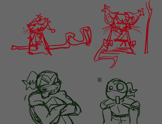


@ezgurple's turts
#literally obsessed w these designs#and their art style is so good and stylized#xd art#tmnt#tmnt fanart#ezgurple#tmnt au#this got me outta my art block#alao listened to icp the entire time
24 notes
·
View notes
Text


some doodles closer to the show's style
#rick and morty#rick sanchez#morty smith#I started reading the comics and the styles were so good esp tom fowlers#ill screw around a bit with stylization I think#my art
507 notes
·
View notes
Text
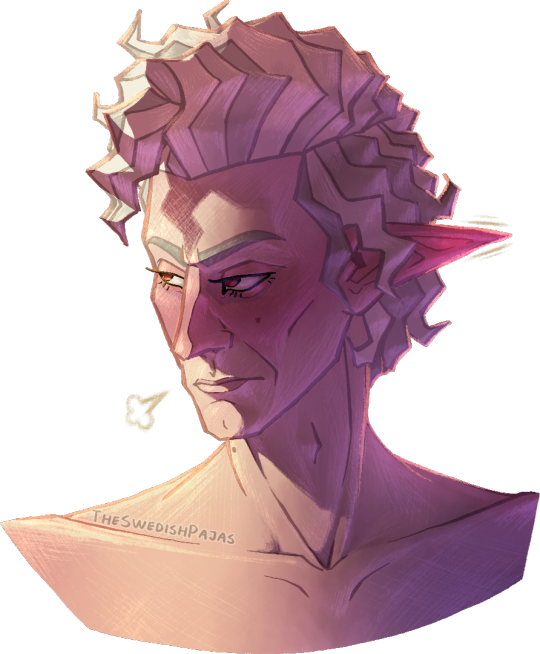
The man truly can’t take a genuine compliment 🙄
#my art stuff#digital art#baldur's gate 3#bg3#astarion#astarion ancunin#this is part of a series I like to call “I’m never settling on a singular detailed artstyle”#I have no consistency in drawing realistic people/characters other than my shapy cartoon style#but I truly don’t get enough opportunity to properly shade anything with art in that style-!!! it always looks weird to me-!!!!!#I think some rude lil worm in my brain is wriggling around telling me it’s a futile attempt at still doing realism#cus I’m one of those “gifted” artists that grew up promising his parents he’ll end up among the big names or whatever#constantly training to become better at art but with realism oil paintings as the goal#you know how it is 😔#I wanna shade my lil funky designs but they never feel good enough to really put energy into or whatever so I compromise with stuff -#- like this where I try to draw characters more accurately while still stylizing them and shading them however I feel like it#which is great and all but I should really learn to give my more relaxed and less perfectionist art a chance#I deserve to enjoy the process and the result without working myself dead#it’s so much easier and rewarding to copy cartoon styles - stylizing realism makes me too anxious of doing it “wrong”#at least cartoon styles give me a goal to reach or a reference to strive towards#man I really should just cut myself some slack altogether#either way - this man is a flustered mess and he’s embarrassed about being called adorable in public or something#being teased in an affectionate way about his sweeter side and stuff#don’t ask why he’s shirtless - anatomy is just a lot more fun for me to draw sometimes#tasteful nudity and all that is extremely gorgeous to me#i need to practice anatomy more cus I just kinda did some shit and went with it this time with a BIT of consideration for muscle structure
54 notes
·
View notes
Text
i'm actually sorry but that "how can people watch one piece when it looks Like That" post is so real because i keep seeing like screenshots of character deaths or other moments that are supposed to be genuinely sad and i just cant take them seriously because every character looks like this while crying:
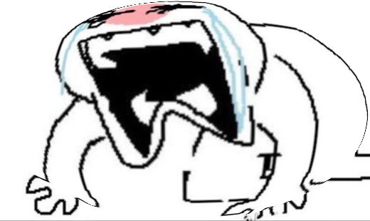
#i feel like there are some good and fun aspects of the art style#i have nothing against heavily stylized art but like#the way everything is so exaggerated makes it feel like it's supposed to be Just an over the top comedy and not like. something with a stor#and it just looks unpleasant to me i dont get it sorryy JHKABSJKHF#leo.txt
42 notes
·
View notes
Text

ID: An illustration of three stylized vehicles, each having one central headlight (or 'eye!'). To the left is a boxy, jeep-like car with a kayak on top and a license plate that reads 'SUR-V3' (survey). In the middle is a rounded mid-century styled car with an '3Y3R011' (eyeroll) license plate, and on the right is an orange and yellow truck with the text "Outta Sight, Outta Mind! Moving Service" painted on the side. Its license plate reads 'N0-P33K1N' (no peekin'). End ID
Some vehicle exploration for Visible Spectrum :) did u know drawing cars becomes a lot more fun when you think of them as little guys. its true i swear
(Additional studies and sketches under read more! These will be using ALT text for IDs and I also included some additional info on each set)


Some of my initial loose car studies, mostly referencing photos of older vehicles from around the 50s since Visible Spectrum's world is partially inspired by a lot of midcentury aesthetics!
These were really fun and I actually enjoyed the process a lot more than I thought I would. I found it was helpful to try and not think of cars as being constrained to box proportions or straight lines.

my initial ventures into attempting to stylize cars into having one 'eye!' Not referenced from any particular photos, but instead cross-referencing different vehicles and pulling aspects that I liked / that I thought would work for these designs. Experimented in some of these with how tail lights might look (vaguely. lol) as well as how to make these cars look expressive (one of the more fun parts of this process)!
I don't like how a lot of that last set looks but I think its fun to look at where the initial planning began to where the final image ended up
#froxart#froxposting#described#visible spectrum#illustration#prop design#vehicle#i wanna say my good friend brewbug is the one that originally got me thinking about making the cars all have one headlight :)#bc of the whole thing about cars kind of subliminally looking like faces. so in a world of cyclopses. what else would they do for their car#yk????#i need to draw..... MORE CARS!!!! i NEED TO!!!!!!!! ITS FUN!!!!!#especially now having kinda figured out how to stylize the one headlight thing +++ how to do shading and shapes for em in this style#shakes my fists. One dayyyy#art fear vanquished. ive drawn bikes and cars i can draw anything.
13 notes
·
View notes
Note
Just wanted to mention this to someone who does art and get their opinion on it:
Sometimes I see some artists do redraws of their old artworks or characters and think "Wow, uh... their older art looks better." Sometimes it's only mildly better, but other times it's vastly better. Like the Upgrade, Go Back! meme.
I understand that art skills are supposed to develop and change, hopefully for the better, but sometimes it just feels like they got... worse? Somehow? Idk. Maybe it's because they were copying another artist's style while finding their own, and it's their own style that doesn't vibe with me? Just curious what your thoughts are about this.
Also, your art has consistently been great, so this isn't directed at you.
I do see this on occasion yeah! usually (in my experience anyway) its because people take a sharp turn towards a stylization that either isn't to your or most people's tastes, or that they don't understand or are still developing. switching up how you stylize your art is like starting over in a sense, you're changing from what you have practice with and that's always going to cause you to revert some as you have to re-learn things you understood in your previous style. i had a pretty big style shift in 2014 when i took up the basis for how my art looks now, and i remember feeling like some of the stuff i was drawing might have looked better if i was using my older style instead. that's something artists just have to push through and figure out, and they'll likely come out of it a better artist than they were before. constructive critiques are a good way for them to figure out why their art might not be as "good" as it used to be, if they're open for those.
art is not always a linear journey, and i would also say things like passion and motivation have a part in it too. feeling inspired sparks you to make something the best it can be, if you're not feeling it (and esp if that feeling lasts for a long time) it'll leave you making decisions you otherwise would not have let fly, and that can result in worse art. and some of it is just personal preference! it's not that their art is better or worse, it's just different now, and maybe that doesn't vibe with you the same way their old stuff did. and that's fine 👍
(thank you! :3 i admittedly struggle a bit with Not Feeling It sometimes like i just described, so it's nice to know people still enjoy what i make when that feeling hits.)
#ask#anonymous#anon#art talk#or occasionally its because they let the h-rny take over and um. they get Grotesque about it whhjbdfdfg#i saw someone post a before and after fanart pic of tasque manager on twitter and everyone was like omg you've improved so much!#and they were all talking about. the older piece. because the newer one had some Proportions that werent even sexy they were just uhhhhhhhh#deviantart would be impressed. lets say#and just generally some of the other anatomy and rendering got way wonkier and broken from the earlier one too. it was strange#the weird thing is the older one was also a lil spicy/exaggerated but it was like tasteful and the anatomy was solid and it had some good#coloring and rendering choices etc etc. idk thats always the first example i think of because there were so many comments#pointing out - inadvertently - that the new art was Worse. but i do see it sometimes. i also think of um#there is some notorious artist whos style suddenly got really transphobically stylized. and racist#you'd think it was a troll but it was real. and most of their older art was actually p good is the weird fuckin thing !!!!!!!!!!!!!!!!!#why'd you kneecap yourself like that bro. i dug around a bit and the artist was rcdart#i feel like most of the examples i've seen of this are COMICALLY bad. like the artist got brain damage#anyway thats a novels worth of text but tldr yeah it do be like that sometimes. rip
47 notes
·
View notes
Text


gachiakuta's art style is actually insane
#STYLIZED ART MY BELOVEDDDDDD#THIS IS SO GOOD ARE YOU KIDDING#i heard people talking about this but i had no idea what it was until i saw res's rbs about that guy#and my first reaction was 'ofc u would <3' and the next was 'holy shit ART?????'#mutuals advertising is worth its weight in gold bc now i have no choice but to check this out#im just admiring random manga panels likeeee#the art style actually to me is like a fusion betweeb bnha and tokyo revengers#tokyo revengers Wishes it looked this good holy shit
7 notes
·
View notes
Text
"Chainsaw Man is ugly". Yeah, I think that's kind of the point, actually. Hell, I think the griminess, the ugliness of it, is actually what adds substance and character and feeling. Like. Whatever. You don't like it. You think it's ugly. Fine. Okay. What I can't really understand is... Why is that a bad thing?
#chainsaw man#bri blabs#i saw a post#i don't know#i really really like the stylization of csm#i love fujimoto's faces#i love that they're 'ugly'#i love that they're not super clean and polished#hyperrealism is tired to me#i've read some fucking great western comics here and there and it's not like i'm going 'thing japan! :O'#it's just good to my sensibilities it is so style and shape it's 'ugly' and unclean but i think that's what makes it good and beautiful#when everything is clean lines and hyperrealism i just get tired like yes sure it is so perfect and realistic but where is the heart#where is the feeling the emotion where is the fucking blood#you're pulling up a comic page as an example of 'good art' and sure it's vivid and pretty and realistic but the face gives me nothing#it was just flat and sure it's pretty and sparkly but more than that it's boring#it's too clean it's too bright it's flat it's shiny it's pretty looking but there's no just no feeling behind the face so it's nothing#who cares if it looks pretty when there's no feeling?#that's something i can't understand
12 notes
·
View notes
Text
Ok. Challenging myself to be better, and I’ve been drawing everyday for the most part now! This week I’ve decided to draw a random(ish) word each day, but I can only work on a new piece after the last one. I have to finish what I start, you know?
Anyway, I’ve done 3, but I’m only posting two, because these are pretty simple stuff, but improvement is improvement, I guess.


Anyway, wrong is inspired by this listing I found on Mercari.

Was tempted to buy it, but it’s 99 dollars… a little much for a little plushy, right? It’s probably super rare, though. How does this even happen?
#art#kirby#magolor#meta knight#HE LOOKS SO DEFEATED IN THE PHOTO#like he’s so disappointed that he put it on wrong#also magolor is covered in oil because he’s been spilling it the entire day#it’s been fun doing this more!#but at some point i need to do some experimentation because have you noticed my art style is really basic/#maybe it’s because the characters i like to draw the most are extremely simplistic#i can’t draw king dedede for the life of me#and that inhibits me from draw all four of them together#so…#next drawing is gonna be king dedede hopefully#but i am really bad at drawing him#even so#people have stylized even the simpler characters#it feels like i’m not doing enough when i know this is better that i’ve ever done#am i just settling for good enough?#is this normal for beginner artists#please let me know i am having a crisis thinking about my art#it kinda makes me hate it#like am i just repeating the same motions over and over again#should i stop it with the kirby?#i hate this confliction#please tell me if you have had the same experience because Y’ALL I’M TIRED OF THIS NEGATIVE THINKING#anyway this is some of my best work tbh#i am so proud of me
24 notes
·
View notes
Text
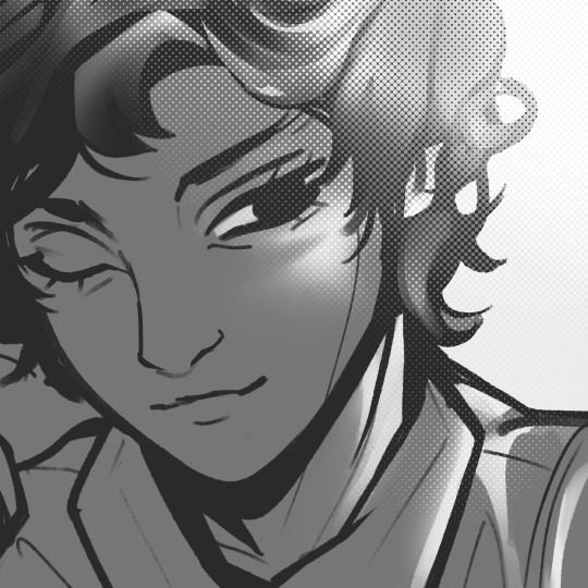
#c ; i like lemon soda#my art.#stop him. stop me. he looks so cute here#im trying to get a good stylization for him… one that fits my interpretation of will but also#fits my style of art in general and what I like to emphasize#EYES. EYELASHES#big time are my favorite thing to exaggerate#and also mouth shape….#sorry I’m so inconsistent in my drawing of him I’m just. still deciding. I make intentional choices in my art#everything has Purpose#and I need him to have pretty eyelashes bc god said so#also it’s still 10:30 pm here so fuck you#I’m still in 2023 assholes
14 notes
·
View notes
Text
"the lack of UO fanart of my favorite characters who I am So Normal about is fine, bc I can make my own," I say to myself as I proceed to repeatedly forget to factor wings as a piece of anatomy into the composition multiple times
#I never figured out a good way to stylize bird wings and you are not going to believe what these characters have on their backs#''but you can just copy the art stylization from the official art'' I promise I am trying I have no idea how to draw feathers#like I can draw them but I can't Draw Them In My Style#getting every part of an art piece to look like the same style for me is such a struggle sometimes#anyhow using Actual Real Life Bird Wing Anatomy as a ref and trying to translate it to a slightly abstracted style is hmm...#not something anyone got taught in art school where realism rules as king that's for sure#(I am doing fine I'm just complaining about art to distract myself from body aches)#anyhow I managed to somehow fuse a horse and a deer into a Passable unicorn so I think I'll call it good for tonight#oracle of lore
2 notes
·
View notes
Photo
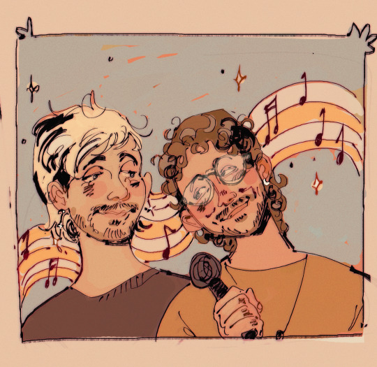
GUYS!!!! GUYS!!!!!!!!!!! i commissioned the incredibly talented insanely cool and radical jay @tacogrande to draw my favorite dudes and im so happy loOK AT THEM........ ashtons lil smile 😭 michaels sleepy eyes 🥺 all of it so gorgeous
pls go give her a follow and check out all her socials and if you can commission her i cannot recommend it enough, i mean look at this dreamy lil portrait 🥺🥰💖💖💖
alt version under the cut cus yea i got tWO VERSIONSSS
jay has been an inspiration to me for so many years since i was a wee little teenager and ive learned soooo much from them and to commission her again after so long whilst still being a huge fan of their art felt like a full circle moment hehe will definitely do again <3 maybe complete the 5sos set dfhjGHFD
#my goal in life now is to get as many people as possible to draw mike and ash gfhjkHDFHJAGHJDFGHJDFGDHJF#me trying to keep myself from gushing too much about jays art in the post#very hard 🧍🧍🧍#fr tho i commissioned them for the first time in like 2016 for my fav glee trio and then my fav tokyo ghoul characters in 2017#this is long overdUE!!!!#its been incredible seeing her art grow through the years and im always in awe of her flowy lines and stylization of people#honestly my thought process for the commish was 'i wanna see ashton in jays style' gfhjkGHJFDGHJDF i just knew she would draw him good ehehe#and the coloring style!!! and the palettes!!! so pretty im so#always looking to their art for inspiration!!!!#ALSO jay was the first 'big artist' to give me time of day if that makes sense gfhjGHJFDGDFJ like i vividly remember them being such a cool#person in the glee fandom esp if u did fanart cus a lot of big fanartists would only share other popular artists#and jay was out there giving space and attention to us lil guys startin out#i know it sounds a lil stupid but it meant everything to my lil 17yo self! built up my confidence like crazy#forever grateful for that!!!#ok i have rambled enough gfhjkGHJGDHFJ SORRY i just rlly appreciate jay and if u got the means id defo encourage you to commission her <3333#michael clifford#ashton irwin#5sos#mashton#5sos art#EDIT ALSO JAY BOUGHT THE FIRST KEYCHAIN I DID EVEN THO SHE DONT GIVE A FUCK ABOUT DEAR EVAN HANSEN a real one fr fr
126 notes
·
View notes
Text
Just a dumb thought about zelda art style
I love the new links to the awakening art style and toy-like aesthetic. But a part of me wonders why have not returned to the windwaker artstyle again. It was used for other games not connected to windwaker like Four Swords and minish cap. I just miss the art style a lot and would like to see it again.
#the cel shading was so pretty#i wonder if theres a reason why that style cant be returned to#it seems more than ever you can mimic the style of concept art#nintendo has always been very good with its stylization in general#ramblings for the void
2 notes
·
View notes
Text
An important thing to remember as an artist that started out drawing characters crudely and then started learning the fundamentals, at first your art will not look nice.
At first, drawing faces and bodies in different positions will make your characters look weird, then poor perspective will make your characters look weird, and finally when all the kinda things I mentioned above will be dealt with, just the hype of finally knowing how to draw anatomy will bite you in the ass because you can do all these things, you can draw them correctly or close to that, but whether that's figure drawing knowledge gaps, or awkwards poses/composition, or just not a very harmonious combination of realism and stylization in facial features or in general, but your before and after pictures might get this look of "clear objective technical improvement but many would consider it a downgrade"
That's a very common thing. I used to be in this before/after art community, and it was so toxic it was a meme within the community that no matter how much you've improved there will be people that will say that the before is better. There's a seed of truth to these words though, what they fundamentally get wrong is this implication that you "ruined your art"
That's a big example of why you shouldn't listen to non-art people for art advice. Keep going. You're closer to your art dreams than you ever were, you just need to look into all these things like the remaining knowledge gaps or personality to your art you might've lost as you were on your anatomy grind.
Keep creating, keep looking at art that inspires you and try to think of how to make yourself like your art better. Don't get stuck on it, if it begins being unfun, please do take a breather. Also, none of that is objective, people will still prefer things different to what you find beautiful. It's alright, create what you like, that's what this post is about. If you don't wanna, don't focus on aesthetics, just the process of creating art is fun and will eventually get you in the right place, that's what I do, I just occasionally throw in things I like and sometimes they work. Take care.
These are my current thoughts on the topic. I wouldn't take them too close to heart, this is just a blogging site and I'm blogin 👍
#Art#Art tips#Art community#Art advice#Technicality wise I have a very very long way to go#But as someone who finally started seeing and incorporating what I genuinely Like in my art it's a bit like opening my art#folder or sketchbook and kind of getting a feeling like I'm on a page of an artist I like and would actually follow#(Not bc of how I currently handle posting my art and how I choose pieces to post but I'm talking about my art archives so regardless)#An insane feeling#Also!!!!!#I chose not to include it in the post because it stood out against the main point of the post#but what the so-called Tumblr art style is all about is kind of related to this#Most of the people you'll see if you google Tumblr artstyle would have 'passable' or even 'decent' art#if they sticked to drawing thin anime girls with Eurocentric features#Current art idea floating around or almost like an unspoken rule:#If you wanna draw fat people/non Eurocentric features/disabilities or any minorities you gotta be a level above the people drawing today's#conventional beauty standards to be considered an equal to them among *gestures vaguely*#I hate that but that's something you have to keep in mind as you deal with art criticism#And as opposed to that#By harmonious in this post I mean very vague ideas and the many many ways you can stylize a real person#These are two ideas you can't detach from each other entirely but I do believe that we can discuss them separately#Just because a good drawing of an ethnic minority is going to be judged harsher than an opposite of that doesn't make it the worse drawing#Again that's why you gotta dismiss opinions of people who don't draw well and by that I'm obv talking artists better than me#Just getting that out of the way#//rambles#My thoughts on this whole topic inspired by this tweet that called the Tumblr art style too ambitious for the artists' skills and that#if anything that's something that should be praised in people#I thought that's a very interesting topic in a wider sense#I strayed away from it but as you might've noticed I wrote a post on the topic in the tags anyways#Sigh
6 notes
·
View notes
Text
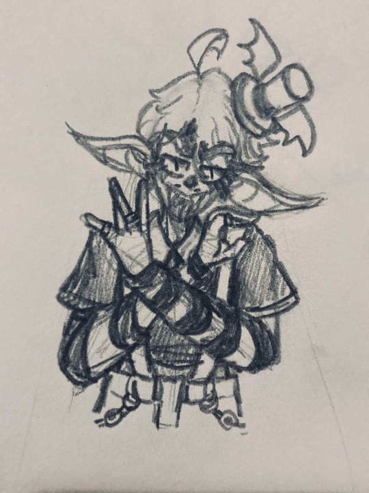
Get clowned on before I go to sleep mf
#🦇// my art#sketch#sona#artist sona#juggalo#wicked clowns#my sona gets more and more stylized every time#This is literally the one character I draw with this eye shape/type/style#Anyways listened to Great Milenko again. Nobody is surprised. It’s so fucking good you can’t be mad
20 notes
·
View notes
Text
I’ve been on a Hachi binge lately and holy shit it’s literally impossible for this guy to write one bad song. Seriously all of them are so good
#hachi#vocaloid#I love his major works like matryoshka and donut hole and sand planet#but my favorite is probably christmas morgue#qualia is also Up There#and terpsichore theatric. persona alice. dear rangge. so many good songs#they all have this unique creepy but melancholic fairy tale vibes#don’t know how to describe it#closest style I can think of is babuchan or some kikuo songs but it’s still not the same#also the original world’s end umbrella pv has me in a bear grip#the second pv is also good but hachi’s art and stylized text just hit different
8 notes
·
View notes