#and that’s the same kinda thing as the texturing it’s just a lot of layering on the darker shadow color
Explore tagged Tumblr posts
Note
Squishes you
HOW DO YOU BACKGROUND
UH i do not. really know
#answering asks#anon asks#if you want a genuine explanation what i do is like. sketch out the general outline of what i want#mostly to get perspective and layout down#and then i either line or paint the base colors#i usually try to keep things fairly simplified and not include a lot of unnecessary detail#and utilize what brushes i can (like for leaves or grass or whatever) ((and the box and line tools))#and then i slap down a lot of texture with other brushes and overlays and lowering opacity#usually that’s a lot of going over the whole thing with a lot of different layers#and then i do the rendering with is just. putting in shadows and light sources with the airbrush brush#i’m not as precise with the rendering for backgrounds so it’s not as detailed both to#draw attention more to the main subject (the characters) and to have it be less work for me#and that’s the same kinda thing as the texturing it’s just a lot of layering on the darker shadow color#with varying opacities and intensities focused on various spots#and then i put a blur over the whole thing to draw attention away from it and toward the subject#and usually at the end when i’ve drawn the characters i’ll go back over the WHOLE piece. meaning it includes the characters and background#layers#and do a bit more finally rendering that includes both the characters and background#like subtle highlights and shadows with the air brush#emphasizing certain things etc#so that it ties the whole thing together more and more coherently#uh. anyway. that’s the process. thumbs up emoji
6 notes
·
View notes
Text
hi birds of paradise and of prey! I sincerely hope your 2024 has been kind to you so far, and if it hasn't, I hope it starts being fucking nicer soon. We got eyes on it and are ready to take it out should it fail.
I'm coming to the end of my list here soon, so if anyone has ideas on what they'd like to see next, please do hit me up! Even if its just a piece of media with interesting food in it and not a specific dish you wanna see. My roommate got me a recipe book from that TikTok fantasy tavern guy, "recipes from the lucky gryphon"? So we could also take a shot at a few of those, although im not really familiar with his work. Regardless-
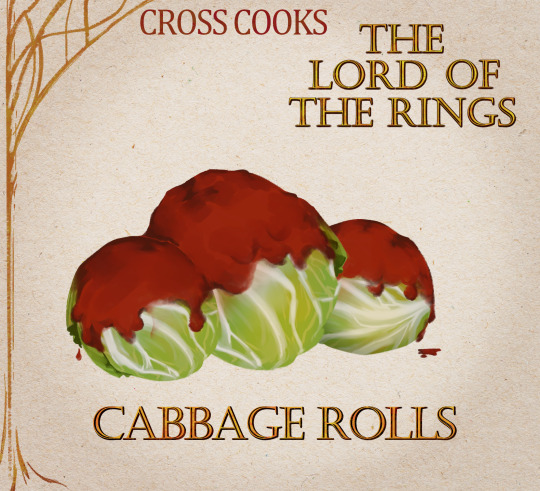
We will be making Stuffed Cabbage from Lord of the Rings Online today!
(As always you can find the cooking instructions and full ingredient list under the break-)
MY NAMES CROSS NOW LETS COOK LIKE ANIMALS
SO, “what goes in to this Stuffed Cabbage?” YOU MIGHT ASKYou cant kinda put whatever you want for seasonings and even the meat filling. I used ground beef but pork and lamb are also stellar candidates.
Yellow onion
Garlic
2 eggs
Ground beef
Rice
A head of cabbage
Oregano
Thyme
Red pepper flakes
Cumin
Crushed tomato
Tomato sauce
AND, “what does this Stuffed Cabbage taste like?” YOU MIGHT ASKBa bawsa
Very, very filling wow
2 rolls filled me up for a meal and i made about 20-ish from one head of cabage
A bit plain tbh, the texture is great but I'd really double up on the seasonings
A blank canvas for you to impart your spice preferences onto
Reheating makes it taste almost identical to fresh
Would pair well with a hot sauce dip
could also go well with an artichoke dip
If you run out of room and need to layer the rolls, I'd try experimenting with pouring some of the crushed tomato and sauce inbetween the stacked rolls. Otherwise the ones at the bottom lack a lot of the tomato flavor. However it might make the bottoms on the rolls laying ontop soggy?
. Where rice called for, used long grain white rice
-----------------------------------------------------------------------------------------------------------
I've never blanched anything before. Theres not much western food that calls for it, meanwhile whenever my friend from malaysia shows a dish they ate, 9 times out of 10 the vegetables are blanched. Much easier process than the fancy name might suggest- boil water and dunk the thing in until its done. Whatever 'done' may be for the thing you are cooking.
Also for the ground beef (or whichever meat you use) you don't have to cook it beforehand, but in doing two tries at making these cabbage rolls i would recommend you at least season your meat before mixing it with everything else. The meat will cook to a safe temperature inside the cabbage rolls, i just prefer the taste and texture of it when cooked twice.
I give this recipe a meandering 7/10 (with 1 being food that makes one physically sick and 10 being food that gives one a lust for life again.) I want to review more horrible recipes, truly i do, so that the rating scale isnt always a 6 and above, but whenever i try something horrible its like "why the fuck would i put all the effort into making and sharing a review of this thing i Do Not Want others to eat????" yknow?? Would people be interested in roasting horrible recipes?
🐁 ORIGINAL RESIPPY TEXT BELOW ��
Ingredients:
1 yellow onion
6 cloves of garlic
2 eggs
2 lbs ground beef
1 1/2 cup cooked rice
1 large head of cabbage
28oz crushed tomato
14oz tomato sauce
Oregano
Thyme
Red pepper flakes
Cumin
Salt/pepper
Method:
Saute garlic and onion in butter over medium heat until onions are caramelized. When done, remove from heat and let cool.
Season the beef to your liking with cumin, red pepper, and salt. Very, very lightly cook the beef in the same pan used for the garlic and onions. Cook until it starts to brown, but dont let it darken.
Beat eggs thoroughly with oregano, thyme, salt, and pepper.
Add all of the above ingredients together in a bowl with (cooked!) rice. Mix thoroughly then cover and let rest in the fridge.
Core and blanche your cabbage in boiling water, peeling them off as they become limp.
Once you've separated all the leaves, cut off any thick stems that would prevent the leaf from folding.
Put roughly 2 tablespoons of meat filling into each leaf. Fold the sides of the leaf inwards and roll it up. Place each cabbage roll seam-down into a casserole dish.
If they don't all fit in one layer, its more than okay to stack. Try not to stack more than 2 layers though.
Once you've used all the cabbage, take your can of tomatos and pour them over the rolls. Mix some oregano into the tomato sauce and pour that over the rolls as well.
Bake uncovered in the oven at 350 for about 2 hours. Dont worry if a bit of tomato on top looks burnt.
IF REHEATING LEFTOVERS: Bake 10 cabbage rolls in the oven at 320 for about 40 minutes. Reduce time for less rolls.
243 notes
·
View notes
Text


yayy post-canon loop designs DONE!!! first one is after they've re-joined the party but are still adjusting, and the second is later when they're more settled and confident.
i knew i wanted to give them a style that's loose and comfortable, but unique and fun; something that can fill a similar niche to siffrin's canon outfit in both style and fit, while remaining totally aesthetically distinct. so i went in a mori kei direction!
design note rambling under the cut
immediately post-canon, loop sticks to dark and black clothing, avoiding siffrin's signature white-on-black. they try both long loose dresses and tighter leggings/turtlenecks, trying to figure out what feels the least weird to wear on their pure-craft-energy body, and end up layering them both. snug and enveloping! they refuse to wear a cloak, but end up just draping their favorite black blanket over their shoulders instead. it's a nice rich lightless, and soft, but still thick enough to block the shine of their head. good for staying cozy or hiding.
after they join up with the party, loop eventually decides fuck it, i can't just define myself in opposition to siffrin, why does he get dibs on our favorite colors. so they start adding white back into their wardrobe! after odile helps them figure out how to craft their body to feel a little more solid, they don't feel like they need to stay so multi-layer covered up anymore, but at this point it's habit. they're still enjoying lightweight fabrics, and getting into fun textures. they don't like the way full pockets affect the drape, so they use a couple bags to store their magpie'd items instead.
once the bodycrafting is more-or-less-done they feel a lot more comfortable in their body, and start to even kinda enjoy how striking their star skin looks among other shades! they still tend to layer, but they no longer need all the layers, and they'll leave the blanket at home in favor of lighter-weight shawls or scarfs that they can still hide their face in. they wear more black and white now, but not in a super high-contrast way; they wear more midshades than siffrin, and less patterns than isabeau. it's all about the variety, lightless and darkless and everything between, draped fabric and lace and ruffles and accessories! their favorite necklace is made out of their five favorite rocks (one to represent each party member, they're finally willing to admit aloud), and they've switched to one nice big bag with plenty of pockets for their various things.
siffrin stuck with the same old outfit for a long time. but just like how having their body forcibly changed made them desperate to change it themself, loop's more experimental and particular about their fashions now as well. they're figuring out who they are, and by the stars they're gonna go full self-expression about it!
#in stars and time#isat#isat loop#in stars and time loop#loop#silverstarsart#loop refuses to let isabeau make clothes for them#but they do let him teach them how to alter their clothes and even sew from scratch#mirabelle loves to take them shopping for silly accessories#and she knits lace for them#bonnie got them the cool bag with custom pockets for their art supplies and everything#and ofc odile did the heavy lifting on all that experimental not-quite-body-crafting#get loved idiot :3#isat spoilers
102 notes
·
View notes
Note
its the same anon as before-
Can I just say I love the way you add depth to the skin tones and I also love your color line art?
The textures and expressions ahahghjdbhjdgjdfbdf <3 not to mention the lighting on some of these are just great!
uh if you don't mind can you tell me how you do your colors? Like the base ones I don't mean all the lighting stuff
im still fairly new to digital art so how do you color inside the character instead of just each individual shape?
jfbdskjbjksfbdf thank you ^v^
THANK YOU SO MUCHH!!!! much appreciated c:
im pretty bad at explaining it but usually i just use much more saturated and warm colors in my art since im biased (i like warm tones a lot) and i also think it more eyecatching!

heres an example-- i make the values generally similar with mainly the darker colors (hair, shoulder thingy) being lightened slightly to reduce contrast so its more easy on the eye & makes it look softer ig? i also like to choose one color in particular to "base" all the other colors around, and that color is usually some sort of primary color and the most saturated. in this case, its a red/orange color, so i had all of my other colors shift closer to it (in reference to the color wheel)
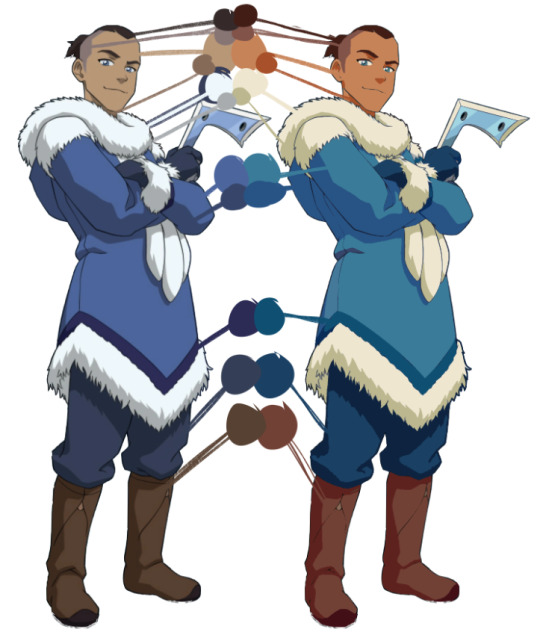
heres another (really crappy LOL) example based around a more orange tone (though looking at it i think i made sokka a little too orange... whoops) and if you look at the values themselves...
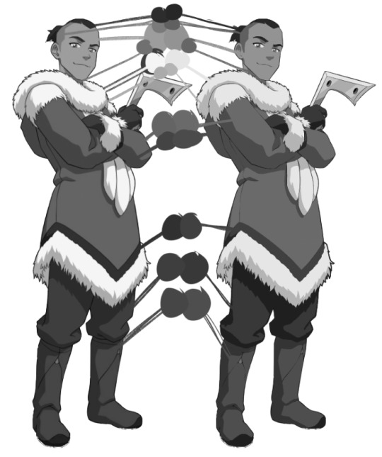
basically the same! most of this is just preference too so its not like you need to REALLY stick to the original values or anything, but all that id look out for is that you pay most attention to stuff like skin tones just to make sure youre not like whitewashing by accident lol
im overcomplicating things but its kinda just something i think you learn over time? the way i figured colors out was by abandoning any and all reliance on blending layers (stuff like multiply, add, overlay, etc.) and just eyeballing literally everything and it kinda forced me to figure out how to make colors look good without relying on filters!
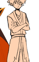
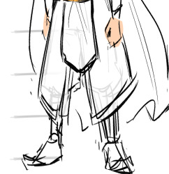
as for blocking in colors in general... i forget how to draw sometimes so im never really consistent with it LOL but lasso fill is your best friend! i either just use a random color and lasso fill the whole character manually (left) and set that layer to alpha lock/protect alpha, or i just lasso fill each color individually (right) bc im a freak sometimes
what i recommend doing/the fastest way is using the magic wand to select outside of your lines, invert the selection and then fill in the selection with a color and setting that to alpha lock.
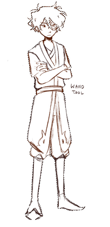
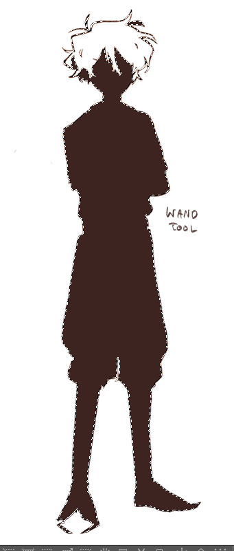
i dont use it as much anymore mostly because i dont line so my stuff is really sketchy (so stuff like on the right happens) and i kinda like messy coloring anyways soooo... but yeah!!! i dont really recommend using the fill bucket that much unless the situation calls for it c:
(and if you do struggle with this and ur results look like whats on the right, try just manually closing your lines or seeing if your wand has an option for automatically closing gaps!)
#sorry this is so long#and sorry if it makes no sense#thank u anon for the kind words tho!#hope this helps a little!
107 notes
·
View notes
Note
Hiii, do you have any tips for drafting out embroidery patterns? I've got one in mind, but drafting it out and color picking is so nerve-wracking!!
[Hi!!!! this got kinda really long so I'm gonna crop it under a read more. And I honestly don't have any real training/instruction in fiber arts so this is just how I do things, and probably others do them very differently!]
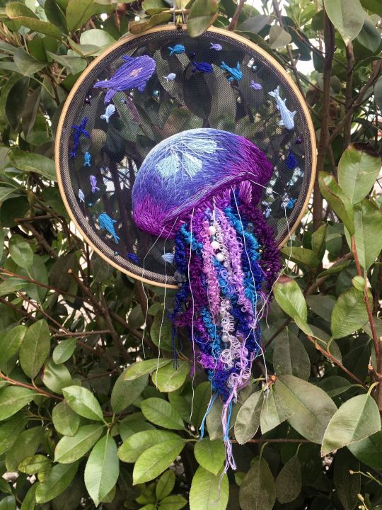
Haha so my fandom embroideries are VERY different from my non-fandom personal pieces in this respect. For non-fandom things i just kind of throw myself in like WAHOO FREEFORM LETS GO and go for a kind of messy colorful approach that ends up as things like this:
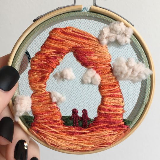
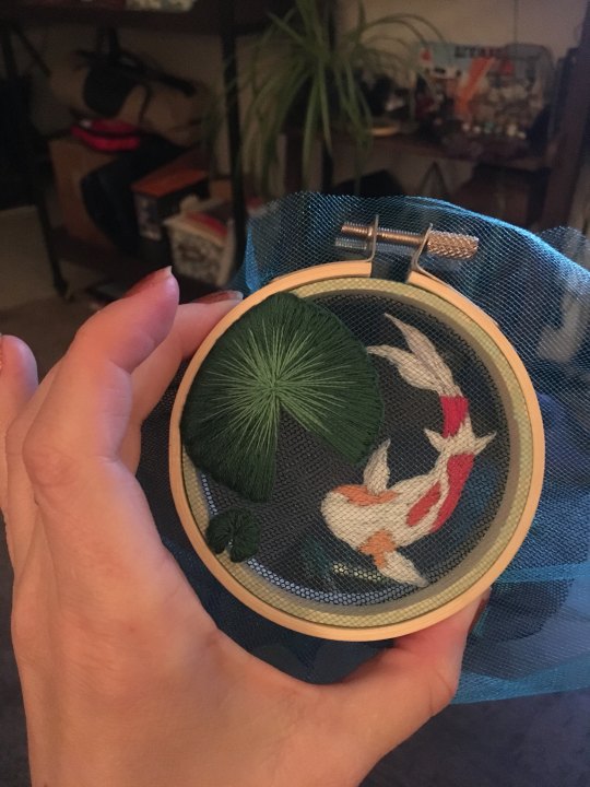
Versus my fandom stuff is way more structured and designed to fill space, be very precise, etc. So for those I do go in with a digital mock up of the design I make in photoshop, that I then color in, and then as my last step translate to thread colors.
For my Dragon Age series. this has been because I'm specifically trying to mimic the stained-glass style of art you see in parts of the game like the dialogue wheels, some icons, windows, etc. The icons in particular were really easy to copy into embroidery because they already come in handy circles:

This is mostly because I have desperately wanted to pick up stained glass work as a hobby for like 6 years now. As in once every 3-6 months I put everything I'd need to start doing it into an online shopping cart and look at the price total and then sadly close the window because I just don't actually have any space I could do it in (I live in a 2bed apartment so i have no garage or yard or anywhere it wouldn't make everything else a mess or be a hazard). The day after one of those events I impulse bought and completed a floral embroidery kit from the craft store and kinda was like... ok, well, I did this once how hard can it be to use this medium to mimic the hobby I wish I could be doing? Plus, it's only like 60 cents per color! I can afford that! So I took the first design I wanted to do, the romance icon, and basically redrew it sloppily in photoshop, then freehand-copied the design onto fabric and stitched it the next day:

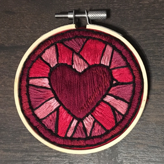
I learned a lot from this piece and changed my approach a little. Here you can see I tried shading in the parallel direction to my thread, which looked messy and added texture, so now I shade horizontally to my thread direction instead.
But it gave me a basic approach for turning the Tarot cards or DA Keep tiles (or any other art!) into embroidery patterns, which I couldn't copy as directly into this really smooth stained-glass style. There's a basic process I follow when doing these conversions that generally follows the same order, which I'll go through below.
STEP 1: SHAPES
The first thing I do is pick the shape of my display frame which is usually a circle, but could be an oval or rectangle too, since I hang the finished pieces on my wall to have nice way to show them off. I like to fill the whole space so knowing the size and shape of what I want the finished project to look like is a good goal for me. Since I am doing fandom pieces I want to be recognizable, I do stick pretty close to the "original" character design/art, but you can absolutely change as much as you want and freehand draw your own interpretation instead. If you're doing original art just substitute the below composition notes with "sketch out roughly what you want it to look like". I personally do my pattern drafting digitally as I find it easier, but you can do this part by hand too.
First, I keep the reference image I'm working off of open next to me while I work, and draw in the shape of my frame (here, a circle). If I'm adding in the little border to be fancy, I add a second inner circle. I keep these as their own top layer so I always know I'm working within the final "frame" and don't spend time designing any section that will fall outside it. Then I will take copies of the reference image and knock the layers down to 25-50% opacity, and start moving them around underneath the 'frame' layer until I like the way their positioning looks as a composition. Sometimes elements of a card I want to include don't all fit in, so I'll chop the section out and add an additional layer to throw in (like the background circle things in the Hermit design below). Or I'll just freehand things like adding much bigger diamonds behind Solas in my Hierophant design because I did NOT want to do 1000 tiny ones. Then once I'm satisfied with the general composition, I'll use the plain ol circular brush tool to trace out the major shapes of each element. I try to keep in mind that I can't go too small, and curvy lines are more difficult to fill in than straight ones. I usually do a rough messy version first, make it mostly transparent, and then a cleaner and more precise one over that.
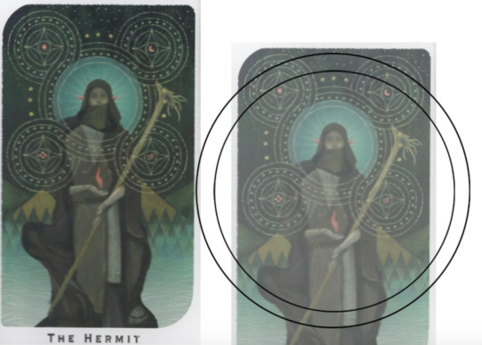


(you can see parts of the rough one on the left and the fully 'cleaned up' on the right for the Hierophant design)
Now: depending on what you are doing next with the pattern, this might be where you stop and start coloring. If you are planning to freehand your design or just trace it onto fabric (or even print it onto fabric here), there's no need to do more than this kind of lineart! However, if you are working digitally and want to create a scalable vector so you can print it at different sizes, you can use the pen tool in photoshop to trace your design and make a "work path" of the lineart. However, another note: THIS PART IS VERY FRUSTRATING AND TEDIOUS BECAUSE THE PEN TOOL WAS CREATED BY THE DEVIL TO TORMENT US. It is so so so easy to accidentally delete a line or even the whole path and not notice later on. Ask me how I know 😭 Anyway I'm not going to include a pen tool tutorial because I don't even know how to use it well and have to google or watch videos every other time I try to use it. But if you can muddle through it gets you some really clean lines that eventually look like this:

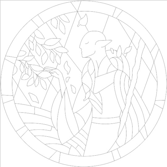
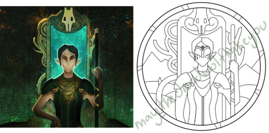
With the work path selected, you can select the brush tool/size/color and use the "stroke path" option to create lineart of the vector. Then you can save this as a transparent png file for use at different sizes and for printing and it looks so nice and clean! one of the big benefits to this is that you get really fine lines that are easier to be precise with stitching on. This is extra perfect if you are printing the design directly onto your fabric (which you can do with an at-home inkjet printer for designs under 8inches wide, as long as you stick a piece of stabilizer on the back of your fabric and cut it down to printer sheet size--this is what I do and can make another post about that process if people want haha), or if you are printing onto transfer paper like you can buy at craft stores.
This is where I end the lineart for my designs. After I have this, I move on to the next phase, which is...
STEP 2: COLOR
For interpreting my designs into thread, I start by thinking of it as flat colors first. You can't "shade" as easily with threads as you can with things like paint or brushes in digital art (though you can A Little, which I will get into), so to start color planning I pick the "main" color each section will be in the piece.

For the existing icons this was simple--I kept the same sections as the original designs, so for each I just color picked or eyeballed the color in photoshop and colored it in (but you could do this on paper with pencils, markers, whatever as well--they don't need to match your threads exactly and usually won't, it's just to give you an easy reference to follow as you go). For the tarot cards which were more complicated in coloration, I just did my best and went with what looked good next to each other, even if it was a little off the original art. It will be off more later anyway when you have to pick threads so don't stress it too much honestly. I will often make layers with different color options and turn them on/off for direct comparison to try to determine what I think looks best as well, like below where I was debating between more blue/desaturated for the background or brighter colors.

I do wanna note I have regrets about the color selection, shapes, or shading in EVERY SINGLE ONE of my finished pieces. But no one else ever comments or probably even notices! One aspect of this hobby is just learning to be satisfied with what you've made and using what you learned to get closer to your preferences next time. I'm only going back and redoing some of my designs' colors because I want to make it easier for others to choose on the patterns I sell, more than I care for just for myself. Also since I'm doing this lineart/stained glass looking approach where I go over the distinct shapes with black thread at the end, it means I get these clear delineations between sections you might not necessarily have in your own pieces, and that's ok.
Ok right. Now while shading/coloring in detail is hard with thread, you CAN make whats essentially dithered gradients. "Dithering" in the concept of art means using 2 (or more) colors to give the impression of a third color, or to gently scale between the existing binary rather than a hard line. Think of it like blocky pixel art or gameboy game images. If you're doing needlepainting, you use really small stitches close together to get this effect, which translates to "smaller pixes"--if you look at the jellyfish in my first photos that's a very messy casual version of that. If you want a better example, I recommend looking at @ammocharis 's pieces like these in her pinned post, which are truly amazing! I simply do not have the patience myself 😂 For my stained glass style, I work only in very long straight stitches, so I can only shade in one direction and have to be a little more precise with it.
So for shading, I think about in each section which direction my threads might go. Then perpendicular to that direction I pick which side will be the light one and which the darker one. Sometimes I color this in on my pattern mockup, but sometimes I don't! Or I'll only do it for certain sections to make sure I don't forget. Like for my Tower design I only colored it as flats, and waited until I selected threads to decide how the shading would go. I am currently working on a smaller, simplified version of my Hierophant design and I did add shading digitally for that one just for fun. But it's not as important as having the flat color version you can use to quick-reference how you want your design to go while you're stitching. You might also notice I don't actually color my gold--I just throw in a stock image of gold foil for that layer so I can't confuse it with any of my yellow thread sections.

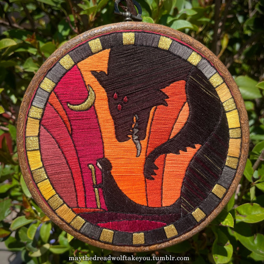

Here's a close up where you can kind of see what I mean by the "dithered" effect between colors--some are more obvious (like the red on the far left or middle orange) and others pretty subtle (dark grey to dark red on the wolf face):
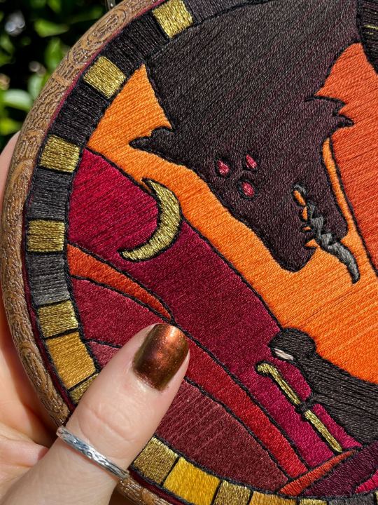
Now, while I use single layers of satin stitches for this, and just alternate thread colors increasing/decreasing as I go, you can accomplish the same thing with short overlapping stitches like with needlepainting, or with clusters of french knots, or whatever else. But in GENERAL you are going to be able to trick people into seeing gradients out of dithering best when you are using the same type of stitch for that whole area. So if I was using multiple stitch types like having french knots, daisy chains, ladder stitching or whatever else for some sections, I would keep those to contrasting areas/colors. A fantastic example of using different layered types of stitching to create more intricate color/texture in an embroidery would be these incredible tarot card depictions by @hattedhedgehog, which I like even better than my own embroideries. Here's his take on the Tower card as well for comparison to mine (I'm so in love with it!!!).
But anyway, at this phase, your design is actually still digital--the above is just to explain how it translates later in the process. The next step is...
STEP 3: THREAD SELECTION
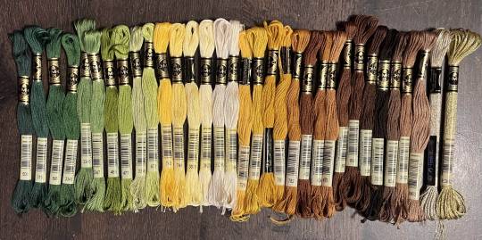
I will admit here I am not great at this part. I am constantly second guessing my thread colors, and can spend over an entire hour in the thread aisle at the craft store agonizing over choices. Really, I think this is just one of those things that takes practice and you get better at it over time. What I have had the best luck with is actually printing out a reference photo of my design/the original artwork and taking it with me. If you already have threads you can do this part at home too, but DMC alone has over 500 colors and I definitely don't even own half that so I like to torture myself by looking at them all together on the thread racks. Plus Anchor and Artiste and whatever other brands there are out there. One approach is to just sit there and pick out what you want for each section and line it all up together on top of your printout. Or in the case of my Tower I laid a bunch of options out on top of my template in the hoop to guess how they'd look in the frame.
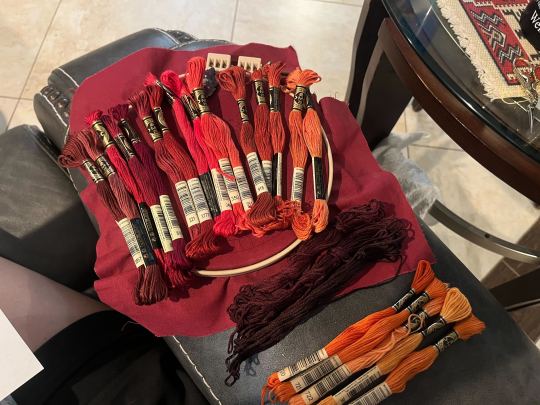
For me since I am also doing this dither shading thing, I also need 2-3 colors per sections depending on its size. Sometimes it's easy and the threads have a color just a little darker or lighter right next to them in the numerical lineup! Other times, there is no good match, or it looks too far away to shade nicely, or I want one to be a warmer or cooler tone than the other... which means a lot of standing and fretting to myself over it. I actually take a lot of photos at this stage because it can be easier to see how they will look in the end from a photo than in person to me? Idk why. Plus then after they get scrambled in my bag I remember wtf order I meant for them to go in later. But as long as you're not preventing other customers from shopping themselves, you can spend as long as you want staring at thread in the embroidery aisle and they won't kick you out unless it's closing time, so take your time.
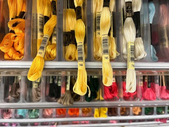
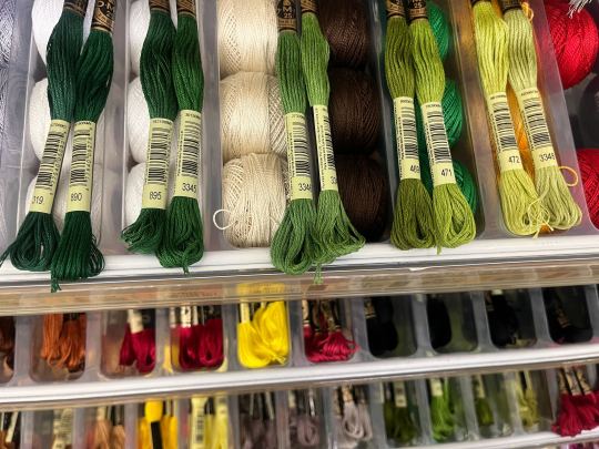
Now, IN THEORY, you can sort of combine steps 2 and 3 by color-selecting from your threads and using that to color in the design. However I have tried this and it led to mixed success because the photoshop eyedropper brush simply isn't actually that exact (in my experience, it desaturates compared to what we actually see). And because then you have to have the threads on hand while you're coloring... which means you might buy ones you don't end up using if you don't like them. So I prefer to just use this as a refinement step where I pick threads based on the design colors, then will re-color the design a second time to match those threads more closely to be sure I like the effect.
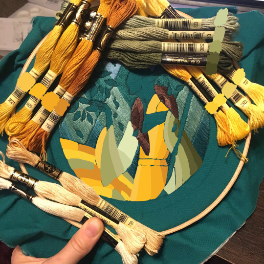
I've even used this as a tool when I needed to adjust my color choices mid-project, by digitally coloring over over my WIP:
Or here's a design (but I haven't posted the finished piece yet bc it's a gift so shhh) I made with certain color tones initially, but after buying thread I re-did the color mockup to be more vibrant, because I liked those threads better in the store:


Once you have your thread, you can make yourself a little reference chart with the colors you intend noted on the sections you want them, like below:
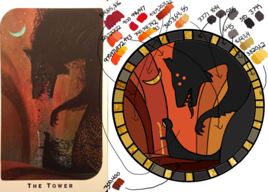
(note: i didn't end up sticking to these colors because I ended up dying my own thread for several sections. And then forgot I made this entirely and picked new ones because I put the project down for a year between design and stitching. Sigh).
Or for my Solas pattern I did this in a really detailed way, which i am sorry but i have redacted because... i have it for sale now and don't wanna just give that away haha. But if you buy the pattern from my shop this is one of the files you'd get with it, for ease of reference. I do also include a text-only list of them as well.

Now I don't go to this much trouble for all my designs, just the ones I put up for sale (or plan to). You can also just make a text list of your color plans if you want. Though for fun I also have been using my scrap thread to make these little "color palette" keyrings for my finished pieces, so if I ever remake them or update their patterns I will know what the original colors were, plus I can compare what i used to other threads if I wanna change part of the design up. This step is absolutely not necessary and I'm just doing it because I'm selling the patterns now, but they are kinda fun to look at.
And don't forget.. if you start a section in a certain color and decide you don't like it, you can just cut the threads and pull them out! I did that with my original hierophant piece actually. I had an entirely different color for one row of diamonds i thought just clashed way too much with the others, so I used photoshop to paint over it with some alternate options until I found one I liked better. Then I cut away all the old threads and put in the new color. It can be a little harder to fill a piece the second time since the fabric will have stretched out a little, but as long as you're using a good stabilizer it usually doesn't move too much.
You can also just make test swatches on spare fabric to test before you add them to your real piece. I wish I'd done this for some color transitions that didn't end up looking the way I wanted, but I am simply too lazy most of the time. My exception is usually for metallic, satin, or sparkly threads, because I want to know how they feel while embroidering. But if you're really worried about a certain color or shade it's a good thing to remember you can just do.
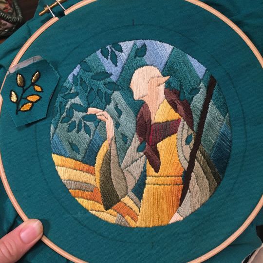
SO yep, that's my general process for drafting patterns. I start with the shapes/design, then do my flat color version, then I pick my threads. Makes it sound easy and short when phrased like that :) But I can honestly spend 8-10 hours just on making the lineart and coloring it in. If I was better at art, probably this would be less, but I'm working with what I've got (not much) 😂 I think all aspects of this are also something that gets easier over time, but it will probably never look as bad as you worry when you start out. I think all my pieces look awkward and rough right up until I do the finishing steps and move them to the display frame sometimes.
I hope this was helpful and answered your questions!! Feel free to post/share your WIPs to ask for feedback or advice ever too :) I've only ever had people in the embroidery community on tumblr be encouraging and helpful to me, and I'm happy to answer any questions myself when I can or if parts of this were confusing
#ramblings#my stuff#my embroidery#embroidery#dragon age embroidery#calicostorms#oh god tumblr changed the alignment of all my images so theyre all huge now great#WELL I keep tryign to rearrage them to be on the same line and it is NOT working so. thats how they will look i geuss#this is gonna annoy me all night... thats what i get for expectign a Functional Website though
29 notes
·
View notes
Text

OOH okay, so i'm at work so a lot of this is gonna have to be word of mouth but i'll do my best w the tips
as far as i can tell, a lot of what people reference as "soft" in my art boils down to looseness in forms and color choices, so lets go from there
》 probably my biggest tip is not beating your sketch to death. i typically only sketch once or twice before lining, 3 times if im not sure or need some minor adjustments. the less i sketch, the looser my lines
》 my liner and painter are the same brush! its a round brush w a canvas texture turned up to 80% texture density and. i think it was 70% mix? its a v simple brush. i found it for free on clip studio's library

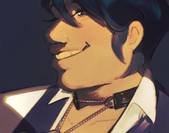
》 my lines and color are on different layers. BUT. the paint layer starts as bg and undertones, and then i lower line opacity to 50-80% before the rest of the painting. like this 👇


》 i'll paint on one layer most of the time! ofc this means i need to adjust skin tone based on undertone. so i usually paint in undertone, pick the Exact color i want for skin, then lightly paint over a small patch so that the undertone comes thru the skin color how i want. then i'll color pick it and go abt coloring the rest in. this means i get the undertone automatically in my paint without having to do a seperate layer. p much the entire painting is done this way, ie choosing an exact blush color 》 painting a light patch over the skin 》 color pick and color in
if this is a little difficult bc of the complexity of undertone, then i'll paint the skin color as an overlay, adjust it as needed, and merge the layers so it's back to being one layer of color. ie, i did halsin's undertone p complex so i painted his skin on a "darken" overlay and merged it down, then color picked as needed from there
》 another thing, i dont use darker shades of skin tone for my shading! in fact, i kinda just do what i want. i pick whatever color fits my piece (blue, pink, purple, etc), and then do the same light patch 》 color pick steps for general shading


even my more "realistic" painting uses a navy blue for my shade! just evened out by mixing with the skin tone

29 notes
·
View notes
Note
VFX ask! You've mentioned before that Jessica the Liberated has notably good bullet and glass shattering VFX, would you be willing to break down what makes them stand out?
Okay yes absolutely I will, and in order to do so, I am going to briefly talk about Arknights' history of guns because this is my feed and you can't stop me. This one will probably be long. I wanted it to be short. But it is not.
Guns in AK's worldbuilding are extremely rare, with only Blacksteel, Lateran, and collab ops wielding guns. So there's a sort of weight towards making the rare gun wielder... feel like they're using a gun, making them feel distinct from a crossbow.

Early on, AK did this in a very very simple way. Simple, single color muzzle flash, impact spark, no visible projectile. All the guns worked hitscan, which did really help to sell the illusion of a gun, it hits instantly.
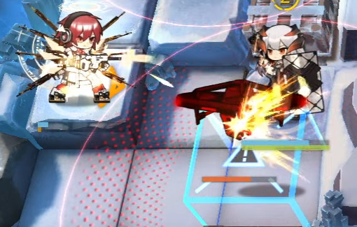
Exusiai even amps it up a little and adds a visible bullet trail when she's in Unloading Mode!
But for a time, because of how rare guns were, that was kinda... It. After Nacho Cheese Executor, the next wielder of a traditional gun was the Rainbow 6 Siege Operators?? Really??
R6S is extremely important. Being from a shooter-ass shooter game, they had a lot of reason to make them feel like real guns. So what does Ash do? Well!
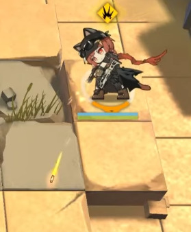
That's a VISIBLE BULLET baby!
It's WILD that removing the single biggest trait about guns - that they are instant - does a LOT to actually help sell that it is a Real Gun.
But on top of that, they do a few interesting things. The muzzle flash isn't just a single flash, it's a semi-realistic looking muzzle flash that also releases sparks. The bullet trail emits sparks as well, eschewing AK's stylization for the sake of making it feel like a Real Bullet Trail. This really helps sell the
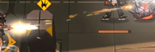
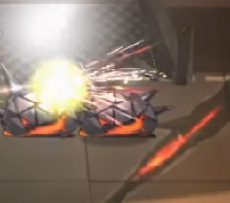
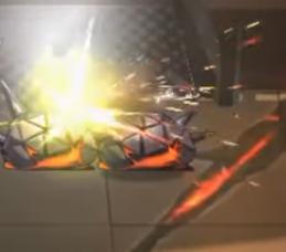
Even on the impact, there's no Textures or traditional bursts to be found - instead it is black, white, and red sparks alongside a very very layered flash of light. This is really unique in AK, and it serves brilliantly to juxtapose the R6S ops within the world of Terra, while still being over-the-top enough to fit in within the game's cartoony artstyle.
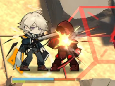
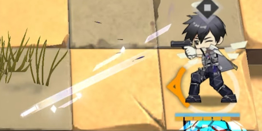
What's interesting is that these choices carried forwards in the future! Enforcer has very realistic-looking muzzle smoke with Ash's black/white/red sparks. Meanwhile, Insider has a visible bullet and sparks coming out of the muzzle flash!
Also I just barely noticed while writing this but all the Lateran use the shape of their wings as part of their effects! Exusiai's bullet trails are triangular like her wings, Ezell's impacts are dark iregular polygons with a lip like his, Insider's trail is rectangular like his, and Cool Ranch Executor's shots are shattered diamonds that fade to black as they get closer to him. Neat!! That's SUPER fucking cool.
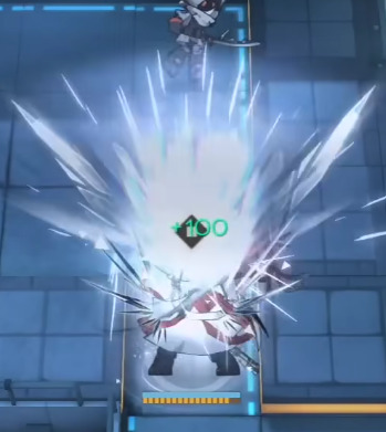
(Also notable is that Exusiai and Ezell's effects are the only lateran guns that don't have a predominantly white aesthetic. Just a little treat for Exu Errari Believers)
So, with a history of four ops with Real Guns and a bunch with weird magic guns, how do you make an operator whose gimmick is that she is definitively Terran who also uses a fuck ton of Guns?
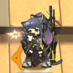

Jessica's muzzle flash is a realistic-esque flash that quickly fades into a burst texture. She gives off a few sparks like Ash does, but there are few of them, and they're really large for stylization. Also her bullet is much larger, but is distinctly a realistic bullet.
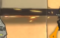
I wish so badly I could get footage of this one properly but an image will have to do. The trail of the bullet is a rotating mesh spiralling like the bullet is rotating. Also the bullet itself is glowing, allowing it to stand out better against the background.
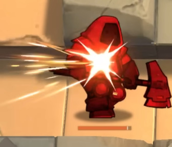
And when it hits, hooooly shit. There's blurry, semi-realistic looking light textures flying off the enemy, sparks, and the same hitflash she has on her muzzle flash (cool asset reuse there!) They went all out to show the impact of her shot, since it is a Real Ass gun.
AND ALL THIS FLAIR AND DRAMA FOR JUST HER NORMAL ATTACK. THIS IS OFF-SKILL. When she's on-skill...
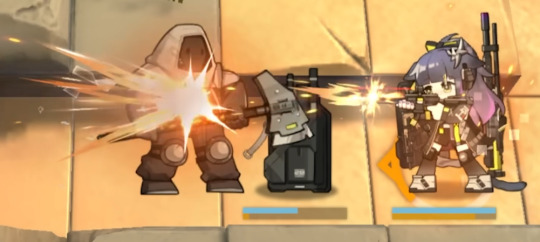
WHOO. WHOOOO. WHOOOO.
The muzzle flashes become longer to sell a BIG impact, but they last MUCH shorter (this muzzle flash lasts one single frame), since all her skills are rapid-fire, making it feel like bigger shots in less time. The impacts become ABSURDLY BIG. And then. My absolute favorite part of the whole thing.

(These are Not The Texture, but a similar, oft-mistaken cousin of The Texture.)
This fucking followthrough. Every hit on an enemy creates a burst of shattered glass and fire. I would not have thought of adding EITHER of these, but I love it. It's a great call to her art, it's unique and distinct, and even though it can be "where is the glass coming from" it's so cool i don't care. I literally saw it and gasped and went "I have never seen this before." It adds great color contrast, conveys the armor-piercing nature of her bullets, adds unique shapes, makes it look more chaotic, I can't praise these glass shards enough, I love them, they're so cool.
Fortunately for you, Jessica's skills all kinda look the same, so I don't have much more to say about this. I like that her S3's muzzle flashes create more chaotic sparks, creating the look of a wild, uncontrollable spray and pray strat. I like that she fires multiple shots and muzzle flashes but only shoots one bullet, but you rarely ever notice it because of the weight of the impact.
But I have one final thing to say.
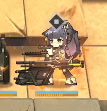
BEHIND HER IN HER S3 SHE HAS AN ACTUAL ROILING, BURNING, MOVING FLAME. WHY IS HOEDERER BEING SHOWN UP BY JESSICA. WHAT THE FUCK.
78 notes
·
View notes
Text
MGA wants to make Rainbow High a fantasy series now, fine.
But if they want me to give a rats ass they def gotta put in some effort for the fits cuz these are downright VILE

So here are my ideas for the main girls Rainbow World (needs a better name) looks
Note: this was all highly inspired by Fairytopia
Sunny

Sunny would be thriving in a fantasy land so she would look absolutely whimsical. I got the idea for flowers from her Fantastic Fashion dress and had the idea of her hair having tons of flowers in it (and also her having a more textured hairstyle)
Jade

I imagine this outfit for Jade but with leaves (cuz butterflies are Poppy's thing). Even in a fantasy world she would look delightfully edgy (like a fairy living in the Mad Max world).
Ruby

I was originally gonna give her a ladybug motif until I remembered that fire kinda was a thing for her and so went with this. She would have a flame bustier with a skirt that looks burnt up and Ruby's jewelry would also feature dragons in it for more of a fantastical vibe (she would also have her beach hair cuz I like the look)
Amaya

Skyler
Guess what inspired this look? I imagine Amaya's hair upgrading from white to silver and the rainbow in it becoming pastel and tied into low pigtails (I also saw someone say that Amaya's hair should've changed for every look a la Ramona Flowers and I agree). She would wear a rainbow gingham dress with a big flouncy skirt and a corset paired with rhinestone heels and the look becomes even sweeter with a locket choker and basket purse (fun fact: I was originally gonna style Bella with this look before realizing it would suit Amaya way better)

Skyler ofc keeps her denim even in a fantasy land. Originally I was gonna double dip and give her a denim butterfly top until I found the angel wing one which suited her perfectly (her skirt would also feature it too). I also remembered one of Skyler's motifs being moons and so incorporated that into her necklace, earrings, and hair clips with even some stars too. Her purse would also be a crescent moon with a constellation pattern on it. Skyler would also wear a long ruffled jacket with a skinny scarf and wear some ankle length boots (she's giving Bloom from Winx Club)
Violet

She's a lot more contemporary compared to everyone else (think like Bratz Fashion Pixies) and because of her Jr High look I just felt like she needed to look like an early 00's Disney Channel character. I also double dipped and gave her a star motif. She would wear those purple pants and ruffle belt with a star pattern on the legs with a long sleeve shirt with ruffles on the wrists with a tank top layered over it along with a fur trimmed jacket. She would also have a wacky Y2K hairstyle.
Bella

After I gave Amaya her original look I thought of giving her a motif like I did for Sunny, Jade, and Ruby + I was originally gonna give a pearl motif to Violet and so I went with that for Bella. I imagine her in a velvet outfit adorned with pearls with pantyhose boots in the same color and fabric studded with pearls and pearls chains on them. Her jewelry ofc features lots of pearls with even her headband being all pearls.
Poppy

Poppy has the best motif for a fantasy world so I went heavy into that. I imagine Poppy would have her hair pulled back with a big butterfly claw clip that could be seen even from the back and I wanted her whole outfit to give fairy. She would wear tons of butterfly bracelets all over her arms and have a butterfly ring on each hand with her heels also doing the same. I wanted her to have a mini skirt with a long piece on it to flow whenever she moved with a butterfly chain belt and ofc she deserved a butterfly top so I wanted her to have the most detailed one I could find (giving fairy warrior). Her jewelry would ofc feature tons of butterflies and I found the perfect purse for her (yes it's also a butterfly).
34 notes
·
View notes
Note
Hai hai! can you plz show how you shade skin and hair?
helloo okay sorry if i took too long to answer this but i wanted to actually show how and i didn't have a lot of time last week!! so for rendering i use a very soft textured brush (2dN_Flat of this brush set) and well, i just drew a very quick weird looking L to act as the base for this since i didnt have any drawing that i could use for this so please ignore that ToT
i usually just start w the base and w a multiplying layer of orange for the blush


then i blend add a layer on top to render on top of everything just getting the blush across the face and start with the most prominent highlights (i use a lot of blush all the time but ik some people dont like that so just skip this stage if u want)
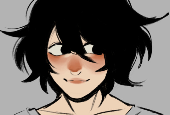
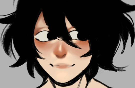
then i add some shade w a more brownish orange in these zones (i gotta say just using photo reference helps but if youre not too familiar w identifying these zones you can just grab an arcane screenshot and study it a bit lol (im no professional so sorry if something looks weird)
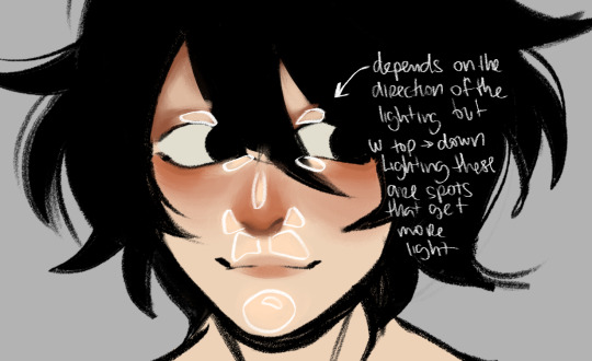

then keep on adding to these shadows and highlights til it looks okay, harden or soften these to get a softer or harder vibe i guess
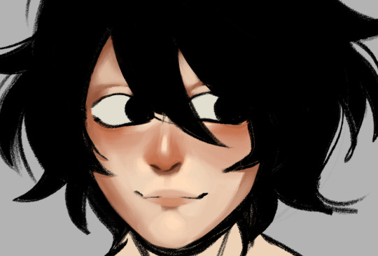

correcting some stuff since working on the top layer its messy sometimes

it looks kinda weird but it was a quick example lol
... now for hair ill actually change to another drawing bc L's dark hair maybe its not the best to explain it
the same thing, start w the base and work on top of a new layer, i add the highlight first
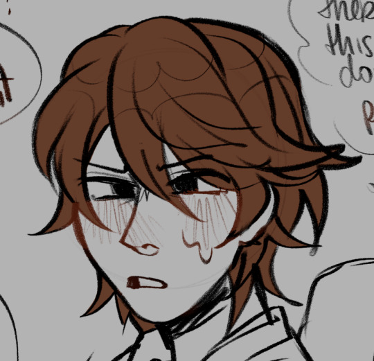

then add a darker color above the highlight and then blend those in w the base color, add dark parts according the light and blend them w the base color again
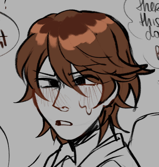

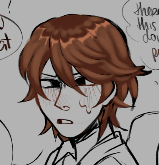
add some more shadows and lighting to the general shape and then add details and strands of hair

its a bit of a rushed rendering but i hope it helps a bit!
55 notes
·
View notes
Note
okkk wait this is the anon that sent an ask about autistic narinder and leshy hc 😅 i retract my statement they're all autistic 🤯🤯🤯🤯
I WAS LITERALLY IN THE MIDDLE OF ANSWERING THAT ASK TO SAY "I FEEL LIKE THEY'RE ALL AUTISTIC" BEFORE THIS ONE GOT SENT IN, I was two sentences in so your comedic timing was impeccable actually
I know there's like no evidence in-game to back my claims so this is purely a vibe check (and also me being unable to write for neurotypical characters) but yeah no I 100% feel like all the bishops have autism for some reason. They definitely express it in different ways and I was actually thinking about that in the car ride back home tonight??
SEMI-DETAILED HC EXPLANATIONS BELOW THE CUT
For leshy, I feel like since he's the youngest...when he came along, everyone was like "yep. We don't even need to get this one tested" after seeing him in his natural element. Which sounds cruel but that's just personal experience after people in my family started getting diagnosed and we started noticing things about each other better LMAO. I kinda actually designed my iteration of him to be like a big stim toy, I did that shitpost sketch in the last post but even the first time I drew him I was like "this dude is made out of orbs that make satisfying noises when they click together", so if I had to categorize the way his neurodivergency manifests, it's definitely "I NEED TO MOVE AROUND!! RIGHT FUCKING NOW!! MAYBE SCREAM A LITTLE IDK IT JUST FEELS RIGHT!!"
Heket is for sure the one that fights the most against people labelling her with it, just because she's like I'M SO NORMAL GUYS. LOOK HOW NORMAL I AM. LOOK HOW WELL I CAN ADAPT TO CHANGE AND LOOK AT ME NOT FREAK OUT AT ALL WHEN I'M OUT OF MY ELEMENT!! She's the new leader of the family so she does her best to hold it together but if you make plans with her, she's gonna be in Waiting Mode as soon as the plans are made and might tear you limb from limb if you flake or reschedule. Something my therapist told me recently is that me getting absurdly upset over injustices (small or big) is likely directly related to being autistic, so if heket feels like something is wrong she will absolutely be vocal about it. If someone says something mean to her, they are her fucking arch nemesis from that point on. The block button is NOT enough she wants them DEAD
For narinder, I feel like he maybe bonded a lot with shamura over the fact both of them feel pretty disconnected from everyone else? The way his autism manifests is probably the feeling that he's on a completely different wavelength than everyone else, and can't experience empathy the same way his siblings can. He'll like have conversations with people but it feels like someone just talking at him, and him having to mentally choose the dialogue options that make the conversation end the quickest. He probably feels like a completely separate species from everyone else on more levels than just "I am a cat and you are not". I know this doesn't line up with my narinder art so far but I have a distinct characterization of him pre-schism that's completely different from post-schism. I feel like he also resented the other siblings for having the same condition as him but presenting so differently, he felt like he got the short end of the stick.
Kallamar........is a FREAk ABOUT TEXTURES. Bro will actually throw up if he has to eat or touch something gross. He would probably excuse himself to go hurl if he sees leshy combining everything on his plate and shovelling it into his face. I'M actually about to hurl just thinking about it. I have to have lotion on at all times or I freak out when I touch things with my hands, and I feel like kallamar needs to have that famous Cephalopod Mucus Layer in order to exist in his body without wanting to implode. Maybe even a special oil he formulates himself? I also feel like he probably has the most freakouts and has been left crying inconsolably + hyperventilating on the floor over something seemingly stupid MANY times, but shamura is understanding enough to be patient with him and not try to grab him or repeat phrases at him over and over.
LASTLY, SHAMURA DOESN'T THINK THEY HAVE AUTISM. They're like "I love my Neurodivergent Family :) can't relate tho" but all the siblings have unanimously agreed they have something going on up there, even before the TBI. I think they're very book smart, and have little file cabinets of their brain of stuff like "arthropod husbandry" and "dreamcatcher making techniques" but are totally clueless to how other people operate. They don't really know *why* people do the things they do; in my prequel AU thing, they gain most of their social knowledge through people watching rather than like...being normal and just knowing how to behave. Out of all the siblings, they've probably been told the classic phrase "but you don't look autistic!" the most LMAO
Also shamura 100000% has misophonia and that's the reason I didn't have them sitting at the table with the other siblings in the voidpunk comic I did of them. They love their family to death but they have to make the conscious decision to not shake baby leshy every time he loudly chokes down his dinner, so they just sit out meals and eat on their own time. If shamura was real I would build them a shrine and sacrifice my noise cancelling headphones cause idk if they have sound reduction methods in cotl world <3
I know autism kinda encompasses ALL of these traits and isn't something that can be categorized into "this one hates noises, this one needs to follow a schedule..." but I also don't want to just point at one bishop and go "YOU. YOU WILL BE MY VESSEL" because I'd never get to write all that I have in mind if only one character had it. There's definitely overlaps in symptoms between them but I just wrote down what I felt would be the most notable to that specific character. I've been wanting to do a comic about their special interests or the times they just like sync up and have a brain blast jimmy neutron moment, cause usually they're all over the place. I have literally never said the word "autism" so many times in my life I think I gotta cut it here, THIS IS SO LONG. I REALLY DID WANT TO TALK ABOUT THIS THOUGH SO THANK YOU FOR THIS ASK GENUINELY. IDK IF YOU EXPECTED A SMALL ESSAY ON THIS BUT I WROTE ONE ANYWAY
42 notes
·
View notes
Note
How do you get your screen caps ??? they’re literally so amazing and perfect and I love them so much 😭
Hey gamer, thanks for the ask~
Prob a good place to mention that I take free screenshot commissions in Fallout 4! Free! Send me a poseprompt/NPC and in my downtime between fic chapters I'll see what I can do! You can browse my photos on my archive with this tag -> Fallout Screenshots. I can pose pretty much any NPC/animal. Long rambly post so there's more below the cut.
I was a film photographer before I ever was artful about game screenshots. I came up in the Ansel Adams school of thought. His whole thing was he'd hike up to a mountain with a large format camera on a heavy tripod. He'd see the resulting image in his "mind's eye" and imagine each and every problem possible he'd have to contend with in the creative process to get there. He was the most low-key, soft-spoken batshit crazy control freak artist who made each photo look easy. You'd never guess at the amount of time and work and travel it took him to take one photo. Even his simplest works make people feel ant-small compared to the arresting grandness of the American landscape's most boring viscera. I have several books of his and four of the official/authorized prints, and I bring AA up because I'm kinda insane in the same ways when it comes to screenshots. In my books, it should never be just an image, it should be the most elevated version of the image you can make given your current skill and tools available at that present moment. My Yeehawgust 2024 entry, Rocky Mountain High, is an example of that. A five image composite stitched in post processing with set and lighting design including hand-placed trees and custom terraforming of a map in Creation Kit.


The easy answer is Photo Mode. I have a 400ish-entry mod list that is built around taking photos, but Photo Mode is really the key because it allows you to rotate the camera and pause game time with a user interface instead of relying on console. I approach screenshots the same as my film cameras.
My simplest game -> upload pipeline are my candid portraits. I will notice the way light creates shadow on an object or a character will be doing something interesting and then I bring up Photo Mode to capture it. I then load the image in Clip Studio and adjust using correction layers; normally levels/saturation/brightness and contrast set to lowish opacity, a sharpness action then a crop and that's it.
My more complex game -> upload pipelines can be as "easy" as posing characters (mine often begin with premade anims/poses but the end result is almost always a custom-tweaked pose; I'm considering releasing a pose mod of my custom work) or as complex as set and lighting design. Sometimes that's as easy as using the settlement builder. Sometimes that's as complex as fixing up a model in Blender/Nifskope, or opening up Creation Kit and making custom tweaks to the world map because the way I need it to look doesn't exist in mods/vanilla. Depending on what I am trying to accomplish, it can take me several days to create a staged scene. Work on Chapter 15 screenshots started two months ago because I knew I would need a lot of time to test and iterate.
Uhhh what else? Most photos take between 10-30 test photos before I get it right. I also use 4k-8k textures; Jack, Livvie and RJ all have unique clothes and bodyslide presets. Shit gets weird when I forget and put RJ in clothes meant for Mr. Bowling Ball Deltoids himself, Jack. I manipulate game time and weather with console. I dislike most ENB and in my arrogance I believe there's almost nothing ENB can do for a still image that I can't achieve in post-processing.
I could go on for hours about taking photos so I will stop here! Thanks for the ask!

#thanks for the ask#game screenshots#fallout 4#photography#robert joseph maccready#maccready#rj maccready#my oc#olivia dallaire#jack ward#deacon fo4#preston garvey#fallout screenshots#fallout 4 mods
17 notes
·
View notes
Text
ghoul hair hcs
dew: his hair was naturally a cool almost white blonde when he was a water ghoul, after his transformation his hair become auburn. he bleaches it still to a platinum blonde, he doesn’t feel like himself when he’s ginger. despite the bleaching he keeps his hair very healthy having a whole ass weekly schedule just dedicated to his hair, it’s long and just reaches his waist. for body hair he’s not very hairy as is but he still shaves everything for sensory reasons, sometimes he’ll let his pubes/ happy trail grow but even then it’s very light and grows very slow
rain: rains hair is thick and dark, there’s a slight curl to it, he has a shaggy kinda wolfcut that just reaches his collarbones. he likes to keep a bit of stubble on his face (mainly cause dew likes it). he cannot grow leg hair (water ghoul thing), he keeps the rest of himself trimmed and proper but even then it doesn’t make much of a difference because of how thick all his hair is, he’s got a perfect line down the middle of his torso reaching a nice splatter of hair on his chest, he keeps a nice bush going
phantom: PHANTOM FUZZYYY. cause of their vitiligo their hair grows black and white depending on the colour of the skin underneath. they have very shaggy hair it’s short but has no particular style to it, it’s so thick that it just kinda stands up on its own and ant has learnt to not fight it, most of the hair of their head is black except for a large streak near their face that’s white. that white streak from their face goes down across their eye leaving them with a white eyebrow. they cannot grow facial hair. because the colour of their hair matches the colour of their skin they look like they’re pretty hairless especially when wet but when you get up close you can see this ghoul has a pretty solider layer of fuzz all over their body, it gets thicker in the winter but also means they shed in the summer, they never shave it’s too much of a hassle which means they have a thick bush
swiss: swiss is fuckin HAIRY. dense dark curly hair from his collar bones to his dick, a well trimmed but thick beard, long dreads reaching midway down his back. if he had his way he’d let it all grow forever without a care in the world but he has a small fire ghoul wife who has built him a perfect routine for caring for his intense hair, making sure his beard is trimmed and neat and his body hair is still soft and clean. after about a month of dew bullying him into a self care routine he actually really started to enjoy it, he loves feeling good and knowing he looks and smells good for his partners
mount: he has very thin hair and it’s very light. he’s ginger. the only hair that isn’t thin is the hair on his head which is long w a slight wave, resembles a lions mane when he wakes up. he does not shave at all so he has full bush leading up to a pretty lil happy trail, he’s got a lil chest hair (it kinda looks like a big heart in the centre of his chest) but his legs are hella hairy it’s almost fur, he also has the same on his arms. it’s all a lot of hair but very thin hair so you don’t get the full picture until it’s wet and sticking to him (when he sweaty). in summer when he’s tan it’s less visible but he’s the same as ant where he’ll grow a winter coat in a way
cirrus: my girl is the hairiest out of everyone. she doesn’t shave at all and is covered in thick dark hair. she has like a long mullet, she takes great care of all her hair so it’s beautiful silky shiny. she doesn’t have a whole lot of chest hair but her tummy and bush are hella fuzzy. she has a double slit in her eyebrow that came from a scar (thanks dew). the hair on her arms and legs contour her muscles so perfectly and it makes everyone fuckin drool
cumulus: cumulus is so particular about her hair, her and dew write out their hair care schedules together, they have completely different hair textures but they just like having someone to talk to about it. her hair is white and big and curly (3b to be specific) it looks like a cloud. she only shaves her pits but the rest of her hair is so light she doesn’t see a point in shaving it, sometimes she’ll shave her legs just cause she likes the feeling of being all smooth and on occasion she’ll trim up her pubes. much like some ppl say “don’t talk to me before i’ve had my coffee” lus will say “don’t talk to me until i’ve done my hair”
aurora: rory is a hair dye girly, her natural colour is a pastel pink but she loves changing it up every few weeks, dew taught her how to bleach her hair and take care of it after and she hasn’t looked back since. her favourites are pastel colours. she has a ramona flowers type cut with a bob but longer in the front, sometimes she’ll let it grow out for a few months but she doesn’t like the feeling of hair on her shoulders. she likes to keep the rest of her body fairly hairless, she keeps her lil happy trail tho and shaves her pubes into a heart.
#ghoul hcs#dew is the dens hairdresser essentially#if anyone has a problem w their hair they go to dew
62 notes
·
View notes
Note
So I know you do digital art, but The Hanged fireMan looks like a watercolor. Do you work with watercolors as well, or is it the program you use?
(please brag about your art process, basically)
Yeah! So I do all my (fan)art in everyone’s favourite innuendo of an art program, Procreate. (Specifically on a 2019 ipad pro with a 1st gen Apple Pencil, both of which I would tentatively recommend if you can get them 2nd hand for less than 200euro like I did)
I did a lot of painting as a teenager, and still paint often to this day. Though I mostly worked in acrylics, I have been known to use watercolours (like, when I was in college I bought a little 3euro paint set and would use the inside of cardboard cereal boxes as diy watercolour paper and paint wild little Irish landscapes… and Winter Soldier fan art, sometimes. 2017 was a different world)
So in summary - I ‘paint’ digitally using some very traditional techniques I picked up over the years, and I kinda prefer digital art now, which I will elaborate on below the cut as I detail how I created The Hanged fireMan…
I’ll start with my favourite digital art ‘cheat’ which is that I use So Many Layers. Like seriously, pretty much every new colour goes on its own layer because I am a control freak and love being able to tweak them all as needed. So for this relatively simplistic piece, I’ve still got something like 20 layers all together.
I’m also usually better at grouping layers but in this one I gave up at some point and it felt dishonest to group them nicely before showing you guys lol

So yeah layers is my biggest hack, but the other is using specific texture brushes
I spent a while playing around with various brushes before finding this Tarraleah one which has just the most delicious watercolour-y texture and a really fun edge to it (and it’s got pressure sensitivity, so I can really control the amount of colour I want to put down on the page)
This background was painted entirely with the 1 brush & colour, and I think it turned out pretty cool. For this particular piece I did have a reference on screen to work off for the most part, but those clouded were just painted with my heart

Next (or maybe before, it’s a while sinceI drew this and sometimes I mix it up) is the lines, which are always done with my best friend, the Procreate Pencil!! I love her, she’s so fuzzy and textured and also if you tilt the tip on the pencil you get a broader line (like with a real pencil) which is just the coolest thing!
When it comes to lines I just sort of go for bigger shapes 1st and details later, and basically always with some kind of reference. I also use a very old & well known trick of putting the most detail into the object of most importance, and leaving the background more loose and vibey
Artists will tell you that this is to draw focus with details. Artists are lying. It’s cause we got lazy after drawing he fun part & phoned the rest of it in lol (I know this because I am an artist)
Also I love this pencil because I don’t have very steady hands and I actually cannot draw straight/smooth lines to save my life! If you’ve ever seen anything resembling a smooth line in something I’ve drawn, it is almost certainly a whole bunch of lines over each other and then erased at the edges to make it look neater
But who needs straight lines when sketchy sketch lines are so fun!

Next is flat colours (the 3layers in the middle with check marks beside them)
I used the same colours as the background, which you can tell from where they completely blend together right down the bottom, and what I genuinely do is use the Tarraleah brush to generally block out he shape, and then go back in with an eraser and smooth out the lines
Why do I do this? …good question

Next is one of my favourite parts, which is adding the lights! Procreate has some really fun -glowy- layer effects - my favourite is probably Add (A) though Colour Burn (CB) is great too for its vibrancy.
Also those 2 layer 11s are there because I duplicated one and then used the ‘Gaussian Blur’ feature to ‘fuzzify’ it (yes, that’s the technical term) It’s a pretty quick and easy way to add a more diffused light effect around something. (I did the same for the yellow reflective strips on the turnouts too!)

Last step now! So full disclosure - I absolutely traced that writing from a photo of a tarot card lol. I actually always trace writing, as, much like drawing straight lines, I’m bad at handwriting on a screen
I also stumbled upon the Exclusion (E) effect by accident - Originally it was going to be a plain cream boarder like a traditional tarot card had, but I wasn’t fully happy with it, so I just flipped through a few layer effects and as soon as I got to this one, I knew it was the right choice
I love the dreamy contrast of the pinks and purples to the dark navy and grey & how it makes everything looks kinda unreal and outer-spacey

And yeah that’s about it! Everything else comes from my 15+ years of Practical Art Knowledge but these are the specifics of how I utilise it digitally!
This was a lot of fun to write out, and I hope that if you’ve made it all the way here, it was fun to read too!
12 notes
·
View notes
Note
Hello! I love your use of geometric shapes and saturated colors in your illustrations. Which artists influence your work?
Honestly while I can name a lot of artists who serve as some sort of inspiration for things like creature design or color, I can't really place ones for specifically the geometric aspect! I'm sure there are some out there, but I think a large part of specifically that is probably just me personally liking balanced/clean/symmetric stuff along with most of my sketch papers growing up being gridline paper, so doing sharp geometric shapes was common. I also tend to think of my lineless art as similar to layered paper art, which has to be physically cut out. Its sort of one of the reasons I reuse colors often? Like you'd reuse the same piece of paper
Color wise I pull a lot from my friends, save a lot of art I think does interesting stuff with colors, etc. Generally I might skip through a couple artworks for a good "starter" color or a palette I like and go from there, adjusting it for personal preference. All the parts are drawn in little individual bits, so I can change them all independently. So often I have colors in mind at the beginning, but don't actually pick them till the very end. Here's some pieces to show how that gets fiddled with
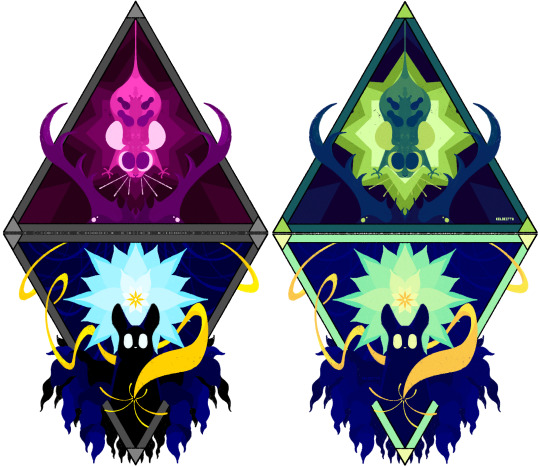
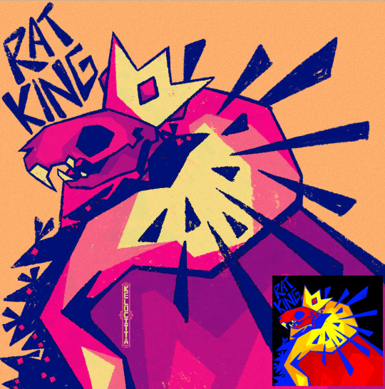

And if you go back far enough, everything starts as a yucky mash of whatever colors made it easiest to tell one piece from another with zero regards to palette
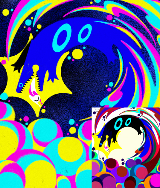
I just really like bright saturated colors and honestly just kinda feel it out from there. Sometimes that's making it brighter sometimes that's making it a little more washed out. Sometimes I decide what I was going for doesn't actually look as nice as I thought. It's sort of hard to name inspirations directly because so much of what I do I do effectively by feeling, and I have piss poor memory so naming exacts is real hard. If I tried to list people whos art I think about a lot we'd be here all day. I know a lot of my recent stuff has had more direct inspo from Boxheadpaint who has just amazing shape language (but almost the exact opposite of 'geometric' but I try and match their vibe a lot when I'm trying to draw a little looser and less stiff. Also looooove how they texture stuff)
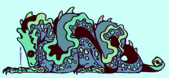
37 notes
·
View notes
Text
Definitely gonna need to read lyrics for these songs, the music is so interesting.
Drum Beat
Straight off, great choice for title track, it's such a catchy, feel good song that sets up the pace for the rest of the album.
Onew's rapping is so good in this, it suits the song perfectly a highlight on a song full of great moments.
I love the outro, that kinda talky bit at the end sounds so nice I don't even know why but hm, hits just right.
I wish it was longer, I could listen to a five minute version of it, but I will have to settle for looping it ┐( ̄ヘ ̄)┌
Hola!
The vocal melody in the beginning of the verses reminds me a lot of latin american pop from the 70s and 80s. It's such a strange thing to me because the song instrumental itself (sans the percusion) is very different, taking sounds more specific to bosa nova, at least that is what it sounds like to me, I had not heard that combination before and gives me a strange sense of familiarity and nostalgia (at this point I was interrupted by Onew's live lol)
Made me wonder if the latin influence is on purpose, since the title is hola, if so 10/10 executed perfectly. Why haven't i heard any latin american artists do something like this?(if anyone has any recs for something that has this same kind of sound, in any language, but specially spanish please let me know)
Maestro
Contender for favorite on the album from the first listen, the bass line, the syncopation and how spacious? the chorus sounds. Floaty, idk you get what I'm saying?
The robotic voice too just fits the mood, the entire song is full of so many textures and layers, pulling forward and falling back, it's so engaging.
It reminds me a little of MGMT's Little Dark Age, but with the added charm of melodic breaks that are more grounded.
To say that I love it is just not enough.
Shape of My Heart
There is this sound in the background, that sounds to me like someone is carving/shaving ice? or perhaps sharpening a blade, i need lyrics for this one haha.
Either way the piano chords sound kinda out of tune at times, like a really old piano; or perhaps it's like a distortion —like the piano is coming in and out of focus, some chords are rattly, out of tune. This song has a lot of interesting stuff going on in the background.
The outro though, it feels like suddenly everything is finally sorted out, every element fits together by the end, the vocal melody, the chords on the piano stop sounding distorted, and it all sounds melodic and sweet. Also those backing harmonies to boost that feeling of order and peace, where before everything was extremely chaotic, going in and out of focus.
It sounds like resolution, i really need the lyrics for this one. I looped it a lot just to get this down, it's such an interesting sounding song.
월화수목금토일 (All Day)
Now I've been listening to this one quite a lot since it came out, and it still is such a feel good kinda song, which seems to be a thread through this whole album, it's so catchy no wonder he picked it for a pre-release.
It showcases his vocals beautifully, what else can I say?
Focus
The synths, the dramatic rests, come on.
I think Shape of My Heart took most of my brain power cause I'm struggling to come up with more than that, but it's a great song, great closer.
The instrumentals in the whole album compliment his voice perfectly, I can't imagine how hard it was to pick the title, half the songs in the album could be strong contenders for title.
I do wish the songs were a bit longer though, but that is just a teeny tiny thing, really.
I keep thinking about it and there is a lot of joy in this album, idk why i got that impression, because it's not like all the songs are happy, maybe it's just Beat Drum, All Day, and Hola!.
I love it so much.
It is just as 'Onew like' as Circle, even though it is so different.
I hadn't really realized how much I had missed him during this hiatus, and it seems to have hit me all at once now. I'm so happy that he is back and maybe that plays a role on it too.
It does seem like the ten months of rest did wonders for him and I can feel a huge amount of joy in the music. He seems to be really happy to be back making music again, and it shows in every second of this album.
He really seems to know how to express himself through music, and it's just wonderful to be here to witness it💖
10 notes
·
View notes
Text
So you want to make a recolor...
I made a quick recolor tutorial for a friend group so I thought I'd go ahead and share here too. This is just a super quick guide for how to recolor an object/cas item.
There are two types of recolors. Standalone and Overrides. Overrides will replace the item/swatches that exist in the game. Standalone recolors create an additional item with it's own swatches. This tutorial works for both kinds, you just pick which one in Step 1, and then the rest is basically the same.
This tutorial also works for pretty much all buy mode items and CAS items. Anything that is tileable...I think maybe that's what you could call it...anything that can be stretched across multiple tiles, for instance, wallpapers, flooring, roofing, fencing...these types of items require a few more steps that I will not be covering here.
Ok so you want to recolor something, you need Sims 4 Studio (S4S) and a photo editing program like photoshop (there are plenty of free alternatives out there too, like Gimp is one I know a lot of people use).
Step 1! Open up S4S and pick either "Standalone" or "Override" depending on what your end goal is. Generally, you'll probably do standalone. I usually reserve overrides for permanent world items I want to change, like changing the images on the billboards in San Myshuno, for instance.
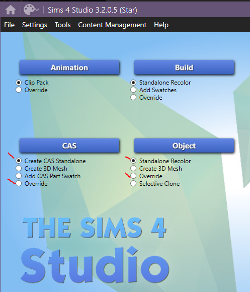
For this, I'm going to make a standalone recolor of an object so you would make sure Standalone Recolor is selected and then click "Object."
Step 2. Find the thing you want to recolor. Across the top there's filters so you can narrow it down by pack or search keywords to help find what you're looking for. Pick your item and click "next" at the bottom. A save window is going to pop up, save your file and make sure to name it something useful that's actually identifying so you can easily find it and remove it/update it/etc in the future. If you just hover your mouse over an item, it will give you the game's name for that item.


Congrats, you've created a Sims 4 package.
Step 3. (Optional) If you want to make changes to the in game display name, description, price, or style tags...you can do that on this first screen and then just hit "Apply To All Swatches." You do not have to make changes here if you don't want to though.
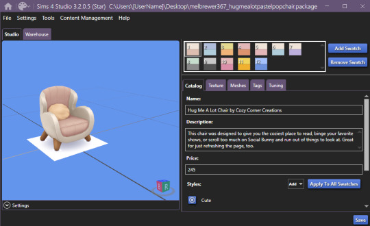
Step 4. This is where the fun begins. Click on the "Texture" tab. This is where you're going to get the file that you actually need to recolor. If there's a plain white swatch, I would pick that one, otherwise, I would go with whatever the lightest and most blank swatch is to make it easier on you to recolor. You just click one of the numbered swatch boxes at the top and then in the lower section make sure you have "Texture" highlighted, in this case it is my only option, and then click "Export." Another save window will pop up, just save that texture file somewhere easy to find, it'll only be there temporarily. (Or, if you want to be really smart and you plan on recoloring many things, you should make a project folder for each thing and save your texture files and things in there so you can always come back to them later.)

Step 5. So the exact tools and steps and such will kinda vary here based on what you want to accomplish and what program you use but, the broader overall process is the same. Open your texture file in an image editing software, change the colors/patterns/etc how you want, and then save that texture file. For instance, on this one I'm just going to change that pink section to a different color by just selecting the pink area with a marquee/quick selection tool and then using the Hue/Saturation tool to change the color.
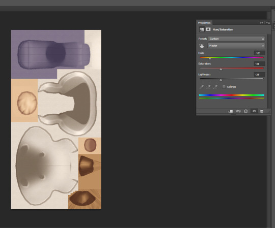
Another example, this is something James Turner did in a recent video that someone asked about, you could choose some in game frames with images, put your own screenshots onto that image, and then boom you have your screenshots in game as framed photos. You would simply add your screenshot on top of the framed image as a second layer, line it up nice and neat, and you're good to go. Here's an example of what that would look like:
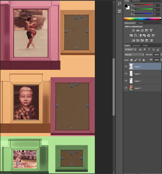
That's also basically how you could quickly add patterns to something. Lay your pattern image over top of the texture, change your layer style to something like "Multiply" or "overlay" depending on the look you're going for. Either way you do these, just remember to save your final product as a .png file.
Step 6. Back to S4S! Same place you were before, except now you need to click "Import" down in that lower texture section, select your texture file you just made. While you're on this screen, you should also update the colors in the "Swatch Thumbnail" section to match your new recolor, and you can also "remove swatch" to get rid of any additional swatches you don't need. Once you're done with all of this, hit save, and then go throw that .package file into your Mods folder.

Step 7. Go in game and check out your items and then pat yourself on the back.
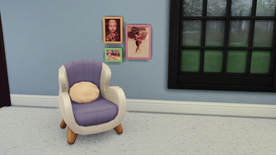
Now you too can be cursed with this knowledge so that every time a new item/clothing is added to the game and you think, "wow I'd really like this if it was in better swatches" you can just...make those swatches.
126 notes
·
View notes