#and some of the shading is reused but i had to redo that myself
Explore tagged Tumblr posts
Text

A continuation of my last post cuz I just had to draw the red life version, its also just so good.
#secret life#secret life smp#trafficblr#mcyt#goodtimeswithscar#josh art tag#a tad of the lineart on this is used straight from the last one#and some of the shading is reused but i had to redo that myself#otherwise its all new!#actually except for the wheelchair wheels i also reused those#anyway i hope u enjoy my goodtimeswithscar appreciation
1K notes
·
View notes
Text
Adventures in... lingerie making?
Yeah so at some point I thought, you know what I'm going to do instead of studying for my finals? Bra sewing. So I took a deep dive into bra patterns, underwires, lace and elastic.
There are a few patterns so many people rave about online, the Harriet bra, the Black Beauty bra, the Marlborough bra etc. There are so many small pattern companies specialised in lingerie patterns and it was a little intimidating when choosing one. They're also not cheap. A bra pattern is easily 15-20$ and I get why, but I'm a little cheap when it comes to patterns. This is however not a project I wanted to draft my own cups for. The Maya bra is a free pattern, but it's not a style of bra I wear often.
I don't have big boobs (I wear a 65D/30D) and like, a lot of the home-sewing bra patterns offer a lot of coverage and support. Which is great! But it's not what I wanted. So when I saw this nice plunging/push-up bra pattern, and people online were like "it's not a beginner friendly, buy when you have some bra-making experience" I went like "that sounds like a perfect pattern for me, a beginner". Of course I bought the paper pattern of the Merckwaerdigh PBH30. And the Cambia bra pattern because it intrigued me.
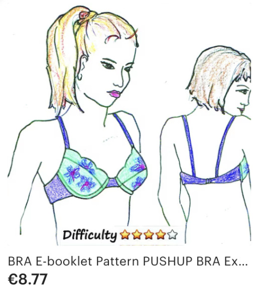


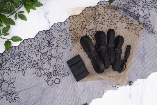
Then it was time to get lost in all the kinds of elastics and fabrics I would need. I caved and just bought a bra kit; shipping prices can variable and I didn't like the kits the Dutch sites offered. I did however like this black lace set by smallbobbins.be.
And then I started on a test bra, made out of some cotton voile and purple lace and lycra I had in my fabric stash. I had such a hard time with the instructions; even though they're available in mine and Merckweardigh's native language, this pattern is very... ehm brief in the instructions. Thank the gods for the wayback machine and clothing engineer's tutorial on how to insert the removable padding pocket. After that things made way more sense, but I still wrote my own instructions + illustrations (message me if you're interested). I decided halfway through my mock up, that I felt confident enough and that I would make a 'mock up' out of the bra set. I used a different piece of bra tule that was included (it was a shade lighter). The cup pieces were so small that I suspected I could make at least 2 bra's out of it if I threw some strap elastic, rings and sliders in that I already had in my stash. I ripped the hook and eye closure of a too small bra and reused it.
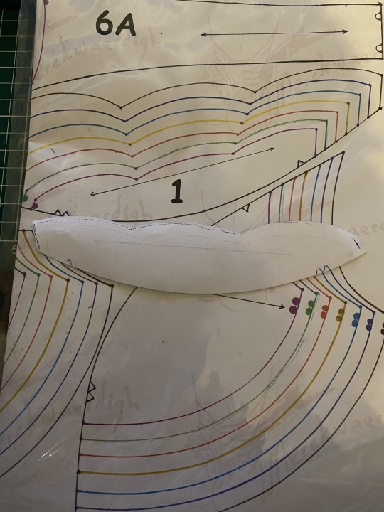
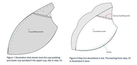
I made the B70, like the measurements table told me to do. I allowed myself some experimenting with a one-piece lace cup fabric (not my fave look). It went pretty well! Until I used a zigzag stitch to topstitch the power mesh to the picot elastic and the black thread on the beige power mesh showed all the missed stitches of my machine. It's not pretty at all. I hate ripping out seams that are positioned well, but I do want to redo this after I do some much needed maintenance and timing management on my machine, before I start zigzagging my 'official' version of the bra.
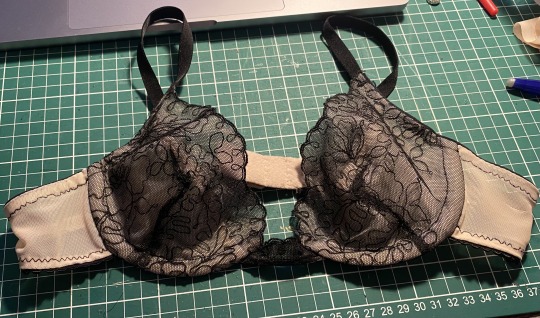
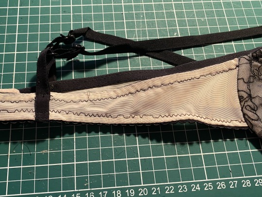
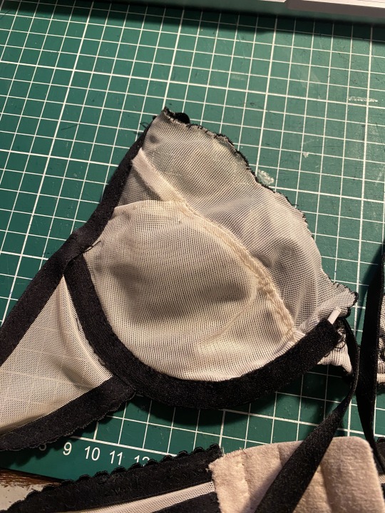
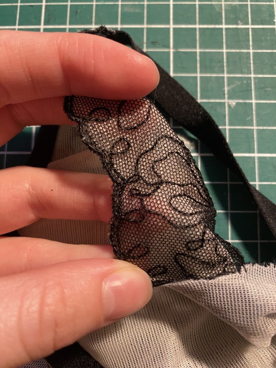
The wires, even though they're push up wires, are a little too big, but I've ordered shorter ones.
To mine and everybody's surprise, (no really, I was really surprised), the cups are... too small? Yeah not sure how that happened. I might be on my period, but even those measurements fall neatly in the "84-86 cm" measurement for the B70 cup. I'm not totally spilling over, but it's noticeable enough that some of my breast tissue is not in the cup before I did the swoop. Adding the little padding 'cookies' for some volume is making the problem a little worse. So I guess that means I'm making a C70 for my 'official' bra.
2 notes
·
View notes
Text
VI c. UV_1
(Previous: Changing the texture displayed in Blender)
As mentioned before, the uv_1 map plays a very different role than uv_0: it tells the game where certain parts of your mesh are located, so that the whole thing could move with sliders. It seems many people struggle with it a lot – and to be honest, I have no idea why, as in my experience uv_1 has always been totally unproblematic. Hopefully you'll share my feelings on this!
Let's click once again the little triangle on the right ('Data') and choose 'uv_1' this time.
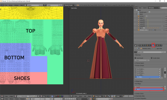
As you can see, the texture on the model turned very weird – and it'll stay this way, as that map is not meant for texturing. You can as well change to solid shading, if you find that craziness spooky or annoying.
If you switch to edit mode, you'll see that the map looks just as crazy:
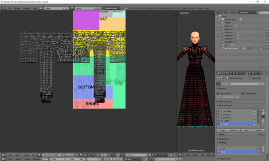
UV_1 uses a completely different type of template. It differs very slightly depending on age and gender of your sim; the adult female one looks like this:
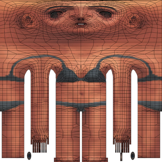
You can download all the versions from S4S forum, in HERE (I highly suggest you make some kind of 'Basics' folder for all those things which you'll keep reusing!)
Once you have downloaded it, click 'Image' and then 'Open image'. It works exactly the same as in case of uv_0. Now it should look like this:
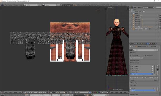
You can see that your vertices are twice wider than the template. I'm not sure why the template has been made in this way instead of getting adjusted to the TS4 requirements, but that's what we have to work with. Select all the vertices (a), press s, then x, then type 0.5 and press enter. Do not move your mouse! Your uv map should be twice narrower now:
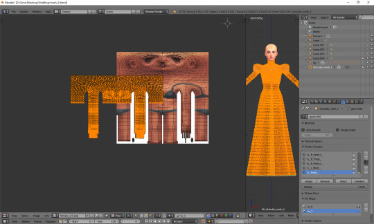
We still have to move it, so that it'd align with the template. Select all again, this time press g, x and type 512. That's exactly the number of pixels you need to move your mesh to the right. Now it should finally look correct.
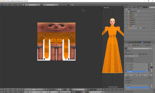
Just like in case of uv_0, the top part is completely done, so the only thing we have to do is unwrap the skirt. This time the only valid methods for doing it are no. 1 and 2 (see: VI a), namely moving the lines manually or using cylinder projection. As at this point making manual adjustments would be too cumbersome, we're going to use option no. 2.
Select the lowest line of vertices to select your whole skirt, go to front view this time (num 1) and choose cylinder projection.
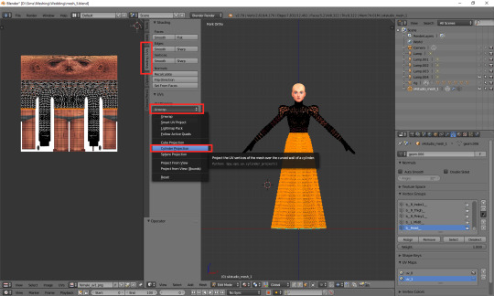
Move the newly unwrapped faces up or down (g, y), to the black area, so that you could properly see them.
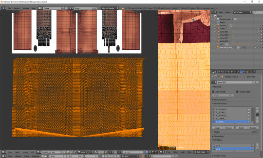
You can see that my dress got unwrapped a bit unevenly – there are small 'steps' on the sides. I highlighted all the faces which should form the left edge. Now I'll move the highlighted parts on the right to the left, and the non-highlighted parts on the left to the right, and then it should all look and work fine.
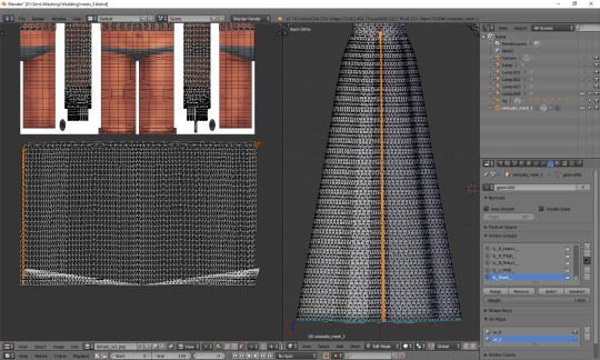
Tip: you can also move them precisely into the right place by typing g, x, 1024 (to move to the right) or g, x, -1024 (to move to the left)!
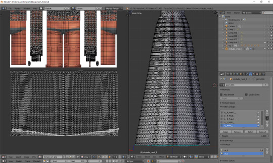
The weird part at the bottom is the closing circle; you can select the central vertex (which is here doubled on the sides), weld it and move it down, to more or less align it with the lowest row. Or simply wait with closing your dress until you're done with uv_1 ;). The bigger problem is that step my dress still has at the top. I'll select all the vertices below it and just very gently move them along the x axis to the left. Now, that looks better:
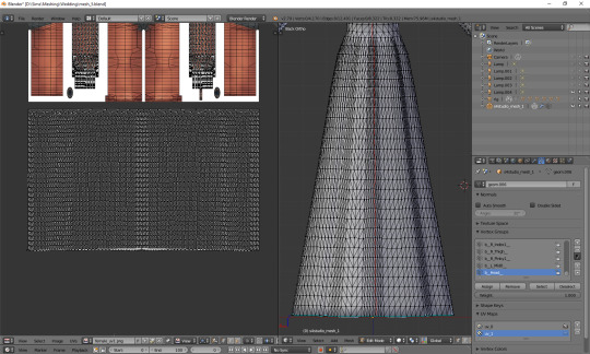
And now, just as we did before, we have to connect the skirt with the top. It's a bit trickier than in case of uv_0, because you can't do it in one piece: your mesh has to be split along the back and both sides. Take a look at the top mesh. Let's start from the left: click the rightmost face and then, in 3D view, the faces right underneath it. This will tell you where your skirt should be split.
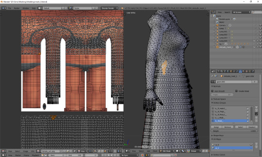
I'll deselect the face of the top, select the whole part of the skirt left from the selection and then move it to the left (g, x), separating it from the central part.
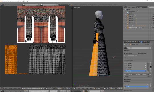
That weird line at the bottom is the closing circle again – I'll delete it and redo it afterwards, it'll really be easier.
Repeat the same steps for the part on the right.
The edges of those three parts should be, if possible, straight. Mine aren't. To be able to adjust them, I'll select the edges and temporarily split them (ctrl + e, in 3D view). Select a vertex or two above as well, or the uppermost one won't get split!
(If you're having problems with selecting edges, it might be smart to select the whole skirt (not the top!) and change it back from tris to quads (alt + j). Then you can easily select edges by clicking them while holding alt).
Split also the top row of vertices, to separate the skirt from the top. Just for a second.
Now select a whole edge, press w and choose 'Align X'
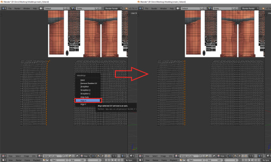
Repeat for the remaining edges. If you want to and feel that it's needed, you can also straighten other lines in your mesh.
Now it's finally the time to put it in the right place. Select the skirt and move it up (g, y).
One can immediately see that it's way too tall. Scale it along the y axis until it looks more reasonable. It should start at the lowest line of the top and end a bit above the feet. Nothing big will happen if it covers them, but it has to fit inside the picture!
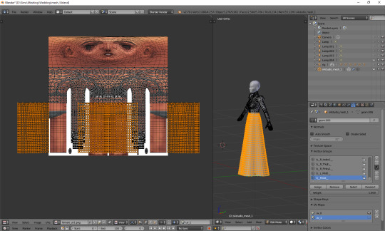
And now just scale and move each of the 3 parts individually, along the x axis, to match them with the top.
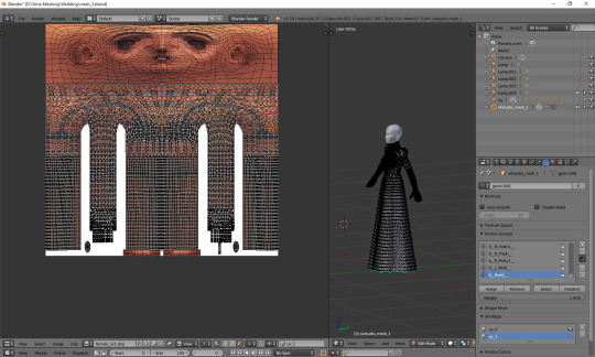
The only thing left to do is to weld the vertices. It's unlucky that we separated the skirt from the top; now we have to select all, remove doubles and then once again split the side edges to be able to weld everything properly. Just like with uv_0: select a vertex, press w and choose 'weld' from the drop-down menu. Repeat for aaaaaall the vertices connecting the skirt with the top.
Sometimes the vertices can be quite far away from each other. Is it still safe to weld them? I'd say risk it. If you see some weird stuff happening in game when changing your sim's body type, you'll know you have to fine tune it: straighten some lines, make them more regular etc. However, chances are quite high that it won't matter at all.
Select all and remove doubles. Yes, again (I keep doing it all the time, that's probably why I love the edge split modifier so much).
And now a very important, final step that I usually forget about: you have to revert the moving and scaling changes you made at the very beginning. Select all and press g, x, -512 to move it back into position, and then s, x, 2, to make it twice wider again. Otherwise TS4 will get quite perplexed with your mesh (and so will you, seeing everything being weirdly deformed and moving with all the wrong sliders)!
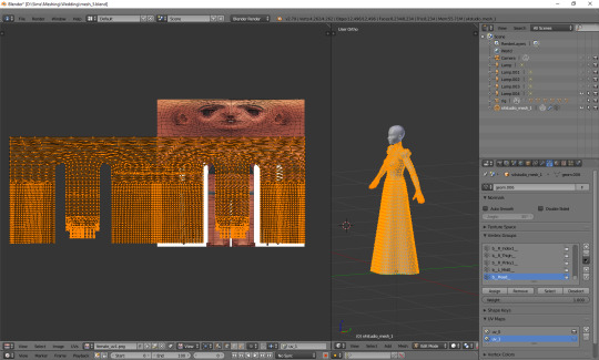
As you see, it's not very difficult and once you get a grip of it, you can do it in no time. To be honest, 90% of the time I don't even do the whole scaling and moving thing; I just open the picture, to know where the feet are, and adjust the rest to the top. UV_1 is really not that bad, at least as long as you don't have to deal with the upper body half.
Here are just a couple of general, closing remarks which I'd like to share:
If you move any vertices of the top, immediately move them on the uv_1 map as well. I try to avoid it at all costs, but sometimes I can't resist making just one teeny tiny adjustment... Arms are usually not a problem, neck can get problematic, and breast area is an absolute nightmare. I already mentioned it once, but honestly, better dissolve vertices and cut new edges with the knife tool than move anything in there.
If you're frankenmeshing, remember to weld any vertices you merged in 3D view! If your mesh is getting split in game when you move any sliders, that probably means you didn't connect those parts on the uv_1 map (or that it's vertex paint... but that's another story).
Of course, if you added any other parts to your mesh than just a skirt – or if you frankenmeshed a thing, but changed its location, e.g. took a hair ribbon and put it on the skirt – you have to put it in the right place as well! In case of frankenmeshing you just have to change its location on the map; if you made it yourself, you'll have to experiment with different types of unwrapping first (pssst, projecting from view usually isn't a bad idea).
There are also certain cases - rarely, but still - when it might be a better idea not to properly unwrap a part of the mesh, but weld it all together to a little dot and put it in the right place on the uv_1. The first example which comes to my mind are 3D buttons. I always weld each button to a single dot, so that it’d be changing its size evenly, without deformations. However, this comes at a prize of an increased risk of clipping.
And finally: if you're having big problems with uv_1 and my method doesn't work for you – or if you made your mesh completely from scratch, so you don't have an unwrapped top – you can always make a data transfer, copying uv_1 data from another mesh. I won't elaborate on this one, because Teanmoon already explained it all in her amazing tutorial, which you can find HERE. Scroll down a bit until you see 'UV-1 Transfers'. I think I used it myself once or twice in the past and I was quite pleased with the results :).
***
Once again, I'm sorry both for how long you had to wait for this tutorial and for its final length. I swear I intended it to be a simple, concise explanation ^^. I hope that at least it's all clear and will help you avoid any problems with uvs. Please tell me if you have any questions or if something doesn't work for you – really, I mean it! Half of my inspiration for this tutorial comes from me watching other simmers struggle with making their first pieces of CC, as it helps me notice what hasn't been explained yet.
From now on we'll be moving into the dangerous territory of clones, cuts, regions, bones and weights, and I need some time to figure out how to divide this whole topic into sensible parts. It's not even that hard, but very interconnected, and that makes it difficult to tackle – as covering it all in one part is absolutely out of the question. Please have some patience with me and stay tuned!
52 notes
·
View notes