#and its not design-wise
Explore tagged Tumblr posts
Text
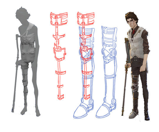
Was looking at refs and since Viktor has two different leg braces I was wondering, do we think he wears them simultaneously?? The refs don't perfectly line up perspective-wise so it's hard to tell but parts of the one he wears during the Hexcore scenes look like they could maybe line up with the brace that he wears over his clothes, but also some parts really don't and look like they'd be super uncomfy. Also HOW does he take these on and off. Experts weigh in
#viktor#arcane#ig my assumption would be that he wears both simultaneously cause in the scene where he injects the shimmer#it seems implied that he just threw off his clothes and kept experimenting#so one might assume he was already wearing the smaller one underneath#tho it is a funny image to think of him just being like 'one sec i gotta go all the way home and grab my other brace to do this'#he can take off the back brace too cause hes not wearing it in the scene where he's in the hospital bed and you can see his shoulder#where the strap would be#but that one seems to make even less sense functionality wise#everything looks like its screwed together#or screwed INTO him#but only the top bolts on his spine are i think#in the close ups of his back brace model it looks like theres cushioning underneath the parts of it that cover the rest of his spine#so he can take it off. but HOW#what parts of it unscrew/detatch to pull open and off#does it not do that at all and he just has to shimmy it off his shoulder and all the way down his legs to get it off like a romper#the shape language of the designs are cool but like. tell me how it wooorrkkksss#forgive me if im just dumb and dont know at all how braces work and theres a very simple practical explanation for all this#any king who wants to infodump about mobility aids at me....the floor is yours#something to be said i suppose about the fact that zaunites have crazy prosthetics with wild augmentations that work flawlessly#and piltover's like. idk heres some fucking uncomfortable ass metal. salo gets wheelchair in non ada compliant place#they havent ever needed to adapt to accommodate disabilities etc etc#or maybe artists were just like 'heres a design' and everybody clapped and didnt give it a second thought#and then they just turned off the visibility on the mesh when they didnt need it knowing thered not be a scene where its taken off#dont even wanna THINK about what that rig would look like#like 40 different controllers#soft body and rigid hard surfaces needing to move together....#a cold chill just shot up my spine#<- guy who is only an animator and doesnt know how to rig#forgive the magic wand tool with zero cleanup. i am lazy
1K notes
·
View notes
Text
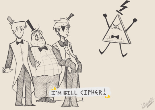
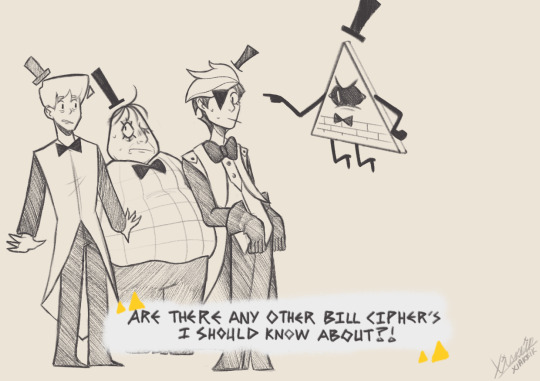
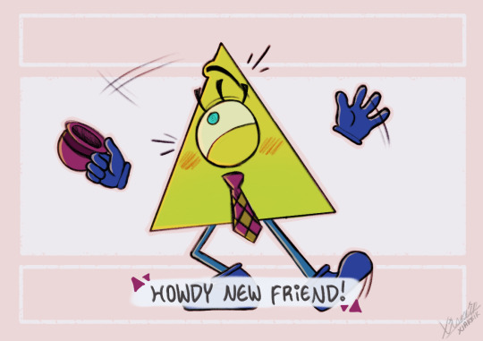
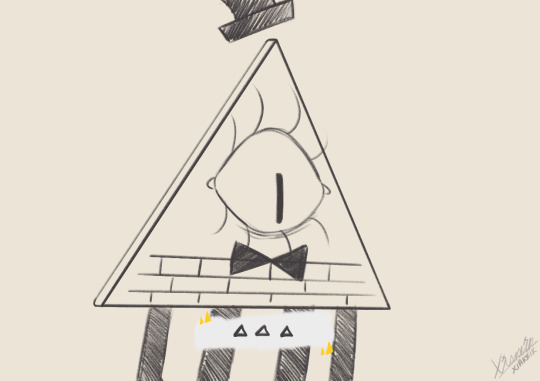
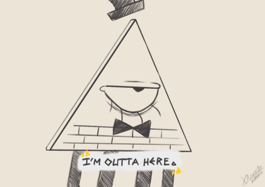
You think Pyramid Steve to Bill is like Doodlebob to Spongebob or something like that

#gravity falls#my art#fan art#doodles#art#pyramid steve#gravity falls bill cipher#bill cipher#bill gravity falls#remind me to never draw those human bills again btw it was... a struggle LMAO#like design wise and everything theyre aight ig but MAN its just so. Off for me-#this is why i keep my boy as a shape bc although i CAN draw humans i HIGHLY prefer simple shapes/objects instead#glad i was able to squeeze this out just before uni starts again#xiakeik arts#id in alt text
2K notes
·
View notes
Text
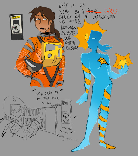
ever heard of. 2007 portal odyssey. my favorite mobie
#portal#portal 2#2001 a space odyssey#2001 aso#chell#glados#chelldos#valve#this glados design is very weird. its amalgamation of her normal design+potatOS and hal-design criteria#i didnt want to make her look like hall but with yellow eye instead i think it would look ugly#also i dont really like the. halman chelldos design color wise because in my head its orange-yellow but what can i do#my art
2K notes
·
View notes
Text

Cooking up an older Clervie outfit design so I don't have to keep drawing her looking like her child self but Long
#genshin impact#clervie#ngl i have so many thoughts about an older clrv's design but at the same time artistically im not that creative </3#mostly tried to make her look more like a direct contrast to arlecchino's design (which was already present but we ignore that)#cause arle's design is mostly very sharp and angular while i'd imagine clervie's being much more rounded out and softer#like they are the round vs pointy cat meme in human form#the hair was really tricky cause on one hand much like everyone else we dont really keep the same hairstyle our entire lives#butttttt at the same time idk i feel like her long hair flowing down (and her headband) are very recognizable parts of her#so i decided to not change much (also cause i dont trust myself making multiple drastic changes without changing their identity too much)#also halfways through coloring I realized she's kinda giving crucabena outfit wise but we ignore that </3#anyways clervie would def be a support/healer character if actually playable (leaning more towards buffer support imo)#ITS A MASSIVE 50/50 IF SHE WOULD BE A HYDRO OR ANEMO USER but i decided hydro for the time being cause it compliments HOTH's dpses more#aka Arlecchino Lyney and partially Freminet since if i remember correctly he's more physical based but cryo nonetheless#i just really like the idea of Clervie's passive being along the lines of boosting stats/dmg if there's HOTH members present in a team#anyways sorry for the text wall I just really need to be kicked out of the kitchen#i am UNDERCOOKING the food#character design is not my passion </3
2K notes
·
View notes
Text
this choice
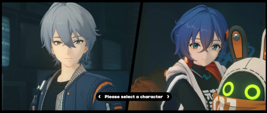
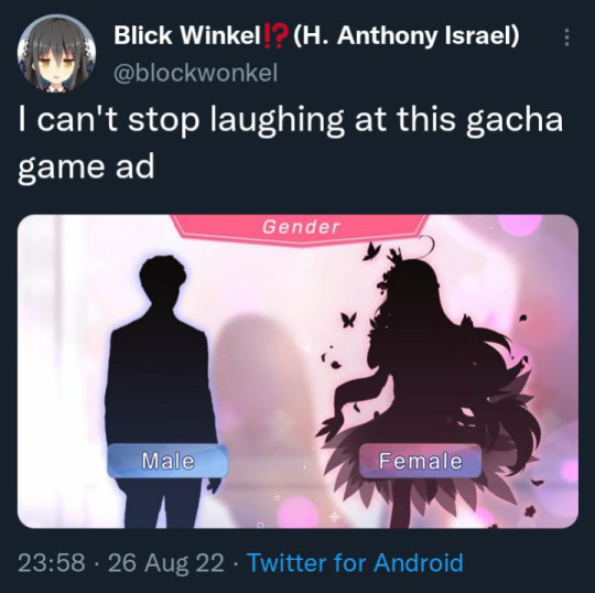
is literally this meme
#gacha games#zenless zone zero#i can't believe how boring Wise is though like. Its like they made him stupidly boring on purpose it has to be a design decision#honestly like. its irritating how boring older brother they made him in contrast to literally everything else in the game he just doesnt fit
826 notes
·
View notes
Text


dreaming abt sophomore year class swap bard!riz


#fantasy high#fantasy high sophomore year#fhsy#riz gukgak#ft. kalina#fh class quangle#tbh Im not suuuper happy with the bones of these designs yet#but also its just a bit hard to measure up to how strong ''kid who wears suit to school'' is#I kiinda gear the sophomore year design specifically towards like. cameraman-esque aesthetics#kind of dude who's working the light rig And the audio at the same time. dude who's running inbetween two huge tripods#theres also a thing with the freshman year arcade scene that I wanted to draw but just do not have the energy today#maybe in the future! if I can be bothered to draw biz lmao#I wanna draw something for cleric!gorgug first anyway... specifically his death in freshman year#man I'm so glad I tossed bard!riz into investigative journalism that is SO annoying. exactly what I set out to do with my classswaps#can you imagine going to school with that guy. can you imagine going to school with tintin#this also makes kipperlilly vs riz even funnier like influencer vs journalist? it'd be the Worst#man thinking of it I should rework gorgug's design too. currently his sophomore design is really zac core lmao#and zac can pull it off but character design wise its. really nothing. laughs#his junior year design is full aerith at least so that one Im very happy with. what if I tell u cassandra is the deity of#the inbetween spaces in this class swap thingy. and gorgug offers her domain as a stop for folks fresh out of a faith to gather themselves#that being transgender as fuck is kinda coincidental lmao. but well I stand by it I like that#nobody's design has jumped out to me like riz and gorgug yet. adaine I have a prreeetty good idea for#mostly bc shes the hoodie kid this time round lmao. gamer adaine true believers rise up#we take it easy! we take it easy as we go. these comics-lite were real fun to do. I should do that more
423 notes
·
View notes
Text

"i love being drunk. i feel nothing... it just feels so good. i hate it i fucking hate it i hate it. but i love it."
#my art#twf#the walten files#felix kranken#idk how i feel about how i drew him here design wise. or even the whole piece itself but its whateverrrr i made it. post.#source of quote? uhh. the source is just trust me bro#gif
915 notes
·
View notes
Text

let's fall down together
#married in red#da jeong choi#bok su go#art#HOLYYY SHIITTT i actually finished something 😭 i abandoned this for a bit and had a strong urge to#but i was finally motivated . my god#hope the motivation conts. tomorrow#anyway i played 2 investigrave games hahahaha how did u know thags ctazy ... i watched playthroughs of their other games thi#hmm. was just feeling particularly inspired when i drew this back then. etc etc their former selves being on the cake knife indicative of#what was killed when da jeong betrayed bok su... etc etc its all very straightforward i just wanted to yap yeasss#also there are a lot of inconsistencies design wise. i never realized da jeong had a flower w her veil My Bad Guys#i worked on this very sporadically throughout periods of time where i didnt touch it or draw at all even#so its jusy that. Also sadge wasnr able to make a bday post. I made tuna pesto pasta for it lol#enough yapping now. hopefully more carefree art i dont want to render anymoree
237 notes
·
View notes
Text

Been enjoying EoW so far!!
Redraw of this:

#loz#loz eow#the legend of zelda#echoes of wisdom#zelda#tri#josh art tag#i already changed up my zelda design lol#so i might post the ref sheet once i get Link's part done#anyway EoW is fun so far!#non spoilery thoughts are its a nice game but unfortunately the combat really isnt for me 😔#but thats like my biggest complaint#and im not even that upset about it cuz i expected that i probably wasnt going to like it 🤷#otherwise my only other complaints are small things#like the way you scroll thru echoes being the botw/totk way cuz like bro the more echoes u get the worse that menu gets#and also i couldnt find a way to lower the bg music?? like domt games usually have settings where u cam change that#if eow does have that i havent found it#its only an issue when i wear headphones. with headphones on the lowest volume setting is still too loud 😭#but yeah mostly small stuff complaint-wise#i would share stuff i like about it but i dont wanna give spoilers lol
243 notes
·
View notes
Text
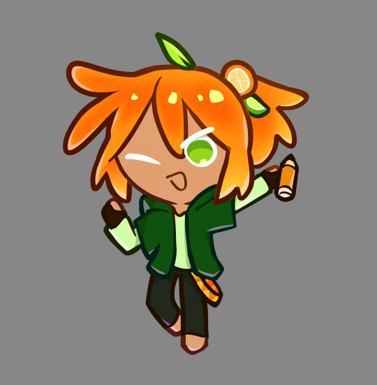
orange citrus cookie ?!!? or something IDK!! the second coming but cookie-fied !!
i dont play cookie run but i like the style:3
#pawu.art#animator vs animation#ava fanart#ava the second coming#ava tsc#its rlly low effort design wise but ive been meaning to draw them as cookies for the longest time#maybe i can like come back to this one day and make a proper cookie design for him- or maybe even draw more of them#but anyways ! that is for another day when i dont have pending assignments SIGHS#i guess i should also put the cookie run tag on here#cookie run
213 notes
·
View notes
Text
uwguwg

we got color and the blob yippee
#pixel art#aseprite#my art#pokemon#old art of mr mime is so much better design wise#dude looks kinda cute and fun#instead of just weird#maybe its cause they only had 4 fingars back then
482 notes
·
View notes
Text

The De Nile sisters!
#monster high#monster high fanart#cleo de nile#nefera de nile#monster high gen 1#monster high redesign#artist on tumblr#character design#been working on this for days i needed to hurry up and post it before i started to hate it#this isnt meant to be a redesign of the two pack btw it just made me want to draw them together so i could figure out their styles#it is interesting tho cuz i gave cleo triangle theming and nefera diamond theming#but the two pack does the opposite which made me feel weird#but now i think im right since nefera's cheek gem is literally a diamond#anyway i wanted cleo to have a more casual style where nefera's is always elegant 100% of the time#i know all the mh ghouls are always overdressed but with nefera its on a different level#i might reblog with some more info on how i reimagined them story wise#but for now i'll just say that cleo is in her final year of high school (basically she's 17/18) and nefera is the equivalent of 21/22#my art#sabz art#EDIT: you can tell i haven't posted in a while cuz i completely forgot to add an ID!!#i was wondering why posting this was so quick#its because i was being a forgetful asshole!!! so#id in alt
388 notes
·
View notes
Note
Dude I'm literally obsessed with your art, it's AMAZING. Also, thank you for making those family trees?! They're amazing and really help me with recalling who is who and related to who, lmao. You're literally the best, bless.
acckkkkk thank you nonnie!!!!! thats so kind of you to say! im especially thankful you like those family trees...... warning for incoming yap session! i pinned it on my blog bc i thought itd be helpful for ppl unfamiliar with my designs of who's-who, but looking back on it now ALMOST THREE YEARS LATER?!?!?!?!!???? there's so many things with it that i wish i could change! im really honoured that youve been finding it helpful with recalling who's related to who, but now i tend to feel guilty abt possibly feeding ppl the wrong information about tolkien's lore aaahahaha (seeing as some of the family relations there e.g. rumil being miriels dad, glorfindel being elenwe's brother, mags n his wife having two kids, are my own headcanon OTL)
nonetheless, its really really high praise to hear that and im very grateful you took the time to send in such a lovely ask, anon! ❤️ hearing all this talk of trees and whatnot made me think back to a tolkien untangled video i was watching where he basically said along the lines of 'most of the iconic elven genealogy in middle earth can be traced down to starting with finwe and elwe' which really shook my worldview HAHA... so in the spirit of continuing silly ask doodles, here's two bros doing some gardening together :D

thank you so much again for such kind words, and i hope you have a wonderful rest of your week!! and a very happy and belated new year's to everyone reading this! ᕙ( •̀ ᗜ •́ )ᕗ
#silmarillion#rin replies#anon asks#finwe#elwe#elu thingol#miriel#im grateful people like the family tree project ❤️🙇♀️#looking back on it now its visually super unprofessional but i have no idea how id make it look all pretty and official and stuff#so i still have much to learn graphic-design wise!#speaking of old stuff... as of today i think its been exactly 4 years since my first silm post.... holy smokes#where did the time go.........#kinda tempted to do redraws of my first few pieces... maybe if i have time :D#silm#silm art#cuivienen#i always forget finwe and elwe were basically besties before the great journey.... i need to see more interactions between them#esp upon reuniting in the Halls#tfw ur best friend's grandsons try to marry ur daughter#i mean like... on one hand finwe's grandsons are somewhat responsible for basically 3 gens worth of kinslaying thingol's relations#BUT ALSO. finwe's less problematic grandkids produced other generations of elves who kept thingol's bloodline going LOL#this is making my head hurt
109 notes
·
View notes
Text
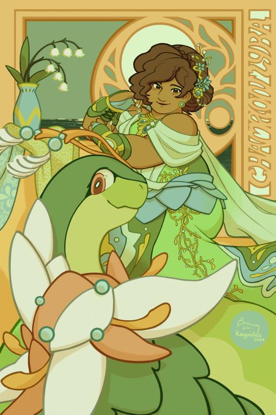
johto’s champion and chronicler for the deity of the ilex shrine, it’s lyra!🌿
this one took me a while due to trying out different techniques (studying a Lot of art nouveau) and making a couple changes to her outfit (the details help), but I’d like to think she’s learned a lot in her journey and wanted to reflect her experience more in her champion fit
her specialty would be in fairy types and her meganium’s divergent evolution is grass/fairy 🧚🪷
and a bonus w/ the johto gang after the photoshoot!
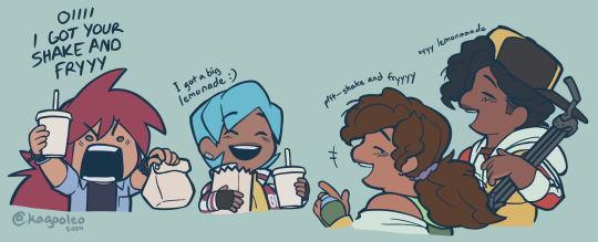
#kagarts#trainer lyra#meganium#pokemon hgss#get ready for a bigass tag wall again HYAH#her team picks are meganium (grass/fairy + shiny!) azumarill togekiss alola ninetales gardevoir and clefable (mega evolves for fairy/steel)#terrains and high sp atk + statuses galore + her dino can cause a stronger confusion (like toxic w badly poisoned but its w/ Bad headaches)#i'll probably make changes as i go design wise for meganium but colors were inspo from sampaguita flowers#the flower's associated with true friendship and utilized in medicines or given as good gestures in various traditions and celebrations#and also bc she's 🇵🇭 babey!!!!!!!! i'm slapping all my favs w the pinoy beam and not even the dinos are safe >:]#since her dino is shiny a lot of the colors are just a few color diffs where the little orbs are + warmer tones. gotta make a ref sometime#not sure if I should tag the others bc the focus is on her. but the quartet always pulls thru for each other#i like thinking silver gets comfortable enough to be the friend that's “s'cuse you my Friend asked for No pickles”#silver in line picking up her food like “yeah yeah i know her and btw that’s CHAMPION lyra to you. YES she ordered a strawberry shake”#both of their meganiums are Best friends and silver likely uses his dino when you rematch him (and his would beee grass/dragon)#calling this piece Done though oh my god this semester has been nuts. don't wanna take any longer on a single piece or i'm eating tree bark#tumblr's gonna kill the quality on it but idgaf im Done. i need to tidy up my sheezy now
236 notes
·
View notes
Text
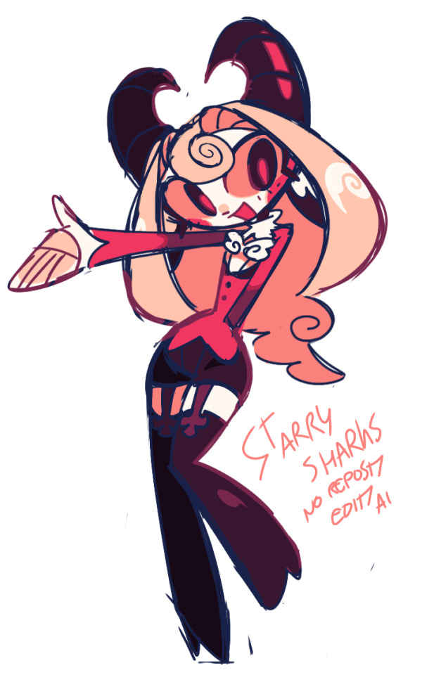
hotel manager
#zeno's art#i'm not sure if i should tag the show itself as i'm not a fan but i guess its “fan”art so i will#hazbin hotel#charlie hazbin hotel#vivziepop#i was bored and wanted to draw something#my main goal here was to create a design that looked distinct and could (potentially) be moderately easy to animate#of course based on charlie's character i added as many angel images as possible through the hair and bowtie#(i know white on white is a character design sin but i wanted to show the angel wing detail ;w;)#also to express the personality and juxtaposition of a sweet devil her horns are supposed to curve into a heart shape#of course the garterbelts are upside-down/st peters crosses because of her satanic themes#i also tried to go harder into the goat theme but its still subtle i think#i actually think the goat theme is really interesting because of the story of the sheep and the goats in the bible#but i cant remember if it was actually something intended in her original design#i'm not going to draw anyone else so dont even anticipate that#this was basically a cooldown? ok i think i'm rambling now#goodbye#ok edit to say it clearly: i am not a fan of vivziepop or her work. i just wanted to redesign charlie as a cooldown/exercise for fun#because i used to be a fan of the character before i wised up about what vivzie had and has done#and before i matured and noticed the cracks and fundamental flaws in her works#so yea i dont support her at all and this redesign is critical i guess#also the reason why the tag “vivziepop” is there in the first place is so that anyone who has that tag silenced can scroll past#without seeing anything related to her work. in case that clears anything up#its the same reason why i tag “long post” and “food” and the like
711 notes
·
View notes
Text
Something I think is cute is that - y’know how Raph’s eyes are more on the yellow side?
Well, you know who also has slightly yellowed eyes? Donnie.
While Raph’s are more yellow, I think it’s cute that this is something that they share and I don’t see it pointed out too often?
It’s also something they both share with Draxum and Splinter’s current form (though again, these two have much more yellow sclera than the boys do.)
But yeah, I like that there’s this little detail that ties Raph and Donnie together, even if it’s small.
#rottmnt#rise of the teenage mutant ninja turtles#rottmnt raph#rottmnt donnie#rise donnie#rise raph#there are a few screenshots that look like Donnie’s eyes were colored more white like Leo and Mikey#but the vast majority has his eyes and teeth yellowed a little#not quite to Raph’s level but enough to be noticeable especially when you contrast it to Mikey Leo and April#I see a lot of art on here not giving Donnie his yellowed sclera and it makes me sad a little#bc Mikey and Leo have soooo many things tying them together design wise (mainly their shells)-#so its nice to keep the things tying Raph and Donnie together as well (their sclera + how THEIR shells are both basically just green)#(+ how even when Donnie makes his battleshells he keeps them one color - just like Raph’s shell)#I’m looking too hard into this but Brains and Brawn is a Good Duo#you could also - considering the show’s theme of giving the less ‘human’ characters more yellowed sclera- consider this design decision-#-a way to show that Mikey and Leo are species of turtles more acclimated to humans since their breeds are very often pets (esp Leo)#whereas Raph and Donnie are species that are more commonly just left in the wild#idk I just think it’s an interesting design decision tbh#esp considering you can see this human acclimation from the very start with the boys as well#with how readily Mikey and Leo interact with Splinter#whereas Raph bites and Donnie is completely disinterested#i like when their species has an effect on their characters tbh#like how Leo being the Face Man makes perfect sense since Red Eared Sliders are the most popular pet turtle BECAUSE they’re pretty-#-and better with people than most other species#Mikey too being so gung-ho about people makes sense for these same reasons#as ornate box turtles as well are very popular pet turtles#idk they’re just fun I love these guys#also- I love when people give Raph a huge tail it’s so cute
275 notes
·
View notes