#and it's LITERALLY JUST THE TUTORIAL CASE RIGHT NOW
Explore tagged Tumblr posts
Text
played Episode 0 of Of the Devil a couple days ago and literally can't get it out of my head. best ace attorney-like i've ever played and it's a fucking demo. i'm obsessing over the relationship and parallels between two characters who had a single scene. the mystery building, the presentation, the setting, the characters, the art, the writing, the mechanics, the way it weaves its themes, its setting, and the way Morgan sees the world into everything from the UI to cuts in the dialogue to the reward system. all playing with gas
AND it's about androids and toxic lesbians. (among other things)
cannot wait for episode 1. dividing it up into episodes really works with the genre and format, how it's already divided into cases. god. godd. i can already tell this game is going to drive me insane
#of the devil#hannah and i have been talking nonstop about it for days#and it's LITERALLY JUST THE TUTORIAL CASE RIGHT NOW#some of the most exciting gameplay and story integration i've seen in a visual novel ever#goddd
39 notes
·
View notes
Note
your shading is AMAZING specially when its conveying organic forms..... do you have any tips for people who dont know wrf going on (with shading)
ok so HI. hi. my old tutorial pisses me off so i will make a new one
i made a guy whose sole purpose is to be shaded so dont worry he likes it. and his name. his name will be mr. Boob. mr boob does not have to be blue
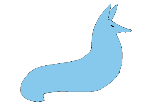
theres probably way better explanations of how to do it but unfortunately trying to "emulate" shading does ask you to somewhat understand ur character in a 3d way. like what would the 2d shape be if you "sliced" it? mr boob is made of so many circles. his tail also does a kind of weird perspective foreshortening thing because its pointing at you. is this being conveyed
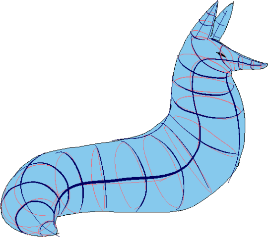
you obviuously dont have to draw a horrendous grid on your characters skin to do this . BUT it helps you put down (or at least envision) the lines of the form shading :
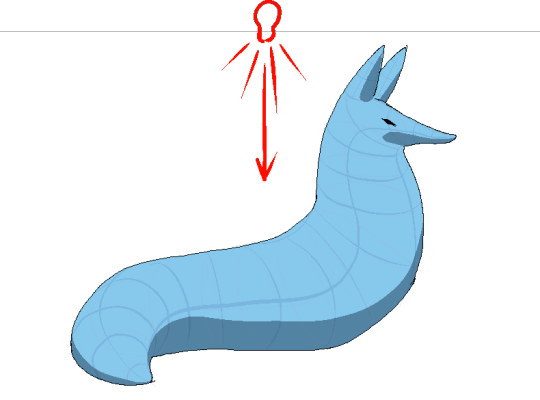
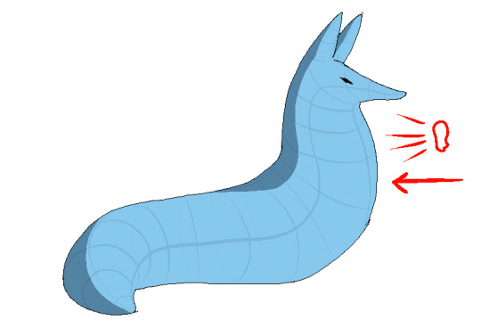
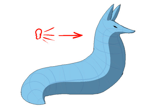
dont worry about cast shadows or the shading color because this is FORM SHADOW time only. think about what surfaces of the character are obviously facing away from the light source and put down the "separation line" of the shading based on that. thr most important thing is that youre trying to separate light from dark
im going to pick the first one for cast shadows bc it will be the most obvious to me
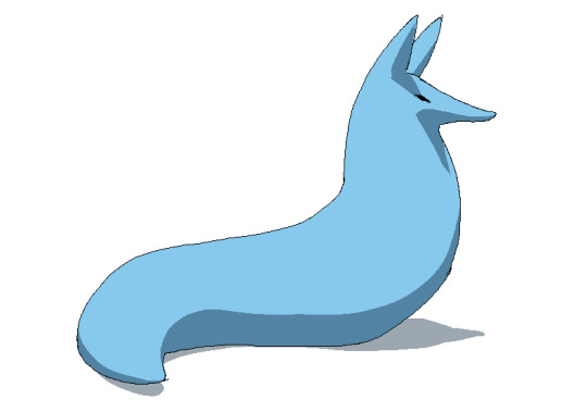
ok so. his ears and snout are blocking other surfaces of his body from the light, which means a shadow is cast!!!! bam. i saw someone describe cast shadows as what the light's pov "can't see." his entire body is putting down a cast shadow on the ground too

im impatient so i blended the form shadows now. its usually the easiest to just NOT blend cast shadows as a way of conveying that they are still cast shadows. but you can still blend them if you want to show "distance" between the obstruction and the surface its blocking. but its just a way of saying form and cast shadows should not be treated the same even if their softness coincides
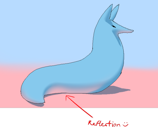
im going to lump reflection and ambient light together because theyre like. similar. reflections dont just happen in mirrors
since the sky is blue, making the ambient lighting, i tinged mr. boobs existing shadow to be a bit blue. (*this is kind of important because it can help you decide a shading color, which should USUALLY be based on the environment) (unless your character is just in the transparent void then it doesnt matter)
since the ground is pink, i made pink light bounce off of him. pointed and labelled. i dont rlly know how to go more in depth than that

contact shadows are literally shadows formed from direct-touching contact. very little light can reach in there, even from how reflections disperse, which means youre free to use the darkest color available (black). in this case mr. boob is making contact with the floor. because he is sitting on the floor.
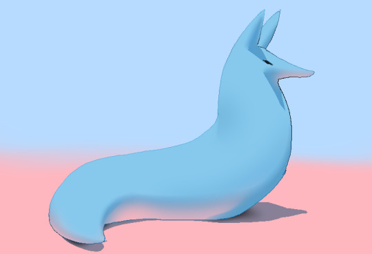
i touched him up a bit and wow!!!!!!!!!! look at mr. boob!!! he is so beautifully sculpted.
and one more thing
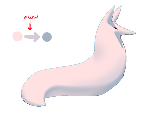
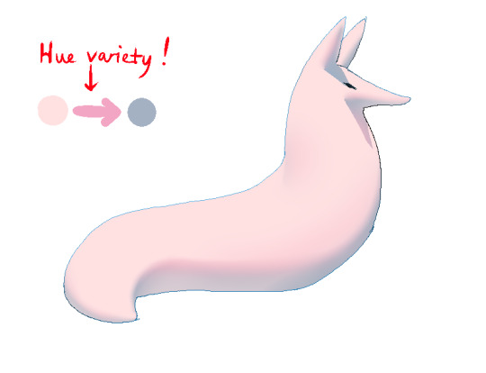
thats right. i made mr boob PINK. hes fucking ruined now. just kidding i would never say that to him
what im trying to convey here (its the easiest with really light colors) is a transitional color. this can also show subsurface scattering depending on how you use it which is fun to look at. the mistake i made on my last tutorial was "Just pick a warm saturated color!" which is really wrong in examples like Blue mr boob. because it would be weird to use a warm color to transition from blue to blue.
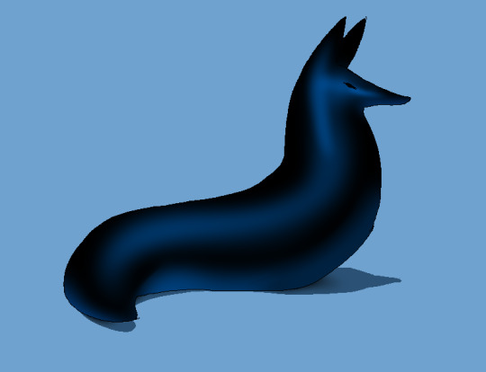
if you have a character that isn't bright enough then obviously the shadows wont be as visible. its BEST to bring more attention to highlights and reflections to reveal the form a bit. they play the biggest role with darker colors
thats all i can think of. fun things to look up:
structuralization + contour lines + foreshortening etc. 3d lingo
form shadows
cast shadows
ambient light
contact shadows
subsurface scattering
im also just speaking out of my ass otherwise. i didnt look up any of these terms until the end now im inferring and hoping i got them right
and remember every time you shade mr boob will be rooting for you
2K notes
·
View notes
Text
joost klein dating & marriage headcanons ( ´ ▽ ` ).。o♡
notes: sfw; the dating part is (accidentally) gender neutral, the marriage part mentions reader as a "wife" but it's not that detailed tbh; inbox open for ideas :)
dating:
• i believe you'll meet him through mutual friends, most likely at a function
• you'll just KNOW that he likes you right away, as he tries to get your insta he really reeks of desperation
• he really tries to impress you as you get to know each other, always taking you out, texting you every free second he has
⇨ ultimately it just smoothly turns into a relationship, you haven't discussed it, but you clearly are dating and everyone knows it loll
• he's very affectionate and touchy
• he's mesmerized by everything you do and say
• takes lots of pics of you, he's literally your own little photographer! also lots of unexpected "in the moment" pics that he takes of you when you don't see hehehe
• always interested in what you're working on
• lots of inside jokes!!!
• he just wants to see you smile :)
• he's a workaholic, but for you he'll REALLY try to not overwork himself so he'll have more emotional resources and time to spend on you
• if you live in the same city, expect to see him at your doorstep nearly every single day
⇨ if you don't live in the same city as him, he will definitely facetime or send you lots of messages everyday and will try to visit you as much as he can, maybe even a few times a month if he's not touring or especially busy!
⇨ if you don't live in the same country as him, once again, expect lots of calls and messages everyday!! he definitely won't be able to visit that often, especially if your country is far away or there's no direct flight, but when he has free time you better believe he's gonna stay here with you for like a whole month or smth
⇨ in some cases he may also just send you money so you'll come to him bc he just misses you that much :(
• he will really want to show you Fryslân!! and he will be really excited to see your home city/country
• in general, if you haven't seen some place, he will be really happy to show it to you or explore it with you!!
• writes down stuff that you like in his notes app in case he accidentally forgets
• he isn't really argumentative, he always tries to remain calm and to de-escalate any situation, it'll never turn into a screaming match with him
• he'll try his best to make your life better, always <3
marriage / domestic:
• any distance between you is insufferable for him, even if you live in the same apartment building, so naturally he will beg you to move in with him!
• you'll probably move in before you get married
• honestly i don't think he will wait that long for you to get married, 3 years MAX, but it depends on what you want
• he will definitely want to marry you since day 1, but will be too shy to discuss it straight away lol he's really the type to only start talking about it when it's brought up in a conversation
• i don't think he's the type to have a really big celebration, he will probably prefer a courthouse wedding, maybe celebrate with friends and family a bit and then travel around the world with you!!
⇨ but once again, it all depends on you, if you want a big pompous wedding then he's gonna organize it for you, as long as he can see that smile on your face!!!
• after he marries you, you better believe that every conversation that he initiates starts with "my wife"
• as he has mentioned before, he's not good at cooking, but he won't force you or expect you to do it; in fact, he will try to improve so he can make you the things that you like; and he also really loves to take you out to eat!!!
• he's also not very good at cleaning and fixing stuff around the house, but he'll try his best, he will watch youtube tutorials and follow them step by step!
• now his recommended page is just "how to clean up greasy kitchen cabinets", "how to fix a leaking toilet" and "25 chicken recipes"😭
• lots of cuddles and kisses 24/7, if he could he would just lie in bed with you the whole day
• eternally grateful for everything you give him
⇨ you found this cute t-shirt in a thrift store? he will bring it with him on every trip. random button you found on the road? it's with him everywhere everyday like a talisman. lip balm? suddenly his lips are always moisturized.
• ughhh why is he just such a sweet and soft boy
• literally him:
#joost klein#joost klein x reader#joost x reader#joost klein x you#joost x you#joost klein x gn reader#x reader#x gn reader#joostblr#headcanons#i love him sm :(((
133 notes
·
View notes
Text
THE ULTIMATE MASAHARU KAITO DRAWING GUIDE!!!!
(Nobody asked for this) but I love Kaito and I absolutely love drawing him and I think everyone should too. Here are some of my tips and references in case anyone needed them.
FACIAL FEATURES:
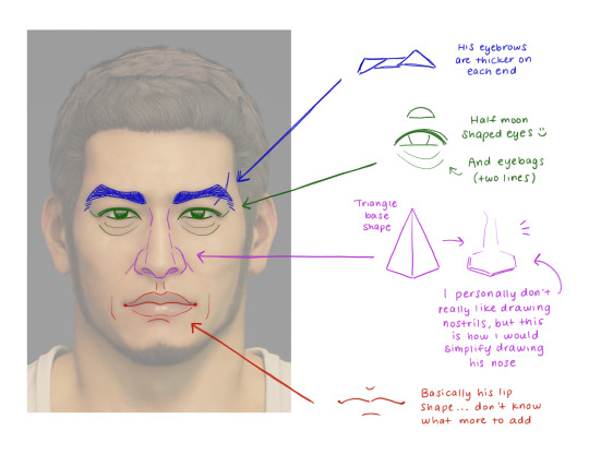
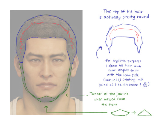
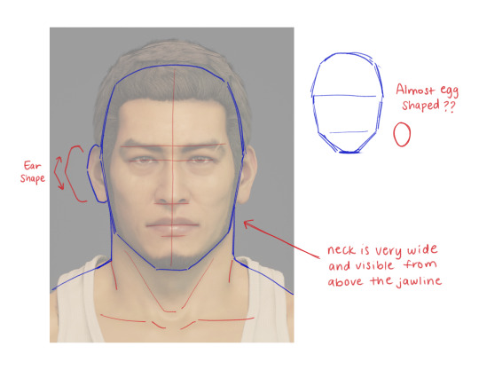

Here are some notes I took a while back while I was doing studies of his facial features. Kaito has quite a large noggin and it looks a little bit goofy on his body sometimes. His neck is also pretty thick too.
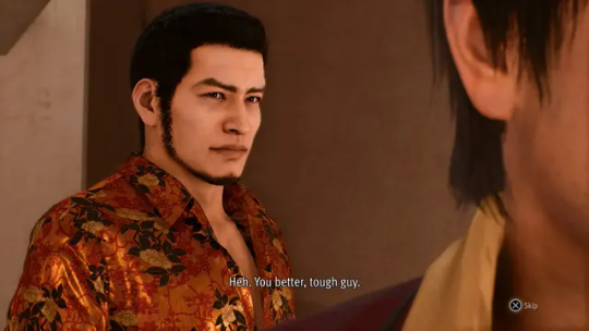
I didn't do one for a 3/4 angle, but as long as you have the right references you should be good! He just has very high cheekbones and a very strong nose overall. Example here:
OTHER FACE DETAILS:
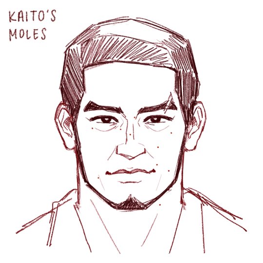
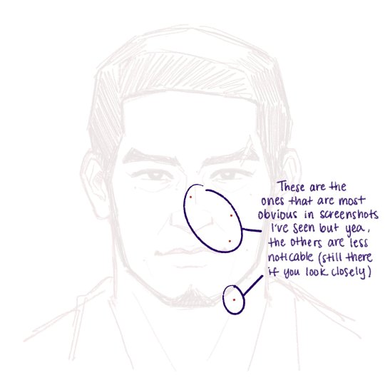
Did you know that Kaito has a few cute little moles on his face? Well I jotted down the ones I noticed at least. A few are more obvious than others and I pointed out which ones here. I don't always draw them myself, but if you're looking to add some extra details then here you go! :)
And of course. The iconic scar on his left eyebrow, who can forget!
BODY DETAILS:
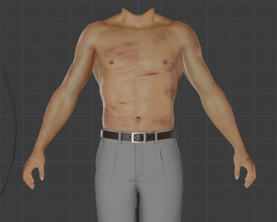
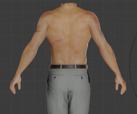
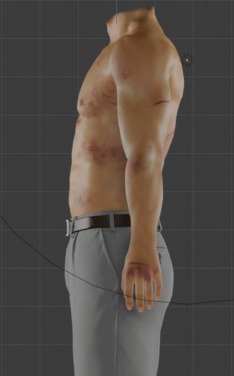
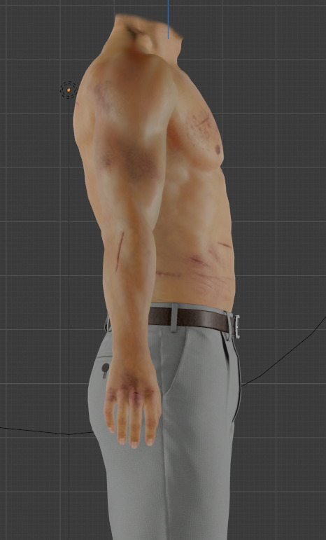
^ I took some screenshots of his 3D model in Blender to show the full turnaround.
From The Kaito Files and onwards, we get to see all of his canon body scars! There's even the one from the gunshot wound from the first game!
Some better quality reference images:
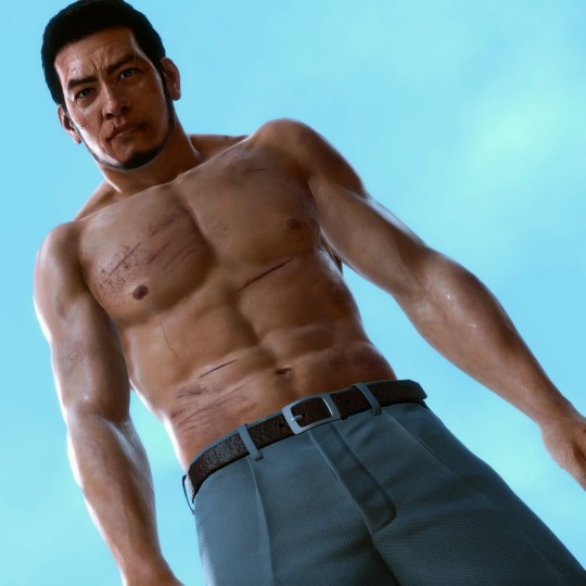
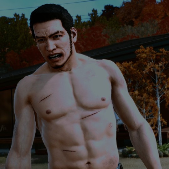
KAITO'S SHIRT PATTERN:
A literal nightmare for any Judgment fan artist to draw, rivaling Yagami's hair even. Luckily for you, I keep images of his shirt pattern on hand in case I'm too lazy to draw it and I can just slap the PNG texture over it instead.
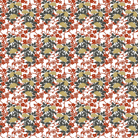
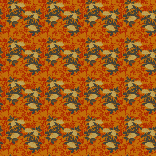
Or if you wanna be extra and draw it yourself, here's a quick tutorial I made of how I simplify drawing his shirt!
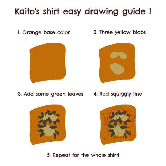
So yeah, this is the result of my brainrot... This is all I have for now, I hope this helps someone! Have fun drawing Kaito! 🫶
#judge eyes#judgment#lost judgment#kaito files#the kaito files#ryu ga gotoku#rgg#rgg fanart#kaito masaharu#masaharu kaito#thefructosefather
125 notes
·
View notes
Text
ellie with a clumsy gf ୨ৎ
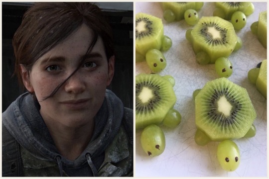
summary: how ellie cares for her clumsy girlfriend
content: nothing thats nsfw!! just ellie being a cutie concerned gf
notes: answer to this req!! SHES SO PUPU BABYGIRL IN THAT PIC I WANNA BITE HER JFWIBFJWKRJR. she's actually so beautiful i can't. entirely unrelated: idk how i feel about this... but i’m trying not to be like EW I HATE THIS FUCK THIS ITS SO BAD. like i dont even feel like that but we already know how i feel about this formatting. its growing on me tho
(wc 0.39k) so short i know guys i gotta dip my feet

constantly laughing but also concerned at how you manage to trip and bump and bruise yourself up on literal air
in apocalypse au, she's always been very aware of her surroundings bc of patrol and combat and stuff so she tries to keep you out of the way of things that she knows you'll bump into
always has an ice pack chilled and ready to go in the freezer in case you bump yourself real hard and it's sore because ice helps bumps not bruise right when you get them (looking at you guys clumsy ladies write that one down)
always warns you about things right as they're happening since you get into things SO FAST
like just as you're bumping into something or dropping an item she's blurting out, "wait! there's- a shirt on the floor"/"remember- that the washing machine door is open"/"baby, you're gonna drop that- just... like you did just now. you okay?"
always asks what you did to get a new bruise. she'll notice a new one and joke, "oh, what did you do this time?" and you'll respond, "i may have walked into the dishwasher while the door was down... but this one doesn't hurt that bad 😁" it's become like a little game
she's become sooo desensitized to any bump or bang sound in the house bc she knows its just you. not to say she doesn't care about you getting hurt--she immediately throws out a "you good?!" or "you need me?"--she just knows you know what to do: ice pack or heat compress. it's routine now.
read that low vitamin c levels make you bruise easily, so always has vitamin c rich snacks stocked up. oranges and strawberries and other fruits, always ready!
she's so stupid in love that she'll cut the fruits up into hearts or try nd make the most simple little animals with them from some mother of 3's tutorial on instagram reels and genuinely gets upset when she can't recreate them.
^ like you notice her absolutely maiming some apples and ask, "ummm why are you slicing and dicing that poor apple?" and she'll mumble, "it's supposed to be a stupid crab."
and for my ladies with darker skin where bruises aren't as visible or even just pale skin that just doesn't bruise easily, she's still just as concerned. and since there is no visible warning of a sore spot, she's hurriedly apologizing after pressing on a sore spot or laying on a tender patch.

@abbysbug @picklesarenice69
hello to my clitter critters. soooooooo erm sorry about going like basically inactive for like 2 weeks i got into the fight of a lifetime with my mother 😊 we still beefing 😊 dw tho when she's old and wrinkly i’ll have power of attorney and trust the cord WILL be plugged.
like i’m joking but as of now that bitch is an opp fr
but anywhoooo i’m back. and my dinosaur of a laptop had a health scare and i thought i was gonna have to plan a funeral for her but she went to the doctor (apple store) and she's all better. idk how it still works so well now bc my mom got this when obama was still president 😆 don't y'all worry tho this motherboard does nothing but purr we chillin (the fan turns on whenever there are too many graphics moving)
#mystellenia 𐑂°‧₊#elle answers 𐑂°‧₊#ellie#ellie tlou#tlou ellie#ellie the last of us#ellie x reader#ellie x you#ellie x y/n#ellie williams#ellie williams tlou#ellie williams the last of us#ellie williams x reader#ellie williams x female reader#ellie williams x y/n#ellie williams x you#ellie williams fic#ellie williams fluff#tlou#the last of us#the last of us x reader#the last of us x y/n#tlou x reader
759 notes
·
View notes
Text
𝐖𝐫𝐚𝐩𝐩𝐢𝐧𝐠 𝐩𝐚𝐩𝐞𝐫 = 𝐦𝐲 𝐠𝐫𝐞𝐚𝐭𝐞𝐬𝐭 𝐞𝐧𝐞𝐦𝐲
summary: you and your boyfriend shed blood, sweat and tears in order to have perfectly wrapped christmas gifts. a/n: rafayel cries when really angry (i'm projecting) also you would think that last week of uni before christmas break would be all vibes but no instead you have to fight to survive (he says, as he wrote it during lecture) (I couldn't care less anymore tbh) (the professor literally was poorly reading from a presentation) (like dude you could sent it to us and we all could go home) cw: none
series masterlist

has no clue what is happening, is here for the vibes
"… and then you're done!" The person in the tutorial shows their perfectly wrapped gift. You look down at you, and while it's looking a little funky, it still looks similar to what was shown on the tutorial.
"That was pretty easy, right Xavier?" You look at you boyfriend, smiling. Then, you look down at how his gift looks like and you couldn't help but laugh.
His gift was a mess. The only thing it had the same as the tutorial is the fact that wrapping paper was used.
"Why didn't you say you're struggling? I could help you or we could watch the tutorial again" you look at Xavier, trying to figure out what he's thinking.
"I had fun, there was no point in stopping" the replies, smiling at you. Your heart squeezes at the sight of Xavier and his pure innocence.

good at wrapping, but gets mad easily
The wrapping on your part was going rather smoothly, the gifts you were tasked with wrapping were rather easy with them being simple boxes, since Rafayel decided to do the more complicated ones as the 'master wrapper' he claims to be. You were about to grab another one, signing along to the song that's playing in the background, when you heard Rafayel mumbling swear words under his breath.
"You ok over there?" You ask, looking over at your boyfriend.
"Yeah" he's not and you know that. His voice was shaking and his face was twisted in anger. You looked down at his hands to check what was making him feel that way. He was struggling with wrapping a particularly weird-shaped object.
"Raf, it's impossible to wrap to let's just throw in in a bag or something hm?" You put a hand on his shoulder and rub it in comforting manner.
"Yeah your right" Rafayel looks up to blink away the tears that were trying to spill from his eyes. You grab a bag,one of the few you bought just in case and let your boyfriend put the object in it.

avoids it, would rather pay/force someone else to do it for him
You hear Sylus sigh for like the fifth time in the last hour. It got to the point that you regret wanting to do it with him in the first place.
"Less sighing, more working, Sylus" you don't have to look up at him to know he's rolled his eyes the moment you said that.
"We wouldn't have to work, if you went with my plan" his voice has a sassy tone to it, his arms crossed
"We're not letting other people wrap gifts for OUR friends and family" you stand your ground and another sigh leaves your boyfriend's lips.
Then, out of nowhere, Sylus is right next to you, wrapping his strong arms around you from the back. He starts leaving soft kisses along your neck, hoping it would pull you away from work.
"It's not gonna work, Sylus. Get back to wrapping" you push him away from you.
"Worth a shot" he shrugs.

god-like wrapping skills AND super patient with your lack of skills
You watch Zayne skillfully wrap each and every gift with ease, his face in full focus that you usually see him have when he's doing patients paperwork.
"You know, if you actually did something else other than staring at me, we would be done by now" Zayne doesn't even look up from the gifts he's currently working on.
"How can I focus, when I have my boyfriend looking all hot while wrapping gifts" you lean against the table, smirking at him. "Besides, I have no clue how to wrap that thing"
"I'll show you" and boy he does. After finishing up with the gift he was working on, he comes closer to you. The two of you are so close, you can feel his warmth.
Zayne shows you all the tricks he knows when it comes to wrapping weirdly shaped objects. Even when you mess up something, he's there to help either guiding your hands or taking over and fixing it.

taglist: @leighsartworks216 @faeryminnyx @iloveboysinred @sstar-ggirl @bellagrayson-wayne
you want in? fill out this form!
#love and deepspace x reader#love & deepsace x reader#lads x reader#lads xavier#lads x you#lads x y/n#lads x mc#lads xavier x reader#sylus x reader#zayne x reader#rafayel x reader#lads zayne x reader#lads sylus x reader#lads rafayel x reader
126 notes
·
View notes
Text
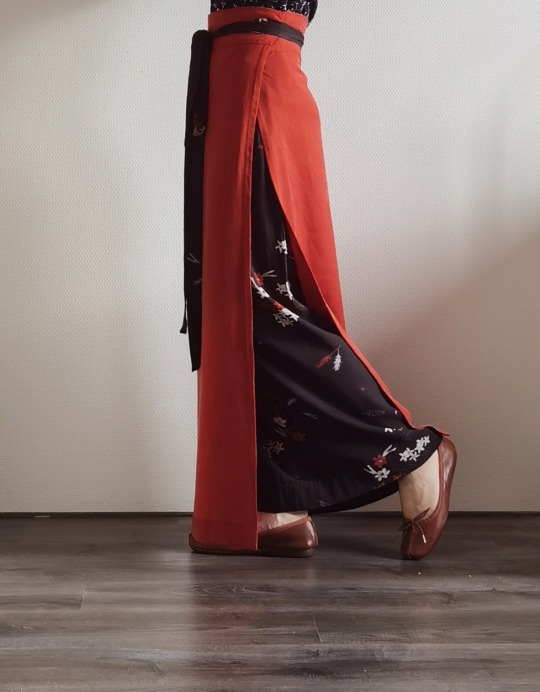
October, 2023 | Two-pieced skirt from Southern Song Dynasty (intro+tutorial)
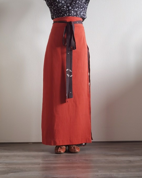
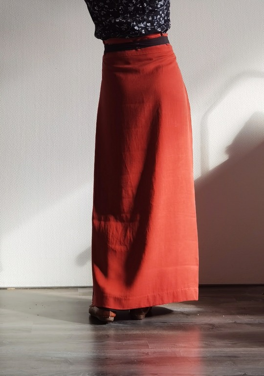
Introduction
(Note: for now I’m not making a bibliography for this article, but if you are interested I’m more than happy to send the sources.)
The two-pieced skirt (liǎng piàn qún) is a type of skirt from the Southern Song Dynasty (1127-1279). It is also known as xuàn qún (literal translation: circle/swirl skirt). As far I know, there are two sets of surviving samples of these skirts, one from the tomb of Ms Huang Sheng (this was her full maiden name - she died at 17, one year after getting married, in 1243) and the other from the tomb of Ms Zhou (also her maiden name - she died possibly at 35 and was buried in 1274). The main stylistic difference between these two sets of two-pieced skirts is that those of Ms Zhou had a relatively large difference between the hem and waist measurements (the hem is 15~20cm wider than the waist circumference), whereas those of Miss Huang Sheng had a small difference (approx. 10cm).
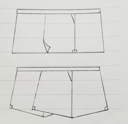
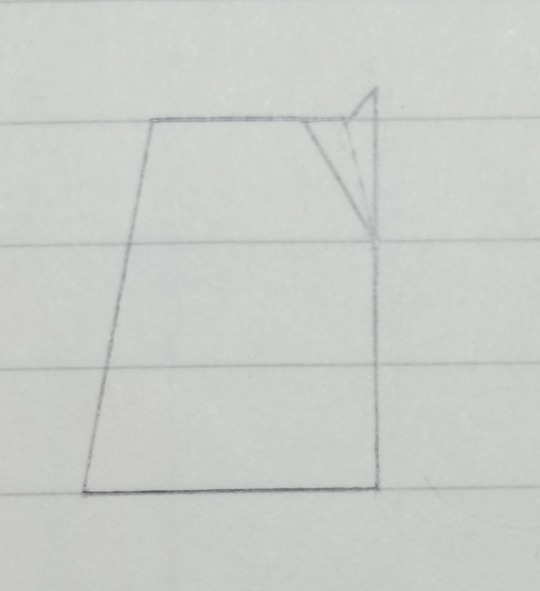
Below is a diagram showing the construction. The skirt is composed of one upper piece and one under piece. Each piece consists of two panels which are trapezoids or (roughly) rectangles. For the sake of convenience, we shall call them the centre panel and the side panel. You can see that the centre panels of the two pieces overlap, and the whole thing is fixed onto a waist band. All surviving samples have relatively wide waist bands—about 10-14cm in width. One strip on each side of the waist band is used to tie the skirt.
Pattern details
The modern common agreement is that the panels are usually right trapezoids (trapezoids with two right angles). I don’t know whether this is historically accurate, as some people think they were pentagons, but I doubt we can ever find out from what is currently available, just because the fabrics had been damaged and distorted over time. Assuming that they are right trapezoids, there are two different ways to piece the panels: you can sew the edges with two right angles together, or you can sew together the opposite edge with two non-right angles together (see diagram). They yield different results. A skirt made with the first method would have more of an A-line and more flowy. One made with the second method would wrap more snugly around the torso and give an H-shape.
You might have noticed that the centre panel is a bit wider than the side panel. This is because the centre panel would be worn in the back and the side in the front. A good starting point is to make the centre panel 10cm wider, but this of course depends on one’s body shape.
Another modern agreement is that the skirt better compliments a flat body shape with gentle curves (as has been the mainstream high-class aesthetics for the female body for a very, very long time right up to now). The most prominent issue with a difference between waist and hip measurements is that the skirt will bunch up at the lower back. To alleviate this issue, darts are used on the sides. Another way is to wear a petticoat, some underpants, or just something around the waist to enlarge the waist measurement. The skirt is not designed to accommodate a large difference between waist and hip circumferences (>30cm probably, though it starts to get difficult at 25cm).
Applying your measurements
(Numbers, when applicable, are in centimetres.)
You need your waist and hip circumferences. The skirt is usually full length. I like to make it as long as possible without the danger of tripping. It could be made shorter for thicker stiffer fabrics or a more modern look. Keep in mind that the skirt has a very high waist.
The length of the waistband is usually 1.7-1.9*waist circumference. In any case, it cannot be shorter than 1.3*hip circumference or it won’t close properly.
Now that you have the length of the waistband, you can calculate the upper edges of the panels. Let a be the length of the waistband, b the finished upper edge of the side panel. Then the finished upper edge of the centre panel is roughly b+10. Using the information discussed in the previous section, we have an equation: a=2b+b+10. This is your starting point—adjust as needed.
Triangular darts. There are a few ways to make them and this is just one of them. Let c be the width on each side of one dart. c=(hip-waist)/4. This means each dart will eliminate half of the (hip-waist) difference, and there are two darts.
c+b= total width on the upper edge of the panel. The bottom edge (i.e. the hem) of the same panel would be about 5cm wider than the upper edge.
The width of the waistband. If you would like to wear it without folding, 6-8cm is good. If wearing with a fold (which sometimes also helps reducing the bunching at the lower back), make it 10-14cm. Note that you need to cut the waistband doubling the width plus allowance.
The ties are usually 2-3cm wide. As for the length, try start from waist circumference+0.6*skirt length. I like to make it 20cm longer because I like long billowy ribbons. Like the waistband, you cut the ties doubling the width since you will fold it in sewing.
Then you would have something like this:
(measurements used: waist 65, hip 89)
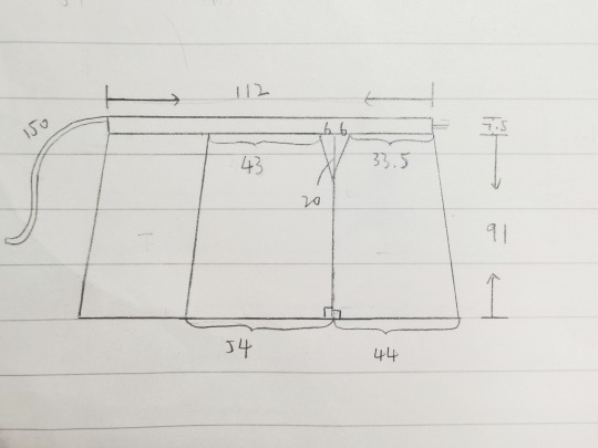
Be careful that you need extra fabric because of the fold created at the dart. (You’d need less fabric if you cut away the excess fabric in the dart.)
Fabric suggestions
This is important. Very very important. Because only the right fabric is worth your time and produces the desired result.
In general, choose something soft, drapey and that conforms to your body. Two or three centimetres of difference in calculation hardly matters when you use a good silk.
Silk: a Chinese specialty called Luo is probably one of the best. Other types of soft drapey silks of medium weights are all fine. I don’t like the right side of silk charmeuse because it reflects the body curves a bit too much.
Viscose: use silk as a guide. I find that twill weave or crepe tends to be more drapey than plain weave.
Cotton/linen/wool: some of these are fine too. If using a thicker wool, only use it for the top piece and use a thin fabric for the under piece of the skirt.
An extra note on cutting out the pieces:
If you are making a skirt with contrasting colours/prints, pay attention to where you cut so that the best part of the pattern of the under piece can actually show through the slit.
Construction
Piece together the side panel and the centre panel, using French seams to make the side seam. Sew all the way from top to bottom.
Sew the dart and press it towards the back. (Alternatively, you can cut away excess fabric, or even make a pocket at the side seam.)
Do Steps 1 and 2 for both the upper and under pieces. Finish the allowances on the sides by folding twice and doing an invisible edge stitch. Leave the hem unfinished.
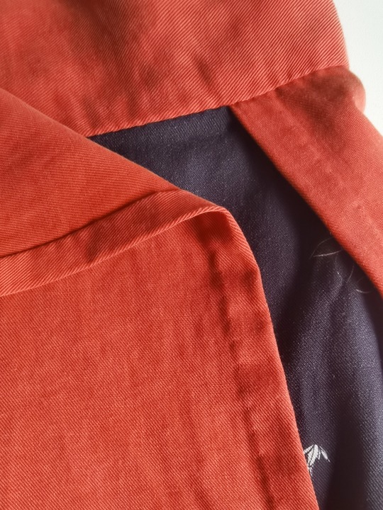
Lay the upper and under pieces together, baste and check fit. Sometimes the centre panel don’t overlap perfectly and that’s fine.
Finish the ties, including the shorter edge not attached to the waistband.
Sew the outer side of the waistband to the skirt panels by laying them right sides together. Press open.
Fold the waistband right sides together and sandwich the tie in between. If wearing the waistband unfolded, you need to attach the tie along the top of the waistband on the under wide and in the middle of the waistband on the upper side (see picture). Sew. Do this for both short edges of the waistband.

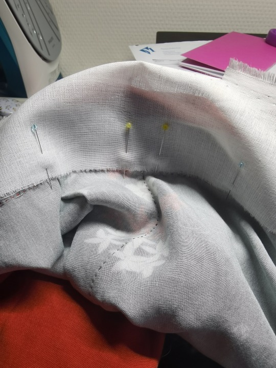
(You can interline the waistband if the fabric is too soft. I used a non-adhesive cotton interlining and cut it without allowance and stitched it onto the allowances of the skirt panels. Whatever method suits you should work.)
Turn the right side out and finish the inner side of the waistband by folding in the allowance and using an invisible stitch/felting stitch.
Finish the hem. For the corner, I prefer to do a three-fold corner so that I don't have to trim away the excess.
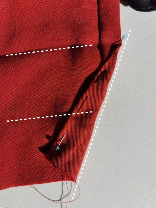
Wash and press. Et voilà!
413 notes
·
View notes
Text
Doing this now because I am LITERALLY in capable of doing anything not at the last possible minute, and because this contest ends on Nov 1 (if it's EST I'm coming in a solid 2 hours before the deadline, unless it ends earlier today, in which case the real prize was the arte I made along the way!)
So, my all-time fave, @meganwhalenturner is doing a contest to win a signed set of the gorgeous new QT editions!
One of the things she requested was a new version of an old fanart, to see how much you've improved. Don't mind if I do! As the self-appointed High Priestess of the Mole God, I make strictly incredible arte.
Way back in June of 2020, I created my first QT fanart pretty much by accident. I remember a legitimately incredibly talented artist had just drawn something with a lot of stairs, and was mentioning that it had been a bit of a pain. So I kindly offered her a tutorial on easy stair drawing:
(Quoth a younger me: draw a line. 90 degree turn. 90 degree turn. 90 degree turn. voila!)
I drew a quick sketch, that I then thought it would be funny to turn into a depiction of the same scene.
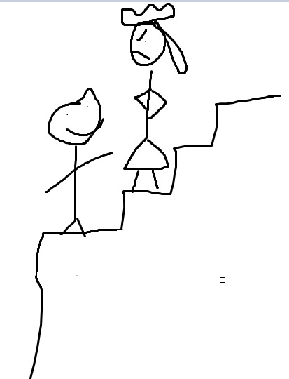
And I was right! It was hilarious!
But since that day four years ago, I think I've really come into my own as an artist.
(For added hubris, I'm writing this before I've finished the new version of the picture).
Please see under the cut for my new techniques!

Note my new talents!!
I've learned to draw perfect circles, freehand!
I've become acquainted with the magic of speech bubbles!
Action shots suggest MOVEMENT!
Sometimes people have HANDS! (Sometimes)
I got rid of that little screenshot square from the first one!
I have forgotten what clothes are!
Are goats different than sheep? Probably not, right?
Thank you for coming on this journey with me.
60 notes
·
View notes
Text
aesthetic ideas + tips for your phone
step 1: update your phone
make sure your phone is up to date and charged at least 80% before you begin! oh yeah and i should mention that this tutorial is for apple phones :)
settings >> general >> software updates >> install

step 2: declutter
clutter literally scares me, so i always try and keep everything (including my phone) clutter free!
remove ever single app that you can, not delete, remove. you can do this by:
hold down any random app button >> click edit home screen >> click the little minus sign at the top left of the app button you want to remove >> click move to app library >> you can now only view it in your app library if you scroll all the way to the right from your home screen

step 3: find inspiration
pinterest and yt are great places to look! i got these off of pinterest
you could also go on google and just type in the theme/color/whatever you're looking for.
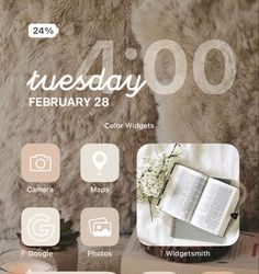
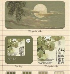
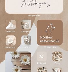
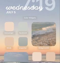

step 4: home screen formatting
this part is a lil overwhelming but that's why i'm here! this is about customizing and decorating your home screen.
first off, look for design formats. you want it to be functional AND aesthetic. take out a sheet of paper or a digital whiteboard or whatever and sketch out what you want your home screen to look like. i find it really helpful to just go "okay, i want a small widget there there and there, my most used apps there, my social media here," etc. remember, it can't just be pretty, it also has to be functional.

step 5: add widgets
now you might be thinking, "how the heck do i do that?" don't worry i'll tell you right now :)
app store >> download widgetsmith >> choose from small, medium, or large widget >> click add widget >> tap it to see all the optiona and pick the one that best fits you (in this case i'm doing photo) >> select the picture you want >> go back to main screen, leave the app >> hold home screen >> press + >> scroll all the way down to widgetsmith >> hold down small >> place it >> hit done >> edit widget >> select the new small widget you created >> untap
don't worry, it's a lot easier once you start doing it!

step 6: customize your app icons
open shortcut app >> click create shortcut >> click add action >> type in open app (multi-colored little squares) >> click choose, look up the app you want and click the 3 dots at the top right >> title the new shortcut >> click add to home screen, rename again >> change image/picture >> click add
#aesthetic#girly aesthetic#pink aesthetic#dreamy#a e s t h e t i c#pinterest#that girl#it girl#pink#cute#iphone#aesthetic phone#customization#pastel dreamer✨
71 notes
·
View notes
Note
Please i gotta know HOW DO YOU COLOR YOUR MODELS PLEASE I CANT SPEND A DAY TRYING TO FIGURE OUT HOW AGAIN /nf
no worries anon :} i literally just use materials / material slots. i avoid texturing because 1. that's closer to phighting's style (there's very very few things that are actually textured in phighting) and also because 2. i can't texture for the life of me. thankfully for both of us, materials are actually super simple to use!
first, make sure to be on material preview mode in the viewport shading, you do this by selecting it in the top right

so, let's say we want to color subspace's horns here (i removed their color for the sake of this post. don't worry, they'll get it back)

what you want to do is select an object (in this case, his horns here) and go to its material properties
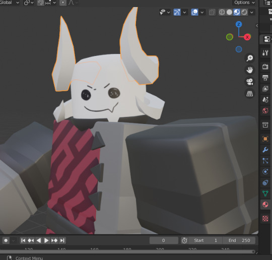
and here you can add a new material
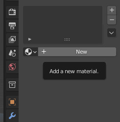
now all these things will show up. (if they don't, you'll have to click the 'use nodes' button under the surface tab.) though you probably won't be needing nodes unless you want something more specific. in this case though, we want to pay attention to where it says 'base color'

if you click on the white box next to base color, this little colorwheel should show up. you can choose any color here, or input a hex code in the hex tab if you want a specific color
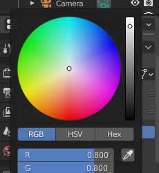
once you choose a color here, it should show up on the current object you have selected

now i just do the same for his bottom horns. any material that you've created before will save, so here i just selected the exact same material as the horns on the top of his head
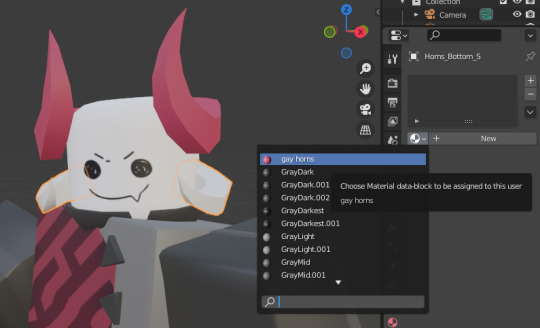

and there you go :} one thing to mention. because both of these objects are under the same material, if you change the color then it should change for both of them at the same time!

here you can see i only have the bottom horns selected, but because they're under the same material as the top horns, it's changed colors too
there's also a way for an object to have more than one material. to do this you have to select an object and go into edit mode
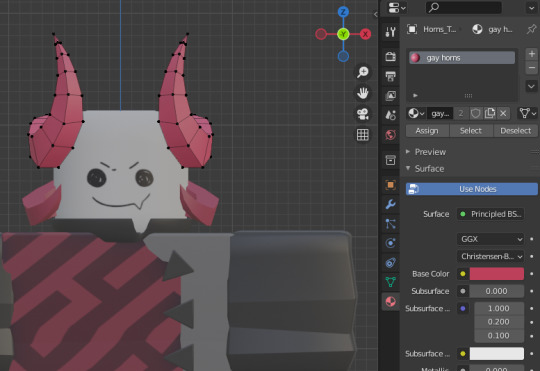
(i had to reset his pose here. goodbye to his gay ass pose)
let's say that, for example, we want only the tips at the top to be a different color. so we do this by selecting the faces at the top
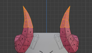
and we click on 'add new material slot', then 'new'
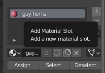
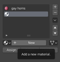
because we already have the faces we want a different color selected, we just click 'assign'
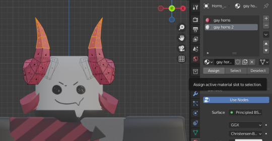
now you can just change the base color as we did before, and only the assigned faces will change color while the rest stays the same

^ he dyed his horns. so stylish
and there you go :} sorry for the long tutorial, but i hope this helps! there's a lot more you can do with materials and it can go a lot more in-depth, but generally for this sort of style the very basic features will suffice (at least for me. i don't like to do texturing. it hurts me)
#answers#long post#SORRYYY i got carried away. i was malding over something and answering this helped me take my mind off it. so thank you anon#3d#tutorial#? it's very basic stuff but it'll help someone out there i imagine#blender is very much not intuitive to use and how to use materials definitely evaded me at first. orz
56 notes
·
View notes
Text
The ultimate guide to being coquette as a hijabi girlie
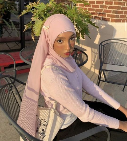
Being a coquette hijabi is so hard because so many of the key motifs (mini skirts/more revealing clothing, the literal meaning of the word, for example) go against what we believe in. But it's not impossible. So here are my personal favorite ways to be a coquette girlie without compromising my faith! (p.s thank you to @augusttheicedcoffeeaddict for reminding me to post this hehe ily)
Also!!! No hate to the coquette girlies who do wear mini skirts etc.
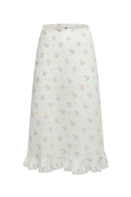
The white maxi skirt 🦢˚✧𓂃🩰 ໒꒱ ⋆ ˚ ⊹
Mini skirts are a staple in so many coquette outfits and so many people will try to make you think maxi skirts aren't cute but they're just haters. A cute sweater + a pleated or tiered white maxi skirt + some crafty layering has been such a lifesaving formula for me. Blouses work great for this too. And the things you can put on top of a white maxi skirt are endless. Pretty blouses, mini dresses, sweaters, sweatshirts, even cute tshirts with long sleeved shirts underneath. Same goes for denim skirts. I'm looking for one right now and I can't find any I like, but once I do I'll be unstoppable.
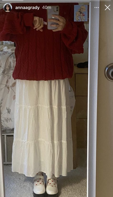
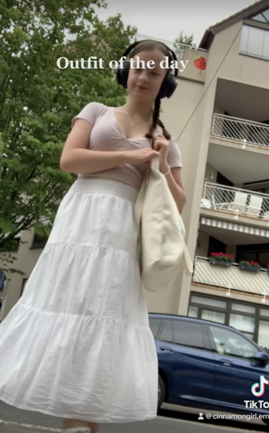
Bowssss 🦢˚✧𓂃🩰 ໒꒱ ⋆ ˚ ⊹
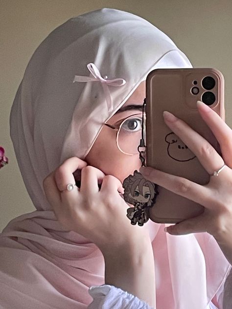
Bows. Bows are THE coquette accessory. And, thank god, you don't have to wear a mini skirt to wear bows!
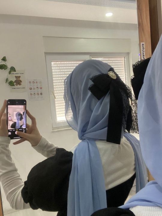
Put them on literally everything. If you want to put them on your hijab, you can use a safety pin to put it on the back of your head, or you could do what I usually do, which is put them in my hijab pins. Depending on the size you can make it as subtle as you want. I have a pinterest tutorial here. (The pic on the left is me!)
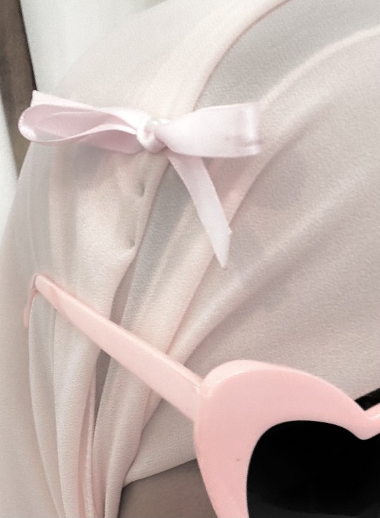
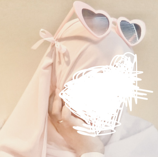
Heart shaped sunglasses 🦢˚✧𓂃🩰 ໒꒱ ⋆ ˚ ⊹
Another coquette/vintage americana staple you can wear!
Berets 🦢˚✧𓂃🩰 ໒꒱ ⋆ ˚ ⊹
Same thing!
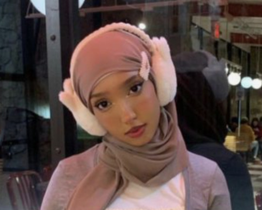
Fuzzy white earmuffs 🦢˚✧𓂃🩰 ໒꒱ ⋆ ˚ ⊹
These are SOSOSO perfect for winter. (pic on the left is me again heh)

At home 🦢˚✧𓂃🩰 ໒꒱ ⋆ ˚ ⊹
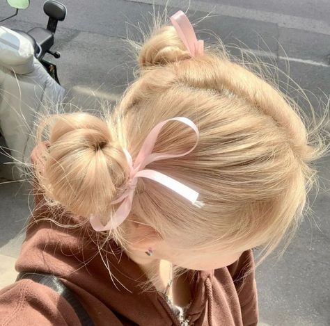
So far, this has all been stuff just in the context of going out in public. At home, I highly recommend doing you hair in a coquette way and wearing things you can only have on in front of family. It's such a confidence booster. It's a bit of effort but it's so so worth it!

Her bedroom is the window into the girl's soul 🦢˚✧𓂃🩰 ໒꒱ ⋆ ˚ ⊹
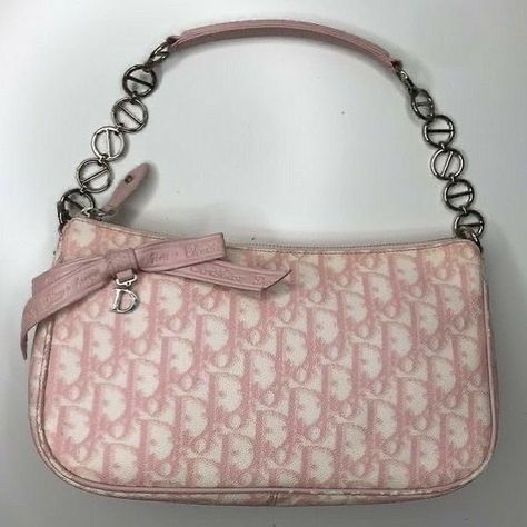
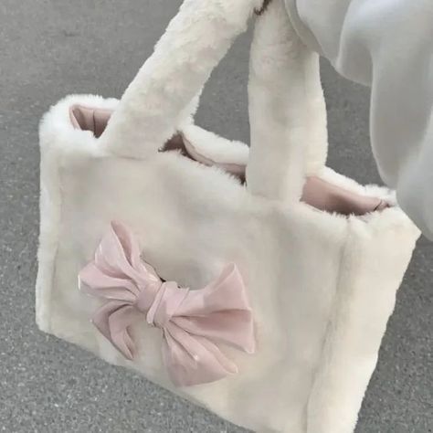
The coquette aesthetic is way more than just the clothes and hair. So if you really want to feel coquette, try and make your room as coquette as possible. Put up some coquette posters on your wall. A lot of coquette posters are haramcore and some people don't like putting up faces on their wall, so here are some really cute pics for inspo :3
What's in your bag? 🦢˚✧𓂃🩰 ໒꒱ ⋆ ˚ ⊹
Purses can make or break a good outfit. My biggest tip is to match them to your hijab. It pulls it all together. The last thing you want is for your hijab to feel like it's clashing with the rest of the outfit.
What's inside is important too! Inner beauty isn't just for living things. Keep whatever essentials you already have, plus lipgloss, a compact mirror bc no one's out here trying to have a bad hijab day, and a little bit of ribbon. Trust me about the ribbon.
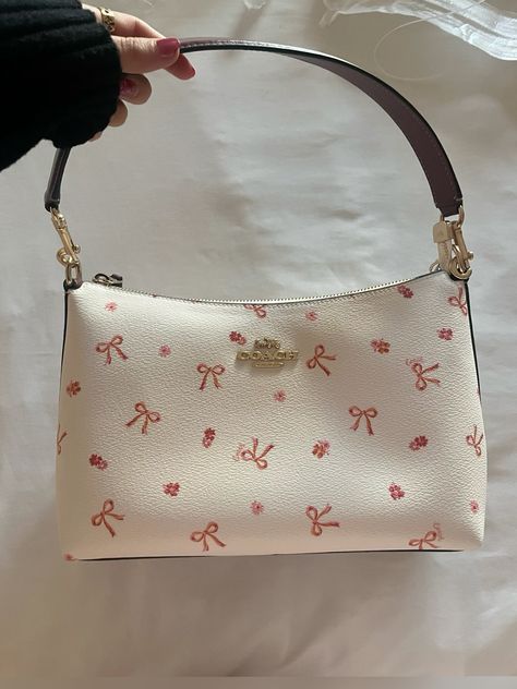
Shoes!!! 🦢˚✧𓂃🩰 ໒꒱ ⋆ ˚ ⊹
Please don't wear a super cute coquette outfit and then wear tennis shoes. Just don't. Mary janes, Doc M's, and ballet flats are all really good choices.
Ik I probably sound like I'm obsessing over tiny things, but you kinda have to bc when you're breaking the mold every little thing matters.
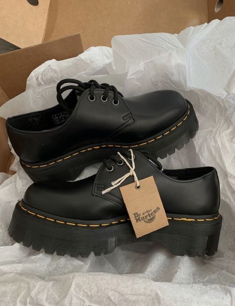
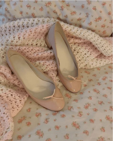
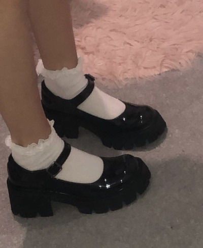
Lastly <3 🦢˚✧𓂃🩰 ໒꒱ ⋆ ˚ ⊹
Last but not least, do not ever ever let people make fun of you. If you're a hijabi coquette girlie, you probably have some form of a muslim community, and they probably won't dress in your style. That was my case, and when I first started wearing mary janes and lace gloves I got SO made fun of. Not from the adults, but from my friends. One girl called my mary janes dorky and said they annoyed her every time she saw them. I think she expected me to laugh, but you just have to keep a straight face and say to their face that you thought that was rude. She never called me dorky again 🤷♀️
Take this post as a reminder that you can stay true to your faith while looking fabulous. If you have any questions pls pls feel free to ask anything. Ily all honeys, bye ♡
#coquette#bows#pink#lana del rey#pinterest girl#heart shaped sunglasses#cinnamon girl#hearts#pink bows#girlblogger#muslim girl#muslim#islam#hadith#quran#islamic#hijabi#muslimah#coquette community#coquette dollete#coquette girl#coquette hijabi
96 notes
·
View notes
Note
Just finished the Jabberwock chapter.... there's so many questions (and possible theories) but rn I just wanted to talk about how Hyde mentioned the ghouls who were worried about MC - for Vagastrom, in jpn he specifically says "a certain someone from Vagastrom" rather than "one or two" and I'm willing to bet it's definitely Sho, since Hyde is the one mentioning it, and soon after he says he wasn't supposed to say that, I can imagine Sho giving him the stink eye to not let anyone know about it lol. Also right after this I got a campus event where Sho almost runs over MC on his bike because she wasn't looking where she was going while watching out for some croc anomalies(?) and he gets mad (worried) telling her what's the point if she's dead and points out where she has to keep an eye out on. I love him Your Honor....
We don't know too much about Hyde yet, but from that last conversation I wonder if having his own younger brother be a ghoul contributed in his empathy towards them ("in the end they're just young boys on the inside") or if he always felt that way. I wonder why exactly he wants humans and anomalies to get along, because while the idea itself might sound nice and peaceful, at the same time it sounds like something a villain with "good intentions" would say too lol. Hyde final boss?
Also rip MC who has to deal with Taiga next chapter lol. After fun times with the Jabberwock kids it's back to treading on thin ice (or glass shards in this case)
Cleaning out all the TDB asks before the new chapter drops at 1 am my time (_ _ )⊹ ࣪ ˖ I am so tired friends
Hyde vs Crowley, who is more likely to be a final boss. My money is on Crowley but Hyde do be looking like Gojo and we all know how my girl felt about the school board.
I swear we must have the same game anon because I literally had just read that school moment before you sent this ask. MC is trying to be aware of zipper crocs, which as a side note: each of the boys cards has a corresponding warding card of the same rarity. The higher rarity warding cards seem to be based off of moments in the story or aspects unique to the character while the SR and R cards are based off anomalous creatures. You get the corresponding SR warding card for your first boy in that joke of a pull they have you do in the tutorial, and the Zipper Croc is Tohma's.
The way Sho speaks to her in that moment (╥﹏╥) the way he's so concerned. Angry even that she's not taking care of herself, because "what good will that excuse be if you die?" I love him so much. And because of that I keep thinking about how guilty he has got to feel about almost letting her die in Book 2. You think he wakes up in the middle of the night to stare at his ceiling because he's thinking about how her mangled body would look staring up at him in judgement if he had just gone along with Leo's plan a little bit more than he did? Do you think that he's eventually going to snap if he keeps hearing Leo talk about MC like she's expendable because the longer he spends time with her the more real she becomes to him? You ever think about Sho looking at her while she's occupied with something else and not paying attention to him and realizing that his time with her has a very real time limit and that she's going to die in a year, however much of which has already passed?
You ever think about an MC who maybe jokes off offhandedly about helping him out now since she won't always be around and him loosing it just a bit because he doesn't want to even think about that even a little. Because I have been oh have I been
I wasn't expecting to like Hyde as much as I do. Don't get me wrong he seems extremely irresponsible, but he clearly loves his brother and his students, which makes him at least ok in my book. If I had to guess I would say Sho being a ghoul probably does have something to do with him being more understanding of the ghouls and their predicament. He has a unique insight into it that the other professors don't, but it could also be that he wants anomalies and humans to get along because through his own research he's seen how important anomalous creatures like the Kraken are to the world and he wants people to have a more respectful attitude towards that. I can't see him doing anything to harm Sho, so if the school ends up being the bad guy I think he'll be our ally.
Well not physically harm anyway... Oooooooh "a certain someone from Vagastrom" that was so fucking Sho. And Hyde so said that to be cheeky about it because he thinks it's cute that his little brother has got a little crush ¬‿¬ no it's ok Shohei, big brother won't tell! He pinky swears! Hyde would be such an annoyingly supportive wing man for his little brother if he'd just let him, if Sho has any classes he shares with the MC he so ends up assigned to a group with her on "accident" more than once. It makes a degree of sense too, I think Alan probably would trust that everything is all right and if it's note he will hear about it, if not from the school than from Tohma. Leo probably thought the whole thing was MC's fault anyway but Sho? He had to be so worried about MC and feel so trapped. It's not like he was going to get permission from Alan to go looking for her, and with Leo being Leo it's not like he really had anyone to turn to about his worries but Hyde, who was definitely supposed to be sworn to secrecy.
I am actually more worried about Romeo and Ritsu at this point than Taiga. Like don't get me wrong, that boy ain't right but I can handle someone being a bit homicidal.
Ritsu is easily the cuntiest out of the freshmen about MC at the intro ceremony and Romeo is willing to take MC in for the bounty dead or alive. I feel like this whole book is a bit of a trip, MC about to be kidnapped by a mob boss fr
42 notes
·
View notes
Text
someone sent in this ask and I spent literal hours putting together this tutorial but then it wouldn't let me post it and when I went back into my inbox the ask was gone?? good thing I copy and pasted it, so here it is in its own post

I'm not sure if this will work with programs other than photoshop, but this is how I do it. I know @shinobi-bacon has a tutorial here on how they do it which is pretty different from the way I do it, so if my tutorial is confusing maybe theirs will click with you better lmao. I stole the greenscreen idea from them anyway
SO FIRST, you want your villager on a green screen background. to do this, go to harv's island and use a custom pattern to make the walls and floors bright green. If the villager you're using has green in their design, you'll have to pick a different colour that isn't in their design, but for most villagers green is fine.
if your villager has every colour on them like pietro or stiches then rip you're gonna have to do some manual editing frame by frame. try to choose a colour that doesn't touch the edges of their silhouette too much in that case because it'll make life easier for you
so once you have them in green purgatory, record them doing their emote or whatever. I just use the built-in screen record function that the switch has. press and hold this button to record the last 30 seconds that your switch displayed:

next send that video to your computer and trim off the start of the video so it starts right before a recognizable part of the animation. for this emote I cut it off right before the blink. if you have a slow computer, you'll probably want to trim the end off too so the video is only a little bit longer than one full animation loop
(you can use the video editing software of your preference, I just use quick time player Edit -> Trim)
okay time for photoshop. go File -> Import -> Video Frames to Layers
for "range to import" select "from beginning to end" (or you could skip the last step about trimming the video and select a range here, but I find it kind of finicky), and make sure "make frame animation" is checked
once imported, if it doesn't pop up on it's own, go Window -> Timeline to get your animation at the bottom

click through those frames at the bottom until you find an easily recognizable frame (I chose the first frame where her eyes are closed) and delete all the frames before it. in the layers panel, the layer from the frame you've selected should be the only one turned on. delete all the layers below it
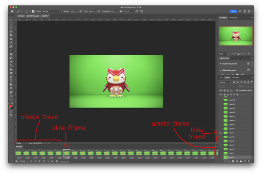
now go through the frames to find the next identical frame. this is where the animation loops. delete that frame and all the frames after it, as well as all of their corresponding layers (note in the picture, frame 121 is selected, and it's exactly the same as the frame from the start of the animation)

hit the play button on the bottom left to double check that it loops properly
next, make sure both THE FIRST FRAME AND BOTTOM LAYER are selected, and crop and reduce the image to your desired size. you can do this step later if you want, it's just that doing it now will reduce the load on your computer and make it run a bit faster. just as long as the first frame and bottom layer are selected, you can do this at any time
SAVE HERE because if you mess up this next part it's a pain to fix, but it's easy to quit and start over if need be
now it's time for my best friend the actions panel !! say hi actions panel !! (Window -> Actions). what the actions panel does is record your steps so you can quickly automate repetitive tasks.
in the actions panel, click the folder and name it whatever you want
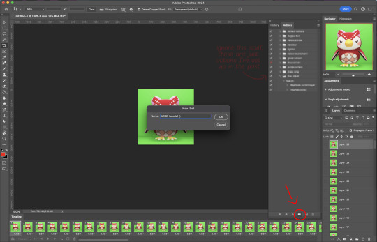
then click the little plus and name that whatever you want and hit record. You'll see the dot turn red to indicate that your actions are now being recorded
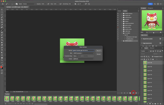
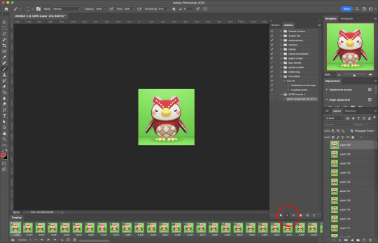
now with the BOTTOM LAYER AND FIRST FRAME selected (ignore that I have the wrong layer selected in the pictures, I fixed it after), go to Select -> Colour Range

click on a part of the canvas that would be green

shift+click on the rest of the green background and adjust the fuzziness until just the character's silhouette remains
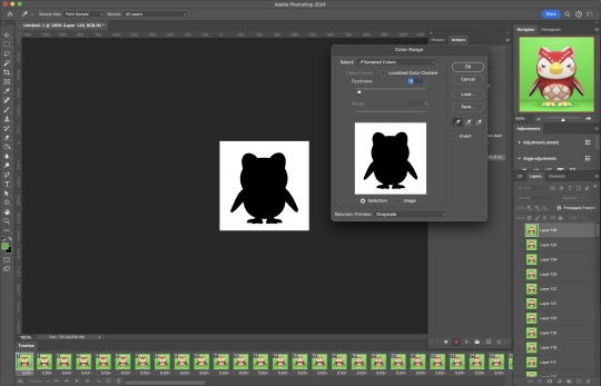
hit OK, now the background should be selected. go Select -> Inverse so that the character is selected, and click on layer mask.
click the next frame button (you MUST click the button, not the actual frame. you need the recording to recognize "go to next frame" and not "select frame 2"),
then keyboard shortcut option + ] to select the next layer up (again, you MUST use the shortcut so it knows to move up one layer and not just "select layer 2"),
and then stop recording.
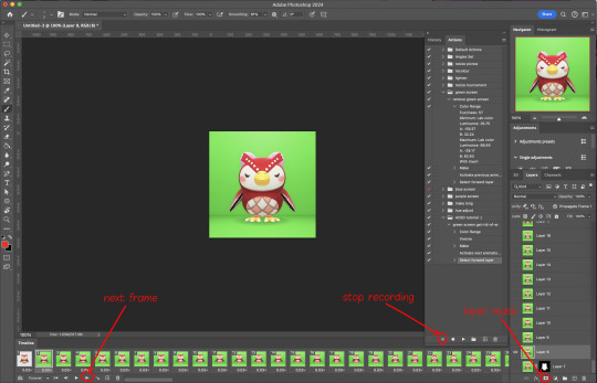
now just repeatedly click the play button and it will do all those steps we just did for each frame :)

this part is usually where it gets messed up for me. if it did something weird like duplicate the same frame or layer your animation over a static frame, just quit and reopen that save I told you to make earlier. the action recording you just made will still be there when you reopen photoshop, so just select the first frame and bottom layer and repeatedly hit play again. if it STILL doesn't work, you probably did something wrong
the recording is now saved in photoshop forever until you delete it, so you can reuse the recording for other gifs! but if they use a different colour background, you'll need to make a new recording (you can see I have separate ones for blue and purple screens). also if you were working with one of those colourful villagers and parts got masked out that shouldn't have been, you'll have to go frame by frame and manually fix them. that's why we masked out the background instead of deleting it.
now it's time to make it into a gif! go File -> Export -> Save for Web. make sure Matte is set to "none" so you don't get those weird white flecks. colours and dither you want as high as they can go, but you can lower them if you need to make the file smaller (though I'd recommend resizing the image smaller first). the bottom left shows your file size. currently as of January 2024, tumblr allows gifs of up to 10MB
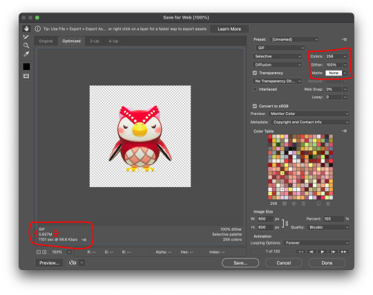
and there ya go! gif! :)
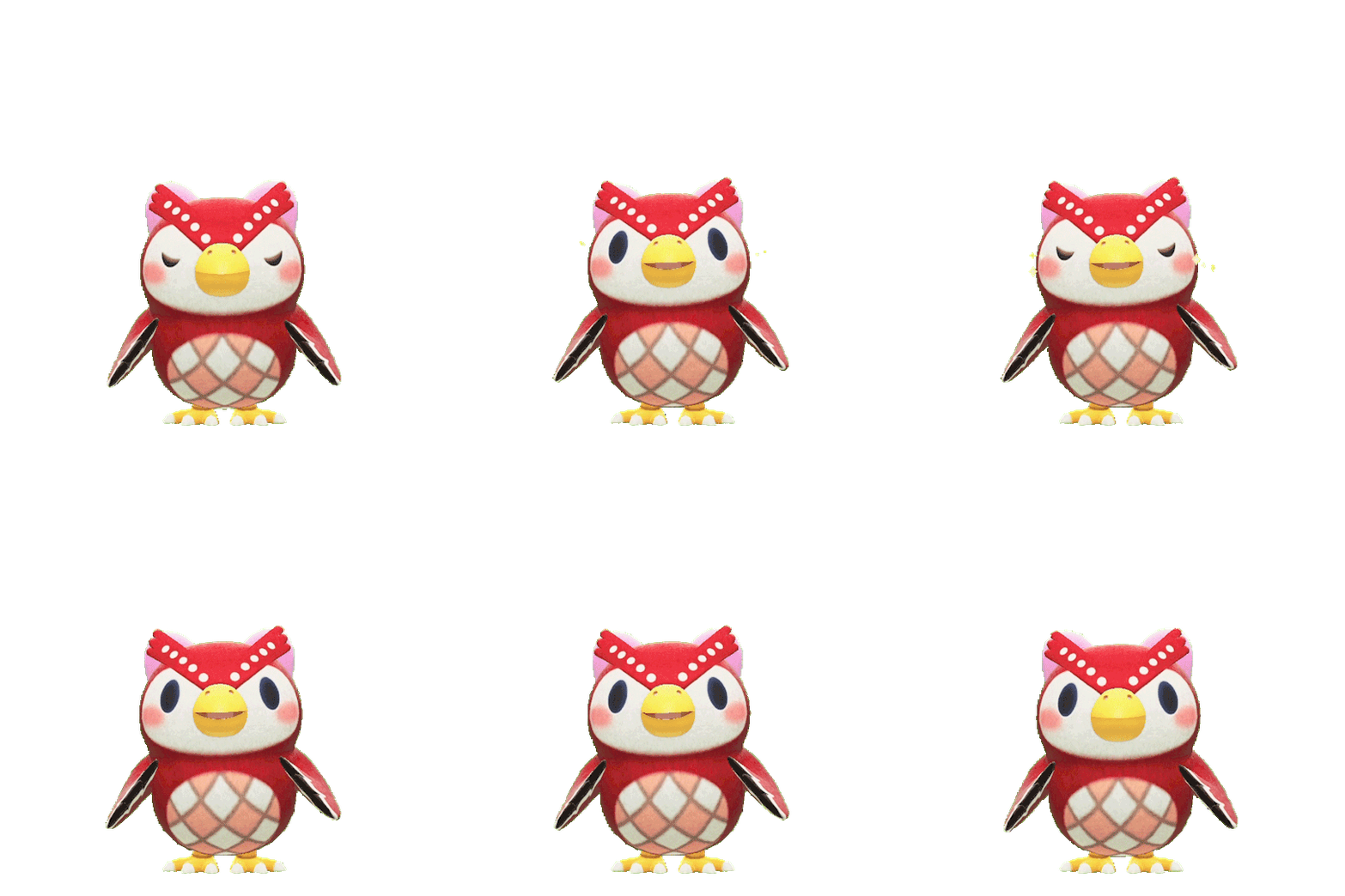
63 notes
·
View notes
Note
Hello, I want to ask you a stupid question? I want to know if I can ask tutorial on how to make multiple gifs in one? Here example: periodedits/tumblr/com/post/673464243167920128/15k-celebration-make-us-choose
hi there! that's not a stupid question at all (and even if it were, i'd still be happy to help) 💙 below the cut, i'll walk you through how to make something like you linked, with multiple shots in one gif:

We're putting two (or more) shots or scenes together in sequence into one gif, so that's how we'll start. I'm assuming a basic understanding on how to make gifs (if not, check the beginner tutorials tag on @gifmakerresource, the resource blog I run), so we begin by making each gif separately.
When putting multiple gifs together like this, it's important to be mindful of the number of frames you'll end up with. I tend to think it looks best if each scene is the same amount of frames, probably somewhere between 25-40 per gif, though it depends on the dimensions you're using as well. Don't sweat if they're not identical, but the closer they are, the better it'll look -- as opposed to one gif only being 10 frames and the other being 40.
So, create each gif separately. You may choose to sharpen and then color (which I believe is the more popular way, but you can always do it vice versa as well. You also might want to color once both gifs are together, but when I do something like this, I prefer to have everything completely finished before I put them both together. Here are my two sharpened and colored gifs:


Each gif needs to be the same dimensions as well. These are 540px x 500 px.
Assuming your gifs are complete, I find it easiest to convert them both to a smart object. To do this, highlight all the layers in your layers panel (shown below) and right click on one of them and select "convert to smart object." For this to work, you do already need to be using timeline animation, not frame animation. You can learn more about that in the beginner tutorials I linked above.
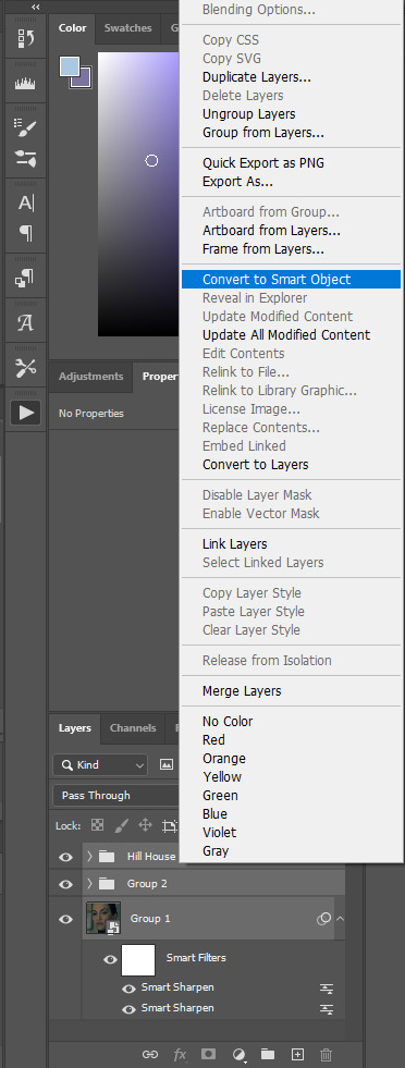
Once both gifs are smart objects, they'll be comprised of only one layer each, thus making them easier to work with and transfer. Now we want to bring gif #2 onto gif #1's canvas. As long as you're working with smart objects, it's as simple as copy (ctrl+c) and pasting (ctrl+p). Copy gif #2, click on gif #1's tab and then paste. This should also properly align the layers. If it doesn't for some reason, you can either use the move tool (v) or the transform tool (ctrl+t) and click and drag until they're aligned properly. This is what you should see now:
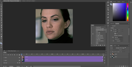
Gif #2 is currently on top of gif #1 in both the timeline and layers panel. If we were to save this gif, they're not going to play sequentially, but rather at the same time and only the top layer will be visible. To make one play after the other, we're going to drag gif #2 AFTER gif #1 in the timeline like so:
We're just clicking and dragging on that top layer and bringing it down to the same line as gif #1 and after it. What I'm doing at the end gets a little cut off, so this is what I'm showing in order to make the timeline smaller so we can see the whole gif. I don't like having to scroll to see it all, but this is just personal preference.
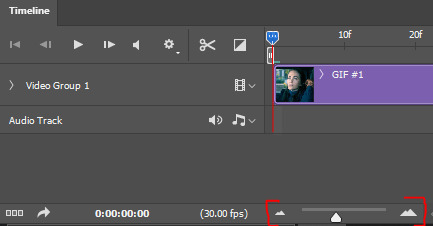
Dragging that slider to the left makes the timeline smaller and dragging it to the right makes it larger, which is great when you're working with detailed stuff like keyframes.
And that's literally all there is to it! You can now save your gif! Here are my save settings that I use for literally every single gif I make:
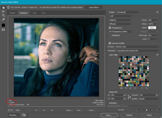
The size limit for uploading a gif to tumblr is 10mb, so at a total of 80 frames (40 each), my gif is too large. In this case, I'm okay with deleting some layers from each, but a tool I use a lot if I don't want to lose frames is ezgif's optimizer. when i tell you this website is a literal lifesaver! you select your gif, wait for it to upload, and then i always choose the first option, lossy gif. You may have to play around with the compression level to get the desired size and quality, though. At compression level 100, my gif is only 5.8mb, but it's pretty noisy. I don't always mind noise (in fact, I add it to my gifs fairly often), but in this case, we have a lot of wiggle room. I played around a bit and found that at compression level 35, my gif still looks nice and comes in at 9.4mb. Right-click and save your gif from here and then upload it to tumblr just like normal!
First gif is using ezgif compression and second is the original gif, just with frames deleted. I ended up having to take off 14 frames in total, 7 from each gif, to come in at 9.5mb. You can decide which method you think looks better!


In this case, I like the 2nd one better as it's less noisy, but it all comes down to personal preference! From here, you can learn cool stuff like transition effects!
I hope this was helpful, but if you have any additional questions, feel free to ask!
#answered#Anonymous#my tutorials#gif tutorial#gifmakerresource#dailyresources#completeresources#chaoticresources
15 notes
·
View notes
Text
So you wanna sell your art on Redbubble but you don't know how?
(Or, I meant to write this months ago but better late than never lol)
OKAY okay. I have a bunch of friends as well as mutuals who have lovely lovely art and have considered selling it online (specifically on Redbubble lol that's what's being covered today anyways) but don't really have any clue how RB works, if it's right for them, or what to expect. SO I'M HERE TO GUIDE Y'ALL THROUGH ALL THE BASICS and hopefully, if I've done my job right, this tutorial will help you set up your RB shop and start selling your art online (or help you decide that RB isn't for you lol).
Table of Contents:
What the heck is RedBubble and should I use it?
How to make your account and set up payment
How to add a new work
Pricing? Markup?
Extra: Checking sales and payment history
Extra: Taxes and copyright, in case that scares you.
Extra: The Partner Program (or how to make "officially licensed" fanart)
What the heck is RedBubble and should I use it?
>> RedBubble is a site that allows you to upload your artwork and sell it on quite a variety of different products.
>> The main benefit of using RedBubble, aside from reach and visibility, is that RB handles *everything* when it comes to the manufacturing and shipment of your product. You are literally not responsible for anything other than making the art, uploading it, and deciding how you want it to look on different products. If there is any kind of problem with material quality or delivery (though in my experience they're pretty good with both of those things), it's not your responsibility to correct!
>> RedBubble does not charge you to sell on their site, but they do set a base price for all products to cover manufacturing and to ensure that they make some level of profit for each sale. We'll look into the specifics of this in a later section when discussing pricing and markup, but it would be considered pretty standard, for example, for an item to cost $20 and you to make $4-$5 upon making a sale.
>> At the end of the day, whether or not RB is right for you largely depends on whether or not you feel their pricing and payment is fair, and whether their available products correspond to what you wish to sell.
Okay, so how do I get started?
Well first you're gonna need an account!
>> Head over to the RedBubble main page and click "Sign Up"

>> Select "Artist Signup"
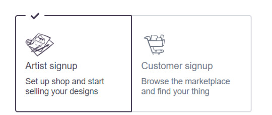
>> Fill in your email, shop name (this is your username also), and password
>> Click "Sign Up"
>> You will be brought to this dashboard page:
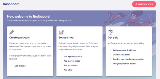
>> We will discuss creating products in the next section. Everything under "Set Up Shop" is optional and I'll let you explore that on your own so we can focus on the essentials. That just leaves... Getting paid!
>> First, check the email you used to confirm your email address. If you didn't receive an email to confirm your email address, don't worry, we can resend the form- keep going with the steps for now.
>> Then, under "Get Paid", click "Add your name & address". Note that all of the options in the "Get Paid" section actually lead to the same form, but selecting this option starts us near the top.
>> Fill out all the fields on this page. If you didn't receive the email to confirm your email address, click on this button:

Then check your email again.
>> Note when choosing your payment method: if you are from Canada, like me, then paypal is your only option. Same for parts of Europe that aren't in the UK. Otherwise, you also have bank transfer options:
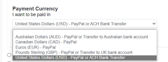
>> Once you've finished filling in everything on this page, click "Save Changes" at the bottom and... That's it! Now you can get paid :)
**Note: I believe RB still requires you to make a minimum amount of money before they do a transfer (for me in Canada I believe it's $20 CAD?), so do keep that in mind!
>> Payments are made to your account monthly, generally on the same day every month (assuming you've made profits!).
How to add a new work
So you've made your account, fantastic. Now you're ready to actually add your works to RB and make them available for purchase to the wider public! To demonstrate the process, we're gonna use our pal Nicky here (who was a gift from my lovely friend @llumimoon) and pretend that we want to upload him:
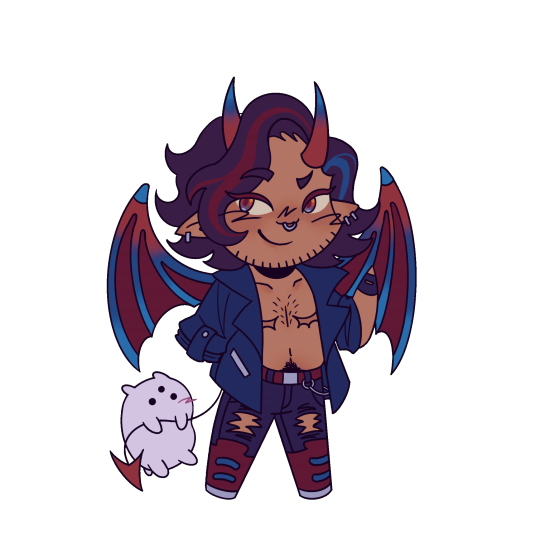
Ain't he a doll? Anyways, let's begin.
>> Hover your mouse over your pfp in the top right corner to make this drop down menu appear:
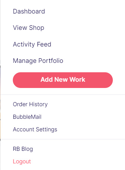
>> Click on "Add New Work"
**On a new account with nothing uploaded, this will look a bit different. instead choose "Sell Your Art" from this dropdown menu, then "Add New Work" from the top right corner of the same dashboard page from earlier.
>> Click on "Upload New Work" (and note the file type and resolution requirements at the bottom. I always stick with PNGs, but in theory JPEG or GIF works as well.)
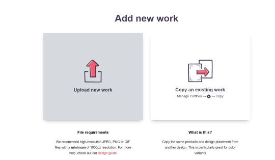
>> Select the file of the image you want to upload. In our case, that's Nicky.
>> Now write a title for your work, tags, and a description if you want. The tagging system is how people will actually find your work, it works a lot like Tumblr's! Try to choose things that are relevant to whatever your piece is. If you're uploading fandom-related art and aren't sure what tags are used for your fandom on RB, try looking some up and seeing what generates the most relevant results!

>> You may have noticed the "background color" section right below Nicky. This sets the default background color for your piece on different products. We're gonna keep this as the default white here, and I'll show you how to adjust this for individual products very soon.
>> Scroll down. This is where we decide what products we want this design to be available on and how we want Nicky to look on each thing we've enabled.
For example, if I were actually selling Nicky here (if that wasn't clear obviously I'm not actually selling my friend's art lol don't do that ofc) I would definitely want people to be able to buy him as a little sticker :]
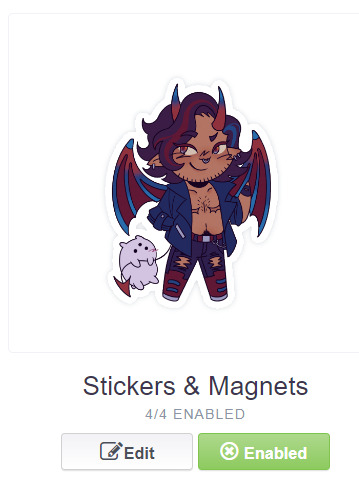
>> In this case, "Stickers & Magnets" have been enabled by default. If you wanted to disable them, you would simply click that little "Enabled" button. Similarly, if we want to enable a product type that is disabled, just click that same button (which will be grey rather than green and say "disabled").
>> If a product is disabled and you are being prevented from enabling it, that's because the dimensions of your image are too small for the product in question! You'll wanna resize your image (preferably in a manner that retains its resolution of course) and come back.
>> Hm. Let's use the hats here as an example of how we might make edits to the layout of a specific product.
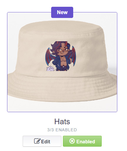
He's kind of cut off, as you can see actually that's pretty in-character, and I think I want this hat to be pink rather than this default beige-looking color.
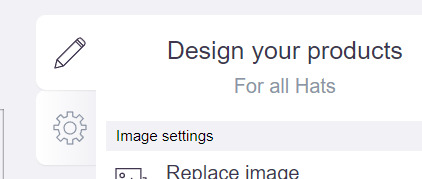
>> Click on "Edit"
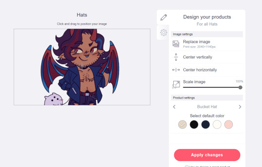
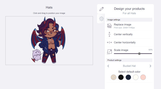
So, the first thing I'm gonna do here is use that "Scale Image" slider to scale him down a bit. I'm also gonna click the image and drag him up a bit to re-center him.
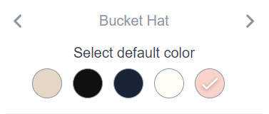
Next, I'm gonna pick from one of the default colors and choose the pink one.
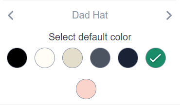
>> Notice the two arrows beside the words "Bucket Hat"? This lets me go through the different types of hats available and change the background/base color for each of those, like the dad hat:
>> Before we apply our changes, click that little gear icon right under the pencil icon
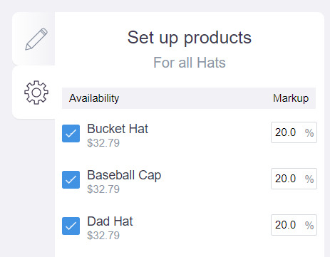
>> This lets us adjust the markup price for each individual hat. It is 20% by default. Changing the markup percentage affects how much you will make off of a sale, as well as how much your product will cost. More on that in the next section!
>> Click "Apply Changes"
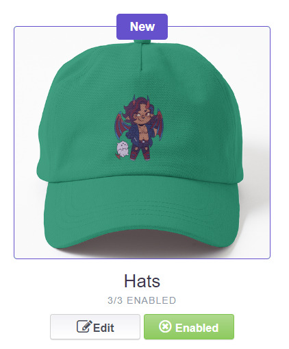
The "dad hat" was the last hat I had selected (when setting its color), so the display has changed to show that one in the preview. Here's our bucket hat from before:
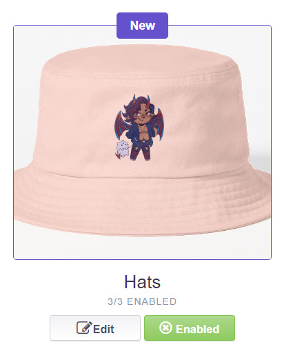
Nice!
>> The specifics of how you can adjust your design will vary depending on the product. With pillows & totes, for example, the editing menu looks like this:
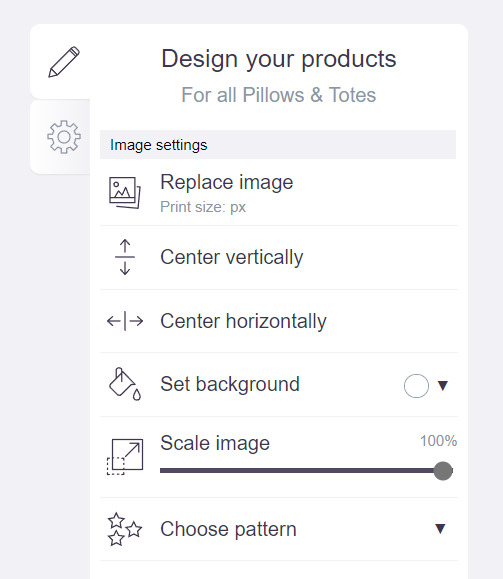
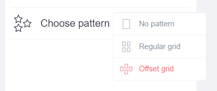
Using the "Choose pattern" option, I can make the Nicky image repeat as a pattern like so:
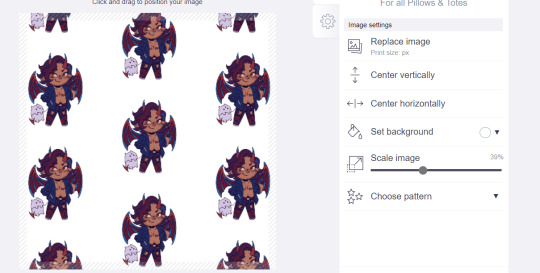
(note that I also scaled the image down a bit here too).
>> One last thing. See that "Replace Image" button near the top?
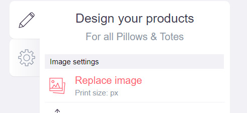
You can use this when you want to use a different version of your image altogether for a specific product.
>> That's the gist! Play around with the settings for each item as you see fit. You can always edit them again later.
>> Scroll down. Select up to 2 relevant media types.
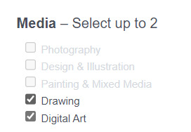
I'm pretty sure this affects search results when users choose specific filters, but tbh otherwise I don't think it's all too important.
>> Let's look at what remains.

>> I have the "Who can view this work?" section set to "Only You"- THIS IS SO I CAN FINISH THE STEPS HERE AND SAVE THE WORK WITHOUT ACTUALLY MAKING IT AVAILABLE TO THE PUBLIC. In practice, you'd only use this option if you wanted to buy your own work on something but didn't want other people to be able to see or buy it. Otherwise, you're always gonna choose "Anybody (public)".
>> Collections can be created to organize the pieces in your shop (for example, by fandom), but we won't cover the specifics of how to do that here.
>> Set whether or not your work contains "mature content".
>> If you want, you can set which product shows up in the preview for your work when people view your shop. If you think your piece looks especially nice on a mug, for example, you can make sure that's what people see first.
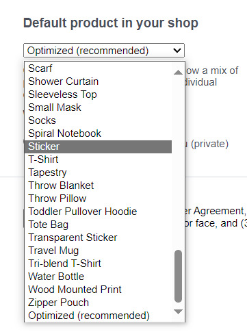
>> Finally, agree to RedBubble's User Agreement (read that little blurble, since that's basically all you generally need to care about when it comes to what you can and can't sell on RB, but more on that later).

>> Click "Save Work" and voila! Your piece is now available in your shop, and can be found in the search results of whatever tags you left on it (this may take a few minutes to take effect).
>> If you want to check out your design in your shop, navigate to your pfp and click "View shop"
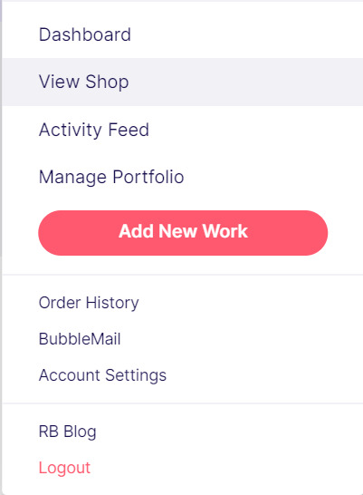
>> Don't fret if the design doesn't appear in your shop right away! Again, this can take several minutes.
>> To edit your design again (and to view/purchase privately uploaded designs like Nicky here), click the "Manage Portfolio" option instead:
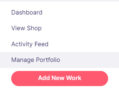
>> Here is Nicky as he appears in my portfolio (again, your portfolio and your shop are different things- Nicky will not appear in my shop at all because he is set to "private")
>> You can click that little gear icon to do a variety of things, like return to the editing menu from earlier. The three icons below Nicky refer to the amount of comments, sales, and likes your design has received in total.
>> Click on your design either from your shop page or your portfolio page. Wow! Your cool art is now available on all the products you enabled. Be sure to look through them and make sure that everything is to your liking!
Pricing? Markup? What's that about?
Well good tumblr user, RB handles everything regarding the production (and shipping) of your product, which means that they set a base (minimum) price for every kind of product to account for materials and production, and of course make some amount of profit themselves. The *markup* is a percentage that you the artist set (see the previous section on how to do so), and will determine how much you actually make off of a sale. Note that increasing the markup price means that your product will increase in price as well!
>> An Example (using hypothetical but more or less realistic numbers):
Let's say that the base price (0% markup, i.e. no profit for you) of a phone case on RB is $15. You set the markup to 30%. 30% of 15 is 4.5, so the public price is increased to $19.5, and if anyone purchases this phone case with your design on it, you will make $4.5.
And that's really the gist! Ultimately the markup price is up to you and what you feel is reasonable, though RB sets it to 20% by default.
Extra: Checking sales and payment history
Eheh, unfortunately I've reached the image limit for this post but:
To check your sales:
>> Click on your pfp
>> Click "Account Settings"
>> Under "Artist Tools" (on the left side), click "Sales History"
To check your payment history:
>> From the same "Artist Tools" menu (see above), click "Payment History"
Extra: Taxes and copyright, in case that scares you.
>> Do I need to report the income I make on RB when I do my taxes?
Yup! But dw, it isn't anything special. I mean, I'm not here to do your taxes for you, but money you make on Redbubble counts as "Self-Employment Income", same as if you sold your art just about anywhere else really!
>> So what am I actually allowed to sell on Redbubble? Is fanart okay?
Generally speaking... Yes! Obviously work should be your own, and it should not contain any company logos or names that you don't have the right to, nor photos of actual people unless you have their explicit permission.
>> Hm, okay, but what if I *do* accidentally sell something that isn't allowed?
In most cases, it'll just get taken down 👍. And no, you won't be asked to pay back any profits you made off the work in the meantime.
**A more extreme case: Story time. So, years ago a friend of mine uploaded some official Rick and Morty art that he forgot to set to "private". Overnight he made... Let's just say he made quite a bit of money. RB responded by taking down the work and banning his IP address, effectively preventing him from ever selling on the site again. But they still let him keep the money he made, and he didn't get into any actual trouble outside of that. What I'm saying is, even if you really fuck up, it'll be alright. And again, this was a pretty extreme scenario.
***Note: if your work falls under one of the brands in Redbubble's "Partner Program" (see the next section), it will be temporarily removed from the search results and your shop while it undergoes review. So don't panic if you see your fanart suddenly disappear from your shop!
Extra: The Partner Program (or how to make "officially licensed" fanart)
Very briefly, Redbubble has their partner program, which I won't explain in full detail here, but basically it means that if you upload a work and tag it as one of these brands, it will be inspected for review and, upon passing that brand's guidelines, will be considered "officially licensed" merch for that brand. Just felt worth mentioning!
So that's really the gist folks! There's certainly much more to play around with when it comes to RB, but that's all you need to know to get started! Hopefully this was useful? Hopefully lol. In any case, good luck out there!
#*breathes* OKAY#gee I sure do hope this is actually useful lol#artists on tumblr#redbubble#selling art#idk what to tag this as lmao#baba's tutorials#<- new tag ig lmao#if y'all have other questions (especially friends and mutuals and followers) feel free to reach out and I'll answer what I can!#so if you're wondering. yes I've sold on the site before. no you don't get to know what haha.#bought a lot from RB too- their shit's good quality!#but to be completely clear ofc I don't speak on their behalf haha this tutorial exists so that I can buy more of my friends' cool art lmao
33 notes
·
View notes
Text
Undead Unluck ch.221 thoughts
[That's a Helluva Cold Open]
or [Bad and Naughty Children Get Put in the Kessler Effect]
(Contents: narrative analysis - story structure; thematic analysis - friendship/growth/loyalty; predictions)
Title Drop TWO!!!
And we have a title!!! ... Again!!!
Admittedly it loses a little bit of its impact this time around, but David Evelyn couldn't have known Tozuka was gonna literally have Andy say "Undead Unluck" when Fuuko previously used furigana to technically say it
I also don't know if there was a way to avoid double dipping like this in English without losing the original meaning in the first place; previously, Fuuko said "Unluck" as the furigana for the "Undead" kanji, so she was literally saying both at once, just in a more subtle way that doesn't translate in English. If it were me and I knew this chapter was going to have Andy say Undead Unluck, I think I would have had Fuuko say "here comes my Undead," since it's clearly a reference to her usual catchphrase while also incorporating the new meaning, but it does come across a little weaker than saying Undead Unluck
I'm not here to gripe about translation choices, though, especially since, again, David made the most of what he was given and couldn't have known it would retroactively become repetitive. No one's at fault here, it's just unfortunate that it made the moment a teeny bit less special
Still, the idea that this is the beginning of the real story does make the timing of that title drop pretty appropriate; I think it's fair to say that a lot of us considered L100 to be a sort of prologue, as once we learned about the loops (and even before that in my case) it was pretty much a forgone conclusion that L100 would end in failure. L101 then seemed like it was the "main" story, but realizing now that the final enemy team was basically hidden behind what amounts to a cutscene gate makes it clear that all of the teambuilding of L101 was basically a crazy long training arc, the tutorial if you will
To put it simply, L100 was the intro of Symphony of the Night (fighting the final boss and losing access to the apparent main character), L101 up to now has been Dracula's Castle (the true main character gaining experience and equipment), and we've only just now reached the Reverse castle (the original main character returns, but so too is the true final boss accessible now after completing a few more challenges, including finding specific key items first)
To continue the SotN metaphor, the boss of the first half is also someone who should be on the main cast's side but is wrongly under the influence of the final boss and his minions!
Hard Lessons
As I expected, the focus of this chapter is definitely Ruin, though perhaps not quite in the way I expected
I figured that either the majority of the chapter would be dedicated to exploring his backstory or Andy would trigger a monologue by saying the right thing. What we got instead was Andy almost taking on a mentor role, using their similar experiences to relate to Ruin's life path and even celebrating it
In much the same way that Andy progressed from being a complete unknown to being "Captain," then "Undead," and finally "Andy" thanks to Fuuko's influence, Ruin went from being a scared, powerless child to "Unruin" and a follower of God thanks to the influence of Blood and Shadow. As I said last week, Ruin has no control over the flow of his life, just as Andy didn't until he met Fuuko
Just like Fuuko wanted to be for Tatiana what Andy was for her, Andy now wants to be for Ruin what Fuuko was for him: the culmination of "dumb luck," the one to turn that luck into fate, the one who can turn the bad hand that was dealt into a big win. All of the events of Ruin's life have led him to Andy here and now, and Andy is the one person who can show Ruin just how massively a person can change and grow when exposed to others
Mutual Growth
Andy gets to make this demonstration twofold: not only is his final attack, Bad Loop, only possible because he has Fuuko, but Ruin will only have the chance to escape it (or at least make the most of his time while caught in it) because Andy released Blood and Shadow and allowed them to go to Ruin's side
Sure, Blood and Shadow are still of the belief that Ruin's only hope for happiness is to defeat the Union and serve God, but based on the rest of the chapter, I don't think that they themselves are all that loyal to God in the first place. Their refutation that Andy's philosophy will help Ruin at first seems like propaganda for God, but I think it's more likely that the three of them have mutually come to the conclusion that this is the right path
After all, Blood and Shadow are the equivalent of Clothy, and it was Clothy who put his faith in them to help Ruin. Andy's partnership with Clothy allowed them to come to an understanding almost wordlessly, with Andy reading Clothy's expression easily and asking a vague question to determine the right course of action. If any UMA can recognize one that values a human over God, it's Clothy
It's also worth noting that Ruin already augments Unruin w/ his UMA pals, so it's not like he's completely unfamiliar with the concept of mutual growth, he just needs to recognize that there isn't really a difference between the UMA and Negators. Sure, they're shaped differently and born by different means, but they all manipulate the rules of the world in some way, and all of them have distinct personalities. I don't think there's a single UMA that's been portrayed as a totally mindless beast, just that some of them aren't given any dialogue to demonstrate their personalities
In a sense, they're all people. Ruin is just trying to create a world where the people he likes can live, and honestly he probably thinks that the Union is trying to kill them. Sure, sometimes they have to kill them, but...really think about why they have to. Who is making them kill the Rules?
God. God is the one letting Ruin's precious Rules be killed, and is even facilitating it. In fact, the idea seems to be that the ones who are targeted for elimination in Quests are the ones that are "expendable" to God's ideal world; is Ruin so bought in that it's okay for Rules to die so long as God says so?
Picking Sides
Given the kind of upbringing that we see Ruin had, it's not hard to see how he might accept something so cruel as just. As @wickedsick pointed out earlier in the week, Ruin's...father? Guardian? Owner? is specifically depicted in silhouette, lifting his foot to kick and stomp at Ruin while scalding him with steaming hot liquid, giving him almost exactly the aesthetic of Sun's descent during Ragnarok
I believe this is meant to demonstrate that Ruin views humanity as exactly the same kind of oppressive force that God is to the Union, but it's also possible that it's a symbol for how, as a Negator, Ruin will always be facing that sort of oppression so long as he refuses to ally with the people who are like him
As Andy says, Ruin is currently taking the easy way out; he's giving up his own autonomy to work under God, selling out everyone else so that he can cling to his own false idea of happiness. He doesn't have to think about the morality of his choices if he just goes along with what he's told, if he buys the lie that all of humanity is an afront to the world and not literally the point of its existence. The Rules of the world are crafted to prompt humanity to find "the greatest life ever" through suffering, and Ruin is an agent meant to provide that suffering. God doesn't have any intention of letting Ruin have a place in his world, as evidenced by the fact that he wrongfully believed Unruin would let him survive the loops. Therefore, Ruin is faced with two choices:
Stay the course and view humanity as the others, remaining in conflict with them only to ultimately be hurt and rejected by both sides
Join forces with humanity and rise against God, breaking the cycle and finding real happiness by creating a world where humanity and the Rules can support and guide each other
Bad Loop
The irony of Andy and Fuuko being the ones to put Ruin through an infinite loop of pain and death that he's capable of actually surviving is pretty interesting, as this is literally what he's always wanted from God but he's receiving it from humanity. Furthermore, by being forced to endure this torture, Ruin is being shown a microcosm of what Andy had to experience, both in the first several million years when he was simply drifting through space as a scrap of his own skull and in the remaining 4 billion where he deliberately planted himself on the surface of the sun. He is experiencing a fraction of the suffering he always wanted and being given the opportunity to really think about the implications of that
By being repeatedly buffeted with death, Ruin will have endless, rapid-fire opportunities to test, understand and improve Unruin, and eventually come to realize that even after all of that, there's a limit to what he's capable of. That's what happened to Andy; he learned everything there is to know about Undead as a standalone ability, and presumably had the time to consider combination techniques, but realized that no matter how hard he thought about it, the only things that would allow him any further growth would be inspiration in the moment or a perspective he isn't capable of providing
After all, Andy only knows everything about Undead. He knows a good deal about everyone else, but just like how Billy couldn't draw out the full power of any of his copied abilities, Andy can only coordinate so well with the rest of his team without first seeing how they've personally enhanced their capabilities. If Unstoppable is different now than it used to be but Andy doesn't realize that, it's just as much Top's responsibility to come up with combo ideas as it is Andy's
Ruin, meanwhile, still hasn't even reached the starting line where he actually knows how to use Unruin in combat. Right now he's just using Blood and Shadow as weapons and augmenting them with his infinite blood supply, but Unruin itself hasn't grown or changed. The problem is that he's still thinking of Unruin as a regenerative ability, as a lesser Undead, and hasn't determined what makes it unique yet. Once he knows how to actually use it, once he accepts his humanity and understands himself, he'll be able to max out his personal growth and begin his interpersonal growth, both with his UMAs and his future Union compatriots
Of course, the real question now is how long until that future arrives
The Final Saga
With Andy's declaration that the final fight is beginning, I've seen a lot of doom and gloom about the series ending. While UU is ostensibly not performing well compared to other Jump manga, it's apparently still selling better than a lot of top-sellers outside of Jump, so I doubt Shueisha plans to axe it
Even if that's not what people are worried about and instead they're just lamenting the knowledge that the end is in sight, I can't help but feel the opposite. In fact, I've never felt so glad to have a series I like declare it's intention to conclude - it means that it won't be forcefully dragged on
This review series was spawned by my opinion that Jump manga are at their peak at the four-year mark, and that they tend to lose interest after the six-year mark. While I'm sure I could love Undead Unluck all the same no matter how long it went, I can't deny the possibility that I would grow tired of it past that point. I became fatigued with Hero Academy despite how much I loved it from the beginning. Food Wars earned my respect by the end of year one but lost it a year or two before its conclusion. Aside from One Piece, I have no evidence of a weekly series holding my attention for so long without developing some feeling of negativity, so it's a valid concern that even UU would pass the threshold and begin to decline
I'm ecstatic that UU is approaching the end of its fifth full year. I love that this past year has been one of if not its best so far, but I'd be lying if I said I could see it doubling that. The story that Tozuka wants to tell has a specific number of beats that have been foreshadowed already, and while it will certainly have plenty of surprises within, it can't produce more indefinitely without deviating from the initial vision. While there may be some cuts or rushed plot points, it's clear that Tozuka is getting to tell the main story that he wants to get across, and that's all I've ever wanted for any Jump manga
With eight Master Rules to fight, the likely return of Seal, and the conflicts with both Sun and Luna on the horizon, there are likely at least 9 storylines to cover, depending on if any of the remaining enemies team up or if there are any more moments of downtime in between like searching for Artifact Heart
Even if we assume this is going to be like the Spring arc and each individual fight prior to the final battle is only like three chapters, that's 27 chapters right there, more than half a year of content, which would then lead into the fight(s) with Sun and Luna, which would likely be at least ten chapters minimum. That would put us ten chapters shy of a full year's worth, landing us in July or August, which is just six months away from the sixth anniversary
I don't know about you, but I could easily see Tozuka making the series last another year and a half from now to hit the six-year mark on the dot, which would give us plenty of time to explore all of the Master Rules, the underdeveloped Union members, the Gods, and give us a good capstone to Andy and Fuuko's relationship
Even if it's just the bare minimum, though, like I've always said, I trust in Tozuka. While the pacing is a bit fast at times, he's never failed to leave me with a satisfying story in the end; even the weaker arcs were a blast to read through the whole time, and I look back on every one of them fondly. I don't want the rest to be rushed at all, but Tozuka has a clear vision of what he wants, and I trust he won't waste any of the time that he's given
Until next time, let's enjoy life!
15 notes
·
View notes