#and are also often more naturalistic in their tone
Explore tagged Tumblr posts
Visit Tumblr Blog
Explore Tumblr blogs with no restrictions, modern design and the best experience.
Last Seen Tumblr Blogs


Fun Fact
Average visit duration of Tumblr.com is 10 mins and 25 secs.
Text
Mockumentaries
The mockumentary format can be really fun, but I've been thinking more and more about how it's not always used to its best effect. Binge watching Abbott Elementary is what has really brought some of the specifics of this into focus, and it's what is freshest in my mind at the moment, but it isn't limited to one show. My problems with it manifest in many ways, and there's nuance to all of them, but to boil them down to their essentials it's usually:
Characters doing/admitting things they want to keep secret, either from the world or from other characters, while aware they are being filmed
Shows going on for years and years, which indicates either that the documentary crew are sitting on years' worth of footage or that the fictional documentary is being released year by year equivalent to how we see the real show
Characters going off to have private moments and acting as if there isn't a cameraman (or several for all those extra angles) two feet away from them.
On the first point, especially egregious examples include the breaking of laws or rules. My main example, because it's the episode I'm halfway through right now and the thing that compelled me to make this post right now, is everyone at Abbott trying to hide the fact that they got the computers as bribes from the golf course. Even if they deceive this one guy (I'm five minutes from the end), it's going to get out eventually via this documentary they're all so happily admitting it to. This goes for various things throughout the show, including more than one plot-important blackmailing.
Even when it isn't something illegal, there are plenty of things that characters are trying to keep secret from other characters, and yet they're brazenly doing or talking about it on camera. Relating this to the second bullet point, it is thus weird when characters find out information in later seasons from interactions with one another, when they should have found that out from watching the prior season (if we assume that is how the documentary functions).
I thought about these first two bullet points a lot during the latter seasons of What We Do in the Shadows, particularly whenever the characters would emphasise that vampires are meant to be secret (eg. when Nandor appeared on the news and they freaked out, or when Nadja yelled at Nandor for sponsoring a marathon during the Vampiric council stuff). They did at least fix all this in the final episode, with the vampires explaining that they've had many documentaries made about them and none of them have ever aired, which is the sort of absurdity that fits really well in the wwdits universe. Even so, this was a last minute addition and my experience of the show as a whole was (very slightly) marred by this dissonance.
On the third bullet point, this is possibly the most egregious because it often takes me out of the most emotional scenes. This especially goes for characters sneaking off to be alone. Sometimes we only see these moments from a distance, as the camera crew has to sneak an angle to catch the character unawares, which works a lot better. Sometimes, though, this goes out the window. Because I watched it yesterday, my mind goes to Janine leaving her School District party to be alone in her office, where there are two different close up angles from inside this very small room. It's not inconceivable that she'd still be able to experience this big moment without acknowledging that she's being filmed from very close up, but it doesn't feel entirely realistic, and there are plenty of similar moments throughout Abbott Elementary and other shows.
There are lots of other little things that can break the immersion - such as the (multiple) cameras already being in the flower classroom when Janine and Gregory have their first kiss, given that J&G think the place is locked and no one is meant to be there. So, the camera crew just ran ahead, got inside and waited, then Janine and Gregory break in and don't even acknowledge the fact that these people who've been filming them for however long are already in there? - but it would be impossible to name them all individually.
It works best for me when the cameras are acknowledged as part of the world. You want to make it so that these characters know they're being filmed? Use that! For example, when Janine and Gregory actually get together and have their second kiss, Gregory dismisses and shuts them out! It still felt weird to me that they started kissing when the cameras were right there, but I love that they chose to acknowledge that it would be forced and unnatural for these two characters to finally get together while a camera crew stared at and filmed them at close quarters.
Anyway, this isn't supposed to be a rant against any particular show's use of the mockumentary format (apologies to Abbott for being my main source of examples). It's more an observation of the way it's used (or misused) in general. If I could be bothered, I'd watch a bunch of shows and take notes every time something bothers me, but it's not that big of a deal. I can see why showrunners choose the mockumentary format, as it allows characters to express their thoughts directly to camera. This can be very valuable, especially since theatrical soliloqoys feel out of place in most standard TV shows. However, while I can suspend my disbelief to an extent, it does often take me out of the world and I'd love to see more care taken when figuring out how the fact that these characters are being filmed would affect the way they act.
#abbott elementary#what we do in the shadows#I worry this sounds like I'm slamming abbott when I'm really not#I actually love the show and I'm so nearly done with it! I'll probably make another post talking about it in a couple of hours!#but this has been percolating in my mind for a long time#and now I've been immersed in the format for several days and I keep thinking about it so I just wanted to get my thoughts down#wwdits is the last mockumentary I watched and I remember a couple of examples from that#(some of which I did mention on tumblr as they happened)#but I remember far less of what happens in others I've watched like the (british) office or 2012 or W1A#those are all british shows interestingly and I have a vague recollection that they aren't as egregious in their misuse of the format#and are also often more naturalistic in their tone#but it's been years so maybe I'm biased and remembering through rose tinted glasses#perhaps I will rewatch one of those at some point and pay attention to their use of the format#and maybe I'll watch the american office one of these days for comparison#I do seem to remember that a lot of the will they/won't they stuff with dawn and martin freeman#in the office was done in a much more understated filmed-from-a-distance way#abbott elementary mine#wwdits mins#wwdits#mine
12 notes
·
View notes
Text
Fansub release + translation notes for Utena ep 29!

Girl 1: でもさー るか先輩もひどいんじゃない? Girl 2: そう?あの子が勝手に盛り上がってただけじゃない。 Girl 1: あー そういうとこある! All: あるある。
Girl 1: Don't you think Ruka was kinda mean though? Girl 2: Yeah, right. I bet she was just getting hysterical over nothing. Girl 1: Oh yeah, maybe! All: Yeah.
I love translating these scenes with the faceless girls talking because the Japanese is so natural and real. Naturalistic speech is a fun challenge because there’s a lot that can’t be directly translated (like filler words and the absence of words), so you really need to consider what these people would be saying if they were speaking English instead. It’s a challenge of creative writing, recalling lived experiences, and using learned social scripts all in one!
For example, the “getting hysterical over nothing” part translates 勝手に盛り上がってた (lit. getting herself worked up) and the 勝手 part implies that Ruka is blameless. But “getting worked up” sounds a bit too animenglish for my tastes, and doesn’t communicate the intensity of the emotions involved. On top of that, I think these gossipy scenes are intended to be a commentary on how women also uphold patriarchal ideals and perpetuate misogyny. So with that in mind, I chose the word “hysterical” — it being a word often used to belittle or dismiss emotional outbursts of women. “Over nothing” was a way to communicate the “Ruka is blameless” piece in a natural sounding way. Altogether I think it’s a great example of the challenge of translating natural language while also factoring in your other aims in the translation like preservation of major themes.

Ruka: だが彼女はわがままで強引で自分勝手で、おまけに嘘つきときている。申し訳ないが、誰があんな女とだ。 Juri: 貴様!何様のつもりだ!
Ruka: But she's narcissistic, coercive, and selfish. And a liar to boot. I'm sorry, but who could put up with that bitch? Juri: Fuck you! Who do you think you are?
This scene is so intense. I’ve never used so many swear words in a single episode before, let alone a single scene! During editing, Anya asked about how I decided where to put the swear words, given that there aren’t really equivalents in Japanese. It’s a complicated question but there are a few things that I factor in.
First of all, there are kind of equivalents, sometimes. In the example above, I translated 貴様! as “Fuck you!” Kisama is often translated as “bastard” or “jerk” or something similar because it’s a disrespectful form of address. Japanese has lots of disrespectful ways of saying “you” but no equivalent of “fuck” or even “fuck you”. I thought “fuck you” got across the anger Juri put into her 貴様! much better than any name calling she could have done. Having done this translation now, I really lean towards “fuck you” being a standard translation of 貴様 (content rating depending).

Juri: 誰が貴様なんかと! Ruka: 本当はフェンシング部の部長である僕の事が好きだったんだろう。 Juri: ふっざけるな!侮辱するにはほどがある!
Juri: Who the fuck would want you? Ruka: The truth is, you've always had a crush on your fencing captain, haven't you? Juri: Are you fucking kidding? I've never been so insulted!
The second factor is, unfortunately, based solely on vibes (and tone). Juri’s first line here literally translates to “who would … you (derogatory)”, with the verb omitted and implicit. But there’s that kisama again, adding an extremely spiteful and emotional tone. The fact the sentence is a rhetorical question also impacts the tone, and the lack of verb makes it feel even more like it’s being spat out at Ruka like an attack. All of this together makes me feel like it needs a swear word in here to properly convey the vibes being communicated in how Juri is talking.
And again, in her last line from the above example, the vibes are powerful and resentful. Even though it’s just a single word, ふざけるな (lit. don’t joke around/are you kidding/etc), the way she delivers it is so spiteful that translating as “are you fucking kidding” just feels right.

Juri: なんといやしいやつになりさがったんだ!
Juri: When did you become such a miserable piece of shit?
I don’t have anything to say on this line that I haven’t already above, but I liked it so much that I wanted to highlight it!

Thank you as always to my amazing editor @dontbe-lasanya! This project would be impossible without you!
Follow the blog for new episodes, and for previously released episodes, check the drive:
Rose divider taken from this post.
#revolutionary girl utena#rgu#utena#shoujo kakumei utena#sku#utena fansub#langblr#translation#japanese vocab#japanese#official blog post
50 notes
·
View notes
Photo

Jan van Eyck
Jan van Eyck (c. 1390-1441 CE) was a Netherlandish Renaissance painter who was famous in his own lifetime for his mastery of oil painting, colouring, naturalistic scenes, and eye for detail. Amongst his masterpieces are the 1432 CE Ghent Altarpiece, otherwise known as The Adoration of the Mystic Lamb, and the Arnolfini Wedding Portrait, a tour de force in optical illusions. A pioneer of using oils for realistic effects, his work was influential on Renaissance art but especially on Italian artists in the second half of the 15th century CE.
Early Influences & Style
Jan van Eyck was likely born in Maaseik, Belgium c. 1390 CE. His family was aristocratic and he may have had an elder brother, Hubert van Eyck (d. 1426 CE), although this figure remains a highly mysterious one in the world of art (see below on the Ghent Altarpiece). Jan van Eyck was first active in art in 1422 CE when he worked for the Bishop of Liège. However, none of Jan's early works can be definitely attributed to him. Works are usually associated with his hand because of a belief (by no means certainly attested either) that he worked as an illuminator of manuscripts as a young man. It is for these stylistic reasons that Jan van Eyck (and/or his brother Hubert) are frequently identified as the creators of the miniatures within the illuminated manuscript known as the Turin-Milan Book of Hours.
Another early influence was the work of Robert Campin (c. 1378-1444 CE) who was active in Tournai, Belgium. The realism and luminosity in van Eyck's work may well have been inspired by Campin's paintings, even if van Eyck overshadowed him during the Renaissance period and beyond. Van Eyck's later works are more securely identifiable and are often signed or carry the inscription: 'Johannes de Eyck'. An additional mark of authorship was the artist's family motto: 'As best I can' or 'As I am able' (Als ik kan or Als Ich Can), perhaps also a pun on his own name. It is in his later works that we can best see his definite and quite unique style of painting.
In the 15th century CE tempera remained the most popular medium for paintings, but Jan van Eyck would master the technique of oil painting, one of the first Renaissance artists to do so, even if it was not a new medium. Oils allowed for greater subtlety in colours and tone, and they permitted the achievement of real depth in a painting that tempera panels or frescoed walls could not match. Consequently, van Eyck's work is typified by its high degree of naturalistic detail, achieved using the very finest of brushes. Everything in his paintings, from the skin of a face to the distant hills seen through a background window, is rendered in minute and utterly convincing detail. Other Eyckian features are the brilliant colours, rich texture and overall finish. Yet another feature of the artist's work is his frequent use of everyday objects in scenes to obliquely signify religious ideas. A shell, for example, signified the resurrection of Jesus Christ while Gothic architecture symbolised the New Covenant.
Continue reading...
28 notes
·
View notes
Text
July 29: National Lipstick Day
Luigi hadn’t dabbled much in makeup, but Wendy was adamant that he finds his ‘colors’.
Starting from his foray into dresses, his only experience with lipstick is the clear gloss he puts on with his more put-together outfits.
Upon learning this, however, Wendy put her foot down:
“You mean to tell me you don’t have any lipstick?!”
“Um-“ Luigi remembers tugging at his gloves nervously, unsure where exactly it became an interrogation. “I, never really brought any? And… it didn’t seem like a big deal…”
Junior, who was doodling nearby, joined Wendy on staring at him in shock. “But Mama! You would look even prettier!”
“Um…”
“Junior’s right!” His daughter is quick to grab his hand, tugging him to and out the door and -presumably- to her room. “A dress without makeup is like a suit with no tie! It’s required by fashion law!”
From there, it was a series of events that had led to Luigi putting on his favorite dress, getting the rest of the kids as a makeshift judge panel, and ‘posing’ for each color and shade imaginable.
His personal favorites where ‘Nude Beach’ and ‘Pretty in Pink’, colors that went well with his skin tone and apparently gave him a ‘naturalistic look’.
But, overall, Luigi didn’t think there would be any shades he would really like-
And then he tried ‘Written in Blood’ (what are these names).
It was a dark red, a few shades lighter than dried blood (which he knew because of kitchen related accidents), and had let his blue eyes ‘pop’.
Mostly, he liked how it made him look almost elegant- maybe even a bit alluring, for a lack of a better word.
Of course, the kids just thought of it as ‘pretty’, but he’ll take their unanimous agreement on the color being ‘his’.
And Luigi ended up with a new, if not small, collection of lipstick.
From then, he dipped into wearing lipstick every now and then, usually sticking to the natural colors for everyday use and wearing the dark red for special occasions.
(It also led to growing his collection through recommendations from Peach, Daisy, and Wendy, but it’s a story for another time.)
The first time he wore it in front of Bowser was during their fifth anniversary, eliciting a sputtering, wide-eyed reaction that had Luigi feeling particularly fluttery.
And when Bowser nervously asked if he could wear it more often?
Well, Luigi may have acquiesced for more than one reason, but the smoldering brimstone look from his husband was his biggest.
#bowuigi#NATIONAL HOLIDAY#some research has been done#but literally color swatching for two hours to test and name
76 notes
·
View notes
Note
You mentioned it recently and again now, what do you mean by naturalistic vs dramatic acting? Do you mean how big and in your face the acting choices are, or is it something like being actively in-character vs passively in-character?
Yeah, I don't know if these are like, official terms - I cannot stress enough that all media analysis for me is very much as a hobbyist and amateur and not as someone with particular training - but I mean naturalistic tends to be more subtle and less in your face. The stage vs. film acting comparison I often use with Liam specifically might help; if you're acting on a stage you necessarily need to make everything bigger so people in the back row will see it, whereas for film you can tone it down a lot. A useful point of comparison is just watching a standard Critical Role episode vs. a live show, because everyone does naturally play it up more for a live show.
It's also things like choices of diction; are you saying things that feel in character in a way that a real person might say this; or is is super heightened, "no one really would talk like that." The latter is a valid choice! Especially in scripted television, sometimes it is about the banger line! But it can come off as stilted or unnatural to me, especially in improv. I have a vague collection of lines that just didn't hit, and they're largely things that make me go "that doesn't really fit the vibe and feels kind of overwrought."
To be honest I am not sure what you mean re: actively vs. passively in character but if it's about still being in voice when describing combat or something that doesn't really enter into it and often is much more about how easily someone can jump back into the voice than acting style.
#answered#Anonymous#woman who loves singin' in the rain: getting real shift from silents to talkies vibes from this.#cr tag
14 notes
·
View notes
Text
Dungeon Meshi
Is this the show that gets me back into watching modern anime? Maybe… just maybe.

Dungeon Meshi is a unique anime in a lot of ways. It’s remarkably grounded, from its characters’ realistically limited combat abilities to their need to eat and sleep. Despite being set in a dungeon filled with monsters and adventurers, the show is more slice-of-life than action. Similarly, despite some thrilling moments here and there, the show’s most delicate animation is typically reserved for its frequent scenes of food prep and cooking. And despite using a fairly generic fantasy framework as the basis of its setting, Dungeon Meshi delights in explaining the logic underlying the dungeon’s ecosystem and the creatures within, leading to a sense of verisimilitude not often seen in anime.


It surprises me how well Dungeon Meshi’s worldbuilding works. I’m usually a big fan of show-don’t-tell worldbuilding, which animation is well-suited for: detail can be crammed into backgrounds, subtly shown in the way a creature moves, or hinted at through unvoiced character reactions. In fact, an anime deciding to monologue all its lore at the viewer is usually a death knell for me: if your first episode starts off with a five minute history lesson about the setting rather than figuring out some clever way to bake it into a story, I’m usually out.
And yet, Dungeon Meshi’s characters are out here explaining, at length, obscure facts about monsters and cooking and I’m enraptured. I think it gets away with it both because its characters are so charming – who wouldn’t want to listen to Laios’ autistic ass tell them everything about weird sheeps that grow in plants? – and because the worldbuilding itself is so creative. From the mollusc-like living armor to Senshi’s use of golems as mobile crop fields, even the most tired fantasy standbys are given a fascinating, original twist.

Dungeon Meshi is also just very pleasant and cozy to watch. It’s not that the story has no stakes – some surprisingly heavy shit happens periodically* – but rather that the characters are so well-adjusted to their situation as to make a life-or-death activity like dungeon delving a casual affair. Plus, the show’s premise necessitates that everything must hard pivot into a cooking show at least once every fifteen minutes, which keeps things chill. It also helps that the characters are all very endearing, helped along by a great English dub. It’s one of the most naturalistic dubs I’ve heard in a while: everyone speaks like a real human instead of in Anime Voice**, with lots of colloquialisms. Special shoutout to Marcille’s VA for all her “HELL no!”s and gems like “Falin! …whoa hey…”.
*Given how matter-of-fact the show is about cooking and eating the monsters, it really shouldn’t be surprising, but look, I just wasn’t expecting forbidden blood magic rituals, okay? **With the exception of Falin, whose voice in Japanese is honestly just as grating


Aesthetically, Dungeon Meshi is a damn fine-looking show, too. As always, any writeup I could do regarding The Craft pales in comparison to kViN’s incredible articles at Sakuga Blog, so go read those. It really shows that this show had a healthy, well-planned production, as Dungeon Meshi is exceptionally consistent, and deploys its most explosively animated bits right where they need to be. Trigger is a great fit for Dungeon Meshi’s tone, as well; the character animation is lovely, filled with huge expressions, great cartoon-ass reactions, and plenty of physical comedy.


My only real complaint here is that the environment art is all bland as hell. For a story that’s all about traversing a dungeon and experiencing its incredible circle of life, it’s disappointing how uninspired the rendering of the dungeon itself is: most of the background art could’ve come straight out of any other generic seasonal fantasy anime, with uninteresting local color palettes, ho-hum designs and sterile digital rendering. Honestly, I still consider Yuji Kaneko’s departure from Trigger one of the hardest blows they’ve received as a studio; the stark difference between the art direction in the Little Witch Academia OVA compared to the TV series always comes to mind for me. Dungeon Meshi’s directing and character animation is still top-notch, and I think it’ll be a modern classic regardless, but I can’t stop imagining a world where Kaneko was still around at Trigger to work on it, and it was top to bottom gorgeous and colorful, with era-defining background art that would inspire decades of fantasy anime to come.


What a relief, after my aborted watch of Summertime Rendering, to find the only panty shots we get in Dungeon Meshi are of an uncommonly handsome dwarf


#will's media thoughts / virtual brain repository#long post#dungeon meshi#delicious in dungeon#anime#shows
3 notes
·
View notes
Text
Adversary reader questions! (part 4)
Feel free to send me questions here or on Bluesky, Pillowfort, or Mastodon!
From yvesdot:
And last question: I love all your smut comics and I'm curious for your thought process on drawing specifically trans erotica. The original Smut Peddler Honesty, for example, shows what I might call "all the bits," and it is so beautiful and tender and so naturalistically depicts trans bodies and sex. In Adversary the sex is largely off-page, but we get a couple of panels of Anton topless, and I personally cheered at a trans guy just existing, topless, with no weird objectifying gaze, just casually standing in a room and being pre/non-op. Are these conscious decisions at all, and what is important to you generally when drawing trans erotica and/or trans nudity?
This is an area where I think I grew a lot as a creator between the original Miles & Honesty story and more recent work, because at that point I didn’t consider myself trans, and now I do. I really enjoy writing M&H as characters and I always wanted to write their scenes together in a way that humanizes them and their bodies, but I’ll admit that at the time I thought I was writing them from an abstract outsider experience. (This happened with O Human Star, too, incidentally, where I immersed myself in queer and trans texts in order to do right by these characters I was obsessed with drawing. “It’s my responsibility… as an ally!!!!” lmao.) My priorities and personal experiences are… substantially different now, and that informed how I planned Curtis and Anton’s scenes. It also should be mentioned that the tone and priorities of Adversary’s sex scenes are pretty different from those in Smut Peddler anthologies. But I think I still approach these scenes in the same way, regardless of tone, by thinking of who the characters are as individuals and how their relationship with their bodies and other people inform how they have sex.

Anton’s behavior in Adversary is influenced by his need to be in control. I tried to communicate that in his body language and mannerisms throughout, and it manifests in his dates with Curtis. Curtis, meanwhile, is constantly being scrutinized and expected to perform, in one way or another. I drew him way more voyeuristically than Anton, on purpose. This definitely happens less often to the cis participant of a sex scene that it does to a trans participant, but I definitely wasn’t approaching it in the same “as an ‘‘‘ally’’’’” headspace as I might have been before.
18 notes
·
View notes
Note
what are your influences/inspirations for your art!! like, stylistically or thematically!
visual art, stylistically:
the Borderlands artstyle obviously. cel shading and outlines my fucking beloved. I am so fucking sad that gbx themselves is kinda toning down on it and that they didn't implement the crosshatch shader they put in teasers for bl3. come the fuck on
the Psychonauts artstyle. even if I do no longer draw in the hyperdeformed style I took from that game I still often deform characters and exagerrate their main features in order to make them more distinct. it also kinda made me addicted to shape language lolmao
Team Fortress 2. I am fucking serious btw. blame that one youtube video on its artstyle. it's been a formative experience for me when I watched it and it stuck itself in my brain. it made me appreciate blockiness/solidity/stockiness in art, as well as teaching me how to limit color palettes and how to draw attention to the important parts of the character by using color contrast.
as for actual artists and not. Video Games. I have been eyeing cubists and futurists recently (even went to a gallery with some of Picasso's earlier works) but it's nothing too substantial as of rn
visual art, thematically:
most of what I draw is characters & fanart so. yeah .
however one thing I've been enjoying recently is redrawing paintings or old photos. usually replacing the ppl in them with my fave old man yaoi. maybe it's cringe but they are a very "love in every time" sort of couple to me so :shrug:
literary art, stylistically:
positivist writing, particularly Lalka by Bolesław Prus. perhaps it's because I consider myself academically inclined, perhaps it's because naturalistic descriptions pander to my Biology Autism, perhaps it's bc of smth else idk
impressionism except not really bc im autistic and thus sensory descriptions come to me naturally
Terry. Pratchett. comparisons in my fics are often snappy(tm) as all fuck because they're, well, Borderlands fics, and to me a Borderlands novel should be Discworld-like. also because Discworld itself slaps
the work of Alexis Kennedy: the guy who wrote a lot of Fallen London, Cultist Simulator and also the Horizon Signal dlc for Stellaris. which is all shit im into. and good lird . its hard to describe you have to read this stuff for yourself
literary art, thematically:
again see the visual art section but largely my fics if they aren't self indulgent fluff are just. taken from my brain tee em because I cover topics or angles that the rest of the fandom wouldn't even think of
Alexis Kennedy again bc he writes gothic/cosmic horror. especially the latter. hoo doggy
other things that in general inspire me:
Darkest Dungeon. both the artstyle and the story have been big influences on me even tho I only played the game once and know everything abt it by watching youtube and bingereading wikis
the legacy of H. P. "Racist" Lovecraft. I guess. what can I say I am a sucker (haha) for those tentacles. except I do everything he ever did sexier and cooler and also he can go roll in his grave
legends, folklore, mythology and occultism. Hellenic of course since that's a big part of Borderlands symbolism but I ain't a coward I throw all that shit in there. slavic (creator bias lollll), norse, japanese, a bit of voudoun, biblical tradition, alchemy, tarot, et cetera. of course I usually don't talk about all the symbols that go into my Everything bc there's a crapton and everyone is entitled to their own interpretations but. yknow! and thats not even accounting for my love of assigning complex motifs to things
#this list is probably non-comprehensive but oh well#themanwhomadeamonster#lavos/alto#fourth wall mail slot
2 notes
·
View notes
Text
Art style and choices musings
Because i have a different art style than phils i have to consider how to make the characters recognizable to their canon appearance while not directly copying him beat for beat. To do that i obviously exaggerated features differently than phil does. Gil got away from me, i think, im trying to tone his hair back to being straighter cause hes looking increasingly like some random ass guy i dont know. But i also was very deliberate with my choices
Agatha and Gils noses are from some earlier more naturalistic panels where phil kinda gives them these button noses. Zeetha gets the same nose and then she and gil get the big circle eyes (while Gil gets the dark circles cause yknow). They also tend to be drawn with lips more often compared to some of the others. And also the fangs. Agatha i kinda flip flop about her eyes, i tend to give her these like half circle eyes, which i think makes her look cheerful. I like it but sometimes it seems too much to me
In general i kept the button nose style for the mongfish family (i dont remember if i also gave them to heterodynes), to give them a family resemblance, but i draw Zola and Theo with different eyes than agatha. Zola i make her face wider and kind of heart shaped, and i try to give her with more obvious makeup like mascara and lipstick. I get stuck on her eye shape a lot. Im usually unsatisfied with it and its rarely consistent. Theo i give sharper eyes and a more angular face shape. I also usually draw them both with different hair, to better differentiate them from Seffie and Tarvek (also i think theo looks hot with short hair)
The valois all have straight noses, sharp eyes, and large eyebrows. The exceptions to this are Seffie, who i dont draw as strong a brow, and Martellus, who phil most consistently draws with a button nose? So he keeps that. I almost never draw human Anevka, but when i do she often looks very similar to how i draw Tarvek
2 notes
·
View notes
Text
How does Oriental Aesthetics Influence Western Art Trends
In the boundless realm of art, the fusion of Eastern and Western cultures has always been an inspiring dialogue. This exchange between cultures transcends not only borders but also time and touches the depths of the soul. Oriental aesthetics have exerted a profound and enduring influence on Western art trends, injecting new elements and perspectives into the art world. This influence has been evident in various periods of history, enriching both the form and content of Western art while fostering cross-cultural artistic exchanges. From the Chinoiserie style of the 18th century, the Art Nouveau movement of the late 19th century, to Impressionism at the turn of the 20th century, and contemporary art creation, the unique charm of Oriental aesthetics has manifested in diverse and profound ways across different historical periods. This cultural exchange has not only shaped artistic styles but also inspired artists to transcend cultural barriers and create breathtaking works of art.
In the late 17th century, the Baroque style was characterized by its profound and solemn artistic expression, often used to emphasize the authority of religion and politics. People sought to escape from the repression brought about by this authority and solemnity. Meanwhile, Oriental aesthetics had begun to influence European society with the influx of exotic goods and the accounts of missionaries. Inspired by these influences, artists drew upon the naturalistic philosophy inherent in Oriental aesthetics, adopting its asymmetric composition and softer color palette, thus indirectly contributing to the emergence of the Rococo style following the Baroque period. Moreover, by incorporating and retaining the ornate decorative elements of Oriental culture on this basis, coupled with the artists' fantastical imagination, a unique Chinoiserie style was achieved.
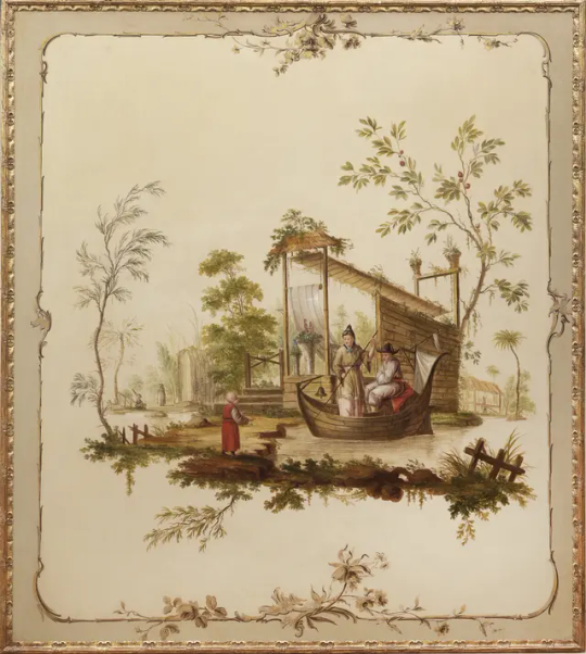
Jean-Baptiste Pillement's "Chinoiserie scene of a Couple in a Boat"
French painter Jean-Baptiste Pillement is considered a master of the Chinoiserie style, renowned for his exquisite and delicate landscape paintings. His works, compared to his contemporary Boucher, are characterized by a more subdued elegance, less dramatic and more pastoral, with an emphasis on decoration. In his piece "Chinoiserie scene of a Couple in a Boat," the artist employs an asymmetric composition typical of Eastern art to depict an imagined Chinese pastoral water scene. While the work still adheres to Western principles of chiaroscuro, it employs a softer color palette, presenting an idyllic and leisurely aspect of pastoral life.
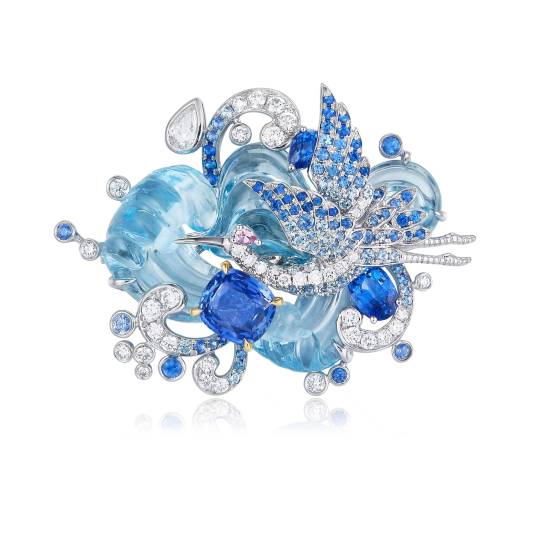
ChuCui Palace's "Shimmering Crane" brooch
In contemporary art creation, another notable contributor to the inheritance and advancement of Chinoiserie style is ChuCui Palace, a luxury jewelry brand originating from an Italian jewelry family. In its piece "Shimmering Crane" brooch, the elegant curves and surfaces derived from the Rococo style, which is a hallmark of French Chinoiserie, stand out prominently. These curves and surfaces evoke a sense of movement between the crane and the rippling water, capturing the beautiful imagery of "cranes flying from the east, creating ripples on the water" through the classic asymmetrical composition typical of French Chinoiserie. The piece also adopts the soft pastel blue tones derived from Rococo-style Chinoiserie and meticulously laid out varying shades of sapphires to mimic the gradation technique in traditional Chinese ink wash paintings. This technique presents the enchanting rendering effect found in ink wash paintings, making the entire piece both romantic and luxurious. It stands as a classic example deeply rooted in Chinoiserie style and traditional Chinese painting aesthetics.
In addition to the Eastward expansion within Chinoiserie, the emergence of new art styles in the 19th century was also influenced and inspired by Oriental aesthetics. The rise of the new art style was a corrective response to the excessively politicized imperial style and the dark and sharp Neue Sachlichkeit style. Art dealers such as Samuel Bing imported a vast quantity of ukiyo-e-style works from Japan at the time. Bing drew various inspirations from these Japanese artworks, including their flatness, cartoon-like qualities, and bold, rough outlines. Subsequently, all of Europe and America (including the United States and Latin America) turned to this new artistic design style. Just as Oriental aesthetics inspired the naturalistic aspects of Rococo style, the appearance of curved patterns, strong spatial contrasts, and flat compositions in Japanese ukiyo-e and woodblock prints similarly inspired the Art Nouveau movement.
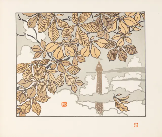
"Thirty-Six Views of the Eiffel Tower," supervised by Henri Rivière
In Sotheby's collection, there is a rectangular quarto book titled "Thirty-Six Views of the Eiffel Tower" personally supervised by the French artist Henri Rivière. This is one of the most beautiful illustrated books of the Art Nouveau period, accompanied by a handwritten dedication, indicating the influence of Japanese woodblock prints on Art Nouveau. Similar to the renowned Japanese landscape series "Thirty-Six Views of Mount Fuji" by the master ukiyo-e artist Katsushika Hokusai, which inspired Rivière to create a book centered around France during the Art Nouveau period. The book employs soft Eastern-style color tones and the black outline and flattened painting language from Japanese woodblock prints to showcase various angles of France's most iconic landmark—the Eiffel Tower.
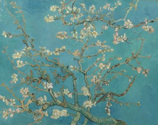
Vincent van Gogh’s 《Almond Blossom》
Chinese art of the Tang Dynasty deeply influenced Japan, which in turn had an impact on Europe. Not only the Art Nouveau movement, but also the Impressionist painters were influenced by Eastern aesthetics. Vincent van Gogh would scatter Japanese prints around him while working. Despite frequently moving, he always carried some of them with him. Having these prints close at hand allowed him to study them "quietly and carefully." From his time in Arles, in the south of France, starting in 1888, his compositions became flatter, colors more intense, lines sharper, and decorative patterns more pronounced. One of his most famous works, "Almond Blossom," reveals the influence of Eastern aesthetics on him. The dark outlines of the tree trunk and branches, flattened brushstrokes, decorative colors brought by the curling motion, soft coloring, and the absence of chiaroscuro all demonstrate the charm of Eastern aesthetics, depicting the vigorous vitality of almond blossoms.
Overall, the profound influence of Eastern aesthetics on Western artistic trends across different historical periods represents an artistic dialogue that transcends cultural boundaries. From the Chinoiserie style to the Art Nouveau movement and then to Impressionism, the unique elements and philosophical connotations of Eastern aesthetics have deeply penetrated into the creative process of Western art. This cultural exchange not only diversified Western artistic forms but also inspired artists to have the courage to transcend cultural barriers and create breathtaking works. By borrowing from and integrating Eastern aesthetics, artists not only expanded the horizons of art but also infused the process of human artistic creation with eternal inspiration and creativity. This cross-cultural artistic dialogue merges Eastern and Western artistic traditions, creating an inexhaustible creative energy and inscribing a brilliant page in the history of world art.
1 note
·
View note
Text
hey op#don't pretend there's no harm in processed foods ok?#food#technology
i think it's interesting that whenever this topic is discussed--including whenever people try to go "well, maybe this constant low-grade orthorexia that is extremely popular in our society due to a combination of the naturalistic fallacy and a vaguely conspiratorial mindset about everything that people for some reason think makes them savvy" people can't be any more specific about what they're worried about than generically invoking the specter of harmful chemicals or "processed foods."
if there is evidence for specific ways of processing food that cause physical harm to people, talk about those specific processes. if there is evidence of specific legal food additives that cause harm (and perhaps should not be legal), talk about those specific additives. but it frustrates me that a bunch of ambiguous correlational studies that get reported on badly in mass media and don't even reliably replicate get digested by pop culture into vague FUD about "processed food" and "preservatives" and in practice very few people can explain what specific evidence for specific harms exists for the questions we're talking about here
what specifically are the "bad preservation methods"? what specific claims have you seen that they are bad? i think people really underrate the extent to which they treat as ironclad and self-evident truth attitudes about the world built on the shakiest of vibes, and ffs, research on nutrition--especially as reported on through, like, headlines passed around on social media--is among the shakiest and vibiest of all domains of human knowledge.
and i'll admit here that part of my pugnaciousness on this topic is bc it's kinda frustrating that we can watch multiple societies around the world rot from the inside right now because people are letting the vibes online construct their worldview for them, lapsing into paranoia and reaction--in both left-wing and right-wing flavors no less--not because institutions are failing but because the negative emotions that excite the limbic system spread particularly effectively on social media. and nutritional woo and wellness and related nonsense is a huge vehicle for that--even the version that people think is reasonable and toned-down. but the fact of the matter is if you live in an OECD country the food supply is extremely safe, food additives are extremely well studied, and they are extremely well-regulated by government agencies; hell, in some places they may even be too well-regulated, as in the case of the EU's paranoia around GMOs. i would wager most countries probably have food regulators who operate soundly in principle, though poorer countries often have more limited state capacity that can make enforcement difficult.
but of course the details of food additive regulation (to say nothing of nutritional science) are complicated and not common knowledge and it's easy to make something sound like a conspiracy when nobody knows the specifics of how something works. so a lot of people are spending a lot of time and effort to make people scared of the food they eat, to sell their own bullshit cleanses and supplements or just for social media clout. and they're bad people. but also you're kinda dumb if you fall for it.
people who for very silly reasons want to market prepared food products without preservatives in them who then discover why we started putting preservatives in prepared food products in the first place (because without a preservation method food quickly grows stale, and frequently also moldy or downright toxic) is a consistently good bit. like people really seem to think we put Evil Chemicals in food on purpose for no reason.
#is that too harsh?#i don't know of a more succinct way of putting it#you *are* dumb if you fall for it!#it is a thing a lot of people fall for#it is a thing a lot of people are dumb about in predictable ways#but that doesn't make it any less dumb
30K notes
·
View notes
Text
Blog 12
Movie Screening Assignment
1.

One powerful scene in Blue Valentine (2010) that utilizes both warm and cool color tones to reflect the emotional trajectory of Dean and Cindy’s relationship occurs in the future timeline, inside the “future room” motel. This setting is crucial because it visually captures the emotional dissonance between the two characters at this stage in their deteriorating marriage. The room is saturated with cool blues and purples, hues often associated with detachment, melancholy, and isolation. These hues engulf the frame, casting a cold, distant atmosphere that mirrors the couple’s emotional disconnect. Dean, trying desperately to reignite the spark, is contrasted by Cindy’s visible discomfort and emotional withdrawal. Her body language is closed off, and the cold color palette enhances the tension and sadness of the moment. However, flickers of warm light, soft yellows, and pinks from the room’s neon signage and bedside lamps briefly interrupt the chill, offering a visual echo of the warmth their relationship once held. These warm tones suggest lingering intimacy and vulnerability, but they’re fleeting and overpowered by the dominance of cool tones. This balance of warmth and coldness in the visual design communicates a painful emotional truth: the remnants of love are still present, but they’re overwhelmed by years of emotional distance and unresolved hurt.
2.

Cianfrance uses color saturation as a subtle yet powerful storytelling device to shape the audience’s emotional interpretation of pivotal scenes involving conflict and reconciliation between Dean and Cindy. The film moves between two timelines—one showcasing the early days of their romance and the other depicting the breakdown of their marriage. These timelines are visually distinguished not only by lighting and framing but also by a dramatic shift in color saturation. In the past timeline, when Dean and Cindy are falling in love, the film leans into warm, high-saturation colors like vivid reds, oranges, and golden hues fill the scenes, evoking a sense of vitality, warmth, and hope. The saturation reflects the emotional intensity of their connection and invites the audience to feel the intoxicating sense of new love. For example, in the scene where they dance together outside a bridal shop while Dean plays the ukulele, the color saturation heightens the intimacy and spontaneity, casting their relationship in a romantic, almost dreamlike glow. Conversely, in scenes of conflict and emotional exhaustion in the present timeline, the film uses desaturated, cool-toned colors like grays, muted blues, and sickly greens. These scenes, such as their argument in the car or the tense moments in the motel room, feel drained of life, mirroring the emotional depletion of their relationship. The reduced saturation distances the audience emotionally, encouraging a more analytical and somber perspective on their deteriorating connection. This shift in saturation does more than differentiate timelines; it shapes audience perception. Higher saturation in the past suggests idealism and possibility, aligning viewers with the characters’ hopeful intentions. Lower saturation in the present fosters feelings of detachment and realism, signaling that their emotional resources have been exhausted. By controlling saturation, Cianfrance allows the audience to experience love’s transformation from vibrant to faded, making the emotional journey all the more visceral and heartbreaking.
3.

Cianfrance’s use of naturalistic lighting plays a crucial role in heightening the emotional realism of the film, allowing the audience to feel immersed in the raw, unfiltered experiences of Dean and Cindy. This lighting approach deeply affects the portrayal of cool and muted hues, particularly blue, green, and neutral skin tones, which are consistently present throughout the film and shift meaning depending on the emotional weight of the scene. One example is the motel room scene, where Dean and Cindy attempt to reconnect. The dim, blue light, largely sourced from practical lights like neon signage and bedside lamps, casts a cold and sterile atmosphere. The blue hues most affected here are intensified by the low, moody lighting, giving the space an emotional chill that mirrors the emotional distance between the characters. In this context, blue symbolizes sadness, detachment, and fading intimacy. The lighting allows blue to become more than just a color; it becomes a feeling the characters and audience inhabit. In contrast, scenes from the earlier timeline, such as the moment Dean and Cindy lie in bed under the soft daylight coming through the window, feature warm skin tones and natural sunlight. The light warms the environment, allowing subtle oranges and gentle yellows to emerge. These hues, amplified by natural lighting, evoke a sense of comfort, vulnerability, and genuine connection. Here, the light doesn't just illuminate the scene—it humanizes the characters, revealing them at their most open and hopeful. By relying on naturalistic lighting, Cianfrance resists artificial emotional cues. Instead, he lets real-world lighting conditions shape the hue and emotional tone of each scene. This approach enhances the authenticity of Dean and Cindy’s story, allowing the audience to interpret emotion not just through performance or dialogue but through the shifting color palette shaped by the available light. These color-light relationships ground the story in emotional truth, making the characters’ highs and lows deeply relatable and painfully real.
4.

The use of color choices and saturation levels is integral in illustrating the socioeconomic divide and the collapse of the American Dream, especially as it relates to the class differences between Dean and Cindy. The film contrasts scenes from the couple’s early romance with their deteriorating present-day relationship, and these temporal shifts are visually reinforced through variations in saturation and color temperature. In the earlier timeline, the color palette is noticeably warmer and more saturated. Scenes like the one where Dean serenades Cindy outside the bridal shop are bathed in golden, romantic hues like soft oranges, warm reds, and creamy neutrals, reflecting their youthful optimism and the hope of building a future together. These warm, saturated colors evoke the idealism of the American Dream, suggesting that love and hard work might overcome economic hardship. However, the film’s present-day timeline is dominated by cool, desaturated blues and grays, signaling emotional and financial stagnation. A powerful example is the kitchen scene, where Dean and Cindy argue. The lighting is harsh, and the saturation is drained, with pale blues and sickly greens dominating the frame. These colors reflect a bleak reality, where dreams of upward mobility have eroded into domestic tension and dissatisfaction. The cluttered kitchen, outdated appliances, and worn-out surroundings subtly highlight their working-class struggle, making the pressures of financial instability on their relationship visible. Cindy, who works in the medical field and aspires for more stability, is often placed in brighter, cleaner environments, though still lit with a clinical starkness. Dean, by contrast, is frequently shown in muted or shadowy scenes, often dressed in darker, faded tones, symbolizing his emotional and professional stagnation. This visual separation mirrors their divergent class ambitions and the resulting strain on their relationship.
5.

The intentional use of desaturated colors plays a critical role in shaping the film’s somber atmosphere and deepening the emotional realism of Dean and Cindy’s deteriorating relationship. The muted color palette, especially in scenes set during the present timeline of their marriage, strips away any visual glamour or romanticization, grounding the story in a raw, unfiltered authenticity. This stylistic choice makes their emotional pain and disconnection feel not only real but unavoidable. One of the most poignant examples of this is the scene in the motel room, where Dean desperately tries to rekindle their intimacy while Cindy withdraws. The lighting is dim, and the colors are flat, primarily washed-out blues and grays, mirroring the emotional coldness between them. The lack of vibrancy in the color communicates a sense of decay, not just in their relationship but in their individual spirits. The room feels emotionally sterile, reflecting the loss of warmth and connection that once defined their bond. Similarly, in the early morning kitchen scene after their fight, the desaturated tones create a bleak domestic setting. The pale light filtering through the windows casts everything in a dull, blue hue. These visuals emphasize the exhaustion and emotional deadness between the two characters and reflect the realism of everyday life under strain—worn walls, tired expressions, and the absence of idealized love.
0 notes
Text
'Andrew Scott is certainly riding a career high: the Irish actor’s much praised turn as Garry Essendine in an updating of Noel Coward’s “Present Laughter” at the National Theatre (also streamed); his starring role in the gripping Netflix “Ripley” series; his extraordinary performance in “All of Us Strangers” on the big screen; and this, his one-man performance of Chekhov’s “Uncle Vanya,” in which he takes on all nine parts.
The last played London’s West End, and also streamed in cinemas, courtesy of NT Live, and has now come to town where we get to see Scott’s amazing tour de force in person. Scott actually trod the boards in New York in 2006 with a supporting role in David Hare’s “The Vertical Hour” with Julianne Moore and Bill Nighy in their respective Broadway debuts but now he’s very much center stage.
Adapter Simon Stephen, director Sam Yates, and designer Rosanna Vize all share co-creator credit with Scott himself, and in all, they’ve done a masterful job of distilling the action to the concept at hand. Though it’s clear things have been updated from the 19th century, the names have been Anglicized --Mikhail Astrov, the doctor, is called Michael, Marina the nanny is Maureen, Waffles is called Liam, Yelena is Helena and so on -- and all the accents are Irish, “Vanya”is in essence scrupulously faithful to its source. The most blatant alteration is Helena’s elderly pompous husband Alexander is now a filmmaker rather than a retired professor.
So, too, there are some 20th century music cues.There is a sprinkling of f-words, a revision that even David Mamet, never one to shy away from an expletive, eschewed in his excellent adaptation of decades ago.
Otherwise, Chekhov is treated with due reverence, and the adaptation seems far more authentic than many other “Vanyas” we’ve had of late, including last season’s starry revival at Lincoln Center.
Scott morphs effortlessly from character to character, sometimes leaving the stage through an upstage door to emerge two seconds later as with a different persona. And sometimes just changing position, or throwing his voice like a deft ventriloquist.
Much of Scott’s delivery is in a naturalistically quiet, conversational tone, requiring us to listen intently, though he rises to dramatic heights in the scene of Vanya’s violent outburst.
Which is not to say that there isn't an occasional confusion as to who is speaking even with a minimal use of props that sometimes help with character identification. Vanya initially wears shades. Michael compulsively bounces a ball. Sonia, Alexander’s daughter, plays with a cloth. Helena fiddles with her necklace. But more often everything is accomplished purely with body language and vocal delivery.
Still and all, a familiarity with "Uncle Vanya" makes a richer experience, and if you plan to see it, I would bone up on the play. (Helpfully, there are several superb productions on YouTube.)
Fabulous as Scott is, I won’t pretend that there weren’t moments I longed for a full cast but Scott’s dexterity and skill are more than compensation. So, too, his assumption of all the roles makes clear the commonality of their loneliness and sense of unfulfillment.
Vize’s set gives Scott ample playing space, but one not rooted in a specific time or place: a table, some chairs, a swing (favored by Helena), a player piano (poignantly used to invoke the memory of Vanya’s late sister who had been married to Alexander before Helena).'
0 notes
Text
Theme and subject of mother and child
Madonna and Child by Giotto di Bondone 1310:
The first painting Madonna and Child by Giotto di Bondone 1310 reflects the transition from the Byzantine iconography that moved to a naturalistic and emotional portrayal of Christian religious subjects. The theme focused on divined motherhood which highlights the Virgin Mary’s role as the mother of Jesus Christ and a spiritual figure for protection and loyalty. Earlier Byzantine iconography was more fixed and symbolic. However, Giotto introduces the feeling of warmth and humanity between Mary and Jesus. The symbolism in this painting such as the throne which Mary sitting on, Mary is often depicted on the throne which emphasises her importance as the queen of heaven. Jesus’s gestures are reaching to Mary that grasping her clothing symbolises his dependence on her and reinforces a human connection and the colour of gold which is an influence of the divine.

Madonna and Child by Raphael 1503:
The second painting Madonna and Child by Raphael 1503, is a classic representation of the Virgin Mary and baby Jesus. The theme reflects love, purity and salvation. There is this symbol of innocence and love of the mother as Mary is often shown in peaceful, elegant poses and representing the maternal care to Jesus. The blue robe symbolises the importance of purity and connection to heaven and as well the pigment of blue was very expensive during that timeframe. Raphael's depiction of the figures is both spiritual and familiar because it follows the High Renaissance principles of harmony, balance, and realism. Raphael sometimes occupations with symbolic patterns, such as a book symbolising wisdom and a veil representing virginity.

The Mother Mary Cassatt 1890
The last painting, The Mother Mary Cassatt 1890 explored the theme of motherhood as a natural and loving experience which is different from than idealized representation of religion. In the traditional depiction of the Virgin Mary and Christ, Cassat focused on the everyday moments of motherhood, and she portrayed them with warmth and honesty. The theme of the maternal relationship and parent is the central subject with put importance on the connection between mother and her child. This artist captures the beauty of domestic life with a soft colour with loose brushstrokes and focuses on the light atmosphere. The symbolism of the soft colour tones created a sense of warmth, comfort, and boosted with a loving atmosphere. The everyday setting presents a moment feels more personal to the viewers and it is a celebration of motherhood as part of life. Also, the way the mother holds the child and gazes at her converts the love and protection with an emotional depth over the religious and social expectations.

0 notes
Text
Designing Serene Outdoor Escapes with Custom Waterfalls
Transforming an ordinary garden into a peaceful retreat begins with thoughtful design and custom waterfalls, which are key elements in crafting serene outdoor spaces. These features not only enhance visual appeal but also introduce the calming sound of flowing water, creating a tranquil environment for relaxation and rejuvenation.
Here are the key factors you may consider:
Enhancing Outdoor Spaces with Waterfalls
Custom waterfalls can redefine the character of any outdoor area. Whether it’s a small garden or an expansive yard, the gentle flow of water brings movement, sound, and a sense of harmony. With flexible design options, waterfalls can complement various landscapes, from modern minimalism to lush, naturalistic settings.
For residents seeking a garden waterfall feature in Monroe Township, the addition of a cascading design tailored to the area can enrich outdoor spaces and serve as a focal point. Beyond aesthetics, waterfalls promote relaxation by masking ambient noise, making them ideal for both urban and suburban locations.
Key Benefits of Custom Waterfall Features
Enhancing Garden Aesthetics; Custom waterfalls are more than decorative additions—they bring structure and dimension to gardens. By integrating natural stones, creative shapes, and varied heights, these features add depth and elegance, becoming an anchor point for surrounding plants and pathways.
Boosting Relaxation and Well-being: The sound of flowing water creates a meditative atmosphere, helping individuals unwind and disconnect from daily stress. These features are perfect for creating quiet nooks within gardens, making them excellent for mindfulness practices or reading corners.
Supporting Ecosystems: Waterfalls attract birds, butterflies, and other wildlife, enhancing the biodiversity of your garden. The continuous flow of water keeps it fresh, creating a sustainable environment that complements the natural surroundings.
Increasing Property Value: A well-designed garden with a custom waterfall can enhance property appeal, making it a valuable investment. The unique character of these features often catches the eye of potential buyers, offering an edge in the real estate market.
Choosing the Right Design for Your Garden
Selecting the right waterfall design depends on the garden’s layout and the desired ambiance. Here are some factors to consider:
Size and Space: Evaluate the available area to determine whether a large cascading waterfall or a compact bubbling design is suitable. Even small gardens can accommodate elegant features with a creative approach.
Materials and Style: Natural stones, concrete, or tile finishes can set the tone for the waterfall, blending seamlessly with the overall landscape design.
Lighting Features: Adding underwater or perimeter lighting enhances the waterfall’s charm, especially during evening hours.
Water Flow and Noise Level: Customizable flow rates ensure that the sound level of the waterfall suits the space, whether aiming for a gentle trickle or a more dynamic cascade.
Incorporating Fire Safety Training into Outdoor Designs
For those exploring garden waterfall features in Monroe Township, fire safety training ensures that installations are environmentally responsible and safe. The integration of fire-safe materials and adherence to safety protocols during construction reduces risks while maintaining the beauty of your garden.
This emphasis on safety extends to electrical components, like pumps and lighting, ensuring their safe operation near water features. Proper planning prevents hazards, combining aesthetics with functionality for a worry-free experience.
Custom Waterfalls as Centerpieces
When strategically placed, waterfalls can serve as the centerpiece of an outdoor retreat. Surrounding them with complementary elements, like stone seating areas or curated plant beds, enhances their impact. Paths leading to the feature invite exploration, while careful lighting highlights its details, ensuring it remains a focal point even after sunset.
Sustainable Water Features
Modern custom waterfalls can incorporate sustainable practices by using recirculating pumps, which minimize water waste. These systems keep the water moving, maintaining a clean and healthy feature with reduced environmental impact. Sustainable materials and designs also contribute to eco-friendly outdoor spaces, aligning with contemporary landscaping trends.
Transforming Gardens into Peaceful Retreats
Custom waterfalls are not just aesthetic enhancements; they create immersive outdoor experiences. Whether paired with additional landscaping elements or standing alone, these features enhance gardens into tranquil escapes. Their versatility ensures that each installation reflects personal taste and adapts to the unique characteristics of the space.
Conclusion
Designing serene outdoor escapes with custom waterfalls is an art that combines functionality, beauty, and a connection to nature. Thoughtful planning and attention to details like materials, size, and safety protocols ensure these features transform ordinary gardens into extraordinary retreats.
0 notes
Text
Finding the Perfect Bridesmaids Bouquets with Lenox Hill Florist & Events
Planning a wedding is an exciting, whirlwind experience filled with decisions, big and small. Among those decisions, one often overlooked but incredibly important detail is choosing the right bridesmaids bouquets. These beautiful arrangements not only complement the bride but also tie together the wedding's overall aesthetic. Here at Lenox Hill Florist & Events, we specialize in crafting bespoke floral designs, offering the Best Flower Delivery NYC, including expert Upper East Side flower delivery services.

Whether you're planning an intimate gathering or an extravagant celebration, we're here to help you make the best choice for your special day.
Why Bridesmaids Bouquets Matter
Bridesmaids bouquets are more than just accessories—they’re part of the visual thread that connects the bridal party to the bride and the entire event. A thoughtful bouquet doesn’t just hold flowers; it carries personal touches, color schemes, and a reflection of the couple's style.
Perfectly chosen bouquets can make your wedding photos more cohesive and create a sense of harmony during the ceremony. But with so many options available, how do you know which design is the right one?
Key Factors to Consider When Choosing Bridesmaids Bouquets
1. Complement the Bridal Bouquet
Your bridesmaids' bouquets should act as a supporting cast to your bridal bouquet, not upstage it. Choose flowers that echo the color palette, style, and theme of the bridal bouquet but in a less ornate or elaborate way.
For example, if your bouquet emphasizes roses and peonies, you could incorporate those same blooms into the bridesmaids' arrangements while adding complimentary greenery for balance.
2. Coordinate with Color Schemes
When planning your bouquets, think about your wedding’s overall color scheme. The bridesmaids’ dresses are a big part of this, so ensure the bouquets blend harmoniously.
For bold dress colors, neutral-toned flowers like white, ivory, or soft pastels may work best. For light or neutral dresses, consider adding splashes of vibrant color to the bouquets for a dramatic effect.
At Lenox Hill Florist & Events, our expert florists can guide you in selecting color combinations that enhance your wedding’s aesthetic without clashing.
3. Consider Practicality
Your bridesmaids are there to support you, but they shouldn’t have to struggle with oversized or unwieldy bouquets. Keep in mind the size, shape, and weight of the arrangements—smaller, hand-tied designs are not only elegant but also easier to handle during the ceremony.
This is where our extensive experience delivering the best flowers in NYC comes into play. Our arrangements are as practical as they are beautiful, ensuring your bridesmaids carry their bouquets with ease.
4. Seasonal Flower Selection
Seasonality is key when choosing flowers. It can affect not only availability but also cost. Incorporating in-season blooms can make your bouquets more affordable without compromising on beauty.
Spring brides might opt for tulips or daisies, while fall weddings could feature dahlias or chrysanthemums. Looking for options? Our Upper East Side flower delivery experts know NYC wedding trends and will help you select fresh, seasonal flowers for your bouquets.
5. Reflect Your Personal Style and Theme
Are you having a vintage-themed wedding? A modern affair? Rustic chic? Bohemian vibes? Whatever your style, the bridesmaids bouquets should enhance the theme of the event.
For a romantic, classic wedding, soft roses and elegant lilies might be the way to go. Meanwhile, greenery-heavy bouquets featuring eucalyptus are perfect for rustic or naturalistic settings.
Why Lenox Hill Florist & Events?
When you trust Lenox Hill Florist & Events, you’re not just getting flowers—you’re getting peace of mind. With decades of experience, we’ve built a reputation for providing the best flower delivery in NYC. Here’s why we’re trusted by so many happy couples:
Expert Curation: Our florists are trained to bring your vision to life, offering personalized designs to match your wedding aesthetic.
Superior Quality: We source only the freshest, highest-quality blooms to ensure that your arrangements look perfect on your special day.
Convenience: From our Upper East Side flower delivery to services extending across NYC, we ensure your flowers arrive exactly when and where you need them.
Attention to Detail: We don’t just deliver bouquets; we deliver meaningful arrangements that tell your story.
How to Get Started
Feeling overwhelmed by all the options? Our team at Lenox Hill Florist & Events is here to make the process simple and enjoyable.
Here’s How It Works:
Schedule a Consultation: Tell us all about your wedding—the theme, venue, colors, and vibe.
Explore Options: Our experts will show you our catalog of designs and help you discover the perfect choices for your bridesmaids bouquets.
Finalize the Details: Once the flower arrangements are chosen, we handle the rest, from preparation to delivery. You can focus on enjoying your big day, knowing every petal is in good hands.
Make Your Day Extra Special
Your wedding is a reflection of your love story, and every detail should feel just right. Thoughtfully designed bridesmaids bouquets are the perfect way to enhance your special day.
At Lenox Hill Florist & Events, we’re here to turn your floral dreams into reality through expert curation and seamless, reliable service. Whether you’re searching for the best flower delivery in NYC or convenient Upper East Side flower delivery, we’ve got you covered.
Get started today by scheduling a consultation with us—we’d love to be part of your wedding story!
0 notes