#and also about the zines(printer paper) i have
Explore tagged Tumblr posts
Text
i get really anxious and existential about owning material items but i just cannot freaking help myself when it comes to art/comic books. i love having them so much. i love art so much
#my dream is to be able to fill a big cabinet with comic books#i do not know if i’ll ever come to regret this#my favourite thing (when i have the time/space to) is to paw through retro and or discount comic bins and just pick some#i have a couple single issues of some series i will never ever seek out fully reading but i own because there’s just something about them#ask me about my plastic case full of single issue comics#and also about the zines(printer paper) i have#twigpost#there was actually a funny(?) exchange i had with a guy at the local comics fest last year where i picked up one of his zines-#and he had a couple variant covers for them and i picked one of the “beta” ones just cuz i liked the colors#and he was like “🤨 a [title] huh…? well okay” and wrote it down in his sales log#not in like a judgemental way i just think he was a) confused b) disappointed that i wanted the old version LOL
5 notes
·
View notes
Text
2024 Fiction Podcast Zine Festival
When: The entire month of September, 2024
Goal: During the month of September, make one (or more) zine of any quality, that is in some way related to fiction podcasts. You can share it using the tags #fiction podcast zine event and #fiction podcast zine festival
On Zines: A zine is a paper booklet that can function as art or an informational pamphlet. These are traditionally very cheaply made and hand-folded.
Zine vs Art Book: Sometimes, fandom or personal projects function under the title "zine" to produce glossy, professionally printed projects. These are more often elaborate, gorgeous group art efforts, and more art books than true zines. You could make one of these if you really wanted to, but I'd encourage you not to, and instead spend just a spare hour (quick), afternoon, or weekend (long) on it.
What should it be about? Whatever you want, so long as it is related to fiction podcasts! Click here for a list of suggestions, or ignore those entirely.
What medium should I use? Literally whatever you like. Hand-drawn/written zines that can be photocopied are traditional, but digital art or documents are fine too. You could experiment physically with all kinds of mediums, too.
Do I have to make them printable to contribute? You do not! While I'd encourage you to if you're able, you can also just make one for yourself.
I want to make something, but it won't be very good. Do it anyway.
I don't own a scanner/printer/copier but would like to make use of one. Any suggestions? Associates who work in offices and schools might be willing to scan or print them for you. You can also check your local library, post office, corner store, and university (in that order, probably). The first three will often charge a small fee for printing, rarely more than 20c, the last will definitely charge a fee higher than that.
Hey, I've got something to add! Let me know! If you have advice to give (to me or more generally speaking), or useful resources, I'd appreciate you sending it my way.
Resources:
Wikihow: How to Make a Zine

Google drive folder containing personal templates (.docx) for one-sided and 2-sided 8 page digital zines.
#fiction podcast zine event#audio drama#fiction podcast#community events#fiction podcast zine festival
448 notes
·
View notes
Text
Wanna help a by-and-for transfem journal?
Wanna get involved?
Thank you everyone for your interest so far! If you have a sec, I’ve written a quick post about a few ways you can help.

Lili Elbe, painted by Szív királynő, serving “journal reader” realness Do you have trans female mates?
Let your girl friends know. Share it amongst your networks.
Can you read?
Wonderful. Subscribe to this substack to be notified when an issue is released.
Can you think?
If you’re a trans woman and you have feelings about something, send it to us. If you’re developing an idea, come chat with us over email (or arrange a phone call) and let’s figure it out together.
Do you sell books and zines?
Wonderful. Email me. Stock it. Perfect. I can also send you a poster version of our invitation to submit to print out.
Have you written?
If you’re a trans woman who writes about things relevant to our lives, send it to me. If it is online and you worry that it won’t stay up forever, it’s affecting your job and life prospects, or that it is a reflection of its time and not 100% wise anymore, send it to me and get it archived. Archiving is part of the goal here. We’re not uncurated, but that doesn’t mean you should shrug and let the internet, time, transmisogyny and linkrot eat your hard work.
If you’re a trans woman with jobs and obligations and you don’t like having your essay ‘Why dickgirls should commit more assassinations’ or ‘transgender materialism: towards a de/coterminous understanding of post tipping point transmisogyny’ or whatever attached to your name then send it to me and get it re/published under a pseudonym.
If we get a large number of submissions like this we will publish it as a separate supplement, but else it will come as a section within WBM.
Do you know grants?
Rates for unfunded zines and pamphlets suck. We want to pay the women well. Let us know if you know of funds or grants you think we fall under. We’ll be sending off applications.
Can you help us host a launch party in a major city?
We envision low-cost evening events with discussion, trans women, and piles and piles of essays to talk about. (Can we crash on your couch?) We’re based in the UK, but are happy to come anywhere Ryanair goes where there’s a willing audience.
Got an idea I don’t have?
Ultimately, I want to keep this dirt simple. Essays come in, paper goes out. No columns, shite graphics. Couple core editors. Schedules loose enough to spend half the year depressed and still get it out. Stolen printer paper. Something that won’t collapse after two years. Posterity.
That said, if you have an idea (and maybe if you want to do it), email us. Think you know enough people to get this translated and shipped somewhere else? Can you translate and know of a non-English language transfeminist text that’s not got much attention in the anglosphere? Maybe we can submit an application for a grant and distribute your translation? Understand distribution better than me? Do you have the wherewithal to manage a personals board? Something else? Anything except an agony aunt section. I’ve called dibs on that one.
Do you have agonies? Issues? Want bad advice?
Write to the agony aunt. writingbadlymag snail symbol gmail dot com.
Do you have something to say which won't make a whole essay but is still worth saying?
Write a letter to the editor. Same email.
Addendum: Can you help us set up a website?
Websites we think are beautiful are dirt simple. Low-tech Magazine has a beautiful low-energy website. Filmmaker Margot McEwan has a lovely fitting website. Any thoughts or suggestions should be sent to the same email.
(update: we're all set now! Check out badly.press!)
See a good stack cutter?
If you see a cheap paper stack cutter for cheap, let me know. :)
Thanks all!
Forthcoming posts: information for writers, extracts from the issue.
160 notes
·
View notes
Text
got started talking about Zines in the Letters server and realized an alarming number of people don't know about the True Nature of Zines, namely that they are Cheap and Have No Artistic Requirements So I decided to Illustrate My Point with: A Very Quick Zine
FIRST the Tools of my Masterpiece:

ID: a piece of used printer paper, cheap pens, and my kitchen scissors 2)Behold An Cover

Cover reads: ZINE TIME , Zines R veRy Romantic (like this : skull and dagger image ) (not like Hallmark)
P1-2:

P 1&2 read: Spontaneous Unplanned Personal Expression , in this case my deep conviction that ZINES ARE CHEAP AND AWESOME (a scratched out area says "SEE I messed up , don't worry about iiiiiit" )
p3&4

p3 and 4 read: Bouzingo parties would have concerts where no one would play an instrument UNLESS they DIDN'T KNOW HOW (this is illustrated with a VERY bad drawing of a drum and a horn)
p5&6

p 5&6 read : these were NOT popular with the neighbors but that wasn't the point (this is illustrated with a frankly amazing depiction of an eviction notice)
Zines can be JUST AS BAD! EVEN WORSE! and the neighbors won't care
p 7&8

p 7& 8 read: LOOK @ THIS NONSENSE ! I don't even got a STAPLER (illustrated by a hand pointing at my UNSTAPLED zine center, a stapler, and a staple remover) (Every staple remover is tortoiseshell, why)
p 9&10

p 9& 10 read: But I got Soul (to sell in Fallen London) and I'm not afraid to be REAL BAD at something (the first step to being Kinda OK at something!) EMBRACE THE GROTESQUE (yr own bad art) (a person is hugging a skeleton,in a work that rivals Gustave Doré, probably)
p 11&12

p 11 & 12 read Like a skeleton , Bad Art is FOUNDATIONAL and (nearly) FREE (Audobonesque birds illustrate the concept of Freedom, and also say Cheep Cheep) And we all face our own some day, even in only internally
p 13 & 14

p 13 & 14 read: NO art is worse than BAD art (like NO skeleton is...worse than...a bad skeleton...this metaphor is escaping) IN CONCLUSION a zine should never cost more than a taco AND to hell with the Academie thenk you thenk you ( a gravestone clearly tells us this is THE END )
Back cover:

Back cover reads: ... gonna pin this with a dang chip clip

(final shot: the zine is indeed pinned with a chip clip.)
SEE a 15 page zine made and posted about in less than an hour! this is how it goes! do not even worry about it!!! make zines! make joy!!
122 notes
·
View notes
Text
So you want to print and distribute a free zine...
I wanted to throw together a short tutorial on how I print zines using this excellent COVID safety zine by @newlevant as an example.
Printing
First make sure you are clicking on the printable file. When you open it, it should look slightly jumbled. I always look for seeing the front cover and the back cover on the same page.
Then click "print" (usually a printer icon) and open "more settings".
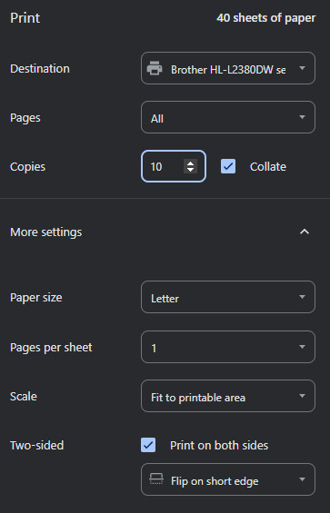
The key things people tend to get wrong when they try printing zines is they forget to make sure that it is double sided and flips on the short edge. If you tried printing one and it came out looking wonky, make sure to check this.
Also, it will make your life infinitely easier if you use the collate option should you have it available to you.
Fit to printable area is a helpful setting to have on if you're printing zines who use a different paper standard than you. This zine didn't for me but I leave this on out of habit.
When you've got this all set up - print as many copies as you want to assemble.
Assembling
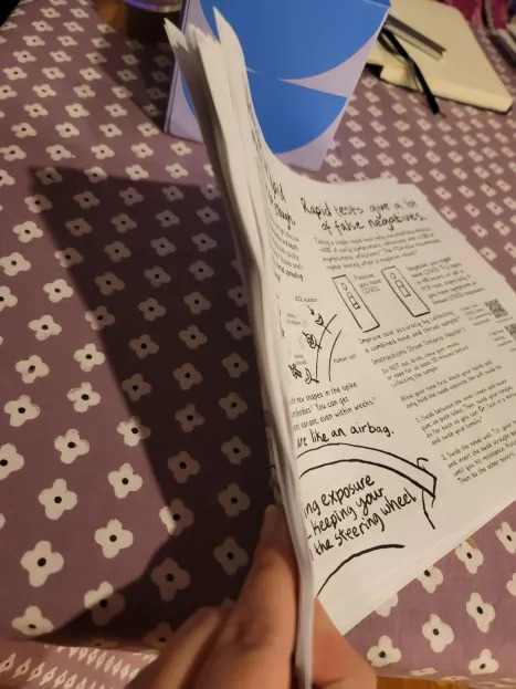
When you get them out of the printer they'll look like this. Just a big old stack. I highly recommend parsing out each individual copy before you try assembling any. I have made that mistake before.
This is how I stack mine.

I like to leave the cover side up as it makes for a clearer division as I'm assembling.
As you're flipping through these to parse and stack them, check them over for any issues with printing. I ran out of printer toner on the first three so I'm glad I checked.
Imperfections are fine but you're looking for anything that makes critical information unreadable.
To assemble a copy, get them lined up by tapping them on the table along a short and a long edge.
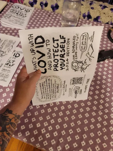
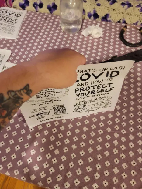
Both hands is a lot easier but I was trying to take a picture lol
Then fold them hamburger style and smooth down the spine as best you can. If you have a bone folder or similar use that.
Again, let go of perfection. We are looking for good enough here. Minor errors here should not make info unreadable so don't sweat the small stuff.
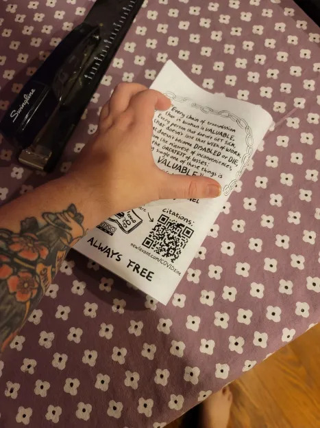

I recommend doing all your folding in one go to prevent errors. Or at least it really helps me.
Now it's time to staple. You will see my fancy stapler in the background - you do not require it and I would not recommend it. Unhinging a normal stapler is way easier to use in my opinion and this one gets jammed fairly easy. Use what you've got.
If you don't have staples, but you do have sewing supplies - check out this tutorial for a way to bind it with thread.
If you have no staples and no thread, you don't have to staple every zine. Smaller ones (~5 pages or less) do fine with no staple. They can be a little tougher for some people to use and don't hold up as well being taken in and out of places so I would consider that when thinking of where to leave them. They're still well worth printing and putting out.
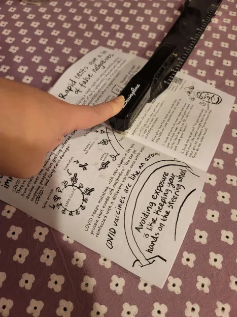

This zine is small enough that one staple in the center should be enough to keep it together.
I opted to staple in two places - one about an inch in from either edge - mostly out of habit. It does add a little stability and will make them a little better for putting in Little Free Libraries and other places where they'll be removed and placed back.
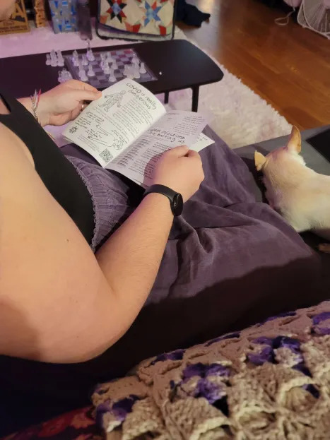
Here is my partner looking over the zines to make sure my stapling didn't cut off any important information in each copy. It's a little tedious but it's pretty important. A quick flip through can mean the difference between someone getting the info you want them to have or not.
And here's the finished product
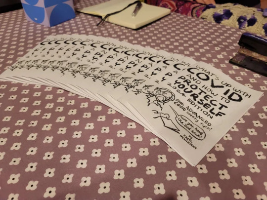
I made 15. I'm pretty privileged and have been making zines for over a decade now so it's almost like knitting or crochet for me. Feel free to make fewer copies or just one for yourself. It still counts.
I will stick some in each car and my bag. I have some medical appointments coming up so I will for sure be leaving some of these in the waiting room.
I'm also going to keep an eye out for Little Free Libraries and other place where people are looking for something to read. I might also toss some on the tables of a coffee shop I pop into sometimes (masked, take out only) and the library to pick up books (also masked).
I tend not to give them to specific people, even people I know, because people are way more open to information they've picked up themself than something it feels like someone is pressuring them to read. But if people bring it up in conversation, I'll be sure to offer a copy to anyone who is interested.
Hope this is helpful!
Go out there and print!
104 notes
·
View notes
Text

A Worksheet Manifesto (Rough Draft)
The Worksheet Manifesto is an attempt to explain why I'm moving my game design toward something I can print for free at the public library and give away. It's not a scold or a call to action; I buy full-color zines and hardcover books, and I support people charging for their work. This is a personal manifesto—an exercise in self-exploration.
The first reason I pursue this is ACCESS. I want people to be able to find and play my games. (Accessibility is maybe a better word for this, but I don't want it confused with the process through which something is made easier to use for people with disabilities.)
Some of the main barriers I've seen are financial (someone can't afford my games), technological (lack of computers and/or printers makes it more complicated to read my games), and international (shipping to someone outside the U.S. is prohibitively expensive).
Combining these three elements, I realized I wanted my games to be cheap or free. The common "community copies" solution on itch.io is much touted, and for good reason, but as I tried explaining the process to friends who weren't familiar with the site (or who flat-out aren't tech savvy), many responses were confused or frustrated. So I've set most of my games to pay-what-you-want with a suggested price.
Going from computer tech to printer tech, my most recent games were laid out in black and white, without ink-sucking textures (although some still have large spots of black in the art--something I continue to consider). Many American libraries offer limited free printing, and I always hope people will "utilize" the printers at their jobs or schools. I want people to be able to easily print out my games and share them at the table or pass them to friends.
And more selfishly, I hate dealing with fulfillment and shipping. It's stressful for me, it requires money up front to print things, and I'm bad at it, which means shipments go out slow, or not at all if someone lives outside of the U.S. Creating a file that's easy to print hopefully encourages people to create their own copies.
These cheap print copies also hopefully contribute to a feeling of DISPOSABILITY. I grew up with comic books, magazines, newspapers, and mass market paperbacks, and I think these cheap, short slabs of culture helped them feel like someone could engage with them without having to be fancy or educated or in the know. (A lot of us gatekeep ourselves!)
Prices for RPGs, like so many nerd collectibles, have steadily risen at least since the start of the pandemic. Crowdfunders often capitalize on FOMO, encouraging people to go all in on deluxe hardcovers with fabric bookmarks or whatever. And if my experience working at a used game store is anything to go by, lots of those fancy editions go right onto the bookshelf, unread. Don't want to break the spine or get fingerprints on it!
And I guess I'm just against consumerism? If someone wants a nice thing, I hope they get it, but a culture of games as luxury items and status symbols is not something I'm interested in.
So if someone has a game of mine and they don't want it anymore, I hope they pass it on, put it in a little free library, or recycle it.
And those dirty little printouts of my games? I want people to touch them and write them. I want TACTILITY. This is partially a usability issue: 300-page hardcovers are hard to find information in, and they're heavy if you have to lug them to a friend's house.
So I try to design games where everything a player (including the GM) needs is on, at most, three sheets of paper. I want them to be able to spread a couple pages out and take in the shape of the game they're about to play. I want them to circle things and make notes in the margins. Moving a pencil around does wild things to your brain, the same way that picking at a guitar or molding clay does. It focuses attention in interesting ways.
And in the end, you hopefully have a personalized article of play. And if you spill beer on it, no one's worried about replacing that $50 hardcover.
Speaking of beer, I want my games to be available to and contribute to COMMUNITY. As the pandemic started, I retreated into lots of online spaces, and those were absolutely vital to my survival. But I lost touch with lots of my friends and acquaintances in my city. I want to reconnect with them.
One of my favorite cartoonists, Mark Connery, is known for drawing little zines and just...leaving them all over. Coffee shops, art galleries, bathrooms. And when I think of him, I think of an artist responding directly to the places around him. Is it sad that some of this work is probably "lost" to all readers other than the person that happens across the zine? A little bit. But I think that comes from a bad part of my brain, the part that wants to own things.
I certainly don't want the entirety of my own work collected and widely distributed. Some of those things were specific responses to specific times that I've moved past. Some were bad! But I want to keep responding to my specific times and my specific place. I want to give things to friends (even if they just pass them on or recycle them). I want to give a game to someone at a zine fest and have them recognize my name from a zine they read in a coffee shop bathroom. And maybe they'll give me a zine in return.
My last hangup is MODULARITY. First, similar to tactility, I want to be able to give a player only the rules that matter to them. Character creation and basic rules? Here's a page. And once you're familiar with that and we've entered a downtime phase, here's a page with those options. You want to start a farm? Here's a page. I want it to feel like printing coloring pages for kids or ripping out my favorite magazine articles. These are the parts that matter. And if they stop mattering, you can get rid of them.
But I also want modularity on a system level. I want to add a subsystem to game as I think of it. I want to throw in an adventure pamphlet when it comes to me. I can keep them all in a little box, like a care package from my past self, and when it's time to run a game, I can dig around like a verminous animal and build my nest out of the best bits.
In CONCLUSION, I want to reiterate that this is a personal practice, and I'm not criticizing people who work differently. I used to work differently, and in the future, I'll probably work differently again.
This is simply the way I've identified what's important to me, set that up against the things that cause me to stumble, taken advantage of the privileges I have, and tried my best to bring that all together in a way that keeps me excited about my own work.

125 notes
·
View notes
Text
Setting Up a Zine Layout for Print (with Affinity Publisher)
Listen up shits spoons
Heyo back with another guide for folks new to art and layout! In this one I'm gonna talk about setting up your zine for print with a commercial printer (Like Mixam). If you wanna look at my other guides you can see them here (as of the time of this one I've done one other guide, but I enjoy doing these so I'll probably do more as time permits)
I'm specifically gonna be talking about using Affinity Publisher 2 because its what I do all my professional work in, but the ideas should hold solid for other programs like Adobe InDesign, Publisher 1, or others! I'm also gonna talk specifically with Mixam measurements since they're my printer of choice.
I'm going to get real into the basics of this one, so if you've done a good bit of layout already this is probably all old hat for you. I'm specifically skipping around the topic of Color Management, but I talk about it a LITTLE.
This is a lot of text, so if folks would like I can probably record the setup some time in the future if that would generally be helpful? Lemme know what we want haha
Okay lets dive in though
So lets start at the very beginning which is choosing a page size. I'm going to assume we are working with Letter sized paper because that's what most folks in the US do, which means we want to set the pages up to be half letter. This is gonna give us a zine that folds like this just for clarity.
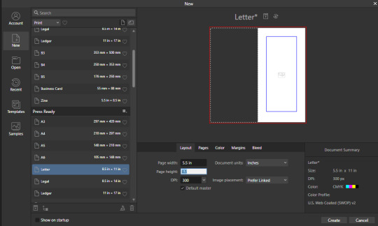
So lets hit File->New... up top, and you'll get a screen that looks like this. We are going to change our measurements to be Page Width 5.5 and Page Height 8.5 which is our measurements all folded and whatnot. We want to set our DPI to 300 so the printer has plenty to work with and we don't end up with pixely shit on the pages.
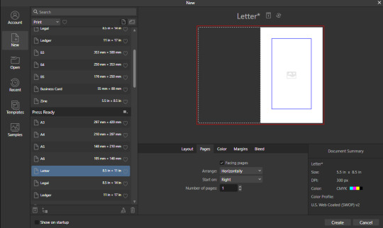
Under the Pages tabs things should default correctly, but we want Facing Pages to make layout a little easier, and we want to start on the Right with a single page. This tab should look like this
Next we are gonna hop on over to the Color Tag the long of the short of this is we want to work in CMYK/8. I'm specifically working with the color space used by Mixam within CMYK/8, but your computers default should be fine here, so just set your Color Format to CMYK8, and let it choose the default for Color Profile.
I don't personally set Transparent Backgrounds because I think they're a fucking eyesore, but that's dealer's choice and if you prefer them what's wrong with you good for you.
Color Management is really a pretty complex topic I'm not really good at talking about because I don't have the knowledge I should on it (I've largely worked in Black and White!), but here is a really solid primer on why we want to work in CMYK over RGB, and why that's so important for printing.

Hopping over to the Margins and Bleed tags, we are gonna do some minor changes to the default. If you're laying out something over say 60 pages I'd look at editing the inner margins here a bit.
I'm gonna go off the Mixam Full Bleed Print guidelines, and give myself some extra space for safety, but if your printer has other thoughts you should follow those instead. I've found that generally these guidelines work for most projects so you're usually safe to follow this bit as is. If you don't know what Margins or bleed are, I'd just read through the full bleed print guidelines linked above because it's a great primer. If you don't care or already know, keep reading.
For Margins we are gonna include margins and set our inner margins to 1 inch, and our outer/top/bottom margins to .5 inches
For Bleed we are gonna set everything to .25 inches for safety, Mixam only needs .125 inches.

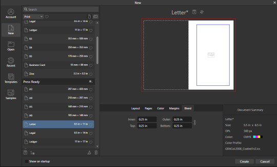
Finally, so we don't have to go through this every single time, we are going to save this setup by clicking the button up top (next to where it says Letter* on my screen). I'm calling mine Mixam Half Letter Zine so I can remember it next time.


FINALLY you can click Create at the bottom right of the popup, and if you've done it right you should be greeted with a screen that looks somewhat like this
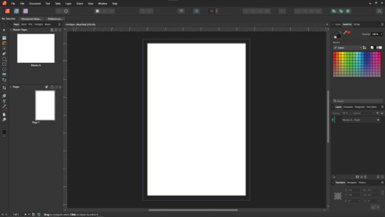
Now we're gonna set up some Master pages, font and paragraph styles, baseline grids, and guides to get the best looking zine possible.
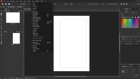
At the top of the screen we wanna go to View->Preview mode, and make sure its unselected. This is gonna make sure we can see all the setup we are doing now, you can unselect it at any time (by hitting the toggle or Ctrl+shift+w) to see what the zine looks like without our guidelines on once we get them setup. Also on the view menu we want to turn on basically everything except Grid in the top bit. Here's what your menu should look like, and what your page will look like if things are setup right!
Okay so lets start with Masters! Setting up a good flexible master page or two is a great way to make sure your Zine keeps a consistent look throughout, and it carries your setup across pages! Look to the top left of the working space, and lets go work on Master A by double clicking on it.
I'm going to setup a quick set of guides just so I can lay things out a bit easier! While on Master A hit View->Guides and under Column Guides we are gonna add in 2 Columns and 3 Rows with a Gutter of .125 inches. The margins should be correct, and we want the Spread to be at x:0 y:0 which it should by default. In a lot of circles you will hear this called The Grid, but my friend Clayton did a great guide on this already so I'm linking that here. I also like to set some Horizontal and Vertical guides just so I know where the exact center of the working area is, so I'm going to make 2 Vertical Guides at 2.5 and 8.5, and a Horizontal Guide at 4.25 inches. The long of the short here is this gives us a lot of room to snap things to in the future. I set my Column Guide to pink to make it stand out a little more, but when you export this it'll disappear so just set it to whatever color works best for you.

With the master set, click back over to Page 1, and you should see it now has a series of guidelines based on this master. Hell yeah.
Lets move on to text styles now! These are going to save you a lot of hassle in the future with making sure everything matches, and works how you like. Double check that you're off the Master, and then lets make a text box using the Frame Text Tool, and lets get ourselves a text box somewhere on this page. The placement doesn't SUPER matter here because we are just going to erase it at the end.
Toss a few lines of text into this box, I usually use Title, Header, Body Text, and then 3 lines of Bullet Text
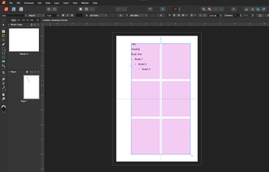
Now we are gonna hop into the Text Styles menu. I keep mine pinned on screen, but if it isn't visible, you can find it under Windows->Text->Text Styles

Now highlight each of these lines of text, and double click the appropriate text style from this menu (ie we are gonna set Title to Header 1, Header to Header 2, etc). It'll look something like this when you're done

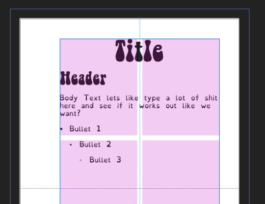
Now we're gonna change each of these lines of text to look how we want! For the example I'm making my titles and headers in Bellybeans FG, and setting the rest of the text to Open Dyslexic and resizing them so they look good.
My page looks like this now
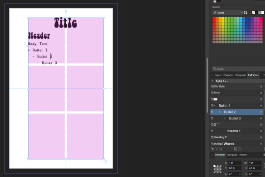
Now's a great time to mention that there is a difference between Rich and True black, and it's confusing and it fucks a lot of folks up. The link up above (the primer on CMYK above RGB) talks some about your blacks, and links to a follow up article about them! You can skip reading any of that for now (but like you should), because the tldr here is going to be make SURE that if you are using Black you have the color set to c:0 y:0 m:0 k:100 if you don't wanna have issues later!
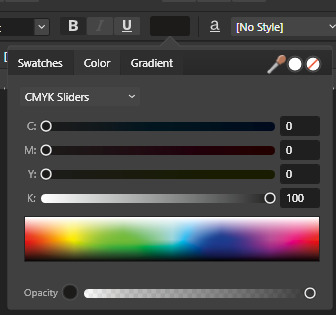
Now we want to update our font styles to match! To do this we are going to go back and individually highlight each line of text, and then right click the matching Text Style, and hit Update. The screens should look like this.

Next we are gonna set up a baseline grid! This makes it so that text on one side of a spread is gonna line up correctly with text on the opposite side of the page, and just helps with making pages look good and even! We want to set the grid Relative to the Top Margin, and then set the spacing to whatever you feel is correct in your heart of hearts. These are the settings I've used, but do whatever looks good here, there are probably some hard and fast rules for how to do this well, but I do not know them.

On my specific example you can see my Bullets are really spread out, and I don't like that, but the Body Text lays out much nicer. Lets deal with some spacing issues!
We are gonna hop on over to the Paragraph tab now, for me this is another tab on the Text Styles Window, but if you don't have it visible Windows->Text->Paragraph should bring it up.
So for me personally I want all my bullets to be on the following line, and not skip a whole line between them. I'm going to highlight all my text, and in this menu I'm going to go to Spacing > Space After Paragraph and set the amount to 0 pts.
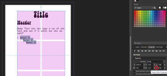
You can also go further into this tab to change some more rules about what your bullets look like (things like how big your tabstops are, what the bullets look like, etc) but I'm not getting into that here!
After all this I'm gonna hop back into text styles, highlight each line of bullets, and Right Click->Update style on each of them (Just like we did previously!)
It's really tempting to skip this section of setting up your zine, but it enables a lot that can really help you out a ton in the long run. Having standardized Headers allows easy updating of headers and titles across the document, easy setup of Table of Contents for folks using them, and also on export is going to auto-bookmark the pdf for folks using PDF formats. It really pays to take time and set things like this up correctly the first time. After you're happy that this all looks good, you can go ahead and erase this text box.
Now we can break into zine layout proper, but if you just wanted basics you can stop here! Whatever you do from here is gonna print pretty decently.
If you'd like to stick around I'm going to set up some slightly nicer master pages, talk about why I use multiple masters, set up page numbers, and get us a table of contents!
So from hereon I'm just gonna work on laying out a basic Zine. So let's hop back into our Master Pages, and start setting up some flexible masters. I know I want at least two masters, one where I have text on both pages, and one where I only have text on the rightmost page. For right now we are going to just work on the spread with text on both pages, so I'm going to create a text box on both pages within the spread that fills the entirety of that guide we set up earlier. On the leftmost page, I'm going to right click the text box with the Frame Text Tool selected, and I'm going to choose to Insert Filler Text so I can see how everything looks.

Make sure this text is in your Body Text Style, and then click the little triangle on the text box
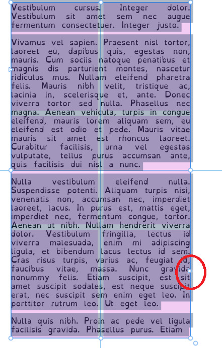
I'm now gonna select the textbox on the rightmost of the spread. If you did it properly, your page should look somewhat like this.
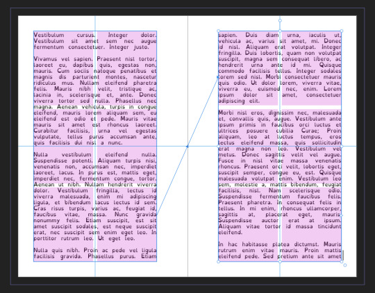
After I'm happy with this page, I'm going to erase the text in both boxes. I wanna add in some page numbers now. They aren't going to fit in the boxes here, but if you remember correctly I left myself a little bit of wiggle room when I set up the margins! Mixam needs .25 in clear, but my boxes are all .5 inches from the edges of the page. To make sure I don't egress the space too badly here, I'm going to set up a new horizontal guide from the View->Guides page we used previously, and I'm going to set this guide at 8.25 in which is the true bottom edge of our workable space.
I'm going to create new text boxes for our page numbers that line up with the outer edges of our guides, and the new true-bottom line I just set up.
It looks like this, but there's an eye icon which means no text in this box is going to be visible!
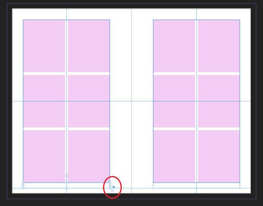
No worries this is because our baseline grid isn't playing nicely here, we are gonna break it in a moment, but for the mean time lets right click this text box, and select Insert Fields->Page Number

On the left page I'm also going to Bold and Left Align this box, but otherwise keep it in my Body Text Style. With the text all highlighted, I'm going to hop into the Paragraph window again, and scroll down to Baseline Grid->Align to Baseline Grid, and turn that option off.
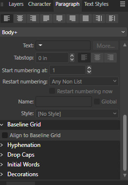
My page now correctly shows a single # in the spot I'd want my page numbers to be. When this master is used, that number will automatically update to be correct! I'm going to duplicate this text box, and drag it onto the right page of the spread, and set the alignment to Right. I'm going to refill the textboxes with Filler Text for a moment, and turn Preview Mode on so I can make sure I like the page. For me this master now looks like this
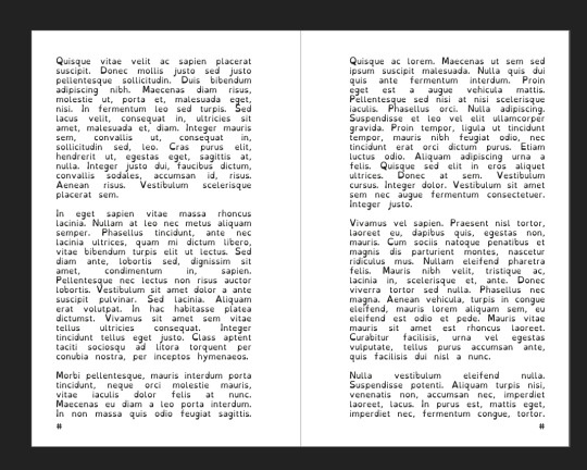
I'm going to duplicate this master now, and on the left page of the spread I'm going to remove both text boxes. I like to name my masters so I know what they are at a quick glance. This is going to leave me a second master that looks like this.

You can get really involved on your master pages generally! I'm not doing anything fancy with this one, but previous projects have that heavily used masters might have pages that look more intense and include things like photo boxes, more complicated sets of text boxes, and even some text to use as a guide as I go.
Lets hop back to Page 1 of our doc, and leave the masters behind
Page 1 is going to be the title page for the book, but it likely now has a bunch of details now that you don't particularly need. If you have a master you don't want on a page, you can right click the page, and click Clear Masters.
I'm almost out of images on this post so I am gonna go mostly imageless from hereout. I'm gonna toss some text on pages, and then make a table of contents, and get my page numbers fixed up since most people don't actually want to count the Cover as Page 1 as far as page numbering goes.
With the project laid out, and the pages where I want them, the actual "Page 1" is going to start on Page 5 for me. Looking at the pages on the left side, I'm going to right click Page 5, and click Start New Section. On this new section I'm going to fill it out so the new section starts on page 5, and restarts the numbering at 1. Here's what it looks like for me.

On page 3 I want to include a Table of contents so if the ToC window isn't visible I'm gonna hit Window->References->Table of Contents, and then in this window I'm going to hit the insert button. You can really dial in a lot of settings here, but as long as you've been using those Text Styles I mentioned previously, it should be pretty easy! Since I've been using only Heading 2 to start chapters, I'm going to unselect Heading 1 since it is effectively only being used on the ToC page and the cover, and I don't think folks need help finding those. This ToC feature rocks and as long as your page numbers are correct, and you use your text styles it should auto-update! If it doesn't there's a refresh ToC button on this window as well. Regardless (and perfectly using my 30th image) this is what it looks like for me now.
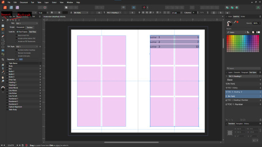
You'll also note I updated the text styles here as well! Anyway this is a real overview of zine layout for print, there's probably more things I should cover, but I'm out of images and tired so I'm leaving it here. If this was helpful I'm gonna put this template up on my itch after I clean it up some down the line.
I'm gonna have to come back with a Part 2 that talks about exporting and whatnot, but this is all I can realistically fit in a post for now.
If you get any use out of this and wanna throw a few bucks my way you can do that here
and if you have any questions I'll answer what I can! Just shoot me an ask on here, or like annoy me on my discord (its in my pinned post)
okay thanks bye
#skillshare#this one is gonna need a followup and I will make it one day but I ran out of images#I keep threatening to stream this so if thats something folks want I actually will I s2g
190 notes
·
View notes
Text
for those interested in printing and creating your own zine! jpegs of the template for the hockey zine here, link to download from drive (+ more info on that) and a tutorial below!!
if you can print from somewhere that supports psd files (also in the drive) i highly recommend, to preserve the colors better (: these appear weird as rgb color profile right now but Should print properly as they'll convert to cmyk. let me know if thats not the case!
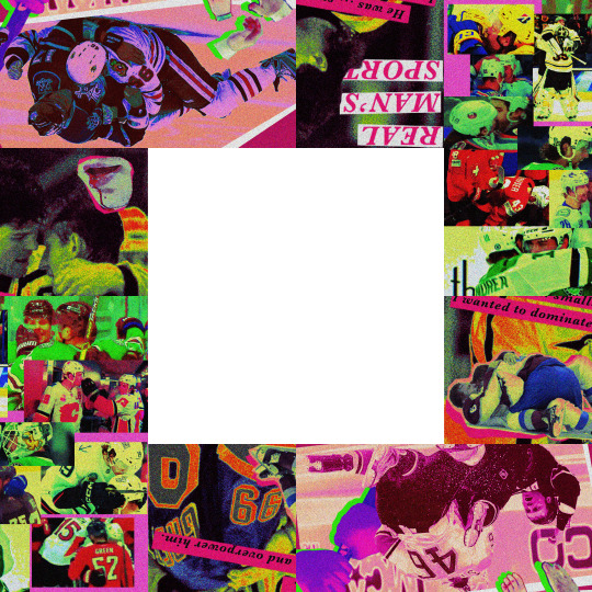
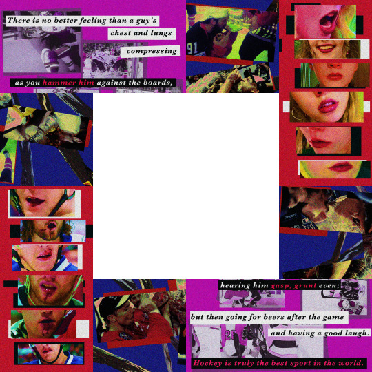
also, i'm. not charging for any of this. but instead if you're able to, please consider donating esims for gaza or in some way supporting those in palestine (even just doing your daily arab.org click!!)
again, if you have somewhere to print psd files that is what i would Highly Recommend, the colors and quality will just turn out better, i think.
here is the link to a drive folder where u will find these files as well as tutorials (both specifically for this zine and for this type of zine in general)
some further info not included/expanded on in that drive! :
this is meant to be 8x8in when laid flat (not folded) and the files there should print as such, you wont need a special printer or anything, i literally just used the normal library printer on printer paper.
you will need to cut off the edge around the printed bits as straight and close to the edge as possible, as well as the 4x4 empty square in the middle.
if you're able to line them up, you can print these back to back as they are. if you can't, or want the zine to be a little thicker, you can just print them on separate pages and glue them back to back (the way theyre currently oriented, if that makes sense) and fold it like that. that's how i did it!
there are 24 image slots, but if you want to make your own you will only make 6 images. these images will then be split up into 4 sections (theres an example of this in the tutorial folder) in order to be folded, which is why there's 24 little sections.
i would recommend folding around every square of an image before doing the Actual Final Fold, it'll be soooo much easier to manipulate it from there imo. then, once you have done the final fold, taking something and creasing around the edges of the zine on each page you flip to will help it be easier to move, as well.
also this is the video i originally used to learn to make these (but found to be a little confusing/not friendly to those making their own)
if theres anything i missed/is unclear/doesn't work, please feel free to send me an ask or message about it!!! i hope you all enjoy and make ur own zines <3
#not all required reading just. Info if u get confused/lost/need tips and tricks (:#hope this is useful!!!!!!#also hope i’m right abt the color profile thing lol…#real man's sport#zine tutorial#art stuff
23 notes
·
View notes
Text
🇵🇸low spoons, low income ways to support a free palestine🇵🇸
For many low-income and/or disabled activists, we can't always do the obvious things to support Palestine like donating money or going to protests. I'm compiling this list to remind myself what I *can* do, and I'm hoping it might help some other people too.
Disclaimer: you might not find all of these to be low spoons for you--maybe drawing is physically difficult, or phone calls are distressing. These are just ideas! Please ignore and adapt them to suit your needs and abilities <3
🍉Get creative with stickers, posters, zines, whatever!
Adhesive shipping labels from USPS ship to your house for free (if you live in the US). You can order up to 750 at a time! Draw a Palestinian flag or "Free Gaza" on there and stick them everywhere (it's actually quite easy to vandalize without getting caught).
If you want to go bigger, try a wheatpaste, and if you have access to a printer or copier, leave some zines around (tutorial, canva template). If you are housebound, you can give them to a friend to spread around for you.
You can also make signs and have someone else take them to a protest. If you're a sewist, make a puppet or wearable patches!
🍉Display a Palestinian flag or pro-Palestine sign in your window
If you live in an area where this isn't safe, or if you don't have your own space, assess the risk before you do this. You could also put up a more subtle symbol, such as a watermelon, if you are nervous about backlash.
🍉Contact your reps!
I know people say this all the time, but for my US-based friends, some pointers to make it take as few spoons as possible--
Democracy.io makes it super easy to email both your senators and your representative at the same time.
Faxzero.com allows you to send a fax straight to your reps' printers. Not all of their offices have this enabled, but I've heard faxes are more direct than emails.
If you don't know what to say, you can adapt this template (it's a bit outdated). Or just write "Free Palestine" or "Ceasefire Now." Something is better than nothing!
🍉Participate in phone zaps
Often times, organizations like USPCN or Jewish Voice for Peace will ask for people to call a person or organization to put pressure on them, such as demanding that a university drop charges against student protestors. Monitor those accounts and, if you're up for it, call or leave a message. Or, you could even text the group chat and conduct your own phone zap!
🍉Check out library books about Palestine
You also may be able to request that your library purchase certain titles, or request titles they don't have through interlibrary loan!
🍉Write a letter to the editor
You can write either to a local paper or a school paper, if you're a student or alum. This is a great way to break out of the echo chamber--local papers often have an intergenerational audience.
🍉Send in a public comment to a city council meeting
Many cities have the option to send in a public comment electronically! So if you can't make it to an in-person meeting, this is a good option, especially if your city is trying to pass a ceasefire resolution.
🍉Attend online Jewish Voice for Peace "Power Half-Hour for Gaza"
JVP's Power Half-Hours are a wonderful space to grieve, process, and build stamina for the fight to come. Monday through Friday, 3pm ET/ 12pm PT, 30 minutes of solidarity-building and reflection facilitated by Jewish leaders but open to all. You can pre-register to join on Zoom or stream on YouTube.
🍉Support friends who go to protests/actions
That can be as simple as texting them before and after and making sure they are safe, lending them a bandana or rain gear, or providing a place to decompress afterward! If you have an animal that does well in crowds, consider allowing a trusted friend to take them to a protest or encampment for a short time. Seeing dogs in keffiyehs always makes my day <3
---
🍉Other Considerations and Reminders 🍉
Focus on the long haul. It's more important to create a pace of activism that's sustainable for you than it is to do everything all the time.
"Ought" implies "can." If you are unable to do something, or if it would be very difficult for you to do so, you are in no way obligated to do that thing!
Block words on social media if you need to. In a similar vein, you do not need to force yourself to constantly watch graphic videos or read upsetting posts. Yes, Gaza has asked us to bear witness to the atrocities there--"All Eyes on Gaza Now" is a common chant for a reason. But that doesn't mean you, specifically, must doomscroll forever.
Please reblog with your own favorite ways to advocate for Palestine when you're broke and spoonless 🇵🇸 🇵🇸
#free palestine#free gaza#palestina libre#solarpunk#disability#valiantly battled the brain fog and dislocating hip for this one. hope it's worth it#long post
18 notes
·
View notes
Text
Welcome to Astorvember week 3: Thread of Fate!

Also keep an eye on the calendar because next week is Age of Calamity week, so fan works for the game Hyrule Warriors: Age of Calamity will be welcome, too! We're gonna finish out Astorvember with a celebration of the game itself. For now here are this week's prompts:
15. Harbinger 16. Astrolabe 17. Lost 18. Chosen 19. Defeat 20. Sacrifice 21. Blood Moon
Full guidelines for Astorvember as well as submission guidelines for the Astor zine can be found here.
FAQ under the cut, updated with more questions I've received since last week.
Q: What can I submit? A: TL;DR writing under 2500 words (ficlets, fic excepts, essays, poems, etc), visual art roughly the size of a half a sheet of printer paper or smaller (drawings, photographs, etc), miscellaneous works such as sheet music, craft tutorials, physical merch, and others subject to approval. Full info above (or here).
Q: How do I submit? A: Email [email protected] and include: -The work's title -The name you would like to be credited as (screen name, url, or nickname preferred over legal name) -Is the work potentially NSFW and if so what content warnings apply Again, more info above (or here).
Q: How many submissions are you looking for? A: As many as y'all got! No limit, go wild.
Q: Can I submit more than one piece? A: Submit as many pieces as you want. Seriously, no limit.
Q: Who can submit works? A: Anyone! Submissions are very specifically and intentionally open to anyone and everyone instead of taking applications and selecting artists to create a piece specifically for the zine.
Q: Can I submit works I've already posted? A: Yes, this zine is intended to be a collection and celebration of the last four years of the fandom. All works are welcome, no matter how old they are or how many people have seen them. This also very much includes pieces from this or last year's Astorvember.
Q: Can I post the piece I submitted? A: Yes, if you want. You can post it, say it was submitted to the zine, post it and don't say it was submitted, or keep the whole thing secret. You can change your mind and post it after submissions close, before the zine is released, whatever you want.
Q: Are original characters/self ships welcome? A: Yes, so many fan works about Astor are full of original characters and the zine would not be complete without them. All original characters are welcome, very specifically including self insert and self ship characters. They are so welcome that we're making a yearbook page dedicated to original characters.
Q: How do I submit an original character to the zine yearbook page? A: Submit a simple school picture style portrait (feel free to make it silly) of your oc with: -Their name -Their relation to Astor (mentor, family, friend, significant other, weird dogs, etc) -The name you would like to be credited as and/or what fic or au they're from if applicable -A senior quote/superlative (if you want) And again, just to be clear, self insert and self ship characters are very much included in this!
Q: Mr. President there's been a second yearbook page. A: So many people have joked about Astor being a mass original character due to his lack of background and character development that if enough people submit the above for their fanon version of Astor we'll do an Oops! All Astors version of the yearbook page.
Q: Will there be physical merch? A: Possibly, still working out logistics. Proposals for physical merch are one of the categories of submissions, email [email protected] with ideas for things like pins, stickers, keychains, etc. Handmade items are welcome and encouraged if you have the time!
Q: Is NSFW content allowed? A: Yes, both art and writing. All submissions that include violence, gore, nudity, sex, etc will be marked as such. In the event that a physical zine is made there will be curated versions including a safe for work version. When you submit your works please include any potential content warnings. We'll be in contact if any works might need additional warnings. That said, no works will be censored. As mentioned above they will be clearly marked in the full version and omitted from the safe for work version. If you would like to submit a censored version of your work for the safe for work version, you may.
Q: I still have a question. A: Send me an ask, a message, email the submissions email, send a flock of birds to follow me around, reach me in my dreams, whatever. If you need something clarified or reiterated, go ahead and ask. If you're unsure about your submission, go ahead and ask. If there's a secret third thing, go ahead and ask.
#astorvember#astor age of calamity#astor aoc#astor prophet of doom#hyrule warriors age of calamity#age of calamity#this is an open invitation for the larger age of calamity fandom to come play dolls with us
6 notes
·
View notes
Note
My zine arrived!!! The quality is so good it’s so awesome to be able to hold all these comics!!
I took a art book publishing class last semester so I’m inclined to ask how you chose the paper weight / texture you did and if you have any advice when it comes to printing art?
Love all your work!
hi im so glad it arrived safely!
The printer I used is called mixam, which i found because it was the same printer used for a few other collaborative zine projects i've been on. Their process for printing is really user-friendly and customizable so I liked them a lot!
As for how I chose paper weight and texture, i had a general idea of what I wanted and what was going to work best for what I was printing--I needed paper that was heavy enough that large blocks of black wouldn't show through from page to page, for example, while also not making the book too thick to be staple-bound, and for the cover I knew I wanted a matte finish because colorful digital art generally prints and displays better on matte paper than glossy. After that it was a matter of picking options that fit those constraints without getting too expensive to print, which wasn't hard since the interior printing was all black-and-white which brought down the cost significantly. I did order a prototype to make sure that my choices worked well physically, and thankfully I was happy with the quality I got and didn't need to order another prototype with different options, but that's what I planned to do if I needed to make any changes ahead of ordering the big batch.
As for general advice about printing art, I've always used the highest possible resolution files any given program can handle, and if I know I plan on printing something I work in CMYK. I've found that if a colored piece is heavy on blacks or very dark colors it doesn't print well, which is part of why I kept the cover of the zine so light. If i DO need to print something that's really dark, I usually bump the contrast considerably higher with the assumption that it will print darker than it looks on my screen. (I didn't originally plan on printing the interior comics in the zine, so some of the artwork had to be cropped or expanded to fit the print dimensions, but luckily they were black and white already so no color problems occurred in the printing process lol)
#prototypes were like decently expensive. my first one was around $30 altogether#bc ordering just one is more expensive per print than ordering a big batch#but given the insane amount of money i made in sales after the fact. that cost means almost nothing now. LMAO#asks
30 notes
·
View notes
Text
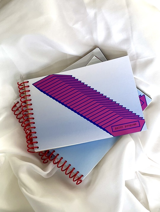
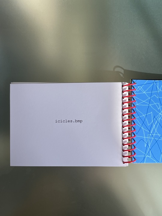
I made a thing!
Paint Program is a compilation of 26 Microsoft Paint files I made in the early 2000s, and recently rediscovered on an old laptop. I consider them to be digital artefacts of the Y2K era, not artworks.
Zine 29 pages 5 x 7" Inkjet printed Edition of 8 2024
Concept, text, & design by Jo Minhinnett
------
Background:
I had this zine idea a few years ago when I was cleaning out my mom's condo and going through our old family laptops, from back in the day when a household only had one computer. The MS Paint files I found there were likely migrated from an even older desktop computer because I wouldn't have owned a laptop in 2003 when the earliest files were dated. The files were BMPs and PNGs and I made sure to retain all the original file names in the zine.
How I made it:
This was a headache to layout as the graphic files were geriatric and I wanted a true-to-screen Microsoft color palette printed on paper, which doesn't work when you convert the files to PDF or drop them into Photoshop (at least without a ton of work; photoshop doesn't recognize the colors in these image files and appears to auto approximate the color). I was out of my wheelhouse and I'm still curious to know how a designer would go about handling these files to get an authentic color match in Photoshop. I spent SO long trying to figure this all out and did a ton of print tests because I NEEDED that MS Paint palette to look turn of the 21st century and not have the colors changed to whatever present day Adobe software wanted them to be.
In the end, Microsoft speaks to Microsoft, so I laid it all out in Powerpoint and called it a day. This was kind of a 'give up' moment for me, but in hindsight, after all the tests, it proved to be the most logical and un-fussy way to do it. I also had to print the zine from Powerpoint if I wanted to get "true" MS Paint colors, which really slowed everything down and made it impossible to print many copies (crying inside a little). I printed on my Epson home printer and a stack of 50lb. premium matte Red River Paper (cardstock weight) which is almost too much and too heavy , but I loved how there was no bleed-through and how it made the book feel extra tactile. If you have memories of printing out your MS Paint creations on office paper circa 2003, you know how terrible and soggy that was and my heart goes out to you. I think I over-compensated with the 50lb. weight because of this traumatic memory. All to say, the inkjet print quality is simply astounding, pure matte heaven! I hand-punched the binding holes and hand-assembled each one with the plastic coil. I am over the moon with how it turned out. My only hope is to have a bigger edition one day, once I solve the color issue, and be able to send this baby off to a local commercial printer. So long as the color isn't compromised. Making this zine was wonderful and nostalgic. The end result fetishizes MS Paint a lot because the print quality would never have been this good back then and on certain pages, it kind of fools me for a second. Like, wait a second, does that actually look good? For the most part, it doesn't though: the graphics were never created with artistic intention and I made sure to include files that were especially brainless (although I kept out any that were remotely vulgar). It's all part of the low-fi aesthetic that I love, which was dictated by the only widely available technology for the average consumer in the early 2000s. I wasn't particularly creative or intentional with the technology and I think that's really point of this zine, as an everyday record and artefact of a teen in the Y2K age.
5 notes
·
View notes
Text
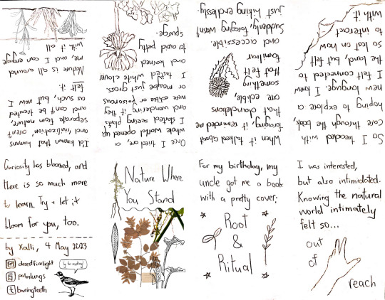
[Image Description: A zine in an 8-page layout.
The first page displays the title of the zine “Nature Where You stand” in big letters. Around it is a collage of plants— a mix of old photos and line-art of leaves and flowers. It is separated from the title text by a solid, squiggly line.
The second page reads “For my birthday, my uncle got me a book with a pretty cover: Root & Ritual”. The book’s title is written below and bigger than the rest of the text, and has a simple line-art drawing of a sprout on one side and a line-art drawing of some sort of grain on the other side. There are also four simple stars surrounding the book title.
The third page reads “I was interested, but also intimidated. Knowing the natural world intimately felt so… out of reach.” The words ‘out of reach’ surround a drawing of a hand reaching out to the top right corner of the page.
The fourth page reads “So I treaded with care through the book, hoping to explore a new language. I knew I felt connected to the land, but felt so lost on how to interact with it.” In the bottom right corner, there is a doodle of one side of a small, rocky hill.
The fifth page reads “When it talked about foraging, it reminded me that dandelions are edible, something that felt familiar and accessible. Suddenly, foraging wasn’t just hiking endlessly.” In the middle right section of the page, there is a small line-art drawing of a dandelion— the yellow kind, not the fluffy kind.
The sixth page reads “Once I tried one, a whole world opened up. I started seeing plants and wondering if they were edible or poisonous or maybe just gross. I tasted white clover and learned to avoid petty spurge.” On the bottom of the page is a line-art drawing of petty spurge leaves, and a white clover flower sticking out in front of the leaves.
The seventh page reads “I’d known that humans and ‘civilization’ aren’t separate from nature, and can’t be treated as such, but I’d never felt it. Nature is all around me, and I can engage with it all.” At the bottom of the page is line-art of a tuft of grass, some flowers, and cabbage sprouting from the ground.
The eighth page reads “Curiosity has bloomed, and there is so much more to learn. Try + let it bloom for you, too.” Below that, there is a dashed line, which has the words “by Xalli, 4 May 2023” underneath it. Underneath those words is the Instagram logo next to “desertfirelight,” the Substack logo next to “palmlungs,” and the Tumblr logo next to “baringteeth.” Best to those usernames is line-art of a little bird with a word bubble that says “Ty for reading!” /End ID]
hi there !! this is my first ever zine called Nature Where You Stand, about connecting to the earth and realizing that we are not as separate from the natural world as we feel
you’re free to turn your screen over and over to read this on your device, or you can print it out and fold it into a zine, using only one sheet of paper. linked in these words is a little visual & word-based tutorial on how to do it
it’ll look like this (though hopefully a bit better, if you have a nicer printer than i do) !

[Image Description: A photo of a hand holding a printed-out version of the zine, where the zine is slightly open so you can see the cover and a little bit inside of one of the pages. /End ID]
of course, fold where the page visually ends and not just where it should end, because i’m certainly not practiced enough at zines to get it too accurate...
you’re absolutely free to print and keep or even distribute or trade this zine-- just please don’t cut out my name or socials !
93 notes
·
View notes
Text
update on Review of the Killer print versions
Hello everyone who has followed me after my zine release. Thank you! You can expect other (hopefully) cool things from me about many things both niche and big, so look forward to that.
But about some things I'll be releasing probably tonight:
So what many of you might not know is that I finished playing Anthology of the killer, fell in love with it, and realized I needed to write something about it- esp when I discovered the bonus zine tucked away in the files. I realized that the steam release was in 14 days, and so i tried to do something I never do: finish something on a short deadline. This meant my life sort of became this zine outside of work (and inside of work. wouldn't it be cool if slime cooper ever stole time from work?? what am I saying), but even with dedication you end up running into time slipping away and things getting cut. 24 pages gets cut to 20 (which I will discuss in detail in the bonus features coming out in a few days) but the biggest thing to get shafted was the quality of the print versions. So let's really talk about this: I don't know jack shit about printing, in the way nobody knows jack shit about anything until they do it a bunch. So yes- those bleed versions are -bit- worthless since they will always provide no actual bleed on one side. Those black and white versions will look, well, strange. because they unfortunately use a lot of red, which will look very dark in greyscale. I also use a lot of flats because it looks nice in color, but in grey you really need images to have a lot more space (except for the black zones. Tbh I love wasting ink on a big blob of ink for contrast sometimes. I do it IRL all the time with my actual ink). In addition, it turns out printer settings that have booklet modes will force margins on the interior page side as well. It means I need to make versions of the pages that are pre formatted to print booklet mode, rather than relying on you to have a printer that does the hardwork for you. I was simply running out of time, and needed to get *something* out that could be printed.
Also it turns out if you don't bundle everything in a zip file, nobody downloads the readme. There was useful stuff in there!!! But I understand. I know why you wouldn't read it. I'm just shaking my head over here because i literally declare my love for you (yes you, reading this) in the readme. SMH, once again. So here is what i'm doing tonight:
extending the border trim of all pages so that way the master bleed version will ACTUALLY have room for bleed (1/8th of an inch around) for both formats.
Make new print versions that ALSO have the bleed room left in for Letterhead and A4, in case you felt like getting these professionally printed. I do all my stuff homegrown, so this truly is for in case you wanted to sell these. Which you totally can!! But I say that because I'm picturing someone actually thinking the thought "i'm going to print this zine read by about 150 people and print it for mega profit, and ill do this by spending 500 dollars at a print shop" and my brain instead pictures a dog dressed in a really cute clown outfit instead, because seriously who is that? Just print some printer copies and give them to some bookstores. Keep the money they give u so you can make the money on material back, and maybe buy some more cool artist's stuff.
Looking at all my pages and adjusting them by hand to be more economic for black and white printers in new separate Greyscale editions. This will include adjusting some colors manually, as well as doing that cool dot thing that printers do (well, i guess all printers do this just really finely) to save on ink. Plus the texture will look better on crazy cool looking paper. Seriously go visit a paper store. They make all sorts of nuts stuff. Read the manual for your home printer too- it can take a lot more punishment than you realize.
Correcting some egregious spelling mistakes. I am sorry. Lmfao. grant me this one indulgence since I literally gave everyone a free pass to distribute it.
Zip up all the print versions together in organized folders, along with and updated readme, including new instructions for all the versions as well as how to print these if you have a printer that doesn't do double sided printing. I glibly said "just go to library" in the original readme, but seriously. I had no clue how to do anything as a baby child and so i have deep sympathies for anyone in the exact position I was (not knowing anything+not having anything).
The in browser version might get updated as well. I'm not honestly sure tho... part of me is super against editing. but man those grammar errors on the paper doll pages are bad... lol anyways have fun with these. If you print them/ give them out you do not have to give me money- although i like money. well, i like not not having money, if that makes sense. but im already not not not having money, so thats why i'm fine with you all selling it- I'm not a starving artist, and I would rather u all get some of that not not not having money in your life so you can spread it around to artists who are! And if you print them, please show me pictures, esp if they go on a shelf or in a library somewhere. I love seeing things out and about. And once again, thank you for reading and sharing this online. This has crossed the threshold for everything else I've ever published as far as confirmed reads, and i've received a lot of kind words from a lot of kind folks about things I've personally agonized about trying to get right. Its validating. Its nice.
okay kids, you can go back to playing. thank you for listening to this old skeleton tell you some things about paper.
4 notes
·
View notes
Note
Do you think you’ll printing the comic when you’re done? I’d love to buy one to add a physical copy to my zine/comic collection
Well there'll be a full res pdf release that you can print yourself? I personally don't think it's very printable though - the yellowed paper background texture would be a nightmare and if i took it out I'd then have to find matching paper irl to print on (<- knows nothing about printing, to be clear)
But as with every other time ppl ask for me to make prints at home - the price involved in shipping from my country to yours would make it largely unattainable for you and unprofitable for me. I really appreciate the interest and I also would love to hold a physical copy but all I got is a laser printer, a bunch of noisy RGB files, and zero technical know-how
38 notes
·
View notes
Note
what made you decide to have a go at making zines, and how did you find the process? fun? frustrating? new hobby unlocked?
it's been a lot of fun and is super satisfying to hold a finished booklet in my hand. new hobby unlocked for sure.
in fact i'm going to ramble about it under the cut.
i'd been looking into on and off for over a year, and, frankly, i've been going slowly mad at having normal levels of focus and productivity dangled in front of me, only to be snatched away AND put on bed rest without even jacking off as an outlet.
i did a bunch of painting, but i've run out of canvases and focus. and while i really wanna sculpt, 1) i just haven't gotten my brain to switch to that track, 2) i've only just recently been able to tolerate standing at my usual work counter again, 3) having a small child who wants to mirror everything i do is fun when i'm physically able to handle it, but i am not physically able to handle it. i can do a craft myself OR i can set them up with supervised craft time. not both.
that leaves my writing, but i haven't been able to focus enough to write. so what to do with all my old stuff? may as well take that last leap into making zines! it's also an excuse for me to break out my drawing tablet to make cover art (i'm not good but they're small and it adds to the charm i think).
overall it's been shockingly easy. the hardest part was making a format template, but once i had that figured out i was set. i conveniently already had a laser printer, and considering i can't go anywhere (like a place with a public printer) i wouldn't have been able to do this otherwise.
the most expensive thing i had to buy for this was a nice paper cutter, which was $24. it honestly wasn't necessary. i could have just folded the paper or cut them with scissors, but imo it really goes a long way in making them look nice. i also have a long reach stapler that's made for making booklets and magazines coming in that will be really nice for putting them together neatly and consistently.
i still dont know what i'm going to do with them tbh. i have some friends that are gonna get free copies of their favs, and at least the poetry one i'm going to have out if i'm able to do the craft fairs this year (fuck me i hope i'm better by then), but i need to see what kind of stuff they allow. even if they allow sexually explicit material, i'll probably still leave stories like Red Hot at home.
i could do an online shop for the rest, but i'm not sure where. i already have a kofi account for commissions, and they have a shop feature, but at the same time they say in their TOS they don't allow any form of sexually explicit material. and last i heard about etsy they were being shitty about charging for advertising you didn't opt into. so i'd need to do more research into that.
say what you want about whether or not i should be able to make a profit off of little homemade porn booklets, but i'd at least need enough money to buy the toner for my printer by the time i ran out, which is hella expensive. i think back when i got this thing it was like $70 a pop. it lasts a lot longer than ink but it's more expensive up front.
4 notes
·
View notes